Power BI Matrix enables you to summarize your data in a dynamic tabular format. You can get a summary of your sales data, display sales yearly by product category, dig deeper into subcategories for a more detailed view, and more.
Learn how to create a Power BI Matrix visual and its various features, including drill-down, formatting, and more!
How to create a matrix in Power BI
We’ll show you the steps to create a Matrix using the Contoso Sales Sample file for Power BI. It’s a free .pbix sample from Microsoft. You can download the file and open it using Power BI Desktop to follow along with this tutorial.
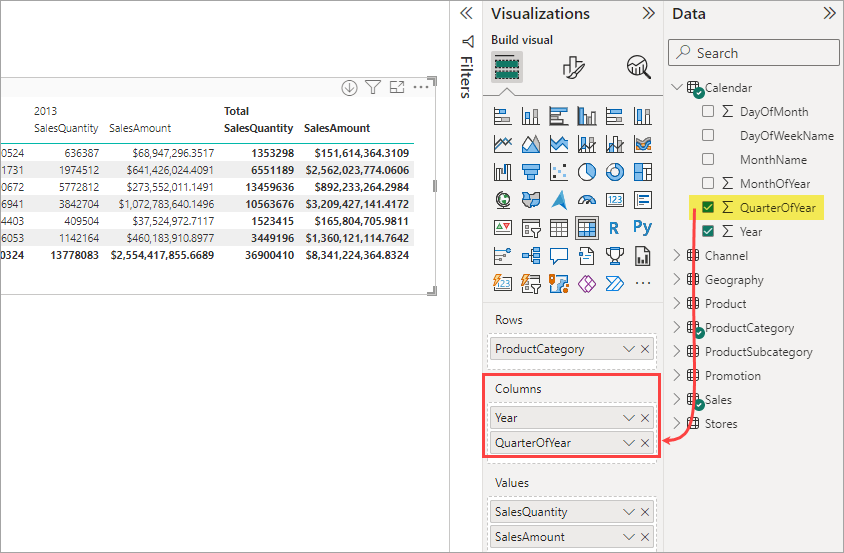
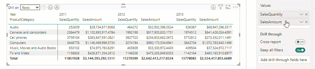
Now, let’s create the following Matrix representing a crosstab report showing sales by product category on rows and years on columns.
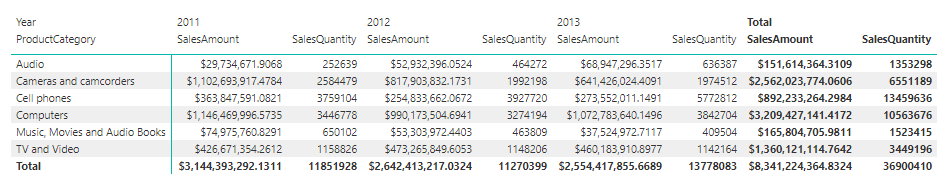
We’ll create a Matrix with the following elements:
- Rows: ProductCategory field.
- Columns: Year field.
- Values: SalesQuantity and SalesAmount fields.
Steps:
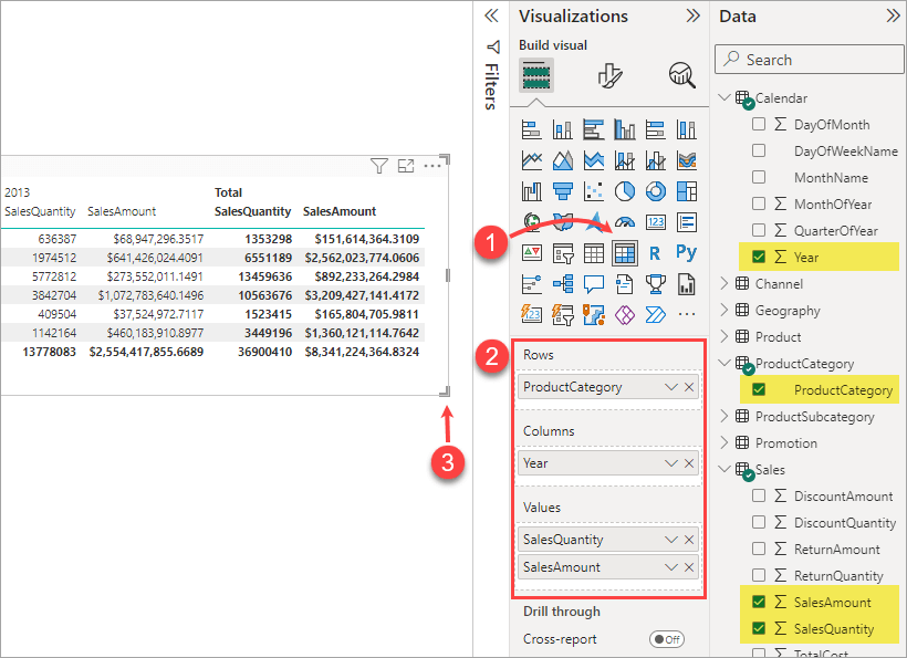
- Click the Matrix icon in the Visualization pane.
- Drag and drop the following fields into the area under the visualization icons:
- The ProductCategory field from the ProductCategory table to the Rows area.
- The Year field from the Calendar table to the Columns area.
- The SalesAmount and SalesQuantity fields to the Values area.
- Resize the visualization as needed.
Power BI Matrix examples
To help you understand the potential of Matrix in Power BI, let’s briefly explore these three examples.
Example 1: Simple Matrix with grand total
Our first example is a simple Matrix that displays a summary of sales data categorized by Location and Store Type. The Total (grand total) column on the right provides a quick overview of the total sales for each location across all store types.
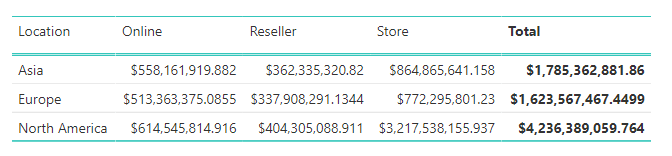
This kind of simple visual is excellent when you want to show a high-level summary of your data in a tabular format.
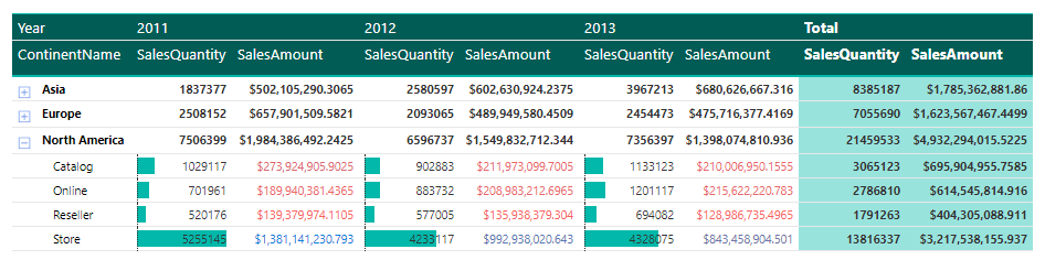
Example 2: Matrix with multiple columns and rows
The following visual displays multiple dimensions in a compact form.
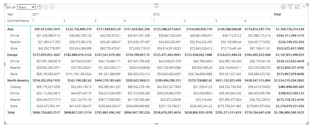
The Matrix shows sales by the continent names on rows and years on columns. You can further see the breakdown of the sales data by store type and quarter of year.
Example 3: Matrix with rich formatting
It’s possible to style your Matrix to impact its visuals significantly. You can add colors and data bars, change the font style, apply conditional formatting, and more.
How to connect data sources to Power BI
With its Power Query tool, Power BI offers many built-in connectors that integrate seamlessly with multiple data sources. Each of these connectors supports a single data source.
If you have multiple data sources, using Coupler.io, a reporting automation tool, is an alternative way of bringing your data into Power BI. You can think of this tool as a multi-source connector that can transfer and manage your data from over 50+ apps directly into Power BI. Coupler.io also supports automatic data refreshes that will always keep your reports up-to-date.
Getting started with Coupler.io is easy.
Just select your data source from the dropdown below and click Proceed.
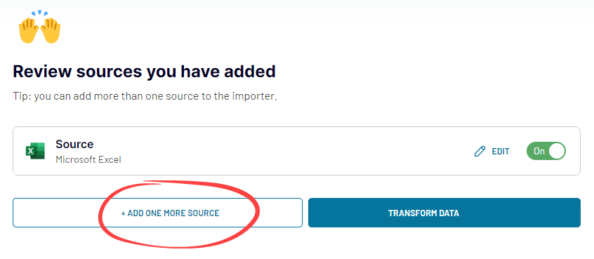
You will need to create a Coupler.io account for free. Then you’ll be redirected to the app’s user-friendly interface, where you can connect your data source account.
In this example, we selected Microsoft Excel as the data source. Optionally, you can add more data sources to the importer by clicking the Add Source button.
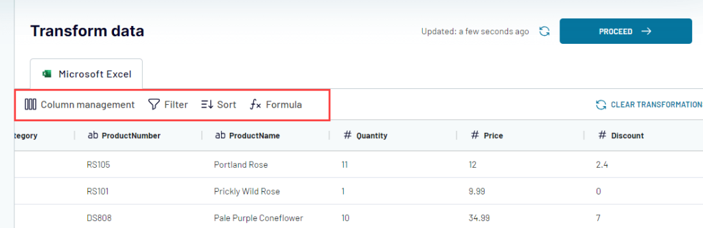
When you’ve added all your data sources, click Transform Data.
You will see a preview of your data and access Coupler.io’s data transformation features. For example, you can hide columns, apply filters, and add calculated columns. When done, click Proceed.
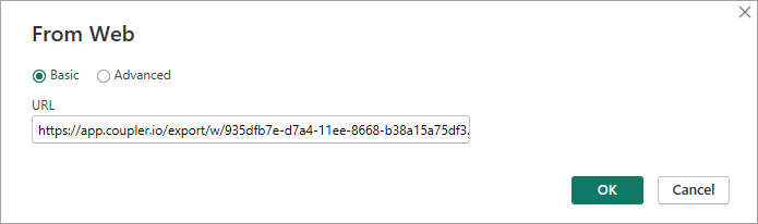
Generate the integration URL and copy it.

Then, click Finish and Proceed.
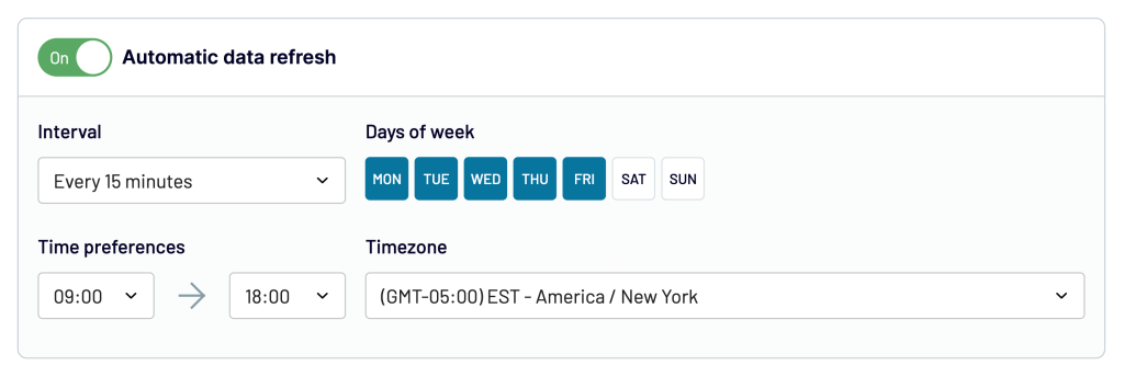
Optionally, you can set up an automatic data refresh schedule.
If everything looks good, click Run Importer.
To finish the setup, open Power BI desktop and click Get data. Select the Web connector and paste the integration URL you copied before.
Done!
You can now create Power BI reports with Matrix visuals and other elements.
Coupler.io helps you connect and manage multiple data sources to Power BI conveniently. Furthermore, your Power BI dashboard will always be updated with automatic data refresh enabled.
How to add multiple columns in Power BI Matrix
To add more columns, simply add the fields you want to the Columns area.
These fields will define the hierarchy or the drill-down path when you’re drilling down your data using columns.
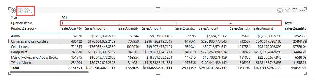
Let’s say you want to add the QuarterOfYear column in your Matrix visual:
- Click your Matrix to select it.
- Drag and drop the QuarterOfYear field from the Calendar table into the Columns area.
Wondering why the QuarterOfYear column is not displayed? That’s because the Matrix visual shows only the top column in the hierarchy by default.
To see the new column, you can click the Drill or Expand icon from the top of the Matrix visual.
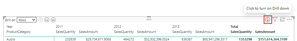
How to drill down in Matrix visual
In data analysis, drill down (and drill up) is an important feature that lets you explore data in more detail.
Again, adding multiple fields to the Rows or Columns area will define the hierarchy (or the drill-down path) for drilling down your data.
To drill down, you can use the Drill Down or Expand icon in the top left corner of the Matrix visual. The Expand feature is actually the same as Drill Down but keeps the current level visible.
If you have multiple fields for both Rows and Columns, you will see the ‘Drill on‘ menu on top. It lets you drill on rows or columns.
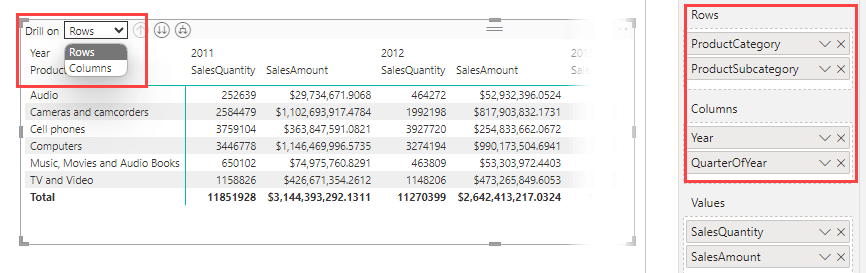
Tip: You can enable Drill Mode by clicking the following icon in the right corner of the visual. If enabled, you can just click a data point to ‘drill-through’.
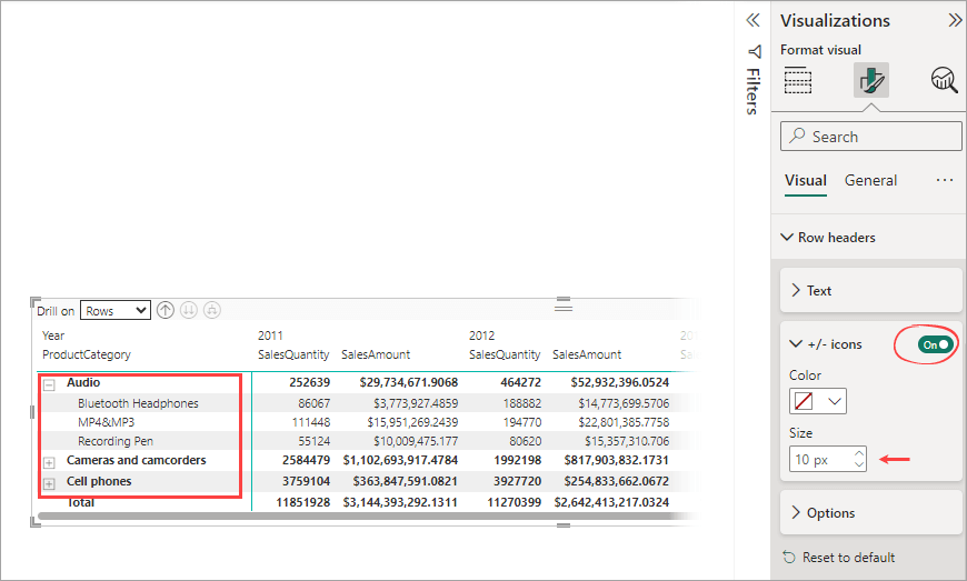
How to expand rows in Matrix
You can add the +/- icons to the row headers to easily expand individual rows:
- Click the Format visual tab in the Visualizations pane.
- In the Row headers section, find the +/- icons section. Then, switch the toggle button to On. Optionally, you can change the color and size of the icons.
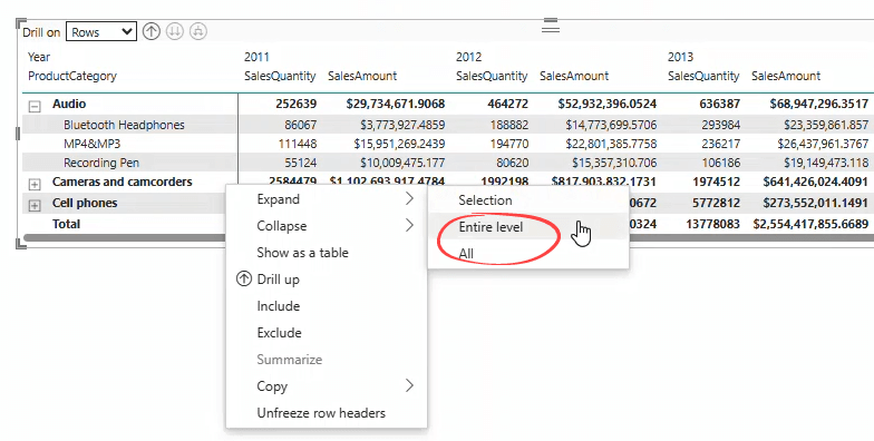
Rather than expanding rows individually, you may want to expand or collapse all rows simultaneously. Here’s how:
Right-click on a row in your Matrix visual and select Expand. Then, select Entire level (to expand all the rows down one level of the hierarchy) or All (to expand down to the very last level of the hierarchy).
Note: The fields added to the Rows area are stacked to occupy a single column and reduce horizontal space. This is the default layout in the Power BI Matrix, called the stepped layout. You may want to expand the layout to separate columns for financial reports. To configure this layout, expand the Row headers section in the Visualization pane. Then, toggle the Stepped layout button to Off.
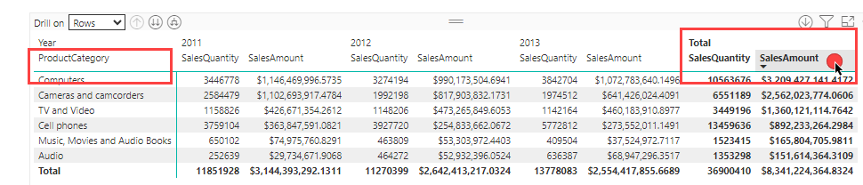
How to sort columns in Matrix
Matrix lets you sort only on fields added to the Rows area and Totals.
To sort, click on the headers of the columns you want to sort. The first click sorts the data in ascending order, while the second one sorts it in descending order.
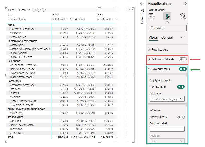
How to turn off grand total in Power BI Matrix
You can easily turn the grand total off (and turn it on again) by using the ‘Column subtotals‘ and ‘Row subtotals‘ options in the Format visual tab.
The label ‘subtotals’ here might not seem intuitive at first, but it makes sense when you consider the structure of the Matrix.
Steps to turn off the grand total:
- Click the Matrix visual to select it.
- Click the Format visual tab in the Visualizations pane. You’ll find the Row subtotals and Column subtotal sections.
- Toggle the button to Off, Depending on which grand total you want to turn off.
- Optionally, you can apply the setting individually for each row or column.
How to rearrange columns in Matrix
The order of the fields in the Values area directly determines the order of columns in your Matrix visual. To rearrange them, you can simply drag and drop a field to the position you want.
The steps are:
- Click on the Matrix visual to select it.
- In the Visualization pane, locate the Values area.
- Drag a field and drop it to a new position within the list.
How to format Matrix in Power BI
Formatting a Matrix in Power BI can significantly enhance its appearance by making it more readable, engaging, and informative.
Here’s how:
- Click the Matrix to select it.
- Click the Format visual tab in the Visualization pane.
- Configure the formatting options as you want.
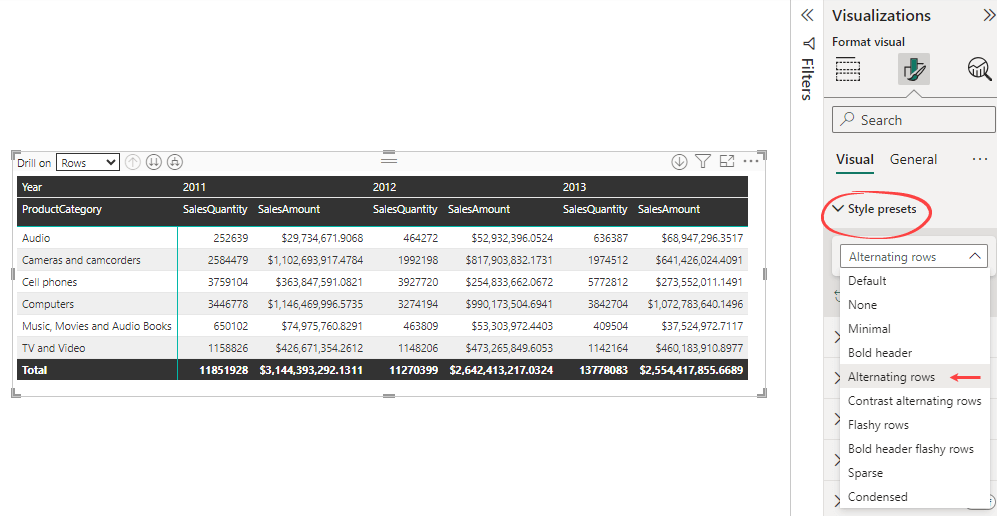
There are many options to beautify the visual of your Matrix. This might seem daunting at first. But here’s a tip for you:
Quickly format your Matrix visual by applying one of the nine style presets available, such as Minimal, Alternating Rows, or Condensed. If it looks good on your Matrix, leave it as is. Otherwise, you can customize it as needed.
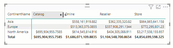
How to hide a column in Matrix
You may want to hide a specific column to focus on certain data.
For example, you have the following Matrix and want to hide the Catalog column:
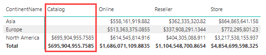
Unfortunately, currently, Power BI does not offer a straightforward way to do this.
For an easy workaround, you can manually resize the column’s width until it seems hidden. Here are the steps:
- Click the Matrix visual to select it.
- Click the Format visual tab in the Visualization pane.
- In the Column headers section, toggle the Text wrap option to Off.
- In the Values section, toggle the Text wrap option to Off.
- Resize the column’s width manually to hide it from the visual.
How to hide blank columns in Matrix
Similar to the case of hiding a specific column, Power BI doesn’t offer a direct method to hide blank columns.
You can follow the workaround explained in the above section for a simple solution.
Matrix visualization Power BI vs. Excel table
If you look at the following screenshots, you will see the similarity between Table and Matrix in Power BI. Both are used to present data in tabular format. However, Matrix (right) has more features. It lets you pivot data by one or more columns so you can create crosstab reports. Matrix also automatically aggregates your data and enables you to drill down.
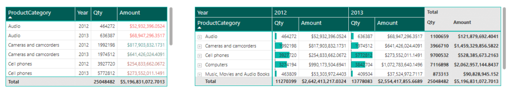
Just like Table visual, Matrix supports interactive sorting. It’s easy to beautify your Matrix appearance by using numerous formatting options. You can also apply conditional formatting to elements such as font color and background color.
Are you an Excel user? If so, you may have noticed that the Matrix visual is actually Power BI’s version of Excel’s Pivot Tables.
Compared to Excel, Power BI is clearly the best option when you’re working with bigger datasets. It’s feasible and advantageous to migrate most of your Excel pivot table-based reports to Power BI.
Final words on how to use Matrix in Power BI
The Power BI Matrix allows you to create a dynamic visualization in crosstab format. With this visual, you can easily display multi-dimensional data in a compact form, making it simpler for your audience to interpret your findings.
However, the effectiveness of this visualization depends on how well you use it. So, take time to familiarize yourself with all the features we’ve discussed in this post, from adding multiple columns and using the drill-down feature to formatting your Matrix.
You can also check out other materials related to visualization in Power BI:
We offer a range of dashboard templates for Power BI to help you streamline your reporting process. These templates are easy to use and designed for optimal analysis. And, if you need assistance with your data visualization and automation tasks, we at Coupler.io are always ready to help you.
For more on this topic, see our article on data visualization with Power BI.

Connect your apps to Power BI and create dynamic reports with Coupler.io
Get started for free