A bar chart is a data visualization that uses rectangular bars to represent categorical data. They allow you to visualize big datasets using one chart, compare categories or variables, and identify trends and patterns in your dataset. The types of bar charts include column charts, stacked bar charts, clustered bar charts, etc.
In this article, we discuss what Power BI stacked bar charts are and how beginners can easily create them.
What is a stacked bar chart in Power BI?
This type of chart is used to compare multiple data series across different categories by stacking several bars on top of each other. You should note that each bar represents a subcategory, and its height is based on the value of that subcategory (either absolute or percentage value).
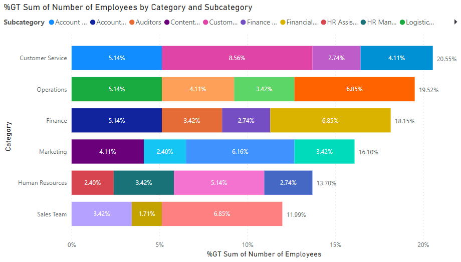
I.e. a company’s staff can have categories such as sales team, customer service, marketing, human resources, finance, and operations. Under each category, we can have sales reps, tech support, HR managers, finance analysts, operations managers, etc. The sales category can comprise 12%, while the customer service team has 21% of employees and others share the rest. Each category is represented by stacked bars (subcategories), and its height is determined by the sum of all numeric values in it.
What does this chart consist of?
There are a few things to understand about a stacked bar chart in order to know the required data fields. A stacked bar chart in Power BI is made up of a title, legend, x-axis, y-axis, and bars. You’ll need separate columns for categories, subcategories, and the KPI values (numeric amounts) for each subcategory. Whether you have a few or many categories and subgroups, the stacked chart helps to visually analyze such data.
Stacked bar chart vs stacked column chart
Since these two charts are right beside each other in Power BI, some users tend to mistake them for each other. Although both are used for the same type of function (multiple data series), their visual representation differs.
In a Stacked bar chart, the bars are arranged horizontally. But a stacked column chart has columns arranged on the vertical axis. You can use a stacked bar chart if you have many categories to maximize space and analyze your chart better. However, a stacked column is often used to represent much fewer categories in both Excel and Power BI.
Your guide on how to make a stacked bar chart in Power BI
Step 1. Connect your data
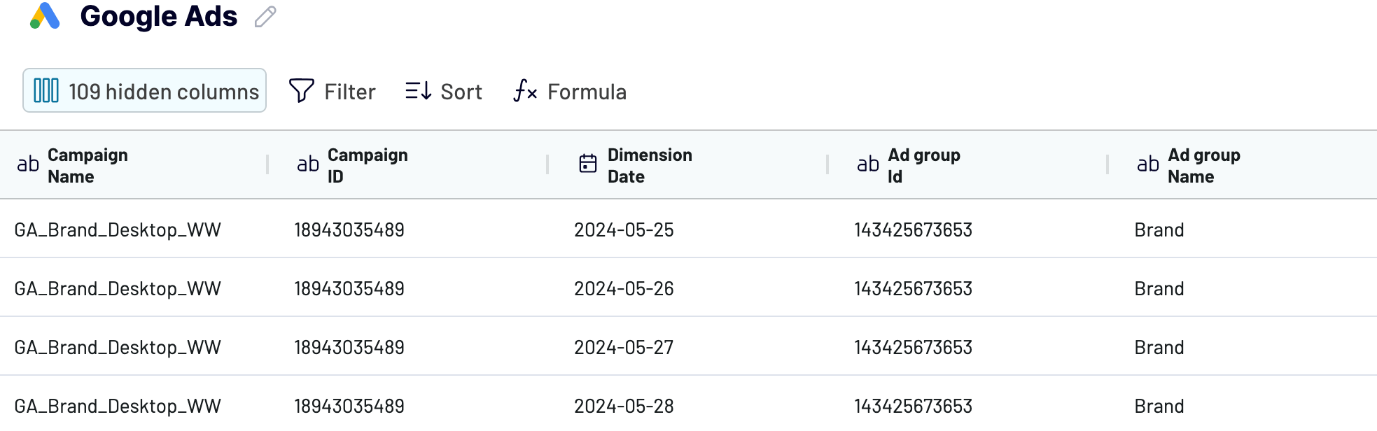
Before creating any visualization in Power BI, you need to import data. If you often have to handle large datasets, it’s best to automate the process with a no-code connector such as Coupler.io. It can extract data from over 50 sources like Google Analytics, QuickBooks, Facebook Ads, Salesforce, etc. You can also enable the data refresh functionality so your data is always updated in Power BI desktop and your chart updates automatically.
To send your data to Power BI, select your data source and click the Proceed button below.
- Once you create a Coupler.io account for free, connect your source account and select what data to extract.
- Then, preview your dataset and edit it, if needed. You can edit and rearrange columns, filter and sort data, add new columns, and use formulas.
- Then, generate the integration URL and copy it. Open Microsoft Power BI, click Get Data -> Other –> Web –> enter the integration URL. Your data will be added, and you can preview it in the Power Query editor.

Connect your data source to Power BI with Coupler.io
Get started for freeIf you’re transferring data manually, you can upload a CSV or an Excel file. You can connect to any of the supported SQL databases or online services in Power BI.
Step 2. Visualize data in a Power BI stacked bar chart
In this section, we provide step-by-step instructions for beginners to create a stacked bar chart for their Power BI report.
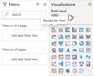
- Go to the Visualizations pane to select the stacked bar chart.
Learn more about another type of visualizations, including Power BI maps and Power BI gauge chart.
- Drag and drop the fields to their corresponding wells to display data correctly.
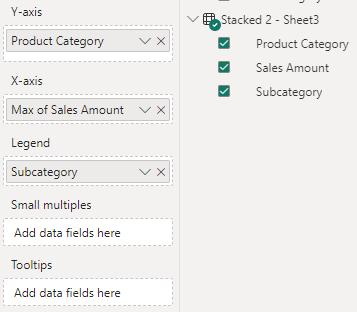
The basics for a stacked bar chart include X-axis, Y-axis, and Legend. However, small multiples serve as a slicer that can split your visual into multiple smaller visuals based on a field. Tooltips also provide extra information when users hover over each series.
- Here’s the Stacked bar chart created for our previously imported data.
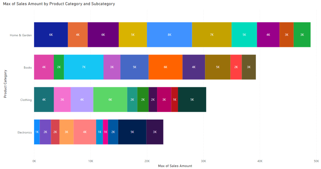
In this example, we are using a Stacked bar chart to compare the sales amount of each product subcategory against another as well as analyze the total sales of each category. As we imported data for this chart automatically with Coupler.io, this visualization will keep updating automatically to always show the latest data.
You can choose to hide or display certain information on your stacked chart. For example, you can display values on each stacked bar by clicking on the “Format your visual” icon under the Visualizations pane and toggle on “Data labels”. Under it, you can also toggle on “Total labels” to display the total values for each category in the dataset.
If it doesn’t show details when you hover on each bar, go to “Format your visual” -> “General” and toggle on “Tooltips”. You can also click on “Visual” to toggle off “Legend”. Make sure to format your stacked chart in a way that allows for better readability.
How to sort stacked bar charts in Power BI?
You can use sorting to change the appearance of a Power BI Stacked bar chart and display your data in a more organized manner. Here are the steps on how to sort:
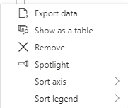
- Click the three-dot icon on your chart.
- You’ll see the available options for sorting your chart.
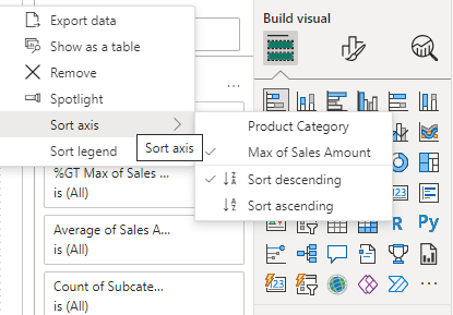
- You can sort both axes by descending or ascending order.
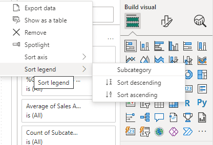
- You can also sort legend by descending or ascending order.
How to change the order of stacked bar charts in Power BI?
You can change the order of a Power BI Stacked bar chart through the options below.
- Sort by category – Change the order of your category or subcategory to either ascending or descending.
- Sort by value – Change the order of numerical values on each bar to either descending or ascending.
- Sort by column – Switch to table view, right-click on each column name and sort by ascending or descending order.
- Custom sorting – Create a lookup table and specify a relationship between it and the main table. Then, drag the required field to the preferred data well for sorting.
You may select the Stacked column chart visual to work with vertical columns. It’s also possible to use DAX or calculated columns to change the order of a Stacked bar chart. You can also improve the chart by specifying and applying some conditional formatting.
How to show percentage in a stacked bar chart in Power BI?
To show the percentage on your stacked bar chart:
- Go to the X-axis well and click the dropdown arrow beside it to show the options.
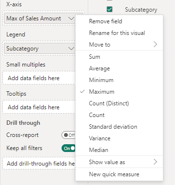
- Click on “Show value as” and choose percent of grand total.
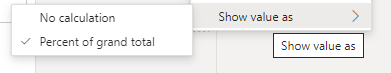
This will calculate and display the percentage value of each Stacked bar in the chart.
Benefits of stacked bar charts
Stacked bar charts are used when your dataset contains multiple categories and each category has multiple subcategories. They help to plot numeric values against them and keep everything organized on one chart. In general, this is a popular graph choice for professional who visualize data in Power BI. Below, we highlight the main benefits of a Stacked bar chart:
- It allows you to visualize large datasets, especially those with multiple variables and subgroups. You can save space by using one chart instead of various charts.
- You can easily interpret your data and compare the total values of each category. This allows you to identify categories with more numbers and those with fewer.
- It shows the KPI values for each subcategory so you can easily compare them against each other and see how they help to contribute to the category’s total.
A stacked bar chart as a part of your reporting toolset
As we’ve shown in this article, a stacked bar chart in Power BI helps to represent sub-groups of different categories and compare them using KPI values.
It can be used in conjunction with line charts, stacked column charts, clustered column charts, and custom visuals to build visually engaging and rich reports for data analysis.
Power BI features such as slicers, bookmarks, tooltips, and drill-downs can help to make your reports more engaging and appealing. If you need a reliable solution for getting data into Power BI, then consider using Coupler.io.