Learning to work with Power BI is easy because of its Excel-like interface. But if you want to really master the platform, you have to dig deeper and understand its architecture.
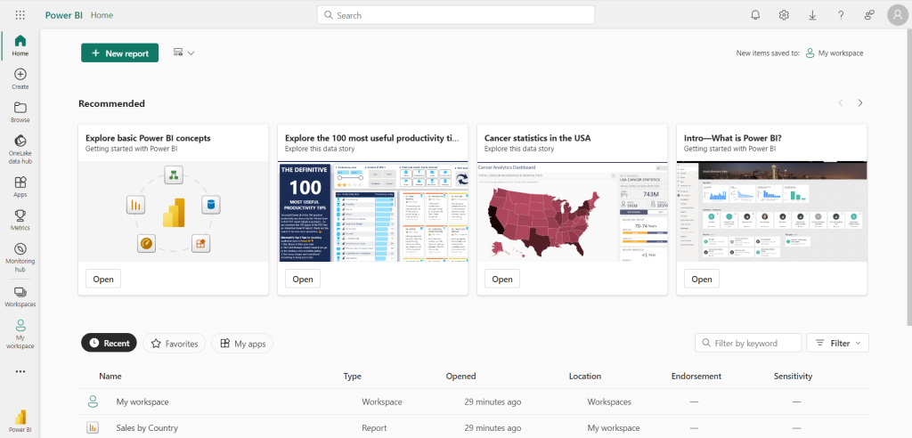
Microsoft Power BI offers robust features for almost any data analytics and reporting needs. Understanding the Power BI architecture, its core components and how they work together can help you make the most out of the platform.
Overview of the Microsoft Power BI architecture
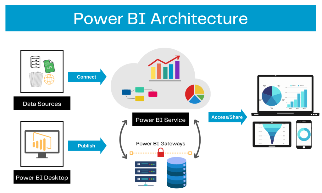
The platform connects to various data sources and helps create reports and visualize data. The architecture of Power BI includes a set of core components that work together to transform raw data into valuable business insights.
It includes both the Power BI Desktop software and Power BI Service, the web version of the platform. You can connect to data sources, create a report or dashboard in the desktop version, and then share it over the cloud using the Service.
For a better understanding, the architecture is designed to accommodate four phases of working with data:
- Phase 1: Connect to data sources
- Phase 2: Transform and model data
- Phase 3: Create and publish a report
- Phase 4: Build dashboards
Let’s understand each phase in detail and see how they work together.
Phase 1: Connect to data sources
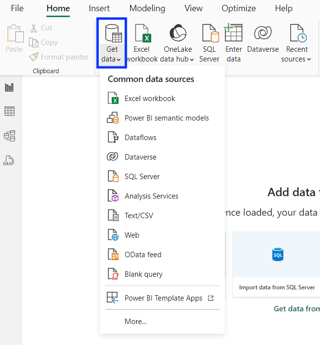
The platform has native connectors for various data sources, including flat files, databases, online applications & services, etc. In the Power BI interface, you can set up the data sources from the Get data option.
For each data source you connect, you can also set up automated refreshes to keep the report updated.
In alternative to the native connectors, you can also use Coupler.io. It can connect 60+ popular data sources to Power BI and manage all of them in a single interface.
To get started, select your data source below from 60+ available options and click Proceed.
Follow the instructions to set up the importer and connect all the data sources you need.
Phase 2: Transform and model data
The raw data may not always be ready for direct analysis. You can use the platform’s data transformation and modeling features to shape and prepare the data for analysis.
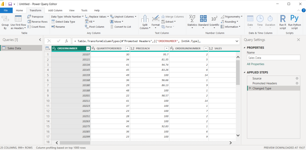
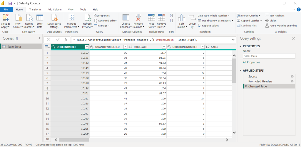
Once you connect a data source, you can use Power Query Editor to perform various transformations like changing objects and column names, removing unwanted columns, filtering and pivoting data, and changing data types.
You can also create calculated measures and columns in the data using the native features.
Phase 3: Create and publish a report
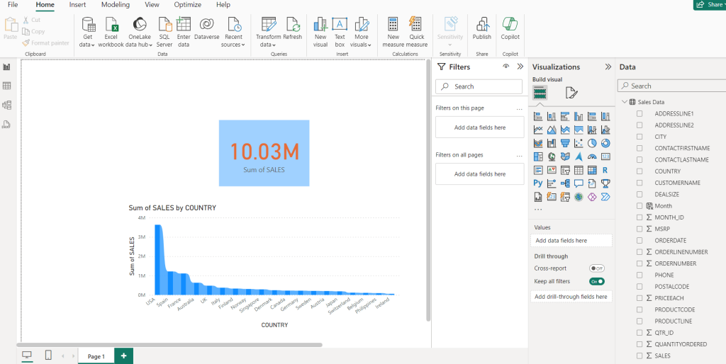
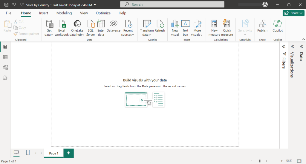
After transformation, you can visualize the data and create reports using Power BI Desktop. It offers plenty of visuals to turn your data into a meaningful report with charts, graphs, tables, and more. You can also download and use third-party visuals from the Microsoft AppSource marketplace.
Once the report is ready, publish it to Power BI Service so you can access and share it online via Power BI Service. You may need to set up data gateways to access the data online.
Power BI Service allows users to access the reports online in a browser.
Phase 4: Build dashboards
Power BI Dashboards are single pages that highlight important insights from the reports. You can build one by using tiles from existing reports in your account. They’re helpful to get an overview of all the reports at a glance.
Power BI architecture diagram (on-premise + cloud)
Here’s a visual representation of how the Power BI platform works.
The main Power BI architecture components
Here are the key components that support the core architecture of the platform.
Power BI Desktop
It’s the desktop version of the platform that’s available only for Windows computers. If you’re using Mac or Linux, you can use it through a virtual machine or a remote desktop. Power BI Desktop is used to create a report from scratch and publish it – you can connect to data sources, transform data, and create visuals.
Its interface is similar to that of Microsoft Excel.
You can also use Power BI Desktop to modify existing report files.
Data sources
They’re the most important part of the Power BI architecture. The platform offers native connectors for various data sources. You can connect to sources in two main ways – import data into reports or establish a direct connection without importing. There is an upper limit of 1GB on the total data you can import to the report.
Here are some common types of supported data sources:
- Flat Files like Excel, CSV, etc.
- Databases
- Microsoft Fabric
- Power Platform
- Azure SQL Database
- Online Services
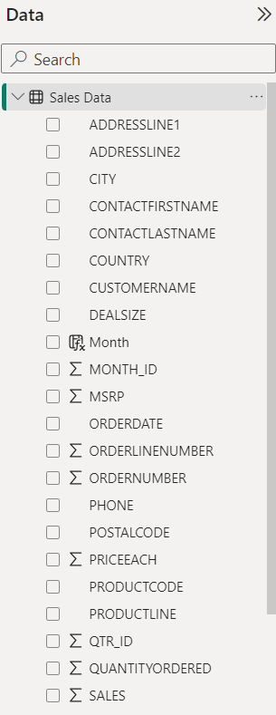
Once you connect to a data source, it appears in the data pane in Power BI Desktop.
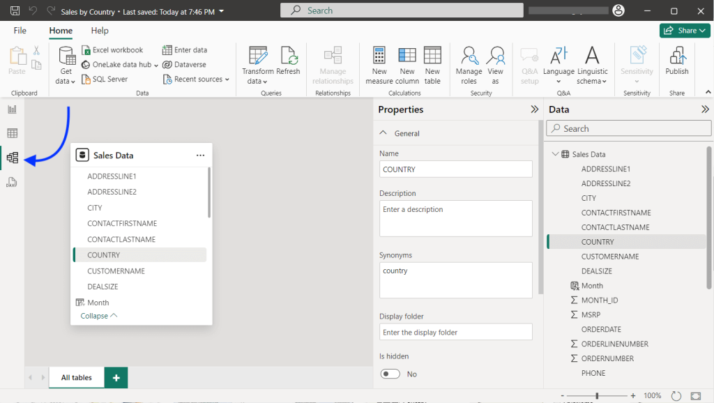
Power Query
It has powerful BI tools to extract and transform data from the sources. Once you connect a data source, the Power Query Editor interface allows you to choose specific data you want to extract and apply various transformations.
This way, you can clean your datasets by removing unnecessary columns and data inconsistencies.
Power BI Service
The reports published from Power BI Desktop can be accessed in Power BI Service, which is the cloud-based version. It enables users to share reports online with others and access insights from anywhere through a web browser.
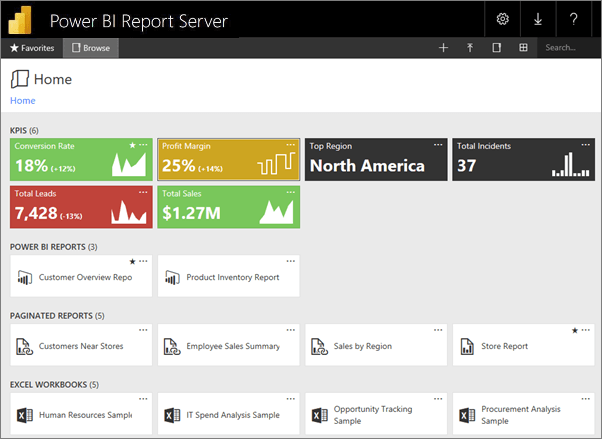
Power BI Report Server
It’s an on-premise reporting server setup to manage all the reports. You can use it to track all the key metrics from your reports in a single place. Think of the Power BI Report Server as an on-premise version of the Power BI Service.
You need Power BI premium or SQL Server Enterprise Edition with Software Assurance to access it.
On the Power BI Report Server, you can host reports (.pbix files), Excel spreadsheets, and paginated reports. It also supports creating new or editing existing reports. You can access all the reports and KPIs through a web portal.
Power BI Gateway
The gateway acts as a bridge between Power BI Service and on-premise data sources. It’s helpful when you publish a report directly connecting to on-premise data sources that require user authentication.
You can download and install the Power BI data gateway on the computer where the data is stored.
Power Pivot
It’s a powerful data modeling tool in Power BI Desktop that helps build data models, establish relationships between tables, and create calculated columns.
You can access it by clicking the Model view section on the left side of the report.
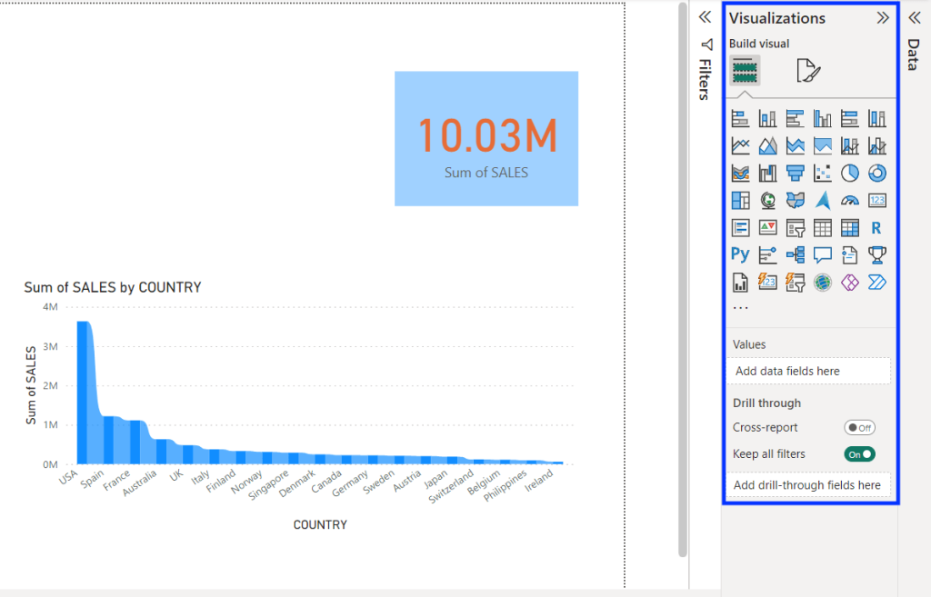
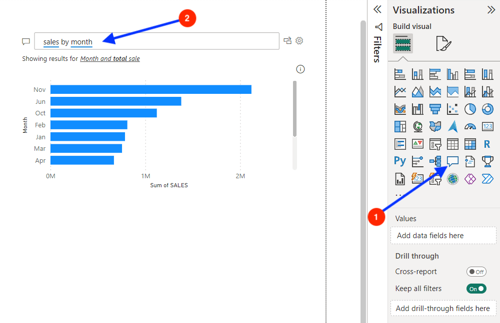
Power View
It refers to the data visualization options offered in Power BI. You can use the Power View to display your data using charts, graphs, maps, and other visuals to understand trends.
You can find a variety of visuals in the Visualizations pane in Power BI Desktop.
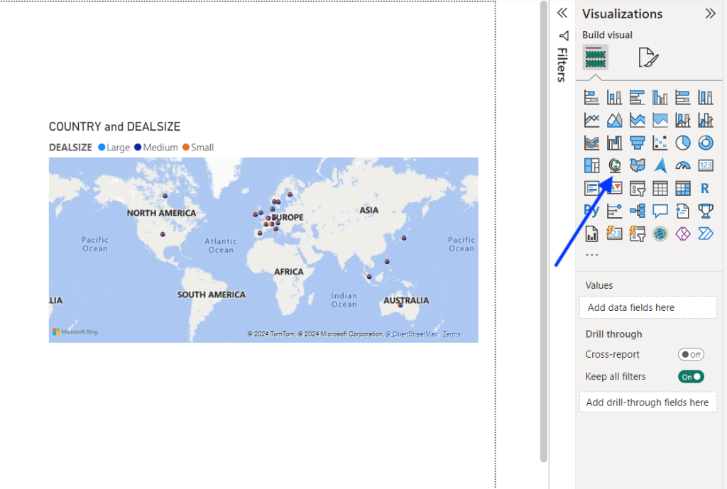
Power Maps
It’s an in-built component of Power BI architecture, that allows creating map visuals. You can use this to create visualizations using data that contains geographical information like country or city.
Learn more about Power BI maps in our tutorial.
Power Q&A
This component lets you explore and interpret the data through visuals. Using Power Q&A, you can ask questions about your data using natural language and get answers in the form of visuals.
You can add a Q&A visual or a button to your report while creating it in Power BI Desktop.
Power BI mobile apps
The Power BI mobile apps, available for both Android and iOS, allow you to access the platform anywhere. You can access the published reports, explore data, use Q&A, and annotate the reports to collaborate with your team.
Power BI Embedded
It’s an Azure service that allows you to embed charts from Power BI into custom applications via an API. The embedded analytics is helpful for developers who want to display interactive charts in their applications using the Power BI engine.
How does Power BI Service architecture work?
The cloud services of Power BI are built on the Microsoft Azure infrastructure and allow web access via websites or mobile devices.
For a better understanding, the architecture of Power BI Service can be divided into two parts:
- Front End cluster – It’s the interface that works between the backend cluster and the client (i.e. web or mobile app) to authenticate the user to Power BI Service.
- Back End cluster – It contains the data, visualizations, and reports and handles all user interactions. It uses Microsoft Entra ID to manage the identities of logged-in users.
Once the user logs into Power BI Service, the Azure Traffic Manager connects the client to the nearest data centre and the content is served using Azure CDN.
Understanding the sharing architecture in Power BI
Implementing a Power BI solution is not a one-man job — it may require collaboration with other users. Depending on your needs, you can follow multiple sharing approaches.
Here’s our recommended Power BI architecture for sharing:
- Developers – You can publish the Power BI report to your Power BI workspace and collaborate with other developers to edit the report.
- Testers – Directly allow testers to access the report/dashboard via the Share option in Power BI Service (requires paid license). They can add their comments for the developer team to address.
- Organization – You can create an app in Power BI Service and share it with the end-users to access the data. They can filter, slice, and drill down the reports with read-only access.
- Public users – You can use the Publish to Web option to make the reports accessible publicly by embedding them on web pages, blog posts, and social media.
How does Power BI architecture differ for enterprises?
Enterprise-level businesses produce a large amount of data (big data) from various sources. Connecting to each data source and performing ETL operations in Power BI may not be efficient here.
In such cases, you can build an architecture comprising a data warehouse, analysis service, and on-premise gateway for efficient reporting.
Big businesses often use a central data warehouse to store data in an organized manner. They can implement a server-side analysis service like SSAS to query the data warehouse and send data for Power BI via gateways via a direct data connection.
Through this Power BI architecture, you can transfer the data extraction, transformation, and modeling operations to the server, improving the reporting efficiency.
Power BI architecture configuration examples
Let’s go through some real-life examples to understand the practical implementation of the platform’s architecture:
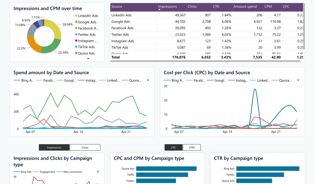
Example 1: Track ad campaign performance across multiple platforms
Scenario: A SaaS startup is running PPC campaigns on several platforms to acquire new users. They want to build a reporting dashboard in Power BI to track the monthly performance of all the campaigns. The challenge is that the platform does not support popular PPC sources like Google Ads and LinkedIn Ads.
Solution: Use Coupler.io to connect the required PPC sources to PowerBI. You can then create a custom report or, what is much better, use an automated PPC dashboard template. It offers a consolidated view of the PPC performance from platforms like Google Ads, LinkedIn Ads, and Facebook Ads. As it’s automated with the help of Coupler.io, a reporting automation platform, the dashboard collects data and refreshes it on a schedule.
An alternative would be to build custom Python scripts to get data from all the PPC platforms via APIs. Then, use the imported data to build a report to analyze the overall performance of all ad platforms. However, this option would be more expensive and take significantly more time.
Example 2: Analyzing retail chain data stored in an SQL database
Scenario: A business has a global chain of retail stores and wants to analyze historical sales data for inventory management. A large volume of transactions from all the outlets are updated on the company’s SQL database.
Solution: Import data from the company’s SQL database into Power BI and set auto-refresh to every 24 hours. Model the data to establish relationships between tables and create calculated columns required to report the KPIs. Build a report that displays key metrics required for inventory management along with region slicers and publish it.
Example 3: Monitoring call centre performance in real-time
Scenario: A telecom company operator has multiple call centres. They want a consolidated reporting dashboard to get real-time insights into call volumes, wait times, and agent performance.
Solution: Connect to the company’s data warehouse using DirectQuery. Use graph and card visuals to display the key performance indicators in the report. Install on-premise data gateway to allow report users to access the data and publish the report to Power BI Service.
Is the BI platform enough for your reporting needs?
There is no doubt Power BI is a popular reporting solution for business and data analysts. Its scalable and flexible architecture is suitable for all types of businesses – from small retailers to enterprises.
However, it does not natively support certain data sources like Google Ads. Data integration and automation platforms like Coupler.io help you overcome this limitation. It connects to 60+ popular apps and lets you manage all data sources within a single interface. Sign up now to streamline your data flows.

Connect your data source to Power BI with Coupler.io
Get started for freeFor more information on using Power BI, check out our other articles: