Analyze Groups of Content with the Search Console Dashboard

In Google Analytics 4, you can use content groups to categorize web pages. Google Search Console does not have this functionality. Nevertheless, we managed to solve this issue with a custom dashboard that lets you analyze the performance of URL categories.
What is a Google Search Console dashboard for?
The SEO dashboard was Coupler.io’s first template in Looker Studio, created using the Google Search Console integration. Its purpose is straightforward – to optimize tracking and analysis of webpage traffic performance. The dashboard provides information about indexed pages, overall performance, the best and worst-performing URLs across various metrics, and more.
However, this Google Search Console dashboard wasn’t a one-size-fits-all solution. Many projects couldn’t fully benefit from it due to one missing feature – the ability to group pages into categories.
Here’s the challenge – URL structures vary across websites. You’re in the clear, if your URL format is simple, such as:
https://domain.com/blog/page-name-1
However, how do you analyze specific groups of pages if your URLs lack an explicit category name like this?
https://domain.com/page-name-1
To address this, we collaborated closely with our partners, who shared their specific requirements and needs. This collaboration allowed us to enhance our SEO dashboard by adding the ability to categorize pages from external sources, such as spreadsheets. Now, you can filter pages by categories you define, like new landing pages, optimized pages, specific author pages, and more. With this flexibility, you can apply any labels or tags to your URLs, making your SEO analytics more tailored and effective.
So, welcome the SEO dashboard with URL categorization developed in collaboration with our partners.
What value can the Google Search Console dashboard provide to you?
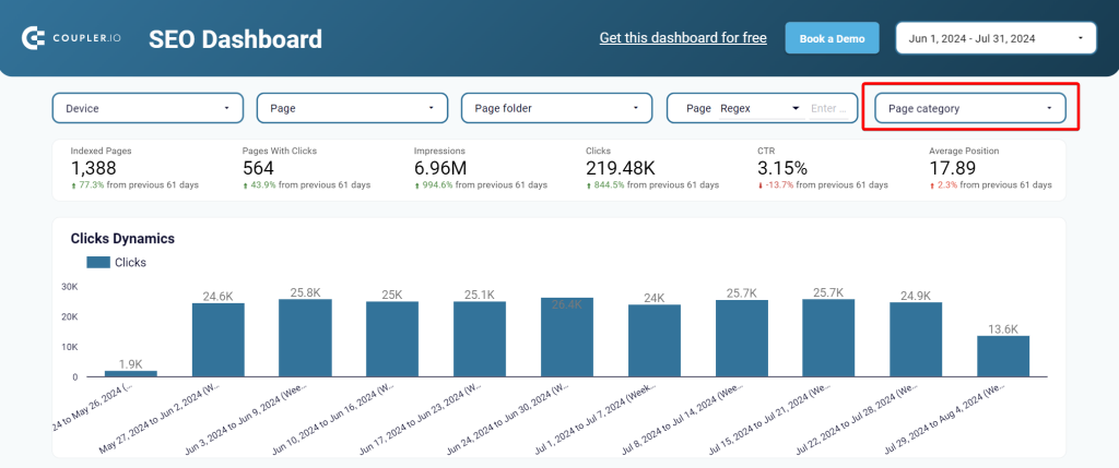
The main difference between the original and updated SEO dashboard is the availability of the Page category filter.
All other scorecards, charts, and tables are the same. So, let’s explore what insights you can derive with this marketing dashboard.
Performance overview + filters
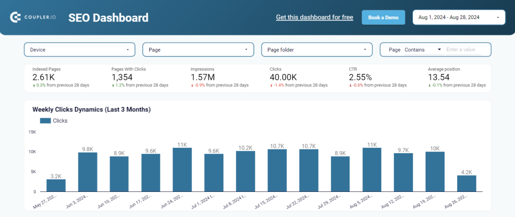
This section provides a comprehensive snapshot of your website’s overall SEO site audit. It showcases KPIs such as indexed pages, pages with clicks, impressions, clicks, click-through rate (CTR), and average rank tracking position.
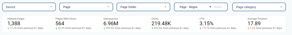
You can also apply filters to get a more granular analysis of your data. These include filtering by device, page, page folder, and page category. As we’ve already mentioned, the latter is the main reason for creating this dashboard with URL categorization.
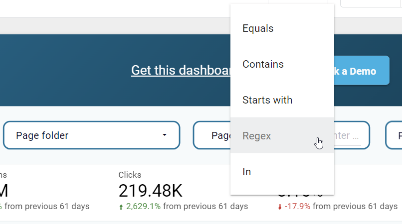
One more filter lets you specify the page or group of pages using Regex or logical operators for text such as equals, contains, started with, and in. For instance, you can filter out all the pages that contain ‘google-analytics‘ in the URL to check their performance and analyze your marketing efforts.
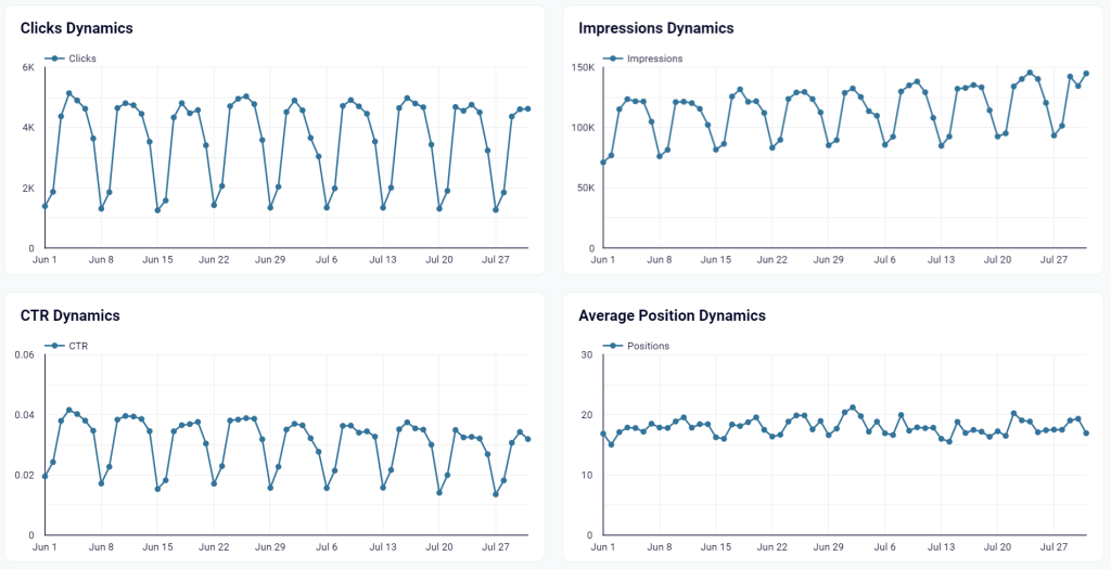
Metrics dynamics
A set of line charts lets you track the dynamics of essential SEO metrics over time. You can identify trends, seasonal variations, and the impact of your SEO efforts on impressions, clicks, CTR, and average position.
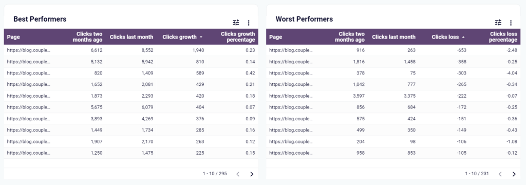
Best and worst-performing pages
This part of the dashboard offers two tables highlighting the top and bottom-performing pages on your website based on the number of clicks. The performance criteria include clicks for two months ago, last month, and growth. These insights can help you pinpoint which pages are generating the most clicks and which ones might require content optimization.
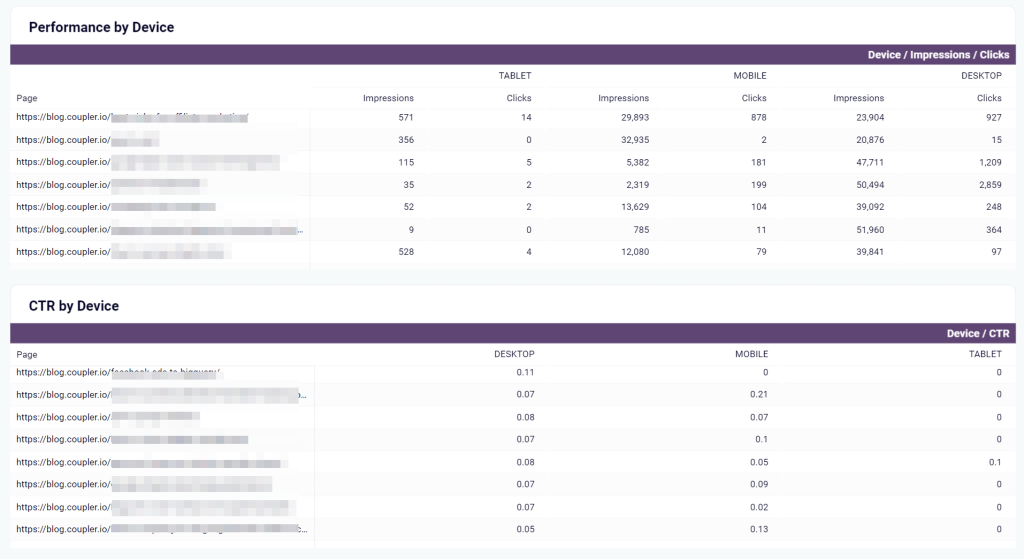
Impressions, clicks, and CTR by device
At the bottom of the Google Search Console dashboard for clients, you get a breakdown of your web page performance by device, including desktops, tablets, and mobile. The performance metrics include impressions, clicks, and CTR. As a result, you can detect the platforms that require content optimization in the first place and ensure a seamless user experience across all devices.
Improved communication with clients
In addition to all the above-mentioned values, we should point out one of the biggest benefits of the SEO dashboard with URL categorization: It significantly improves client reporting.
Your agency won’t need to make unnecessary calls or send emails since clients get 24/7 access to performance data whenever they need it. As a result, you achieve a high level of client reporting transparency. It tackles one of the biggest pain points in client-agency relationships — clear communication. Plus, when a client decides to part ways, they’re left with a tool that still lets them track their SEO performance going forward, which feels like a nice parting gift.
How to analyze URLs’ performance with the dashboard template
So, you like it, you need it, you want it! How do you get it?
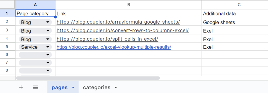
To start using the SEO dashboard for clients, you’ll need to make a copy of this spreadsheet and specify your URLs and page categories in it. Enter a list of categories in the categories tab. Then add a list of your URLs and assign the respective categories to each of them.
Go to the dashboard’s Readme page and follow the instructions to load your data from Google Search Console to your dashboard. Let’s see the details of the setup flow.
- Once you click Set up Coupler.io importer, you’ll be offered to sign in to your Coupler.io account. If you don’t have one, sign up for free with no credit card required. Then you’ll see the following:
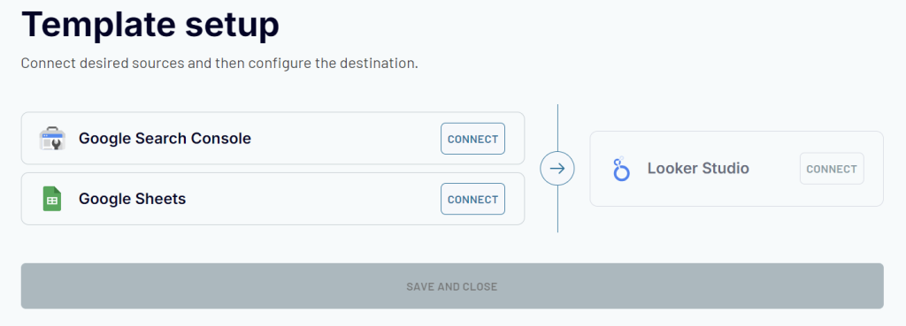
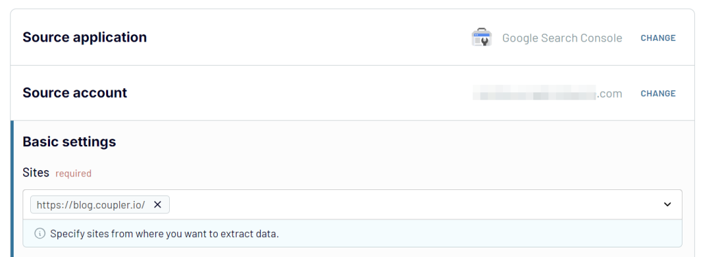
- You need to connect your Google Search Console account and select the websites you want to analyze, for example, like this:
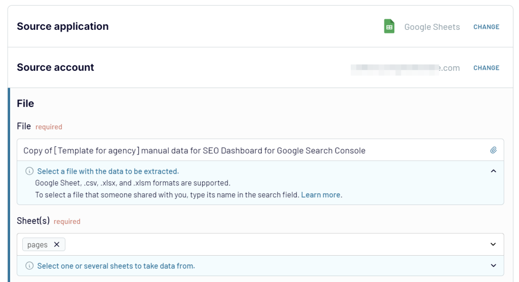
- Then connect your Google Sheets account and replace the file with the copy of the spreadsheet that you’ve made before. Select pages as the sheet as well.
Click Finish and Proceed => you’ll see the following screen:
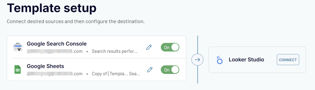
Now you need to click Looker Studio and follow the in-app instructions to:
- Generate a data source
- Authorize the Coupler.io connector in Looker Studio and connect the data source
- Change the data type for the CTR field: select Numeric ? Percent data type
- Click Create Report to load the data to your dashboard copy.
The entire setup flow takes no longer than 5 minutes and is pretty intuitive. In the end, you get a self-updating SEO dashboard for clients to monitor your website traffic performance. Moreover, the template is white-label, i.e. you can easily customize it to meet your brand specifics.
What metrics are essential for an SEO report?
An effective SEO dashboard gives you a clear understanding of your website’s performance. To achieve this, you should have access to the following key metrics:
Impressions: This value represents how often your website appears in search engine results for specific queries. With this metric, you can understand your online visibility and assess your SEO efforts to show your content to potential visitors. If the number of impressions grows, this indicates improved keyword rankings.
Clicks: This value shows the number of times users actually click through to your website from search engine results pages (SERPs). It directly indicates the effectiveness of your meta titles and descriptions. An increasing number of clicks suggests that your content is appealing and relevant to searchers.
Click-through rate (CTR): It is the ratio of the number of clicks to the number of impressions. CTR is usually expressed in percentages. This metric helps you understand how well your search listings are performing. A low CTR may suggest improving your content relevance to match user intent better.
Indexed pages: This number is about how many of your website’s pages are indexed by search engines like Google. An indexed page means that your content is available to be shown in search results. A high number of indexed pages indicates that search engines can crawl your site effectively.
Pages with clicks: This metric helps you identify which pages are actually driving traffic to your website since not all indexed pages will generate clicks. As a result, you can understand what content resonates with your audience and optimize other web pages accordingly.
Average position: This value shows where your pages typically rank in SERPs for particular keywords. It is a key indicator of your overall SEO performance. The lower the average position (closer to #1), the better your visibility and potential for traffic.
In addition to these metrics, you can enhance your SEO dashboard for agencies with some additional ones that will add more value to your report:
- Bounce rate: To measure the percentage of visitors who leave your website after visiting only one page. A high bounce rate indicates that your content isn’t relevant to the user’s search intent or that it’s poorly presented.
- Organic traffic or new users: To monitor the number of visitors who arrive at your site through non-paid search results. This metric lets you measure the effectiveness of your SEO efforts in attracting relevant visitors to your web pages.
- Keyword rankings: To track the performance of individual keywords. This lets you understand which keywords drive traffic and which may need more focus in your content strategy.
- Conversion rate: To measure the percentage of visitors who take a desired action on your website. Such actions can include signup, purchase, form submission, etc. With this metric, you can understand how effectively your users turn into customers.
- Backlinks: To monitor your backlink profile and understand the quality and quantity of sites linking to you. Backlinks are crucial in search engine rankings that can influence your site’s authority and ranking potential.
Who can use the SEO dashboard with URL categorization?
This SEO reporting tool is designed for a wide range of stakeholders, including marketing managers, SEO experts, content creators, and more. It will also be a useful tool for agencies due to the dashboard’s ability to work with different projects and tasks.
You’re not limited to just adding page categories for analysis. The dashboard’s flexibility allows it to adapt to many other aspects of your SEO efforts analytics. All this makes it a useful solution whether you’re managing a small business or overseeing a large-scale digital marketing operation.

Explore other dashboard templates or create custom ones with Coupler.io
Get started for free