X (Twitter) built-in analytics are too limited to grasp the bigger picture of ad performance. Luckily, report templates are here to bridge this gap. You can use them to transform raw data into actionable insights without building reports from scratch.
In this article, we’ll cover the top 5 Twitter Ads report templates for your choosing. So, let’s dive straight into precise, data-driven analytics!
Twitter Ads report templates for in-depth analytics
X (Twitter) Ads dashboard template by Coupler.io
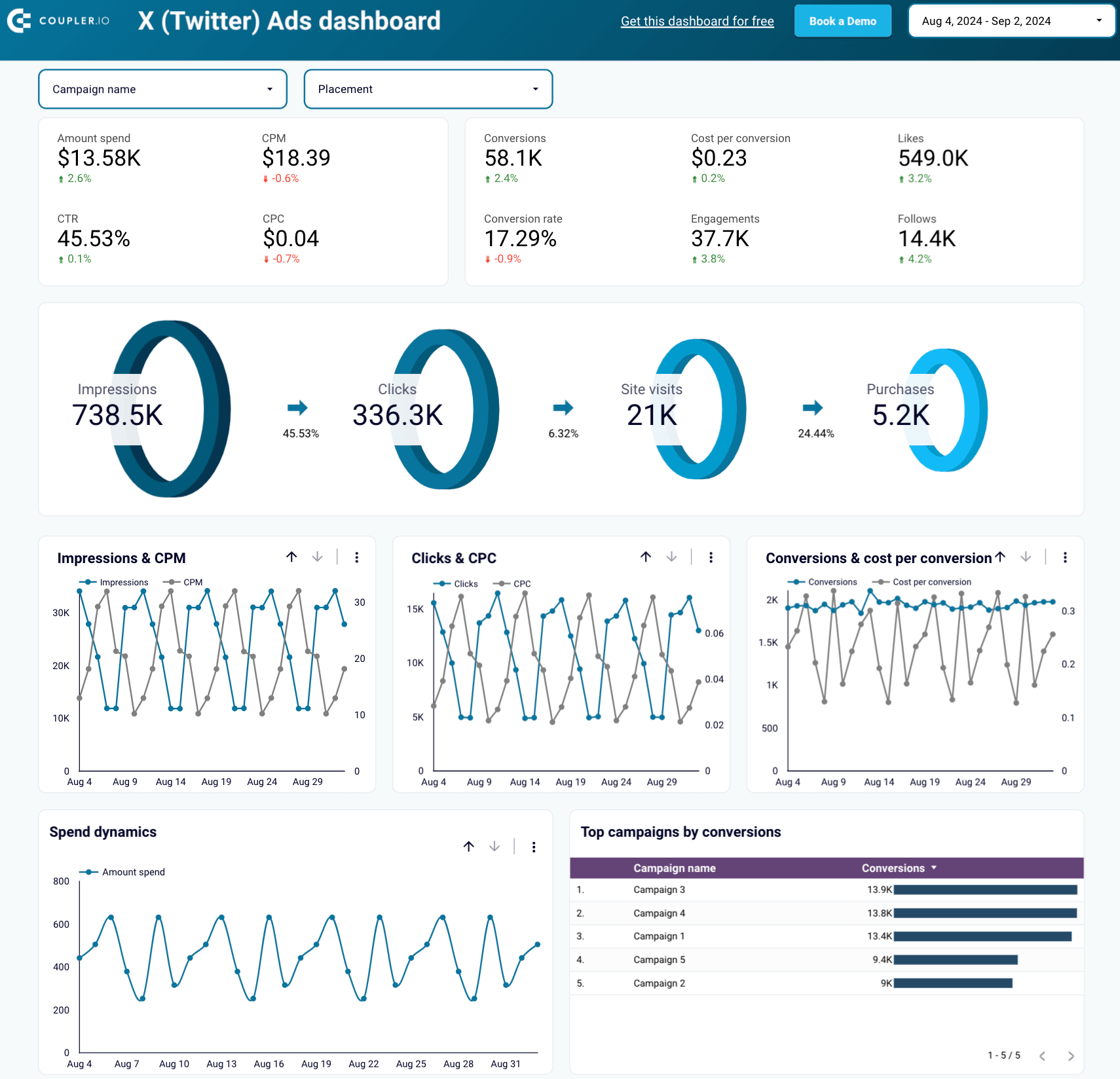
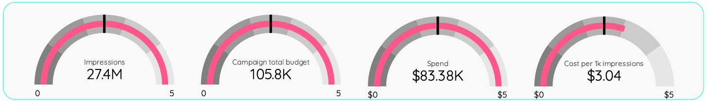
Coupler.io’s X (Twitter) Ads dashboard template allows you to analyze your ad performance from various standpoints. It tracks key metrics across the funnel, shows the best-converting campaigns, and monitors your ad spend dynamics. Additionally, you can filter your data by placement, platform, and audience segment.
The template is available in Looker Studio. It’s equipped with the Coupler.io Twitter Ads connector to automatically import data into the dashboard.
Key insights available from the dashboard
Metrics overview + funnel visualization: Get a detailed breakdown of your campaign’s primary metrics. From impressions to conversions, you can track the effectiveness of your campaigns at every funnel stage.
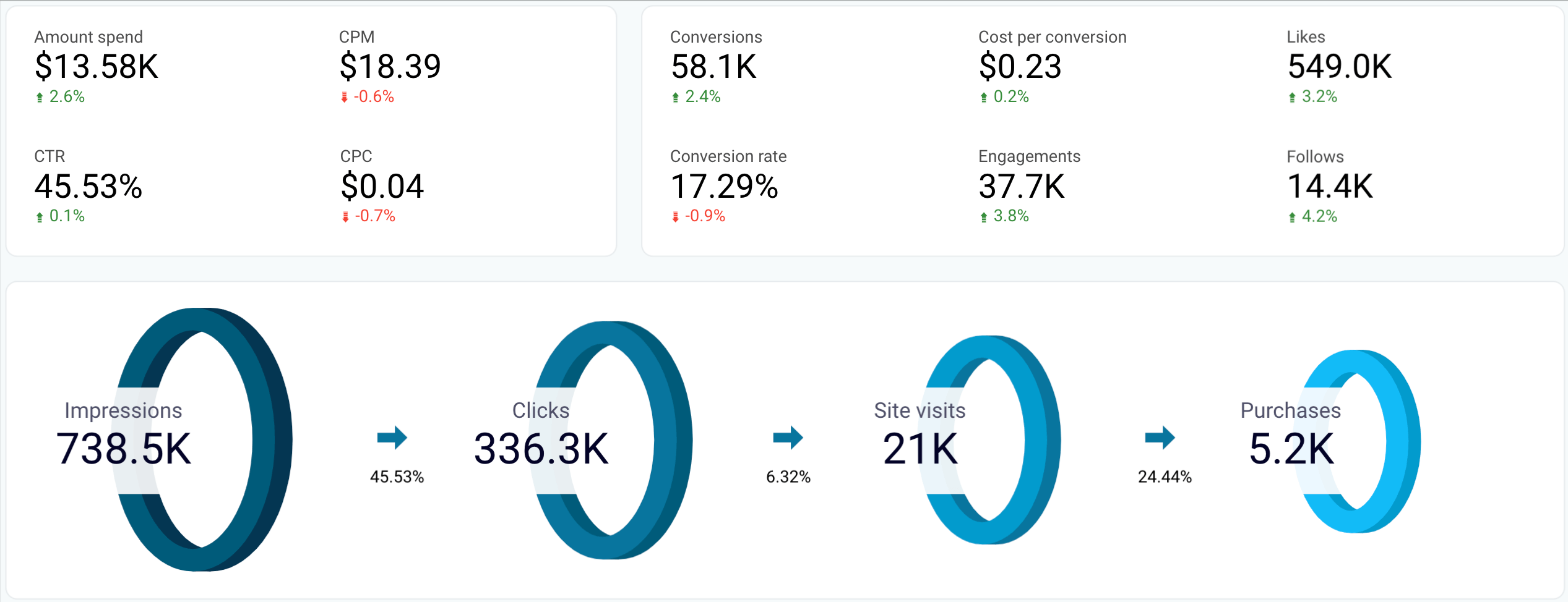
Top campaigns: Explore the best-performing campaigns in terms of conversions to understand which content, keywords, or designs work best. As a result, you can allocate your budget more efficiently.
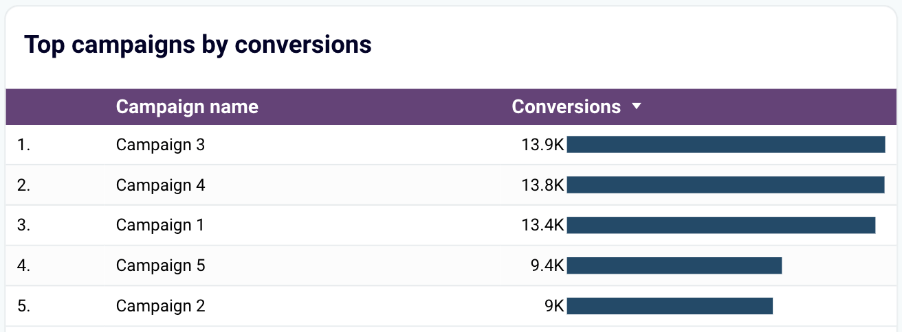
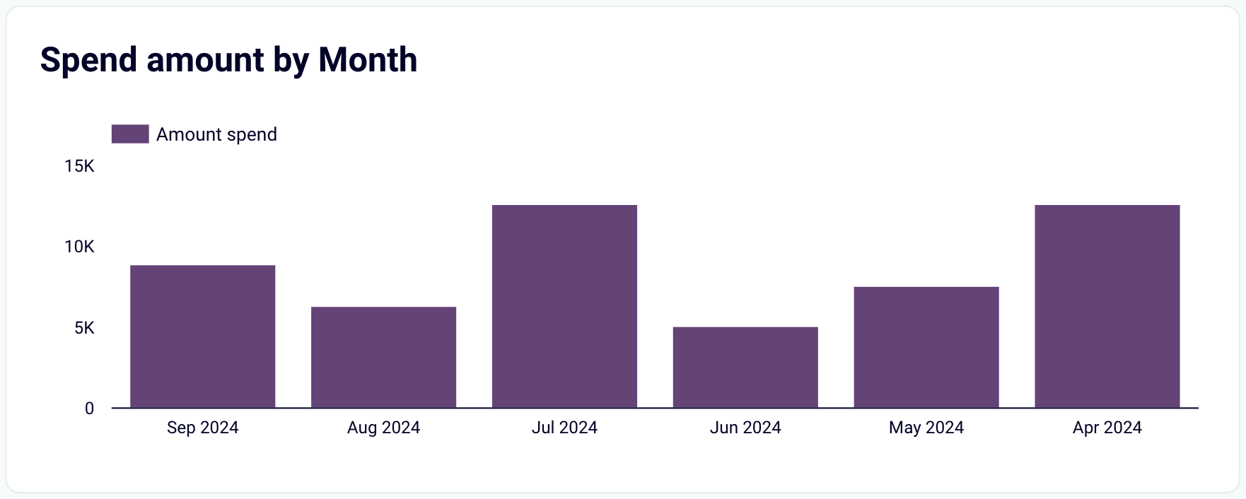
Spending analysis: Track your advertising costs using a chart that shows daily spending fluctuations.
For a broader perspective, you can switch to the “Monthly Dynamics” tab to view your spending patterns month by month.
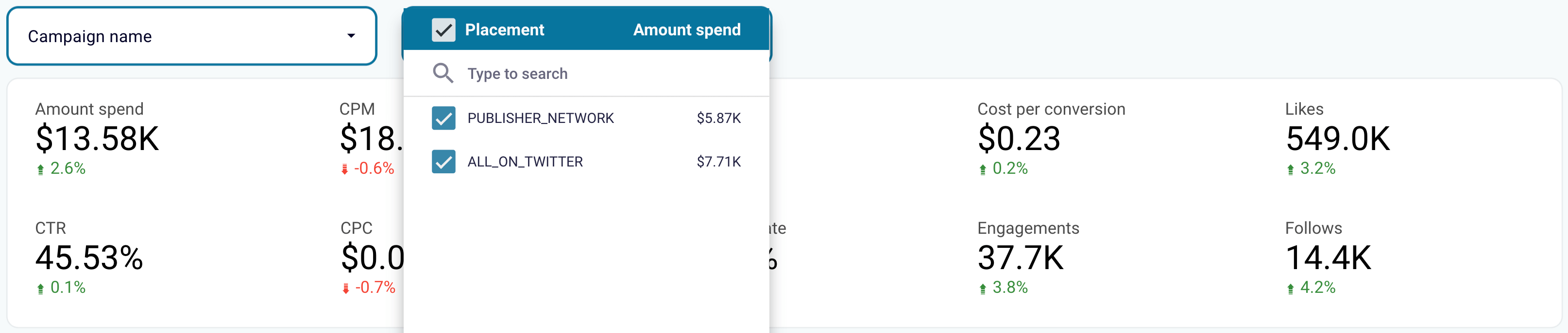
Twitter vs. Publisher Network performance: Filter data by campaign and placement to compare Twitter’s performance versus the Publisher Network. So, you’ll learn whether it’s worth running ads in the Publisher Network (currently called X Audience Platform) – or if you’d better spend your budget just on Twitter.
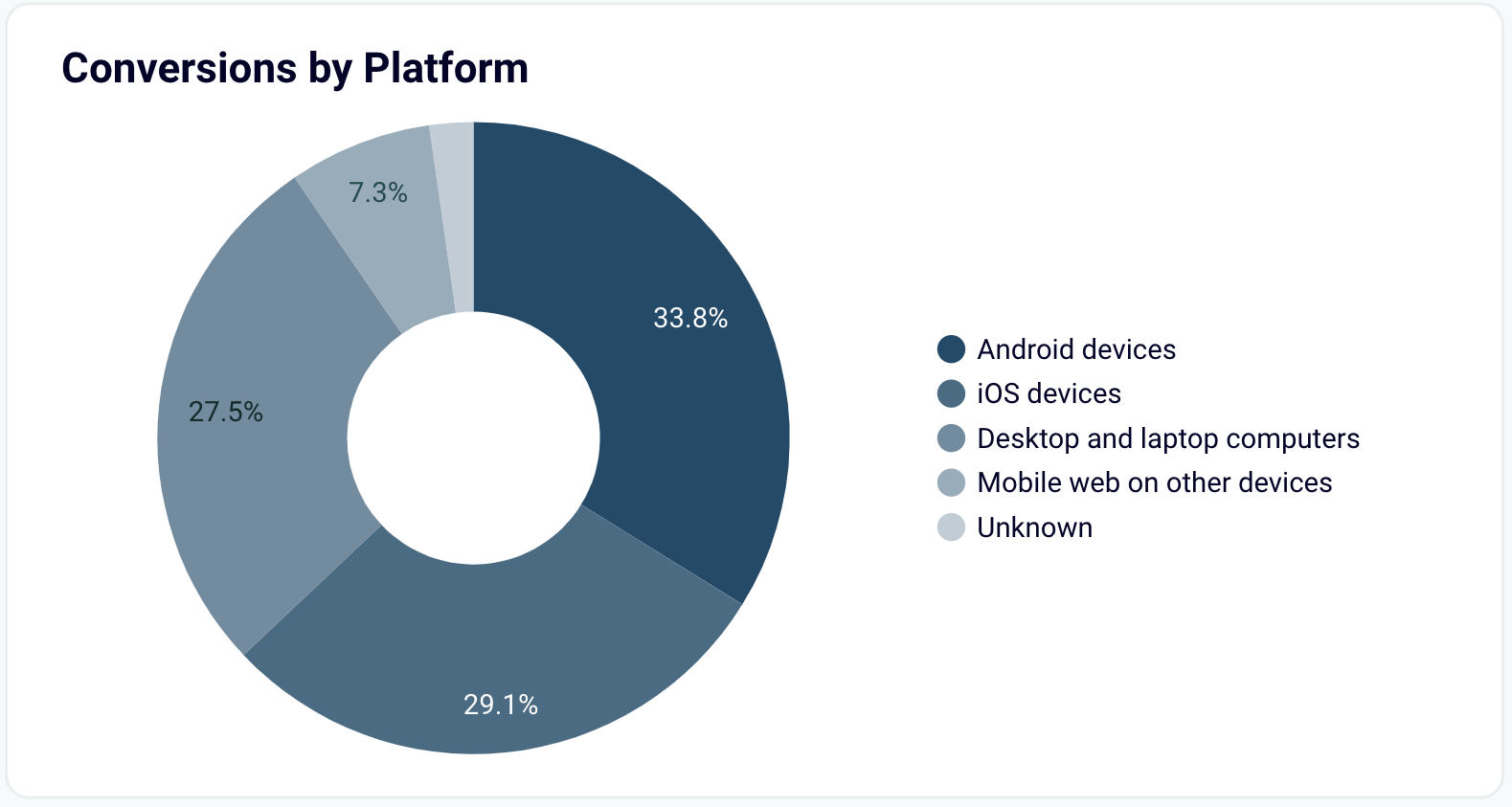
Ad conversions by platform: Analyze your conversions filtered by platform – such as Android, iOS, desktop/laptop, and mobile web on other devices. The goal is to balance your ad placement and focus on the platforms that generate the most revenue.
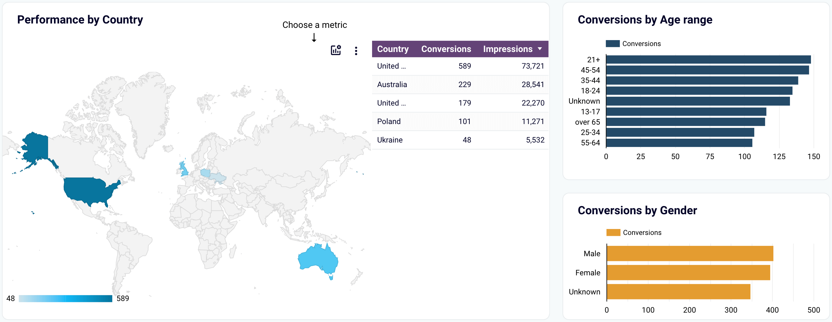
Audience performance insights: Discover the performance of different audience segments by country, age range, or gender. Then, you can adjust your ad configurations to target the demographics that deliver the highest ROI for your campaigns.
How to install
Follow the straightforward instructions in the template’s readme tab. It will only take a few minutes to sign in to Coupler.io, set up the Twitter Ads connector, and load your data to the free self-updating dashboard.
Twitter Ads full report template by Portermetrics
This Twitter Ads report template will help you analyze ad content, audience specifics, reach, spending, and more. It’s available in Looker Studio and consists of seven pages, each dedicated to a specific aspect of advertising performance. Let’s have a look at some of them below.
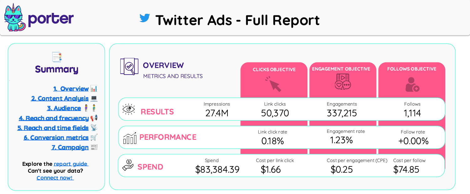
Key insights available from the dashboard
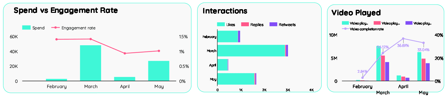
Content analysis: Review data on interactions such as likes, replies, retweets, video views, and link clicks. To assess cost efficiency, compare engagement rates with spending to see if your expenses deliver the expected return.
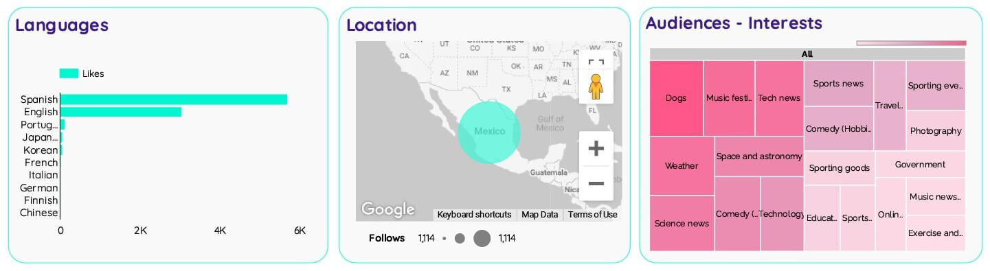
Segmentation: Analyze advertising performance by audience segments, including gender, language, location, and interests. This way, you can identify the most responsive demographics and optimize your targeting strategies accordingly.
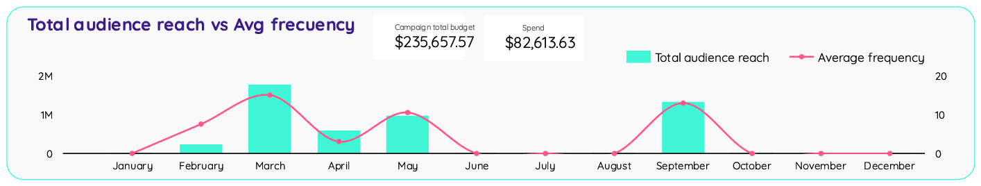
Reach and frequency: Compare the average ad frequency with the total audience reach to identify the best-performing campaigns for these metrics. Additionally, track reach and frequency over time to understand changes in ad exposure.
Campaign spend: Collate the total campaign budget versus actual spend and analyze impressions against cost per mille (CPM). This comparison shows how well your expenses align with campaign performance.
How to install
To use it, install the Portermetrics Twitter Ads connector for Looker Studio, go to the template, choose to make a copy, and import your data to the dashboard.
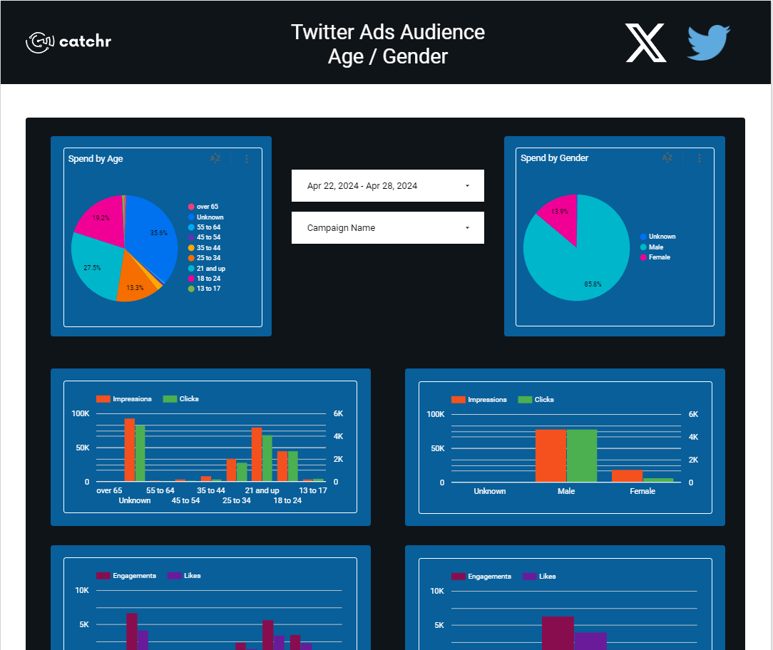
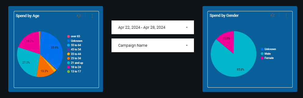
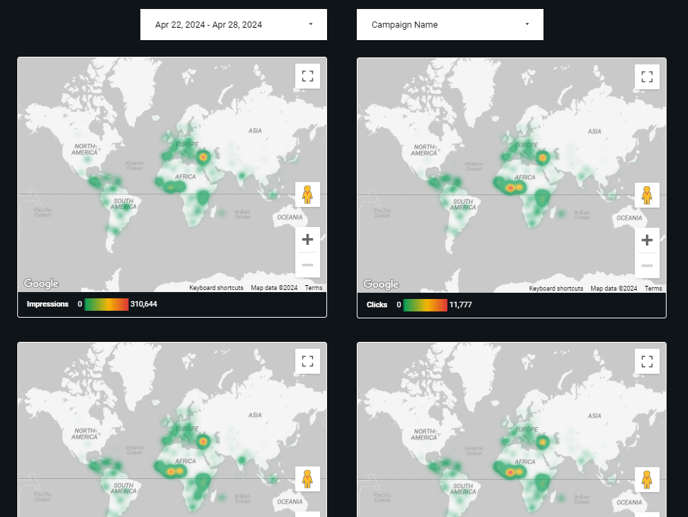
Twitter Ads audience by Catchr
The Twitter Ads audience report template in Looker Studio clearly shows how your ads work across different audience groups and locations. So you can focus on your campaigns’ demographic performance.
Key insights available from the dashboard
Performance by age/gender: Analyze how separate age and gender groups respond to your ads. By identifying the most engaged segments, you can direct your budget where it will yield the highest return on investment.
Performance by location: Evaluate your Twitter Ads’ geographic performance to see where they are most effective. Use this knowledge to improve your location-based targeting by focusing on top regions for conversions and potential growth.
How to install
The setup process involves several steps: add Catchr’s Twitter Ads connector to Looker Studio, go to the template, choose to make a copy, and link your data.
Digital Marketing – Twitter Ads by Tableau Accelerators
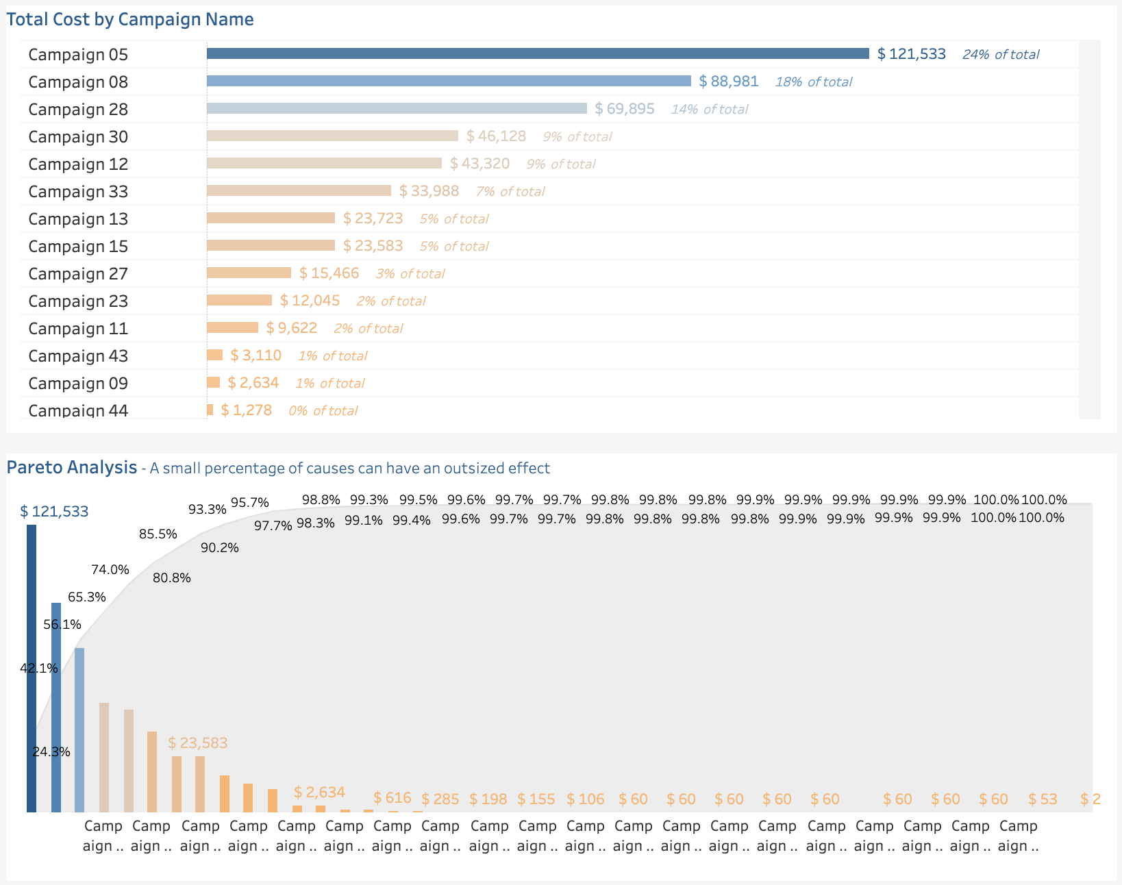
This Twitter Ads report template in Tableau offers a focused view of each PPC funnel stage. It also allows for budget analysis, so you can drill down into the campaign’s cost details when needed.
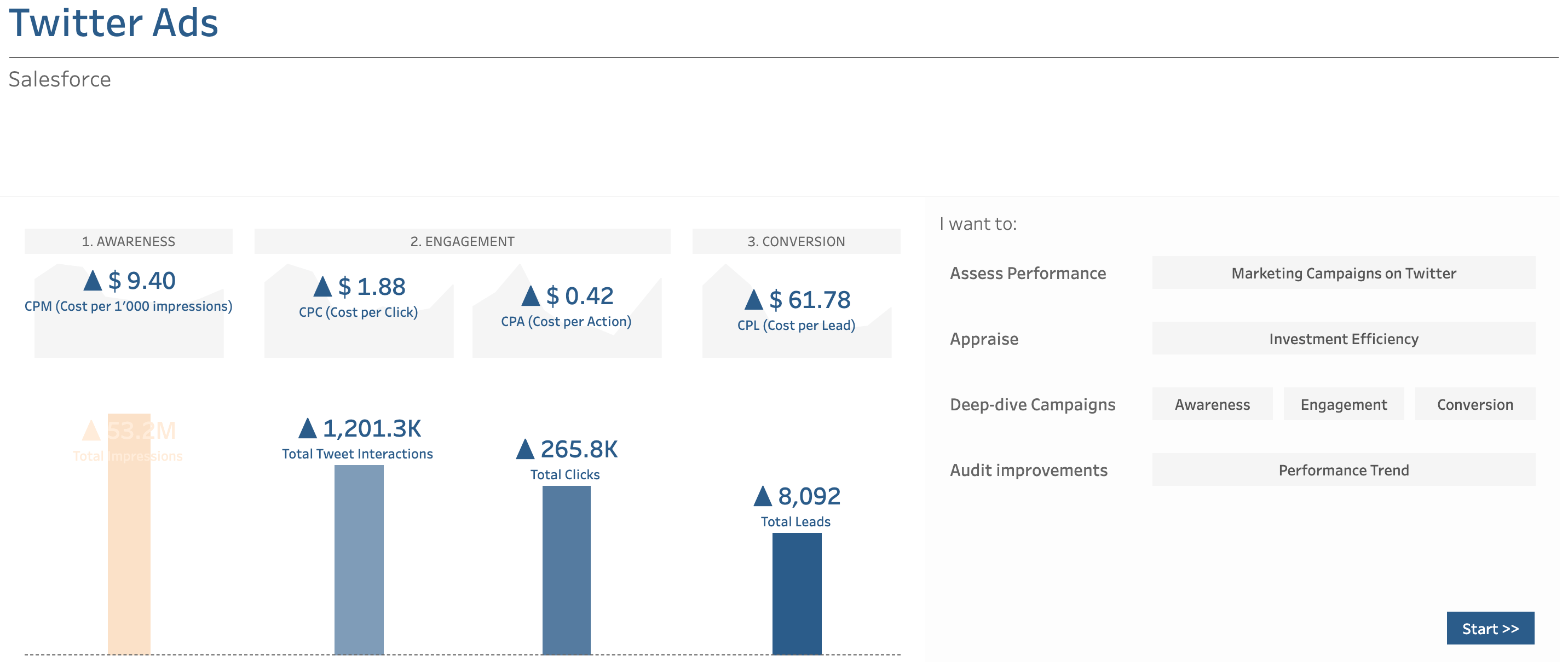
Key insights available from the dashboard
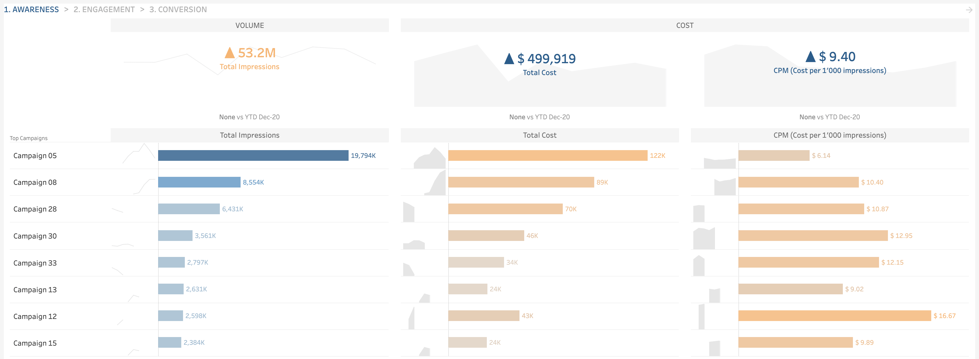
Awareness: Analyze your campaigns by impressions, cost, and CPM. By understanding which campaigns generate the most impressions at the lowest price, you can optimize them for maximum visibility.
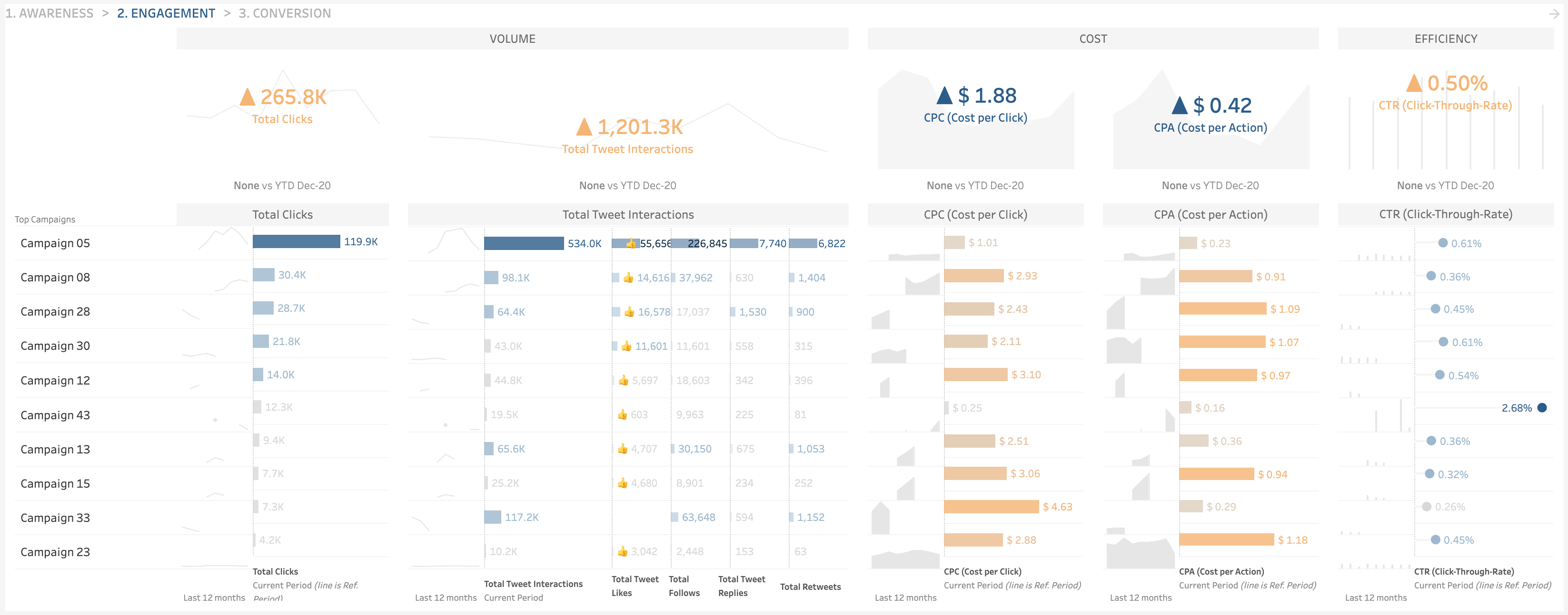
Engagement: Track each campaign’s clicks, tweet interactions, cost per click and action, and CTR. These engagement metrics reveal the campaigns that drive interactions at the most efficient cost.
Conversion: Discover how your campaigns perform regarding leads, cost per lead, and lead-through rate. This way, you learn which are most successful in lead generation and at what expense. Use this insight to allocate resources toward campaigns that yield tangible results.
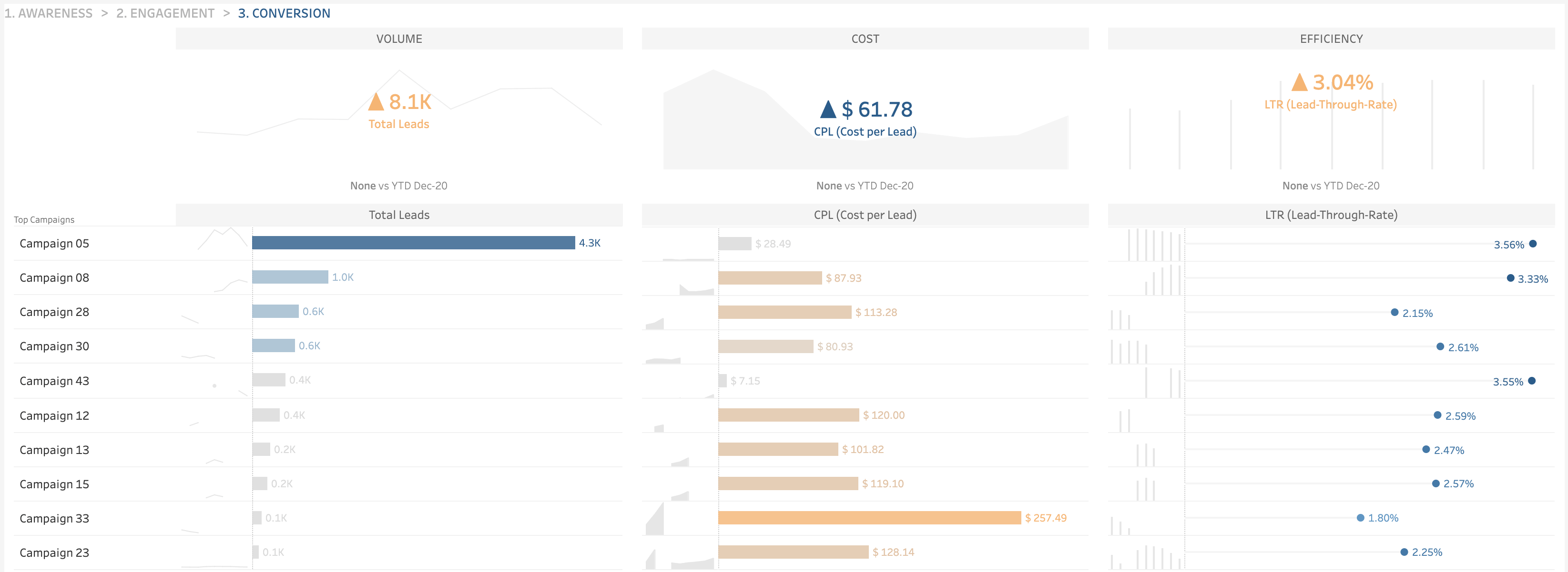
Pareto analysis on an ad hoc basis: Assess the effectiveness of individual campaigns by considering their cost relative to the overall budget. This method – often called the 80/20 rule – stems from the idea that roughly 80% of your results come from 20% of your efforts. So, your task is to spot the few campaigns that might drive the most expenses. Focus on them to address your cost issues and better manage your budget.
How to install
To set up the template, download and open the report using the latest version of the Tableau Desktop application. When the app launches, you’ll get a prompt to connect to your Twitter Ads account. Consider that your data may not match the template’s structure, and you might need to adjust it for proper alignment.
Note: If your company uses Tableau Cloud or Tableau Server, check whether all are running the same version as Tableau Desktop to avoid any compatibility issues.
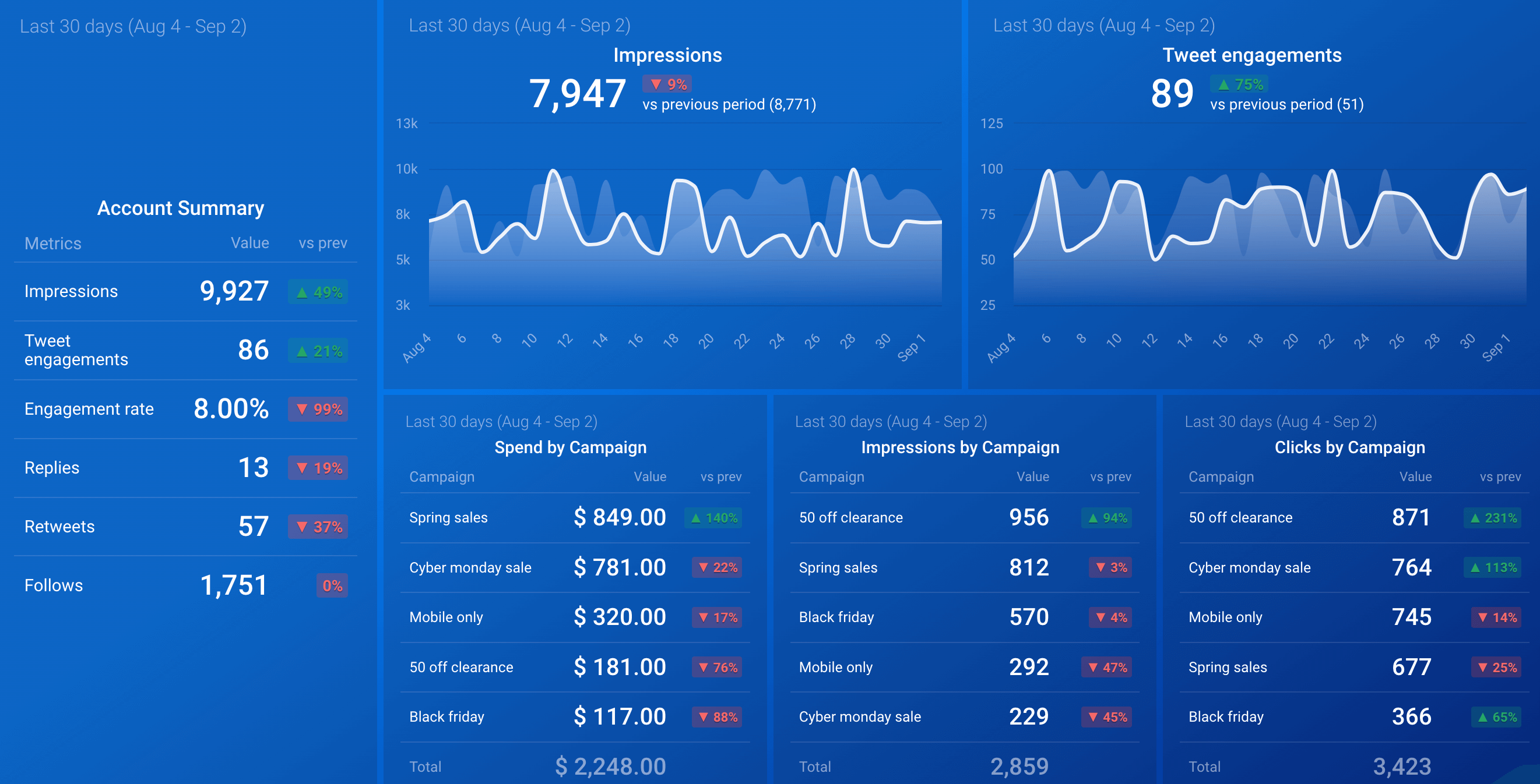
X (Twitter) Ads account overview by Databox
This report allows for a current and historical analysis of your Twitter Ads account’s performance. It summarizes metrics over a specific period and compares them to the previous. The template doesn’t require the use of any BI tool.
Key insights available from the dashboard
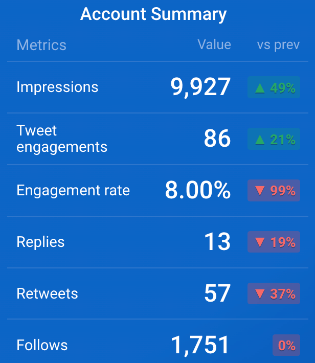
Total performance: Review your account’s overall performance, including impressions, tweet engagements, engagement rate, replies, retweets, and new followers. The report also shows the percentage increase or decrease in these metrics compared to the previous period. As a result, you can identify trends and make informed adjustments.
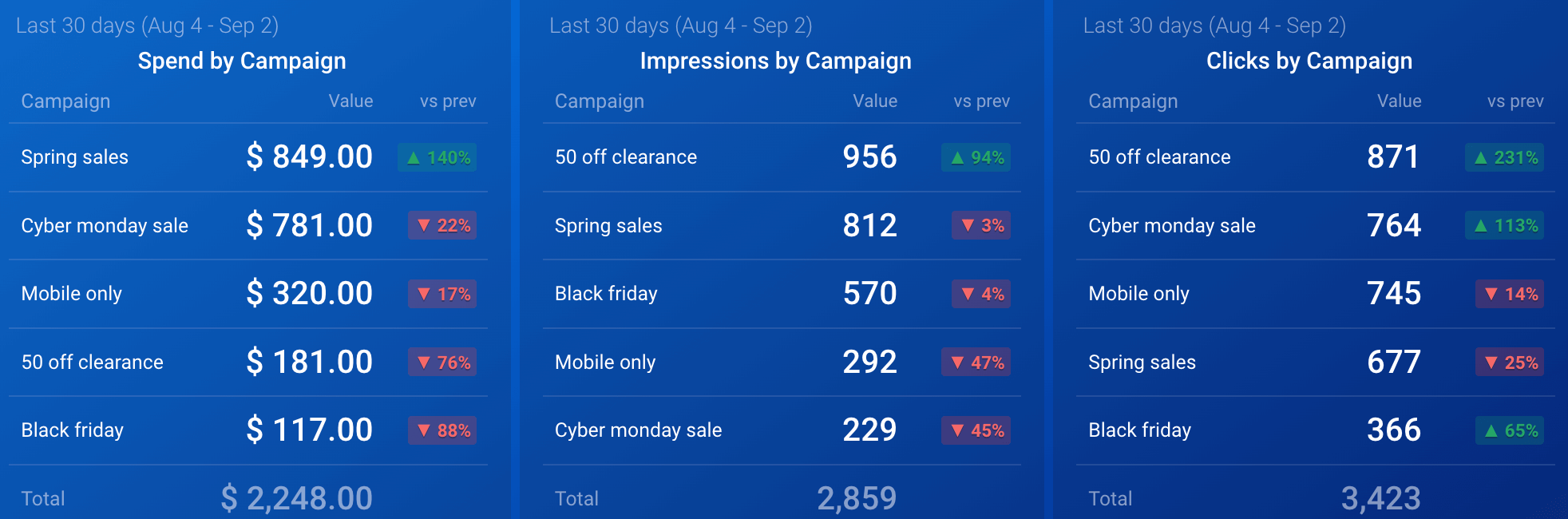
Campaign performance: Analyze your campaign metrics, such as spend, impressions, or clicks, and compare them with the previous period’s values. By tracking your campaigns’ performance over time, you can identify the most effective ones to focus on and optimize future ad spend.
How to install
To use the template, first log in to Databox. Then, load your Twitter Ads data to the dashboard within the app using the built-in connector.
What are the key metrics to track using Twitter Ads reporting templates?
To make the most of Twitter Ads reporting templates, you need to know which data points should be a priority. Below, we have provided an overview of the must-track metrics for your analytics:
1. Impressions represent how often your ad appears on users’ screens. This metric is essential for measuring the reach of your campaign.
2. Cost per mille (CPM) is cost per thousand impressions. You calculate it by dividing the total amount spent on an ad by the number of impressions (in thousands):
CPM = (total spend ÷ impressions) * 1,000
This amount reflects your campaign’s cost-efficiency in terms of reach.
3. Click-through rate (CTR) measures the percentage of people who click on your ad after seeing it. To calculate it, divide the number of clicks by the number of impressions. Then, multiply the result by 100:
CTR = (clicks ÷ impressions) * 100
A high click-through rate signifies that your ad resonates well with your audience.
4. Cost per click (CPC) refers to the amount you pay for each click on your ad. The calculation formula is to divide the total amount spent by the number of clicks:
CPC = total spend ÷ clicks
By monitoring this metric, you learn how efficiently your ads drive traffic.
5. Engagements include all interactions with your ad, such as likes, retweets, comments, and clicks. They illustrate how much the audience interacts with your content and how engaging your ad is.
6. Follows are the number of new followers gained from your ad campaign. This metric is valuable if follower growth is the campaign’s critical objective.
7. Site visits reveal how many users clicked on your ad and visited your website afterward. It’s crucial for tracking your ads’ effectiveness in driving traffic to your site.
8. Conversion rate measures the percentage of users who took a desired action (like making a purchase or signing up) after clicking on your ad. To figure it out, divide the number of conversions by the number of clicks, then multiply by 100:
Conversion rate = (conversions ÷ clicks) * 100
A higher conversion rate suggests your ad is compelling and strongly encourages users to act.
9. Cost per conversion informs how much you spend on average to acquire a conversion. You should just divide the total amount paid by the number of conversions:
Cost per conversion = total spend ÷ conversions
It helps you check how well your campaign’s expenses match its ultimate results.
10. The amount spent is the total expenditure on your Twitter Ads campaign. Track it to stay within budget and evaluate the return on investment.
Once you understand these metrics, you can conduct multifaceted Twitter analytics without missing essential details.
How do you build a Twitter Ads report template on your own?
If preset Twitter Ads report templates lack the required level of customization, you can build your dashboard from scratch. It’s more complicated than a ready-made solution but allows you to tailor the analytics report precisely to your needs.
Coupler.io allows you to collect your Twitter Ads data and turn it into a custom report. Then, you automatically import this report into your chosen app for further analysis. Destinations range from spreadsheet apps like Google Sheets to visual analytics tools like Looker Studio, Power BI, Tableau, and Qlik.
It only takes three simple steps to create a Twitter Ads report with Coupler.io:
Step 1. Collect data
To start, use the form below to select your preferred destination from the drop-down menu. Then, click Proceed and sign up for Coupler.io (no credit card required).
If you already have a Coupler.io account, simply log in and continue. Next, connect your Twitter account and select the Ad accounts from where you’d like to load data. Afterward, specify the Report type, which is the particular kind of data you’ll import. The Campaign is the default choice, but you also have six more options at your disposal:
- Funding instrument
- Line item
- Media creative
- Promoted account
- Account
- Promoted tweet
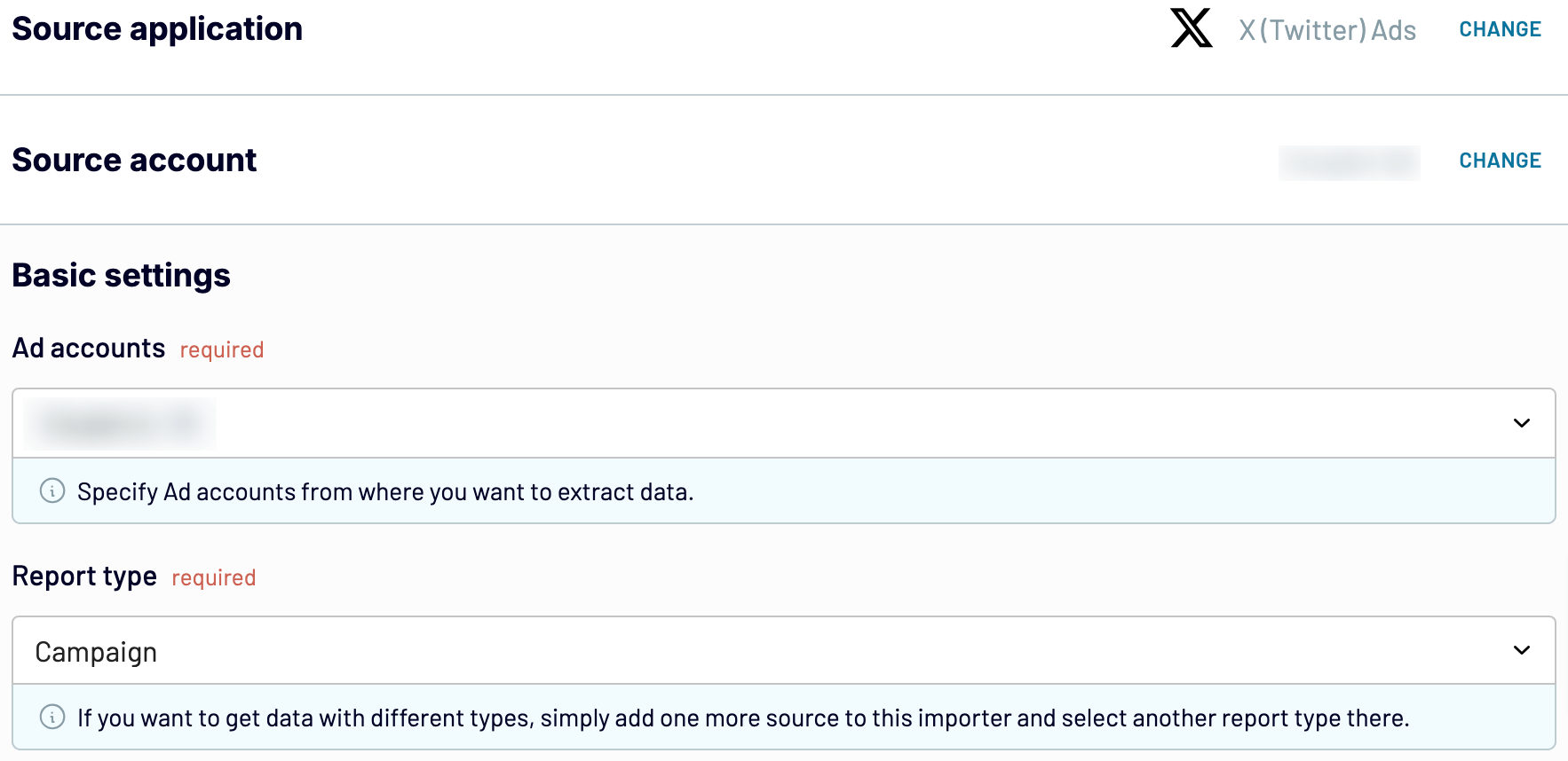
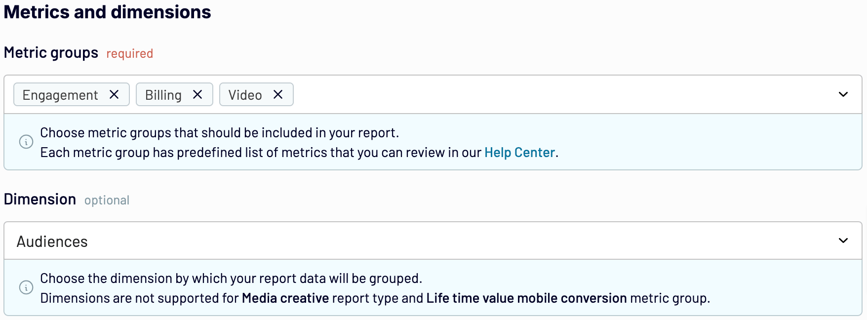
Afterward, select the Report period and how you’ll split data by period. Then, choose the Metric groups to include in your report. Optionally, you can pick the Dimension by which you’ll group your data.
Note: Media creative report type and Lifetime value mobile conversion metric group don’t support Dimensions.
When you finish setting up your data source, proceed to the next step.
Step 2. Organize data
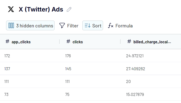
Now, you can preview your data and make the following adjustments if needed:
- Rename, rearrange, hide, or add columns.
- Apply filters and sort your data.
- Create new columns with custom formulas.
- Combine data from several accounts or apps.
Next, move forward to set up your destination.
Step 3. Load data
Follow the in-app instructions to load your data into the destination. Then, customize your dashboard by adding graphs, filters, and other interactive elements to align with your reporting goals.
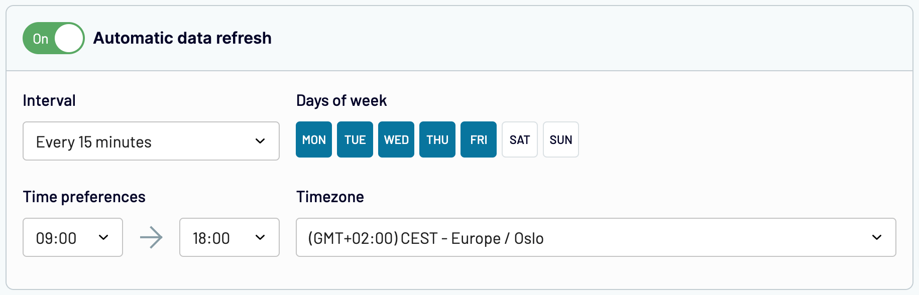
Coupler.io also offers Automatic data refresh. You can set up a schedule to have your report auto-updated at intervals ranging from monthly to every 15 minutes. This feature ensures your dashboard remains in sync with the latest Twitter Ads data in near real-time.

Automate reporting with Coupler.io
Get started for freeStart tracking Twitter Ads performance with ready-to-use dashboards
Creating a Twitter Ads dashboard on your own is complex, but you’re in luck. You can skip all the manual, time-consuming work and proceed straight to analytics with a prebuilt white-label template.
Coupler.io’s Twitter Ads reporting template allows you to collect your data quickly, load it to the dashboard, and analyze it from various perspectives. There are also Facebook Ads report templates, along with many others, available through Coupler.io. Dive straight into your ad performance and start optimizing your campaigns today!
Analyze Twitter Ads performance with a ready-to-use dashboard
Get the free template