Google Sheets might not be the first tool you think of for building custom dashboards, but it’s a great option if you want to quickly convert your spreadsheet data into insights without having to deal with complex data visualization tools.
We have gathered 21 free Google Sheets dashboards for analyzing PPC campaigns, tracking budgets, monitoring social media traffic, measuring ad performance, and more.
1. Facebook Ads dashboard in Google Sheets
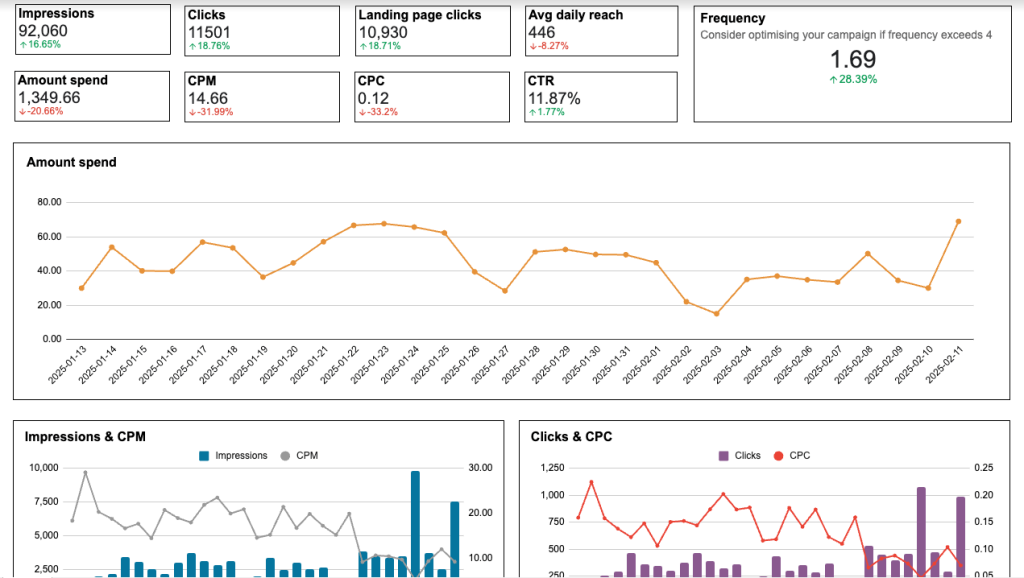
The first on our list is the Facebook Ads dashboard by Coupler.io. This interactive report allows you to closely monitor campaign performance and track associated costs. It is a ready-to-use reporting solution that only requires you to connect your Facebook Ads account. The built-in Coupler.io’s Google Sheets connector will load your data to the dashboard, and you’ll be able to analyze your results in just a couple of minutes.
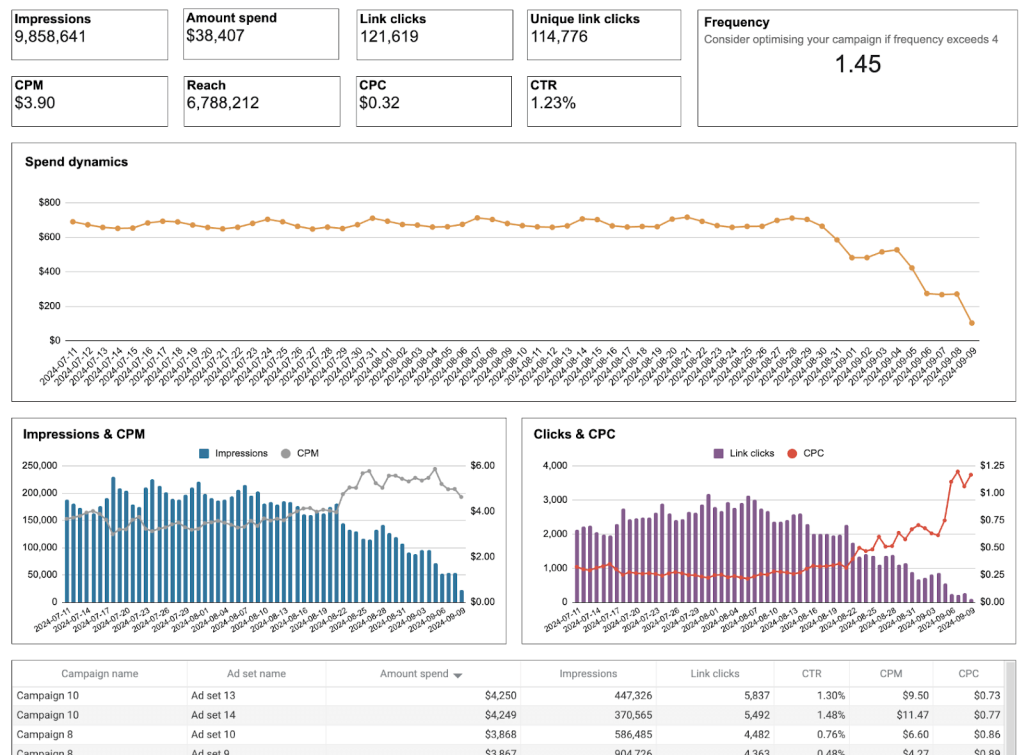
Insights the dashboard provides:
- Frequency meter – Avoid spam reports and optimize campaign engagement by using the meter to monitor ad frequency.
- Clicks by demographic – Identify which audience segments click on your ads the most, and use this information to refine your targeting strategy.
- Monthly dynamics – On a separate page, get an overview of key performance metrics including impressions, amount spend, clicks, CPC, and more. This is useful for tracking progress and sharing your results with stakeholders.
- Breakdown by country – quickly identify which countries generate the most traffic (link clicks), and adjust your Facebook Ads targeting to capture more leads from those locations.
Let’s imagine you check the geo map chart and notice that your ads in Egypt are generating three times more clicks than other regions. Based on this insight, you can immediately adjust your budget allocation to focus on this market and achieve a higher ROAS.
Setting up this dashboard is easy and free. The built-in Coupler.io’s Google Sheets connector will load your data to the dashboard, and you’ll be able to analyze your results in just a couple of minutes.
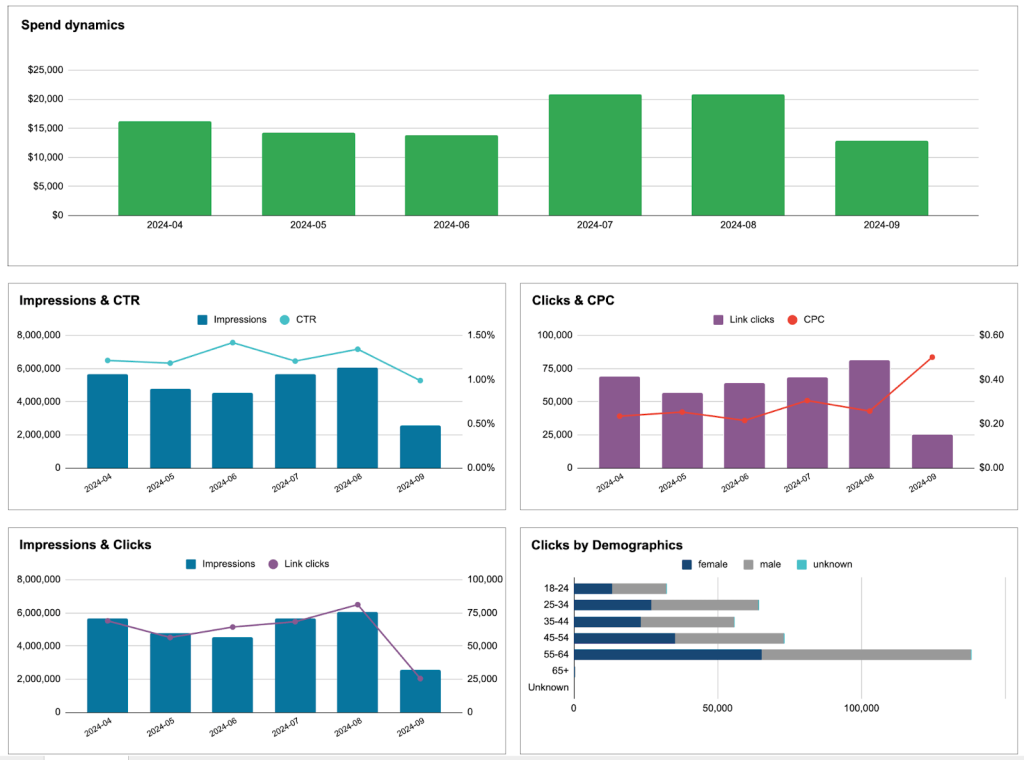
2. PPC multi-channel dashboard in Google Sheets
This PPC Google Sheets dashboard is designed for marketers who need to track and analyze campaigns across multiple platforms on a single page. The template can save you a lot of time and effort on reporting as there is no need to switch between multiple tabs and apps to gather performance data.
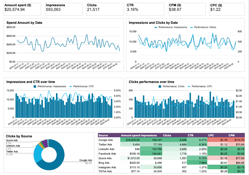
Insights the dashboard provides:
- Cross-channel analysis – evaluate the combined performance of your ads across platforms, including spend amounts, impressions & clicks, and CTR growth.
- Key metric dynamics – monitor trends in critical metrics such as clicks, CTR, CPC, impressions, CPM, and more. This gives you a clear view of how your campaigns are performing across channels.
- Individual source & campaign type performance – on separate pages, analyze results from specific channels (e.g., Facebook, TikTok) and campaign types (traffic, engagements, etc.). It may help you find opportunities for improvement.
- Compare cost and impact – analyze engagement and ad spend metrics for each campaign side-by-side to understand your PPC return on investment. That way, you can allocate your budget more effectively.
Currently, the dashboard supports the following ad platforms:
- Google Ads
- Twitter Ads
- LinkedIn Ads
- Facebook Ads
- Quora Ads
- Instagram Ads
- Bing Ads
- TikTok Ads
Let’s explore a real-life example of how to use this dashboard for PPC optimization. Imagine you review your cross-channel data and spot that while your Facebook Ads drive more clicks, your TikTok campaigns deliver conversions at half the cost. This data can help you reallocate your budget, prioritizing TikTok for conversion-focused campaigns while keeping Facebook for brand awareness.
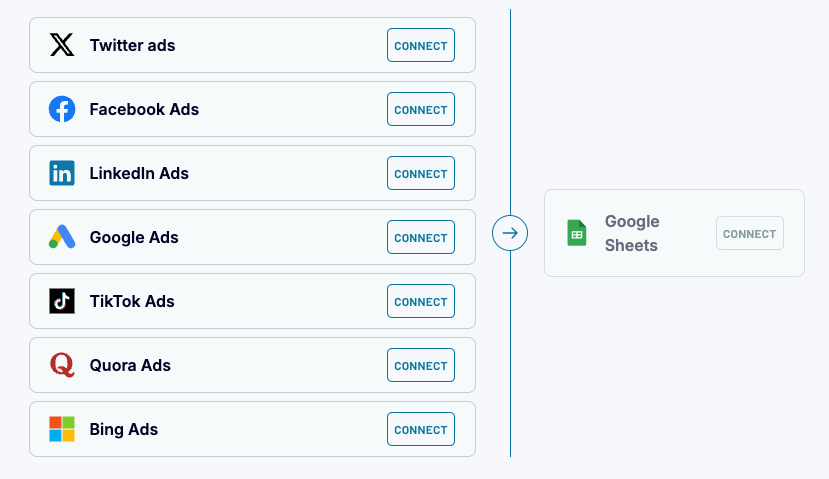
However, you don’t have to connect them all to use the dashboard. It will work even with 1 or 2 channels connected. This Google Sheets dashboard is also free to use with a Coupler.io account. Sign up and connect your PPC data in a matter of minutes.
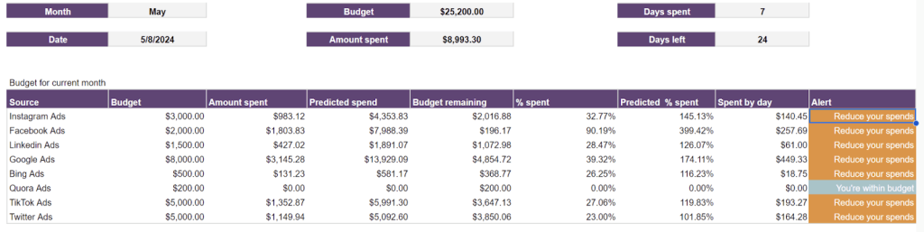
3. PPC multi-channel dashboard with budget in Google Sheets
If you are managing multiple projects for several clients and have agreed on specific budgets for each project, keeping track of your spending can be quite challenging. This PPC dashboard for budget tracking is extremely useful for such situations, as it enables you to track and manage ad spend across all your PPC platforms in near real-time.
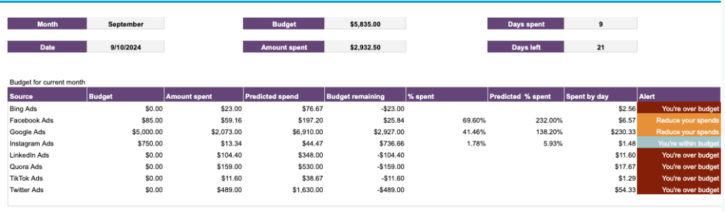
Insights this dashboard provides:
- Future spending predictions – custom formulas automatically calculate the budget spent and provide a forecasted percentage based on your current spending pace. This can help you optimize next month’s budget for each channel.
- Alerts – tells you when you’re over or within budget, as well as when you should reduce spending to prevent exceeding your set limits. All you need to do is manually enter the planned budget amount for each ad platform and plug in your ad accounts.
Let’s look more closely at how this dashboard can help with budget management. Suppose you check the table and notice you’re spending 40% faster than planned on Google Ads, while your Facebook campaigns are underutilizing their budget. The alert system flags this trend, allowing you to quickly rebalance your spending before you exceed monthly limits.
As the dashboard is automated with the help of Coupler.io, it will automatically pull data from the ad platforms and refresh numbers in the report according to your preferred schedule.
4. PPC monthly budget dashboard in Google Sheets
This Google Sheets dashboard resembles the previous one as it also features a tab providing an overview of the ad budget for the current month. However, the real value here is the historical data from multiple PPC sources, which enables you to conduct time-over-time analysis. The dashboard gives you a comprehensive overview of your ad campaign expenses and shows how your actual ad spend compares to the planned budget.
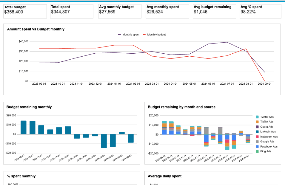
Insights the dashboard provides:
- Monthly dynamics – track monthly advertising spending to ensure you don’t blow your budget too early in the year, or lose opportunities to spend more.
- Monitor average daily costs – keep on eye on how much you spend each day and how it impacts your monthly budget.
- Detailed budget and cost breakdown – monitor spending per channel (e.g., Google Ads) to compare costs and prevent going over budget.
Take this scenario: You check your dashboard on a Wednesday morning and notice your Google Ads spending has already hit $8,500 – 70% of your monthly budget. The daily cost breakdown shows three consecutive days of $450 spent, far above your $300 daily target. With this insight, you can quickly adjust campaign parameters to maintain steady ad visibility through the rest of the month.
Tip: After linking your data sources, manually input your planned budget as a reference point for tracking expenses and predicting future costs. You will get a detailed budget and cost breakdown by ad platform, as well as alerts to avoid overspending.
5. Website traffic from YouTube – a performance analysis dashboard in Google Sheets
This dashboard is designed to analyze the traffic coming to your website from your YouTube videos. When users click the links you’ve added in your YouTube video descriptions, this generates traffic to your landing pages. The dashboard automatically pulls data from Google Analytics (GA4) to show insights on user behavior and conversion metrics.
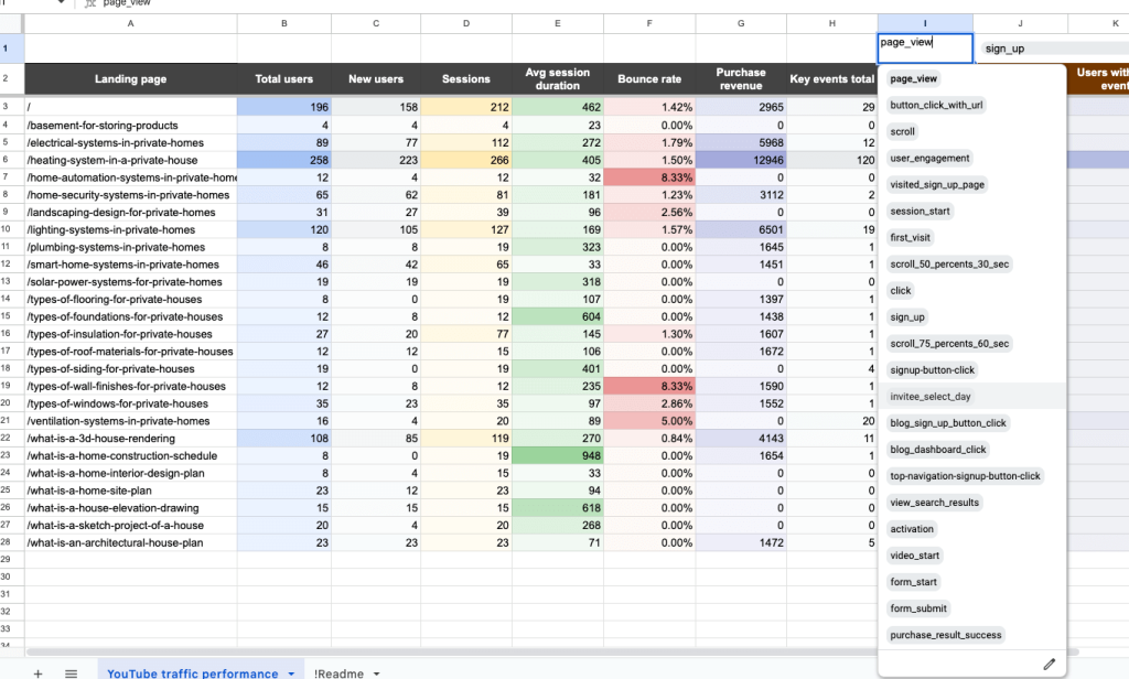
Insights this dashboard provides:
- Pages generating the most sales – track purchase revenue for each landing page to understand the impact of videos on sales generation.
- Links in videos performance – check which videos featured the best-performing links and create similar content to attract more leads.
- Top pages and best-performing videos – optimize your ad and content strategy by identifying which webpages produced the best results (and in which YouTube videos those links are mentioned).
- User interactions – filter by specific user actions (e.g., page views, button clicks, sign-ups, etc.) to assess which events lead to conversions. Use this information to refine your content for better results.
For instance, let’s say you open the dashboard to find your “Beginner’s Guide to SEO” video has generated $3,200 in sales – triple your other videos’ performance. Spotting that timestamp links to tool demonstrations convert best, you quickly pivot your content strategy toward tool-based tutorials.
Get a copy of this Google Sheets dashboard for your business by following the instructions on the Readme tab to collect data from GA4 using the built-in connector by Coupler.io.
6. Technical SEO dashboard in Google Sheets
For SEO professionals performing regular site audits, this technical SEO dashboard from Coupler.io provides a detailed overview of your website’s technical health. It connects directly to Google Search Console, helping you quickly identify pages with potential issues that need immediate attention.
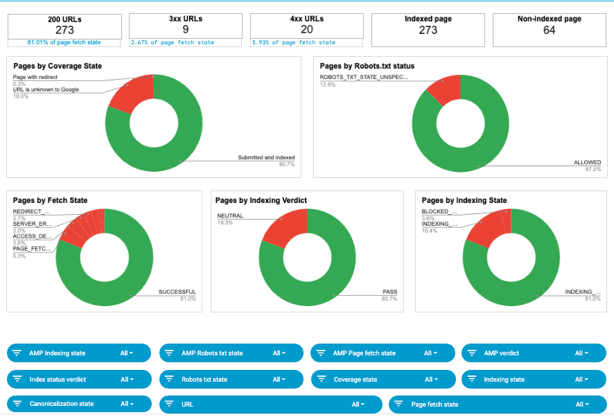
Insights this dashboard provides:
- Overview of URL status – quickly assess your website’s health with scorecards showing the current status of URLs.
- Detailed analytics – use the set of filters to drill down into data. Monitor page rendering status, identify which pages are blocked by Robots.txt or robots meta tags, and review the list of submitted and un-indexed pages.
- Share of pages by different states – analyze the pie charts to determine the share of pages with coverage, fetch, and indexing state issues. This can be useful for prioritizing fixes.
Let’s say, for example, you discover 40% of your product pages aren’t being indexed. After filtering the data, you realize that these pages share the same template. This quick insight leads you to find (and fix) a blocking robot’s meta tag that’s limiting your site’s visibility.
You can take a closer look at the template by clicking the button below. Signing up for Coupler.io is quick, easy, and free. It also ensures you won’t waste time on manual data entry during dashboard set-up!
7. Time-tracking dashboard for Clockify in Google Sheets
This Coupler.io time-tracking dashboard is ideal for HR teams, freelancers, and project managers using Clockify to monitor work hours and productivity. Using this dashboard, you can easily pinpoint areas of high productivity and spot potential inefficiencies, such as differences between billable hours and actual earnings.
Insights this dashboard provides:
- Revenue generation – see which clients and projects generate the most income for your business. Use this information to refine client retention strategies and targeting parameters for new projects.
- Team productivity – filter by user to identify top and low performers based on logged hours, and adjust your team allocations accordingly.
- Client/project dynamics – monitor monthly changes in hours and billable amounts to pinpoint your most loyal, valuable, or unreliable clients.
- Calendar view – on a separate page, review the logged hours of individual employees and identify people who systematically underwork or overwork.
Let’s further explore these benefits with a practical example. Imagine you notice that your marketing team’s hours for small clients have dropped 40% while consulting projects now consume 70% of billable time. With this insight, you begin shifting your business development focus toward more lucrative consulting opportunities.
To get a free copy of this Clockify dashboard, sign up for Coupler.io – no credit card required. It only takes a few minutes to set up the template and configure automatic data updates.
8. Sales team performance dashboard for Salesforce in Google Sheets
This sales team performance dashboard is ideal for managers seeking to evaluate the productivity of their teams. It connects to your Salesforce account to provide an overview of individual performance and the teams’ combined results. This information can be useful for making data-driven decisions about team allocations.
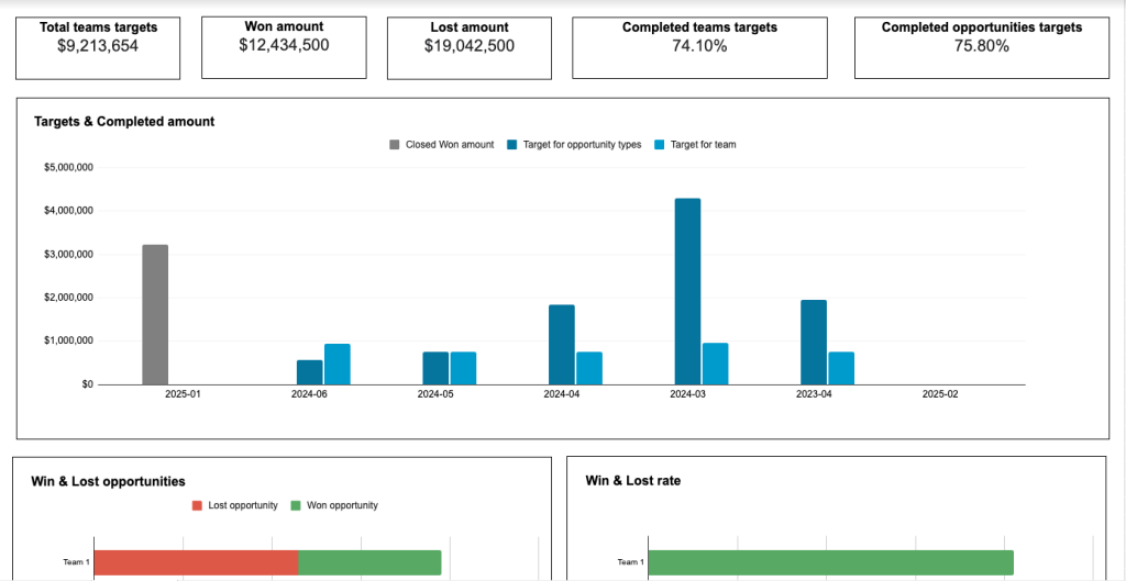
Insights the dashboard provides:
- Win/loss rate comparison – quickly identify each team’s best & worst performers in terms of deals lost and won.
- Closed deal comparison – use the filters or analyze bar charts for won amounts and opportunity type/size to understand where each sales manager excels. Explore the sales stages funnel to see which teams deliver the best results.
- Top-performing sales managers – dig deeper into individual performance based on key sales metrics like won revenue, won opportunities, win rate, etc.
- Task status – evaluate the productivity of team members by the number of high priority tasks they manage to close.
Here’s a typical scenario: You review the dashboard and spot an interesting pattern. Mark’s team excels at new business deals with a 78% close rate, but they’re only winning 25% of their upsell opportunities. By shifting their focus to new business clients and reassigning upsell leads, you quickly optimize team performance.
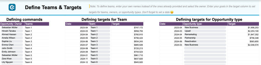
The dashboard also has a handy template (on a separate page) for setting team and opportunity-type targets. That way, you can track your targets and performance all in one place.
Follow the instructions on the Readme tab to connect your Salesforce account and get the dashboard with your data with no hassle thanks to the built-in Coupler.io connector.
9. SEO dashboard for Google Search Console in Google Sheets
This SEO dashboard loads data from your GSC account to provide an overview of your website search performance. SEO specialists can use it to monitor key metrics (clicks, impressions, CTR) and identify opportunities for search ranking optimization.
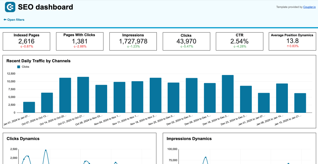
Insights the dashboard provides:
- Clicks, impressions, and average position dynamics – track weekly trends in content performance to understand where your SEO strategy succeeds/falls short.
- Best and worst performing pages – compare pages by clicks growth/loss to spot areas for improvement.
- How visitors engage with and access your content – optimize the user experience for mobile or desktop based on CTR, clicks, and impressions.
For example, you open the dashboard on Monday and see that a popular blog post about morning yoga routines has dropped from the first page of search results. Looking deeper, you see it’s getting fewer clicks than similar posts, indicating it might be time to refresh the content with new tips and trends.
Generate a copy of this template for your GSC data. Follow the steps within the template, sign up for Coupler.io for free (no credit card is required), and get started in just a few minutes.
10. QuickBooks financial dashboard in Google Sheets
This financial dashboard for QuickBooks is a valuable tool for small business owners who want a clear and easy way to track their earnings, profits, cash flow, and expenses over time. It helps you monitor your financial performance closely, ensuring you can make informed decisions and keep your company’s financial health in check.
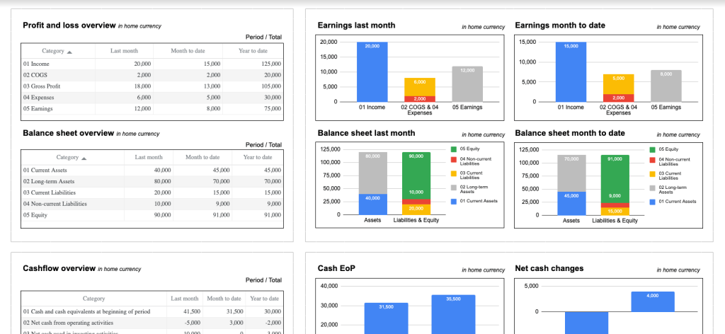
Insights the dashboard provides:
- Profit & loss overview – monitor profitability and control your costs with a summary of revenue vs expenses. Compare earning trends month on month to seize new growth opportunities. Check out P&L dashboard examples.
- Balance sheet overview – get a snapshot of your company’s financial position, based on assets, liabilities, and equity. Use the comparison charts to track changes and identify trends over time. And here is a selection of balance sheet dashboard examples that are available as templates for QuickBooks and Xero.
- Cash flow overview – understand how your cash position evolves over a specific reporting period. Assess overall financial stability and make improvements to ensure liquidity in the coming months.
- Bank and cash accounts status – quickly check your available funds, with a comparison of accounts by currency (EUR and USD).
Let’s explore a practical example here. As a small business owner, you notice that your revenue has grown 15% this month, but your cash flow chart shows upcoming payments that could strain your resources. This quick insight helps you decide to delay a planned office renovation until your cash position improves next quarter.
This Google Sheets dashboard is free with a Coupler.io account. Simply sign up (no credit card required) and connect your QuickBooks data in minutes.
11. Revenue dashboard for QuickBooks and Xero in Google Sheets
This dashboard provides a complete overview of your company’s income and expenses. It connects to either your QuickBooks or Xero account and displays revenue distribution by customers and products. The report also highlights key revenue metrics, top customers, and best-selling products.
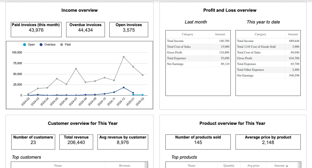
Insights the dashboard provides:
- Income overview – track revenue trends for the past 12 months to identify seasonal fluctuations, peak revenue periods, and any unexpected dips.
- Profit and loss overview – assess how well your business is managing costs relative to income by comparing revenue to expenses. Use this information to optimize financial planning and budget allocation.
- Customer overview – identify your most valuable customers by revenue contribution to refine your acquisition, marketing, and customer retention strategies.
- Product overview – pinpoint which products or services generate the most revenue for your business. This information is useful for inventory management, product promotion, and understanding the demand for various offerings.
Suppose you run a growing food business. In the dashboard, you see that your monthly meal prep service generates 40% more revenue than your cooking classes. The customer overview reveals that your top customers are large local enterprises, so you focus your next marketing campaign on corporate wellness programs.
You can start using this dashboard in less than 5 minutes by setting up a free Coupler.io account. Take your pick and schedule automatic data refreshes in a few clicks.
12. AI traffic performance dashboard in Google Sheets
This is a simple, two-page dashboard that displays the performance of traffic your website receives from AI tools. Performance is measured via metrics like total users, bounce rate, average session duration, purchase revenue, and more. It pulls all of this data from your GA4 account.
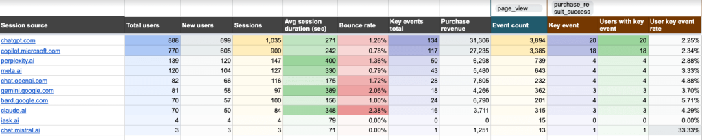
Insights this dashboard provides:
- Traffic volume – compare the volume of traffic based on total users and session data to identify which tools bring the valuable visitors to your site.
- Conversions attributed to AI traffic – filter by a GA4 event and key event to check if AI traffic helps you convert visitors into customers.
- Traffic quality – assess the level of user engagement you receive from AI tools, using metrics like average session duration and bounce rate.
- Revenue generation – determine which AI tools deliver the highest conversions and revenue for your business. Then redirect marketing investments to the ones that perform best.
- Landing page performance – understand which pages attract the most visitors from AI tools. Use this information to optimize your landing page content.
Here’s a quick example. When reviewing the report, you notice that users coming from ChatGPT spend twice as long on your site compared to other AI tools. The landing page data shows these visitors primarily land on your how-to guides, helping you understand which content format resonates best with AI-directed traffic.
To grab a free copy of this template, simply sign up to Coupler.io and connect your GA4 account in minutes.
13. Referral traffic performance dashboard in Google Sheets
Designed for marketers and SEO specialists, this dashboard consolidates referral traffic performance data into a single, easy-to-skim page. It highlights several key metrics such as total users, average session duration, purchase revenue, etc. Like the previous dashboard example, it pulls all data from your GA4 account.
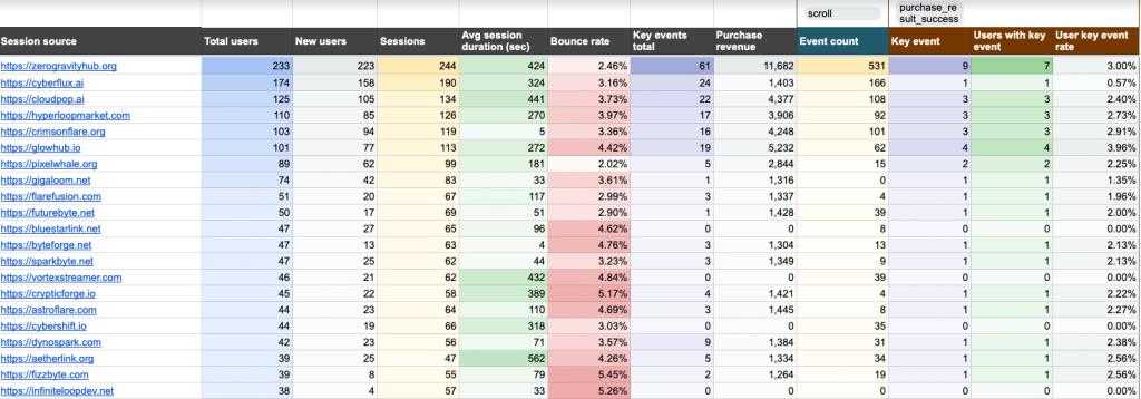
Insights the dashboard provides:
- Source effectiveness for user acquisition – optimize your marketing strategies by identifying which referral sources attract first-time, high-quality visitors.
- User engagement – compare average session duration and bounce rate across referral sources. Improve overall engagement by determining which sources require further attention and content refinement.
- Conversions and revenue impact – assess which referral sources deliver the highest returns on investment and allocate your marketing budgets accordingly.
- User behavior – personalize and optimize content based on behavioral insights (choose ‘key events total’ in the filtering options).
For instance, you discover that visitors from a niche industry blog where you published a guest post are spending twice as long on your site than other referral sources. Conversion data shows they’re downloading your industry reports at a high rate, helping you pinpoint websites to target for future guest posting.
Obtain a free copy of this Google Sheets dashboard with a Coupler.io account – it only takes a few minutes to sign up and load your GA4 data with the automated flow.
14. Landing page performance dashboard in Google Sheets
This landing page performance dashboard is another valuable tool for SEOs and marketers. It’s a one-page report that helps you understand how effectively your landing pages drive traffic, engage visitors, and convert them into customers. The dashboard connects to both your GA4 and Search Console accounts, displaying key performance metrics such as impressions, clicks, CTR, total users, event count, and purchases.
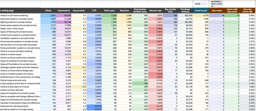
Insights the dashboard provides:
- Landing page performance – analyze key metrics to develop a comprehensive understanding of page performance and user behavior dynamics.
- Effectiveness of SEO and paid campaign strategies – evaluate strategies by metrics like average position and CTR. Find opportunities to improve page visibility and SEO growth.
- User engagement – identify which pages capture and retain your audience’s attention. Filter by key events to understand which marketing tactics drive clicks.
- Conversion and revenue impact – track metrics like users with key events, user key event rate, and purchase revenue to assess how landing pages contribute to business outcomes. Use this information to optimize low-performers.
- Bottleneck detection – pinpoint pages with high traffic or low clicks to address content issues.
Let’s imagine you checked the dashboard and saw your product comparison page gets lots of clicks but has a high bounce rate. The average session duration for the page is also unusually low, telling you it’s time to simplify the comparison tables.
Click the button below to generate a copy of this dashboard for Google Sheets. Be sure to sign up for Coupler.io and automate data imports from your GA4 and GSC accounts.
15. Google Calendar availability & meeting hours dashboard in Google Sheets
The Google Calendar availability & meeting hours dashboard is designed to help you take control of your time and improve productivity. It provides a clear overview of your schedule, highlighting availability and meeting patterns so you can make targeted optimizations.
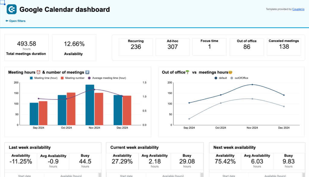
Insights the dashboard provides:
- Overview of meeting hours and availability – analyze the scorecards and bar charts to identify patterns in your workload or common disruptors, such as too many meetings.
- Week availability – assess your productivity based on data from the past three weeks, and make schedule optimizations to prevent future blockers.
- Availability by week – learn how to better manage your recurring commitments by investigating how your time is distributed each week/day.
- Meeting overview – analyze the ‘meetings’ table for a detailed review of your scheduled events, their creators, your responses, and more.
For example, the dashboard highlights that you’re spending over 60% of your week in meetings, primarily with external stakeholders. Using these insights, you choose to delegate some client update meetings to your senior team members, freeing up crucial time for hands-on tasks.
To get a copy of this dashboard for your Google Calendar and have it update automatically, log in or sign up for a free Coupler.io account.
16. LinkedIn Ads dashboard in Google Sheets
The LinkedIn Ads dashboard is a single-source report that allows you to analyze your campaign performance and conversions in one place. It offers a more efficient and convenient way to track your data compared with the native LinkedIn campaign manager.
Insights the dashboard provides:
- Overview of key performance metrics + frequency meter – get a birds-eye view of your LinkedIn ads performance with metrics such as amount spent, impressions, CTR, clicks, etc. Monitor ad frequency to prevent spamming your audience.
- Dynamics within the selected time range – use the line charts to identify trends and spot issues with targeting strategies or content.
- Campaign performance breakdown – optimize LinkedIn budget allocation by comparing campaigns based on key performance indicators.
- Conversion dynamics and Lead form funnel – on separate pages, analyze how well your campaigns generate leads and conversions over time. Use the funnel visual to quickly identify conversion ? lead bottlenecks.
Let’s look at a practical case. The dashboard shows that ads featuring customer success stories are generating double the clicks and conversions compared to your product feature campaigns, while spending 50% less of your budget. With this hint, you reallocate your ad spend towards case study content and adjust your targeting parameters. Ultimately, it leads to a significant increase in qualified B2B leads.
Finally, check out the dashboard for yourself. Connect your LinkedIn Ads account using the built-in connector by Coupler.io, and it will automatically populate and refresh data in your dashboard.
17. Google Ads dashboard in Google Sheets
This Google Ads dashboard allows you to track the performance of your campaigns in a simple, two-page report. You can view your most critical metrics (e.g., views, clicks, CTR, CPM) in a single dashboard and compare the results of different campaigns to find opportunities for improvement.
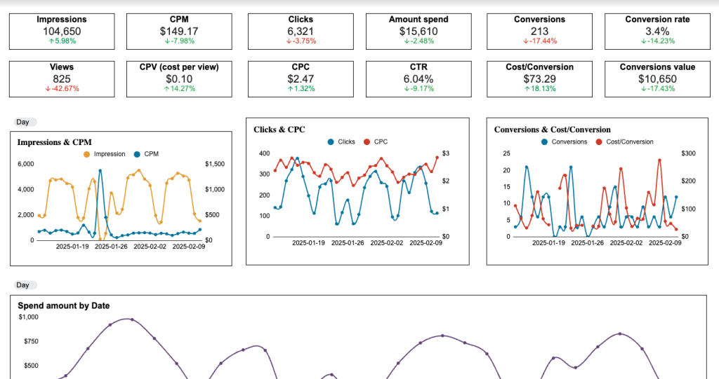
Insights the dashboard provides:
- Overview of key metrics – including impressions, CPC, amount spend, and conversion rate. Quickly understand the performance of your campaigns over time.
- Specific campaigns driving clicks – filter by ‘campaign type’ or ‘campaign name’ to identify which ads deliver the best results.
- Top-performing campaigns – see which ads and ad groups are most effective at converting viewers into customers.
- Monthly dynamics – analyze your conversions based on demographics (country, age, and gender). Make data-driven targeting decisions to improve your results month over month.
For instance, the charts reveal that your feature launch campaign performs best with young male professionals, receiving 40% more conversions than other audiences. Based on this data, you adjust your targeting and messaging to improve your engagement rates.
Generate a copy of this dashboard for your Google Ads account by setting up a Coupler.io account. Remember, it’s free, and only takes a few minutes to complete!
18. Email marketing dashboard in Google Sheets
This Email Marketing Google Sheet Dashboard by Two Minute Reports is designed to give email marketers a clear and insightful overview of their campaigns. It tracks essential metrics like open rates, click-through rates, and spam rates to help you evaluate the effectiveness of your email efforts.
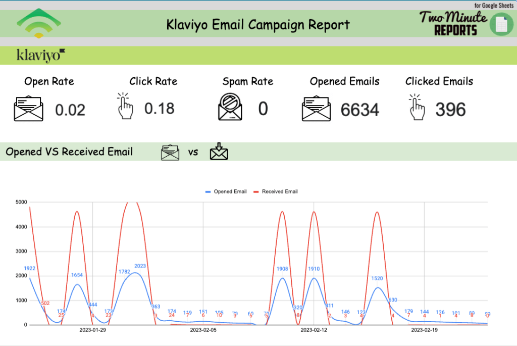
Insights this dashboard provides:
- Real-time engagement – closely track the number of opened vs clicked emails and keep an eye on your spam rate.
- Open rates – compare opened and received emails to spot worrying trends and adjust your campaign strategy accordingly.
- Campaign performance by country – understand which regions respond best to your emails or newsletters and create stronger marketing campaigns for those segments.
- Email campaign performance – use the table to compare the performance of individual campaigns by clicks, opens, bounces, and spam reports.
As an example, let’s imagine you open the dashboard and see that your product update newsletters consistently achieve 45% higher open rates in European markets compared to other regions. Armed with this insight, you optimize your email scheduling and create region-specific subject lines. It results in a significant boost to your open and engagement rates.
Make a copy of this Google Sheets dashboard by clicking ‘Use Template’ in the top-right corner.
19. Sales KPI dashboard in Google Sheets
This Google Sheets sales KPI report from You Exec lets you quickly track whether your sales targets are being met or not. Business owners or sales teams can use this dashboard to closely monitor their sales operations.
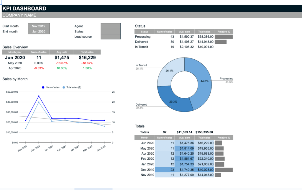
Insights this dashboard provides:
- KPI tracking – get a quick overview of the current month’s results and the dynamics for the past quarter.
- Sales performance over time – compare KPIs (e.g., number of sales, total sales, avg. sale) over a 6+ month period to understand your team’s velocity and ability to meet targets.
- Visualize the sales pipeline – see how many orders are currently in processing, how many have been delivered, and how many are in transit. Use this information to improve the process and boost customer satisfaction.
Let’s say you’re a sales manager for an e-commerce company. Looking at the dashboard this week, you notice that despite an increase in sales, total revenue has remained flat due to a decrease in average order value. Equipped with this data, you decide to introduce a new cross-selling strategy to boost overall revenue.
Keep in mind, you’ll need to manually enter your sales data into the Data Sheet tab. Once entered, the dashboard will automatically display the data.
20. Project management dashboard in Google Sheets
This project management dashboard from Smartsheet is designed to help you organize and track your project’s progress from start to finish, making sure everything stays on schedule and any potential risks are spotted early. You can find it in the Google template gallery, and it’s valuable for project managers, team leads, and anyone involved in project planning and execution.
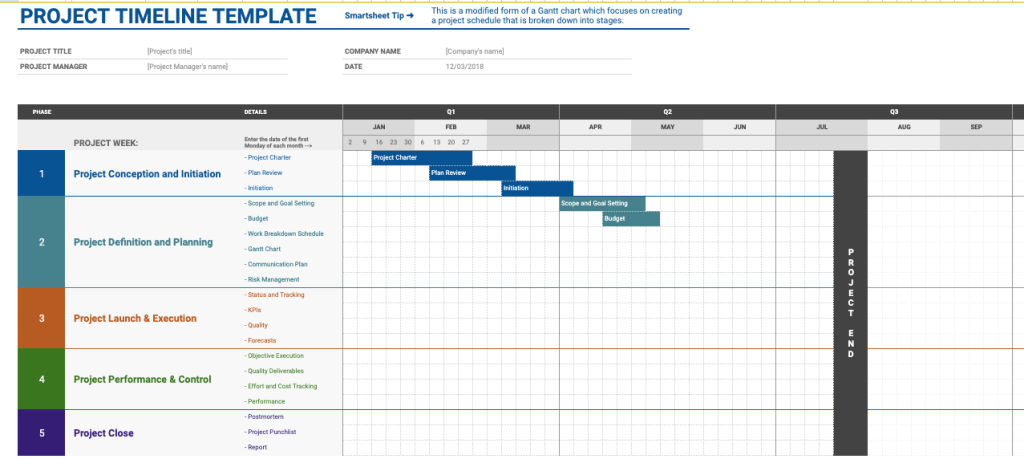
Insights this dashboard provides:
- Visualization of a project timeline – the Gantt chart helps you break down tasks into manageable chunks and quickly assign roles to team members.
- Clear view of your project’s schedule – thanks to the ability to update the progress status of tasks directly in the dashboard (this requires manual data entry, however).
- Progress of deadlines, milestones, and key tasks – track the status of project deliverables to ensure everything runs smoothly.
Suppose you’re a social media manager planning a major influencer campaign. The dashboard allows you to assign tasks and track important milestones, such as influencer confirmations and content approvals. You quickly spot and resolve any issues as they crop up, ensuring a high-impact, well-executed marketing campaign.
Remember, if the default tasks such as “Project Charter” or “Plan Review” do not align with your project, you have the flexibility to quickly edit them to better suit your needs. Additionally, you can modify the Gantt chart bars to accurately represent the actual start and end dates for each task.
21. Recruitment dashboard in Google Sheets
The Recruitment dashboard by Indzara is designed to help HR professionals, recruiters, and hiring managers organize the hiring process and monitor progress. It provides insights into various stages of recruitment, such as applications received, candidates interviewed, and positions filled.
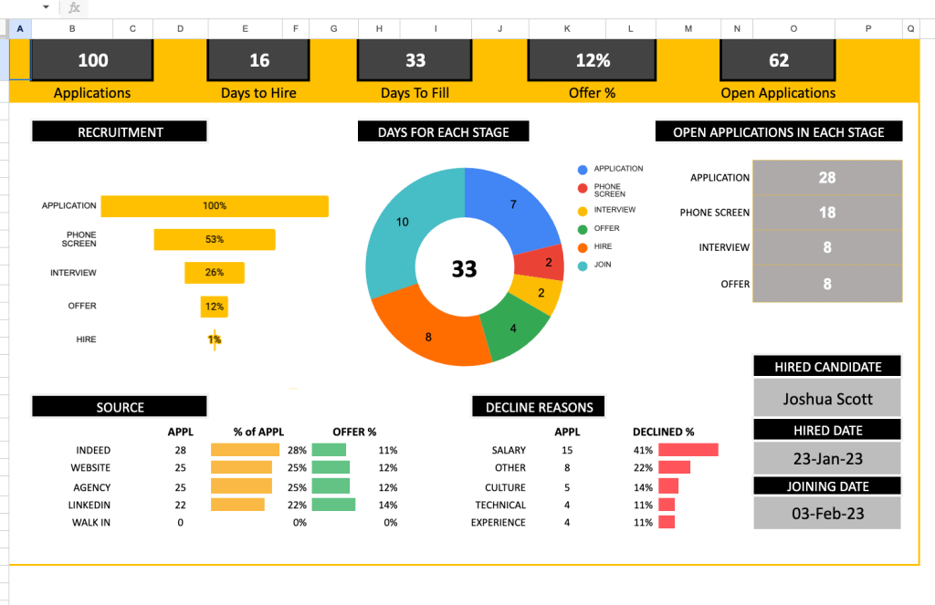
Insights the dashboard provides:
- Performance tracking – monitor key recruitment metrics such as the number of applications, days to hire, and offer acceptance rates.
- Sources of applicants – identify where applicants discover your vacancies and allocate more of your advertising budget to the platforms that attract applications.
- Reasons behind declined offers – craft competitive offers by understanding the common reasons for rejection (e.g. salary is too low).
- Open applications by stage – quickly address bottlenecks in the recruitment process by analyzing the application funnel stages (phone screen, interview, etc.)
Let’s explore one more example. Imagine the dashboard shows that it takes an average of 35 days to hire for software engineering roles. By looking at the source data, you notice that most applicants are coming from LinkedIn, so you decide to allocate more of your budget to ads on that platform. This leads to an increase in applications and a shorter vacancy close time.
As a final note: In the Applications sheet, manually enter the details for each candidate such as the job title, application date, interview date, etc. As candidates progress through different stages, update their information, and the dashboard will visualize your metrics, helping you optimize your recruitment strategy.
How to access free dashboard templates in Google Sheets and use them
Templates speed up your workflow and save you the headache of designing a dashboard from scratch. Here’s how you can access free Google Sheets dashboards that can be customized to fit your needs.
Free templates from Coupler.io
Coupler.io is a reporting automation platform that provides free, ready-to-use, self-updating Google Sheets dashboard templates for various use cases. The first 17 dashboards from the list above are all from Coupler.io. Setting up your Coupler.io dashboard template is quick and easy. All you need to do is:
- Follow the link to your chosen template, click Use, and authorize Coupler.io to run in Google Sheets.
- Once you’ve completed the authorization step, connect your data sources. For multi-source templates, there’s no need to connect all the available sources – just connect what you use.
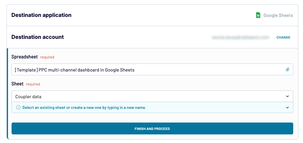
- After connecting each of your sources, connect your Google Sheets account. The spreadsheet and sheet fields will pre-populate. You don’t need to change anything – simply click Finish and Proceed to finalize the set-up.
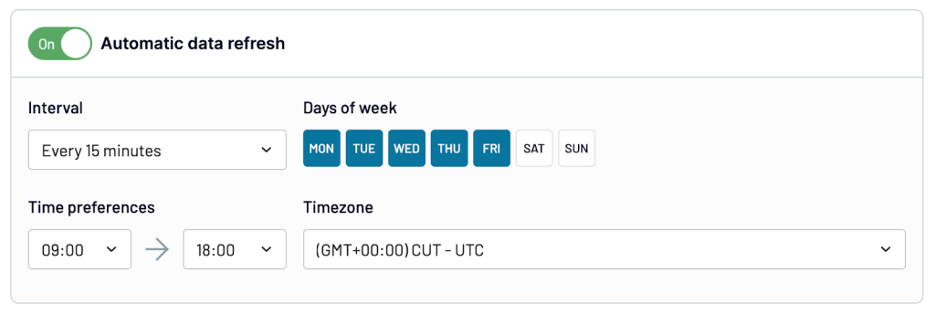
- Lastly, in the Coupler.io app interface, create a schedule for automatic updates to ensure your dashboard is always up-to-date.
Within minutes, you’ll have a fully functional, analysis-ready dashboard.
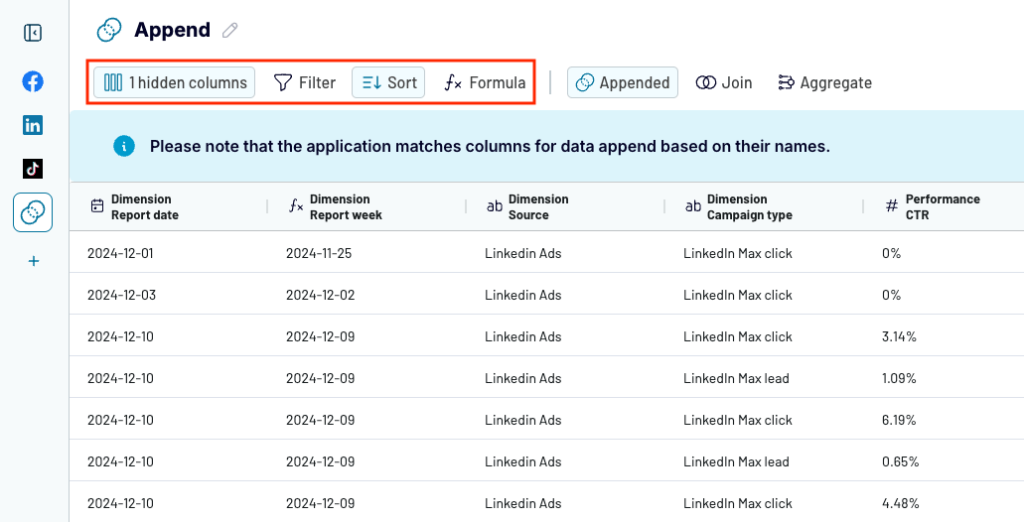
To make adjustments to your data, such as sorting or renaming columns, you can always edit your data flow in the Coupler.io interface.
If you need to connect more data sources or customize the dashboard in other ways, you can use Coupler.io to automatically load data from over 60 apps to Google Sheets. This gives you full control to tailor your dashboard exactly to your needs.
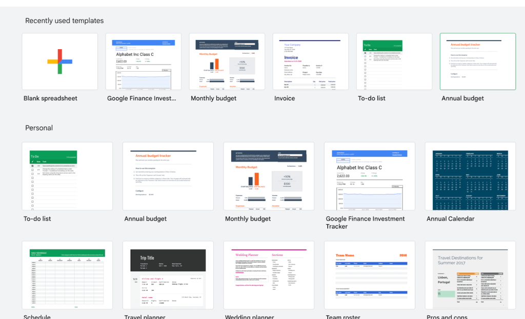
Google’s built-in Template Gallery
The template gallery offers a variety of pre-designed templates that cater to different needs. Whether you’re managing a personal budget or overseeing a project, there’s likely a template that fits your requirements.
- Open Google Sheets in your browser and click on the Template Gallery button in the top right corner.
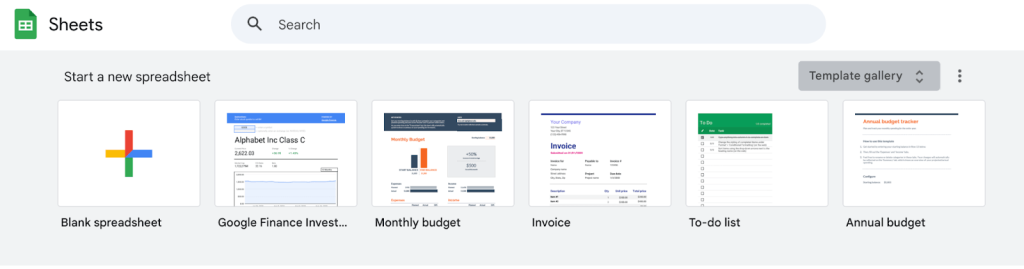
- Browse through the available templates designed for personal, work, project management, and educational purposes.
Once you’ve selected a template, you can customize it by editing the data, charts, and layout to fit your specific needs.
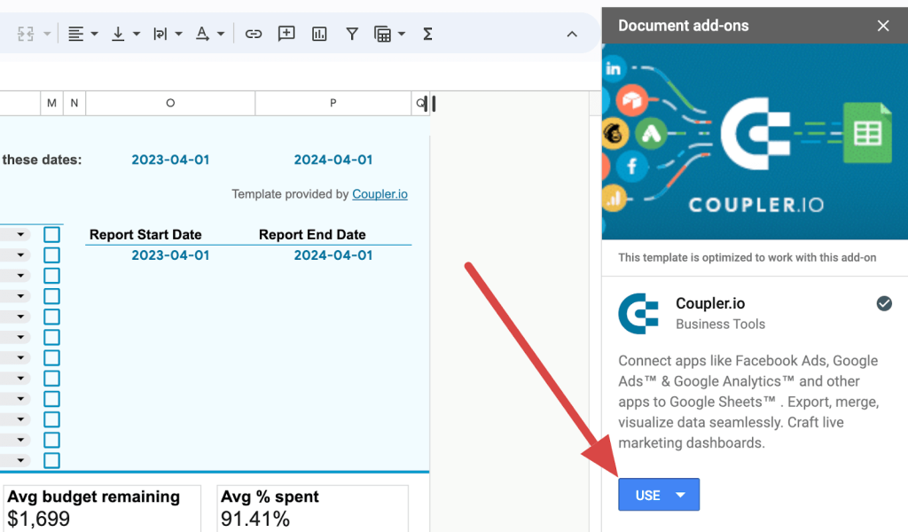
Using add-ons
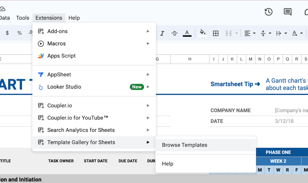
Another option to access free templates is by using the Vertex42 add-on. To do this:
- Open an existing Google Sheet or create a new one by typing sheets.new in your browser.
- Navigate to Extensions > Add-ons > Get add-ons from the top menu.
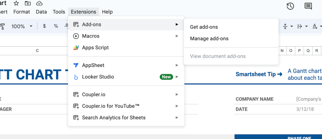
- Search for the add-on you need in the add-ons store – for example, Vertex42. Install it and access the templates by going to Extensions > Template Gallery for Sheets > Browse Templates.
Enhance your analytics with Google Sheets dashboards
Templates provide a quick way to start tracking and evaluating important metrics for your business. We’ve compiled 14 free Google Sheets dashboard templates that you can use immediately, each designed to address various business requirements.
The Google spreadsheet templates from Coupler.io are fully automated, allowing you to easily load data on your preferred schedule. For other templates, you’ll need to import your raw data manually as a CSV or Excel file into Google Sheets. For some data sources, you can also use Coupler.io with other templates to load your data to Google Sheets automatically.
Once your dashboard is set up, you can easily share it with stakeholders via Google Drive, allowing them to view and collaborate in real time directly from your workspace.

Automate reporting with Coupler.io
Get started for free