Power BI Financial Reporting – The Complete Guide for Beginners

Financial reporting provides insights into an organization’s financial condition, which is essential for decision-making.
In the early stages of your business, tools like Excel may suffice for preparing simple reports from statements. However, as your business grows, it encounters mounting challenges as data volumes increase and reporting needs become more complex.
Power BI for financial reporting solves the challenges and complexities associated with growing data sources. In this guide, we will showcase the platform’s capabilities and provide examples for financial reporting.
What’s wrong with financial reports in spreadsheets?
Generally, businesses use spreadsheets to analyze their bookkeeping data. While this method is easy, it is not suitable for growing businesses with regular financial reporting needs; here’s why:
- Time-consuming – You may need to import all the data sources individually into spreadsheets, merge them, and use formulas to get insights. This could be time-consuming when you have a lot of data from various sources and formats.
- Prone to human errors – If you accidentally miss a column, row, or even a table from your calculation, the report may produce misleading insights.
- Static reporting – Reports quickly become outdated as new financial data emerges. Therefore, you must re-import the data sources whenever you want fresh insights.
- Not scalable – Since Excel reports heavily rely on local storage, you may experience performance issues while working with large datasets.
- Poor access management – Excel does not offer granular-level user access configuration. For example, you can not choose which users can view/edit reports or edit data sources. The access levels are spreadsheet-specific.
You can use Power BI for financial reporting and financial data analytics to overcome all these challenges.
Why should you consider Power BI for financial reporting?
Microsoft Power BI is a robust data reporting and visualization tool used by enterprise-level organizations worldwide. Its Excel-like interface makes it easy for users to adapt, but it’s more focused on reports and data visualization.
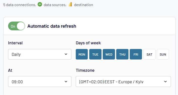
The Power BI platform can connect to various data sources (like files, databases, and cloud services) and create reports using real-time data. You only need to connect to data sources the first time you build a report. After that, you can set up automatic data refreshes and deploy the report on the cloud to obtain real-time insights.
The platform is available in two editions:
- Power BI Desktop: This version is for Windows OS and allows users to connect to data sources and build reports using visuals. It’s free, but you’ll need the pro plan ($10/mo per user) to share and publish the reports on the cloud.
- Power BI Service: This cloud version of the platform enables users to publish, view, and edit reports. It facilitates collaboration with team members on reports, datasets, and data sources.
- Power BI Premium: A paid subscription, starting at $10/mo, which offers enhanced features and reporting capabilities. It’s required to publish and share reports in Power BI Service.
Key components of Power BI for financial reporting
Before we get started with the platform, it’s important to understand its core components and how they work together for reporting.
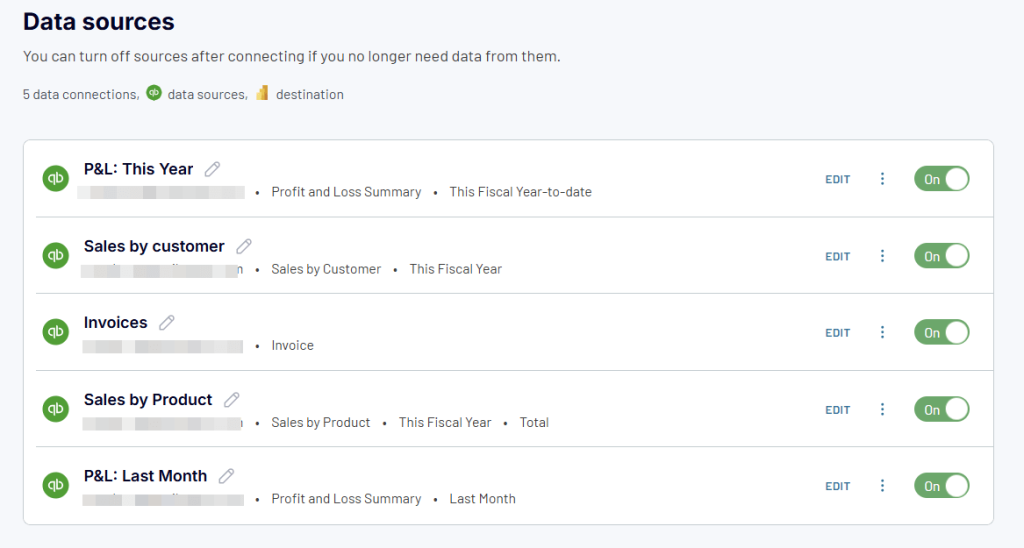
- Data source – Your financial data may come from various sources, like ERP systems, bookkeeping software (QuickBooks, Xero, etc.), databases, or financial system APIs.
- Data connector – The Power BI platform provides native integrations with financial systems like SAP, QuickBooks, Xero, and Dynamics 365 Finance. You can connect to a data source to access data without importing it manually. The data connections also support automatic data refreshes for real-time financial reporting in Power BI.
- DAX (Data analysis expressions) – This is a formula language in Power BI that is useful for calculating custom financial metrics, aggregations, and calculations. You can use the DAX formulas to create custom KPIs for financial reports.
- Data model – In Power BI, you can create models to define relationships between the tables and link your financial data for analysis. For example, you can link transactions to accounts, accounts to departments, etc. This model can then be used to prepare a financial report.
- Visuals – Power BI offers visualizations that convert financial data into charts, tables, matrices, etc., making it easy to interpret. Common visuals include:
- Profit & Loss Statements (Table/Matrix format)
- Balance Sheets (Hierarchical financial reports)
- Cash Flow Statements (Waterfall charts)
- Revenue & Expense Trends (Line charts)
- Variance Analysis (Stacked bar charts for Actual vs. Budget vs. Forecast)
- KPI Cards (Net Income, Operating Cash Flow, Revenue Growth %)
- Report – You can build a multi-page report containing visuals to monitor key financial data. You can filter and drill down the reports for further analysis. For example, an executive financial summary report displays charts and data bars for revenue, costs, profits, etc.
- Dashboard – This is a single-page summary of financial metrics and visuals important to your business, which helps monitor financial health in real time and make informed decisions. You can use visuals from your existing Power BI reports to build dashboards.
These components help you build and automate Power BI financial reporting. For example, you can connect your SAP or accounting software to the platform and schedule data refreshes to build a live report.
How to use Power BI for financial reporting?
Generally, financial reports are built from multiple data sources like accounting tools, statements, and flat files. You can pull this data into Power BI, establish relationships between them to create a data model, and then use it to generate interactive financial reports.
Let’s go through a step-by-step process for building a financial report in Power BI:
Step 1: Get data from sources
First, you need to load data from your financial data sources into the blank report.
The platform can connect to data sources like:
- Excel spreadsheets (financial statements, manual data entries, etc.)
- Accounting tools (QuickBooks, Xero, SAP, etc.)
- SQL databases of financial tools and services
- Custom integrations via APIs
Some of these sources support live connections that automatically update data, while others, like flat files, require manual imports.
To get started, click Get data on the top ribbon and select the data source of your choice. Then, follow the on-screen instructions to connect the data source.
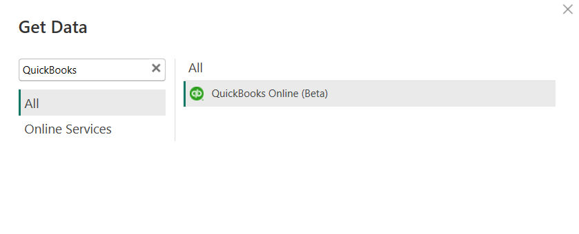
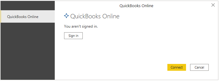
For example, to get data from QuickBooks to Power BI, log in using your QuickBooks Online account to set up the data source.
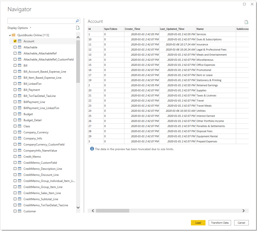
Once connected, Power BI will display the list of tables from QuickBooks. Select the table(s) you want to load into the report.
While Power BI offers native connections, you may encounter limitations with connection types, refresh rates, or support for other financial systems and data sources. For a more flexible approach, consider using Coupler.io, which provides dedicated Power BI connectors for popular financial systems like QuickBooks, Xero, Stripe, and many others. It has simplified authentication and more reliable data refresh schedules. This is particularly useful when dealing with complex financial data structures or when connecting to multiple financial systems simultaneously. The platform allows you to consolidate and pre-process your financial data before importing it into Power BI, making the reporting process more efficient.
Step 2: Clean & transform data
The imported data may not be ready for reporting. You can use Power Query to perform transformations like:
- Data cleaning (e.g., remove unwanted columns, invalid rows, etc.)
- Modify data formats (e.g., format datetime columns)
- Merge multiple data sources (e.g., combine multiple statements into one)
- Create calculated columns (e.g., create a financial metric like Net Profit and Operating Costs)
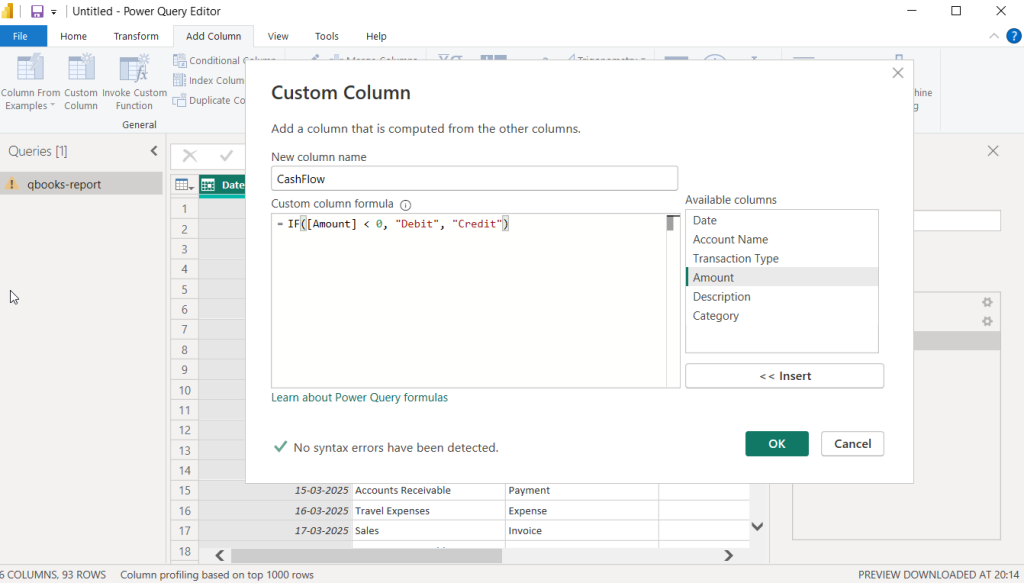
Click on the three dots beside the data source and select Edit query. This will open the Power Query editor, where you can perform data transformation steps.
For example, here, we added a new column to classify cash flow as debit or credit based on the amount column using this formula:
CashFlow = IF([Amount] < 0, “Debit”, “Credit”)
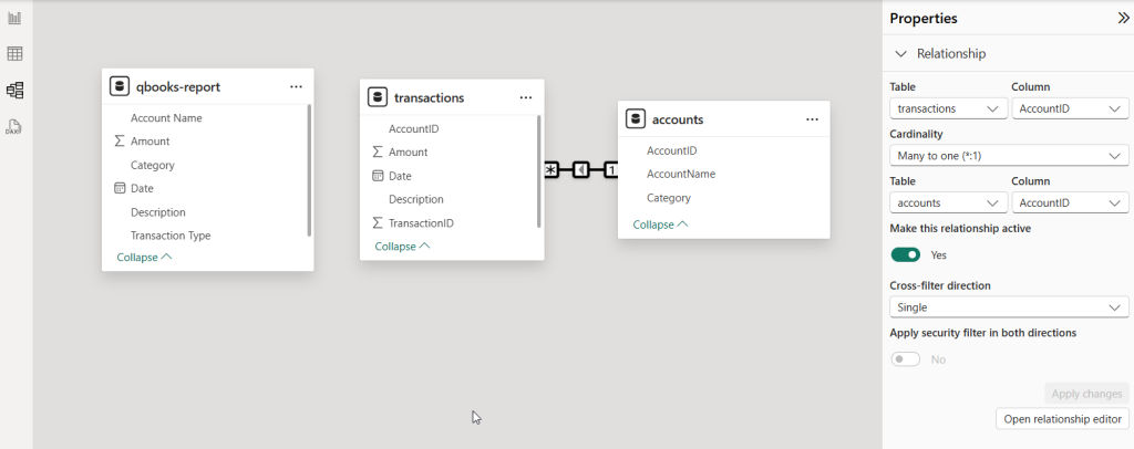
Step 3: Define relationships & create data models
Once the data is loaded, you can define the relationships between the tables and create a structure (known as a data model). This helps you analyze data from all the sources as a whole, avoid data duplications, and improve filtering.
For example, you have a transactions table and an accounts table with a common column for accountID. Using this column, you can define a relationship between these tables and create a Power BI data model.
In the left pane, click on the Model view tab to see the available tables in the report. Then, select the tables to define relationships in the data model.
Step 4: Calculate financial measures & KPIs
Once the data model is prepared, you can calculate key financial metrics and KPIs from the data. Power BI supports DAX formulas to calculate metrics (known as measures) that update based on filters and user interactions.
For example, you can use certain columns from the data model to calculate total revenue, expenses, and profits.
To create a new measure in Power BI, select a table in the Data pane on the right and click New measure on the top ribbon menu.
Enter a DAX formula for the measure, for example.:
Net Profit = SUM(transactions[Amount])
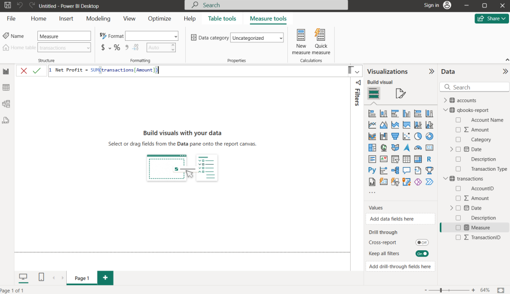
This will add a new metric to the data model, which you can use in reports to display KPIs.
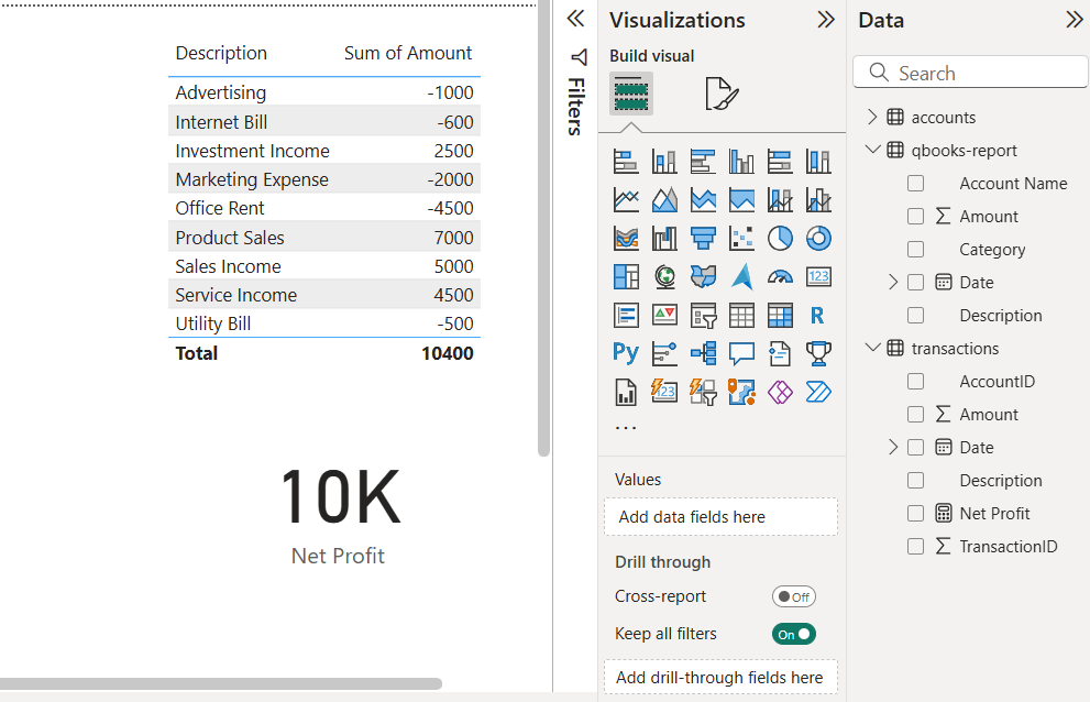
Step 5: Visualize data in the report
Once the data model and calculated metrics are ready, use the visualizations to convert them into charts, data cards, and graphs.
Power BI offers a variety of visuals useful for financial reports, such as:
- Tables & Matrices – Income Statements, Balance Sheets, Cash Flow Reports
- Column & Bar Charts – Compare revenue and expense trends
- Line Charts – Profit and revenue trends over time
- KPI Cards – Net Profit, Gross Margin, Revenue Growth
- Waterfall Charts – Changes in revenue and expenses
Open the Visualizations pane on the right and select a visual from the available options.
Then, add the data fields you want to visualize in the report.
For example, here, we have used a table visual to summarize income and expenses. We have also used card visual to monitor the net profit value.
You can also modify the appearance of the visual by applying styles — you can change font sizes, text colors, header colors, etc. It’s a recommended practice to stick to a consistent color scheme for visuals across the report.
For financial reports, you can apply conditional formatting to style elements as per data values, for example, red/green for negative/positive.
Power BI Desktop reports are created and stored locally on your computer. To make them accessible to others, you need to publish them to your Power BI Service workspace.
First, go to File > Save to save the report as a PBIX file locally.
Go to File > Publish and click Publish to Power BI.
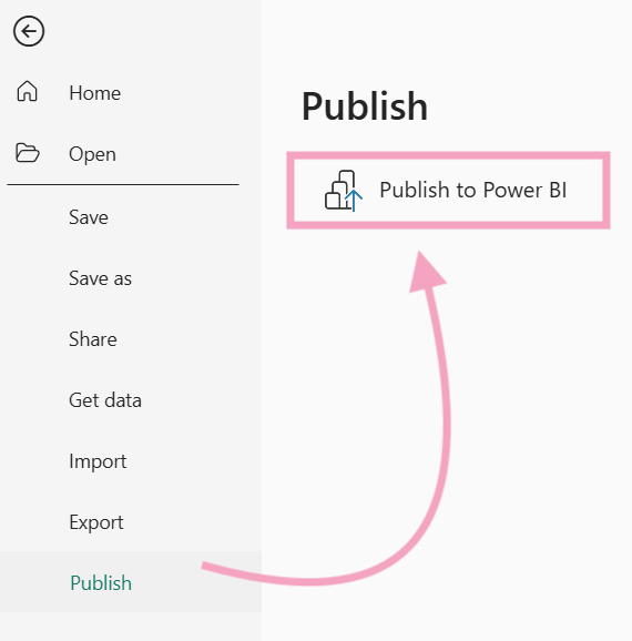
Log into your Microsoft account (work) and select the workspace to publish the report. Then, you can log into the Power BI Service account and share the report with others via email.
Automate financial reporting in Power BI with Coupler.io
Power BI supports a limited number of data sources. If a connector isn’t available, you’ll need to write custom queries or find workarounds. Further, performing transformations requires a good knowledge of Power Query, which can be complex and time-consuming.
Therefore, many business users seek better, more manageable alternatives to the native connectors.
Coupler.io is a reporting automation platform that connects over 60 apps to Power BI and other destinations. You can use its no-code interface to extract data from financial apps and other sources, organize it into the form of a report, and load it into Power BI. The tool also supports automatic data refreshes to keep your Power BI report updated.
To automate financial reporting with Coupler.io, simply follow these three easy steps:
- Step 1: Connect the source app and extract data (e.g., QuickBooks, Xero, etc.)
- Step 2: Organize your data into a report using the supported transformations (e.g., apply filters, sort data, blend datasets, etc.)
- Step 3: Load data into Power BI for further visualization using charts, tables, and other available elements. Enable automatic data refresh to schedule the auto-update of your Power BI reports.
In addition to data flow automation, Coupler.io provides a library for predesigned dashboard templates. You can find useful QuickBooks and Xero report templates for financial analytics, as well as reporting solutions for marketing, sales, ecommerce, etc.
Alternative option: Use Power BI financial reporting templates
Creating Power BI reports from scratch is a time-consuming task — you have to connect all your data sources, create visualizations, design a layout, and more. It could take a few days for you to create a financial report manually.
A quicker and easier option is to utilize ready-made templates of financial dashboards for Power BI. They display the important insights from your financial data without creating the visuals from scratch.
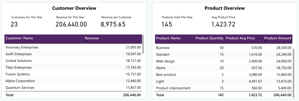
1. QuickBooks revenue dashboard in Power BI by Coupler.io [Free template]
This ready-made dashboard from Coupler.io transforms your QuickBooks data into real-time business intelligence within minutes. It is helpful for business owners to keep track of important financial metrics.
The income overview displays a 12-month trend of paid, overdue, and open invoices, allowing you to analyze income trends over time. Additionally, the P&L overview section displays your income against expenses to help you stay organized and plan your budget effectively.
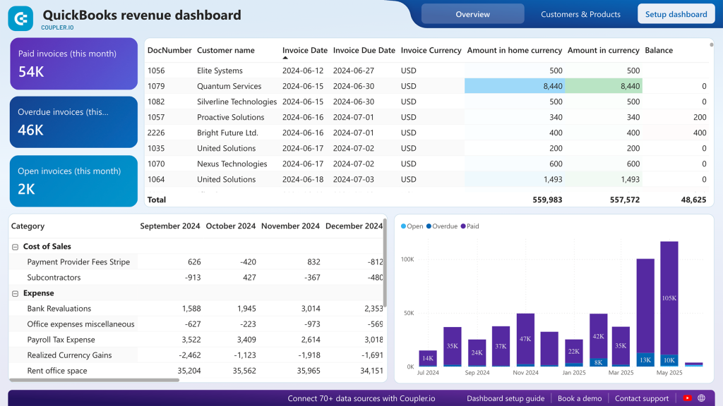
The dashboard also features a customer overview, enabling you to identify the top clients by revenue. This data can be useful for customer segmentation or targeted marketing. You can also find the number of customers for the current year with revenue figures to see if your marketing efforts are paying off.
In the product overview, you can find a list of top products, where you can identify the ones that generate most of the revenue and make data-driven decisions for marketing.
This Power BI report template is automated by Coupler.io, which means it updates on its own. It can be set up in a few minutes – you need to create a Coupler.io account and connect your QuickBooks account to it. You can open the template and follow the instructions in the Readme tab.
Learn more about other available QuickBooks report templates.
2. Modern finance dashboard template by Metricalist
This dashboard template helps you stay on top of finances by showing metrics important to your business. You can track revenue, gross profit, net profit, and other important metrics. It also displays a trend-line chart to track profits over time so that you can analyze the finances over time.
Furthermore, the template offers options to filter the report for a specific entity, financial year, and month. It also tracks the assets and liabilities of the organization, making it a perfect choice for tracking financial health.
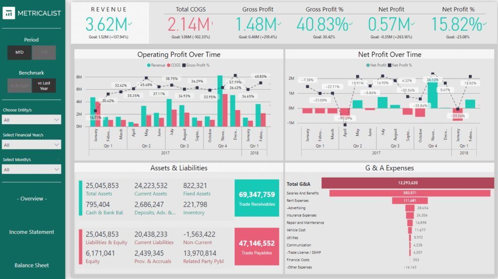
The report template is available on the Metricalist store. You’ll get a PBIX file, which you can open in Power BI and use with your data.
3. Finance dashboard template by Global Data 365
This premium dashboard template offers a comprehensive view of your organization’s finances through interactive Power BI visuals. The first page provides insights into the overall financial health, covering figures like revenue, COGS, profit, and expenses.
The report includes trend charts and bar charts to see how the business is performing over time. On the other pages, you get the financial analysis for the previous year, actual vs. budget analysis, income statement, and balance sheet.
It’s a perfect Power BI dashboard for finance teams and CFOs looking for an all-inclusive report.
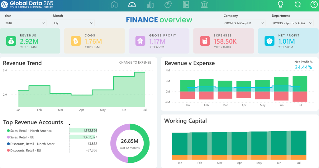
To learn more about how to use it, you can contact the creator.
4. Profit & loss statement analysis template
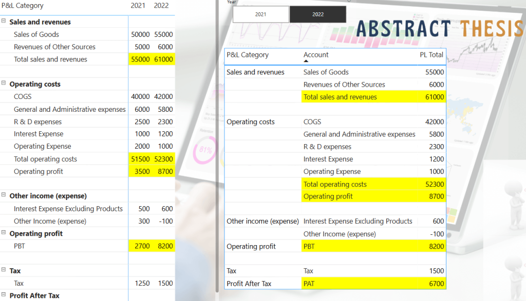
P&L statements are common in accounting for understanding the overall financial condition of a company. You can create a similar statement in Power BI using a matrix visual that categorizes transactions and calculates the overall profit and loss.
5. Income statement
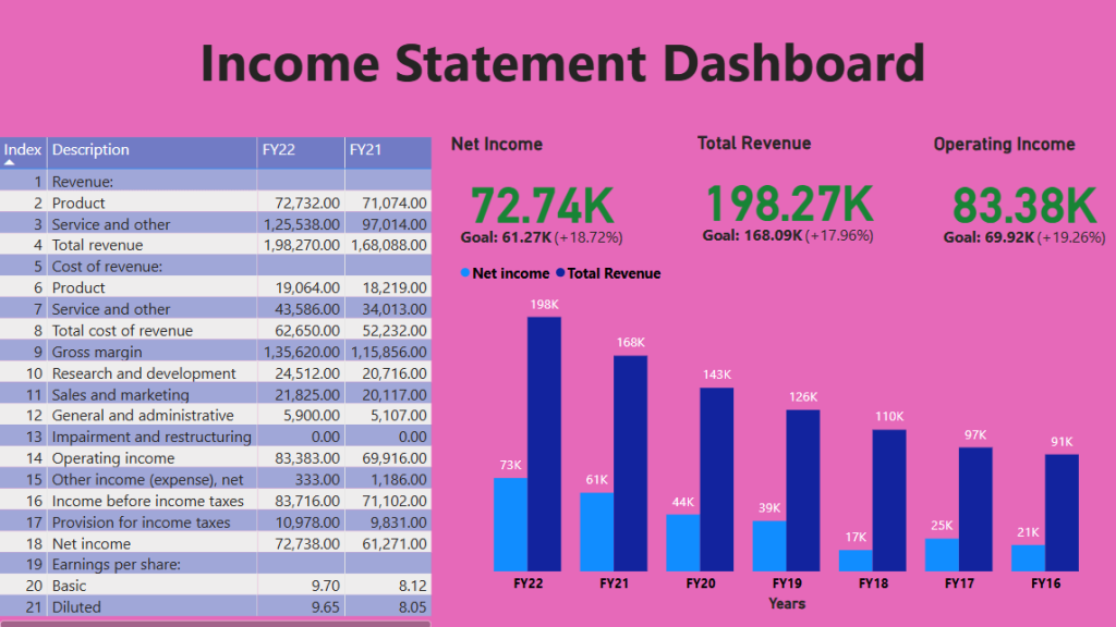
In Power BI, you can load year-wise income statements and use a matrix visual to generate a year-wise income report. You can also display the income and revenue figures using cards.
Explore other income statement dashboard examples.
6. Personal finance analysis
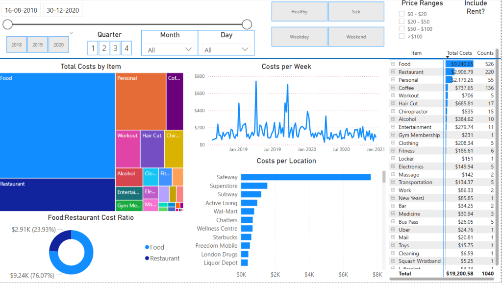
To learn Power BI financial reporting, you can create a report analyzing your personal spending as shown above. You can create a category-wise breakdown of spending and use line charts to analyze spending.
Common financial report types in Power BI
Power BI is a versatile BI tool suitable for nearly all types of financial reports. Based on your reporting needs, you can use its visual elements and other features to create interactive reports.
Here are some common types of financial reports you can create:
1. Executive financial dashboard
You can create a financial dashboard in Power BI that includes key financial metrics for executives to monitor using these components:
- Top-line revenue and profit data cards
- YTD performance against budget
- Cash position and liquidity metrics
- Key financial ratios
- Forecast vs. actual trending
2. Financial statement reporting
Import balance sheets and transaction records into Power BI and create dynamic income statements. Use data modeling to consolidate data and visualize the statements using a single matrix.
For example, you can create a balance sheet in Power BI with:
- Asset and liability account hierarchies
- Point-in-time filtering (not period sums)
- Balanced validation checks
- Comparative period displays
3. Budget vs. actual analysis
You can import financial budget and actual spend data from Excel spreadsheets, databases, or other sources, and perform comparative analysis.
The report can:
- Compare actual performance to budget
- Calculate absolute and percentage variances
- Include commentary capabilities
- Project year-end results based on actuals to date
This can help you analyze variance points and plan spending accordingly.
4. Cash flow forecasting & analysis
In Power BI, use historical transaction data to forecast future cashflows for budget planning. You can utilize the Quick Insights feature on your data model to analyze transactions and obtain predictions.
Using the forecasted data, you can visualize:
- Historical cash flow patterns
- Projected inflows and outflows
- Cash conversion cycle metrics
- Working capital analysis
Best Practices to follow while using Power BI for financial reporting
By now, you might have a basic understanding of Power BI fundamentals. Here are some best practices to follow as you progress further:
Financial dashboard design principles
The Power BI reports, and dashboard should be visually interpreted for users to read. Here are some ways you can make them better:
- Maintain a consistent layout and style for visuals across the report
- Use simple and easy-to-understand headings and labels for the elements
- Use specific colors to highlight areas and metrics that need attention, e.g., green/red for positive/negative metrics
- Place the essential metrics and visuals first in a multi-page report
- Start the report with key metrics and allow drill-down options for detailed analysis
- Choose the appropriate sizes and dimensions for visuals; e.g., make important visuals larger
- Ensure the report layout is easily accessible on devices with smaller screens, like phones or tablets
Performance optimization for large datasets
When working with very large datasets or complex data transforms, you may encounter performance issues with Power BI reports.
Here are some strategies to efficiently optimize the performance:
- Use incremental refreshes in Power BI to refresh only new or modified records in the dataset
- Choose import mode for datasets that are static and do not require frequent data updates
- Limit the number of visuals on a page; too many visuals can slow down reporting performance
- Avoid using complex DAX calculations in Power BI on large datasets. Instead, you can transform the data outside the platform and then load it.
- Do not import unnecessary columns or tables from the dataset
For organizations dealing with large financial datasets from multiple sources, consider using Coupler.io to pre-process and transform your data before it reaches Power BI. By handling heavy transformations externally, you can significantly improve report loading times and overall performance while maintaining a single source of truth for your financial reporting.
Documentation & knowledge transfer
If you’re working on a team project, it’s a good idea to document the process, data sources, and reporting logic for effective development and maintenance.
- Prepare a list of data sources with their types and refresh schedules
- Create a business glossary to maintain financial terminology
- Define naming and labeling conventions to maintain consistency
- Build a custom metrics library with calculated metrics (using DAX) to use in the reports
Common problems with financial reporting in Power BI
Getting started with Power BI is easy — connect the data source and add visuals to create a report. However, as you start using Power BI for financial reporting for your business, you may experience a few common issues.
Data refresh failures
If you notice that Power BI reports are not updating or blank, it could indicate a data refresh error. There could be multiple reasons the automatic data refreshes may not work, especially in the cloud. It could be a misconfigured data gateway, expiry of credentials, or network issues.
Here are some troubleshooting steps:
- Ensure that the on-premise data gateway is configured correctly
- Check for any network issues on the data source server
- Try manually refreshing the data source and check for any errors
Handling fiscal year vs. calendar year
Financial reporting often follows fiscal years that don’t align with calendar years. You can use a custom DAX formula to derive a new column for the fiscal year.
For example:
Fiscal Year =
YEAR(DATE(YEAR([Date]), MONTH([Date]) + (MONTH([Date]) < [Fiscal Year Start Month] ? 12 : 0), DAY([Date])))
You can also create date tables with fiscal years, quarters, and months and use them to filter your financial data.
Implementing account hierarchies
Financial accounts follow hierarchical structures like:
- Parent-child hierarchies, e.g., Product Sales (Child) ? Revenue (Parent)
- Custom financial hierarchies e.g., Salaries ? Operating Expenses ? Expenses
You can use DAX formulas to aggregate data at all levels, such as:
SUMMARIZECOLUMNS(
    ROLLUP(Accounts[Account], Accounts[Parent Account]),
    "Total Amount", SUM(Transactions[Amount])
)
The above formula calculates the sum of child accounts for each parent account. For example, Revenue = Product Sales + Service Sales.
Handling account sign conventions
The financial data uses + and – sign conventions for assets (debit balance) and liabilities (credit balance).
You can create a custom measure to handle this automatically:
Signed Amount =
IF(
    Accounts[Type] IN ("Asset", "Expense"),
    SUM(Transactions[Amount]),
    -SUM(Transactions[Amount])
)
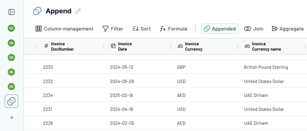
Handling multi-currency data
If you have data in multiple currencies or want to create a multi-currency report, note that there is no in-built currency conversion feature. Furthermore, the currency exchange rates change every day, you can not use a static rate in the dataset.
To handle multi-currency data:
- Create an exchange rate table from a third-party API that updates daily
- Use the DAX function
LOOKUPVALUEto dynamically apply exchange rates
Amount in Reporting Currency =
SUMX(
    Transactions,
    Transactions[Amount] *
    LOOKUPVALUE(
        ExchangeRates[Rate],
        ExchangeRates[CurrencyCode], Transactions[CurrencyCode],
        ExchangeRates[Date], Transactions[Date]
    )
)
- You can store past exchange rates in a dataset to avoid recalculations with the current rate
Merging data from multiple sources
Financial reports often load data from multiple sources, such as Excel sheets, ERP tools, bookkeeping platforms, and SQL databases. Each data source may have its own structure and format, making merging complicated.
For example, you may encounter mismatched column names (“dept” and “department”) and inconsistent data types (one data source may use integers for numbers, while the other may use strings).
To avoid such issues, use Power Query to rename columns and data types or apply DAX functions to convert data into a consistent format before merging.
While Power Query offers tools for merging data, the process can be complex and time-consuming, especially for non-technical users. Coupler.io simplifies this process with its intuitive interface, allowing you to blend data from multiple financial systems before importing it into Power BI. This approach ensures your data is properly formatted and ready for visualization, reducing the need for complex transformations within Power BI itself.
Performance issues (slow loading reports)
Extensive datasets, complex DAX calculations, and too many visuals can slow down Power BI financial reporting. Therefore, optimizing your reporting strategy is essential for better performance.
- Import only the required columns to avoid memory overload
- Avoid using complex DAX calculations, if possible
- Use import mode instead of DirectQuery mode whenever possible
- For large datasets, use a third-party warehouse to aggregate data before loading
Coupler.io can help you maximize reporting performance by handling data merging and transformation outside Power BI. You can use it to extract data from multiple sources, apply transformations, and merge them into a single data source.
The platform offers over 60 built-in integrations with popular apps, and you can easily integrate any third-party platform using REST APIs. It also automatically refreshes data to ensure that your reports remain up to date.

Automate financial reporting with Coupler.io
Get started for free