Trying to make sense of accounting reports can be frustrating. Even when all the relevant data is presented in a one-page sheet, it’s difficult to pinpoint what’s important and how it can help you make decisions today.
That’s why simplifying and automating the accounting reporting process is so important. But first, you need to understand what kind of information you’re working with and what it can tell you about your company’s financial health.
In this article, I cover the fundamentals of accounting reports and introduce alternatives for data visualization and analysis. I also recommend templates for accounting report automation and explain how to obtain financial insights on the go.
Types of accounting reports
While every business has different financial needs and obligations, there are several accounting reports that need to be prepared regularly. Let’s explore the six most common types in more detail.
Balance sheet
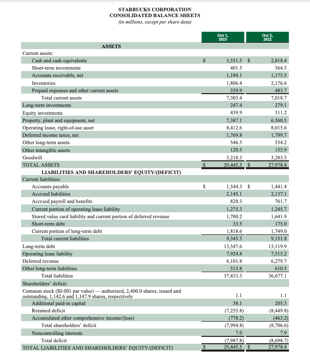
A balance sheet provides a quick overview of your company’s financial position. It helps evaluate the financial health of your business and understanding the factors hindering or driving success. For instance, it may show that your company is being held back by excessive liabilities such as high payroll costs or stubborn long-term debt. The accounting equation for a balance sheet is Assets = Liabilities + Shareholders’ Equity.
Typically, a balance sheet is prepared every quarter or at the end of the financial year. You may need to generate them more frequently (i.e. monthly) if you have doubts about the solvency of your business. Or you can use a dynamic balance sheet dashboard template by Coupler.io that will refresh automatically.
Here’s a snapshot of a balance sheet for Starbucks, showing the various assets and liabilities the company must account for:
Income statement
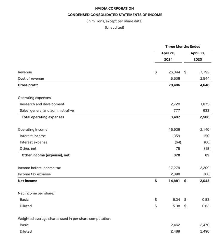
An income statement summarizes the revenues, expenses, gains, and losses accrued by your company over a specific reporting period. It breaks down your sources of revenue (e.g. product sales), types of expenses (e.g. cost of goods sold, salaries, utilities), and displays your net income at the bottom of the sheet. It can also include figures relating to pre-tax income or one-off sales.
An income statement is one of the most critical accounting reports because it tells you if – and how – your business is making money. It answers questions like: Are we currently spending beyond our means? Is our business profitable? Is our revenue growing?
Here’s an example of an income statement for Nvidia, comparing quarterly revenue from 2024 (when it famously skyrocketed) against the same period of 2023.
Check out free income statement dashboard templates.
Cash flow statement
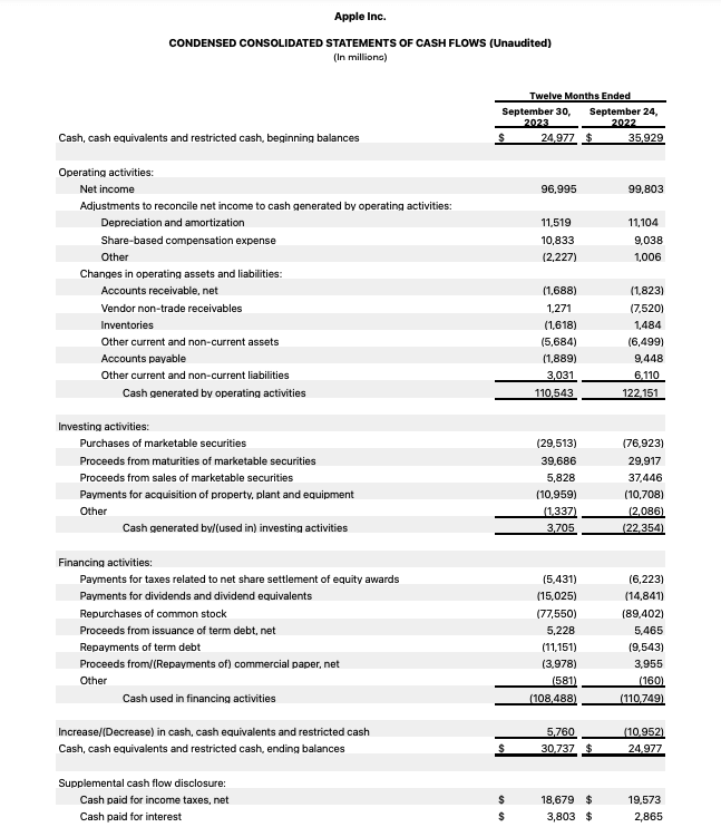
A cash flow statement, also known as a statement of cash flows, is a basic report demonstrating how money moves in and out of your business. It splits cash flow into three categories: operating activities, financing activities, and investing activities. At a glance, you can see changes in your working capital, expenditures, long-term debt, dividends, and more.
Cash flow statements provide granular insights into your business’s liquidity. It helps you understand exactly where your cash comes from and how sustainable those sources are.
Here’s an example of an annual cash flow report prepared by Apple Inc:
Use a free cash flow dashboard by Coupler.io to monitor your money coming in and out of your business.
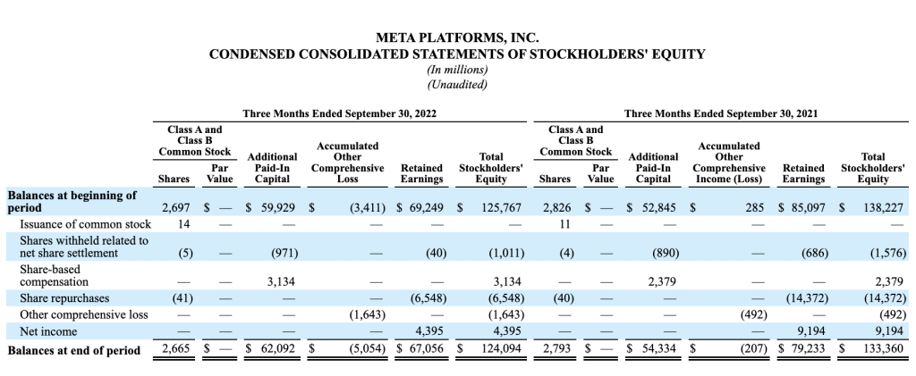
Statement of changes in equity
This report outlines the transactions between your company and its shareholders over a specific accounting period. It covers changes to aspects of equity such as share capital, proceeds from shares issued, dividends paid, and so on.
Statements of changes in equity are most commonly issued by public companies with a huge number of shareholders. However, small, private businesses with a few stakeholders (co-owners, lenders) also need to generate this report whenever new shares are issued or dividends are paid out.
Here’s an example of a detailed shareholder’s equity report by Meta:
Accounts receivable and accounts payable
Accounts receivable (AR) and accounts payable (AP) are not mandatory accounting reports, but they are very useful in day-to-day operations. Accounts receivable tracks the money owed to your business by other organizations (e.g. customers). Meanwhile, accounts payable tracks the money you owe to your creditors.
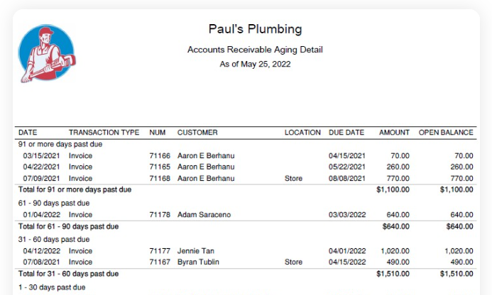
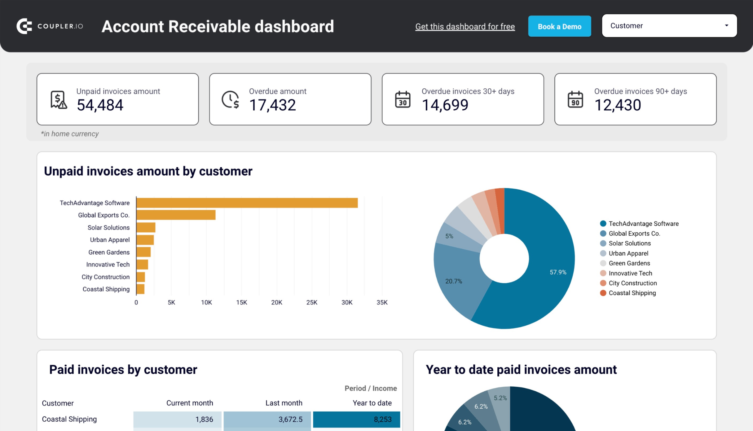
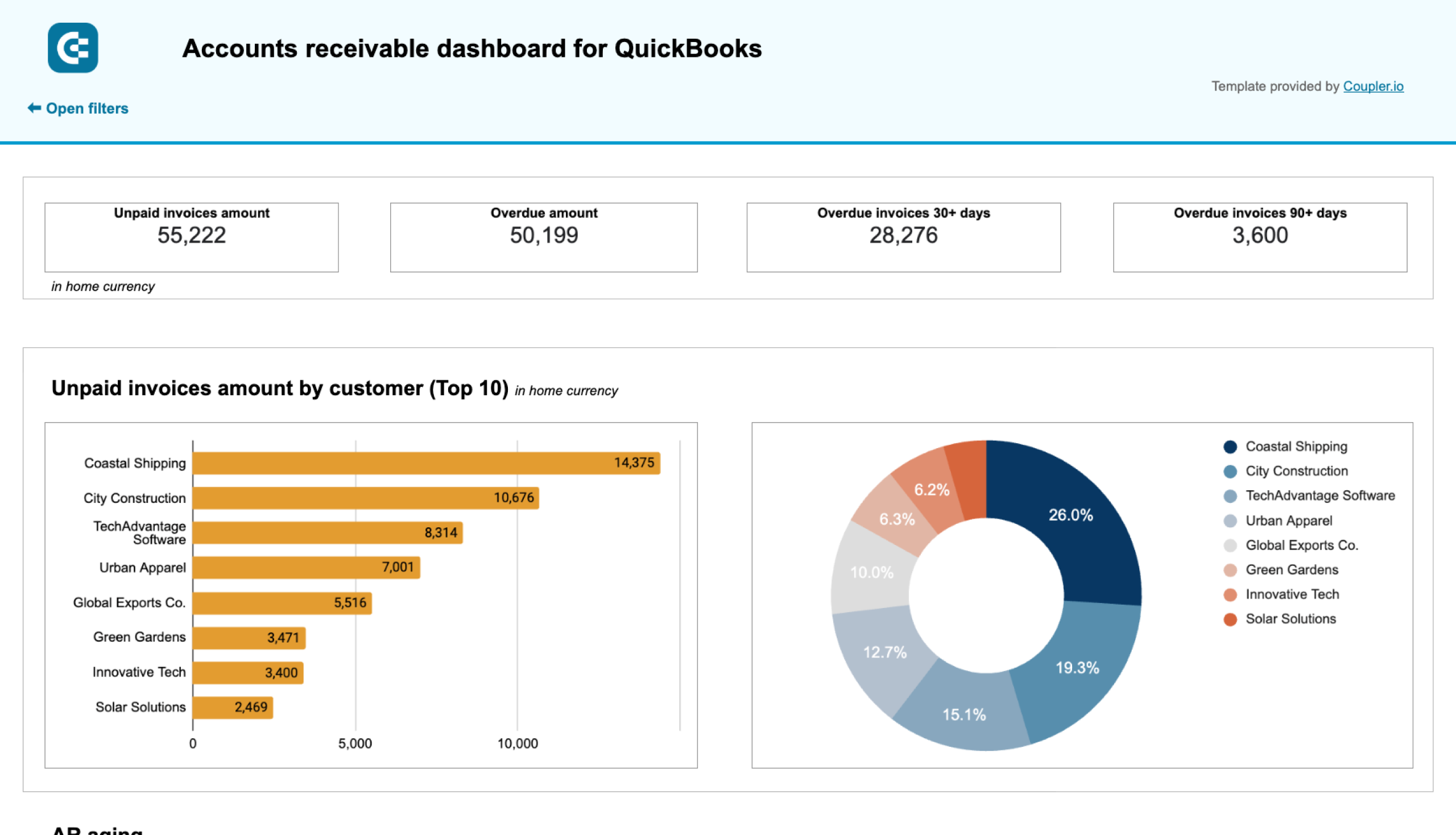
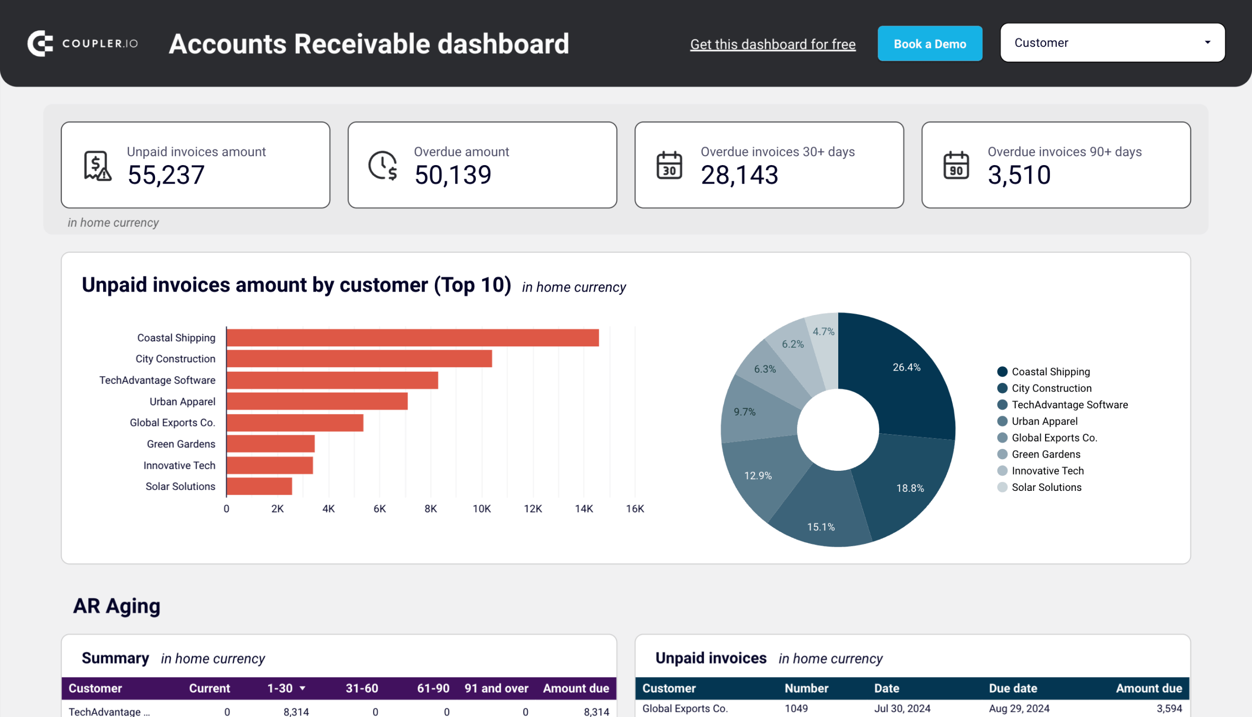
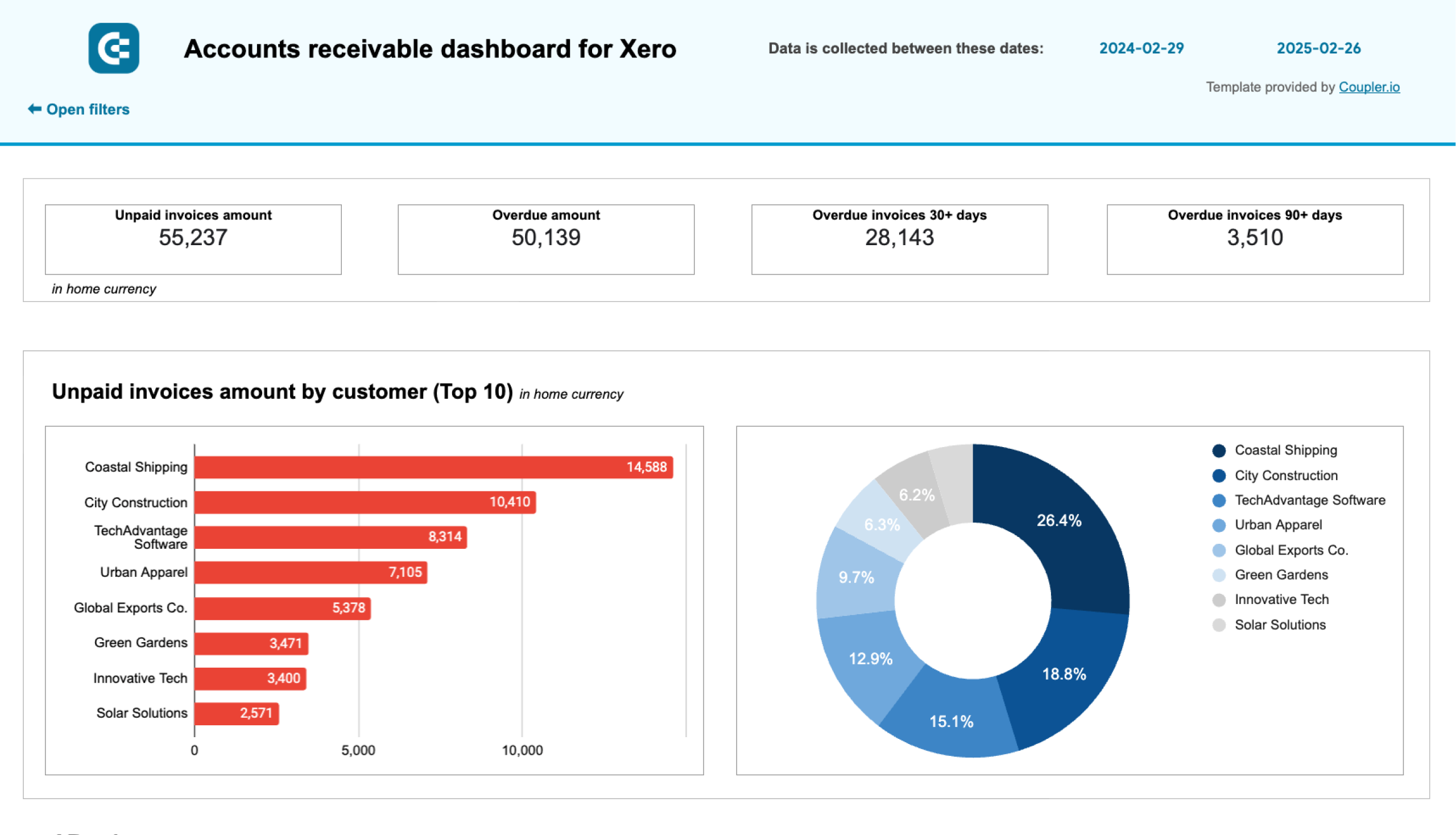
These reports provide insight into your business’s financial stability and help prevent cash gaps. By knowing exactly which client invoices are unpaid, you can follow up and collect (or with repeat late-paying customers, cut your losses and move on). Here’s how this financial information is presented in an AR report:
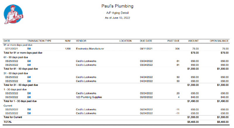
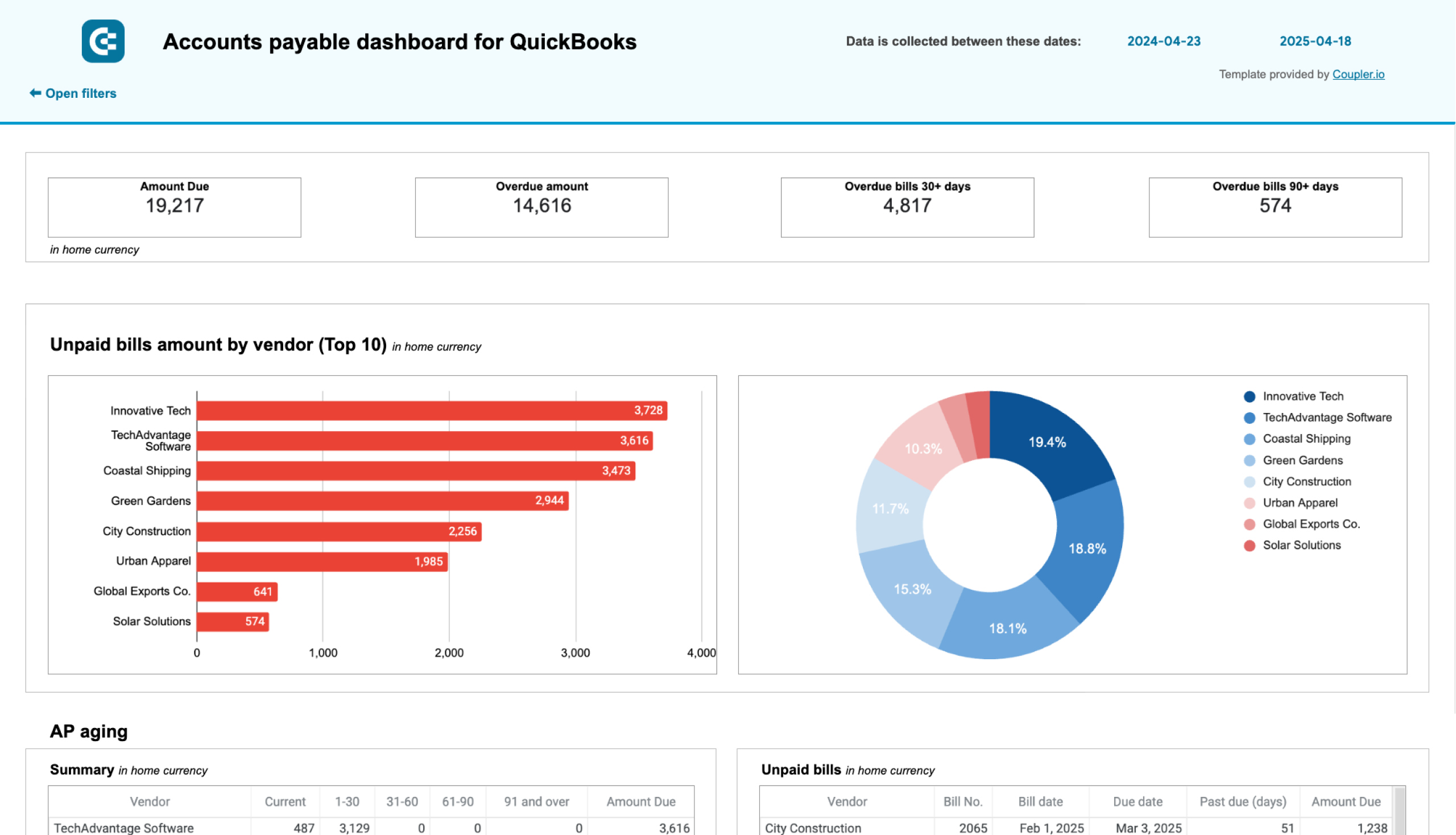
Likewise, when you understand the full extent of your debts and how they are classified, it becomes much easier to tackle them. For instance, an AP report can help you prioritize vendor payments when your business is low on cash. This is what a typical AP report looks like:
Notes to Financial Statements
Notes to financial statements are exactly what they sound like: written notes within an accounting report that provide additional details about the methods used and the numbers presented. They are usually prepared by your accountant. They appear as footnotes under your accounting reports or supplementary statements in an annual consolidated report.
In summary, notes to financial statements provide clarity and context about the numbers in your reports. They are crucial for helping you and your stakeholders, auditors, or governing bodies understand how your records are prepared and interpreted.
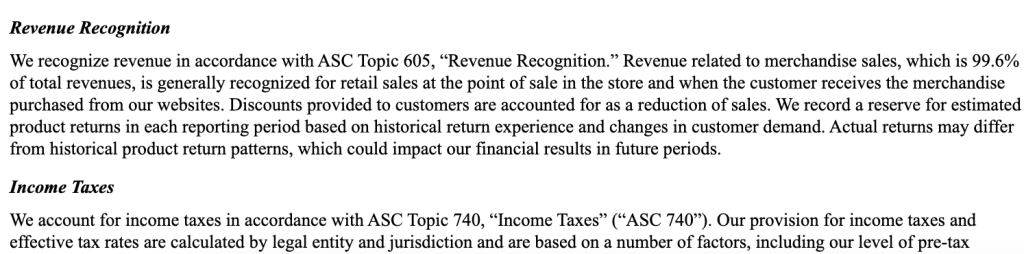
Here is an example of notes from an annual report filed by Toys R’ Us, where they explain the accounting policies adhered to in their report:
Free templates of accounting reports
Accounting reports aren’t known for being easy to read or nice to look at, but you can always use financial dashboards to simplify analysis.
Although these dashboards don’t necessarily replace the reports you generate in QuickBooks or other accounting software, they do offer a useful visual summary of your accounting data, making it easier to make financial decisions on the fly. Let’s explore each of the free dashboard templates:
Accounts receivable dashboard template for QuickBooks or Xero
First up is an accounts receivable dashboard that pulls data from your QuickBooks Online or Xero account. It’s a simple tool for managing unpaid invoices and offers a more visual representation of your AR reports with:
- Scorecards for a quick overview of money owed to you.
- Pie charts to identify your major debtors at a glance.
- Summary tables for assessing AR aging and customer invoices.
- Overview of your past 12 months paid vs unpaid invoices so you can identify payment trends and anticipate cash flow interruptions.
- Ability to filter by individual customer or analyze aggregated AR data.
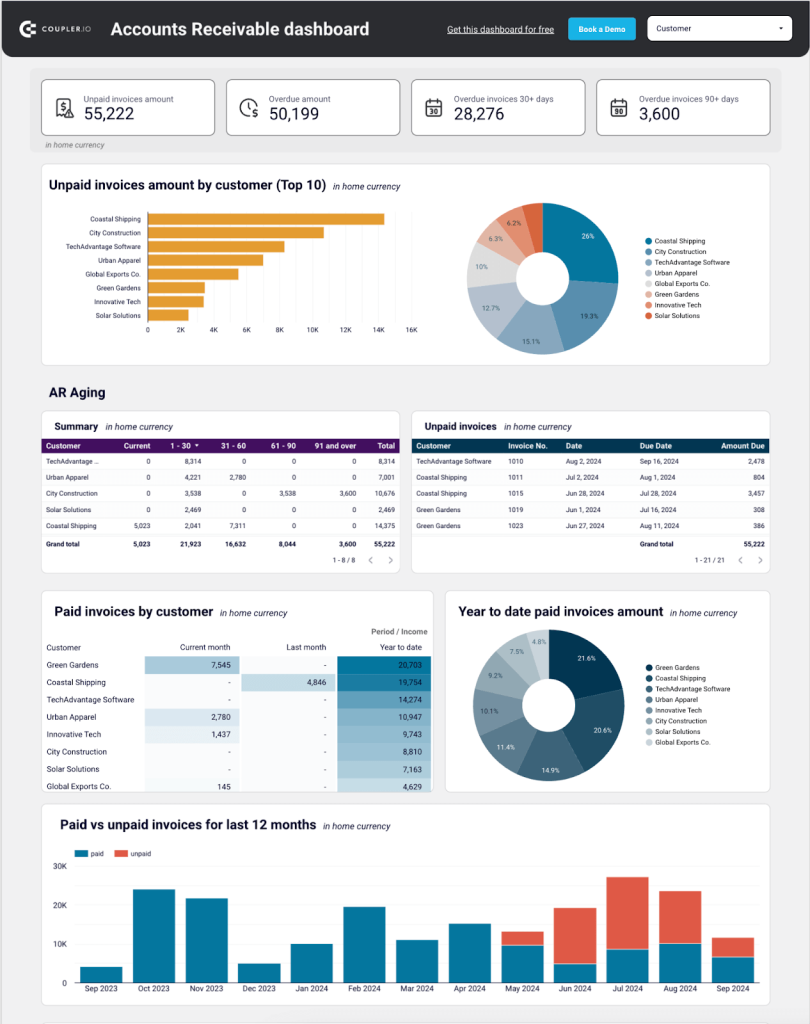
This dashboard is designed to assist you in prioritizing which customers to contact when collecting overdue invoices. It identifies your most reliable clients and provides you with an estimate of the expected future cash receipts. By examining the tables, you can quickly identify repeat offenders and make an informed decision about whether or not to keep working with them.
It only takes a few minutes to populate this Google Sheets or Looker Studio template with your own data. Sign up to Coupler.io for free and use the built-in connector to load AR data from your Xero/QuickBooks Online account.
Accounts receivable dashboard for QuickBooks in Looker Studio
See which customers accumulate unpaid and overdue invoices, analyze AR aging, and track changes over time. Get useful insights for maintaining financial health.


Accounts receivable dashboard for QuickBooks in Google Sheets
Monitor customer payment statuses, overdue invoices, and collection trends with this dashboard connected to QuickBooks. Get clear visibility into your cash flow cycle with aging analysis and customer payment patterns to improve financial forecasting.

Accounts receivable dashboard for Xero in Looker Studio
See which customers accumulate unpaid and overdue invoices, analyze AR aging, and track changes over time.

Accounts receivable dashboard for Xero in Google Sheets
Track outstanding customer payments, monitor aging receivables, and analyze the correlation between paid and unpaid invoices to improve cash flow management.
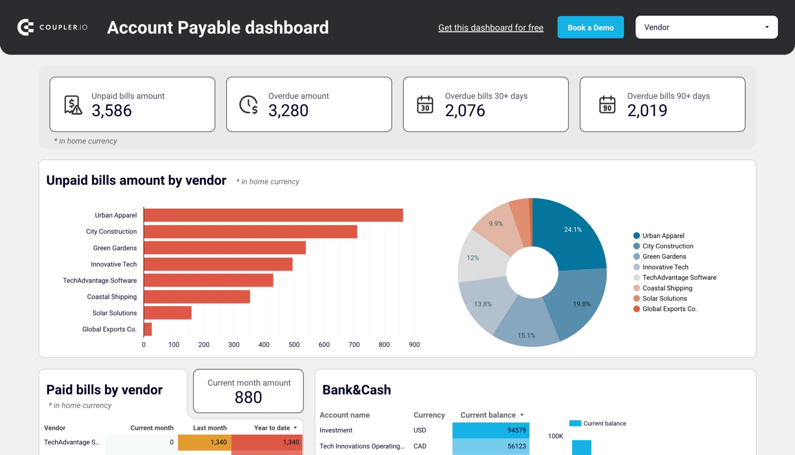
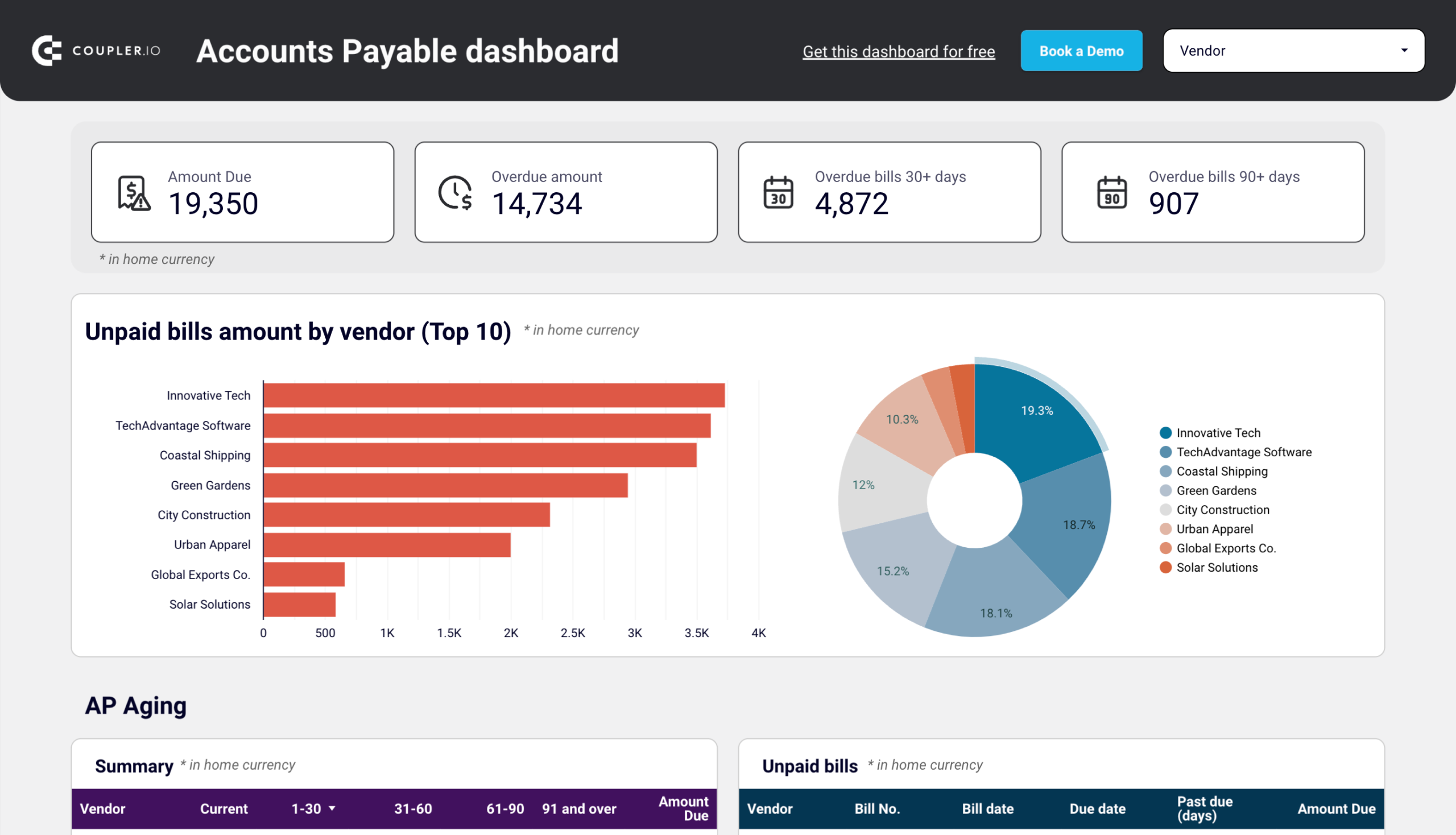
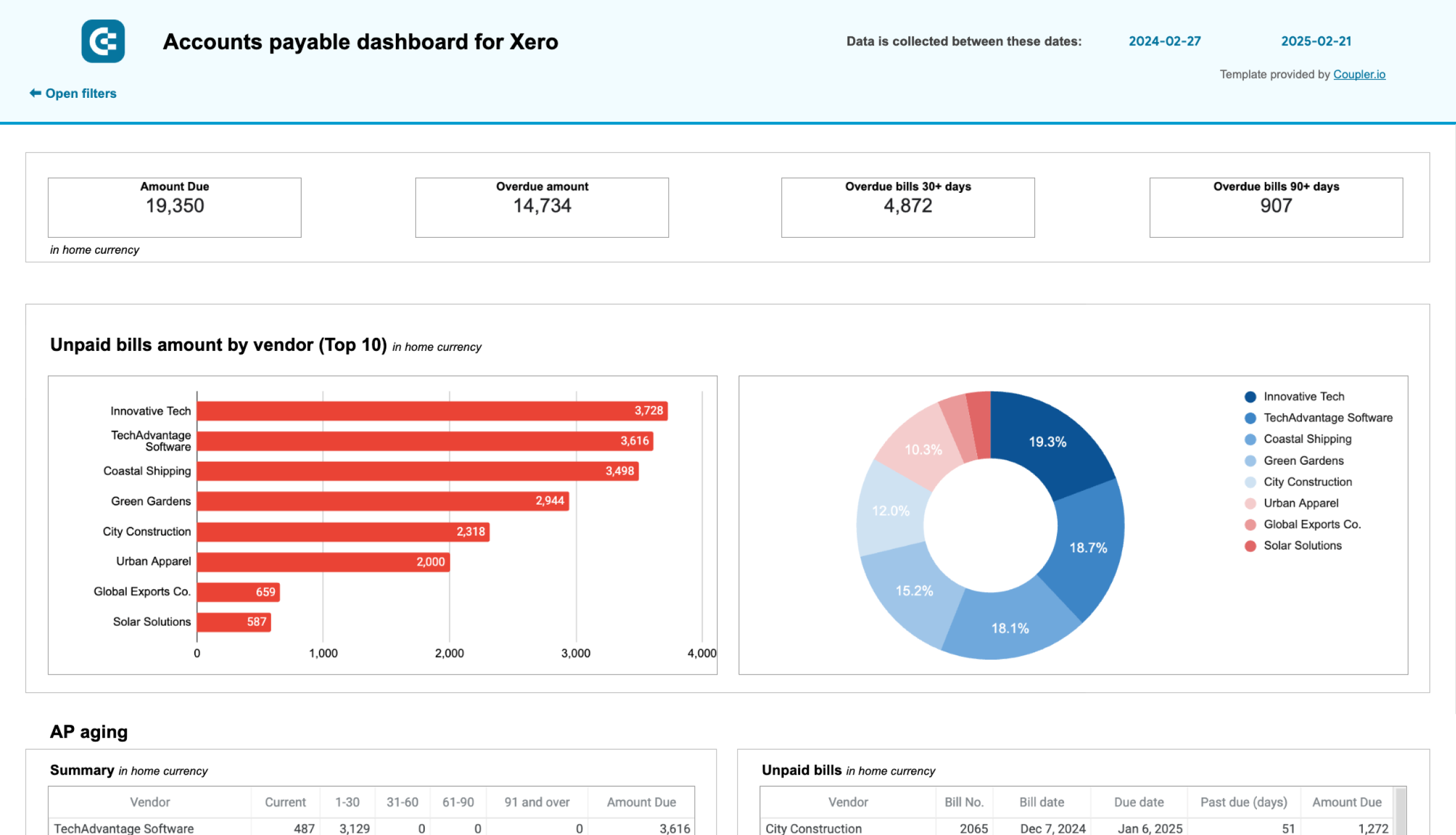
Accounts payable dashboard template for QuickBooks or Xero
This dashboard also connects to your QuickBooks Online or Xero account. It provides an overview of accounts payable so you can understand who your main creditors are and how much you owe them.
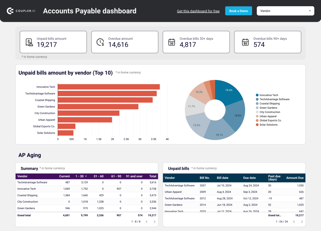
Much like in the AR template, the accounts payable dashboard provides:
- Scorecards showing totals of unpaid bill amounts, so you can determine if (and when) action should be taken.
- Bar charts and pie charts displaying the TOP 10 amounts due – handy for prioritizing payments.
- Tables to track which vendors you owe the most money to and what those bills are for.
- Ability to filter by vendor for a more detailed assessment of outstanding bills and payment history.
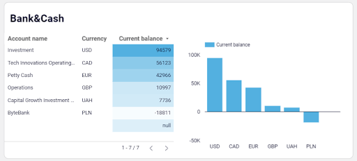
Additionally, there are two helpful charts for tracking your bank balance by account and currency. They show your available cash, helping you decide which vendors to pay first.
Coupler.io’s ready-made connector makes it easy to load data from your QuickBooks Online/Xero account into this Looker Studio or Google Sheets dashboard. Sign up for free and get started in just a few clicks:
Accounts payable dashboard for QuickBooks in Looker Studio
Get an overview of unpaid, overdue, and paid bills grouped by vendor. The dashboard helps you prioritize payments and improve cash flow management.
Accounts payable dashboard for QuickBooks in Google Sheets
Track outstanding vendor obligations, payment schedules, and expense patterns with data from QuickBooks. This dashboard helps you manage cash flow, identify payment priorities, and maintain healthy supplier relationships through visualized aging reports.
Accounts payable dashboard for Xero in Looker Studio
Track outstanding, overdue, and paid bills to optimize payment schedules, manage vendor relationships, and ensure smooth cash flow.
Accounts payable dashboard for Xero in Google Sheets
Monitor vendor payment deadlines, track aging bills, and analyze payment history to optimize cash flow management and maintain healthy supplier relationships.
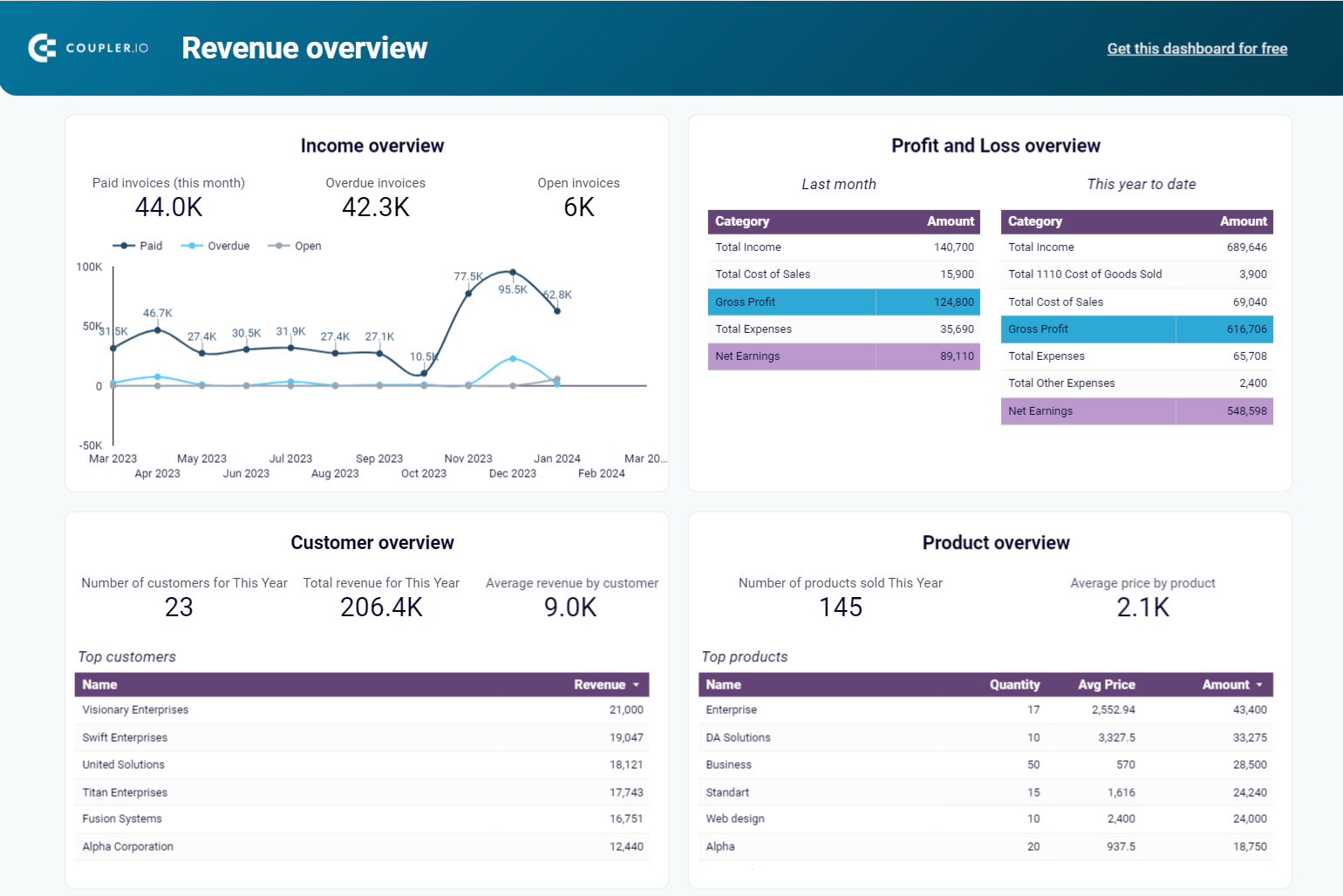
Revenue dashboard template for QuickBooks
Like the other templates, this revenue dashboard template integrates with your QuickBooks account to give you near real-time insights into your business’s financial performance. It consolidates data from your income and profit and loss statement sheets, giving you a bird’s eye view of your revenue streams and overall profitability. Explore other P&L dashboard examples by Coupler.io.
The report contains several charts and tables that allow you to track total revenue, monitor fluctuations in your P&L over time, and identify business growth trends. This information can assist you in day-to-day decision-making and ultimately save you money in the long run.
There is also a large table where you can filter paid invoices by date, customer, and status. This can help ensure timely cash flow and improve forecasting.
You can get this free QuickBooks dashboard natively in Coupler.io or as a template for Looker Studio, Google Sheets, or Power BI. Simply connect your QuickBooks Online data to the dashboard using Coupler.io, and schedule automatic updates as frequently as every 15 minutes!
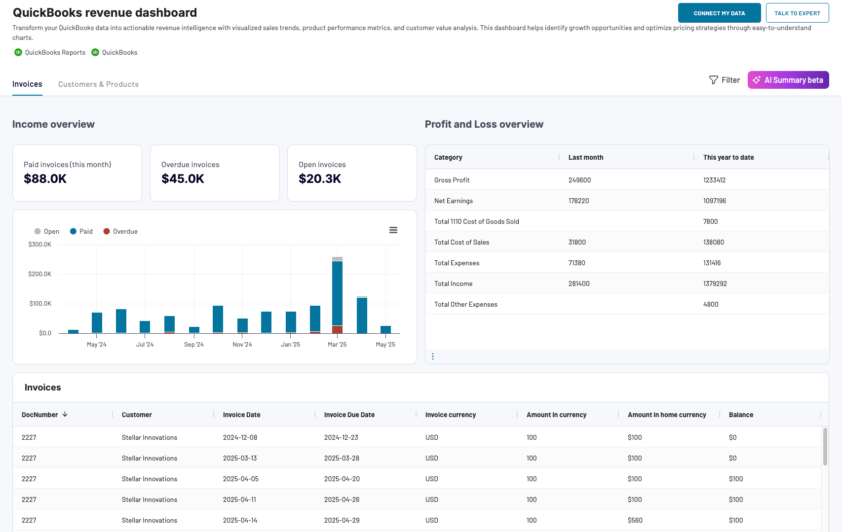
QuickBooks revenue dashboard
Transform your QuickBooks data into actionable revenue intelligence with visualized sales trends, product performance metrics, and customer value analysis. This dashboard helps identify growth opportunities and optimize pricing strategies through easy-to-understand charts.

QuickBooks revenue dashboard in Google Sheets
Analyze your revenue through a set of reports collected from QuickBooks Online on a single dashboard.
QuickBooks revenue dashboard in Looker Studio
Get an overview of your revenue based on the data from QuickBooks and unlock in-depth insights to drive informed business decisions.
QuickBooks revenue dashboard in Power BI
Monitor your income and expenses on an all-in-one revenue dashboard connected to your QuickBooks Online account.

Check out this round-up of QuickBooks report templates for a bigger selection of self-updating, ready-to-use dashboards.
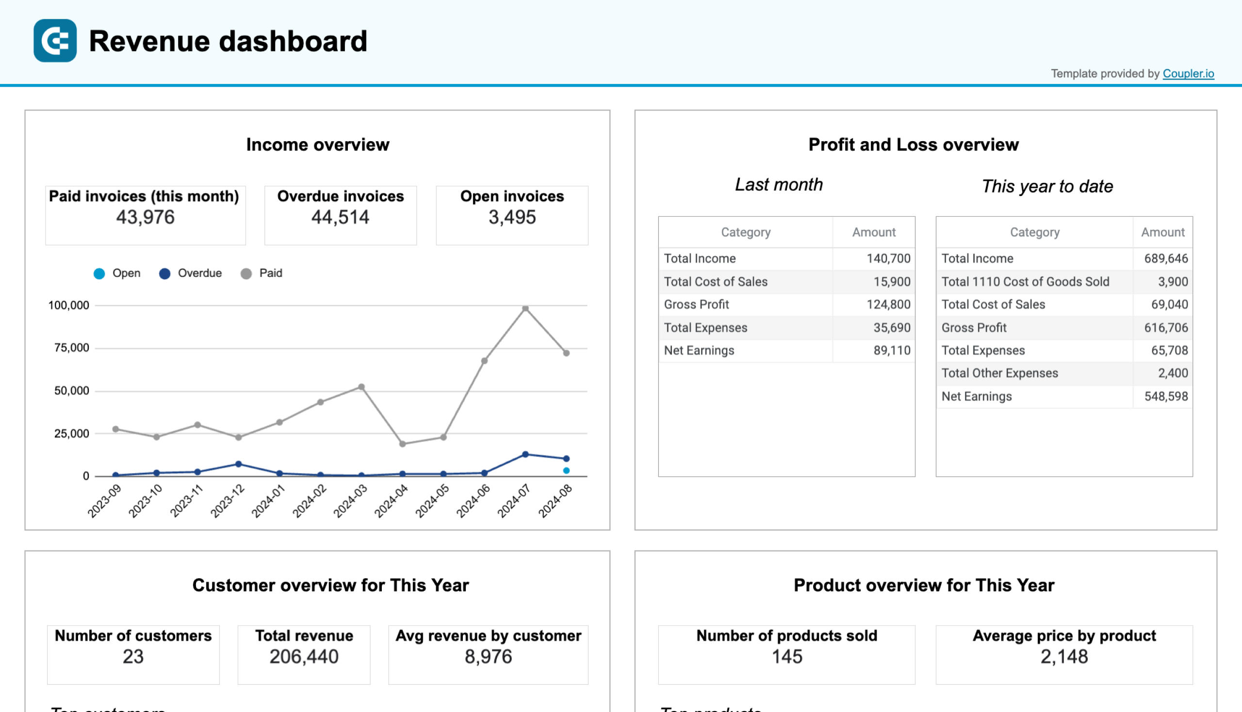
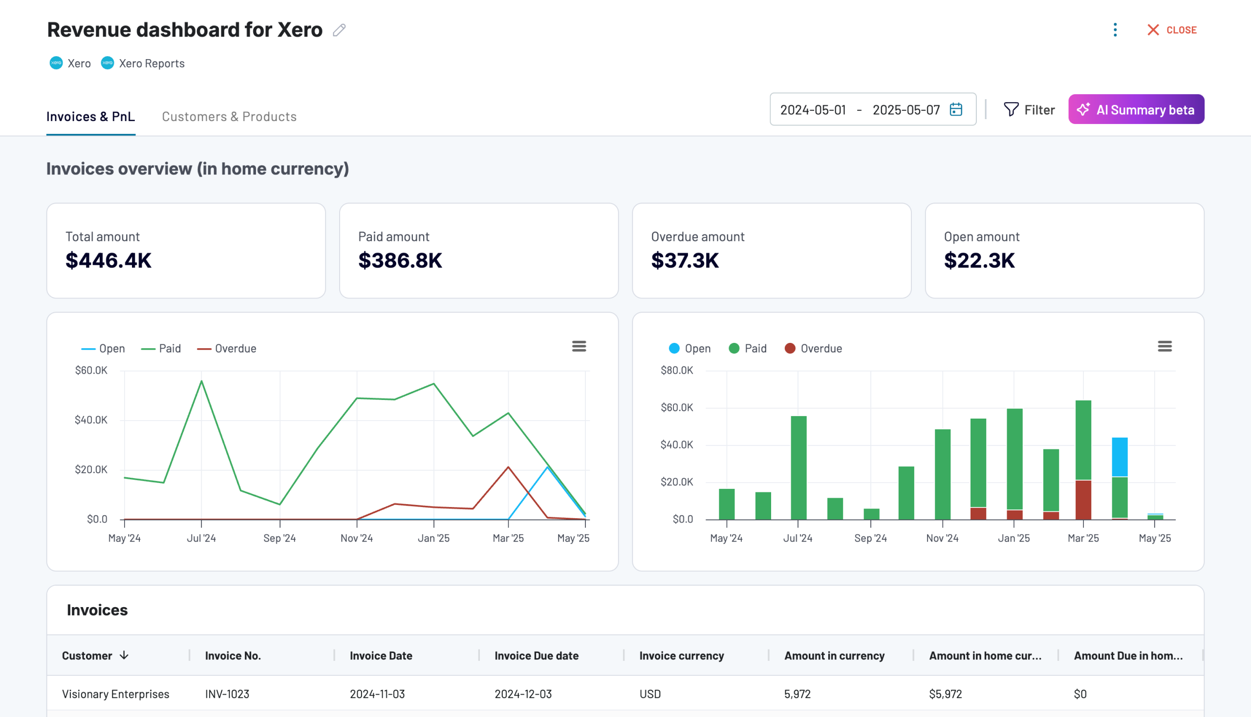
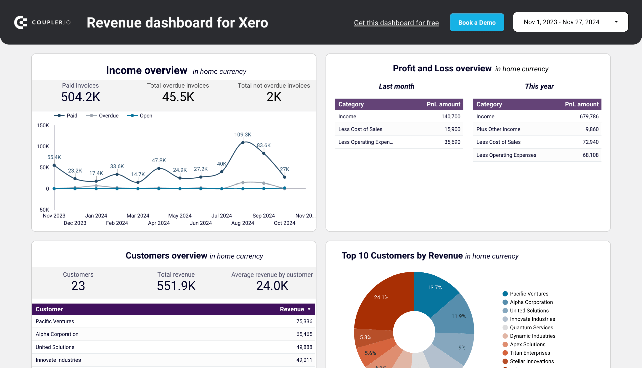
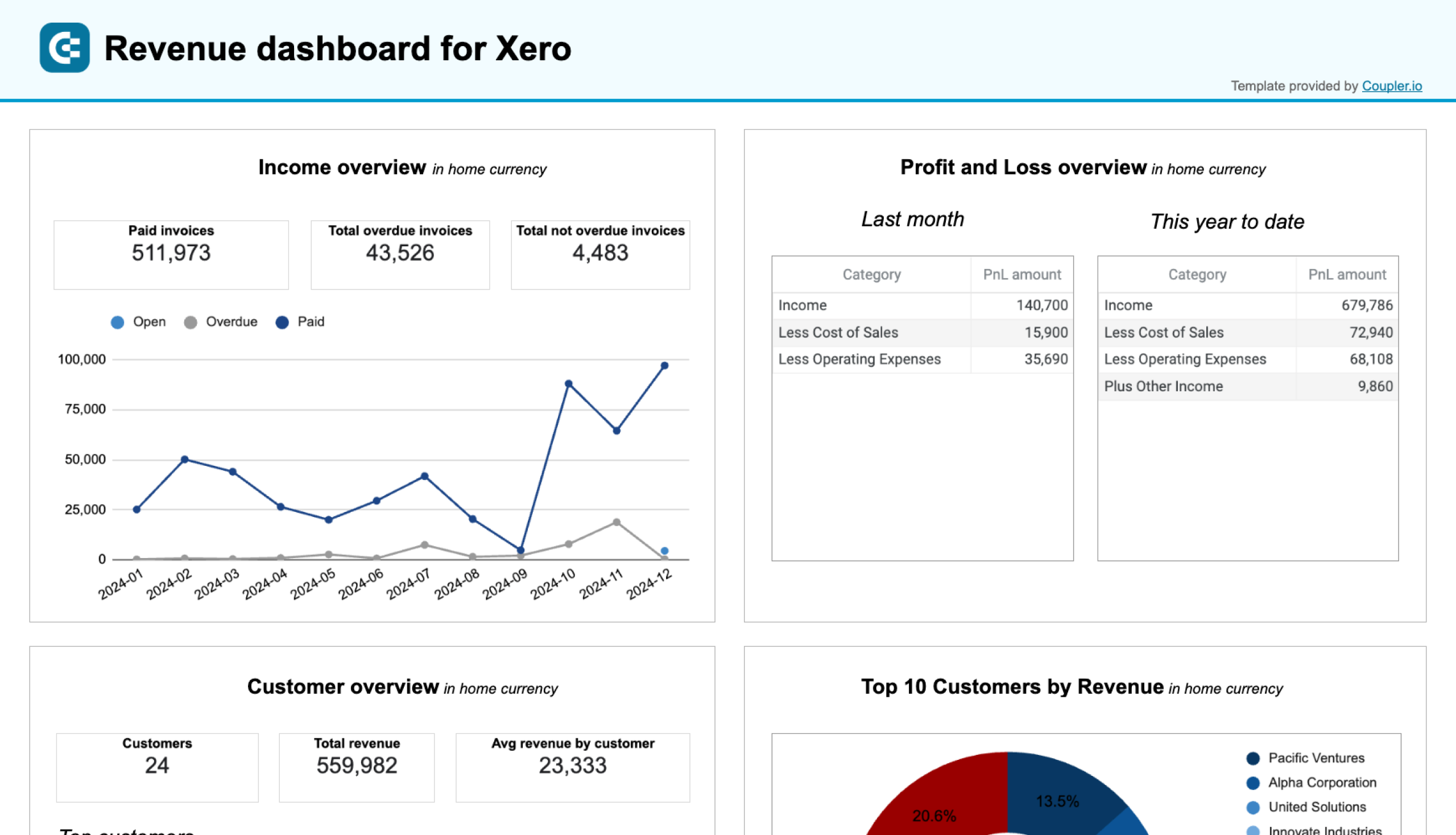
Revenue dashboard for Xero
This revenue dashboard template connects easily with your Xero account to give you near real-time insights into your income and financial performance. It combines data from income and expense records and provides you with a complete picture of your revenue streams and overall profitability.
The dashboard includes line charts, pie charts, and tables that help you monitor total revenue, track monthly trends, and identify seasonal patterns. You can also see the contribution of top customers and products. The profit and loss overview ensures you stay on top of your costs and net income, to make informed decisions.
With filters to analyze customer and product-specific data, this profitability dashboard helps you prioritize revenue sources, address overdue payments, and identify trends for more accurate financial forecasting. Choose the preferred version – either a native dashboard or a template in Looker Studio or Google Sheets and follow the instructions to connect Xero using the built-in connector by Coupler.io.
Revenue dashboard for Xero
Analyze revenue streams, customer spending patterns, and product performance with data automatically synced from Xero. Gain actionable insights into sales trends, top-performing products, and high-value customers to drive growth strategies.
Revenue dashboard for Xero in Looker Studio
Get an overview of your profit and loss, products, and customers through a set of reports collected from Xero.
Revenue dashboard for Xero in Google Sheets
Track your revenue, costs, and customer insights with a comprehensive dashboard connected to your Xero account.
Time-tracking and billing dashboard template for Harvest
This dashboard is slightly different from the other templates but no less insightful. It allows you to analyze the time efficiency of your team and keep track of your client billing data. It’s particularly useful for service companies and agencies who bill clients by the hour.
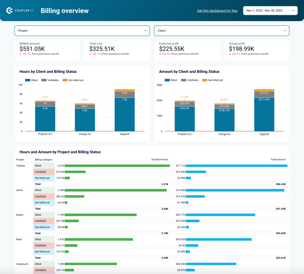
The dashboard connects to your Harvest account and consists of two pages: one for analyzing time-tracking data and another for your billing stats. Let’s focus on the billing overview page, which provides:
- Scorecard for quick insights into billable amounts and expected profits.
- Bar charts for analyzing amounts billed by client and their current payment status.
- Charts for monitoring P&L by client and project and profit margin by client and project.
- Detailed billing breakdown by project, user, task, billed amount, and more.
All this information can be valuable for identifying the most profitable clients and projects. It can also help in efficiently allocating your team’s time and adapting your pricing strategies. For instance, if you’re not meeting your financial targets, you could check this dashboard to understand if you are charging your clients enough.
Again, you can use Coupler.io’s ready-made connector to load data from your Harvest account and visualize it in Looker Studio and Power BI. It only takes 5 minutes to sign up and get started for free:
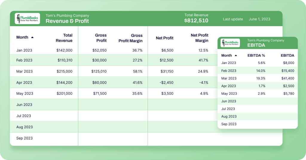
Example of automated accounting: PlumbBooks & Coupler.io
We’ve already covered how things such as QuickBooks or Xero automation can save you time, but what about its potential to increase your business revenue?
That was the case for PlumbBooks, a premium QuickBooks-based bookkeeping service catering to home service providers. They increased their revenue by 40% by providing clients with customizable, easy-to-read financial dashboards.
PlumbBooks initially used spreadsheets and an online plugin to give each client an overview of their business accounting data. However, this approach turned out to be inefficient. Crucially, the spreadsheet reports were hard to read and lacked visual appeal.
Here’s where the finance function automation comes in. PlumbBooks now uses Coupler.io to extract their clients’ QuickBooks Online data from four different reports:
- Profit & Loss Statement
- Balance Sheet
- Accounts Payable (AP)
- Accounts Receivable (AR)
A PlumbBooks employee then links each tab to a pre-built Looker Studio dashboard template only once. But there’s a bit more to the process than that (in terms of automation).
During the onboarding process, PlumbBooks’ clients fill in a Google Sheet with information about their business (financial goals, assets, operating expenses, etc.). The spreadsheet is connected to the Looker Studio template and updates automatically.
This functionality allows PlumbBooks accountants to customize the template directly in Sheets without the need to edit the Looker Studio dashboard itself. Additionally, accountants can utilize Coupler.io to customize the data refresh schedule to fit the requirements of every client.
Here’s a snapshot of the finished report:
Benefits of an automated approach
What did PlumbBooks gain from switching to an automated approach?
- ?As mentioned, revenues soared by an incredible ~40% in 2023.
- ?The team saved 4-6 hours of manual setup for each client.
- ??The team freed up more time to spend on growing the business. No more working with tricky plugins or creating spreadsheet dashboards from scratch.
Tools for automated accounting
Do you want to achieve something similar to PlumbBooks? Of course! You simply need a few tools and an understanding of how they work together. Let’s go through the options:
1. Data sources: ERP, accounting software, billing systems
Before you can visualize your accounting data, you need to identify all potential sources to ensure reports will be comprehensive and accurate. You can find relevant financial data in the following tools:
Enterprise resource planning (ERP) software
Your ERP software and enterprise management tools, such as Netsuite or Odoo, may contain essential accounting data, such as financial transactions, inventory details, total assets, and payroll information. This may be relevant to your potential dashboard, so don’t forget to check.
Accounting software
Your accounting software, such as QuickBooks or Xero is the most critical data source for any accounting report dashboard. It is home to all the standard reports: balance sheets, income statements, etc.
Billing systems
Payment processing systems like Stripe, Adyen, or Paddle handle all customer-related transactions for your business. As a result, they contain vital information about your revenue, client invoicing, and transaction history, which you can visualize more clearly in an automated dashboard.
2. Data management tool: Coupler.io
Coupler.io is an analytics and marketing reporting tool that allows you to consolidate your accounting data and turn it into self-updating reports like the ones introduced above.
You can use Coupler.io to automatically connect your accounting sources to BI tools such as Looker Studio or Power BI and visualize your data. The reports or dashboards will refresh based on the schedule you choose, with intervals as frequent as every 15 minutes.
Learn more about Power BI financial reporting and the specifics of reporting in Power BI for accountants.
With Coupler.io, you no longer need to manually export data from your accounting reports, which eliminates the loss of data when copy-pasting from one tool or spreadsheet to another. You can easily set up a connection with a data source (such as QuickBooks) in minutes, schedule data imports with a few clicks, and start analyzing your accounting data on an ad-hoc or regular basis.
3. Data visualization tools
There are a few different options for data visualization, depending on the level of sophistication you need. Here are some of the most accessible options available:
Looker Studio
Looker Studio is a free data visualization tool developed by Google. It lets you create intuitive, easy-to-read reports that are ideal for sharing with stakeholders. You can build reports from scratch or use customizable templates, as I mentioned earlier.
But Looker Studio’s best feature is its range of visualization options – for example, interactive line charts, drill-down tables, and scorecards – which help you speed up data-driven decision-making.
Google Sheets
You may be familiar with another free tool from G Suite: Google Sheets. Although it lacks the advanced visualization features offered by Looker Studio, GSheets is better at handling large, complex datasets.
The pivot table feature is perfect for quickly summarizing and comparing financial data. Meanwhile, the range of bar, line, and pie charts offered by GSheets is sufficient if you don’t need to dive too deep into reports.
Excel
If you work with the Microsoft ecosystem, Excel is the obvious alternative to Google Sheets for data visualization. Like GSheets, it has several handy features for advanced visualization, such as scatter plots, waterfall charts, and the ability to customize the color, labels, and style of your charts.
You can further enhance readability by customizing gridlines and formatting a chart’s axis. Overall, Excel is a solid option if you want to get more out of your sheets.
Best practices for accounting reports
To avoid mistakes in accounting reporting, pay attention to these best practices:
Adherence to accounting standards
As a general rule, all reports should adhere to the accounting standards set out in the IFRS or GAAP frameworks. IFRS stands for International Financial Reporting Standards and is the best-known global framework for accounting standards. Meanwhile, GAAP refers to Generally Accepted Accounting Principles. It is the framework most commonly used in the U.S.
Let’s quickly review their common principles, which demand that reports should:
- Be relevant, comparable, and understandable
- Follow the accrual accounting concept (v.s. cash basis method)
- Be prepared with the assumption of going concern
- Reflect economic substance over legal form
- Have materiality and full disclosure, ensuring data is always significant and truthful
For small and medium-sized businesses, it’s not mandatory to prepare your reports according to GAAP or IFRS rules. IFRS standards are flexible and voluntary.
In the United States, only publicly traded companies, non-profits, businesses in regulated industries, and government agencies are required to follow GAAP. However, to ensure your records remain accessible over time, it’s best to apply a framework to your reports.
N.B. There are some differences between these frameworks, particularly relating to inventory valuations (FIFO vs LIFO). If you have doubts about which approach you should use, refer to the official documentation above and check the standards adopted by your country.
Accuracy and completeness
It’s important to consider factors like accuracy and completeness when preparing reports for official filings or shareholder presentations. However, remember that a lack of attention to detail – or simple human error – can also impact your ability to make data-driven business decisions.
You can ensure reports stay accurate and complete by:
- Using accounting software (e.g. QuickBooks Online) to standardize formatting and keep all of your accounting data in one place.
- Leveraging accounting automation where possible to minimize the risk of human error (e.g. cells in spreadsheets accidentally being deleted or uncounted).
- Regularly reconcile your accounts to ensure your bank transactions, invoices, etc., align with the numbers in your reports.
- Investing in the continuous training and development of your accounting specialists so that your team stays up-to-date with industry changes and can handle challenges of varying complexity (for instance, migrating financial reporting processes to another tool or incorporating AI into your work).
Consistency in reporting methods
It’s a cliche, but consistency really is key when it comes to accounting reporting. Not only does it make decision-making smoother – no need to triple-check for discrepancies in records from last quarter – but it also enhances the comparability, transparency, and reliability of your reports. Here are a few ways to stay on the right track:
- Establish clear standards or policies – adopt GAAP, a process guided by IFRS, or some other approach entirely. What matters is that everyone understands the rules and follows them consistently.
- Document your reporting processes to ensure that every time your team prepares a report, they follow the same procedures and quality standards. For example, it could be a checklist that requires an accountant to verify data, confirm compliance with accounting standards, and then pass the report to a team lead/C-level for inspection.
- Conduct regular internal audits or hire external auditors on an ad-hoc basis to assess the consistency of your reports and rectify mistakes before they escalate.
That’s it! This article covered the basics of accounting reports and introduced some templates to make financial analysis easier. So, are you ready to automate financial reporting for your business?
Automation is one of the first steps towards creating more reliable and consistent reports. Sign up for Coupler.io for free, and explore our accounting dashboard templates!
Free templates for accounting reports
Get started for free