Why interpreting data is still a struggle, and AI bridges the gap
Analyzing data for decision-making can be complicated, even with the best tools at your disposal. Data overload has become a critical barrier, with 65% of businesses managing at least 1PB of data – the equivalent of 20 million filing cabinets filled with paper. It’s no wonder many professionals are struggling to gather the needed data, let alone draw insights from it.
At the same time, companies are racing to become data-driven, yet few know how to do so efficiently. Data literacy is a major obstacle. Many specialists simply lack the skills to work with data at scale. A recent report revealed that only 17% of businesses are encouraging employees to become more confident with data, despite pursuing data-driven strategies across departments.
Generative AI helps bridge this gap between overwhelm and insight. While many businesses use it for content creation and automation tasks, few have tapped into its potential for data analysis. If you’re looking for quick insights on marketing performance, personalized growth tips, ideas on maximizing your budgets, or a convenient way to validate financial data, AI can be your best friend.
Meet AI Insights by Coupler.io: What it is and how it works
AI Insights is an AI-generated dashboard summary designed to help you quickly make sense of your data. The summary highlights key trends, opportunities, and anomalies to support decision-making. It also offers actionable advice on how to optimize strategies, campaigns, and boost overall performance.
Think of it as your own personal marketing analyst, ready to weigh in at a moment’s notice.
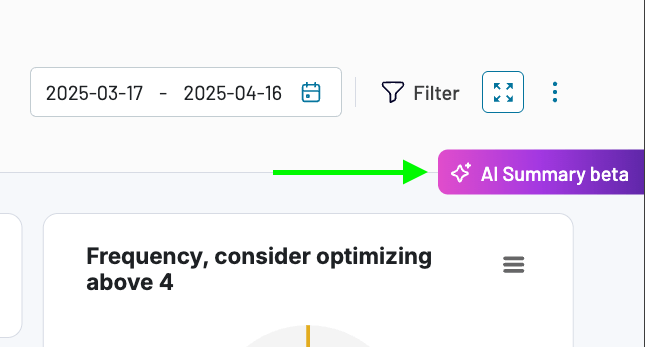
Powered by the latest version of Claude, AI Insights automatically interprets your dashboard data and generates an organized list of insights – no manual input required. All you have to do is open the dashboard, click a button in the right-hand corner, and wait about 20 seconds for the summary to load.
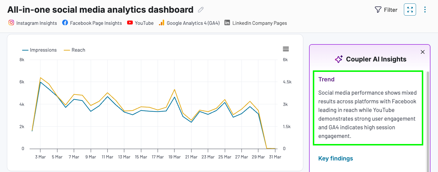
The summary itself consists of 3 core elements. For demonstration purposes, let’s explore a marketing example based on our all-in-one social media analytics dashboard:
Trend
The first thing you will see is a brief, high-level overview. This section draws your attention to critical trends and the marketing channels or campaigns driving results. It provides an immediate rundown of what’s working and which areas require a closer look.
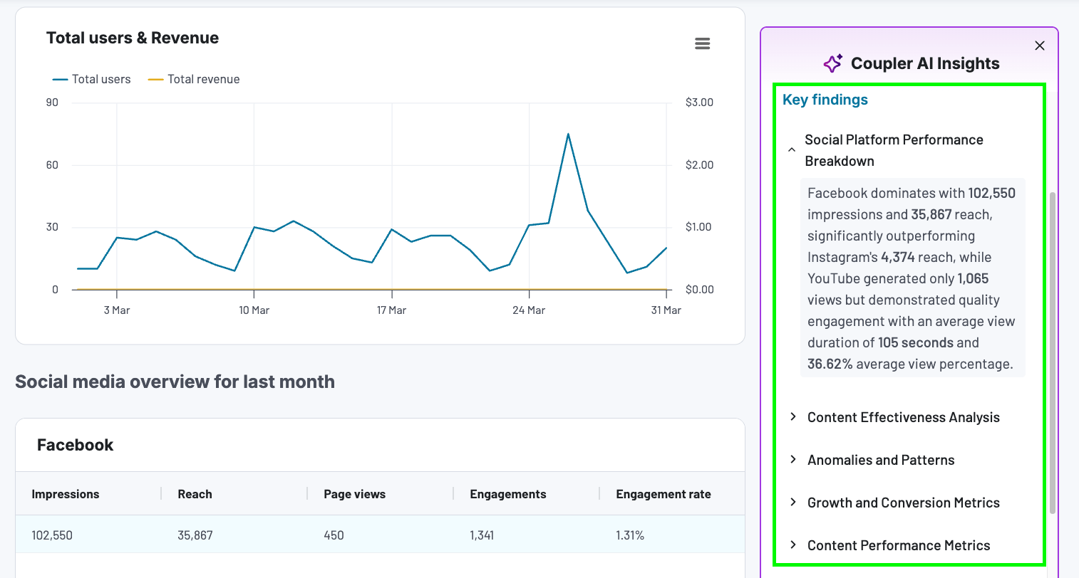
Key findings
Next, you’ll find a list of 5-6 key points focused on different aspects of performance. Click on the arrows to expand each ‘finding’ and review the highlighted metrics.
This part of the summary is designed to speed up decision-making. For example, if you read that LinkedIn generates fewer impressions but more conversions than other platforms, you might decide to invest more in it over the coming weeks.
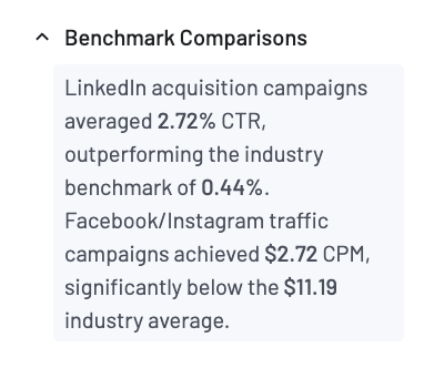
Occasionally, you might even get a benchmark comparison finding. This is useful for gauging how your campaigns perform against industry averages, enabling you to set realistic goals.
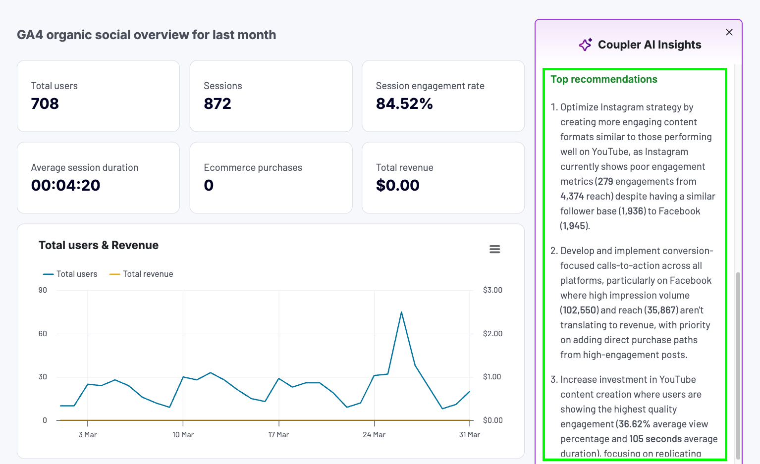
Top recommendations
The final element of the summary provides 3 personalized recommendations. These offer solutions to problems raised in Key Findings, such as poor engagement on Instagram or an ineffective content strategy on Facebook.
The recommendations provide concrete advice on how to achieve better results. For instance, they may suggest increasing video content production, creating stronger calls to action, or simplifying the purchase flow.
Remember, implementing the recommendations is entirely optional. Think of them as opportunities to explore rather than hard-and-fast rules on how to fix performance.
Note: AI Insights for Coupler.io financial dashboards will not include recommendations, but you will still have access to trends and detailed analysis findings.
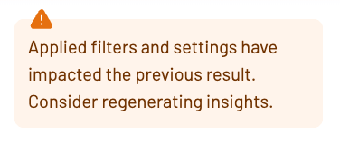
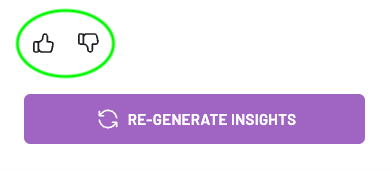
One more thing: AI Insights can be adjusted to your current dashboard view. If you apply filters, such as date range or specific metrics, just click Regenerate Insights to receive an updated summary of trends, key findings, and recommendations. You’ll see this prompt as a reminder:
Keep in mind, there will be limits on how many times you can generate insights for your dashboard(s). The precise number will vary based on your plan. You can easily track these limits in your Coupler.io account.
What you can do with AI Insights by Coupler.io
Let’s explore the practical benefits of AI Insights for marketers using our dashboards.
Instantly understand complex data
Dashboards full of charts and graphs can be overwhelming, especially if you’re not accustomed to working with data. AI Insights makes it quick and easy to cut through the noise.
The summary is storytelling-driven with a clear information hierarchy and zero fluff. Simply open the dashboard(s) every other day or week to receive a brief, updated analysis based on changes in your marketing data.
Save time on data analysis and reporting
Even with the convenience of dashboards, data analysis can be complicated and time-consuming. You can spend hours hopping between tabs, cross-checking numbers, and second-guessing your conclusions. Meanwhile, AI Insights delivers answers in under 30 seconds.
Marketing agencies can also save time on reporting with a built-in analysis. The AI highlights what matters most, making it easier to communicate performance to clients. You can also incorporate the analysis into your contextual reports, reducing time spent writing summaries.
Spotting emerging trends or underlying issues by merely looking at a dashboard can be challenging. It often takes extensive filtering, a second pair of eyes, and time – a luxury you don’t typically have. AI Insights allows you to skip the digging and focus on what’s important.
For example, if a specific shopping ad campaign receives many clicks and impressions but almost zero conversions, you might initially miss the anomaly. However, the summary highlights the issue, enabling you to take action before any more of your budget goes to waste.
Optimize strategies and campaigns with targeted recommendations
AI Insights provides specific, personalized advice on how to improve results. Essentially, the summary doesn’t just tell you what’s wrong and why – it guides you toward the potential fix. For example, in a marketing context, it can recommend:
- Immediately pausing underperforming campaigns.
- Reallocating advertising budget to platforms delivering stronger ROI.
- Developing specialized creatives for audience segments with the highest engagement.
- Implementing conversion-focused calls-to-action across all platforms.
Quick disclaimer: AI Insights is designed to support your data analysis, not replace your judgment and expertise. The summaries are only as accurate as the data in your dashboards, and AI tools occasionally make things up. Keep this in mind when reviewing your insights and making decisions.
How to access AI Insights by Coupler.io
The AI Insights feature is only available in a selection of Coupler.io marketing dashboard templates. To access them, you need a 7-day free trial or an active Team or Business plan subscription.
Dashboard template set-up typically takes less than 5 minutes. Here’s how it works:
- Sign up for/log in to Coupler.io and navigate to the Templates tab in the main menu.
- Filter the list by Coupler.io dashboards.
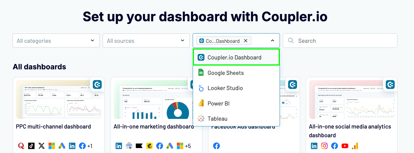
- Preview the options and click Try Report when you find a template that fits your marketing needs.
- Follow the steps to connect your marketing accounts and establish data flows. Here’s a quick video tutorial if you need some guidance.
- That’s it, your dashboard is ready to use! Click on the purple box in the top-right corner to generate your personalized insights.
Our goal for AI Insights is to deliver value every time you click that button in your dashboard. Feel free to give us feedback by hitting the thumbs up/thumbs down at the end of the summary.
Currently, only Coupler.io marketing dashboards are equipped with AI Insights, but we are working to expand availability to our financial dashboards very soon. Have ideas about where you’d like to see it next? Let us know at contact@coupler.io.
Optimize your marketing analytics with Coupler.io
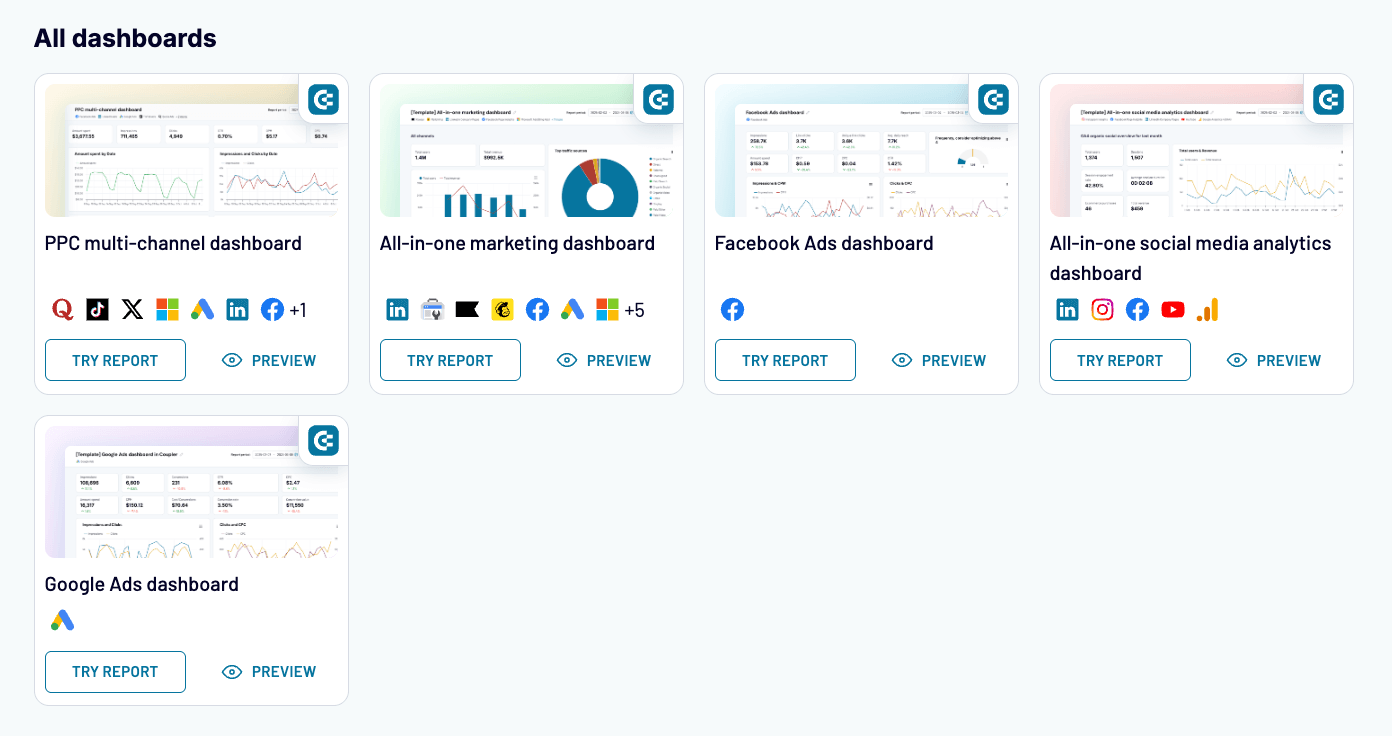
We’ve discussed the value of AI Insights for dashboard analysis, but have not focused much on the dashboards themselves. Our marketing report templates offer an alternative to analyzing your data on platforms like Looker Studio, Google Sheets, or Power BI. They are easy to read, quick to load, and packed with critical performance insights. Here’s a peek:
PPC multi-channel dashboard
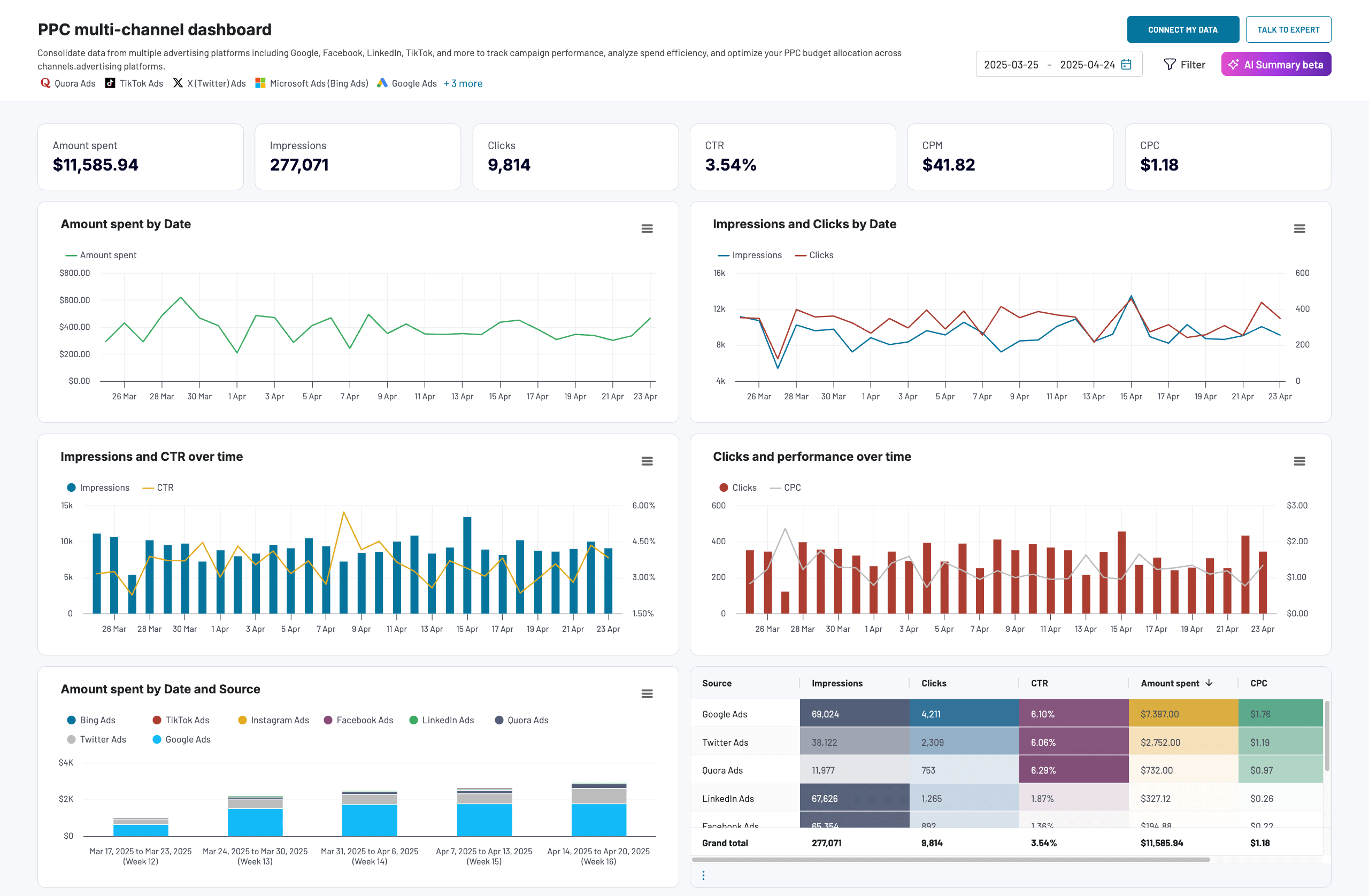
What you can do with it:
- Consolidate campaign data from 8 advertising platforms, including Google Ads, Facebook Ads, TikTok Ads, etc.
- Compare key metric performance over time – clicks, impressions, amount spent, and CPC. Filter by date for more detailed insights.
- Analyze budget efficiency across platforms with comparisons of amount spent/CPC by date, source, and campaign type.
- Investigate the performance of specific campaigns in a color-coded, metric summary table.
Google Ads dashboard
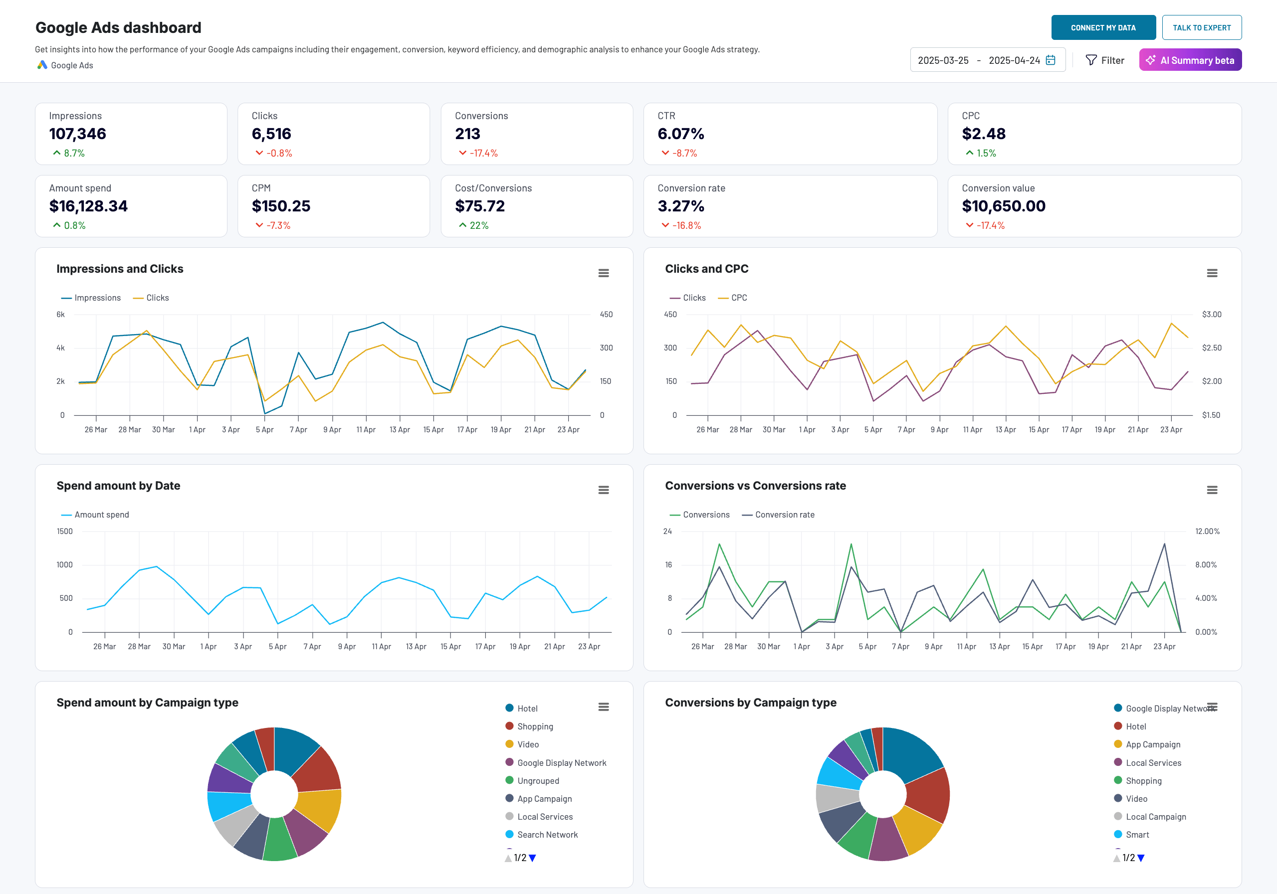
What you can do with it:
- Review key Google Ads metrics, including clicks, conversion rate CTR, CPC, spend amount, and more.
- Compare the dynamics of related metrics to understand how your advertising efforts translate to clicks and conversions.
- Analyze top-performing campaigns by the number of conversions.
- Track granular campaign and keyword performance across 8 metrics (CPM, conversion value, etc.)
- Get a breakdown of conversions by age range, gender, device, and country.
Facebook Ads dashboard
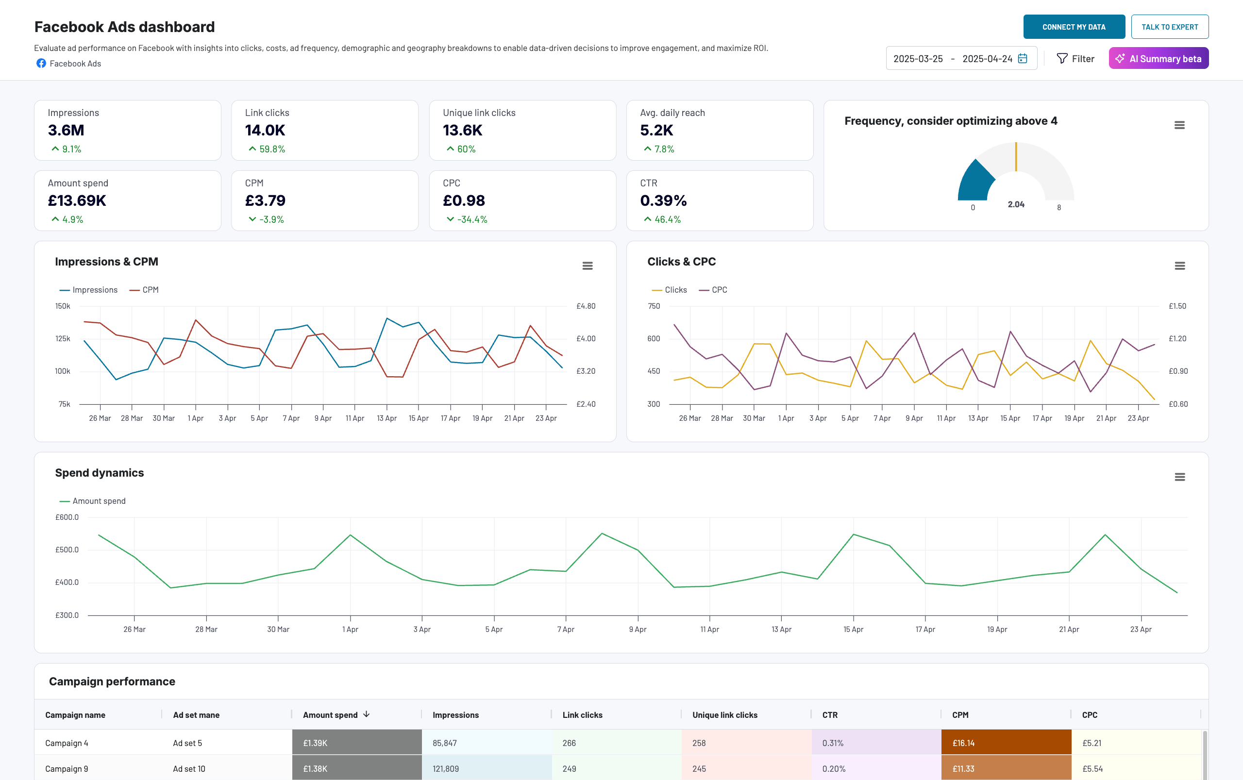
What you can do with it:
- Monitor key Facebook Ads metrics such as impressions, spend amount, CPM, and CTR in a centralized view. Gauge frequency to prevent ad fatigue among your audience.
- Track spend dynamics and budget efficiency over time.
- Understand which audience segments perform best in terms of engagement, e.g., males aged 35-44, users in the United States and Canada, etc.
- Compare granular campaign performance in an interactive table.
All-in-one marketing dashboard
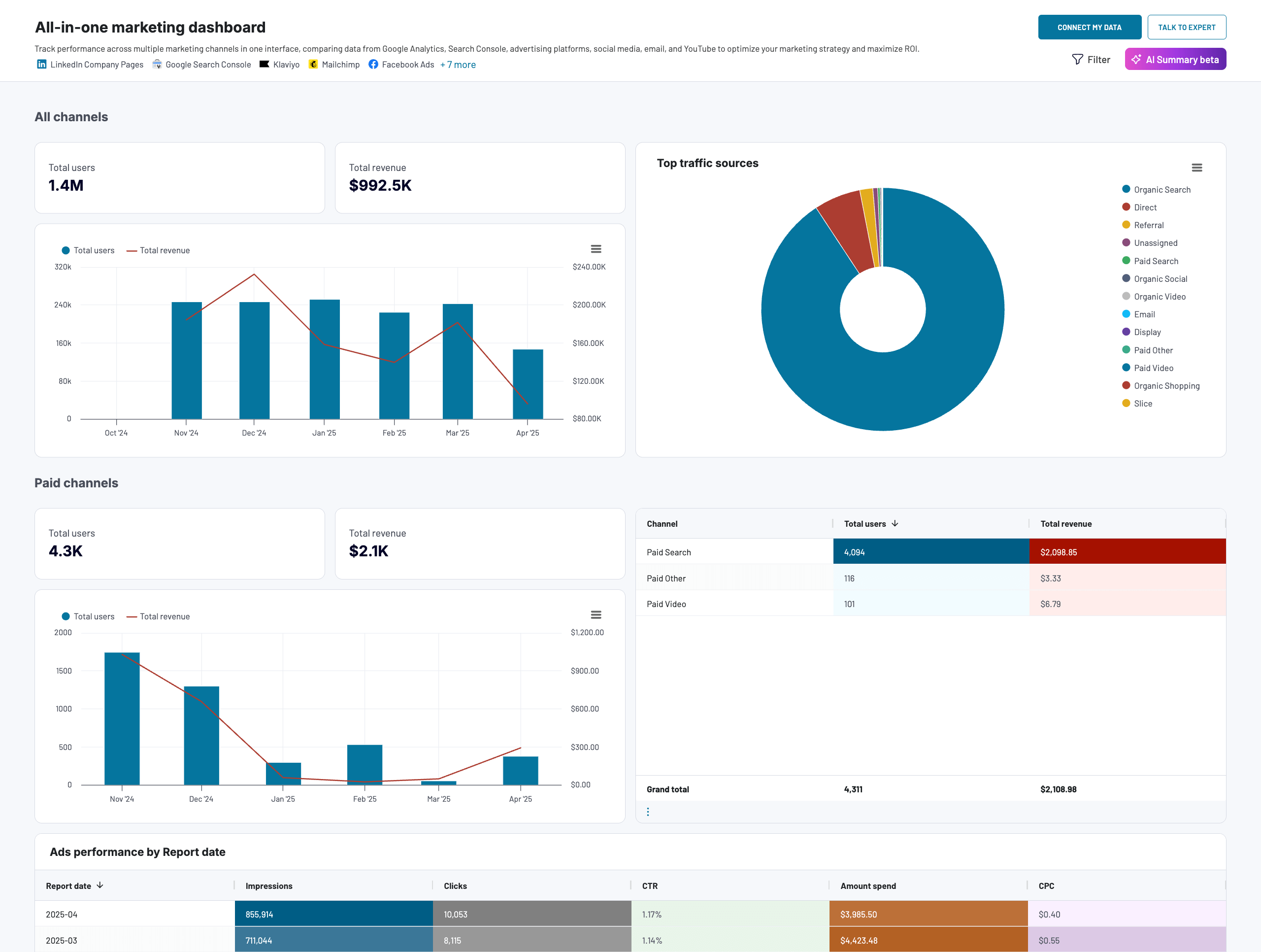
What you can do with it:
- View data from all your marketing channels in one place, including PPC, organic search, social media, organic video, and email.
- Use the top traffic sources breakdown to guide budget allocation and increase investment in high-performing channels.
- See which channels drive the most value in terms of user acquisition and revenue generation.
- Compare general performance across channels and track dynamics by date and individual platforms.
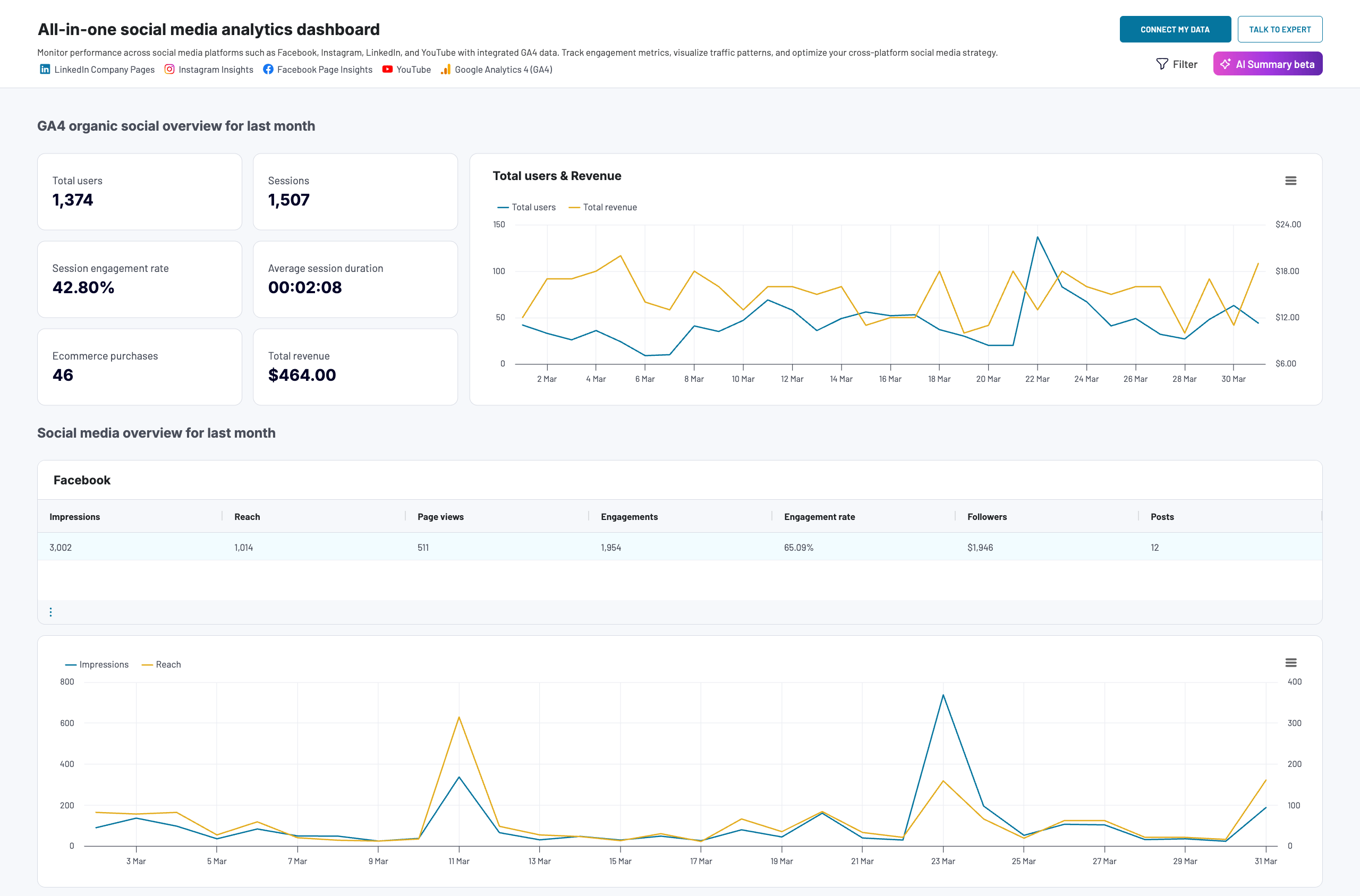
What you can do with it:
- Analyze performance data from multiple platforms – GA4, Facebook, Instagram, LinkedIn, and YouTube – in a single dashboard.
- Track key metrics for each platform (e.g., impressions, reach, engagement, views, total users) to gauge the impact of your campaigns.
- Understand how your social media efforts generate leads and revenue for your business.
- Compare results from different platforms to determine which ones deliver the best ROI.
Got more questions about our dashboards, AI Insights, and what they can do for your business? Reach out to our team for expert advice on solutions and getting started.
In the meantime, don’t hesitate to try AI Insights for yourself! Again, it’s available under a 7-day free trial for Team or Business plans. You can easily compare them on our pricing page.


