How to Build Your Brand Awareness Dashboard: Key Metrics, Tools, And a Free Template

There are two main ways to create a brand awareness dashboard. The first one is to use a ready-made template. This allows you to get a live dashboard with your data in just a few minutes and with minimal effort. The second option is to do it yourself from scratch. In this blog post, we’ll give you instructions and examples for both cases. But first, let’s see what data you will need for such a dashboard and where you can get it.
How do you measure brand awareness?
While many marketing metrics can be measured directly or calculated with formulas, brand awareness is not one of them. There’s no straightforward way to measure it, and attributing leads to awareness campaigns is an even trickier task.
However, it can be gauged based on indirect indicators, such as social media engagement or changes in traffic. By looking at a combination of various marketing metrics, you can find correlations between them and assess the impact of your brand awareness campaigns.
Data sources for your brand awareness dashboard
| Google Search Console | This is one of the most important data sources as it allows you to measure such metrics as branded impressions and branded clicks. |
Google Trends | This is a free tool that can be used to check the search volume of brand names, keywords, and topics. In particular, it allows you to compare several brands in one graph. This helps you conduct competitor analysis and set benchmarks. |
Google Keyword Planner | A free tool within Google Ads that shows search volume data for keywords. |
Ahrefs and other SEO platforms | They help you analyze the search volume of branded keywords for you and your competitors. |
Google Analytics 4 | Here, you can check website traffic for your branded keywords and analyze its sources. |
PPC platforms | If you run ads on social media, your ad data can be used to estimate the impact of your campaigns on brand awareness. For example, you can analyze how ads impressions correlate with branded impressions. |
Native SM page analytics | TikTok, LinkedIn, and all other social media platforms collect data on your brand pages. Here, you can check your engagements and impressions generated by your content. |
Social media monitoring tools | They mostly aggregate information from different platforms and provide social media analytics, insights on branded hashtags, and so on. Some of the popular tools are Hootsuite and Buffer. |
Social listening tools (also called brand mention tools) | These solutions help you track media coverage and brand mentions across different platforms. They are also useful for analyzing brand sentiment. For example, you can use Mention or Brand24. |
Ad recall surveys on social media | You can use special ad formats that allow you to survey your audience when your campaign ends. For example, you can ask if users recall seeing your ad. This type of ad is called a “Brand lift campaign”, “Ad recall lift”, and so on. This option is mostly for ad campaigns with a significant monthly budget. Apart from estimating brand awareness, this can help you understand how relevant your social media marketing efforts are for your audience. |
Most of these sources allow you to export data, so you can use it for your dashboard. Just like with metrics, you don’t need to use all the apps from this list to build a brand awareness dashboard. Depending on your goals and channels, you can select just 2 or 3 sources and focus on them.
Now, let’s see how you can visualize your data in a dashboard.
How to create your brand awareness dashboard with a free template
Using templates is the fastest way to visualize your data and get a result in just a few minutes. You don’t need to create any calculations or add visualizations. Everything is already predesigned.
Coupler.io, a reporting automation platform, offers different dashboard templates for marketing, SEO, sales, etc. All our templates are equipped with connectors that let you easily populate the dashboards with your data. Here are two templates for measuring brand awareness provided by Coupler.io
Brand Awareness Dashboard template
This dashboard lets you understand the correlation between brand search queries and your advertising campaigns. It loads data from Google Search Console and three advertising platforms: Google Ads, Facebook Ads, and Microsoft Ads.
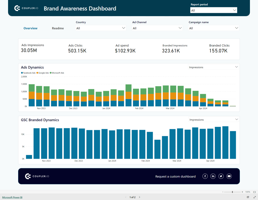
On the dashboard, you can a comparison of paid impressions with branded impressions and clicks. This insight allows you to estimate how brand awareness changes over time and which ad campaigns contribute to increasing it.
The template is designed in Power BI and is one of the top CEO dashboard examples. To start using it, follow the enclosed instructions to connect your data sources and specify your brand name. BTW, if you do not use any of the ad platforms, just ignore them during the setup.
The setup takes a couple of minutes after which you’ll get a fully functional brand awareness dashboard at your fingertips.
Facebook Ads & Brand Awareness Dashboard
Here is another brand awareness dashboard template by Coupler.io. However, it only focuses on ad campaigns on Facebook and is designed in Looker Studio. The dashboard logic remains the same – it compares your paid impressions with branded impressions and clicks you receive. This allows you to see an extra impact of your ads, which you can’t find in Google Analytics or Facebook Ads reports. As a result, you can estimate how brand awareness changes over time and which ad campaigns help you increase it.
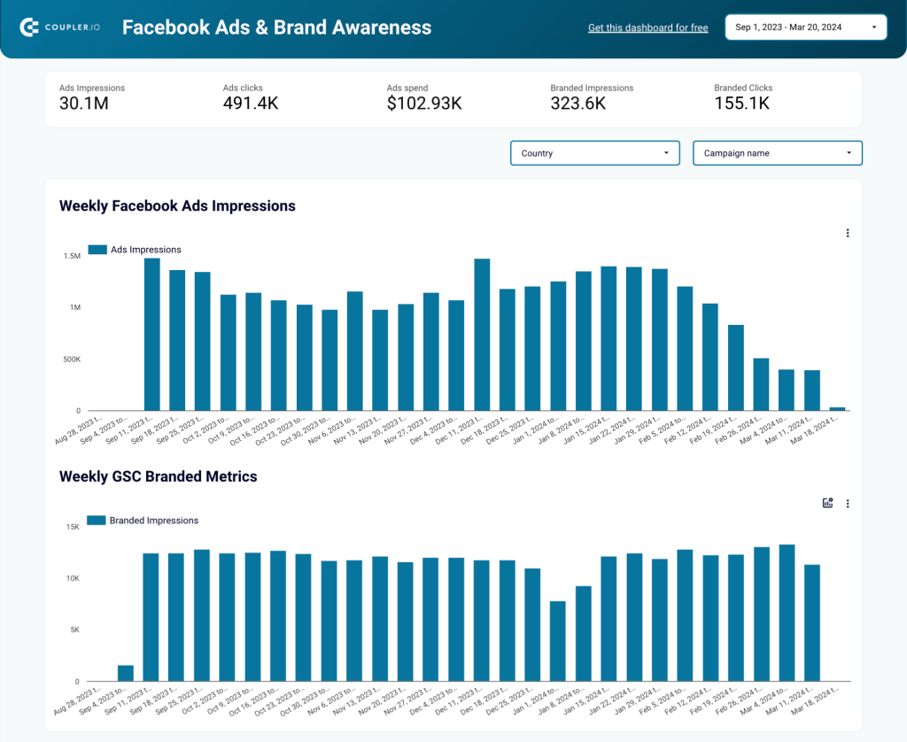
To start using the dashboard, you need to connect your Facebook Ads and Google Search Console accounts, as well as enter the brand name in the respective field. Coupler.io will keep pulling fresh data from these sources and send it to your brand awareness dashboard regularly.
Once it’s done, you can start analyzing your data. Alternatively, you can use Looker Studio’s functionality to customize the dashboard. You can change colors, add more graphs, and so on.
What insights a brand awareness dashboard can provide
The dashboard we built in the example above is a helpful analytical tool and can be used in many ways. Here are just a couple of examples.
Analyzing paid and branded impressions
One of the ways to estimate and analyze brand awareness is to see how active ads influence branded searches and convert into branded clicks.
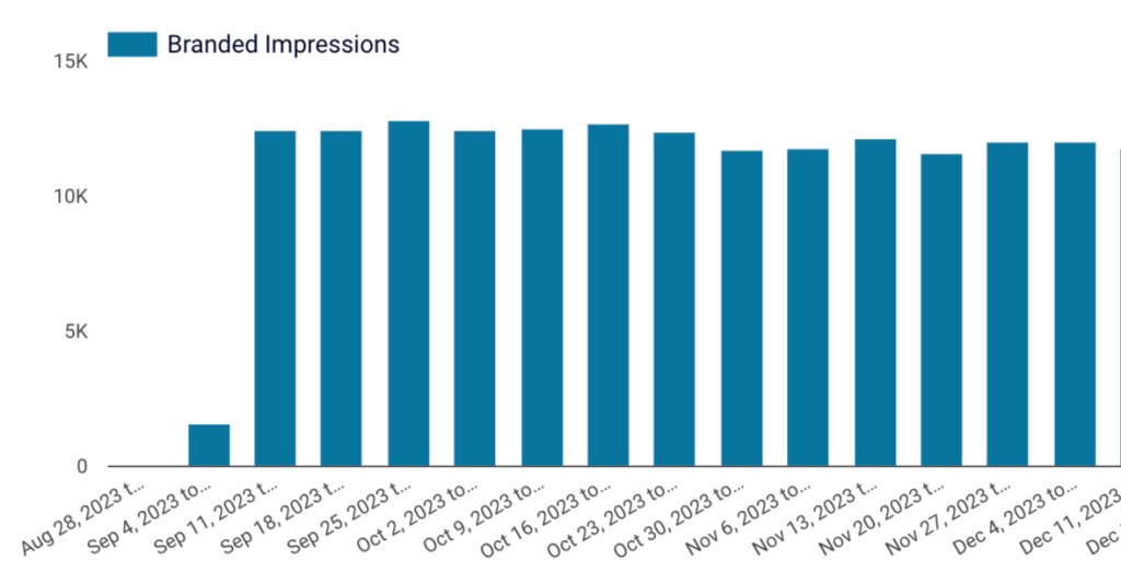
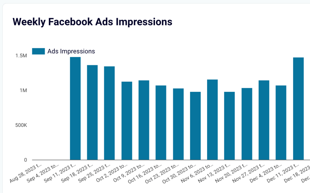
Use the Paid impressions and Branded impressions graphs to analyze the correlation between ad performance and branded searches. But keep in mind that the increase in branded impressions often doesn’t occur immediately after an ad campaign. It can take up to a month before the effect builds up and becomes visible.
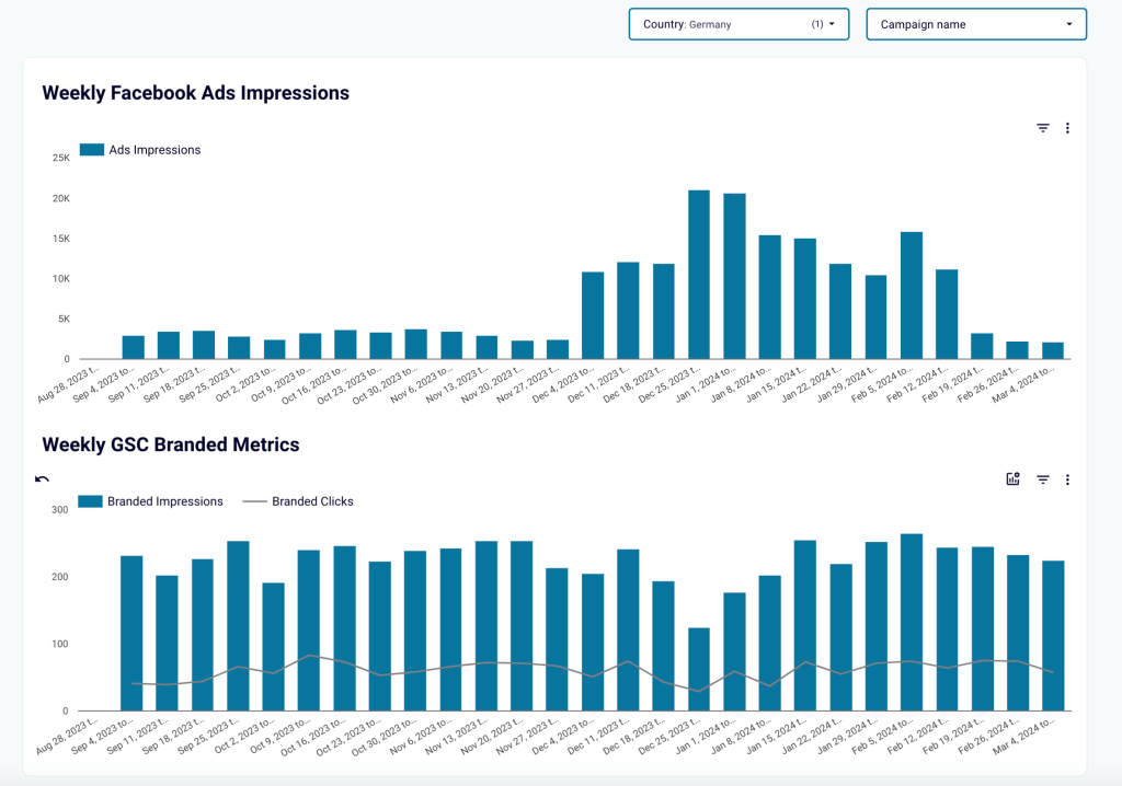
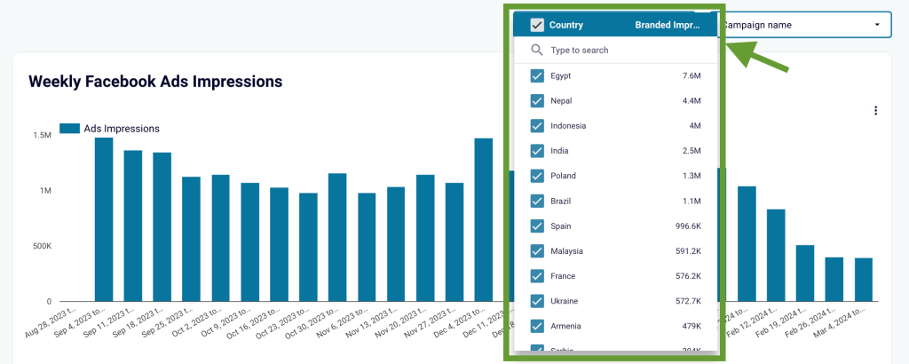
In the example above, we filtered data for ad campaigns that ran in Germany. Here, we see that a significant increase in ad impressions since December didn’t lead to increasing branded impressions and branded clicks in January and February.
If the main goal of the campaigns was increasing awareness, then, the results don’t look so bright. In such a case, it’s necessary to investigate the reasons behind this. Updating messaging or changing demographics settings are some of the ways to improve the result. But if awareness was just a secondary goal and the campaign focused on sales, for example – then, you can further analyze how different types of campaigns impact brand awareness.
Conducting geographical analysis
Use filters to display data for the countries where you spend the most. Then, look at data for each of these countries on both graphs (paid impressions and branded impressions). Analyze correlations to determine where your ad spend brings the most significant impact.
Then, you can use this data to reallocate your ad budget in favor of the best-performing countries. You can also analyze the factors behind the underperforming countries’ poor results to see what can be improved.
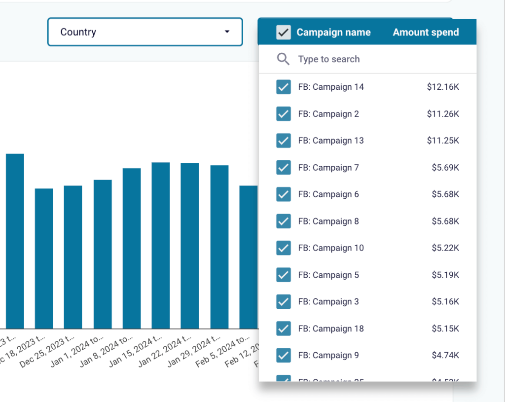
Campaign analysis
If you run multiple campaigns, then you can use filters in the top right corner of the dashboard to display the results for specific campaigns. This will help you understand what works best and what the impact of each campaign is.
All of this provides vital information for your marketing team, clients, and other stakeholders to improve and optimize your strategy.
Build a brand awareness dashboard from scratch
You can create a dashboard on your own using a spreadsheet app or BI tool of your choice.
In this example, we’ll show you how to make a brand awareness dashboard that displays the correlation between video ads and branded searches. It will feature information from:
- Google Search Console – branded impressions and clicks
- Google Ads – YouTube Ads impressions and YouTube Ads views
Let’s see how to do this.
Collect data
For regular monitoring, it’s best if the dashboard updates automatically. To achieve this, we will collect data with the help of Coupler.io. To start building your dashboard, select the app where you want to create it and click Proceed in the widget below.
We will select Google Sheets for our example, but you can also opt for Excel or pick from a variety of data viz and BI tools (Looker Studio, Power BI, Tableau, Monday.com, Qlik).
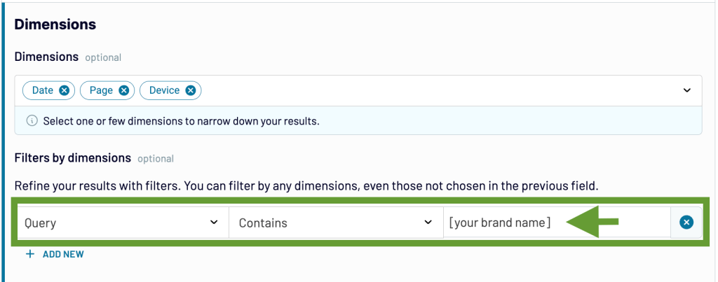
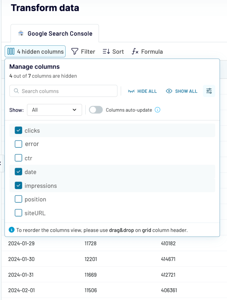
Once you created a Coupler.io account for free, follow the onscreen instructions to connect your Google Search Console account and specify the preferred settings. In the Report type field, choose Search results performance. In the Dimensions section, type in your brand name to filter out data on branded traffic and clicks.
Organize and prepare data
In the next step, you can preview and edit your dataset. In particular, you can:
- Organize columns (hide, rearrange, rename)
- Split and merge columns
- Add new formula-based columns
- Perform calculations
- Sort and filter data
- Combine data from different accounts or apps into one dataset
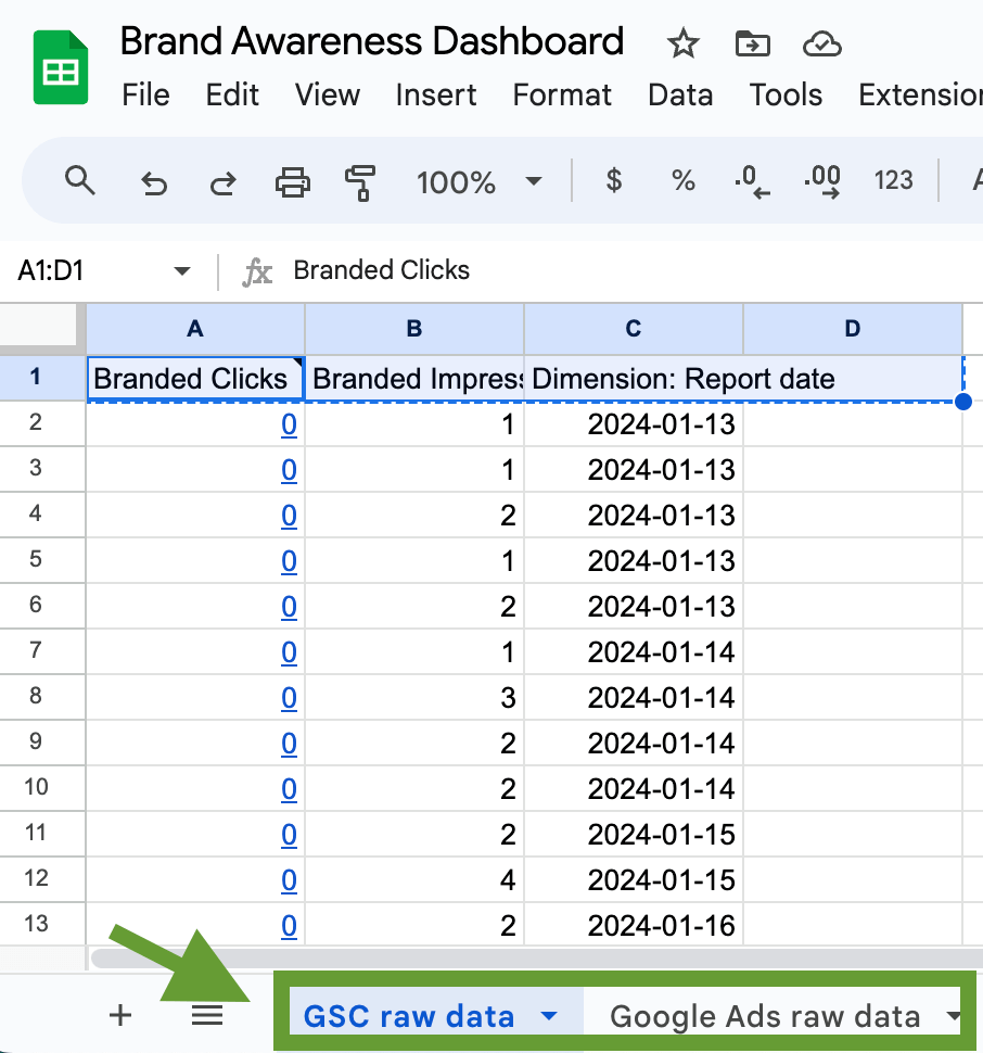
This is quite useful as we don’t need all the available fields for our report. So, we will only select the columns we want to include in the dashboard: impressions, clicks, and date. This will be enough to track dynamics over time.
Once this is done, follow the further instructions and connect your destination account. In our case, it’s Google Sheets.
In the next step, select the schedule for automated updates and run the importer. Now Coupler.io will channel fresh GSC data into your dashboard.
Connect more data sources
Then, repeat the steps described above for another data source or sources. We will connect Google Ads, but you can select any other app you need. Once ready, click Proceed below.
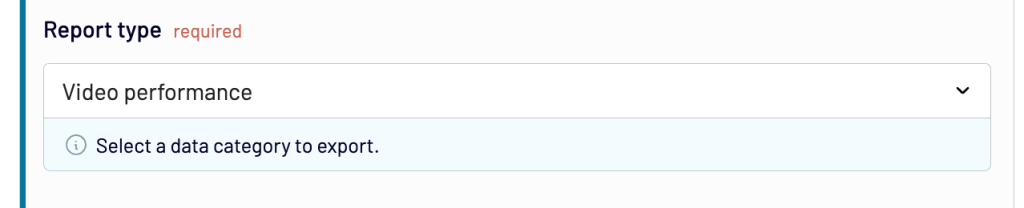
For this dashboard, we decided to use data on YouTube Ads performance, so we select Video performance in the Report type field.
In the data transformation step, select the columns you want to include. In our example, these are impressions, video views, and date.
As we are going to create a dashboard in Google Sheets, we send our Google Ads data to the same worksheet where we already have GSC data. But this time, we select a different sheet. As a result, we have two separate tabs containing raw data from each of our data sources.
You can connect as many data sources as you need. Just make sure that you select the same date range and update the interval for each of them.
Visualize your data
Now, all the data you need is transferred to the app you chose for building the dashboard. You can use the selected tool’s functionality to add graphs and charts.
In this example, we are using Google Sheets as it allows you to easily visualize data without any prior knowledge. At the same time, specialized data viz tools like Looker Studio and Power BI may require more effort to master.
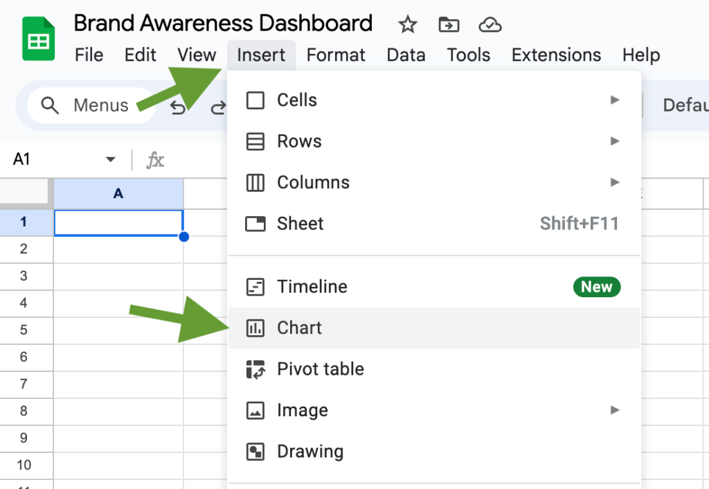
First, we are going to present GSC data as a graph. In the top menu, click Insert -> Chart, and select the graph type you need. We will go with a combo chart containing bars and lines.
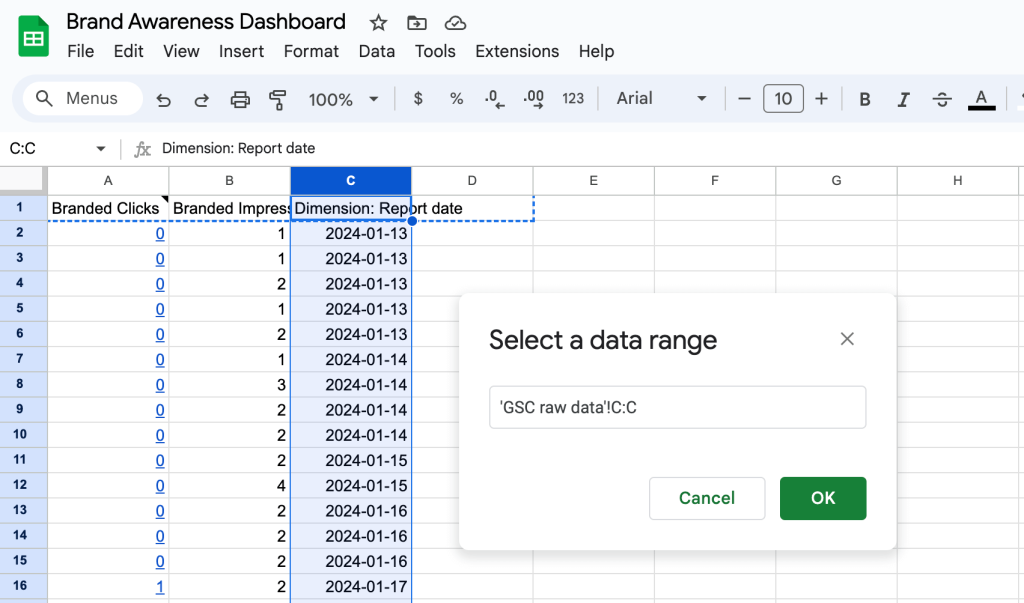
In the menu on the right, click Add X-axis. Then, go to the tab with the GSC raw data and click the letter representing the Date column. In the example below, it’s the C column. Then, press OK.
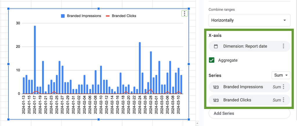
Then, press Add series and select the column with branded impressions as a data range. We repeat this step once more to show branded clicks, which are visualized with a red line.
Now, we go through the same steps again to create a similar graph with the YouTube Ads data. Here’s what the end result looks like:
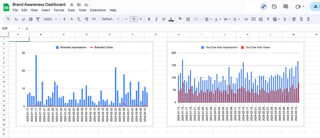
That’s it, a brand awareness dashboard is ready. Now you can analyze your data and see how YouTube Ads campaign performance correlates with changes in branded search. If YouTube Ads is not the only channel you use, it makes sense to add data from other channels to the dashboard to analyze it all together. And of course, you can add more graphical elements to your dashboard – scorecards, tables, and so on.
If you need more tips on how to visualize data, check our videos on Creating a dashboard in Google Sheets and Looker Studio tutorial for beginners. They will help you understand how to add different elements to your dashboard, add interactive filters, and more.
Now you know how to build a brand awareness dashboard from scratch. As we already mentioned, you can go through the steps described above even if you want to work with other data sources or if you picked another tool for building your dashboard.
Metrics that can help you estimate awareness
You don’t necessarily need to use all these metrics to create a brand awareness dashboard. Depending on your focus and the marketing channels you use, you can select the most relevant ones for your purposes.
Branded search volume
This metric shows you how many times users organically searched for your brand name on Google or another search engine. You can track how the search volume changes after different marketing activities, website improvements, launching special offers, etc.
Where to find:Google Keyword Planner, Ahrefs
Branded impressions
This is how many times your website showed in the search results for branded searches. This metric is closely related to the previous one, but they are not exactly the same. Not all branded searches may convert into impressions, and not all impressions come from branded searches.
Where to find: Google Search Console
Direct website traffic to the homepage
If someone types in your website URL directly and visits your website, such sessions count as direct traffic. Another possibility is when someone bookmarks your website or clicks on a link with broken tracking. While it can be difficult to attribute traffic changes to specific marketing efforts, still, you can track how it changes over time. Traffic increase can be an indirect indicator of brand awareness growth.
Where to find: Google Analytics 4
Referral traffic
Traffic from links shared on social media, on your partners’ websites, etc. It can be analyzed in the same way as direct traffic. For easier analysis and attribution, you can add UTMs to links to mark specific marketing campaigns or projects.
Where to find: Google Analytics 4
Earned media coverage
This means organic positive mentions of your brand on different platforms. This includes articles about your products, publications made by influencers, positive reviews, product unpacking videos, and so on.
Where to find: Brand 24, other social media listening tools
Social media reach and impressions
Reach shows you the number of people who saw your ad, post, or other branded content. Impressions indicate how many times your content was shown to a user. One person can have multiple impressions. If these two metrics grow, this can also mean brand awareness growth. However, it’s better to check the click-through rate and conversion rates and make sure impressions translate into user interest.
Where to find: social media platforms
Social media engagement
This refers to your users’ activity on social media: reactions, reposts, comments or replies on your brand pages. Engagement rate shows you how interested the target audience is in your content and your brand. It’s better to analyze it in connection with social media sentiment as some of the comments and reactions may be negative.
Where to find: social media analytics platforms
This is when your brand is tagged (@BrandName) or appears in user posts as a hashtag, or just when the brand name is mentioned by the users. A lot of mentions indicate interest from the audience and good brand awareness. Like with the previous metric, it’s necessary to also check whether these mentions are positive or negative.
Where to find: social media analytics platforms
This metric shows the level of your brand’s presence in your niche compared to your competitors. Here’s the formula for calculating it:
Your branded SOV = number of your brand mentions / number of market competitors mentions x 100.
Where to find: brand mention tools
The importance of analyzing brand awareness
Brand awareness is created by virtually everything you do, from digital marketing and content marketing to offline events and in-store promos. When all these activities are well-aligned, they let you crystallize and strengthen your brand identity. With time, awareness converts into brand recognition and improves brand recall, helping your product become a top-of-the-mind choice.
That’s why evaluating, tracking, and analyzing brand awareness is an important part of marketing analytics. It gives you vital information that can be used for optimization and improvements. To ensure the best results, you should conduct regular monitoring. Then, you will be able to track dynamics and see how patterns and correlations change over time. Using a live auto-updating dashboard is a great way to organize this process with minimum effort.