Data is essential for every business. However, without contextualization and visual representation, it’s difficult to derive valuable insights from the huge amounts of data you accumulate every day, week, and month. Visualization is designed to solve this issue. In this article, we focus on data visualization and its importance for business.
Importance of data visualization in business
Data visualization helps you reach decisions faster because it gives you better insight into patterns and trends. With the help of business data visualization, you can benefit from 6 analytic functions:
- Part-to-Whole: see how a data point (metric/channel/variable) fits into the whole picture. For instance, how much traffic comes from email marketing as part of the whole website traffic?
- Comparison: you can compare two data points on the same variables. For example, you can compare the revenue in 2022 with that in 2021.
- Distribution: it shows how certain data points are distributed. For instance, the distribution frequency of a feature or how many customers actually use a certain feature.
- Flow: see the flow of tasks, data points, or steps. This is great for creating workflows or guidelines for users.
- Change over Time: spot how a certain metric evolved over a period. For example, see how website traffic increased in the last year.
- Spatial: you can visualize geospatial data. For instance, you can see the countries your shoppers are placing orders in and observe which countries you need to focus more on.
Before digging deeper, let’s start with the basics.
What is business data visualization?
Business data is all the information related to a company and its operations. Everything from brand characteristics to data collected from customers is part of one business’s data.
Data visualization is the visual representation of data and information. Graphical representation of data puts it into context and provides a clear overview.
Imagine having hundreds of different pieces of the puzzle made out of wood, plastic, and cardboard. Your first instinct would be to separate them into categories based on their material and combine them to create puzzles. The same goes for data visualization.
When you have multiple pieces of information and data, it’s impossible to draw any conclusions without visualizing them correctly.
Business data visualization examples
There are dozens of different ways to visualize business data. We’ll discuss them in more detail later, but first, let’s explore some practical examples of data visualization in dashboards and interactive reports.
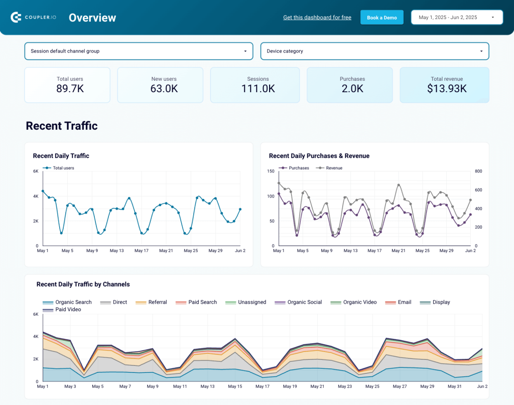
Website analytics report
This is an example of a report created in Looker Studio with data from Google Analytics. It has 4 pages of insights which focus on traffic dynamics, aquisition, user behavior, and key events. This marketing data visualization is useful for spotting patterns in customer behavior, opportunities for page optimization, and purchasing trends on your website. It can help you improve conversions and the overall customer journey flow.
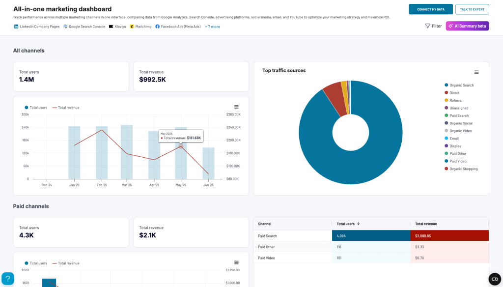
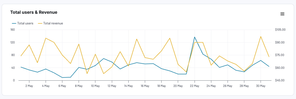
Marketing performance dashboard
In this dashboard, you can analyze results from all your marketing platforms in one place. The report pulls fresh data from platforms like Google Search Console, Facebook Ads, Youtube, and Mailchimp to help you understand your marketing performance. It also contains key metrics such as total revenue, total users, and top traffic sources, allowing you to make informed decisions about which platforms to invest in.
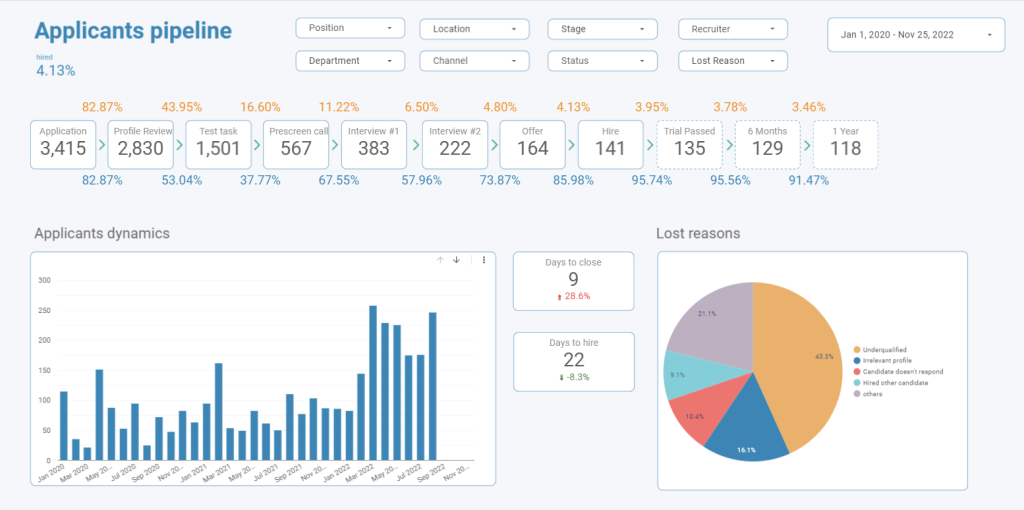
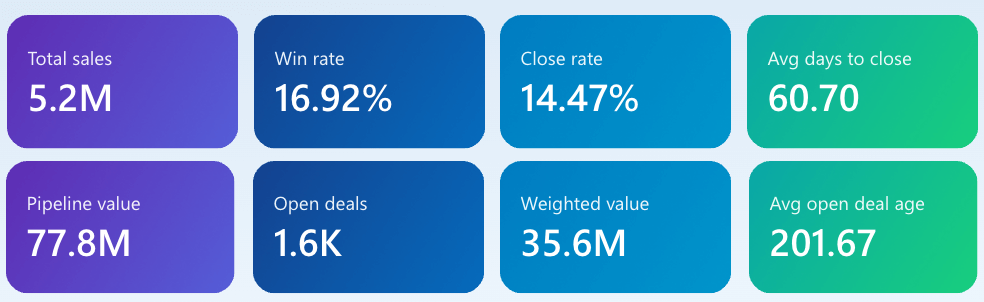
HR applicants pipeline report
Another department in which data is crucial is HR. Human resources specialists need to know how many people they’ve managed to hire, what the turnover rate or retention rate is, and how much each new hire costs. This applicant’s pipeline report contains all of this data, and it’s easier to understand and analyze.
How can data visualization help in a business
Businesses need to collect and turn data into paths, trends, patterns, and relationships which are not easy to spot from numerical data and other forms of representation. Data visualization helps them fulfill various strategic or operational objectives. Customer data, for instance, is crucial for most businesses because it offers an overview of your customers’ behavior. This will help you make informed decisions.
For example, an eCommerce platform can see which products are bestsellers and which are just collecting “dust” and need to be replaced. By turning simple geographical or demographical data into graphs and charts, data becomes an essential factor for decision-making and forecasting.
Also, according to Bain & Company, companies that use data visualization are 5 times more likely to make faster decisions and 3x more likely to execute them than their competitors.
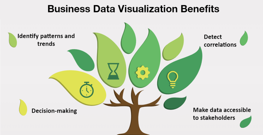
Business benefits of data visualization
Data visualization can have a major impact, especially on business intelligence. Here are a few benefits of using data visualization for business.
Decision-making
One of the biggest benefits of data visualization is that it helps professionals understand data easier. This, of course, has a major impact on decision-making. For example, you invest in LinkedIn Recruiter to hire more people. After testing it for 1-2 months, you will need to compare the number of newly acquired employees from this period to the ones from before using the tool. Apart from checking the number of new employees, you should also calculate the cost of acquisition to see if it’s a good choice for your current budget.
Identify patterns and trends
Another great thing that data visualization brings to the table is that it helps you identify trends or patterns. This brings a lot of value for businesses, especially those in retail. Why? You can see how the shopping patterns of your customers have changed over time. This allows you to make informed decisions when it comes to inventory forecasting, for instance.
Also, discovering patterns allows businesses to adapt their strategies and include new sales or marketing tactics.
Detect correlations
Most businesses have various departments, from financial to sales and marketing, and all of these departments collect different data. Sales focus on revenue, leads, closed deals, and retention rate, while marketing focuses on customer acquisition cost, website traffic, and conversion rate. While all of these data are important, it’s also helpful to identify correlations between different metrics.
With data visualization, you can find correlations between the recurring revenue and the conversion rate or between the number of qualified leads and the churn rate. Some metrics might impact others, but without spotting these correlations, it’s hard to know this and make informed decisions. Be careful, though – you may come across misleading data visualization examples that appear to show correlations where there are none.
Make data accessible to stakeholders
While each professional knows and understands the data they work with, it might be harder to share specific insights hidden within the raw data with stakeholders. By creating graphic representations of data, you can make data more accessible to stakeholders or other teams that might not be familiar with the metrics you track and analyze.
Also, thanks to data automation, you don’t have to manually create dashboards and reports to present to stakeholders. You can rely on a user-friendly tool Coupler.io that allows you to sync information automatically from various apps like LinkedIn Ads and Asana directly to Looker Studio, Tableau, Excel, Google Sheets, and more.
How to use data visualization in business
There are various ways and moments in which you can use data visualization in business – from automated reporting to strategic decision-making. As a data automation and analytics platform, Coupler.io can be the solution to cover all your use cases related to visualizing business data and beyond. You can opt for our data analytics consulting service to handle any of the following use cases and get professional help in any data-related issue, from building a self-updating dashboard to setting up a data management infrastructure.
Meanwhile, let’s see the most common cases when data visualization in business is used.
Build decision-making powered by data
Data-driven decision-making means using data, facts, and metrics to make strategic business decisions that align with your goals and objectives. It’s hard to be objective, especially regarding something you suggested, but data visualization helps you make objective, data-driven decisions.
Let’s say you proposed a new content marketing strategy focusing on creating and sharing videos on different channels (Instagram, Facebook, etc.). While this trend works well for many B2C businesses, it might not be the right choice for a B2B SaaS product. By analyzing data and metrics such as website traffic from social media channels, you will observe if your new approach has a positive impact on the business or not.
One of the most common uses for business data visualization is to share information and business insights between teams or members of a company.
For instance, marketing and product teams must work together for business growth. While marketing teams look at metrics like cost per acquisition, return on investment, and the number of qualified leads, the product teams focus on customer lifetime value, churn rate, and product usage. Each team rests on the raw data they take from their sources, and they need to share this information with each other in the most efficient way as this is essential to align their activities to reach their scaling goals. With the help of data visualization, the product and marketing teams can turn their raw data into an actionable report or dashboard that showcases complex relationships and correlations between churn rate and the number of qualified leads.
Reports and analysis
Data visualization makes it easier for everybody to digest a large amount of data compiled in one report. If you were to bring all of the data you included in a presentation to the meeting, you might need a few days to make a point. With simplified, graphic reports, everybody can spot different trends, understand when there’s growth in a sector, or spot the areas where there’s still work to do.
Validate a new approach/channel
When you implement a new approach or choose a new channel for paid advertising, you need to see some results before you decide if it’s the right path for your business. With the help of data visualization, you can see if you’ve seen the impact of a new approach in a certain period. For example, you decide to implement a paid advertising campaign on Facebook, LinkedIn, and Twitter. After a month, you might want to see some data to know how each platform is performing. LinkedIn ads have a higher cost of acquisition but tend to bring in more qualified leads, while Facebook and Twitter might bring more traffic with a higher return on investment, but the conversion rate is lower.
With data visualization, you can see how each channel is performing and compare the results taking into account different metrics. Then, depending on your business needs and budget, you can choose the right channel or channels for advertising.
Making forecasts
Another way in which you can use data visualization is for forecasting. This is important for all types of businesses to build any sort of predictions to rest upon. For example, you can forecast the budget for the next year by analyzing data from past years.
For SaaS businesses, forecasting has a major impact. SaaS revenue forecasting helps you understand and predict how much money you can generate from product sales over a period of time. By constantly forecasting the revenue, you will be incentivized to focus on growing your business to reach your goal.
Types of business data visualization
Depending on the type of data you are working on and what you would like to identify, you can choose from various business data visualization types and types of graphs:
Scorecards
Scorecards are useful for displaying key metrics at the top of reports. They highlight crucial stats, allowing your audience to grasps the most important information at a glance.
Bar Chart
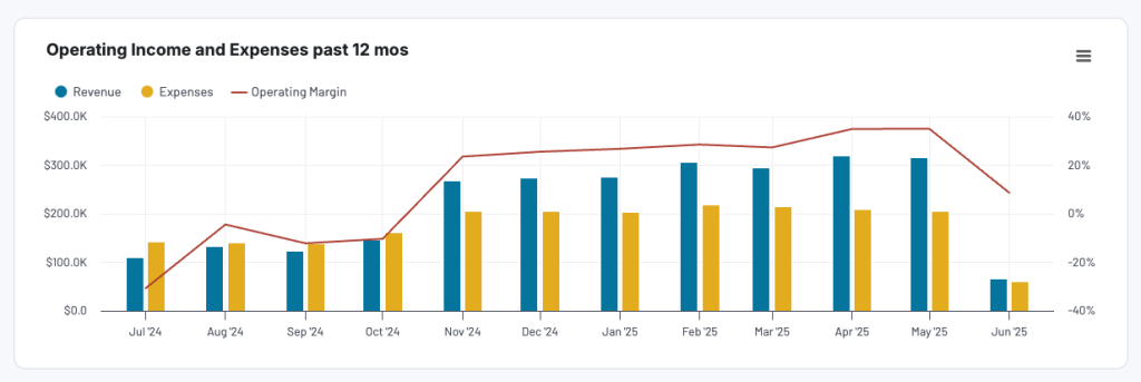
This is one of the most commonly used types of data visualization. It’s easy to understand and it allows you to compare different data points. You can use bar charts to show sales over a period of time, income vs expenses fluctuations, or how much traffic comes from different channels or sources.
Line Chart
Another great type of business data visualization is the line chart. This is simple to create, and it can showcase various data points. It is best suited when you want to compare and show the fluctuation of certain data points over time.
Scatter Plot
This is a type of data visualization used to showcase a correlation between variables. However, it’s best to use scatter plots only when you have 2 variables and few data points. For more data points, the graph will become impossible to read.
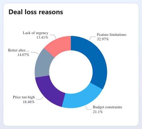
Donut Chart
Donut charts are amazing data visualizations that analyze part-to-whole ratios. For example, if you create a donut chart for expenses per department, you can see which department has a bigger budget. It’s also handy for analyzing the reasons why your sales team loses deals, for instance.
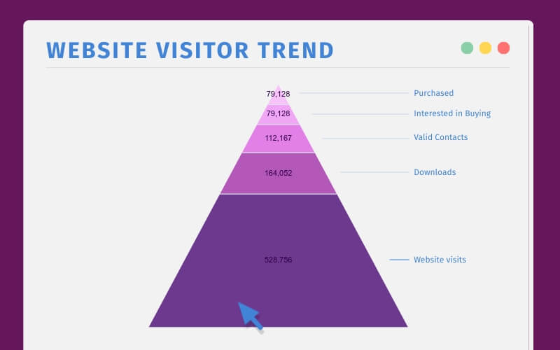
Pyramid Chart
The pyramid chart is another type of data visualization that focuses on showing the part-to-whole ratio. In the example below, you can see how many of the whole visitors have ended up making a purchase of downloaded content.
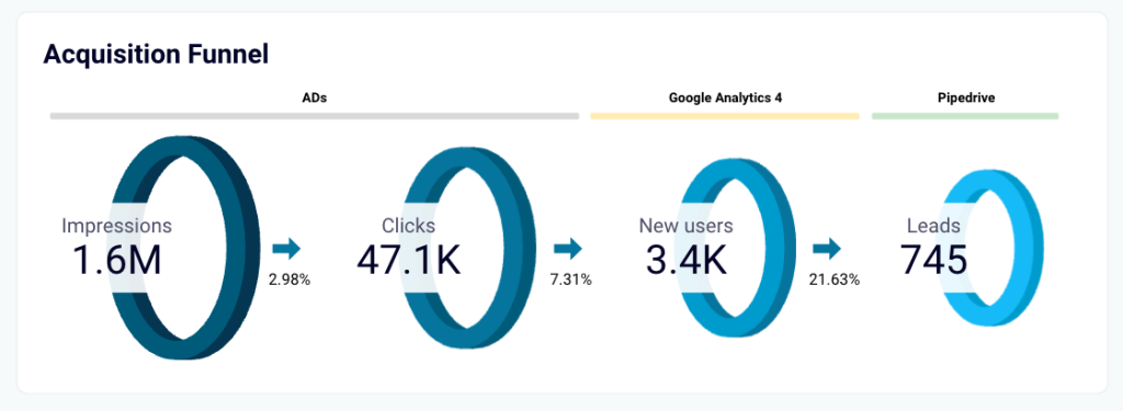
Funnel Chart
The main point of a funnel chart is to visualize a sequential process from top to bottom. It’s also great for showing the different stages of a customer journey and it’s commonly used by marketing teams. Read more about Looker Studio funnel visualization.
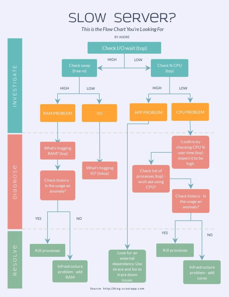
Flowchart
A flowchart helps you visualize the necessary steps or tasks needed to reach point A to point B. It’s best suited for creating workflows or for showing the hierarchical data of items.
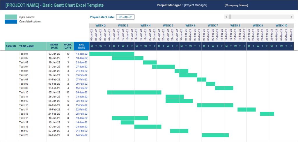
Gantt Chart
Gantt charts are useful assets, especially for event planning and management. You can immediately see when a certain task needs to be performed, the responsible department or worker, and how that task fits in the whole picture.
Top 5 data visualization best practices
Let’s explore some data visualization best practices that can help you make the most of your data.
1. Always start with the audience and define the goal first
If you have amazing marketing campaign results, shouldn’t you jump straight into choosing between pie charts and bar charts? It might sound counterintuitive, but this is not the best place to start.
Always begin by defining your audience and the goal you want to achieve. These crucial parameters allow you to understand how to better present your data. For example, if the visualization is meant for a marketing team, you can provide more details and include a variety of metrics, since your audience is already familiar with them. However, if you need to present the same data to C-suite executives, select higher-level results and explain how they fit into the company’s overall strategy.
Handpick the data your audience needs to better understand the situation and make informed decisions. Your visualization should be structured around the audience and its end goal. Ask yourself why they need to see your graph or dashboard, and use this as a starting point. You can also address this question directly to your audience: what metrics do they want to see, and what correlations are important for them?
It also makes sense to ask for feedback when your graph or dashboard is ready. Your audience can provide valuable ideas regarding what else to include or how to make the visualizations even more insightful.
2. Use simple graphs for stand-alone activities; build dashboards for complex processes
A best practice of data visualization is to select the graphical representation that matches the complexity of your data. If you need to visualize a relatively simple process or activity, there’s no need to overcomplicate things. A pie chart or bar chart is enough to present your data clearly and concisely.
However, if you plan to visualize several interconnected processes or explore multiple parameters simultaneously, it’s best to opt for a dashboard format. This type of visual representation can include many different elements, like scorecards, various types of graphs, tables, maps, and so on. When you combine all of these elements, you’ll get a comprehensive overview of your activities.
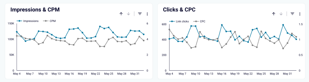
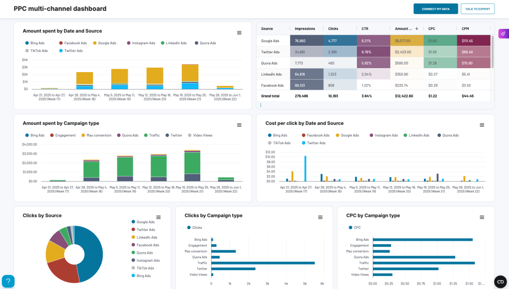
Here’s an example of a dashboard built for tracking PPC performance. It can be used to analyze ad engagement, spending patterns, and the strengths and weaknesses of your campaigns.
3. Make your visualizations interactive and automate data flows
Sometimes it makes perfect sense to prepare a one-time visualization for a yearly report or important meeting with a client. However, when you need to make data-driven decisions on a daily, weekly, or monthly basis, it’s better to create self-updating dashboards.
You can use a reporting automation solution like Coupler.io to fully automate your data flows. Coupler.io automatically pulls data from 60+ sources, such as Google Ads, Salesforce, Facebook Ads, and YouTube and connects them to spreadsheets and BI tools. You can create dashboards from scratch or use our library of prebuilt templates to visualize your data quickly.
Here’s an example of an interactive dashboard designed by Coupler.io in Looker Studio. It’s self-updating, which means you don’t need to refresh the numbers manually. You simply need to connect your data once and configure a schedule for regular (hourly, daily, weekly) updates.
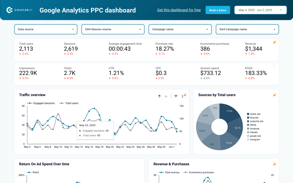
The dashboard is interactive, allowing you to filter data by source, campaign, and date. Youc an use the arrows next to each visualization to drill down further into your data. Interactivity is an important factor that turns this report into a powerful tool for ongoing monitoring and analysis, not just a mere demonstration. You can easily assess your current PPC performance and make targeted optimizations.
If you are working in marketing and looking for more efficient ways to manage your data, check our guide on marketing data visualization.
4. Don’t forget about basic design rules
Here are some best practices that will help you make visualizations clear and compelling:
- Contrasts. Use contrasting colors to compare different categories. Use gradients or shades of the same color to differentiate between the maximum/minimum values within a data type. Colors should make it easy for the audience to identify what is where. If you select a particular color for a specific product or metric, it’s better to stick to it to avoid misleading the audience (see more misleading data visualization examples).
- Patterns. To make your visualization easier to understand, apply various patterns to your bar and pie charts. For example, a dotted pattern or even texture can make the elements of your chart more contrasting and easier to read.
- Palette. Try to use as few colors as possible. Less important data can be shown as white or gray. For more meaningful metrics, select vivid colors. To avoid your visualizations becoming busy or difficult to read, stick to a handful of complementary colors.
- Proportion. When you visualize numbers, for example, in a bar chart, ensure that the bar length corresponds with the number this bar represents. It may sound obvious, but many people fail to do this and end up with graphs where a bar representing 200K can be twice as long as a bar depicting a 70K value. This doesn’t make sense mathematically, and it makes your visualizations misleading.
- Labeling. Don’t forget to properly label your graphs or dashboards. Use clear titles to show what is where, and always accompany numbers with units so that your audience can easily understand whether each number represents thousands of dollars, kilometers, milliseconds, or otherwise.
5. Keep it minimalistic – focus on data, not design
Whatever format you choose, one of the best practices in data visualization is avoiding visual clutter. However tempted you might be to create eye-catching infographics, staying focused on your data is crucial. The form shouldn’t overshadow the essence, and data should remain the main character in your visual story.
Use visual elements, such as charts or icons, only if they make the numbers easier to understand. If you feel that a particular data set should be visualized as a table without additional graphic elements, then it’s best to use this format. Design elements are of secondary importance; using them only makes sense when it makes your data easier to read and understand.
Still, when you need a more elaborate design, it’s possible to create visual elements with the help of design tools like Canva or Canva alternatives.
Tools for data visualization in business
We’ve covered what data visualization is, why it is important, and what types of data visualization you can use. Now, let’s take a look at some of the top business intelligence tools to create custom reports and dashboards.
Looker Studio
This is one of the best tools for business data visualization, especially for marketers, because it can automatically extract data from Google Analytics and Search Console. This way, you don’t have to export and import data from one tool to the other.
It’s easy to use and comes with predefined templates that will make your job a lot easier. You can create different types of reports, from YouTube, BigQuery, Google Analytics, and Search Ads. Bonus, it is web-based and free, making it suitable even for small businesses or agencies.
Microsoft Power BI
Another powerful data visualization tool that can help you create insightful reports is Microsoft Power BI. If you are using Microsoft Office, then Microsoft Power BI is the right choice for you.
Apart from its easy-to-use interface, it has built-in AI capabilities and data security features that are easy to scale with your business. Check our article on Power BI visuals for more details.
Tableau
If you are looking for an intuitive user experience in your data visualization tool, Tableau is a great pick. It has built-in visual best practices that allow you to create charts and graphs that perfectly capture the key value of data.
Since customer data is sensitive information that should never end up in the wrong hands, Tableau provides enterprise-grade security.
At Coupler.io data analytics consulting service, we benefit from all these tools for advanced reporting & analytics for businesses. For your project, you can specify your requirements for a customized auto-updating dashboard, including which BI solution you want to use for it. The rest is handled by our data experts.
What’s the business value of data visualization?
Data visualization is essential for every business, no matter the size. Business data visualization allows you to understand data easier and to make better, more informed decisions in terms of adjusting budgets, validating new channels or strategies, improving the collaboration between departments, and spotting anything that is not working for your business.
Using tools like Coupler.io, Tableau, and Looker helps you save time while creating graphs and charts that will make data analytics easier.