Successful companies don’t have secrets behind the scenes – they have regular reporting habits. Executives rely heavily on top-level KPIs that provide a 360-degree view of the entire organization’s performance and cross-departmental dependencies.
If you also run a business and want it to thrive, employing all-in-one reports is key. We have collected over 20 CEO dashboard examples to help you understand corporate performance and make a strategic shift towards success.
Top CEO dashboard examples to enhance executive reporting
Dashboards for executives come in various forms and configurations, so how do you pick the right ones? To help you navigate the myriad of reporting options, we have prepared a list of 8 must-have CEO dashboard templates. We’ve chosen these particular examples because they represent the core functional areas executives need to monitor: marketing effectiveness, sales performance, financial health, operational efficiency, and customer engagement. Each dashboard transforms complex datasets into clear visualizations that reveal both the current business status and predictive insights for future planning.
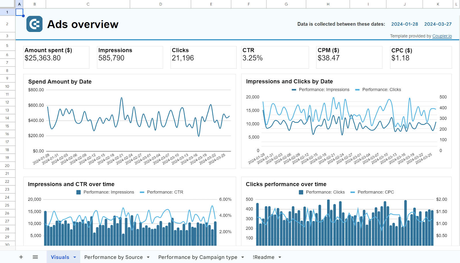
1. PPC multichannel dashboard
Does it make sense to look at different ad channels separately? Absolutely not. Just as finance experts analyze all stock exchanges simultaneously to grasp the current economic situation, CEOs review all ad channels together to understand how the overall strategy performs. This is possible with a PPC multi-channel dashboard aggregating data from Facebook Ads, Google Ads, LinkedIn Ads, and other similar sources in a single reporting space. With this information at hand, you can easily identify the most efficient channels and focus your ad campaign efforts on them.
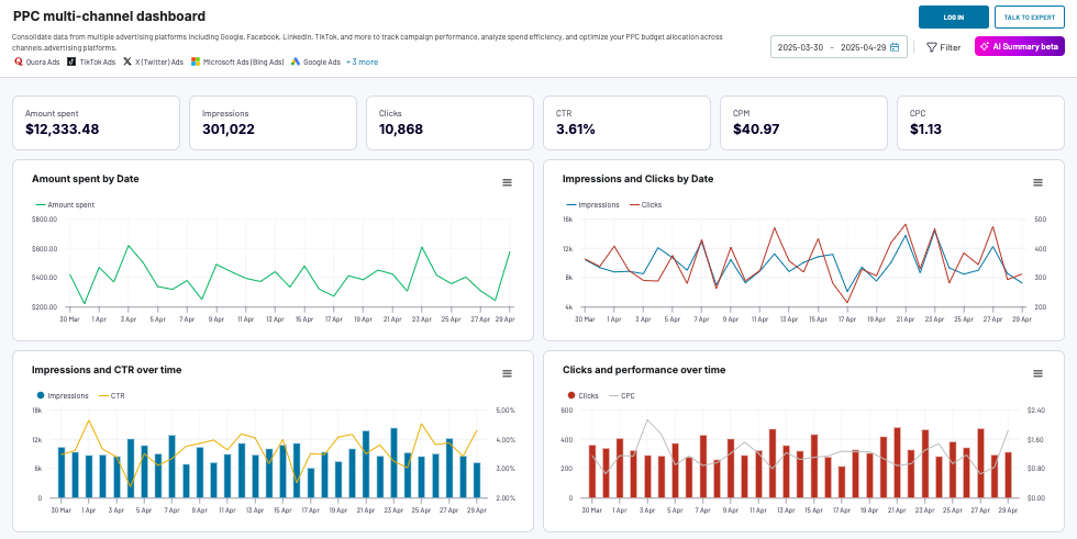
What you can do with this dashboard:
- Explore current and historical trends in advertising campaigns with filtering by date, metrics, and dimensions.
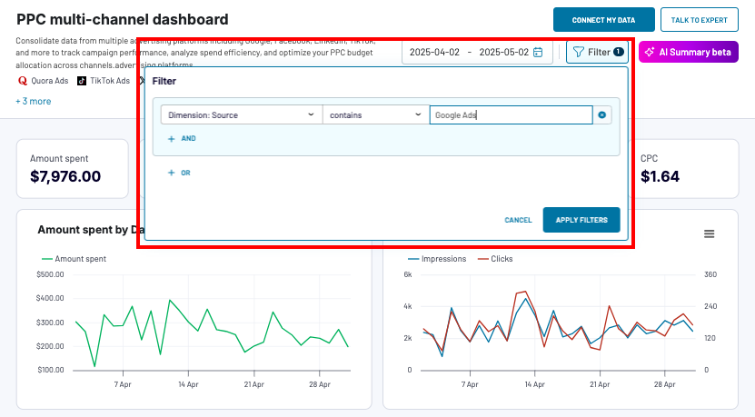
- Review the performance of each channel individually. For that, select the Dimension: Source filter and specify the platform (Facebook Ads, LinkedIn Ads, TikTok Ads, etc.).
- Review and compare the performance of all advertising channels in the same workspace to define the impact and effectiveness of each.
- Monitor key metrics (cost per click (CPC), click-through rate (CTR), and others) that depict ad campaign spending. Select the exact dates to see these numbers for a specific time frame.
- Compare the performance of various ad campaign types.
- Observe key metrics, such as clicks, impressions, amount spent, and others.
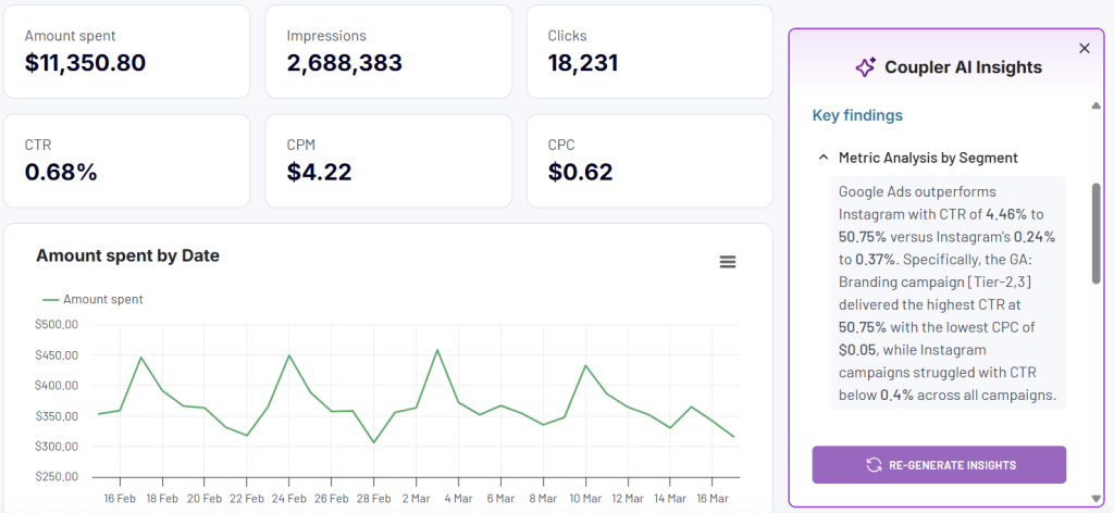
One of the key features of this CEO dashboard is the built-in AI insights designed to help you quickly make sense of your data.
This dashboard template is available natively in Coupler.io and as a template in Google Sheets, Power BI, Tableau, and Looker Studio. Implementing this PPC dashboard is easy thanks to the on-screen instructions incorporated into it. You just need a Coupler.io account to pull business data from your preferred ad channels using the built-in connectors.
PPC multi-channel dashboard
Consolidate data from multiple advertising platforms including Google, Facebook, LinkedIn, TikTok, and more to track campaign performance, analyze spend efficiency, and optimize your PPC budget allocation across channels.


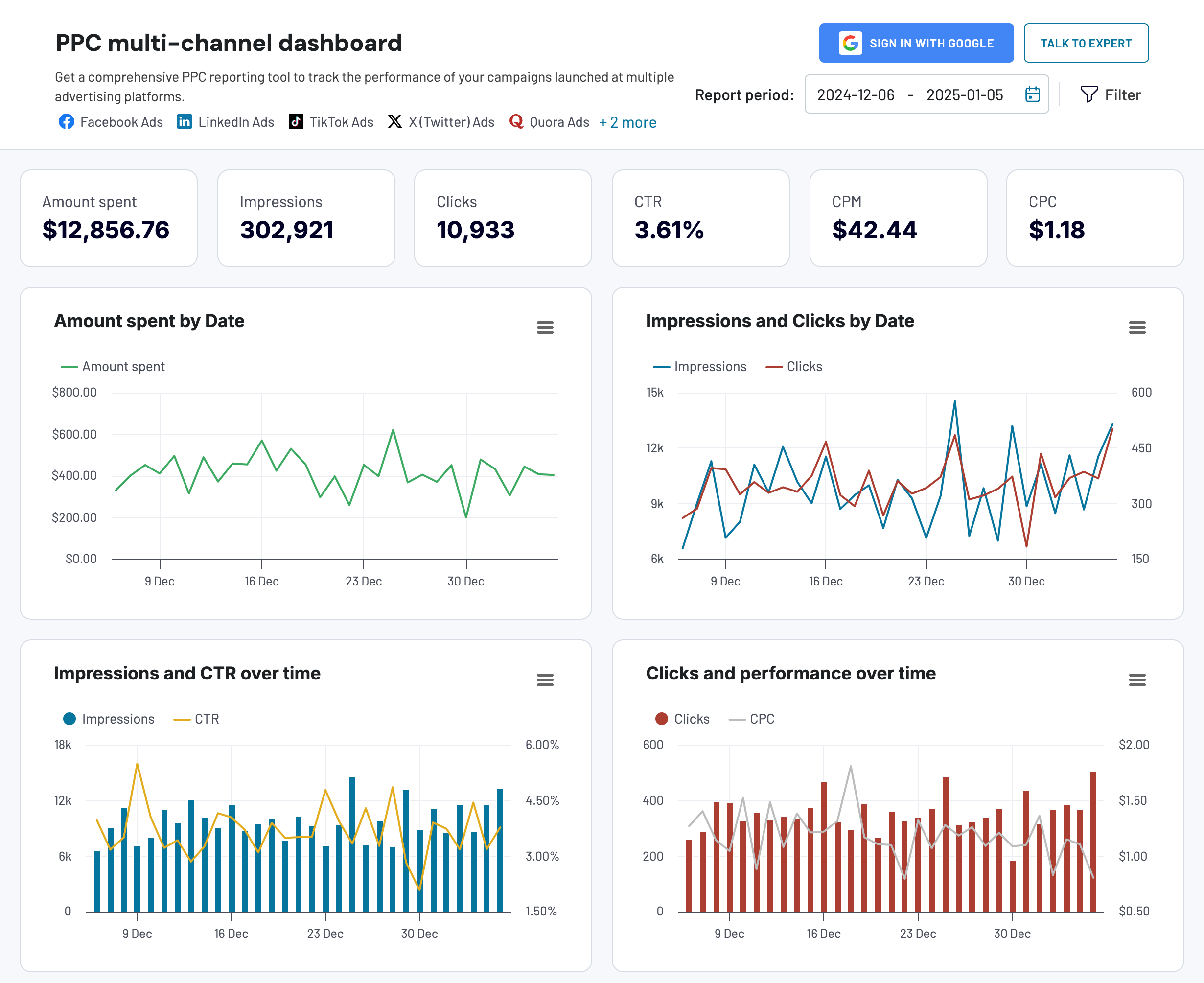
PPC multi-channel dashboard in Google Sheets
Use a PPC dashboard designed for Google Sheets to track the performance of your campaigns across multiple advertising platforms.

PPC multi-channel dashboard in Looker Studio
Get a comprehensive PPC reporting tool to track the performance of your campaigns launched at multiple advertising platforms.

PPC multi-channel dashboard in Power BI
Use a Power BI PPC dashboard for tracking and analyzing your advertising campaigns across multiple platforms.

PPC multi-channel dashboard in Tableau
Track and analyze the performance of your advertising campaigns across various platforms using a one-stop PPC dashboard in Tableau

2. All-in-one marketing dashboard
The name of this CEO dashboard speaks for itself since it provides a unified view of all your business’s marketing efforts. It gathers data from ad channels, social media platforms, email tools, YouTube, Google Analytics, and Google Search Console. As a CEO, you can observe the strengths and weaknesses of the marketing campaigns in progress.
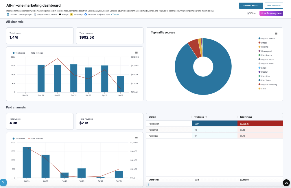
What you can do with this dashboard:
- Obtain a high-level summary of marketing channel efficiency across all the channels used and see the share of each source.
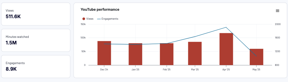
- Review the YouTube channel performance to understand how the audience engages with video content and how it impacts your overall marketing strategy.
- Monitor the performance of PPC campaigns and discover which ad platforms perform best so you can focus your efforts on those.
- Explore the organic search performance and its share compared to other marketing channels.
- Evaluate the success of your email marketing campaigns and see how you can optimize user engagement.
- Get personalized advice from AI insights on how to improve results.
This CEO dashboard is available in Coupler.io and as a Looker Studio template. You can easily retrieve data from the marketing sources using the built-in connector. If you don’t have all of the tools included in the dashboards, don’t worry; just connect those you use. To get this template for free and transform your marketing data into actionable insights, make sure you have a Coupler.io account.
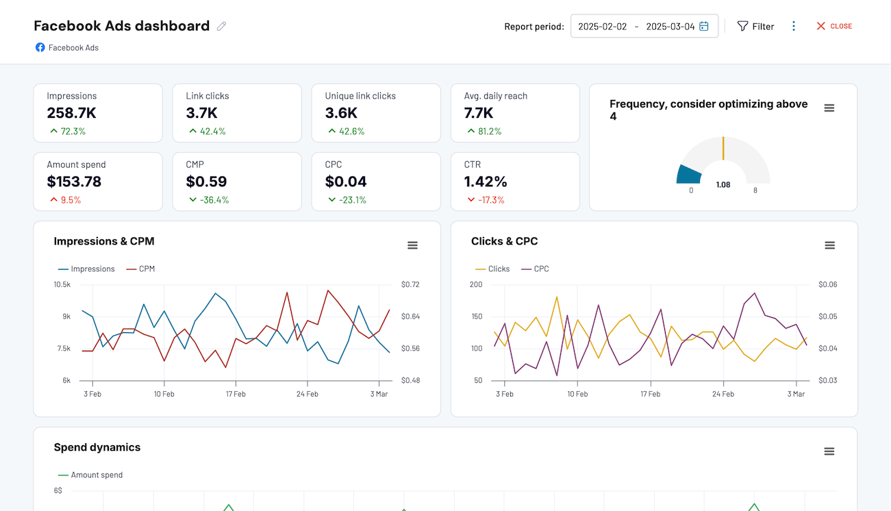
3. Facebook Ads dashboard
With this CEO dashboard template, you can comprehensively review your ad campaigns running on Facebook. It provides the possibility of observing and interpreting the key metrics to determine the effectiveness of Facebook Ads. With this information, you can easily generate ideas on optimizing your campaigns and improving user engagement.
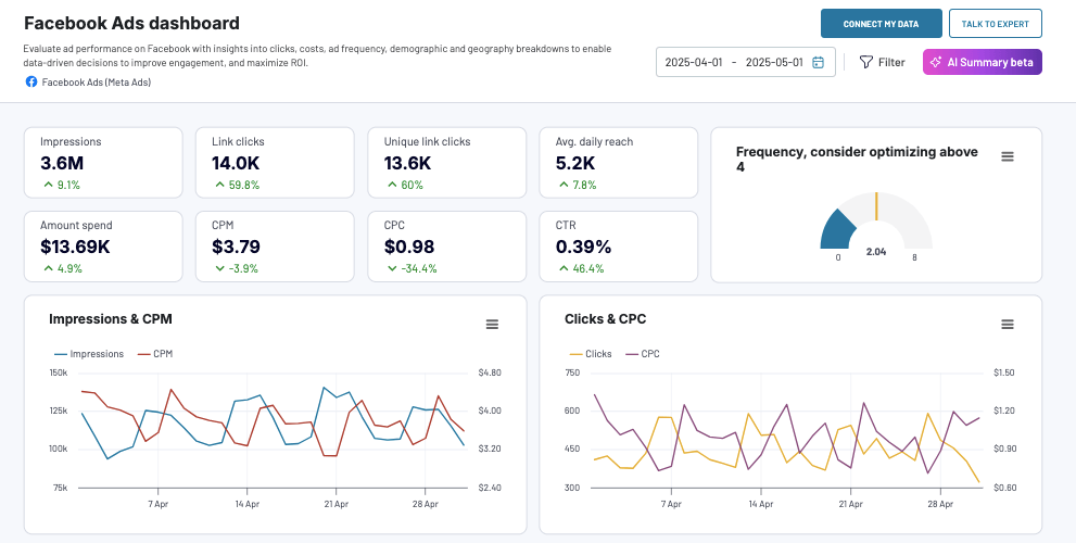
What you can do with this dashboard:
- Check how often your ads appear to users on Facebook Ads and see whether this number matches the golden standard (4-6 times). This determines the overall campaign success and indicates whether it needs further optimization.
- Gain insights into which audience segments click on your ads the most.
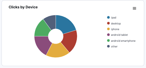
- Explore which devices your audience uses to optimize the ad appearance accordingly.
- Observe your campaign’s key metrics (amount spent, CPC, CPM, etc.) over time by selecting the corresponding time frame.
- Discover which country most of the traffic comes from to determine whether your Facebook Ads campaign needs to be retargeted.
This CEO dashboard template is available for use in the Coupler.io interface and has a built-in AI insights assistant. It also comes as a pre-configured template for Looker Studio, Power BI, and Google Sheets. To start using this report, you just need to create a Coupler.io account and follow the on-screen instructions. The data will be pulled automatically, even in real-time, once you provide access to your Facebook Ads account using the no-code built-in connector in Coupler.io.
Facebook Ads dashboard
Evaluate ad performance on Facebook with insights into clicks, costs, ad frequency, demographic and geography breakdowns to enable data-driven decisions to improve engagement, and maximize ROI.
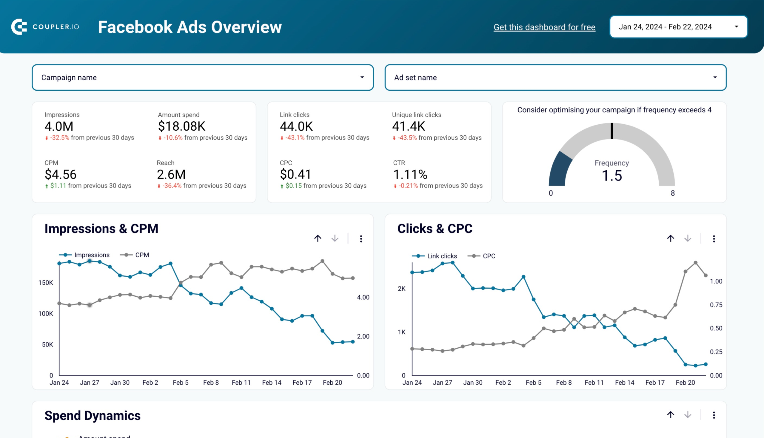
Facebook Ads dashboard in Looker Studio
Effectively manage and optimize your Facebook advertising campaigns, reaching your target audience in a data-driven way.
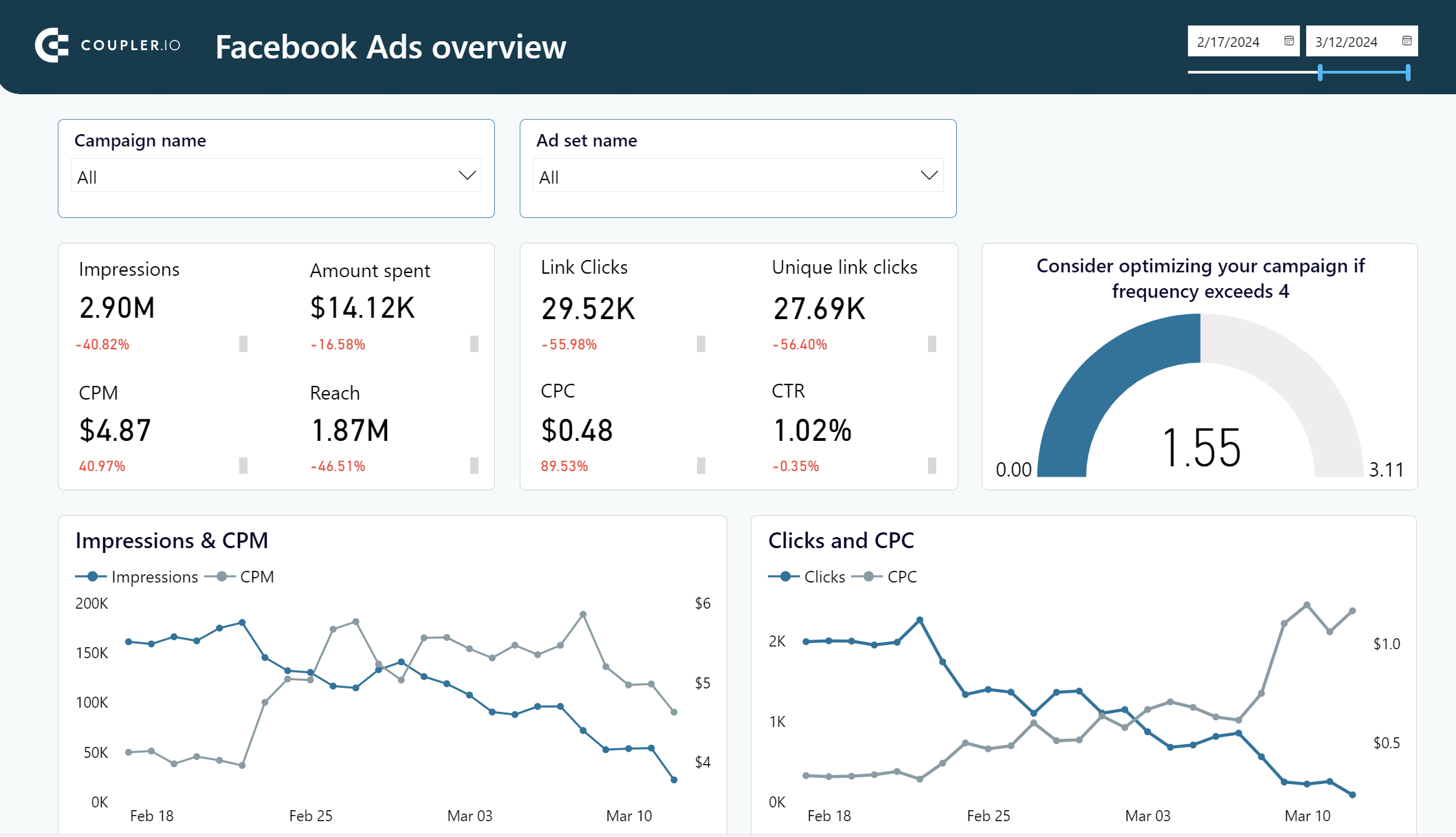
Facebook Ads dashboard in Power BI
Get a detailed overview of your advertising campaigns’ performance using a dynamic Power BI dashboard template equipped with a no-code Facebook Ads connector
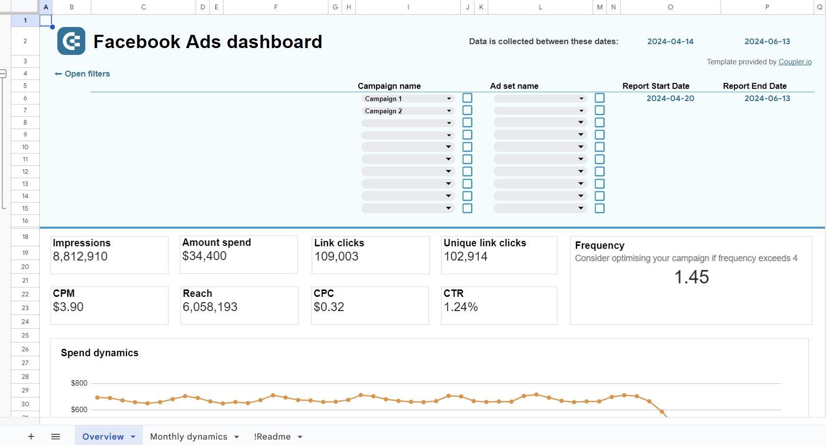
Facebook Ads dashboard in Google Sheets
Monitor the performance of your advertising campaigns in Facebook and identify top assets to spend your budget wisely.
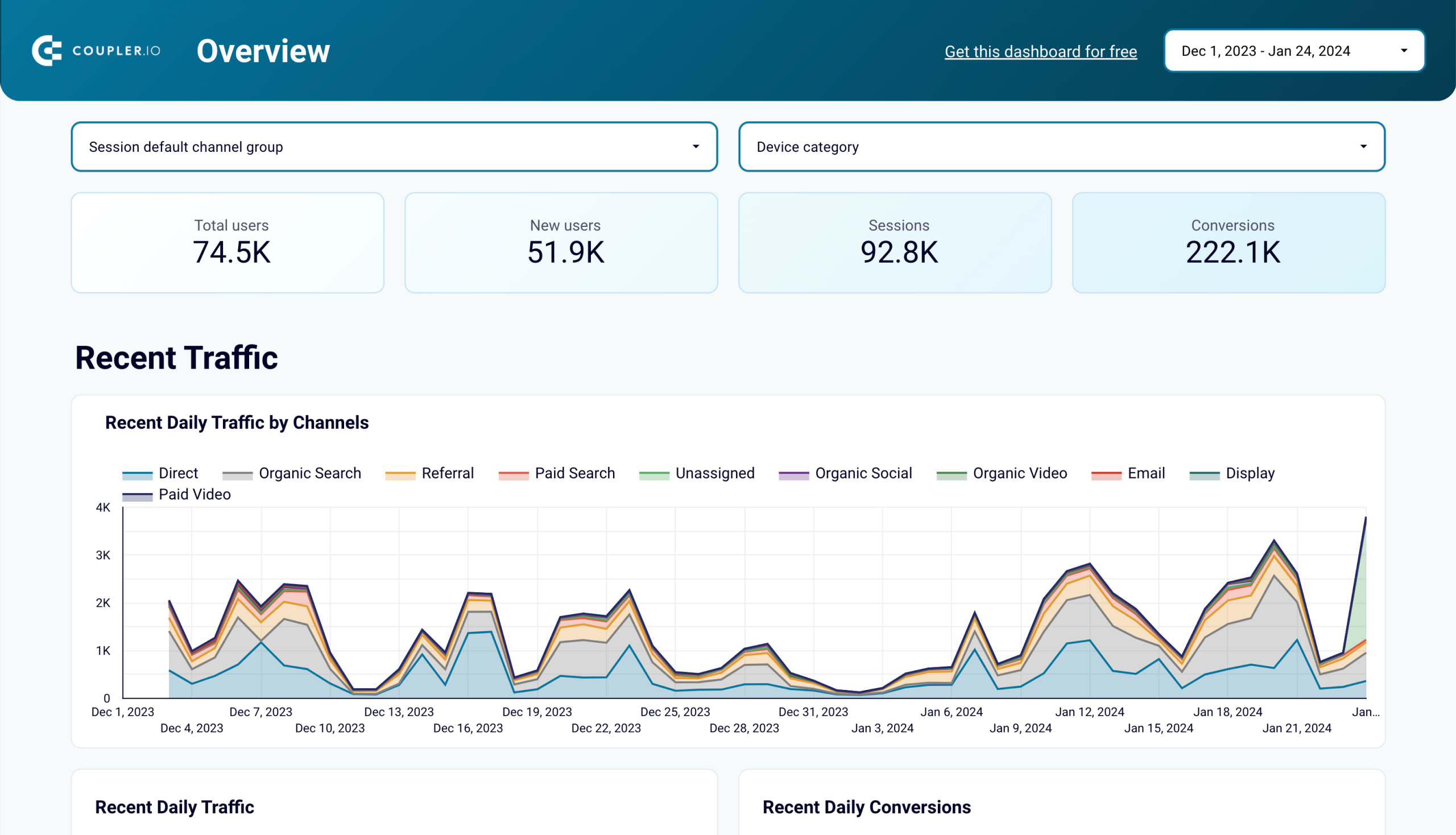
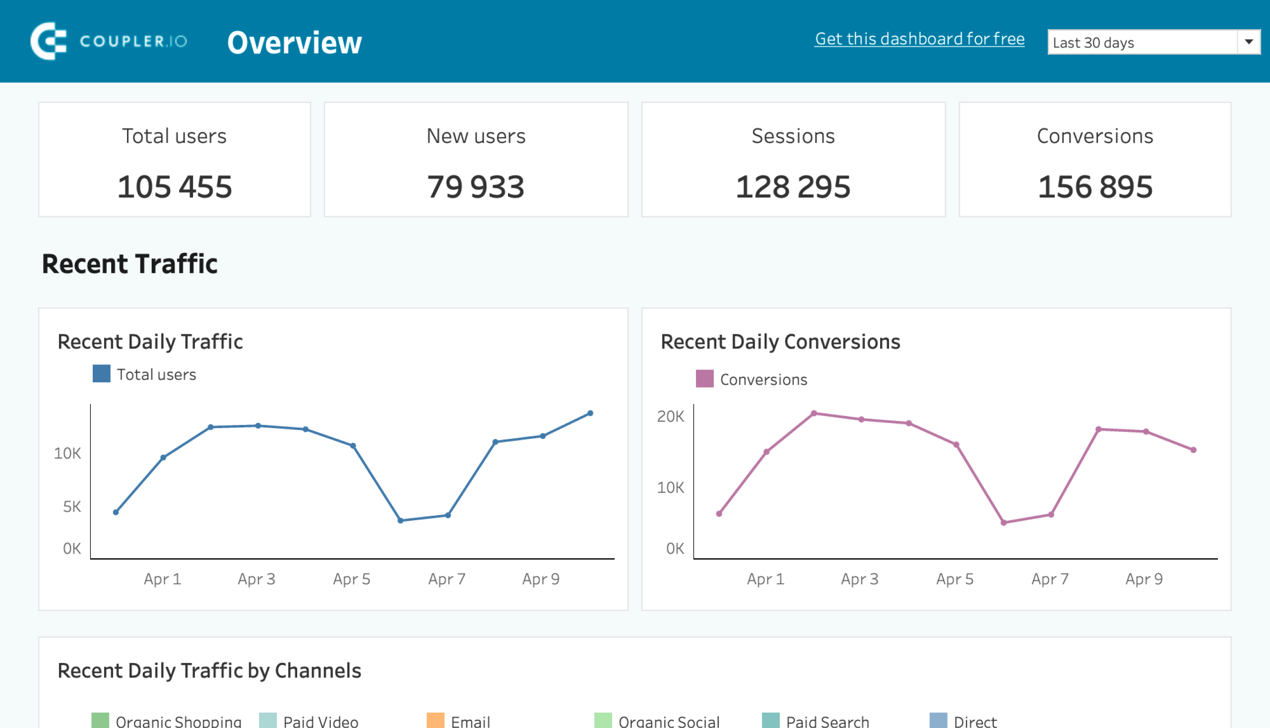
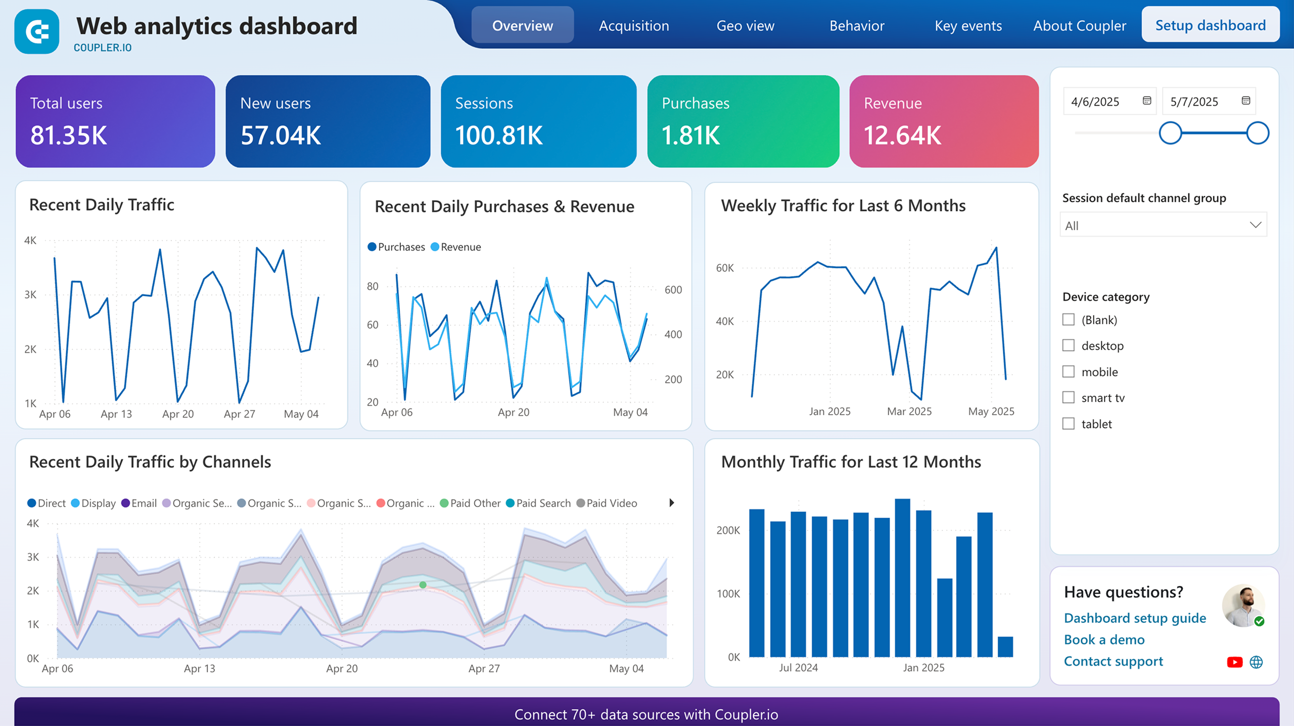
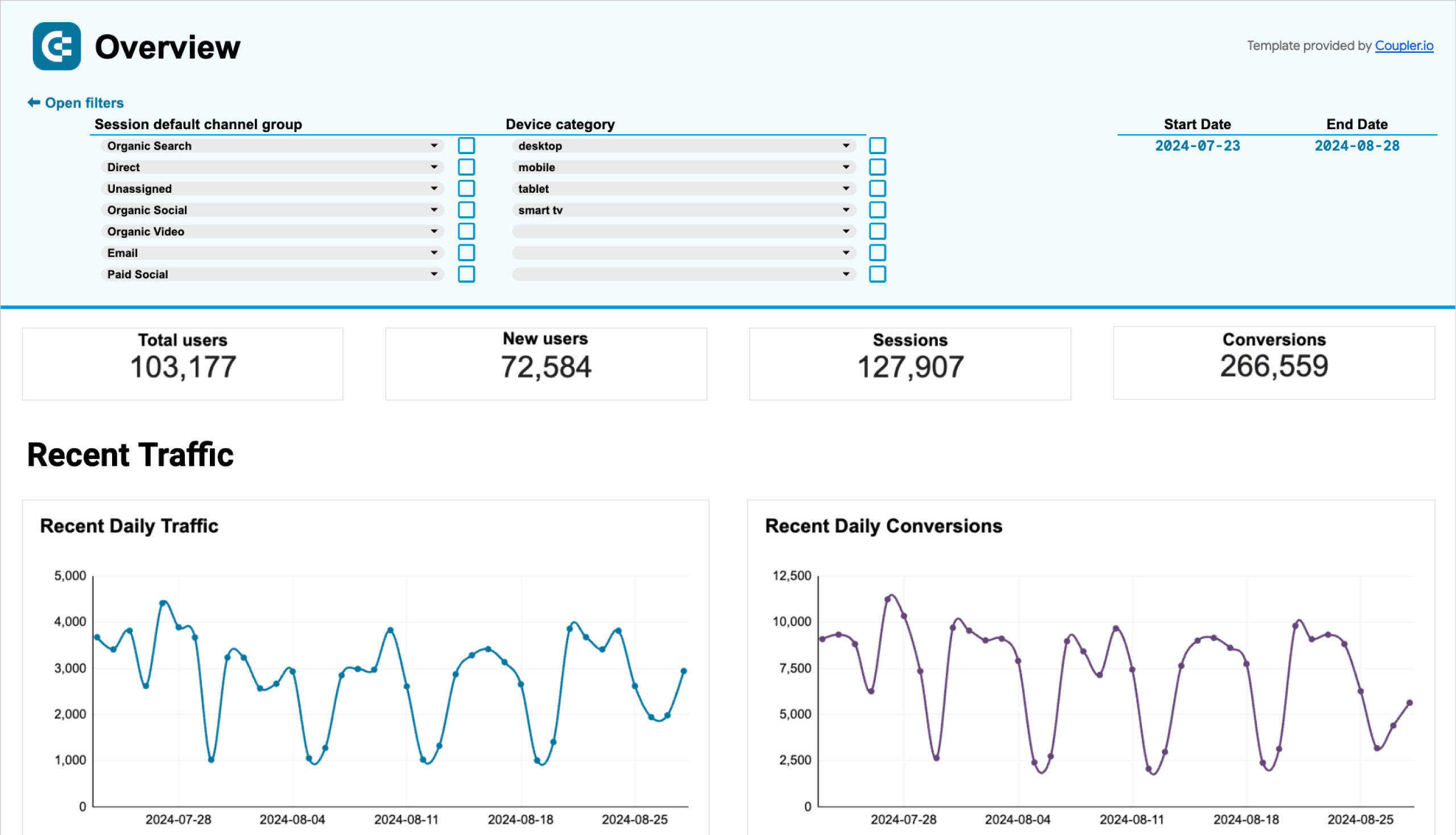
4. Web analytics executive dashboard
This reporting template is one of the most commonly used CEO dashboards by executives. It clearly depicts how users find and interact with your website. The web analytics dashboard also shows key product and marketing metrics (page views, bounce rates, purchases, etc.) so you can analyze the traffic growth on a day-by-day basis.
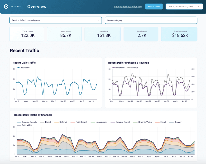
What you can do with this dashboard:
- Monitor the website traffic fluctuations for the last several days or weeks and analyze why certain peaks or drops occurred.
- Explore where your target audience comes from geographically, and see whether they found your website through organic search, paid ads, or referrals.
- Get an overview of the user characteristics, such as demographics and location data, as well as the most visited pages, to better understand your target audience and its interests.
- See details about key events (sign-ups, purchases, etc.) to understand how users get converted.
This template is available for Tableau, Looker Studio, Google Sheets, and Power BI. The detailed instructions on how to start using it are provided in the Readme tab for each version. You just need to connect to your GA4 account and specify the frequency for data extraction.
Web analytics dashboard in Looker Studio
Use the insights based on the data from GA4 to monitor your website traffic and discover which pages resonate most with your audience.

Web analytics dashboard in Tableau
Monitor the performance of your traffic, analyze the conversion funnel, and derive other insights from Google Analytics 4.
Web analytics dashboard in Power BI
Discover insights into your website’s traffic acquisition, audience, and conversions with Google Analytics 4 data seamlessly connected to our Power BI dashboard template.
Web analytics dashboard in Google Sheets
Gain valuable insights into your website’s traffic sources, user interactions, and conversion metrics based on data from GA4.
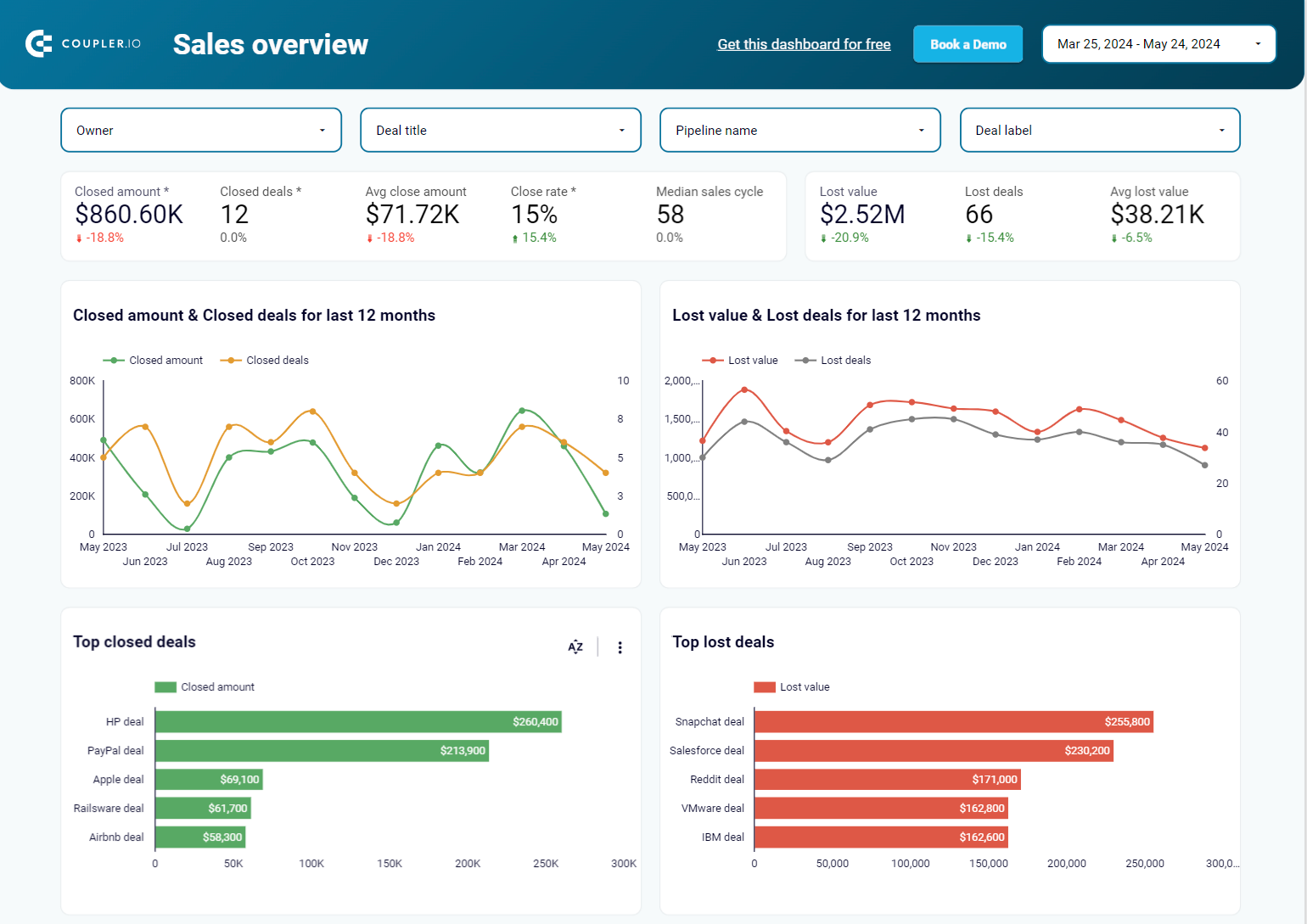
5. Sales KPI HubSpot/Pipedrive dashboards
This CEO dashboard template presents key metrics for sales performance. It connects to popular CRM systems, including HubSpot and Pipedrive, to gather and aggregate data within the unified reporting space. The Sales KPI dashboard lets you easily track the deal status, revenue trends, and sales team performance. Based on this information, you can discover what impacts the overall sales process and identify the causes of inefficiencies to derive conclusions for sales process enhancement.
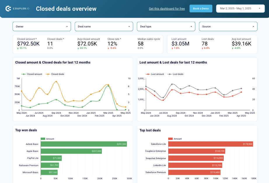
What you can do with this dashboard:
- Monitor the revenue dynamics of closed deals over time to outline seasonal patterns in sales and see which factors (conferences, team growth, economic recession, etc.) have the most influence on them.
- Assess your sales pipeline to identify any bottlenecks where many deals drop off and explore each funnel stage in-depth to identify the major reasons for such inefficiencies.
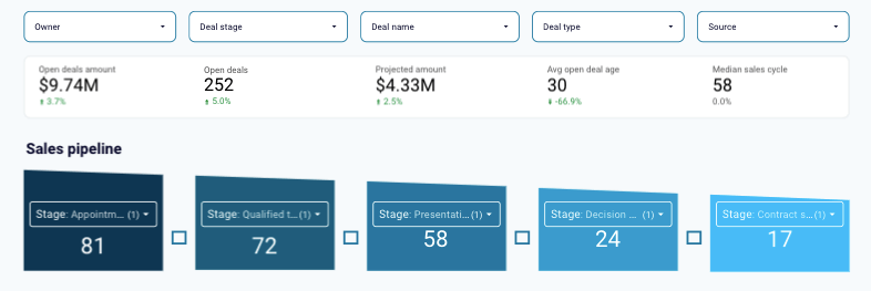
- Explore lost deals to identify the reasons that lead to the following outcomes through filtering for deal amount, country, source, and other available criteria. This will help address specific issues and optimize your sales approaches.
- See how your team performs in general and discover the efficiency of each sales representative to discover patterns that impact performance and result in high success rates.
The sales KPI dashboard is free to use for those who have a Coupler.io account. It’s designed for Looker Studio to automate CRM data flow with pre-configured connectors to HubSpot and Pipedrive. All the details on how to set up and implement this dashboard are provided in the Readme tab.
Sales KPI dashboard for HubSpot in Looker Studio
Get an overview of the HubSpot sales metrics and KPIs to derive insights into pipeline health using our sales KPI dashboard.

Sales KPI dashboard for Pipedrive in Looker Studio
Analyze the critical sales metrics and key performance indicators from Pipedrive to make smart strategic decisions.

6. Shopify orders executive dashboard example
If you need a comprehensive view of your e-commerce store, the Shopify orders template is the right instrument. Even though this platform contains built-in reports, each represents only a minor part of the entire online shop. Therefore, using this CEO dashboard that combines all the crucial aspects of e-commerce store performance in one place makes sense. It shows key indicators like total sales, total tax, average order value, total orders, shipping countries, and many others.
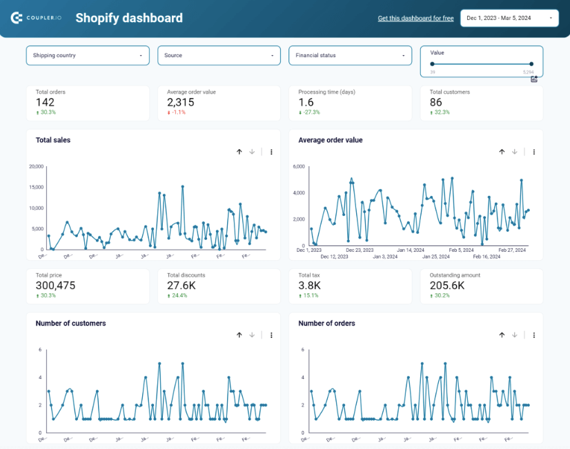
What you can do with this dashboard:
- Explore the order shipment information by country to make further logistics and courier partnership decisions. For instance, if you had only one delivery to a country with high shipping costs, limiting the availability of shipments in that region makes sense.
- Discover the top-selling items in your online shop to ensure proper stock levels that match the current demand and align this information with your production facilities.
- Find a correlation between the blocked orders and the geographic regions to determine patterns that limit purchases in certain areas.
- Spot the sources that bring the most customers and consequent conversions to your Shopify store with the Source filter. That way, you can make informed decisions about where to focus your marketing and sales efforts.
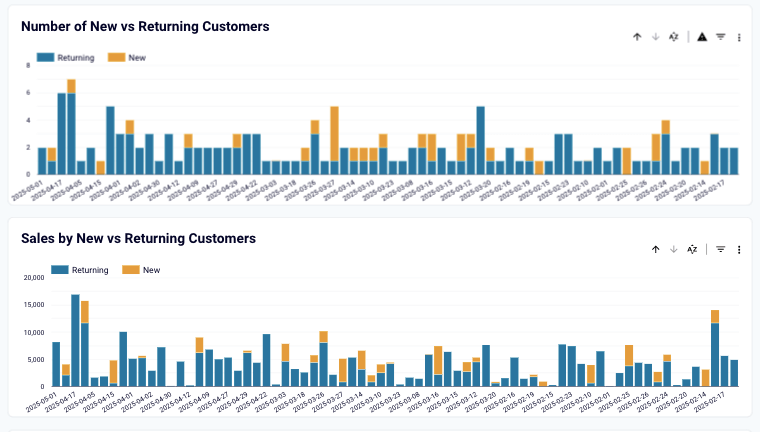
- Review the cohort analysis to see the number of orders placed by new and existing clients and compare them. Based on the obtained data, decide whether customer retention programs need to be implemented.
This CEO dashboard is a ready-to-use white-label template designed by Coupler.io and available for Looker Studio. The Readme tab provides all the information needed to start utilizing this reporting solution. You just need to give access to your Shopify store via a pre-built connector and specify the frequency of data updates to start getting insights.
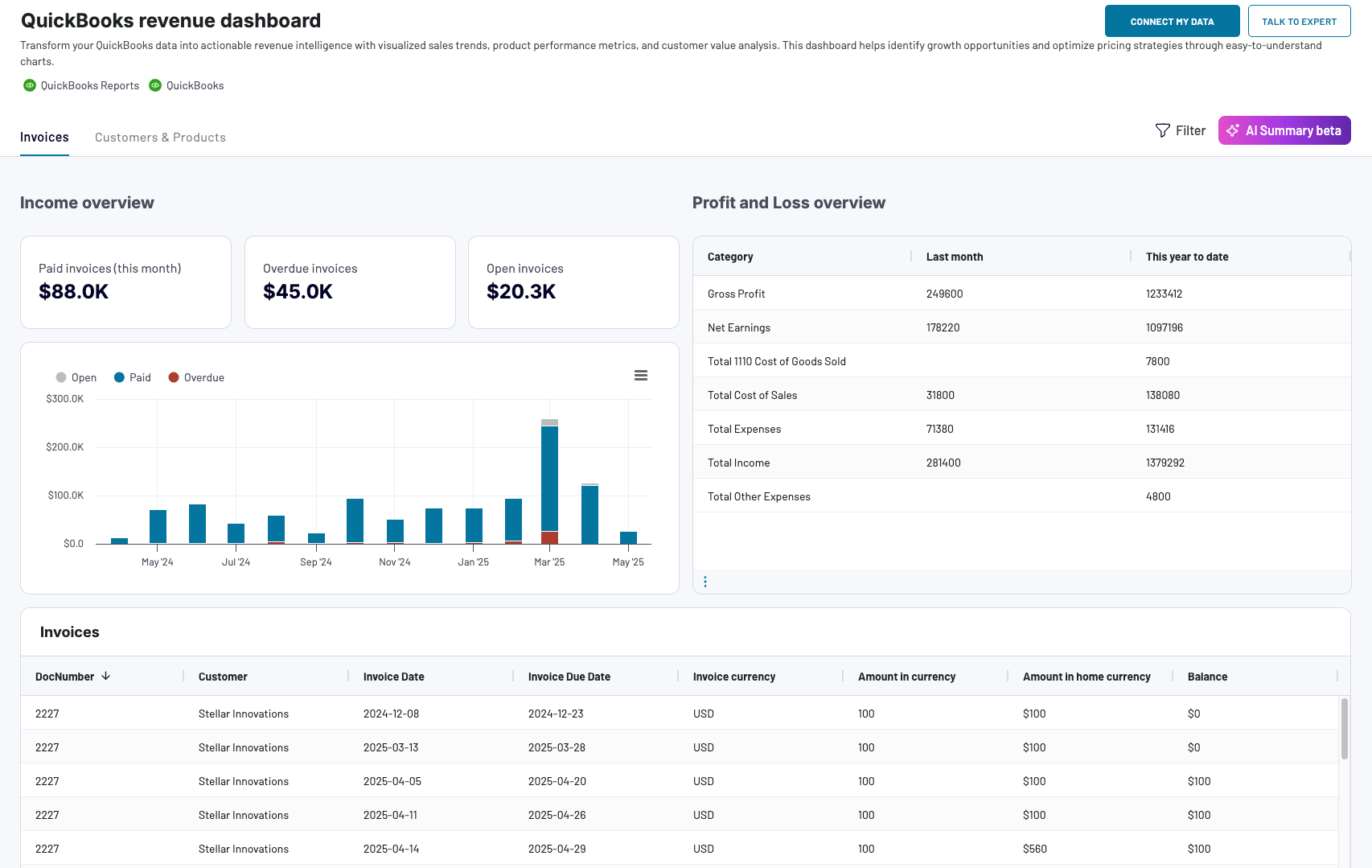
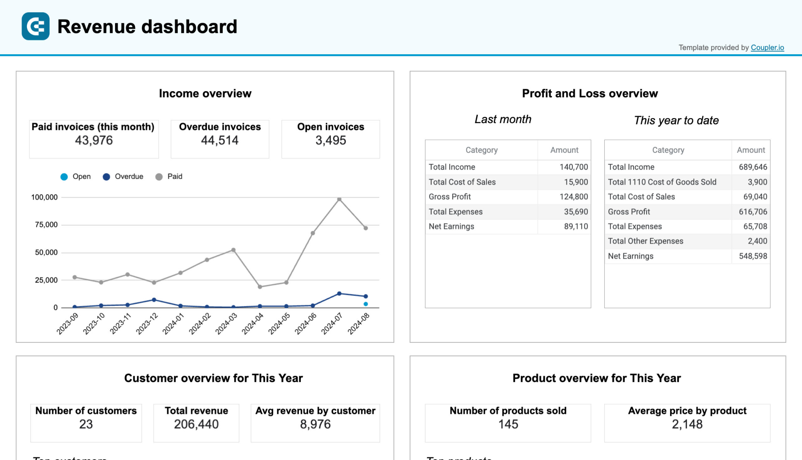
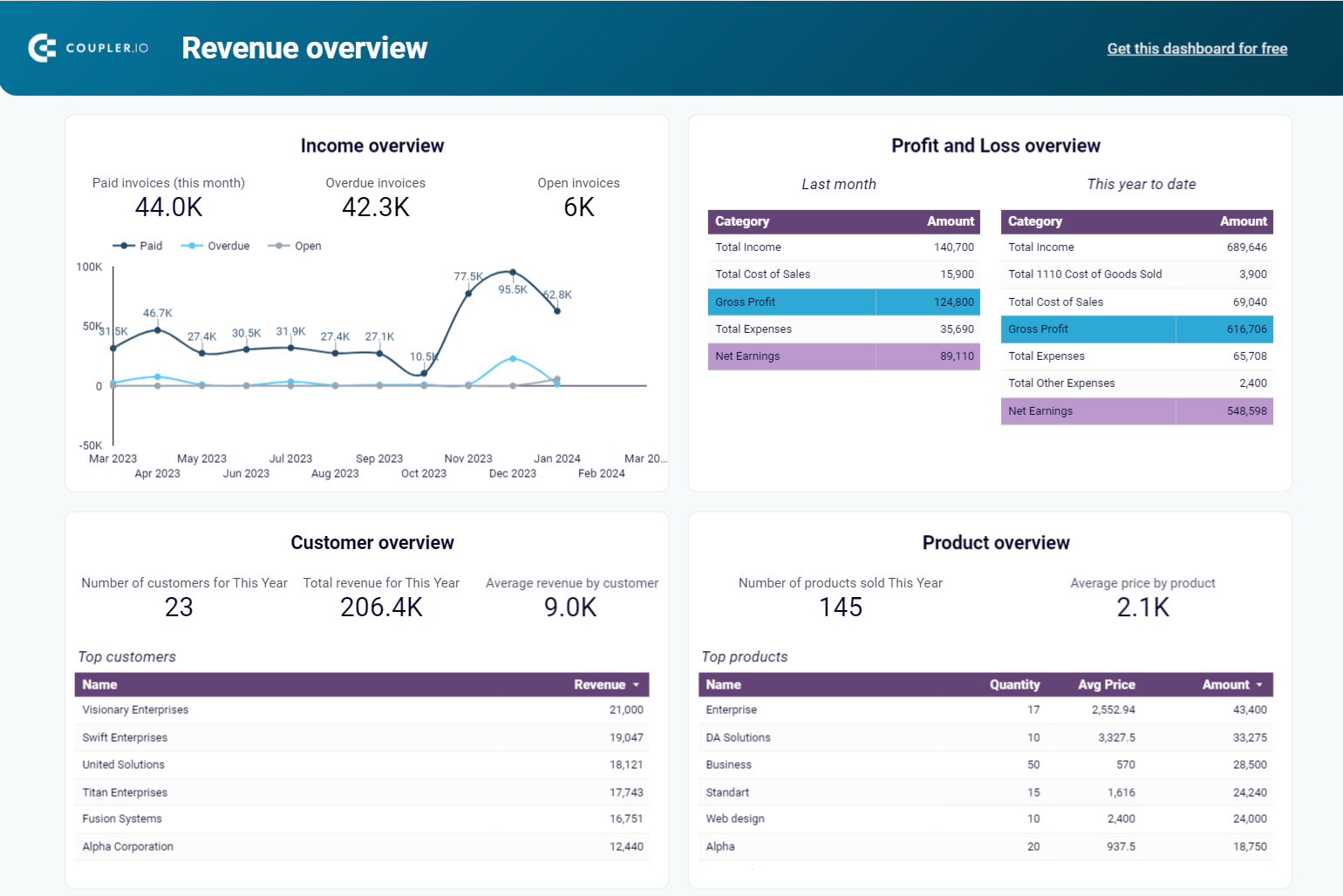
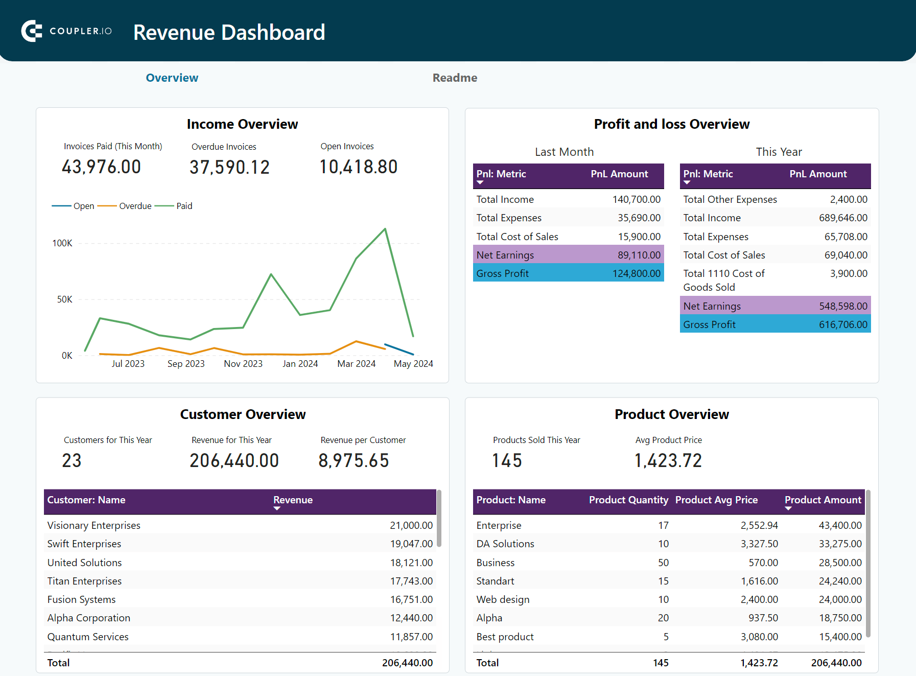
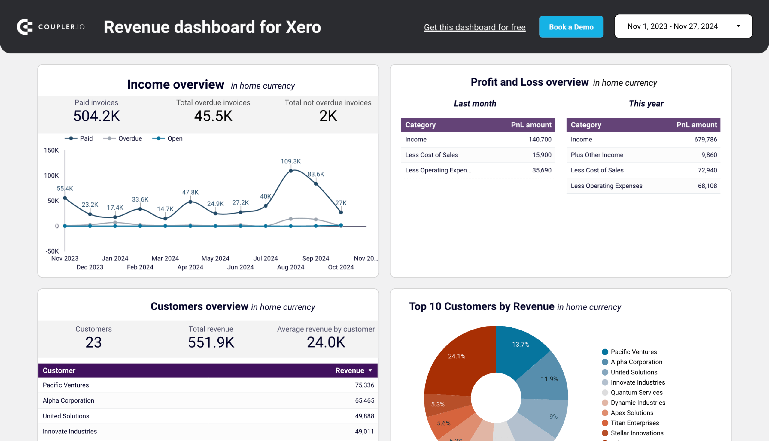
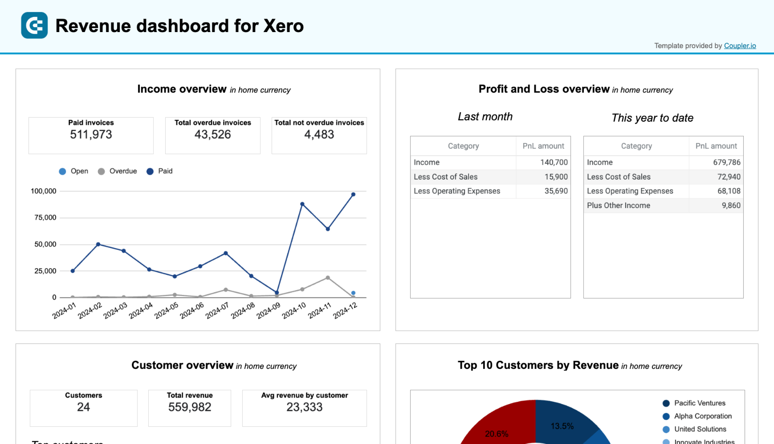
7. Revenue dashboard for Xero/QuickBooks
This one is among the fundamental CEO dashboards for executives and top managers. The revenue dashboard provides a clear overview of the company’s income and expenses. It also shows the distribution of revenue by customers and products.
QuickBooks revenue dashboard + AI insights
 Preview dashboard
QuickBooks revenue dashboard + AI insights
Preview dashboardWhat you can do with this dashboard:
- Track the revenue flow for up to 12 previous months to define seasonal peaks and drops.
- Explore which customers have largely contributed to the overall income during the selected period.
- Compare the profit and loss results to define whether your business is profitable. With this information, you can also execute financial planning and budgeting for the upcoming fiscal periods.
- Find out which of your company’s products generate the highest revenue to adjust the inventory management and optimize promotions for less popular items.
The revenue dashboard comes in two variations: for QuickBooks and for Xero. The financial data can be pulled from your preferred platform by connecting it to Coupler.io with no coding required. To start working with the revenue dashboard, check the instructions provided in its Readme section and create a Coupler.io account for free! Here are the versions of the dashboard for QuickBooks.
QuickBooks revenue dashboard
Transform your QuickBooks data into actionable revenue intelligence with visualized sales trends, product performance metrics, and customer value analysis. This dashboard helps identify growth opportunities and optimize pricing strategies through easy-to-understand charts.

QuickBooks revenue dashboard in Google Sheets
Analyze your revenue through a set of reports collected from QuickBooks Online on a single dashboard.
QuickBooks revenue dashboard in Looker Studio
Get an overview of your revenue based on the data from QuickBooks and unlock in-depth insights to drive informed business decisions.
QuickBooks revenue dashboard in Power BI
Monitor your income and expenses on an all-in-one revenue dashboard connected to your QuickBooks Online account.
And this is a set of the revenue dashboard for Xero. Keep in mind that the native Coupler.io dashboards for both Xero and QuickBooks are equipped with AI assistant.
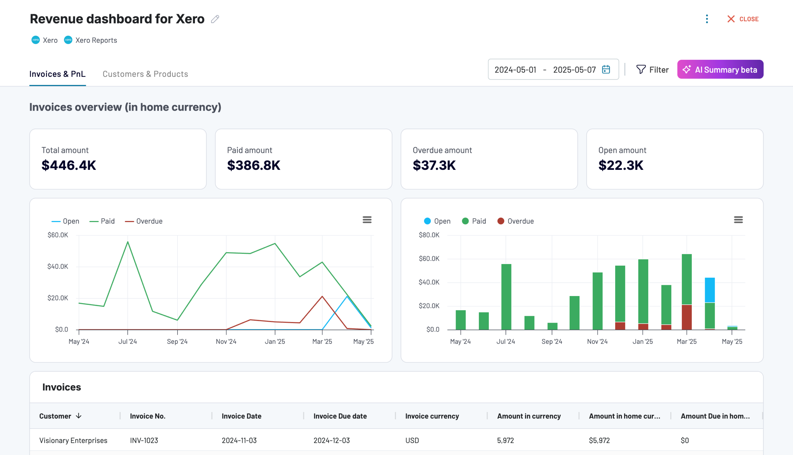
Revenue dashboard for Xero
Analyze revenue streams, customer spending patterns, and product performance with data automatically synced from Xero. Gain actionable insights into sales trends, top-performing products, and high-value customers to drive growth strategies.

Revenue dashboard for Xero in Looker Studio
Get an overview of your profit and loss, products, and customers through a set of reports collected from Xero.
Revenue dashboard for Xero in Google Sheets
Track your revenue, costs, and customer insights with a comprehensive dashboard connected to your Xero account.
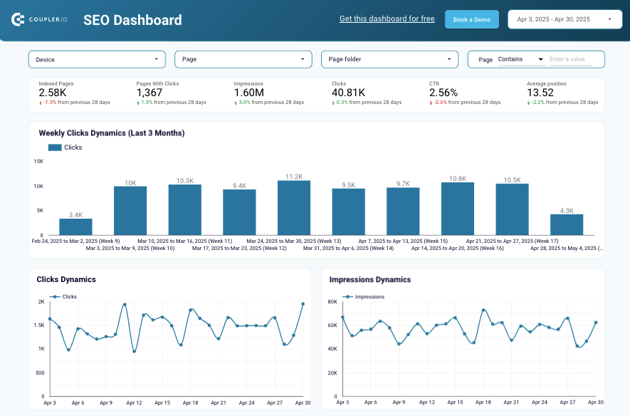
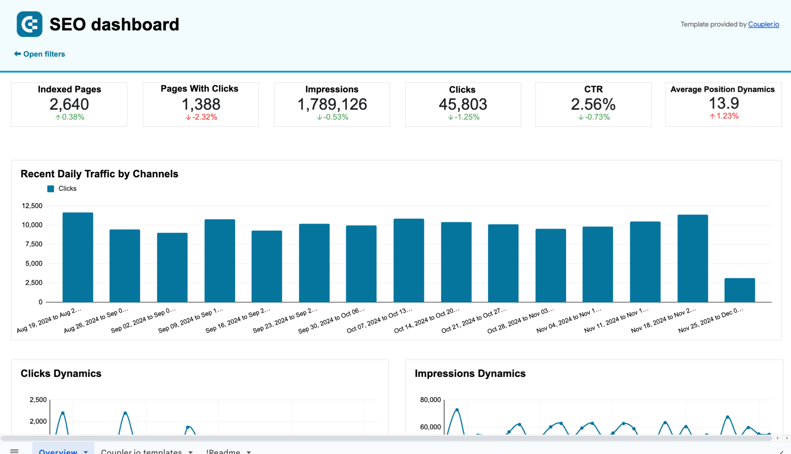
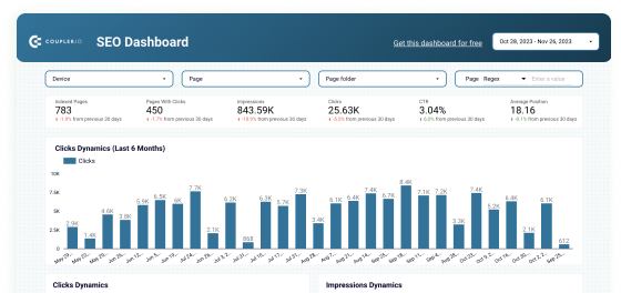
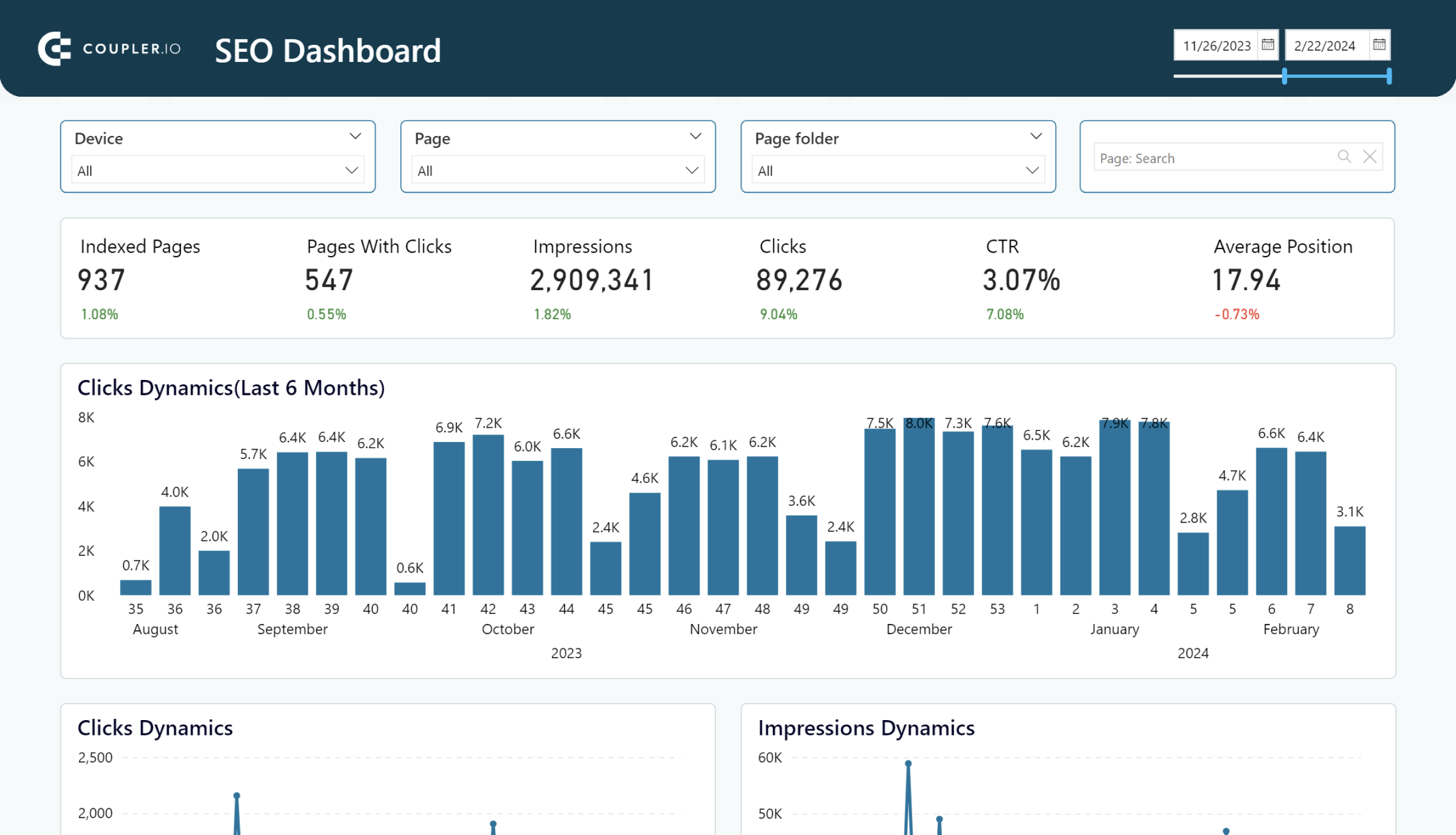
8. SEO dashboard
This dashboard for CEOs provides an all-in-one overview of the SEO-related aspects for management. It helps you understand how your website appears on search engines and how users interact with it. With this SEO report, you will easily understand which pages are the most frequently visited, how often users click on CTAs, which keywords perform well, and more.
What you can do with this dashboard:
- Track traffic fluctuations on a weekly basis to analyze how the most recent Google updates, internal SEO optimization processes, and other factors impact your website’s rankings.
- Explore the reach levels by paying attention to impressions to understand how often your web pages appear in search engine results for users.
- Monitor the average position dynamics over time to identify any drops in traffic and start optimizing your page content to regain your positions on search results.
- Analyze the best and worst-performing pages to derive conclusions on what factors have influenced the gain and loss of traffic, respectively. Design best practices to enhance the performance of existing pages.
- Investigate the performance by device to determine where users interact best with your website. With this information, decide how to optimize your website’s appearance for various devices to drive more traffic and conversions.
SEO dashboard template extracts the information from Google Search Console via a pre-built Coupler.io connector. It’s available for Looker Studio, Power BI, and Google Sheets. Select the version that meets your reporting needs and follow further guidelines in the Readme tab.
SEO dashboard for Google Search Console in Google Sheets
Get an overview and details of the key performance metrics from Google Search Console required for SEO of your websites.

SEO dashboard for Google Search Console in Looker Studio
Optimize SEO with Looker Studio’s dashboard for Google Search Console. Track and enhance page rankings, CTRs, and organic traffic efficiently.
SEO dashboard for PowerBI
Optimize SEO with PowerBI’s dashboard for Google Search Console. Track page rankings, CTRs, and organic traffic efficiently.
In addition to the top 8 dashboards for executives, there are other reporting solutions that grant a complete business overview. These dashboards can be categorized (Marketing, Sales, Finance, etc.) and applied in their respective business areas.
CEO dashboards to overview marketing efforts
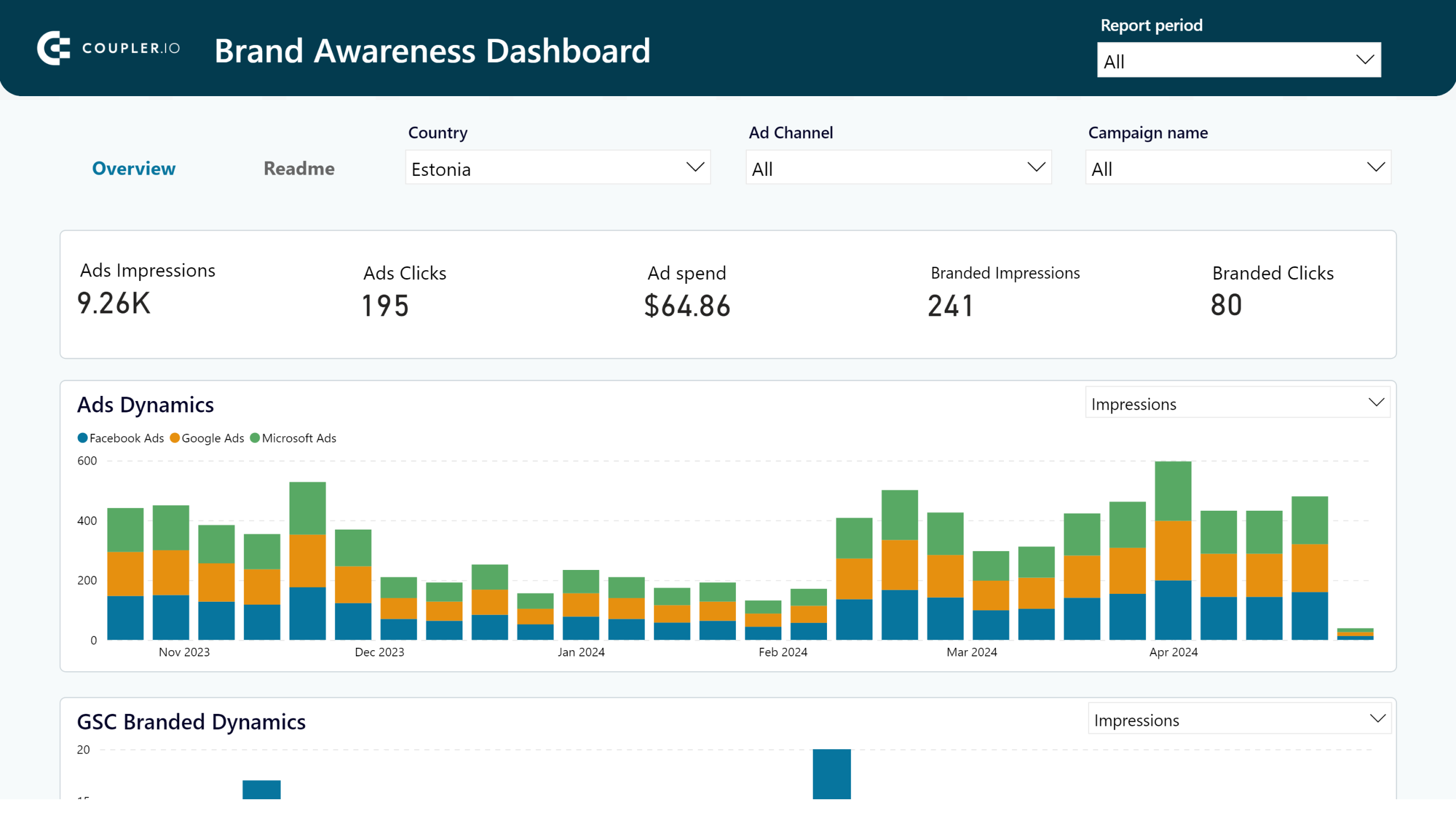
9. Brand awareness dashboard
If you aim to increase awareness of your brand, this CEO dashboard is the right place to start. It helps you to keep an eye on the correlation between branded keyword searches, branded clicks, ad clicks, and ad impressions across platforms (Google Search Console, Google Ads, Bing Ads, and Facebook Ads).
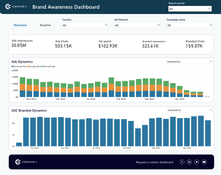
What you can do with this dashboard:
- Monitor how ad impressions correlate with global branded searches on a global scale if you run advertisement campaigns worldwide.
- Explore the correlation of branded ads and impressions locally by selecting a specific country from the Country filter drop-down list. Perform this procedure for each country where your campaigns run and compare the results.
- Evaluate the performance of each ad campaign by selecting the appropriate option in the Campaign drop-down list. See which campaign shows the best results for increased brand awareness and reallocate your budget accordingly.
- Investigate the outcomes of ad campaigns for each platform (Google Ads, Facebook Ads, etc.). Decide which of them contributes to increased brand awareness, and distribute your marketing efforts wisely.
The brand awareness dashboard is only available for Power BI at the moment. Detailed instructions on how to start using it within your Power BI workspace are provided in the Readme tab. Even if you don’t implement all the ad platforms used in this report, you can set up only those you use via the pre-configured Coupler.io connector.
Brand awareness dashboard
Understand how your advertising campaigns in Facebook, Google, and Bing correlate with branded searches in Google to optimize your brand awareness.
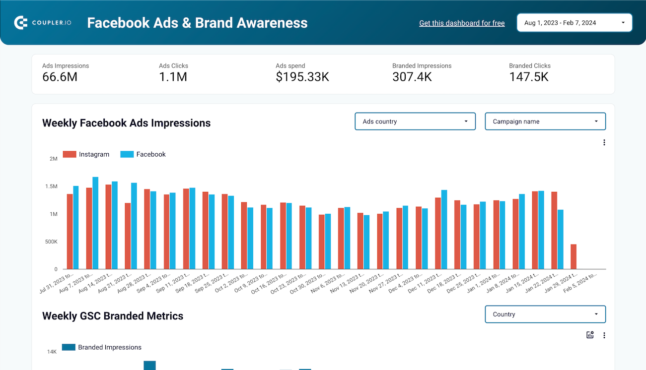
Facebook Ads & Brand awareness dashboard
Understand how your Facebook or Instagram Ads campaigns impact brand awareness. Find a correlation between paid impressions and branded searches in Google. Check country by country with 2 simple charts to find where your Ad spend impacts the most.

Branded organic search vs. paid campaign performance dashboard for Google
Compare the performance of branded searches from Google Search Console with paid campaigns on Google Ads to gain insights into your overall brand impact.
10. Advertising budget forecast dashboard
This CEO dashboard template is a convenient instrument for marketing teams that run ad campaigns. It primarily focuses on the amount spent and performance metrics for each ad campaign running on Google Ads, Facebook Ads, LinkedIn Ads, TikTok Ads, and other popular platforms. A notable advantage of this report is that it shows predicted spend and results for the upcoming month.
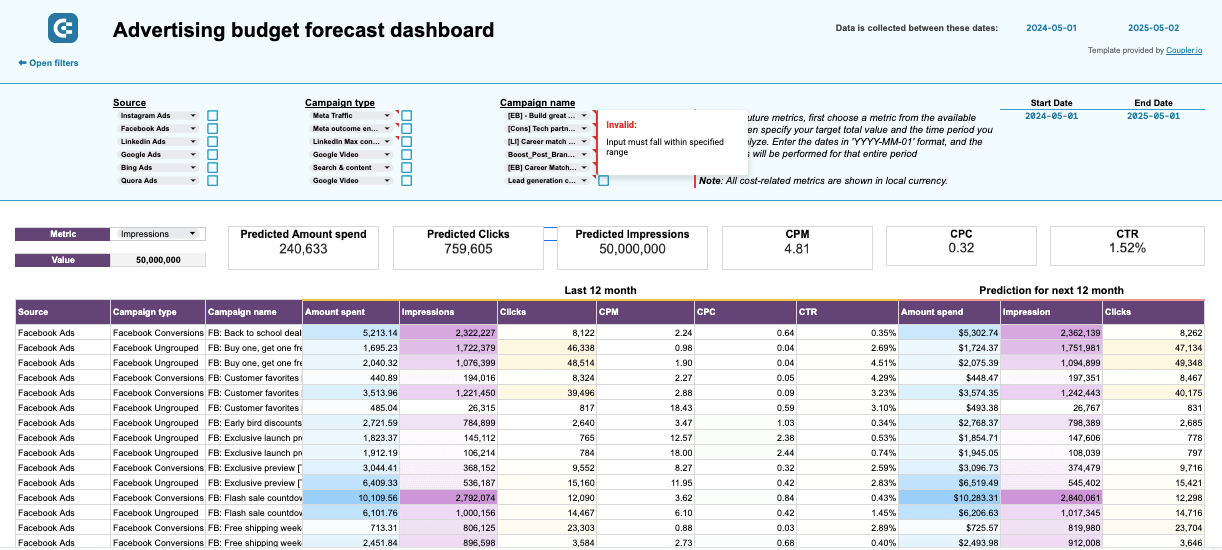
What you can do with this dashboard:
- View and compare KPIs (impressions, clicks, CTR, CPC, etc.) across platforms within a unified view. This way, you can identify which source delivers the highest ROI and achieve your marketing goals.
- Control the remaining sum for ad activities for the current month with smart color markets in order to stay on the budget.
- Compare the actual budget spending with the planned one for more refined financial planning and budget allocation for future campaigns.
- Explore the approximate spending for future ad campaigns and the expected values for key metrics derived from the previous monthly activity and historical data.
The ad budget forecast report is designed for Google Sheets by Coupler.io. To start using it, you need a Coupler.io account and an installed add-on in Google Sheets. That way, you will be able to extract data from advertising platforms in just a few clicks right into your dashboard.
CEO dashboards to analyze sales activities
11. Salesforce CRM dashboard
This CEO dashboard provides a comprehensive overview of popular CRM systems. In this case, we review Salesforce-oriented variants, though the reporting template is also available for Pipedrive and HubSpot tools. With this dashboard, you can clearly see which sources bring leads and generate revenue effectively. What’s more, you can explore existing sales opportunities in detail and drill down into the specifics of the sales pipeline.
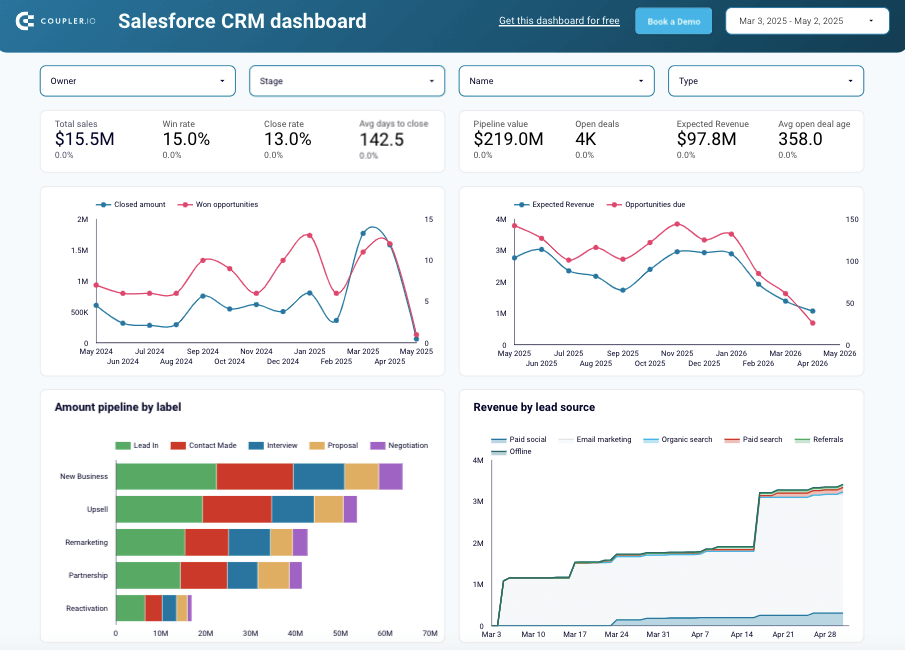
What you can do with this dashboard:
- Filter your current sales opportunities by owner, campaign, stage, and type to obtain a more specific view of the sales picture.
- Compare the actual revenue to the number of won opportunities to define sales trends.
- Explore the approximate number of upcoming opportunities and expected revenue.
- View a detailed breakdown of opportunities across deal stages to discover any drop points in the pipelines and address them appropriately.
- Assess the performance of each sales team member to pinpoint who brings the most won deals and find out which factors contribute to that, either internal or external.
- Get a detailed overview of the opportunities to focus on those that will potentially provide the biggest impact and take a look at the stalled ones to uncover the possible reasons for that.
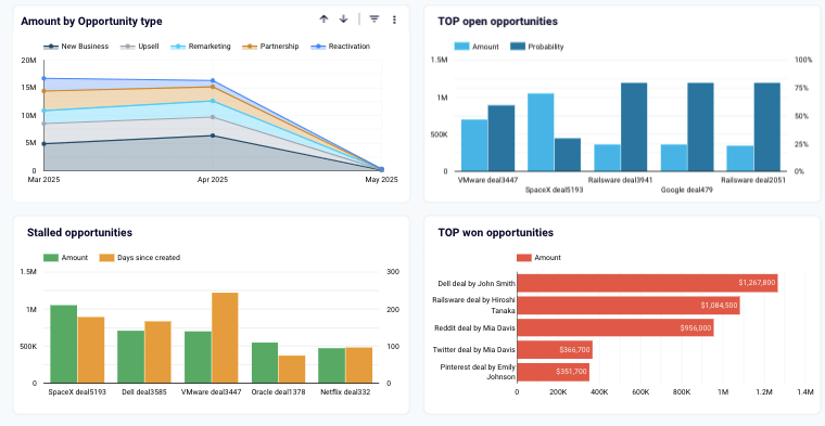
The Salesforce CRM template is available for Google Sheets and Looker Studio. Both variations are equipped with the Coupler.io connector that automates data extraction from your Salesforce account to the dashboard. More instructions on how to use and configure this reporting template are provided in the Readme tab.
12. Sales team performance dashboard for Salesforce
If you need to get a detailed overview of individual sales representative performance, this template would be very helpful. It pulls data from your Salesforce CRM and structures it in a visually appealing report. The dashboard also depicts the overall results of the entire sales team’s effort.
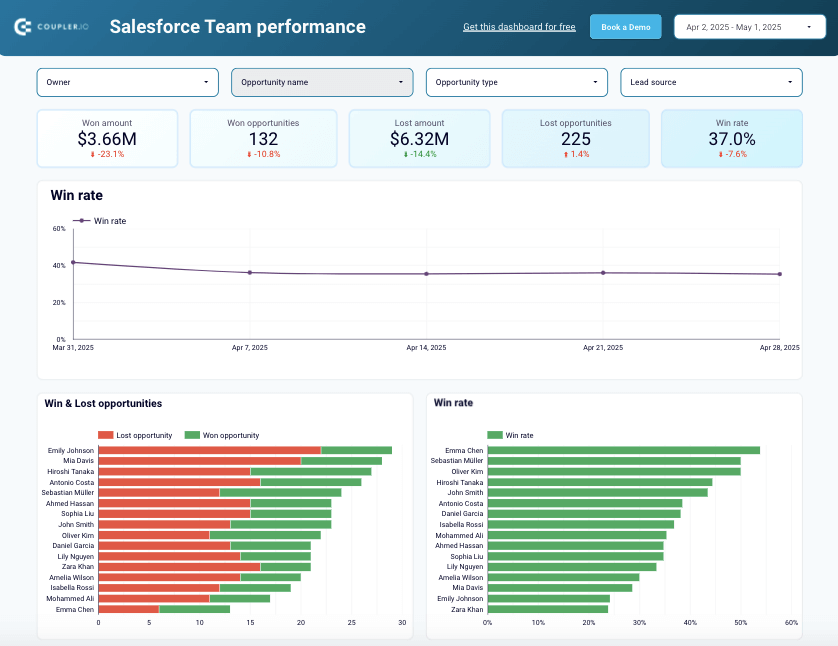
What you can do with this dashboard:
- Segment sales team members by applying the Owner filter to explore their individual performance and deal types they handle by geography, stage, and lead source.
- Filter the sales metrics by opportunity type to explore and compare the performance of each sales representative. This information will help to allocate team members according to the area where they show high won rates.
- Compare the won and loss rates of sales team members to quickly spot the best performers and assign them to the deals with the highest potential.
- Explore the types of closed deals for each sales manager to discover the strengths and weaknesses of each representative. This information will help you allocate each manager to the areas in which they are confident.
- See the sales pipeline of each team member and pay attention to areas where most drop-offs occur. Carry out a detailed analysis to find out the reasons why opportunities are fading away and provide some pieces of advice to your sales members.
Sales team performance dashboards come in two versions: for Looker Studio and Google Sheets. In both cases, you can use a pre-built connector to pull data from Salesforce with no coding required. Explore the Readme section for more details on using the dashboard.
CEO dashboards to track ecommerce activities
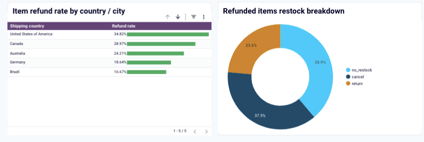
13. Inventory dashboard for Shopify
With this CEO dashboard template, you can gain control over the stock levels and order patterns in your online Shopify store. It also includes information about returned and refunded items by country and type. Overall, this inventory dashboard for Shopify helps you maintain optimal stock levels and identify problematic products.
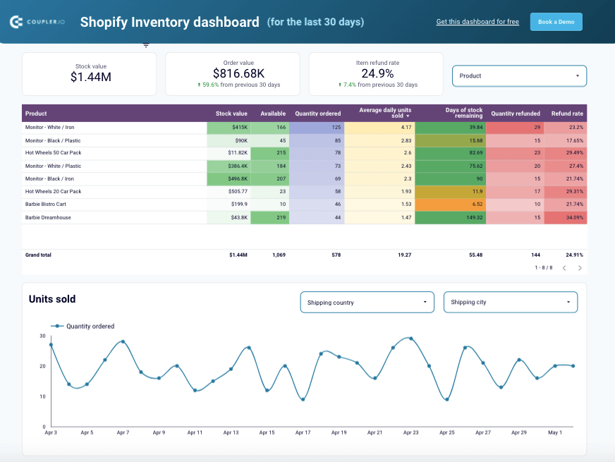
What you can do with this dashboard:
- Observe all the products and their key characteristics (items in stock, daily turnover, etc.) in a unified view.
- Spot the most popular items in your online store to ensure proper procurement levels and organize logistics operations for continuous supply.
- Detect the countries with the highest refund rates and investigate the root causes. With this information at hand, you can either optimize the shopping experience in those regions or exit those markets.
- Define the sales patterns, with peaks and drops, to plan supply management for the future. Use filters to see how these patterns vary across cities and countries.
- Carry out a detailed analysis of the returned items and see whether there is an issue with the product itself or whether it’s a region-based trend.
- Explore the stock levels in each geographical region to optimize refillment operations and reduce shipping costs.
You can use this reporting template in Looker Studio to transform dispersed data from your online store into a digestible format. Thanks to Coupler.io’s pre-configured connector, you can easily pull data from Shopify and send it to the destination. All you have to do is create a Coupler.io account and check the Readme tab to set everything up.
14. Shopify sales funnel dashboard
This sales funnel dashboard provides a 360-degree overview of your sales processes. With this reporting template, you can track the customer journey and analyze e-commerce performance by channel, items, and country. In a nutshell, the sales funnel dashboard delivers valuable tools to help you optimize the overall sales strategy or its components.
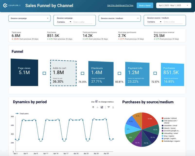
What you can do with this dashboard:
- Review the five-stage funnel representing the sales process, from page view to purchase, with raw numbers and conversions. This data helps you detect the points of frequent drop-offs and optimize your strategy to boost sales.
- Decide which sales channel shows the highest conversion rates by applying the session source filter or reviewing a dedicated table. This information will help to promote enhanced investment decisions for ad campaigns.
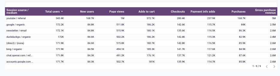
- Assess the purchasing dynamics by geographic regions to understand the local market trends and adjust country-specific strategies. Compare performance in different zones to detect those with the highest number of conversions and the highest traffic.
- See the detailed breakdown of the sales funnel by item to detect products that generateinterest and convert well to understand your revenue drivers. At the same time, spot those items that result in a high cart abandonment rate and initiate the processes of finding the root causes of this.
- Analyze the daily, weekly, and monthly traffic of your Shopify store to detect popular shopping times, which is helpful for ad campaign planning.
Even though this Looker Studio template is designed for Shopify, it extracts information from the GA4 platform. Therefore, make sure that your store is connected to Google Analytics 4. If you need help with this, check out the instructions in our article about Shopify analytics. Afterwards, proceed with the instructions available in the Readme tab. The entire setup process will take you up to 5 minutes.
CEO dashboards to overview financial performance
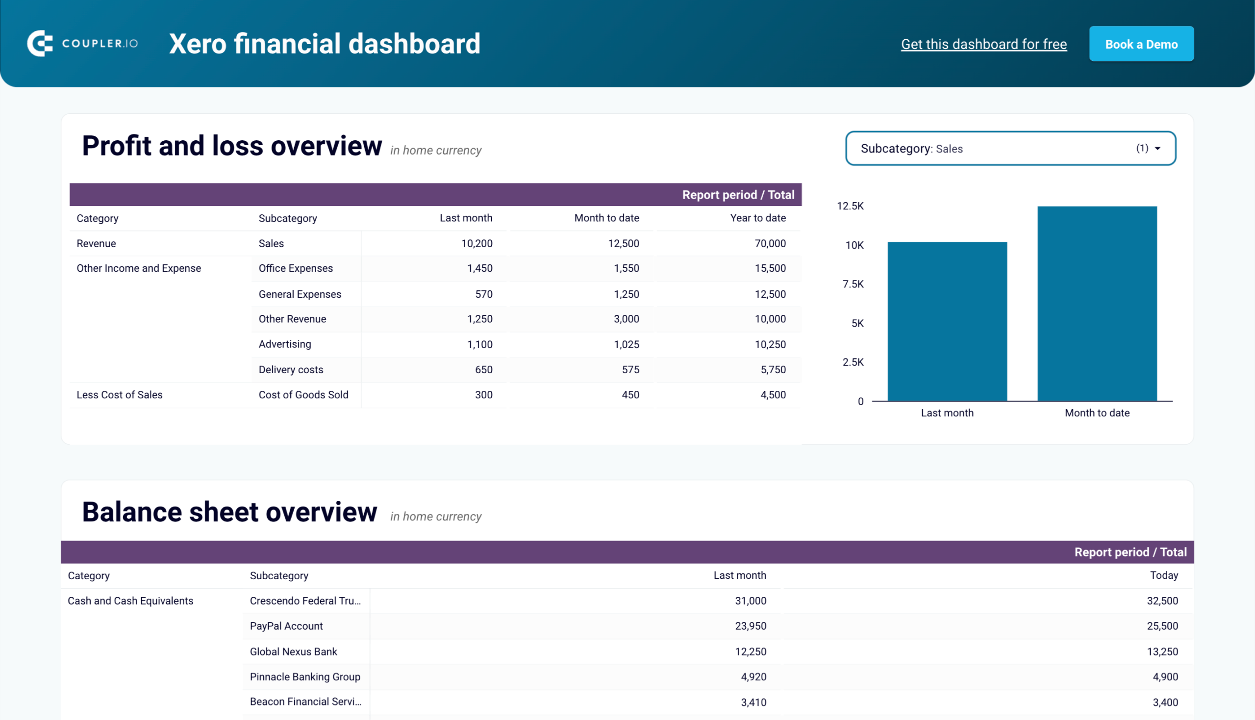
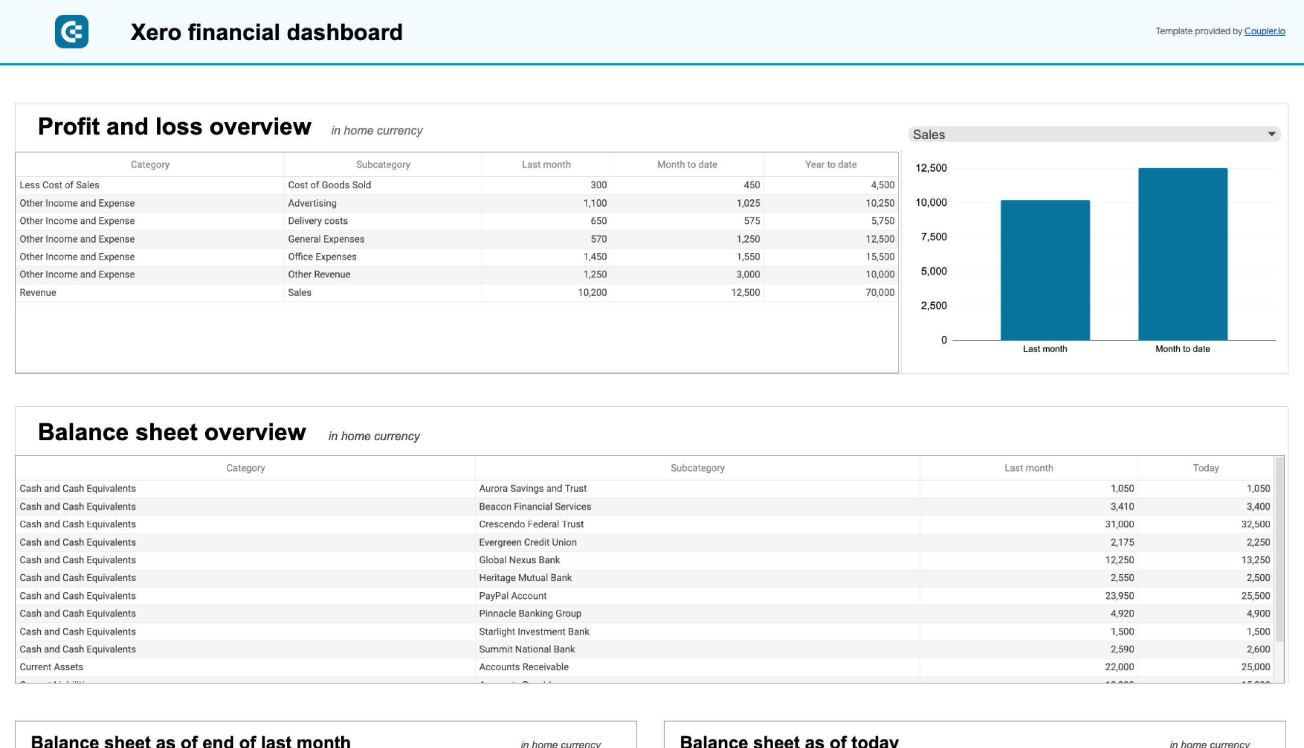
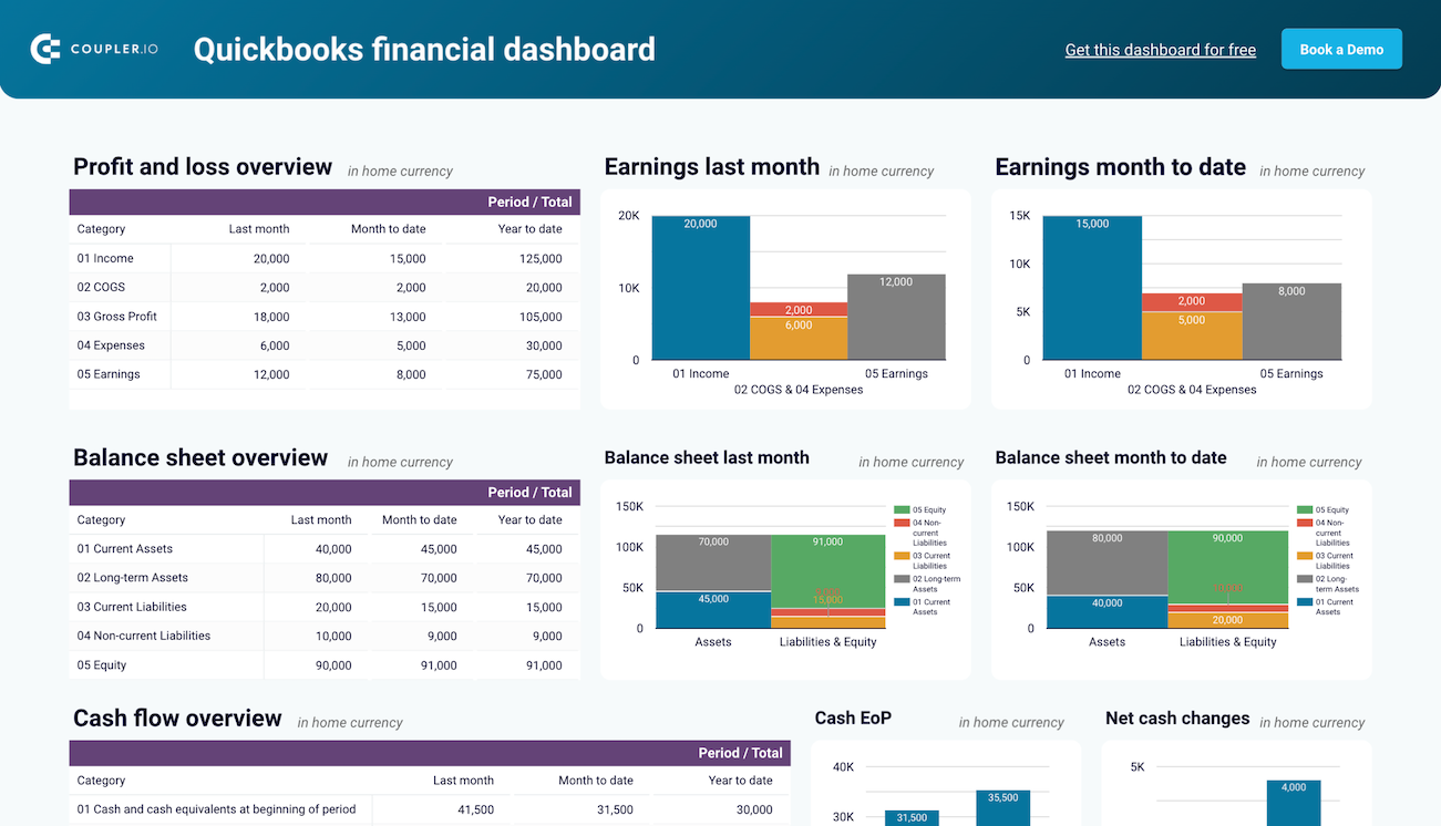
15. Financial dashboard for Xero/QuickBooks
This dashboard extracts data from your QuickBooks or Xero account to provide you with the overall financial performance of your business. It shows details on profit and loss, balance sheet, cash flow, and other key indicators. This lets you explore your company’s financial health without diving deep into specific accounting procedures.
What you can do with this dashboard:
- Track your net income and expenses for the previous months and year to determine whether your business remains profitable over time.
- Check the current and long-term assets and liabilities to help you understand your business’s liquidity and financial health.
- Track the net cash changes over the reporting period to assess your financial stability and implement effective liquidity management.
- Take a look at the available funds and balances in your business bank accounts. This data ensures transparency in your day-to-day financial operations and management.
- Monitor the state of your bank accounts in other currencies to handle international transactions effectively.
You can use the dashboard for Xero in Coupler.io, which offers the AI insights feature designed to help you quickly make sense of your data. It is also available as a template in Looker Studio and Google Sheets.
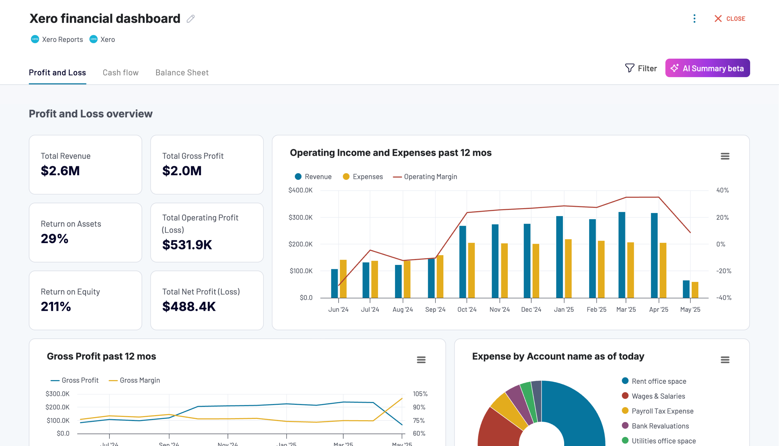
Xero financial dashboard
Get comprehensive financial insights from your Xero account with key performance metrics, balance sheet analysis, and cash flow projections. Quickly assess your business health and make informed financial decisions.
Xero financial dashboard in Looker Studio
Analyze your financial performance with a unified dashboard featuring key reports from Xero like cash flow, profit and loss, balance sheet, and others.
Xero financial dashboard in Google Sheets
Get instant visibility into your company’s financial health through key performance reports from Xero such as cash flow, income statement, and balance sheet.
There are versions available for QuickBooks in Coupler.io, Looker Studio, and Google Sheets. To set up your chosen one, go to the template’s Readme tab and follow the instructions.
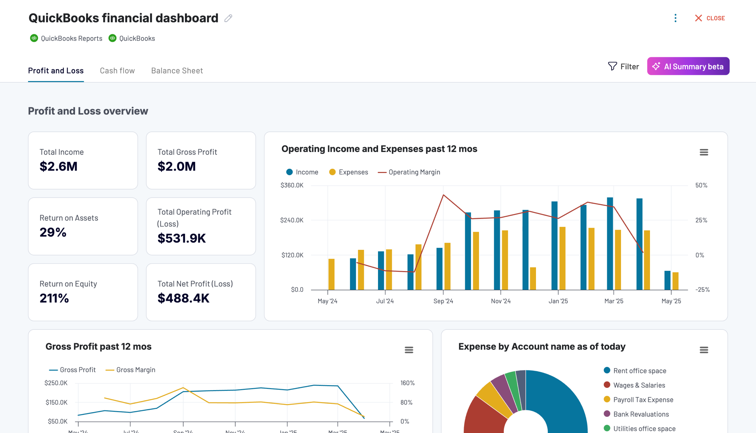
QuickBooks financial dashboard
Tracks earnings, monitor cash flow, and analyze balance sheet changes with a dedicated dashboard that provides a clear picture of your business finances.
QuickBooks financial dashboard in Looker Studio
Monitor and analyze your business’s financial health with real-time insights into profit and loss, balance sheet, cash flow, and bank & cash accounts.
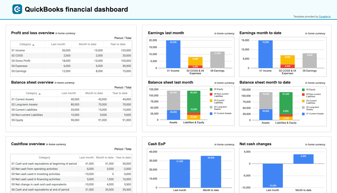
QuickBooks financial dashboard in Google Sheets
Get a clear snapshot of your business finances, including cash flow, P&L, balance sheets, and bank accounts, powered by data from QuickBooks Online.
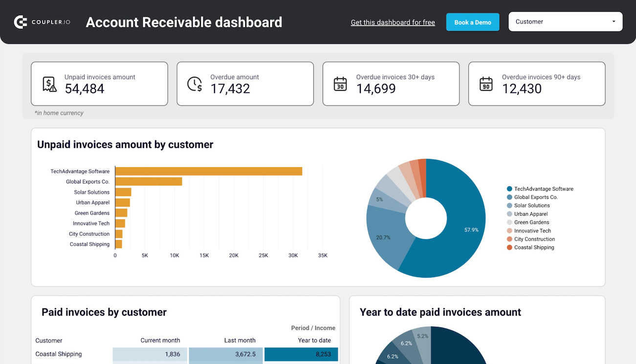
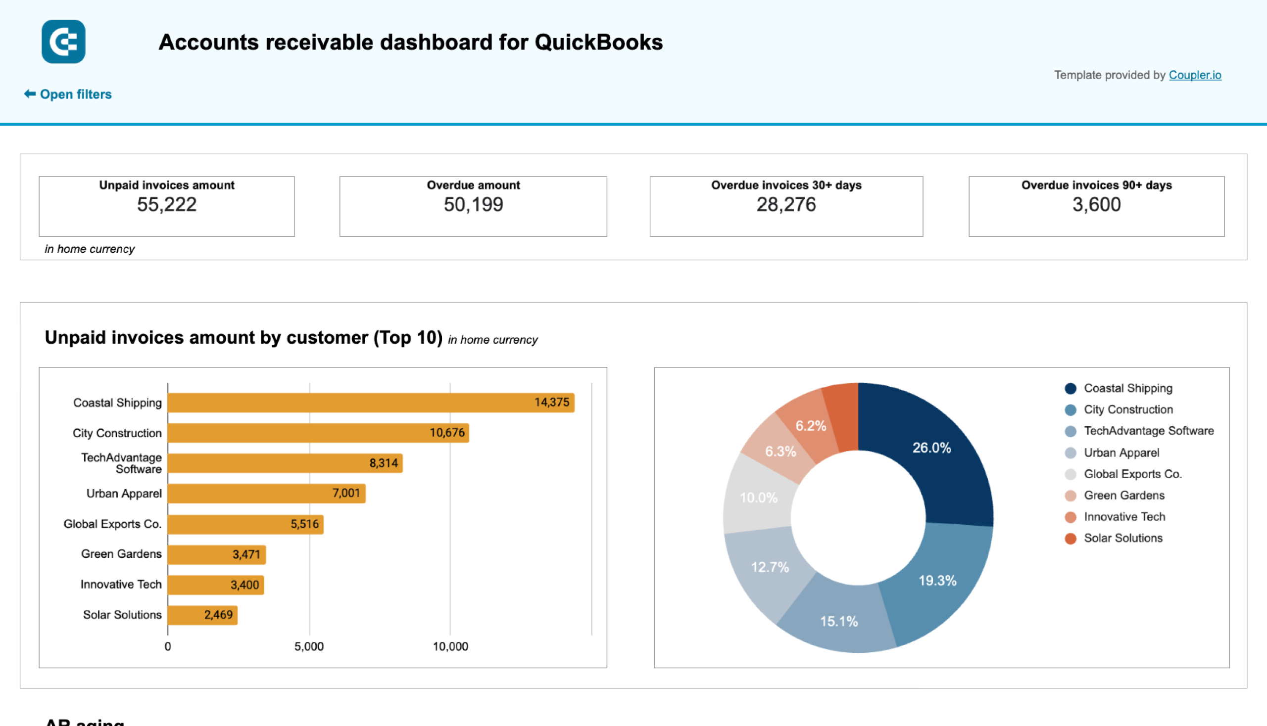
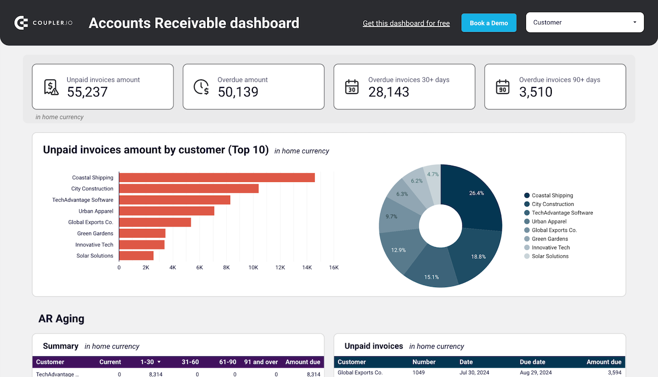
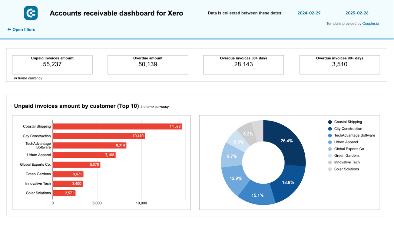
16. Accounts receivable dashboard for Xero/QuickBooks
This dashboard lets you track the accounts receivable turnover based on your QuickBooks or Xero data. It provides a summary of all invoices, including paid, unpaid, and overdue ones, in a visual and easy-to-grasp format. With this report, you can easily prioritize your efforts for the overdue invoices and improve the overall cash flow.
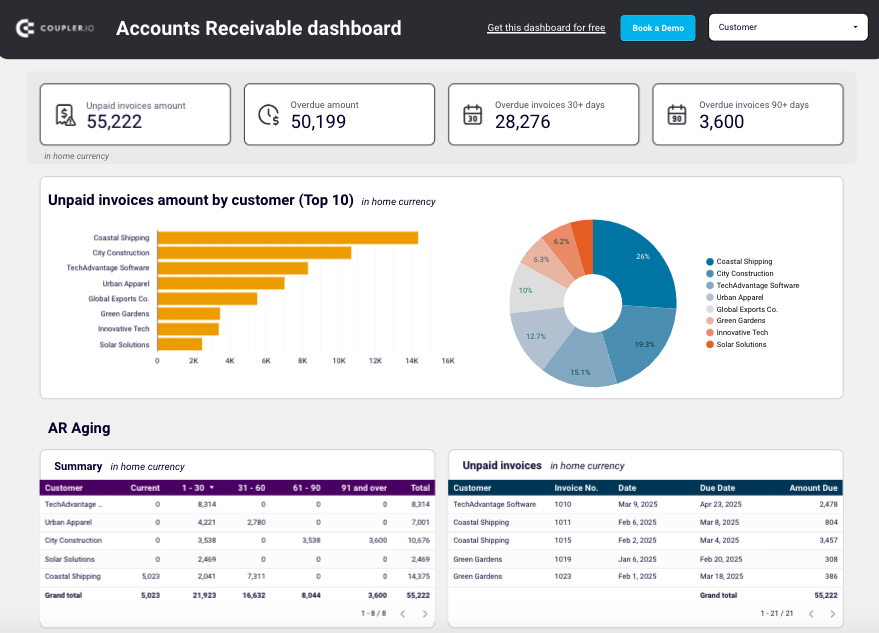
What you can do with this dashboard:
- Check which customers have the highest number of unpaid invoices and see whether there are any overdue ones. Based on this information, plan debt collection activities.
- Explore the paid invoices for each customer and juxtapose them with the unpaid invoices list to see which clients should be addressed first with the request to pay off debts.
- Analyze all paid and unpaid invoices for the last 12 months to understand the general dynamics of cash flow and understand the current payment trends.
- Review all paid and unpaid customer invoices in the table showing all the related details for the last 12 months to track the monthly dynamics.
Open the dashboard template in Looker Studio or Google Sheets, and proceed with the guidelines in the Readme tab. The entire process will take only several minutes of your time since Coupler.io offers a pre-built connector for QuickBooks and Xero. Also, it allows you to configure the automated data flow and update on the report.
Accounts receivable dashboard for QuickBooks in Looker Studio
See which customers accumulate unpaid and overdue invoices, analyze AR aging, and track changes over time. Get useful insights for maintaining financial health.
Accounts receivable dashboard for QuickBooks in Google Sheets
Monitor customer payment statuses, overdue invoices, and collection trends with this dashboard connected to QuickBooks. Get clear visibility into your cash flow cycle with aging analysis and customer payment patterns to improve financial forecasting.
Accounts receivable dashboard for Xero in Looker Studio
See which customers accumulate unpaid and overdue invoices, analyze AR aging, and track changes over time.
Accounts receivable dashboard for Xero in Google Sheets
Track outstanding customer payments, monitor aging receivables, and analyze the correlation between paid and unpaid invoices to improve cash flow management.
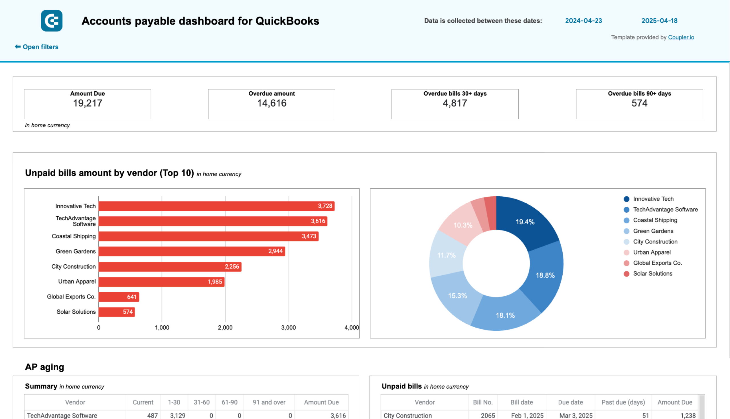
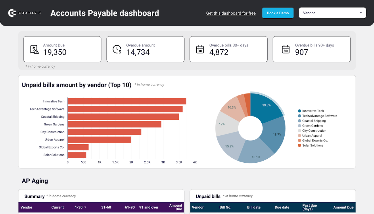
Coupler.io also provides dashboards with accounts payable review, both for Xero and QuickBooks data. With these solutions, you can monitor paid bills along with the sums you owe suppliers and business partners.
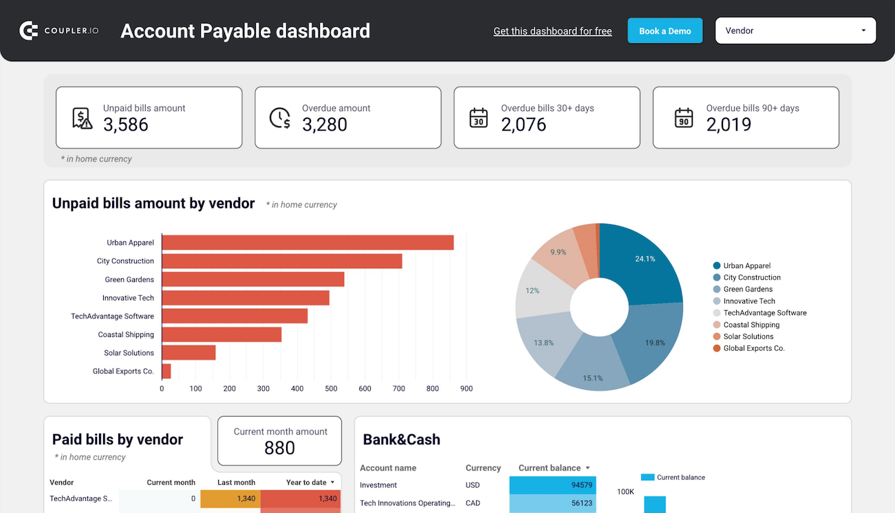
Accounts payable dashboard for QuickBooks in Looker Studio
Get an overview of unpaid, overdue, and paid bills grouped by vendor. The dashboard helps you prioritize payments and improve cash flow management.
Accounts payable dashboard for QuickBooks in Google Sheets
Track outstanding vendor obligations, payment schedules, and expense patterns with data from QuickBooks. This dashboard helps you manage cash flow, identify payment priorities, and maintain healthy supplier relationships through visualized aging reports.
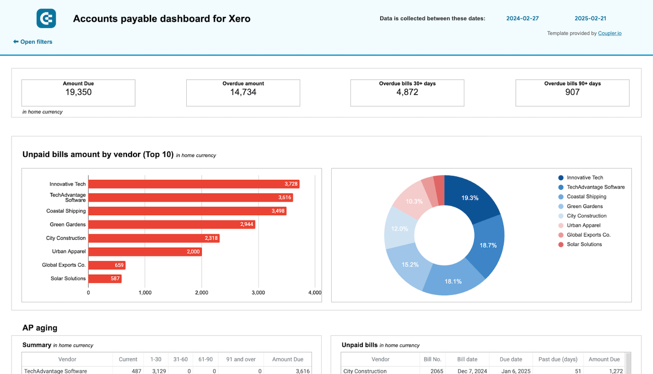
Accounts payable dashboard for Xero in Looker Studio
Track outstanding, overdue, and paid bills to optimize payment schedules, manage vendor relationships, and ensure smooth cash flow.
Accounts payable dashboard for Xero in Google Sheets
Monitor vendor payment deadlines, track aging bills, and analyze payment history to optimize cash flow management and maintain healthy supplier relationships.
CEO dashboards to check on SEO and web analytics
17. Global SEO performance
If your business operates across different geographical regions, then this global SEO performance report will suit you. It pulls data from Google Search Console and shows country-specific KPIs, such as clicks, impressions, CTR, and others. That way, you can compare these metrics to identify the geographic areas with the most rapid growth and provide opportunities for your business.
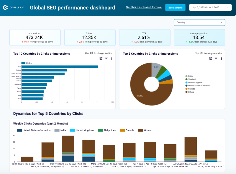
What you can do with this dashboard:
- Spot the top countries in terms of clicks and impressions and their share in the overall traffic. This data helps you detect the best-performing countries and adjust your localization strategies for other areas.
- Define growing or declining regions by reviewing the daily metrics and generalized ones for the last two months. This will help you evaluate your efforts better and decide whether each particular localized strategy needs further investment.
- Inspect the summary of the best-performing and worst-performing countries based on the click dynamics for the last 30 days. With this information at hand, you can further adjust your regional strategies.
- Analyze particular areas of your website by applying various filters on the data. This will help you understand how each page performs in a specific country. If, for instance, a page performs well across all regions except France, it’s probably necessary to check its content and ensure it’s properly localized.
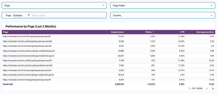
The global SEO performance dashboard is available in Looker Studio. Make sure you have a Coupler.io account and check the Readme tab. Coupler.io implements a pre-configured connector to Google Search Console, which allows you to perform the dashboard setup in minutes and make it self-updating.
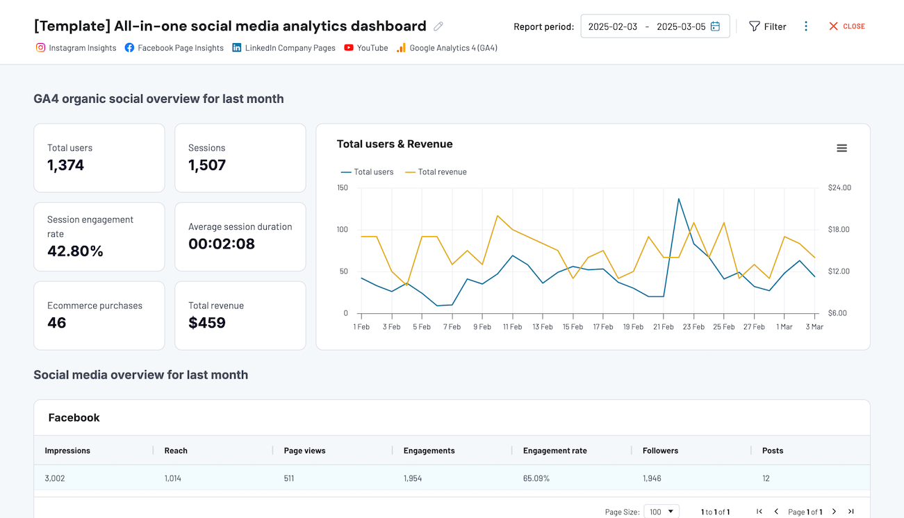
This reporting template provides a comprehensive view of the performance on social media channels (Facebook, Instagram, LinkedIn, and others) and Google Analytics 4. That way, you will see the entire cycle of where your traffic comes from and how it contributes to the website development.
All-in-one social media analytics dashboard
 Preview dashboard
All-in-one social media analytics dashboard
Preview dashboardWhat you can do with this dashboard:
- Get a complete overview of the website traffic resulting from social media with key metrics, such as total users, average session duration, sessions, purchases, etc.
- Explore the analytics for each social media platform and its contribution to the overall website traffic growth.
- Analyze how YouTube contributes to the traffic dynamics to decide whether to invest further in the video content creation strategy.
The all-in-one social media analytics dashboard is natively available in the Coupler.io interface. It also comes as a template for Looker Studio with detailed instructions in the Readme tab on how to set it up and use it. You only need to create a Coupler.io account to start using this report, as the entire process will be further automated with our platform.
CEO dashboards to track business performance
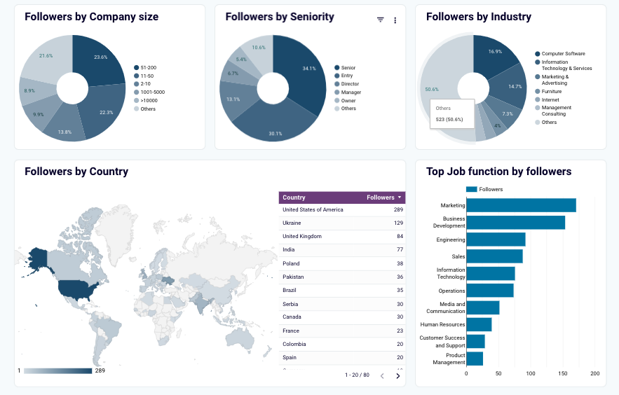
19. LinkedIn company page performance dashboard
This reporting template allows you to track your company’s presence and assess its visibility on LinkedIn. It provides metrics that help you analyze the follower growth rate and think of what can be optimized to improve the company’s profile on LinkedIn. With data retrieval from LinkedIn Company Pages and its transformation into a ready-to-use view thanks to Coupler.io, you can also understand how the audience reacts to your posts and announcements.
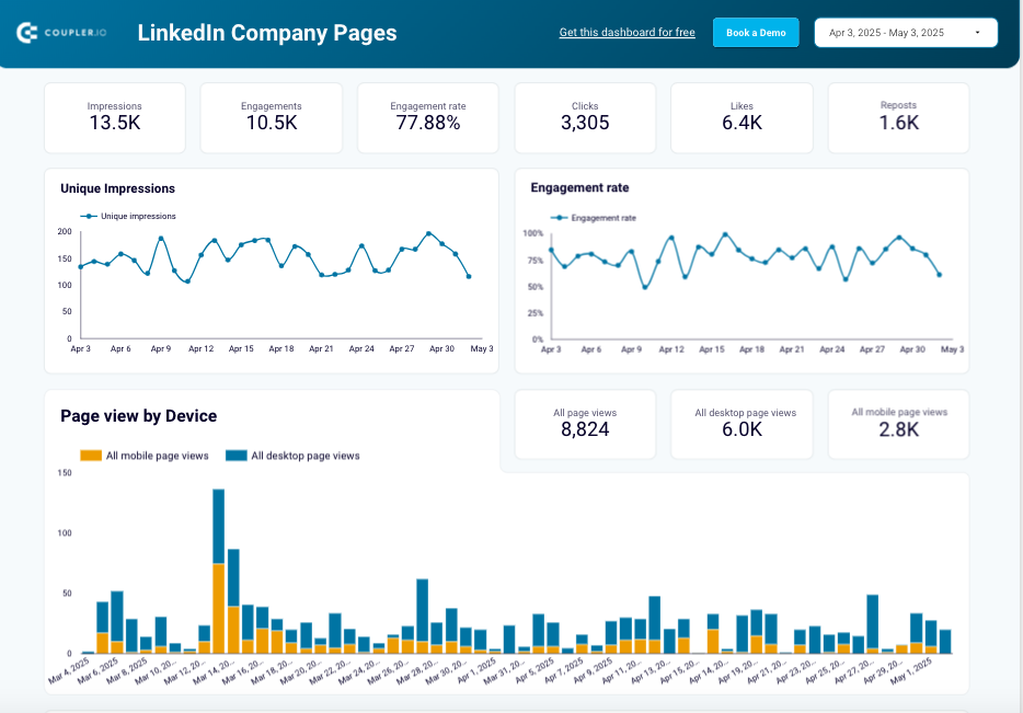
What you can do with this dashboard:
- Track follower growth via organic and promoted search to assess the effectiveness of your strategies and campaigns.
- Explore the effectiveness of your posts by looking at impressions, clicks, reposts, and other crucial engagement metrics to understand which content resonates most with users’ interests.
- Analyze audience behavior and habits by viewing the most popular devices used to reach your profile and the countries that users come from.
- Drill down into the followers’ profiles by observing their distribution by country, seniority level, industry, and company size. With this data, you can prepare content for your business profile on LinkedIn and localize it according to regional tendencies.
This dashboard comes as a ready-to-use template for Looker Studio. With the Coupler.io built-in connector, you can extract your GA4 in a few clicks and set up a schedule to continuously fill a report with fresh data. Check the detailed guidelines in the Readme tab.
20. Google Business Profile analytics dashboard
This kind of analytics dashboard shows brief statistics of your local business presence online. It includes multiple metrics, from phone calls to the detailed interaction breakdown, to help you gain insights into your business activities and outcomes. With the Google Business Profile analytics report, you can determine what and how your SEO strategy needs to be optimized.
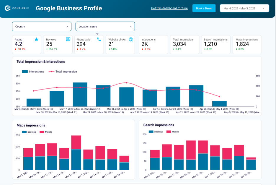
What you can do with this dashboard:
- Track the effectiveness of your local SEO results at a glance with KPIs such as total reviews, ratings, calls, clicks, and many others.
- Define customer engagement patterns and see how they correlate to the changing website visibility.
- See which devices your customers use to access your profile and optimize your Google Business Profile pages accordingly.
- Discover which keywords drive most of the traffic to your profile and improve your profile description to match the user’s search intent and visibility for search terms.
- Examine customer engagement across different locations to understand regional variations in your business perception and identify opportunities for improvement.
- Analyze customer reviews in detail to address customer concerns and enhance the overall quality of your products or services.
This analytics dashboard is equipped with a built-in connector that automatically extracts data from your Google Business Profile account and refreshes the report. It comes as a pre-configured template for Looker Studio. Don’t hesitate to use this dashboard to improve your local SEO strategy and user engagement rates.
CEO dashboard templates for time management
21. Google Calendar dashboard
The Google Calendar dashboard template provides an all-in-one overview of your working schedule, including meeting hours, out-of-office hours, and more. Whether you are a CEO who needs to optimize daily workflow or a remote worker looking for more effective planning, this report will work well for you. With this tool, you can generate ideas on how to minimize time wasting and focus on important meetings.
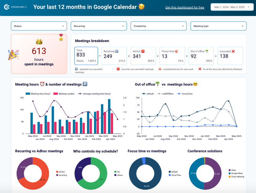
What you can do with this dashboard:
- Audit all your meetings and see how much time you spend on them daily and weekly. This data helps you optimize your meeting workload and make smarter scheduling decisions.
- Identify peak load times with lots of meetings and periods with less busy schedules to see how to plan future projects, vacations, and non-meeting times.
- See who controls your calendar and decide how to regain control over your working time.
- Explore the types of meetings that occupy most of your time to place them in preferred time slots and organize your schedule properly.
- Analyze the platforms you use for meetings and see whether this can be standardized to switch to a certain tool.
- Compare the working time in meetings with time off to exclude the risk of burnout. This information is helpful not just for individuals but also for managers and HR teams trying to build healthier, more sustainable work habits.
Coupler.io designs the Google Calendar dashboard, which can be used as a white-label template for Looker Studio. To start using it, just connect your Google account via the built-in connector by Coupler.io to populate your dashboard with data automatically.
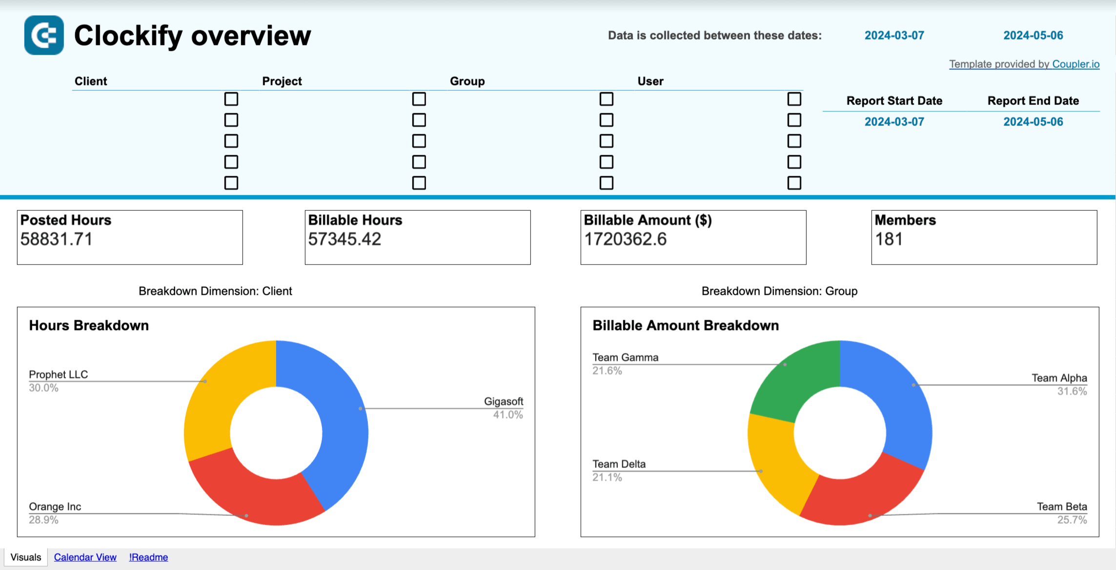
22. Clockify time tracking dashboard
This time-tracking dashboard allows you to review your team’s productivity in general and each member in particular. It helps you spot any potential issues like mismatched billable hours and earnings. With this report, you can also compare logged hours with active user counts to balance the team workload and prevent burnout.
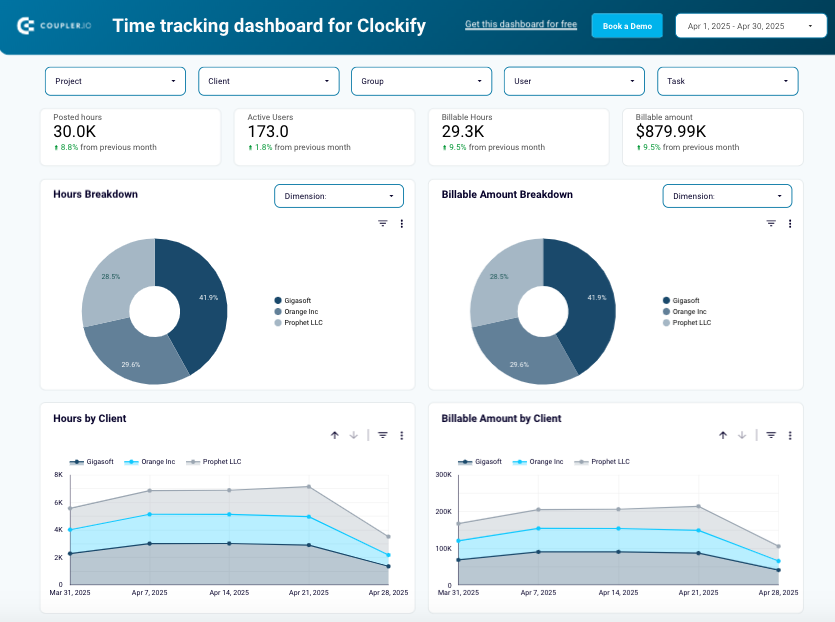
What you can do with this dashboard:
- Get a detailed overview of the time spent on the project, client, group, or other criteria by applying the corresponding filters.
- Monitor the correlation in hours and billable amounts of your projects, groups, and clients for the last fiscal month.
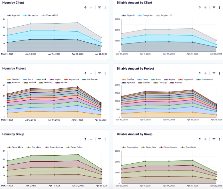
- Explore individual performance in detail with the calendar to identify excessive or insufficient working hours for each team member and spot possible logging mistakes.
- Observe users with the most and least working hours to determine those at risk of burnout and those who might underperform, and address these in good time.
The time-tracking dashboard is available not only for Clockify but also for the Harvest tool. It can be used as a pre-made reporting template in Looker Studio and Google Sheets, and it can be used to extract automated data thanks to the Coupler.io connectors.
Time-tracking dashboard for Clockify in Looker Studio
Use a powerful Clockify analytics dashboard that provides insights into how you can increase the time efficiency of your teams.

Time-tracking dashboard for Clockify in Google Sheets
Increase your team’s productivity by analyzing how time is spent across projects and clients using the Clockify analytics dashboard for Google Sheets.
Time-tracking dashboard for Harvest in Looker Studio
Derive insights into how you can optimize your teams’ time efficiency with a ready-to-go analytics dashboard connected to Harvest.

Time-tracking dashboard for Harvest in Power BI
Get an overview of your team’s time and billing performance based on the Harvest data connected to the interactive dashboard.
Is it worth building custom CEO dashboards instead of using templates?
Even with hundreds of templates available, picking the ones that match your reporting needs 100% might be challenging. It’s no secret that any dashboard example is preset, so it might contain metrics you probably don’t need and distract your attention from key indicators. In such cases, it makes sense to create custom reporting solutions.
If you feel that a custom report is precisely what you need, but you don’t know how to implement it, Coupler.io is there for you. This reporting automation platform allows you to create unique dashboards with specific metrics for popular BI solutions and spreadsheets. It also enables data flow automation and regular report updates with fresh data to gain better control over your business operations as CEO and share results with stakeholders.
To start crafting your dashboard, create an account with Coupler.io first. No credit card details are needed, and a free trial is available!
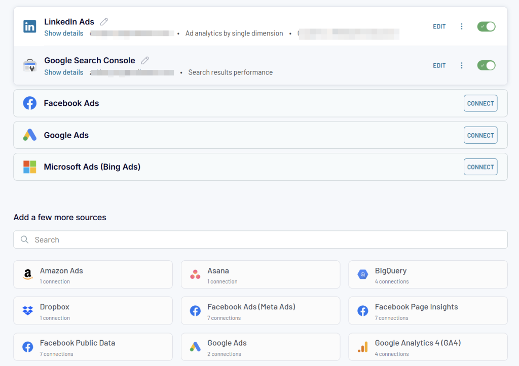
Then, initiate a new data flow and select the sources from which you need to pull data.
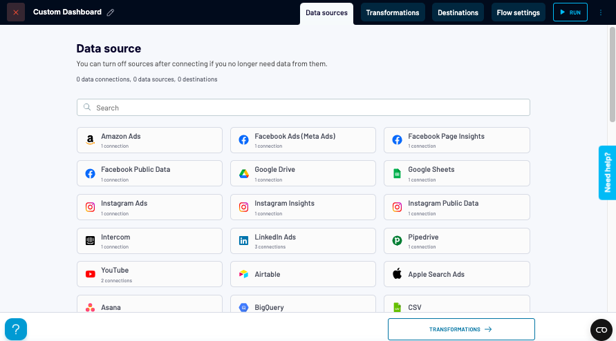
Step 1. Collect data
Follow the step-by-step procedure to connect to the chosen data source and consent to Coupler.io accessing the data. Take action on all the required fields in the source configurations window (for instance, select the data entities that need to be pulled into the dashboard).
To add data from other tools, select them and follow the on-screen instructions to set it up.
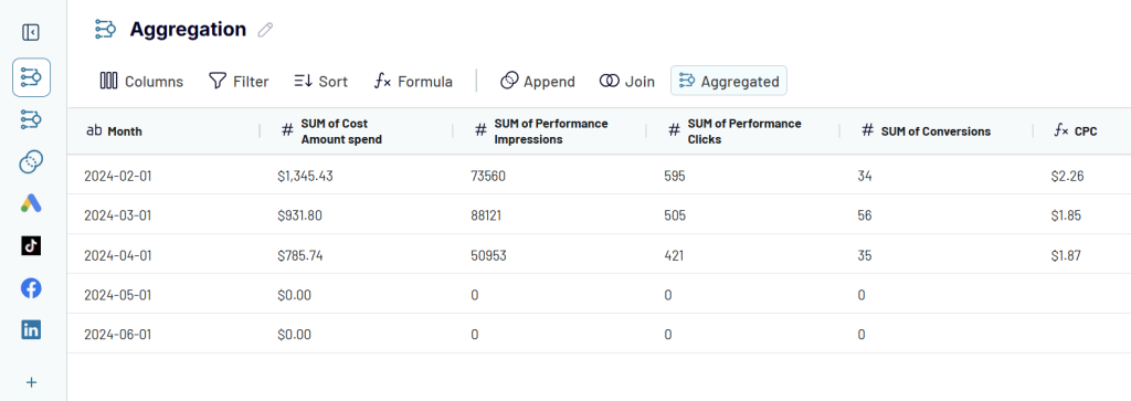
Step 2. Apply data transformations
- Filter and sort reporting data according to your preferences.
- Adjust the column view by adding, rearranging, renaming, and hiding columns.
- Add new metrics based on mathematical calculations in custom columns.
- Blend data from different accounts and tools in a unified space with these functions:
- Append creates a dataset where rows from sources are placed below the data rows from the first connected source. Columns with identical names are matched and combined vertically, while unmatched columns are added horizontally.
- Join creates a dataset with data from sources of different structures. All the rows from the primary (left) dataset are kept, while only the matching rows from the secondary (right) dataset are included in the joined dataset.
- Drill down the data with the Aggregate function that allows you to summarize specific columns with operations such as SUM, AVG, MIN, MAX, etc.
Step 3. Load data and schedule auto-updates
Select the reporting tool from the list of available options and proceed with the steps to connect to it and load data there.
Set up automatic data refreshes to ensure your report is refreshed automatically. Select the preferred data refresh interval (e.g., every 15 minutes, 1 hour, etc.), time, and days of the week.
To make your report appear in the preferred destination tool, click Run. Check how data populates the newly created dashboard!
That’s it! As you can see, creating a new report from scratch with custom metrics is not rocket science. Even though it takes some time to set up everything and arrange the dashboard view at the beginning, these investments will soon pay off and contribute to your strategic decision-making on the executive level.
Automate reporting for CEO with Coupler.io
Get started for free