The first thing you need to know about a CMO dashboard is that it doesn’t actually exist as a single report. In practice, CMOs often use a set of dashboards that provide an overview of the most vital areas they are in charge of.
I’ve been working in digital marketing for over a decade, and now, as Head of Marketing at Coupler.io, I know how challenging it can be to focus on the right numbers and turn them into the right decisions. In this article, I’ll share my insights and explain what I include in my CMO dashboard set, show some useful examples, and share free dashboard templates.

What does a CMO dashboard look like in practice?
It’s important to understand that a CMO dashboard is not the same thing as a marketing dashboard. As a CMO, you have a broader field of responsibilities. Apart from being in charge of multiple marketing projects, you need to coordinate your team and, of course, keep track of the business results produced by your marketing efforts.
So, if you work at a product company, in SaaS, ecommerce, etc., you need to keep tabs on three main things:
- marketing KPIs
- product metrics
- team performance
As a result, you will likely need a set of 3-5 dashboards to stay on top of things. While cramming everything together in one dashboard is not impossible, such a dashboard would likely be overwhelming and not analysis-friendly. Besides, depending on the data viz tool you use, you can get a very slow and completely impractical dashboard. So, my recommendation is to use a separate dedicated dashboard for each area you need to monitor.
Now, let’s have a look at what reports you can include in your CMO dashboard set.
1. The marketing part of a CMO dashboard: Marketing Funnel Report
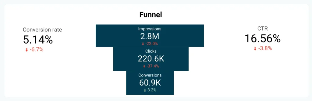
This is where you can assess the impact of various campaigns, PPC ads, and other channels. A Marketing Funnel Report should show you the financial results with attribution to each channel: how much revenue you got from paid ads, how many clients you got from organic search, and so on.
It should also reflect all the key stages of the funnel with the focus on acquisition, retention, upsale, and churn. Ideally, you should have a dedicated report or dashboard tab for each stage of the AARRR funnel.
Below, you can see an example of the conversion funnel for a SaaS product.

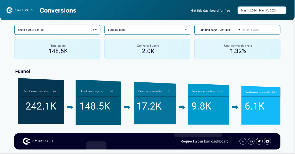
Apart from providing a big picture, the funnel report should let you zoom in and analyze the details. For example, it should let you see what value was generated by each marketing project or even each landing page, if needed.
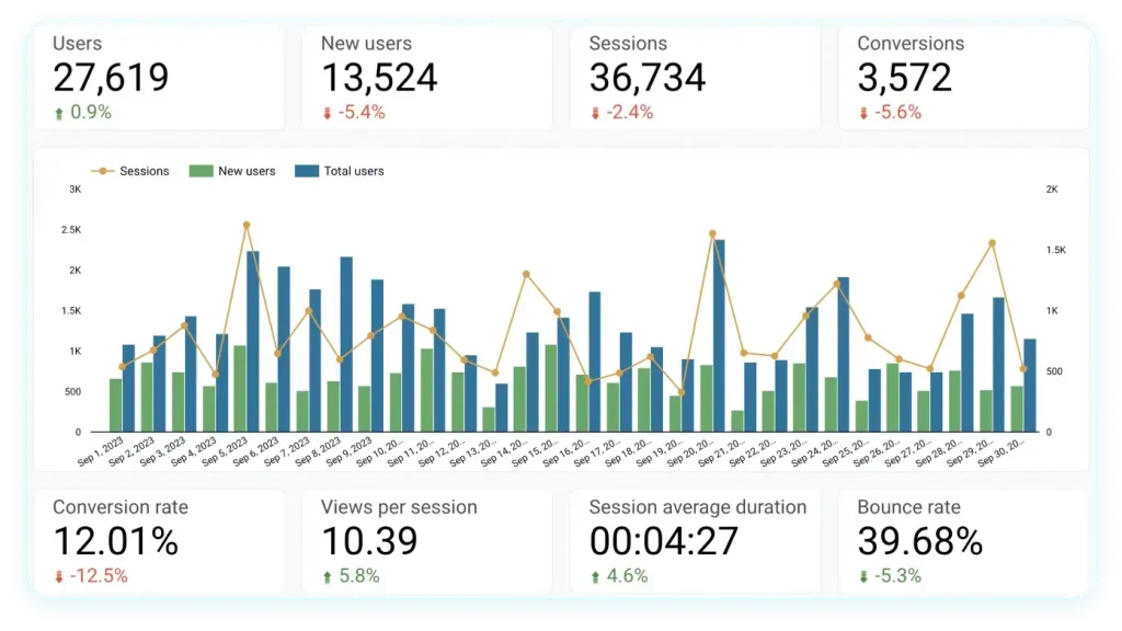
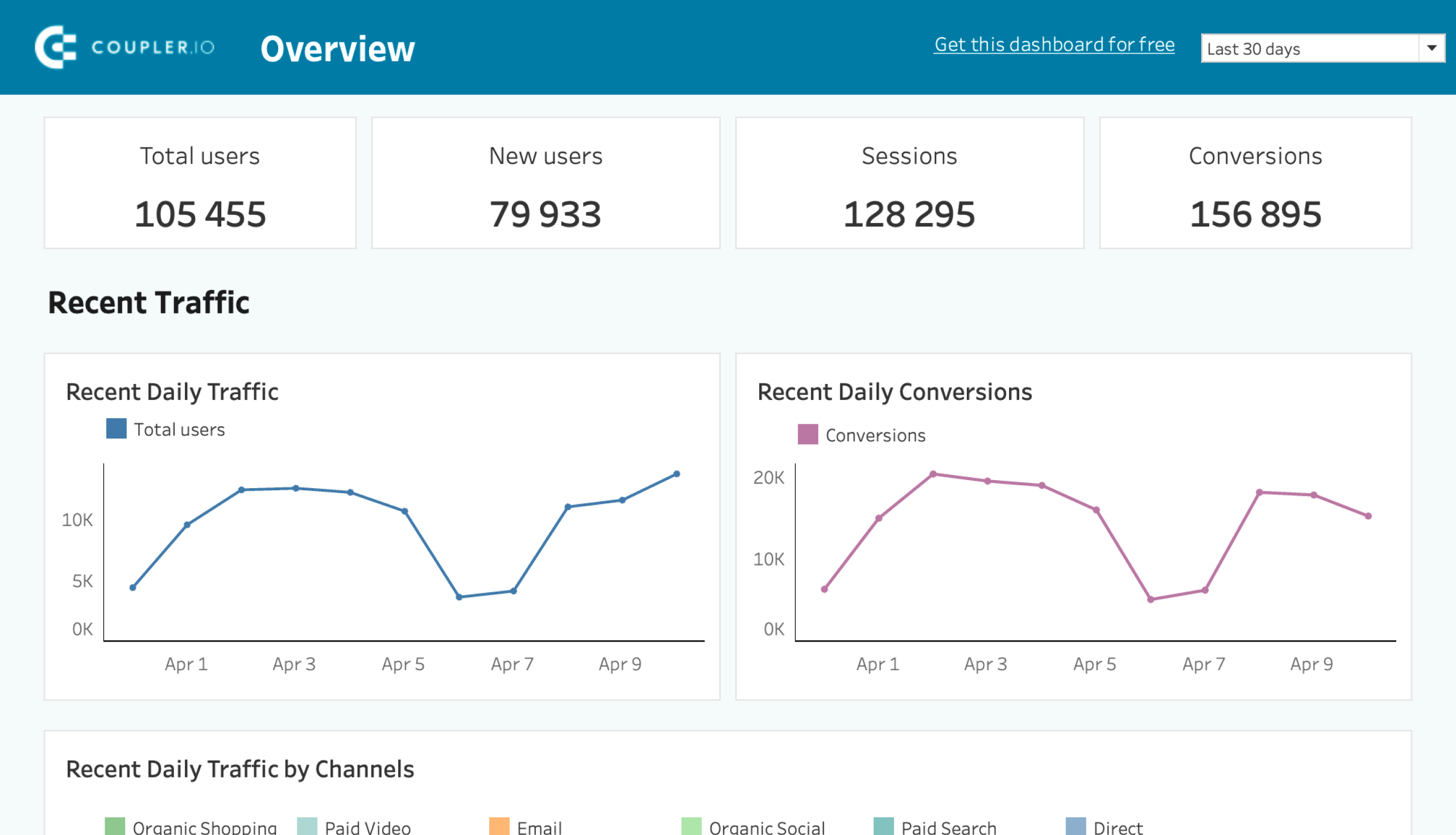
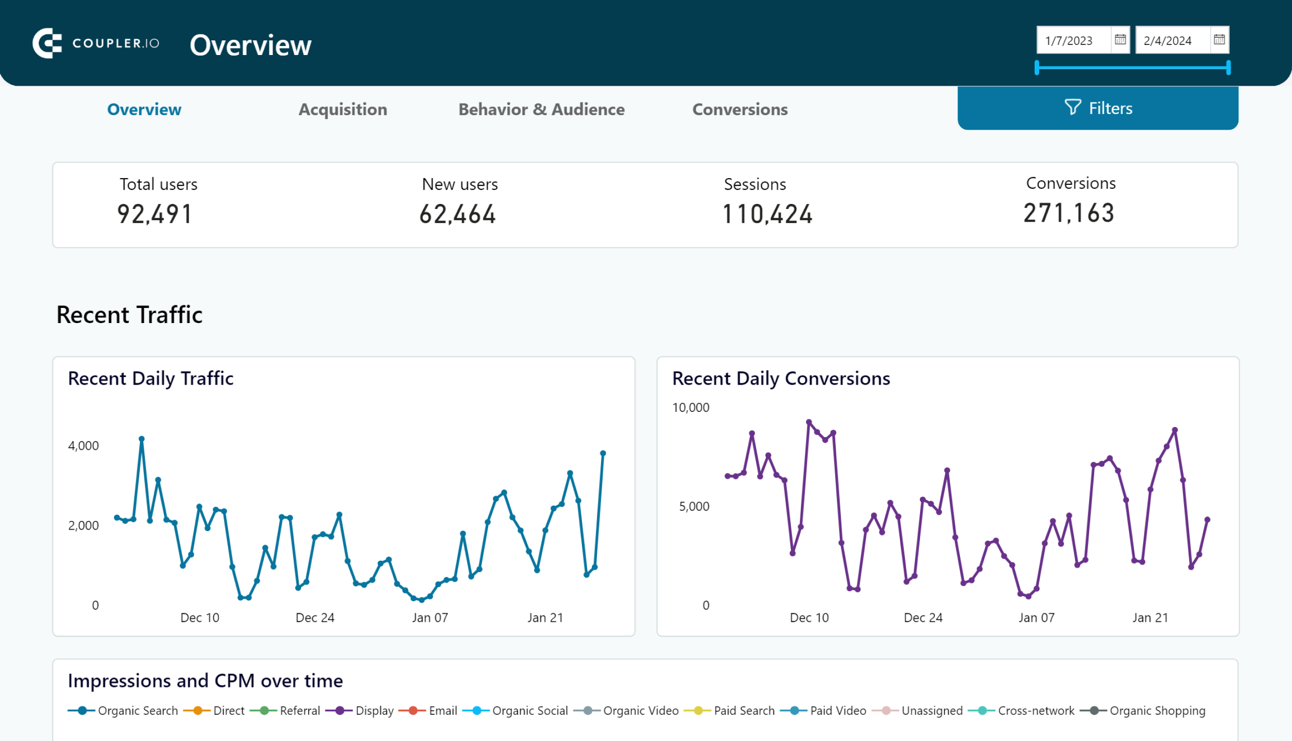
For these purposes, I recommend building a custom report. Then, you can include all the channels you use, your marketing activities, promotional campaigns, special projects, etc. However, for some insights, a GA4 report will do too. In the example below, you can see a user acquisition dashboard for Google Merchandise Shop.

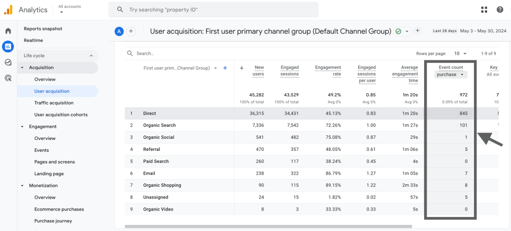
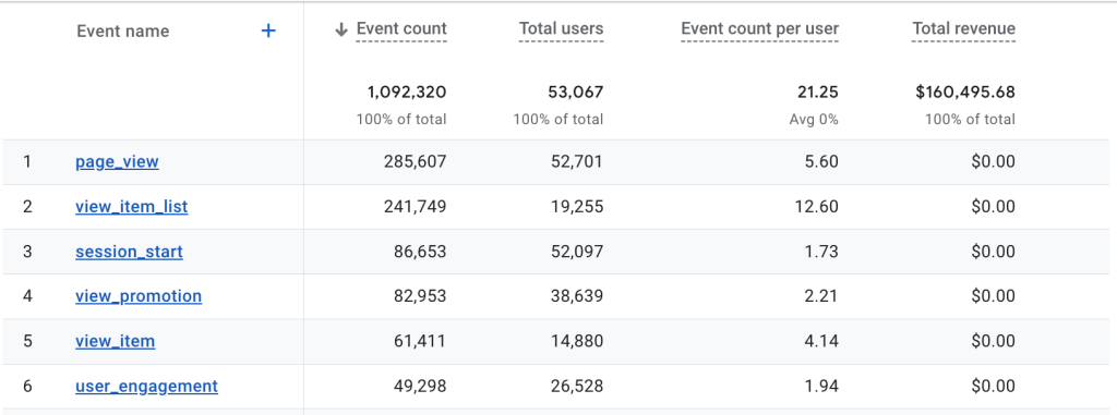
In the Event count column, I selected Purchase, so now we can analyze performance by channel. We can see how many users each channel brought, how this translated into engagement, and how many purchases each channel generated.
2. The product part of a CMO dashboard: Product Funnel and MMR Report
One of the most vital things is to know how your product (service, store) is performing. In other words, how it’s doing, in general. For this, you need to monitor product metrics, such as new MMR, new sign ups, and new clients. At this stage, you don’t need to drill down into attributing results to different marketing channels. I monitor and analyze product metrics with the help of a Product Funnel and MMR Report.
Product funnel
This is one of the dashboards a CMO needs to check first thing in the morning. It gives you answers to questions such as:
- how your product or store is acquiring new customers
- what exactly they are buying or showing interest in
- where your traffic originates from
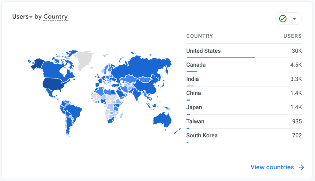
- how the breakdown by country looks, and so on.
With all this information, you can see what you need to focus on. For instance, to launch an ad campaign for a country that shows a spike in user interest. Or to identify the funnel stages where you lose more customers than normal. Then, you can use these insights to tackle the challenges.
For confidentiality reasons, I can’t show the actual dashboard that I use, but here’s another good example. See this Customer Acquisition Dashboard in Looker Studio for the full version.

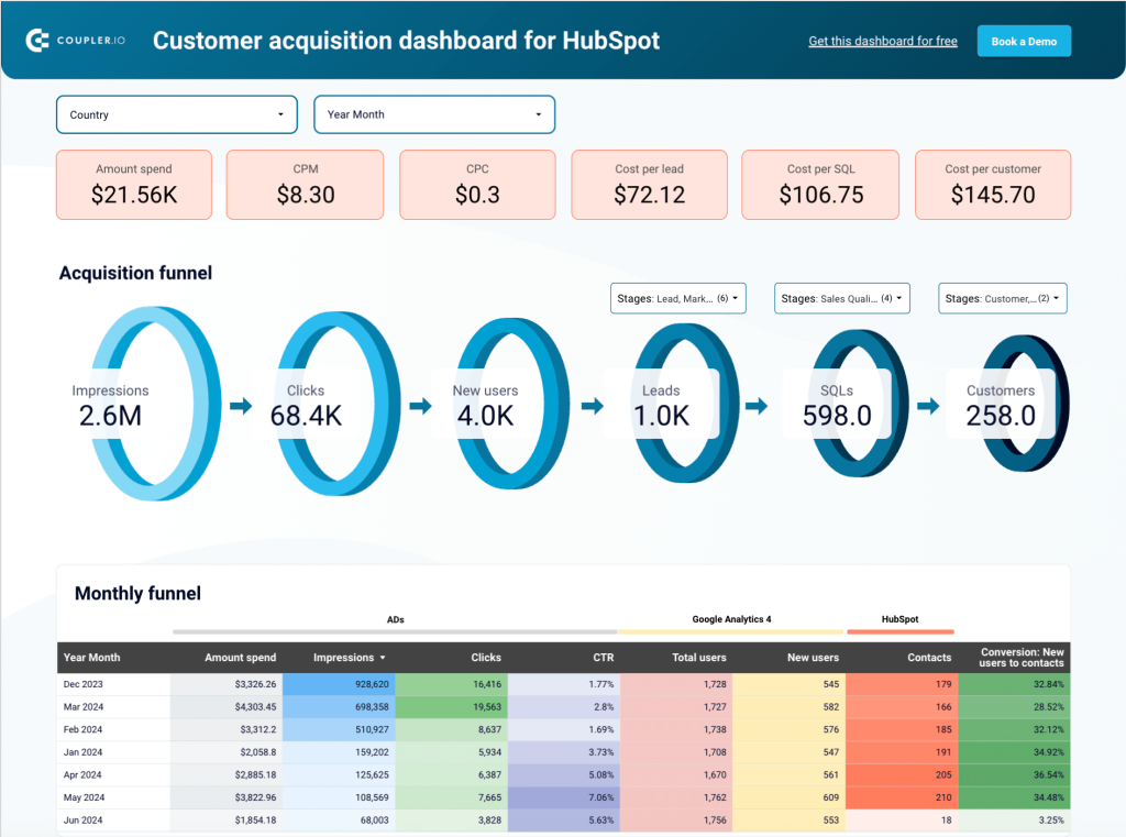
This dashboard has handy filters and breakdowns, which allow you to dig deeper into specific stages, countries, and periods. This is important because you can clearly see where your users come from and how they convert.
MRR overview
Here’s another important report to check on a daily basis. Ideally, this dashboard should answer the question – how exactly is your MMR formed? It should give you a breakdown of revenue by country, channel, and other parameters. With an MMR dashboard, you need to monitor the general trend, check the dynamics compared to the previous period, and analyze the factors behind the changes in MMR.
Below, you can see an example of an MMR dashboard with mock data. It provides an overview of such crucial metrics as new MRR, Churn, Active customers, and New customers. You can use filters to switch between countries, traffic channels, and other parameters.

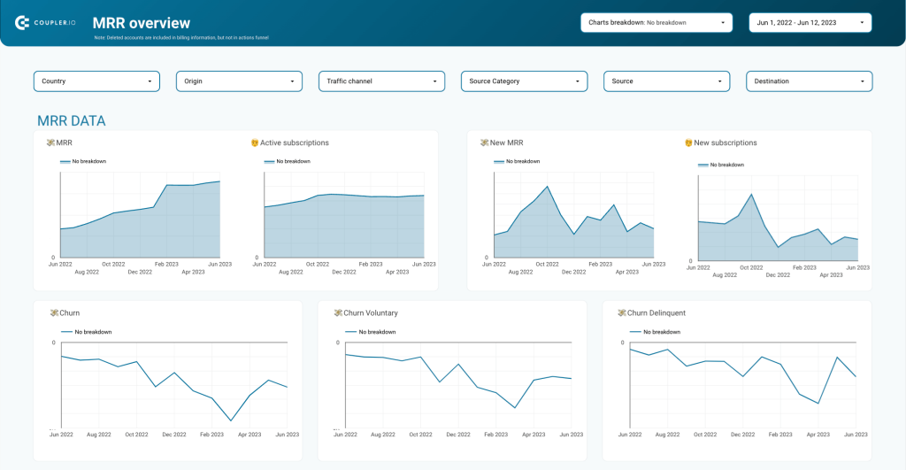
Understanding how your MMR is formed and what impacts it can help you grow it over time.
3. The team management part of a CMO dashboard: Team Performance Overview
For a CMO, it’s also important to understand the team velocity, monitor their performance and efficiency. This helps you see what resources you have for upcoming projects, who you can allocate for a specific task, whether you need to scale up your marketing team, and so on.
At Coupler.io, we use Clockify to post time spent on each project or task. This helps the team track their efficiency and work towards their KPIs. It’s also a handy instrument for planning future activities. Based on historical data, you can learn how much time some standard tasks or project phases typically require. As a result, this helps you estimate time for future tasks and plan your roadmap timeline.
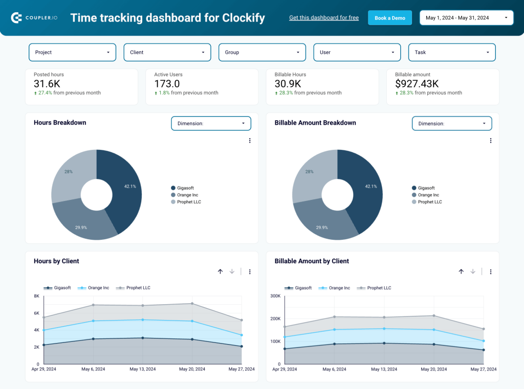
Here’s a sample of a time-tracking dashboard with mock data. In this example, you can see how much time was spent on each client/project and how much of the posted time is billable. We’ve also included this Clockify interactive report in our selection of CEO dashboards.
Time-tracking dashboard for Clockify in Google Sheets

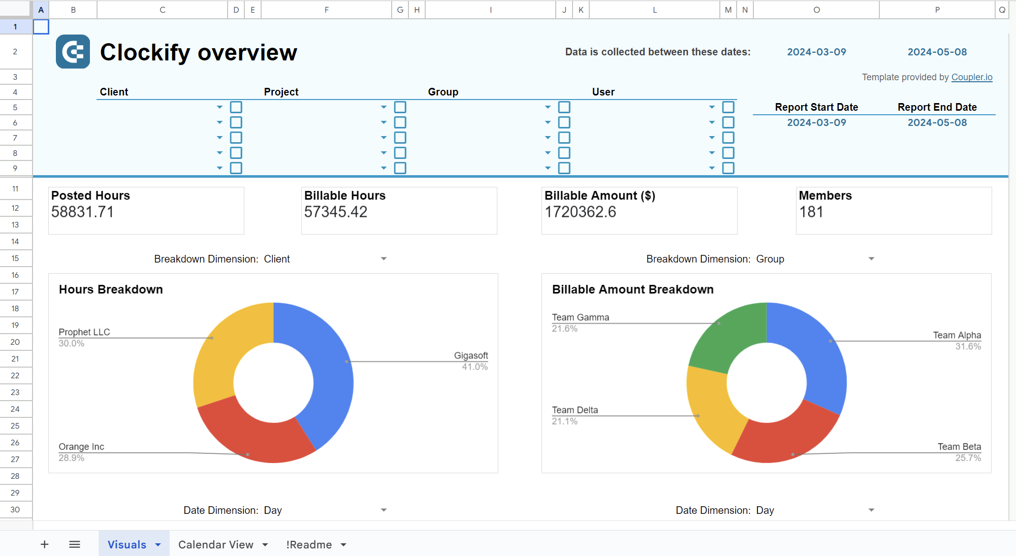
Time-tracking dashboard for Clockify in Google Sheets
Preview dashboard4. Other reports to include in the CMO dashboard set
Dashboards for separate channels
It’s also useful to have a dedicated dashboard for each channel you use. You don’t have to check these reports on a daily basis, but they come in handy when you need to analyze marketing performance.
For instance, I have separate dashboards for SEO, PPC, and blog performance. They are a valuable addition to my CMO dashboard set that I need for decision-making.
As an example of a channel dashboard, here’s a YouTube Channel Overview report. As you can see, it displays the main KPIs and lets you estimate performance at a glance.


Dashboards for major marketing projects
Just like with channels, you may need a separate dashboard for each big activity or project you run. For example, if you launch a promotional campaign to support a new product or offer, or if you start selling on a new platform. Then, you will have a lot of different activities running in parallel. It will be useful to analyze the results and understand how you got them and how each part of the project contributed to achieving the goals you set.
Where to get data for a CMO dashboard
You can have many different data sources, depending on what apps you use and where your company accumulates information. Here are some of the most common examples for CMO dashboard data sources.
| Type | Data sources | Comment |
| Marketing | – Google Analytics 4 – Google Analytics 360 – Google Search Console – PPC platforms: Facebook Ads, LinkedIn Ads, Microsoft Ads, Google Ads – Mailchimp, Klaviyo, other email service providers – Social media marketing apps | Marketing analytics platforms, PPC platforms, ESPs, and, basically, all apps you use to run your marketing activities – they are all useful data sources for a CMO dashboard. |
| Product | – MixPanel – Amplitude – Segment.io | Another important data source is customer data platforms and event analytics tools that track user interactions. They let you collect customer data and see how people use your product. |
| These data warehouses are a good place to store your product data and conduct in-depth analysis. For example, using ML models to build projections based on historical data. | ||
| Sales | – Pipedrive – HubSpot – Salesforce | Sales funnel and the key sales KPIs can also provide plenty of insights. |
| Competitor analysis | – Ahrefs – Semrush – SEranking – Similar web | These SEO tools can give you useful information about the market where you operate and your competitors’ activity. |
| Team performance | – Clockify – Harvest – Jira | Data on how much time is spent on different projects and what your team is currently focused on. |
| Finance | – QuickBooks – Stripe – Xero – SAP | Information about your product’s financial performance: revenue, profitability, etc. |
| Mobile | – AppStore – GooglePlay – Appsflyer – Sensor Tower – Firebase | If your product or service has a mobile app, then, you can get valuable information from the mobile app stores and mobile marketing analytics tools. |
CMO metrics to include in your dashboard
As I already explained, my recommendation is to use a set of dashboards rather than just one master dashboard. So, as you can see from the examples I provided earlier, the list of metrics for 3-5 reports would be rather long. Still, if I needed a CMO metrics dashboard focused on the most essential KPIs, here are the metrics that, in my opinion, are a must:
- MRR – monthly recurring revenue your product generates
- New MRR – revenue from the new customers acquired that month
- Leads generated – how many leads your marketing initiatives brought
- Active customers – the number of customers who currently use your product and/or make purchases
- New customers – the percentage of new users in the total number
- Purchases – how many purchases each of your channels generated
- Churn rate – the proportion of customers who stopped buying from you
- Retention rate – the percentage of people who make repetitive purchases
- Conversions – how many people from each channel converted into customers
- Revenue – the total revenue generated over the specified period
- Customer acquisition cost – how much was spent on acquiring new customers
- Cost per customer – an average cost for gaining one new customer
- ROAS – revenue you got from ad campaigns as compared to their cost
- ROI for marketing – how much revenue your marketing campaigns generated compared to the marketing spend. Return on investment is one of the most important key marketing metrics.
How to build a CMO dashboard from scratch
Depending on your needs, you may follow my advice and prepare several dashboards, or you may decide to build one comprehensive dashboard. The choice is yours. In any case, this report should be automated and self-updating.
There are two ways to build such a dashboard:
- From scratch – a great option if you are proficient with data viz tools and have a good vision of what you want to create.
- Using a template – you can choose this method if you want to get a dashboard fast (typically within minutes), and then customize it.
In this section, I am going to cover the first option. For the second one, jump to the Use a CMO dashboard template section.
Step1. Transfer data to a data viz app
As I already mentioned, it’s best to collect data for your dashboard automatically. You can use Coupler.io to do the trick. It supports 60+ data sources, as well as the most popular data viz tools as destinations. If you don’t work in data viz tools, you can build a pretty decent dashboard in spreadsheets.
To start transferring your data, select your data source and the preferred destination in the form below.

You will be asked to create a Coupler.io account first. It’s free, no credit card required. Once you have an account, you will be redirected to the importer settings.
Follow the onscreen instructions to connect your data source and select the data type to export.
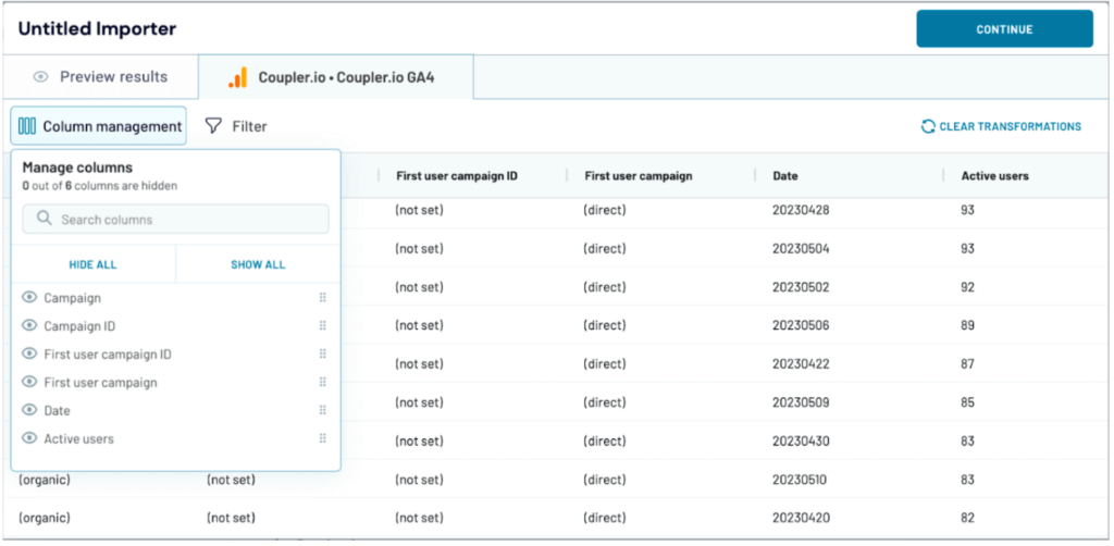
Step 2. Transform data and schedule updates
At the next stage, you can preview and transform your data. It’s quite convenient because, as a result, the dataset you send to the data viz tool is clean and analysis-ready. In particular, you can:
- Split, merge, and rearrange columns
- Rename columns
- Hide columns you don’t need
- Add new calculable columns
- Sort and filter data
- Use formulas and calculate custom metrics
- Blend data from different apps or accounts
The latter is especially useful if you need to combine marketing data related to a campaign that runs on different platforms.

If you don’t need any transformations at the moment, just preview the data and press Continue. Then, follow the wizard’s instructions to connect your data viz app.
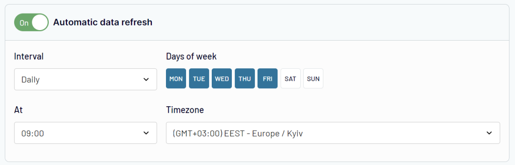
Once this is done, set up your schedule for the automatic updates. Coupler.io can send fresh data to your dashboard at intervals varying from once a month to every 15 minutes. So, thanks to automation, you can monitor your metrics in near real-time.

After this, follow the onscreen instructions to complete the setup and run the importer. These steps will differ depending on the destination you choose. Repeat this process and add as many importers as you need to transfer all the necessary data.
Step 3. Use graphs and charts to visualize your data
Once your data is imported into spreadsheets or a BI tool, you can start visualizing it. Navigate to the graph selection menu and pick the charts you need.
Here are some of the graph types I recommend using:
- Funnels – a graphical representation of how your audience goes through different stages of the user journey. It helps you understand how people convert into paying customers.

- Bar charts and line charts – these are amongst the most popular graphs. They come in handy to depict various processes and track progress over time. It’s also useful to build combo charts containing both bars and lines.

- Scorecards – this is an essential part of every dashboard as they present the most important KPIs and let you quickly assess the situation at a glance. I recommend adding progress indicators to scorecards. For instance, in the screenshot above, each scorecard is accompanied by a green or red number with an arrow showing growth or decline.
- Geo charts – data visualization in the form of a map is useful for conducting geographical analysis. Breakdown by country is necessary to analyze your audience, purchases, traffic, campaign performance, and more.

- Data tables – presenting data in a table format gives you an opportunity to drill down and explore your metrics in more detail. It’s better to equip tables with filters and sorting options so that you can work with your data.

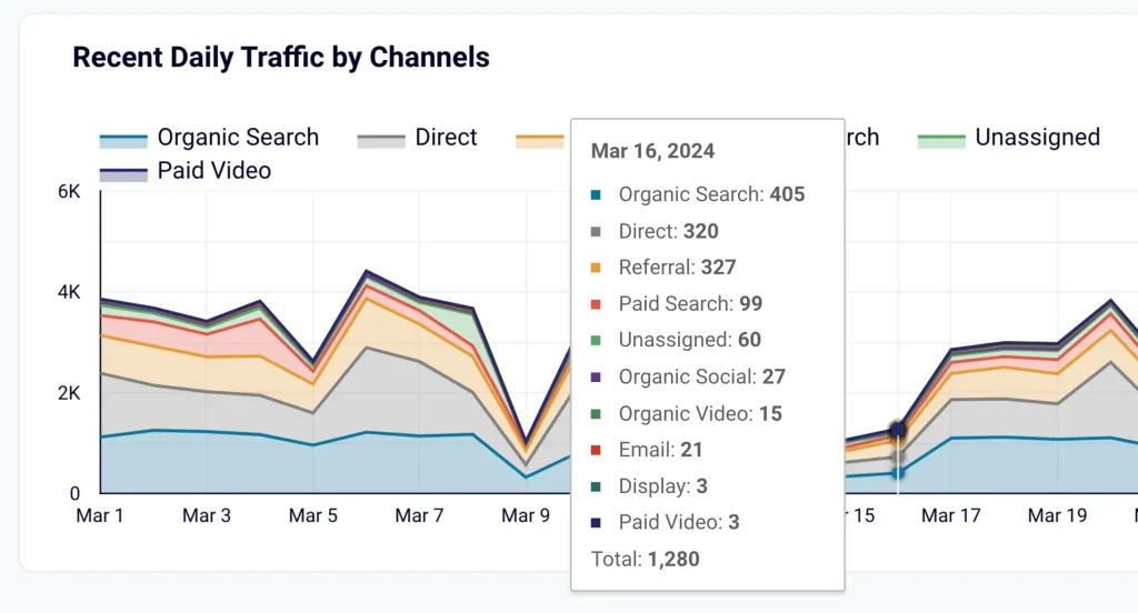
- Area charts – these graphs are good for comparing different factors. Stacked area charts, like the one below, are very helpful when you want to understand how different channels contributed to the overall results.

Of course, these are just a few examples, and there are many more graphs to choose from.
For more details on using different charts for your data, see our article 20 Types of Graphs for Marketers.
An alternative: use a CMO dashboard template
Building a dashboard from a template has its advantages. You only need to plug in your data source account and your data viz tool. After this, your metrics will be visualized automatically.
There’s no need to deal with settings and, more importantly, no need for the hassle of adding and arranging the graphs. The whole process takes just a few minutes. As well as this, if the dashboard made from a template is not exactly what you want – you can customize it later in your data viz tool.
- First, you will need to select a template. I will give you a list of free dashboard templates in the next section.
- Then, go to the Readmy / Setup guide tab of the selected template and follow the instructions.
- The steps will be similar to the ones I described before, but all the settings will be already pre-selected. Also, you don’t need to change anything in the data transformation step.
- In the end, customize your auto-updating dashboard to your liking. For example, you can add your logo and corporate color, connect new data sources, add more graphs, and so on.
10 free templates for building your CMO report set
1. Customer acquisition dashboard
This template collects data from various PPC sources, Google Analytics 4, and a CRM app (HubSpot or Pipedrive). All this data is then used to build an acquisition funnel.

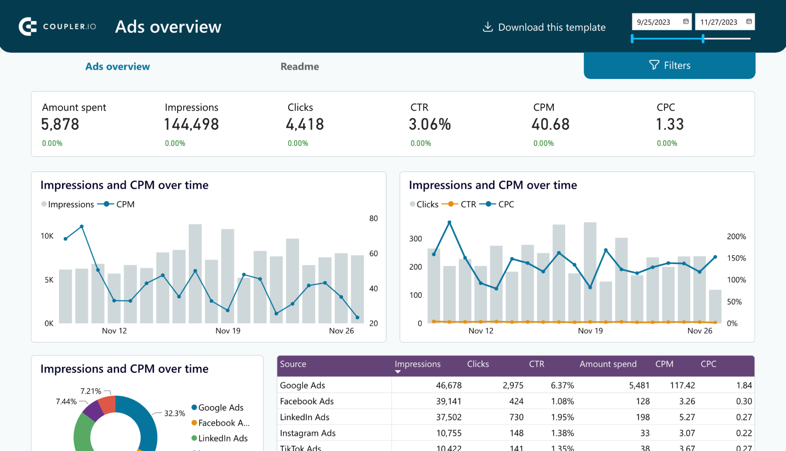
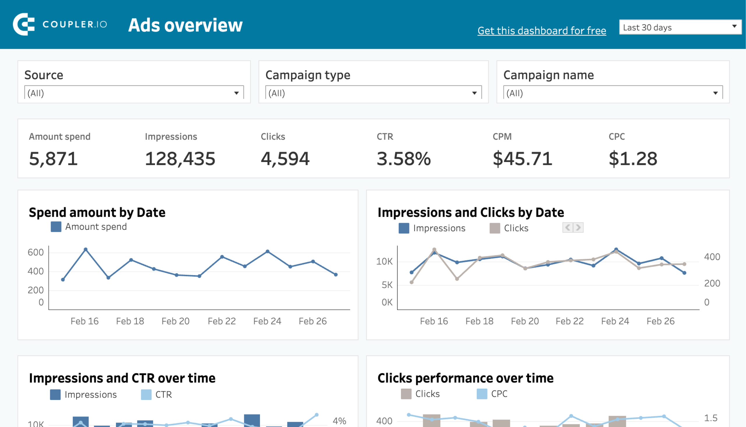
2. Cross-channel PPC dashboard
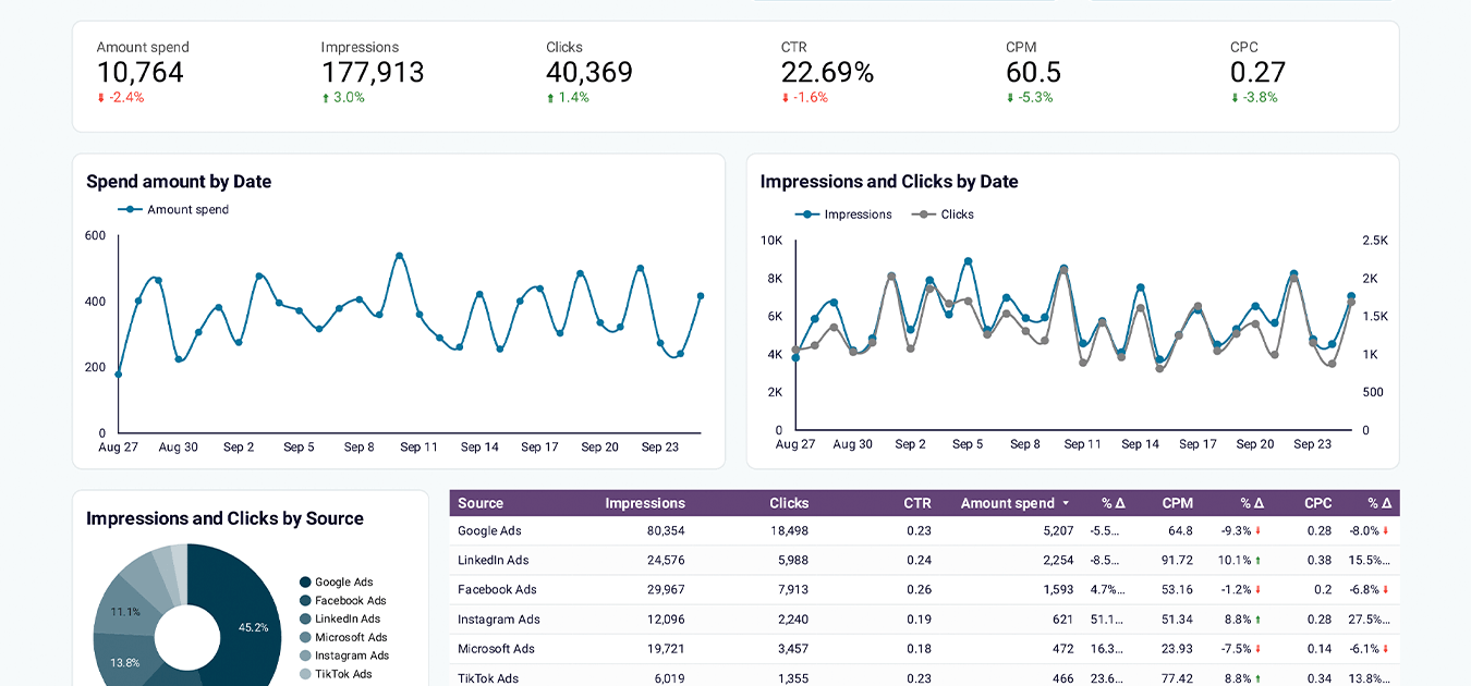
This dashboard pulls data from multiple ad platforms and allows you to conduct cross-channel analysis, keep track of your ad spend, and update your PPC strategy depending on the situation. For example, you can see which platforms perform best for a specific campaign and redistribute your ad budget accordingly.

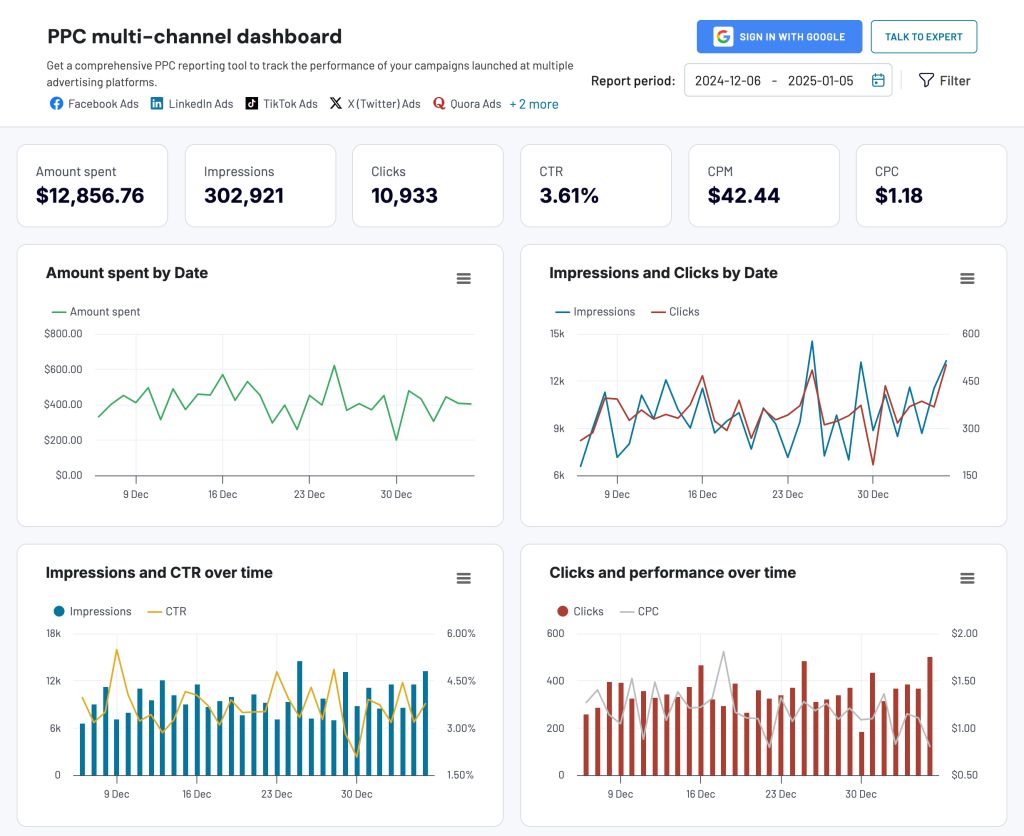
You can use this template with all these ad platforms at once or just with one-two platforms from the list:
- Google Ads
- Twitter Ads
- LinkedIn Ads
- Facebook Ads
- Quora Ads
- Instagram Ads
- Bing Ads
- TikTok Ads
Moreover, this PPC multichannel dashboard is available as a template for external reporting platforms, including Google Sheets, Looker Studio, Power BI, and Tableau. You can get started with any of these at no cost.

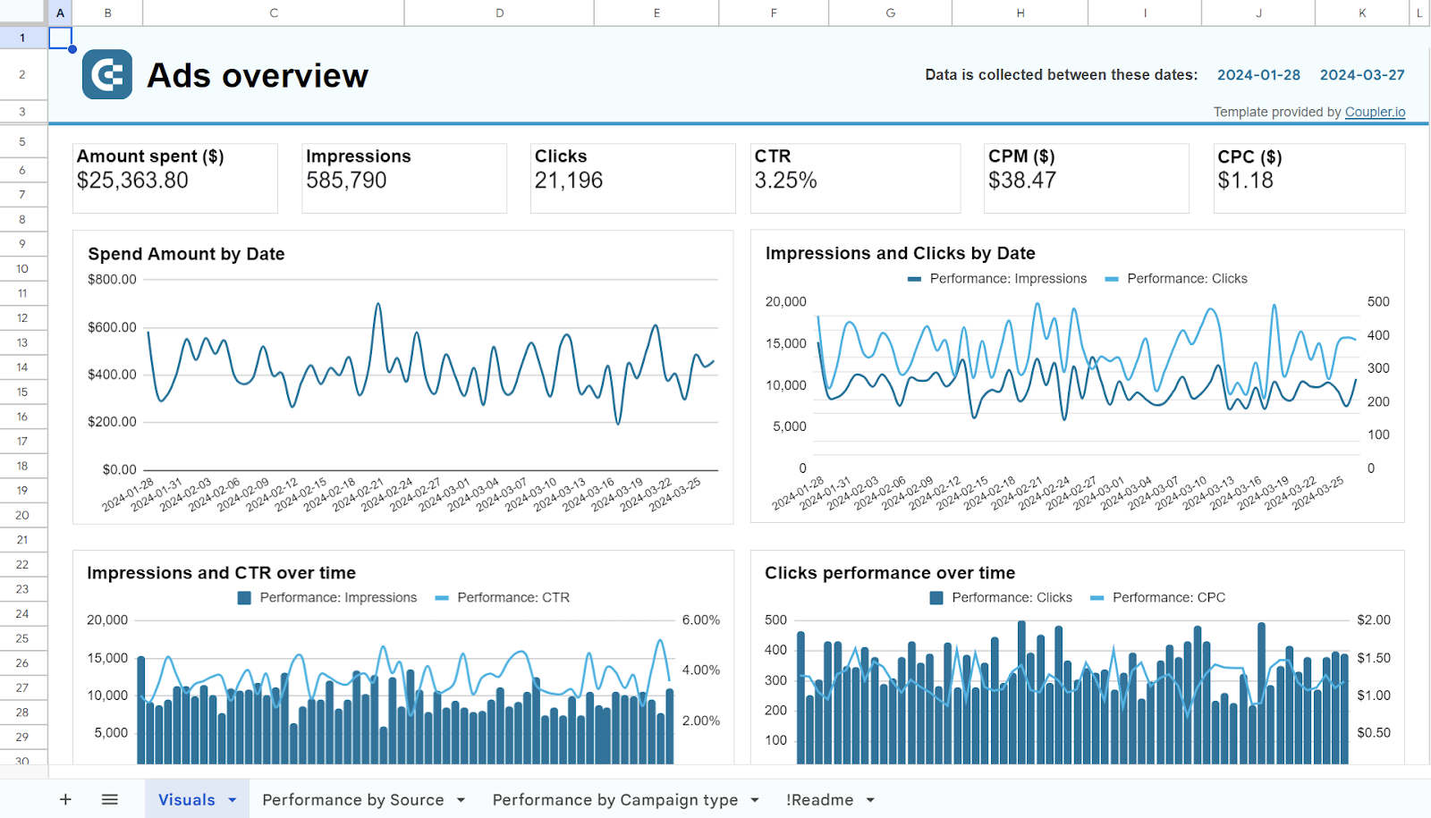
PPC multichannel dashboard in Google Sheets
Use a PPC dashboard designed for Google Sheets to track the performance of your campaigns across multiple advertising platforms.


PPC multichannel dashboard in Looker Studio
Get a comprehensive PPC reporting tool to track the performance of your campaigns launched at multiple advertising platforms.

PPC multichannel dashboard in Power BI
Use a Power BI PPC dashboard for tracking and analyzing your advertising campaigns across multiple platforms.


PPC multichannel dashboard in Tableau
Track and analyze the performance of your advertising campaigns across various platforms using a one-stop PPC dashboard in Tableau
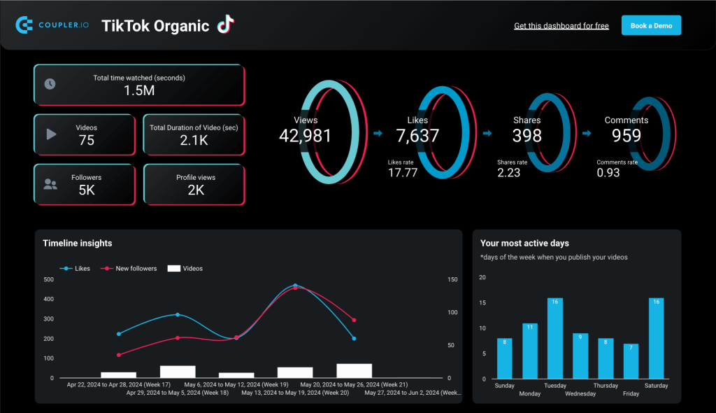
3. TikTok Analytics dashboard
A dashboard that gives you an overview of your TikTok account performance. It includes an engagement funnel, audience insights, popularity analysis, and more. Apart from that, this TikTok Analytics dashboard gives you other useful metrics, such as Total Time Watched for your videos. This is a metric that you can’t see in your TikTok account.

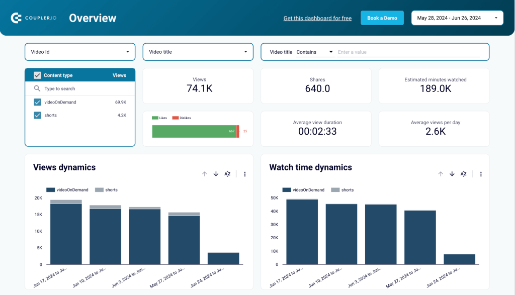
4. YouTube Analytics dashboard
If YouTube is one of the channels you use, I recommend trying this YouTube Analytics dashboard. It includes audience demographics analytics, subscriber dynamics, and the key performance indicators. In addition, it allows you to analyze your content performance by sorting videos by various criteria.
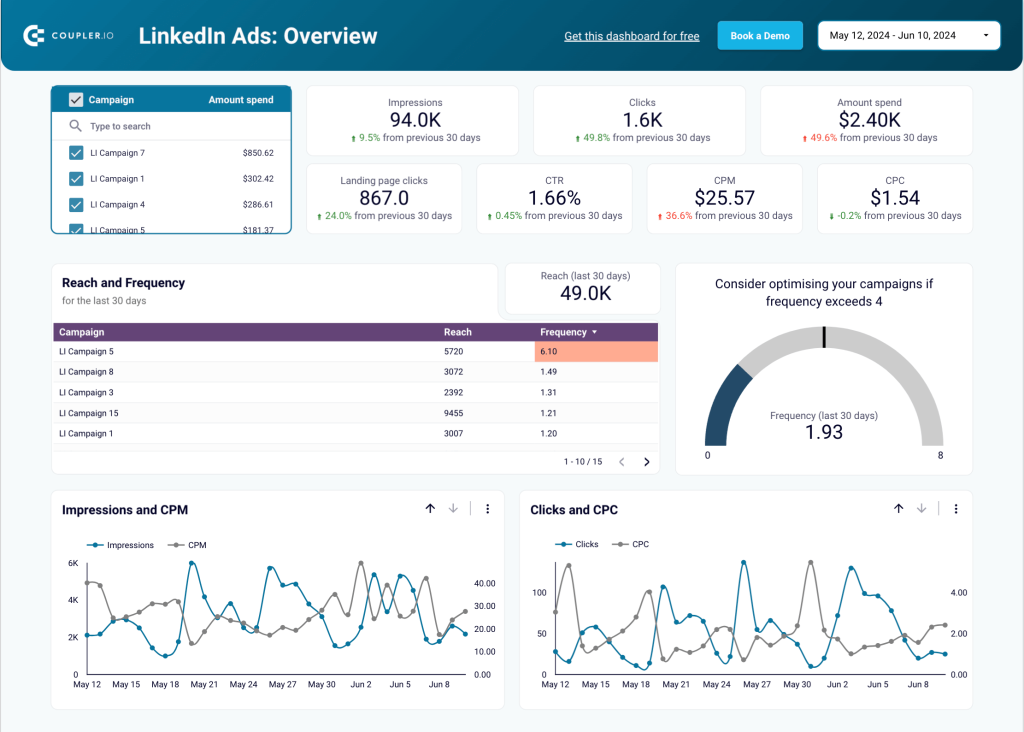
5. LinkedIn Ads dashboard
This is one of many PPC dashboard templates we developed for marketers. LinkedIn Ads dashboard allows you to keep track of the KPIs, check performance by campaign, and analyze conversion rate dynamics with an informative funnel.

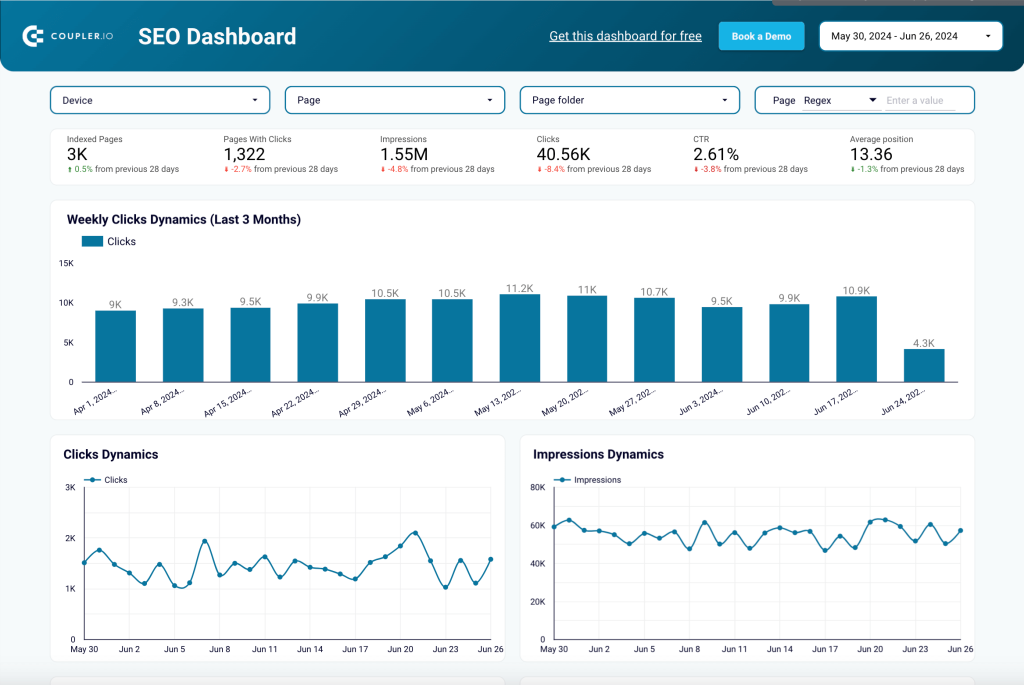
6. SEO dashboard
This SEO KPI dashboard offers a lot of useful information, and some things you can’t even find in native reports in Google Search Console. For example, the list of your best- and worst-performing web pages. You can use this SEO dashboard to analyze performance dynamics, filter out branded traffic, and more.

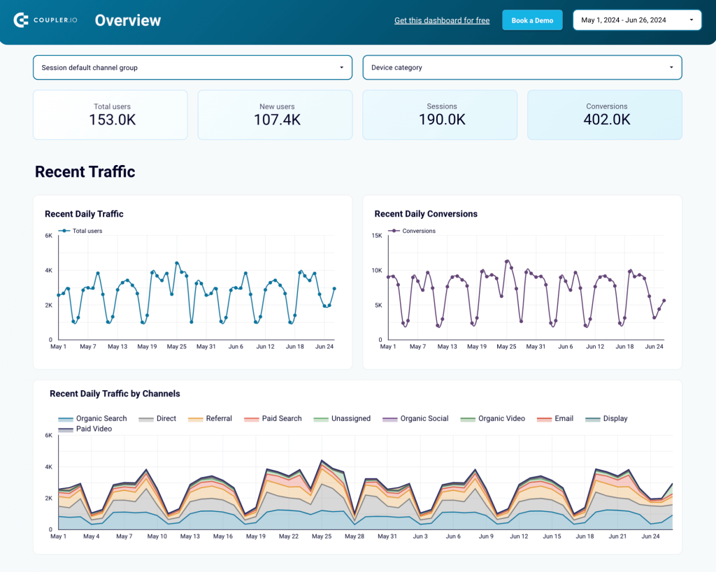
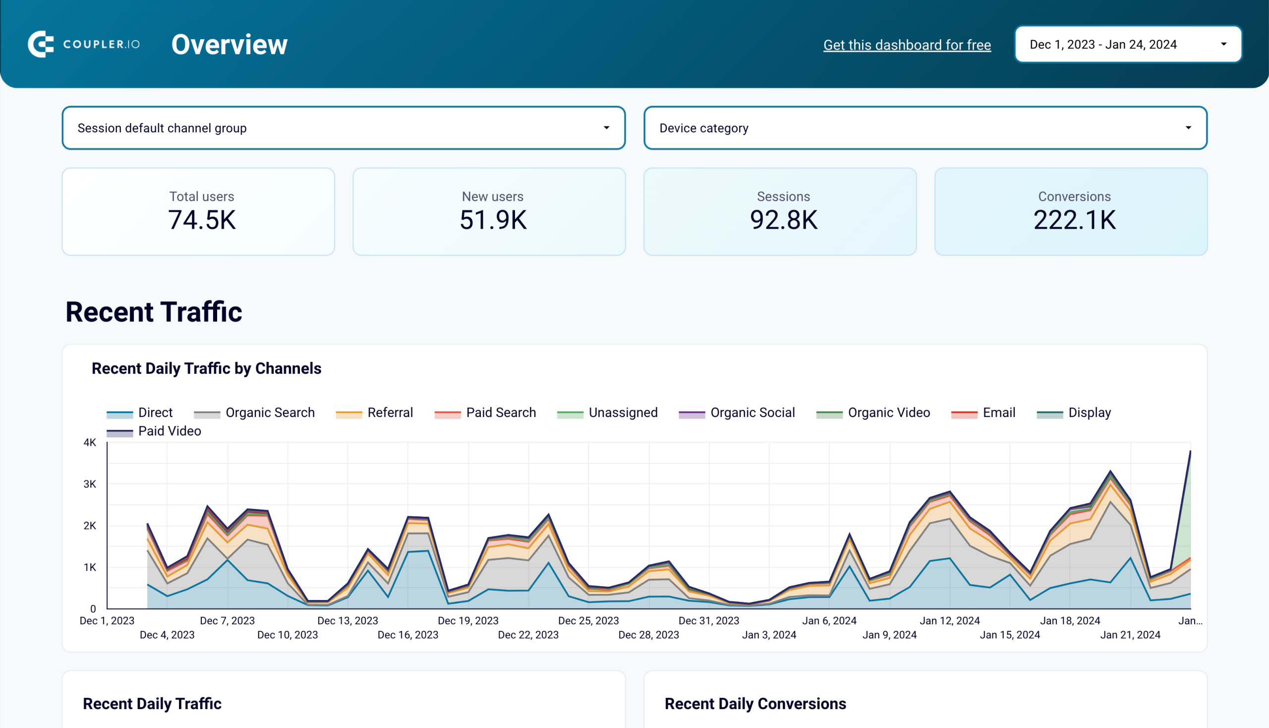
7. Web analytics dashboard
This template pulls data from Google Analytics 4 to help you better understand your website performance. The Web analytics dashboard helps you analyze traffic by channel, track conversions through different funnel stages, and conduct geographical analysis.

Web analytics dashboard in Looker Studio
Use the insights based on the data from GA4 to monitor your website traffic and discover which pages resonate most with your audience.
Web analytics dashboard in Tableau
Monitor the performance of your traffic, analyze the conversion funnel, and derive other insights from Google Analytics 4.
Web analytics dashboard in Power BI
Discover insights into your website’s traffic acquisition, audience, and conversions with Google Analytics 4 data seamlessly connected to our Power BI dashboard template.
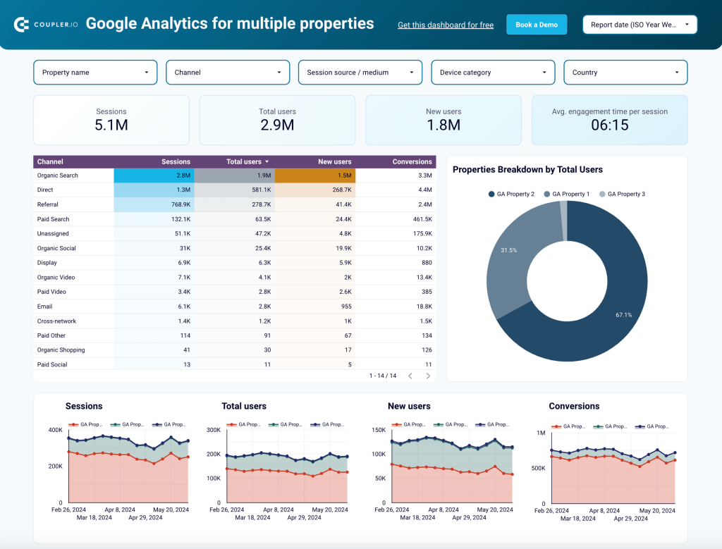
8. Google Analytics dashboard for several properties
This template can be used to collect data from several GA4 properties. It’s useful when you need to combine data on several related websites or compare their results. Thanks to this GA4 for multiple properties dashboard, you won’t need to switch between accounts to collect all the data you need.

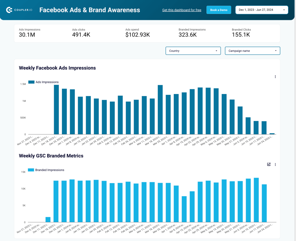
9. Facebook Ads and Brand Awareness dashboard
The next free template I would recommend uses information from Google Search Console and Facebook Ads. With this Brand Awareness dashboard, you can assess how your ad campaigns impacted growth in branded impressions.
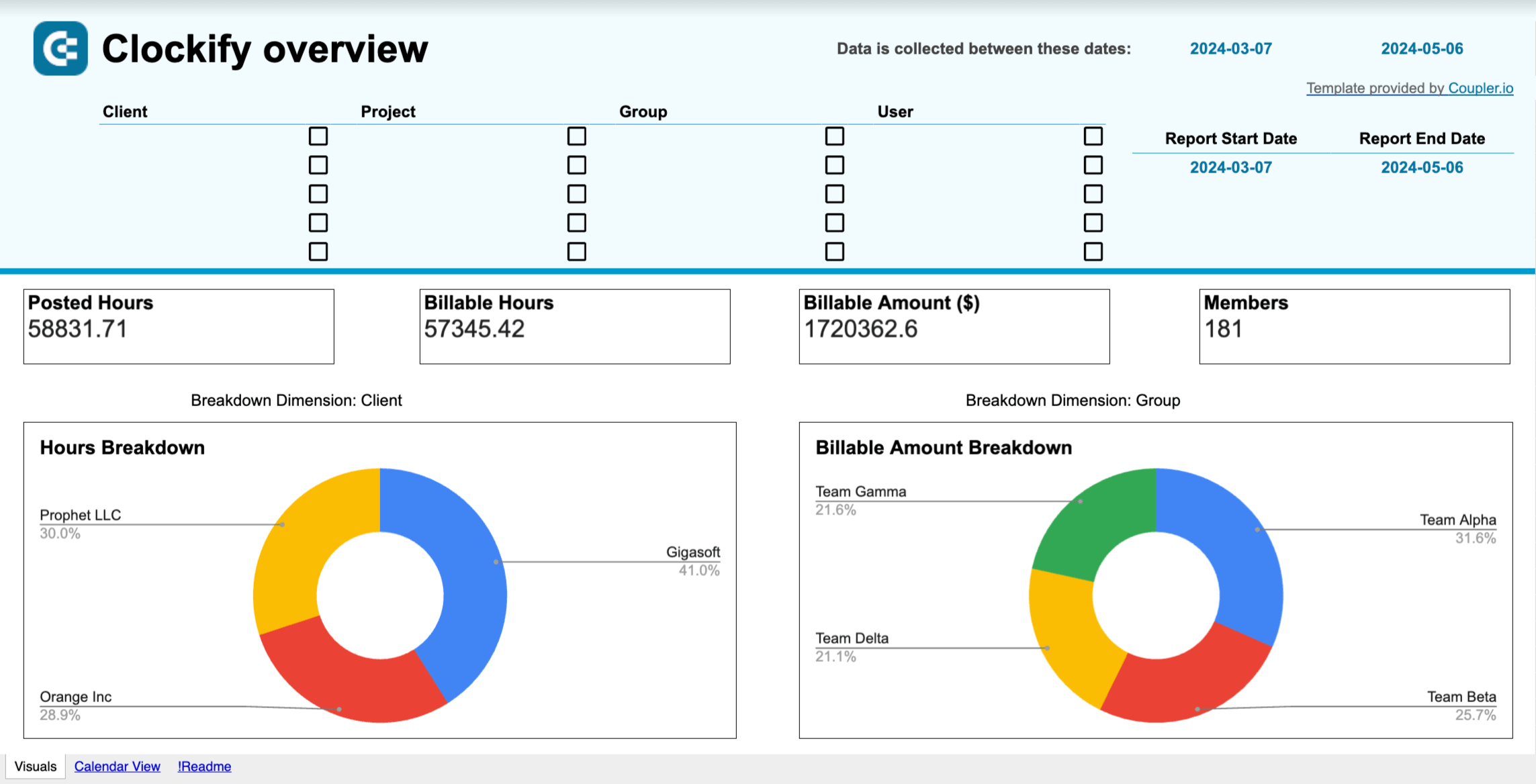
10. Team performance dashboard for Clockify
As I mentioned, monitoring team performance is also important for a chief marketing officer. You can use one of these time-tracking dashboard templates to analyze how your team uses their time, identify bottlenecks, and plan ahead to improve efficiency. It can also provide important insights for process optimization.
This free template is offered for different time-tracking apps – Clockify and Harvest:

Time-tracking dashboard for Clockify in Looker Studio
Use a powerful Clockify analytics dashboard that provides insights into how you can increase the time efficiency of your teams.

Time-tracking dashboard for Clockify in Google Sheets
Increase your team’s productivity by analyzing how time is spent across projects and clients using the Clockify analytics dashboard for Google Sheets.

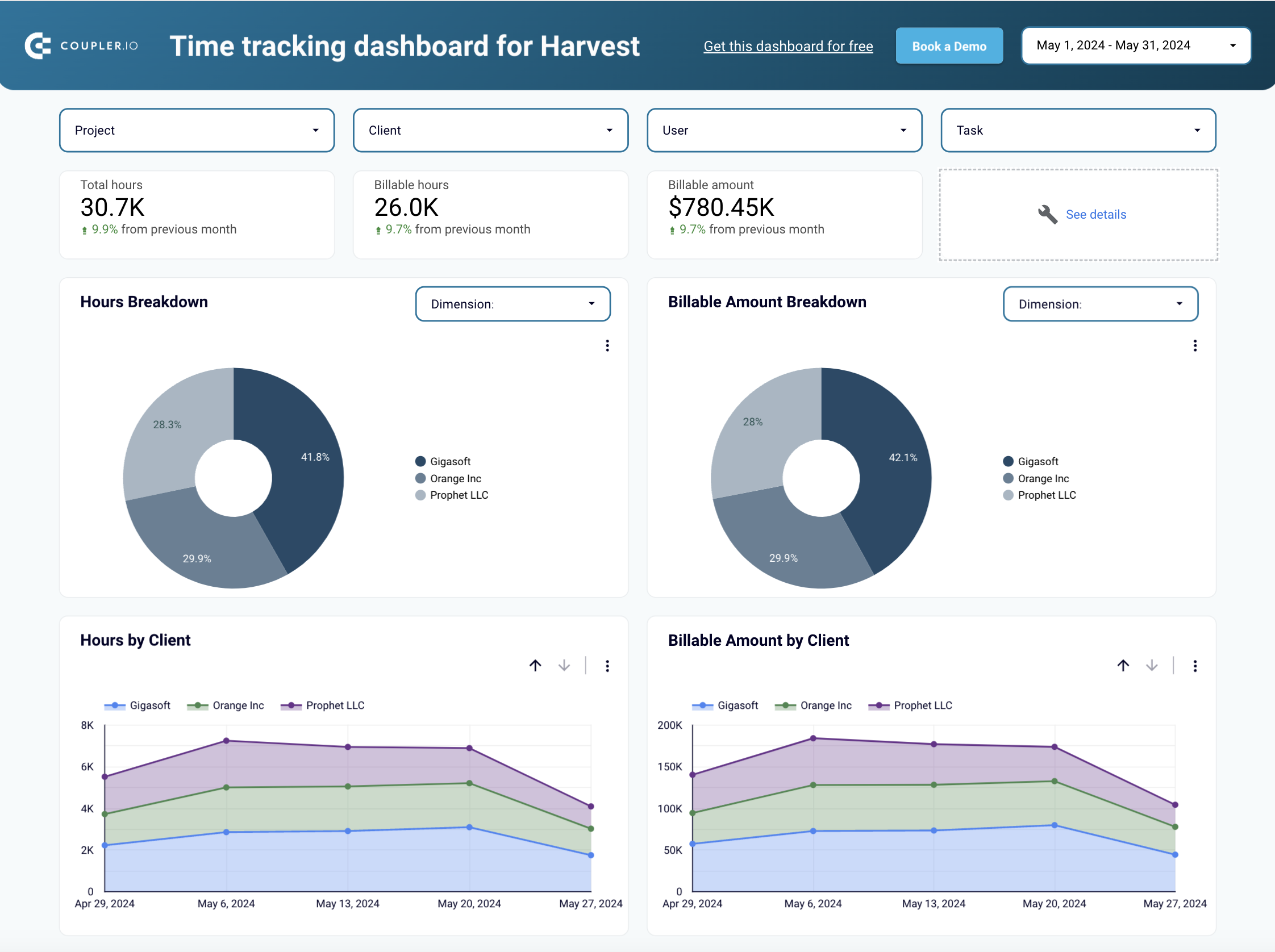
Time tracking dashboard for Harvest – Looker Studio
Use a powerful analytics dashboard that provides insights into how you can increase the time efficiency of your teams.

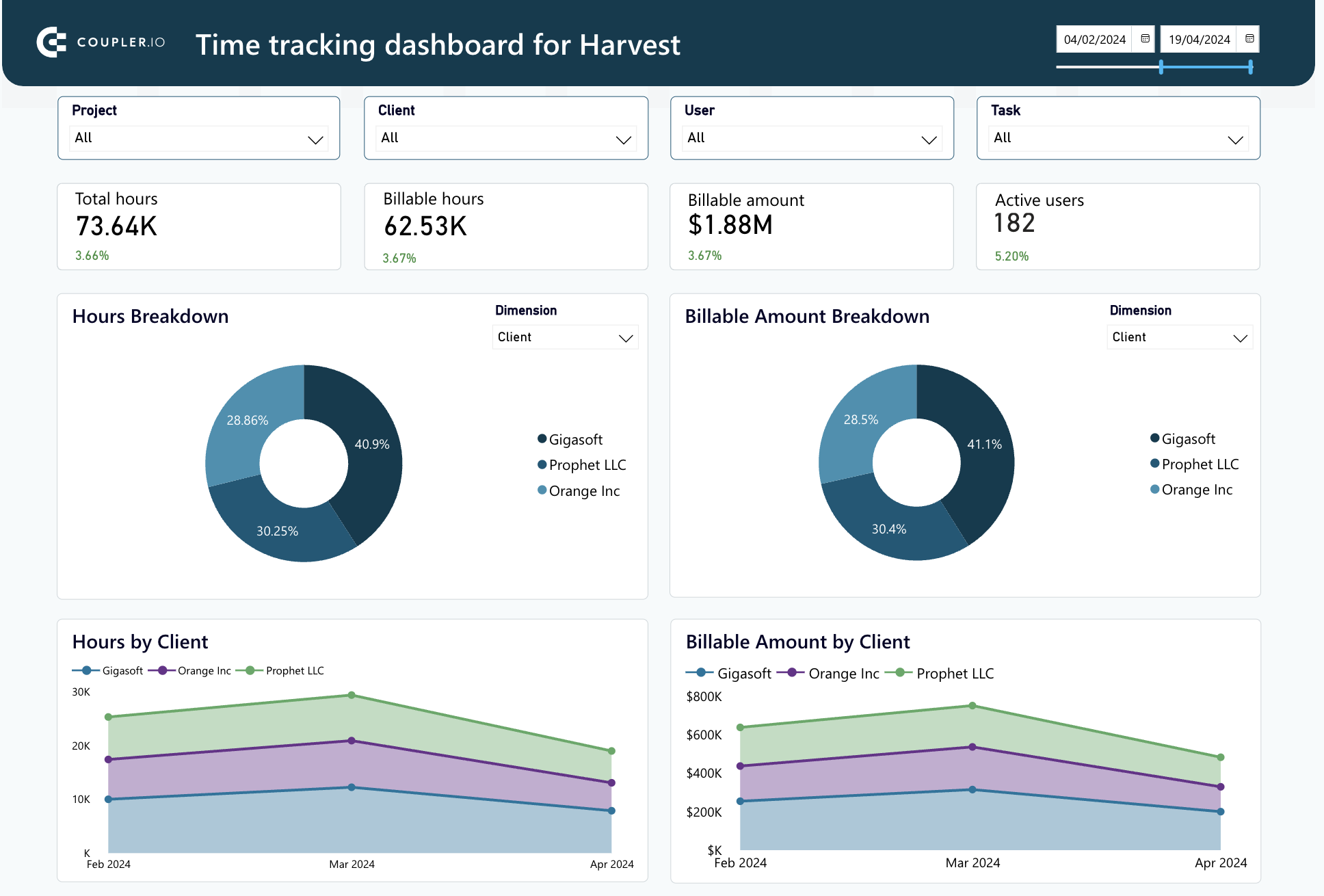
Time tracking dashboard for Harvest – PowerBI
Use a powerful analytics dashboard that provides insights into how you can increase the time efficiency of your teams.
Check out our other free templates for marketers in our Dashboard Gallery.
I hope this article has been helpful for you, and your CMO dashboard set will be a valuable resource to back informed decisions. Having said that, it’s still important to remember that every company is unique, and industry contexts can vary greatly. So, before building your dashboard, ask yourself: what questions do I want to answer with this report? What do I need it for? When you have clear answers to these, you will be able to center your dashboard around your specific needs and maximize its usefulness.
For more on this topic, take a look at our articles on Marketing Reporting and How to Become a Marketing Analyst.