Understanding user behavior on your website is more important than ever, especially when you have a large volume of users visiting your website.
However, just as the number of internet users has increased, so have the methods for analyzing their events. Cohort analysis is one such technique, and in this post, we’ll explore it in depth.
What is a cohort analysis?
A cohort is simply a group of people who share a common characteristic that can be used as a basis to analyze their behavior.
These characteristics can be the acquisition date or any specific actions taken on the site e.g. clicking a button, making a purchase, submitting a form, etc.
You get the idea! You use these characteristics that bind your visitors together and then analyze how they behave as a group (aka ‘cohort’) over a given period.
Commonly, cohorts can be used to understand things like your retention rates, churn rates, or purchasing behavior. Here are a few quick examples:
- Retention: Find out how many users return to your site after they first visit your site.
- Churn: Find out how many users first signed up for a subscription and then canceled it later on.
- Behavior: See how a group of visitors who perform a specific action on your site behave.
The goal of recognizing these patterns in your website visitors is to use that data to optimize your marketing and/or CRO efforts.
Why? Well, to improve retention rates or drive desired actions/features that result in bringing users back and/or driving more engagement.
Given how privacy has been a hot topic for the past couple of years, cohort analysis helps to circumvent these concerns.
This is because individual users are not identified; rather, a whole group is looked at which keeps the data anonymized yet insightful.
Hopefully, we’ve given you an idea of what cohort analysis means. Next, let’s explore the types of cohorts.
Types of cohorts
Cohorts are typically divided into two types:
- Acquisition Cohorts
- Behavioral Cohorts
Let’s explore what each one of them means.
Acquisition cohorts
These cohorts are based on ‘when’ users first signed up for your product / service, started using it, or simply visited your site. Remember the retention example above? That falls into this category.
As the name suggests, it tracks your acquisitions and then sees how they behave over a period of time. This gives you an idea of how good your retention is and helps to start a conversation about retention strategies.
Learn more about marketing funnel analytics.
Behavioral cohorts
This type of cohort analysis focuses on understanding what actions play a part in bringing users back. These actions could be things like adding to a cart, making a purchase, using a specific feature, completing an onboarding tour, etc.
Understanding this sort of behavior provides insights into how things can be further improved for these groups to get better retention or engagement.
Now that we have learned what cohorts and their types are, it’s time we learn how to put things into practice in Google Analytics, aka GA4.
Setting up cohort analysis in Google Analytics 4
In GA4, we can create both types of cohorts as we can choose the first touch (acquisition date), events, and other events or conversions in the inclusion criteria.
The return criteria, on the other hand, allows us to include users with any event, conversion, or transaction to understand behavior.
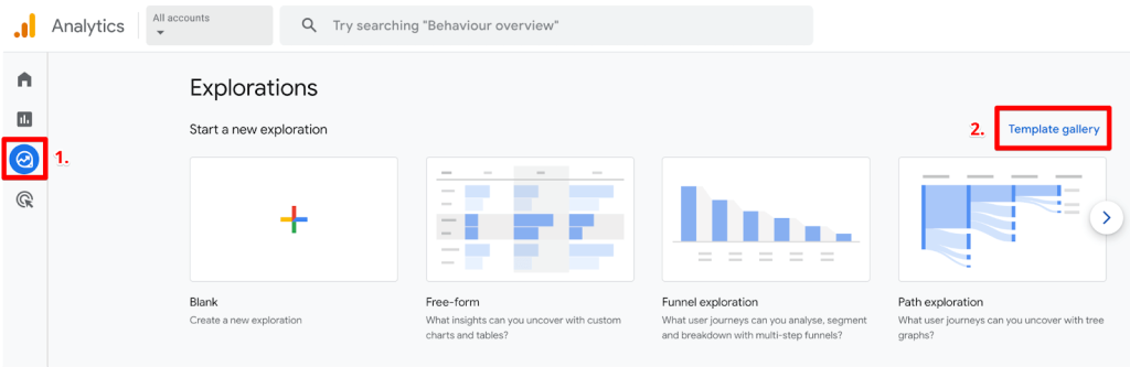
Cohort analysis reports, along with other custom reports in Google Analytics, are called ‘explorations’. The quickest way to start a cohort exploration is by following three steps:
- Head over to ‘Explore’ on the left navigation.
- Click on the ‘Template gallery’ on the right.
GA4 explorations and template gallery
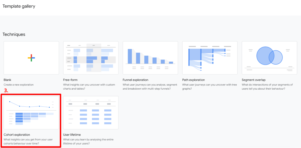
- Select the ‘Cohort exploration’ under the techniques.
Cohort exploration in GA4 template gallery
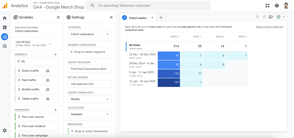
Here’s what a default cohort report looks like.
Default cohort exploration in GA4
The two left columns, Variables and Settings, define what the output, i.e. report, looks like on the right side.
In Variables, you can choose the following:
- Name
- Date Range
- Segments – These are pre-built, but you can add your own custom ones
- Dimensions – These can be used to filter and/or break the report further
- Metrics
In Settings, you can set the following parameters:
- Technique – It is better to leave it as is since it’s what we want, i.e. cohort and sometimes switching the technique between different ones makes the final report appear weird with certain settings not applied anymore.
- Segment Comparisons – This is where you add / drag and drop the segments you create in Variables.
- Cohort Inclusion – Super important for this report as it defines the conditions that users must fulfill to be part of the cohort. We’ll take a look at them in detail in a bit.
- Return Criteria – The second important part is used to define which users to include in the returning cohort.
- Cohort Granularity – This is used to show the time span of the columns on a daily, weekly, and monthly basis.
- Calculation – How a metric is calculated, i.e., Standard, Rolling, and Cumulative.
- Breakdown – Add a dimension to further break down the report, e.g. device category, gender, etc.
- Rows Per Dimension – If the breakdown dimension has a lot more values, e.g. First user source, then you can choose to have 5, 10, or 15 rows.
- Values – Your chosen metric comes here. Commonly used: Active users, Purchase revenue, Transactions, Event count, etc.
- Metric Type – How you display the values, i.e. Sum of totals or per cohort user. Remember, if you hover over any cell, you can still see both aggregations.
Before we move on, we should learn more about the inclusion criteria, return criteria, and what different calculation methods really mean.
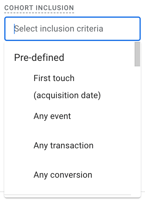
GA4 has the following options for Cohort Inclusion:
- Pre-defined
- First touch (acquisition date) – The first time a user visits your site/app.
- Any event – The first event for the user in the selected date range.
- Any transaction – The first transaction for the user in the selected date range.
- Any conversion – The first conversion event for the user in the defined date range.
Pre-defined cohort inclusion events
- Others
- These are individual events that include automatically collected and any custom events that you send to your GA4 property. You may have guessed that these are also counted from the first time.
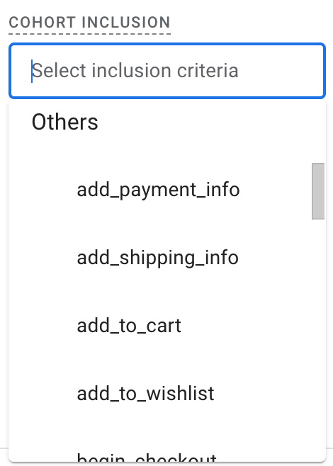
Individual and custom events for cohort inclusion
Return Criteria also has a similar drop-down except for the First touch (Acquisition date), and any selected event isn’t the first time.
Return criteria help you understand behavior, while inclusion parameters focus on acquisition.
Let’s see what the three cohort calculation methods mean:
- Standard – Each cell simply shows the total users who meet the return conditions for that individual period only. However, the metric shows the total value for that individual time period.
- Rolling – Every cell includes users who fulfill the return criteria for that individual period and all the previous periods. The metric also shows the total value for that individual period.
- Cumulative – With this method, the cells include users who meet the return criteria in any period of the selected date range. The selected metric also displays the cumulative value for each time period.
This might be a little confusing, so let’s try to understand with an example where we include users who had any event in the selected time period with weekly granularity.
Let’s say you acquire 5 active users in Week 0, and their interactions over the next 3 weeks look like this:
| Week | Active users |
| 0 | All 5 acquired (A, B, C, D, E) |
| 1 | 3 (A, B, C) |
| 2 | 3 (A, C, D) |
| 3 | 4 (A, B, D, E) |
Now, we’ll see how these numbers will show up based on different calculation methods:
| Week | Standard | Rolling | Cumulative |
| 0 | 5 | 5 | 5 |
| 1 | 3 (A, B, C) | 3 (A, B, C) | 5 |
| 2 | 3 (A, C, D) | 2 (A and C) | 5 |
| 3 | 4 (A, B, D, E) | 1 (A) | 5 |
Let’s do a quick summary of what we learned here:
| Method | Counting Criteria | Used For | Example with Week 2 |
| Standard | Count users only in the current week | Identifying engagement for specific weeks | 3 users (A, C, D) were counted. Users in previous weeks or who return later don’t matter |
| Rolling | Count users in the current and all previous weeks | Analyzing long-term user retention and loyalty | 2 users (A, C) were counted because they were active in Week 0 all previous weeks are not counted |
| Cumulative | Add up unique users from Week 0 up to the current week | Understanding total unique users over time regardless of drop-offs | All 5 users were counted as they have been active at least once from Week 0 to Week 2, regardless of whether they were active every week or not |
So, what can you do once you have this information depending on the chosen calculation method?
- Standard – Since it helps to identify the number of users who drop off every week, we can further look into what might have caused this. For instance, if the users in Week 2 drop significantly is it because of no follow-up emails or poor remarketing campaigns?
- Rolling – With this, we can identify our loyal customers and also address churn. For example, users A and C remain active till Week 2, making it likely for them to have higher life value. We should have retention strategies for them.
Most users drop after Week 1 (churn), perhaps a better onboarding experience will help to retain them. We could also learn from loyal users (A and C) what made them stay and use that info. - Cumulative – This method could help us understand our user growth, e.g. if Week 2 has a higher user count vs Week 1 then it means your overall reach has increased.
Slow or dwindling cumulative growth means you need remarketing strategies, whereas for campaigns that lead to higher cumulative growth, you should double down on those efforts.
We spent more time here because it’s important to understand these nuances so you can decide which one to use and when.
Business value of cohort analysis in GA4
We are going to explore some examples of how using cohort exploration can provide us value, starting with e-commerce purchase patterns.
E-commerce purchase patterns
Specifications of this exploration:
- Inclusion criteria: Any transaction
- Return criteria: Any transaction
- Granularity: Monthly
- Calculation: Standard
- Values: Transactions
- Metric: Sum
- Date range: 1 Jun 2024 – 30 Sep 2024
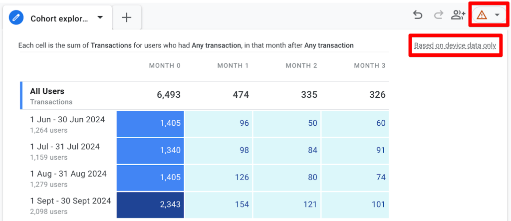
E-commerce transactions monthly cohort
Before we move on, there are two important things to note in the top right corner:
- The orange triangle means that the report is sampled. if you hover it you can see how much.
- The report mentions that it’s based on device data only. We’ll see why that can be a problem in the limitations section.
Now, let’s talk about some insights and actions:
- September has a high number of transactions, most probably due to back-to-school campaigns. These campaigns could be analyzed to drive more initial acquisitions.
- Repeat purchases for Aug and Sep cohorts are higher vs Jun and Jul, which could be due to better retention strategies aka remarketing campaigns.
- Transactions decline sharply in Month 1 across all cohorts; this necessitates a strategy to incentivize users to return and make purchases more.
- Repeat purchases for Sep are much better than for the other three months. Marketing campaigns for users in Sep seem to be doing much better and these efforts could be replicated.
Now, if we switch the value / metric to something like Purchase revenue, we might get more context that’s not entirely based on the number of transactions.
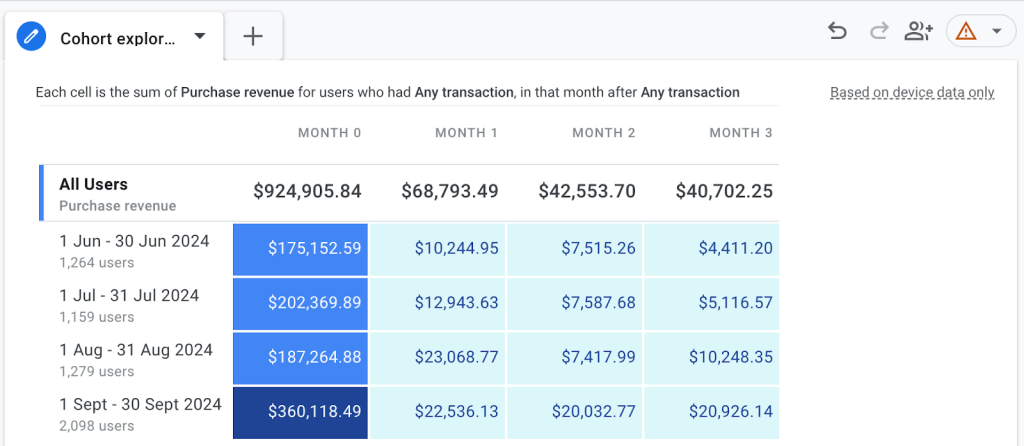
E-commerce transactions and purchase revenue monthly cohort
- Sep Month 0 shows a lot more revenue than all others, but it’s interesting to see that the Jul cohort has been more valuable in Month 0 than Aug.
- Aug Month 1-3 revenue is still higher than the previous two months.
This data can be further contextualized, for instance, by adding a breakdown dimension like the device category.
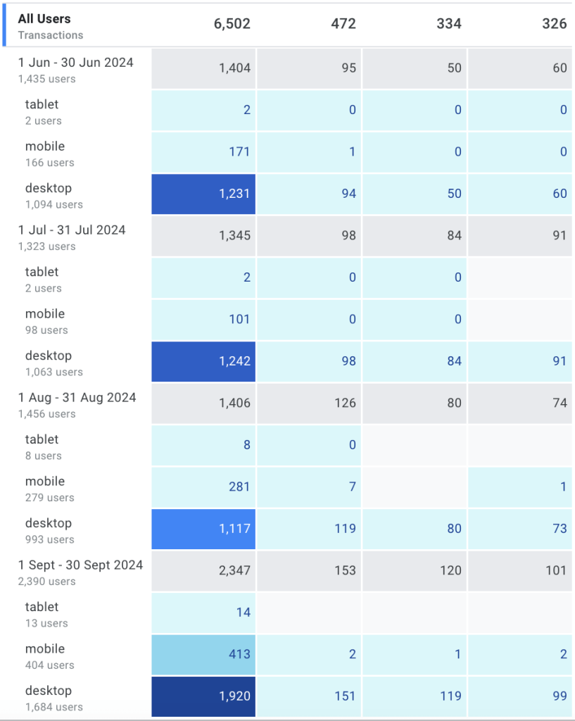
E-commerce transactions monthly cohort with device breakdown
You could also add a segment for source, medium, or campaign to find out which one of them does a better job at retaining users or bringing high-value users.
We can also examine other aspects of e-commerce, such as how many customers return to browse products or add items to their carts. This provides insights into their behavior in relation to retention.
Let’s have a look at some common cohort analyses for SaaS businesses.
SaaS cohort analysis
While GA4’s demo account doesn’t have SaaS data to show some of these cohort analyses, the following types should give you an idea of how they can be used if you’re tracking these events.
Uninstalls after update
When you release a new update for your app and want to see how many users uninstall it after that.
Specifications of this exploration:
- Inclusion criteria: app_update
- Return criteria: app_remove
- Granularity: Monthly
- Calculation: Cumulative
- Values: Active users
- Metric: Sum
- Date range: 19 Nov 2024 – 18 Jan 2025 (max available at the moment)
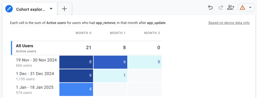
Feature adoption cohort analysis with active users
- Partial Nov saw a lot more app removals vs partial Jan compared to the total number of users in Month 0 and Month 1. Possibly, the update on Nov 19-30 had some bugs.
- How could the same user have app removals in Month 1 if they already removed the app? Are they re-installing the app, updating it, and then removing it again?
Let’s say we want to look at the total app removal events vs users who had this event.
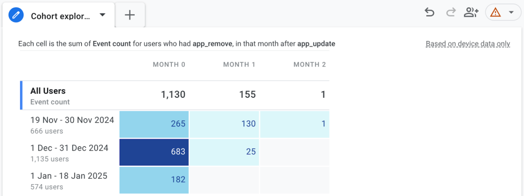
Feature adoption cohort analysis with event count
- The event count can be easily inflated since this metric includes the events performed by the same users multiple times.
- This can lead to misleading interpretations, especially when the number of users is significantly lower than the event count. For example, in December, there were nine users who uninstalled the app, but this action was recorded 683 times. Did these users repeatedly install, update, and uninstall the app due to in-app promotions? Or were they updating and uninstalling multiple times in an attempt to get a specific feature to work? This raises important questions about user behavior and warrants further investigation.
Another common cohort analysis is to see how many people encountered an error event and removed the app.
Now let’s quickly explore some other SaaS cohort analyses.
User retention
- Cohort inclusion: Users who start a trial or sign up, e.g. start_trial, sign_up.
- Return criteria: Users who logged in or used some specific event, like used a template or created a report, e.g. template_used, report_created.
- This would show retained users who then return back to log in and/or use some feature.
Feature adoption
- Cohort inclusion: Users who use a new feature, e.g. update_contact.
- Return criteria: Users who use the same new feature.
- This could give insight into how well users adopt any new feature you launch.
Free-to-paid conversion cohort
- Cohort inclusion: Users who start a free trial, e.g. start_trial.
- Return criteria: Users who upgrade their plan to become, e.g. start_subscription.
- With this type of cohort analysis, you’ll get an insight into things how good the onboarding and user experience has been for users to come back and get a full subscription.
These are obviously only a few examples. Your cohort analysis will depend on the type of industry / business you have.
For instance, for content sites, this could be focused on users who subscribe to newsletters and return to consume specific categories or types of content, e.g. blogs, videos, etc.
Like most tools, GA4’s cohort exploration has its limitations. We’ll look at them next before wrapping things up.
Limitations of GA4 cohort exploration
It’s important to keep the following things in mind so you have a proper context for your analysis:
- GA4 uses the device ID rather than the user IDs to identify users. This can skew the data, especially when users can visit from multiple devices and be counted as acquisition and returning users.
- Sampling is another issue that you can encounter, as we observed in the reports above.
- User counts are generally estimates based on GA4’s HLL++ algorithm. You can read more about it here.
- GA4 can apply thresholds if the demographic data is low in your property to anonymize users which means they will be excluded.
- It shows a maximum of 15 rows for breakdown dimensions.
- You can only see a maximum of 60 cohorts, i.e. cells (including any breakdown dimensions).
These limitations should not stop you from using the cohort technique because you can still get some pretty good insights as long as you take them with a grain of salt and not the absolute truth.
Custom reporting to overcome GA4 cohort exploration
However, if you need a more precise and flexible cohort analysis, Coupler.io offers a solution that addresses these limitations. With this reporting automation platform, you can create custom GA4 reports that overcome the constraints of GA4’s native reporting system.
Coupler.io allows you to extract data directly from your GA4 account and transform it according to your specific needs.
What makes it particularly valuable for cohort analysis is its ability to handle large datasets without sampling issues and combine GA4 data with other sources for more comprehensive insights.
You’re also not limited by the 15-row restriction for breakdown dimensions or the 60-cohort cell maximum that GA4 imposes. Instead, you can create detailed cohort analyses that capture the full scope of your user behavior patterns.
The process is pretty straightforward:
- Export Google Analytics data from your properties.
- Transform it using Coupler.io’s data preparation tools.
- Load it into your preferred visualization platform, whether that’s Google Sheets, Looker Studio, Power BI, or Tableau.
For businesses grappling with complex user behavior patterns or needing to integrate GA4 data with other data sources, Coupler.io provides the flexibility and power to create more sophisticated cohort analyses while maintaining data accuracy and completeness.
One of the coolest things about using Coupler.io for cohort analysis is the automation feature. Once you’ve set up your reports, you can schedule automatic data refreshes to ensure your cohort analysis always reflects the most current data.
This eliminates the need for manual updates and ensures your insights are always timely and actionable.
The platform even provides white-label GA4 report templates that you can customize to match your brand’s identity while saving time on report setup.
You can try it out for free by selecting your preferred destination app and clicking Proceed. Build your custom GA4 dashboard to analyze cohorts from scratch or choose one of the available templates.
Take action with cohort analysis
To wrap things up, we covered what cohort analysis is, its types, and how it can be beneficial for us to understand user retention and behavior.
We then explored how to set up cohort analysis in GA4, spending quite a bit of time on the three calculation methods; standard, rolling, and cumulative. We learned the implications of using each one of them.
It was important to learn about important business values of cohort analyses by looking at different types of business models, starting with e-commerce retention.
You are now familiar with some SaaS cohort analyses like uninstalls after an update/error, user retention, feature adoption, and free-to-paid conversion cohorts. This is useful to ensure that your cohort reports are tailored to your business or industry, with an example provided for a content site.
Learning about the limitations when using cohort exploration in GA4 was our last stop so we are aware of the quality of data we are seeing. Coupler.io can be of great help here since it allows you to do much more than just create cohort analyses in Google Analytics for agencies as well as businesses’ in-house teams.
This is because it supports automation and integration with other tools to blend data and transform it into how it will be useful for your team/business. After all, as an analyst trying new tools is something we do quite a bit to see how we can do better than yesterday.
The key takeaway here is simple: all the roads from this type of analysis should lead us to optimize our retention and engagement strategies, and that makes it worth it!
Automate GA4 reporting with Coupler.io
Get started for free