Coupler.io is a reporting automation platform that enables you to build insightful reports in minutes. It’s a one-stop shop that combines several functionalities, including data export, report creation, and data refresh. Non-Coupler.io users would have to seek alternatives to perform each of these functionalities separately. In this blog post, we share the available options for you to consider.
Alternatives for data export
Coupler.io offers integration with various apps, pulling data from many of them in one place. Alternatively, you’d need to browse through different options that suit your specific data sources.
Built-in export options
Native data extraction from apps and software
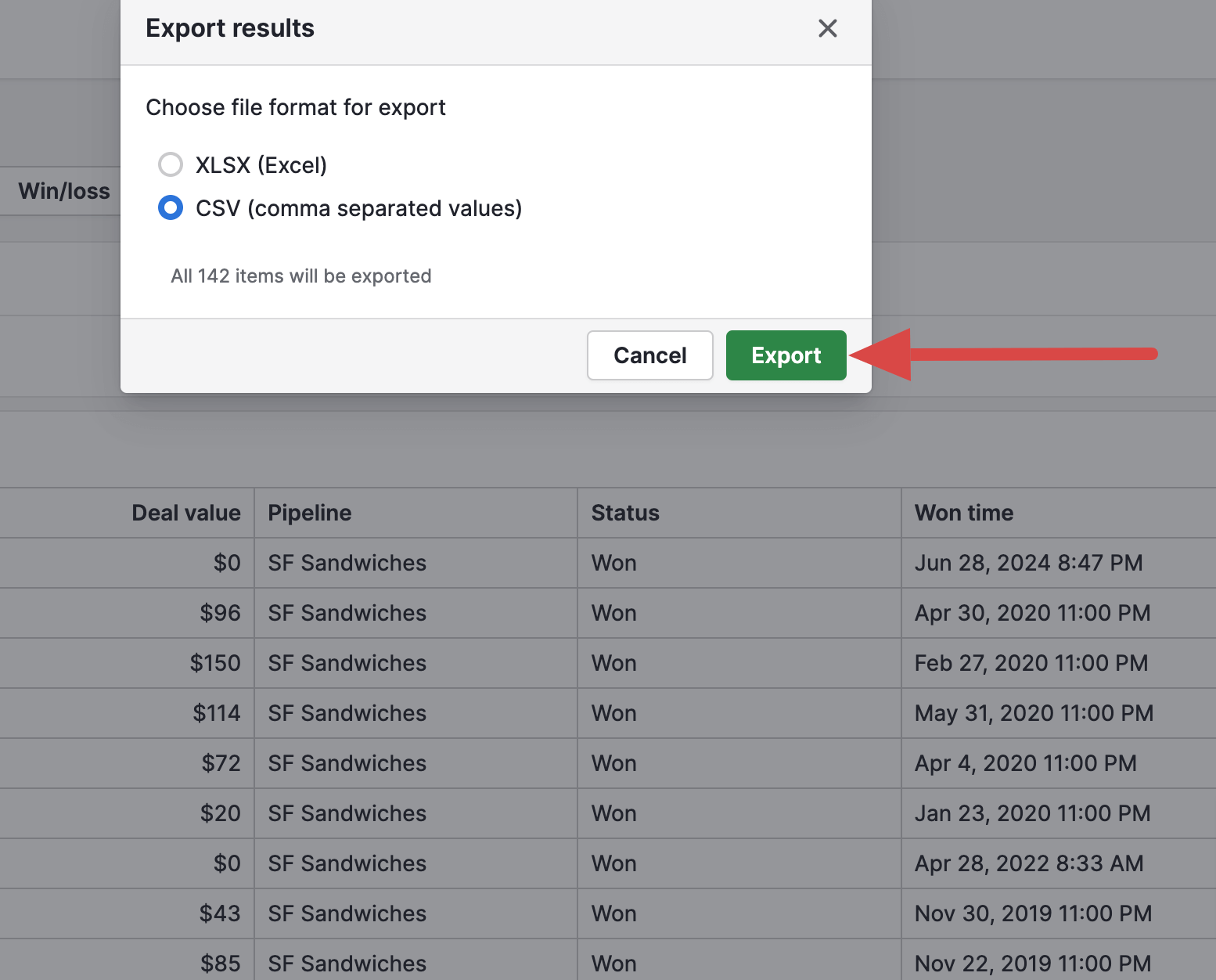
Analytics tools, CRMs, ad platforms, and other sources typically allow you to save data and built-in reports in .csv or additional file formats, which can later be uploaded to the destination. While this is the most straightforward export method, it works best for small datasets and occasional downloads. It becomes slow and time-consuming if you must export large data volumes regularly.

Built-in connectors in spreadsheet apps and BI tools
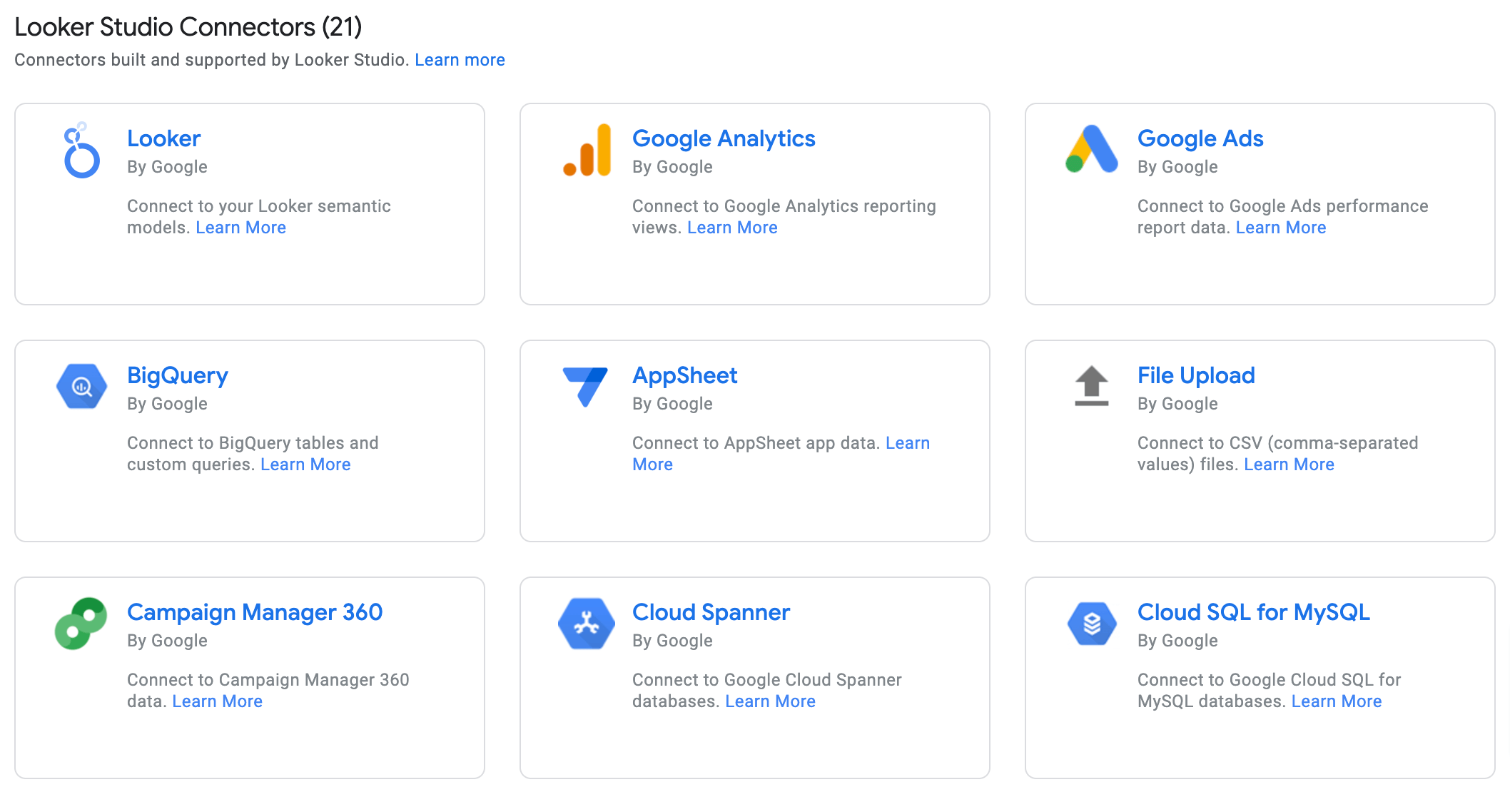
To reduce manual effort and save time, you can use a built-in – native or third-party – connector between the data source and destination. For example, popular BI tools like Looker Studio and Tableau offer connectors to various apps that serve as data sources, like Google Analytics. All you need to do is install the connector following the in-app instructions and import data automatically.

However, this method has its pitfalls. First, if you work with various sources, you’ll need to find separate connectors for each one. Then, if you connect multiple sources to a single report this way, it’s likely to slow down when refreshing data or interacting with it. Besides, this method won’t be enough if you need to export more than just the reports and metrics the connector allows.
Finally, built-in connectors often lack the necessary customization options. Suppose you export marketing data from Google Analytics to Looker Studio using this method. In that case, you can’t select a specific marketing reporting period. This will also return all metrics and destinations, making it difficult to set up a report due to numerous irrelevant fields, often with excessively long names.
API integrations
If no built-in connector exists between your source and destination, or you need more advanced capabilities, you can create a custom API integration tailored to your reporting needs.
First, you write a script to pull the necessary data from the source application’s API. Then, the script sends this data to a database (such as MySQL or PostgreSQL), a data warehouse (BigQuery), or – if it’s not thousands of rows – to spreadsheets (Google Sheets, Microsoft Excel). Finally, import the data into a BI tool using a built-in connector or continue working with it in the spreadsheet app. During the process, you can transform your data either in the script or in the database, warehouse, or spreadsheets.
This method requires coding skills in Python, JavaScript, SQL, or other programming languages, as well as knowledge of databases. If you lack these competencies, you’ll need help from data analysts or developers, who might not always be readily available. Additionally, custom integrations require occasional maintenance to keep up with platform API updates.
Alternatives for report creation
Coupler.io lets you build custom reports or set up dashboards using prebuilt templates, and it’s recognized for the reporting and analytics capabilities globally. For instance, Tekpon highly rates Coupler.io in the marketing analytics software category.
Alternative options for turning your data into reports include source apps’ visualizations, data viz tools, and programming libraries.
In-app visualizations
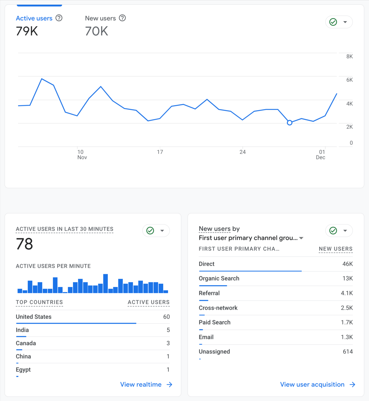
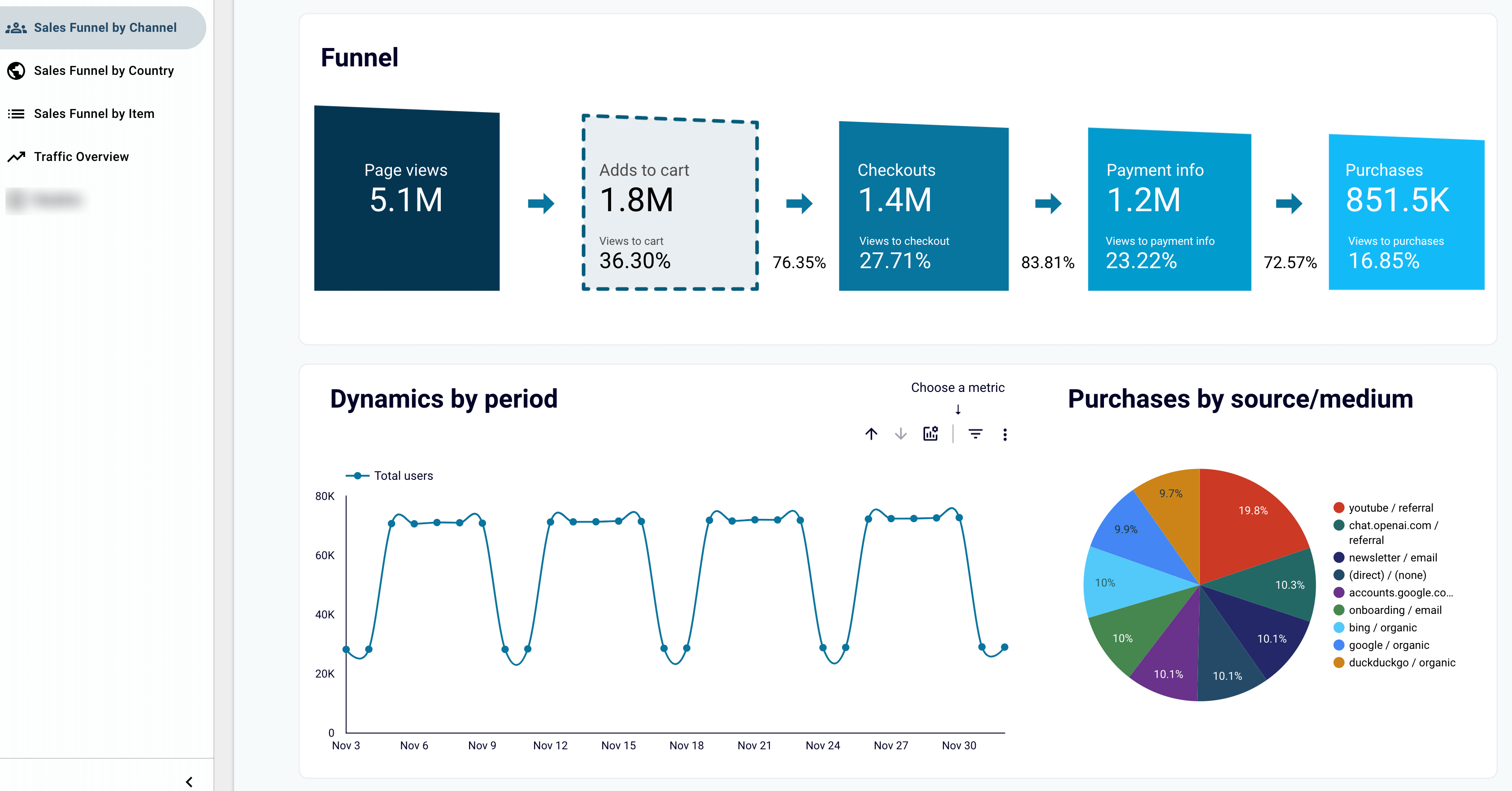
Many data analytics tools, CRMs, and ad managers provide built-in visualizations and dashboards, along with templates for creating your own. However, they are often limited in filter options and visualization types, offering only a high-level perspective of your data. To give you an idea, here are examples of ready-made visualizations in Google Analytics:

To create more detailed dashboards tailored to your analysis needs, you can turn to data visualization tools, including spreadsheet apps and BI platforms.
Data visualization tools
Google Sheets
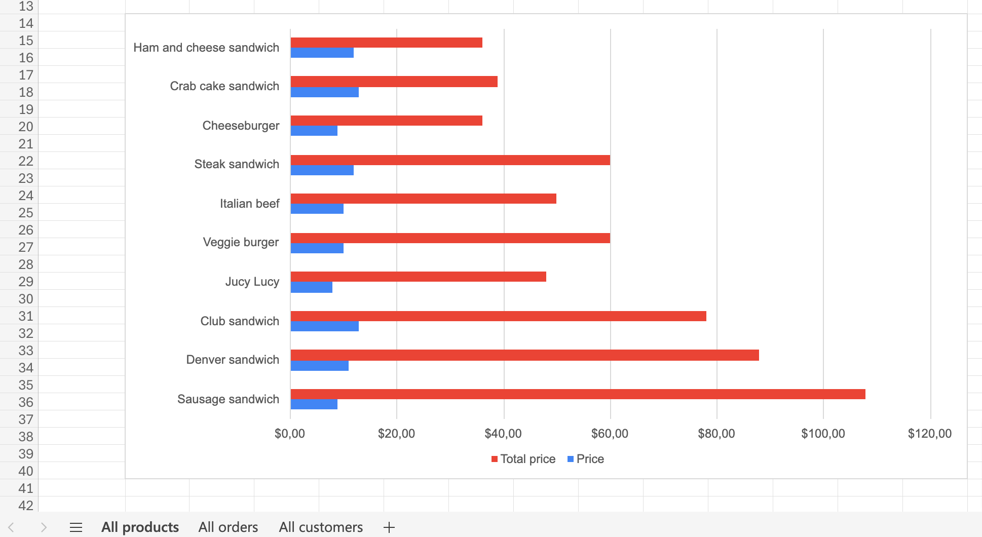
Google Sheets helps you organize and analyze data in spreadsheets. You can add, edit, and format spreadsheet items, as well as apply formulas and functions. To make your reports easier to understand, you can visualize data using charts, graphs, and tables.

Microsoft Excel
Microsoft Excel is another spreadsheet application. Like Google Sheets, it allows you to arrange data into spreadsheets and perform calculations with formulas and functions. It also suggests charts used to summarize data, identify trends, and highlight patterns.

Looker Studio
Google Looker Studio is a BI tool for creating dashboards that turn raw data into actionable insights. It allows you to create various visualizations, including line, bar, pie, bubble charts, geo maps, area graphs, and pivot tables. Using features like viewer filters and date range controls, you can make your dashboard even more interactive. Check out the dedicated Looker Studio tutorial for deeper insight into data visualization with this tool.

Tableau
Tableau is an analytics tool that processes vast amounts of data and transforms it into visual formats. You can organize data into maps, tables, diagrams, and charts. Tableau chart types are pie, bar, line, packed bubble charts, scatter and box-and-whisker plots, histograms, bullet graphs, and treemaps.

Power BI
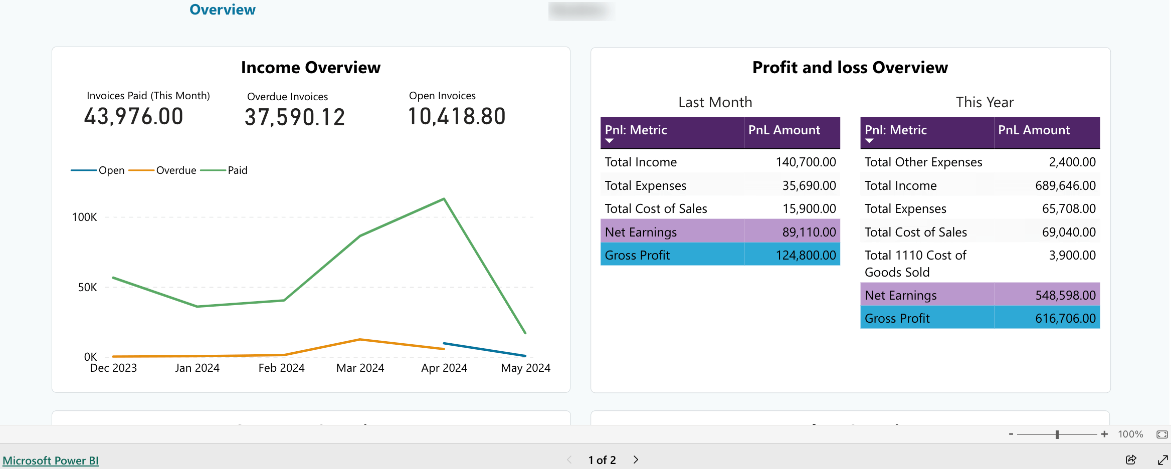
Microsoft Power BI is another business intelligence platform that is well-suited for large and complex datasets. It’s also an excellent choice for beginners and non-data analysts, offering a more accessible alternative to Tableau. Available visualizations for your data include bar, column, line, pie, and donut charts, as well as maps, tables, matrices, and cards. To learn more about using this tool, refer to our Power BI tutorial.

Data visualization libraries
For even more customizable visuals, consider using data visualization libraries available in Python or JavaScript. They provide pre-built chart types, interactive elements (tooltips, hover effects, zooming capabilities), and customization options designed to create visual data representations.

Here’s how to do this step-by-step:
- Import data stored as .csv, .xlsx. or .json, query it from an SQL/NoSQL database or pull it using the source application’s API.
- Prepare the data for visualization by cleaning it of inconsistencies, removing duplicates, outliers, and unrealistic values, addressing missing values, etc.
- Choose a data visualization library. Popular examples in JavaScript include D3.js, Chart.js, and Plotly.js, while Python users often visualize their data with libraries such as Matplotlib, Seaborn, and Plotly.
- Create data plots through coding to transform raw numbers into visuals.
- Optionally: If you use BI platforms like Power BI that allow you to add custom code, save your visualizations as HTML to embed them later and organize them into a dashboard.
Data visualization libraries offer complete control over colors, labels, styles, layouts, and interactive elements. Additionally, if you don’t use BI platforms with advanced plans, you’ll save on costs since most Python and JavaScript libraries are open-source. However, this method is only suitable if you have programming skills or access to expert assistance.
Alternatives for reporting automation
Lastly, it’s time to automate your reporting process, and you have two basic options: a scheduled (also available with Coupler.io on the go) and a triggered approach. Both approaches can be used with the programming languages and custom API integrations mentioned earlier. Alternatively, there are simpler no-code and code-based methods outlined below.
Scheduled automation
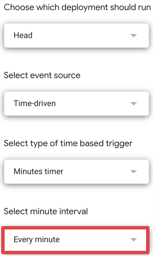
The most straightforward option is to use a built-in connector between apps that offers intervals for automatic data refresh. For example, native Looker Studio connectors allow you to schedule reports at intervals ranging from every minute to every 12 hours.
A more advanced alternative involves writing a script through coding. For instance, you can schedule data reporting from Google Calendar events to Google Sheets using Apps Script, a native scripting platform. To do this, you must write the script in the Script Editor and run it. Next, you set up a time-based trigger in your Apps Script project to schedule reporting from every minute to monthly or on a specific date and time.

Custom scripts are also schedulable with cron jobs or any scheduler available in cloud solutions like Google Cloud. You can set a specific schedule, for instance, to collect data and send it to a report, such as every Monday at 9:00 a.m.
Triggered automation
If you don’t want to auto-refresh your report on a schedule but only when specific updates occur in the data source, triggered automation is the solution.
Some native connectors between apps allow you to set triggers for data refresh. For example, Airtable’s “Automations” feature offers 7 event-based triggers to set up data import into Google Sheets.

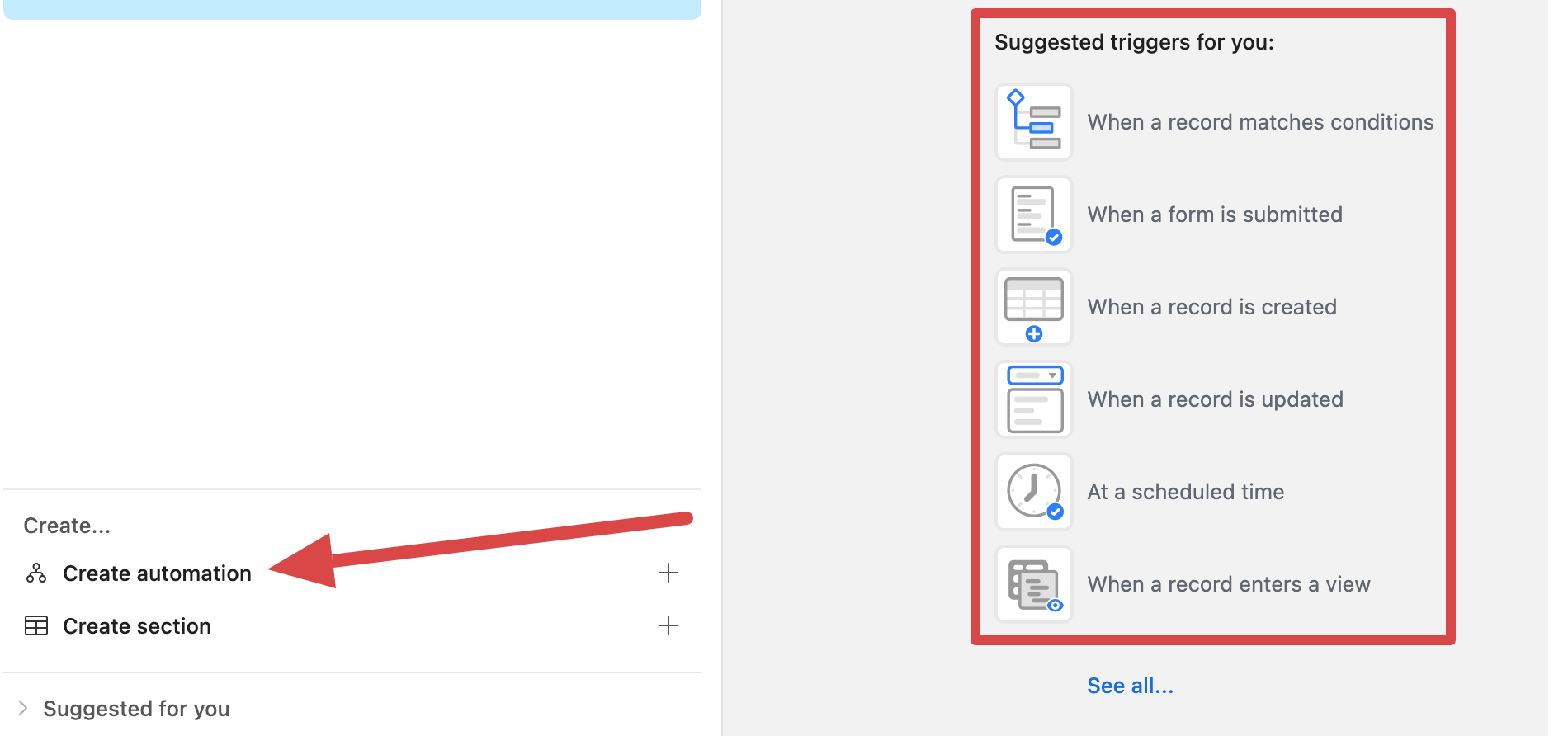
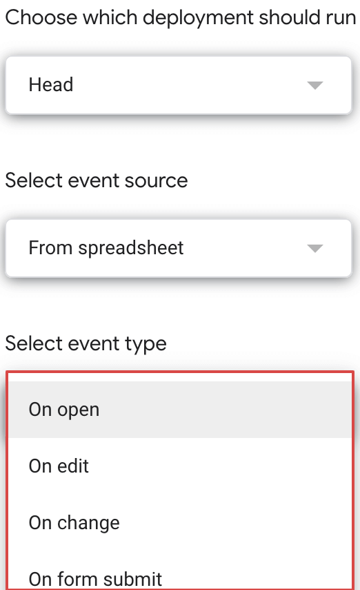
You can also achieve triggered data automation with a low-code solution, such as using a script written in Apps Script, which we described earlier. For example, if your data source is Google Calendar, you can set the report to auto-refresh whenever the calendar updates. Alternatively, if your data source is Google Sheets, the report can update automatically based on events such as opens, edits, changes, or form submissions.

If the previous options aren’t relevant, an alternative would be to create a webhook data integration. Here’s how it works:
- Set up a webhook URL in your destination system – this URL acts as a listener for incoming data.
- Configure the source application to send data to the webhook URL whenever a specific event occurs by using HTTP POST requests – a method to transmit data securely, ensuring the information reaches its intended destination.
You can use tools like Zapier, which simplifies webhook setup with prebuilt workflows, or write custom scripts in programming languages such as Python or JavaScript for greater control over data formatting and delivery.
The advantage of webhooks is flexibility, as various data sources and destinations can handle different triggers. However, the downside is that they may require technical skills for setup and maintenance, mainly when using custom scripts.
Are you sure you need a Coupler.io alternative?
As you already know, there are particular alternatives to each Coupler.io functionality. However, you’d have to combine multiple tools and approaches to achieve a full-fledged alternative solution for the entire reporting process – depending on your specific goals.
Backup
Suppose you need to back up data from your CRM to create a recoverable copy in case of a primary data failure. In such a scenario, you would typically need to build a custom API integration with scheduled automation to load data into your chosen database or warehouse. This process is technically demanding, as it requires programming skills and database knowledge or reliance on data analysts.
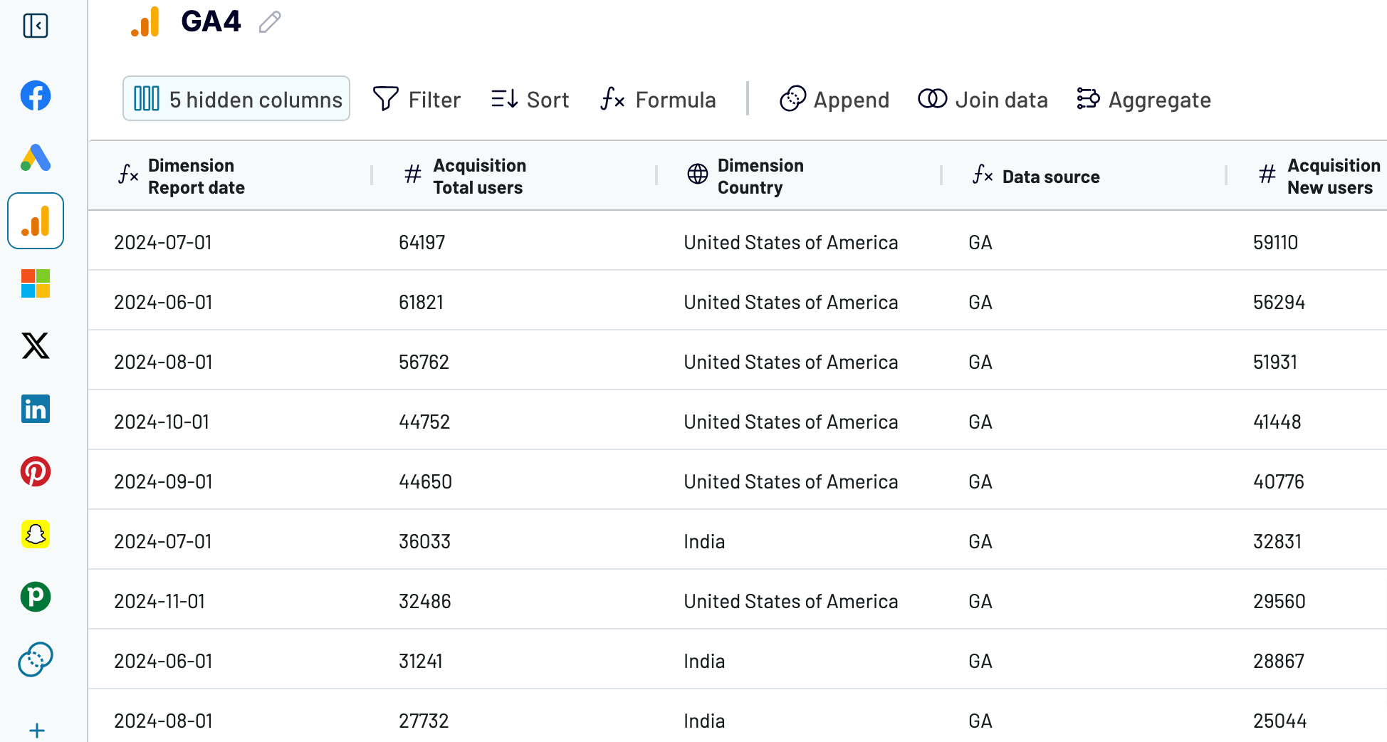
With Coupler.io, you can automatically load data from CRMs like HubSpot, Intercom, Pipedrive, Salesforce, etc., directly into PostgreSQL, BigQuery, or Redshift. You can set self-updates to be as frequent as every 15 minutes, ensuring your backup stays nearly real-time and always reflects the latest changes in your source.
Reporting
Let’s look back at the options available for data reporting and scheduled automation. To report on your data, you can pull it from the source and upload it to the destination manually, but this can be time-consuming. Alternatively, built-in connectors are available, though not for all the sources and destinations you use. Another option is custom API integration, as mentioned a few lines above.
When it comes to scheduled automation, you can, for example, use native data connectors or do this programmatically when building a custom integration. Low-code methods are also available, such as App Script or Google Cloud Scheduler, which are more manageable but still require coding skills.
As you can see, reporting is a complex process, and you must choose from various workarounds, each with its drawbacks. Thankfully, Coupler.io lets you extract data from over 60 sources, build reports on the go, load them into spreadsheets and BI tools, and refresh data on your chosen schedule. Learn more about this in our Coupler.io tutorial.

Data sharing
Imagine you just need to share data – let’s say from the Google Analytics platform – with external parties. Naturally, you wouldn’t grant access to an internal platform with sensitive data that is not meant for outsiders. Instead, you’ve agreed to share the data as an online report, for example, in Excel. In that case, you wouldn’t want to manually download and upload the data whenever needed. Nor would you like to spend time creating an API integration solely for data sharing.
With Coupler.io, you can share marketing data from GA4 to Excel, Google Sheets, and BI tools automatically in just a few clicks. Connect your Analytics account, select the data to share, set the destination, and have it imported. Then, you’ll provide stakeholders with access to the report. Coupler.io will refresh data in the report on a schedule, so you won’t need to send it every time.
Visualization
As mentioned earlier, you can visualize your data directly in your source, but this approach is quite limited in terms of the insights it provides. Alternatively, you can use spreadsheet apps, BI platforms, or data visualization libraries, although these typically require specialized skills.
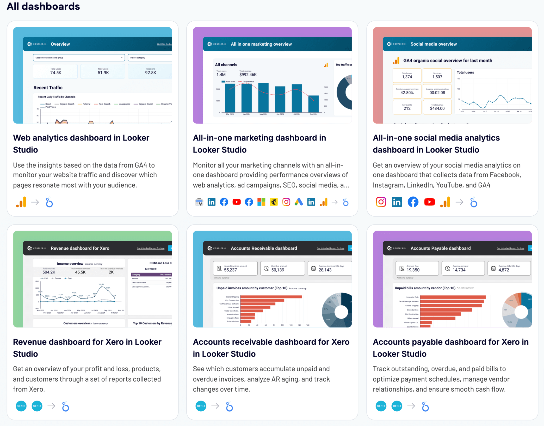
To save time creating visualizations yourself, consider Coupler.io’s free, ready-to-use dashboard templates for Google Sheets, Looker Studio, Power BI, or Tableau. Each template includes a built-in Coupler.io connector, so all you need to do is follow the provided instructions to extract your data from the source and load it into the dashboard.
Additionally, you can visualize your data directly with Coupler.io Dashboards. This native alternative to external BI tools allows you to select a template, connect your data sources by following the in-app instructions, and run the dashboard – no additional connectors or accounts are required. Coupler.io Dashboards can load up to 500,000 rows in under 10 seconds and are optimized for mobile viewing.

If you’re not willing to spend time choosing between multiple tools and approaches for each reporting step, use Coupler.io instead. It allows you to export data, create reports, and automate processes on schedule – all in one web app. Try Coupler.io for free and see how it makes your reporting run like clockwork.
Automate reporting with Coupler.io
Get started for free