What is Coupler.io?
Coupler.io is a reporting automation platform that enables users to create scheduled data flows and transform data into reports. The essence of the platform is based on three steps:
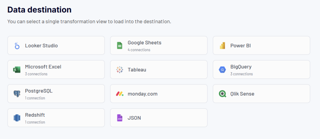
1. Collect data from cloud sources and load it to several destinations
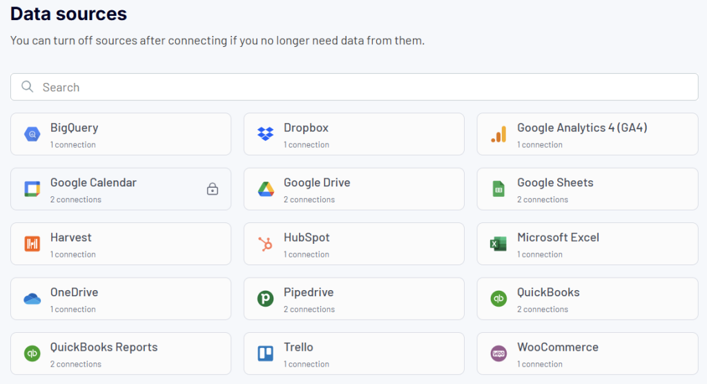
- Sources include over 60 apps and software for marketing, sales, CRM, finance, and accounting, as well as databases, cloud drives, and more.
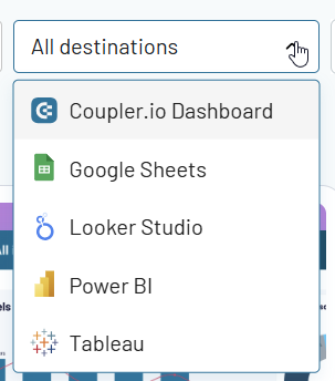
- The supported destinations include spreadsheet apps (Google Sheets, Microsoft Excel), data warehouses (BigQuery, PostgreSQL, Redshift), and BI tools (Looker Studio, Power BI, etc.).
- Coupler.io allows you to schedule automatic data refreshes at a custom frequency, up to as often as every 15 minutes.
- No coding is required to connect your data sources and export data from them.
2. Organize data into insightful reports
- Combine multiple data sources into unified datasets.
- ?reate reports from scratch using a set of data transformation capabilities.
- Use predesigned dashboards within Coupler.io and dashboard templates in BI tools. The dashboards are designed for instant reporting and analytics in marketing, finance, PPC, sales, SEO, and more.
- Schedule the automatic refresh of your reports to make them live.
3. Visualize your data using predesigned dashboards or BI tools
- Instantly visualize data with built-in Coupler.io dashboards that provide AI insights to make rapid data-driven decisions.
- Leverage predesigned dashboard templates designed in Google Sheets, Looker Studio, Power BI, and Tableau.
- Load your organized datasets and reports to spreadsheets and BI tools to create custom reports from scratch.
Who is the platform designed for?
Coupler.io is designed for various business professionals who need to make data-driven decisions.
Marketing executives (CMOs, marketing directors, heads of marketing)
As a marketing leader, you need comprehensive insights to drive strategic decisions and prove marketing ROI. Coupler.io helps you consolidate marketing data to:
- Gain a bird’s-eye view of marketing performance across all channels
- Make data-driven decisions about budget allocation and strategy
- Monitor the ROI of all marketing initiatives in real-time
- Create executive-level dashboards for board meetings and stakeholder reporting
- Track marketing’s contribution to company-wide KPIs and revenue goals
Marketing experts
Marketing experts can use Coupler.io to track campaign performance and evaluate their marketing efforts. The tool enables marketers to consolidate data from multiple marketing tools like GA4, HubSpot, Mailchimp, and more. With Coupler.io, marketers can:
- Track lead generation performance across different marketing channels
- Analyze customer journey touchpoints to optimize conversion paths
- Automate marketing report creation for stakeholders and team members
- Predict campaign outcomes based on historical data patterns
- Share centralized marketing insights with team members and stakeholders
PPC specialists
The platform helps PPC experts make informed decisions about budget allocation and campaign scaling. They can consolidate campaign data from various advertising platforms and optimize advertising spend across multiple channels. Coupler.io allows PPC specialists to:
- Monitor critical metrics like cost per click, impression, and action in real-time
- Compare campaign performance across different channels and regions
- Track ROAS (Return on Ad Spend) to optimize budget allocation
- Visualize the complete advertising funnel from impression to conversion
- Create automated reports for clients and stakeholders without manual data exports
Finance/accounting experts and entrepreneurs
Coupler.io enables financial experts to manage budgets, create projections, track P&L, and standardize financial procedures while minimizing manual data entry errors. They can automate financial reporting and analysis by connecting data from platforms like Stripe, Xero, and QuickBooks. It’s a go-to option for entrepreneurs dealing with finances to:
- Create automated P&L statements and financial reports
- Build data-backed financial projections and forecasts
- Standardize financial procedures across the organization
- Minimize errors in financial reporting through automation
- Generate professional client-ready financial dashboards
Sales managers
Coupler.io helps sales representatives and executives visualize sales funnel data and optimize deal closure. It also allows them to collaborate effectively with marketing teams by creating a single source of truth for all sales-related data. Use Coupler.io to:
- Track and analyze the entire sales pipeline
- Optimize follow-up sequences based on email performance data
- Segment leads using rich data from multiple sources
- Monitor sales performance metrics in real-time
- Create data-driven sales forecasts and predictions
Marketing agencies
The platform enables agencies to create transparent, automated reports, track project progress, and balance workloads. With Coupler.io, they can:
- Create transparent client progress reports
- Track project timelines and resource allocation using data from tools like Harvest and Clockify
- Build trust through data-driven transparency
- Improve client retention through proactive data sharing
- Enhance team collaboration with centralized reporting
E-commerce businesses
Managers of e-commerce stores can use Coupler.io to analyze customer behavior, manage inventory, and optimize pricing and promotions. The platform is also valuable for evaluating marketing campaign effectiveness across multiple channels. It allows you to:
- Analyze customer behavior patterns and purchase journeys
- Optimize inventory management through data-driven insights
- Track marketing campaign effectiveness on revenue
- Monitor and optimize pricing and promotion strategies
- Identify up-sell and cross-sell opportunities
Other users
Worry not, if don’t find yourself among the listed categories. Coupler.io is a versatile solution that is a good fit for a broad range of users. It allows you to move and organize data without technical expertise. Small business owners can consolidate information from various tools. Freelancers can manage client data across multiple platforms. Project managers can track progress across various tools, and so on. Coupler.io enables you to:
- Move customer feedback from survey tools to reporting sheets
- Aggregate performance metrics from different business tools
- Collect data from project management tools for further analysis
- Create backup copies of critical business data
- Simplify data migration between work tools
What you can do with Coupler.io
Due to Coupler.io’s versatility, new users might be puzzled about what they can use the platform for. Therefore, we decided to single out the key high-level use cases:
- Create an automated data flow – you simply extract data from a source app and load it to a destination app. No data transformation or visualization is required.
- Create a report and export it – you collect data from one or multiple apps, organize it in the form of a tabular report, and load it to a destination. You need to transform data on the go, but no visualization or dashboard creation is required.
- Turn data into a dashboard using a template – you use a predesigned dashboard or template in a BI tool to get instant insights into your source data.
Let’s go through the steps for each of these use cases.
1. Create an automated data flow – Extract and load data
The basic thing you can do in Coupler.io is create a data flow from a source to a destination. This is helpful for quick data sharing. For example, when you want to showcase some results to stakeholders without providing access to your app account. For this, complete the following steps:
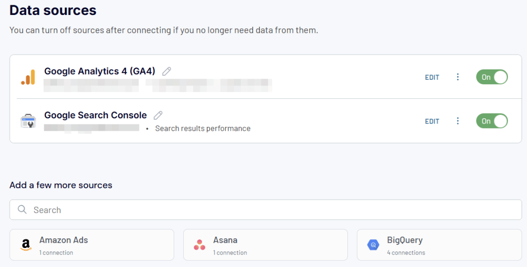
Step 1. Connect data source
- In the Data Flows section, click + Create, then select a data source.
- Next, connect your source app and specify what data you want to export. Depending on the chosen source, you’ll need to either:
- Log in to your account (for most sources)
- Use source-specific details to connect, like URL or database details
- Once your source app is connected, specify the data you want to export. Again, the configuration will differ depending on your source.
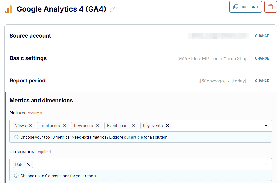
For example, if you’re exporting data from GA4, you’ll need to select properties, specify the report period, and select metrics and dimensions.
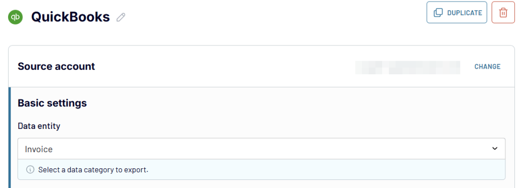
For exporting data from QuickBooks Online, you’ll need to select a data entity.
After that, proceed to the next step.
Step 2. Load data to the destination
Coupler.io will load the preview of your data, and you’ll be able to transform it.
Since we’re assuming that you won’t need any transformations for this basic data flow, we’ll skip this step. We’ll cover the transformation options in the next use case.
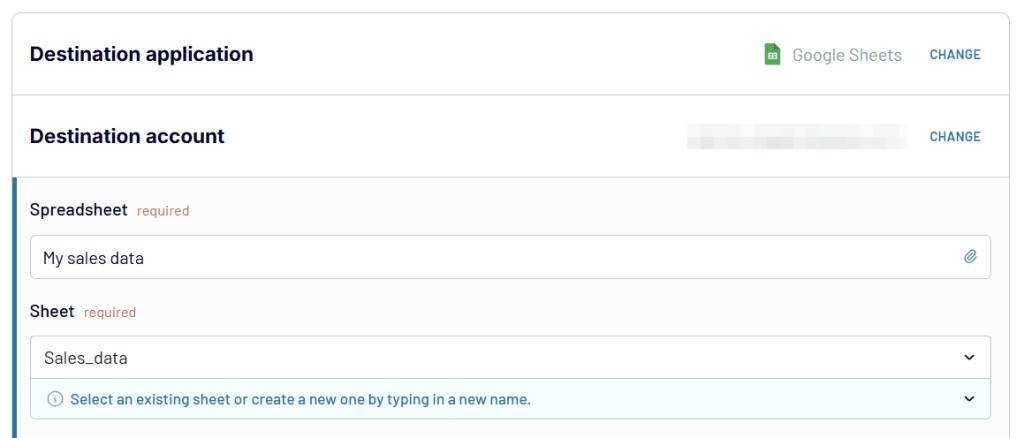
- Click Destinations in the right bottom corner or on the top panel.
- Select the needed destination app from the list.
- In most cases, you’ll need a spreadsheet app like Google Sheets or Microsoft Excel as a destination for quick data sharing. To connect those, just log in to your account and specify the spreadsheet and a sheet for your data.
If you need to load data to a data warehouse or a BI tool, follow the in-app instructions to configure the connection.
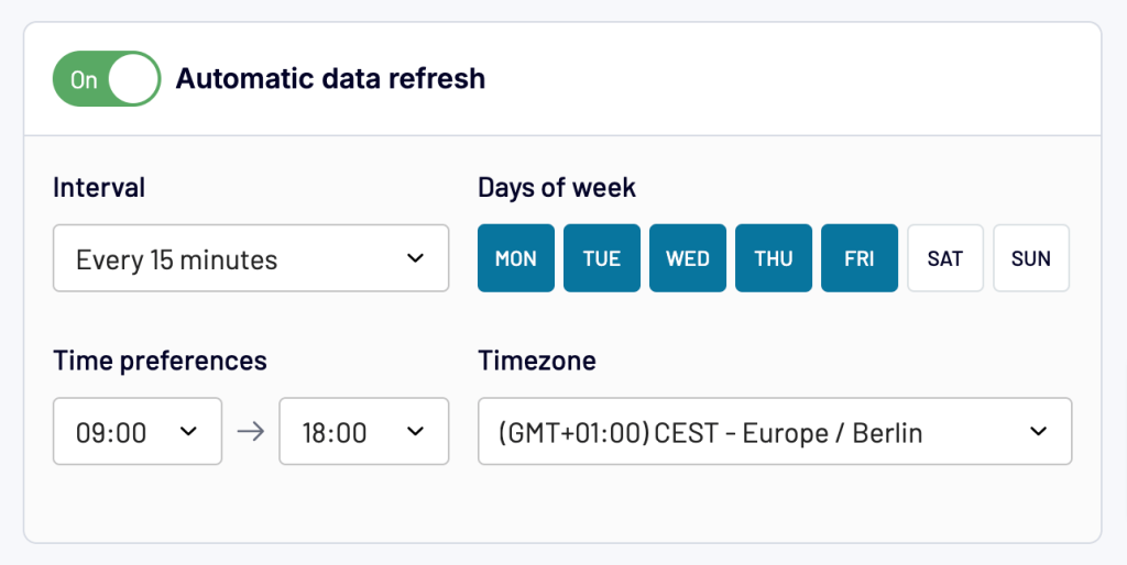
Step 3. Automate data flow
The last step is optional, but it allows you to automate your data flow. You can schedule data refresh to ensure the destination is synchronized with the source. Just toggle on the Automatic data refresh and configure the schedule, including the interval, days of the week, time preferences, and time zone.
The final step is to run your data flow. In a moment or so (depending on the amount of data you’re exporting), the data will be transferred from your source application to the destination. After that, Coupler.io will refresh your data at the destination according to the set schedule.
2. Create a report and export it – Extract, transform, and load data
The next use case we’re going to review goes beyond just extracting and loading data. Coupler.io allows you to create reports by collecting data from multiple sources and applying different transformations. And, of course, you can load these reports to spreadsheets, data warehouses, and BI tools. Here is what it looks like.
Step 1. Connect data sources
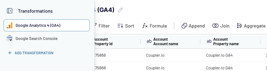
- The kick-off is the same: Click + Create in the dataflow section, select a data source, and configure the connection. However, before moving to the next step, Coupler.io also allows you to add more sources.
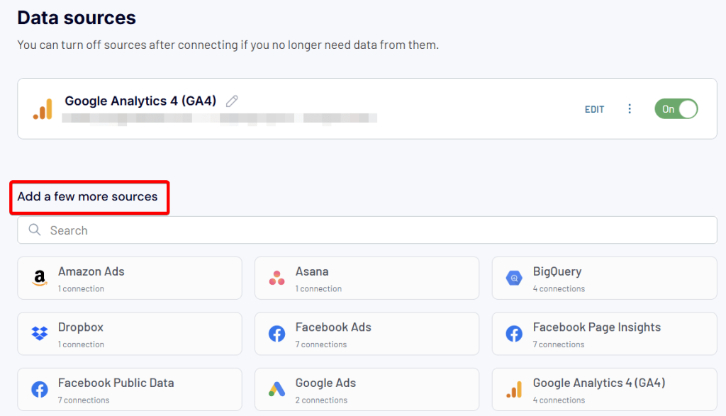
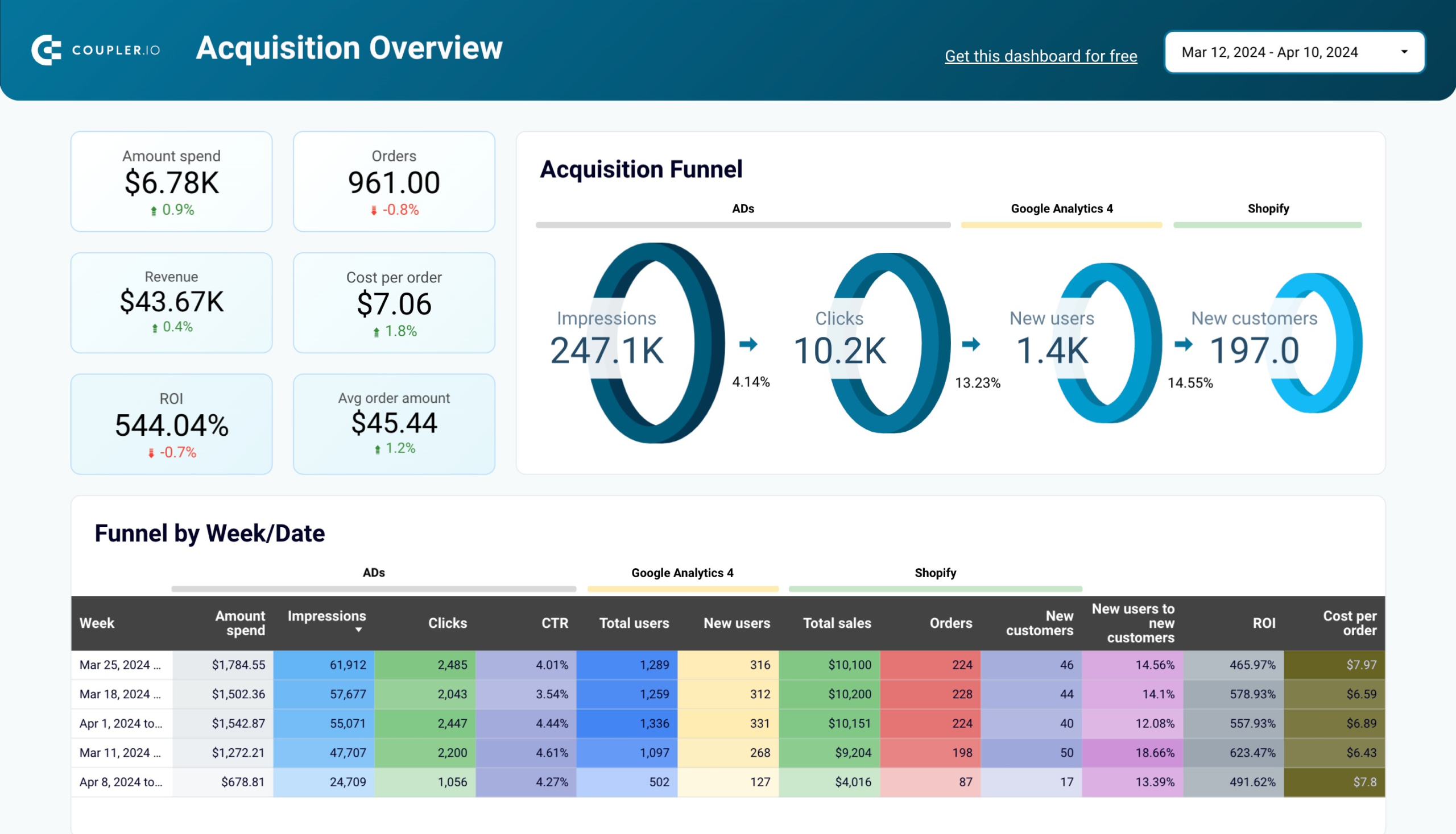
- Just click on the app you want to add and configure the connection. This is useful for creating cross or multi-channel reports. For example, you can collect data from multiple advertising platforms to monitor their performance in a single report. Or, you can consolidate data from GA4 and Google Search Console to analyze the performance of your website URLs. Here is what it may look like:
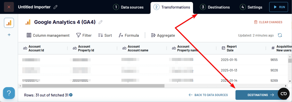
Once all the needed sources are connected, proceed to Transformations.
Step 2. Transform data in a report
As you already know, Coupler.io loads the preview of your data. If you’ve connected multiple sources, you can preview and transform the data from each source separately.
To turn your data into a report, Coupler.io allows you to:
- Hide, edit, and reorder columns
- Filter and sort data
- Add custom columns using formulas
- Summarize data in columns by performing operations like sum, average, count, min, or max
Additionally, you can consolidate your data from multiple sources into a single view. For this, there are two options available:
- Append – to combine data from multiple sources with similar structures. Columns are matched by name.
- Join – to merge data from multiple sources with different structures. Select one or multiple shared columns to link.
The details of transforming and blending data are described in the section about key features.
Step 3. Load report to the destination
Once your data preparations are complete, proceed to the Destinations step. You’ll need to select a destination app to load your data.
If you’ve connected multiple sources and/or performed data aggregation or blending, you’ll also need to select a data view you want to load. This allows you to export datasets from your sources, as well as aggregated or blended data separately.
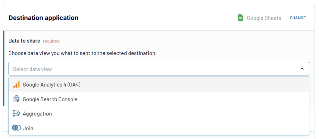
After that, follow the in-app instructions to load the selected dataset to the chosen spreadsheet app, data warehouse, or BI tool.
Step 4. Automate data refresh in your report
To make your report live, enable the Automatic data refresh and configure the desired schedule. All your transformations will be preserved.
3. Turn data into a dashboard – Visualize data using templates
Loading data from A to Z is good, as well as creating reports from scratch. However, most of the time, you require immediate insights into your data. To achieve this, you should definitely consider exploring the Coupler.io dashboard templates.
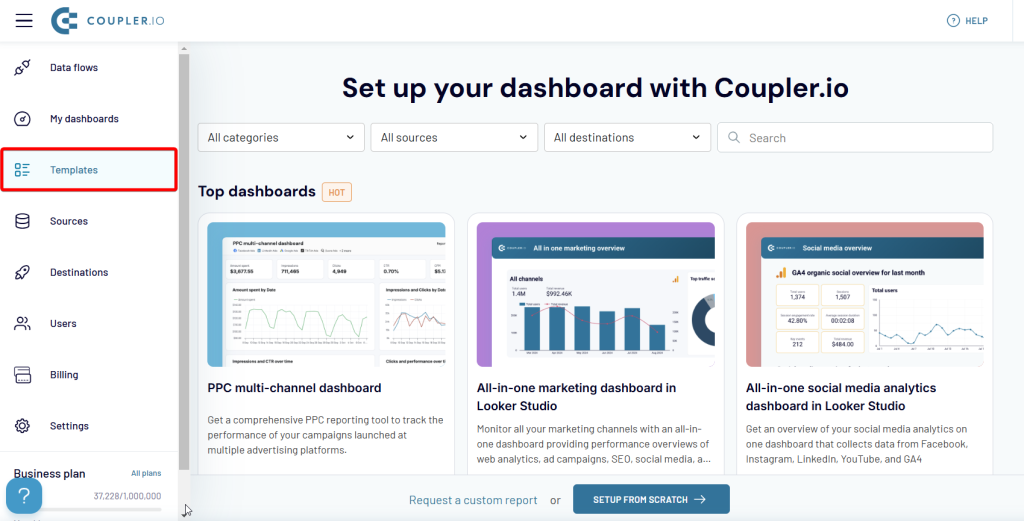
It’s a collection of predesigned reports and dashboards that only require you to connect your data sources to use. No building is required. The templates are available both in Coupler.io UI and external spreadsheet and BI tools.
Simply select the dashboard you want and set it up by clicking Try this report.
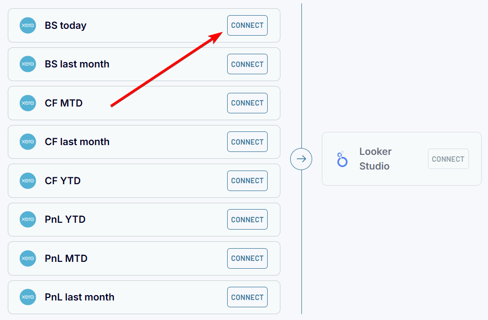
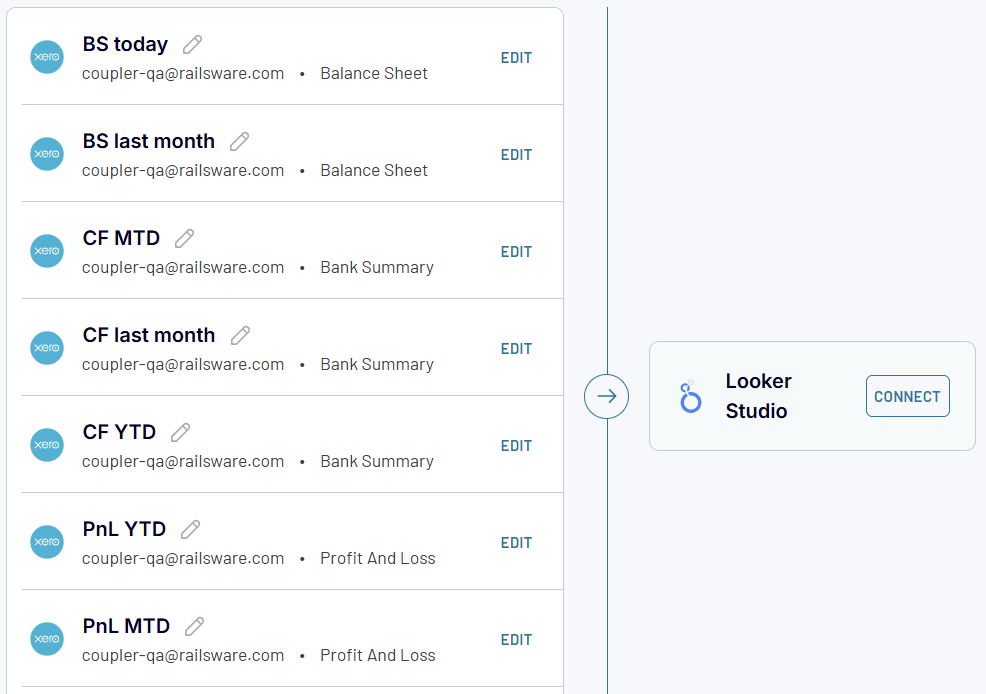
Step 1. Connect data sources
Click Connect and log in to your source app account. If you have multiple data sources of the same app like for this Xero financial dashboard, you only need to connect Xero for the first source. The rest will be connected automatically.
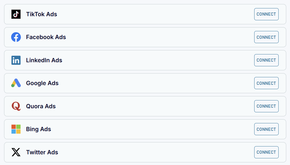
For different data sources, like in this PPC multi-channel dashboard, you’ll need to connect them separately. At the same time, you can skip unnecessary sources. For instance, only connect Facebook Ads, Google Ads, and LinkedIn Ads. The dashboard will work anyway.
Step 2. Connect data destination
This step differs depending on the tool for which your dashboard template is designed.
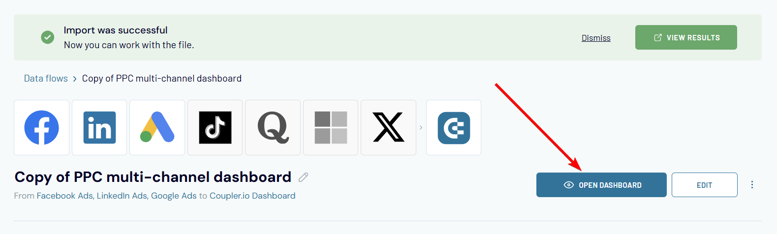
If you’re setting up a dashboard in Coupler.io, you only need to click Create Dashboard.
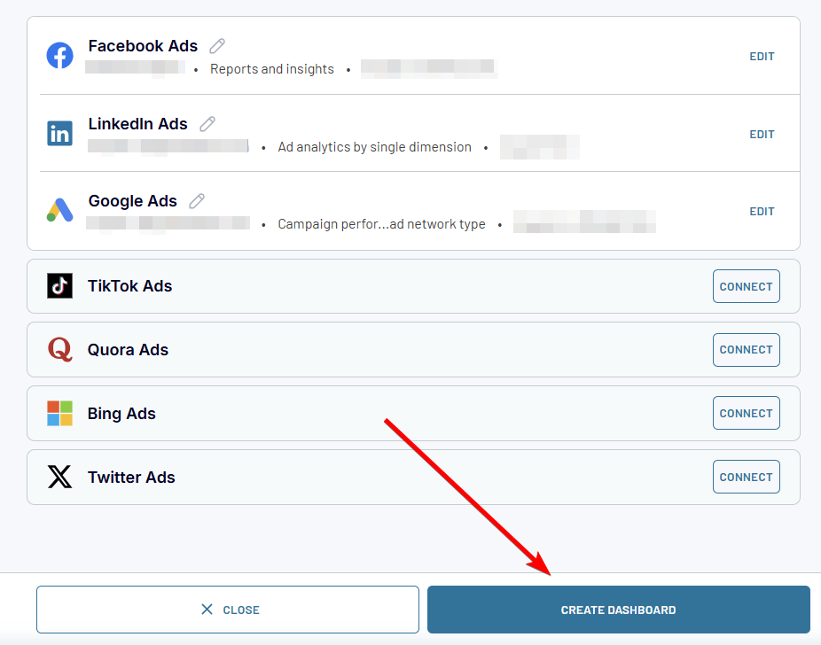
The dashboard will be prepared with your data in a couple of moments.
If your choice is a dashboard template in an external spreadsheet app or a BI tool, then click Connect and follow the setup instructions.
Note: We recommend setting dashboard templates in BI tools from the dashboard library. In this case, you can check out the specific configuration instructions on the Readme tab that are not available when you set up the dashboard template from the Coupler.io app.
Once your dashboard is created, you have access to editing the source connection and transformation options which can be useful for customization. You can remove, edit, and add metrics, change report period, data refresh schedule, and more.
Key features
Knowing what you can do with Coupler.io is valuable. At the same time, you can enhance this knowledge by learning useful features available within the tool.
Data transformations
Column management
This option allows you to hide unnecessary columns.
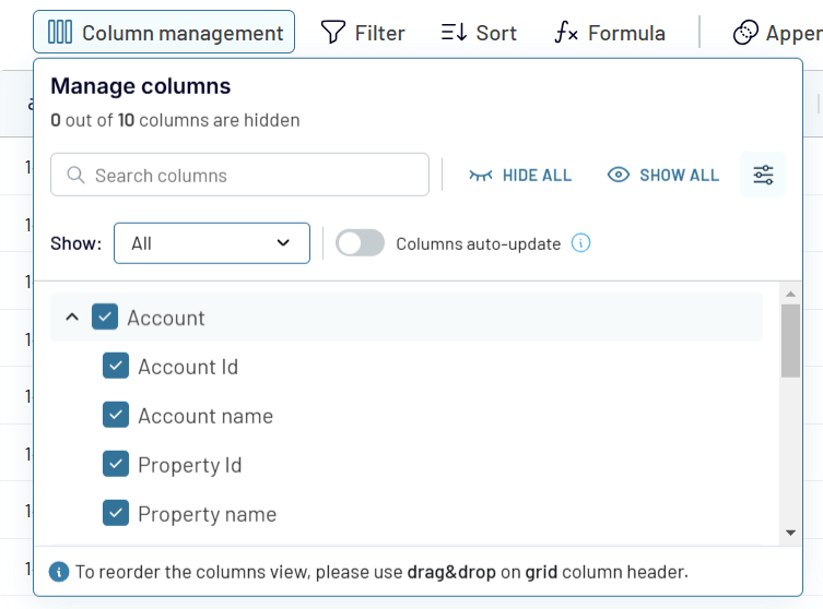
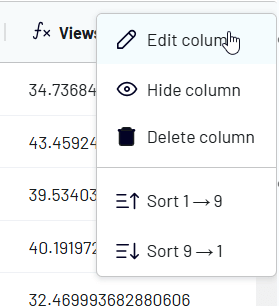
Other column-related transformations are available via the menu button, which appears once you hover over a column name.
Click on it, and you’ll see that you can edit, hide, and sort the column.
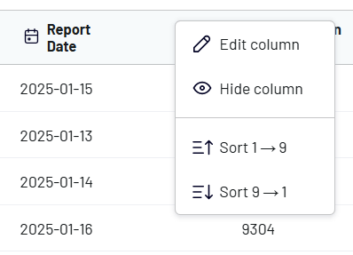
The Edit column option allows you to change column name, type, and format.
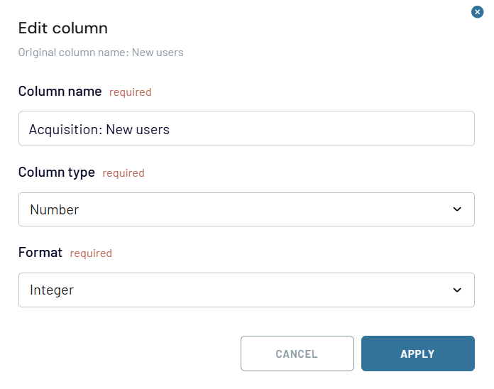
The available column types are:
- String: A text-based column type that stores alphanumeric characters, including words, symbols, and spaces.
- Number: A column type that holds numerical values, which can be used for calculations, aggregations, or comparisons. The number type requires you to select a number format from integer, decimal, percent, and currency. For all formats except for integers, you can also specify the precision (number of digits after the dot).
- Date: A column type that represents calendar dates without time information. Date is formatted as YYYY-MM-DD. Optionally, users can select the time zone.
- DateTime: A column type that includes both date and time components, often used for timestamps or tracking events. DateTime is formatted according to the ISO-8601 format: YYYY-MM-DDTHH:MM:SS:mmmZ. Optionally, users can select the time zone.
- Boolean: A column type that stores true/false values, commonly used for binary conditions or flags.
- Country: A column type that contains country names or codes, often used for geographic segmentation or filtering.
Note: The column type capability does not mean that you can change the column format to any of the supported types. For example, if a column contains not only numbers, you won’t be able to change its type to number or boolean.
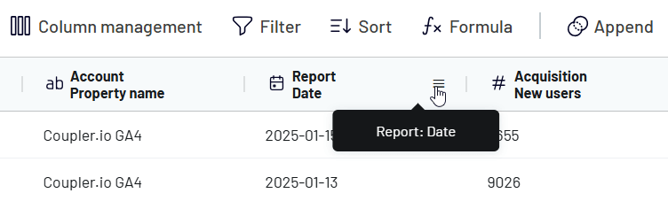
To reorder columns, you only need to drag and drop them using the grid column header.
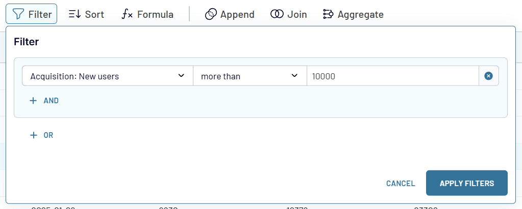
Filter
Coupler.io allows you to filter data to include in your report. You need to select a column, logical operator, and enter a value. Logical operators depend on the column type you select. Here are the options available:
| Column type | Logical operators |
|---|---|
| String, Country, Boolean | • contains/does not contain • is/is not • starts with/ends with • is empty/is not empty |
| Number | • equals/not equals • less than/more than • less or equals/more or equals • is empty/is not empty |
| Date DateTime | • is/is not • is before/is after • is empty/is not empty |
For example, here is a filter that only returns rows that have more than 10,000 new users.
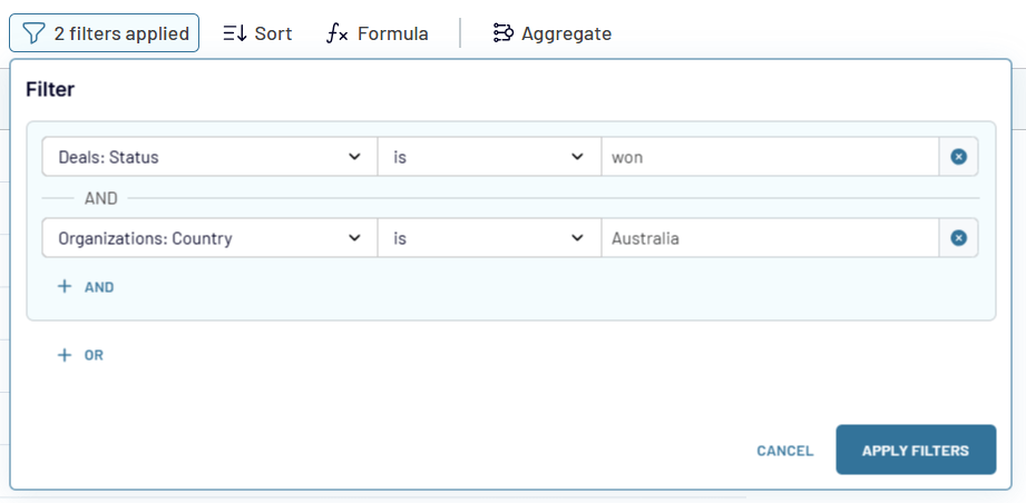
You can combine multiple filters using AND and OR logic easily.
AND logic
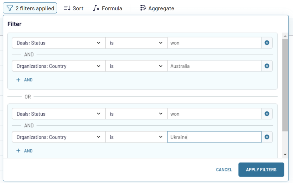
For example, to filter out all deals that have “won” status and come from Australia, your filter should look like this:
OR logic
If you need to see the won deals from Australia and Ukraine, click +OR and add another filter with the AND logic. Here is what it looks like:
Sort
This is pretty simple since you only need to select a column and a sort order: descending (9-1) or ascending (1-9).
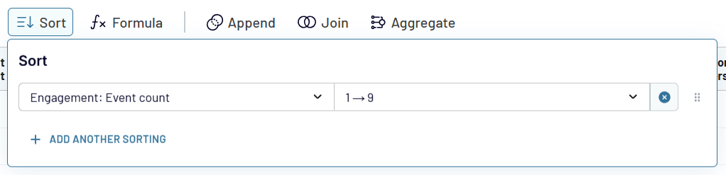
As you recall, sorting is also available via the menu button of each column.
Formula
With this transformation option, you can add new columns based on calculations with the existing ones. For example, to create a column that will return the views to new users ratio, you’ll need to divide the column New users by the column Views and multiply by 100 to display the percentage.
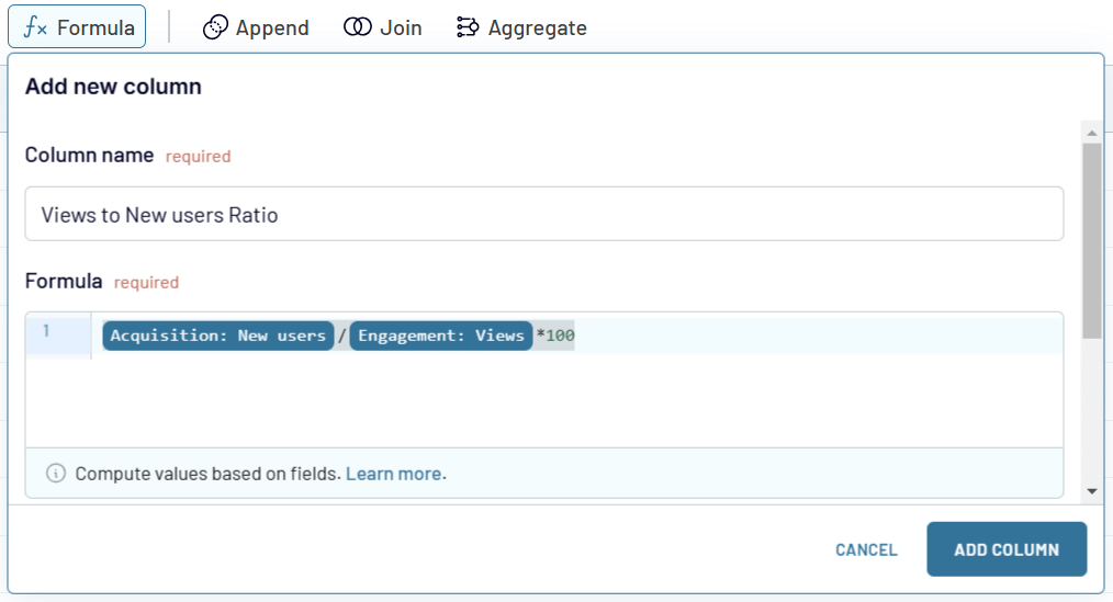
Once you click Add column, a new column will appear. To further edit it, use the edit menu just like for the regular columns. However, there is one difference – the created columns can be deleted, while the exported ones can only be hidden.
Learn more about creating formula-based columns in the Coupler.io knowledge base.
Aggregation
The last transformation option to introduce is aggregation. This allows you to summarize specific columns by performing operations like sum, average, count, min, or max. If you click on the Aggregate button, you’ll see a window where you need to select a data source, dimensions, and metrics. For example, if you want to understand the average value of key GA4 metrics such as event count, new users, and views by day, here is what your aggregation configuration may look like:
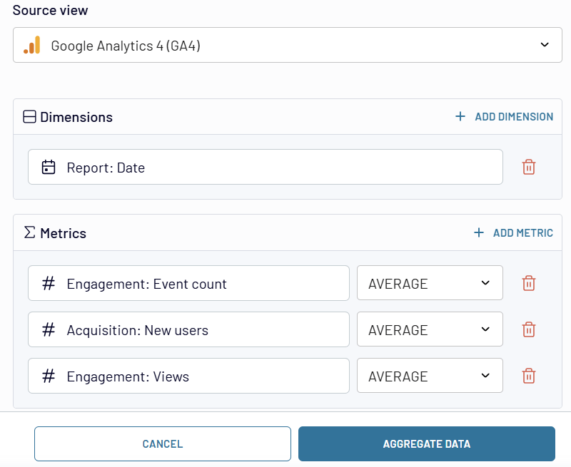
Once you click Aggregate data, Coupler.io will return the requested summary.
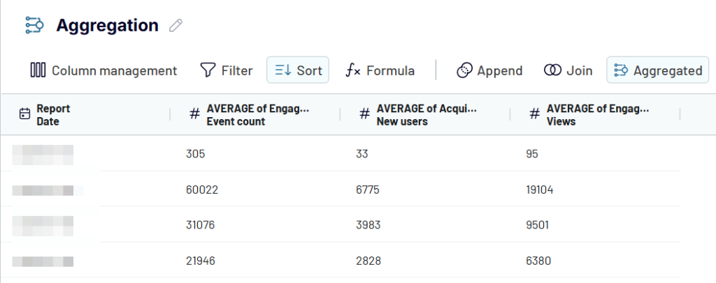
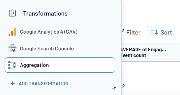
The aggregation will also appear near the connected data sources. This means that you can then load it to the needed destination separately. In the destination settings, you’ll need to choose the aggregation data view.
Note: You can only load one data view.
Data blending
Once you’ve connected more than one data source, you have two options to blend data from them: append and join.
Append
This data blending method creates a dataset where rows from sources are placed below the data rows from the first connected source. Columns with identical names are matched and combined vertically, while unmatched columns are added horizontally as is.
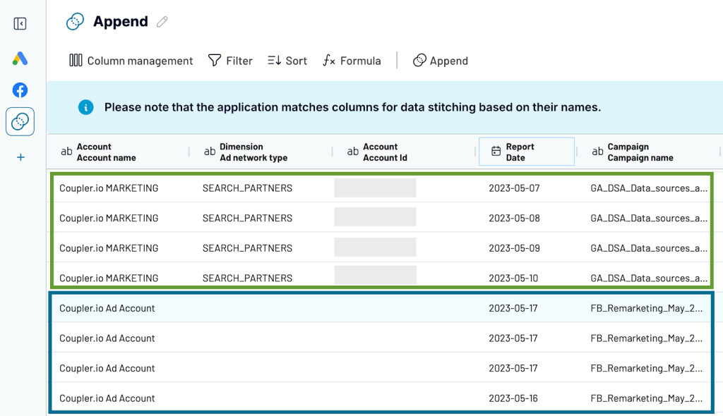
For example, you can append data from Google Ads and Facebook Ads since they have a similar structure.
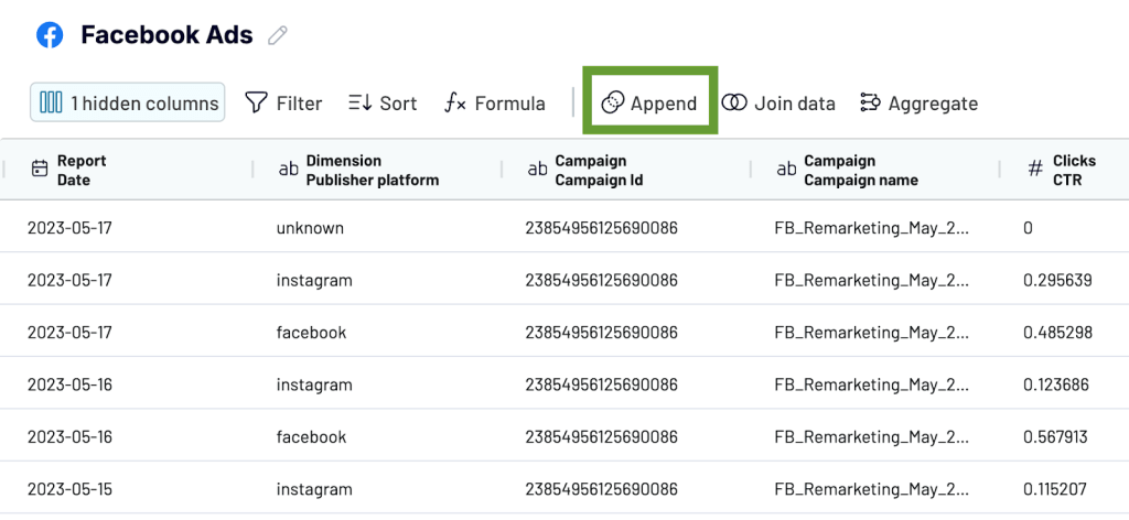
Keep in mind that columns are matched by name. So, it makes sense to rename any unmatched columns to ensure they are combined properly. In this example of appending data from advertising platforms, you need to align the naming of metrics (e.g. Impressions, Clicks, Conversions) in each of the sources.
Once the data has been appended, you’ll see rows from Facebook Ads placed under the rows from Google Ads. Columns with identical names were matched and combined: Account name, Report date, and Campaign name. Columns that couldn’t be matched were added without blending.
Join
This creates a dataset of the sources with different structures.
All the rows from the primary (left) dataset are kept, while only the matching rows from the secondary (right) dataset are included in the joined set.
The data is combined based on the shared columns. Columns that didn’t match the conditions you specified won’t be included.
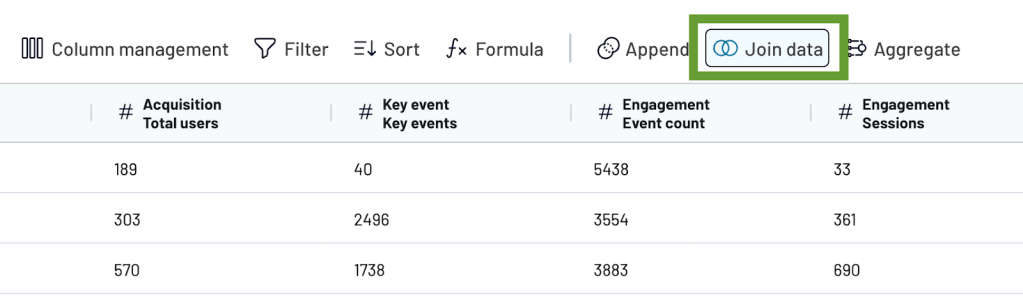
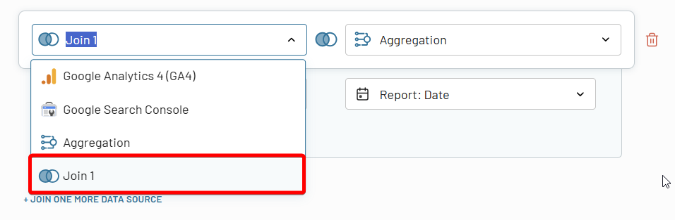
For example, you can join data from Google Analytics 4 with the data from Google Search Console to create a website URL performance report. These sources do not have a similar structure but have a shared dimension column like Date or Page.
Once the sources have been connected and loaded for preview, select Join data.
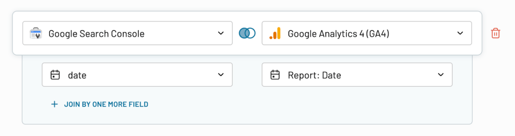
Then, specify how to join your data. The app on the left will be your primary source. This means that only matching information from the sources to the right will be added. Select the column to join data by. In our example, it’s Date. Once everything is ready, click Join data.
Here’s the joined dataset. Data from Google Search Console (on the left) was joined with data from Google Analytics 4 (on the right).
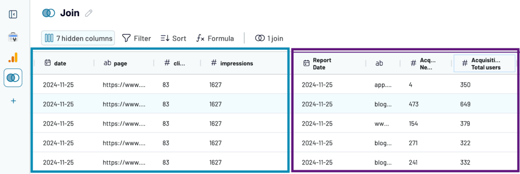
To avoid the duplication of the shared column, make sure you’ve unified its name in both data sources.
Note: You can create multiple joins and even use the joined datasets separately for other data blending, transformations, and aggregation.
Import modes
When loading data or reports to spreadsheet apps, data warehouses, or Monday.com, users can choose between two primary import modes. They determine how data is transferred to the destination spreadsheet or table: Replace and Append.
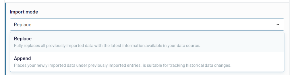
Replace import mode (default) completely removes all previously imported data and substitutes it with the most recent information from the data source. This mode is ideal when you need a comprehensive update of your entire spreadsheet or database.
Choose Replace when you need a full data refresh.
Append import mode adds new data entries to the end of an existing dataset, preserving previous imported records while introducing the latest information. This mode is particularly useful for dynamically evolving documents. It allows you to continuously accumulate new data without overwriting existing entries.
Choose Append for incremental data collection.
Automatic data refresh + webhooks
Data refresh in Coupler.io can be achieved through two primary approaches: scheduled refresh and webhook-triggered refresh. Each method serves distinct use cases and offers unique advantages in managing data integration workflows.
Scheduled refresh automatically updates data at predetermined intervals, including monthly, daily, every hour, every 30 or 15 minutes.
Additionally, you can choose a day of the week, time, and timezone.
Automatic data refresh on a schedule is best suited for:
- Consistent, predictable data updates
- Regular reporting cycles
- Hourly/daily/weekly business intelligence processes
A webhook-triggered update is a programmatic on-demand data synchronization. If you need to synchronize the refresh of your data flow/report with other ones, you can also use incoming and outgoing webhooks. They allow you to create sequences of dataflows, so they refresh one after another.
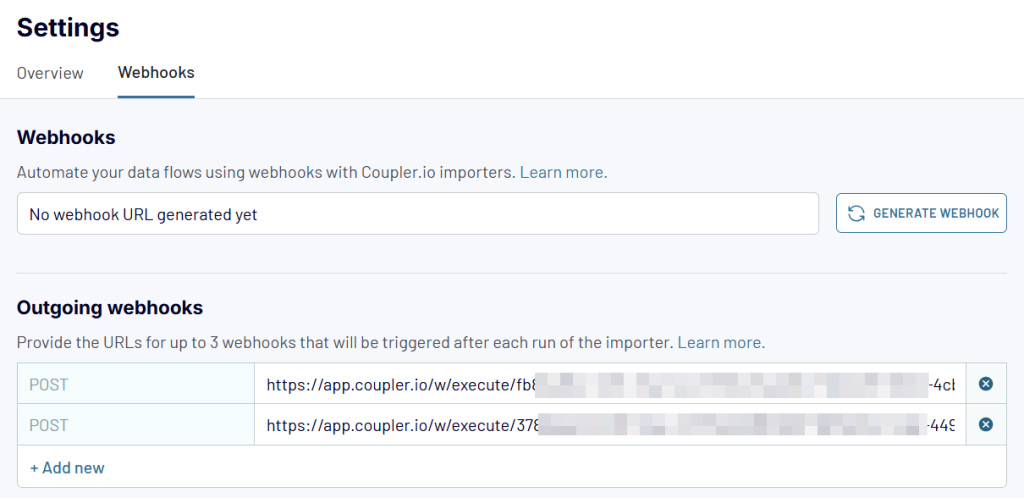
Webhooks are best suited for:
- Event-driven data synchronization
- Systems with frequent, unpredictable data changes
- Complex integration scenarios
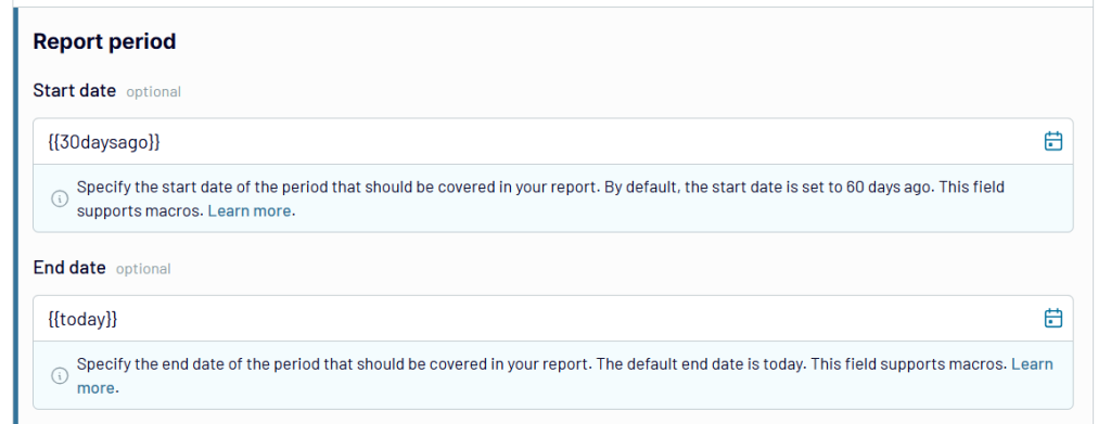
Macros
Macros are automated input sequences that dynamically interpolate date and date-time strings in Coupler.io importer settings. Sounds complex, right? ?
In simple English, these are the textual values that automatically generate certain dates. This way, you won’t have to manually enter dates.
For example, if you want to set a date that was two weeks ago, you can simply type {{2weeksago}}.
Supported date macros
{{today}}
{{yesterday}}
{{tomorrow}}
{{thisweekstart}}
thiscan be replaced withlastornextweekcan be replaced withmonthorquarteroryearstartcan be replaced withend
{{weekago}}
weekcan be replaced withmonthorquarteroryear
{{2weeksago}}
{{2weeksfromnow}}
2can be replaced with any numeralweekscan be replaced withdaysormonthsorquartersoryears
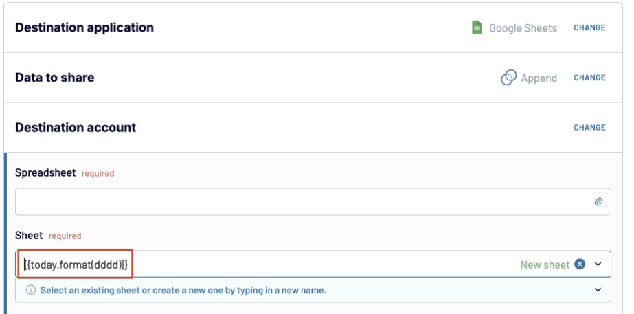
Where you can use macros
- Date & date-time settings in the source setup
- Body/string/query settings that allow dynamic input
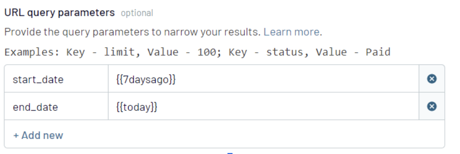
- Sheet name configurations in the destination setup
Learn more about macros in our knowledge base.
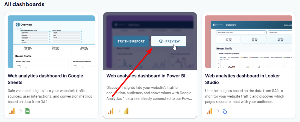
Ready to use dashboards and report templates gallery
Coupler.io offers two approaches to using dashboard templates:
- Built-in dashboards
- Templates in external apps like spreadsheets and BI tools.
For both options, the source connection setup is the same, but the destination part is different.
With Coupler.io dashboards, everything is super simple – you click Save and Run and then the dashboard will open. To open it from the importer, you only need to click Open dashboard.
For external apps, the flow is different and may include a few steps on the app’s side.
We recommend you first preview these dashboard templates and follow the instructions described on the Readme tab/page to start using them.
What is incremental fetching and how does it help you optimize data management?
Coupler.io’s incremental fetching is a smart data retrieval feature that optimizes how your data is collected and stored. Instead of pulling all historical data from your sources every time, Coupler.io intelligently fetches only new or updated records. This reduces the time spent on data loading as you don’t have to wait until all the dataset is retrieved from the source app.
How it works:
- During the first run, Coupler.io retrieves and stores your complete dataset. It may take a while if you’re loading lots of data.
- In subsequent runs, be it scheduled or manual data refresh, it:
- Checks what data is already stored
- Identifies new or changed information
- Fetches only the missing or updated records
Key benefits:
- Faster performance: By fetching only new data, the data refresh completes much more quickly.
- Enhanced reliability: Smaller data transfers mean less chance of connection issues.
- Historical data preservation: It allows you to keep data previously collected from sources with limited historical data access, like TikTok’s 60-day limit.
Note: Incremental fetching is currently available for a few data sources, with ongoing expansion to additional integrations.
Use cases
For marketers
Coupler.io allows you to collect data from marketing tools and transform it into a holistic view of the performance of your campaigns and channels.
- Identify which campaigns drive the most traffic and conversions
- Track your email performance metrics like open rates and click-through rates
- Analyze your lead generation trends to understand where your audience is engaging most.
- And more
These insights help marketers allocate budgets wisely and improve campaign strategies.
Source apps supported
- Amazon Ads
- Apple Search Ads
- Bing Ads
- Calendly
- Facebook Ads
- Facebook Page Insights
- Facebook Public Data
- Google Ads
- Google Analytics 4
- Google Business Profile
- Google Search Console
- HubSpot
- Instagram Ads
- Instagram Insights
- Instagram Public Data
- Intercom
- Klaviyo
- LinkedIn Ads
- LinkedIn Company Pages
- Mailchimp
- Pinterest Ads
- Quora Ads
- Snapchat Ads
- Stripe icon
- Stripe
- TikTok Ads
- TikTok Organic
- Vimeo Public Data
- WooCommerce
- WordPress
- X (Twitter) Ads
- YouTube
Dashboard templates available
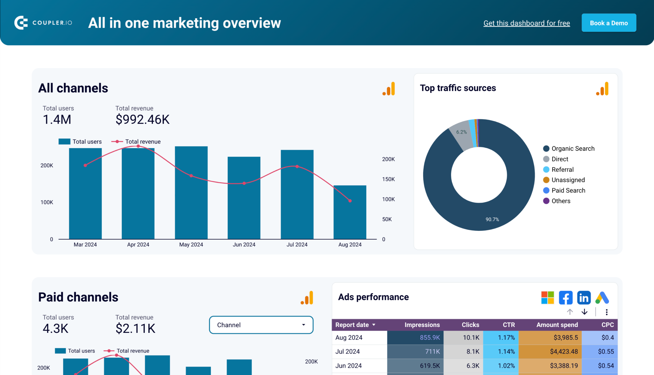
All-in-one marketing dashboard in Looker Studio
Monitor all your marketing channels with an all-in-one dashboard providing performance overviews of web analytics, ad campaigns, SEO, social media, and emails.


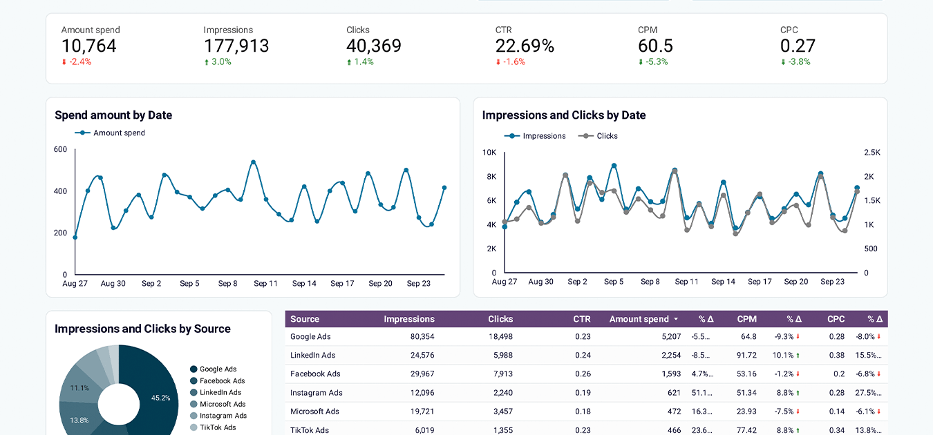
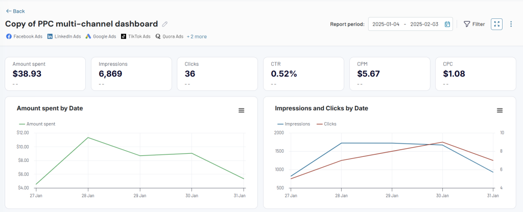
PPC multi-channel dashboard in Looker Studio
Get a comprehensive PPC reporting tool to track the performance of your campaigns launched at multiple advertising platforms.


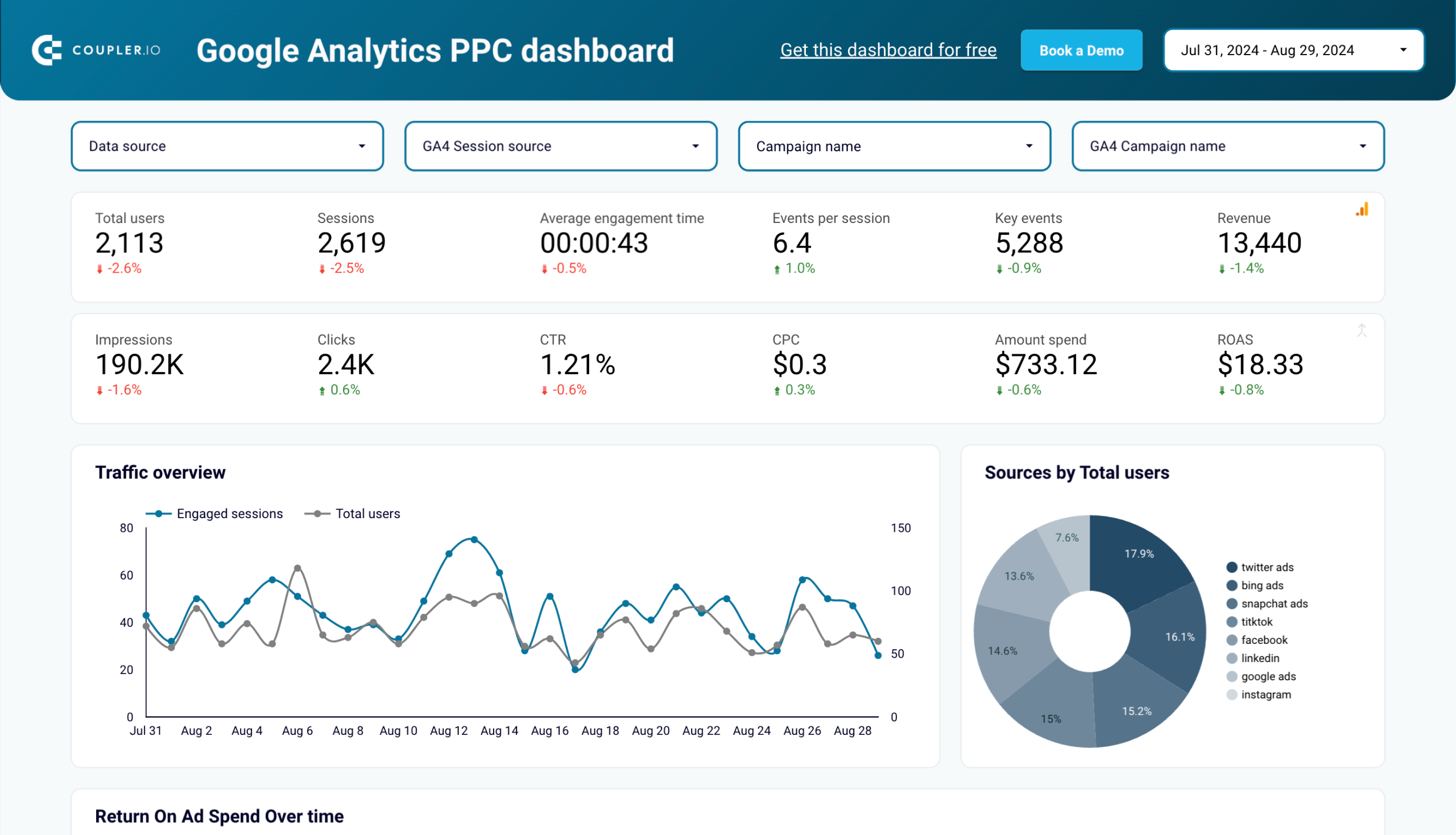
Google Analytics PPC dashboard in Looker Studio
Get an overview of the traffic performance of your advertising campaigns launched across different PPC platforms.
For finance
Coupler.io enables finance teams to create reports to track and analyze financial performance, as well as:
- Monitor cash inflows and outflows to manage liquidity
- Analyze the dynamics of financial performance to spot discrepancies
- Keep a close eye on overdue invoices
- And more
These insights allow you to make informed decisions about budgeting, forecasting, and overall financial health.
Source apps supported
- QuickBooks
- Xero
- Stripe
Dashboard templates available
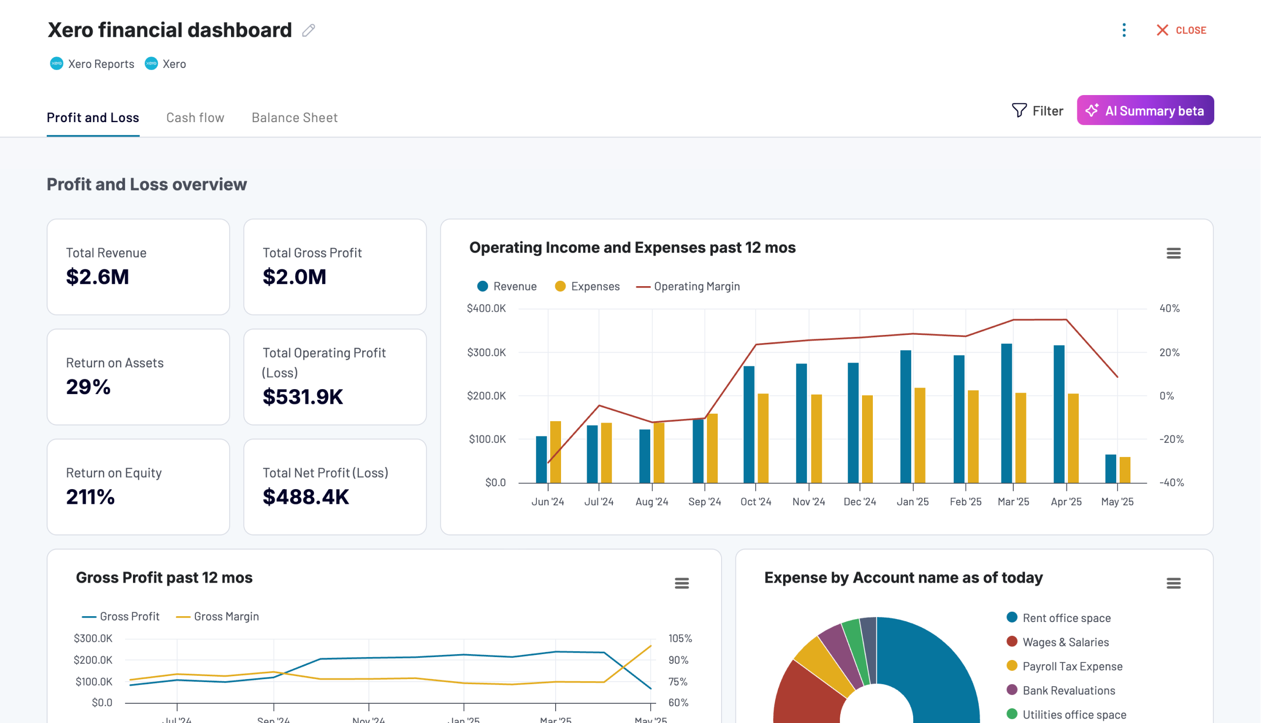
Xero financial dashboard
Get comprehensive financial insights from your Xero account with key performance metrics, balance sheet analysis, and cash flow projections. Quickly assess your business health and make informed financial decisions.


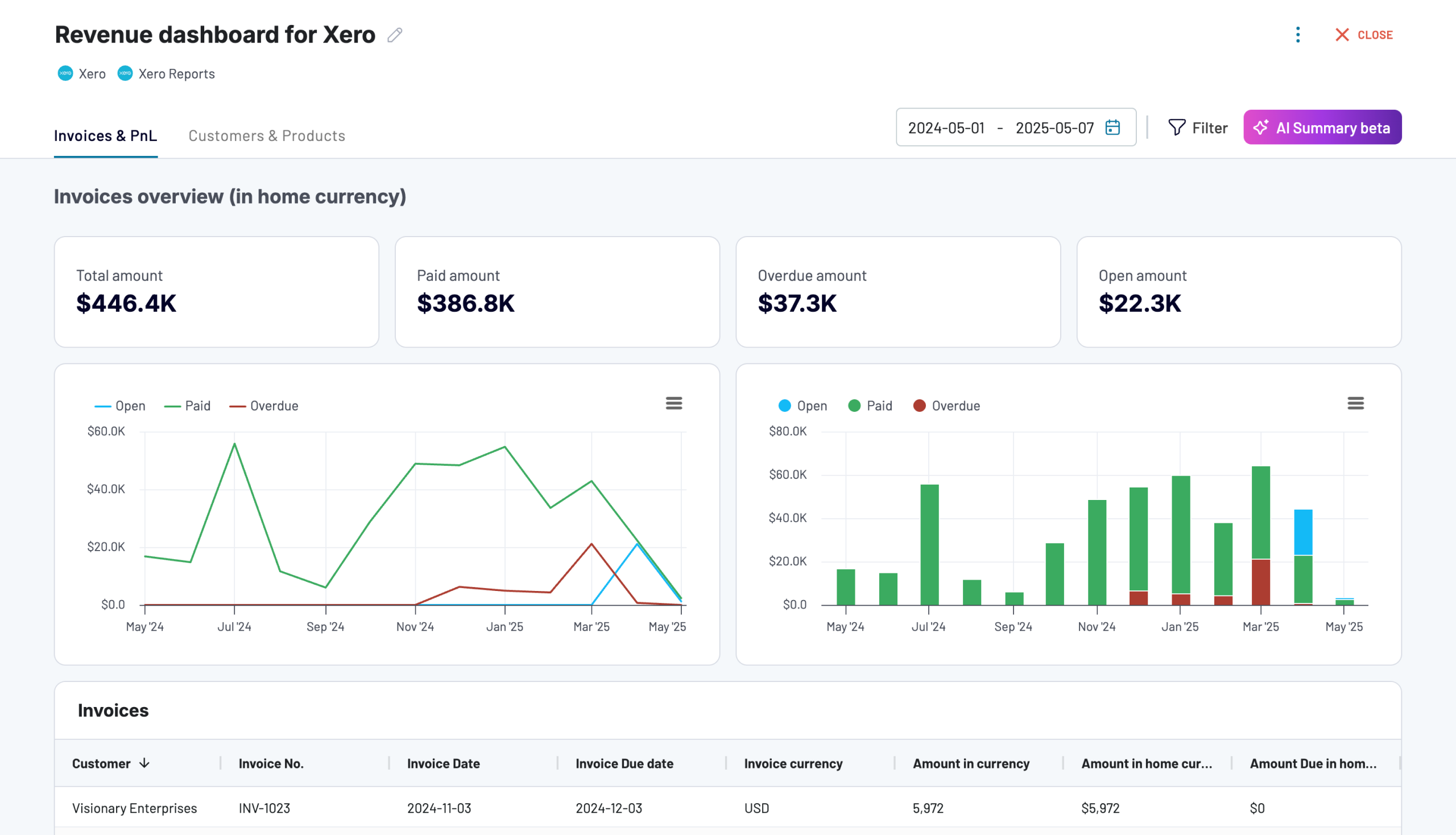
Revenue dashboard for Xero
Analyze revenue streams, customer spending patterns, and product performance with data automatically synced from Xero. Gain actionable insights into sales trends, top-performing products, and high-value customers to drive growth strategies.
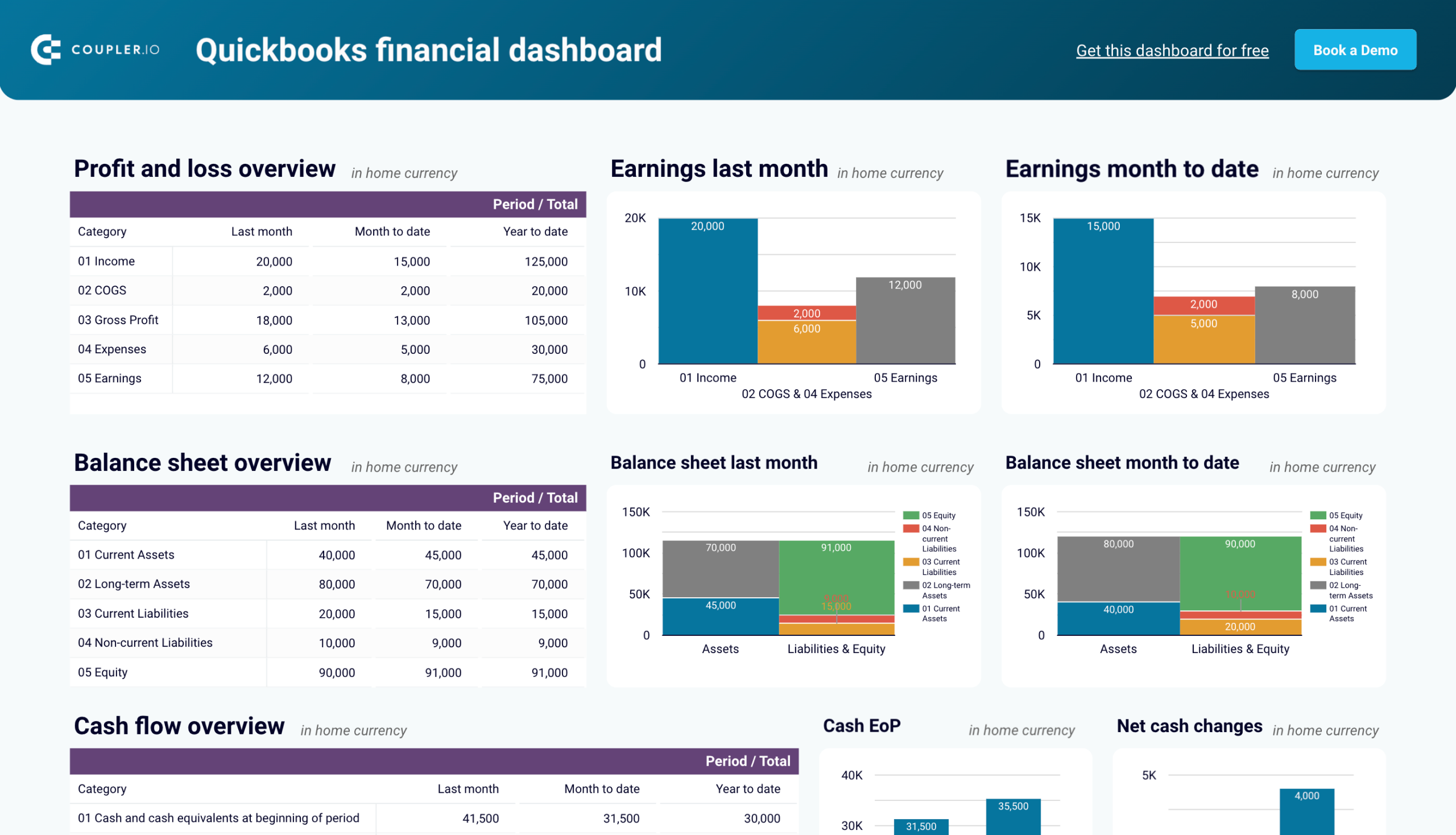
Quickbooks financial dashboard in Looker Studio
Monitor and analyze your business’s financial health with real-time insights into profit and loss, balance sheet, cash flow, and bank & cash accounts.

For sales
Sales teams can use Coupler.io to monitor the health of their pipeline and understand how deals progress through different stages:
- Analyze sales team performance
- Forecast revenue more accurately
- Identify bottlenecks in the sales funnel
This enables better planning and more focused strategies for closing deals.
Source apps supported
- Salesforce
- Pipedrive
- HubSpot CRM
- Intercom
- Calendly
- Google Calendar
Dashboard templates available
Sales KPI dashboard for HubSpot in Looker Studio
Get an overview of the HubSpot sales metrics and KPIs to derive insights into pipeline health using our sales KPI dashboard.

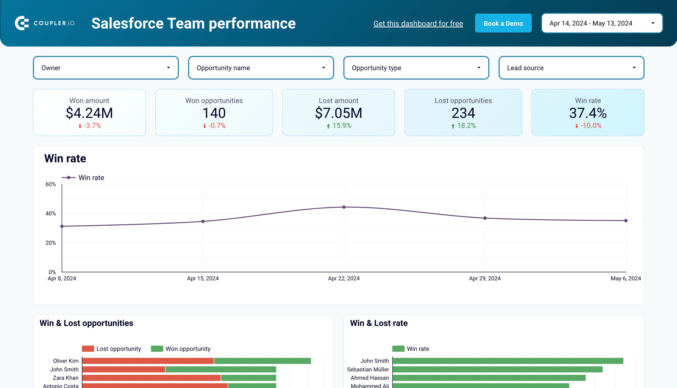
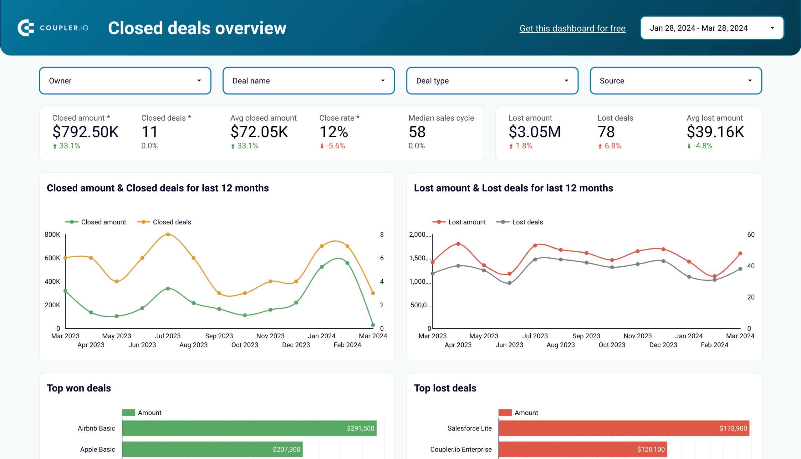
Sales team performance dashboard for Salesforce in Looker Studio
Get insights into your sales team’s effectiveness in converting opportunities within your sales pipeline in Salesforce.


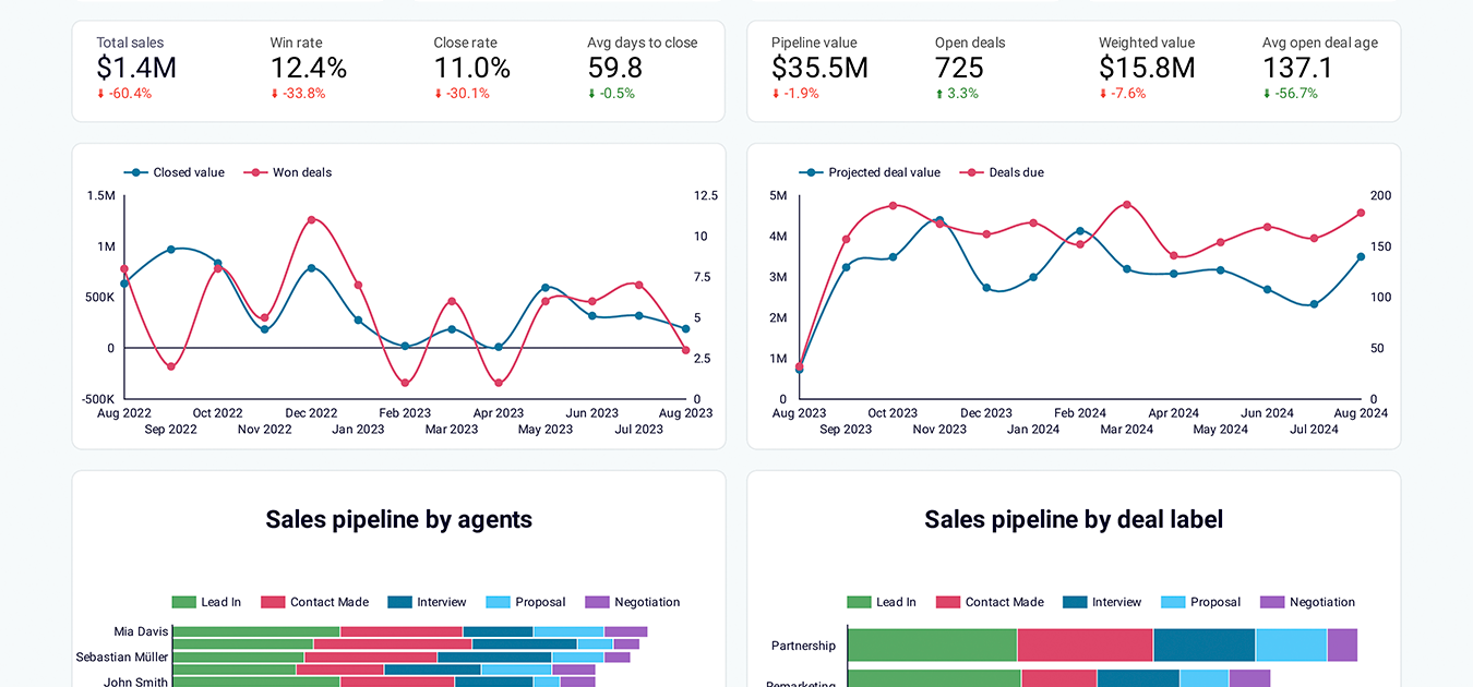
CRM dashboard for Pipedrive in Looker Studio
Stay on top of your Pipedrive sales using our CRM dashboard which allows you to analyze your sales department’s performance.
For PPC
PPC experts can analyze the performance of their PPC campaigns more efficiently by creating custom reports in Coupler.io or using predesigned dashboards.
- Track ad performance metrics like impressions, clicks, and conversions across multiple ad platforms in one place
- Optimize your ad spend by analyzing cost-per-click (CPC) and cost-per-acquisition (CPA)
- Determine which campaigns deliver the best ROI and refine targeting for better results
Source apps supported
- Amazon Ads
- Apple Search Ads
- Bing Ads
- Facebook Ads
- Google Ads
- Google Analytics 4
- Instagram Ads
- LinkedIn Ads
- Pinterest Ads
- Quora Ads
- Snapchat Ads
- TikTok Ads
- X (Twitter) Ads
Dashboard templates available
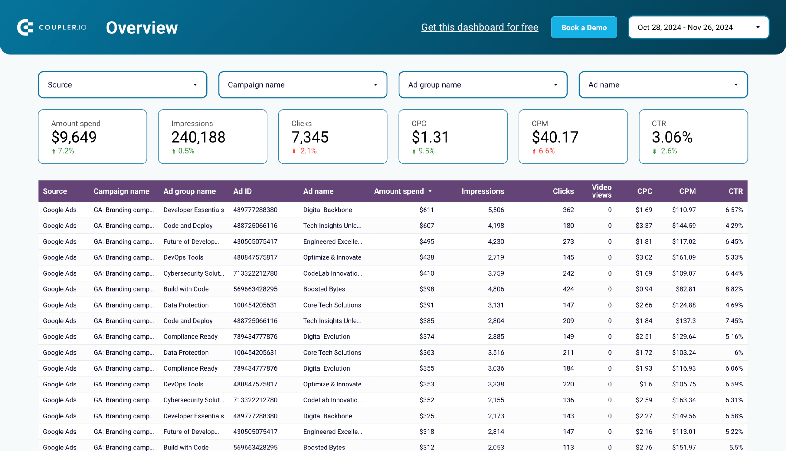
Multi-channel creatives performance dashboard in Looker Studio
Check the performance of advertising campaigns you run on different platforms and compare their outcomes to improve your creatives.
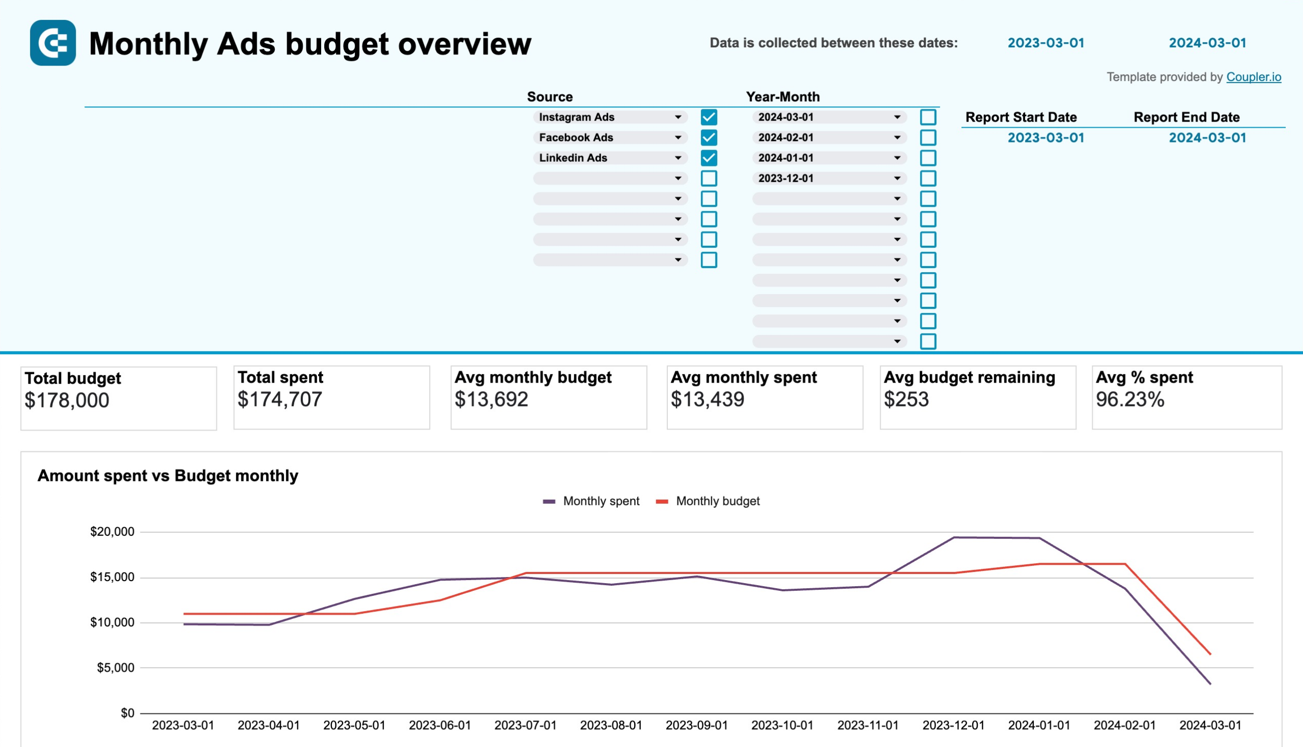
PPC monthly budget dashboard in Google Sheets
Monitor how much you spend on your ads across multiple platforms using a one-stop PPC monthly budget dashboard template.

PPC flex dashboard in Looker Studio

Coupler.io allows social media experts to understand how their content performs across platforms:
- Measure engagement metrics, such as likes, comments, and shares
- Track trends in audience growth
- Identify the types of posts that resonate with your audience
With these insights, you can refine your social strategy and build a stronger connection with followers.
Source apps supported
- Facebook Pages
- Facebook Public Data
- Instagram Insights
- Instagram Public Data
- LinkedIn Company Pages
- TikTok Organic
- Vimeo Public Data
- YouTube
Dashboard templates available
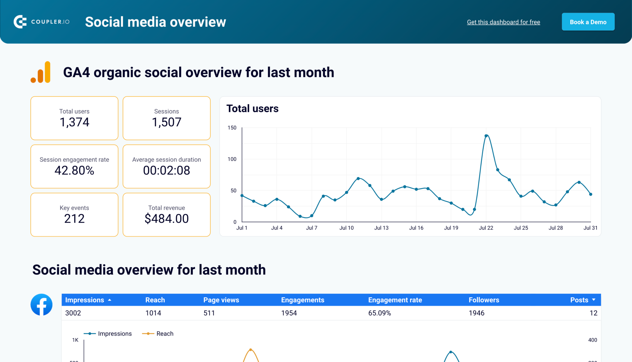
All-in-one social media analytics dashboard in Looker Studio
Get an overview of your social media analytics on one dashboard that collects data from Facebook, Instagram, LinkedIn, YouTube, and GA4
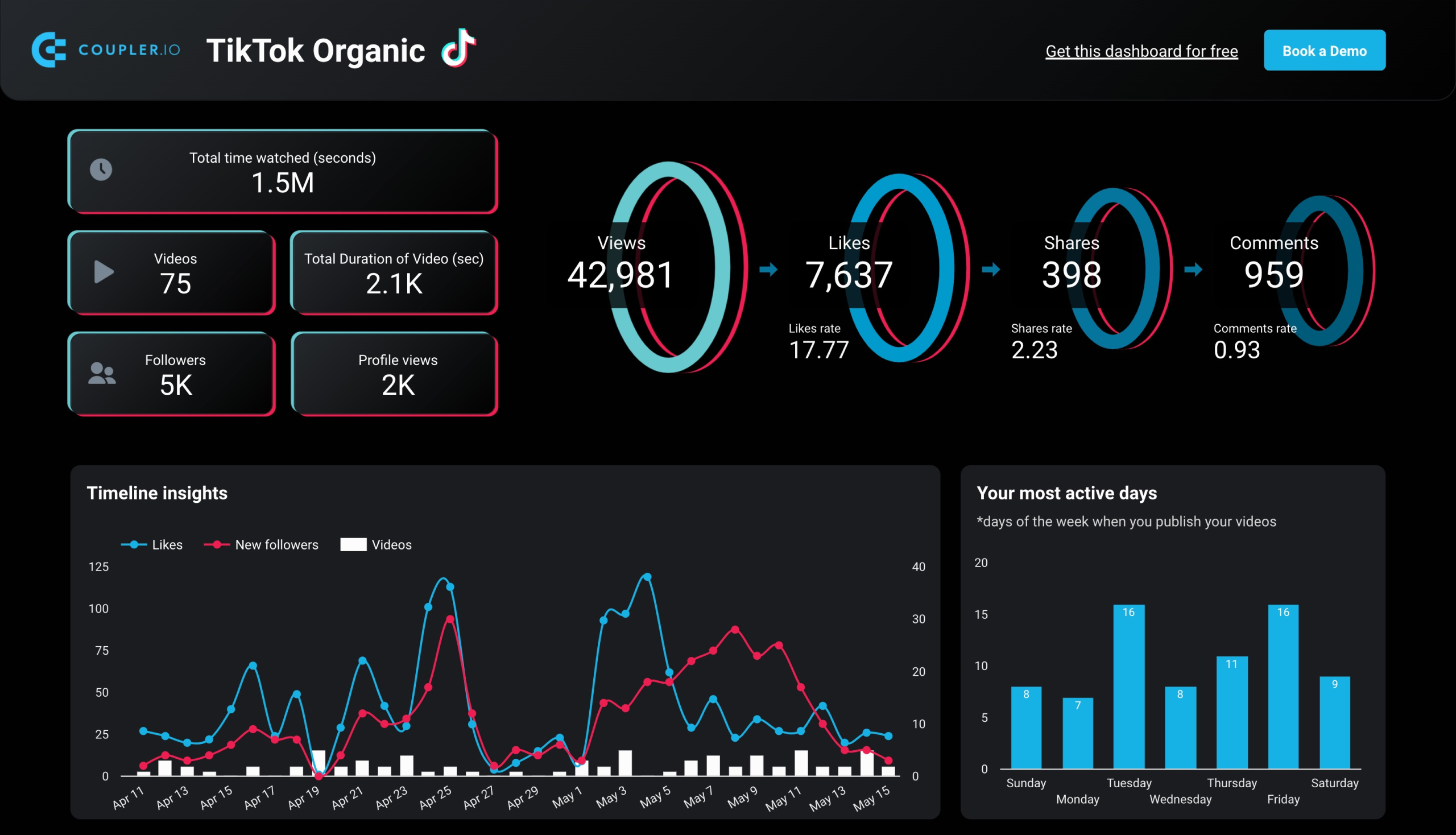
TikTok analytics dashboard in Looker Studio
Get an overview of TikTok data and metrics that provide insights into how your content performs on the platform.
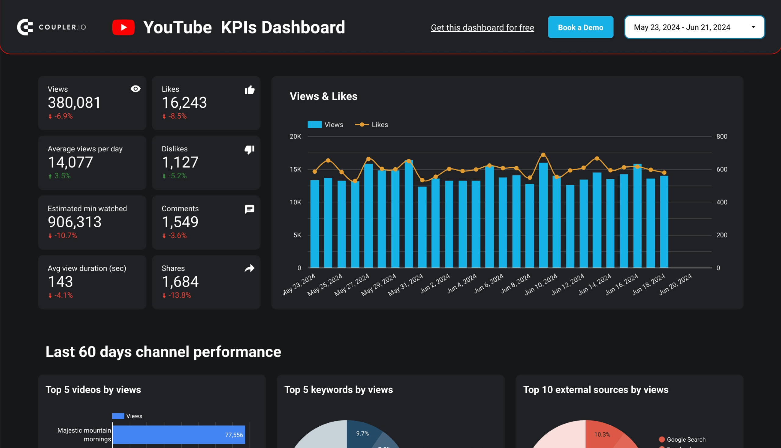
YouTube KPIs dashboard in Looker Studio
All the key information about your YouTube channel in one concise dashboard. Track performance, monitor subscriber base growth, and analyze the sources that bring you views.
For SEO
SEO experts can use Coupler.io to turn data from Search Console and Google Analytics into dynamic reports and dashboards.
- Track organic traffic growth to identify which pages perform well
- Uncover opportunities to improve rankings for specific queries
- Analyze your keyword performance to find gaps in your strategy
This data helps you make smarter SEO decisions that drive long-term results.
Source apps supported
- Google Search Console
- Google Analytics 4
Dashboard templates available
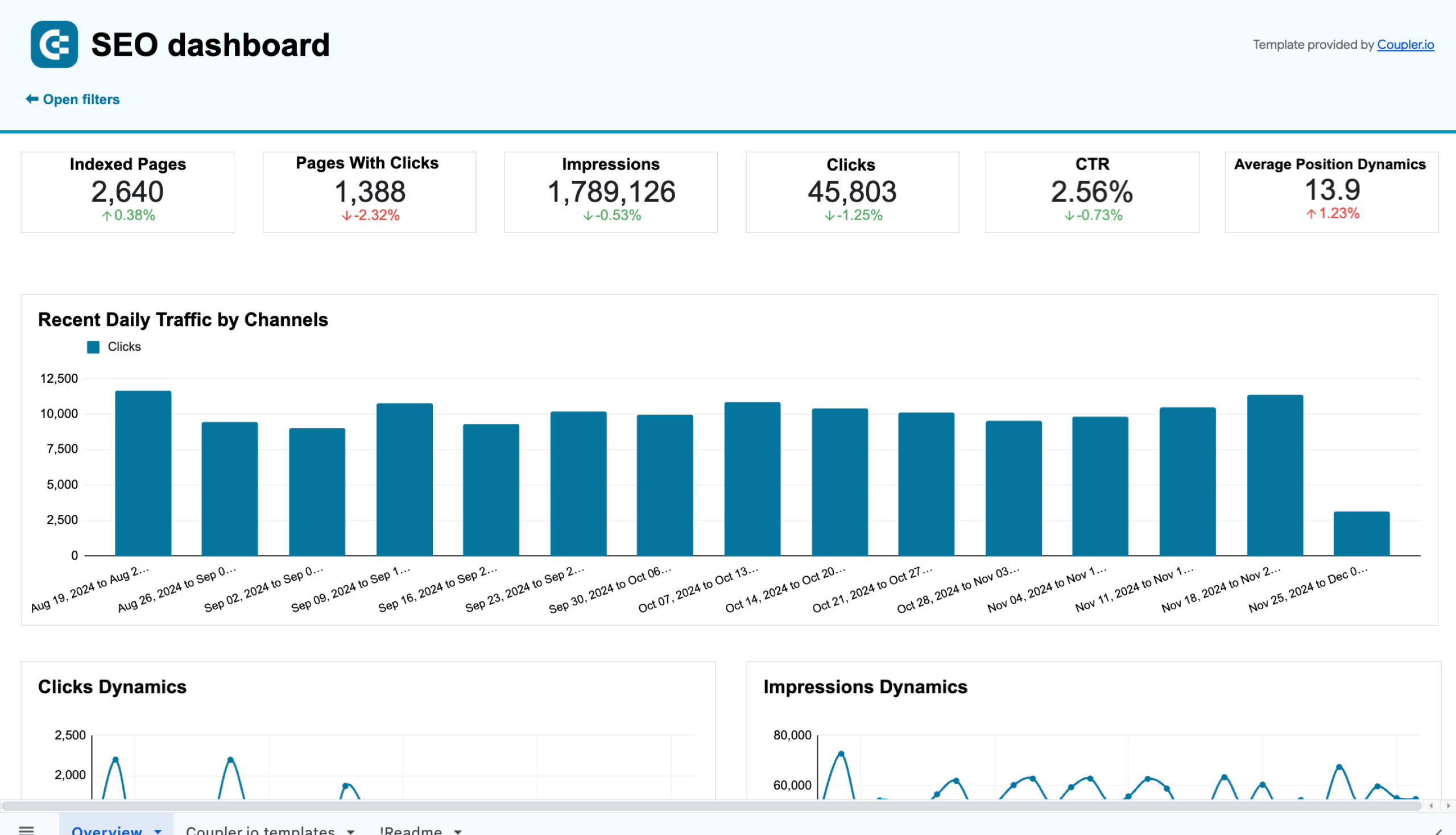
SEO dashboard for Google Search Console
Get an overview and details of the key performance metrics from Google Search Console required for SEO of your websites.
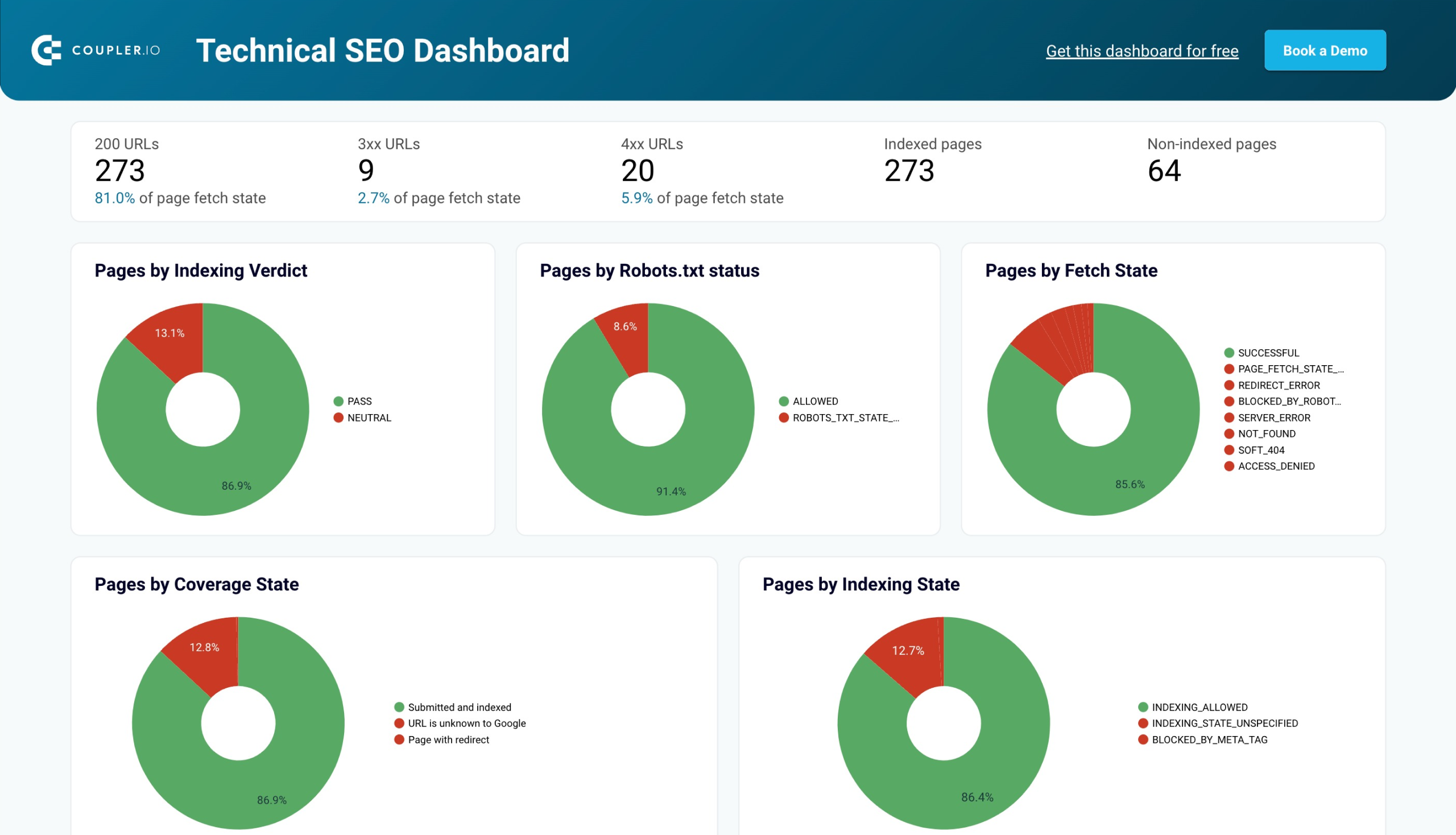
Technical SEO dashboard in Looker Studio
Track the technical SEO health of your website to make sure it operates efficiently for Google to find, crawl, and index your website pages.
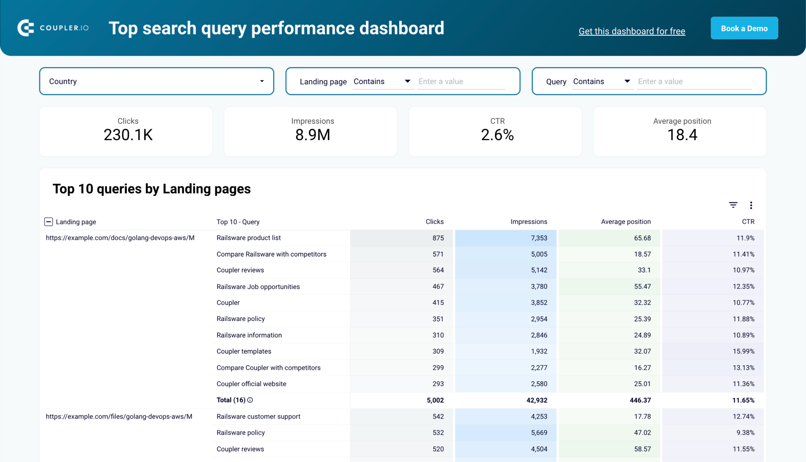
Top search query performance dashboard in Looker Studio
Analyze your top-performing queries with key SEO metrics like clicks, impressions, CTR, and average position for landing pages.
For e-commerce
For e-commerce businesses, Coupler.io simplifies data analysis by pulling sales, customer, and inventory data into one place:
- Understand sales trends across products and categories
- Identify your most valuable customers
- Monitor your inventory levels to avoid overstock or stockouts
With this data at your fingertips, you can ensure smooth operations and a better customer experience.
Source apps supported
- Shopify
- WooCommerce
Dashboard templates available
Shopify marketing funnel analytics in Looker Studio
Analyze the performance of the traffic to your Shopify store using data from advertising platforms and Google Analytics 4, all consolidated on a single dashboard.

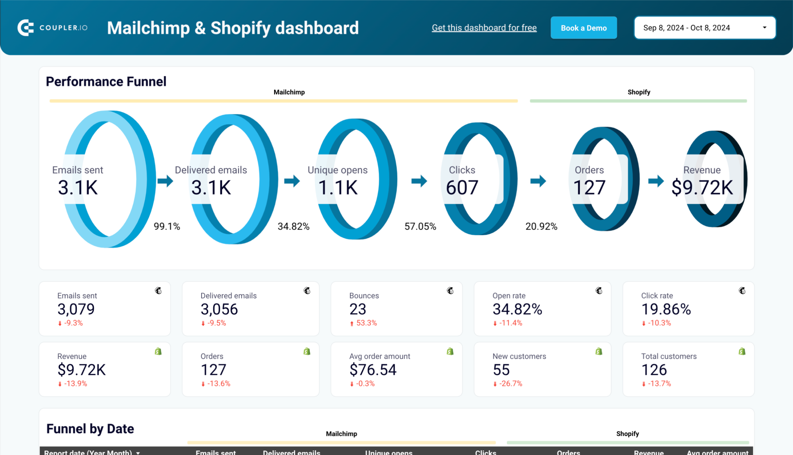
Mailchimp email campaign performance dashboard for Shopify store in Looker Studio
Monitor how your Mailchimp email campaigns drive orders and revenue for your Shopify store with this detailed performance dashboard.
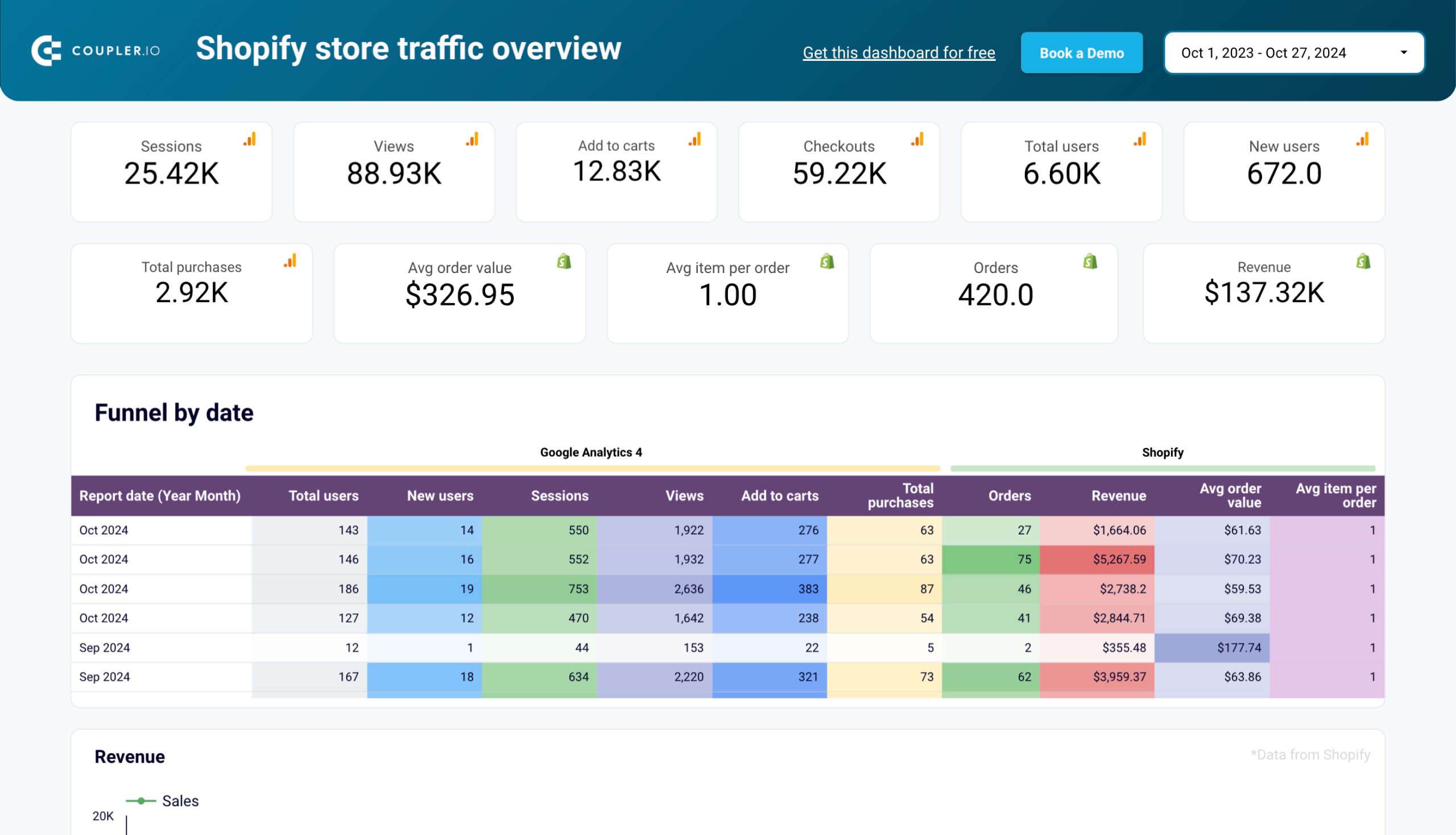
Shopify store traffic overview dashboard in Looker Studio
Get an overview of the traffic coming to your Shopify store based on information from Google Analytics 4.
Coupler.io vs. competitors
Given the versatility of Coupler.io in solving various tasks, you may want to explore alternative solutions. To help with that, we’ve compiled a list of competitors offering similar capabilities to Coupler.io, which you can find in the table below.
| Use cases | Data transformation | Built-in visualization | Analytics services | Free plan | Starting price | |
|---|---|---|---|---|---|---|
| Coupler.io | – Automate complex multi-source business reporting – Orchestrate data flows across spreadsheets, data warehouses, and BI tools – Transform raw data into actionable insights through built-in dashboards or predesigned templates in Google Sheets and BI tools | ? | ? | ? | ? | $24/month |
| Porter Metrics | – Consolidate marketing data from multiple channels into unified performance reports – Build automated marketing ROI and attribution analysis – Create custom marketing analytics dashboards with cross-channel insights | ? | ? | ? | ? | $12.49/month |
| Supermetrics | – Pull marketing and analytics data from multiple platforms into reporting tools – Create cross-channel marketing performance reports – Build automated marketing dashboards in Looker Studio, Excel, or Google Sheets | ? | ? | ? | ? | $29/month |
| Funnel.io | – Centralize and standardize marketing and advertising data from multiple platforms – Transform raw marketing data into analysis-ready datasets – Automate marketing performance reporting and data distribution to numerous destinations | ? | ? | ? | ? | Custom pricing |
| Adverity | – Create end-to-end marketing intelligence workflows with automated data collection – Generate predictive insights using AI-powered marketing analytics – Scale data operations with enterprise-grade data integration and transformation | ? | ? | ? | ? | Custom pricing |
| Klipfolio | – Build real-time business dashboards connecting multiple data sources – Create and share customized performance metrics across the organization – Monitor business KPIs with automated alerts and notifications | ? | ? | ? | ? | $90/month |
| Databox | – Design custom performance scorecards and metrics dashboards – Track business goals with real-time progress monitoring – Generate automated performance reports with insights from multiple data sources | ? | ? | ? | ? | $47/month |
Smart reporting for users with users in mind
Coupler.io stands as a comprehensive reporting automation and data integration platform that transforms how businesses handle their data operations. At its core, the platform excels in connecting over 60 different applications across marketing, sales, CRM, and accounting domains. The sophisticated data transformation capabilities allow users to consolidate data through append and join operations, create custom formulas, and perform advanced aggregations – all without requiring coding expertise.
Coupler.io addresses specific needs across various business functions.
- Marketing teams can track campaign performance across channels
- Finance experts can automate their P&L statements and projections
- Sales teams benefit from pipeline visualizations and analysis
- PPC specialists can analyze multi-channel advertising performance
- Social media managers can track cross-platform engagement metrics
- SEO specialists can analyze organic traffic
- E-commerce businesses can derive sales and inventory insights
- And much more
What truly distinguishes Coupler.io is its ability to serve as an end-to-end solution for data management and visualization. The platform successfully bridges the gap between raw data and actionable insights with its pre-designed dashboard templates. Those who need more of that can still create complex data transformations and custom analytics solutions on their own.
Whether you are implementing basic data flows or complex analytical solutions, Coupler.io provides the tools necessary for modern data-driven decision-making.


