Customer decision journeys have evolved from simple linear sales funnels. Instead of following predictable paths from awareness to the moment of purchase and post-purchase experience, customers now navigate back and forth across multiple touchpoints on different channels.
They research products on social media, compare options on review sites, read reviews in online communities, and switch between devices before making a purchase decision.
This process requires a strategic approach to data collection and analysis to map the customer journey accurately.
Challenges such as data silos, dark funnel tracking, and changing customer expectations make this a more complex and challenging task. However, the right combination of tools and analytics approaches can help.
Key challenges in mapping the consumer decision journey
Marketers collect several analytics data across platforms and channels while implementing a successful marketing strategy. Using this data to map an accurate customer decision journey can be challenging. However, it’s also an essential step in understanding what influences consumers’ purchase decisions.
Let’s examine the key challenges marketing teams face when trying to map the customer journey and how to overcome them.
Identifying key touchpoints and moments of truth
Think of touchpoints as the digital breadcrumbs customers leave behind. The main challenge in mapping the customer journey is identifying and prioritizing which of these data points are relevant and impact the buying decision.
Does social media engagement carry the same weight as product page views when purchasing? You need to ask these questions and look at the data to understand which touchpoint is essential.
Removing non-essential touchpoints from your journey map can help declutter it and provide you with better insights into where you can most impact the decision-making process.
How to identify key touchpoints:
- Conduct post-purchase surveys among existing customers to understand what influenced their purchase decisions.
- Collect data during the signup process to identify the main channels for awareness, pain points customers want to address, and decision-making stages.
- Use attribution marketing mix models to understand the impact of different touchpoints.
For example, a B2B software company might discover that while customers interact with multiple touchpoints, demo requests following blog post engagement lead to 3x higher conversion rates than other paths.
Creating customer personas with data
Customer personas built on assumptions instead of data can be misleading. At the same time, focusing solely on demographics doesn’t give you much insight.
Piecing together the vast amounts of collected data into realistic, useful personas is often challenging, especially since customers don’t always fit into the personas you create.
Sure, you have lots of data points, but connecting them to understand who your customers are and what drives their behavior is often a challenge.
How to create customer personas with data:
- Combine behavioral data, such as website page visits and purchase history, with data from your CRM to identify patterns.
- Collaborate with customer-facing teams to collect relevant qualitative insights, such as customer success and support.
- Use Coupler.io to consolidate customer data from multiple sources (CRM, analytics platforms, social media, support systems) into a single report, allowing you to identify behavioral patterns more effectively. With automated data refreshes, your persona analysis will continuously evolve based on the latest customer interactions instead of becoming outdated.
For example, you might discover that many existing customers check feature comparison website pages and download technical documentation before requesting a demo. This pattern can help shape a customer persona, which you might call the Tech Evaluator, who needs to validate technical fit before making a purchase decision. You can shorten sales cycles by creating more technical comparison content that addresses this persona‘s needs.
Changing customer expectations
With so many solutions available, customer expectations change frequently. Additionally, the rise of freemium and free trial business models has lowered the entry barrier to quickly find solutions.
Customers can now quickly adopt, abandon, and shift between multiple solutions to find the best one without too much hassle.
This makes mapping these journeys even more challenging, as customers constantly compare different experiences and change their expectations.
How to stay ahead and meet customer expectations:
- Implement a Voice of the Customer (VoC) program to monitor expectations across different channels and stages of the journey. This includes tracking social media mentions, support tickets, customer effort score surveys, and direct feedback.
- Design and map different purchase flows to allow customers to personalize their path to conversion and product adoption.
- Look beyond direct competitors when conducting market research to understand overall industry trends that customers are familiar with and expect from your product.
For example, a financial software business should understand customers’ expectations when interacting with mobile apps like Uber or Spotify before launching its own. When it comes to using mobile apps, user-friendliness expectations are similar across B2B and B2C products, giving you insights into how to simplify the purchase journey for your product.
Mapping multiple touchpoints across channels
The consumer decision-making process can be quite straightforward when buying in-store products. However, mapping the journey across multiple digital marketing channels can become more complex.
Imagine trying to follow a customer who begins their journey by discovering your brand on Instagram. They then check your website, read online reviews on G2, ask for user reviews in Discord communities, and finally purchase using a referral link discovered in a Reddit thread—all these actions spanning across 45 days.
Not having access to some of this data, also known as the dark funnel, can lead to gaps in your purchase funnel tracking and negatively impact your marketing efforts.
Image source: strategicabm
For example, you might attribute the purchase to your referral program and consider it an important touchpoint in the decision journey when, in fact, the customer decided to purchase based on online reviews on G2.
Also, examining data across individual platforms only will make it even harder to understand the purchase journey, as you‘ll be missing important data.
How to overcome the dark funnel and map touchpoints across channels:
- Use UTM parameters across channels to better understand how customers move between touchpoints.
- Account for dark funnel touchpoints by monitoring mention spikes, brand traffic spikes, and unusual referral spikes.
- Implement a unified tracking system across different channels to make it easier to consolidate data and track the customer journey map for omnichannel experiences.
- Conduct post-demo surveys asking, “How did you first hear about us?” with specific options for dark funnel sources.
For example, analyzing UTM data or brand mentions can explain a spike in your demo requests without a correlated increase in your tracked marketing campaigns.
Data silos and their impact
On top of the challenge of mapping multiple touchpoints across channels, you are also faced with data silos. This might be your biggest roadblock when trying to map customer decision journeys.
You’re collecting all the relevant customer data in different places:
- Your CRM has customer history data
- Your email marketing tool tracks newsletter and email campaign data
- Your support portal contains customer interactions and support data
- You use an analytics tool to track in-product engagement.
And this is probably less than 20% of the data you are actually collecting.
These disconnected systems create data silos that can skew the reality of how potential customers find, purchase, and engage with your product.
How to overcome data silos:
- Implement a centralized data warehouse solution that serves as a single source of truth, pulling in data from all customer-facing systems through automated ETL processes.
- Use standardized data definitions across teams and tools to make it easier to consolidate data.
- Utilize visualization tools to track key touchpoints by blending data from multiple platforms.
For example, suppose you’re struggling with disconnected customer data across your Shopify store, HubSpot CRM, and Intercom customer service system. In that case, you can use Coupler.io to automatically pull data from these sources, combine it, and visualize it in insightful dashboards. It provides over 60 pre-built data integrations to eliminate manual data collection efforts and ensure your customer journey mapping is based on fresh data from all touchpoints.
This enables you to build automated data pipelines with up-to-date data from your main sources.
Real-time vs. batch processing needs
Another challenge in mapping customer decision journeys is determining your data processing needs. You must find the right balance between obtaining real-time customer insights and effectively managing your system resources.
You want to know immediately when customers interact with your website, abandon the purchase flow, or contact support so you can trigger automatic responses.
But here’s the challenge: tracking everything in real-time across all touchpoints can be expensive and resource-intensive.
In comparison, processing data in batches is more resource-efficient but may cause you to miss time-sensitive opportunities.
How to balance real-time vs batch data processing:
- List key customer interactions that need to be tracked in real-time and prioritize those for real-time data tracking.
- Use hybrid processing approaches where critical touchpoints like cart abandonment or payment failures trigger real-time alerts, while less time-sensitive data, such as weekly engagement metrics, is processed in batches.
Tools like Coupler.io offer a balanced approach to this challenge. You can schedule automated data refreshes at custom intervals—from hourly updates for critical touchpoints that require near real-time monitoring to daily or weekly refreshes for trend analysis data. This flexible scheduling ensures you receive timely insights without overwhelming your systems or analytics budget.
Metrics to track at each journey stage
Understanding which metrics to track at each customer journey stage is key for making data-driven decisions and optimizing the customer experience.
Let’s explore the key performance indicators to track at different touchpoints:
| Category | Metrics | Insights Example |
| Awareness metrics | • Website traffic and sources (organic, paid, referral) • Social media reach and impressions • Brand mention frequency | Tracking the percentage of new users coming from LinkedIn organic posts vs. Google Ads can help you optimize your budget allocation for awareness campaigns. |
| Consideration metrics | • Product page visits and time spent on them • Returning users frequency • Content downloads and engagement rates | Discover that visitors who read 3+ product comparison blog posts are more likely to sign up for a trial, which can lead to prioritizing content creation. |
| Decision metrics | • Cart abandonment rate • Demo to purchase conversion rate • Average time to purchase or complete the trial signup flow. | A/B test different offers to find out that free shipping for orders over $100 reduces the cart abandonment rate by 25%. |
| Post-purchase metrics | • Retention and churn • Product usage frequency • Customer satisfaction, Customer Effort scores • Support ticket volume | Discovering that customers who complete onboarding within 7 days have a 60% higher retention rate can lead your attention to optimizing the onboarding process through A/B testing different campaigns. |
| Loyalty and advocacy metrics | • Net Promoter Score (NPS) • Referral rate • Word of mouth | Finding out that customers with NPS scores above 8 are more likely to generate referrals can lead to targeting word-of-mouth campaigns toward them. |
Data sources for customer decision journeys
Now that you understand the key metrics you need to track to map your customer decision journey, let’s look at the primary sources of this data.
- Website Analytics: Understand user behavior, traffic sources, and engagement metrics across your website with data from Google Analytics, Google Search Console, Mixpanel, Amplitude, or similar tools.
- CRM Systems: Track customer interaction history, contact information, and sales pipeline data using tools like HubSpot, Salesforce, or Pipedrive.
- Social Media Platforms: Measure brand engagement, audience demographics, content performance, and ad campaigns with data from Meta, Twitter, LinkedIn, TikTok, or YouTube Analytics.
- Customer Surveys: Collect user feedback data and satisfaction metrics with tools like Google Forms, SurveyMonkey, Typeform, or Airtable. Distribute surveys via email, direct links, QR codes, and website embeds.
- Third-Party Data Providers: Analyze market trends with data from Statista or G2 reviews.
- Financial data: Track transaction data from payment processing tools like Stripe or accounting software like QuickBooks.
- Email marketing: Monitor customer engagement pre and post-purchase with data from email marketing campaign tools like Mailchimp and ActiveCampaign.
Tools for data analysis
Coupler.io
Data automation platforms are essential for creating comprehensive views of the customer decision journey based on real-time data. Coupler.io enables marketing and sales teams to consolidate data from multiple platforms into a single source of truth.
You can use it to:
- Collect data from all major ad platforms, CRMs, sales and marketing tools, and even financial tools.
- Transform data: merge, transform, and apply formulas to calculate specific metrics you want to track that are not readily available inside the data sources.
- Visualize it inside BI tools like Looker Studio or Tableau with ready-to-use dashboard templates specifically designed for customer journey analysis.
- Automate data refreshes to keep your journey maps and dashboards fresh with the latest customer interactions without manual work.
Use Coupler.io to create real-time journey mapping dashboards that track touchpoints from brand awareness to conversion and loyalty.
Customer journey analytics platforms
Customer analytics platforms like Mixpanel and Amplitude track and analyze customer journeys across various touchpoints. They offer features such as funnel mapping, heatmaps, and other data visualization capabilities that allow users to track real-time data.
You can also use them to identify patterns in conversions and churn with their predictive analytics.
Predictive analytics tools
For more advanced customer journey analysis, you can leverage machine learning and AI to forecast customer behavior and identify optimization opportunities.
For example, you can use Google Analytics 4’s built-in machine learning algorithms to identify patterns in the journey or HubSpot predictive lead scoring capabilities to score and prioritize leads based on their likelihood to convert.
Building effective journey dashboards
Creating dashboards to visualize the customer decision journey is more than just displaying data visually. It’s about telling a clear story that drives action.
While there are many ways to visualize customer journey data, the key to building effective dashboards is focusing on the right visualization types, connecting data across channels, and making data actionable.
Essential visualization types
The way you display data can help you spot patterns easily. Nobody likes a cluttered graph with too much data.
Funnel visualizations and heatmaps are most helpful in understanding how customers progress through the journey.
For example, a SaaS company can use funnel visualizations to track users from first visit to signup. This helps identify where customers spend the most time in their decision process and where they’re most likely to drop off.
Then, analyzing heat maps of product pages can reveal which features and actions influence purchase decisions.
Cross-channel data representation
Today’s consumer multi-channel customer journeys make it mandatory to unify data from different platforms when building decision journey maps.
Effective dashboards should blend data from different sources to properly track touchpoints from initial consideration to conversion and repeat purchases. This might mean combining social media engagement metrics with website behavior and email response data in a single view.
With Coupler.io, this process becomes straightforward. You can automatically import data from platforms like Google Analytics, Facebook Ads, your CRM system, and email marketing tools, and transform it into a report on the go. After that, load the report to spreadsheets or BI tools for visualization if needed.
Tracking metrics across all channels will help you understand how multi-channel campaigns impact the overall customer journey and how you can optimize your marketing spending to increase ROI.
Making dashboards actionable
Go a step further than simply displaying metrics. Actionable dashboards also highlight specific insights and opportunities for improvement.
Include trend lines, comparison metrics, and thresholds to easily identify areas that need to be optimized.
You can also configure alerts to track spikes and anomalies so you can react quickly.
These will transform your dashboard from a passive reporting tool into a real-time actionable customer journey tracking tool, giving your marketing team a competitive advantage.
Examples of ready-to-use dashboards for custom decision journey
Let’s examine some ready-to-use dashboard examples that you can use to track the customer decision journey. These are all built-in Looker Studio, and you can easily import your data using Coupler.io.
Shopify sales funnel dashboard in Looker Studio
If you run an e-commerce shop on Shopify, this ready-to-use marketing dashboard will help you easily track the customer decision journey.
It collects data from Shopify, GA4, and advertising platforms like Facebook Ads, Google Ads, and more. This makes it easy to track the performance of your campaigns across the funnel.
You can visualize the user journey through data collected at each relevant touchpoint. Track metrics like impressions, clicks, CTR, ad spending, orders, total sales, and new customers.
The weekly data for impressions, clicks, total users, and new users helps you understand how ad spending translates into sales. With the insights from this Shopify dashboard, you can make data-driven decisions and boost your e-commerce store’s performance.
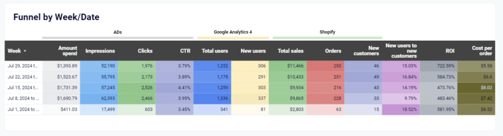
The Shopify analytics dashboard template is designed in Looker Studio and equipped with a connector by Coupler.io to load data from GA4, Shopify, and ad platforms.
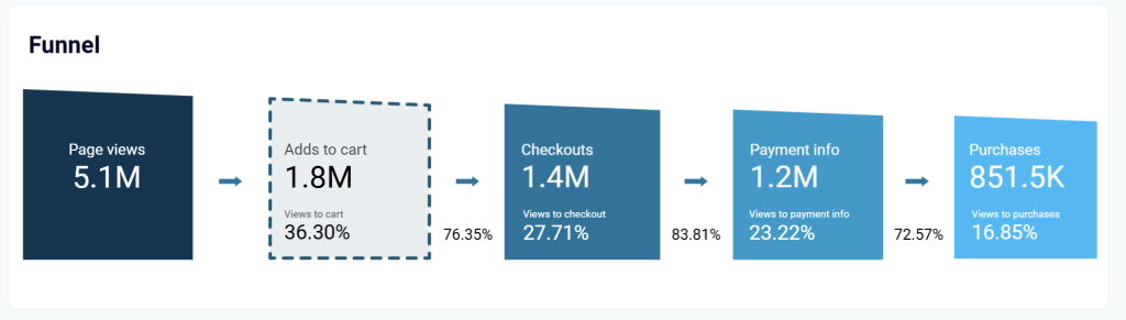
Facebook Ads e-commerce performance dashboard
The Facebook Ads e-commerce performance dashboard is designed specifically for businesses running e-commerce campaigns on Facebook’s advertising platform. This dashboard provides real-time visibility into campaign performance and enables quick identification of high-performing ads and areas needing optimization.
You can use it to track the customer decision journey through a clear visual representation of important metrics such as impressions, clicks, adds to cart, checkouts, and purchases.
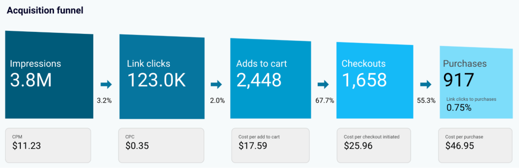
This dashboard focuses on tracking the decision stage of the journey and makes it easy to track how spending correlates with purchases generated.
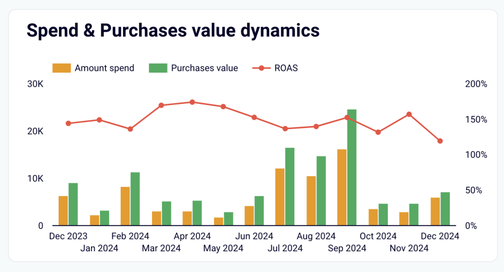
It also gives you insights into your customer persona by tracking the geo performance of your campaigns.
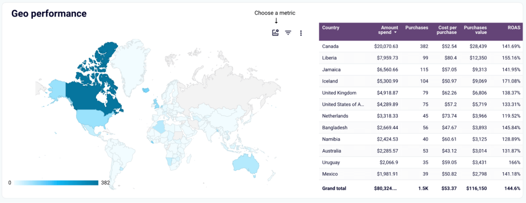
For example, if some regions generate a lot of clicks, even with low costs, they might still not bring any value in terms of revenue. Such areas might be excluded from ad campaigns. Or, if you find that some regions bring revenue with limited spending, it might be worth increasing the spending for such areas.
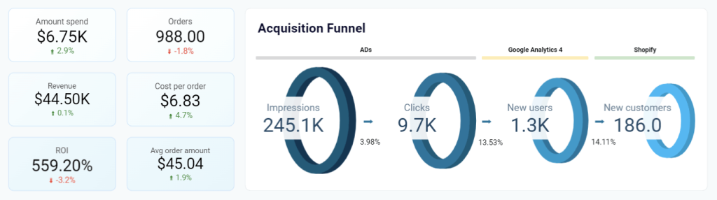
Customer acquisition dashboard for HubSpot/Pipedrive
The customer acquisition dashboard combines HubSpot or Pipedrive data with marketing data from GA4 and all major ad platforms, such as Facebook, LinkedIn, and Google Ads.
It focuses on tracking each customer journey stage from acquisition to conversion.
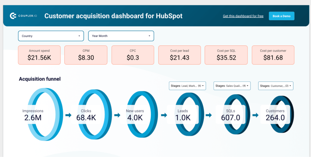
With the multi-source acquisition and lead generation funnel, you can track how many impressions and clicks your ads generated, how many users made it to your website, and how many leads this generated.
Compare conversion rates for each stage with industry benchmarks to identify funnel leaks. If your rates are significantly below average, develop and test hypotheses to improve them. This will allow you to drive more revenue from your existing pipeline.
Additionally, leverage historical data to build sales forecasts for future ad investments. For example, predict the number of leads you could generate by doubling your ad spend. The report template is designed in Looker Studio and is available for Pipedrive and HubSpot CRM tools.
Salesforce sales analytics dashboard in Looker Studio
If your CRM of choice is Salesforce, then this sales analytics dashboard will help you track the customer decision journey. It aggregates data from Salesforce and advertising platforms to attribute leads and revenue to specific marketing channels.
Use it to visualize the sales conversion funnel using data from GA4 and Salesforce. The visual funnel representation allows you to track the customer journey through metrics like total users, leads, and SQLs.
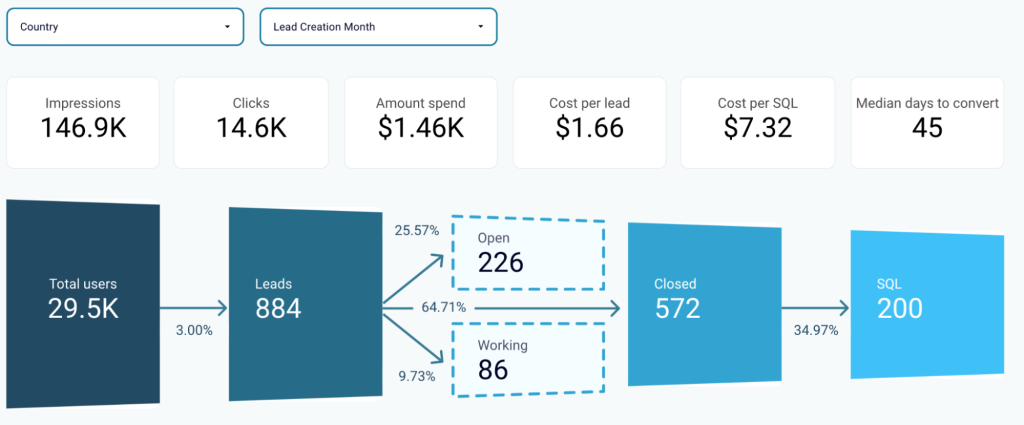
Using table-view funnels, you can also compare the performance of different periods and regions. Identify and correlate the best-performing segments with marketing or lead-generation activities to uncover growth opportunities.
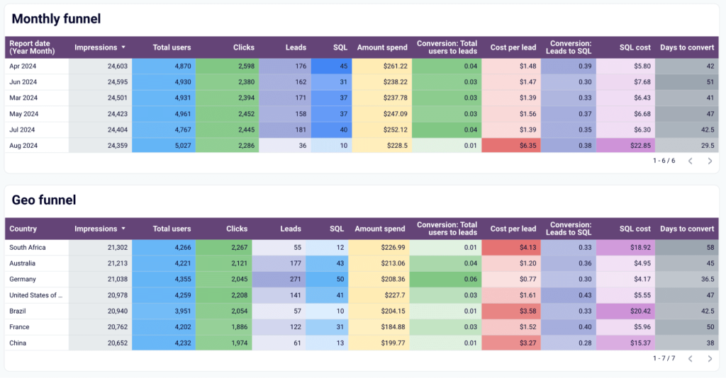
The Looker Studio dashboard template has the built-in Coupler.io connector to collect data from Salesforce, GA4, and PPC platforms. Follow the setup instructions described in the readme tab to get started for free.
All of these dashboard examples are accessible through Coupler.io, which simplifies the entire process of data collection, consolidation, and visualization. Instead of manually pulling data from multiple sources and struggling with integration challenges, you can leverage Coupler.io’s automated data pipelines to keep your customer journey dashboards fresh with the latest information. This allows your team to focus on analyzing insights and optimizing touchpoints rather than spending time on data preparation tasks.
Advanced analytics usage for journey optimization
We’ve covered how traditional analytics can help you build comprehensive customer journey maps to understand where your funnel has leaks and needs optimization.
To take this to the next level, use advanced analytics and AI to predict future outcomes. This approach to analyzing data is more proactive than tracking real-time results and reacting based on the insights.
Let’s explore how different advanced analytics approaches can transform your journey mapping from a reactive tool to a predictive one.
Predictive analytics in journey mapping
Predictive analytics uses historical customer journey data to estimate or “predict” future customer behavior outcomes and identify potential conversion paths.
Instead of just knowing which touchpoints led to conversions in the past, you can predict which combinations of interactions will likely lead to conversion for existing prospects in your pipeline.
Most marketing tools, like HubSpot and Salesforce, include predictive analytics capabilities out of the box, making them easy to use to get started.
You can also opt for more custom solutions using Python scripts and linear regression analysis with MMM models, but these require advanced skills.
Start small by predicting which actions impact sales the most and optimize conversion rates at each journey stage before moving to more complex predictive algorithms.
Machine learning for pattern recognition
Predictive analytics and machine learning go hand in hand, as predictive models usually include machine learning (ML) algorithms.
ML algorithms can process large volumes of customer interaction data and identify patterns that humans can’t. Machine learning can help segment customers based on behavioral patterns and quickly build personas from the data.
The insights will reveal who your best customer is and what the top-performing engagement strategies are for each.
The integrated ML algorithms on analytics platforms like Mixpanel and Amplitude allow you to easily detect patterns in your customer journey data. These platforms provide entry-level access to using ML to optimize your marketing efforts and respond to customer needs.
Attribution modeling
Attribution modeling goes beyond the well-known first-touch and last-touch attribution.
It’s a helpful technique for understanding each touchpoint’s real impact on the customer journey. It uses machine learning to determine how different combinations of touchpoints work together to influence conversion.
For example, a multi-touch attribution model can help you understand your blog’s impact on conversions, even though this is usually not the last touchpoint in the customer journey.
Google Analytics 4 offers built-in data-driven attribution modeling that is accessible to most marketers. For more advanced custom attribution models, you can use enterprise solutions like Adobe Analytics, but these require a higher investment and technical expertise.
Customer Lifetime Value analysis
Advanced customer lifetime value (CLV) analysis uses AI to predict a customer’s potential spending based on previous consumer purchasing behavior data.
You can also use this analysis to understand which customer journey paths generate the most valuable and loyal customers.
For example, you can uncover that customers who engage with educational video content in the first week of signing up have a 2x higher lifetime value. This insight can help you optimize onboarding campaigns to drive more engagement with that type of content.
Tools like Klaviyo, Shopify, and ProfitWell provide basic CLV analysis and predictions without technical complexity. For custom CLV modeling, you can use LookML, Google’s entry-level modeling language, available in Looker Studio.
Churn prediction and prevention
Last but not least, you can use machine learning algorithms to analyze patterns in your data and identify behaviors that lead to churn. This enables you to take action at specific touchpoints and proactively reduce business loss.
For example, a SaaS company can use a churn prediction model to identify leading indicators of potential churn, such as reduced feature usage or delayed support responses.
Customer success platforms like Gainsight or ChurnZero have built-in churn prediction features that most teams will find helpful. For enterprise teams with in-house data scientists, leveraging Python custom scripts can provide more granular insights. The key component of any data analysis is collecting the right data, cleaning and consolidating it. This helps keep predictive models and your real-time customer journey maps accurate and insightful.