What is data reporting?
Data reporting is the process of gathering information from various sources, analyzing it, and presenting the findings in a concise form. Typically, the purpose of such reports is to allow decision-makers to assess the situation and come up with specific data-backed action points. Reports can take various forms – from simple tables and graphs to automatically updated dashboards that show key metrics in real time.
A major trend businesses face in data reporting is the growing number of sources. Consequently, manual data collection and report updates become counterproductive and too time-consuming, especially when done regularly. To simplify things, let’s explore how to automate the process, starting with the value it brings to your business.
Why is data reporting important?
When performed effectively, data reporting brings many tangible benefits, such as:
- Enabling data-driven decision-making. When all the latest data from across the organization is instantly available in one place, this creates ultimate transparency. Through data analysis, stakeholders can explore the situation from various angles and take action exactly where it’s needed.
- Monitoring performance. Be it tracking business performance, analyzing cash flow, or looking into employees’ performance on certain projects, efficient data reporting is crucial. Monitoring performance is important for assessing current progress and adjusting strategy accordingly.
- Building forecasts. Data reporting allows you to analyze historical data, blend it with information on expected changes, and build projections for the future. This is a great way to assess the feasibility of new initiatives or prepare in advance for an increase in customer demand or an upcoming business challenge.
- Enhancing efficiency. Quality reports allow professionals to identify the best-performing strategies, as well as define areas of improvement. This helps optimize processes, use funds efficiently, and allocate resources proportionately to what a task requires.
- Improving collaboration. Presenting and discussing reports allows everyone to be on the same page. If you share the information on crucial KPIs and actionable insights across the organization, it helps to better align different departments and coordinate their efforts.
Main types of data reporting
There are many types of data reporting. We’ve summed up the most common of them in the table below.
| Reporting type | Description |
|---|---|
| Real-time reporting | Reports of this type reflect any changes in data instantly or near-instantly. This is a great option for working on projects that require continuous monitoring. |
| Ad-hoc reporting | In this case, custom reports are built on request when the need arises – for example, to look into an unexpected problem or opportunity. |
| Regular reporting | This type of reporting, on the contrary, implies a planned activity performed at regular intervals – for example, weekly, monthly, or yearly reports. |
| Descriptive reporting | Such reports are typically focused on presenting data on a process or project in as much detail as possible to capture the complete picture. |
| Prescriptive reporting | In general, reports of this type are better suited for business needs as they are focused on making data actionable. The goal of such a report is to provide data analysis and help define further steps that should be taken. |
| Predictive reporting | These reports are typically based on historical data and involve using machine learning algorithms and building predictive models to identify future trends. |
These types can overlap – for example, you can perform regular descriptive reporting or ad-hoc predictive reporting.
How to automate the data reporting process
Automation is a crucial part of a successful reporting process. From having a full-scale custom reporting system to using simpler tools, automation provides an enormous efficiency boost.
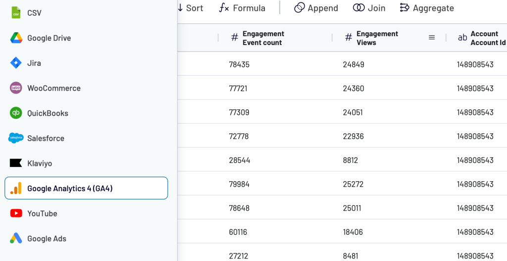
For dynamic reporting that runs without manual intervention, use Coupler.io. It lets you create self-refreshing reports from data automatically extracted from 60+ business apps and sources, such as:
- Ad platforms: Google Ads, Microsoft Advertising, Meta Ads, and others.
- Social media: Facebook, Instagram, LinkedIn, YouTube, TikTok, etc.
- Marketing analytics tools: GA4, Google Search Console, and the like.
- Email marketing platforms: Klaviyo and Mailchimp.
- CRMs: Pipedrive, HubSpot, Salesforce, and Intercom.
- Accounting and billing systems: QuickBooks, Xero, and Stripe.
- Ecommerce platforms: Shopify and WooCommerce.
- Workflow management tools: Jira, Airtable, and so on.
- Cloud storage: Google Drive, Dropbox, and OneDrive.
- Spreadsheets, databases, JSON files, CSV URLs, and more.
Once extracted from your sources, preview the data to ensure it meets your reporting needs. If necessary, adjust it: rename, rearrange, or hide columns, sort or filter data, combine it across multiple sources, and more – which we’ll cover later in the article.
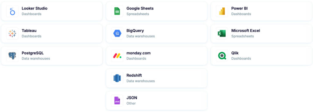
After the report is ready, Coupler.io pulls it to a destination: spreadsheet (Google Sheets, Excel), BI tool (Looker Studio, Power BI, Tableau, Qlik), database (BigQuery, Redshift, PostgreSQL), or other.
With report scheduling, your data will automatically refresh at your selected interval and stay synced with the latest changes in the source.
Benefits of reporting automation with Coupler.io
By using Coupler.io to automate your data reporting, you’ll gain the following benefits:
- Time savings: When the process is automated, you save a significant amount of time because you don’t need to collect ever-changing data across multiple sources to update your reports manually.
- Continuous monitoring: With auto-updated reports, you always have access to the latest data and can closely monitor projects or processes in near-real time.
- Regularity: Automation allows you to optimize your reporting and perform it regularly without any manual work.
- Efficient data management: By automating your reporting, you’ll effortlessly collect data across your company and bring it to one place for analysis. This enables you to actually use the data you accumulate on a daily basis.
Get started with Coupler.io to discover how it can benefit your unique case and fully automate your reporting!
Key data reporting methods
There are various methods of organizing data for reporting purposes, which result in building different types of reports. Which method to choose depends, first of all, on the goal of the report, its audience, and the type of data you need to present. Let’s explore the main methods.
| Data representation method | Description |
|---|---|
| Tabular report | Information in such a report is presented in the form of a table. This is a handy format to organize large amounts of numerical data, for example, in financial reports. Tabular reports are often created in spreadsheets, although other options are also possible. |
| Narrative report | This mainly consists of textual descriptions containing detailed analyses of a specific topic and explanations of the key findings and takeaways. Narrative reports are common for academic research, market research, and so on. |
| Graphical report | Such reports are the opposite of narrative ones – they mostly contain visual elements and include little text. Information is typically presented with graphs, scorecards, and charts (such as bar, pie, donut, Gantt charts, and so on). This is useful when you have a lot of various data types to present. |
| Dashboard | Dashboards are similar to graphical reports as they include a variety of visual elements. Besides graphs and charts, they can also contain tables, scorecards, etc. Dashboards are typically interactive and often self-updating, which allows you to monitor data in real-time. |
| Infographics | Infographics are similar to graphical reports as they also represent data, mostly with visual elements. The difference is that infographics are not limited to using charts or graphs and often include illustrations, icons, roadmaps, etc. This requires the work of a designer, so such reports are often visually compelling. You can also make infographics in PowerPoint, which is a more accessible way to design such reports. |
In addition to this, regardless of the data representation type, reports can be:
- Static. As the name suggests, data in static reports does not change and cannot be manipulated. Once it’s included in a report, it always remains the same.
- Interactive. Such reports allow the reader to work with the data – filter, sort, extract for custom calculations, explore it from different angles, and so on.
- Self-updating. If you create an automated report, the data presented can be updated automatically as the latest information from your sources continuously arrives.
As we’ve already mentioned, this can be applied to any report type – for example, a tabular report can be static, or it can be interactive and/or self-updating, depending on how it’s built.
How do you organize your data for reporting?
You’ve previously learned how to build reports with Coupler.io. Now, we’ll drill down into specific ways to organize your data throughout this process and customize the report for your needs:
- Filter your data to export only the information narrowed down by your required parameters.
- Create custom metrics using formulas to tailor reports to particular KPIs, ensuring the data presented is relevant to your analysis or decision-making.
- Get an overall view of data through aggregation to organize your data into a more analyzable form and reveal key insights from it.
- Combine multiple datasets to bring together various data types or records from several accounts within the same source, or to extract them from different sources. ?
Filter your data
Imagine you’re a SaaS company and need to track only the landing pages that lead website visitors to sign up for your product. Once you’ve extracted the Google Analytics 4 data and reached the preview, you can filter it by event, as shown in the example below.
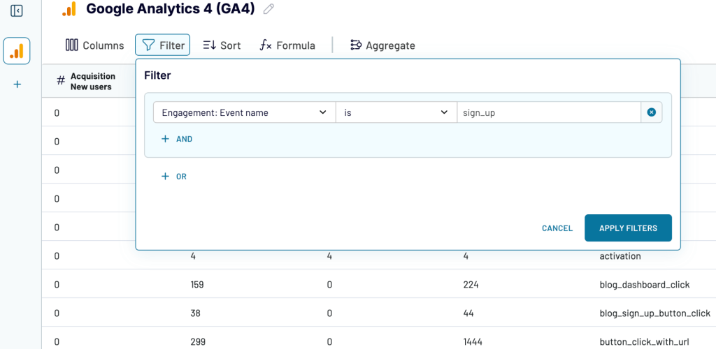
As a result, Coupler.io will return only the data on landing pages that brought new customer signups to your business.
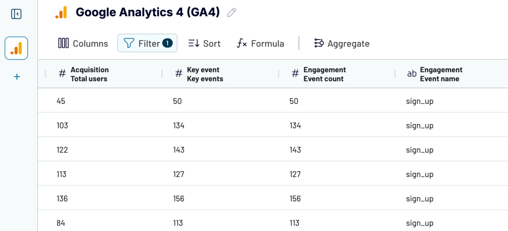
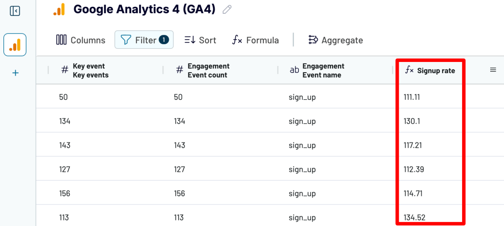
Create custom metrics using formulas
It’s common to need metrics that aren’t natively available in Google Analytics. Suppose you want to calculate the signup rate for landing pages on your SaaS website. If so, you can do this with Coupler.io using the Key events and Total users metrics.
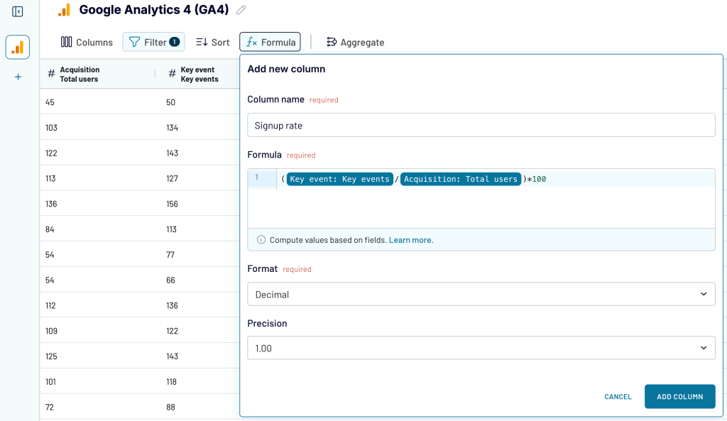
Now you’ll have a column with your signup metric added to your report.
Get an overall view of data through aggregation
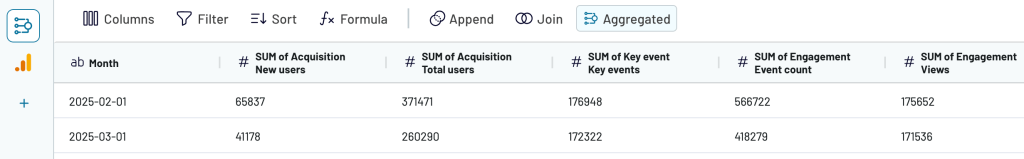
Coupler.io allows you to aggregate data using operations like sum, avg., count, min., or max. For example, consider that you need to sum up the numbers for your Google Analytics metrics per month rather than view individual figures for each date. In that case, you can create a custom Month metric and then sum up the numbers for each month via the Aggregation feature.
To create a Month metric, use the following formula:
DATETIME_FORMAT(START_OF_TIME({Dimension}, "MONTH"), "YYYY-MM-DD")
Here’s what it will look in Coupler.io:
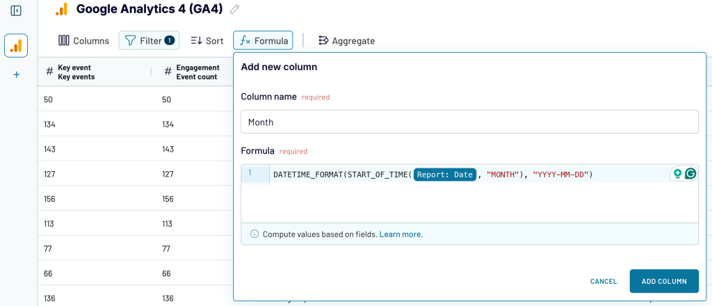
Add this custom column and then proceed to aggregate. In the new window, specify Month as the dimension and select the metrics you need to sum up.
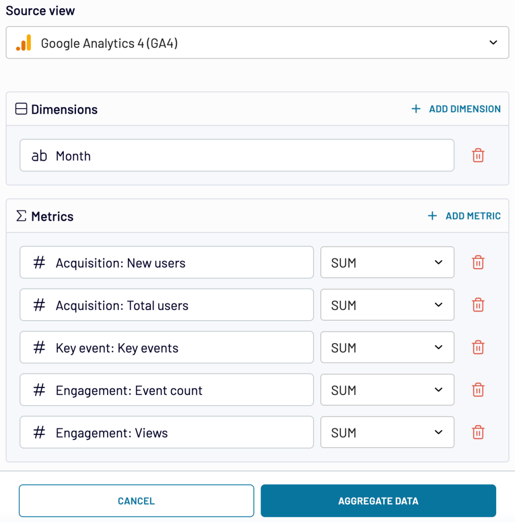
Aggregate your data and view the total amounts for each selected metric per month.
Combine multiple datasets
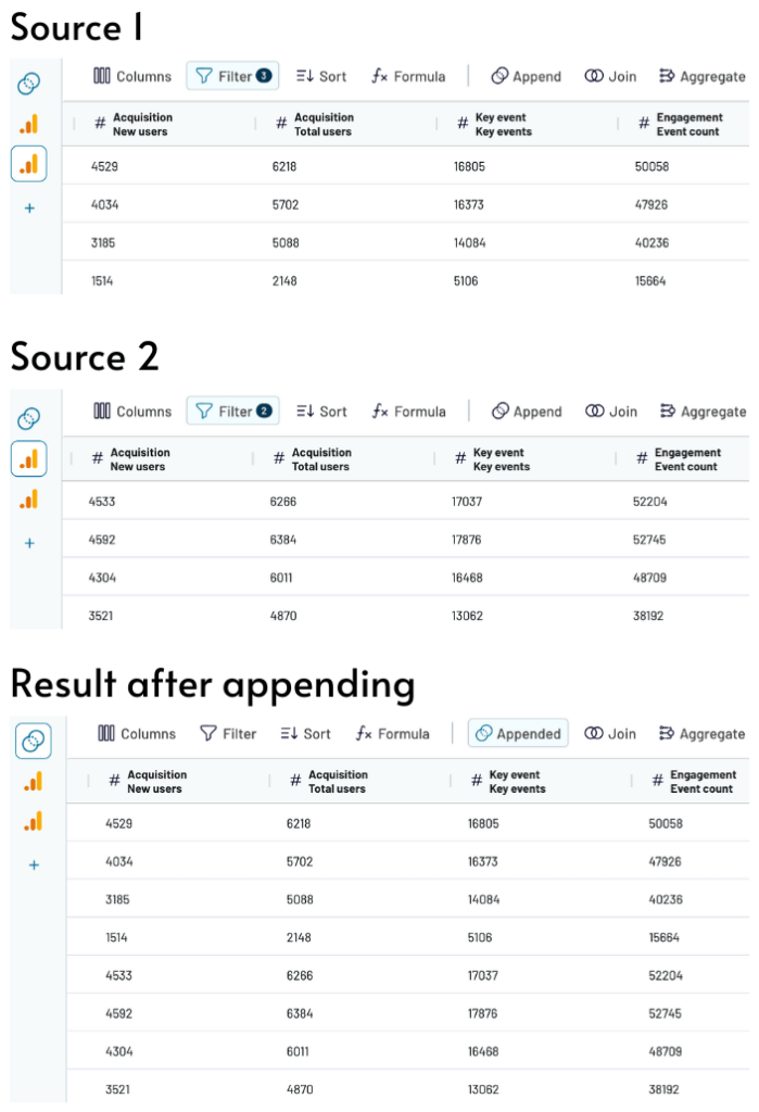
Coupler.io allows you to blend your data using one of two modes – Append or Join.
Append merges datasets by adding all possible columns and rows, and matching columns with the same name. Suppose you need to combine Google Analytics data from different accounts. If so, this mode will place the rows from columns shared by both datasets into unified columns under the same headers.
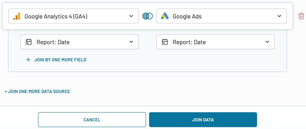
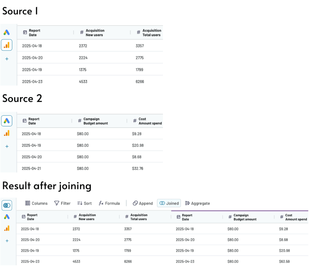
Join combines two datasets by aligning rows based on at least one shared column. Let’s say you’re blending data from GA4 and Google Ads. In that case, you’ll need to specify the columns with similar information shared by both datasets (not necessarily with the same name) – like in the example below.
Coupler.io will then keep the columns from the left (GA4) dataset unchanged and place the columns from the other dataset (Google Ads) to the right, including only rows that match the left dataset by date.
Real-life data reporting examples
Now, let’s take a look at some real-life examples of data reporting. In this section, we’ll focus mainly on dashboards, as this is arguably one of the most useful reporting types for business needs. This type of visualization allows you to present data in the most concise and actionable way. It’s also a perfect format for monitoring performance and KPI tracking progress.
Coupler.io offers a dashboard gallery with templates for reports on marketing, sales, finance, ecommerce, and more. These templates come with built-in Coupler.io data connectors. Therefore, the data is automatically loaded into the dashboard and visualized.
All-in-one marketing dashboard
This dashboard provides an overview of your marketing efforts across multiple channels. It’s perfect for omnichannel reporting, covering paid ads, organic search, social media, and email campaigns – all in a single interface.
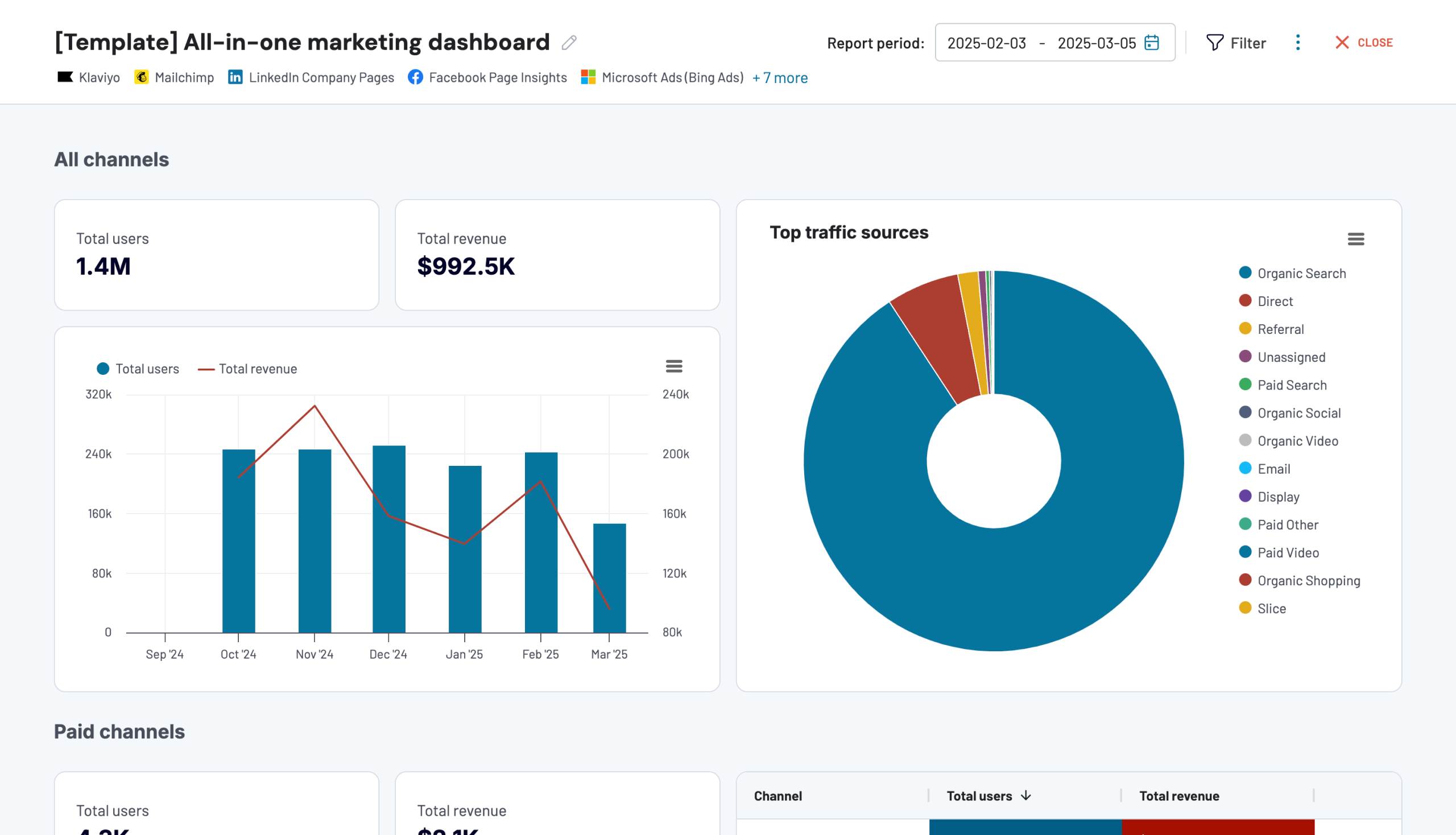
What you can do with this dashboard:
- Get a high-level view of performance across all your marketing channels, and see how each one contributes to your overall traffic.
- Track your paid ad campaigns using key metrics like amount spent, cost per click (CPC), click-through rate (CTR), and others.
- Analyze organic traffic, including impressions, clicks, and average position based on data from Google Search Console.
- Break down your social media channel data in detail. Look at impressions and page views across all of the socials or focus on specific platforms.
- Reveal the results of the email marketing campaigns based on Klaviyo and Mailchimp data. Highlight metrics like emails delivered, open rates, bounces, unsubscribes, etc.
The report is available in Coupler.io and as a template in Looker Studio. To set up the Looker Studio dashboard, go to the template’s Readme tab and follow the provided instructions.
Customer acquisition dashboard for Pipedrive and HubSpot
With the customer acquisition dashboard, you can monitor and optimize your lead generation funnel, track trends over time, and compare platform performance. It integrates Pipedrive and HubSpot data with metrics from Google Analytics 4 (GA4) and various ad platforms.
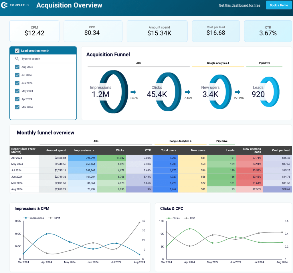
What you can do with this dashboard:
- ?heck the impressions and clicks your ads generate, the number of users visiting your website, and the leads entering your Pipedrive/HubSpot.
- Monitor monthly changes in your funnel to find correlations with marketing and lead generation activities.
- Identify your best-performing months and analyze the cross-channel marketing campaigns or activities that led to higher results to replicate success in the future.
- Quickly compare your spending on different platforms with conversion rates during the same period.
The dashboard has two versions: one for Pipedrive and the other for HubSpot, both available in Looker Studio. To get started, navigate to the Readme tab in your chosen version and follow the setup guide.
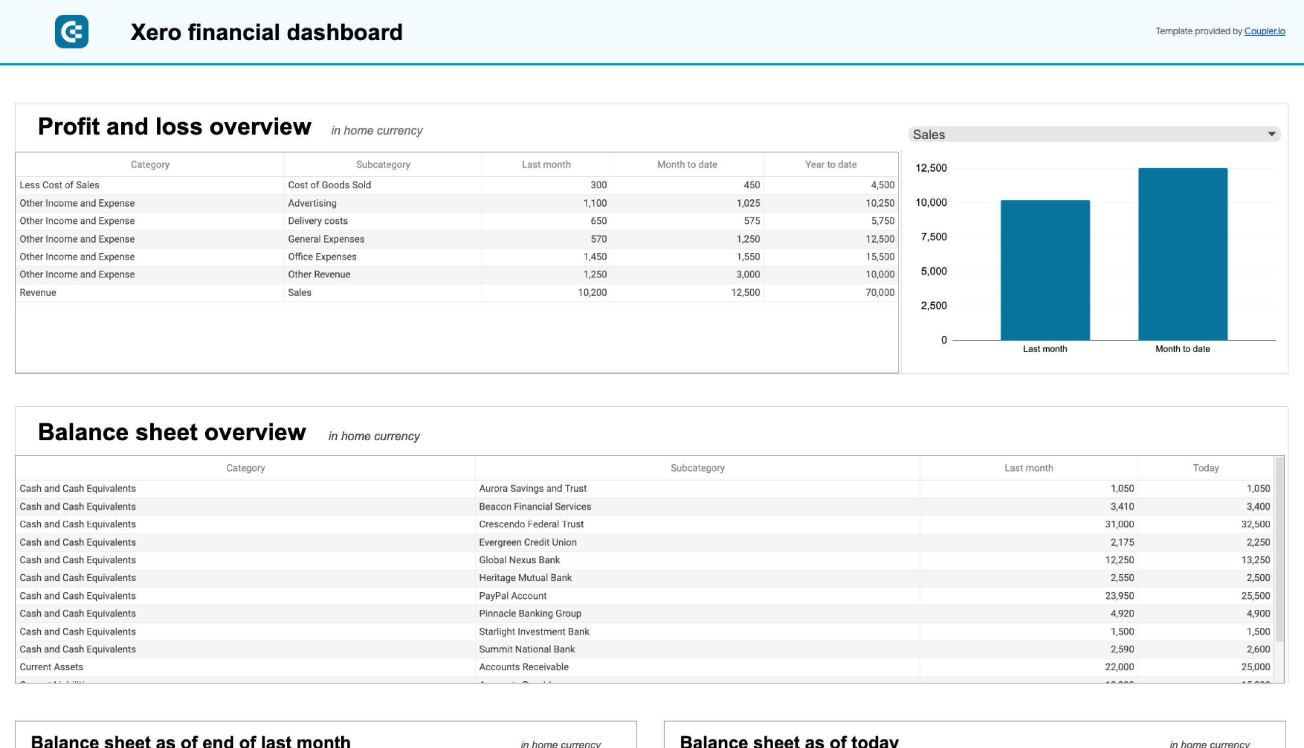
Financial dashboard for QuickBooks and Xero
The financial dashboard lets you track your earnings, cash flow, and balance sheet changes. It gives you an at-a-glance understanding of financial health without diving into detailed spreadsheets or reports.
What you can do with this dashboard:
- Get a summary of the company’s revenue, expenses, and net income for the last month, month to date, and year to date to monitor profitability and control your costs.
- Take a snapshot of your assets, liabilities, and equity to understand your company’s financial position, liquidity, and business health.
- Look at net cash changes over the reporting period to see how your cash position evolves and ensure effective liquidity management.
- Go over your available funds and list balances for all linked bank and cash accounts to help you verify that all accounts are reconciled.
This dashboard is available for QuickBooks and Xero. Here are the versions for Xero:
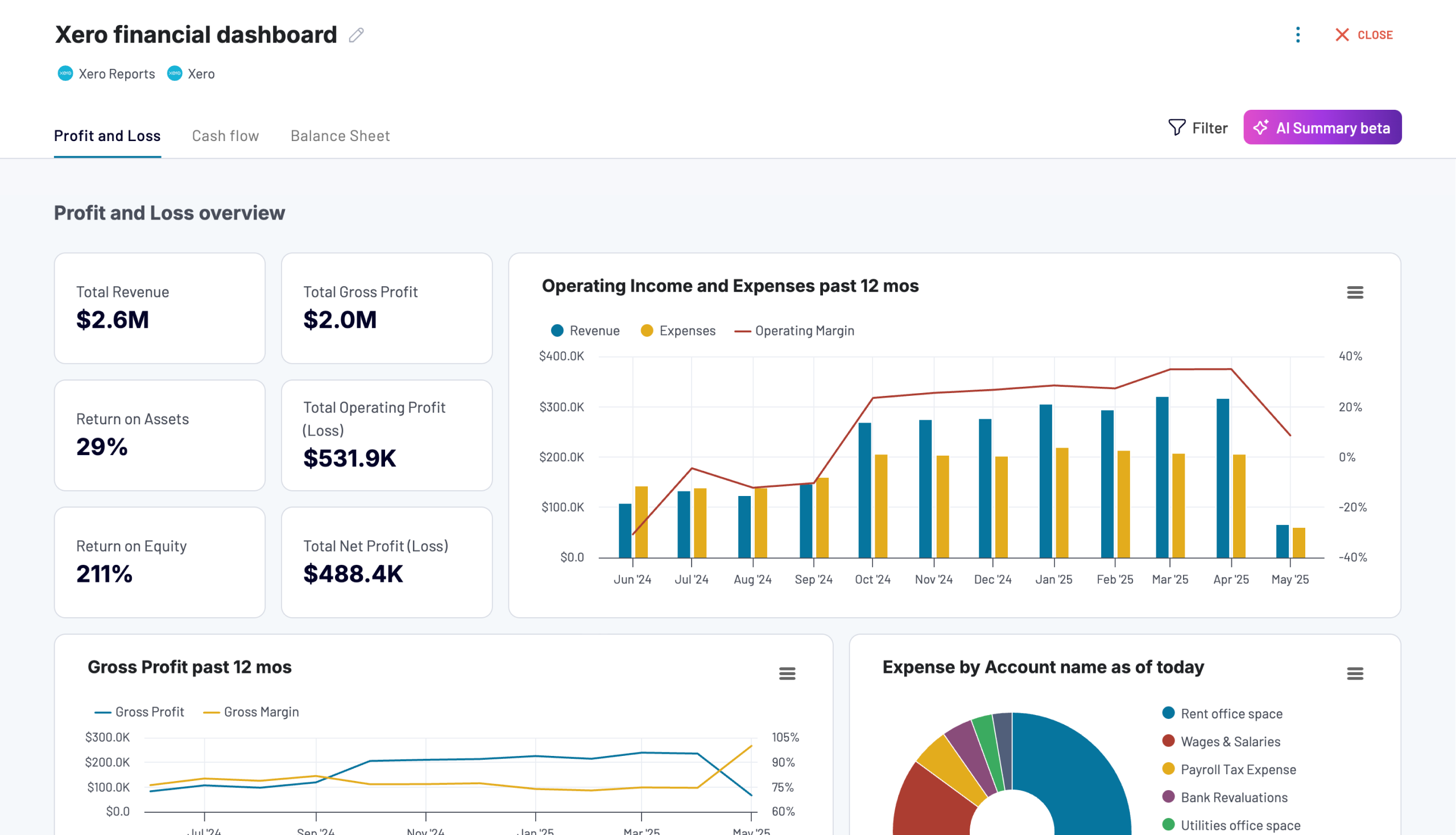
Xero financial dashboard
Get comprehensive financial insights from your Xero account with key performance metrics, balance sheet analysis, and cash flow projections. Quickly assess your business health and make informed financial decisions.


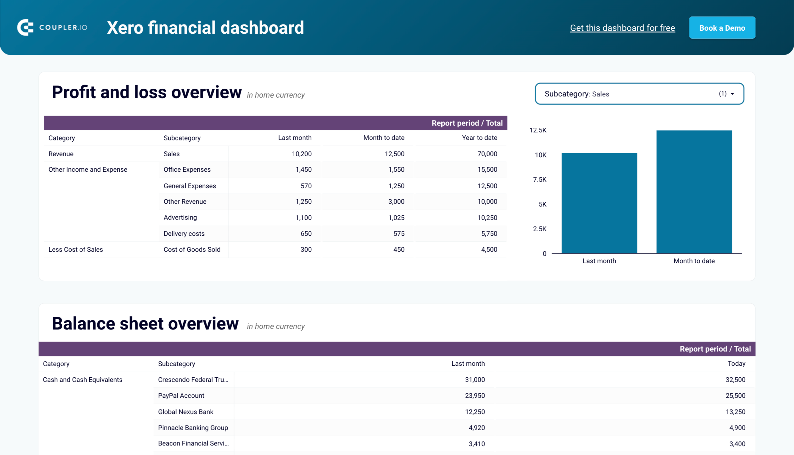
Xero financial dashboard in Looker Studio
Analyze your financial performance with a unified dashboard featuring key reports from Xero like cash flow, profit and loss, balance sheet, and others.

Xero financial dashboard in Google Sheets
Get instant visibility into your company’s financial health through key performance reports from Xero such as cash flow, income statement, and balance sheet.

Here are the versions available for QuickBooks:
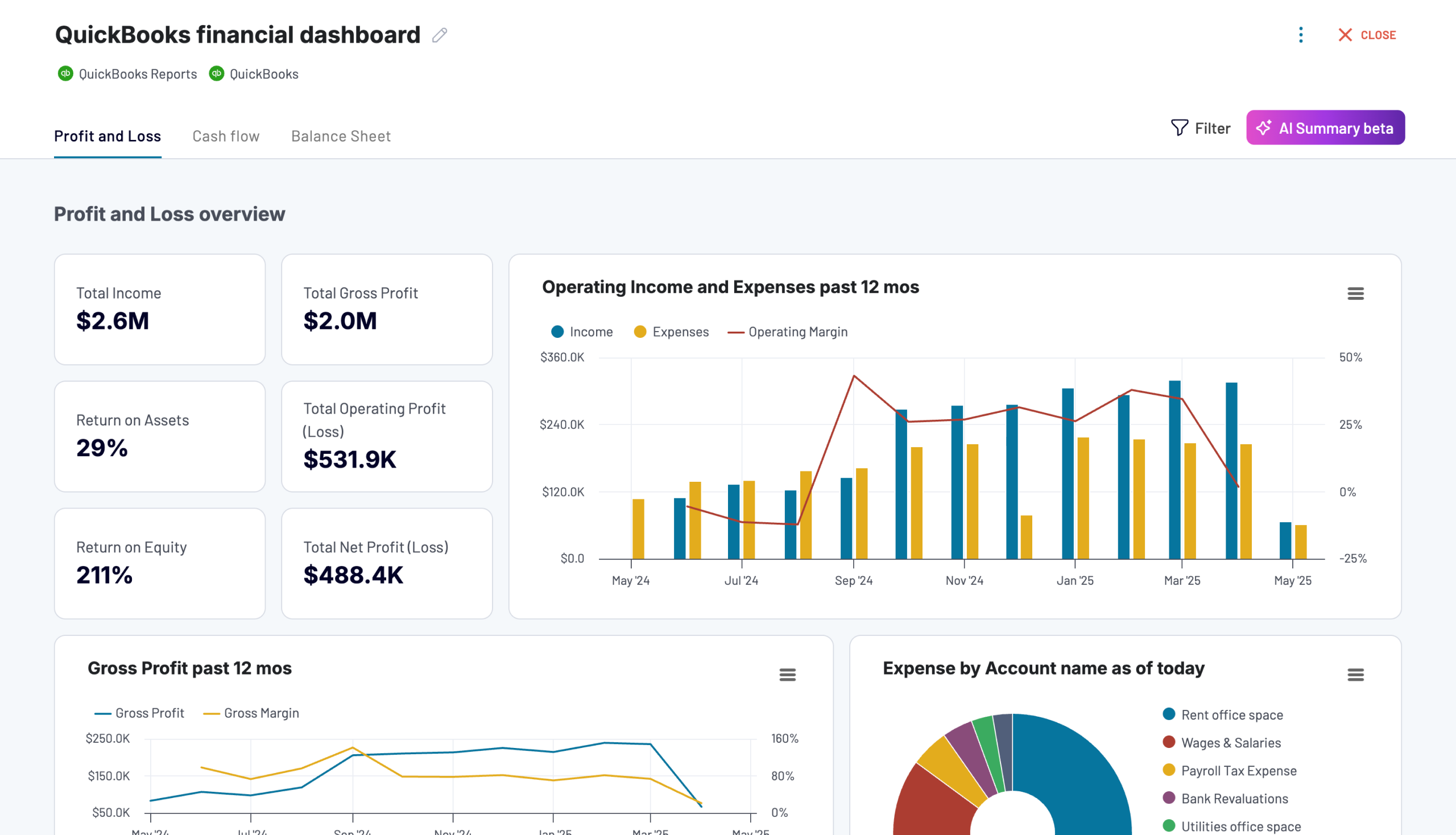
QuickBooks financial dashboard
Tracks earnings, monitor cash flow, and analyze balance sheet changes with a dedicated dashboard that provides a clear picture of your business finances.

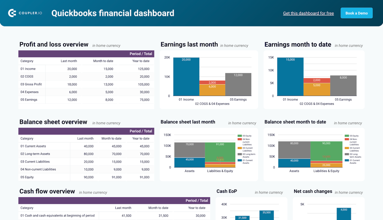
QuickBooks financial dashboard in Looker Studio
Monitor and analyze your business’s financial health with real-time insights into profit and loss, balance sheet, cash flow, and bank & cash accounts.
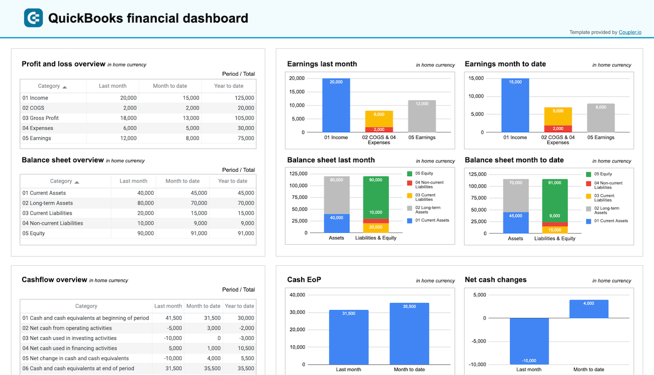
QuickBooks financial dashboard in Google Sheets
Get a clear snapshot of your business finances, including cash flow, P&L, balance sheets, and bank accounts, powered by data from QuickBooks Online.
Shopify orders dashboard
The Shopify orders dashboard allows you to access the performance of your Shopify store and provides insights into your sales pipeline, so you can keep track of your orders and sales.
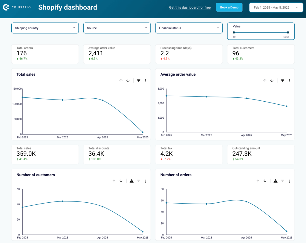
What you can do with this dashboard:
- Explore breakdown statistics by country to make decisions about shipping.
- Find a correlation between blocked purchases and geography or between blocked orders and specific products.
- Check cheap or expensive orders to find dependencies like country, number of orders, status, total revenue from different price batches, etc.
- Analyze the distribution of sales, revenues, and customers by new or returning customers.
The dashboard is available in Looker Studio and Google Sheets. Set up your preferred version by following the steps described in the template’s Readme tab.
Try Coupler.io dashboards for free and have your data transformed into actionable insights! Also, check out our article on Google Sheets dashboards for more examples.
If you, however, need help with creating a tailored dashboard solution, you can turn to Coupler.io’s data analytics consultancy services.
Talk to Coupler.io data experts
Book a callData reporting best practices
Now, let’s explore some of the best practices that can help you improve data reporting and make it more effective.
Focus on the audience
When you are planning to work on a report, it’s best to begin with the analysis of the audience and their goals. Then, you can structure your report according to what your audience needs. For example, C-level executives will likely be interested in a high-level overview of your project, while people working on your team might need much more detailed information to see how things are going and what needs to be adjusted. Asking for feedback is also a great way to learn what the target group might need and how to improve your reporting.
Automate your reporting
The process of collecting information and updating your regular reports might be tedious and time-consuming when performed manually. With automation, the speed, efficiency, and quality rapidly increase. As digital transformation gains momentum, businesses that fail to implement automation will fall behind their competitors who leverage it successfully. Using automation for reporting data can be quite simple and affordable, so this option is worth considering, regardless of the scale of your business. Coupler.io allows you to easily automate the reporting process by providing an all-in-one solution that requires zero technical skills.
Visualize your data
Arranging your data into a visual story is a very effective approach. It helps your audience quickly understand what the main correlations are, grasp the gist at a glance, and focus on what matters most. Various graphs, charts, tables, and dashboards make working with data easier and improve collaboration. It’s even better if you make these visualizations interactive to enable filtering data and zooming into particular details.
Make it a regular activity
Of course, reporting data is valuable even if you only do it from time to time. But if you want to make your organization data-driven, you will need a solid basis for informed decisions. Data that is incomplete or simply not fresh enough may result in giving a distorted picture and lead to wrong or untimely decisions. If the process of collecting and analyzing data is regular or, better yet, continuous, this will provide decision-makers with the ultimate transparency they need to gain actionable insights.
Use templates
Even though you might need to prepare custom reports for some purposes, many can be standardized. Ready-to-use templates let you save time and implement a unified approach across the organization. This improves collaboration and helps keep everyone on the same page. You can use Coupler.io’s white-label dashboard templates or create a set of custom ones in-house.
Select meaningful data
Even if everything about your project seems worthy of attention, there’s no need to include all the data you have. As we’ve already mentioned, you should consider the needs of your audience. What decisions do they need to make after reading your report? What information might they need for this? Answering these questions will help you select relevant metrics and make your report concise, clear, and effective.
How to improve data reporting?
The tips, best practices, and examples provided in this article can help you optimize data reporting in your organization. One of the main takeaways is that automation and data visualization are important parts of this process. So, if you want to improve it, use graphical reports, build dashboards, and make them self-updating through automation. This will ensure timely access to fresh and accurate insights, which are necessary to enable data-driven decisions.
Another way to improve your reporting is to ask for feedback from the audience whose needs it must meet. This can inspire valuable ideas on how to make your reports more helpful and meaningful.
One more option is to use ready-made report templates.
For more information on data visualization, check our articles about SEO dashboards and CRM dashboard examples.
Automate reporting with Coupler.io
Get started for free