Understanding ecommerce reporting
Ecommerce sales has been growing annually and reached an estimated $5.8 trillion in 2023.
Analytics plays an important part in generating such growth. In fact, leading ecommerce companies leverage data and analytics to gain a competitive edge.
These businesses collect data about visitors, which includes page visits, marketing channels, user behaviors, product views, and promotions used. Other pertinent information includes order value, product price, shipping method, payment info, and customer data.
Ecommerce reporting goes next.
All of that collected data is presented in an easy-to-digest way through visualization with charts, graphs, or in more detailed information such as a data table containing individual transactions. These deliverables can be used to guide storytelling with the data to help ecommerce businesses figure out their performance.
What is an ecommerce report?
In short, an ecommerce report is a data presentation highlighting various insights about your ecommerce business.
It helps you gain an overall understanding of your online store, including your products, orders, customers, and more. This powerful tool allows you to identify any potential weaknesses and capitalize on any growth opportunities effectively.
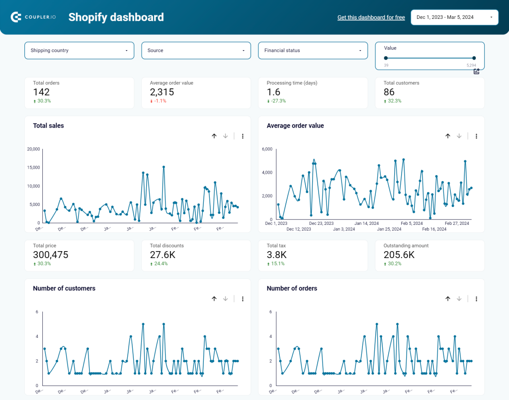
An accurate and well-designed ecommerce report is a valuable asset providing greater visibility — helping you make crucial decisions. Here is an example of a Shopify ecommerce report.
The importance of ecommerce reports
So, what makes ecommerce reports important?
Well, generally speaking, they provide information you need to know about your online business that can help in improving future decisions.
In more detail, here are some important points that can be discovered through ecommerce reporting:
- Comparison. You can compare data to find similarities and differences. For example, you can compare data across time periods or compare two metrics side by side in a report.
- Relationship. You can see how data is connected or could be connected. For example, with reports, you can understand if the number of page views is related to conversion rates.
- Distribution. It shows how often something happens in a group of data points. We can look at distributions across one, two, or three dimensions. For example, we might look at lifetime value by city by customer.
- Composition. It shows the elements or pieces that make up a whole. For example, the composition of your generated revenue might be from 38% paid search and 62% organic search.
What should be included in an ecommerce report?
An ecommerce report tells you important things about your ecommerce business. These include:
- Metrics and key performance indicators (KPIs) relevant to your business. Some examples include cost per acquisition, revenue, customers, visits, conversion rate, and average order value. We’ll focus on this part in detail in the next section.
- The conversion funnel. It helps to show how many people follow a linear path that leads to buying something.
- Abandoned cart data. It helps to figure out what items people are leaving behind when shopping. Helpful measurements include abandoned cart rate and revenue.
- Lists of frequency, rank order, or popularity. For example, you can see the top products and marketing channels, revenue per user, conversion rate, and average lifetime value per user.
KPIs to track in your ecommerce analytics reports
The list of possible KPIs is large.
It’s hard to recommend which ones are the best for your business because they should help you reach your goals.
Of course, there are a few shared goals across all ecommerce businesses: conversion rates, gross profit, cost and revenue-per metrics, and other useful measurements.
Now, let’s talk about some of the KPIs below.
Page or screen views
The “page views” metric measures how many times a page is seen by a user. This metric helps you understand how popular a page is on your ecommerce site.
You can use this metric to see if changes to the page lead to more visits or less.
Its derivative KPI, called page views per session or per user, tracks how many pages people view in one visit, which is a useful way to indicate how engaging the content on your site is.
Bounce rate
The bounce rate tells you the percentage of people who came to your website and then left without doing anything.
Google Analytics 4 defines the bounce rate as the percentage of visits that were not in engaged sessions. An “engaged session” is a visit that lasts 10 seconds or longer, has one or more conversion events, or has two or more page views. So, if someone views your page for more than 10 seconds and then leaves, the session does not count as a bounce.
Different tools might have different definitions.
However, the basic principle is the same: bounce rate is a way to measure visit quality. A high bounce rate generally means that the site page isn’t relevant to the visitors.
Visits or sessions
A session starts when you visit a website or open a mobile app.
Sessions vary in length depending on the company’s data definition. Most commonly, a session automatically ends after 30 minutes of inactivity. Information about sessions can help you create more engaging experiences and increase conversions.
Revenue
Revenue is the money collected from customers when they purchase things or services from you during a given time frame.
This metric shows the results of all your efforts—from website operations, marketing, analytics, conversion optimization, and so on. Thus, knowing the accurate amount of revenue you make is an important goal. You’ll also need to consider the third party’s payment processing states of approval (such as authorized, charged, approved, settled, etc.) when defining revenue.
Ensure you have consistent definitions across all selling channels.
Gross profit margin
This metric shows the amount and percentage of money that remains after you subtract the cost of the things you sell (COGS) from the revenue.
This metric, or another “margin” metric such as net profit margin, can be important enough to track how your business is doing financially.
Things like sales, discounts, and promotions can impact gross margin, so it’s important to analyze it carefully.
Abandoned cart rate
Abandoned carts occur when a user adds items to their cart but does not buy them. This is one common frustrating issue in ecommerce.
The average rate for an ecommerce website is nearly 70 percent. The rate tends to be higher for small screens.
Reasons for cart abandonment can include unexpected shipping costs, website errors, a complex checkout process, a declined card, and customers not being ready to buy.
Conversion rate
Conversion rate refers to the percentage of visitors who take an action on your website. This action can be anything that you think is valuable.
Many different types of conversion rates allow you to gain specific insights. Here are some common examples:
- Sales conversion rates
- Lead generation conversion rates
- Click-through rates
There are different ways to measure conversion rate, like based on visits, unique visitors, or customers. However, most people use visit conversion due to technical and conceptual challenges.
Understanding this metric will give you an insight into how well your marketing and sales strategies work, and whether their operations are aligned.
Cost per Customer Acquisition (CAC)
This metric shows how much money it takes to generate a new customer.
To calculate CAC, divide the total money spent on marketing and sales by the number of customers acquired.
Knowing CAC is important, as it can help plan and allocate marketing budgets appropriately. If CAC increases too much, your profits could decrease despite making more sales.
Average Order Value (AOV)
The AOV is an essential ecommerce metric that measures the average amount spent by customers per order.
AOV is calculated by dividing the total revenue by the total number of orders in a particular time frame.
Ideally, a high AOV number means that your business is doing well and making money.
Lifetime Value
Lifetime Value (LTV) shows the predicted value (usually revenue and net profit) that your customers will spend over the expected duration of their relationship with your ecommerce website.
This metric is referred to as Customer Lifetime Value (CLV or CLTV) for an individual customer. Calculating lifetime value helps you understand how much you can invest in retaining the customer so as to achieve a maximal return.
How to create dynamic ecommerce reports to drive strategies
There are three ways to build an ecommerce report:
- Build a report from scratch using a reporting automation tool
- Use a customizable template for ecommerce reporting
- Order a custom ecommerce reporting solution from a data analytics service
Make an ecommerce report from scratch
To build an automated ecommerce report, you need to complete three steps:
- Collect data
- Organize data
- Visualize data
Let’s see how you can do this using Coupler.io, a reporting automation solution.
1. Collect data
Select your data source and the preferred destination in the form below. Then, click Proceed. For example, you can choose Shopify as a source, and Looker Studio as a destination.
You’ll be prompted to create a Coupler.io account for free.
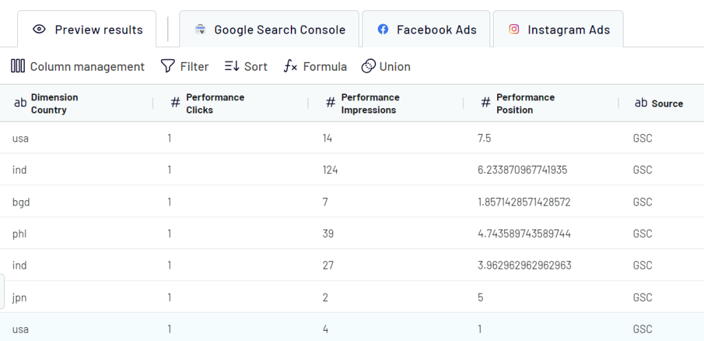
Then you’ll need to connect your source application account and choose the data to export. Depending on the source, this can be reports, raw data categories, metrics, queries, etc. This is the answer to the question of how to export data from Google My Business and other sources.
2. Organize data
At the next step, you can preview and transform the data to make it analysis-ready:
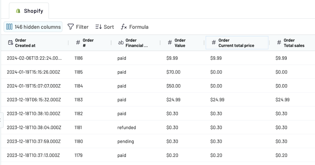
- Rename, reorder, hide, or edit columns
- Filter and sort the data
- Add new columns using calculations and formulas
- Combine data from several accounts or data sources into one dataset
As a result, you can send a clean, analysis-ready dataset to the data viz tool. Well-organized data will be easier to visualize and work with.
3. Visualize data
Follow the in-app instructions to load your data to the selected BI tool. After that, you can visualize the data using charts, graphs, pivot tables, scorecards, and so on. We recently blogged about how to visualize data in Looker Studio, so check it out.
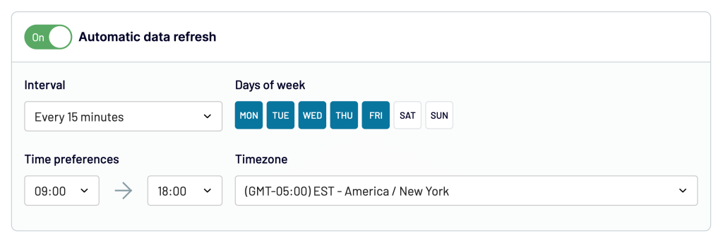
4. Automate your ecommerce report
This is a bonus step that we did not mention above. It’s needed to make your ecommerce report live. Coupler.io allows you to enable automatic updates on a custom schedule. Toggle on Automatic data refresh and specify how frequently you want to have your data refreshed.
Coupler.io supports also apps that are used in ecommerce. For instance, you can export Amazon Ads data and create a report.
Build an ecommerce report using templates
Templates are supposed to significantly simplify your reporting since they provide you with a ready-to-use report. Let’s explore how to create a Shopify ecommerce report in just 3 minutes with the help of a template by Coupler.io.
- Click here to create a Coupler.io account for free and importer for your ecommerce data. Then connect your Shopify account.
- In the next step, you can preview your data. This module allows you to transform and organize data. But, as you are using a template, no transformations are needed here – everything is already pre-configured.
- Then, follow the in-app instructions to load your Shopify data to the predesigned ecommerce report in Looker Studio.
The automatic data refresh is enabled by default. Coupler.io will keep sending fresh data from Shopify to your dashboard every day. You can change the schedule to your liking.
Order a custom ecommerce reporting solution from a data analytics service
The end-to-end data integration process might be complex to manage on your own. Especially, if after that you need to create advanced and custom ecommerce reporting using a visualization tool such as Looker Studio, Power BI, or Tableau. In this case, hiring a data analytics consulting service may be the best option for you.
Coupler.io offers a data analytics consulting service that handles advanced data management cases, such as data automation, custom reporting, data visualization, and everything related to helping you with your data tasks. Many successful businesses recommend their services. So, contact our team of experts to start a free call to discuss how they can help you with attaining your business goals.
Types of reports in ecommerce
There are many types of ecommerce reports based on the data and sets of metrics they display.
Many ecommerce platforms such as Shopify, BigCommerce, etc., enable reporting. While the number of reports each of these platforms offers may be different, generally, they provide standard ecommerce reports to successfully monitor your business.
Now, let’s discuss several types of ecommerce reports that may benefit you.
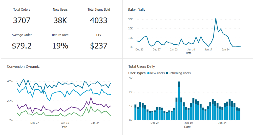
Ecommerce full report (overview dashboard)
This type of report gives you a bird’s-eye view of your ecommerce KPIs in one place. KPI tracking involves monitoring the most important metrics related to your business goals.
An overview report renders a large volume of data, usually from multiple sources, into a meaningful, understandable, and actionable summary.
The following is an ecommerce overview dashboard – an omnichannel reporting example provided by Coupler.io. It features scorecards for goal tracking, line charts for sales and conversion trend tracking, and a stacked bar chart for showing user composition. It contains several financial metrics, which can also be useful for financial reporting and analysis.
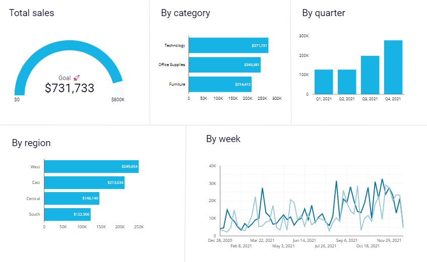
Ecommerce sales report
An ecommerce sales report typically provides insights about the total sales generated by your ecommerce business, including details based on criteria such as sales over time, by product, by region, or by channel.
From this type of report, you might notice that every Friday your ecommerce sales increase to their highest point all week. You might also see which products and marketing channels generated high sales.
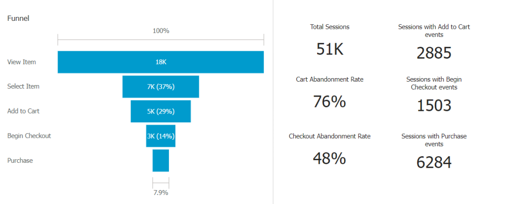
Ecommerce funnel report
This type of report helps you analyze your ecommerce marketing funnel.
It usually includes a funnel chart that displays a graphical illustration of the steps that lead to conversion within an ecommerce experience. A visitor may start viewing a list of products on your ecommerce site > select an item > add it to the Cart > checkout > payment.
The following ecommerce funnel report example shows the steps in a linear path.
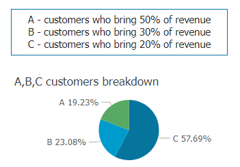
Ecommerce customer report
This type of report helps you analyze your ecommerce customers.
It can be used to answer business questions related to customers, such as how to generate more revenue for existing customers, how to reduce costs for new customers, etc.
Analyzing customer data typically involves segmentation and clustering. See an example visualization of customer breakdown below:
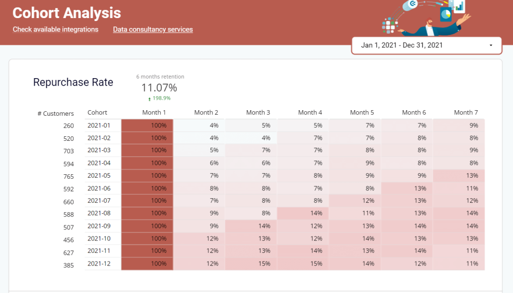
There are special types of customer reports. For example, if you want to better understand customer behavior across time, you can use customer cohort reports—here is an example:
Ecommerce marketing report
This type of report helps you assess the impact of your marketing effort on your ecommerce business. It may show data about your campaigns, email analytics results, social media analytics results, search engine optimization (SEO) results, affiliates, and resellers.
As an example, here’s an ecommerce marketing report that measures activity across all marketing channels:
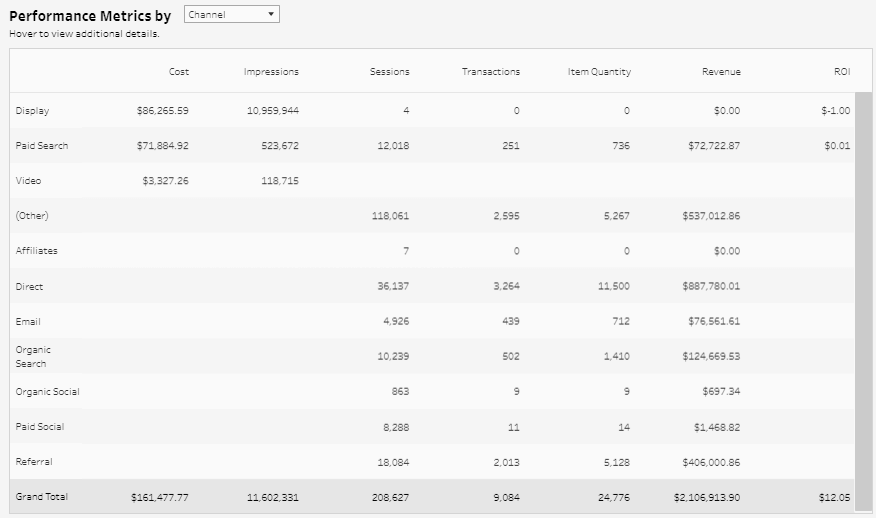
By understanding the data in this report, you can see what marketing channels are best contributing to conversion, then make decisions on how to optimize them to maximize your revenue.
Ecommerce product performance report
Products and orders are the financial core of ecommerce, and this type of report helps you explore these two elements, as they’re highly related.
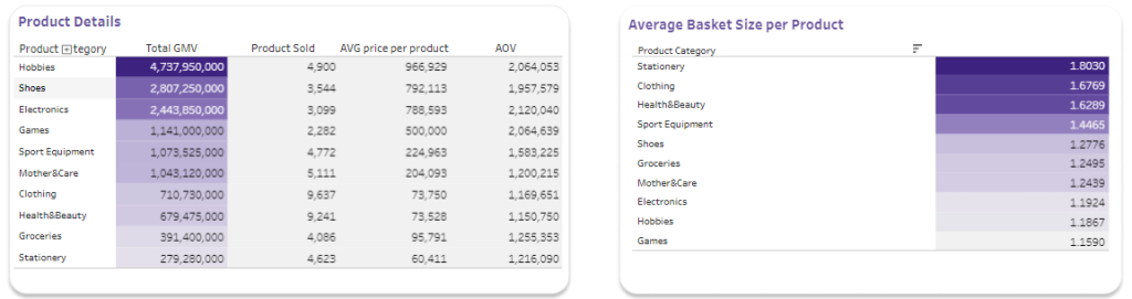
With this type of report, you can do various kinds of analysis by answering questions such as:
- Which products are most frequently included and bought in orders?
- Which product categories drive the highest lifetime value?
- What brands are most popular?
- What brands are bought when other brands are bought at the same time?
- Do products with the highest prices drive the most orders?
- And so on…
Ecommerce carts report
This type of report helps you understand why people are not buying items they had in their shopping carts. It shows what the website might be missing out on.
Here is BigCommerce’s high-level overview cart report as an example:
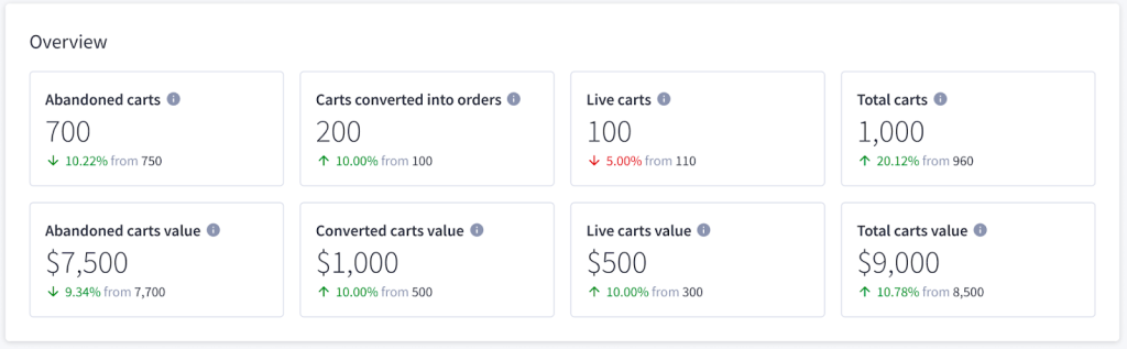
Some helpful metrics displayed in this type of report may include:
- Total abandoned carts
- Total abandoned cart revenue
- Cart abandonment rate
- Top abandoned products, including their abandoned revenue and carts
5 ecommerce reports examples
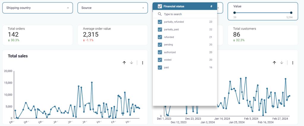
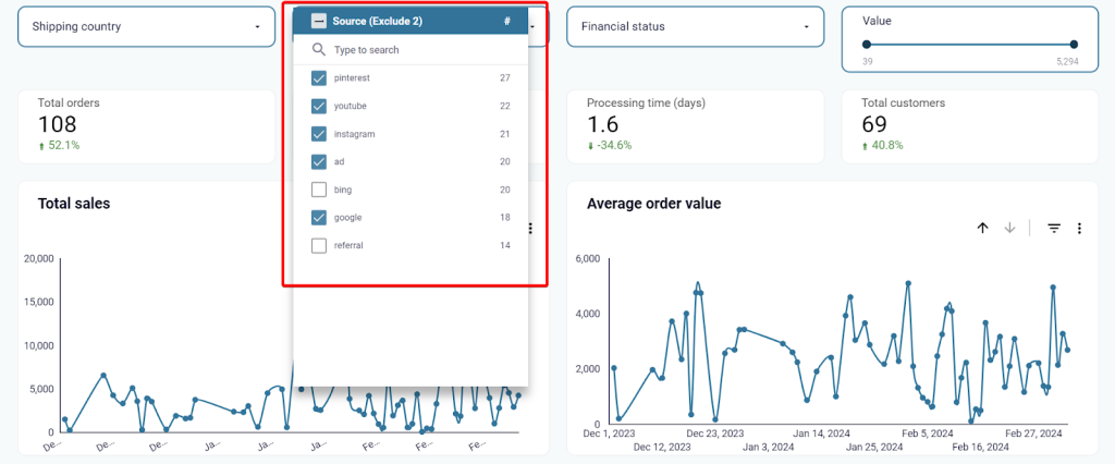
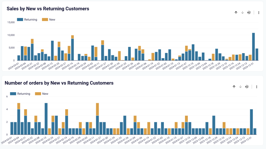
1. Shopify store sales overview (+ free template)
We’ve already introduced the Shopify ecommerce report by Coupler.io. It’s a free template with a built-in Shopify connector. To get started, you only need to connect your Shopify account and load your ecommerce data to the report. It will take less than 3 minutes.
With this ecommerce report, you can:
- Track orders by financial status: pending, voided, refunded, etc. This way you can find correlations between blocked purchases and geography or blocked orders and specific products
- Check each channel’s performance in terms of orders or revenues. This will let you understand what marketing campaigns to scale.
- Track new and returning sales by numbers and money. The report shows the distribution of sales, revenues, and customers by new or returning customers.
- And many more.
Apart from strategic analysis, this dashboard can also be useful for monitoring daily operations. For example, to track orders by financial status, fulfillment status, and cancel reason. It also helps to monitor the purchase history of each customer in your store.
Report metrics
- Total orders: Round-up of orders placed on the store.
- Average order value: The average amount customers spend on each purchase.
- Total sales: Total number of successful purchases
- Total tax: The cumulative tax on every product sold.
- Outstanding amount: The total amount to be realized for pending orders.
2. Ecommerce cohort analysis report
This ecommerce cohort analysis report was created by Capitol Data Analytics. It’s a two-page dashboard that can help to monitor sales performance on your online store.
The Summary report displays values for metrics such as total products sold, total sales value, average price, unique customers, and total orders. You can also view order value by date, product, and type. The total sales for every product are also included.
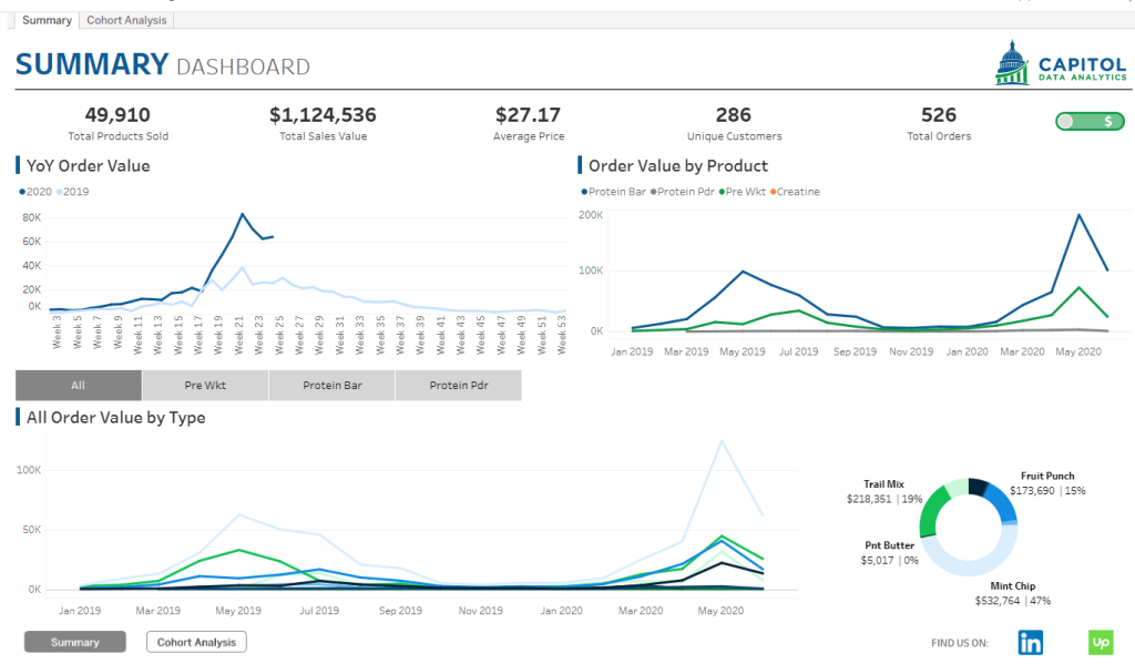
The Cohort Analysis report helps to break down your data into specific groups e.g. new customers recorded in each month. It shows the monthly and yearly purchase value for each customer within a cohort. You can analyze all the products, sales value, and orders sold to each cohort or drill down to focus on each of the products available. This will give you a granular view of your store’s performance.
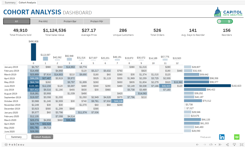
To use this ecommerce report, you can click the download icon and select the file formats (image, PDF, or PowerPoint).
Report metrics
- Total products sold
- Total sales value
- Unique customers
- Average price
3. Product performance analysis report
This is an ecommerce report example that focuses on product performance. It helps to understand how your store is performing by monitoring product sales and revenue dynamics.
This report includes pie charts showing how sales are distributed in each region for every category. Next, you can evaluate the exact sales recorded in the subcategories. Lastly, there’s a profit vs sales comparison graph and the top-selling products in the store.
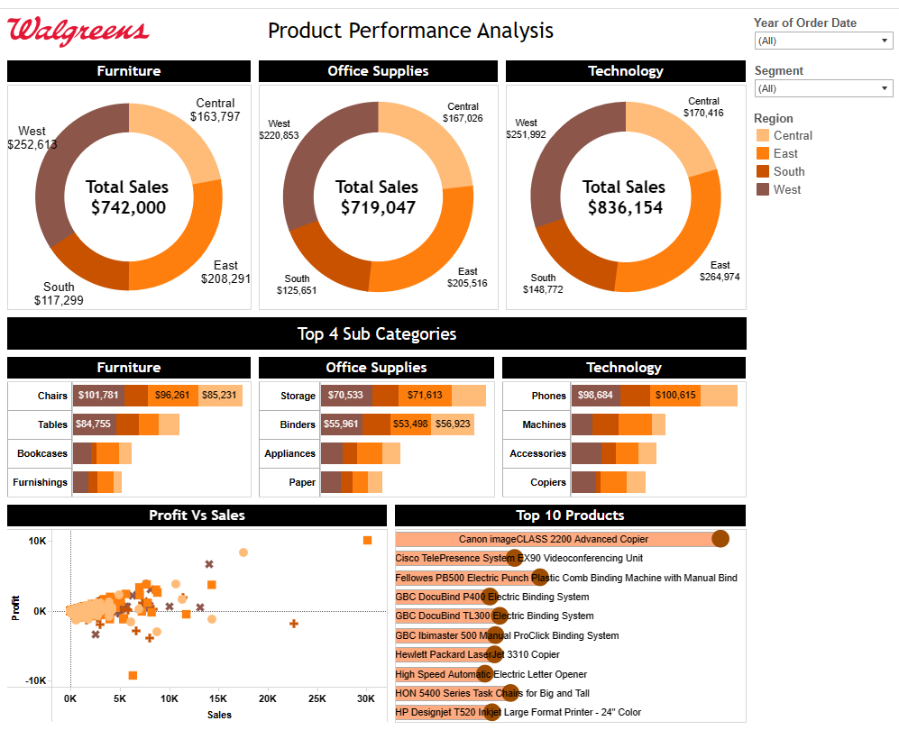
If you don’t have such categories in your ecommerce store, simply edit to fit what you’re selling. To use this dashboard, you can click the export icon and choose any of the available formats.
Report metrics
- Total sales per category: See the total sales amount in each category.
- Profit vs sales: Compare profit vs sales amount on products
- Top 10 products: Best-selling products in the ecommerce store.
4. Customer journey report for Shopify
This is an ecommerce report by Lovelytics for analyzing Shopify data. It provides insights into the customer journey based on the influx of product orders and sales.
It’s a single-page template that includes KPIs such as total sales, total orders, average order value, total customers, one-time customers, repeat customers, lifetime value, repeat rate, and purchase frequency. You can also check out the charts to analyze total sales by month, total sales by province, and purchase analysis.
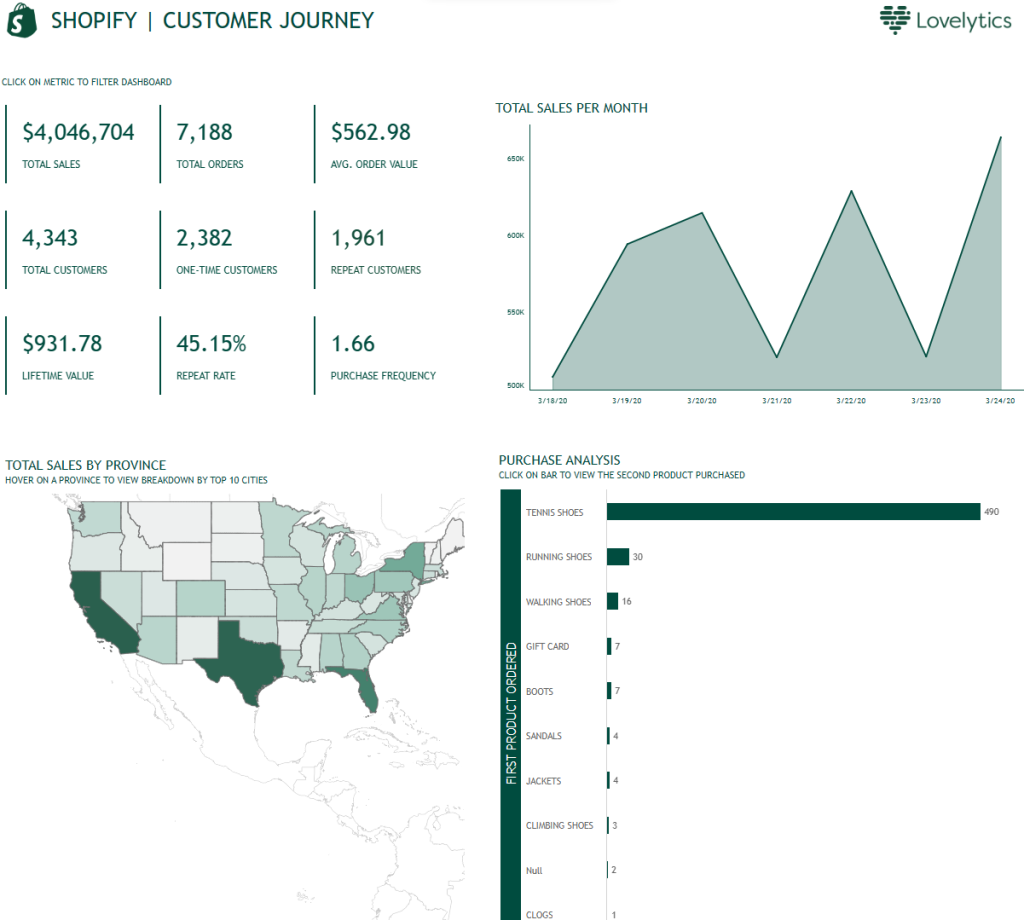
To use this ecommerce dashboard example, you can click the export icon on the report details page to download as an image, crosstab, PDF, PowerPoint, or Tableau workbook.
Report metrics
- Total sales
- Total orders
- Total customers
- One-time customers
- Repeat customers
5. Customer performance report
Here’s another report for ecommerce that helps to analyze customer behavior in an online store. You can learn the type of customers that are contributing towards sales.
On this ecommerce report, you can see the scorecards displaying metrics like total revenue, total customers, and customer average age. Next, it shows the percentage of customers with children and those without children. You can also analyze total revenue by age group, total revenue by customer status, top 5 customers by revenue, and then, you can check out the revenue generated by each gender.
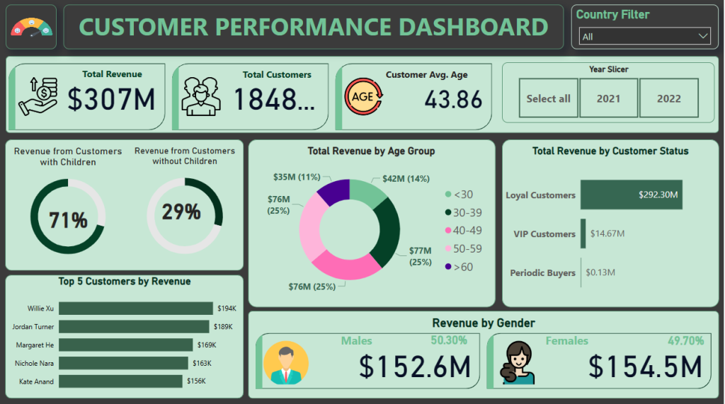
On the report details page, you can download the .pbix file and upload it to Power BI. Then, you can add your own data, tweak some visuals, and analyze your metrics.
The main sales metrics on the dashboard:
- Total revenue
- Total customers
- Customer average age
- Total revenue by age group
How to analyze an ecommerce report
Creating ecommerce dashboards can be a challenge, but analyzing and interpreting the findings can be another difficult task.
So, here we share a few tips to help you with the analysis:
- Define the questions you want to answer
It’s best to start with a general question and then layer in more detailed ones. For example, to analyze behavioral data, you may want to consider this one:
What marketing channels drive the most revenue?
Then, some specific details may interest you:
What is the average time spent by channel?
What is the conversion rate by channel?
Do people who come from particular marketing channels abandon carts at a higher rate?
And so on…
- Understand KPIs or metrics for your analysis
Your analysis is measured by KPIs and other related metrics. So, understanding what measurements you need to analyze is crucial, because they are the means of judging success or failure.
- Understand the “calendar” of your ecommerce analysis
Ecommerce analysis frequently involves comparing data across different time periods. Time series data is common. But unfortunately, comparing time periods in ecommerce may not be an easy thing to do.
You may want to know how certain values compare to yesterday, last week, last month, last year, and so on. In addition, special days may impact your sales and this is also necessary to track.
By understanding your ecommerce “calendar”, you’ll be able to avoid data misinterpretation when there are changes or fluctuations in your report.
- Understand statistics for better analysis
Understanding basic concepts such as mean or average, and more advanced concepts such as data correlation, linear regression, etc., will surely help you correctly interpret certain data visualization elements in your reports.
The value of ecommerce reporting for your business
The world of ecommerce is highly competitive! This is why it is important to leverage data to your advantage. By collecting data, generating reports from it, and analyzing the results, you’ll be able to make well-informed decisions to boost business performance and stay ahead of the competition.
In addition, automatic data integration plays an important role in the success of your ecommerce reporting. Fortunately, with Coupler.io, you can create simple yet meaningful ecommerce reports.
Automate data export with Coupler.io
Get started for free


