Ever feel like your email marketing efforts are a bit like sending messages in a bottle? You craft the perfect email, hit send, and then… who knows?
Well, it’s time to stop guessing and start knowing.
In 2024 (and I think — after it as well), email marketing reports for SaaS aren’t just about open rates and click-throughs — they’re about turning insights into income.
So, I’m going to share some thoughts about how you can unlock the true potential of your email campaigns and make your data work as hard as you do (I know you do for sure). Hope you’re ready to turn those clicks into cash.
What exactly are email marketing reports?
Think of email marketing reports as your campaign’s report card, but way more fun and insightful. These reports give you the lowdown on how your emails are performing — everything from who’s opening them to who’s clicking on your links and even who’s unsubscribing (ouch, we don’t want it!).
They’re like a treasure map (or a marketing funnel), guiding you to what works and what doesn’t, helping you tweak and perfect your email strategy, and growing your SaaS MRR.
In practical terms, email marketing reports track key metrics like:
- Open rates (who’s curious enough to open your email)
- Click-through rates = CTR (who’s engaged enough to click on your content)
- Conversion rates (who’s taking action, like signing up for a demo or making a purchase)
- Bounce rates (which emails didn’t get delivered)
- Unsubscribe rates (who’s saying bye-bye).
But it doesn’t stop there.
These reports can tell you which subject lines grab attention, which CTAs drive results, and even what time of day your audience is most likely to engage.
We’re part of the SaaS world, and as data-driven marketers, we know every lead counts. These insights are pure gold. They tell you not just if your message was received, but if it resonated, and ultimately if it converted.
Why SaaS companies can’t ignore these reports?
Imagine you’re a captain steering a ship without a map. Sounds risky, right?
That’s exactly what it’s like running email campaigns without using reports. For SaaS companies, these reports are more than just numbers; they’re your strategic playbook.
Want to know which features resonate most with your users? Your click-through rates will tell you which parts of your emails are getting the most attention, helping you prioritize product development or feature updates.
Curious whether your latest pricing plan is hitting the mark? Conversion rates will reveal if your offer is converting free users to paid plans.
But the benefits don’t stop there.
These reports also help you reduce customer churn by understanding what content keeps your customers engaged. For instance, if a segment of users regularly opens your product tutorials, you know they value ongoing education, so you can double down on similar content to keep them loyal.
And let’s talk about increasing your ROI.
Email reports show you what’s working and what’s not, enabling you to focus your marketing budget on strategies that drive subscription renewals and upsells. This means more efficient spending and better results without the guesswork.
Are you ready to move forward? Then let’s speak about types of reports.
What are the different flavors of email marketing reports?
All the marketing data reports come in all shapes and sizes, each offering unique insights into your campaigns. I’ll show you the “GOAT” ones, and we’ll see together how they can spice up your email marketing game.
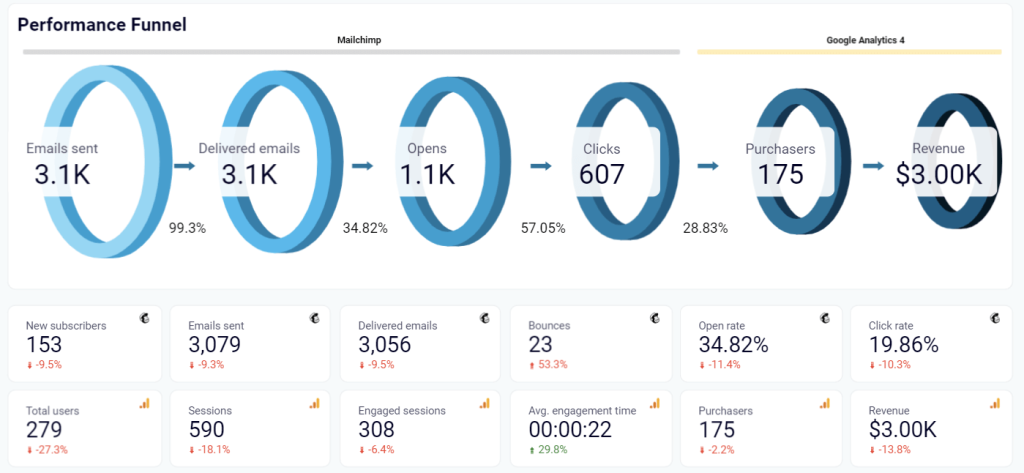
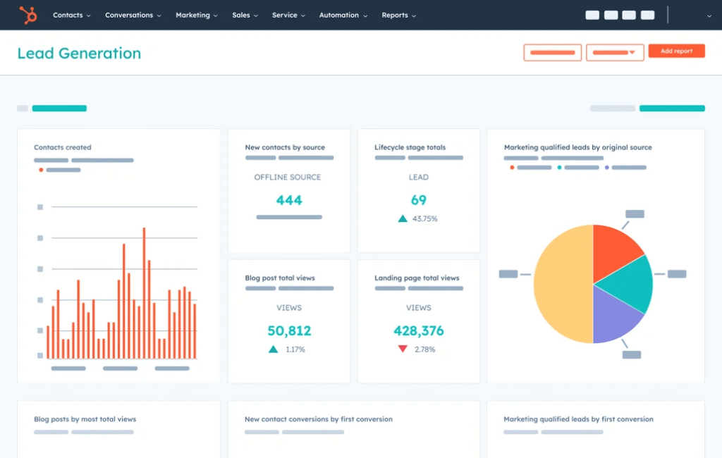
Campaign performance reports — your report card
First up, we’ve got campaign performance reports, casual ones.
Think of these as the ultimate report card for your email campaigns. They give you a high-level overview of key metrics like open rates, click-through rates, conversion rates, and more.
Want to know if that witty subject line worked? This report will tell you. Curious if your CTA was compelling enough? You’ll find the answer here.
These reports help you see the big picture and understand which campaigns are hitting it out of the park and which ones need a little extra TLC (or “Tender Loving Care” if you missed the meaning).
Here is an example of a campaign performance report for Mailchimp that is available as a template:
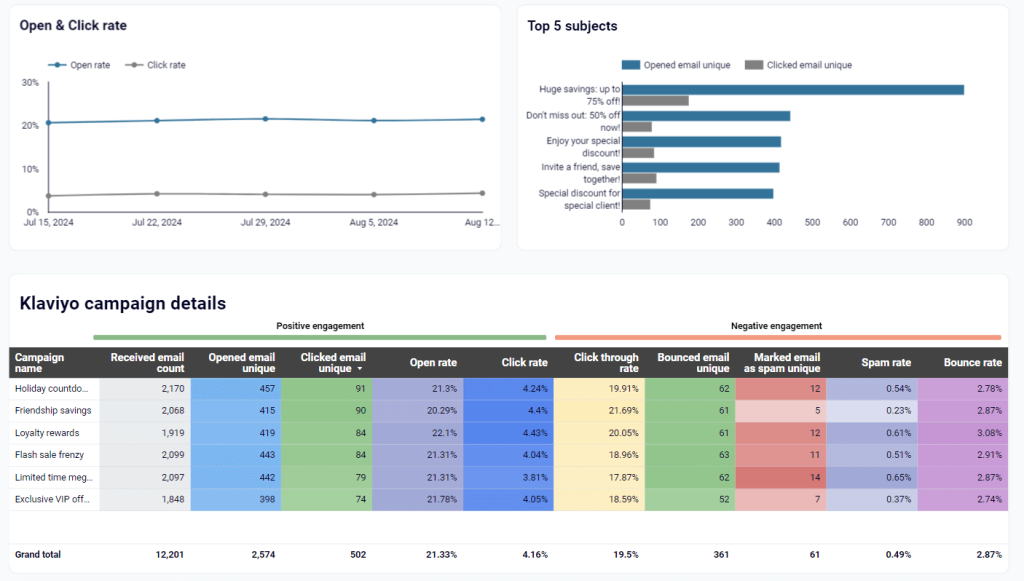
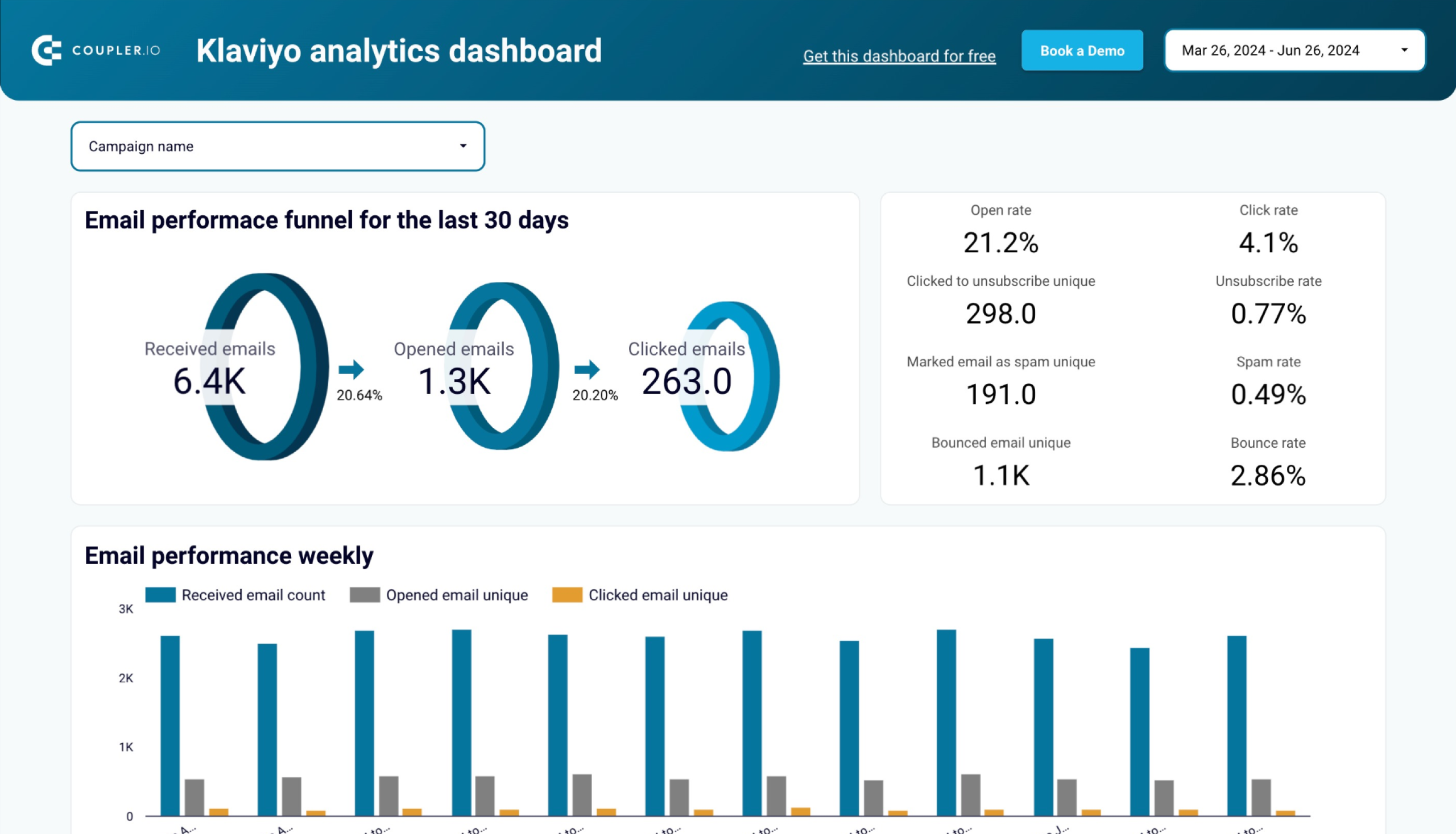
Engagement metrics — are they really engaged?
Next, let’s talk about engagement metrics. That’s where things are getting interesting.
These reports dive deeper into how your audience interacts with your emails. They track metrics like time spent reading your email, the number of clicks on different links, and even how many times an email is forwarded.
Engagement metrics help you understand if your content is truly resonating with your audience or if they’re just giving it a quick skim.
By analyzing these metrics, you can fine-tune your content to better meet your audience’s interests and needs, ensuring your emails are not just opened but also enjoyed.
Here is an example of an engagement metrics report for Klaviyo that is available as a template, too:
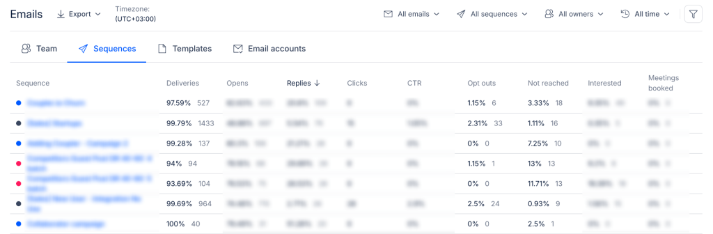
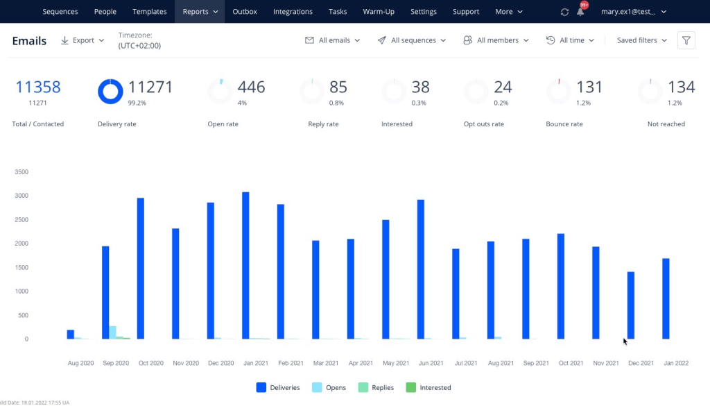
Deliverability reports — making sure your emails land right
Now, let’s speak about deliverability.
As you already know, sending an email is one thing; getting it to land in your recipient’s inbox is another. Especially with all these restrictions by Google in 2024. Harsh.
While email verification solutions can help increase deliverability, you need to monitor your rates. And deliverability reports will assist here. These reports provide insights into your email deliverability rates, including bounce rates, spam complaints, and inbox placement rates.
Are your emails ending up in the dreaded spam folder? Hope they didn’t. Deliverability reports will help you figure out if they did and how to fix it.
Ensuring your emails reach their destination is crucial because even the best-crafted email is useless if no one sees it.
Here is an example of a deliverability (and engagement) report for Reply:
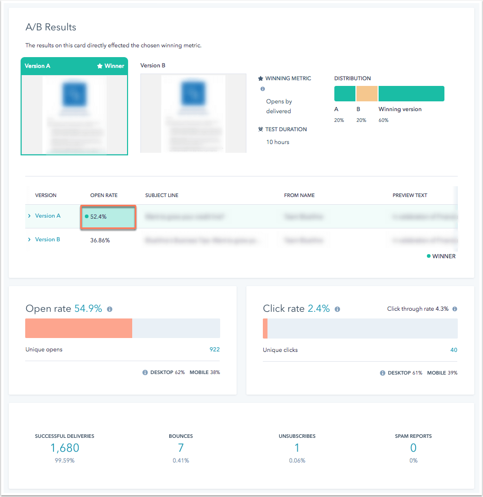
A/B testing reports — experiment and win!
Finally, we have A/B testing marketing dashboards. As a matter of fact, testing your emails is like finding the cheat codes for boosting your ROI (+28%, according to HubSpot)!
If you’re not A/B testing your emails, you’re missing out on a goldmine of insights. These reports compare different versions of your emails to see which one performs better.
You can create effective subject lines, change up the email design, or experiment with different CTAs — A/B testing helps you find out what works best for your audience.
The reports will show you the winning variations so you can continuously optimize your emails for maximum impact.
Here is an example of an A/B testing report for HubSpot:
What is the ultimate tech for email marketing reports?
In the quest for email marketing supremacy, having the right tools can make all the difference.
I’ll show you my favorite ones — three powerhouse platforms that are transforming how SaaS companies analyze their email marketing efforts: HubSpot, Coupler.io, and Reply.io.
HubSpot — sales dashboard magic
First up, let’s dive into HubSpot. We met each other 6 years ago, and our partnership is stronger than ever.
Known for its awesome suite of marketing and sales tools, HubSpot offers powerful dashboards that give you a bird’s-eye view of your high-ticket sales and marketing performance. For email marketing, HubSpot’s dashboards track all the crucial metrics, from open and click rates to conversions and revenue generated.
What makes HubSpot special for me is its integration with your entire sales pipeline. You can see exactly how your email campaigns are driving leads through the funnel, spot bottlenecks, and measure the ROI of your efforts.
HubSpot’s dashboards provide actionable insights that help you align your email marketing strategy with your overall sales goals, ensuring every email counts towards your bottom line.
Want to connect your HubSpot instance with something more advanced to control email and everything? Here is Coupler.io, check it out.
Coupler.io — reporting automation wizard
Coupler.io is the wizard of data integration and reporting automation.
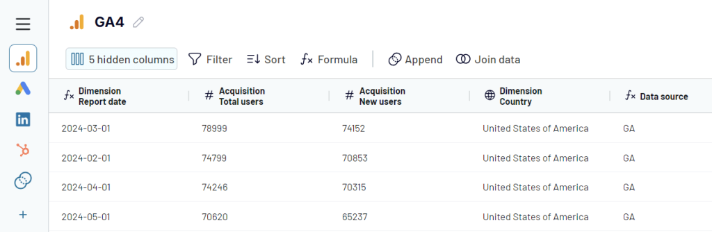
It lets you turn email marketing data into simple reports, creating a unified view of your marketing performance. You can pull in data from your CRM (HubSpot, Pipedrive, for instance), e-commerce platform (think Shopify and Woocommerce), or other marketing tools (Klaviyo, Mailchimp, all social media platforms, you name it) — Coupler.io makes it seamless.
The destinations for your reports include spreadsheets like Google Sheets or Excel, BI tools like Looker Studio or Power BI, and data warehouses like BigQuery or Amazon Redshift. In addition, you can benefit from a library of preset report templates for marketing, PPC, sales, and so on. For example, here is what an email marketing dashboard for Klaviyo looks like.
Just imagine having your email metrics side-by-side with B2B sales data, customer interactions, and more.
I couldn’t believe it the first time I saw it.
This extensive connectivity allows you to see the bigger picture, uncovering insights that you might miss with isolated data. Amazing, right?!
Reply.io — cold email ace
Last but definitely not least, we have Reply.io.
If cold outreach (including emailing) is part of your strategy, this tool is a total multichannel revolution. Reply.io offers robust dashboards that give you a crystal-clear view of your cold email campaigns.
These dashboards track essential metrics like open rates, reply rates, and bounce rates, providing a comprehensive overview of your campaign’s performance.
But it doesn’t stop there.
Reply.io’s dashboards also let you drill down into individual emails to see what’s working and what’s not. Are your subject lines grabbing attention? Are your follow-ups converting leads? And you can improve everything with AI SDR on autopilot (and it’s not just an AI email generator; it’s much more!).
Just remember — with Reply.io, you can easily spot trends and optimize your cold email strategy for maximum impact.
So, we chose the tools; what’s next? Let’s find a way to overdo your customers.
How can you overcome common reporting hurdles?
Even with the best tools, marketing reporting can sometimes feel like navigating a maze. But fear not, my friend!
Here’s how to get the most out of your data in a fun and practical way:
| Action steps | How to implement |
|---|---|
| Set clear goals | Sit down and outline what you want to achieve with your email campaigns. No matter if it’s boosting open rates or increasing conversions, write these goals down. Then, regularly check your reports to see if you’re hitting those targets. If not, tweak your strategy and try again. |
| Segment smartly | Dive into your reports to identify different audience segments based on behavior and preferences. Create separate email lists for these groups. For example, one list for users who clicked on a product link and another for those who opened but didn’t click. Send tailored content to each list, making your emails feel more personal and relevant. |
| Get personal | Use the data from your reports to add a personal touch to your emails. If a user frequently clicks on links about a specific feature, mention that feature in your next email to them. Tools like dynamic content blocks can help automate this personalization. |
| Optimize subject lines and CTAs | Use A/B testing tools to test different subject lines and CTAs. Send out two versions of your email with slight variations and see which one performs better. Use these insights to craft subject lines and CTAs that your audience loves. |
| Time it right | Check your engagement metrics to find out when your audience is most active. Schedule your emails to be sent at these peak times. Most email marketing platforms have tools to automate this scheduling based on user activity. Interesting fact: According to a survey of US marketers, Tuesday is the superstar for email sends, with 27% swearing by it. Monday comes in second with 19% — looks like people actually like starting their week with your emails! |
| Keep it clean | Regularly clean your email list by removing inactive subscribers and invalid addresses. Most email platforms provide tools for list hygiene, making it easy to keep your list up-to-date and engaged. |
| Automate follow-ups | Set up automated workflows that trigger follow-up emails based on user actions. For instance, if someone clicks a link but doesn’t complete a purchase, send a reminder email with a special offer. Automation tools in platforms like HubSpot and Reply.io can handle this for you. Another interesting fact: Automated emails are like money machines — they generate 320% more revenue than their non-automated buddies! |
| Monitor and pivot | Keep a close eye on your email reports. If you notice a drop in engagement or a spike in bounce rates, dig into the data to find out why. Make adjustments to your strategy based on these insights. Being agile and responsive is key. |
| Visualize your data | Use data visualization tools to create charts and graphs from your email reports. This makes it easier to spot trends and patterns. Tools like Coupler.io can help you integrate data from different sources and visualize it in one place. |
| Share the love | Share your email marketing insights with your team. Use collaborative tools to create and share dashboards that highlight key metrics and performance trends. This ensures everyone is aligned and working towards the same goals. |
By tackling these hurdles head-on, you’ll transform your reporting from a chore into a strategic asset, driving your email marketing success.
So, I’ve spilled all the beans! Now it’s time for you to dive in, roll up your sleeves, and put these insights into action.
How to turn email reports into action with Coupler.io
It’s time to make your email marketing truly shine. Building your reports in Coupler.io is super-easy:
1. Pick your data sources and destination. Sign up for Coupler.io and create a new importer. You’ll need to choose the source for your email marketing data (like HubSpot or Mailchimp) and the destination for your report. If you want to create a cross-channel report, you can add more sources later during the setup. Coupler.io lets you mix your email metrics with CRM data, sales figures, or even social media stats for a full picture.
2. Set up your importer. Connect your source apps and transform the data to make it analysis-ready. Coupler.io allows you to filter information, hide and add columns, append or join information from multiple connected sources.
3. Schedule imports. Automate your data updates by setting a schedule — daily, weekly, or monthly. Say goodbye to manual updates!
4. Create your dashboard. Load your report to the selected destination, where you can turn it into a dashboard with your imported data. Make it look awesome and share it with your team.
And voila! You’ve got your email reports ready to rock, thanks to Coupler.io.
If you don’t want to create a report from scratch, check out the ready-to-go report and dashboard templates.
Email marketing reports – final words
Email marketing is like a fast-paced game — what works today might flop tomorrow. Keep an eye on your reports, be ready to tweak your strategy, and embrace the ever-changing landscape.
Let your data be your guide!
With the right approach (and tools like Coupler.io), it can be a fun and rewarding part of your inbound marketing strategy, driving growth and engagement like never before.
Remember, insights are just the beginning — execution is where the magic happens. So, get out there and turn those insights into results. Happy emailing!