Instead of muddying the waters with vague phrases like “helping you make better decisions,” we thought it’d be better to share tried-and-tested insights. These insights come from dashboard reports we’ve created, which are now trusted tools for hundreds of executives in different industries.
Today, you’ll learn the ingredients for crafting executive reports that answer the unique needs of senior leaders.
What is executive reporting?
Executive reporting is a method of sharing a company’s data to provide leaders with the critical insight they need to achieve business success. Unlike operational reporting, which typically includes more day-to-day data, the executive report focuses exclusively on high-impact activities that drive the organization forward.
Executive reports enable executives to:
- Gain an overview of the business’s health
- Identify opportunities and challenges
- Monitor progress and performance
- Make accurate forecasts
- Communicate effectively with stakeholders
- Determine the next steps
Creating effective executive reports often requires consolidating data from multiple sources. Coupler.io can significantly simplify this process by collecting data from various platforms and combining it into a single report.
The goal is to make the lives of executives easier and simplify decision-making. This is achievable through effective visualizations, including infographics, charts, graphs, and tables commonly found in executive dashboards, which we’ll cover in more detail.
Understanding the types of executive reports
Executive reports come in different types, and each one has a specific purpose. Here, we’ve listed and explained the main types to help you choose the best format for communicating with company leaders.
- Status Reports
- Summary Reports
- Analysis and Dynamics Reports
- Other types
Let’s take a closer look at each.
Status reports
A project status report is a concise and clear document that provides stakeholders and project managers with a quick snapshot of progress, highlights current challenges, and supports effective strategic planning for the next steps. It answers essential questions such as:
- Where are we now?
- How far have we come?
- How are things going?
Project status reports come in different types, each customizable for specific project needs and timeframes. The frequency of these reports depends on the phase of the project and its requirements:
- Daily Status Report: Focuses on real-time updates for fast-paced projects requiring constant monitoring.
- Weekly Status Report: Summarizes weekly progress, plans for the upcoming week, and immediate concerns. By nature, these are more operational than monthly reports.
- Monthly Status Report: Provides a broader overview of achievements, often used by leadership. It serves as a review of the past month, offering a high-level view of what has been achieved globally. While weekly reports keep you close to the action, monthly reports allow you to take a step back and see the full picture of progress and overall performance.
- Quarterly Status Report: Provides insights into long-term trends and performance, supporting strategic decisions.
A project status report includes several essential elements that overview progress, challenges, and next steps. Here’s a breakdown:
| Feature | Description |
| Progress summary | Outlines accomplishments, milestones achieved, and a comparison of planned versus completed tasks. |
| Challenges | Highlights issues encountered, their impact, and reasons for any delays or deviations. |
| Next steps | Details plans for the upcoming period, including adjustments to address challenges. |
| Additional notes | Includes comments, observations, and unexpected changes or developments during the project. |
Since many departments work together toward a shared goal, meetings allow team members from different departments to discuss specific issues and explain them to stakeholders in more detail.
Project status reports are indispensable for keeping projects on track and efficiently achieving their goals. They foster transparency, improve communication, and enable informed decision-making.
Summary reports
Summary reports summarize key findings from a completed project or research period.
They are also an excellent way to summarize a series of reports or data from dashboards, making them useful guides. Instead of having to dig through the dashboard themselves, executives can already have a clear idea of what to focus on.
A good summary report should:
- Present information clearly and factually
- Include essential data for decision-making
- Stay brief and well-structured
- Focus on clarity over fancy formatting and technical jargon
Summary reports are used in many fields (like healthcare or finances). In marketing analytics, reports can cater to different audiences, each with unique needs. But how do you distinguish between reports for upper management versus those for teams involved in daily operations?
Example:
| High-level summary for management | Detailed report for specialists |
| Focuses on overarching metrics like total website traffic, conversion rates, and revenue generated. This type of report gives decision-makers a clear view of how the website supports business goals without overwhelming them with unnecessary details. | Breaks down specifics like page load times, bounce rates on individual pages, and keyword rankings. Includes actionable insights, such as identifying which pages need optimization or where technical issues affect the user experience. |
As you can see, high-level summaries provide the big picture, while technical teams receive detailed information for targeted improvements.
Analysis and dynamics reports
Analysis and dynamic reports are powerful tools for understanding and acting on business data. While analysis reports focus on solving specific business problems through in-depth research and tailored insights, dynamic reports provide real-time updates to help businesses respond quickly to changes and unexpected challenges.
Analysis reports
An analysis report is a custom business report designed to solve a specific business problem. Unlike pre-made reports, which often give general insights, an analysis report is made to meet a clear need.
Because they address specific problems, analysis reports don’t usually have a set list of metrics (though they often include financial data). Instead, they focus on providing relevant and actionable suggestions. This approach means they should give enough relevant information to help decision-makers rely less on instinct or experience and more on facts.
Analysis reports often require deeper research, so data drilling is one crucial feature they commonly include.
Other features of these reports are:
- Comparing data
- Making predictions
An analysis report usually starts when a manager or senior leader requests help to solve a business issue. They share what they need, including the goals, priorities, and data they want to use.
Each decision-maker has their preferred way to view this information. However, dashboards are often the best option because they provide clear data visualization, are easy to understand, and don’t take up much space. With Coupler.io, you can both create custom dashboards and use predesigned dashboard templates. Whichever option you prefer, the platform ensures your visualizations are up-to-date and eliminates manual data collection tasks.
Dynamics reports
Dynamics reports reveal progress over time instead of displaying individual data points. As a result, stakeholders can identify trends, spot anomalies, and take proactive measures rather than merely reacting to events. Here is an example of a simple report showing the dynamics of win rate.

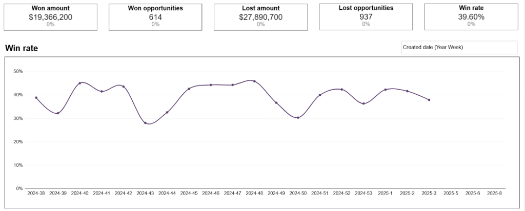
However, they can also provide a more comprehensive view of business performance by focusing on patterns and changes rather than isolated metrics.

Dynamic dashboard example. Source: FineReport
The power of dynamic reporting lies in its three core components: trend analysis, performance tracking, and predictive insights.
Trend analysis breaks free from static perspectives, allowing executives to detect emerging patterns and maintain a competitive edge. It shifts the analytical focus from momentary snapshots to a continuous, evolving narrative of business performance.
Performance tracking extends beyond single-point measurements and provides rich contextual insights. For instance, instead of simply showing the current monthly revenue ($5.2M), a dynamic report displays a 12-month revenue trend paired with a year-over-year comparison to highlight growth or decline patterns. This nuanced perspective transforms raw numbers into meaningful stories about organizational progress.
Predictive insights represent the most strategic aspect of dynamic reporting. By carefully analyzing historical data and ongoing trends, these reports help businesses anticipate future scenarios. They convert past performance into forward-looking strategies, enabling executives to utilize these insights to prepare and adapt proactively.
A practical illustration of dynamic reporting can be found in sales pipeline analysis. Such reports track deals across multiple stages—from initial lead generation to final negotiations. This report reveals potential friction points and pipeline efficiency.

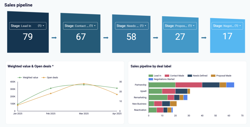
The bottom-left graph features two lines: one for weighted values and another for open deals. It enables sales executives to assess opportunity quality and predict future revenue potential. A rising number of open deals with stagnant weighted value might indicate lower-quality opportunities, which prompts immediate strategic reassessment.
Ultimately, the true value of dynamic reporting lies not in the numbers themselves but in the story they tell—a continuous narrative of organizational growth, challenge, and potential.
Annual reports
Annual reports compile data from all channels to evaluate the company’s progress toward its annual goals. They assess which marketing and business activities delivered results versus those that fell short, identify areas for improvement, and analyze budget allocation. This comprehensive review helps shape the strategic direction for the upcoming year.
Sure, storytelling matters in all reporting, but if you had to pick just one time to use it? Annual reports would be it, hands down.
When you’re painstakingly chronicling the events of the past 52 weeks, the final presentation deserves special attention. This is when reporting should effectively weave together the story of your achievements and progress toward annual goals.
However, creating this narrative requires significant time and careful consideration of how to arrange graphs and data to build a compelling story. With Coupler.io, these typically tedious workflows are virtually eliminated thanks to their dashboard templates.

Characteristics of successful executive reporting meetings
The key to productive executive meetings is having access to digestible and accurate information. This reduces the need for repeated clarifications, enables more targeted questions, and facilitates better interpretations.
That’s where dashboards and reports come in. They provide a concise and actionable snapshot of key performance indicators, helping executives to make informed decisions.
Before creating a dashboard, it is essential to identify the decisions it will help inform and the actions that will follow those decisions. Here are three key steps to guide the process:
- Choose the right KPIs or OKR
- Track only what matters
- Focus on strategy
Let’s explore these steps.
Choose the right KPIs or OKR
OKRs, or Objectives and Key Results, help align teams, focus on results, and achieve ambitious goals.
- Objectives are clear, actionable, and aspirational goals.
- Key results are measurable outcomes that define success.
OKRs prioritize results over tasks, encouraging teams to focus on impactful initiatives.
A real-life example
At the start of the year, the CEO of a small digital marketing agency shares a bold vision: to expand the company’s focus from analytics to broader marketing topics. The COO then sets clear OKRs to bring this vision to life, including a significant goal to grow revenue from $100,000 to $1 million.
Each team receives specific OKRs to help meet this target. For example, the marketing team might aim to “Generate 10,000 new leads,” while the sales team works to “Close 20% of those leads“.
Progress is tracked using project management tools or even Looker Studio, with 100% progress bars showing how close each team is to their goals. In regular meetings, teams share updates, and all progress adds up toward the $1 million goal.
As you can see from this example, OKRs can inspire collaboration and drive teams to achieve remarkable results by breaking goals into clear steps and tracking progress transparently.
A quick guide on setting up OKRs:
- Set Aspirational Objectives
Define ambitious goals aligned with company objectives to push the team beyond their comfort zone.
- Break Down by Teams or Specialists
Assign actionable steps to departments or individuals to tackle key results.
- Track Progress with Dashboards
Use tools like Looker Studio with 100% progress bars to visualize individual and team contributions. During regular check-ins, progress is updated and combined to reflect the company’s overall progress.
- Regular Updates and Celebrations
Weekly or biweekly updates keep everyone aligned while celebrating milestones, which boosts motivation and ensures accountability.
Track only what matters
Start by ensuring your tracking is tied to the most important goals and questions. This means being clear about what you want to achieve and focusing your efforts. Whether it’s big-picture planning or setting up tools to track actions like clicks or form submissions, staying focused is important. If you try to track everything, you risk casting your net too wide and losing sight of what’s really useful.
To determine which metrics truly matter, align them with your organization’s strategic initiatives and board-level KPIs. Ask yourself: ‘Does this metric directly inform decisions about our strategic priorities?’ If not, it probably doesn’t belong in your executive reporting.
For example, instead of tracking every single user interaction, prioritize the ones that align closely with your strategic objectives. If customer acquisition is a priority, it’s more beneficial to measure completed sign-ups and conversion paths than general metrics like page views.
Taking a selective approach ensures that executive discussions stay centered on actionable insights. By cutting through the noise of non-essential data, you reduce resource overhead and free up time to focus on metrics that truly move the needle for the business.
Remember to periodically review your tracked metrics – typically quarterly or during strategy updates. Business priorities evolve, and your metrics should evolve with them. What was crucial last year might not be as relevant today, and new strategic initiatives may require different measurements.
Focus on strategy
In executive reporting meetings, discussions can often take various turns, making it essential to maintain a clear focus on strategy. Discussions should center around the actions and initiatives necessary to achieve set goals, and potential roadblocks should be anticipated and addressed proactively.
Additionally, while it is common for board members to provide insights on topics they are well-versed in, their input should align with the organization’s overall strategic objectives. Technical matters should be discussed in terms of their impact on the bottom line and overall business performance.
Executive reporting best practices and tips
What is an executive dashboard?
An executive dashboard is a strategic visualization tool that provides leadership with a clear and concise overview of organizational health, performance trends, and progress toward key objectives. By presenting critical data graphically, it enables busy executives to rapidly assess the company’s performance, spot trends, and pinpoint areas needing attention. This facilitates making informed decisions at a glance.
Executive dashboards connect data to key goals, giving company leaders a clear overview and the ability to dig into important details when necessary. Their main purpose is to highlight the most useful insights for decision-making rather than focusing on complex technical setups.
By combining data from tools like financial systems and customer records, they reveal future trends and key patterns. This helps executives make smart, informed choices and stay ahead of potential challenges.
What should an executive report include?
Designing an effective executive dashboard requires balancing strategic priorities, robust technical capabilities, user-centered design, and stakeholder engagement. These four key components provide a comprehensive framework for success:
- Strategic Alignment and Content
- Technical Infrastructure
- UX and Accessibility
- Engagement of Stakeholders
Let’s quickly elaborate on these.
1. Strategic Alignment and Content
The dashboard should reflect organizational goals by providing a clear overview of performance metrics, enabling trend analysis, and allowing users to drill down into specific details.
2. Technical Infrastructure
A strong technical foundation aggregates data from multiple sources easily and reliably. The dashboard must maintain accuracy, meet security standards, and support flexible update schedules, such as daily, weekly, or monthly. Coupler.io as a reporting automation solution can help establish this foundation by automating the collection and consolidation of data from various platforms. This ensures your dashboards always display up-to-date information.
3. UX and Accessibility
A well-designed dashboard simplifies complex data with intuitive navigation and easy-to-interpret visuals. It should support all skill levels to bridge the gap for leaders who may excel in their fields but lack expertise with business intelligence tools.
4. Engagement of Stakeholders
Involving decision-makers in planning is the key ingredient to achieving a successful executive dashboard. Their input ensures the final product meets actual user needs and promotes better adoption across the organization. The next section focuses on this.
Planning an executive dashboard
One of the most effective ways to create impactful executive dashboards is to involve executives actively in the planning process. Ask them key discovery questions to ensure the dashboard works for them. For example:
- What key decisions do you need this dashboard to inform?
- Which metrics do you consider most critical for measuring business success?
- How do you currently analyze performance, and what works or doesn’t work?
- What format best supports your decision-making process (visual graphs, detailed tables, or a combination)?
- How frequently do you need to review different types of data?
Executives are busy, so this might feel like a big ask. However, it’s actually a quick task that can take less than 10 minutes. They’ll appreciate the effort because it leads to a clear and helpful dashboard, making their work easier.
Often, executives only see the finished reports or dashboards at the very end of the process. Unfortunately, these final versions may not make sense or align with their needs. When this happens, it can cause delays and create extra work for everyone involved.
If you’re a leader reading this, remember that not everyone who builds dashboards knows which questions to ask. It’s a good idea to explain what you want in detail at the start. This will help prevent back-and-forth conversations and ensure that the final dashboard effectively meets your needs.
To make the process even smoother, consider sharing:
- Examples of reports or dashboards you’ve found effective
- Your typical workflow when reviewing performance data
- Critical decision points where data insights are most valuable
- The level of detail and drill-down capabilities you prefer
- Any specific compliance or governance requirements
Providing this context upfront helps the team create a dashboard that aligns with your needs and avoids unnecessary revisions.
To optimize this process and reduce the technical burden, consider using Coupler.io. With its help, you can automate collecting and consolidating information from your various business platforms. This allows you to design a dashboard that meets executive needs and makes it dynamic without any manual effort.
The balance between design and functionality in dashboards
Dashboards are often created using different colors and methods to improve their visual appeal and make a lasting impression. This is very important and can be one of the best ways to influence decision-makers. By guiding them through key points, you can use these methods to effectively make your case.
However, a common mistake is prioritizing design at the expense of functionality. To put it plainly, this happens when your dashboard looks great but fails to deliver meaningful insights.
The consequences for decision-makers? You waste their time by presenting something that doesn’t address their needs.
A good dashboard strikes a balance between design and effectiveness, ensuring it’s not only visually attractive but also provides the insights that decision-makers need to make informed choices.
How to structure a summary report
Here’s a simple step-by-step structure for crafting a razor-sharp summary report:
- Address your audience
Begin by identifying who the report is for and briefly explaining its purpose in 1 to 2 sentences. For example:- “As requested, this is the report on…”
- “This is the quarterly report on…”
- Provide context
In 1 to 3 sentences, explain the background of the report. For example, why the report was created or what period it covers. - List Findings and issues
Use bullet points to summarize key findings, challenges, or insights. Keep this list concise, with 2 to 5 main points. - Conclude with insights
Wrap up with a short conclusion that summarizes what the findings suggest. Avoid deep recommendations unless explicitly requested or you are confident in their accuracy.
Here’s a full example to give you an idea:
Q3 2024 – EU Marketing performance report:
This quarterly marketing performance report is prepared for the Executive Board to evaluate the effectiveness of our recent marketing initiatives for NeoGenic 3X, the smart cleaning robot assistant, across France and Switzerland.
This report evaluates the performance of marketing campaigns, including awareness and conversion campaigns, that were executed throughout Q3 2024 and targeted urban households.
Key findings:
- French Market:
- 42% increase in digital engagement
- €385,000 in campaign-attributed revenue
- Strong performance in urban centers like Paris, Lyon, and Marseille
- Swiss Market:
- 38% increase in digital engagement
- CHF 425,000 in campaign-attributed revenue
- Success concentrated in French-speaking regions, including Geneva and Lausanne
Challenges identified:
- Cultural differences in messaging reception between regions
- Higher costs and lower conversions in German-speaking areas
Insights & conclusion:
The campaigns demonstrated strong results, with France achieving excellent engagement and revenue growth in urban areas. In Switzerland, success was concentrated in French-speaking regions, which outperformed German-speaking areas in conversion rates and cost efficiency.
Further analysis and testing are needed to refine the campaign’s appeal in German-speaking regions and reduce conversion costs. Additionally, future campaigns should factor in Switzerland’s higher marketing expenses to optimize budget allocation and maintain profitability.
Note: When incorporating report summaries into your dashboard, a concise paragraph or two will be more than enough.
Executive dashboard examples
Executives need quick and actionable insights from a wide range of data. To help leaders avoid getting lost in the details, Coupler.io provides powerful, ready-to-use dashboards tailored to various industries and senior roles. Built-in connectors make it easy to automate data loading from multiple sources without hassle, ensuring accurate and up-to-date insights.
Designed as templates in popular BI tools like Google Sheets, Looker Studio, Power BI, and Tableau, these dashboards provide clear, high-level views of essential metrics, ranging from marketing performance to financial health. They empower leaders to make informed decisions quickly and effectively.
All-in-one marketing dashboard
The All-in-one marketing dashboard is among marketing executives’ favorites. In one interface, leadership can view performance across multiple channels, pulling data from:
- Google Analytics
- Google Search Console
- Advertising platforms
- Social media apps
- Email tools
- YouTube

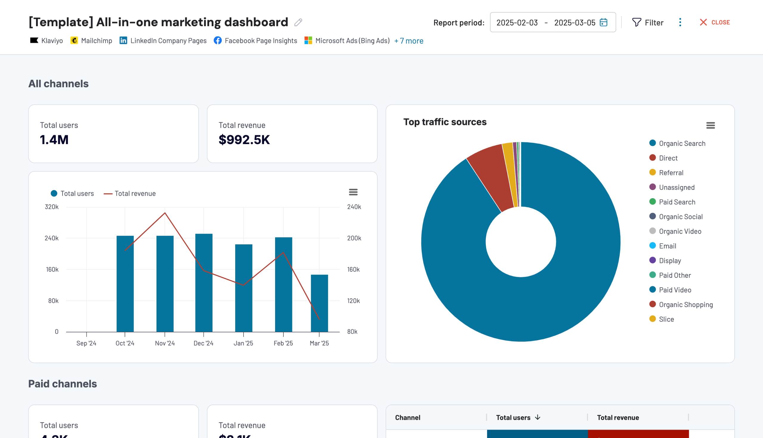
With comprehensive metrics at their fingertips, executive teams can quickly find answers to their pressing questions. On one hand, it can be a solid CMO dashboard; on the other hand, it’s better to use it together with other marketing and PPC dashboards.
This report is available in Coupler.io and as a template in Looker Studio. Try it right away for free!
Salesforce sales analytics dashboard
This dashboard gathers data from Salesforce and industry-leading advertising platforms to attribute leads and revenue to specific marketing channels. You can visualize your sales funnel using GA4 and Salesforce. This helps you evaluate the quality and performance of your traffic by comparing conversion rates with industry benchmarks.

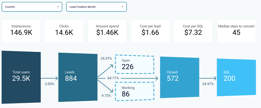
The dashboard is structured to help you develop data-driven hypotheses for increasing revenue from underperforming stages in your current pipeline.
It enables you to:
- Develop data-driven hypotheses to increase revenue from underperforming pipeline stages
- Apply regional filters
- Compare performance across different periods
- Identify the best-performing segments and link them to specific marketing activities
Additionally, you can get a detailed overview of open deals with segmentation by:
- Owner
- Deal type
- Revenue amount
These insights help identify and capitalize on your most effective sales and marketing strategies while addressing pipeline bottlenecks.
The report is available as a Looker Studio template and has the built-in Coupler.io connector to collect data from Salesforce, GA4, and PPC platforms. Just follow the setup instructions described in the readme tab and enjoy a powerful reporting solution in just a few minutes.
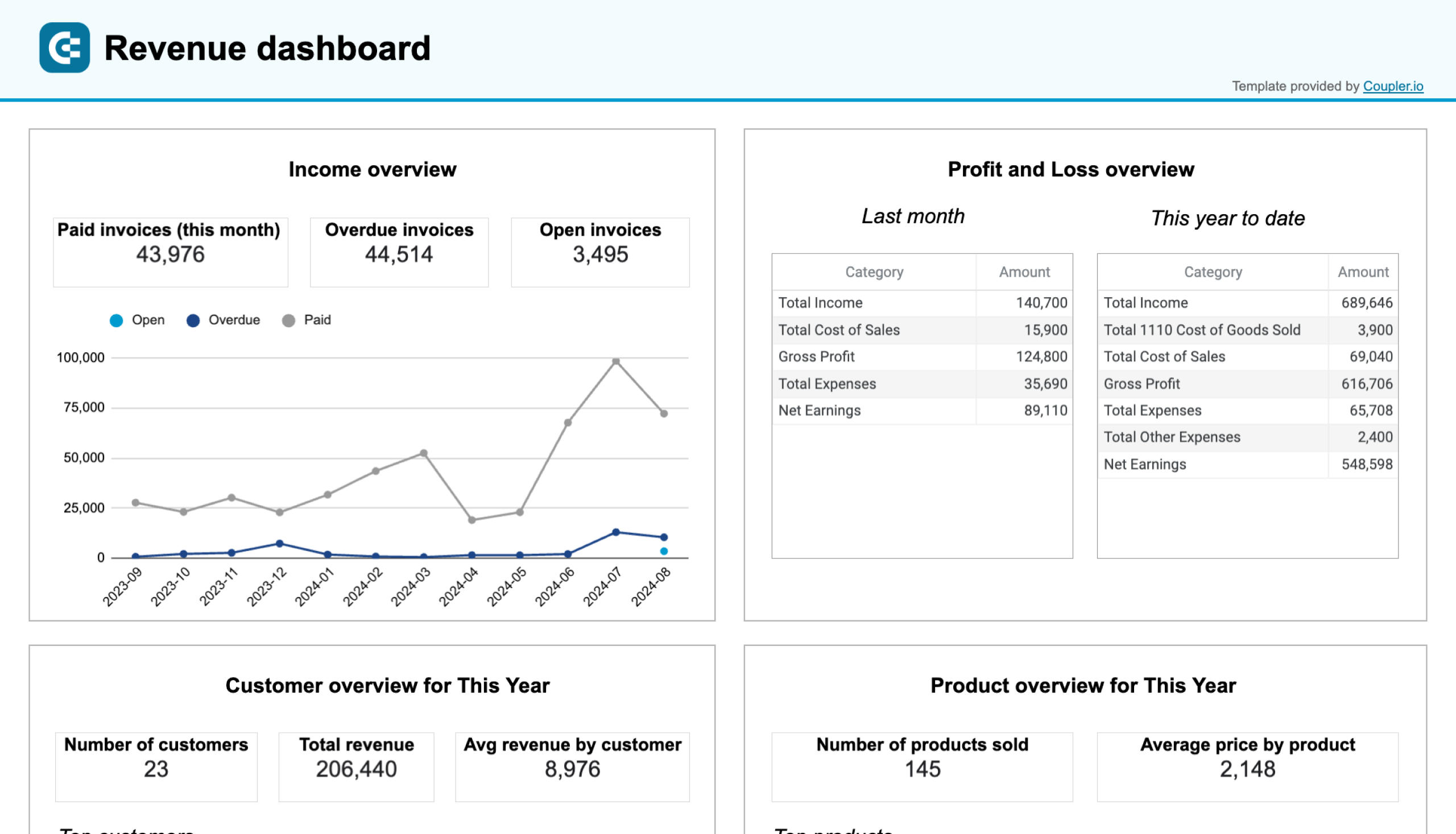
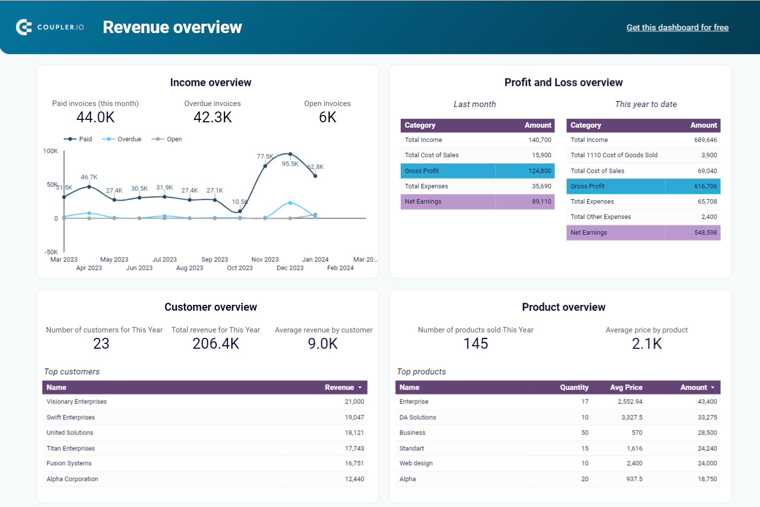
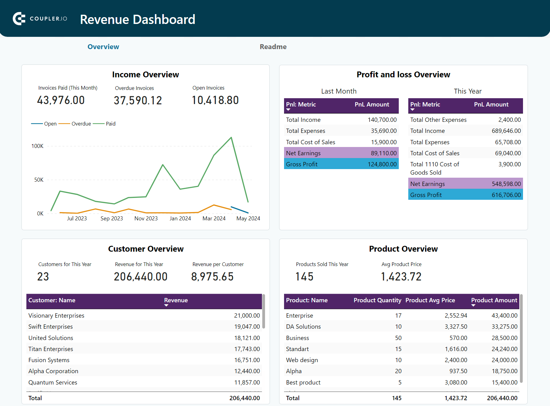
Revenue dashboard for QuickBooks/Xero
If you use Xero or QuickBooks and need to view your financial performance at a glance, use this revenue dashboard. It provides a detailed overview of revenue distribution, showing how much money is earned from different customers and products.
The report highlights key revenue metrics that offer important insights into earnings. Additionally, the report includes a list of top customers and shows the best-selling products that significantly contribute to sales.
The dashboard is designed in Coupler.io and equipped with the AI insights feature. At the same time, you can use this Xero dashboard as a template for Looker Studio and Google Sheets
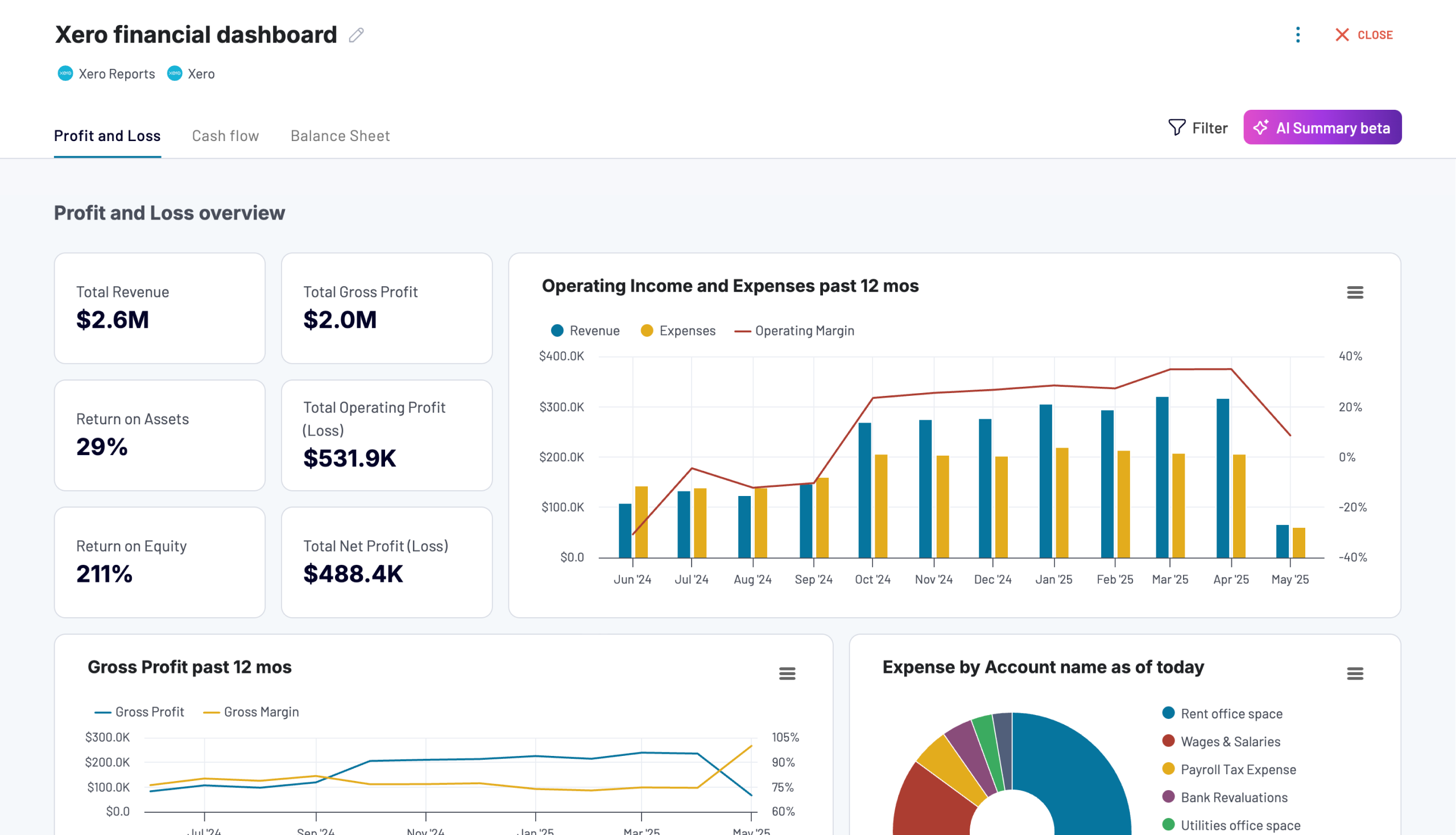
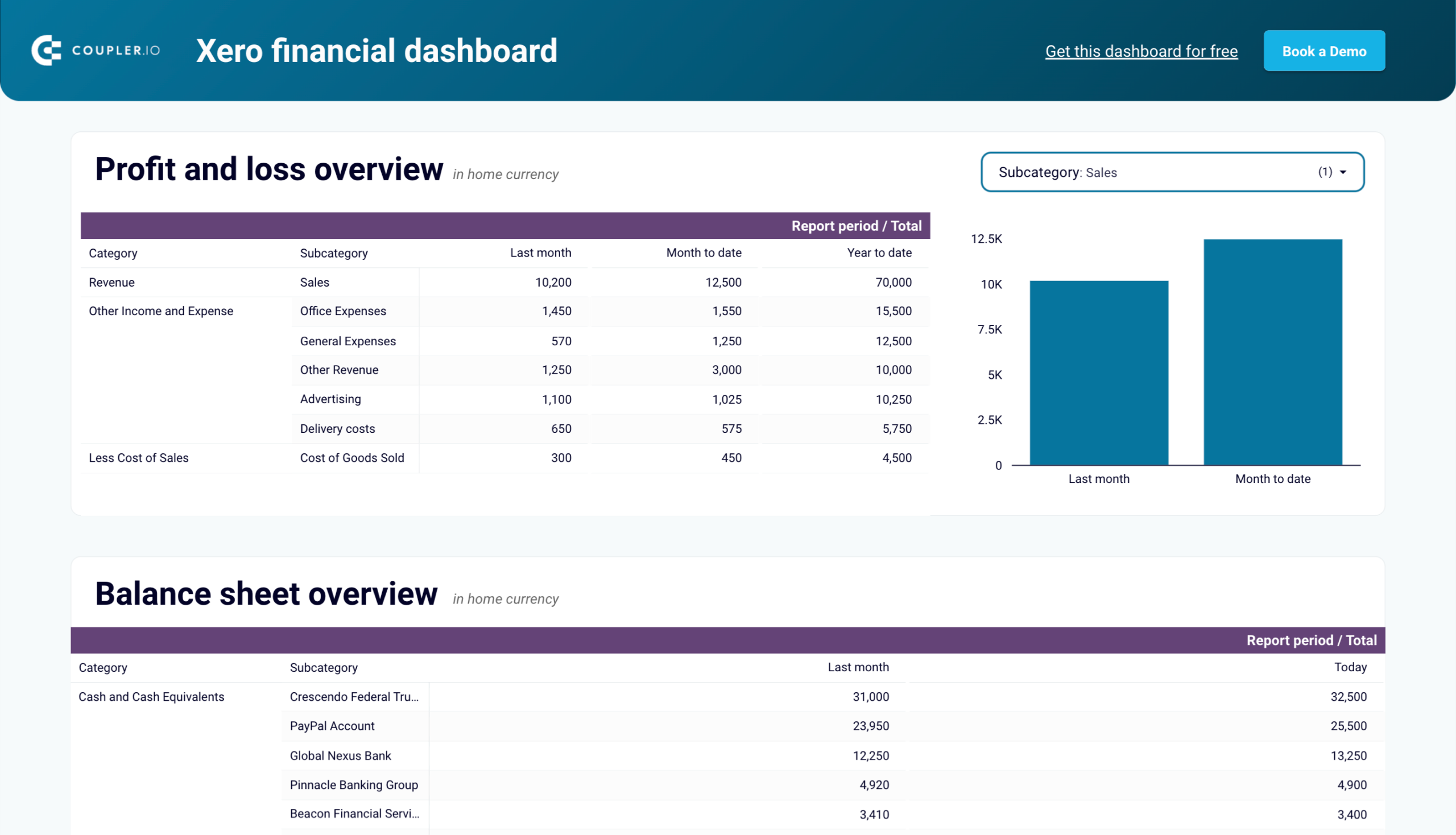
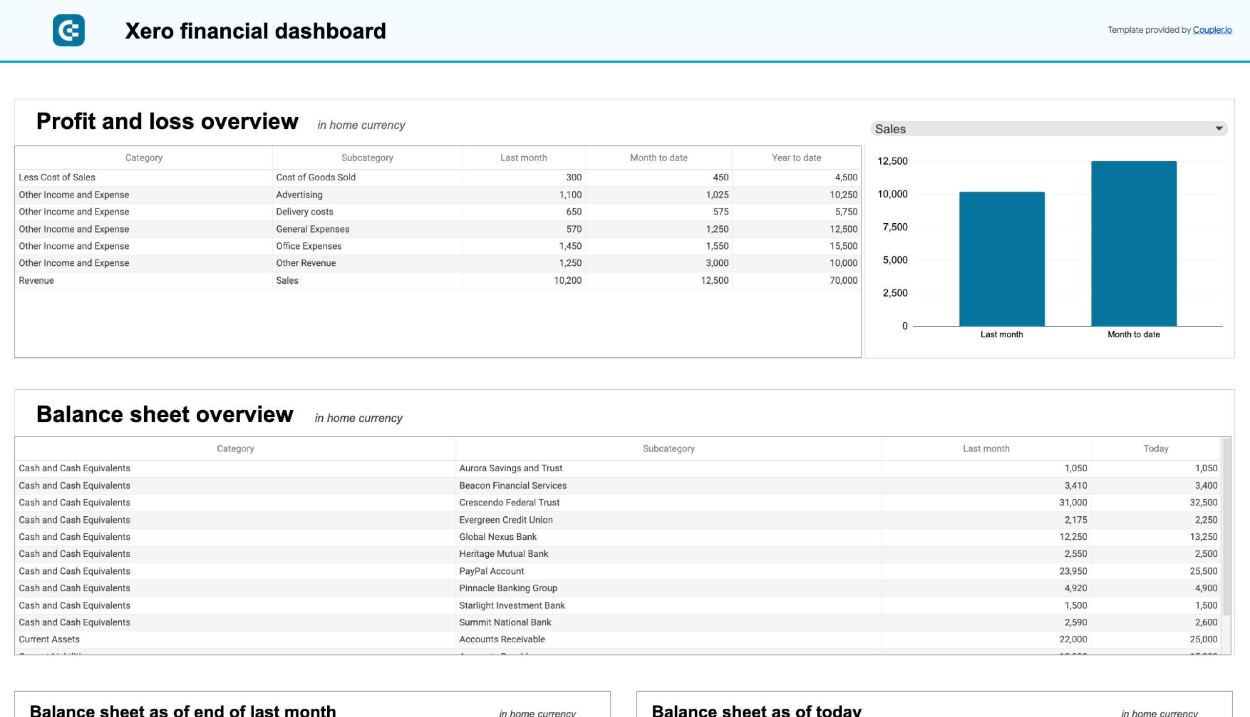
Xero financial dashboard
Get comprehensive financial insights from your Xero account with key performance metrics, balance sheet analysis, and cash flow projections. Quickly assess your business health and make informed financial decisions.


Xero financial dashboard in Looker Studio
Analyze your financial performance with a unified dashboard featuring key reports from Xero like cash flow, profit and loss, balance sheet, and others.
Xero financial dashboard in Google Sheets
Get instant visibility into your company’s financial health through key performance reports from Xero such as cash flow, income statement, and balance sheet.
Pretty much the same case is with the QuickBooks version of the dashboard. If you want a fast response rate and AI assistance, use the native dashboard in Coupler.io. Or opt for any of the available templates for external tools:

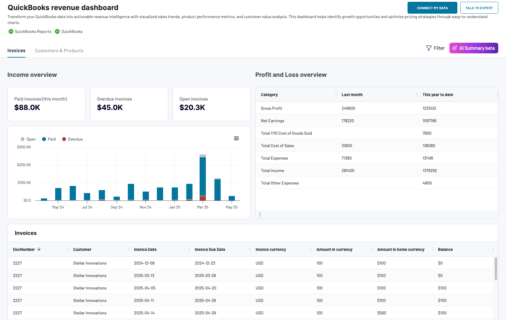
QuickBooks revenue dashboard
Transform your QuickBooks data into actionable revenue intelligence with visualized sales trends, product performance metrics, and customer value analysis. This dashboard helps identify growth opportunities and optimize pricing strategies through easy-to-understand charts.
QuickBooks revenue dashboard in Google Sheets
Analyze your revenue through a set of reports collected from QuickBooks Online on a single dashboard.

QuickBooks revenue dashboard in Looker Studio
Get an overview of your revenue based on the data from QuickBooks and unlock in-depth insights to drive informed business decisions.

QuickBooks revenue dashboard in Power BI
Monitor your income and expenses on an all-in-one revenue dashboard connected to your QuickBooks Online account.
PPC multi-channel dashboard with budget
The PPC monthly budget for Google Sheets dashboard comprehensively manages and monitors your advertising spend. It provides a cross-channel view of your advertising performance, helping you track monthly spending trends and see how they align with your budget.

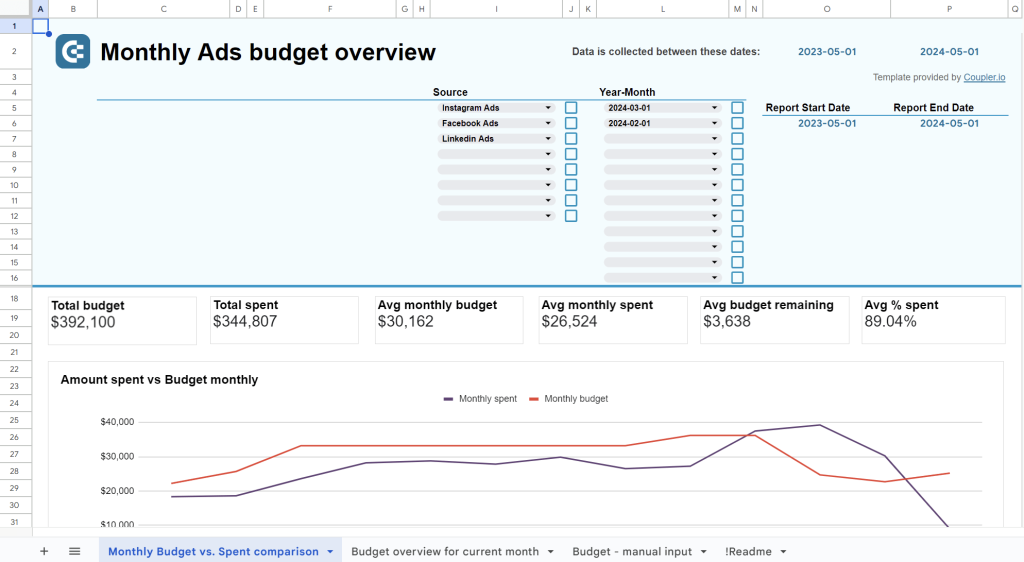
It strongly focuses on budget management and includes detailed breakdowns by ad platform and insights into average daily costs. You’ll also get an overview of your current month’s budget, spending predictions, and alerts to avoid overspending, ensuring your campaigns stay on track.
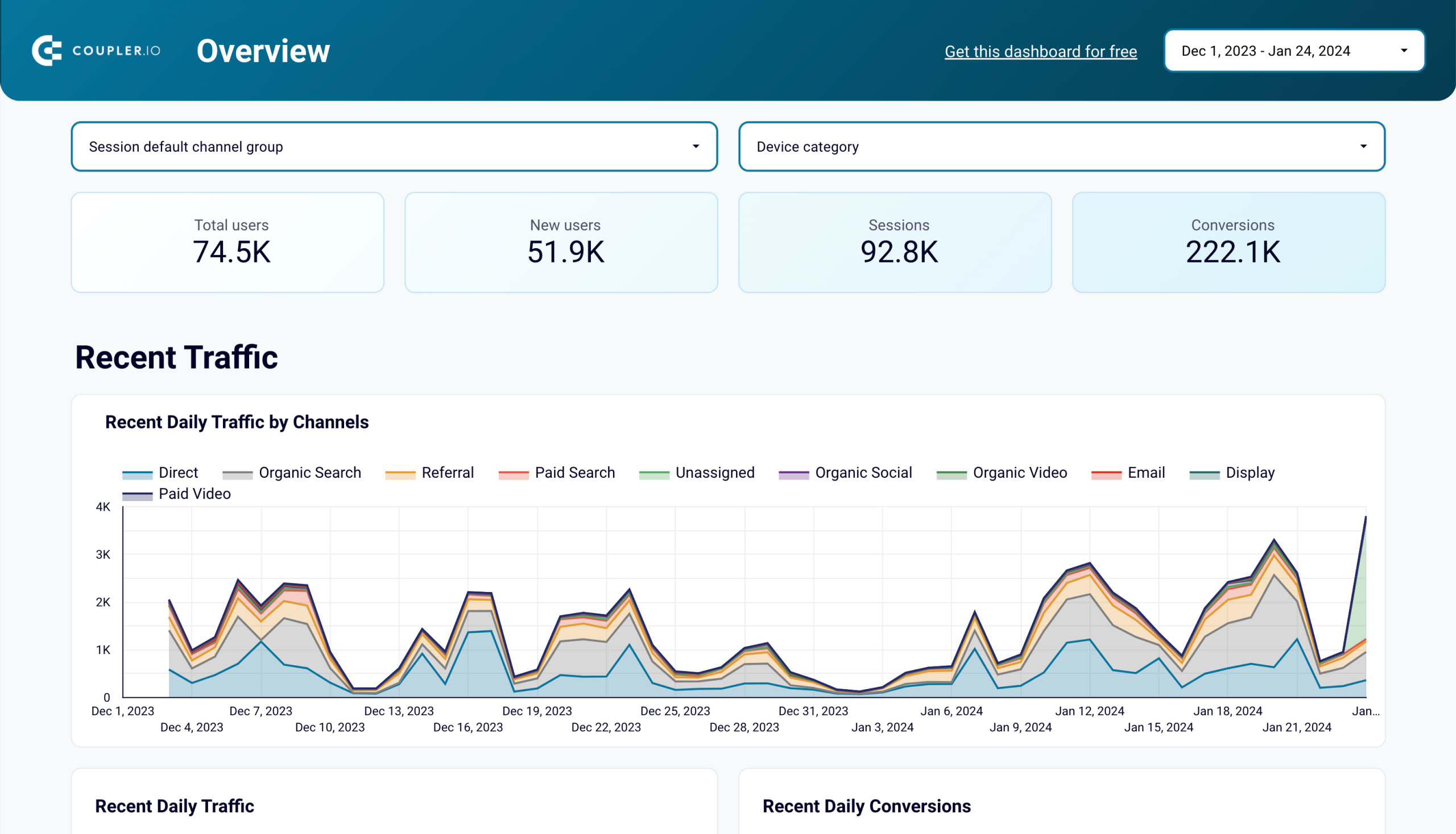
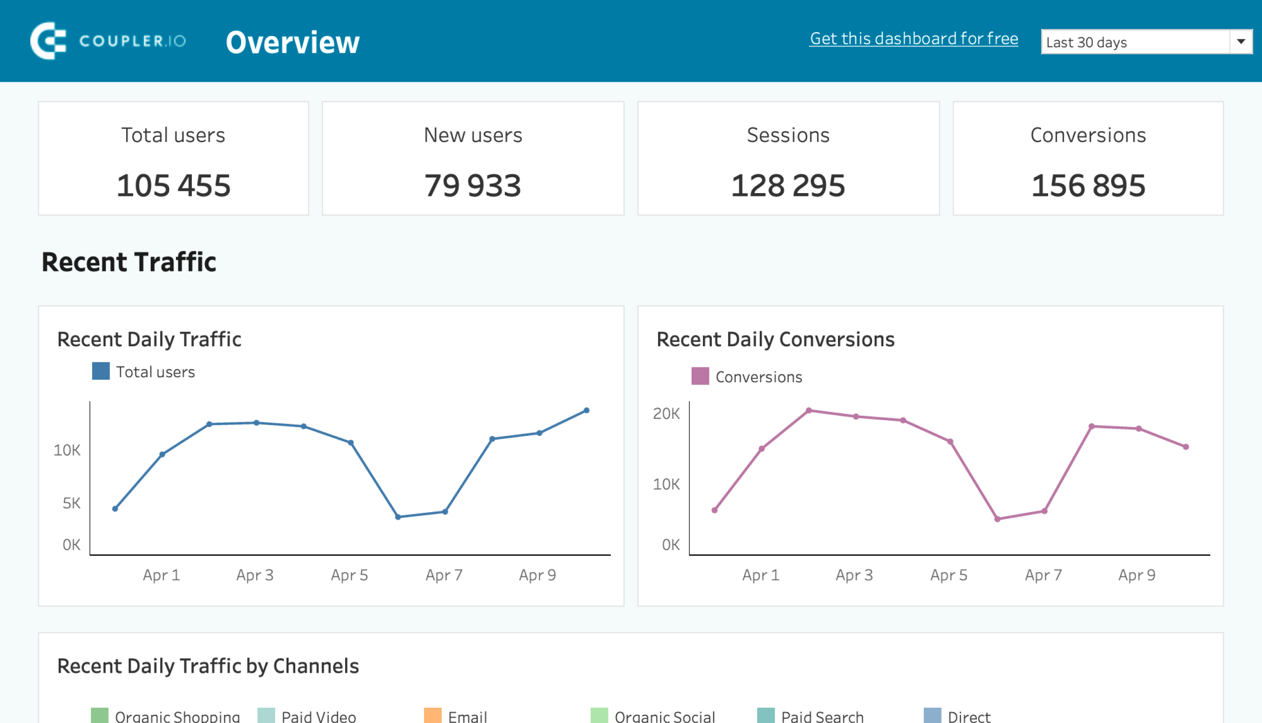
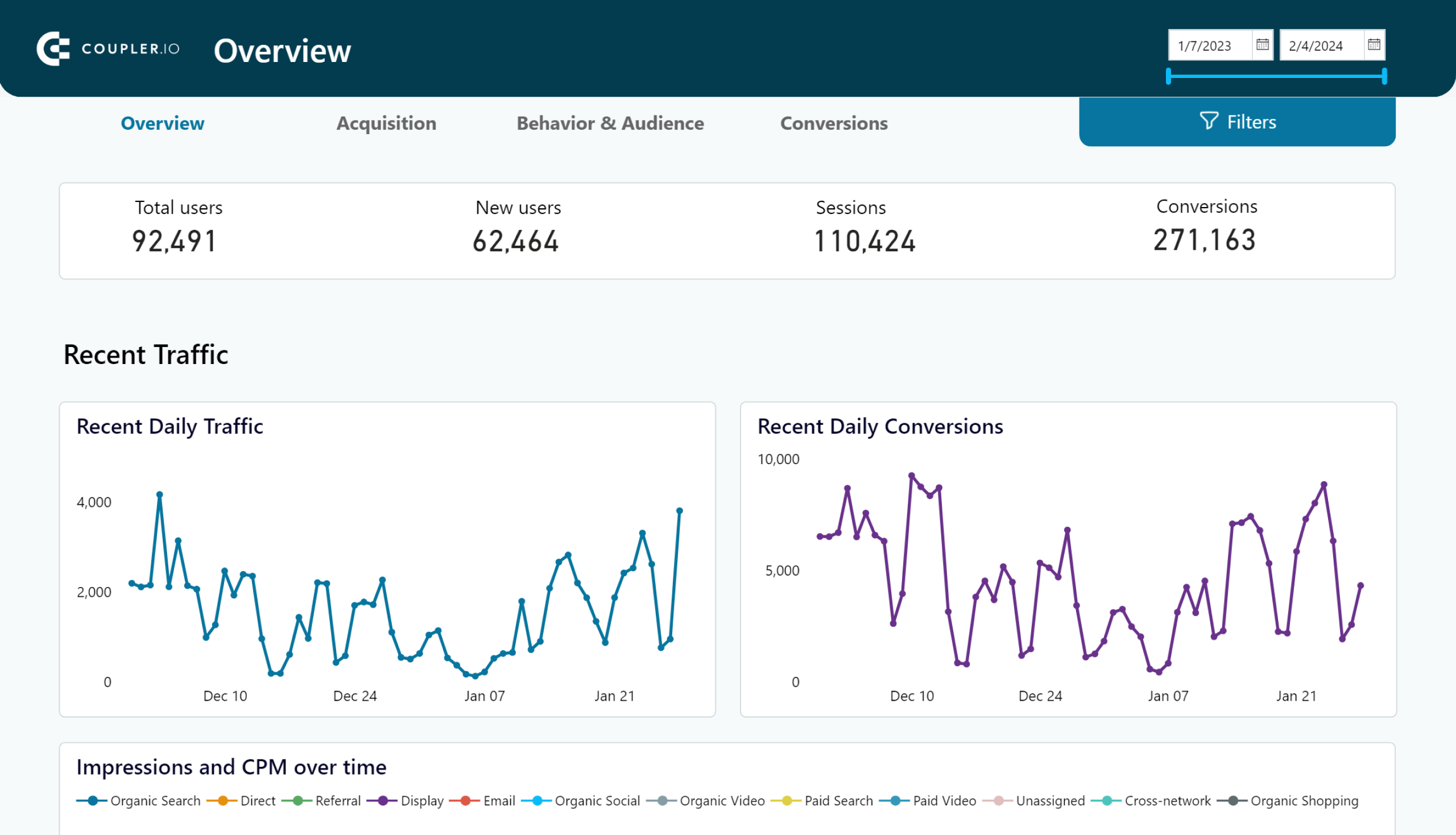
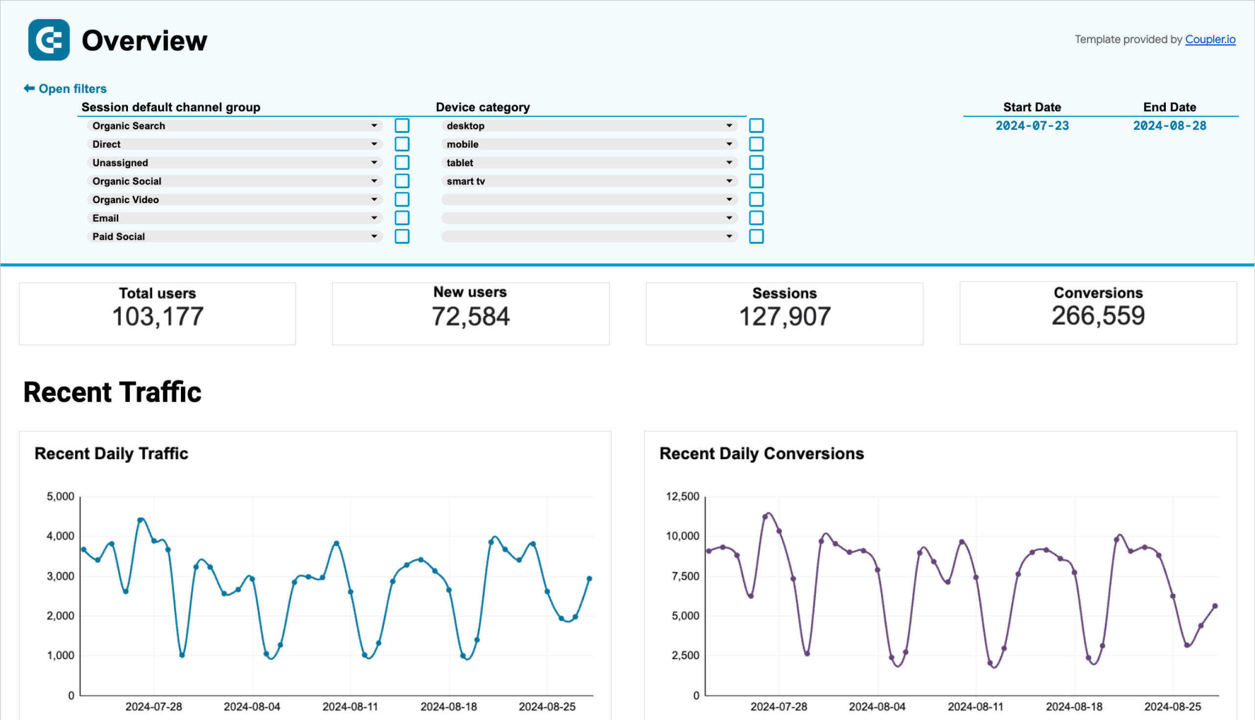
Web analytics dashboard
The web analytics dashboard provides an overview of daily updates on key product and marketing metrics.


In addition to key product metrics, marketing insights, traffic growth stats, and conversions, this dashboard delivers a detailed analysis of:
- Acquisition: Understanding how visitors find the website.
- Behavior & Audience: Analyzing how users interact with the site.
- Conversions: Tracking the actions that lead to desired outcomes.
The dashboard template is available for Google Sheets, Looker Studio, Tableau, and Power BI.. You will have permanent access to this dashboard with the Coupler.io free plan. Try it out! You have everything to gain and nothing to lose.
Web analytics dashboard in Looker Studio
Use the insights based on the data from GA4 to monitor your website traffic and discover which pages resonate most with your audience.
Web analytics dashboard in Tableau
Monitor the performance of your traffic, analyze the conversion funnel, and derive other insights from Google Analytics 4.
Web analytics dashboard in Power BI
Discover insights into your website’s traffic acquisition, audience, and conversions with Google Analytics 4 data seamlessly connected to our Power BI dashboard template.
Web analytics dashboard in Google Sheets
Gain valuable insights into your website’s traffic sources, user interactions, and conversion metrics based on data from GA4.
Customer acquisition dashboard (both Pipedrive and HubSpot versions)
This dashboard integrates data from Pipedrive with marketing insights from Google Analytics 4 (GA4) and various advertising platforms, including Facebook Ads, LinkedIn Ads, and Google Ads.

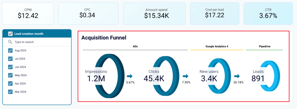
To analyze customer acquisition performance, it provides:
- A cross-platform acquisition funnel that tracks conversion from ad impressions to leads, with predictive modeling for spend and lead generation
- Monthly funnel performance analysis of lead generation campaigns across advertising, website traffic, and CRM data
- Comparative analysis of spend and conversion rates across advertising platforms
This is a helpful tool for clearly understanding overall customer growth and focusing on business outcomes rather than tactical details. The report template is designed in Looker Studio and is available for Pipedrive and HubSpot CRM tools.
Key principles in executive dashboard reporting
First, we recommend understanding the different types of executive reports and identifying which ones apply to your situation. We’ve listed the various executive report types and shared pro tips on what to include, with methods, use cases, and examples to guide your choice.
Secondly, getting leaders involved in the reporting process (including the dashboard design) ensures better adoption at the top level and creates more purposeful reports.
While dashboards effectively communicate data insights to board members, they also present unique challenges. Creating them requires collecting and managing data from multiple sources and then displaying it clearly across departments and industries.
Coupler.io simplifies all the above by uniting key themes found in various executive-level reports. With its ability to integrate data from over 60 business platforms like Google Analytics, CRMs, advertising platforms, and financial tools, it eliminates manual data collection and ensures your dashboards always display up-to-date information.
All you need to do is plug in your data and select from pre-built templates designed specifically for executive reporting.
Make your executvie reporting smart with Coupler.io
Get started for free