Power BI offers different ways to structure reports and highlight specific data points. One of these methods involves using filters to narrow down large datasets and display only relevant information in reports.
In this article, we explore the different types of Power BI filters, when to apply them, and how you can use them to extract valuable insights from your data.
What are filters in Power BI and how can they be helpful?
Filters are tools that allow you to extract specific information from a dataset and choose what data to display in report visuals.
They make data analysis easier and enable report viewers to interact with data and explore it from various angles. For example, a report on website analytics can contain filters to show data by specific GA4 property, user acquisition channel, device category, country, and so on. Using filters in Power BI reports allows you to focus on the most relevant information, making data a basis for informed decisions.
How to add filters in Power BI: step-by-step instructions and examples
Step 1. Get your data into Power BI
First, you need to load information from your data sources. This is possible with the help of native connectors or Coupler.io.
It’s a reporting automation platform that lets you load data to Power BI from 60+ cloud sources, such as Google Analytics 4, Facebook Ads, Shopify, Salesforce, and more. Coupler.io also has a data refresh feature that automatically queries the data sources and updates your reports in PowerBI on a schedule.
You can connect your cloud data source right away. Select the required app in the form below and click Proceed.
You will be asked to create an account – it’s free, and no credit card is required. Next, follow the onscreen instructions to connect your source app, transform the data, load it to Power BI, and schedule automatic data refresh.
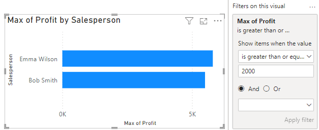
Step 2. Add a visual-level filter in Power BI to your report
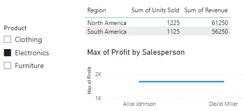
Once you’ve loaded data to Power BI, you can proceed to select visuals and display data. Here, we have a sales dataset for a company operating in various regions.
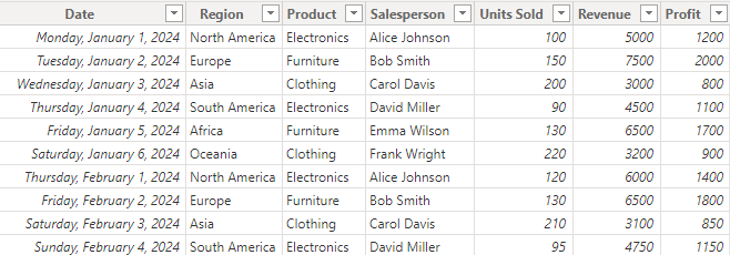
We can filter a visual to show data for one category. First, you’ll pick a visual on the Visualizations pane. Next, you’ll go to the Filters pane, check the Filters on this visual section and choose the specific category for filtering the visual (e.g. Electronics).
Now, you know how to add a visual-level filter to your report.
What are filtering levels and how to use them?
Filtering levels define which part of the report a filter should be applied to: the whole report, a specific page, or a specific graph. We’ve just introduced the visual-level filter to you in the example above. So, let’s discuss how other filtering levels work and have a look at some examples.
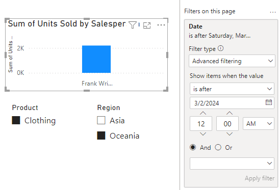
Page-level filters in Power BI
These filters can be applied to all visuals on a single report page.
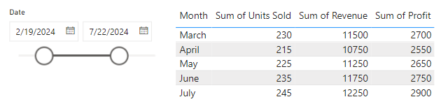
Example
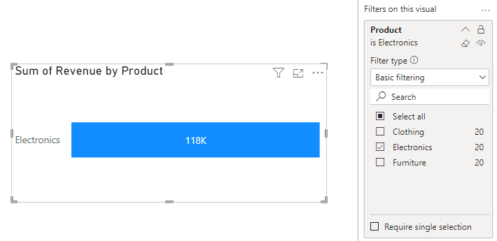
We can filter a page so the visuals would only show data for the first quarter of the year. First, you’ll add one or more visuals to the page. Next, you’ll drag the preferred category into the Filters on this page section, e.g. we’ll use the Date field. Then, you’ll continue to set the filter condition to a particular time frame, e.g. January 1st to March 31st.
All the visuals on the page display data for the first quarter.
Report-level filters in Power BI
These are filters that apply to all pages and visuals within an entire report.
Example
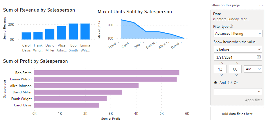
We can filter the entire sales report to show only data for North America. You’ll create a fresh report and add one or more pages to it. Next, you’ll go to any page, select the category to filter by and drag it into the Filters on all pages section, e.g. the Region field. Then, you’ll set the filtering condition to include a specific region, e.g. North America.
All pages in the report would display data for the selected region.
The most useful types of filters in Power BI that will enrich your report
You can use filters to control what data is displayed in reports and dashboards. They allow you to understand your data and gain meaningful insights quickly. Each type of filter in Power BI utilizes different filtering techniques. Below are the most popular ones:
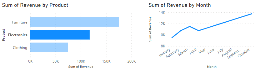
1. Drill-down filters in Power BI
The drill-down is often used to navigate from higher levels of data to a more detailed view within a visual. It allows you to temporarily filter information by moving up and down the data hierarchy. These filters also interact with the visual, affecting how your data is presented.
We can drill down from higher levels to lower levels e.g. from year to month and day. The first step is to add a visual that supports drill down, e.g. We’ll use a line chart here. Next, you’ll drag the required fields to the visual, e.g. We’ll put Date on the x-axis and Revenue on the y-axis. Then, you have to enable the drill-down feature on the chart.
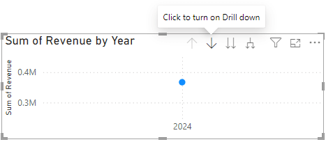
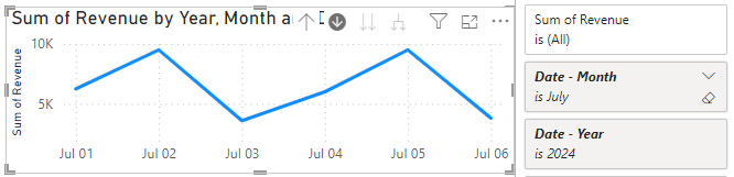
Drill down from year to month to day by clicking on the data points in the chart.
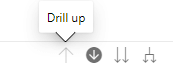
Drill back up by clicking the upward-facing arrow on the chart:
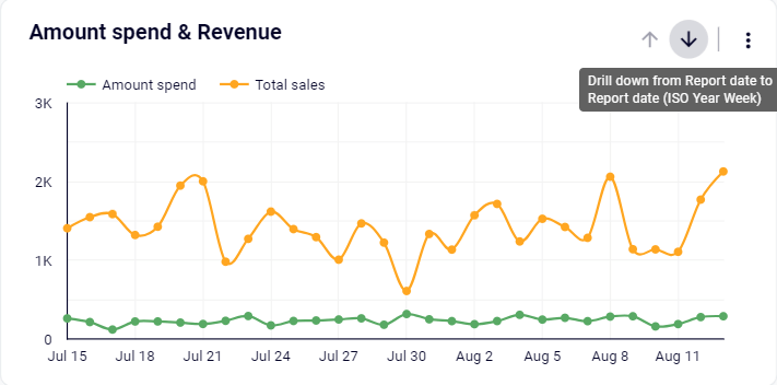
Here is what a drill-down chart looks like in the report:
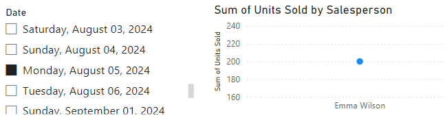
2. Slicers
A slicer is a visual control that lets you interactively filter data in reports. It can be applied to certain visuals, an entire page, or across multiple pages.
You can use slicers to filter data by a certain category, e.g. product. First, you’d add a slicer visual to the page and drag the desired category to the “field” well. Next, you’ll go to the Visualizations pane -> Slicer filter settings -> Options and pick a style for it.
3. Date filters in Power BI
It’s possible to use date ranges to filter your data and focus on important time periods. Relative date filters can be applied at any level (visual, page, or report) to show only the necessary data. For example, you can use it to display metrics for the last 30 days.
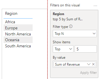
4. Top N filters
The top N filter is mostly used to display the top or bottom N number of items. It can be based on any measure that has a numerical value, i.e. impressions, sales, profit, etc. For example, you can aggregate the top results in a certain category.
5. Cascading filters in Power BI
These are filters that are dependent on each other. When a user selects a value in one filter, it affects the options available in another filter as it needs to display relevant data. For example, selecting a country in one filter affects the options available in subsequent filters.
6. Advanced filters
An advanced filter has complex filtering criteria and can be created with the help of DAX functions. Such a filter allows you to create a custom measure with multiple conditions and logical operators. For instance, you can use such a filter to calculate the revenue made from each product category in the past several years.
FilteredRevenue =
CALCULATE(
    SUM(Sales[Revenue]),  // Calculate total revenue
    FILTER(
        Sales,
        Sales[OrderDate] >= TODAY() - 365 * 3 &&  // Orders in the last 3 years
        Sales[Category] IN {"Electronics", "Furniture"}  // Only selected categories
    )
)
7. Multiple filters in Power BI
It’s possible to use more than one filter at a time. When you combine various filtering techniques, your report becomes more precise and easier to work with. For example, you can use a combination of slicers, visual-level filters, page-level filters, etc.
8. Manual filters in Power BI
A manual filter is any filter that can be applied manually – by dragging a field to the desired section on the filters pane. Then, you will need to specify the filtering condition and respective values. It’s a permanent filter that won’t change when the user interacts with the report. E.g. visual-level, page-level and report-level filters.
9. Cross-filtering and cross-highlighting
This type of filter helps to enable interactions between different visuals in a report. When a user selects data points in one visual, it filters or highlights related data in other visuals. This helps to interact with data and explore relationships within the report. E.g. click on a specific category in a bar chart to filter a line chart on the same page.
10. Dynamic filters in Power BI
A dynamic filter changes based on user interactions or set conditions. It requires using slicers (with or without calculated columns) to apply responsive filtering in real time. For example, clicking on a specific data point on a slicer to dynamically filter and focus on one metric at a time.
How to clear all filters in Power BI
It’s quite easy to remove basic filters.
- Visual-level filters: select the visual, check the filters pane for “Filters on this visual”, and click the eraser icon next to each filter.
- Page-level filters: go to the selected page, search for “Filters on this page”, and click the eraser near each filter you want to remove.
- Report-level filters: navigate to any page on the report, check for “Filters on all pages”, and use the eraser.
If you want to clear a slicer filter, you need to select the slicer and click the eraser icon in the top-right corner of the visual to clear the selection. Another option is to remove the slicer visual from the report page entirely.
How to sync filters in Power BI between multiple pages?
There are a few ways to sync filters in Power BI reports.
Option 1 – Use DAX expressions
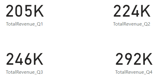
Although DAX can’t apply filters to pages, it can create calculated measures that can be used to display specific data (i.e., apply filters indirectly). For example, we can calculate the total revenue for each quarter instead of using the filter pane.
First, you need to identify the filter conditions and create new measure(s):
TotalRevenue_Q1 =
CALCULATE(
    SUM('Sales'[Revenue]),
    'Sales'[Quarter] = "Q1"
)

TotalRevenue_Q2 =
CALCULATE(
    SUM('Sales'[Revenue]),
    'Sales'[Quarter] = "Q2"
)

TotalRevenue_Q3 =
CALCULATE(
    SUM('Sales'[Revenue]),
    'Sales'[Quarter] = "Q3"
)

TotalRevenue_Q4 =
CALCULATE(
    SUM('Sales'[Revenue]),
    'Sales'[Quarter] = "Q4"
)
Here’s the result:
Option 2 – Sync slicers
Add a slicer visual from the visualizations pane and drag the desired column to the “Field” well. Under the View tab, you’ll find Sync slicers.
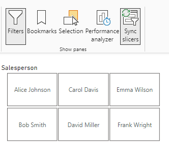
Once you click on it, you’ll see the pane for syncing slicers. Next, select the pages you want to sync.
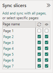
This will add a copy of your slicer to all the selected pages. If you want to remove the slicers later, simply deselect them.
Do you need filters to analyze your data?
Filters in Power BI help you focus on relevant data and make data analysis easier. By using them, you extract only the relevant portion of data from a large dataset and control what’s displayed. Anyone who views the report can also use interactive filtering to work with the presented information.
Note: Explore our Power BI tutorial to learn more about reporting in this business intelligence tool.
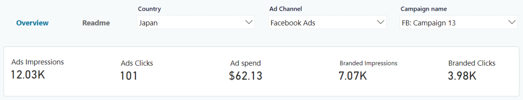
If you need to import datasets from cloud sources into Power BI, then consider Coupler.io. This reporting automation solution lets you connect 60+ different applications to Power BI, keeping your data fresh and analysis-ready. You can filter data on the go and benefit from dozens of ready-to-use dashboard templates in Power BI.
Apart from this, you can use Coupler.io to transfer data to other business intelligence platforms (Tableau, Looker Studio), spreadsheet apps (Excel, Google Sheets), and data warehouses (BigQuery, Redshift, and more).
Connect your data sources to Power BI with Coupler.io
Get started for free