From a CFO financial dashboard to a revenue overview and cashflow forecast – in this article, you will discover 20 financial dashboards that will help you make sense of your financial data.
Some of them can be an inspiration for building your own dashboard, while others are ready-to-use templates. The latter allows you to visualize your financial data automatically in a matter of minutes. We will also explain how to automate your financial dashboard reporting so that your dashboards are always up-to-date and analysis-ready. ?ee how to turn numbers into compelling visual stories. For your convenience, we’ve grouped the dashboard examples into several categories:
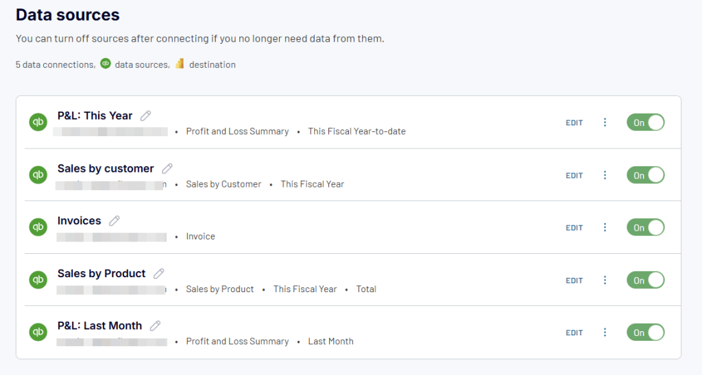
- Financial dashboards for QuickBooks
- Financial dashboards for Xero
- Time-tracking financial dashboards
- E-commerce & sales financial dashboards
- Revenue & profit analysis dashboards
- Cash flow management dashboards
- Financial overview & performance dashboards
Financial dashboard examples for QuickBooks
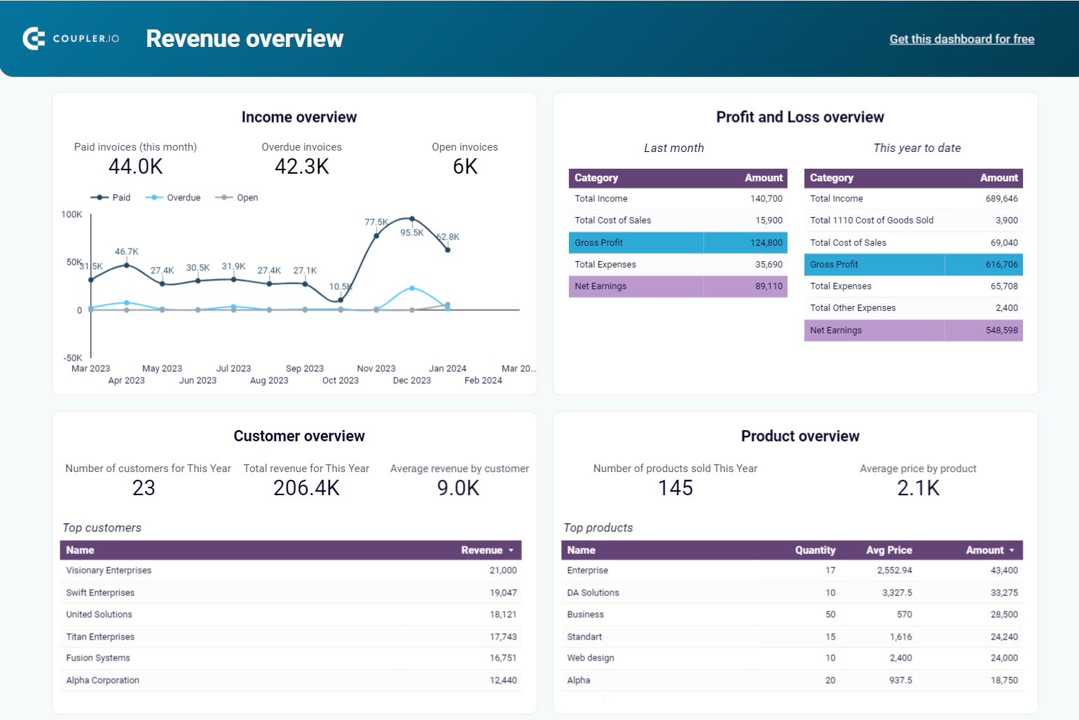
1. CFO revenue financial dashboard template for QuickBooks
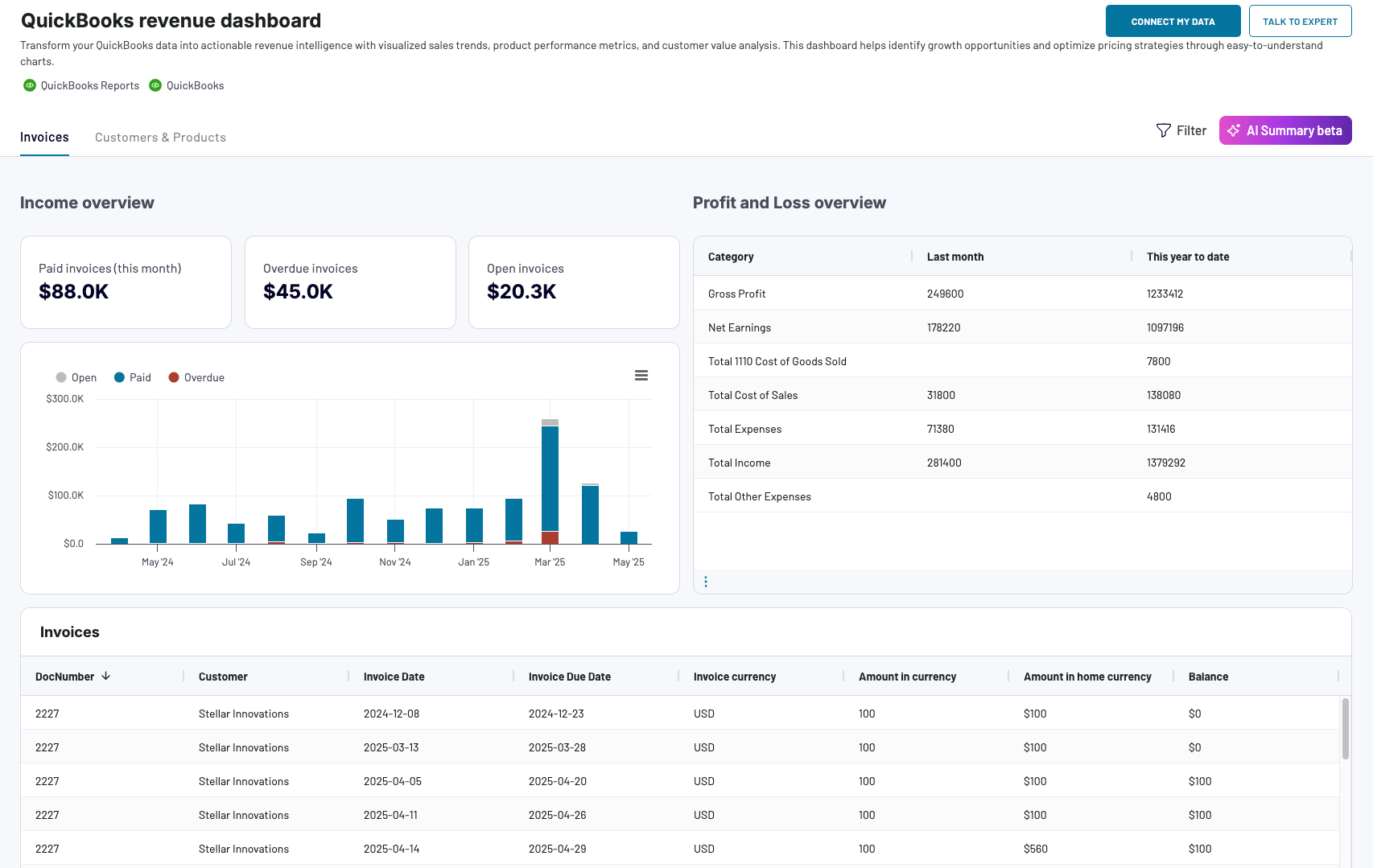
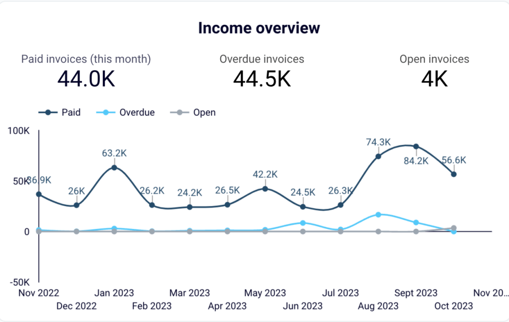
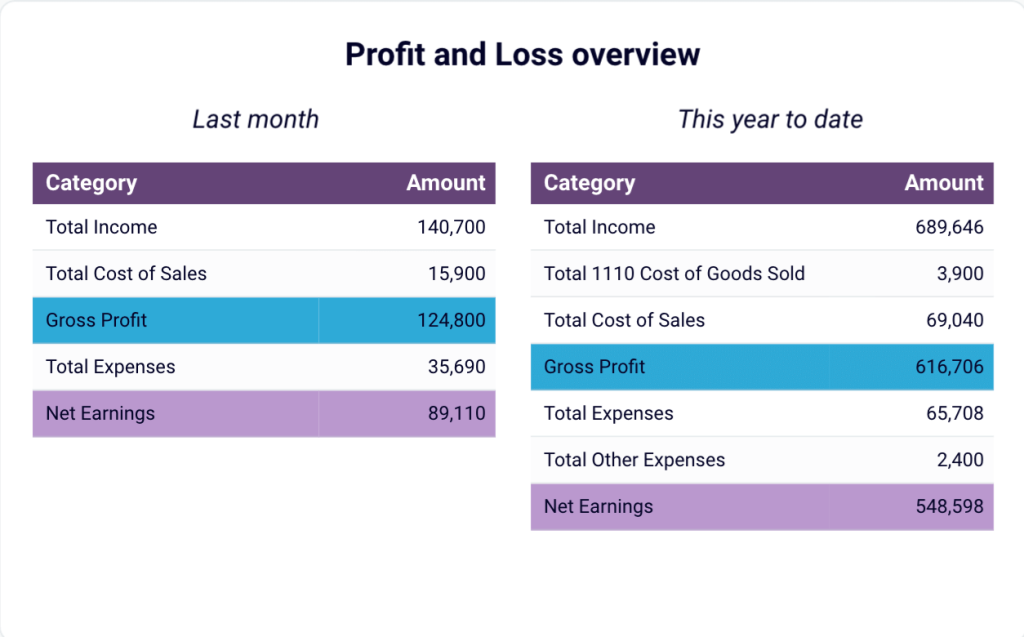
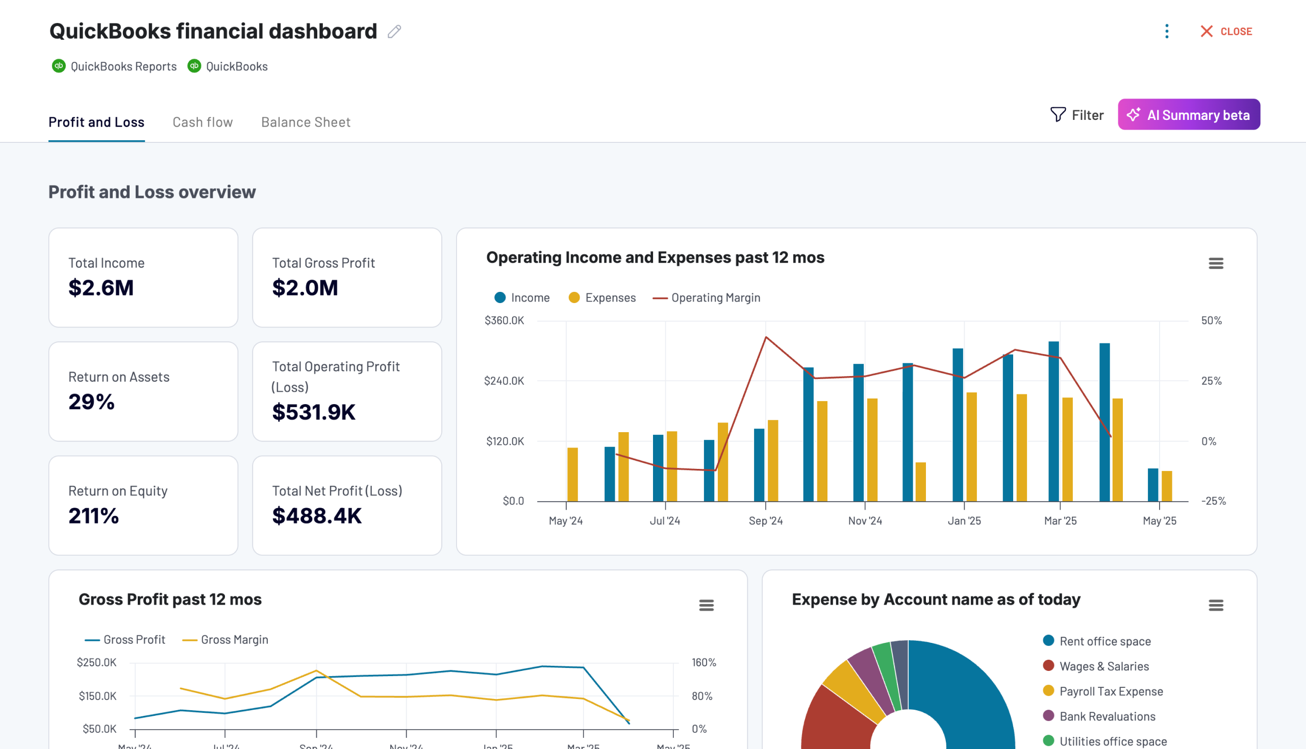
This financial dashboard is a great analysis instrument for a CFO as it provides a comprehensive overview of the main key performance indicators loaded from QuickBooks. In particular, it shows such metrics as total revenue, net earnings, average revenue by customer, and more. The dashboard also includes a comprehensive overview of profit and loss, income, products, and invoices.
QuickBooks revenue dashboard + AI insights
 Preview dashboard
QuickBooks revenue dashboard + AI insights
Preview dashboardA set of interactive filters and drill-down capabilities allow executives to explore data in depth and switch between the high-level overview and a more granular level. Let’s take a closer look at some of the sections included in this CFO dashboard.
- In the income overview block, you can track the statuses of your invoices and conduct a time-over-time analysis. The scorecards on the top show you useful financial KPIs and allow you to quickly assess the current situation at a glance.
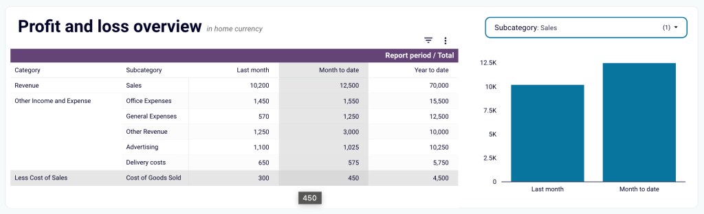
- The profit and loss overview is an important part of this visualized report. It includes the most essential financial metrics and success indicators, such as total income, gross profit, total expenses, and net earnings. The information is summarized into two blocks, giving an overview of the last month and, for a broader context, this year to date.
With this financial reporting dashboard template, you can:
- Monitor revenue growth in near real-time
- Identify the best-performing products
- Keep track of the invoices
- Analyze your financial data to obtain actionable insights
- Create data-backed projections and plan ahead
The financial dashboard for QuickBooks is available natively in Coupler.io (with AI insights) and as a template in Google Sheets, Looker Studio, and Power BI. Each version is automated with Coupler.io, a reporting automation solution. As a result, you always have access to the latest financial data, and your report is always up-to-date. Just connect your QuickBooks account – and you will get a copy of this dashboard with your data in just 5 minutes.
QuickBooks revenue dashboard
Transform your QuickBooks data into actionable revenue intelligence with visualized sales trends, product performance metrics, and customer value analysis. This dashboard helps identify growth opportunities and optimize pricing strategies through easy-to-understand charts.


QuickBooks revenue dashboard in Google Sheets
Analyze your revenue through a set of reports collected from QuickBooks Online on a single dashboard.

QuickBooks revenue dashboard in Looker Studio
Get an overview of your revenue based on the data from QuickBooks and unlock in-depth insights to drive informed business decisions.

QuickBooks revenue dashboard in Power BI
Monitor your income and expenses on an all-in-one revenue dashboard connected to your QuickBooks Online account.

2. Financial dashboard for QuickBooks
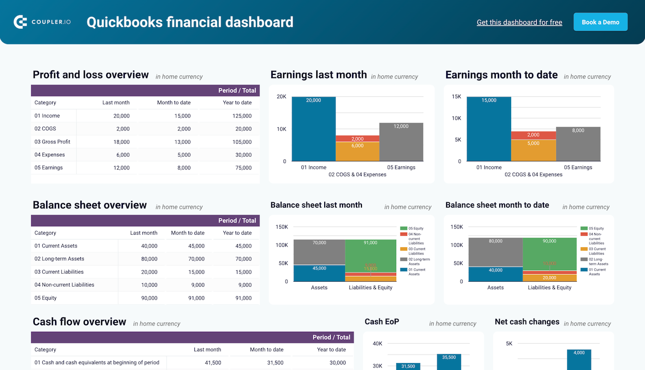
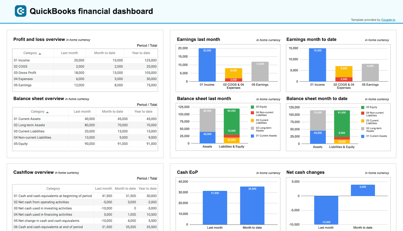
The QuickBooks financial dashboard gives an overview of the key reports like Profit and Loss, Balance sheet, Cash flow, and Bank and cash accounts in one place. This allows business owners, finance teams, and executives to understand their business’s financial position at a glance.
It features intuitive visualizations like charts, tables, and KPI scorecards, providing a clear view of financial performance. You can track cash inflows and outflows, monitor profitability, and review assets, liabilities, and equity. The interactive filters and drill-down options let you analyze specific data points for a deeper understanding of your financial health.
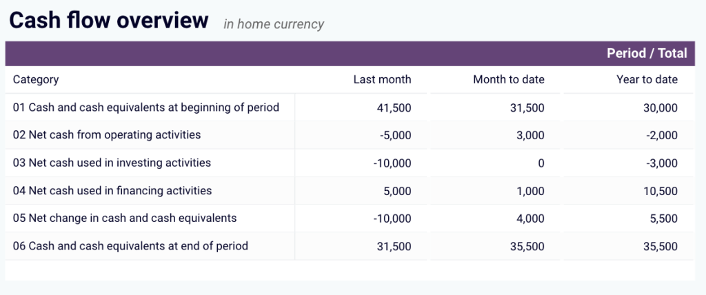
The cash flow report tracks cash inflows, outflows, and net cash changes for a specified period. It displays the cash position at the end of each period, helping you maintain liquidity and avoid cash shortages.
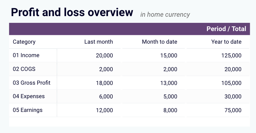
The profit and loss dashboard provides a summary of revenue, expenses, and net income for the last month, month-to-date (MTD), and year-to-date (YTD). It highlights earnings trends, allowing you to identify growth patterns and control expenses.
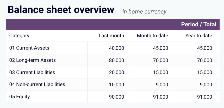
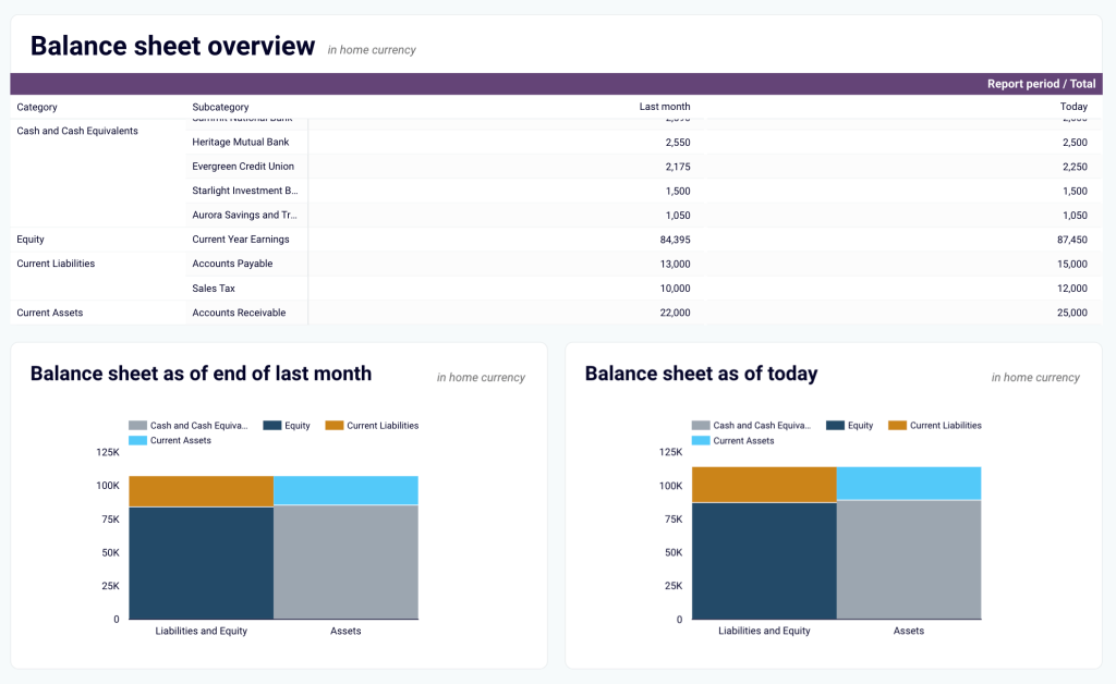
The balance sheet dashboard shows the balances of all linked bank and cash accounts, along with multi-currency tracking for foreign accounts. It gives visibility into available funds, making it easy to reconcile accounts and manage daily cash flow.
With this financial reporting dashboard template, you can:
- Track cash flow in real-time and identify cash flow gaps
- Analyze profit and loss statements for key financial insights
- Assess the overall health of your balance sheet
- Drill down into specific data points for deeper analysis
- View up-to-date financial data with automatic refresh
This QuickBooks financial dashboard is available in Coupler.io and as a template in Looker Studio and Google Sheets. All it takes is a simple connection with your QuickBooks account, and you’ll have a fully populated dashboard with your data in minutes.
QuickBooks financial dashboard
Tracks earnings, monitor cash flow, and analyze balance sheet changes with a dedicated dashboard that provides a clear picture of your business finances.
QuickBooks financial dashboard in Looker Studio
Monitor and analyze your business’s financial health with real-time insights into profit and loss, balance sheet, cash flow, and bank & cash accounts.
QuickBooks financial dashboard in Google Sheets
Get a clear snapshot of your business finances, including cash flow, P&L, balance sheets, and bank accounts, powered by data from QuickBooks Online.
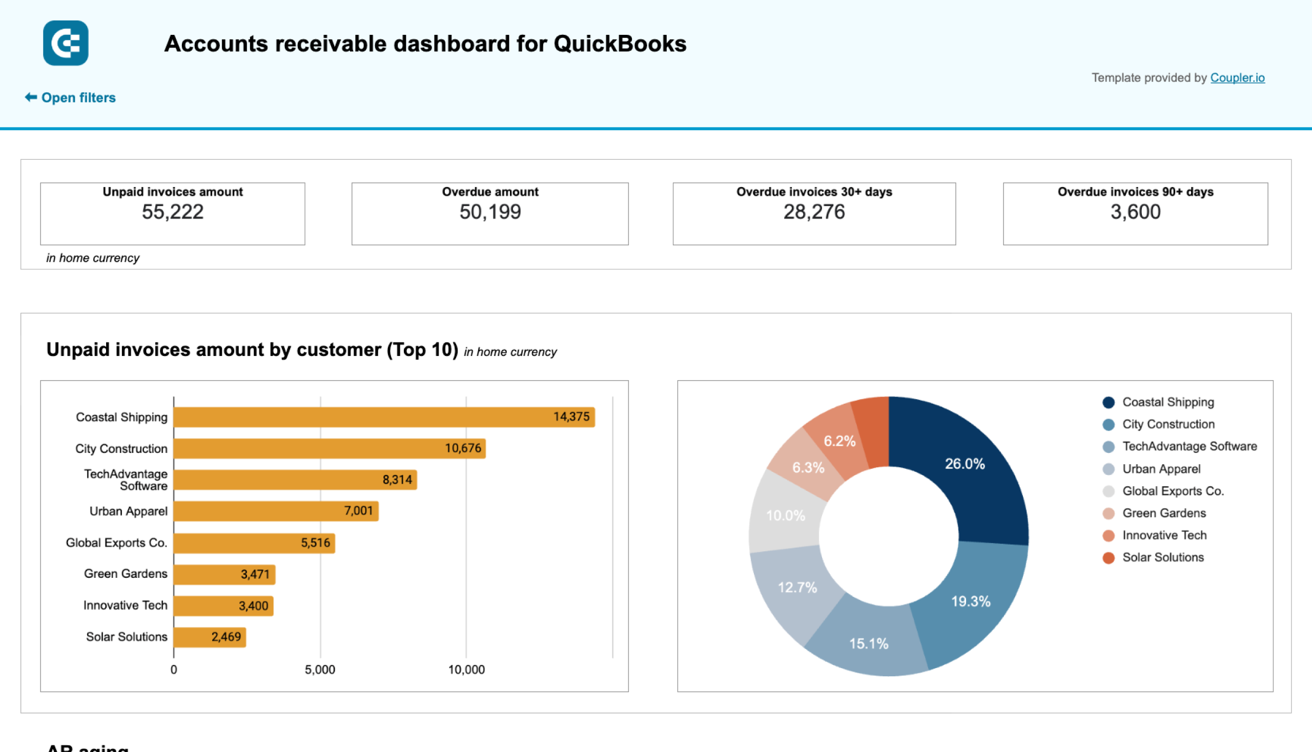
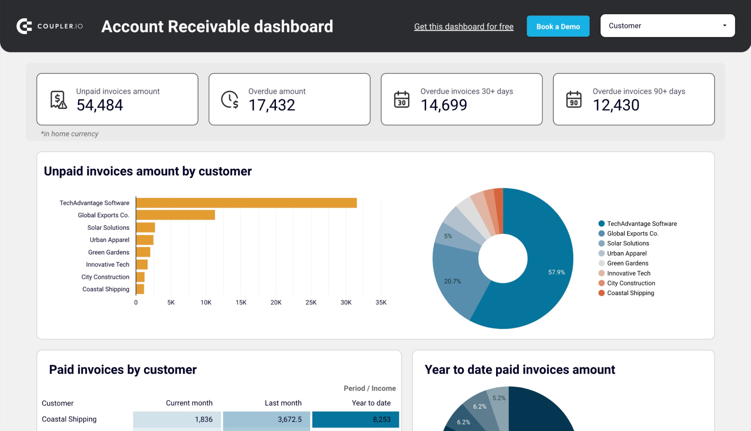
3. Accounts receivable dashboard for QuickBooks
This QuickBooks accounts receivable dashboard provides a comprehensive overview of client invoicing and payment tracking. It helps you visualize unpaid and overdue invoices, track customer payment patterns, and manage your accounts receivable aging. With this CEO dashboard template, you can quickly identify which customers have outstanding balances and prioritize collection efforts.
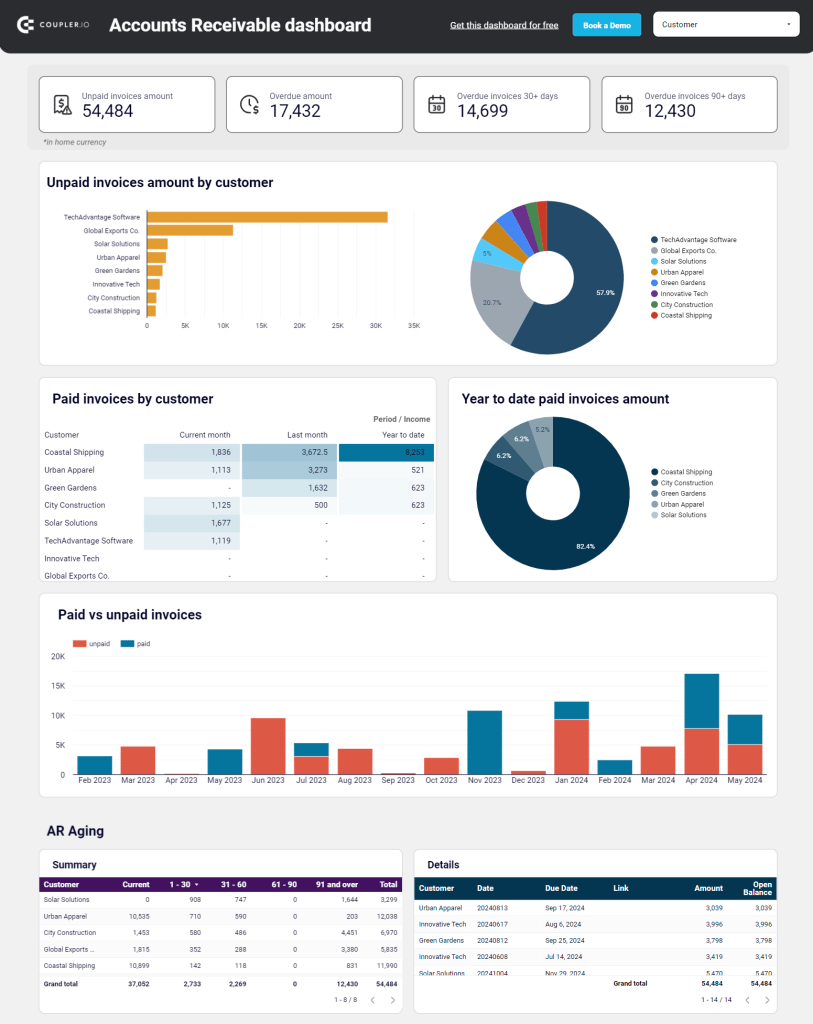
The dashboard highlights total overdue amounts and shows which customers are accumulating unpaid invoices. You’ll see a detailed breakdown of paid vs. unpaid invoices and can track changes in your receivables over time. The aging report helps you understand how long invoices have been outstanding, allowing you to take appropriate action before they become difficult to collect.
With this dashboard, you can:
- Monitor total unpaid and overdue amounts at a glance
- Identify your top 10 customers by outstanding balances
- Track payment patterns and history by customer
- See the distribution of overdue amounts by time period
- Access detailed invoice information for better cash flow management
- Make informed decisions about customer credit terms and collection strategies
This accounts receivable dashboard is available as a free template for QuickBooks in Google Sheets and Looker Studio. The template connects to your QuickBooks account through Coupler.io’s automated data integration. Check the Readme tab for step-by-step instructions on setting up your dashboard.
Accounts receivable dashboard for QuickBooks in Google Sheets
Monitor customer payment statuses, overdue invoices, and collection trends with this dashboard connected to QuickBooks. Get clear visibility into your cash flow cycle with aging analysis and customer payment patterns to improve financial forecasting.
Accounts receivable dashboard for QuickBooks in Looker Studio
See which customers accumulate unpaid and overdue invoices, analyze AR aging, and track changes over time. Get useful insights for maintaining financial health.
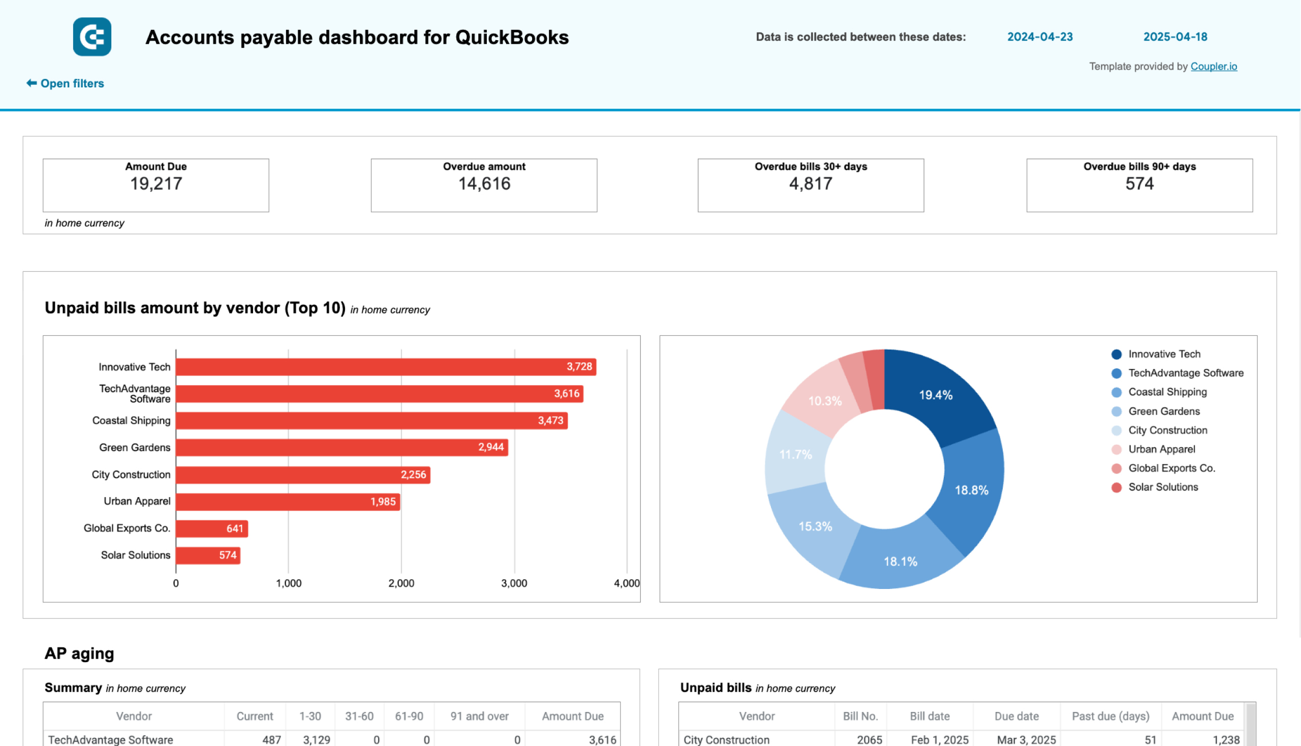
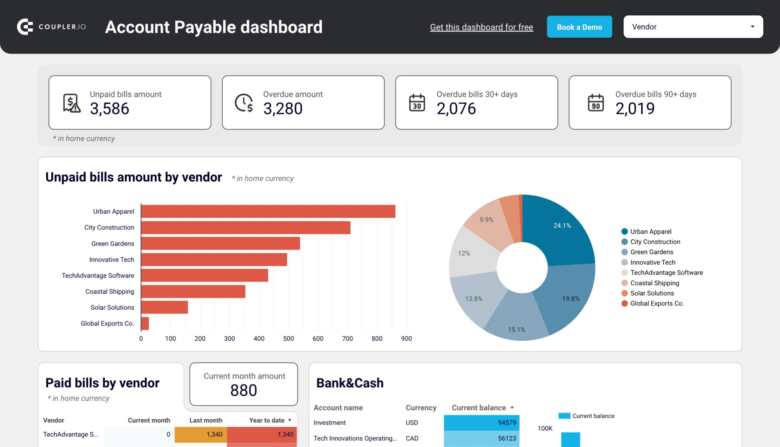
4. Accounts payable dashboard for QuickBooks
This QuickBooks accounts payable dashboard helps you visualize and manage your vendor payments effectively. It provides a clear overview of your bills and payment obligations, helping you maintain good vendor relationships while optimizing your cash flow. The dashboard offers visibility into unpaid and overdue bills, vendor payment history, and upcoming payment obligations.
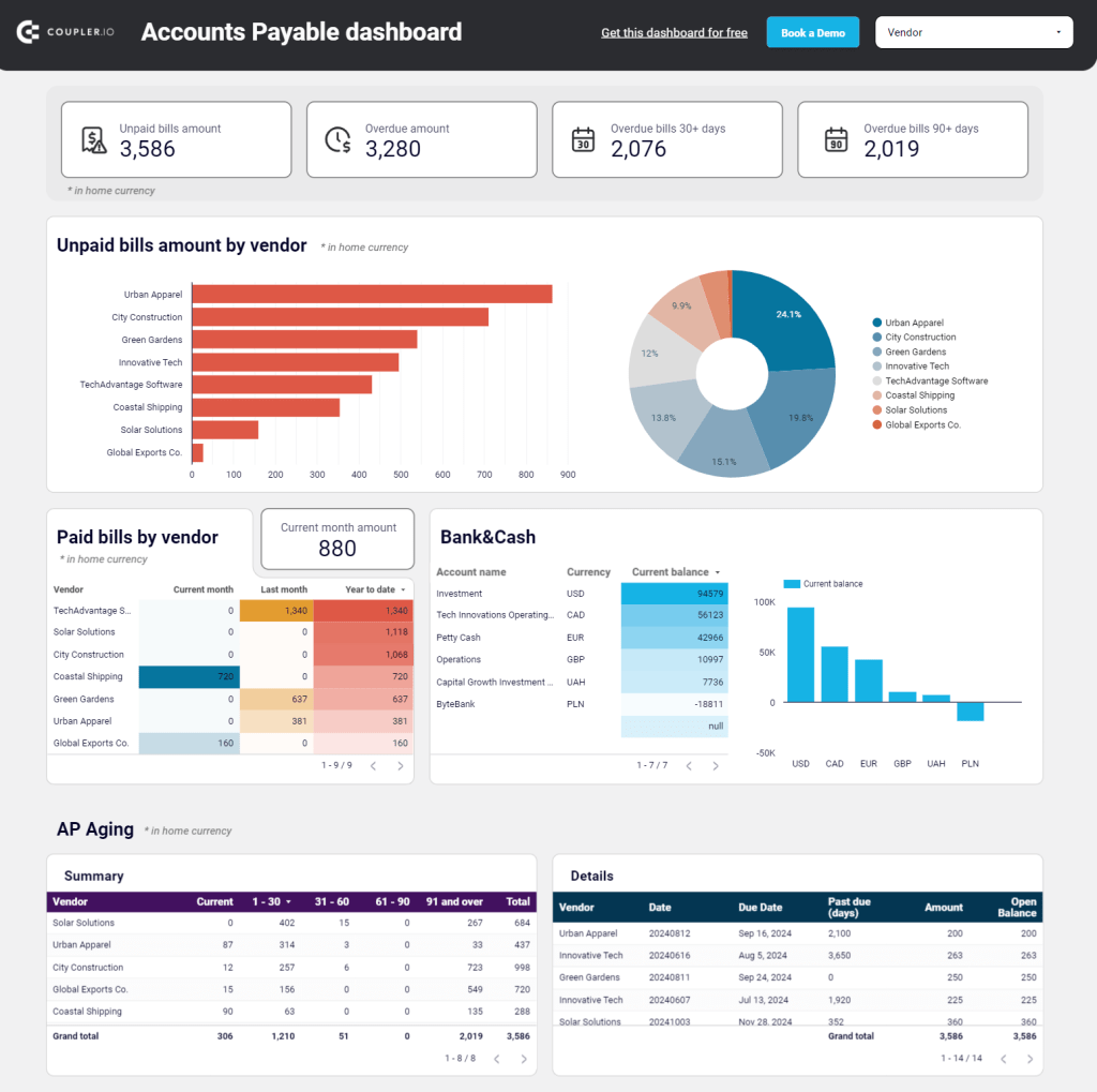
With scorecards showing total unpaid and overdue amounts, you can immediately understand your current liabilities. The top 10 vendors by outstanding amounts are highlighted, helping you prioritize your most significant payment obligations. You can also track vendor payment history and analyze your cash accounts to ensure sufficient funds for upcoming payments.
With this accounts payable dashboard, you can:
- Monitor your total unpaid and overdue bills in home currency
- Identify which vendors have the largest outstanding balances
- Track bill aging to prevent late payment penalties
- Analyze payment history to identify payment patterns
- View detailed bill information including due dates and amounts
- Make more informed decisions about when to release payments
This accounts payable dashboard is available as a free template for QuickBooks in Google Sheets and Looker Studio. It automatically updates with your latest QuickBooks data through Coupler.io’s integration. Follow the instructions in the Readme tab to set up your own dashboard in minutes.
Accounts payable dashboard for QuickBooks in Google Sheets
Track outstanding vendor obligations, payment schedules, and expense patterns with data from QuickBooks. This dashboard helps you manage cash flow, identify payment priorities, and maintain healthy supplier relationships through visualized aging reports.
Accounts payable dashboard for QuickBooks in Looker Studio
Get an overview of unpaid, overdue, and paid bills grouped by vendor. The dashboard helps you prioritize payments and improve cash flow management.
Financial dashboards for Xero
5. Financial dashboard for Xero
The Xero financial dashboard is a powerful reporting tool for small business owners, financial managers, accountants, and bookkeepers who use Xero to manage their finances. It provides a real-time snapshot of a company’s financial health for users to track earnings, cash flow, and balance sheet changes in one place.
This dashboard features visualizations that simplify financial reporting. It lets users monitor revenue, expenses, assets, liabilities, and cash flow without diving into complex spreadsheets.
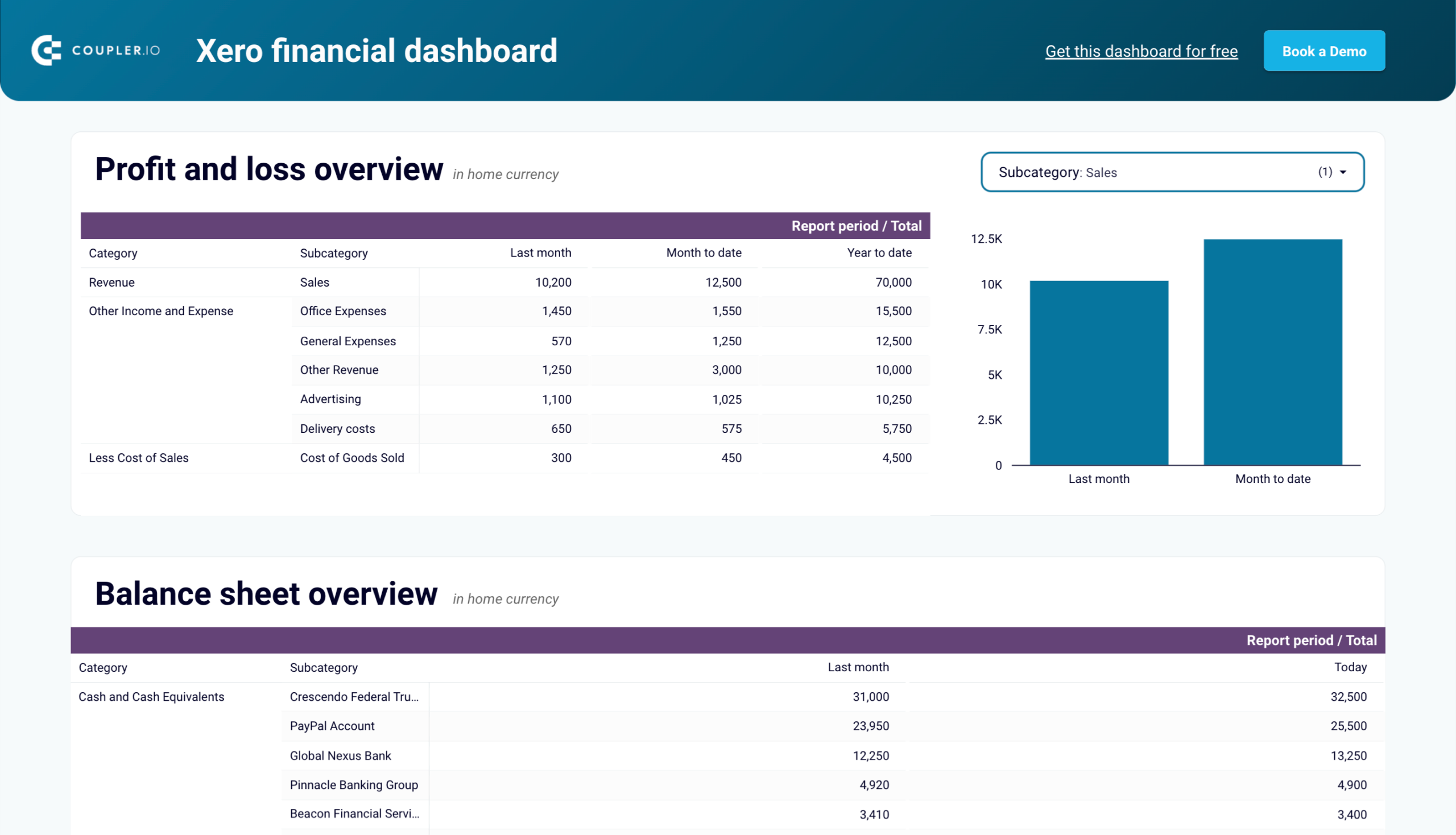
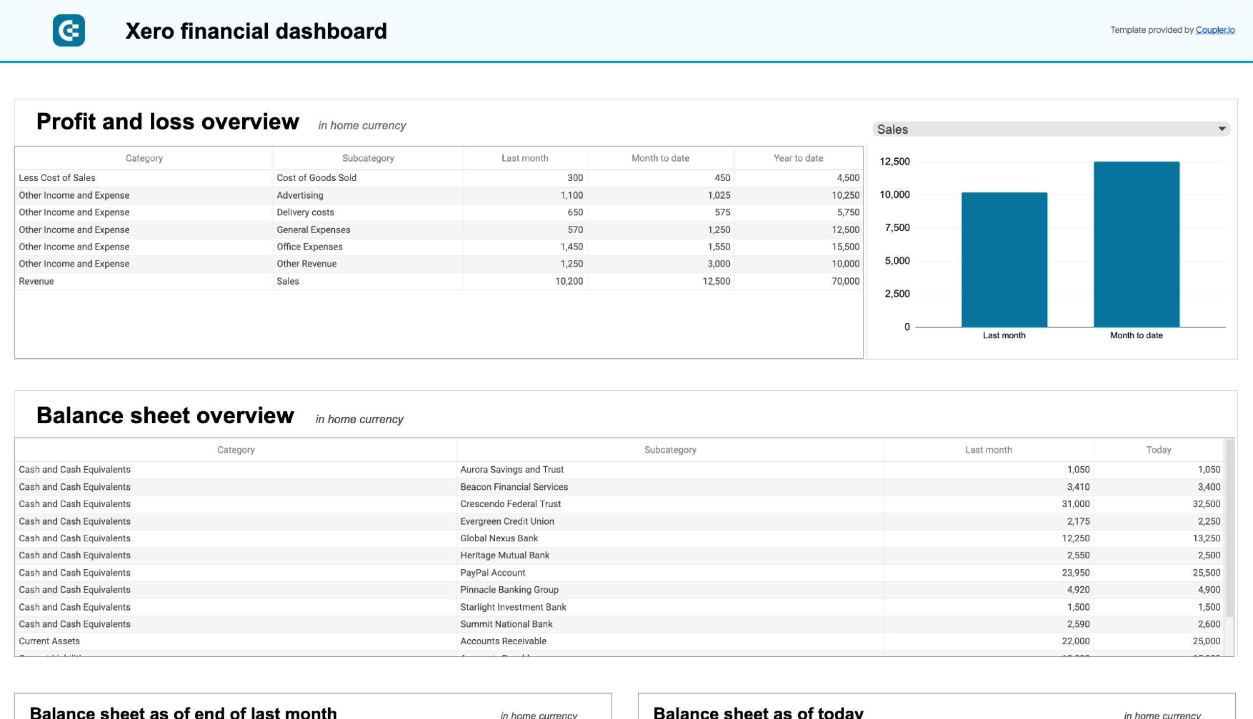
The profit and loss overview summarizes revenue, expenses, and net income for the last month, month to date, and year to date. This section helps you understand profitability and control costs.
The balance sheet overview provides a snapshot of assets, liabilities, and equity, offering insights into financial position and liquidity. Two charts visually represent balance sheet changes, showing financial trends from last month to today.
The cash flow overview highlights net cash changes over the reporting period, allowing businesses to manage liquidity effectively. Below the table, two visualizations illustrate cash position trends and net cash changes over time.
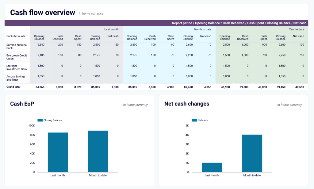
With this financial dashboard, you can:
- Track earnings, expenses, and net profit at a glance to assess financial health and optimize budgeting decisions.
- Analyze trends in your revenue and cost structure to identify growth opportunities and control unnecessary expenses.
- Monitor assets, liabilities, and equity to ensure financial stability and plan for future investments.
- Gain real-time visibility into cash flow and liquidity to maintain smooth operations and avoid financial shortfalls.
- Make data-backed financial decisions quickly to seize opportunities and mitigate potential risks effectively.
You can use the Xero financial dashboard in Coupler.io, which offers the AI insights feature designed to help you quickly make sense of your data. It is also available as a template in Looker Studio and Google Sheets. Simply connect your Xero account, and your dashboard will be populated with real-time financial data in minutes.
Xero financial dashboard
Get comprehensive financial insights from your Xero account with key performance metrics, balance sheet analysis, and cash flow projections. Quickly assess your business health and make informed financial decisions.

Xero financial dashboard in Looker Studio
Analyze your financial performance with a unified dashboard featuring key reports from Xero like cash flow, profit and loss, balance sheet, and others.
Xero financial dashboard in Google Sheets
Get instant visibility into your company’s financial health through key performance reports from Xero such as cash flow, income statement, and balance sheet.
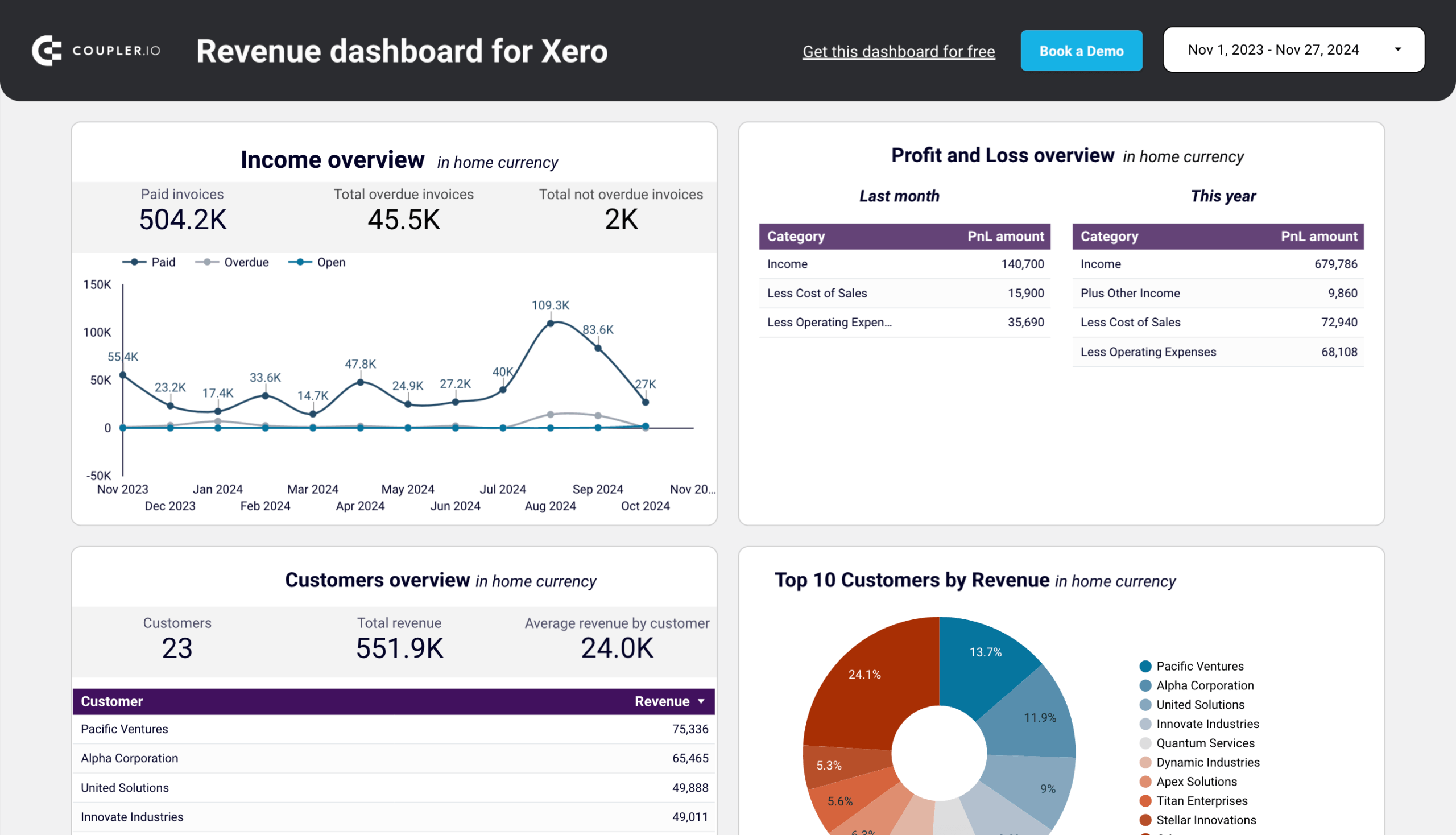
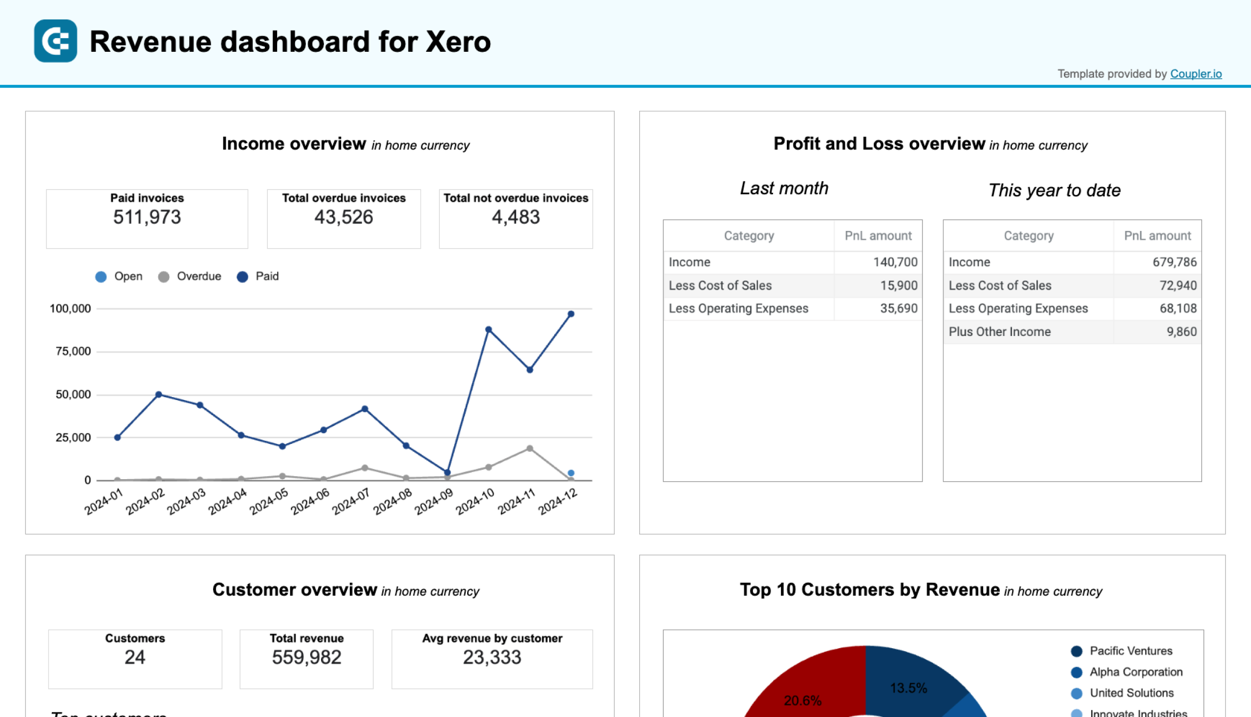
6. Revenue dashboard for Xero
The revenue dashboard for Xero is useful to track your business income and expenses in one place. It is designed for small business owners and finance teams to easily monitor revenue trends, understand key income drivers, and assess overall financial performance.
This dashboard includes simple visualizations like charts and tables to show revenue trends over 12 months. It highlights your top customers and products by revenue and provides a Profit and Loss breakdown to compare income and expenses. You can use these insights to make data-driven financial decisions.
With this dashboard, you can:
- Track revenue trends over time
- Identify your most valuable customers and products
- Review profit and loss to manage costs effectively
- Explore detailed data for better insights
- Keep data updated automatically
The dashboard is available in Coupler.io and as a Looker Studio and Google Sheets template with a built-in Xero connector. Choose the version you like and follow the instructions on the Readme tab to connect your Xero account and populate the dashboard with your data easily using the built-in connector by Coupler.io.
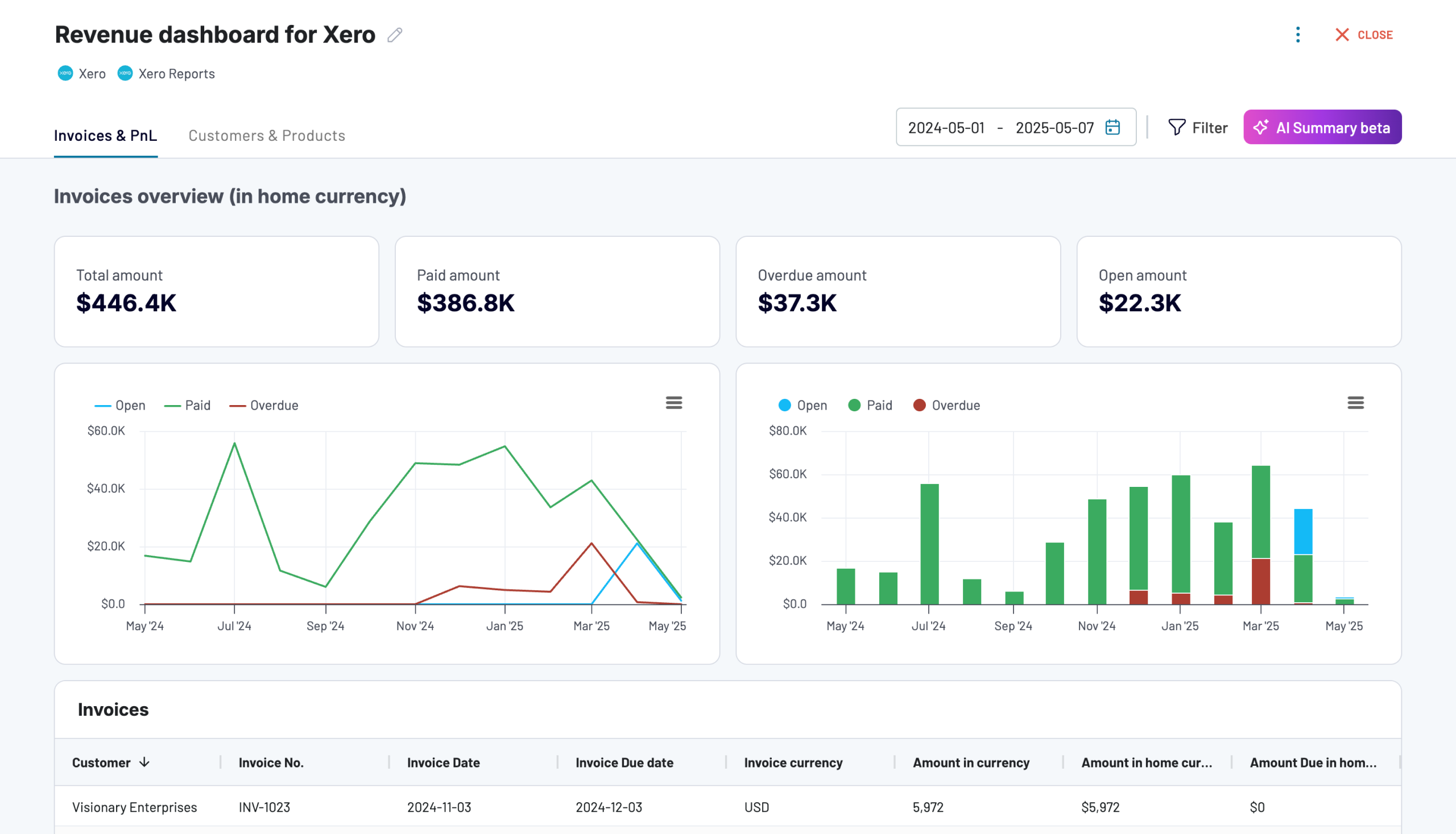
Revenue dashboard for Xero
Analyze revenue streams, customer spending patterns, and product performance with data automatically synced from Xero. Gain actionable insights into sales trends, top-performing products, and high-value customers to drive growth strategies.
Revenue dashboard for Xero in Looker Studio
Get an overview of your profit and loss, products, and customers through a set of reports collected from Xero.
Revenue dashboard for Xero in Google Sheets
Track your revenue, costs, and customer insights with a comprehensive dashboard connected to your Xero account.
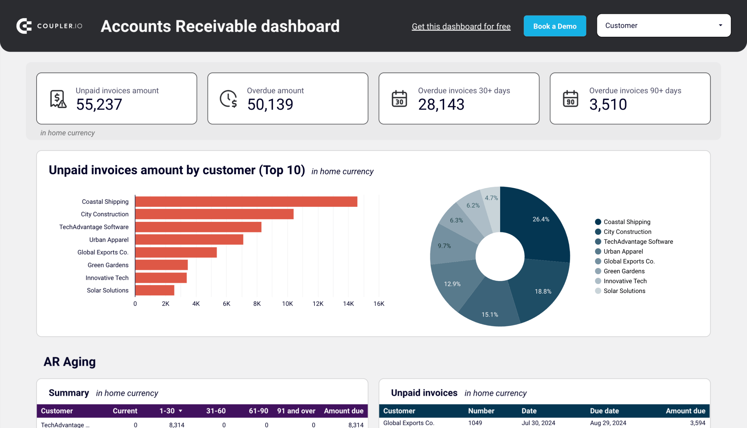
7. Accounts receivable dashboard for Xero
This Xero accounts receivable dashboard gives you complete visibility into your customer invoices and payments. It helps you monitor outstanding customer balances, track payment trends, and manage your accounts receivable aging effectively. The dashboard is designed to help Xero users identify collection opportunities and maintain healthy cash flow.
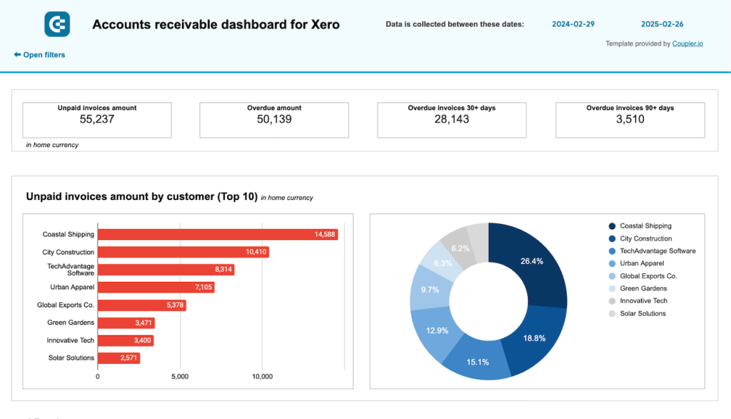
The dashboard provides a clear visualization of both unpaid and overdue invoices with scorecards showing total amounts. You can filter data by customer to analyze individual payment patterns and see which customers contribute most to your receivables. The monthly invoice trends chart helps you understand seasonal patterns in your billing and collections.
The accounts receivable aging section breaks down overdue amounts by time periods (current, 30 days, 60 days, 90+ days), helping you prioritize collection efforts. A detailed table of all customer invoices provides comprehensive information about payment status, due dates, and amounts.
With this accounts receivable dashboard for Xero, you can:
- Monitor total unpaid and overdue amounts in your home currency
- Identify which customers have the largest outstanding balances
- Track monthly invoice trends to better understand your cash flow cycle
- Focus your collection efforts on the most critical overdue accounts
- Analyze customer payment histories to improve credit decisions
- Maintain better relationships with customers through proactive invoice management
The dashboard is available as a template in Looker Studio and Google Sheets with a built-in connector by Coupler.io. Follow the instructions on the Readme tab to connect your Xero account and load data to the dashboard.
Accounts receivable dashboard for Xero in Looker Studio
See which customers accumulate unpaid and overdue invoices, analyze AR aging, and track changes over time.
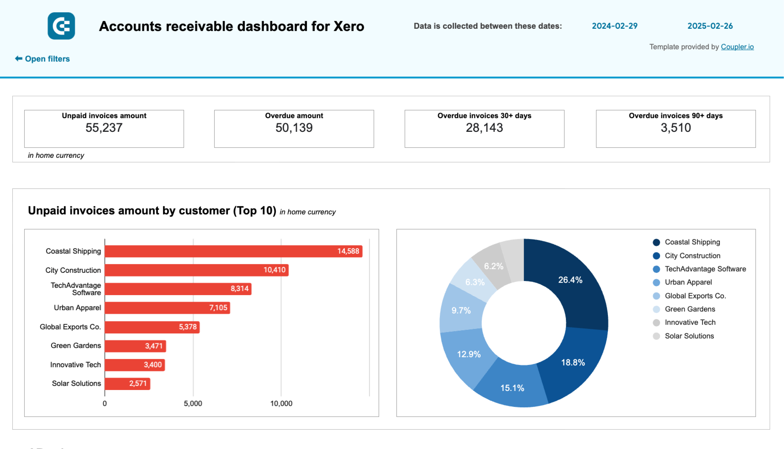
Accounts receivable dashboard for Xero in Google Sheets
Track outstanding customer payments, monitor aging receivables, and analyze the correlation between paid and unpaid invoices to improve cash flow management.
Explore other Xero report templates for accounting reporting.
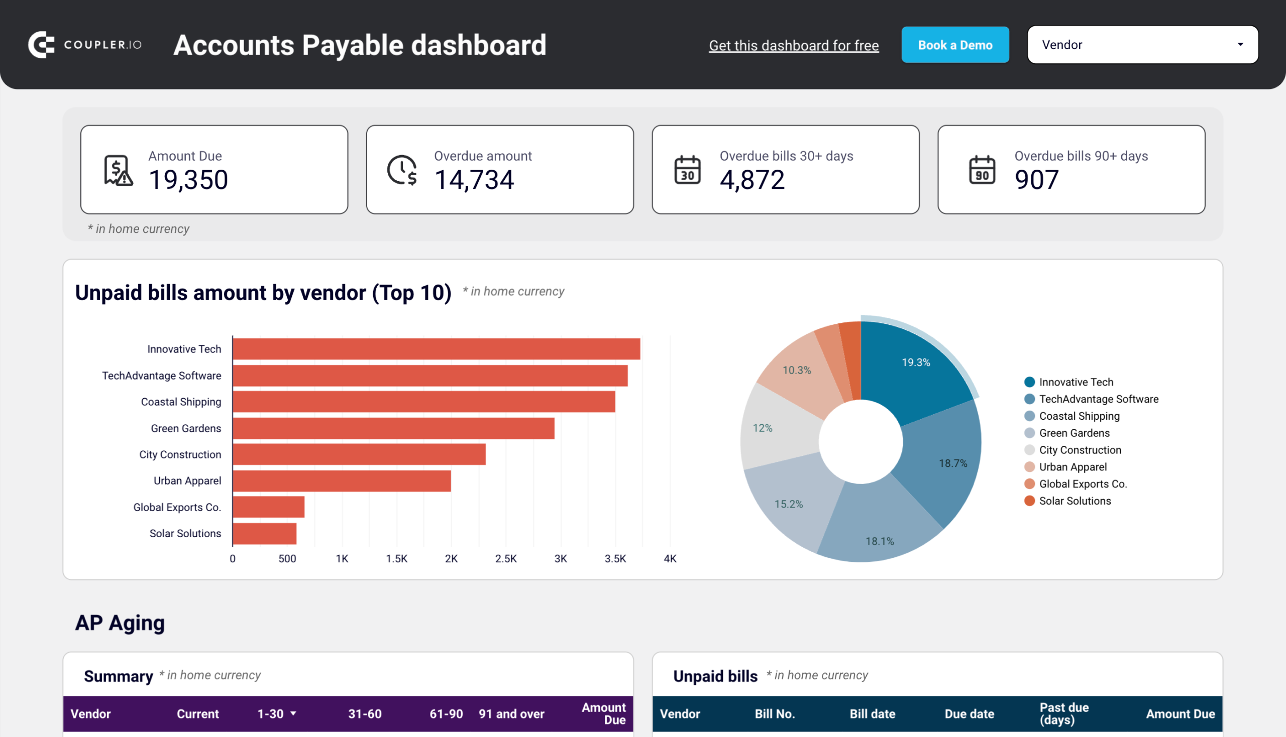
8. Accounts payable dashboard for Xero
The Xero accounts payable dashboard provides finance teams with a clear overview of vendor bills and payment obligations. It helps you manage your payables efficiently by visualizing unpaid bills, vendor payment history, and upcoming obligations in an intuitive format. The dashboard highlights critical metrics that help you maintain good vendor relationships while optimizing cash flow.

The dashboard displays total unpaid and overdue amounts with clear scorecards, allowing you to immediately understand your current obligations. It identifies your top vendors by outstanding balances and shows the distribution of these balances through an interactive pie chart. You can filter the dashboard by specific vendors to analyze individual payment relationships.
The accounts payable aging report breaks down overdue amounts by time periods, helping you identify which bills need immediate attention. A comprehensive table of all vendor bills provides detailed information about payment status, due dates, and amounts.
With this Xero accounts payable dashboard, you can:
- Monitor total unpaid and overdue bills in your home currency
- Identify which vendors have the largest outstanding balances
- Track paid bills by vendor to understand your payment history
- View the monthly dynamics of your payables to identify patterns
- Access detailed bill information to make informed payment decisions
- Optimize your payment schedule to maintain vendor relationships while preserving cash
This accounts payable dashboard template for Xero is built in Looker Studio and Google Sheets and connects to your Xero account through Coupler.io’s automated data integration. Check the Readme tab for step-by-step setup instructions.
The dashboard is available as a Looker Studio and Google Sheets template with a built-in connector by Coupler.io. Follow the instructions on the Readme tab to connect your Xero account and load data to the dashboard.
Accounts payable dashboard for Xero in Looker Studio
Track outstanding, overdue, and paid bills to optimize payment schedules, manage vendor relationships, and ensure smooth cash flow.
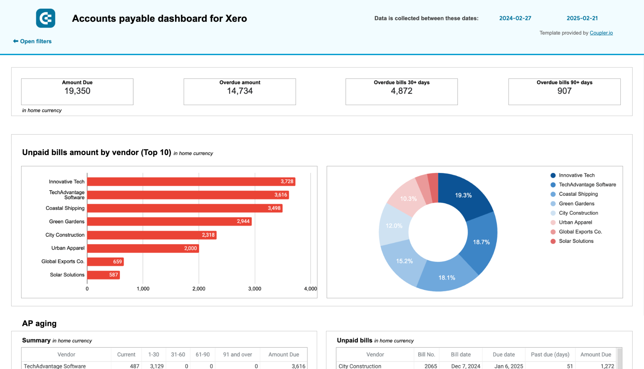
Accounts payable dashboard for Xero in Google Sheets
Monitor vendor payment deadlines, track aging bills, and analyze payment history to optimize cash flow management and maintain healthy supplier relationships.
9. Accounting dashboard for Xero
It’s critical for service businesses to keep a close eye on outstanding invoices and avoid spending what they don’t (yet) have. Earlier, we recommended using a time-tracking dashboard to make your billing process more accurate and transparent. An accounting dashboard picks up where those billing dashboards left off.
This one was built by BoldBI for finance teams who use Xero. It offers side-by-side comparisons of accounts payable versus receivable (by time period and payment target), as well as more granular insights on financial health.
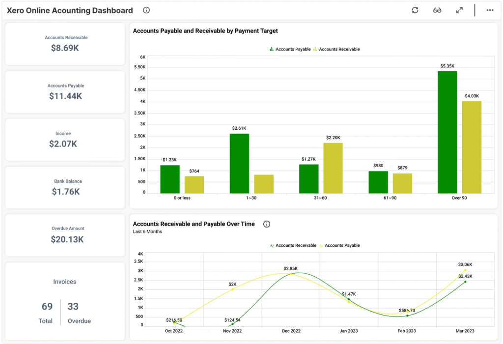
For instance, you can break down expenses by type, track the status of invoices, and get an executive financial summary. There is also a profit and loss summary and a table for checking how much each client owes.
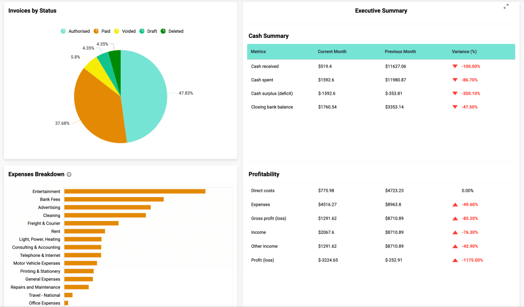
With this dashboard, you can:
- Analyze the profitability of your business
- Track the stability of income and expenses
- See total wealth at a glance
- Monitor the status of invoices
- Make decisions to prevent insolvency
- Simplify your accounting reporting process
Time tracking financial dashboards
10. Harvest time tracking dashboard template with billing overview
This time tracking dashboard is a handy tool for teams who use Harvest to track billable hours. You can see the total billable amount for specific periods and understand which clients and projects bring the most revenue.
On the second page of the dashboard, you’ll see a comprehensive overview of billable hours for a team that charges its clients by the hour. This dashboard automatically receives fresh data from Harvest every 15 minutes. It transforms information about the team’s billable hours tracked into a detailed visualized billing overview. You can see how many hours the team worked for every client and how much of this time is already billed, not billed, or not billable. You also have a bar graph that shows the same data structured by the amount to pay.
Other sections of the dashboard show you hours and amount to pay by project and billing status.
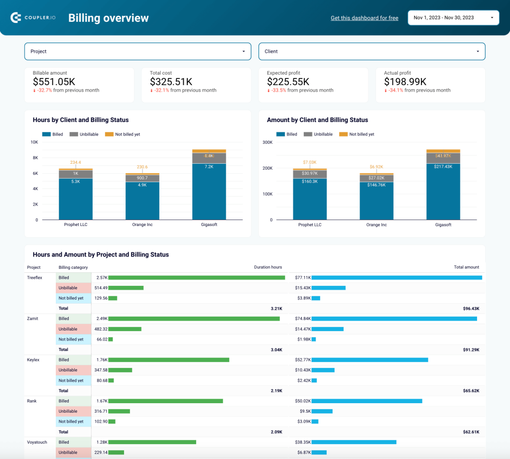
There’s also a granular overview of profits and losses by client and by project, profit margin by client and by project, billing breakdown, and profit timelines. All this information can be useful for the finance department team.
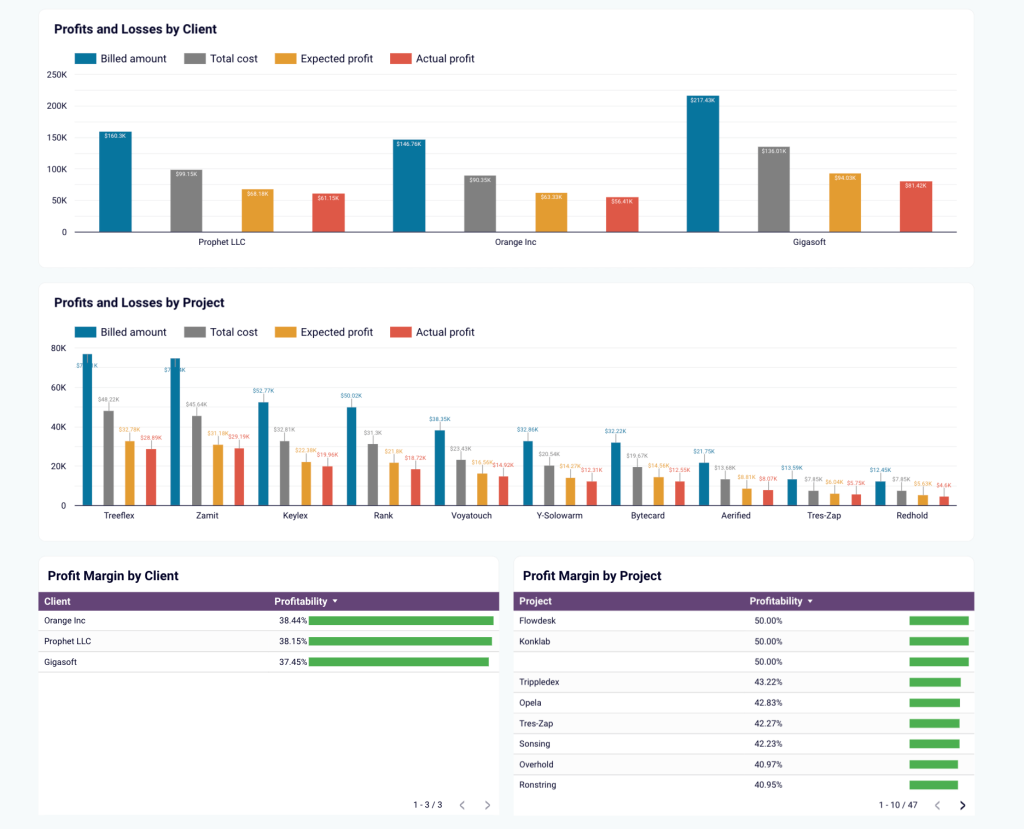
With this dashboard, you can:
- Visualize billable hours and billable amounts
- Drill into amounts to be billed (by client or project)
- Analyze changes over time in billed amounts
- Decide where to focus your business development efforts
- Identify the best-performing projects and clients
- Analyze profits over time from different angles
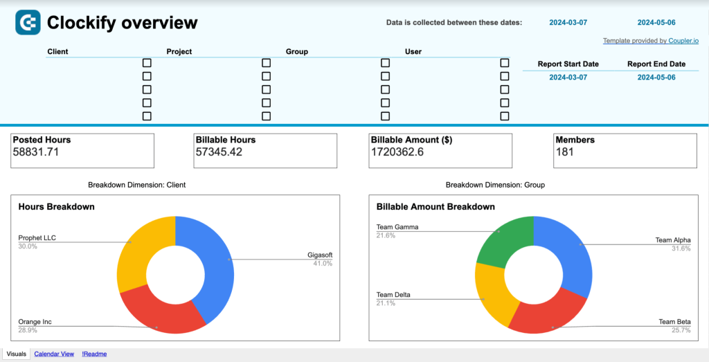
11. Clockify time tracking dashboard template in Looker Studio
This dashboard is built for the time-tracking tool Clockify and displays detailed information about billable hours/amounts. It’s an essential tool for service businesses who want to increase the accuracy and transparency of their client billing process. For instance, it can help you pinpoint your most valuable clients or cost-effective teams. You can also analyze monthly trends and address anomalies before they appear in your invoices.
With this dashboard, you can:
- Compare total posted hours against hours to be billed
- Monitor fluctuations in the total billable hours and billable amount
- Break down billable amounts by client, project, or team
- Assess the financial viability of various projects
- Identify the clients and projects that generate the most revenue
- Make informed decisions about business development efforts
12. Clockify billable hours dashboard template in Google Sheets
Unlike the previous examples on our list, this dashboard is built for Clockify in Google Sheets. It’s a less comprehensive version of the dashboard we mentioned above. Yet it contains a couple of unique elements that some businesses may find useful. For instance, you can view more specific totals for billable hours and amounts, and analyze the billable amount by day. If you are planning to optimize your client billing process, this is a valuable asset to have on hand.
With this dashboard, you can:
- Compare total posted hours against hours to be billed
- Break down billable amount by team or date
- Drill into billable amounts by client, project, team, or user
E-commerce & sales financial dashboards
13. Sales KPI dashboard template for HubSpot
This financial reporting dashboard template is useful for identifying exactly how a sales team’s efforts translate into financial results. The obtained insights can be used to optimize strategies and improve performance.
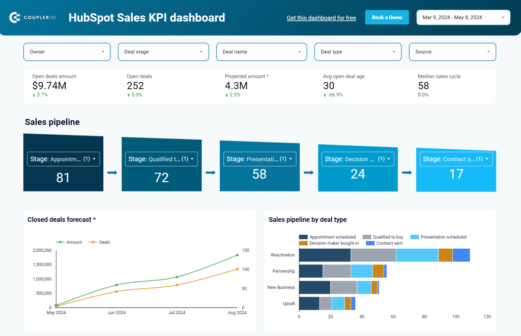
The dashboard is automatically connected to the HubSpot CRM app with Coupler.io and can display information in near-real time. This enables continuous monitoring and allows you to implement changes with flexibility, quickly reacting to emerging challenges and opportunities.
In addition to HubSpot, Coupler.io offers you can get the same dashboard template for Pipedrive.
With this dashboard, you can:
- Identify factors that drive financial results
- Uncover present and potential blockers
- Analyze the role of sales in generating revenue
- Track revenue dynamics over time
- Analyze reasons behind lost revenue
- Adjust your strategy to improve financial performance
14. Ecommerce financial reporting dashboard template for Shopify
This Shopify dashboard will be useful to ecommerce businesses that need to keep track of their Shopify store’s financial performance and increase revenue. The visualized report shown below includes such important metrics as total orders value, average order value, total discounts, total tax, and more.
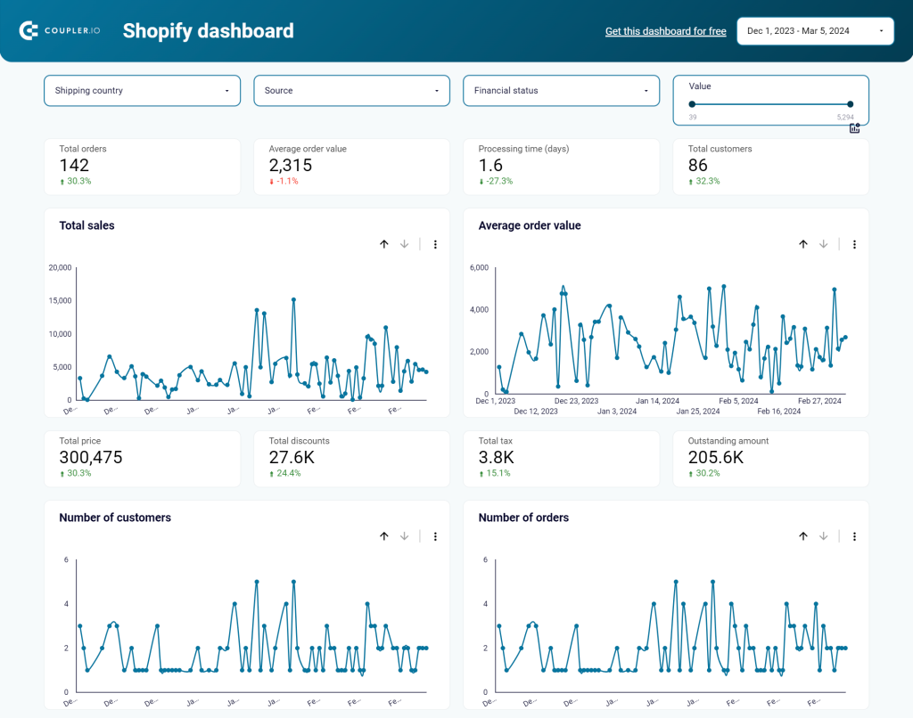
With this dashboard, you can:
- Get a data breakdown by country to make decisions about shipping
- Filter orders by financial status to find correlations between blocked purchases and countries, blocked orders and specific products, etc.
- Check cheap or expensive orders to find dependencies like country, number of orders, status, total revenue from different price batches, etc.
- Analyze the performance of each marketing channel to understand what marketing campaigns to scale
- Get an overview of top-selling products by number and value.
15. Ecommerce sales funnel dashboard template for Shopify
This dashboard allows ecommerce businesses to visualize their Shopify sales funnel and identify the factors impacting customer acquisition. Much like the Shopify dashboard we mentioned earlier, this is a sales-focused report. But it’s useful for monitoring the cost-efficiency of your ad spends.
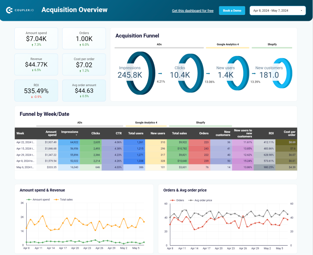
The dashboard has the built-in connector by Coupler.io that loads data from Shopify, GA4, and ad platforms such as Google Ads, Facebook Ads, etc. As a result, you get an overview of key financial metrics for the sales funnel, including ROI, amount spend, total revenue, cost per order, and average order amount.
With this dashboard, you can:
- Measure the cost-efficiency of your ad spends
- Analyze amount spend by advertising platform and date
- Filter sales-related financial data by week/date
- See the full picture of your customer acquisition pipeline
- Get clues on how to increase conversions and maximize ROI
- Identify potential bottlenecks in funnel stages
Revenue & profit analysis dashboards
16. Income statement dashboard in Tableau
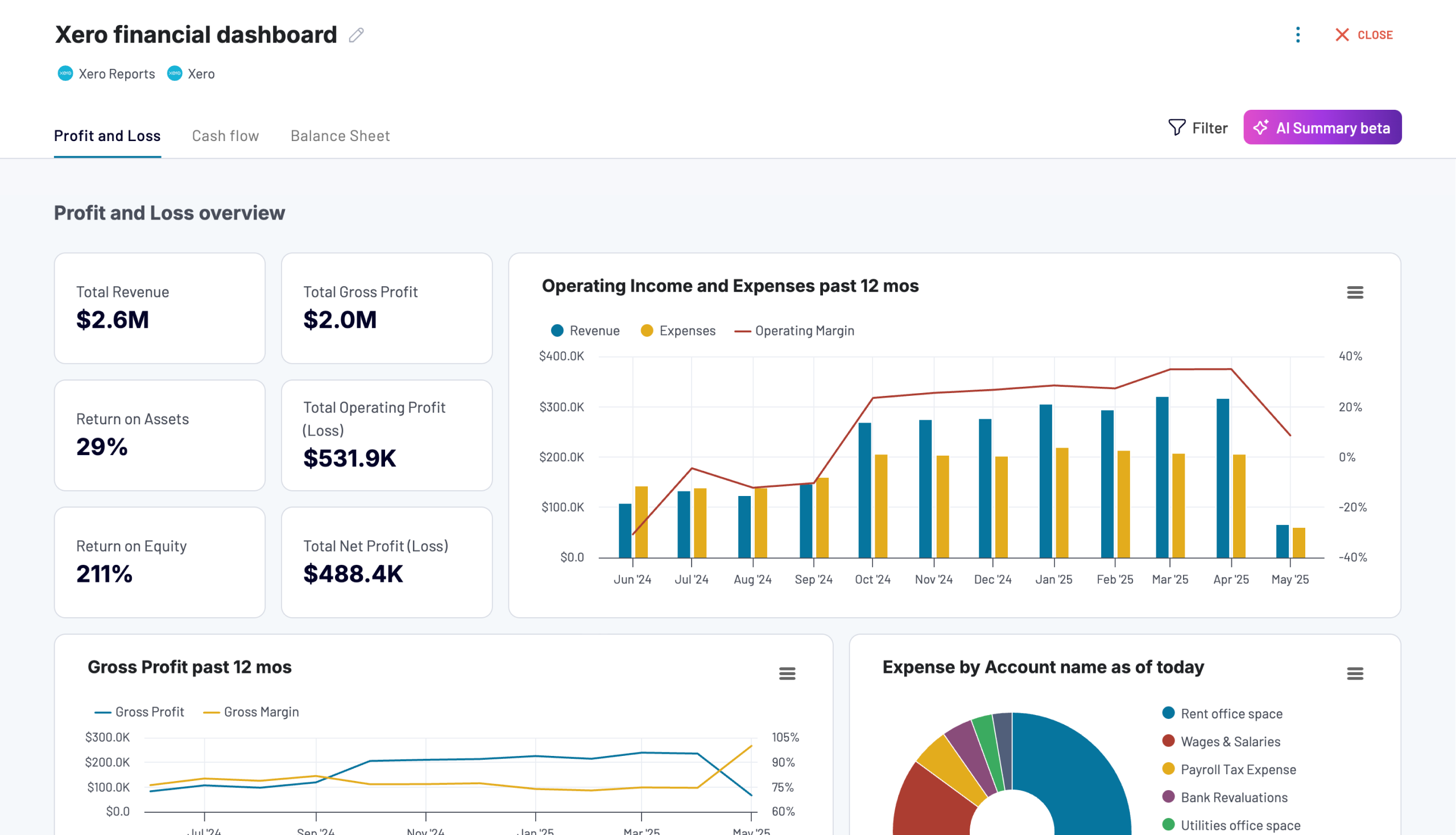
This dashboard provides a comprehensive representation of your business’s financial performance over an extended period. It was created by phData for Tableau and automatically connects to your ERP app (e.g. Quickbooks, SAP). In short, it’s an interactive replacement for the traditional PDF reports that are generated every month/quarter or at stakeholders’ request.
Income data is structured into six key components: gross sales, net sales, gross margin, operating income, EBIT, and EBITDA. It can be broken down further by expense category or revenue stream. As a bonus, this information is also represented as a percentage of sales.
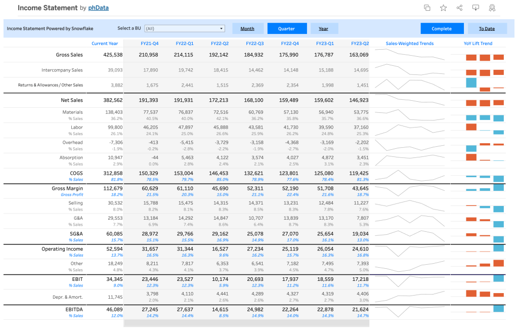
With this dashboard, you can:
- Compare year-over-year sales performance
- Identify cost saving opportunities
- Filter by month, quarter, year, or business unit
- Develop more accurate sales forecasts
- Visualize fluctuations in sales volume and YoY growth trends
17. High-level revenue and profit dashboard
While detailed reports allow you to conduct in-depth analysis, high-level overviews can also be useful for certain purposes. For example, the dashboard shown below was built by Coupler.io’s data analytics team for PlumbBooks, a company offering bookkeeping services. Their clients wanted to have a financial report that would allow them to monitor their revenue and profit in a simple and understandable format. Their data in QuickBooks, however, was too detailed and unfocused for this purpose.
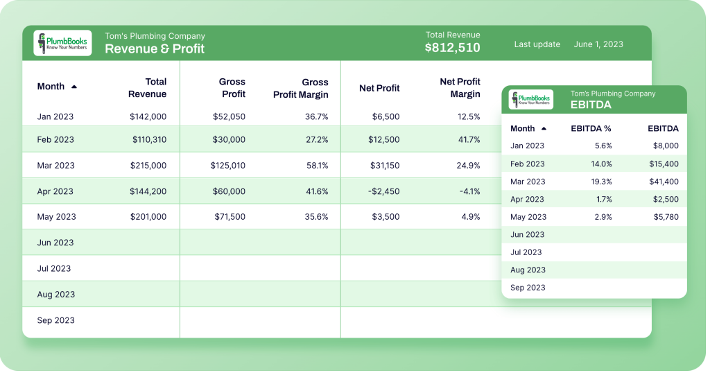
PlumbBooks used Coupler.io to channel fresh data from QuickBooks and send it to the live dashboard in Looker Studio (an individual report for each client). Under the hood, Coupler.io importers automatically comprise 4 different reports from QuickBooks financial statements: Profit & Loss, Balance Sheet, Account Payables (AP), and Account Receivables (AR). Data from these reports is then displayed in the self-updating dashboard.
With this dashboard, you can:
- Track the most vital metrics – total revenue, gross profit margin, net profit margin, and more
- Monitor month-to-month changes
- Have access to the latest financial data 24/7
18. MRR breakdown dashboard
As we’ve already mentioned, it is recommended that an organization has a set of financial dashboards that serve different purposes. An MRR breakdown dashboard is an important part of this set. A dashboard like the one below can help identify the factors that drive or impede growth, as well as make projections, uncover trends and correlations, and obtain valuable insights.
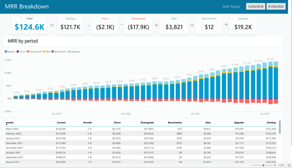
In this dashboard, you can see a detailed overview of monthly recurring revenue by period. It includes information about the regular MRR, churn, new, and reactivation MRR, and also shows their share in the monthly MRR.
The dashboard presents MRR changes over several years, which enables you to conduct time-over-time analysis.
With this dashboard, you can:
- Monitor and analyze MRR data
- Discover trends and important factors influencing MRR
- Conduct month-over-month comparison analysis
- Keep track of the crucial metrics, such as churn or reactivation
- Extract helpful insights to incorporate into your strategy
- Integrate financial analytics into your routine processes
19. Product revenue dashboard
This financial dashboard offers a detailed picture of revenue generated from selling a particular product. For comparison purposes, the presented data shows the revenue for the last two months.
This visualized report can help you track such vital metrics as current MRR and ARR (monthly and annual recurring revenue), monthly sales, and their growth rate.
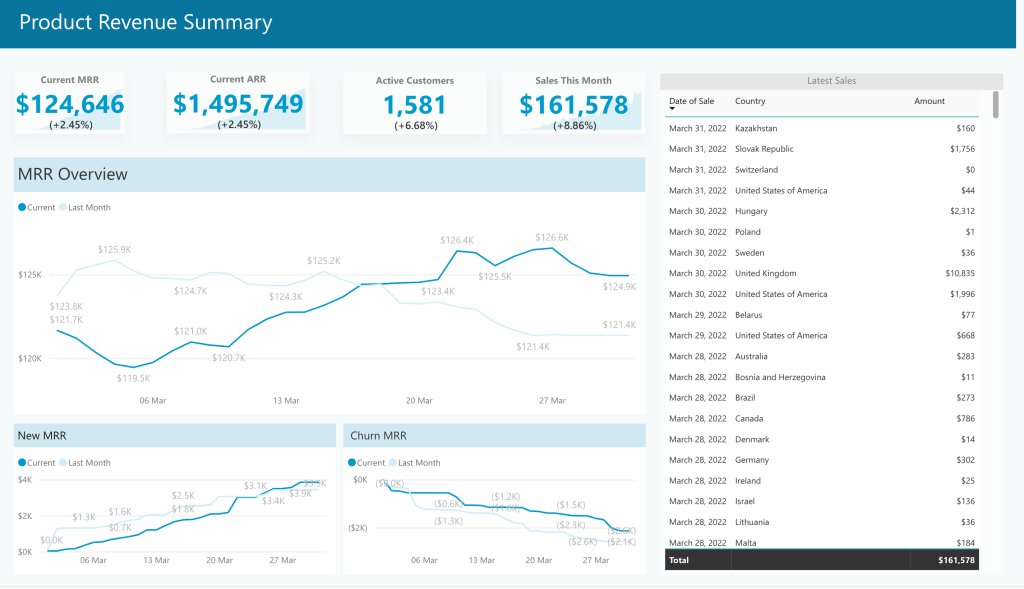
The line graphs allow you to instantly assess the results of the current month and see how they compare to the previous month. This is important to make sure things are well on track – or act promptly if the planned goals require more progress.
With this product KPI dashboard, you can:
- Track and analyze product revenue
- Stay in control of churn
- Better understand MRR trends
- Conduct financial analysis in relation to the product performance
Cash flow management dashboards
20. Daily cashflow forecast dashboard template
Using this dashboard, you can build data-backed forecasts for your daily, weekly, and yearly cashflow. Like the Clockify example we mentioned earlier, this template is created in Google Sheets. To use it, you need to choose a forecasting model (long-term forecasting, short-term forecasting), and then populate the table with historical data. After this, you will be able to work with your data and build your prognosis. For more details on this, you can refer to our article on preparing a cashflow forecast in Google Sheets.
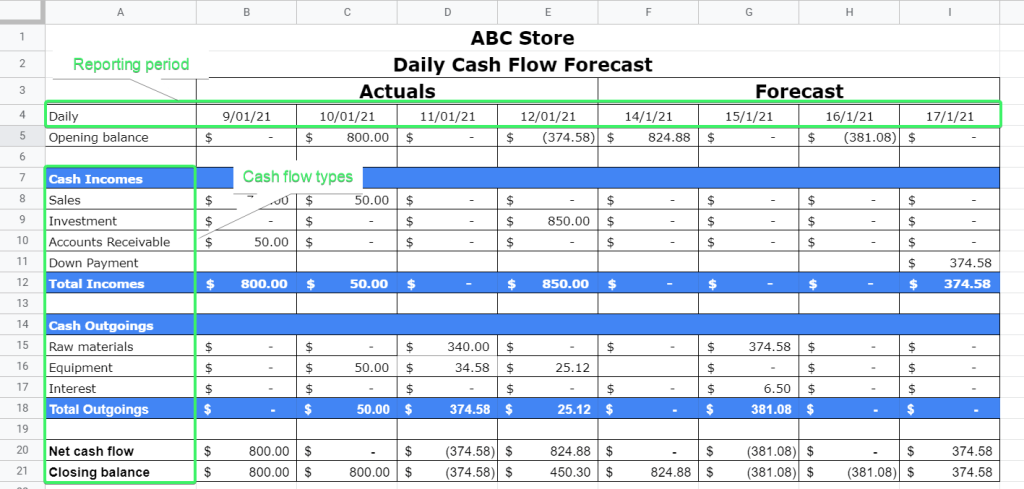
With this template, you can:
- Build projections for different time periods
- Conduct cashflow analysis
- Draw plans on how to achieve the projected results
- Make informed decisions
21. Cashflow tracking dashboard
Our next dashboard example is a cash flow dashboard designed in Power BI. It allows you to monitor sales by period and see how financial performance changes over time. A handy set of filters and other interactive features let you explore data from various angles, as well as drill up and down to switch between high-level and granular views.
With this dashboard, you can:
- Monitor cashflow dynamics over time
- See the value of different products in the cashflow (annual/monthly subscriptions)
- Identify trends and patterns
- Conduct time-over-time analysis
Financial overview & performance dashboards
22. Financial performance dashboard
This dashboard was built in Tableau by MergeYourData. It’s designed to serve as a cockpit giving several graphs and multiple scorecards presenting different aspects of financial performance. In particular, you can see sections with year-to-date revenue, hours booked, and customers. Apart from these overviews, there is a bubble graph with YTD invoices and a line chart with a monthly revenue forecast.
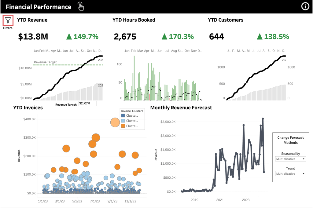
Such a dashboard can be useful for day-to-day monitoring of your company’s financial performance.
With this dashboard, you can:
- Track revenue against the set targets
- Quickly see the changes in growth trends
- See how actual revenue compares to your projections
- Assess overall financial health in a glance
23. Finance overview dashboard
Here’s the last report in our collection of financial dashboard examples. It was built in Tableau by Useready. The dashboard consists of a set of scorecards with the KPIs and two graphs depicting revenue and gross profit trends, as well as a DSO vs DPO comparison (days sales outstanding, days payable outstanding).
In particular, among the included metrics, you can see total revenue, gross profit, income before taxes, and net income.
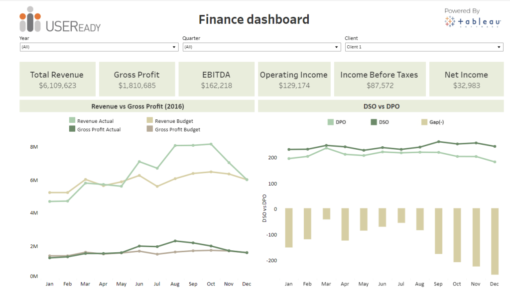
Such a dashboard can be useful for monitoring key metrics and assessing financial performance. For example, it can be used to analyze revenue and gross profit compared to the numbers included in the budget beforehand. Analyzing such metrics as DPO and DSO can help you optimize processes and make sure that things are running smoothly.
With this finance dashboard, the finance team can:
- Keep track of the key financial metrics
- Filter and analyze data by year, quarter, and client
- Analyze revenue and gross profit
Now as we’ve already seen some great financial dashboard examples, let’s talk about using them in practice.
To make the most of data analysis, it’s important to share the obtained insights and hypotheses with all the stakeholders within a company. In this particular example, to make these findings actionable, it would be necessary to bring together the finance, sales, and marketing teams to devise a comprehensive strategy for the next year.
How to use financial dashboard templates by Coupler.io
On our list of dashboard examples, we provided several automated dashboard templates, which you can use for free. With these templates, you can visualize your financial data in about 5 minutes. You will only need to connect your data source and destination accounts. After this, you can customize your dashboard in various ways. For example, add or remove metrics, connect more sources, add new charts, change colors, and so on.
The best thing about these templates is that they are automated with the help of Coupler.io. As we already mentioned, this reporting automation solution can regularly send fresh data to your dashboard as often as every 15 minutes. This gives you access to your financial data in near-real time.
Let’s see how to visualize your data with a template:
- Choose one of the templates from the list above and open it. Go to the Readme tab of the template you chose and follow the instructions. First, sign up for Coupler.io – it will take less than a minute (the credit card is not required). After this, you will be redirected to the importer setup page. Here, you’ll need to connect your source account(s).
- Then, follow the on-screen instructions to connect your destination app account. In a moment, you will get a dashboard with your data.
As you can see, the financial dashboard templates provided by Coupler.io are quite easy to use and allow you to visualize your data quickly and effortlessly.
How to automate financial reporting dashboards and reports
If you are not using an automated template, you can still easily make your own dashboard automated. In this case, you will need to create a data visualization on your own, and Coupler.io will channel your financial data from the data source to your dashboard.
You don’t need any technical skills to set this up. The flow is more or less similar to what we already described in the previous section. Let’s go through the main steps.
1. Collect data
Select your source and destination apps in the form below and click Proceed. You’ll be offered to create a Coupler.io account for free.
Then connect your source app account and specify the data you want to use for your financial dashboard or report.
2. Preview and transform data
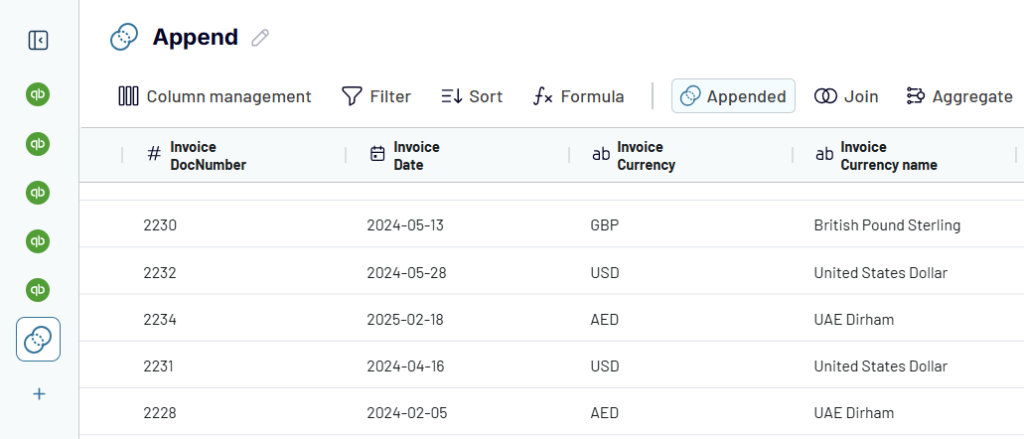
In the next step, you can preview data that is about to be exported and perform data transformations, if needed. In particular, you can:
- Hide the columns you don’t need – they won’t be exported
- Rename, rearrange, split, and merge columns
- Sort and filter your data based on multiple parameters
- Combine data from different apps or accounts into one dataset
- Add formula-based columns and perform calculations
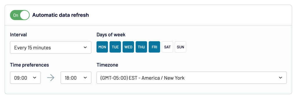
3. Load data and schedule updates
After previewing your data, follow the in-app instructions to connect your destination app account to load the data. After that, you can actually create the dashboard by adding visualizations, tables, etc. When this is done, you can schedule automated updates to make your future dashboard self-refreshing and powered with real-time data.
That’s it! You now know how to automate financial reporting dashboards with the help of a user-friendly solution, Coupler.io.
How to use a financial dashboard for analysis: a hands-on example
Dashboards make it easier to work with data and analyze it as they present it in a visual format and offer various interactive elements. Let’s see an example demonstrating how you can analyze and interpret data to obtain actionable business insights.
Analyzing customer data to improve strategy
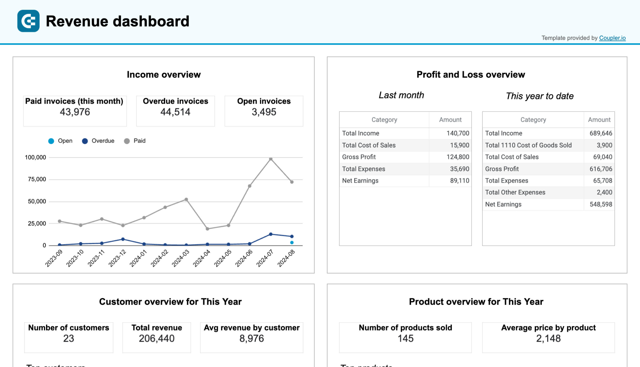
This example is based on the table taken from the SFO financial dashboard, which was #1 on our list. Let’s take a look at this customer overview. You can see the total revenue obtained from all the customers during the current year, as well as the average revenue by customer. Apart from the scorecards, we have the list of the customers showing the revenue they brought.
This data can be used to assess the potential revenue from each customer for the next year and devise a plan on how to improve business results.
For example, we can see that the top 6 customers combined generated over 50% of all revenue this year – 105,1k out of 206,4k. Depending on the business context, you can assess the additional needs these top customers might have and come up with some upsell ideas for them.
Likewise, you can also check which customers bring revenue below the average mark. It would be useful to analyze the reasons behind that and think of some strategies to improve these results.
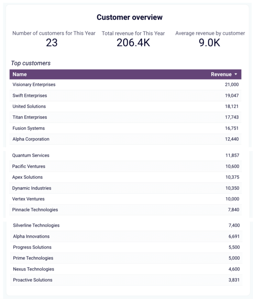
In general, you can use this data to segment your customers into different groups and tailor your offer for each of them.
Additionally, you can conduct a risk assessment – as the major part of this company’s income comes from a rather small group of customers, it can create a strong dependency. Losing one or more such customers would have a serious impact on the company’s financial health. To mitigate risks, it can be useful to consider some diversification opportunities to make the company more stable. For example, a possible option would be to focus on acquiring more big clients, as well as developing a strategy to significantly grow the number of smaller customers. Even if the latter only brings small revenue, if there are hundreds of such small customers, they will generate significant profits while ensuring relative stability.
To make the most of data analysis, it’s important to share the obtained insights and hypotheses with all the stakeholders within a company. In this particular example, to make these findings actionable, it would be necessary to bring together the finance, sales, and marketing teams to devise a comprehensive strategy for the next year.
Make better decisions faster with financial dashboards
A financial dashboard can be much more than a simple visualization of your financial data. Depending on the purpose, it can be a reporting tool, a KPI monitoring cockpit, a data analysis instrument – or even all at once. But to be all that, a dashboard needs to be meaningful and well-suited for the challenges at hand. Then it will help finance professionals to be in control of their data and achieve more.
A good financial dashboard should be:
- Focused on a specific topic/goal. There’s no “the” financial dashboard or “best financial dashboard” that would encompass everything. You need to clearly define the aspect you want to focus on – billing, revenue, MRR, etc.
- Tailored to the audience. For example, a CEO might prefer a high-level overview, while a financial analyst will require more granular data.
- Be live and auto-updating. In a fast-paced business environment, an automated financial dashboard is a must. A good dashboard can be connected to your main financial data sources and receive fresh information from them without manual effort.
- Be interactive, include filters and drill-downs. A modern financial dashboard is not just a visual representation of numbers, but an instrument to work with data. So it’s important that the audience can manipulate data directly in the dashboard and explore it from different angles.
- Include relevant metrics. There’s no need to include everything – once you know what your focus is, you can select information that is useful for your particular goal. It’s better to have a set of financial dashboards for different purposes.
A dashboard that can offer all of this can be a valuable instrument for decision-makers. It can be used to monitor KPIs, oversee and control processes, track progress, and much more. It can also provide a solid basis for data-driven business decisions and allow you to actually use your data.
In this article, we explored examples of finance dashboards powered by automation and featuring real-time data to provide you with actionable insights. We hope this will inspire you to use your data to the fullest and benefit from the data-driven approach. Good luck with your data!!
Automate financial reporting with Coupler.io
Get started for free