Financial Data Visualization: How to Turn Numbers into Clear and Actionable Insights (With Tools, Templates, & Real Examples)

Spreadsheets show you the numbers. Visualizations show you the story.
Financial data only becomes valuable when it’s easy to interpret and act on. Clear visuals help identify trends, spot red flags, and communicate financial insights with speed and confidence, especially to stakeholders who aren’t deep in the numbers. To make this possible, it’s essential to select the appropriate visualization methods and tools. This is what we’re going to cover in this article, as well as:
- The most effective chart types for financial data
- Real-life dashboard examples using Looker Studio, Google Sheets, Power BI, etc.
- Tools and templates to help turn raw numbers into clear, actionable insights
Let’s make your financial data easy to understand and impossible to ignore.
The most efficient ways for data visualization in finance
Not all charts are created equal, especially in finance.
Choosing the correct visualization isn’t just about aesthetics. It’s about clarity. The right chart makes your data speak. The wrong one creates confusion or hides critical insights.
Here’s a breakdown of the most effective chart types and when to use them in financial reporting:
Line charts
The line chart is the most familiar yet underrated financial data visualization. It excels at revealing how a metric evolves over time, making it easy to spot growth, dips, or repeating patterns.
Let’s say you’re tracking monthly recurring revenue (MRR). A table of numbers might show you growth, but it won’t show momentum. A line chart, on the other hand, makes acceleration or slowdowns instantly visible and even more powerful when paired with annotations for product launches, campaign rollouts, or policy changes.
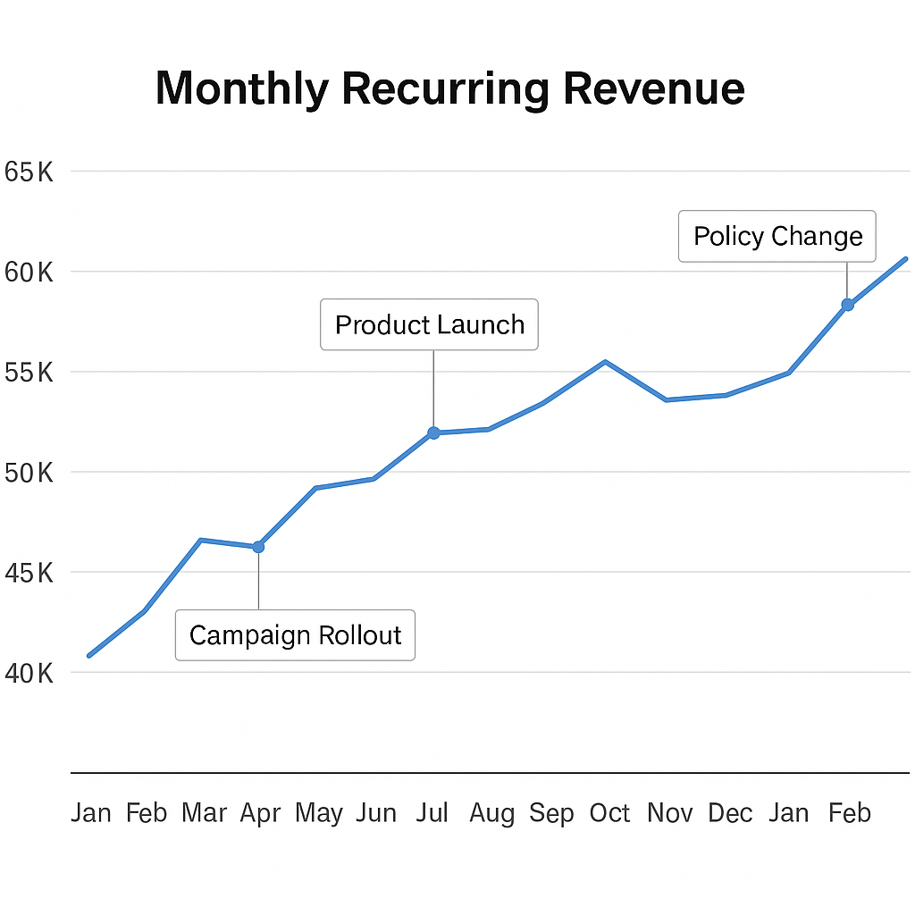
It transforms flat numbers into a narrative timeline.
Use line charts when you need to:
- Track trends in revenue, expenses, or profit over months or quarters
- Monitor churn or customer acquisition rates over time
- Compare multiple business units or KPIs side by side
Pro tips for using line charts:
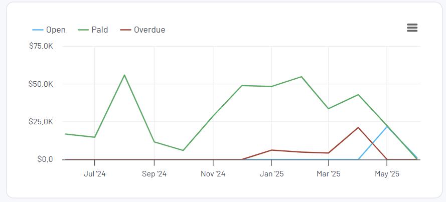
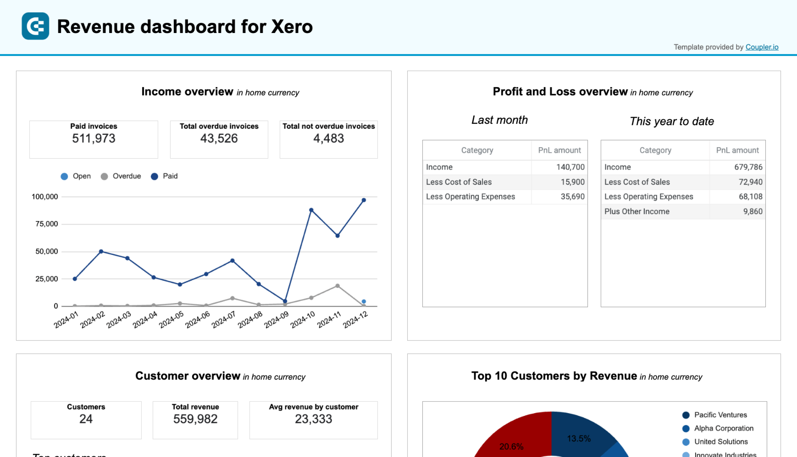
- Stick to 2–3 lines per chart to avoid confusion. For example, here is what a line chart comparing open, paid, and overdue invoices looks like in the Revenue dashboard for Xero by Coupler.io.
- Use annotations or callouts to mark events that explain spikes or drops
- Use rolling averages for smoothing volatility and revealing long-term patterns
Waterfall charts
Waterfall charts are a go-to when you want to show how different factors contribute to a financial result, like how revenue becomes profit or how your budget went off track. Instead of dumping numbers into a spreadsheet, a waterfall chart presents them visually so anyone can follow along.
For example, if you’re walking stakeholders through net income. You start with total revenue, subtract the cost of goods sold (COGS), layer in operating expenses, taxes, and one-time adjustments, and arrive at the final number. A waterfall chart clearly shows what changed and breaks down the steps that led to the final outcome.
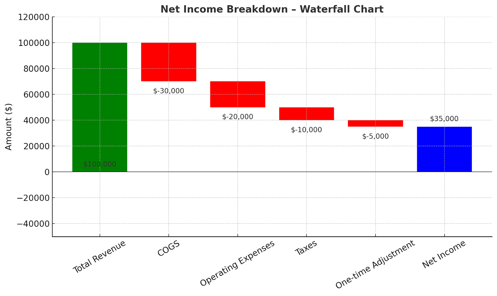
Instead of requiring stakeholders to calculate the impact themselves, a waterfall chart visually illustrates the impact step-by-step.
Use the waterfall chart when you need to:
- Break down how net income or cash flow changed over a period
- Present a profit bridge in board meetings or reports
- Explain budget vs. actual variance in a single view
Pro tips for using waterfall charts:
- Combining minor line items under a single label, such as “Other adjustments,” keeps the chart clean and focused on the bigger picture.
- Stick to intuitive colors—green for gains, red for losses, and a neutral color for totals. It makes interpretation instant, especially for non-finance viewers.
Bar and column charts
When you want to compare values side by side across categories, periods, or business units, bar and column charts are your best friends. They’re perfect for highlighting which vendors, departments, or product lines are leading or lagging, without overwhelming your audience.
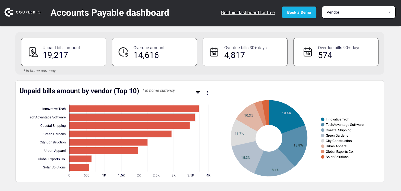
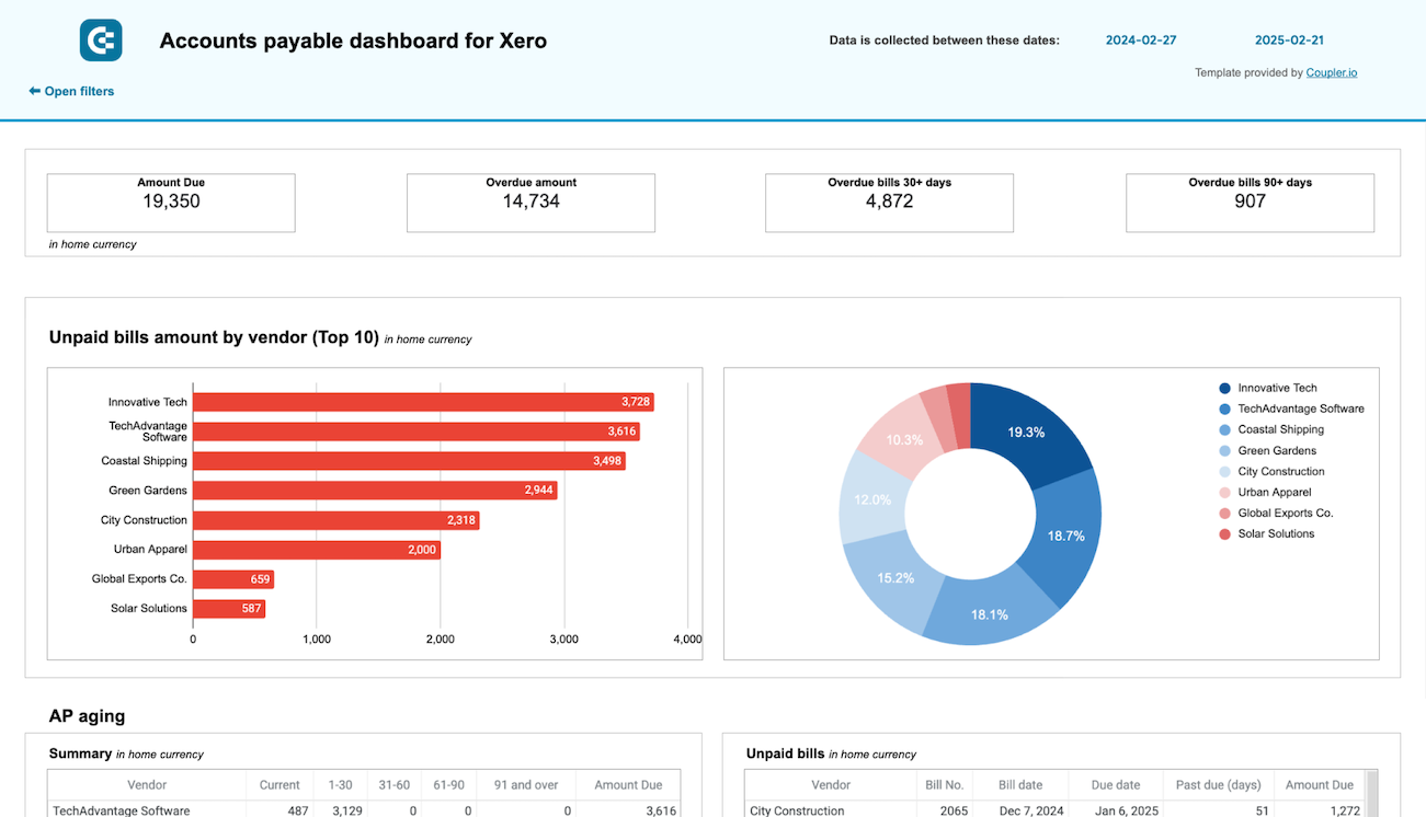
Take the chart below, for example. It shows the top 10 vendors with the highest unpaid bill amounts. It’s clean, direct, and actionable.
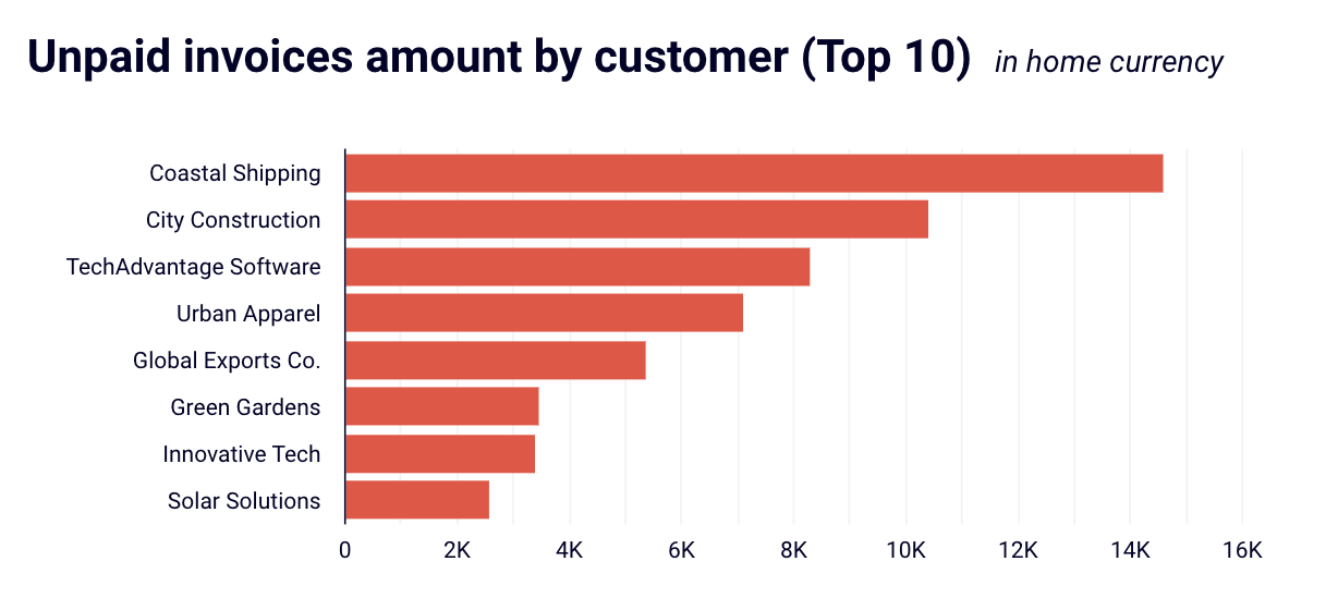
You instantly know which vendors (Innovative Tech, TechAdvantage Software, Coastal Shipping) account for the largest liabilities. You can prioritize follow-ups or negotiations based on the value at stake. And, it eliminates the need to sift through dozens of rows in a payables report.
We use such charts in Accounts receivable dashboards for Xero and QuickBooks.
Accounts receivable dashboard for QuickBooks in Looker Studio
See which customers accumulate unpaid and overdue invoices, analyze AR aging, and track changes over time. Get useful insights for maintaining financial health.


Accounts receivable dashboard for Xero in Looker Studio
See which customers accumulate unpaid and overdue invoices, analyze AR aging, and track changes over time.

Use bar/column charts when you want to:
- Compare revenue or spend across products, departments, or regions
- Highlight overdue receivables or top expense categories
- Visualize rankings (e.g., top-performing salespeople or costliest vendors)
Pro tips for using bar and column charts:
- Sort bars by value to emphasize highest-to-lowest financial performance
- Use horizontal bars when category labels are long (as in the example above)
- Pair with filters or slicers in dashboards to make them more interactive
Stacked column and Area charts
Stacked charts are your best bet when you want to show how different components contribute to a total over time, and how those components shift in size or importance.
Consider this balance sheet stacked column chart example. Instead of listing line items in a table, this chart visually compares Assets on one side and Liabilities and equity on the other while breaking them down into meaningful categories.
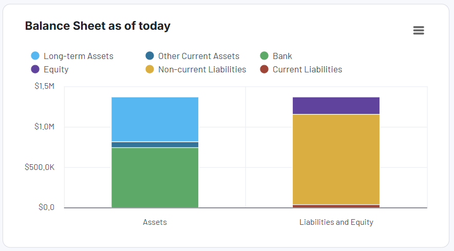
Assets are split into Cash & Cash Equivalents and Current Assets, giving immediate insight into liquidity. Liabilities & Equity shows how those assets are funded, mainly through Equity, with a smaller portion of Current Liabilities. The visual symmetry confirms that the balance sheet is healthy, and the company isn’t over-leveraged.
This chart is taken from the financial dashboard for Xero/QuickBooks by Coupler.io. Check them out and try them for free!

Xero financial dashboard
Get comprehensive financial insights from your Xero account with key performance metrics, balance sheet analysis, and cash flow projections. Quickly assess your business health and make informed financial decisions.

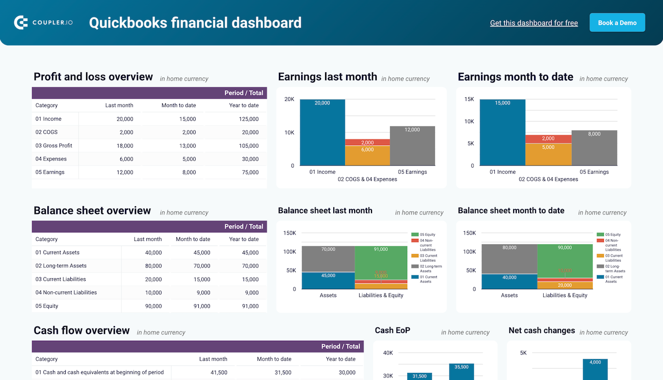
QuickBooks financial dashboard
Tracks earnings, monitor cash flow, and analyze balance sheet changes with a dedicated dashboard that provides a clear picture of your business finances.
Use stacked columns and area charts when you want to:
- Compare two sides of a financial structure, like Assets vs. Liabilities & Equity
- Visualize layered financial data without jumping across charts
- Quickly communicate proportional shifts, like rising liabilities or declining equity share
- Simplify dense financial statements into visuals that anyone on the team can interpret
Pro tips for using stacked charts:
- To avoid confusion, maintain the same stacking order throughout and use color cues that your audience already recognizes.
- Stick to 3–4 categories. Beyond that, it gets hard to interpret, especially in area charts.
Heatmaps
Heatmaps are incredibly useful when you’re working with large datasets and want to identify patterns, outliers, or changes in intensity. Instead of staring at rows of numbers, a heatmap uses color to show you where to look first.
In finance, this can save you hours of digging.
Let’s say you’re doing a data analysis of departmental spending across multiple months. A heatmap instantly highlights spikes in cost, such as unusually high marketing spending in March or an IT dip in August. With the right color scale, red signals urgency, green signals stability, and patterns emerge that would otherwise get buried in a spreadsheet.
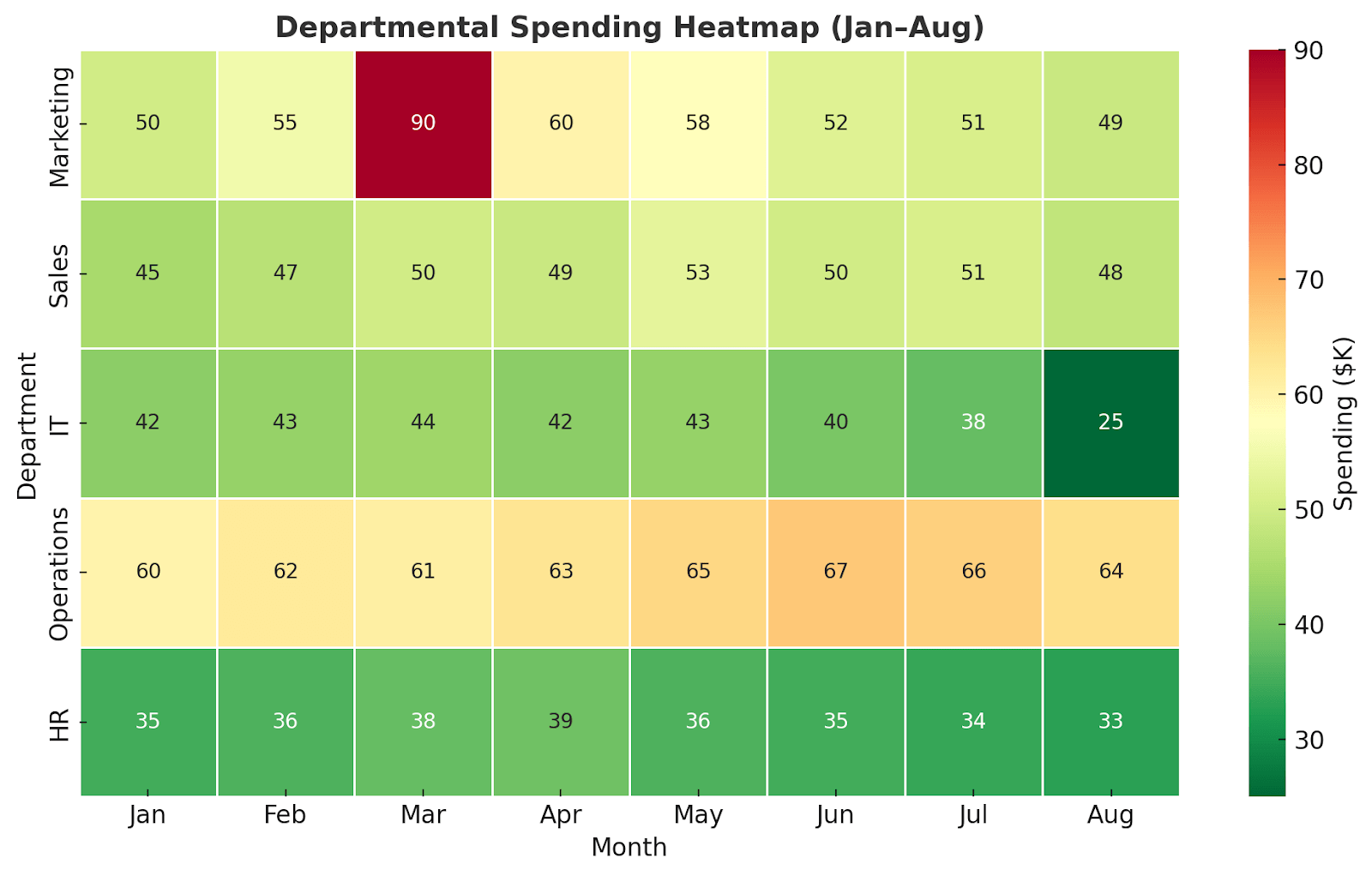
Heatmaps are also great for aging reports, profitability comparisons, or performance benchmarking across regions, products, or periods.
Use heatmaps when you want to:
- Identify irregularities or outliers in large financial datasets
- Highlight intensity or frequency, like overdue invoices or budget overruns
- Compare performance metrics across products, teams, or timeframes
- Make quick sense of dense reports, such as multi-department expense trends or AR aging summaries
Pro tips for using heatmaps:
- Use a diverging color scale (e.g., red to green) to show positive vs. negative performance
- Avoid too many similar shades to keep the contrast strong for readability
- Add tooltips or data labels for exact values, especially when used in dashboards
Maps
When your financial data is tied to geography, whether it’s revenue, costs, or customer distribution, maps turn numbers into stories. It shows you where it’s happening.
Let’s say you’re a finance manager at a company operating across multiple regions. Your team needs to identify which countries are driving the most revenue or where operating costs are creeping up.
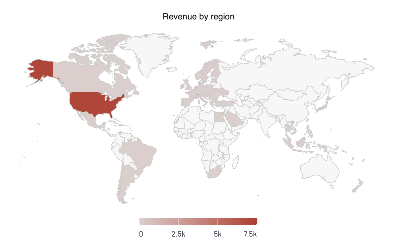
Regions with high performance can be shaded darker, while underperforming areas can be shaded lighter. You can even overlay multiple layers, such as revenue and profit margin, to spot areas where sales look strong but margins are weak.
This helps with budget reallocations, expansion planning, and risk exposure assessment
Use maps when you want to:
- Visualize sales or revenue by country, state, or city
- Track regional operating costs, taxes, or compliance exposure
- Identify geographic trends in customer activity or churn
- Compare performance across franchise or branch locations
Pro tips for using maps in financial dashboards:
- Stick to one clear metric per map to avoid confusion (e.g., revenue or margin, not both unless layered well)
- Use tooltips or filters so users can hover to get the exact numbers behind the color scale
- Avoid default settings—customizing labels, colors, and scales can turn a basic map into a decision-making asset
Scatter plots
Scatter plots are one of the most underused yet powerful tools for data visualization in finance. They help you explore the relationship between two variables and spot outliers that might require deeper investigation.
Let’s say you’re comparing marketing spend vs. revenue across product lines. A scatter plot can help you answer:
- Are we getting a good return on our ad dollars?
- Which products are outliers – high spend but low revenue?
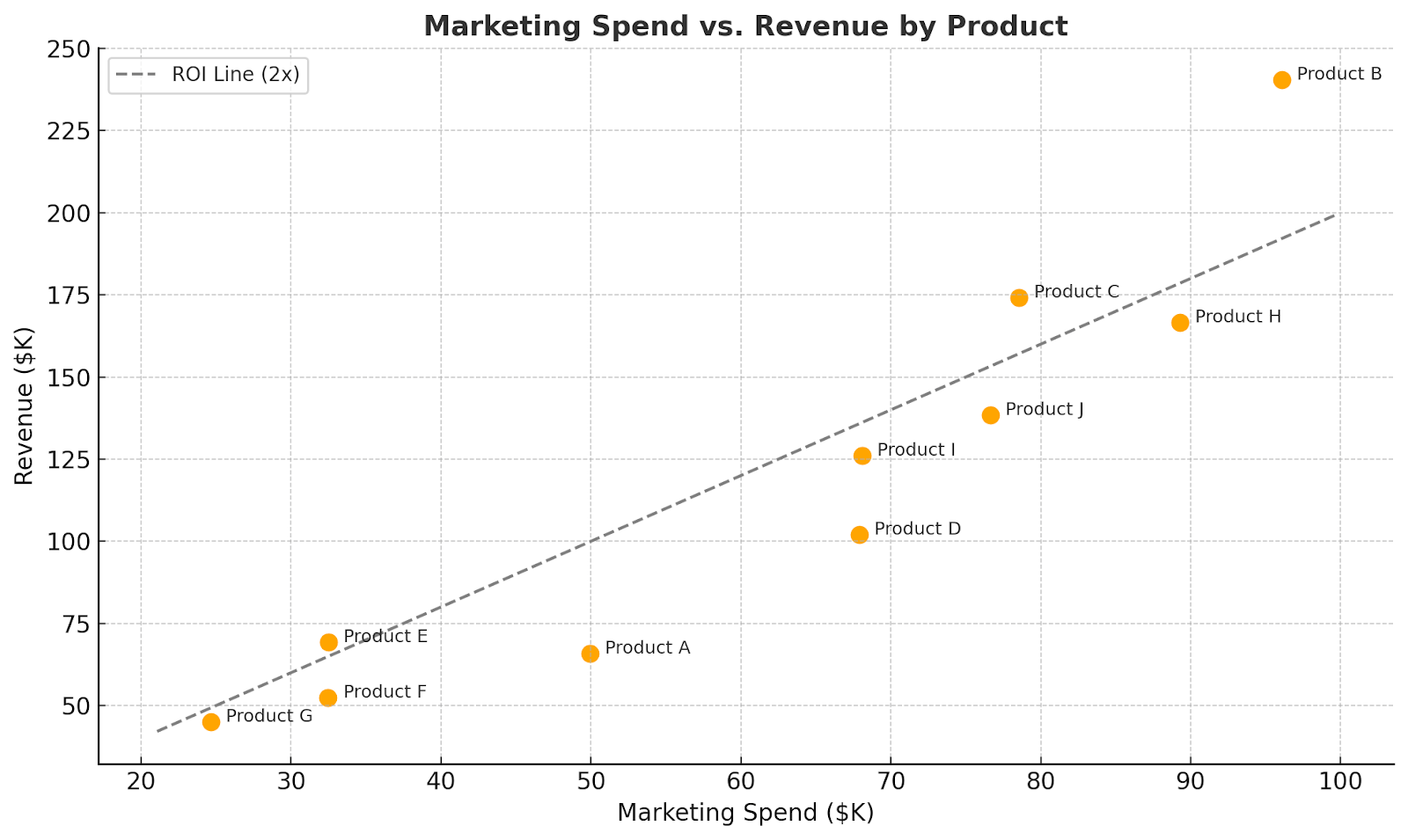
??Each orange dot on the chart represents one product. The ROI Line (2x) helps you instantly spot over- and under-performers.
You can also use scatter plots to analyze Risk vs. return in investment portfolios, Sales vs. discount rates, and Customer lifetime value vs. acquisition cost.
Use scatter plots when you want to:
- Compare two related financial metrics across entities (products, teams, regions)
- Identify performance trends and find what’s working or underperforming
- Detect outliers that could signal risk, error, or opportunity
- Assess correlation without running a full regression analysis
Pro tips for using scatter plots:
- Add labels or hover details to identify key outliers instantly
- Use color or size to bring in a third variable (like category or margin %)
- Draw reference lines (like breakeven or target zones) to show what’s “good” vs. “needs attention”
KPI cards
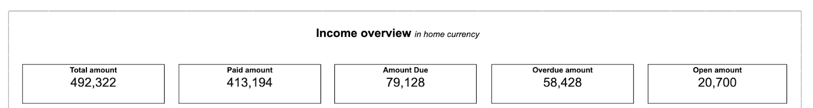
KPI cards put the spotlight on the most important numbers. Instead of charts and breakdowns, you get clear, bold figures that tell you what’s happening right now.
Take this invoice overview example. It doesn’t ask users to sift through reports. It simply displays the total amount invoiced, the amount paid, what is still due, what is overdue, and what remains open.

This is why KPI cards are often the first thing you see in a dashboard. They give you an instant read on where things stand.
Use KPI cards when your goal is to:
- Display top-level metrics like revenue, profit, or cash flow
- Show a current status, like overdue invoices or open balances
- Give decision-makers a “quick scan” view before they dig into the details
Pro tips for using KPI cards:
Pair cards with subtle design elements, such as colored text, arrows, or icons, to add clarity. For example, use green for good and red for risk, without overwhelming the simplicity.
Avoid KPI cards when you need context, comparison, or trend analysis.
Tables
Charts are great for spotting trends, but sometimes what you really need are the actual numbers—clean, complete, and detailed. Tables in financial reporting are often the most trusted format for presenting granular data, such as invoices, account balances, or trial balances.
Let’s say you’re reviewing accounts payable by vendor. A bar chart might show you which vendors have the highest outstanding amounts, but if you want to know exactly how much, what’s overdue, and when it’s due, a pivot table gives you that context in a single view.
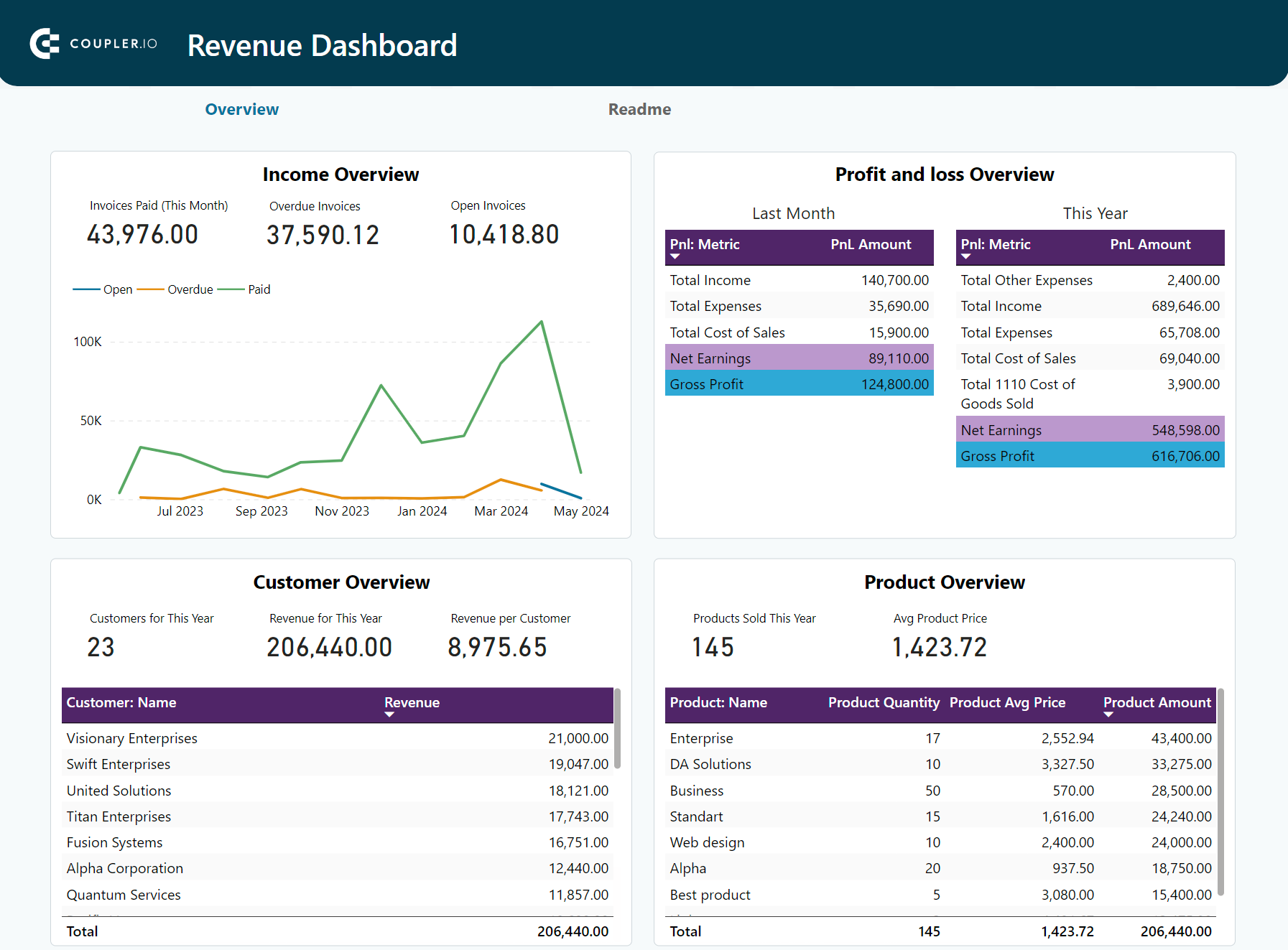
Tables also pair well with other data visualization techniques. A dashboard might use charts to summarize trends and use tables below to allow users to drill into line-item details. For instance, here is what it looks like in the revenue dashboards for Xero/QuickBooks.
Use tables when you want to:
- Present precise financial values that need to be verified or referenced (e.g., ledger entries, invoice line items, balance sheet accounts)
- Allow users to filter, sort, or export detailed records for further review
- Supplement charts with data that backs up the visuals
Pro tips to use tables:
Use conditional formatting (such as color-coded cells, icons, or highlights) to make tables more scannable. It transforms your table from a static block into an interactive, insights-first layout—perfect for dashboards.
Financial data visualization examples in real-life
Now that you’ve seen which visual formats work best and when to use them, let’s look at how they come together in real-life financial dashboards.
In this section, we’ll go through financial dashboard templates built in Looker Studio, Power BI, and Google Sheets by Coupler.io.
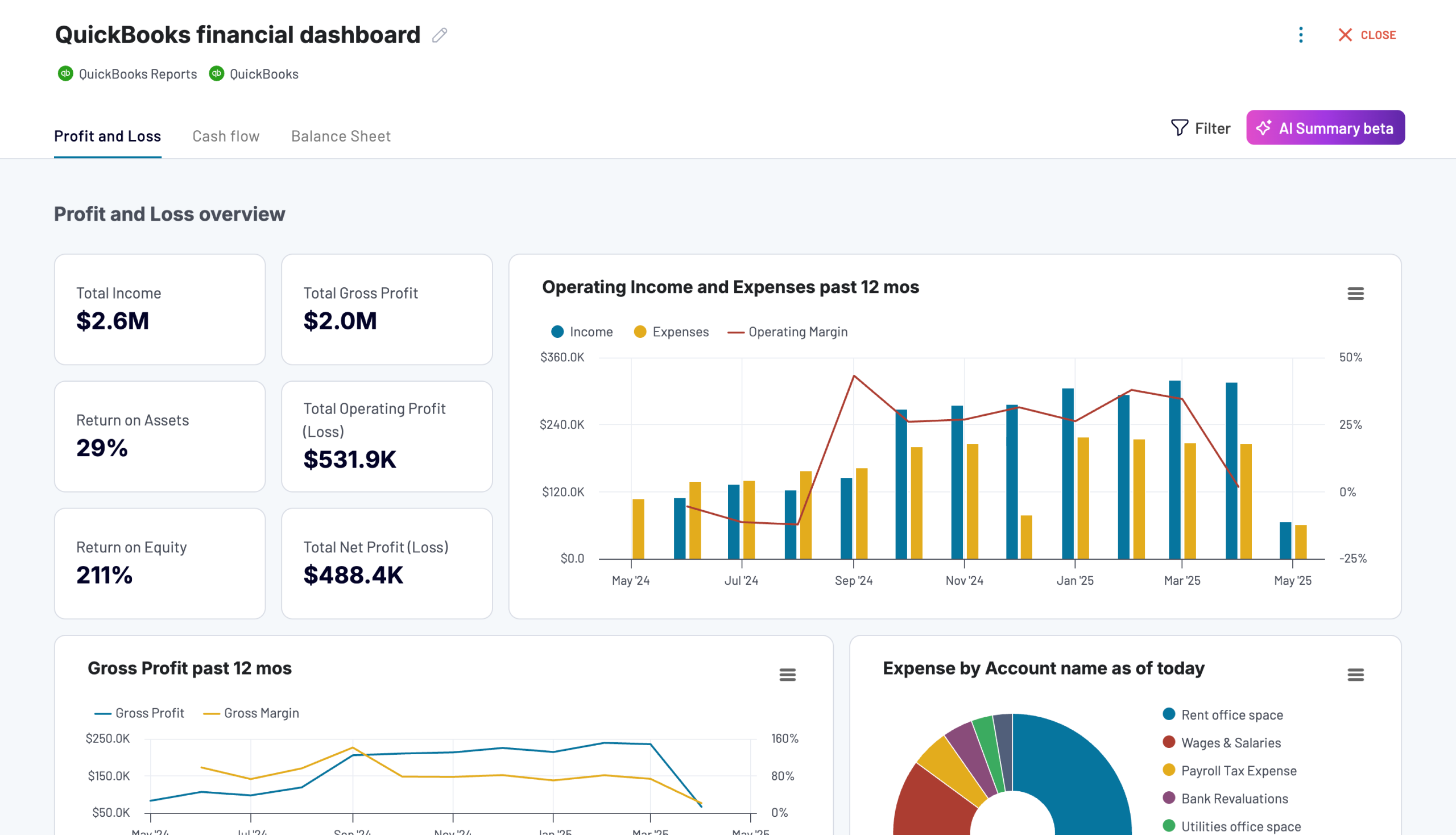
Financial dashboard for QuickBooks/Xero
The financial dashboard provides a unified view of key financial reports, including profit and loss, balance sheet, and cash flow. It makes it easy to track the overall business’s financial health at a glance. It also helps business owners, accountants, and finance teams get real-time visibility into revenue, earnings, assets, liabilities, and liquidity across accounts.
With this dashboard, you can:
- Analyze income, expenses, and net earnings over time.
- Review balance sheet components and equity breakdown.
- Track cash flow changes month-to-date and year-to-date.
- Monitor bank and cash balances across currencies and accounts.
You can use the Xero dashboard in Coupler.io, which offers the AI insights feature designed to help you quickly make sense of your data. It is also available as a template in Looker Studio and Google Sheets.
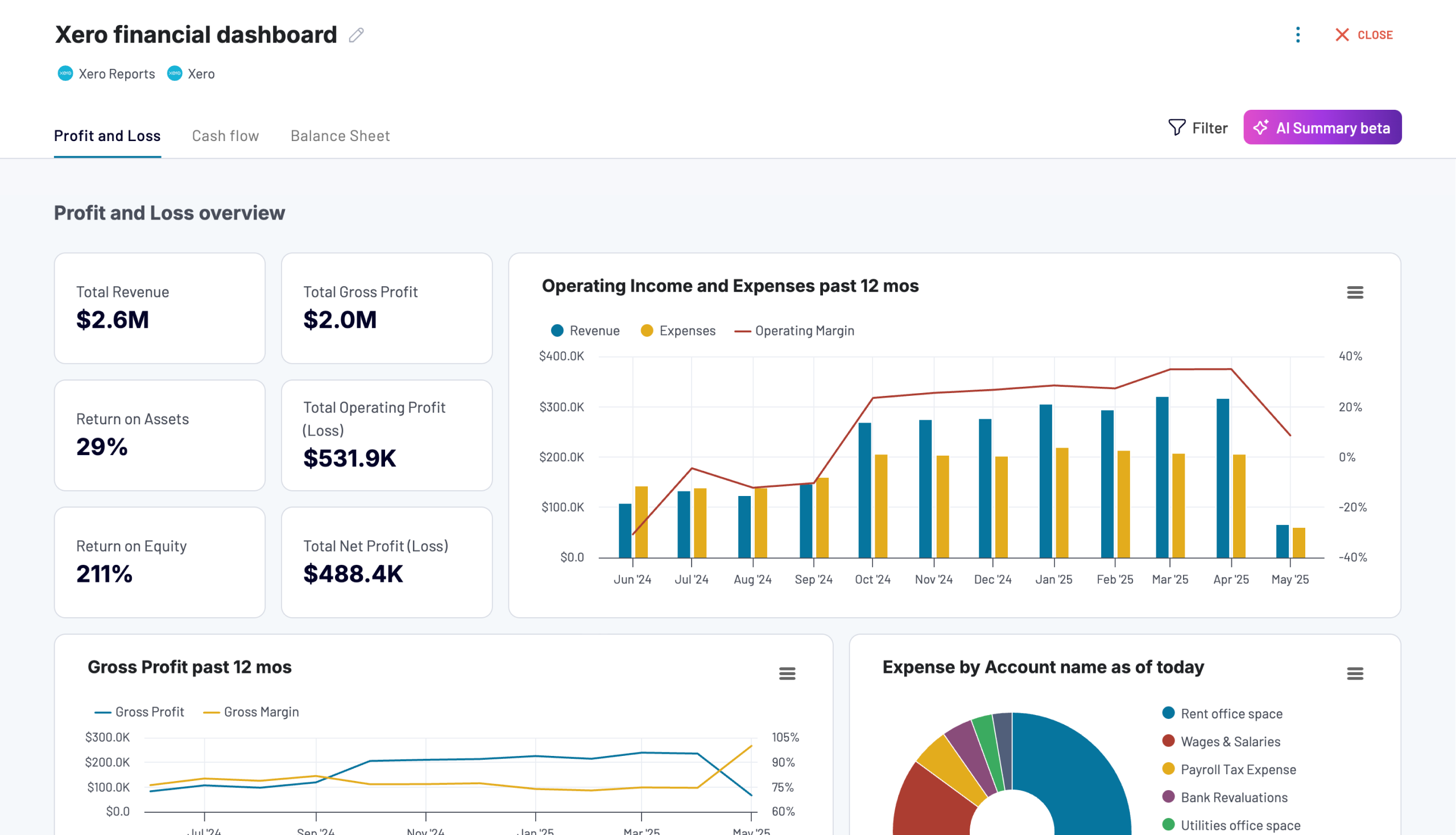
Xero financial dashboard
Get comprehensive financial insights from your Xero account with key performance metrics, balance sheet analysis, and cash flow projections. Quickly assess your business health and make informed financial decisions.
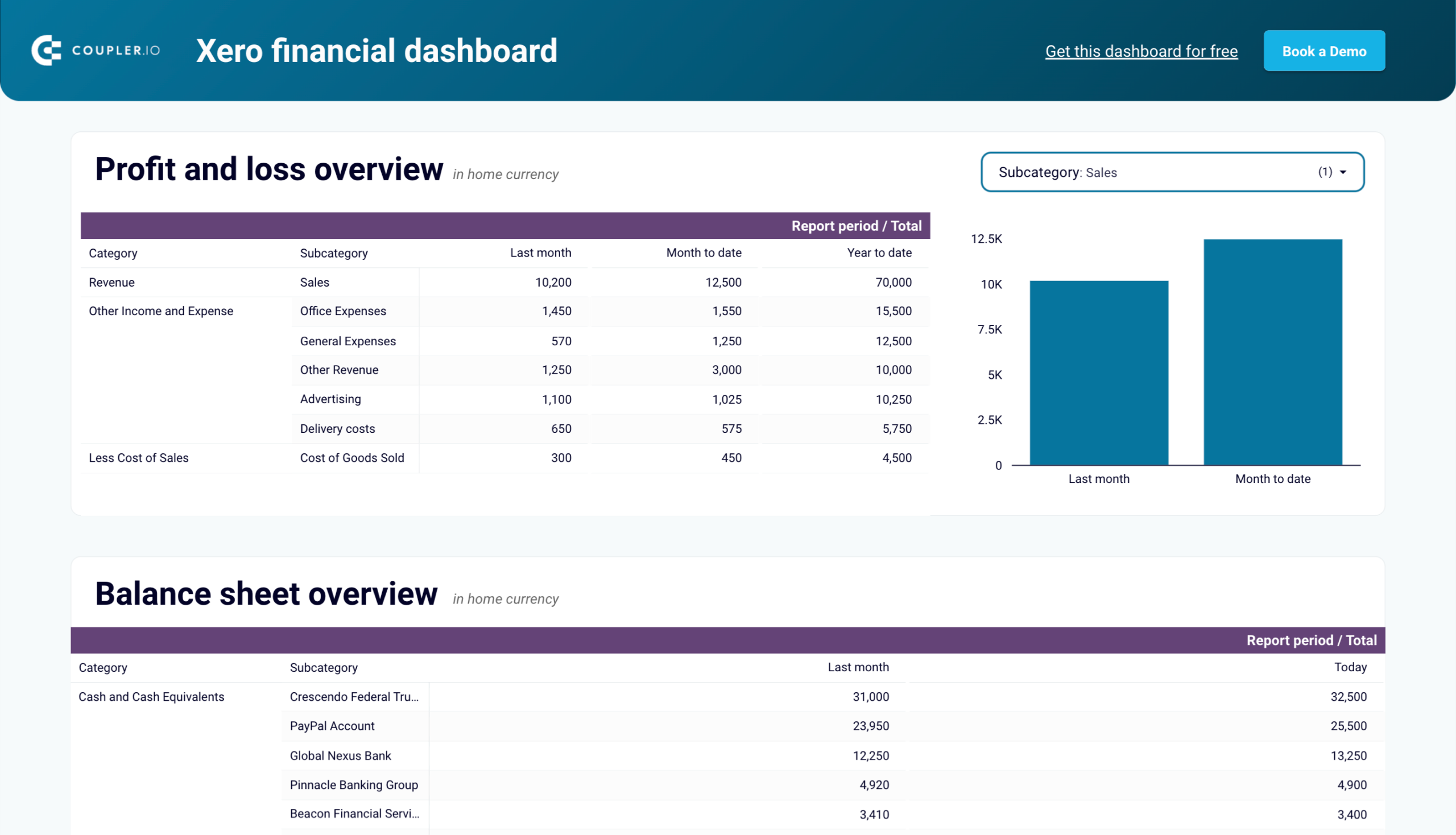
Xero financial dashboard in Looker Studio
Analyze your financial performance with a unified dashboard featuring key reports from Xero like cash flow, profit and loss, balance sheet, and others.
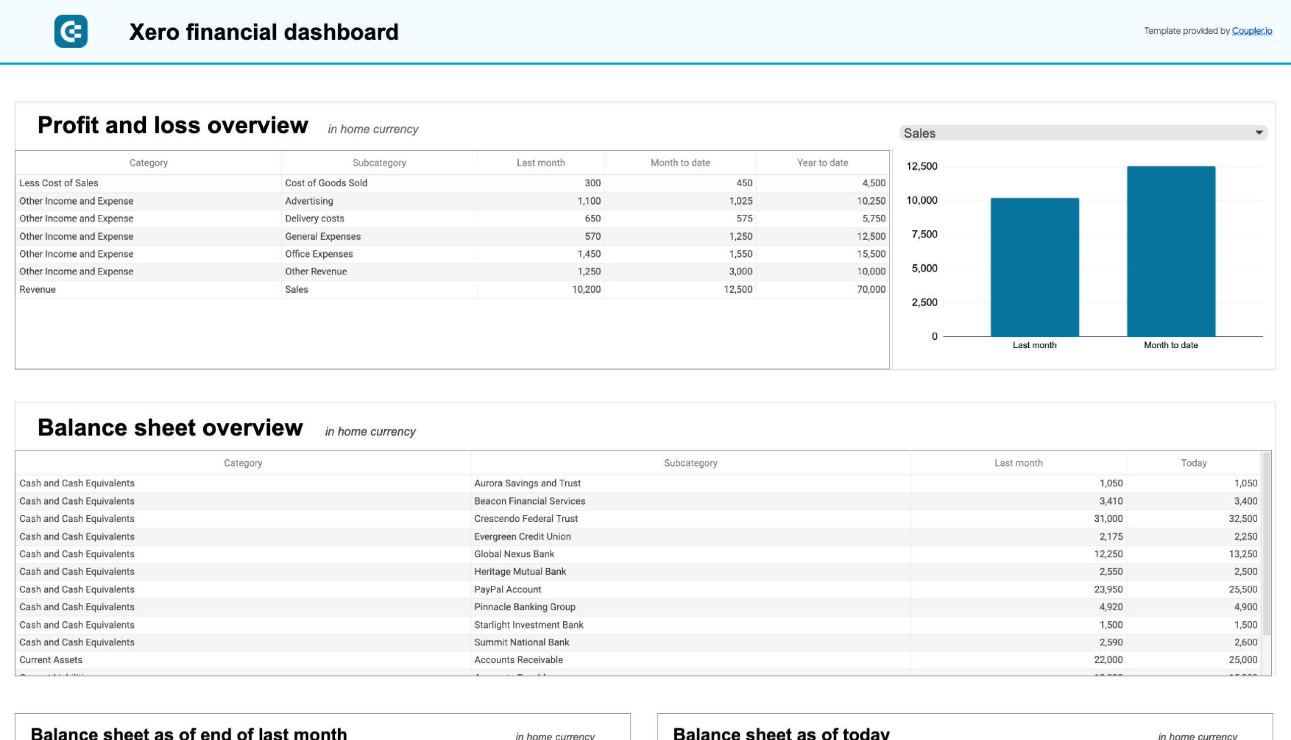
Xero financial dashboard in Google Sheets
Get instant visibility into your company’s financial health through key performance reports from Xero such as cash flow, income statement, and balance sheet.

If you use QuickBooks, then check out the versions of this dashboard as well.

QuickBooks financial dashboard
Tracks earnings, monitor cash flow, and analyze balance sheet changes with a dedicated dashboard that provides a clear picture of your business finances.
QuickBooks financial dashboard in Looker Studio
Monitor and analyze your business’s financial health with real-time insights into profit and loss, balance sheet, cash flow, and bank & cash accounts.
QuickBooks financial dashboard in Google Sheets
Get a clear snapshot of your business finances, including cash flow, P&L, balance sheets, and bank accounts, powered by data from QuickBooks Online.
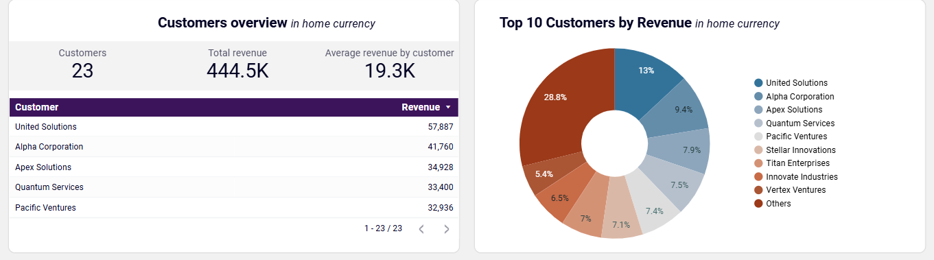
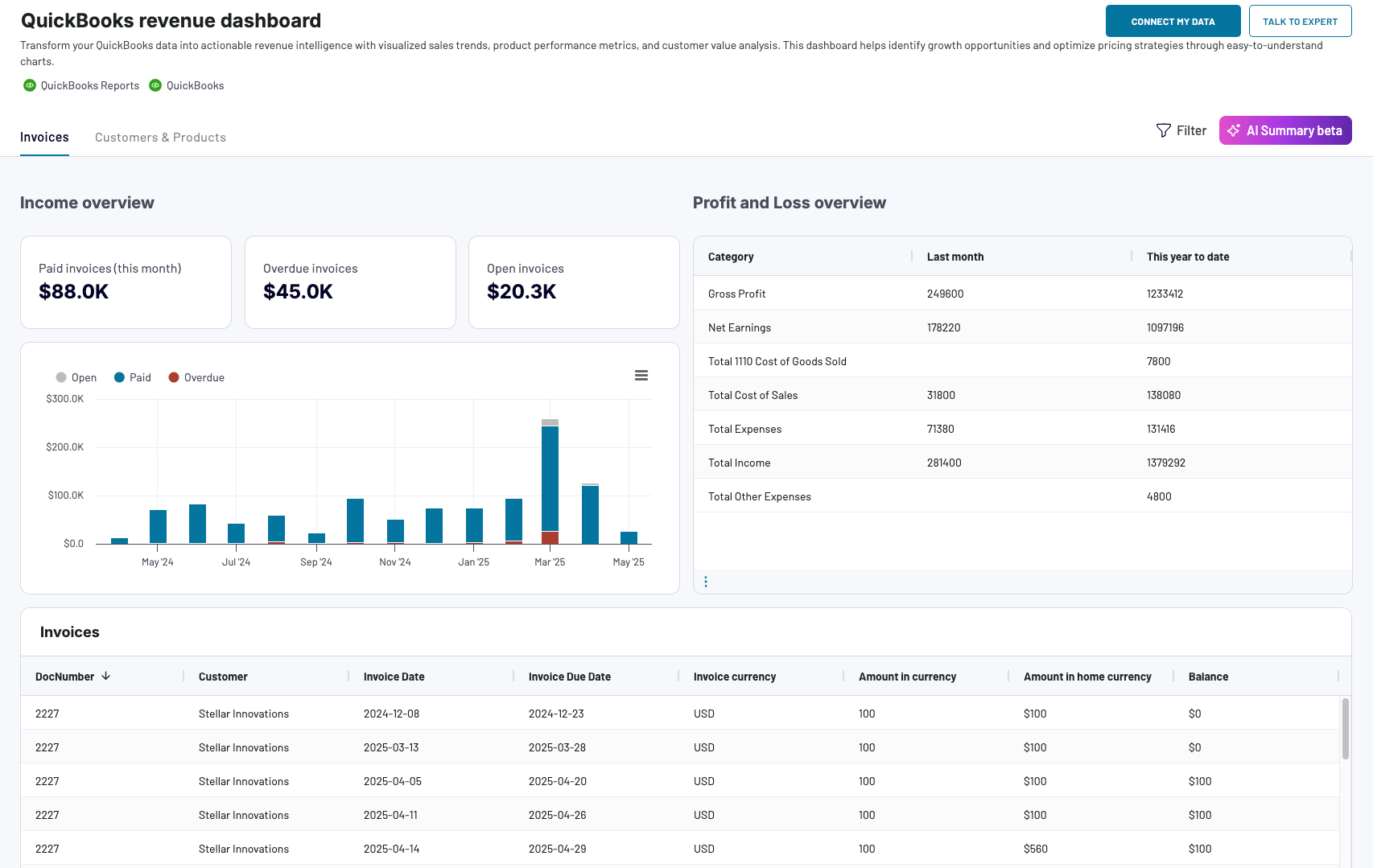
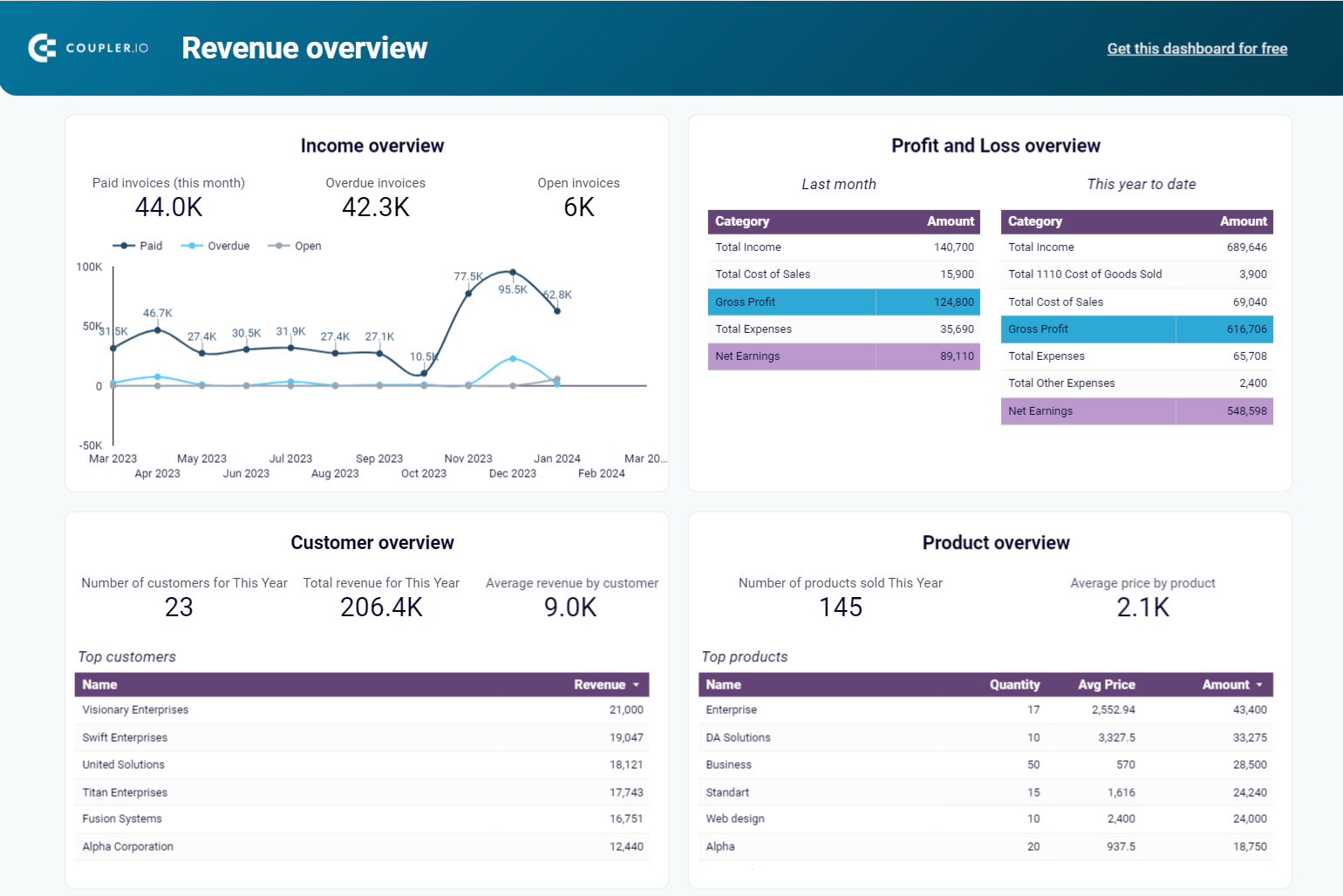
Revenue dashboard for QuickBooks/Xero
This dashboard gives a complete overview of your company’s financial health. It combines key reports, such as profit and loss, Balance sheet, Cash flow, and bank accounts, in one place. You can track cash inflows and outflows, monitor profitability, and review your assets, liabilities, and equity all in one place, without needing to switch between reports. The interactive filters and drill-downs make it easy to zoom into the numbers that matter most.
QuickBooks revenue dashboard + AI insights
 Preview dashboard
QuickBooks revenue dashboard + AI insights
Preview dashboardHere’s what insights you can get with this dashboard:
- Track invoice health over time (paid vs. overdue vs. open)
- Spot peak revenue months and unusual drops
- Identify your most valuable customers and products
- Compare income vs. expenses at a glance
The QuickBooks dashboard is available in the Coupler.io UI with faster performance and a built-in AI insights feature. At the same time, you can also use it as a template in Looker Studio, Google Sheets, and Power BI. Connect your QuickBooks account via the Coupler.io connector and follow the Readme tab to use it with your data.
QuickBooks revenue dashboard
Transform your QuickBooks data into actionable revenue intelligence with visualized sales trends, product performance metrics, and customer value analysis. This dashboard helps identify growth opportunities and optimize pricing strategies through easy-to-understand charts.
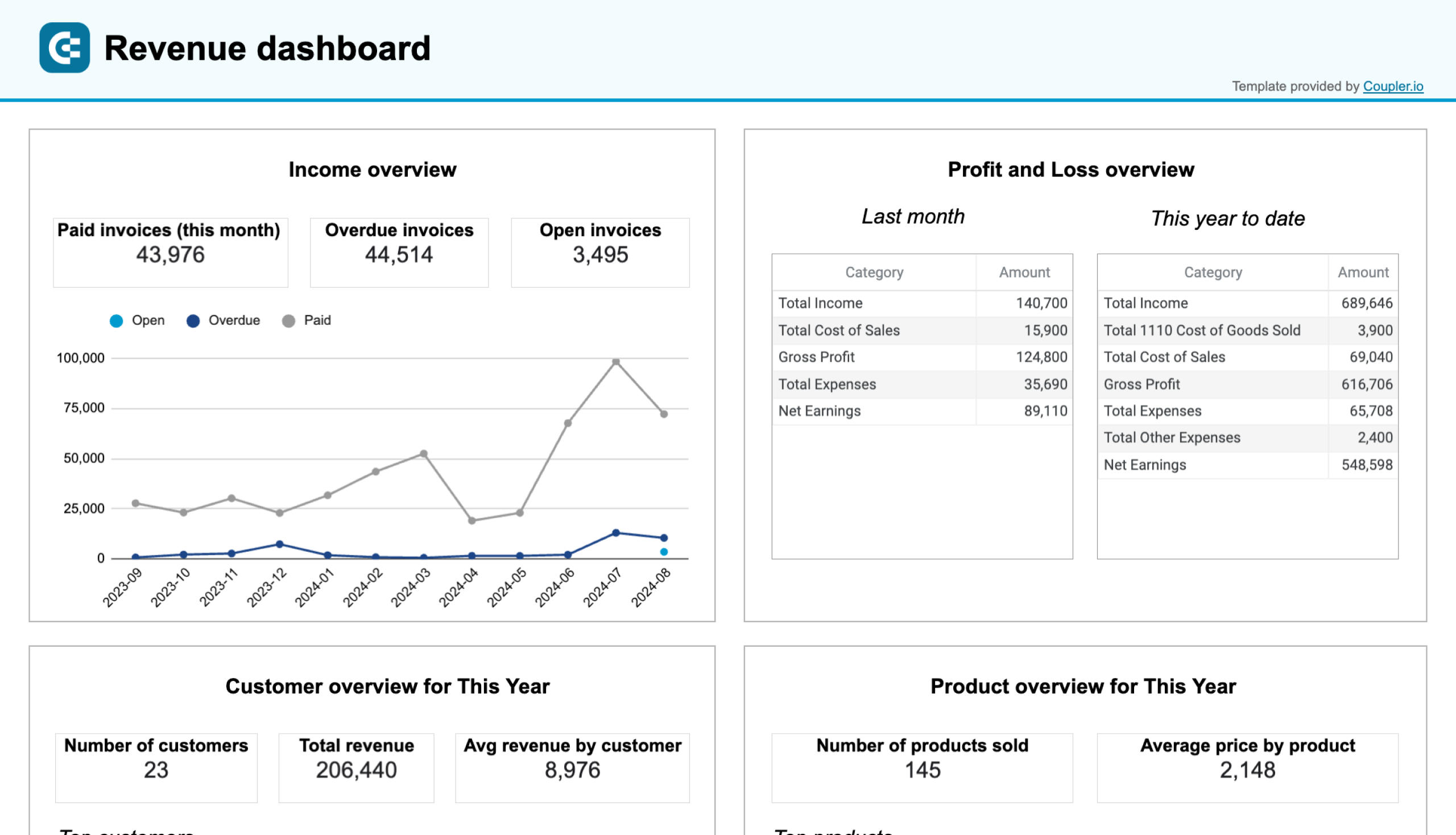
QuickBooks revenue dashboard in Google Sheets
Analyze your revenue through a set of reports collected from QuickBooks Online on a single dashboard.
QuickBooks revenue dashboard in Looker Studio
Get an overview of your revenue based on the data from QuickBooks and unlock in-depth insights to drive informed business decisions.
QuickBooks revenue dashboard in Power BI
Monitor your income and expenses on an all-in-one revenue dashboard connected to your QuickBooks Online account.

The revenue dashboard template is also available for Xero.
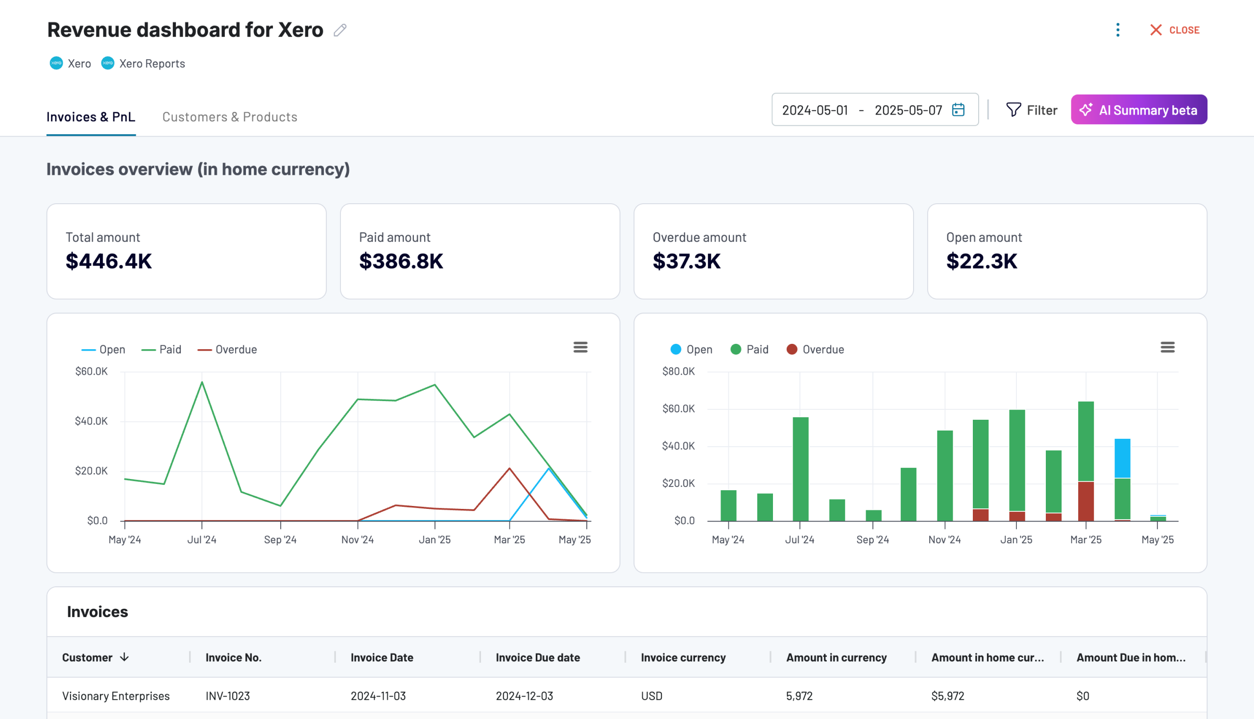
Revenue dashboard for Xero
Analyze revenue streams, customer spending patterns, and product performance with data automatically synced from Xero. Gain actionable insights into sales trends, top-performing products, and high-value customers to drive growth strategies.
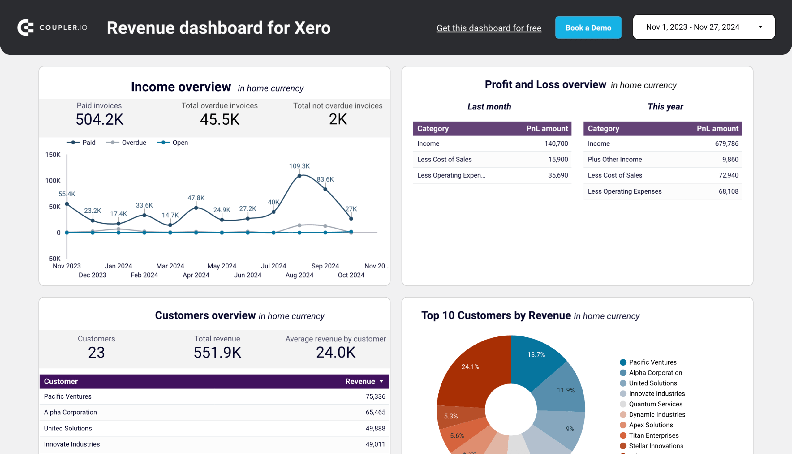
Revenue dashboard for Xero in Looker Studio
Get an overview of your profit and loss, products, and customers through a set of reports collected from Xero.
Revenue dashboard for Xero in Google Sheets
Track your revenue, costs, and customer insights with a comprehensive dashboard connected to your Xero account.
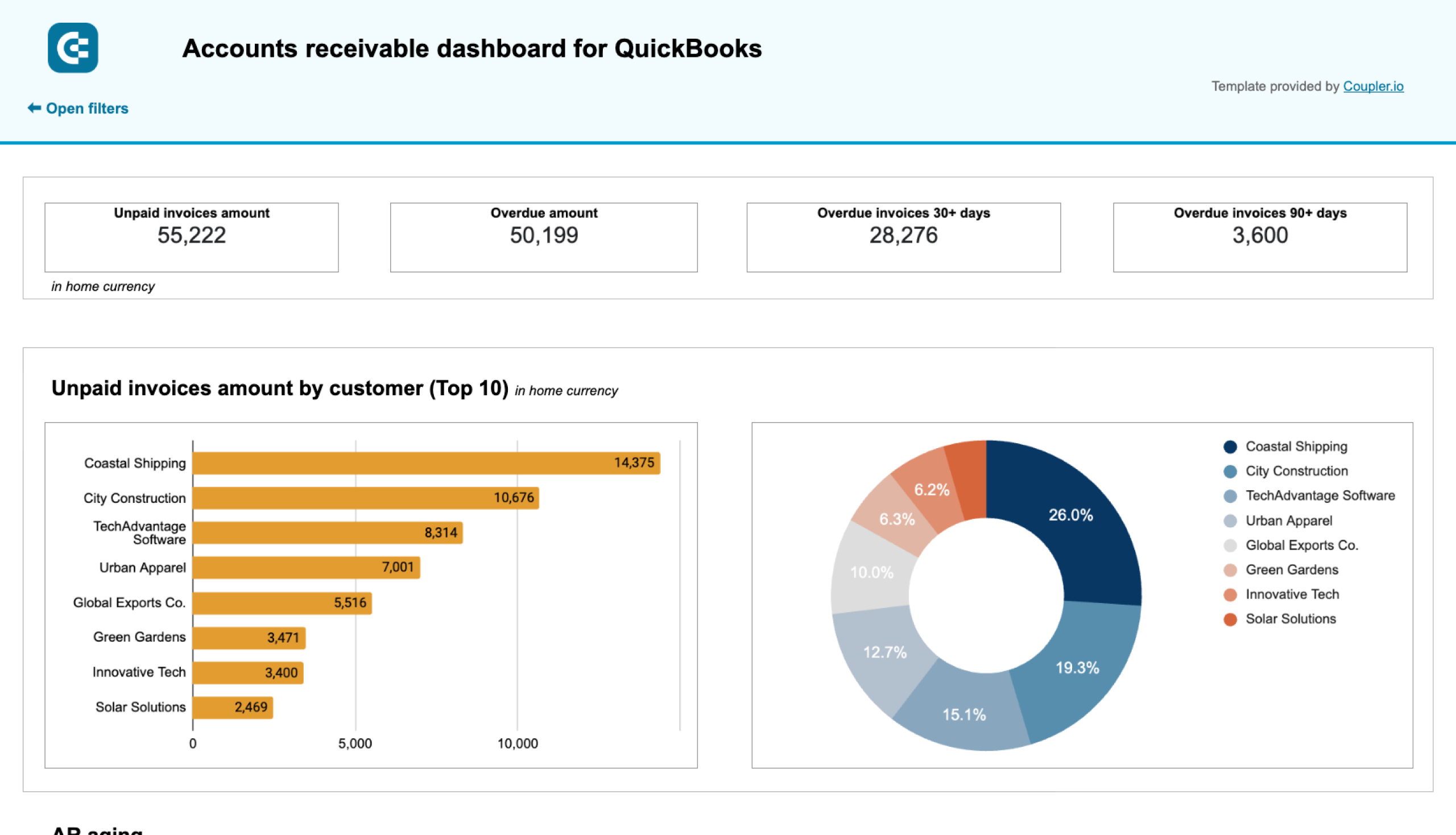
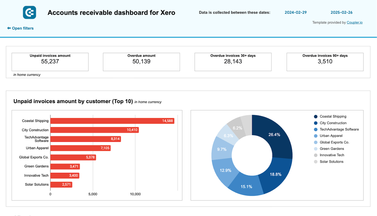
Accounts receivable dashboard for QuickBooks/Xero
Staying on top of customer payments is crucial to maintaining a financially healthy business. This accounts receivable dashboard helps you track outstanding invoices, overdue amounts, and customer payment patterns. This makes it easy to follow up, plan ahead, and prevent cash flow issues before they start.
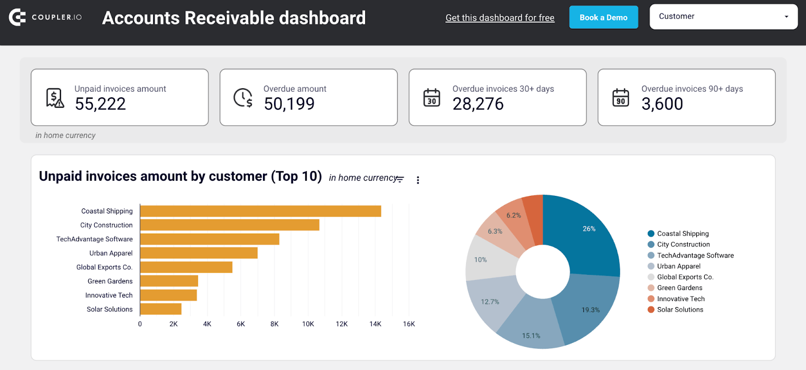
Here’s what you can do with this dashboard:
- Get an instant view of unpaid invoices by amount, aging, and customer
- Identify your biggest debtors and prioritize follow-ups
- Track how much each customer has already paid (year-to-date)
- Monitor paid vs. unpaid invoice trends over the last 12 months
- Drill down into invoice-level detail with interactive filters
This template is available in Looker Studio and Google Sheets.
Connect your QuickBooks or Xero account to Coupler.io for free, and your data will automatically flow into this dashboard, eliminating the need for setup or coding.
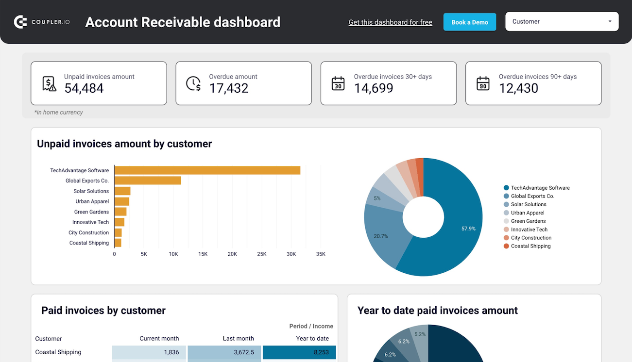
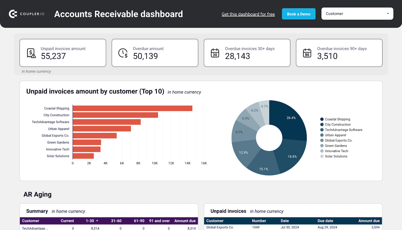
Accounts receivable dashboard for QuickBooks in Looker Studio
See which customers accumulate unpaid and overdue invoices, analyze AR aging, and track changes over time. Get useful insights for maintaining financial health.
Accounts receivable dashboard for QuickBooks in Google Sheets
Monitor customer payment statuses, overdue invoices, and collection trends with this dashboard connected to QuickBooks. Get clear visibility into your cash flow cycle with aging analysis and customer payment patterns to improve financial forecasting.
Accounts receivable dashboard for Xero in Looker Studio
See which customers accumulate unpaid and overdue invoices, analyze AR aging, and track changes over time.
Accounts receivable dashboard for Xero in Google Sheets
Track outstanding customer payments, monitor aging receivables, and analyze the correlation between paid and unpaid invoices to improve cash flow management.
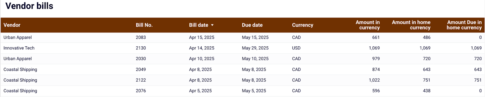
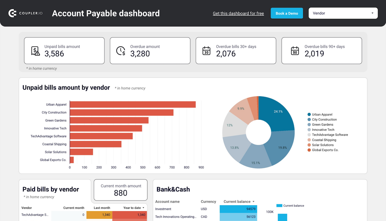
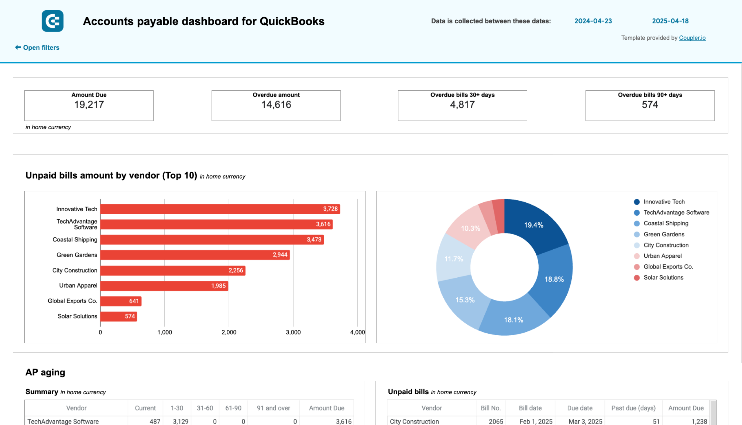
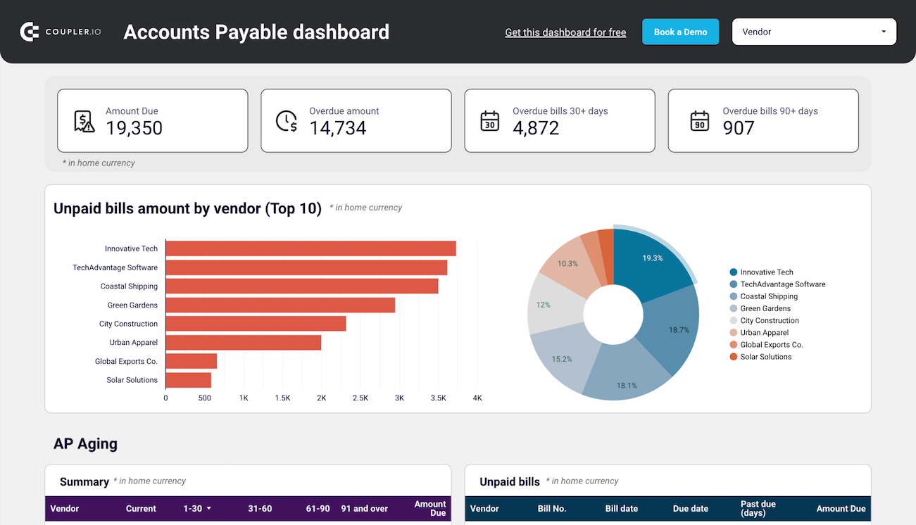
Accounts payable dashboard for QuickBooks/Xero
Keeping track of what you owe without letting it pile up is just as important as monitoring what you earn. This accounts payable dashboard helps you stay on top of your vendor obligations in real-time.
It begins with a high-level summary of unpaid and overdue bills, including the number of bills that are overdue by 30 or 90+ days. You can instantly spot which vendors are owed the most through bar and pie charts that break down the top 10 creditors. Click into any slice to filter and analyze by vendor.
It also includes:
- A breakdown of paid bills by vendor so that you can identify high-volume partners.
- AP aging details to see how long bills have been overdue.
- Bank and cash balances by account and currency to inform payment planning.
- A full view of vendor bills from the past 12 months—paid or unpaid.
You can use this dashboard to prioritize who to pay next, plan payments based on your available balance, and avoid late fees or strained relationships.
It is available in both Looker Studio and Google Sheets. To access this dashboard with your data, sign up for Coupler.io for free, connect your QuickBooks or Xero account, and the dashboard will populate with your data automatically.
Accounts payable dashboard for QuickBooks in Looker Studio
Get an overview of unpaid, overdue, and paid bills grouped by vendor. The dashboard helps you prioritize payments and improve cash flow management.
Accounts payable dashboard for QuickBooks in Google Sheets
Track outstanding vendor obligations, payment schedules, and expense patterns with data from QuickBooks. This dashboard helps you manage cash flow, identify payment priorities, and maintain healthy supplier relationships through visualized aging reports.
Accounts payable dashboard for Xero in Looker Studio
Track outstanding, overdue, and paid bills to optimize payment schedules, manage vendor relationships, and ensure smooth cash flow.
Accounts payable dashboard for Xero in Google Sheets
Monitor vendor payment deadlines, track aging bills, and analyze payment history to optimize cash flow management and maintain healthy supplier relationships.
Financial data visualization tools
Choosing the right tool can make the difference between a dashboard that feels clunky and one that delivers insights instantly. Let’s walk through the main types of tools you can use to visualize financial data effectively.
Spreadsheet apps
Google Sheets and Microsoft Excel are some of the most accessible and flexible tools for data visualization in finance. They’re ideal for structured, moderately sized datasets where you want full control over how reports are built and customized.
Spreadsheets are great for,
- Building custom revenue, expense, or cash flow trackers manually
- Creating pivot tables, KPI cards, and line or bar charts for financial reports
- Analyzing historical data with formulas and conditional formatting
But for very large, complex datasets, multi-source reporting, or automatic data updates, they can become slow, fragile, and manual.
Use spreadsheet apps for custom, controlled financial reporting when you need flexibility and hands-on editing, but upgrade to business intelligence (BI) tools once automation and scaling become priorities.
Business intelligence (BI) tools
Looker Studio, Power BI, and Tableau are purpose-built for larger, more dynamic financial reporting. They enable you to create interactive dashboards that automatically pull live data, update without manual intervention, and handle significantly more complexity.
BI tools are great for,
- Managing financial reports across multiple sources (QuickBooks, banks, CRM)
- Tracking KPIs and financial trends in real-time
- Sharing live dashboards with leadership, investors, or clients
- Drill-down filters, user access controls, multi-source blending, and trend forecasting.
Use BI tools to create scalable, automated, and shareable financial dashboards that provide every stakeholder with the correct view of the numbers, eliminating the need for manual updates.
Coupler.io
Coupler.io connects everything —data integration, automation, and visualization —into one solution. It helps you easily pull live financial data from apps like QuickBooks, Xero, HubSpot, and more, and organize it in reports like this:
With Coupler.io, you can:
- Automate data refreshes to always have the latest financial numbers
- Blend and transform data for multi-source analysis. In this example, Stripe and QuickBooks are joined to reconcile QuickBooks invoices with Stripe payments.
- Build financial dashboards using ready-to-use templates
Even though Coupler.io’s built-in dashboarding for financial data is coming soon, you already have access to robust financial dashboard templates across Google Sheets, Looker Studio, and Power BI.
This makes Coupler.io an all-in-one reporting automation solution for anyone who wants real-time financial visibility without the manual work.
Use Coupler.io to connect, automate, and visualize your financial data workflows. Be ready to build fully customized in-platform dashboards as soon as they launch.
Why it’s important to visualize financial data
When financial data is buried in rows and columns, it’s challenging to translate numbers into actionable insights. Visualizing that data bridges the gap between raw numbers and real insights.
Here’s why it matters:
- Faster, smarter, and more informed decisions: A well-designed dashboard can surface critical metrics, such as revenue dips or rising accounts receivable, at a glance, without digging through reports.
For example, a sharp bar chart showing cash burn or a heatmap of overdue invoices instantly conveys the point.
- Easier trend analysis: Visuals make it easy to spot seasonality, growth trends, or sudden changes in cash flow. You can act before a spreadsheet would have raised a red flag.
For example, two quarters of revenue might look similar on paper. But a simple line chart could show a dip in retention or a surge in refunds. These are insights you’d miss without visuals.
- Stronger stakeholder communication: Whether it’s a board meeting or a client update, charts and graphs simplify complex data, making your message clear, even for non-finance audiences.
For example, a finance lead might spot trends, but a founder, investor, or department head remembers color-coded visuals, not a balance sheet.
- Greater accountability: Dashboards track performance in real-time, providing teams with visibility and ownership over financial KPIs.
For example, a dashboard showing weekly budget vs. actual spend, broken down by department, keeps every team accountable.
Best practices for data visualization in finance
Effective financial dashboards don’t just display data; they highlight the key insights that matter. Following a few proven practices will make your financial data visualizations easier to understand and more accurate.
- Keep it simple and readable: Financial data can easily overwhelm if it’s packed into dense tables or cluttered charts.
For example, adding more KPIs to a single dashboard or using large KPI cards can be confusing and make it difficult to understand the metrics.
Instead, highlight 4 to 5 key metrics and allow users to drill down if needed. Use clear layouts, limited colors, and straightforward labeling to maintain a sharp focus.
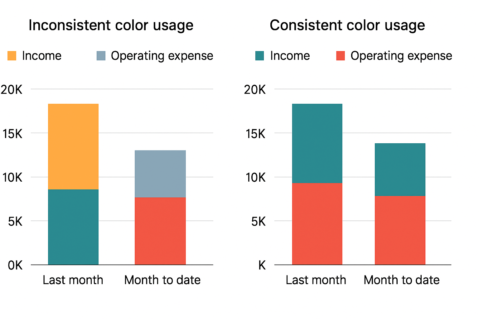
- Use consistent color-coding intentionally: Color isn’t just for decoration; it communicates meaning.
For example, always use green to represent growth or profit, and red to represent decline or loss. If expenses are blue in one chart, keep them blue across all charts. Consistent color usage reduces confusion and speeds up comprehension.
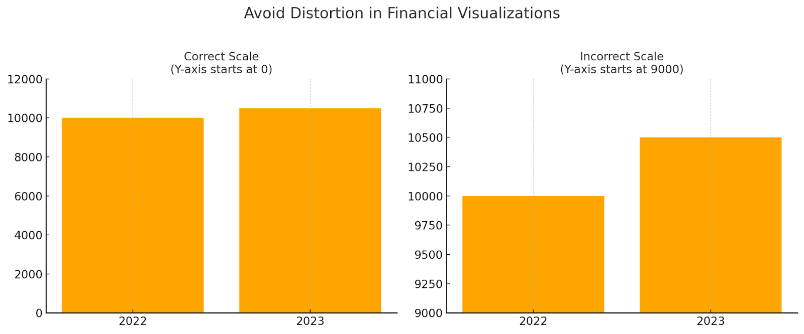
- Avoid distortion or misrepresentation: Visuals must accurately represent the data without exaggeration.
For example, a bar chart showing revenue growth shouldn’t start its Y-axis at 90%. It should start at zero to avoid making small changes look dramatic. Trust is easily lost if visuals are misleading, even unintentionally.
- Regularly validate and update data for accuracy: Financial decisions rely on current and trustworthy data.
For example, a dashboard showing cash flow from three months ago is worse than no dashboard at all. Schedule automatic refreshes and regular validation checks to ensure reliable insights.
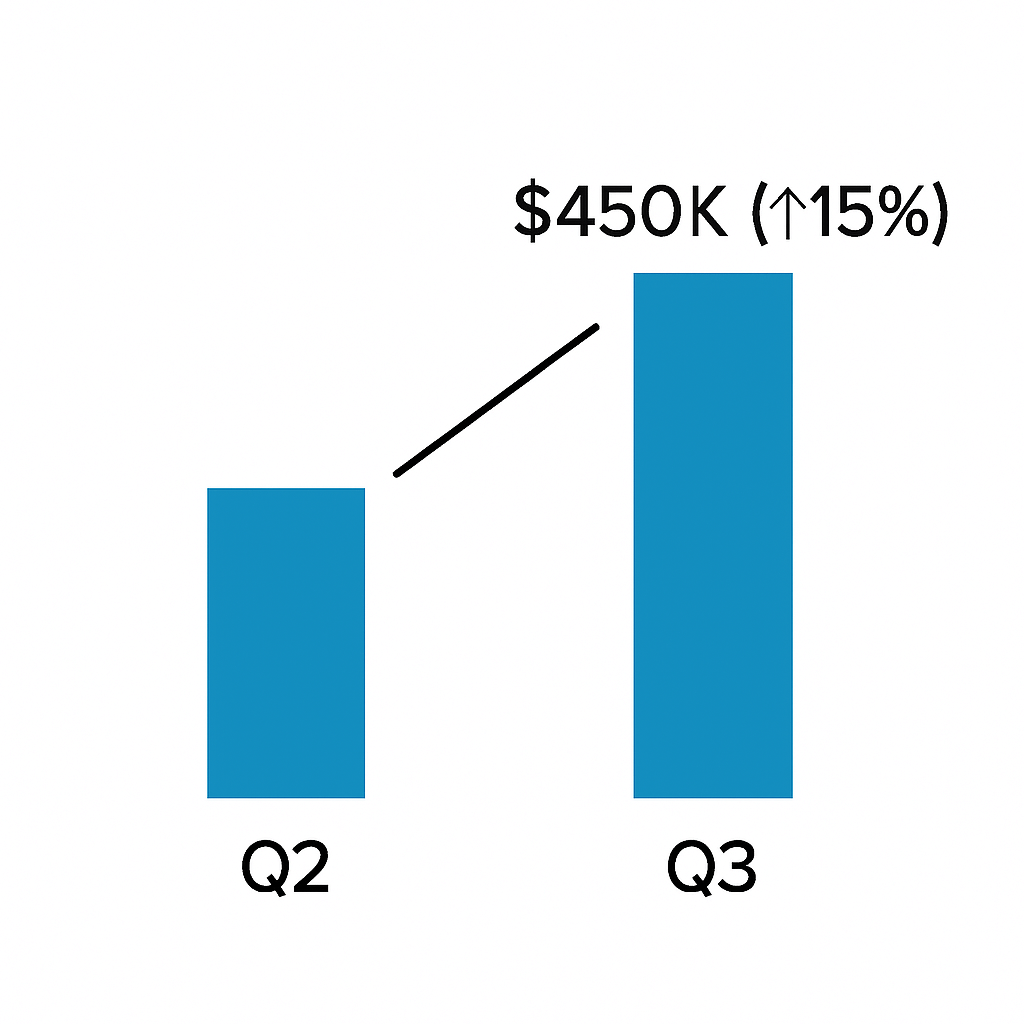
- Always provide context: Numbers without explanation leave room for misunderstanding.
For example, instead of just showing “Q3 Revenue: $450,000,” add a note like “? 15% compared to Q2” to show performance improvement. Adding comparison data points, footnotes, or brief highlights transforms raw numbers into actionable insights.
Bonus: Uncommon methods of data visualization in finance
When financial information gets complex, standard charts sometimes fall short. That’s where more advanced, uncommon visualization methods can reveal patterns, highlight risks, and tell better financial stories.
Here are five powerful techniques that can take your financial dashboards to the next level:
Sankey Diagram
A Sankey diagram visualizes the flow of money, resources, or transactions between different entities, with the width of each flow proportional to its value.
In finance, they are helpful in breaking down how revenue is earned, how expenses are incurred, or how funds are allocated across various accounts or departments. They help identify inefficiencies, bottlenecks, and major contributors at a glance.
For example, the Apple FY22 Income Statement uses a Sankey diagram to illustrate how revenue from various product lines flows into total revenue, which then splits into cost of revenue, gross profit, and ultimately net profit.
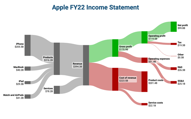
You can immediately spot where Apple earns the most and where major costs occur, without reading through complex spreadsheets.
Network graph
Network graphs excel when uncovering hidden relationships between financial entities, making them ideal for risk contagion analysis, fraud detection, and ownership mapping.
For example, the below graph shows customers and their transaction links with merchants.
Shared connections reveal how risks (like a failing retailer) can affect multiple customers (risk contagion) or expose hidden ties useful for fraud detection and ownership mapping.
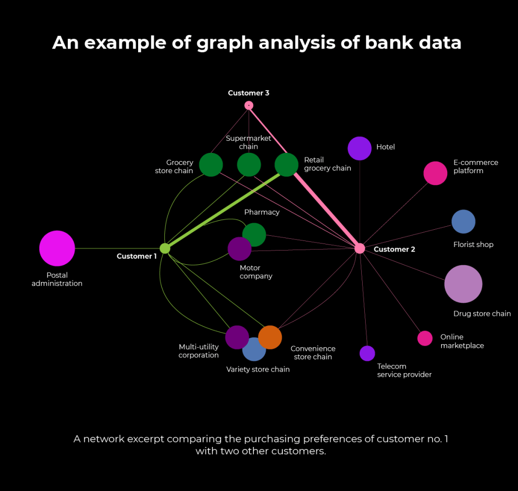
In finance, network graphs help visualize these risks at a glance, flagging suspicious patterns early and enabling smarter, faster investigations.
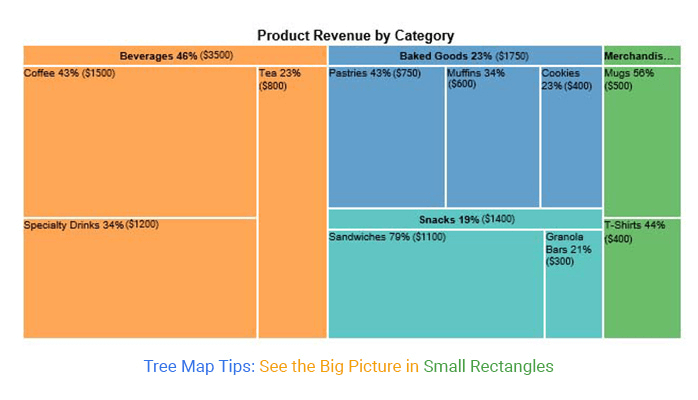
Treemap
A treemap is a compact way to visualize hierarchical financial data using nested rectangles, where the size and color represent different metrics. Unlike common pie or bar charts, treemaps can quickly display complex structures, such as revenue composition, portfolio allocations, or expense breakdowns, in a single view.
For example, it’s easy to see that beverages drive the largest share of product revenue, with coffee leading within that category. This method is still uncommon in finance, but it is highly effective when you want to show both the big picture and detailed proportions simultaneously.
Interactive SVG
Interactive SVGs (Scalable Vector Graphics) let you build financial visuals that users can click, hover over, or interact with—bringing static charts to life. Unlike regular images, SVGs can respond dynamically to actions such as zooming into a chart, highlighting a revenue stream, or opening detailed breakdowns with a single click.
For example, in this ‘Paid vs Unpaid Invoices’ visualization, you can highlight the invoice amount of a particular invoice by just clicking on it.
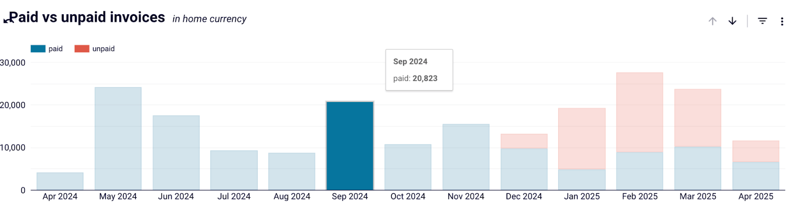
While they require a more technical setup, interactive SVGs are a powerful way to make financial dashboards dynamic and engaging for your data story.
Use financial data visualization to make data-driven decisions
Clear financial data visualization helps turn numbers into insights that drive better decisions across teams and organizations. Instead of working through dense spreadsheets or isolated reports, well-designed charts, dashboards, and visual representations make it easier to understand key metrics, spot trends, and identify areas that need attention.
Throughout this guide, we explored the most effective ways to visualize financial data, ranging from basic chart types to real-world dashboard templates and unconventional methods, such as Sankey diagrams and network graphs.
The right visual approach depends on the complexity of your raw data, the message you want to convey, and the audience you are presenting to.
With the right tools and a clear strategy, financial data visualization can become a foundation for faster, smarter, and more confident decision-making.
Automate your financial reports with Coupler.io
Get started for free


