Clicks. Leads. Revenue.
Individually, they don’t say much. But when placed in a funnel, they tell the full story. Funnel reporting connects the dots across platforms, so you can focus on what actually drives growth.
A marketing funnel report shows how users move from discovering your brand to becoming paying customers, highlighting what’s working, where users drop off, and where to optimize.
But setting up a funnel report isn’t always simple. With data spread across ad platforms, web analytics, CRMs, and eCommerce tools, marketing teams often rely on manual work just to build a basic view.
That typically means:
- Downloading data separately from each platform
- Aligning different formats and metrics manually
- Maintaining multiple spreadsheets for different stages of the funnel
- Repeating the same process for every reporting cycle
- Trying to visualize the data clearly enough to spot bottlenecks and performance gaps
Spreadsheets and siloed dashboards might work at first, but they often lead to fragmented reports, data errors, and limited visibility. And over time, they slow down analysis and hide growth opportunities.
That’s why more teams are shifting to automated solutions like Coupler.io. It helps streamline the entire process from connecting data from different sources, organizing it into clear funnel stages, to keeping reports updated automatically, without relying on code.
In this article, we’ll show you what that looks like. By the end, you’ll have a solid understanding to build and analyze your complete marketing funnel report easily.
Different levels of funnel reporting
Depending on how many tools you use and how much visibility you need, your funnel report can be as simple or as detailed as you want it to be.
Here are three ways to structure marketing funnel reports, from tracking a single channel to mapping the full customer journey.
One-source funnel: With a single platform like Google Ads (or any other platform), you can already build a powerful funnel report. It helps you go beyond basic metrics and understand how each campaign performs from impression to conversion. You can track conversion rates by keyword or campaign, calculate cost per lead, and spot drop-offs between views and clicks, all in one clean and focused view.
Multi-source funnel: As you expand your marketing efforts across platforms, like Google Ads, Facebook Ads, and LinkedIn Ads, bringing them into one funnel report gives you a bigger picture of your acquisition performance. Instead of switching between dashboards, you can compare channels, track total spend and conversions, and understand how different platforms contribute to the top of your funnel.
Unlike a full-funnel report, this view is focused on the acquisition layer. It helps you decide which channels are worth the investment before diving deeper into the customer journey.
Full marketing funnel report: This is where everything comes together, from the first ad click to the final purchase. By blending ad platform data with website analytics (like GA4) and sales or CRM data (like Pipedrive ), you get full visibility into how users move through your funnel.
Explore more about marketing attribution software.
You can spot where drop-offs happen, compare new vs returning customers, and tie actual revenue back to campaigns. A full-funnel report helps you optimize every stage. It’s the kind of insight that turns marketing data into a growth strategy.
How to create a one-source funnel
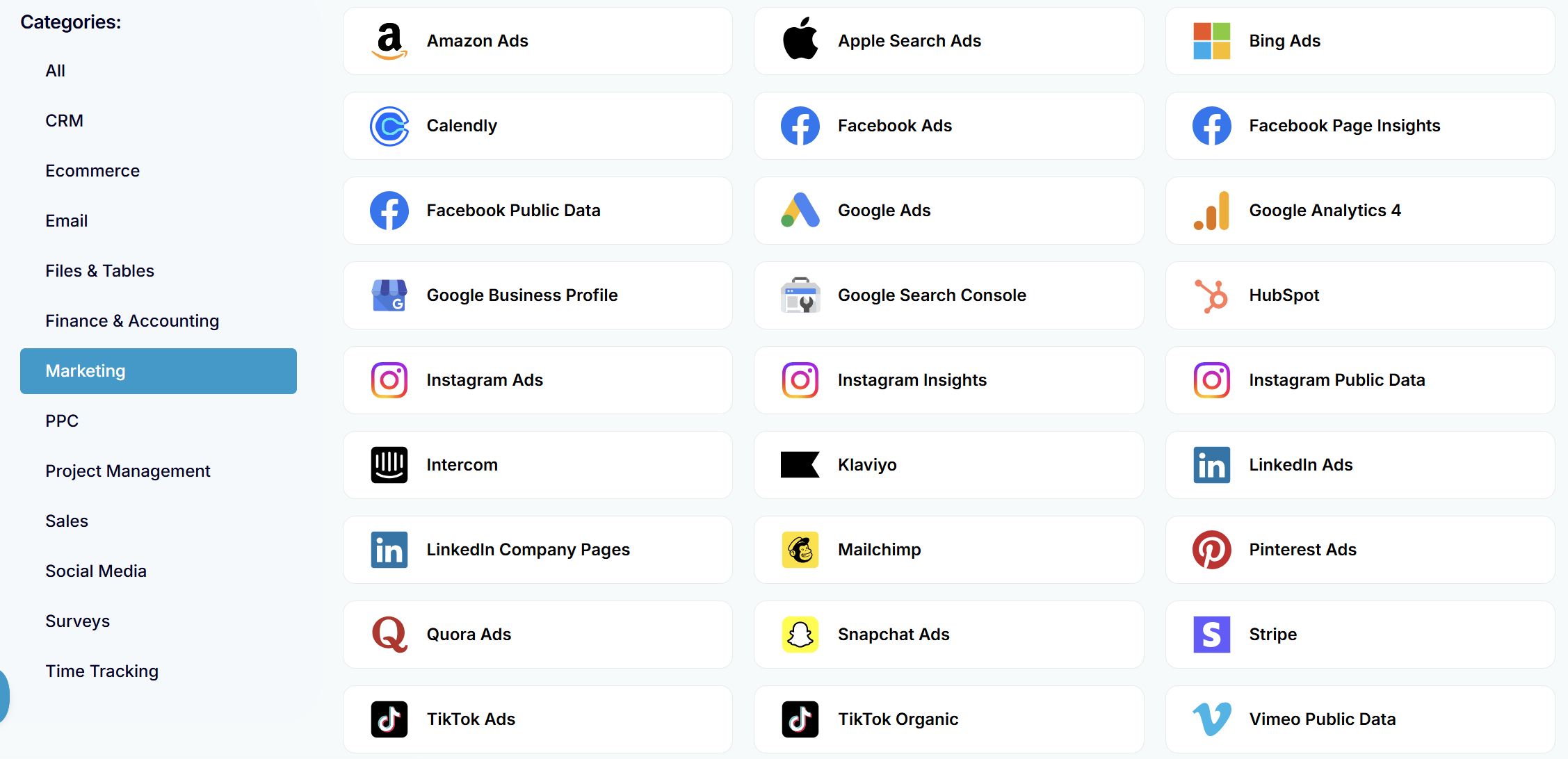
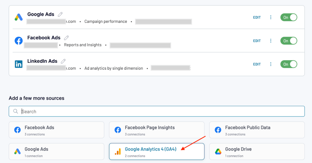
The simplest way to get started is with a single data source. Coupler.io offers over 70 apps apps and tools to pull data from, so choose your preferred one.
For example, let’s consider Google Ads. With Coupler.io, you can connect your account and select relevant metrics like impressions, clicks, and conversions.
Next, prepare and organize data with data transformation features and send the data straight to BI tools, data warehouses, and spreadsheet apps. Or you can use a ready-for-analysis dataset like here.
Even at this level, you can build a clear funnel view from impressions to clicks to conversions and calculate basic metrics like cost per conversion, CTR, or campaign ROI.
You can reuse this same workflow for any single source (Facebook Ads, LinkedIn Ads, GA4, etc) and get a clear view of your funnel.
Want to try this yourself? The setup process is the same as the first steps of the full-funnel guide below — just connect one source and skip the rest. You’ll find all the details in the funnel report walkthrough that follows.
How to create a multi-platform funnel
While running campaigns on multiple ad platforms, use Coupler.io dataflow to bring all the data into a single unified report. For example, we are adding Google Ads, Facebook Ads, and LinkedIn Ads as data sources.
Connect your sources and select matching metrics like impressions, clicks, conversions, cost, etc. Coupler.io’s Append function lets you combine them into a single dataset, giving you a side-by-side view of your paid acquisition performance.
You can compare channel-level performance, track total spend, measure cost per lead or ROAS, and map how each platform contributes at the top of your funnel. Here is what it looks like in our PPC multichannel dashboard.
The multi-platform funnel setup follows the same process we walk through in the next section – full funnel report. We’ll show you how below.
How to create a funnel report with Coupler.io: A step-by-step walkthrough
A marketing funnel report is only as strong as the data behind it. With Coupler.io, you can bring all your marketing and sales data together and build a report that gives you a complete view of your funnel.
In a few simple steps, you’ll connect your advertising, analytics, and e-commerce platforms, transform the raw data into clean funnel stages, and send it to your preferred destination for reporting.
In this section, we’ll show you how to set up a marketing funnel report by connecting the platforms we use daily — Google Ads, Facebook Ads, LinkedIn Ads, Google Analytics, and Pipedrive.
Follow the same steps for any other sources you use.
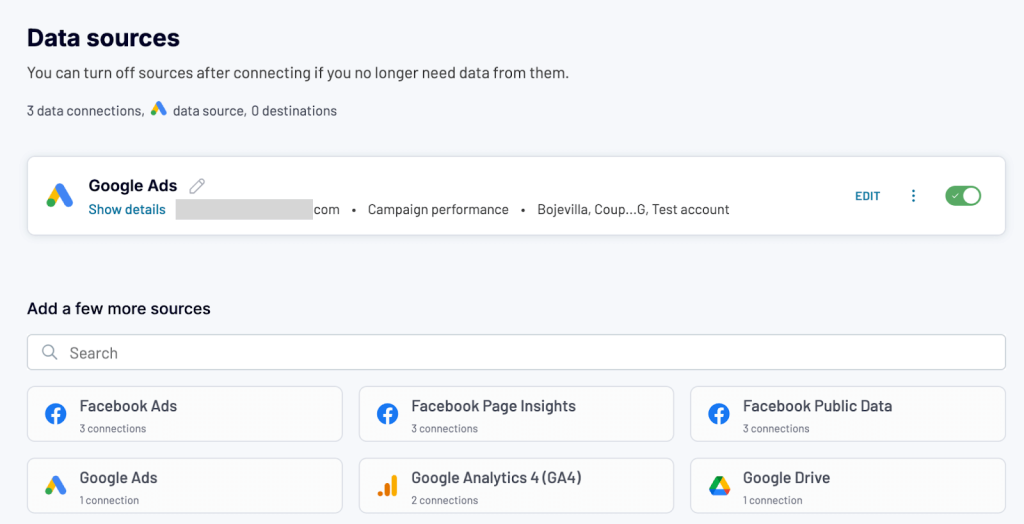
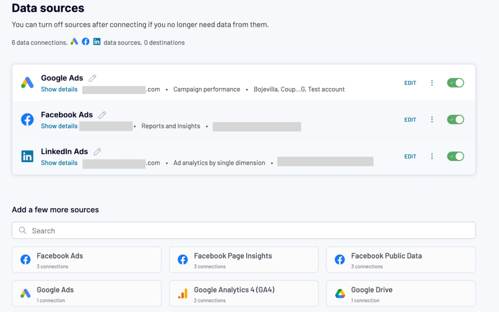
Connect sources
The first step in building your marketing funnel report is connecting the right data sources.
Start by creating a new dataflow in Coupler.io. Use the form below to select your first source and destination. We’ll be adding the rest of the data sources later during the setup.
Collect data from Google Ads
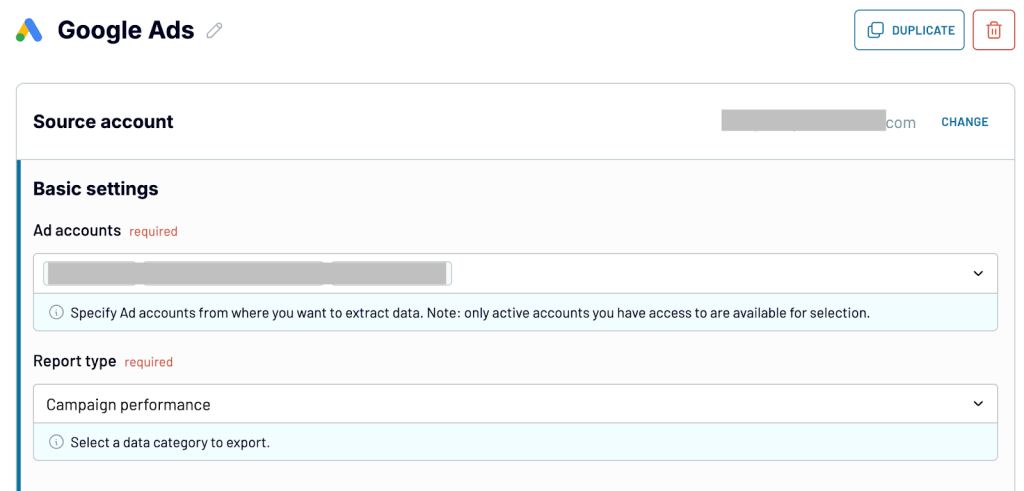
We’ll begin by connecting our first data source – Google Ads.
Authorize and connect your account. Configure the source with the basic settings,
- Choose the ad account you want to pull data from
- Select the report type – campaign performance or ad group performance.
- Set the start and end dates for your report
- You can split the data by periods (daily, weekly, or monthly), to analyze trends more effectively over time.
Collect data from Facebook Ads
After setting up Google Ads in the data flow, select Facebook from the sources below.
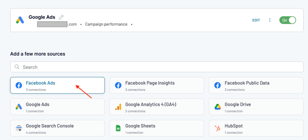
Connect and authorize your Facebook Ads source account. Next,
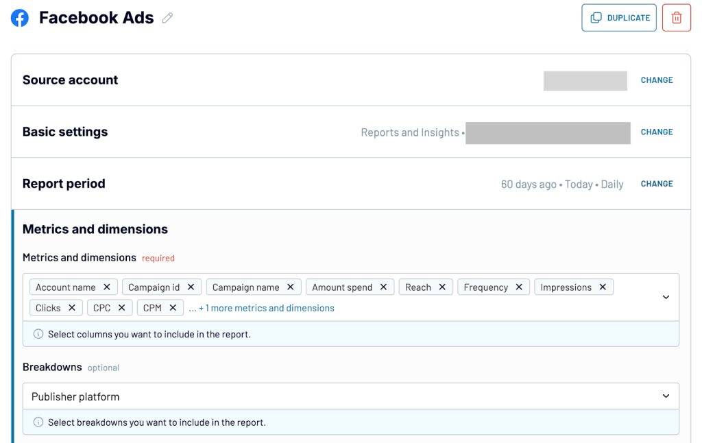
- Select the Facebook Ads account you want to pull data from.
- In Basic settings, choose the report type as Reports and Insights.
- Set the start and end dates for your report. You can also split the data by periods, such as daily, weekly, or monthly.
- Under Metrics and Dimensions, select the fields you want to include in your report, like amount spent, impressions, clicks, and publisher platform.
- In Advanced settings, choose how attribution settings should be applied. You can inherit them from your ad account or set them manually for full control.
- You can optionally apply filters to further narrow down the data.
Collect data from LinkedIn Ads
We are adding LinkedIn Ads as the next source.
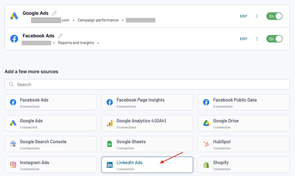
Start by connecting your LinkedIn Ads account and authorizing access to your ad account.
- Select the LinkedIn Ads account you want to pull data from.
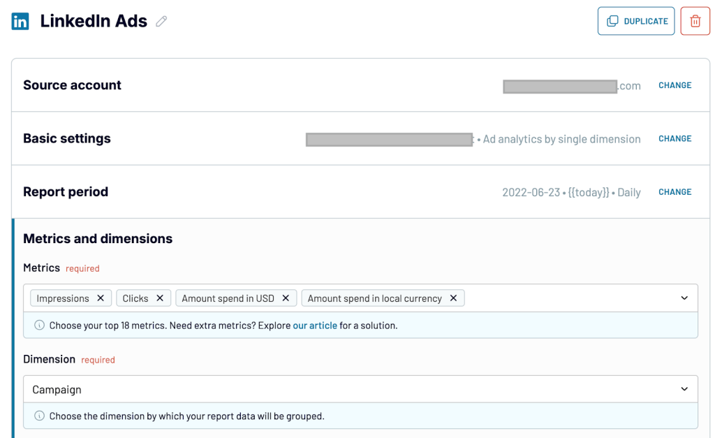
- Choose Ad analytics by single dimension as your report type.
- Set the start date and end date for your report.
If you want to track trends more closely, you can split the data by periods (daily, weekly, or monthly) - Choose key metrics like impressions, clicks, amount spent in USD, and amount spent in local currency. For the dimension, select Campaign to group your LinkedIn Ads data by campaign level.
This setup helps you organize your LinkedIn Ads performance data in a way that’s easy to map into your overall marketing funnel.
You can also add more PPC sources depending on your needs.
Collect data from Google Analytics
The next data source to connect is Google Analytics 4 (website data). It tracks how users interact with your website, which is key to understanding what happens between ad clicks and conversions. You can see website visitors, how they engage with your content, and how effectively you move users through the funnel.
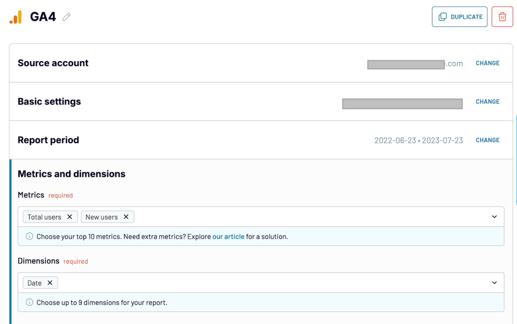
Start by connecting your GA4 account. Authorize access to your analytics property.
- Select and confirm the GA4 property where your website or app data is collected.
- Choose the start date and end date for your report to define the timeframe you want to analyze.
- Select metrics like Total users and New users to track the number of people visiting and engaging with your website. For dimensions, select Date to group the data by day and monitor changes over time.
Collect data from Pipedrive
Pipedrive is the final stage of your marketing funnel, where leads convert into qualified opportunities or deals.
By connecting Pipedrive, you can bring in valuable CRM data like lead status, contact details, and deal progress to track how marketing efforts translate into pipeline growth and sales outcomes.
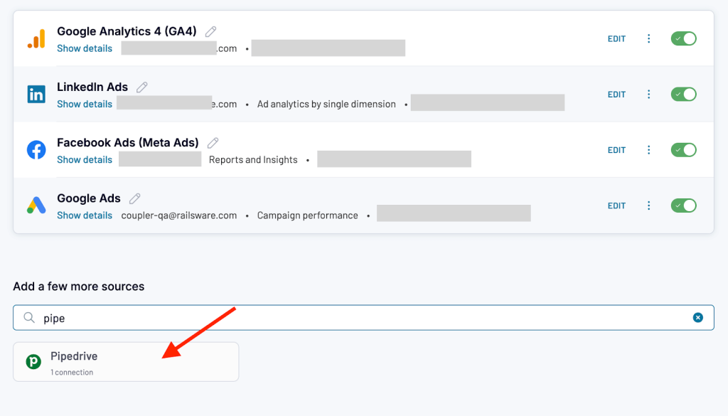
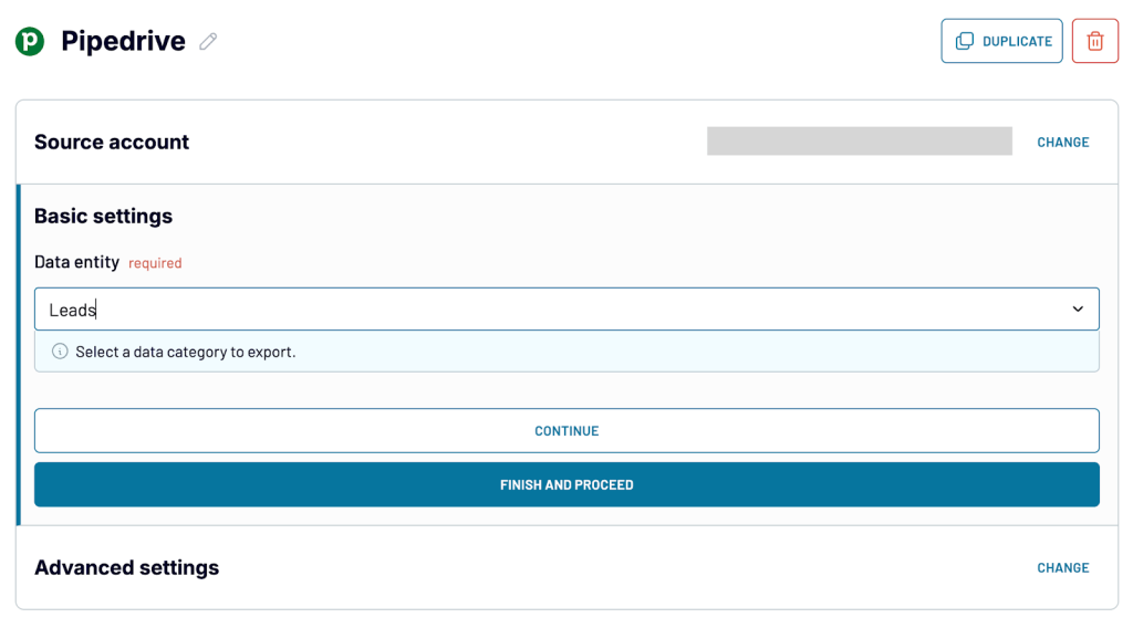
Start by connecting your Pipedrive account. Authorize to access your store.
- In Basic settings, choose the data entity you want to import. For this case, let’s select Leads.
- In advanced filters, you can apply optional filters to narrow down the data, such as importing only leads with email to ensure contact quality.
This helps keep your funnel report clean and focused on actionable leads that are ready for nurturing or conversion.
With all your sources connected, the next step is to organize and transform the raw data into a structured funnel report.
Transform data to create a report
Coupler.io offers data transformation features that make it easy to organize and prepare your raw data for reporting. You can rename columns, hide/ unhide columns, create custom fields, and blend datasets in a single workflow.
Align column names across sources
Different platforms use different names for similar data points. Make sure the field names match to combine them into a single report.
Here’s how you can align them:
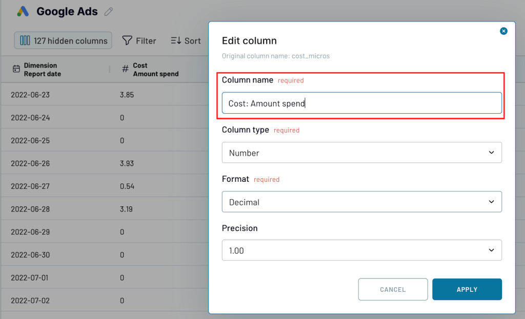
- Rename all ad cost-related columns to Cost: Amount Spend
- Rename impression fields to Performance: Impressions
- Rename click fields to Performance: Clicks
- Rename all conversion-related fields to Leads
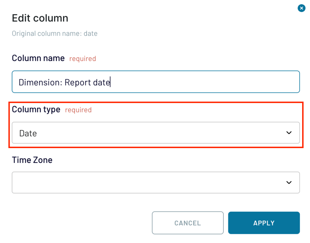
Select column types
After renaming columns, make sure each column is assigned the appropriate column type.
For example,
- Set dates as Date type.
- Set numeric values (like amount spent, clicks, impressions) as Number type.
- Set text fields (like campaign names or data sources) as Text type.
Setting the right column types ensures your columns behave correctly during analysis and visualization. You can also hide columns that are not important for analysis.
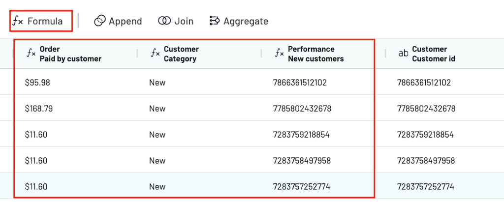
Create custom columns
To make your funnel report easier to analyze, you can create custom columns that organize and enrich your data.
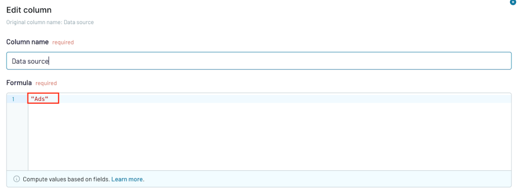
Create a Data Source column. Assign the value “Ads” to all PPC data (Google Ads, Facebook Ads, LinkedIn Ads), “GA” for Google Analytics data, and “Leads” for Pipedrive data.
This helps you group and filter the different stages of your funnel later.
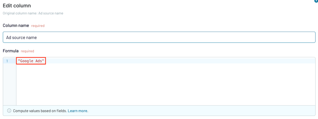
You can also create a separate Ad Source Name column to label each platform more specifically.
For example:
- Google Ads ? “Google Ads”
- Facebook Ads ? “Facebook Ads”
- LinkedIn Ads ? “LinkedIn Ads”
Adding these fields gives you flexibility when analyzing performance by platform or comparing results across channels.
Once the source columns are ready, you can create additional calculated fields to add key performance metrics to your report:
- CTR :
(Performance_Clicks / Performance_Impressions) * 100 - Expected deal value:
{Deal value} * {Probability} - Lead age:
datetime_diff(today(), {Lead created date}, "days") - Lead category:
if({Expected deal value} >= 100000, "High Value", if({Expected deal value} >= 50000, "Mid Value", "Low Value"))
By creating these columns inside your data flow, you won’t need to apply extra formulas later in your dashboard or spreadsheet.
Your data will be clean, structured, and ready for analysis as soon as it loads.
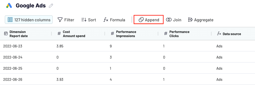
Combine all datasets
After aligning your fields and creating custom columns, combine all your sources using Coupler.io’s Append feature.

Appending the data will merge your advertising, website analytics, and e-commerce records into a single table. This gives you a complete view of the entire funnel from the first ad impression to the final purchase.
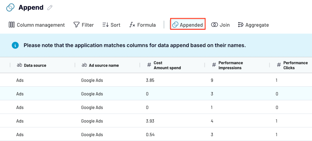
With this combined dataset, you can track performance across platforms, spot trends, and identify where users drop off or convert along the journey.
Load your report for further visualization
When your data is ready, you can load it into a visualization tool of your choice. Coupler.io lets you send the data to spreadsheets like Google Sheets or Excel, or connect it to any business intelligence (BI) platform that supports your reporting needs.
To do this, configure the destination settings inside Coupler.io.
Select your preferred destination, connect your account, and follow the in-app instructions to complete the setup.
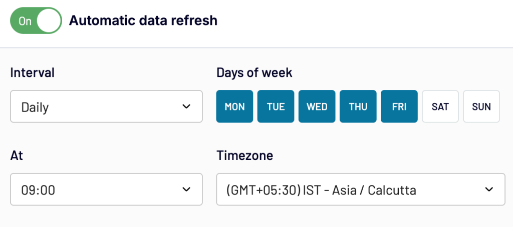
Schedule data updates
Once connected, go to Flow settings for your data to start flowing into the destination automatically.
Coupler.io lets you refresh the data daily, weekly, or monthly, depending on how often you want to track performance. With an automated schedule, your report will always reflect the latest marketing and sales activity without any manual effort.
Visualize your data
In the destination, you can use visualization features to build a marketing funnel analytics report that helps you analyze performance at every stage.
Here are a few types of marketing data visualization you might want to add:
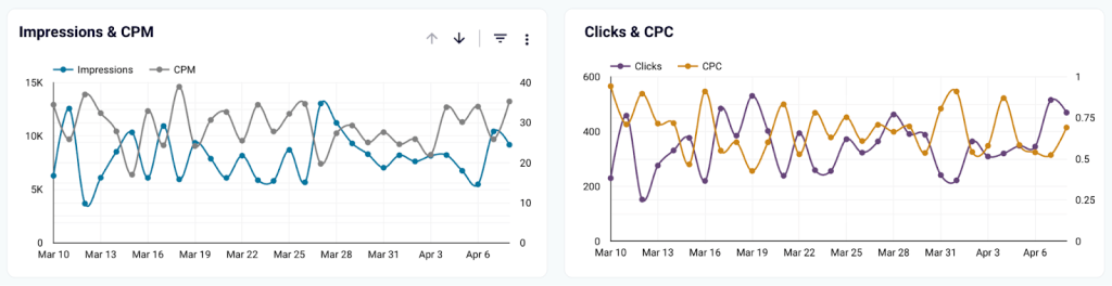
- Funnel charts to track the drop-off or conversion rate between funnel stages
- Time series charts to show daily, weekly, or monthly trends in clicks, conversions, or revenue
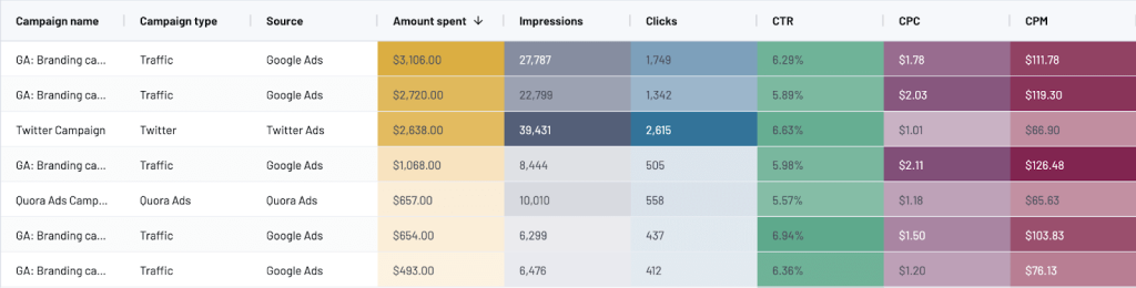
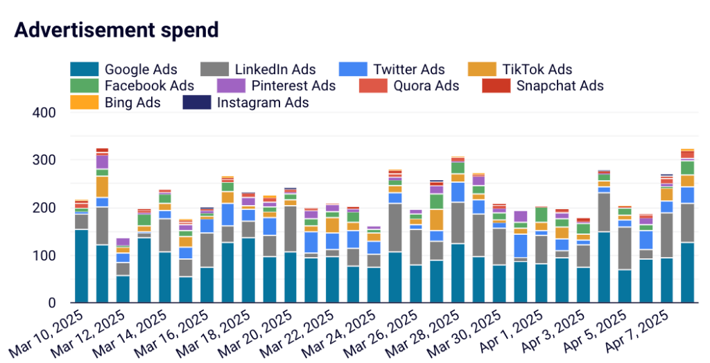
- Bar charts to compare advertising spend across platforms like Google Ads, Facebook Ads, and LinkedIn Ads
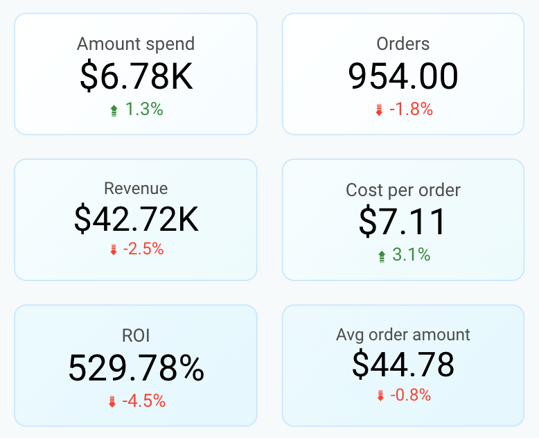
- Scorecards to highlight key metrics like total spend, total conversions, and ROI
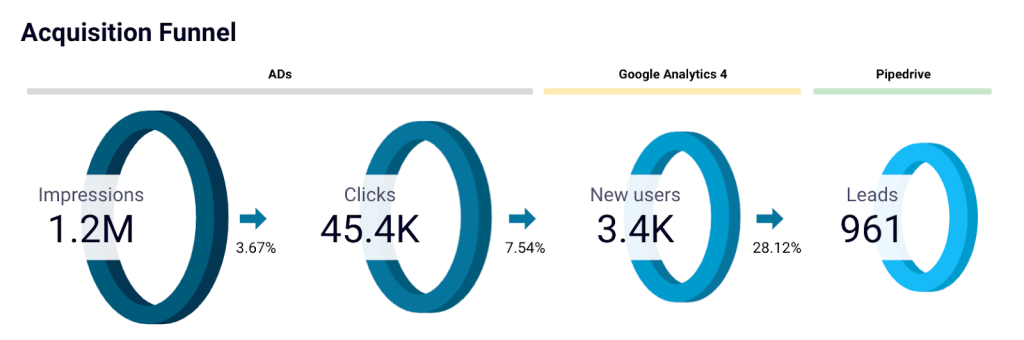
What insights can you get from this funnel report?
When your funnel report is ready, it becomes much easier to connect the dots between your marketing activities and business outcomes.
Each part of the report highlights a different stage of the customer journey, helping you monitor performance, spot trends, and find new opportunities for optimization.
Here’s what you can understand from a marketing funnel report like this:
- Track user movement across the funnel: Monitor how users move from seeing an ad to clicking, visiting your website, and becoming a potential lead/ customer.
- Identify drop-offs between stages: Spot where users are dropping off — whether it is low ad engagement, poor website conversions, or abandoned carts.
- Analyze marketing spend versus revenue: Compare how your ad spend translates into actual revenue, and understand which campaigns deliver the highest return.
- Monitor key metrics at a glance: Monitor important numbers like total spend, orders, revenue, ROI, cost per order, lead age, and average order value.
- Compare platform performance: See how different ad platforms like Google Ads, Facebook Ads, and LinkedIn Ads perform against each other in terms of spend and results.
- Track new user and customer growth: Track new visitors and customers to understand how your audience is growing over time.
- Measure funnel efficiency: Review metrics like click-through rate (CTR) and the conversion rate from new users to customers to gauge the overall health of your marketing funnel.
- Spot trends and patterns early: Detect shifts in user behavior, marketing performance, or sales trends early so you can take action quickly.
Bonus: Ready-to-use dashboards for funnel reporting
Building a marketing funnel report from scratch gives you complete control over your data and insights. But if you want to get started even faster, ready-to-use dashboards can help you quickly visualize performance across different marketing and sales channels.
Coupler.io offers several dashboard templates that are designed to work with the most popular visualization tools. To use them with your data, sign up for a free Coupler.io account, follow the instructions in the Readme tab, and your data will auto-populate in these dashboards in minutes.
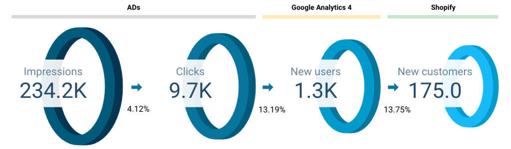
HubSpot customer acquisition dashboard
The Pipedrive customer acquisition dashboard is directly aligned with the full-funnel marketing report we walked through earlier. While that report connects the dots from impressions to leads, this dashboard zooms in on how leads are captured and added to your CRM, step by step.
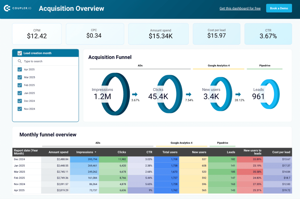
It brings together advertising data, web analytics, and CRM data from Pipedrive to show how each campaign contributes to lead generation. You can track the entire acquisition journey: impressions ? clicks ? new users ? qualified leads in Pipedrive.
With built-in funnel charts, trendlines, and conversion metrics, the dashboard helps you answer questions like:
- Which campaigns are bringing in the most leads?
- How much are you spending per lead?
- Are your ads reaching the right audience?
- How are new users converting into CRM leads?
The Pipedrive acquisition dashboard is designed in Looker Studio and uses Coupler.io’s native integration to pull data from Pipedrive, ad platforms, and GA4. Setting it up takes only a few steps, and you can view it with your data visualized instantly.
If your goal is to optimize lead quality, reduce cost per acquisition, and build a stronger top-of-funnel pipeline, this dashboard gives you the visibility to act fast and scale what’s working.
Shopify marketing funnel dashboard
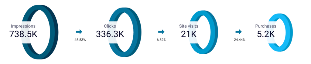
This marketing dashboard connects data from your advertising platforms, analytics tools, and Shopify store into a single view, giving you a complete picture of how users move through your marketing funnel.

Inside the dashboard, you can see how impressions turn into clicks, how website visitors become customers, and how your marketing spend translates into revenue. It also highlights key performance metrics like cost per order, ROI, and average order value to monitor the health of your funnel at a glance.
Since the dashboard is fully customizable, you can easily adjust the sources, metrics, or visualizations based on your specific reporting needs. This dashboard gives you a strong starting point if you want to dig deeper into platform performance or optimize conversion rates.
The Shopify marketing funnel dashboard is available as a template in Looker Studio and Power BI, both equipped with Coupler.io’s built-in connector to load data from Shopify, Ad platforms, and GA4. You can connect your data in just a few clicks without any code.
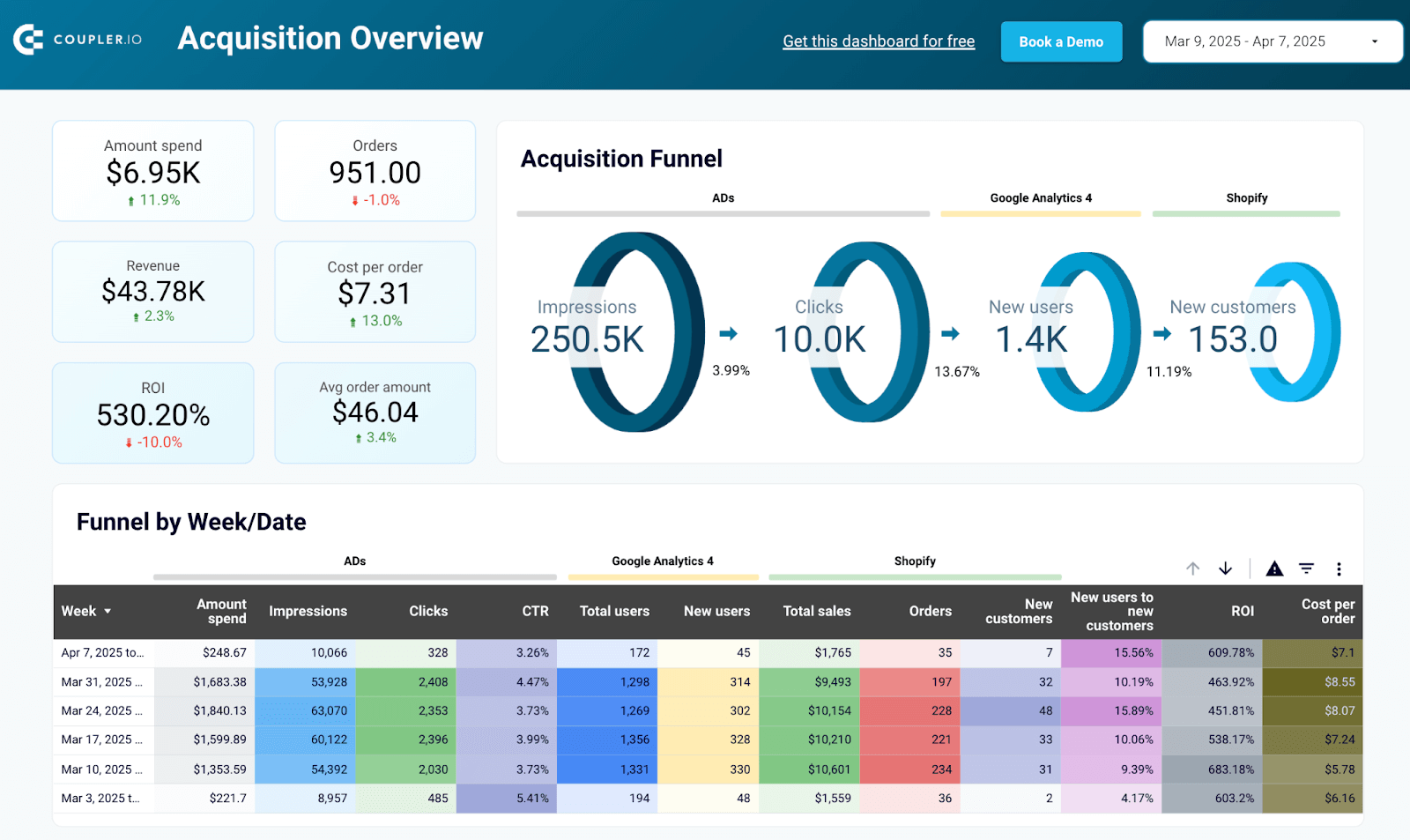
Shopify marketing funnel dashboard in Looker Studio
Analyze the performance of the traffic to your Shopify store using data from advertising platforms and Google Analytics 4, all consolidated on a single dashboard.


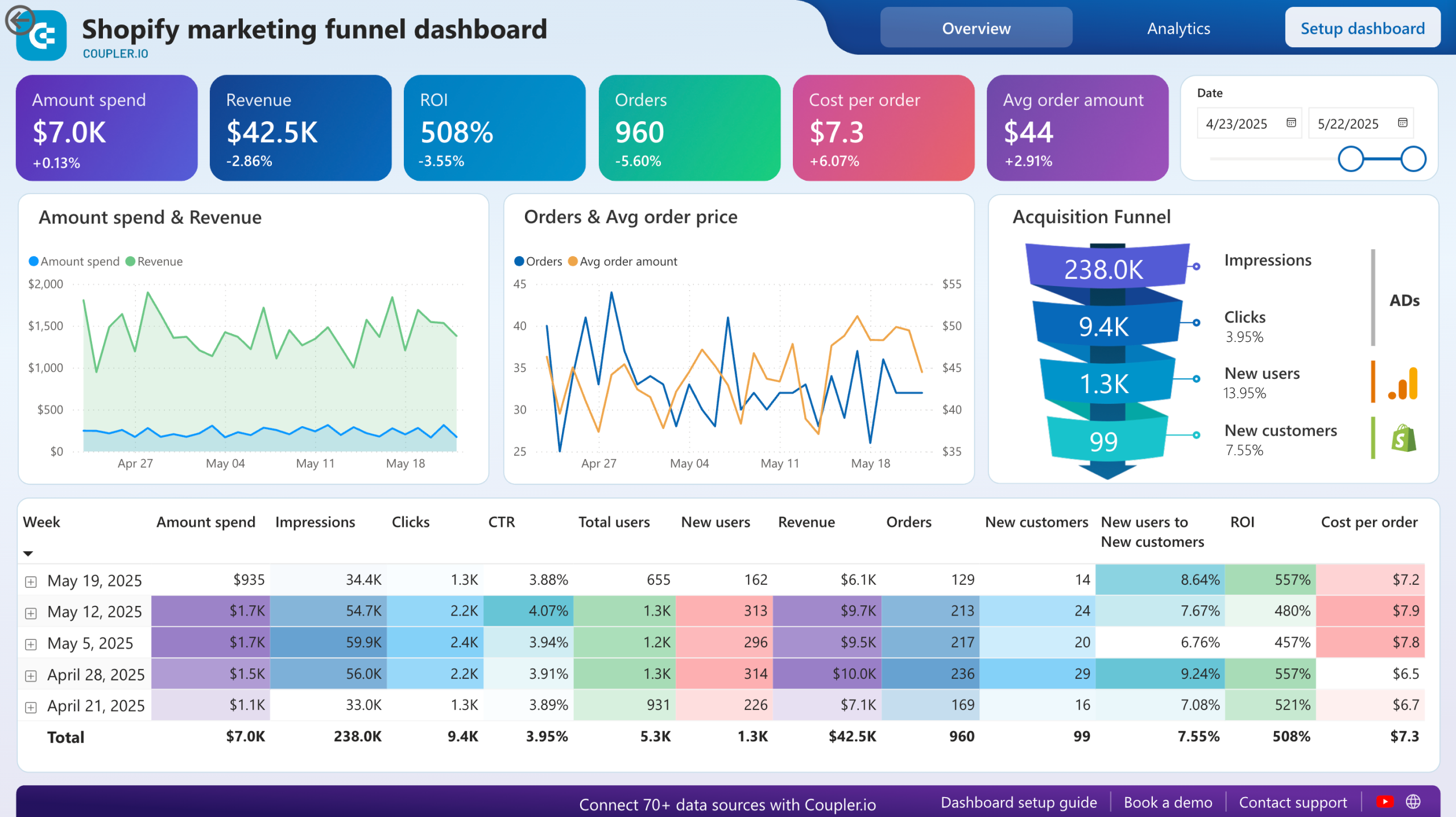
Shopify marketing funnel dashboard in Power BI
Examine the customer journey from advertising exposure to purchase completion with integrated data from your Shopify store, advertising platforms, and analytics tools.

Facebook Ads leads breakdown dashboard
With the Facebook Ads leads breakdown dashboard, you can move beyond surface-level metrics and focus on the quality of leads generated from your campaigns. Instead of piecing together data from multiple ad reports, the dashboard gives you a complete view of how impressions, clicks, and leads connect and how much value those leads bring.
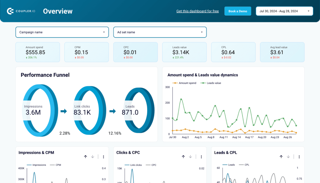
You can quickly spot which campaigns drive the best leads, monitor cost-per-lead trends over time, and refine your targeting based on demographic and geographic insights. This is a practical way to maximize ROI on Facebook lead ads without getting buried in fragmented data.
Created in Looker Studio, this Facebook Ads leads breakdown dashboard connects to your Facebook Ads account using Coupler.io’s ready-to-use connector. Just plug in your account, and the data flows in automatically, making it easy to track lead quality and campaign performance right away.
Klaviyo email marketing analytics dashboard
The Klaviyo email marketing analytics dashboard helps you streamline how you measure and optimize email performance. Instead of manually checking open rates or bounce rates for every campaign, you get a clear snapshot of overall engagement and trends.
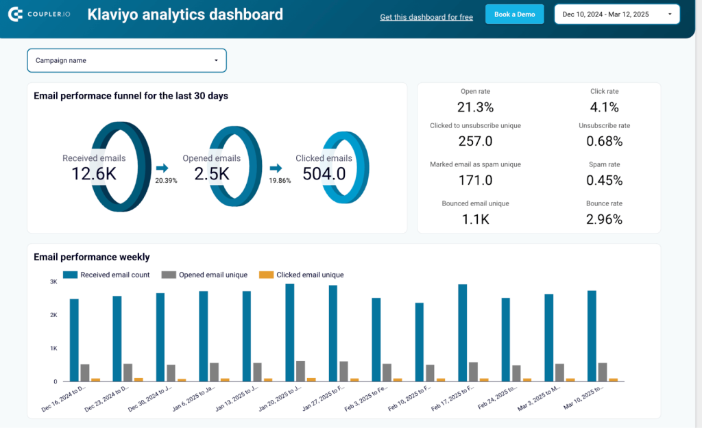
You can easily identify which days deliver the best results, adjust sending times based on subscriber behavior, and monitor unsubscribe rates to keep your list healthy. Tracking performance by email client and domain also helps fine-tune your strategy to match where your audience actually interacts with your emails.
Designed in Looker Studio, the Klaviyo email marketing data analytics dashboard uses Coupler.io’s connector to load email performance data directly from Klaviyo. With just a few clicks, you can sync your campaigns and start monitoring engagement without any manual exports.
TikTok analytics dashboard
A centralized dashboard makes managing TikTok growth much easier. The TikTok analytics dashboard gives you visibility into how your content performs, who your audience is, and where your best engagement comes from.
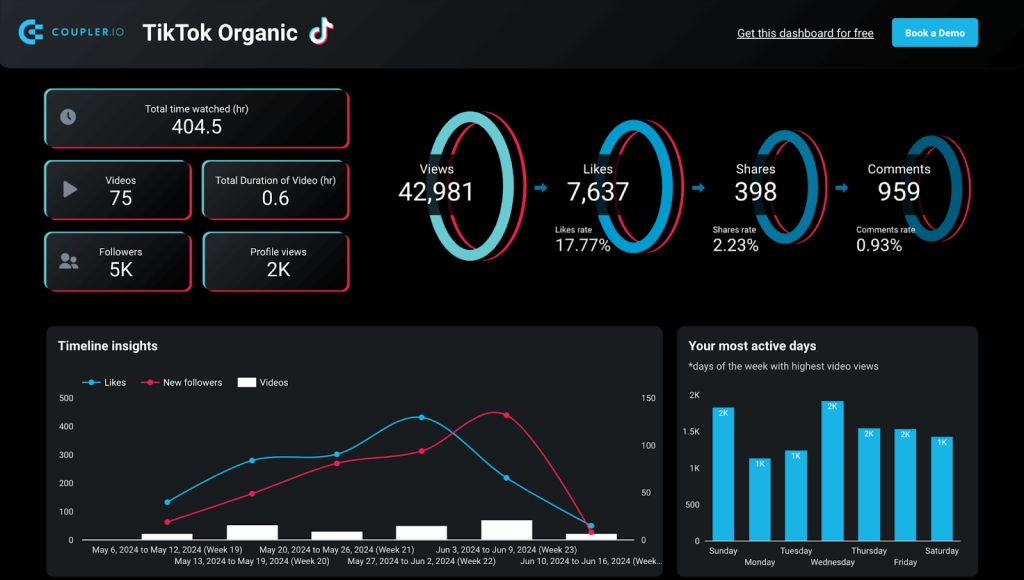
You can track profile growth over time, analyze engagement across videos, and use audience insights like country and gender breakdowns to better shape future content. If you work with sponsors or brands, this dashboard also makes it easier to present professional, data-backed reports of your channel’s value.
The TikTok analytics dashboard is built in Looker Studio and uses Coupler.io’s connector to bring in video, profile, and audience metrics. Once connected, it updates automatically, so you always have fresh data to analyze your growth.
Mailchimp email campaign performance dashboard
The Mailchimp email campaign performance dashboard connects email marketing with real business results. You can track not just opens and clicks, but also how emails contribute to orders and revenue from your Shopify store.
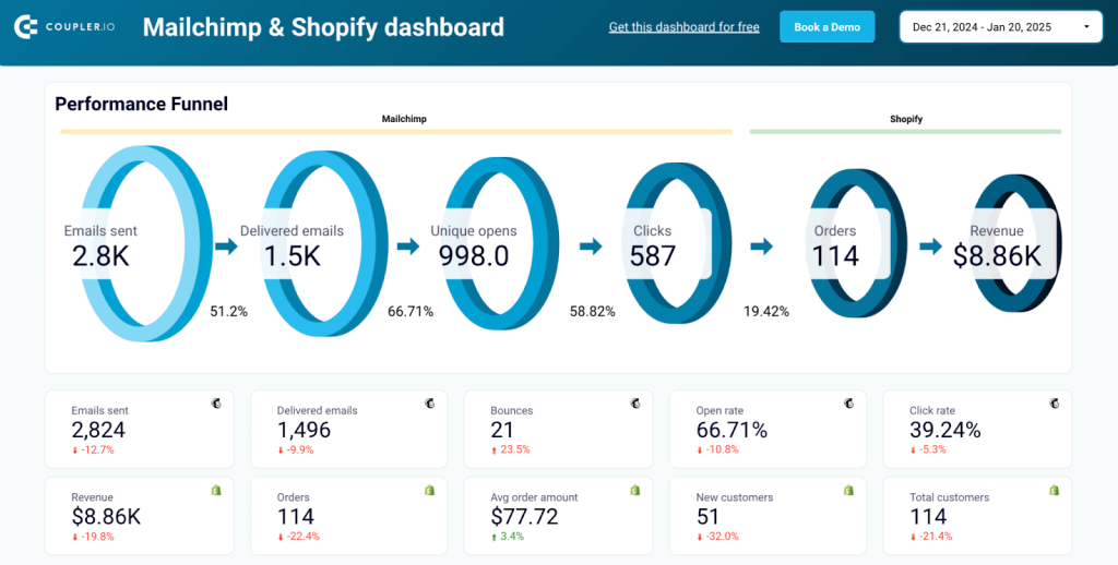
Having engagement and sales data side by side makes it easier to optimize your messaging, identify top-performing campaigns, and fix gaps where email interest doesn’t convert into sales.
Over time, the dashboard helps refine your email strategy based on what actually drives growth, not just what gets clicks.
Created in Looker Studio, this dashboard pulls email and sales data with the help of Coupler.io’s connector. You can link your accounts in minutes and start measuring email performance alongside actual revenue.
From building a report from scratch to using a ready-made dashboard template, Coupler.io gives you the flexibility to track your marketing funnel in the way that works best for your team.
Turn marketing data into insights with Coupler.io
Get started for free