In this blog post, I will share with you a set of 11 GA4 report templates that I regularly use to evaluate the impact of our marketing campaigns. These templates help you monitor performance, analyze key metrics, and make data-backed decisions.
All the templates on my list are free, easily customizable, and powered by Coupler.io, a reporting automation platform. This means you can plug in your Google Analytics account, and Coupler.io will extract your ad data automatically and send it to your report. Thanks to this automation, your GA4 dashboards will be live and always display the latest data.
1. All-in-one dashboard for GA4 and other marketing sources
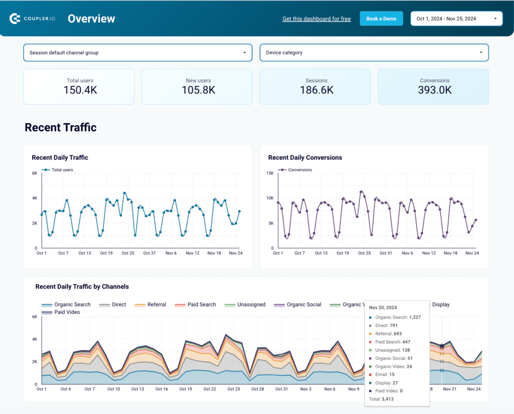
This all-in-one dashboard provides a concise summary of your marketing activities across multiple channels. It automatically visualizes data from GA4, combined with information from Google Search Console, PPC platforms, social media, YouTube, and email marketing tools. As a result, you can monitor performance all around and work with data from over 10 apps in a single dashboard.
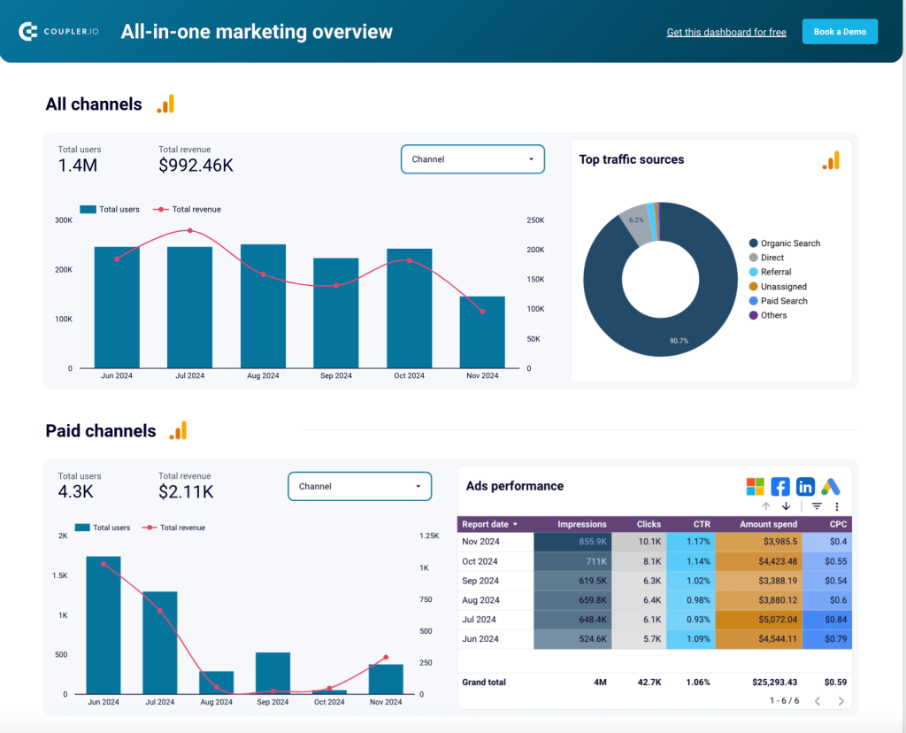
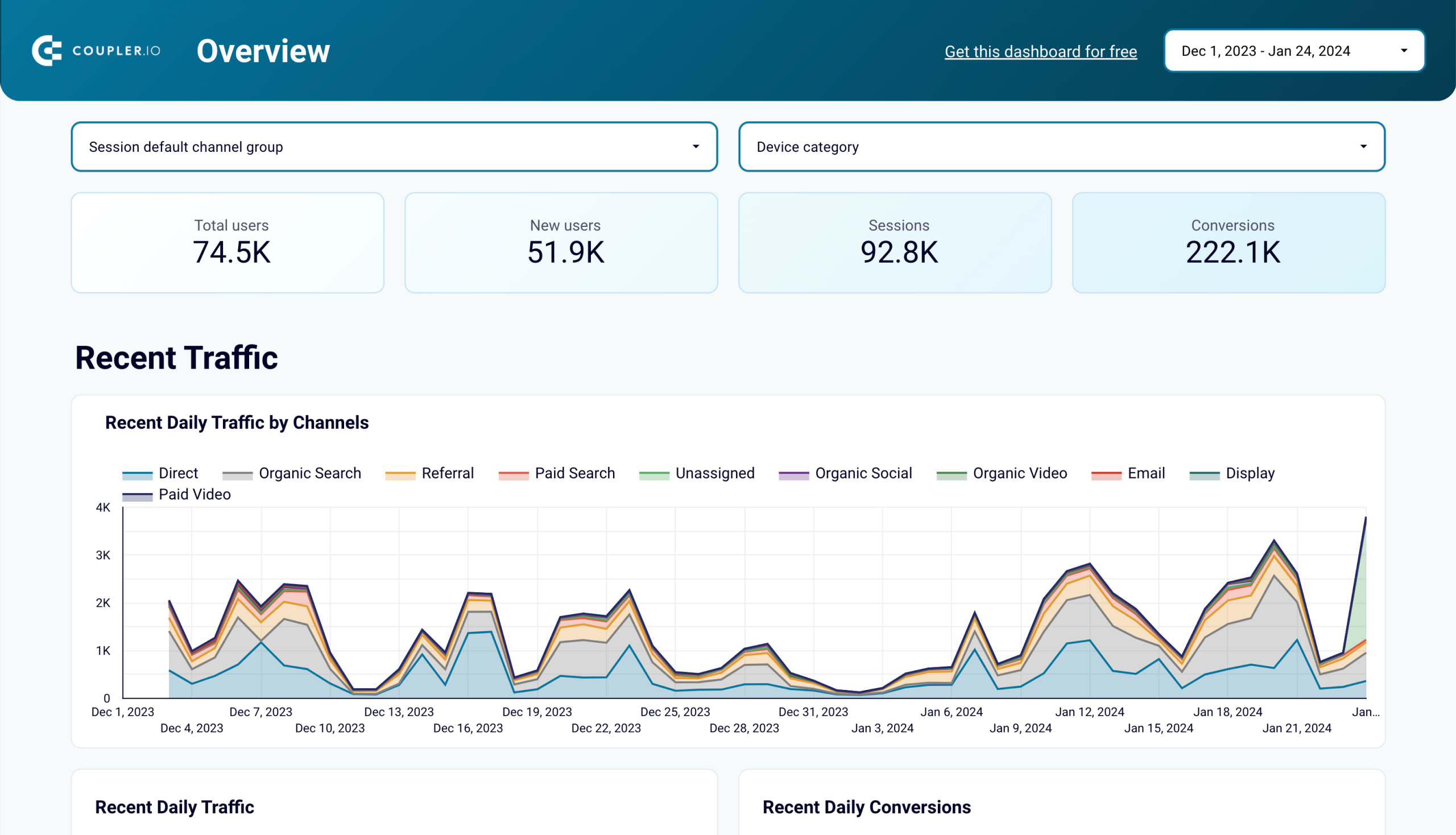
The first two graphs in this dashboard show aggregated metrics from across all channels. This helps you see the total number of users and the revenue generated by all your marketing efforts, as well as determine the top traffic sources. This data can be filtered by channel and date for further analysis.
The next section is dedicated to paid channels, providing aggregated marketing data from Microsoft Ads, Google Ads, Facebook Ads, and LinkedIn Ads. This helps you analyze PPC performance over time and explore the contribution of each individual channel to the overall result. The latter can be achieved by using filters and sorting data.
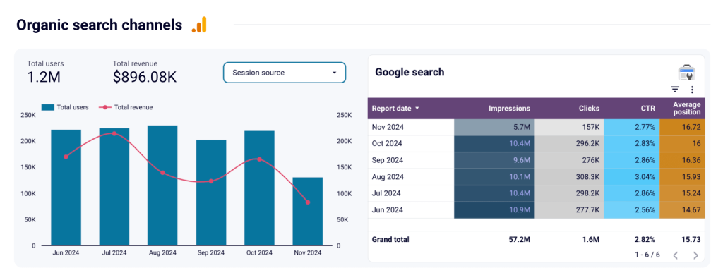
Additionally, the dashboard includes several sections covering various organic channels. These range from Google search and organic social channels (Facebook, Instagram, LinkedIn) to organic video channels (YouTube). The report shows you the number of users and the amount of revenue generated by each channel, along with more granular details and channel-specific metrics.
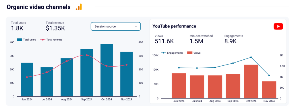
For example, the YouTube performance overview features metrics such as views, watch time (minutes), and engagements (comments and likes). Apart from the organic channels, the dashboard has a section demonstrating monthly email performance. This part is based on data from tools such as Mailchimp and Klaviyo.
Overall, this dashboard helps you maintain control of all your marketing activities. It enables you to see the performance metrics at a glance, eliminating the need to check over 10 applications separately.
To use this GA4 report template, open the dashboard and follow the instructions provided in the Readme tab. You’ll need to plug in your marketing accounts and connect to the Looker Studio account. As a result, you will get a live dashboard that automatically updates with the latest information.
2. Google Analytics 4 PPC dashboard template
The next GA4 dashboard template on our list will be useful to marketers who run PPC campaigns. The dashboard, which is built in Looker Studio, presents the traffic performance of your advertising campaigns running on various platforms. Apart from GA4, the template automatically pulls and visualizes data from Bing Ads, Google Ads, Snapchat Ads, TikTok Ads, Meta Ads, Twitter Ads, and LinkedIn Ads. This allows you to monitor key engagement metrics and campaign performance in a single live dashboard.
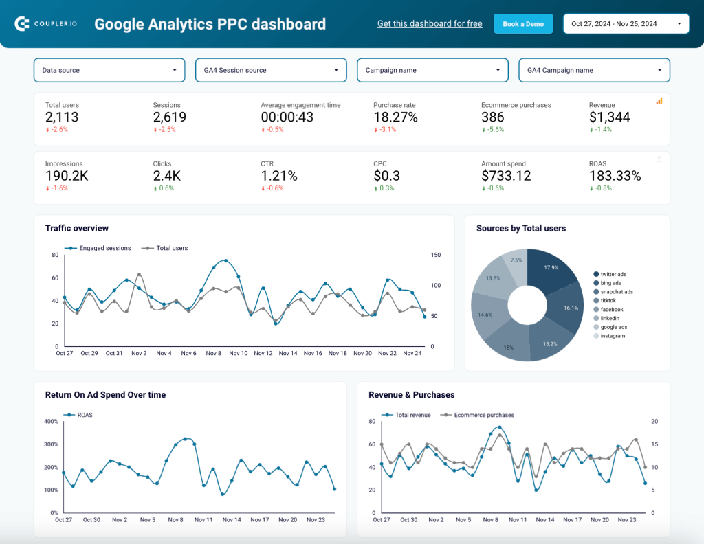
A set of scorecards on the top shows aggregated metrics from all your PPC channels. This includes Total users, Impressions, Clicks, Average engagement time, Purchase rate, Purchases, and Revenue. The graphs below demonstrate monthly dynamics for Traffic, ROAS, and financial metrics.
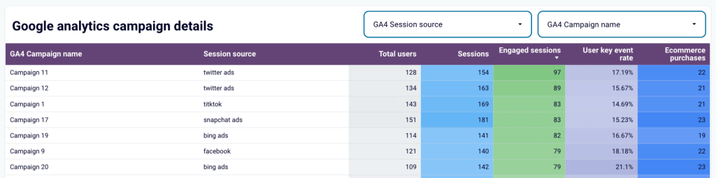
Filter data by GA4 session source, data course, campaign name, and other parameters. This enables you to zoom in on details of a specific campaign or platform and analyze its results separately. The report also includes a data table with granular information on performance by source.
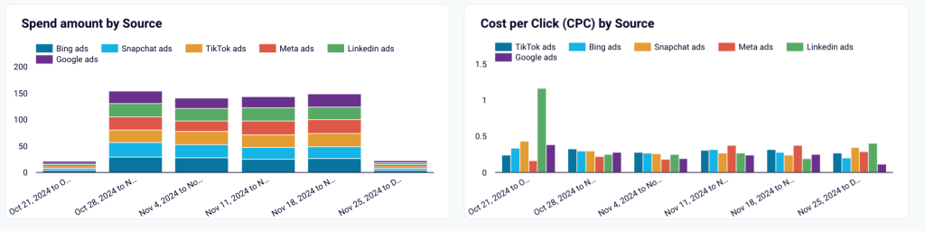
A block presenting financial information, such as spend by platform and CPC by source (see above) allows you to analyze the efficiency of different PPC campaigns. For example, you can check whether a higher cost per click correlates with a better conversion rate and purchases. If not, you may want to consider redistributing your ad budget between the platforms you use to maximize revenue.
The GA4 report template includes a dedicated tab for campaign performance, specifying key metrics for each campaign. You can sort and filter the data to identify best-performing campaigns, as well as ineffective campaigns that should be paused. This dashboard is a useful analytical instrument that helps analyze key metrics and make sense of your data.
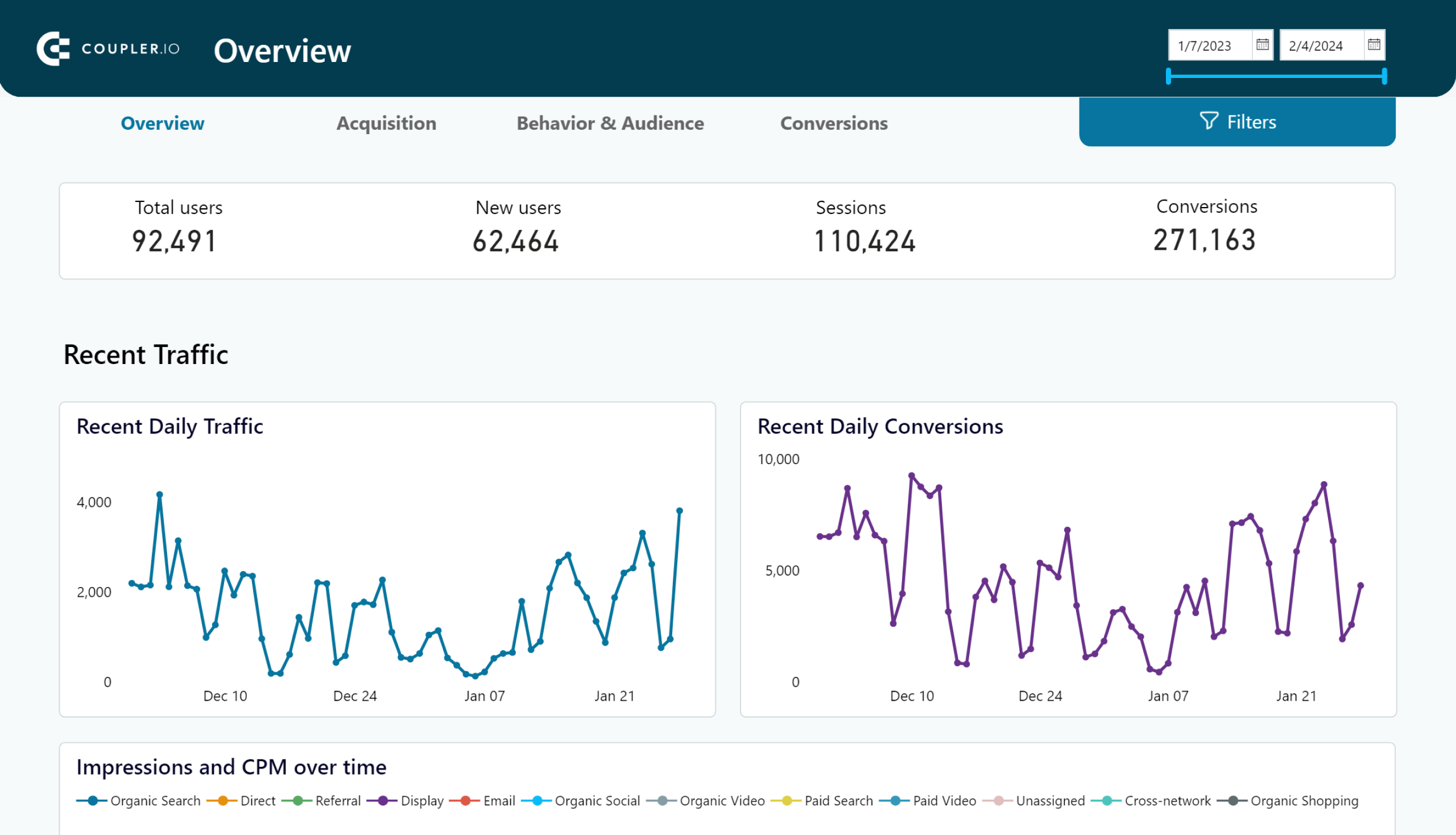
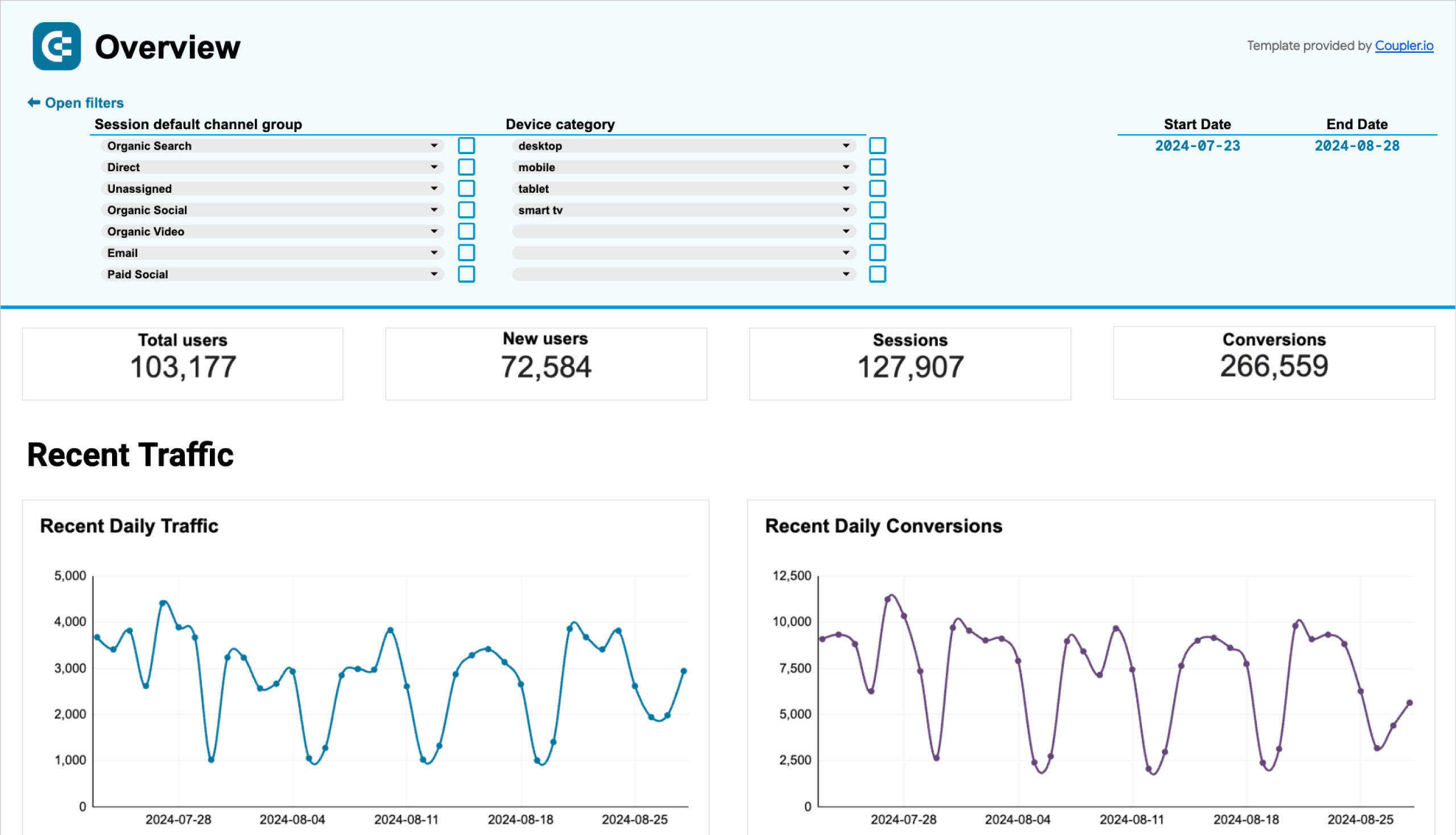
3. GA4 dashboard template for web analytics
This comprehensive dashboard covers multiple aspects of your website’s performance with the associated product and marketing metrics. This ranges from a detailed traffic overview to acquisition analytics, audience and user behavior insights, and conversion funnel. The web analytics report enables you to better understand how your website drives conversions, which, in turn, provides opportunities for enhancements. This report is based exclusively on GA4 data.
The part dedicated to traffic analytics provides an overview of the key metrics and their dynamics over time. The stacked line graph shows changes in the Daily traffic by channel. Hover over a specific date to see the breakdown of traffic for that day.
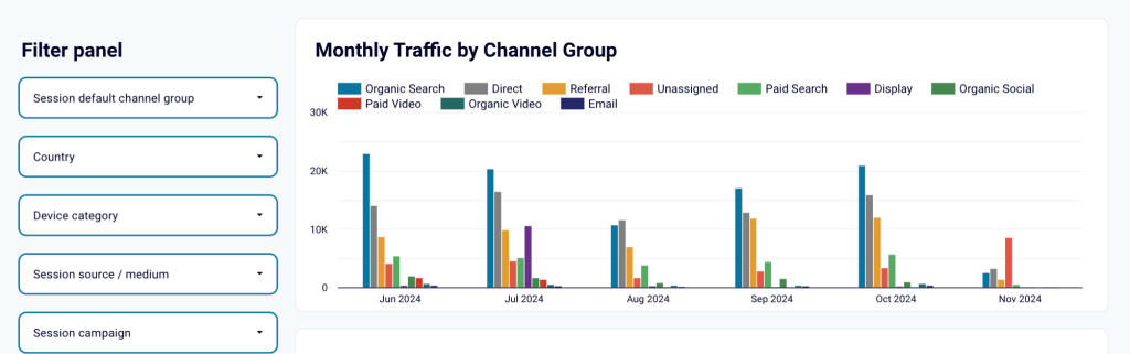
The acquisition analytics tab presents data on the main traffic sources. This information can be filtered by campaign, country, device category, and other parameters. There’s also a breakdown of metrics by source, campaign, and channel, as well as a geo chart. All this gives you a rich toolset for exploring your data from various angles.
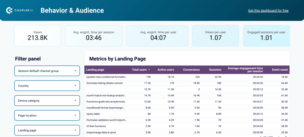
The section covering audience and user behavior focuses on metrics such as Views, Average engagement time per session, Engaged session per user, and more. Work with the filters and data table to uncover which pages of your website drive conversions. This will help you determine what type of content, products, or offers is the most interesting to your audience. This tab also includes insights on user demographics and location.
The report has a dedicated tab that details the conversion funnel, dynamics over time, and a breakdown of the top user actions. You can customize the funnel by selecting the conversion types that are most relevant to you. For example, sign-up, form submission, file download, and many others.
This dashboard is available in Looker Studio, Power BI, Tableau, and Google Sheets. To start using it, select the version you need and check the Readme tab for instructions.
Web analytics dashboard in Looker Studio
Use the insights based on the data from GA4 to monitor your website traffic and discover which pages resonate most with your audience.


Web analytics dashboard in Tableau
Monitor the performance of your traffic, analyze the conversion funnel, and derive other insights from Google Analytics 4.

Web analytics dashboard in Power BI
Discover insights into your website’s traffic acquisition, audience, and conversions with Google Analytics 4 data seamlessly connected to our Power BI dashboard template.

Web analytics dashboard in Google Sheets
Gain valuable insights into your website’s traffic sources, user interactions, and conversion metrics based on data from GA4.

4. Multi-website GA4 dashboard template
As you know, Google Analytics 4 only displays data for one property at a time. This limitation may be inconvenient in cases when a company has several different products or has separate websites for different countries. This dashboard solves this issue as it allows you to collect data from multiple GA4 properties and analyze this information together.
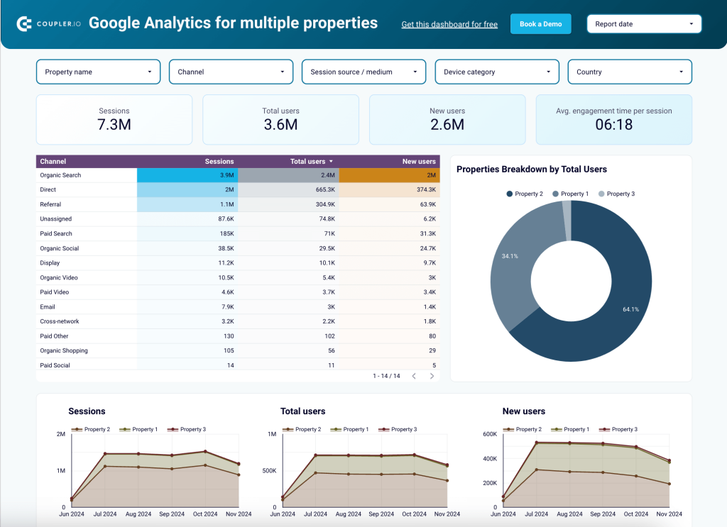
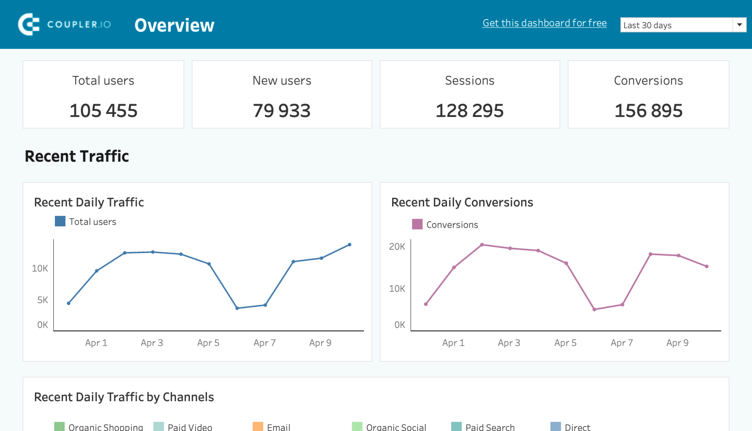
You can monitor sessions, total users, and new users across several websites/GA4 properties. This helps you uncover insights for optimizing engagement, developing a retention strategy, and efficiently distributing budget across channels.
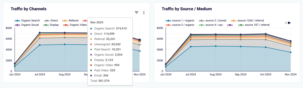
This Looker Studio report includes stacked line charts that give you a breakdown of traffic by channel and source. Hover over the graph to see details for the selected month. These charts help you uncover traffic trends – for example, identify periods with increased demand. Information about such patterns can be considered when planning marketing or sales campaigns.
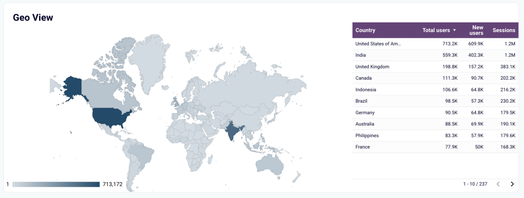
Use the map chart to perform geographic analysis. Check which countries generate the most traffic and tailor your content and campaigns for different regions.
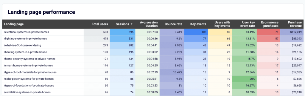
5. GA4-based landing page performance dashboard
This is a dedicated report for analyzing landing page performance. It gives you a complete picture of how your landing pages contribute to revenue generation, from an SEO metrics overview and user engagement trends to financial results. The dashboard makes it easy to identify the best-performing and worst-performing pages, analyze metrics such as CTR and bounce rate per page, and make informed decisions to enhance performance. The template combines data from GA4 and Google Search Console.
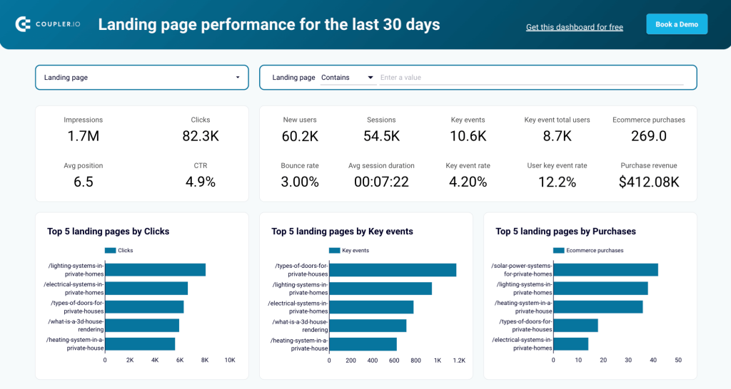
The dashboard features GSC metrics like Impressions, Clicks, Average position, and CTR. This shows you the website’s visibility and helps you assess the effectiveness of your SEO strategy.
Another set of scorecards demonstrates GA4 metrics that are important for analysis. This covers new users, sessions, bounce rate, average session duration, and key events. These performance indicators help you analyze how users interact with your website. By examining these numbers together, you can identify problematic areas in the user journey and tackle those challenging areas. All data can be filtered by a specific page or group of pages.
The bar charts showing the Top 5 landing pages based on different parameters enable you to identify which content or offers bring in the best results. Once you have these insights, you can use them to produce more of this content.
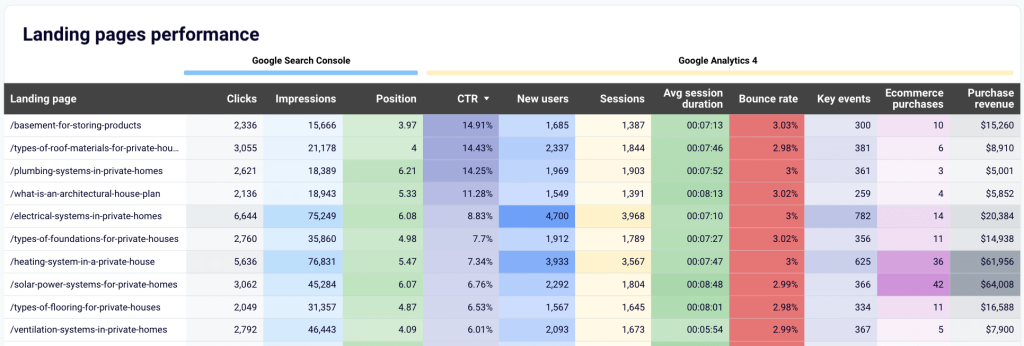
The report includes a data table comprising information from GA4 and GSC. It provides a granular view of your landing page performance and enables you to find opportunities for optimization. The template is offered in two versions – for Looker Studio and Google Sheets.
6. GA4 key event insights dashboard
This GA4 report template focuses on key events and provides a detailed breakdown of users who complete critical actions such as purchases, sign-ups, and downloads. Unlike default GA4 reports that track user behavior, this dashboard enables businesses to analyze high-value users and optimize their marketing efforts accordingly.
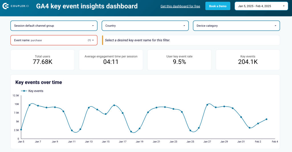
The first section presents aggregated metrics—the total number of key event users, average engagement time, and event completion rate. These scorecards provide a quick snapshot of overall conversion trends to identify shifts in user engagement.
Below, a trend graph visualizes key event completions over time. It allows you to track performance on a daily, weekly, or monthly basis. The graph is useful to evaluate the impact of marketing campaigns, product changes, or seasonal trends.
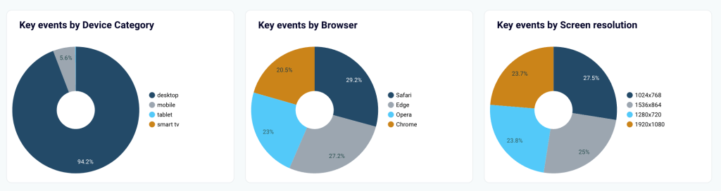
Another key part of the dashboard categorizes key event users by device type and browser. This data helps businesses prioritize UX improvements on the most-used devices.
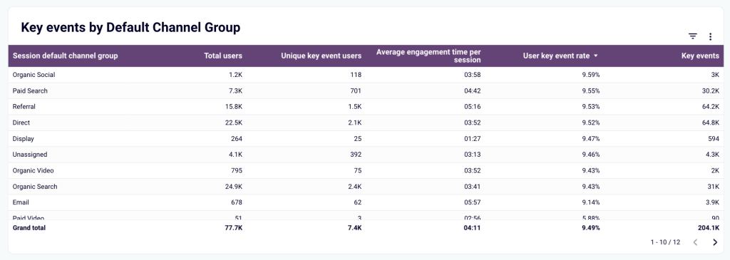
A dedicated section breaks down traffic sources, showing whether key event users come from organic search, paid campaigns, social media, or email marketing. By identifying high-converting sources, businesses can adjust their budget allocation and refine their marketing strategies.
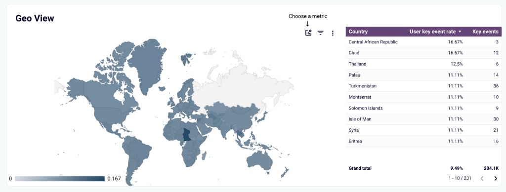
The geographic analysis section displays the countries and regions that generate the most key event completions. This helps marketers identify high-value locations and tailor region-specific campaigns or promotions.
The dashboard template is built in Looker Studio. Follow the instructions in the Readme tab, connect your GA4 account, and you’ll have an automated dashboard with your own data.
7. GA4 template for website traffic from YouTube
Many marketers publish videos on YouTube and add links to their websites in video descriptions. This dashboard helps you analyze the performance of the traffic your website receives from YouTube. Use this report to determine which types of video content bring you the most new users and purchases, and how your landing pages perform.
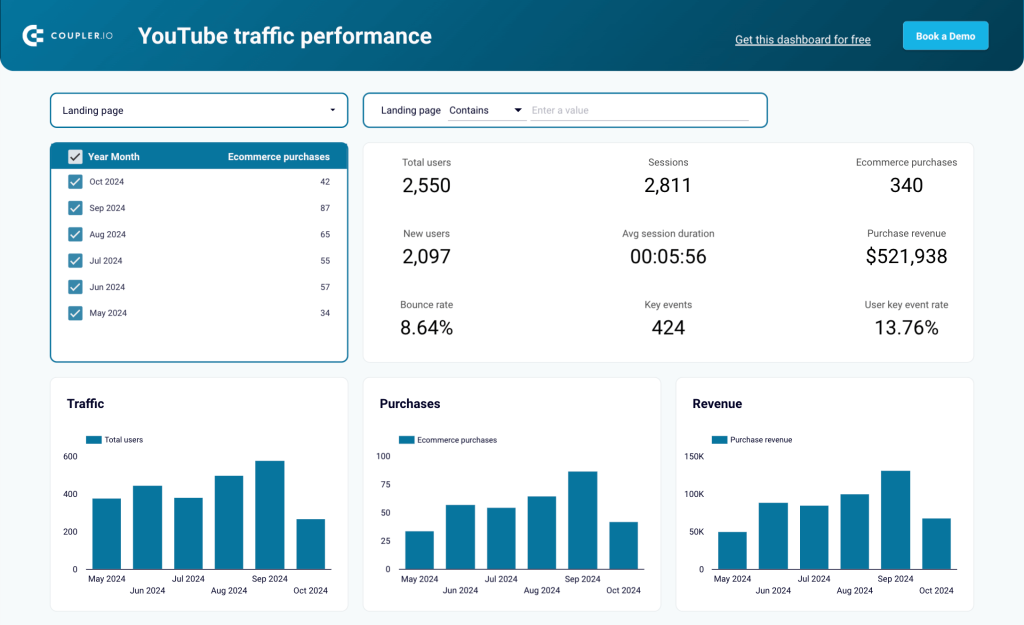
Filter data by specific pages to gain a complete understanding of user behavior on that landing page and view the achieved results. In particular, you can check how long visitors stay there, whether they make a purchase, or if they perform any actions marked as key events in GA4.
The dashboard includes a summary of the key metrics on your landing pages. Sort data to identify the pages with the most key events and revenue. Then, you can trace these links back to the YouTube videos they are featured in. This helps you adjust your content strategy, reduce bounce rate, and increase purchases. For example, you can produce more videos that demonstrate good results, launch ads or promo for such videos, and so on.
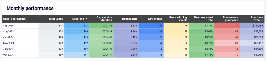
The monthly performance overview shows you data segmented by month. This is helpful for tracking dynamics and ensuring progress. This dashboard is offered in two versions: Looker Studio and Google Sheets.
8. AI traffic performance dashboard
If an AI tool suggests your company or product to a user, your website may receive traffic from these mentions. This dashboard template is based on GA4 data and presents information on AI traffic in an analysis-ready way. It gives you an overview of key metrics and allows you to identify best-performing sources, assess traffic quality, and more.
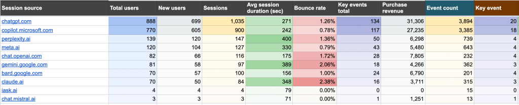
The covered metrics include Average session duration, Bounce rate, Key events total, Purchase revenue, and others. Sort data by Total users and Sessions and compare the volume of traffic generated by different AI tools. Evaluate user engagement and identify which tools correlate with longer session duration and a lower bounce rate.
Additionally, the report allows you to evaluate user acquisition and revenue generation by source. All this provides you with a better understanding of how and where people discover your products. You can use these insights to refine your marketing strategy. The dashboard is built in Google Sheets.
9. Referral traffic performance dashboard
Based on GA4 data, this dashboard is a useful instrument for tracking and analyzing referral traffic sources that drive visitors to your website. Similarly to the previous template, it can be helpful for evaluating source effectiveness in terms of user acquisition, user engagement, and and revenue impact.
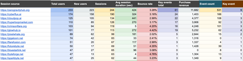
The report covers metrics such as New users, Average session duration, Bounce rate, Purchase revenue, and more. It helps you identify the most important traffic sources, analyze the factors behind their success, and use the findings to update your strategy. For example, you may notice that websites dedicated to certain topics or targeting a specific audience are more effective than others. Then, you can prioritize partnerships with similar referrals.
Analyze user engagement to see which sources need to reduce bounce rates or improve session quality. In addition, keep track of the revenue metrics and check for high-converting referral sources. Then, you can allocate more budget to such sources and maximize the purchase rate. This dashboard is built in Google Sheets.
10. GA4 ecommerce report template for Shopify
If your Shopify store is integrated with GA4, you can get more information on the user journey and performance. For example, you can trace which channels drive visitors to your website and analyze how each of the channels contributes to the number of purchases. This template combines data from GA4 and Shopify to give you a complete picture.
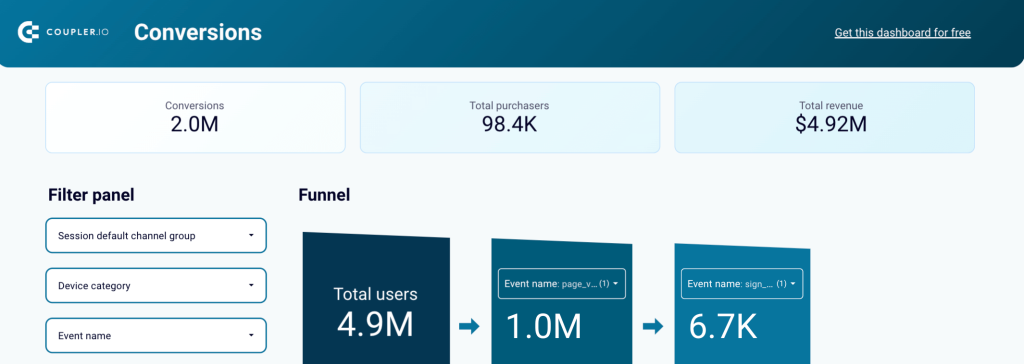
This ecommerce performance report consists of four tabs, each presenting crucial ecommerce information from a different angle. It shows the Sales funnel by Channel, Country, and Item, and also provides a detailed Traffic Overview. All this allows you to keep track of the main KPIs, analyze sales dynamics over time, and identify opportunities for improving the sales funnel performance.
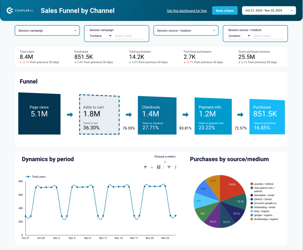
The dashboard provides a comprehensive view of the sales funnel, allowing you to analyze how landing page visitors convert into paying customers as they progress through the different stages. The funnel graph helps you identify the stages that can be improved or that require additional attention. You can filter data by channel or campaign to understand how different platforms and marketing activities contribute to the result.
The graph showing dynamics by period provides insights on metrics such as Total users, Purchases, Gross purchase revenue, and Page views. It enables you to identify seasonal trends and adjust your strategy to maximize impact.
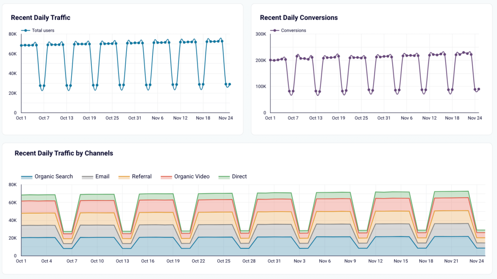
The section dedicated to traffic analysis features several graphs demonstrating recent daily traffic and conversions, as well as weekly traffic for the last 6 and 12 months. Among other things, this section helps you identify the most essential traffic sources and monitor long-term trends. Like most other GA4 report templates on our list, this dashboard is created in Looker Studio.
11. GA4 traffic overview dashboard for Shopify store
This dashboard displays data from two data sources – GA4 and Shopify (please note that your ecommerce store must be integrated with GA4, otherwise you won’t be able to use this template). By combining information from these two apps and looking at it together, you can get a 360-degree overview of your store’s traffic. The dashboard enables you to identify the main traffic sources and estimate their impact on purchases and revenue.
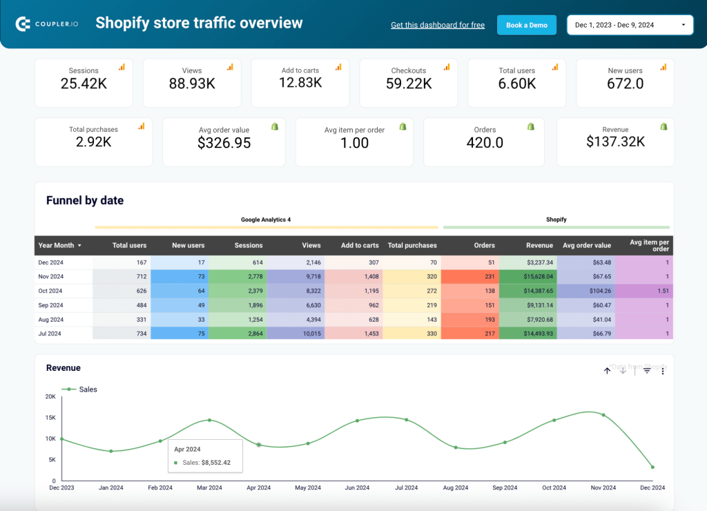
It’s also a helpful instrument for monitoring key metrics such as Sessions, Views, Total purchases, Orders, Revenue, and more. It also allows you to analyze the funnel by looking at data from GA4 and Shopify from the same period.
The dashboard includes a data table with the traffic source breakdown. Sort data by various metrics to see which marketing channels are the most effective in terms of bringing you page views, new users, and purchases.
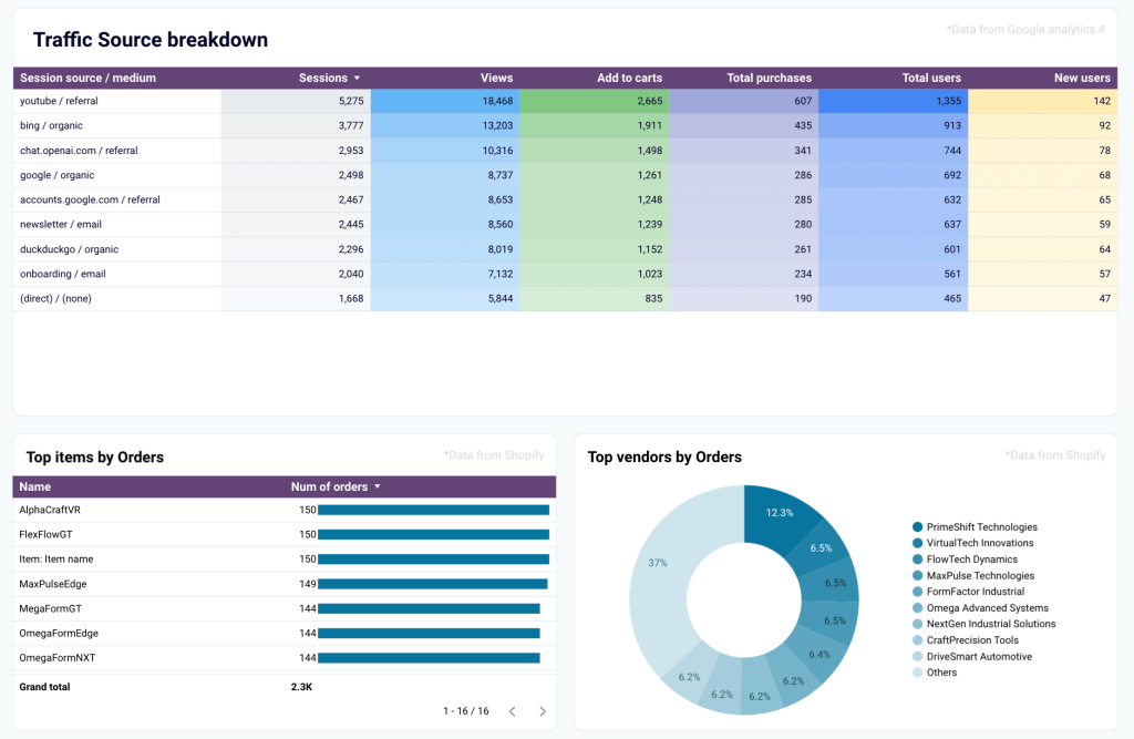
The report features two graphs: one illustrating the top items by orders and the other showing top vendors by orders. The charts allow you to identify the best-selling products and use this information to shape new offers. Additionally, by knowing who your most loyal and engaged customers are, you can run an upselling campaign for them, create a loyalty program, and so on.
This template is built in Looker Studio.
How to create a custom Google Analytics 4 report template
GA4 report templates by Coupler.io are easy to set up and can be customized to meet your specific requirements. For example, you can change colors, rearrange or remove graphs, add your logo, or connect additional data sources.
However, if you have a very specific idea about what you need, you may want to build a custom template from the ground up. Coupler.io allows you to create automated live reports in Looker Studio, Tableau, PowerBI, Google Sheets, and Excel. Additionally, you can build dashboards directly in Coupler.io, using its data visualization feature.
Let’s see how to build a live dashboard in a BI tool or spreadsheet in three steps.
1. Extract GA4 data
To start transferring data, select your preferred destination in the form below.
You will need to create a Coupler.io account to start using this reporting automation platform. This is free, and no credit card is required.
Next, connect your GA4 account and select the property from which to extract data.
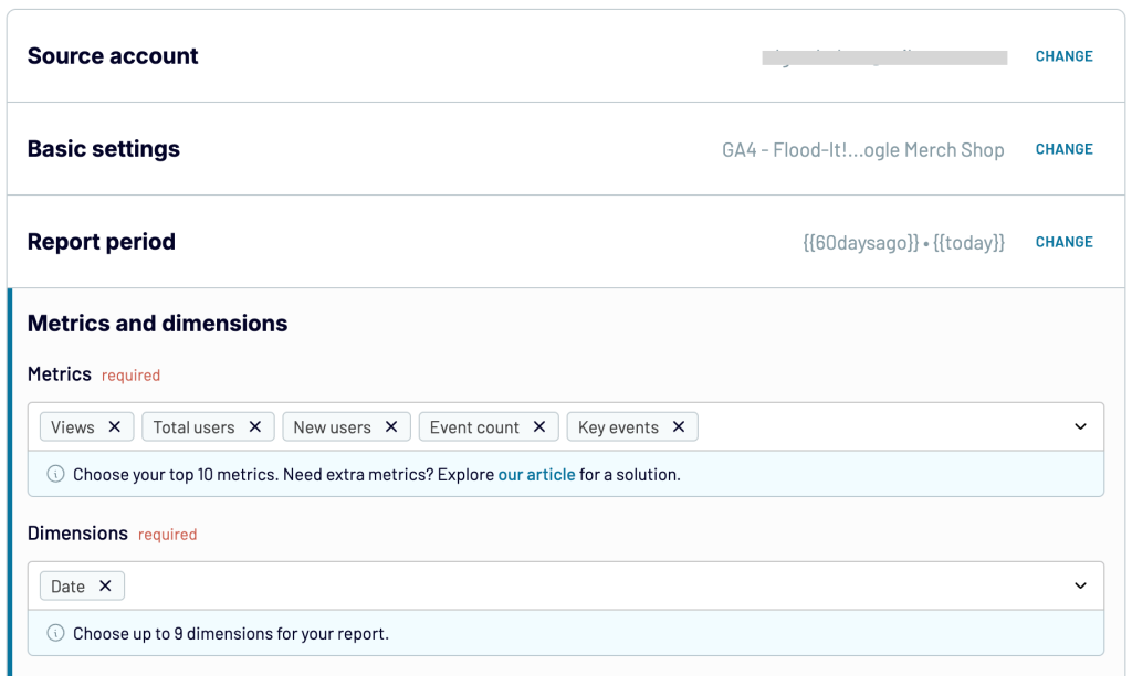
Specify the metrics and dimensions and specify the report period.
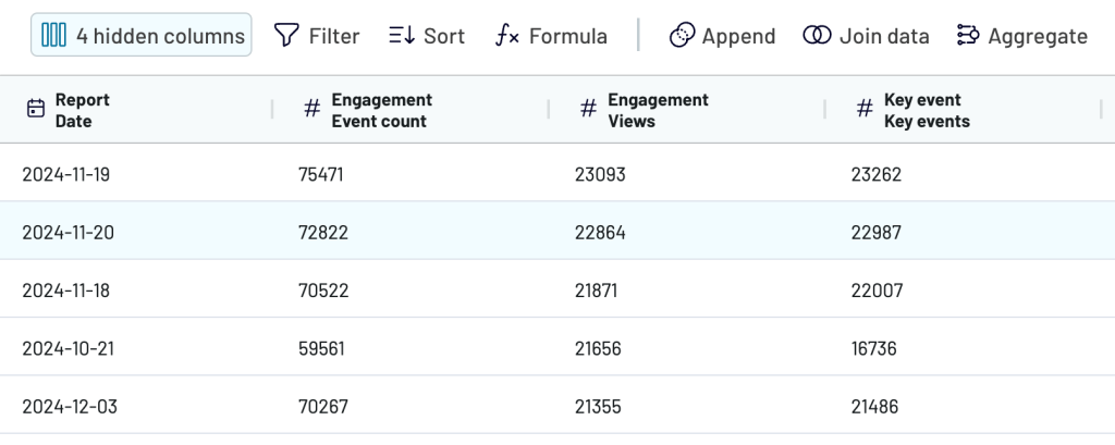
2. Preview and transform data
In the next step, you can preview the data that is about to be exported and perform transformations, if needed. For example:
- Hide, rename, and rearrange columns
- Sort and filter data
- Use formulas to calculate new columns
- Blend data from several accounts or apps into a single dataset
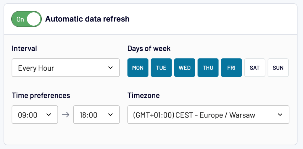
3. Load data and schedule updates
Follow the onscreen instructions to connect your preferred destination account. The exact steps will depend on the app you choose.
Then, select your preferences for automatic updates. Coupler.io can send the latest GA4 data to your dashboard as often as every 15 minutes. This enables you to monitor your metrics in near real time.
After this, you can use the native functionality of the selected BI tool or spreadsheet app to turn your raw data into an insightful dashboard.
If you are building your custom template in Looker Studio or Power BI, watch our tutorials to learn how to visualize your data.
Leverage GA4 report templates to streamline reporting and analytics
The templates provided in this article allow you to easily build insightful dashboards, saving you significant time. They will be helpful to digital marketing professionals, especially those who struggle with switching from Universal Analytics to Google Analytics 4.
Thanks to integration with Coupler.io, these templates enable you to build live marketing reports. This means they will always show the latest data from GA4 and other sources. Once your dashboard is ready, it can be easily turned into a custom report. You can use the BI tool’s native functionality to rearrange various charts or add new ones, calculate custom metrics, and so on.
I hope this article has helped you find a Google Analytics 4 report template that suits your needs. If not, you can use Coupler.io to build your own automated template in spreadsheets, Google Looker Studio, Power BI, or Tableau.