It was a tough year: hundreds of meetings and a lack of time to focus on some valuable chores. Almost everyone has this reflection but only a few of us can actually say how much time they’ve spent on different calls and meetings.
Well, you can get such a recap of your calendar for the last 12 months in less than 3 minutes. Our team developed a dashboard that connects to your Google Calendar and gives answers to many questions: how many meetings you’ve had, how much time you’ve spent, who are the top meeting organizers, and so on. Let’s see how it works and get it for free!
My happy last 12 months – what can I learn with this Google Calendar dashboard?
Let’s get straight to the point – here is what the Google Calendar dashboard looks like.
It’s a free report designed in Looker Studio with a built-in connector to Google Calendar by Coupler.io. This means that you can start using this calendar template with just a few clicks and without any tortuous configuration.
This Google Calendar dashboard is not just a fancy report stuffed with charts and visualizations. It’s an analytical tool that lets you understand what was good in terms of scheduling for the last 12 months. Here are the metrics you can learn.
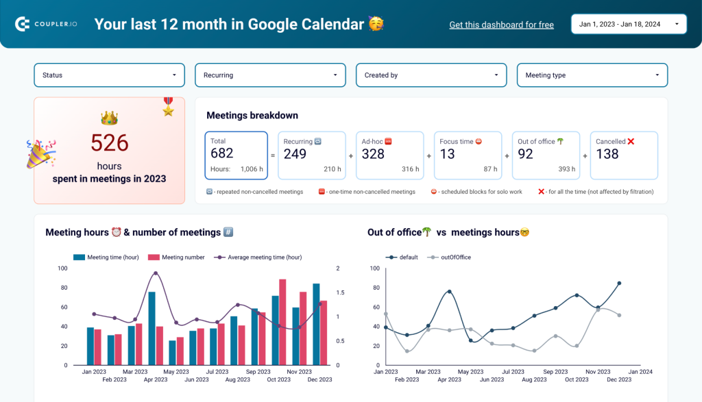
How much time you’ve spent in meetings and what were these meetings
The dashboard starts with the answer to the key question: How much time you’ve spent in meetings?
In addition to this, you’ll get the meeting breakdown showing the share of recurring or ad-hoc meetings, focus time, time out of the office, and the number of canceled meetings.
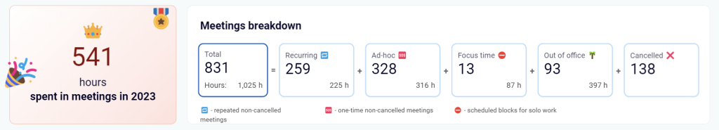
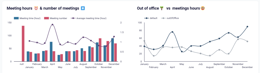
How many meetings you have had throughout the year
Knowing the total number is good, but it’s not very informative since you could have had one-third of all your meetings within one pretty tough month. So, the next section should give you insights into your meeting scheduling throughout the year. You will see the average meeting time, as well as the comparison of out-of-office time vs. meeting hours.
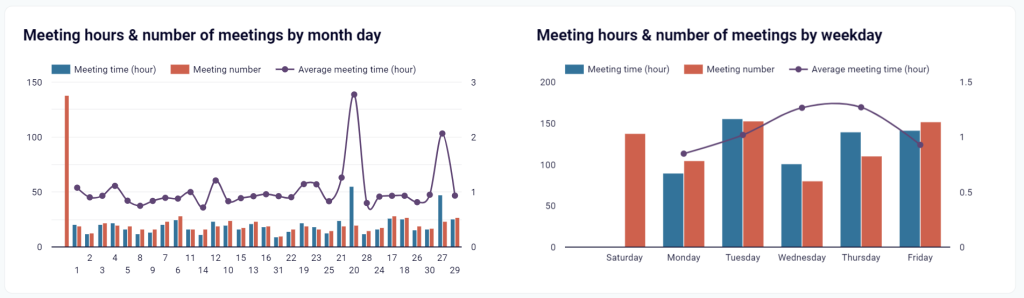
Later on the dashboard, there is another section dedicated to meeting hours and numbers. It provides two charts with this information split by the day of the month and the weekday.
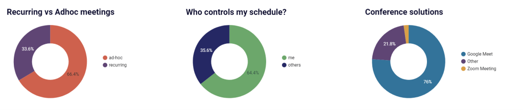
Who controls your schedule?
It’s not about any conspiracy theory but more about who has the biggest influence on your meeting scheduling – you or your teammates. In addition to this, you’ll learn the ratio of recurring to ad-hoc meetings, and your top conference tools like Google Meet, Zoom, Slack, etc.
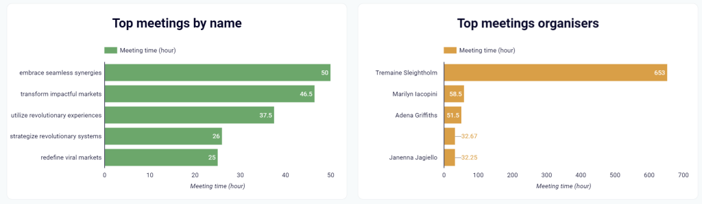
Top meetings
Speaking of top selections – the Google Calendar dashboard also allows you to see your top meetings by name and organizer. The latter tells who could not do without you in the last year?
Filtered meetings
At the bottom of the calendar dashboard, there is a table to filter your meetings by organizer, creator, summary, and description.
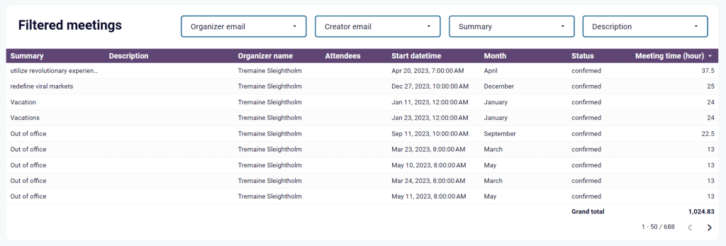
The table shows attendees to your meetings, meeting time, status, and other information.
Note: If you suddenly forgot the difference between meeting creator and organizer, here is a refresher from Google:
The term ‘calendar event organizer’ here refers to the owner of the event on Google Calendar and might be different than ‘event creator’ for instances where an event is created on or transferred onto another calendar.
How to get the Google Calendar dashboard
To start using the dashboard, you only need to complete three simple steps that take no longer than 3 minutes:
- Navigate to the Readme tab and click the button to set up a Google Calendar importer (integration) with Coupler.io.
Note: if you don’t have a Coupler.io account, you’ll be offered to create one by signing up with your Google account. After signing up, you’ll be directed to a page with a newly created Google Calendar importer.
Once the importer is created, you’ll need to connect your Google account to load Google Calendar data.
- Select your Calendar (if you have many of these) and click Finish and Proceed. You’ll see your calendar raw data loaded for preview.
- You only need to follow the in-app instructions to load your data to the copy of your Google Calendar dashboard in Looker Studio.
Try it yourself right away and get your calendar analyzed for free!


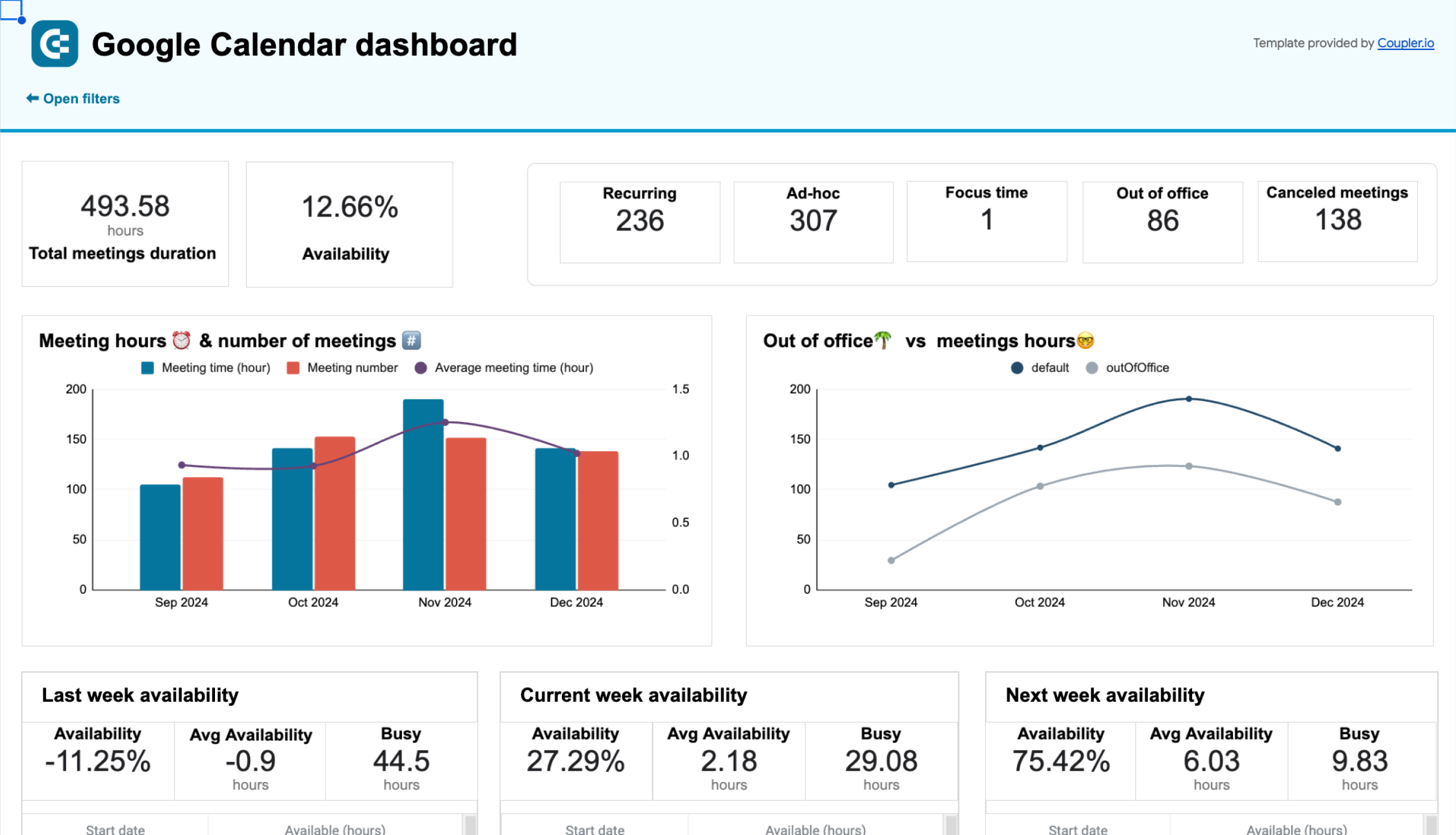
Can you analyze availability with this Google Calendar dashboard?
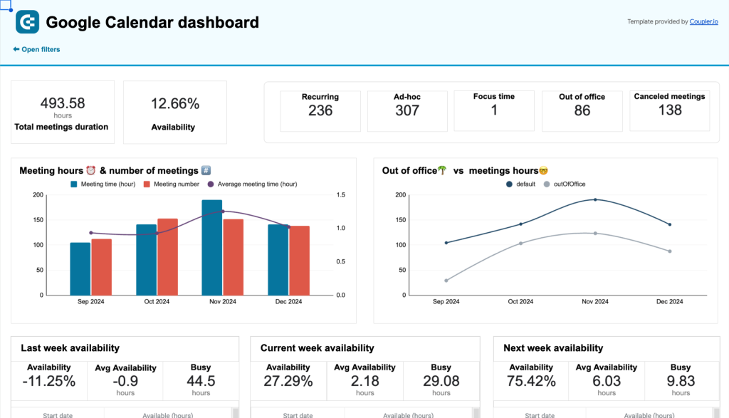
The Google Calendar dashboard provides the 12-month retrospective time insights of your schedule. If you’d like to analyze the available hours and meetings in your Google Calendar, you should check out another dashboard.
The Google Calendar availability & meeting hours dashboard by Coupler.io helps you understand calendar availability and optimize your schedule.
With this dashboard, you can:
- Understand your overall time spend and get an overview of total meetings duration, availability, and the number of meetings by type (recurring, ad-hoc, etc.).
- Reflect on your past week’s productivity and allocate time for future important tasks or meetings.
- Identify which weekdays are the busiest and manage recurring commitments.
This dashboard template is a good aid for any kind of professionals and managers who want to optimize time management.
Thanks to the built-in Google Sheets connector by Coupler.io, you can easily load data from your Google Calendar to the dashboard and get instant insight.

The Google Calendar dashboard is fun and easy to use. Moreover, we’ve included it in our selection of the top CEO dashboard examples. Share it with your colleagues and friends to figure out who has the largest number of hours spent in meetings in the last 12 months. The winner of this competition can get a standing ovation and the loser will pay for dinner – but it’s up to you to decide on the win/loss terms?
Data analytics can be fun, so try the calendar dashboard for yourself. However, if you need more business-focused analytics solutions for sales, marketing, project management, etc., check out our dashboard gallery.