GA4 has all the data you need, but it’s not exactly user-friendly when it comes to building custom reports. Exporting relevant data to a spreadsheet makes it much easier to create your own reports—and it’s simpler than you might think.
Here’s the referral traffic performance report you can download for free—or stick with me as I guide you through the steps to create it from scratch. Referral traffic is just one of many insights you can gain with this template. You can also track the sources driving your traffic, monitor your campaign performance, analyze geographic data about your visitors, monitor conversions, and much more.
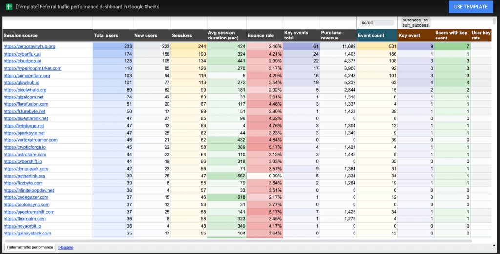
Here are some ideas on how you can best utilize this report – track link-building activities, monitor influencer campaigns, partnerships, and sponsorships. The report is essentially a funnel that starts with the total users for each session source. It then takes you through key events, including purchases, and provides an overview of the revenue generated from each referring source, all available at a glance..
To get started, you simply need:
- A method to export GA4 data: While you can do this manually, for regular updates rather than a one-time report, an automated solution is best. I’m using Coupler.io.
- A Google spreadsheet.
How to build a referral traffic performance report in Google Sheets
Here’s a quick action plan for what we’ll be doing:
- Set up Coupler.io to import events and traffic data from GA4.
- Send all data to Google Sheets and enable a daily refresh.
- Transform the raw data: group data by session sources, count and filter events, and calculate additional metrics.
- Design a clean, interactive report that users can explore to retrieve the insights they need.
I’ll create a template you can reuse to visualize not only GA4 data but also data from other apps if needed.
Reminder: If you don’t want to set up from scratch, grab this template for yourself and set it up with your own data in just a few minutes. We also offer other Google Sheets templates for monitoring advertising, SEO, web analytics, accounting, sales, and more.
Importing data to Google Sheets
There are various ways to export GA4 data. Thousands of marketing analysts use it on a daily basis because it’s fully automated and incredibly easy to set up. However, if you’re comfortable querying raw GA4 data, you could also use native connectors like BigQuery Links. This approach can yield similar results, but it usually requires more time to prepare the data for analysis, and costs can add up if your site receives a high volume of traffic.
In Coupler.io, you can select from hundreds of GA4 metrics and dimensions, just as you would in the GA4 interface. To track referral traffic effectively, it’s helpful to retrieve data on both events and traffic.
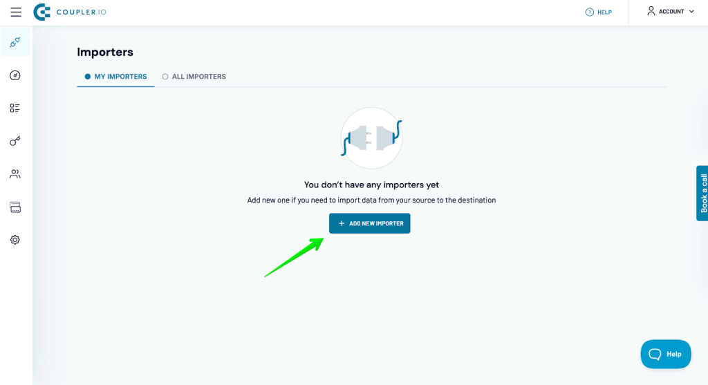
To start, sign up for free on Coupler.io (no credit card required) and create a new importer.
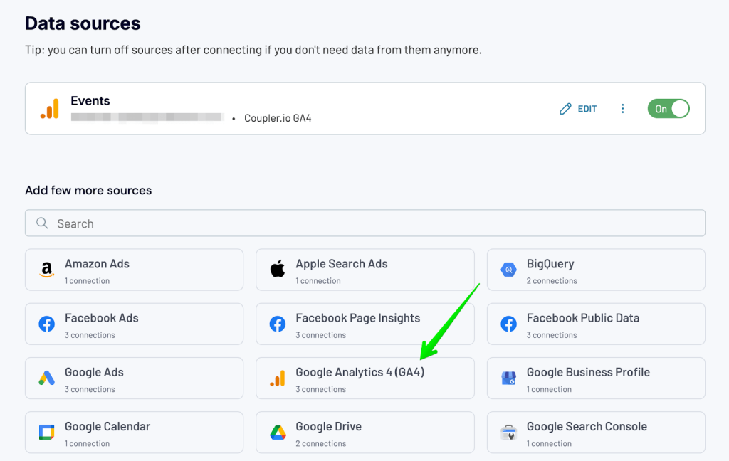
Select Google Analytics 4 as the data source and Google Sheets as the destination.
Next, connect your GA4 account and configure several settings, such as choosing one or more properties to track and setting the report period.
By default, data is pulled for the last 60 days, but you can adjust this period as needed. Keep in mind that if the range is too short, certain events, like purchases, may fall outside this window, making it harder to attribute them to specific traffic sources. On the other hand, if the range is too wide, you may miss recent shifts in user engagement or changes in referral performance—factors that are crucial when adjusting your marketing strategy.
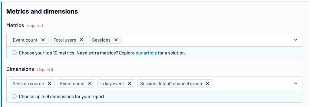
I’m focusing on events data initially, so here’s my setup for metrics and dimensions:
Metrics:
- Event count
- Total users
- Sessions
Dimensions:
- Session source
- Event name
- Is key event
- Session default channel group
Automate Google Analytics reporting with Coupler.io
Get started for freeOnce you’re done, add a new GA4 source, and this time, fetch data for traffic.
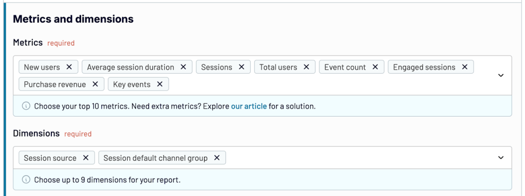
The following set of fields will be useful here:
Metrics:
- New users
- Average session duration
- Sessions
- Total users
- Event count
- Engaged sessions
- Purchase revenue
Dimensions:
- Session source
- Session default channel group
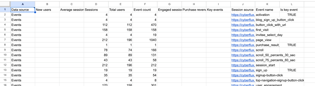
Once you have these two sources set up, proceed to the transformation step. After a quick load, you’ll see a preview of the data for each source. There are a few tasks to tackle at this point. For each data source:
- Fields like Account ID or Property Name are identical for all rows and won’t be useful for analysis, so it’s best to hide them to prevent importing unnecessary data into Sheets.
- Apply a filter to retrieve only data where the session default channel group is set to ‘Referral’. You can hide this field afterward, as once the filter is applied, its values will be the same for all rows.
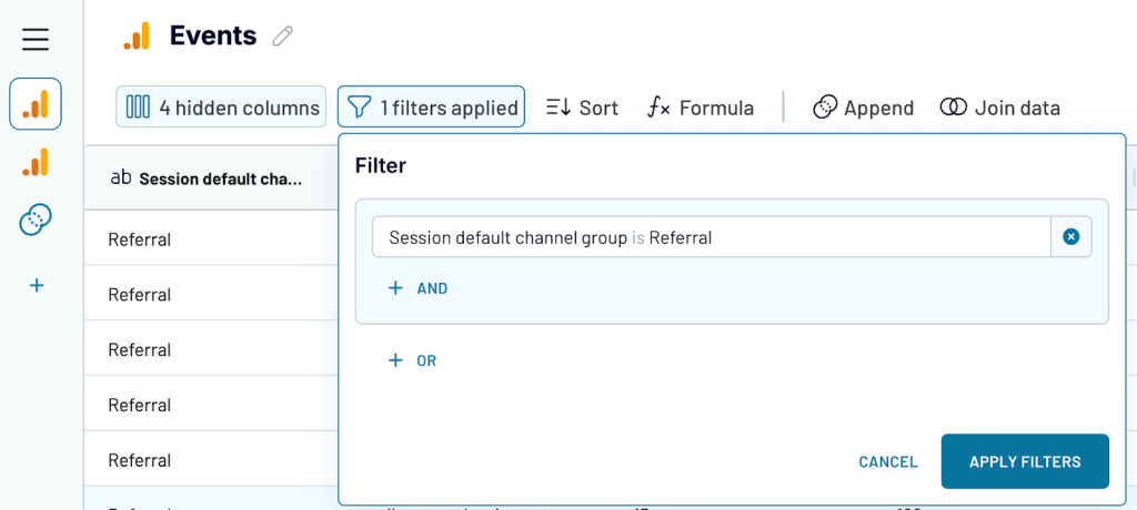
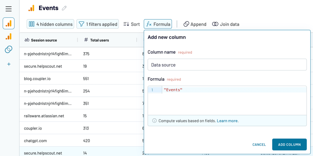
- You’ll also want to add a new field to each source to indicate which table the data is coming from. This is essential, as we’ll later use these values to look up specific data from each source accurately.
- Lastly, click the ‘Append’ button to combine one dataset with the other. Don’t worry if some fields don’t match—we’ll handle that in the spreadsheet.
Optionally, you can rearrange the columns—for instance, placing the ‘data source’ column on the far left in the appended dataset and moving event data to the far right.
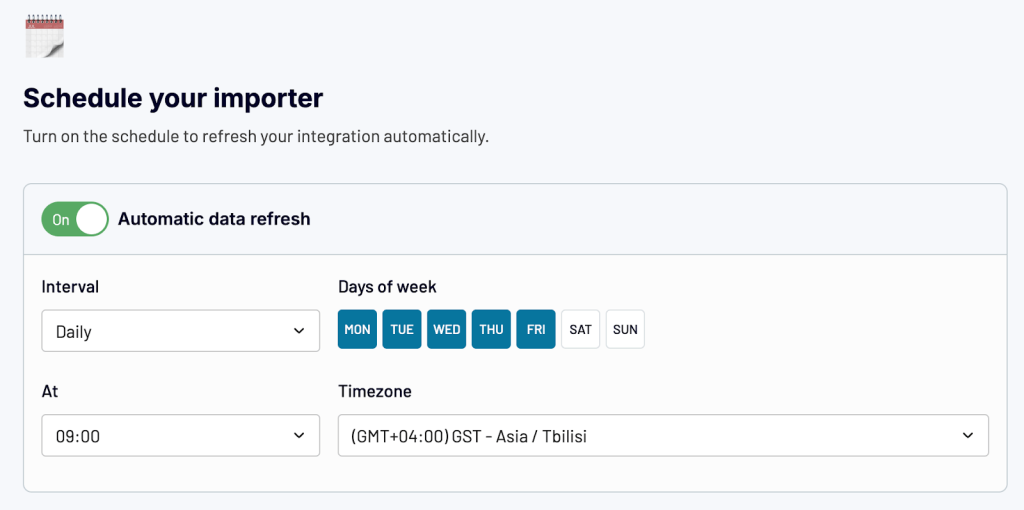
When you’re ready, move on to the destination setup. Connect your Google account, select the spreadsheet for import, and set up a scheduled refresh to keep your data up-to-date automatically.
Now, run the import, and you’ll soon see the raw data appear in your spreadsheet.
Give this tab a meaningful name—I’ve named it ‘Coupler data’—and let’s move on to building the report.
Transforming data in Sheets
Coupler.io will continue refreshing the raw data and overriding previous imports, so to apply any transformations, it’s best to create a new tab—I’ll name it ‘Calculations’—and link the relevant columns.
First, let’s aggregate data by event type. To start, I want to fetch the session source data into column A. I’ll use the FILTER formula:
=FILTER('Coupler data'!$A$2:$M,'Coupler data'!$A$1:$1 = A1)
In cell A1, I’ll add data validation by collecting the list of columns from the first row of my ‘Coupler data’ tab and selecting ‘session source’ from that list.
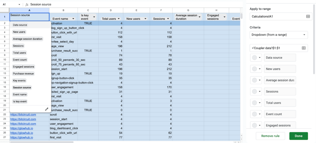
Let me explain the logic behind this here:
The most straightforward approach would be to simply reference the specific column where the session source data is located (in my case, column J). However, using FILTER with data validation provides several advantages:
- Adaptability: If the order of columns in the source data changes (for example, if I collect additional data from GA4), the calculation remains intact.
- Reusability: I can reuse the same formula across all following columns by dragging it to the right. Google Sheets will automatically adjust A1 to B1, then C1, and so on, so all calculations work seamlessly.
- Versatility: This setup allows me to use the entire file to visualize different data from GA4—or even data from other sources. All I need to do is select the relevant fields from the dropdowns and apply the desired transformations.
I set up columns A through L using the same approach. From this data, I can extract two additional metrics that I’ll use shortly to calculate the average session duration and bounce rate.
To get the total session duration, I’ll use the following formula:
={"Session duration total";ARRAYFORMULA(IF(LEN(D2:D)=0,,IF(L2:L="Events",,G2:G*F2:F)))}
This formula essentially multiplies the number of sessions by their average duration, skipping rows where there’s no data or where the row is labeled “Events”.
To calculate the number of bounces, I’ll use this formula:
={"Bounces";ARRAYFORMULA(IF(LEN(D2:D)=0,,IF(L2:L="Events",,F2:F-H2:H)))}
This formula subtracts the number of engaged sessions from the total number of sessions, giving the bounce count for each event.
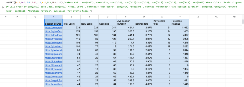
And now, a few columns to the right, let’s aggregate traffic data and group it by session source. For that, I’ll use the QUERY formula:
=QUERY({A:A,D:D,E:E,F:F,J:J,K:K,M:M,N:N,L:L},"select Col1, sum(Col2), sum(Col3), sum(Col4), sum(Col7)/sum(Col4), sum(Col8)/sum(Col4), sum(Col6), sum(Col5) where Col9 = 'Traffic' group by Col1 order by sum(Col2) desc label sum(Col2) 'Total users', sum(Col3) 'New users', sum(Col4) 'Sessions', sum(Col7)/sum(Col4) 'Avg session duration', sum(Col8)/sum(Col4) 'Bounce rate', sum(Col5) 'Purchase revenue', sum(Col6) 'Key events total'")
What this formula does in a nutshell:
- Filters rows to only collect ‘Traffic’ data
- Sums up metrics, such as total and new users, count of key events, etc.
- Calculates average session duration and bounce rate using the existing fields
- Orders the results by the total number of users in descending order
- Adds meaningful labels to each column
Now, a few columns to the right, let’s aggregate the traffic data and group it by session source. For this, I’ll use the QUERY formula:
=QUERY({A:A,D:D,F:F,I:I,B:B,L:L},"select Col1, Col5, sum(Col2), sum(Col3), sum(Col4) where Col6 = 'Events' group by Col1,Col5 label sum(Col2) 'Total users', sum(Col3) 'Sessions', sum(Col4) 'Event count'")
And that’s just about all the data I’ll need for my report. Now, let’s create a new tab for the actual report that users will interact with.
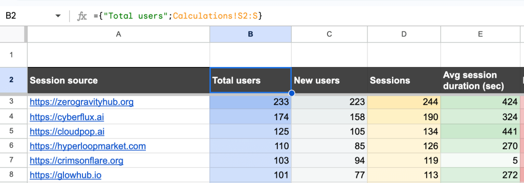
Building a referral traffic report
For most fields, you’ll simply link data from the ‘Calculations’ tab. For example:
={"Total users";Calculations!S2:S}
For events, it’s helpful to let users choose specific events to display data for, rather than summing up all events. So, I’ll enable filtering by both events and key events. To do this, I’ll create a separate tab and retrieve the list of each event type into separate columns:
={"Event name"; UNIQUE(FILTER(Calculations!B2:B, Calculations!L2:L="Events"))}
={"Key event name"; UNIQUE(FILTER(Calculations!B2:B, Calculations!L2:L="Events", Calculations!C2:C = true))}
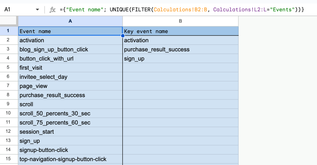
Then, I’ll set up data validation, using these columns as the source.
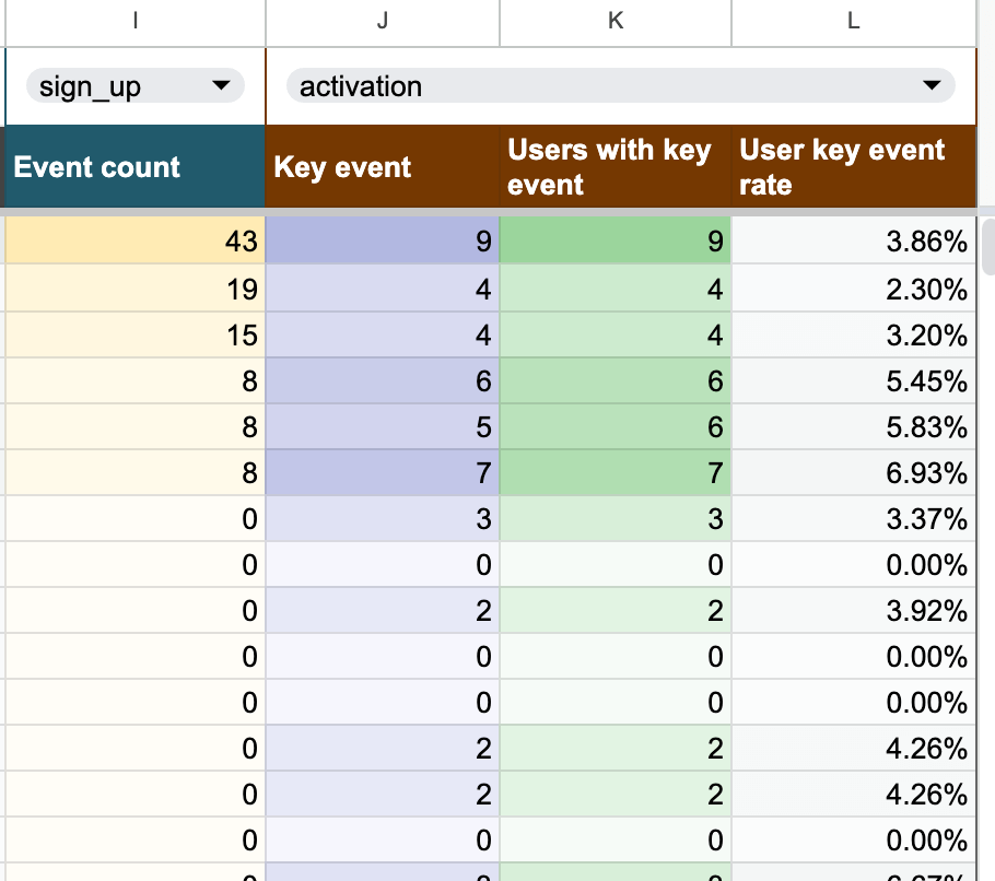
Now, onto calculating events. I’ll use the formula:
={"Event count";ARRAYFORMULA(IFNA(IF(LEN(B3:B)=0,, VLOOKUP(A3:A,FILTER(Calculations!AC:AG, Calculations!AD:AD = I1),5,false)),0))}
This formula scans through the available session sources and collects the number of events that match the event type selected in the filter above. If no matches are found, it returns 0.
I use a very similar approach to look up data for key events, returning the count of key events for each session source:
={"Key event";ARRAYFORMULA(IFNA(IF(LEN(B3:B)=0,, VLOOKUP(A3:A,FILTER(Calculations!AC:AG, Calculations!AD:AD = J1),5,false)),0))}
Next, I’ll retrieve the number of users associated with these key events:
={"Users with key event"; ARRAYFORMULA(IFNA(IF(LEN(B3:B)=0,, VLOOKUP(A3:A,FILTER(Calculations!AC:AG, Calculations!AD:AD = J1),3,false)),0))}
Finally, I’ll calculate the user key event rate by referencing the total users column:
={"User key event rate"; ARRAYFORMULA(IF(LEN(B3:B)=0,,IFERROR(K3:K/B3:B)))}
And here’s the events section of my report in full swing, with two filters on top and data below that auto-updates as different filters are applied.
Next steps
And that’s about it! Now, it’s time to polish the report and apply some conditional formatting as I did. You may also want to hide the columns with raw data and calculations, leaving only the report tab visible. This way, users won’t accidentally tinker with the calculations and risk breaking the report.
Also, adjust the import schedule in Coupler.io to match your needs. Or, simply duplicate the report to pull in different data, making small adjustments as needed.
As a reminder, you can get this and many other Google Sheets templates from Coupler.io’s dashboard gallery. Just follow the README attached to each template, and you’ll have them set up with your own data in minutes.
Thanks, and see you around!