Intercom is a valuable solution for customer service teams since it embeds all the necessary functionality for interacting with clients. However, its reporting and analysis options are insufficient for businesses: only 3-month-old data is available, and there are minor reports, each dedicated to a different subject.
Users can overcome such limited reporting functionality by creating custom reports in spreadsheets or BI tools. For this, they need to automate Intercom data export to the chosen destination. Let’s find out how to easily do this.
Methods to export data from Intercom
Coupler.io – reporting automation platform. Users can schedule data exports from Intercom using Coupler.io. This platform lets you access any kind of Intercom data, ranging from conversations to articles, and import it regularly to spreadsheets, data warehouses, or BI tools. Coupler.io provides an intuitive UI, so you can collect, organize, and load data in just a few clicks without programming knowledge.
Manual data export. Intercom lets you export data in the form of different reports. Users can view those reports within the application or download them as PDF files. However, such dispersed graphs don’t provide a clear vision of the support team’s performance. That’s why users will likely need to create custom reports in analytics tools by entering Intercom data manually.
API integration. The Intercom API allows users to access and retrieve data from an Intercom account via programmatic methods. Intercom REST API may also be suitable when you need to integrate this service into your proprietary application or system. Note that this method requires knowledge of Python or other programming languages, an understanding of API protocols, script-writing skills for executing API calls, and general technical expertise.
How to set up an automated export of data from Intercom on a schedule?
Discover how to set up automated extraction of Intercom data on a schedule with Coupler.io in this step-by-step tutorial.
Step 1. Extract Intercom data
In the form below, we’ve selected Intercom as the source. You need to select the preferred destination and click Proceed.
If you don’t have an account on Coupler.io, you can easily create a free one without the need for a credit card.
You’ll be asked to provide access to your Intercom account. This is necessary to authorize Coupler.io access to your data on Intercom.
Then, select the source account from the drop-down and click Continue. Decide precisely which data needs to be imported from Intercom by selecting the needed option from the drop-down under Report type.
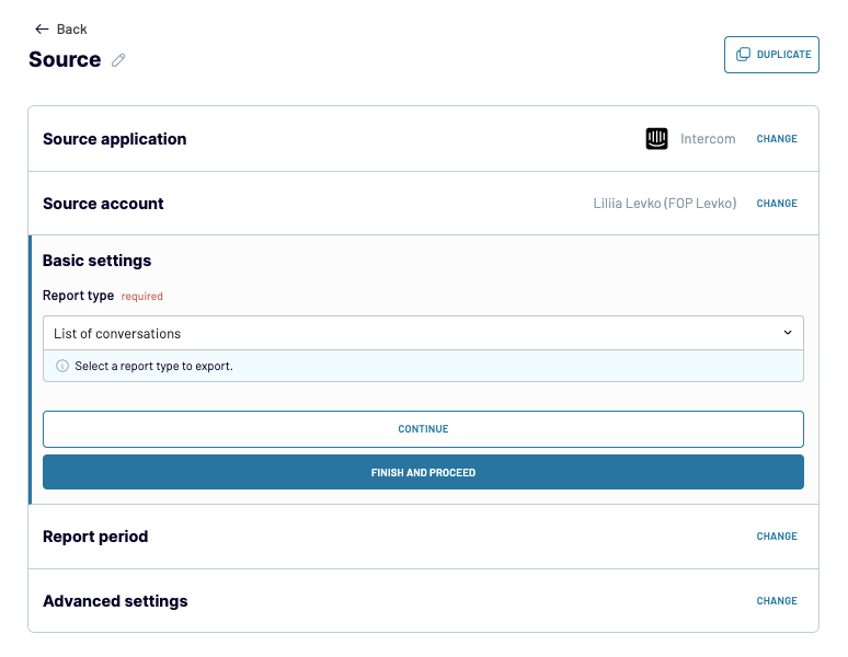
Specify the date range for reporting and add any filtering criteria in the Advanced Settings section if needed.
Once everything is set up on the source side, click Finish and Proceed.
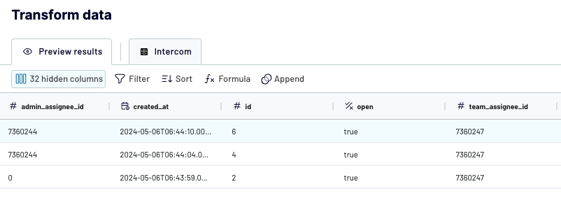
Step 2. Transform data
Coupler.io starts extracting Intercom data and provides a preview for you. Based on that, you can decide how to transform and organize data using the available functionality.
- Decide whether you need to remove any columns that won’t be necessary for the report. It’s also possible to rename a column by clicking on the 3-line icon next to its name and choosing the option for editing it.
- Apply any filters in case you want to extract only certain data from Intercom. For instance, if it’s necessary to include only conversations with ratings lower than 6, set up the appropriate filter for that.
- Indicate the sorting order to arrange your data based on a specific parameter.
- Create new columns by combining and/or transforming data from other columns.
- Blend data from multiple Intercom data entities, accounts, or even other apps.
Step 3. Load data and schedule automatic refresh
When all the data transformation and management operations are completed, click Destination to proceed. Then, follow the in-app instructions to configure the connection to the chosen destination tool. Once finished, click Setup a Schedule.
To have up-to-date reports on your customer support team performance, set up regular data migration from Intercom to a chosen destination by toggling on Automatic data refresh.
Coupler.io grants incredible flexibility, so you can set up data refreshes every 15 minutes for instant insights. Otherwise, choose daily or monthly data updates for longer-period reporting.
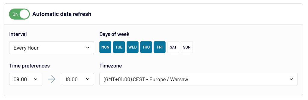
To start integration processes right away, click Save and Run Importer.
What data can be exported by Coupler.io from Intercom?
During the source setup process, there are many report types available. Let’s review each of them to uncover all the specifics of available reporting options and help you decide which one suits you best.
| Report type | Description | Value |
|---|---|---|
| List of admins | Shows admin users on the selected account along with a list of their superpowers. | Get the list of admins. |
| List of articles | Depicts the collection of articles within the help center along with their characteristics such as author, creation date, views, publication status, etc. | Discover the most popular articles and topics. |
| List of companies | Presents the business users (companies) with their related attributes, such as company ID and assigned segments. | Get a complete overview of your business customers. |
| List of contacts | Provides user data such as device used, browsers, location, contact information, user ID, and many others. | Discover the most popular locations where customers reside and share this information with marketers, for instance. |
| List of conversations | Provides conversation IDs for the selected reporting period with multiple characteristics, including rating, creation date, requester, type, and so on. | Export Intercom conversation data to define average first reply time, rating, correlation between various conversation types, etc. |
| List of data attributes | Presents all the attributes describing both customer and agent profiles as well as their actions. | Decide which custom attributes could be added to the system for better conversation management. |
| List of help centers | Provides available help centers associated with the Intercom account. | See existing help centers and their base languages. |
| List of help center collections | Shows groups of articles combined within your help center based on certain criteria. | Get an overview of existing article groups. |
| List of news items | Depicts the announcement of product updates, news, promotions, and events. | Get a holistic overview of your promotional activities currently running on Intercom. |
| List of news feeds | Fetches characteristics of the active news feeds. | See the existing news feed, |
| List of segments | Shows the range of available marketing segments for users (active, new, slipping away). | Decide whether to add any new segments or remove/modify the existing ones. |
| List of subscription types | Shows the types of objects available for subscription along with the content type and communication channels (SMS message, email, etc.). | Understand how your customers receive updates, news, or promotions. |
| List of tags | Shows the list of tags used for marking conversations and tickets. | Decide whether to add any new tags or remove the existing ones. |
| List of teams | Shows the list of internal team types (technical, support, sales, etc.). | Get a holistic overview of subteams. |
| List of tickets | Presents the collection of tickets with their current status, created at date, requester, and other related attributes. | Get the peak hours of customer requests and other valuable insights. |
| List of ticket types | Presents the categories of tickets, helping team leaders to classify customer requests. | Decide whether to add any new ticket types or remove the existing ones. |
Example of insights you can get from Intercom data
Given the multiple report types, extracting the needed value from all this data might be challenging. To clarify matters, let’s examine the most important metrics for evaluating the support team’s performance and see how Coupler.io helps to export and brush up on the Intercom data.
Note: In the How to get column of the table below, we assume that the List of conversations report type is selected for each case.
| Metrics | Description | How to get |
|---|---|---|
| Customer Satisfaction Score (CSAT) | Shows how customers react to custom support service received by putting a rating, usually from 1 to 5. | Make sure the conversation_rating column is present. Once data is exported to the selected destination, apply the formula of the average value of the conversation_rating column. |
| First reply time | Shows how fast the customer service team reacts to the ticket. | Make sure the statistics.first_admin_reply_at column is present. Once data is exported to the selected destination, apply the formula of the average value of the statistics.first_admin_reply_at column. |
| Average resolution time | Shows the time from the ticket submission to the complete resolution. | During the Transformation step, create a new column with the formula (statistics.time_to_last_close – Created_at). |
| Tickets solved | Shows the total number of tickets solved for the indicated period. | During the Transformation step, apply the filter where ticket.stats is equal to ‘closed’. Once data is exported to the selected destination, find the total number of closed tickets. |
| Agent occupancy rate | Shows the average number of solved tickets per agent for a defined period of time. | During the Transformation step, apply the filter where team_assignee_id is the agent and ticket.stats is equal to ‘closed’. That way, you’ll get the number of closed tickets for each agent on the team. |
You may include all these metrics on the dashboard in your preferred BI tool. Coupler.io can regularly supply such a dashboard with the most recent data and track metrics change over months and years to see how well the customer service team performs.
What are the supported destinations to import Intercom data?
Coupler.io allows you to export Intercom data to a notable range of data destination tools. You can design several importers, each dedicated to a chosen destination tool either for reporting, storage, or sharing. The choice of the tool obviously depends on what value you expect to extract from the Intercom data.
BI and data visualization tools
- Looker Studio. Import all the needed Intercom data there to turn it into meaningful reports and dashboards. Looker Studio also offers high customizability, so you can adjust your report to your needs.
- Tableau. This is a leading data visualization tool, so sending your Intercom data to Tableau makes sense when you need to create impressive charts and diagrams.
- Power BI. If your software toolkit is based on Microsoft tools, it makes sense to import Intercom data to Power BI for analysis and reporting.
- Qlik. This tool is known for its powerful associative analytics engine, uncovering complex data relationships within the Intercom environment. This helps you better understand your customer service landscape.
Spreadsheets
- Google Sheets. This solution is effective for data management and manipulation as well as for report sharing. You can load Intercom data there using a tutorial provided above or install the Coupler.io add-on to query Intercom data directly within Google Sheets.
- Microsoft Excel. For those who prefer desktop spreadsheet programs, Excel could be an excellent solution for data management and analysis.
Data warehouses
- Amazon Redshift. Export Intercom data and load it into Redshift to unveil customer service trends.
- Google BigQuery. Load your Intercom data into BigQuery and apply built-in business intelligence and machine learning features for in-depth analysis.
- PostgreSQL. Transfer your Intercom data into PostgreSQL for complex analytics operations and storage.
Other tools
- JSON. If you use applications that handle this format, it’s possible to extract Intercom data into a JSON file.
- Monday.com. Being one of the leaders in the project management software market, monday.com is widely used for task management and collaboration. Load Intercom data into monday.com for sharing reports and insights on customer feedback.
How to visualize data from Intercom
A picture is worth a thousand words! This phrase can be applied not only to everyday life but also to the professional life of analysts, customer support team leaders, executives, and other experts. Coupler.io could be your great assistant on the way to getting data visualized. Follow the automated export guidelines and select Power BI, Looker Studio, Qlik, Tableau, or a spreadsheet tool as a destination.
Then, start building your custom reports and dashboards in the selected BI or spreadsheet solution. Each of them offers powerful data visualization and reporting functionality, so feel free to take advantage of it.
One way to visualize data is to build custom reports from scratch. While this gives you more flexibility, it takes time and requires data visualization skills to build one. To make this easier for you, there is another way—using an Intercom dashboard template.
Intercom customer support dashboard
The Intercom customer support dashboard helps you analyze and improve your customer service performance. It gives you real-time insights into your team’s workload, response efficiency, and service quality, all in one place. The dashboard makes performance tracking easy by saving time and delivering clear, actionable data.
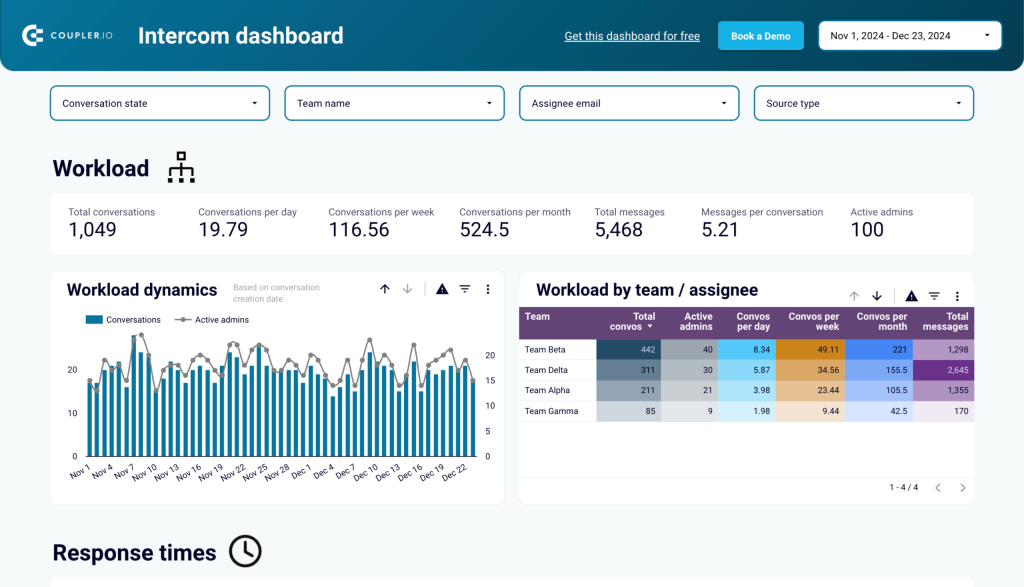
With this dashboard, you can:
- Track overall performance: See key metrics like the number of conversations, response times, and team workloads to understand your support operations at a glance.
- Analyze workload trends: Identify busy periods by monitoring the flow of customer requests over days, weeks, or months, and ensure your team is prepared.
- Improve response times: Measure metrics such as first response time (FRT) and average resolution time to ensure faster and more efficient interactions.
- Monitor service quality: Evaluate customer satisfaction through ratings and reopen rates to identify and address service gaps.
- Understand customer preferences: Learn which communication channels—-email, Facebook, or the website widget—your customers prefer for reaching out to your team.
- Assess team and agent performance: Compare how different teams or individual agents perform based on key metrics like response times and ticket reopen rates. This can help you identify areas for improvement or celebrate top performers.
The Intercom dashboard template is designed in Looker Studio and equipped with the Coupler.io connector to automate data load from your Intercom account. Follow the steps in the Readme tab to get a fully functional dashboard with your data in a couple of minutes.
You can also explore other predesigned dashboard templates by Coupler.io for SEO, sales, marketing, and other areas.
How to manually extract data from Intercom?
If you need to understand user interaction with the help center or discover email deliverability rate, then the built-in data export feature within Intercom might be okay. Several reports are available as dashboards right within the application. They can also be downloaded as PDF files and shared with your team members.
Here are the instructions on how to view and download reports from Intercom:
- Log into your Intercom account.
- Select Reports on the left panel.
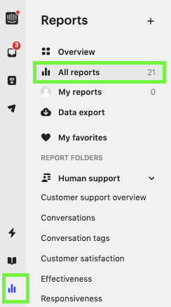
- Click on All Reports from the list of available options.
- Select the report type that interests you and click on it.
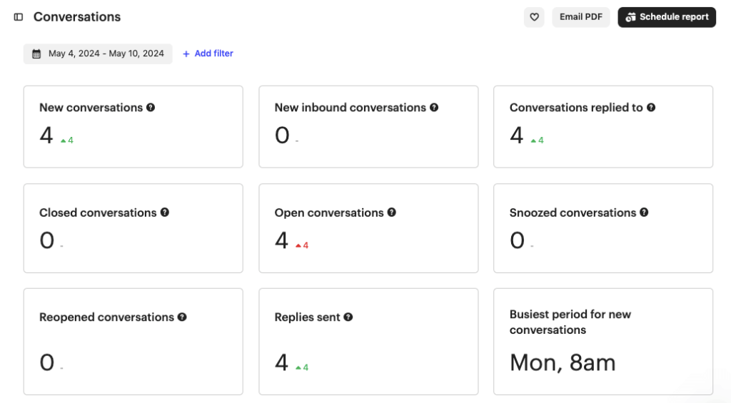
- Click Email PDF to get the report sent to your email box. You can also schedule regular emails with the most recent reports in PDF.
Despite the simplicity, the manual export of Intercom data won’t let you create a dynamic reporting solution that gives you access to the most recent data. However, if you connect Intercom to spreadsheets, data warehouses, or BI tools with Coupler.io, you’ll be able to create custom self-updating reports. As a result, your executives obtain a holistic data overview for predicting peak periods for support teams, improving the workflow assessment, and obtaining other valuable insights.
Automate data export from Intercom with Coupler.io
Get started for free