HubSpot provides so-called dashboard templates that are a collection of specific reports that you can organize into one view. It’s a simple way to kickstart your sales reporting. However, dashboard templates by HubSpot are limited to the reports (metrics) they can display. Therefore, sales managers tend to opt for custom reporting dashboards using their HubSpot data. With this article, you’ll be able to choose the option that suits your reporting needs.
What is a HubSpot sales dashboard?
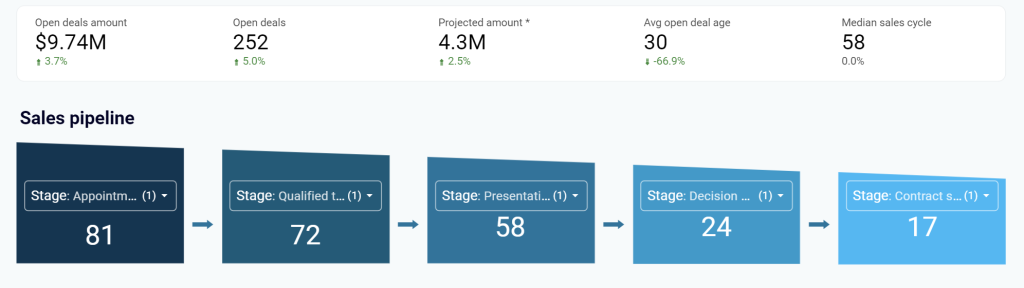
It’s an overview of key metrics that can explain the performance of your sales pipeline in HubSpot. Such metrics include open deals, closed deals, average open deal age, and many more.
Where you can get a sales dashboard for HubSpot
1. HubSpot templates
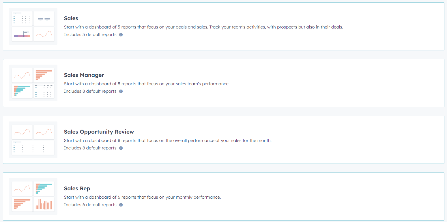
HubSpot provides 4 native sales dashboard templates that you can set up right in HubSpot: Sales, Sales Manager, Sales Opportunity Review, and Sales Rep
The drawback of using these templates is that they are limited in reports displayed as well as customization options. So, they are good for basic or entry-level HubSpot sales reporting but they are not suited for advanced cases.
2. Custom templates of HubSpot dashboards
HubSpot is not the only platform that offers sales dashboard templates. You can find custom solutions that provide better layouts, designs, customization options, etc. To use such HubSpot reporting templates, you need to load data from HubSpot. Some of them may be equipped with HubSpot connectors, so you only need to connect your HubSpot account to use them.
3. DIY sales dashboards
The third way to get a HubSpot sales dashboard is to create it yourself. For this, you’ll need to choose an app for your dashboard. This can be a spreadsheet app like Google Sheets or a BI tool like Looker Studio.
Then you need to load data from HubSpot. The manual way to export-import data works for laymen. Professionals use reporting automation platforms like Coupler.io to connect HubSpot to their dashboard tool.
And the third step is basically creation. You are to add graphs, tables, metrics, filters, and other elements to your sales dashboard.
Let’s go through each of the ways to get a HubSpot sales dashboard starting with the most actionable one – custom templates.
White-label HubSpot sales dashboard templates by Coupler.io
Coupler.io is a reporting automation platform that lets you turn raw data into meaningful reports. It provides white-label dashboard templates for sales, marketing, SEO, finances, and so on. All the templates are equipped with built-in connectors, so you only need to connect your source app to populate the dashboard with your data.
Here are the available HubSpot sales dashboard templates designed in Looker Studio.
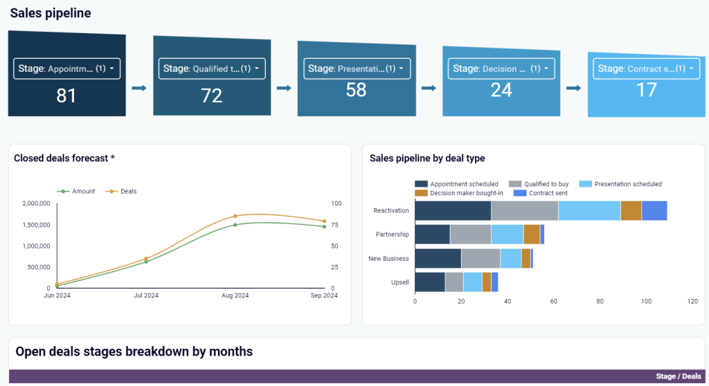
Sales KPI dashboard for HubSpot
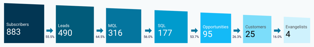
It is a sales dashboard to analyze critical sales metrics, including revenue, won deals per stage, and revenue per deal. You can also use it to monitor your sales funnel and gain a deep understanding of how your sales team members are performing.
With this dashboard, you can:
- Have an aerial view of the closed/lost deals and related revenues on a timeline to identify patterns, sales seasons, and correlations to campaigns that you run.
- Quickly see and filter the key reasons for losing deals to identify region-, owner-related, and other challenges.
- Customize your sales funnel to focus on desired stages of the sales process, next analyze the data to identify spots where deals drop, and understand what the problem is.
- Easily spot variations in achievement levels for each team member, then discuss insufficiencies and collaborate to eliminate these and improve success rates
The template is in Looker Studio and includes an in-built connector to let you easily pull all the data from HubSpot. Click the link below to open the template and go to the Readme tab for quick instructions on how to use it.
CRM dashboard for HubSpot
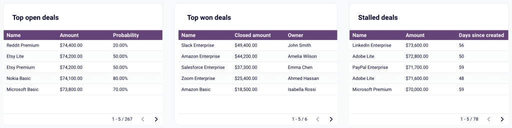
This sales dashboard for HubSpot provides an overview of the sales pipeline per agent or per different deal labels. Thanks to that, you can track your salespeople’s performance, observe deals’ progress, and discover opportunities for growth.
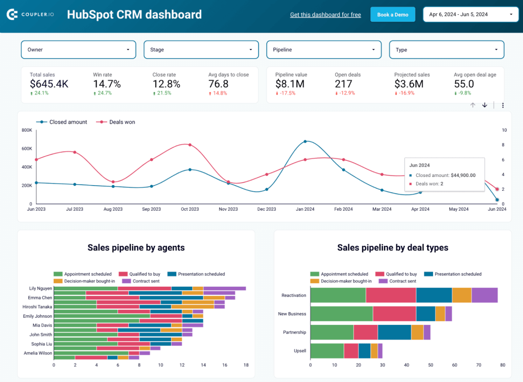
Use this dashboard to effectively:
- Explore your sales department’s KPIs to stay up to date and track trends in time
- Filter open deals by owner, stage, type, etc. to identify stuck or stalled ones and proactively address challenges or improve processes
- See which customers and industries bring the most value by analyzing top won deals and target your promotion efforts at specific groups
- Quickly analyze reasons for won deals to learn about your strengths and for lost deals to draw conclusions and improve
Equipped with a Coupler.io data connector, this dashboard lets you extract your HubSpot CRM data and bring it to Looker Studio with ease. To try it and get short installation instructions, click the button below and see the steps on the Readme tab.
Customer acquisition dashboard for HubSpot
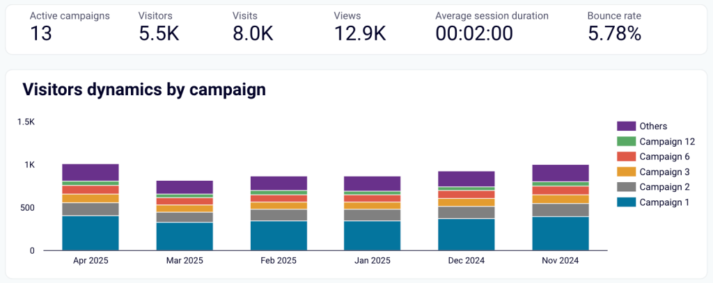
This dashboard template is more of a HubSpot marketing dashboard. However, it’s worth your attention, since it allows you to analyze your paid ads and organic traffic performance that directly influence your sales. It uses data from HubSpot, Google Analytics 4, and advertising platforms like Google Ads, Facebook Ads, etc.
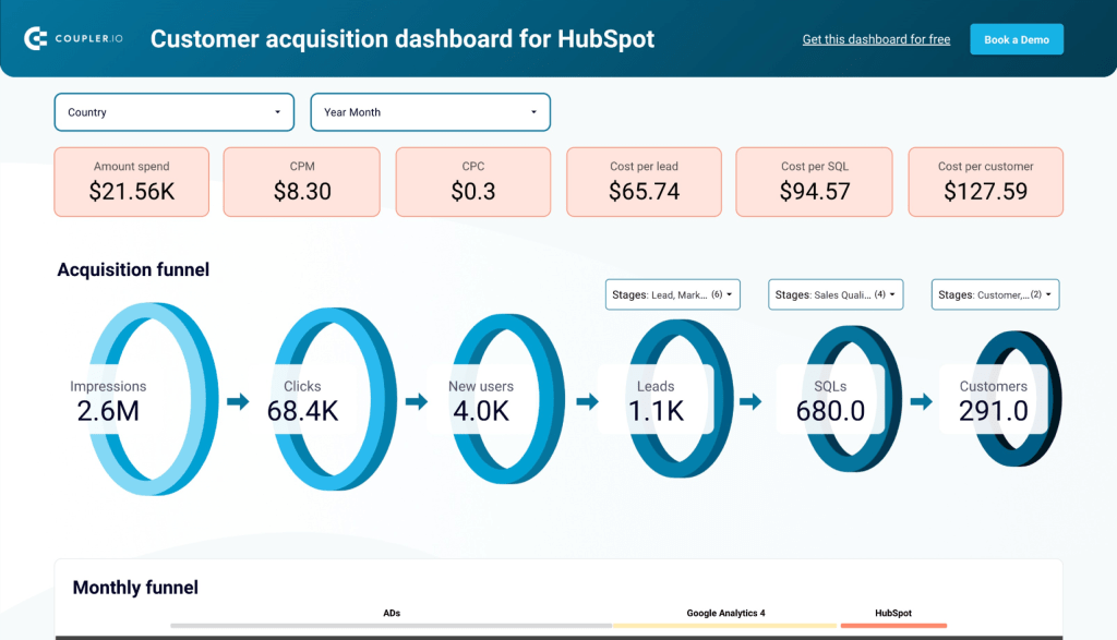
This dashboard is a perfect way to:
- Analyze each stage of your lead generation funnel to see how you perform and what needs more focus
- Use popular KPIs like CPC, conversion rates, etc. to get insights into how effective your advertising campaigns are for generating leads and customers
- Compare ad spending across channels to better plan your campaigns and avoid overspending
- Use historical data to forecast future sales based on your ad spending and marketing efforts
This Looker Studio dashboard comes with Coupler.io data connectors to load data from multiple sources in a breeze. Click the button below and follow the steps on the Readme tab to use the dashboard for your very benefit!
Hubspot marketing performance dashboard
This HubSpot dashboard combines data from all marketing channels (ads, website, email) and covers marketing funnel performance as well. Thanks to that, you get a universal and comprehensive source of information showing you how good your outreach activities are.
Note: To populate all the reports on this dashboard, your website needs to be built on Hubspot Site Builder.
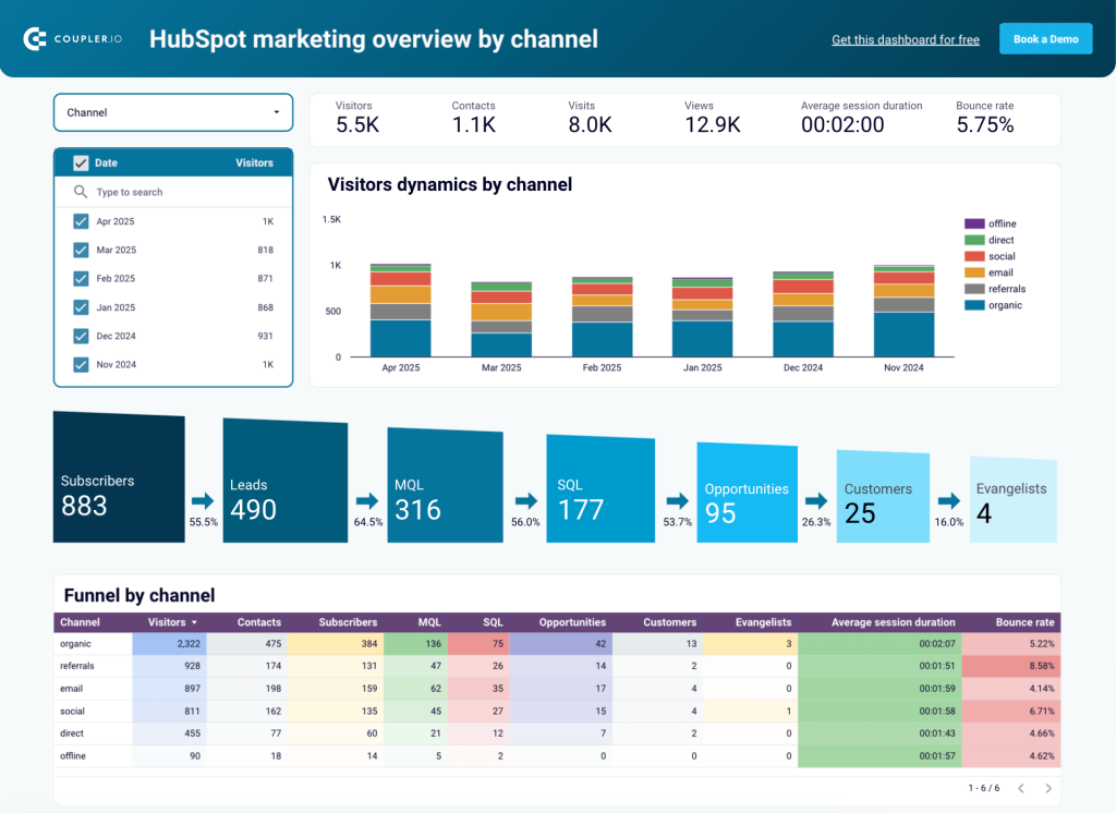
Once you get it up and running, the dashboard will let you:
- See the last 6-month breakdown of your website visitors by channel to determine which sources (e.g., social media, emails, etc.) bring the most traffic to your website and plan your marketing spending accordingly.
- Make use of the detailed 7-stage sales funnel to see how the traffic flows and make data-backed decisions about optimizing each stage.
- Precisely analyze your sales performance in different geographies to target your campaigns at specific countries or regions.
- Get the most important email performance metrics in one place to track email campaigns’ effectiveness, including click rates, spam intercepts, or bounce rates.
Connect your HubSpot software using the Coupler.io data connector to get insightful reports directly in Looker Studio. Click the button below to open the dashboard. Next, go to the Readme tab for the guide on how to set it up.
Marketing and sales performance dashboard for Hubspot
With this dashboard, you can easily learn how your marketing efforts translate into sales performance. See your users’ journey to optimize actions and processes at each stage of the funnel.
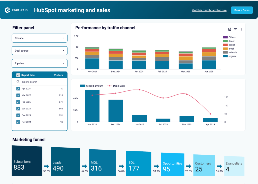
Using this dashboard, you’re able to:
- See which channels are the most effective in bringing you qualified leads and closed deals to plan and align your marketing strategies
- Analyze each stage of the marketing funnel to quickly identify bottlenecks and introduce improvements
- Have a look at the breakdown of deal stages by channel to determine the sources of the deals that progress the fastest
- Understand which channels bring the most deals that are won or lost to refine your campaigns, messaging, etc.
The dashboard template has been designed with Looker Studio in mind. It features a Coupler.io data connector to quickly get all the data from HubSpot without a hassle. Use the button below to view the template. With the instructions on the Readme tab, you’ll set it up in no time.
All these HubSpot dashboard templates are automated. Coupler.io will keep refreshing your dashboards according to the set schedule, so you can always have up-to-date insights.
Other Hubspot sales dashboards you may find useful
To give you more freedom of choice, we’ve researched HubSpot dashboard templates beyond Coupler.io. Have a look at our selection of competitors’, community-created, and HubSpot-team templates to see if there’s something suited for you.
Sales pipeline insights dashboard in Power BI by BIGINTSolutions
This report (the common name for a dashboard in the Power BI ecosystem) focuses heavily on open deals, letting you analyze your current situation as well as forecast future revenue and compare it with targets.
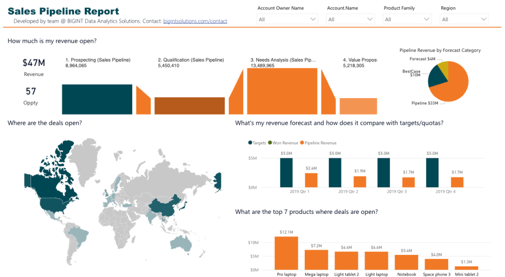
Pros:
- Multiple filtering options to let you see what you want to see.
- Clear insight into open deals from different perspectives: revenue, targets, products, owners, etc.
- Question-based titles of charts provide a clear idea of what a specific chart is about.
Cons:
- The scope of sales pipeline reporting might be too narrow for some people.
- Not automated configuration, requiring some knowledge of API, coding, etc.
- The look of the dashboard isn’t the freshest one.
To learn more about this dashboard and how to use it, visit its topic on the Microsoft Fabric forum.
HubSpot data dashboard in Tableau by Mohamed Azarudeen
This is a true community-made dashboard (or viz, as Tableau guys call it) that focuses on the sales funnel, in particular owners. You can easily track your team’s performance by deal number, stage, area, days to close, and more.
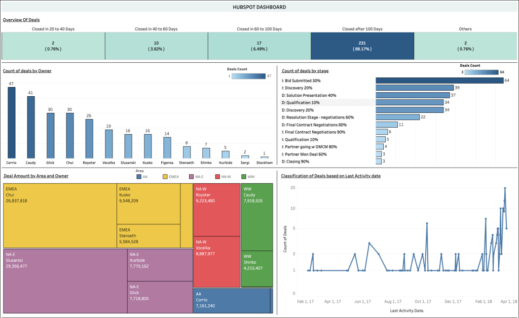
Pros:
- Nice breakdown of deal closing periods to filter your data.
- The most important team performance indicators in one place.
Cons:
- The design might seem a bit outdated.
- Not free — you need to pay for a Tableau subscription.
To use this dashboard, visit its website in the Tableau viz gallery, download and open it, and connect HubSpot as your data source.
Sales dashboard in Google Sheets/Excel by HubSpot
This dashboard lets you analyze a range of sales KPIs to get data insights and track patterns. Being compatible with popular spreadsheet software, it can facilitate collaboration in your sales team.
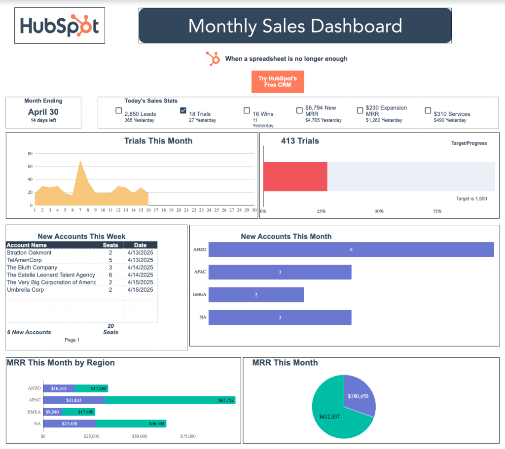
Pros:
- Clear overview of the most important performance indicators.
- Easily shareable thanks to compatibility with spreadsheet software.
Cons:
- Limited number of metrics, so no deep analytics is possible.
- While seemingly free to use, you need to share your personal data, like first and last name, email, phone, etc,. to download it.
- Not automated — you need to copy and paste data manually in subsequent workbooks, which can be error-prone.
Go to the dashboard’s website to learn about its features, benefits, and use. Then download the version that matches your toolset.
Hubspot sales funnel dashboard in Looker Studio by Windsor.ai
Another sales funnel dashboard to help you visualize the customer’s journey. With an insight into each stage, sources, average time to engage, revenue, and other metrics, you have all the data to improve conversions and your customer experience in one place.
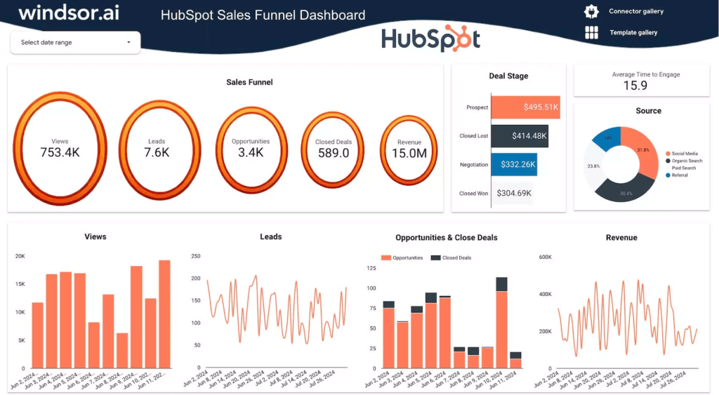
Pros:
- Clear presentation of the most important KPIs like deal stages, sources, etc.
- Nice performance-measuring chart that compares opportunities to closed deals
Cons:
- Not very detailed insights, but might be OK for a start
- Chart designs might not fit everyone’s aesthetics
Visit the dashboard’s website to learn more about its use cases and see how to use it.
HubSpot marketing dashboard in Looker Studio by Supermetrics
This HubSpot dashboard template provides a centralized view of users’ journey and engagement, plus marketing campaign performance.
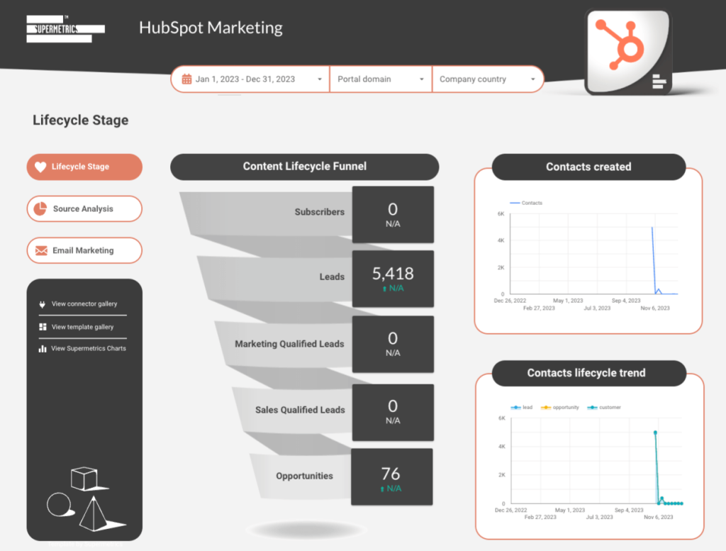
Pros:
- Clear design makes it easy to focus on metrics and charts
- Separate views for sales funnel, source analysis, and email marketing make it easier to navigate through
- Includes all the important data to measure your marketing activities
Cons:
- Not an effective use of the available space, so you get fewer visualizations/metrics
- Limited colors make the dashboard less pleasant to look at
- Not free even in the case of the basic 1 source & 1 destination configuration (Supermetrics’ Starter plan priced at $29/month)
Visit the template’s website to learn more about it and get installation instructions.
How to add a new sales dashboard in HubSpot?
Now, let’s see how you can use the native or built-in sales dashboard templates in HubSpot.
- Log in to your HubSpot account and go to Reporting => Dashboards.
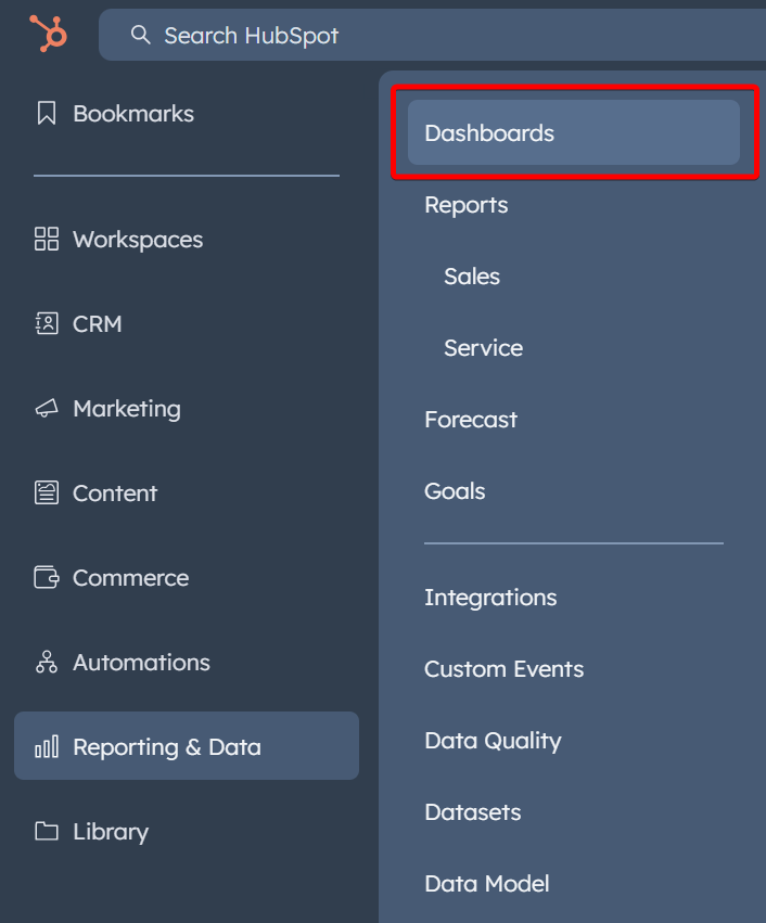
- Click Create dashboard, then select one of the available templates for sales dashboards. Then you need to select the reports to include in the dashboard
- Name your HubSpot sales dashboard and configure the access parameters.
- Once you click the Create dashboard button, the dashboard reports will be populated with the relevant data.
What dashboard templates are available in HubSpot?
Sales dashboard
You access 5 reports on your deals and sales.
Sales Manager dashboard
You access 8 reports on your sales team performance.
Sales Opportunity Review dashboard
You access 8 reports on the overall performance of your sales for the month.
Sales Rep dashboard
You access 6 reports on the monthly sales performance.
How to customize my new sales dashboard in HubSpot?
HubSpot gives you the competency to customize your dashboard. You can add new reports and make changes to them.
Right on top of the access option, you will find the Actions drop-down menu. From this menu, you can give the authorized user, the ability to make changes or customize the dashboard.
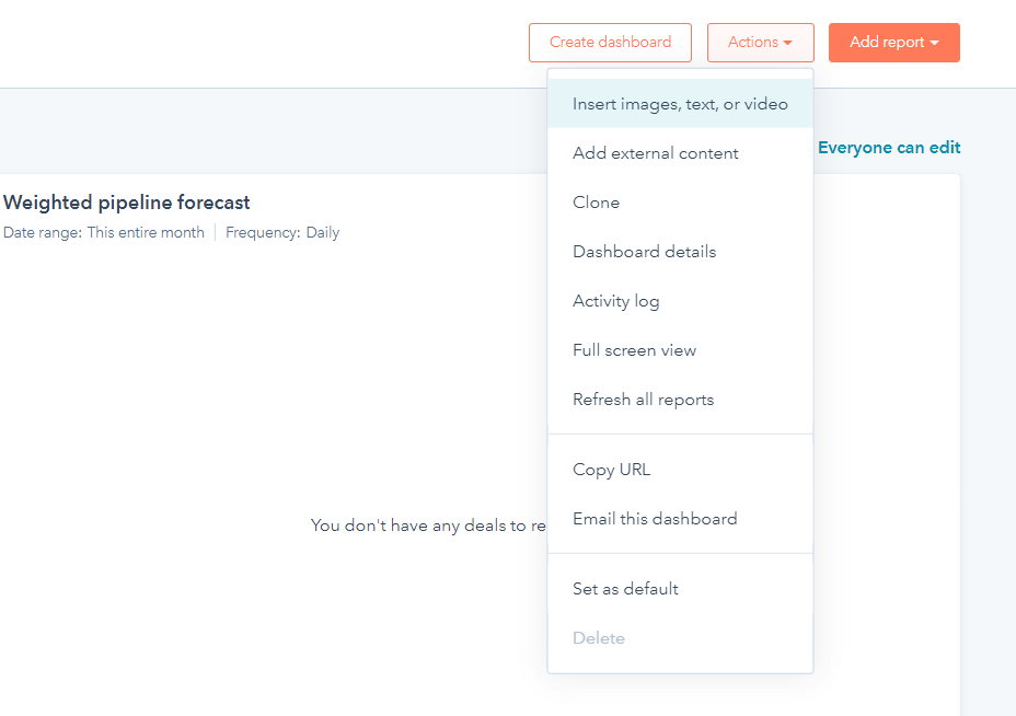
- Add image, video, or text: This allows you to add notes in that dashboard, which is explained in the next section.
- Clone: This option allows you to clone a particular dashboard. After selecting the dashboard, click on the Clone option. In the right panel, give the Dashboard name and decide who will have access to it from the options. Then select Clone Dashboard, and your dashboard will be cloned.
- Copy dashboard URL: Select this option so that you can share this dashboard with other users.
- Email this dashboard: You can email this dashboard to anyone by selecting this option.
- Edit name and description: You can edit the description and name of your dashboard by clicking on this menu. Once you are done, just click Save.
- Set as default dashboard: This option allows you to make a dashboard your default one. Once you select this option, this dashboard will be shown to you as soon as you log in.
Can you rename, copy, or delete reports in sales dashboards in HubSpot?
Yes, HubSpot allows you to rename, copy/clone as well as, and delete reports. This can be done as follows:
- Move your cursor over the desired Report in which you want to make changes. Now, click on the drop-down menu in the upper-left corner.
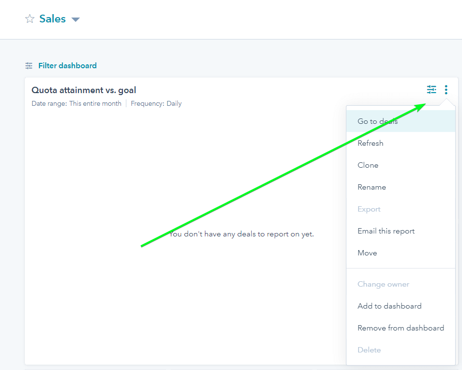
- To rename a report: Just click on the Rename option from the drop-down menu. In the new dialogue box that appears, rewrite the name and then click on the Rename Report option.
- To copy/clone a report: Choose the report that you want to copy or clone. In the new dialogue box that appears, choose a name for your new report. You are given the option here to add the cloned report to a new dashboard or to an existing one. For this, click on Clone to existing/new dashboard.
- To delete a report: Choose the report that you want to delete. In the actions drop-down menu, just select the Delete option. This will delete your report completely from your dashboard as well as your HubSpot account.
Is it possible to add notes to the sales dashboard in HubSpot?
Yes, you can add notes to your sales dashboard. This will allow you to add extra information, instruction, insights, or content for your team and for you as well, the next time you see this dashboard. In order to add notes, just go through the following steps:
- Now, navigate towards the upper-right corner where you have to select the Actions drop-down menu.
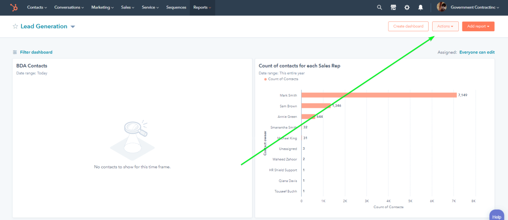
- Choose the Add images, text or video option.
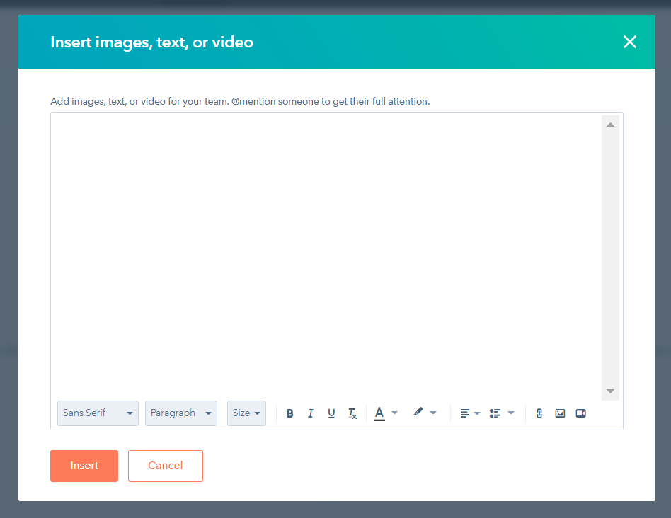
- Hereafter, in the notes field, you can enter the desired type of content. The toolbar will help you to do so.
- Once you are done adding notes, click Add. This action will add them to the dashboard and will give you and your team insights into the dashboard the next time you open it.
How to build a HubSpot sales dashboard yourself
As we mentioned above, the premade HubSpot sales dashboards offer a limited number of reports. Of course, you can add custom reports, but anyway, you won’t be able to go beyond the customization options supported by HubSpot.
To overcome this limitation, you can build a sales dashboard yourself, outside of HubSpot. For this purpose, use:
- Coupler.io to connect HubSpot and other data sources (which you need for the dashboard) to a data visualization tool, plus enable scheduled data syncing. With this automated approach, you can not only save about 40 hours per month on data reporting but also make your dashboard self-updating with no coding at all!
- A visualization tool of your choice (e.g., Looker Studio, Power BI, Google Sheets, Tableau, etc.) to customize reports and metrics on your dashboard and tune them according to your vision.
Collect data for your sales dashboard outside of HubSpot
Copying data manually is a time-consuming and unpleasant chore, which is likely to produce errors. In addition, handling data updates means only more manual labor for you. Use Coupler.io to easily overcome these inconveniences, save your precious time, and stand out as a data reporting expert. Just the following 3 steps are enough to achieve it:
Step 1: Connect Hubspot and other data sources
To begin, select the desired data visualization tool in the form below and click Proceed.
You’ll be offered to create a Coupler.io account for free if you haven’t done it yet. After that, connect your HubSpot account, select the data entity you want to export: Deals, Contacts, Companies, etc., and configure the rest of the settings (e.g., choose columns, filter data).
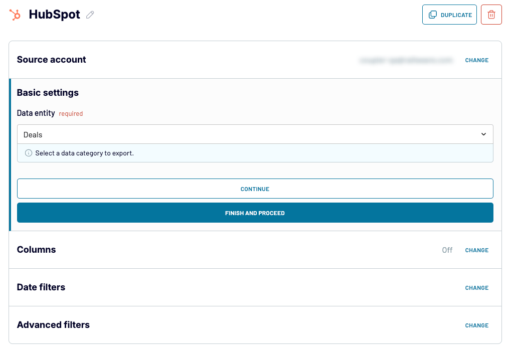
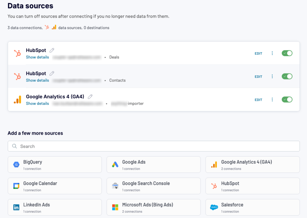
- Now, it’s time to add the next sources of data (e.g. Google Analytics, Facebook Ads) for your custom dashboard. To do it, choose the desired source under Add a few more sources and configure it as necessary. Then repeat the steps to add more data sources if needed.
Tip: To import more data types from your HubSpot account, choose HubSpot again, but this time select a different Data entity, e.g., Contacts. You can repeat the process to add other data entities.
Step 2. Join and transform data sources into a dataset
Next, use one of the data blending methods in Coupler.io to join your data sources into a single dataset:
- Append — this one is more suitable for sources with a similar data structure (similar columns). It can be handy, for example, when you wish to blend the same data entity from multiple HubSpot accounts.
- Join — this one, on the other hand, is better for sources whose structures differ, but they share at least one common column. When connecting different data sources or HubSpot entities, you’re likely to use this method.
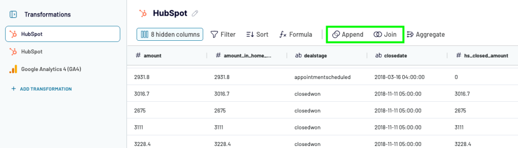
Finally, preview the resulting dataset and tweak it before importing it into the data visualization tool. You can:
- Hide columns that are not important for the dashboard
- Add, rename, and rearrange them
- Filter and sort data as needed
- Add formula-based columns, calculate custom metrics
- Summarize your data with the Aggregate feature, using common formulas like Average, Sum, etc.
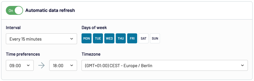
Step 3. Load data and schedule refresh
When your dataset is ready, load it to your destination data visualization tool, following the instructions in the Destinations step in Coupler.io. Do not forget to toggle on the Automatic data refresh feature and specify your schedule preferences.
Visualize the data exported from HubSpot
There are many different data visualisation tools on the market, so it’s quite challenging to offer universal instructions on how to build a sales dashboard. However, if your choice is Google Sheets or Looker Studio, check out our other blog posts where you can find some inspiration or guidance for your process.
And here are some tips that may be useful for you:
- Your reports can be based on comparisons, compositions, or trends.
- It’s good to compare data from two different periods to understand the various segments of your metric.
- Always make good use of graphics rather than overcrowding the data with colors and graphs.
- Advanced calculations will let you get more of the regular sales metrics.
- When you make your dashboards accessible to the team, you promote transparency within the team.
Which metrics to use in your custom HubSpot sales dashboard
HubSpot hosts lots of sales data. This raw data can be translated into metrics that you can build your HubSpot reporting dashboards around. To help you not get lost in the data, we’ve prepared a list of 8 useful metrics for your sales analytics. Use them to build your perfect custom HubSpot sales dashboard:
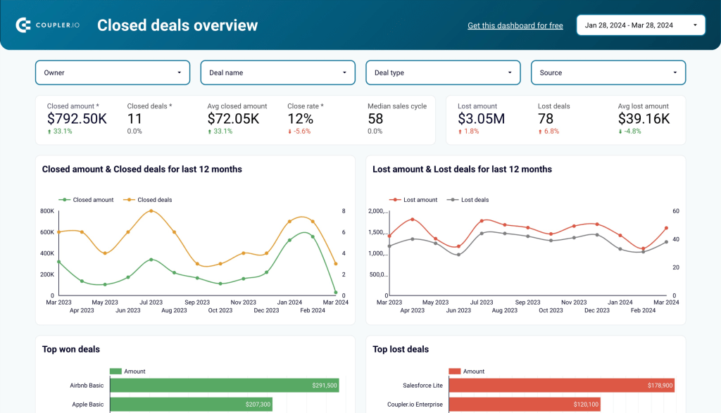
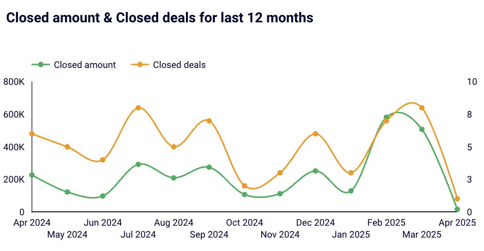
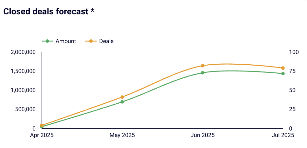
Closed amount and deals in the last 12 months
To be more accurate, here we have two metrics: closed amount and closed deals on a 12-month timeline. By combining them into a single chart, you can easily see the correlation between the number of deals and the amount they yielded. For example, to see when fewer deals actually brought more revenue.
Secondly, looking at the timeline and taking the average days-to-close metric into account, you can precisely determine the factors that influenced deal value/number, such as seasonal sales, your marketing campaigns, participation in conferences, and others.
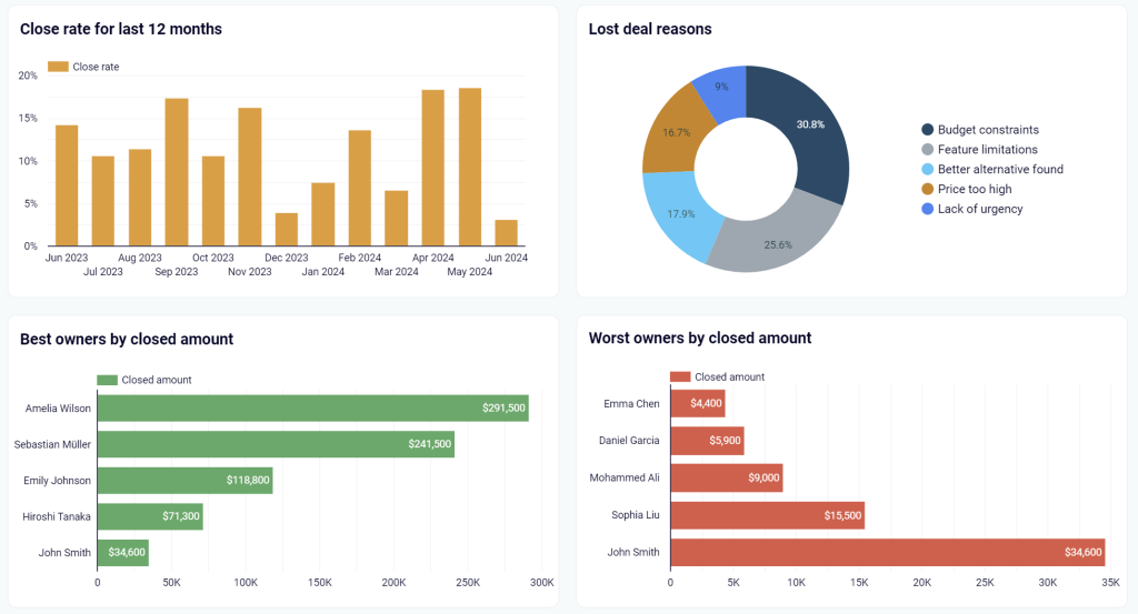
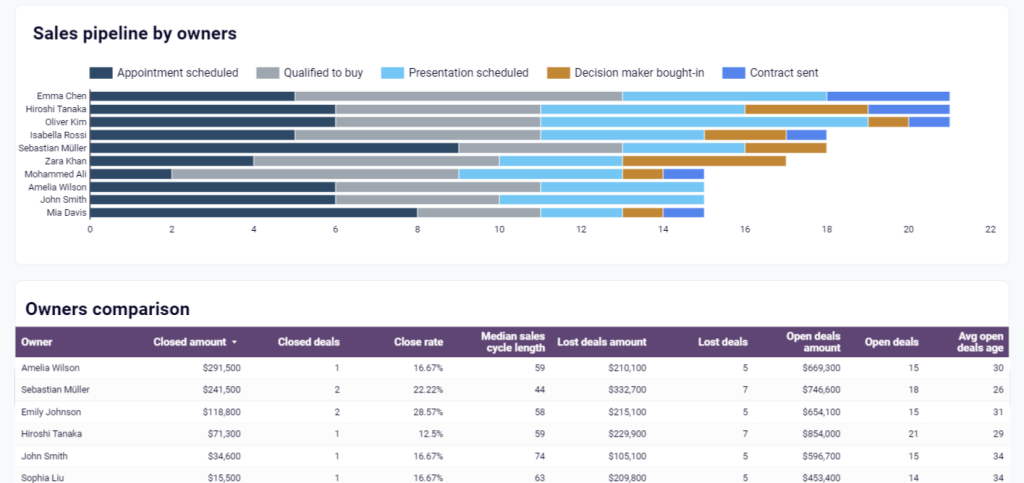
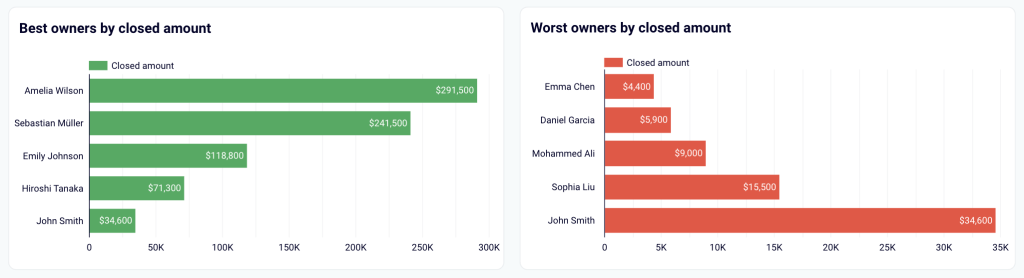
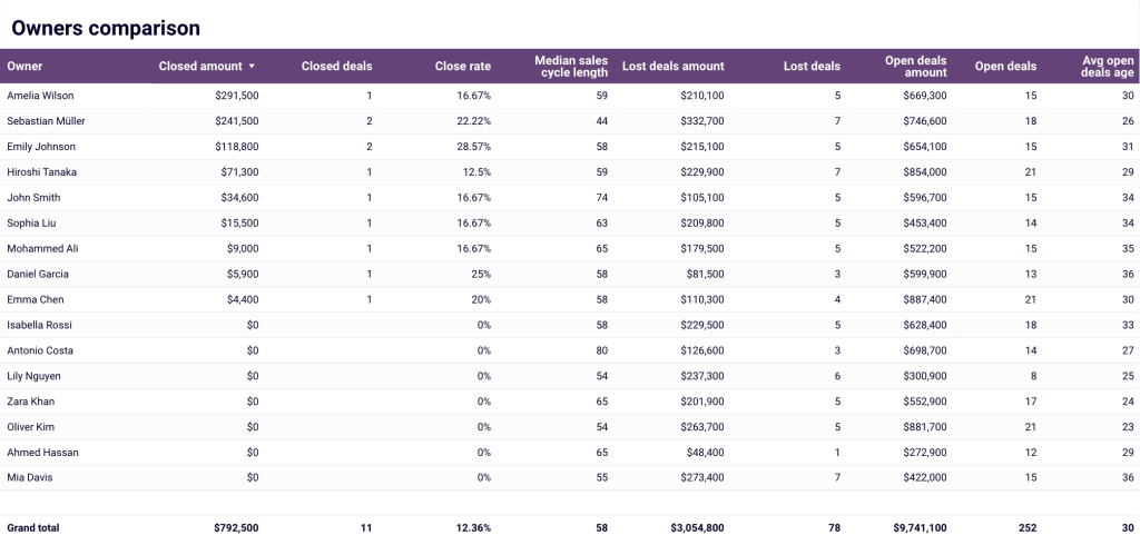
Best and worst owners by closed amount
Here comes the team performance metrics. The best thing about them is that they clearly show who brings the most revenue to your organization. So, no more excuses or innuendoes—now you precisely know who deserves the highest bonus or the most coaching.
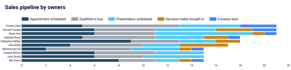
Sales pipeline by owners
Another team performance metric. With this one, you can quickly see who is effective at proceeding to key stages of the pipeline or is likely to finalize the most deals in the near future. Thanks to that, you get a better way to plan your budget. You can also use this metric to analyze patterns that result in exceptional or poor sales performance.
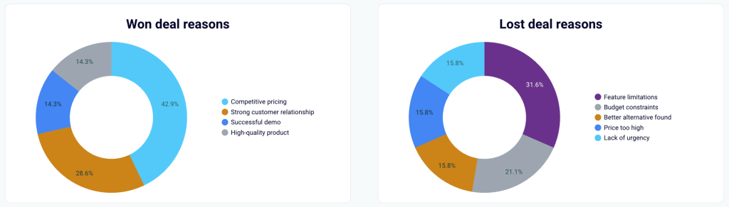
Won and lost deal reasons
Learning lessons from experience might sometimes be painful, but is always beneficial.
With won deal reasons, you get to know your strengths, so you use them to your advantage in future customer interactions for more successful outcomes.
The lost deal reasons metric, on the other hand, lets you work on your weaknesses to turn them into your strengths in the future.
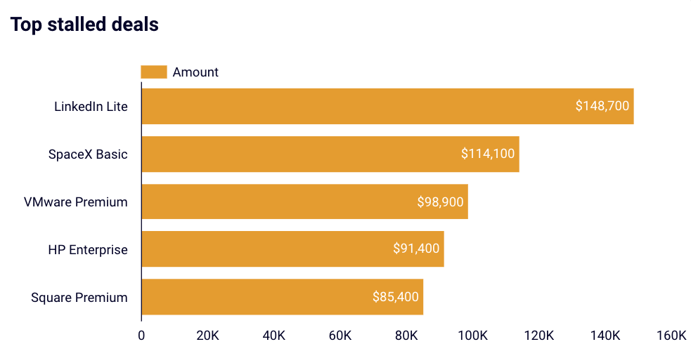
Top stalled deals
By stalling deals, your team risks missing valuable transactions that, after all, can bring you real revenue. With the top stalled deals metric, you can easily identify the deals at risk. What’s more, you will be able to quickly prioritize them because they are clearly ordered by their value.
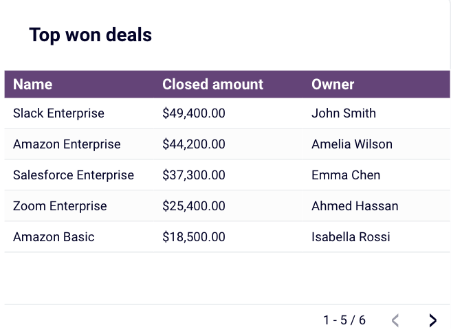
Top won deals
With this metric, you learn which customers are the proverbial goose that lays golden eggs. Consequently, you can optimize your campaigns, future interactions, selling techniques, etc., for those customers to maximize your revenue.
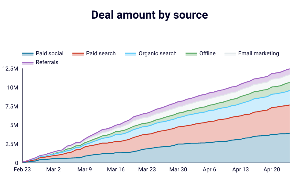
Deal amount by source
This metric provides you with insights to maximize your total sales in the future. Once you know which source or sources are beginning to positively impact your revenue, you can cooperate with your marketing team to launch campaigns targeted at those sources to keep the good things going.
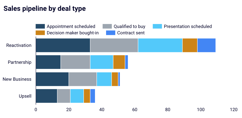
Sales pipeline by deal type
Using this metric, you can learn which deal types are the easiest to close because they progress the fastest, where convincing a decision maker isn’t hard, and so on. Consequently, you can focus your efforts on acquiring these deal types to increase deal closing rate and ultimately sales performance.
Why do you need a HubSpot sales dashboard?
A HubSpot sales dashboard is useful when it comes to making important decisions concerning your business, as well as when you are evaluating your sales performance or the performance of your sales team. In fact, with such a dashboard, you can improve and optimize nearly any aspect of your marketing and sales activities. Just consider these:
- Key metrics in one place to stay up to date and make key decisions
A HubSpot dashboard includes key metrics such as open deals amount, pipeline value, total sales, etc., at the top of it. Thanks to this bird-view section, if you’re a CEO or one of the decision makers, you can immediately see the condition of your business and stay updated. No way to do it that quick with just HubSpot tables and reports at hand.

Next, you can get into more detail with a sales pipeline visualization. Just a quick glance and you can see any potential leaks or determine whether the pipeline is even broken. Gaining such insights with raw data tables would be much more time-consuming and would require some deep analysis.
- A multiple-angle analysis of campaigns to boost them
You can spend hours switching workbooks and analyzing raw data from sources like Facebook Ads, Google Ads, email, and others. But what’s the point of doing it when you can have the data in one place, visualized and broken down by different criteria such as: number of visitors, source channels, bounce rates, CTRs, countries, and many more.
With these nice visualizations at your disposal, you can track your marketing performance, identify issues and apply fixes, refine all your campaigns, re-target them, etc. in no time!
- A deep insight into deals to maximize closing
When your users convert into deals, a custom HubSpot sales dashboard can provide you with in-depth visual insights into deal stages, problems with deals, and more. Instead of scrolling through table-based reports in HubSpot, you can instantly identify the most beneficial open deals (to focus on them and turn them into closed ones) or stalled deals (to spot any issues and be proactive in solving them).
A custom sales dashboard will also help you easily analyze deal stages to see how deals progress in time and to optimize processes, learn about deal-winning/losing reasons to improve, or track a deal forecast to plan your stock and/or campaigns.
- Team performance analysis to build the strongest sales team
A custom dashboard is also a perfect way to track your team members’ performance. For example, you can clearly and instantly see who brings the most revenue or who’s the most efficient at closing deals to award team members, or who’s less busy to take up that newly opened deal. On the other hand, you can easily plan and provide training and coaching to those associates who are less efficient or are simply struggling. It’s up to you!
As you can see, HubSpot sales dashboards can hugely improve and speed up your work in multiple ways. With them, you not only get a tool to harness the wealth of CRM data, but also become capable of making data-driven decisions, which are crucial for effective sales management.
Which option to choose for a HubSpot sales dashboard?
If you are totally fine with what HubSpot gives you to analyze your sales performance, then keep it. At the same time, this option won’t be a good fit for growing businesses that accumulate tons of data with every sale they perform.
Sooner or later, you will need to switch to a more advanced solution to monitor and stay on top of your sales pipeline health. And when this time comes, you know what you can do. You can use a white-label dashboard template as a starting point since it lets you scale your reporting needs and streamline HubSpot data analytics. Or build a sales dashboard for HubSpot from scratch if you feel that templates can’t meet your needs.
Automate HubSpot sales reporting with Coupler.io
Get started for free