Looker Studio’s user-friendly design and Google ecosystem synergy shine. However, limitations like customization constraints and data source compatibility push users to seek alternatives. Businesses and data analysts often look for more advanced functionalities, diverse data source integrations, and pricing models that suit their unique needs.
This deep dive explores the top 9 Looker Studio alternatives that stand out in data visualization and analytics. We scrutinize each tool – from Coupler.io’s predesigned dashboards to Power BI’s extensive enterprise-level capabilities.
Top Looker Studio alternatives – comparison table
| Description | Features | Pricing | Target audience | |
|---|---|---|---|---|
| Looker Studio | A Google-integrated BI tool offering intuitive data visualization and analysis. | User-friendly design, Google ecosystem integration, and customizable reports. | Free | Small to medium businesses, data analysts. |
| Coupler.io | A simple data integration and visualization tool for consolidating and analyzing marketing data. | Pre-built dashboards, built-in connectors, data transformation, customizable templates, multi-channel PPC. | Free plan. 7-day free trial for paid plans starting from $24/ month. | Marketers, small to medium businesses managing PPC. |
| Power BI | Microsoft’s enterprise-level data visualization tool offering extensive BI capabilities. | Rich visualization options, extensive datasets, integration with various apps, and advanced data security. | Free for desktop Pro: $9.99/user/month Premium: $20/user/month. | Enterprises, data analysts. |
| Tableau | A leading tool in data visualization aimed at professional analysts and non-technical users alike. | Advanced data visualization, extensive data connectivity, and intuitive interface. | Creator: $75/user/month Explorer: $42/user/month Viewer: $15/user/month. | Data professionals, large enterprises. |
| Qlik | A cloud-based BI platform using associative analytics for deeper insights. | Personalized dashboards, AI-powered insights, predictive analysis, seamless integrations. | Standard: $20/user/month Premium: starts at $2700/month. | SMEs and large businesses. |
| Metabase | An open-source BI tool with a modern interface for exploring and visualizing data without heavy coding. | SQL-based querying, customizable dashboards, self-hosting option, and visual query builder. | Free for open source. Cloud plans from $85/month. | Startups, and technical teams that look for open-source BI. |
| Apache Superset | An open-source data exploration and visualization tool for technical users comfortable with self-hosting. | SQL editor, 40+ visualization types, self-hosting flexibility, and integration with various data sources. | Free (self-hosted). Hosting costs depend on setup. | Technical teams, startups, and open-source advocates. |
| Sisense | A BI platform offering embedded analytics, AI-powered insights, and scalable performance for large datasets. | Embedded analytics, AI-driven insights, customizable dashboards, and seamless integration with workflows. | Custom pricing – Starts at ~$137,000/year. | Enterprises needing embedded analytics and scalability. |
| MicroStrategy | A comprehensive BI platform offering analytics, security, and mobile functionality for large datasets. | HyperIntelligence, visualizations, customizable dashboards, and broad data access. | $600-$5,000/user for on-premise; cloud discount available. | Large-scale enterprises. |
| Domo | A cloud-based BI and analytics platform with a focus on customization and predictive analysis. | Powerful visualization palette, simple interface, AI-powered insights, and cloud infrastructure. | Standard: Starting at $300/month; Custom solutions available. | Executives to operations teams in various industries. |
Top Looker Studio alternatives
Coupler.io
Coupler.io is a reporting automation tool that transforms raw marketing and business data into actionable insights. It automates data transfers, merges multiple data sources, and simplifies report creation with ready-to-use reports. And what about data visualization, which is the main reason why users opt for Looker Studio?
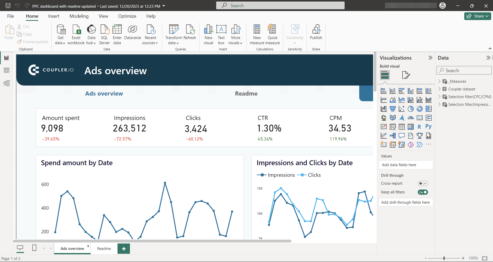
Currently, Coupler.io provides built-in dashboards to visualize performance data from advertising platforms. So, users won’t need to create charts or graphs on their own. They only need to connect their data sources and watch how the data populates predesigned visual elements on the dashboard.
Coupler.io offers three built-in dashboards:
- Multi-channel PPC dashboard – A unified view of ad campaigns across platforms.
- Google Ads dashboard – Insights into Google Ads performance.
- Facebook Ads dashboard – A report to track Facebook ad campaigns and results.
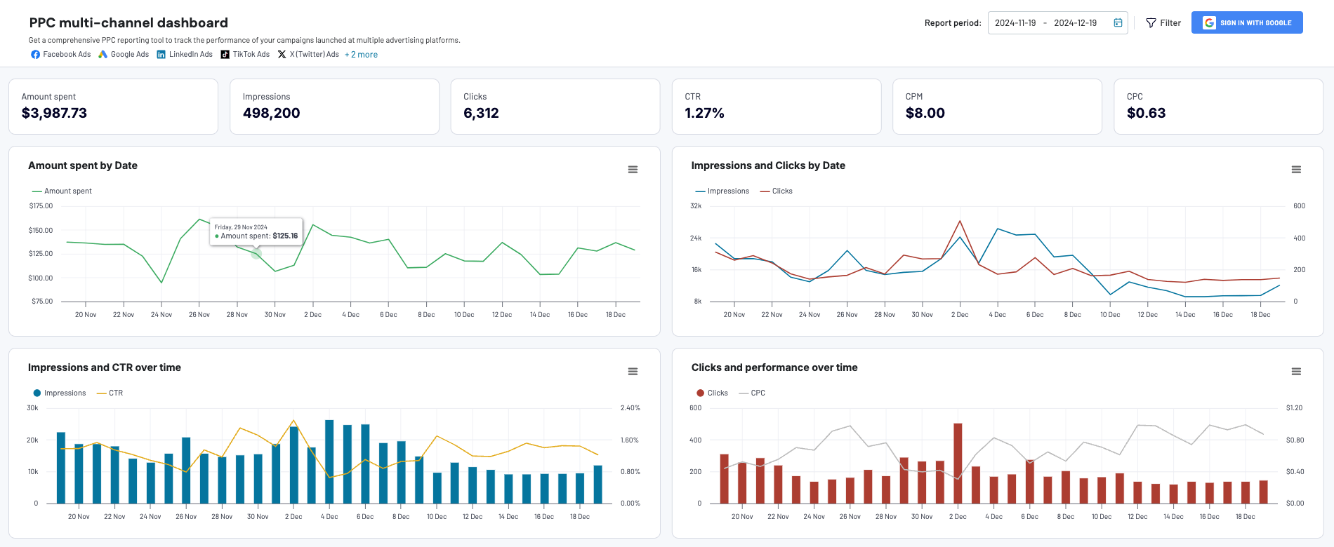
PPC multichannel dashboard
Get a comprehensive PPC reporting tool to track the performance of your campaigns launched at multiple advertising platforms.


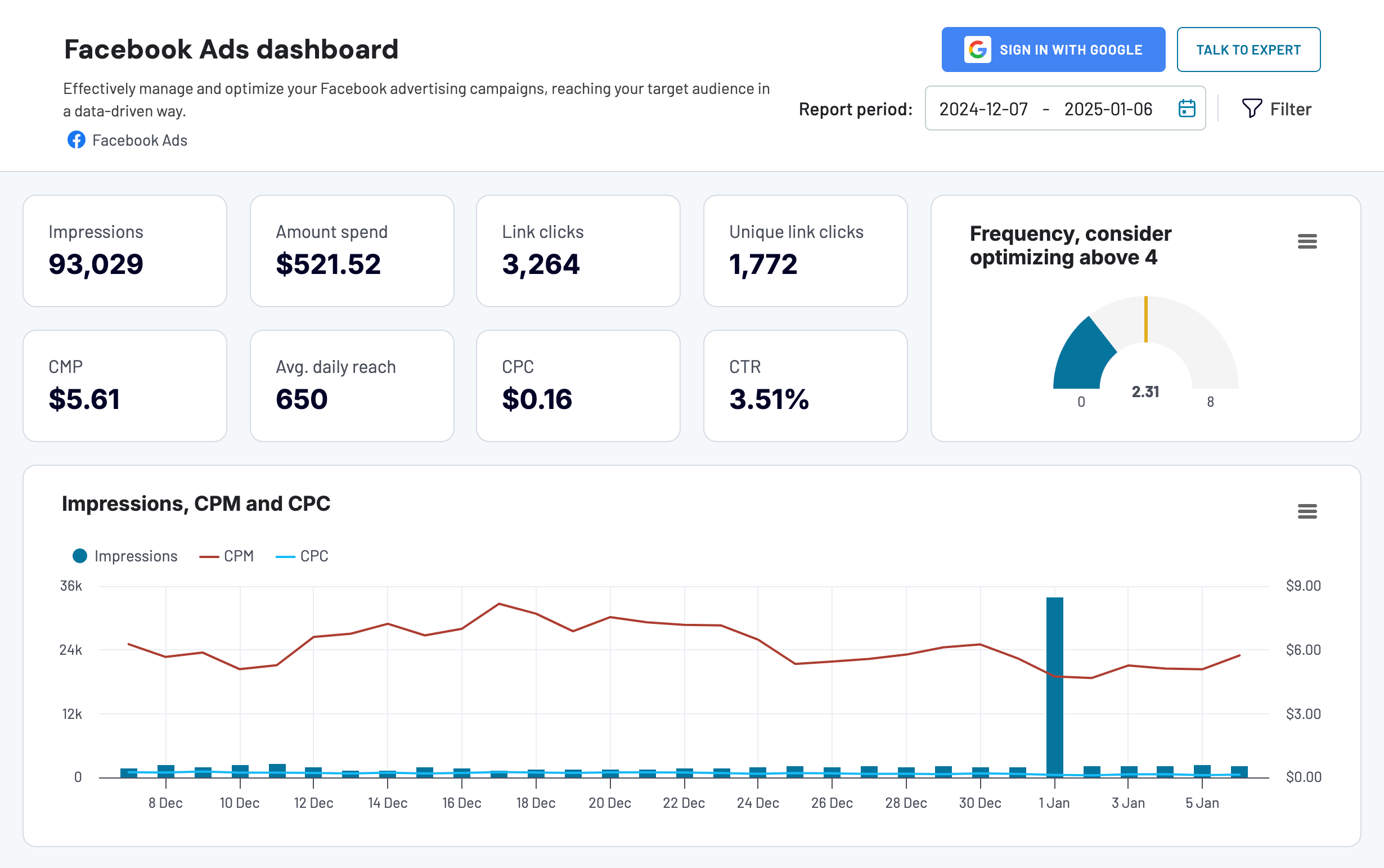
Facebook Ads dashboard
Effectively manage and optimize your Facebook advertising campaigns, reaching your target audience in a data-driven way.
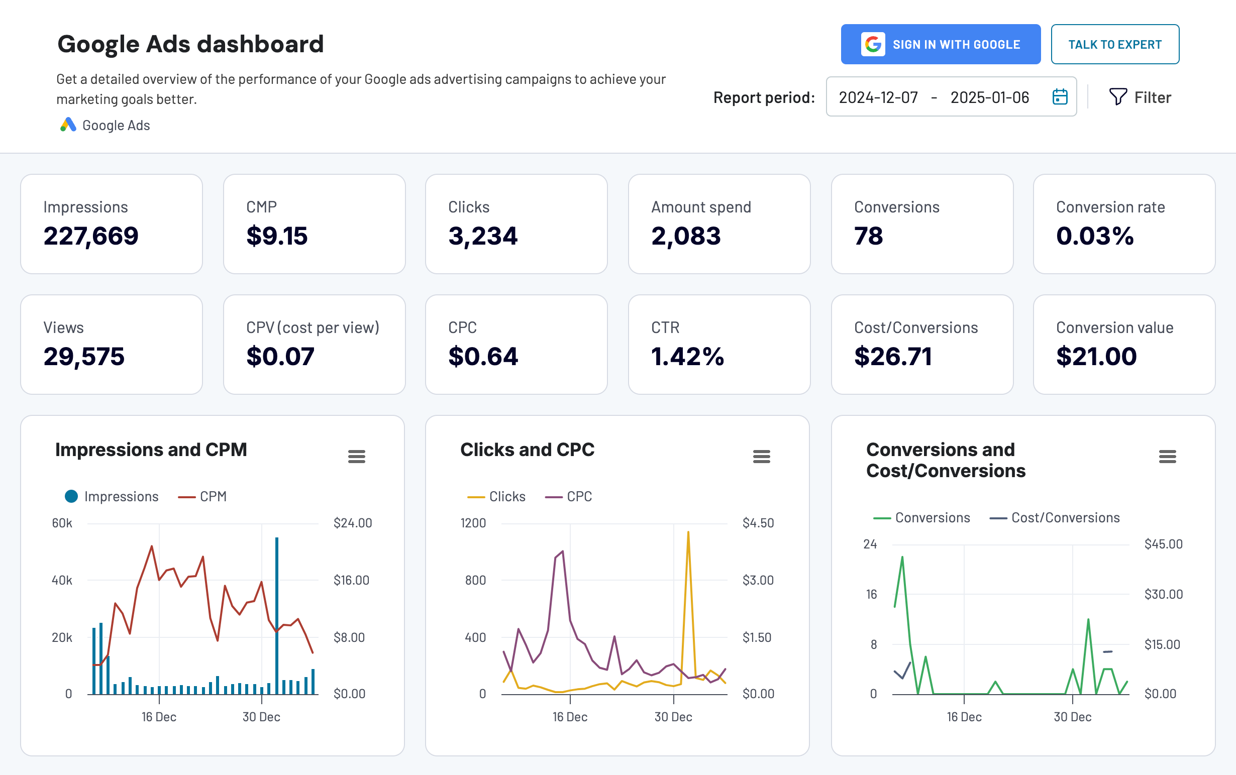
Google Ads dashboard
Get a detailed overview of the performance of your Google ads advertising campaigns to achieve your marketing goals better.
At the same time, the platform is actively working on launching more dashboards soon.
With this in mind, we can’t claim that Coupler.io is a Looker Studio competitor. However, PPC experts and marketers looking for a way to visualize their data can consider it a strong alternative to Looker Studio.
Key features of Coupler.io dashboards
- Built-in connector: You no longer need to manually connect data sources to external tools like spreadsheet apps or BI platforms. If you want to analyze Facebook Ads performance, the connector in the Coupler.io dashboard will automatically sync your data and ensure you always have fresh data leaving the platform.
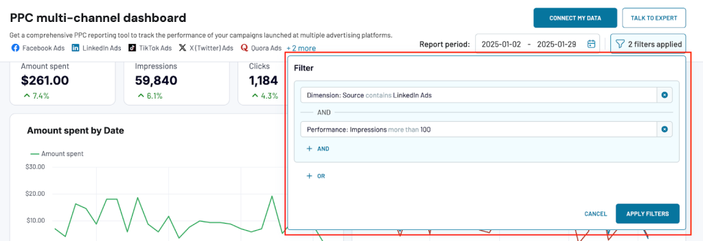
- Filters: Coupler.io dashboards offer customizable filters to focus on specific data points. For example, you can filter by data source (e.g., LinkedIn Ads) and apply performance criteria like showing only campaigns with impressions greater than 100. This helps users quickly identify trends and track key metrics without overwhelming data.
- Speed of load: Reports load quickly, even with large datasets or complex visualizations. In comparison, Looker Studio can experience slower load times when dealing with heavy data or multiple visualizations.
In addition to that, it’s worth mentioning that Coupler.io provides over 100 predesigned dashboard templates in Looker Studio, Power BI, Tableau, and Google Sheets. And they are not limited to PPC campaign performance tracking. You can find dashboards for marketing, web analytics, sales, finances, accounting, and more!
Coupler.io as a reporting automation platform
Now let’s see what Coupler.io can do as a reporting automation tool.
- Organizing data. You can sort, filter, or hide columns to focus on what’s important. You can also create custom columns using formulas. You can filter by a specific campaign name or hide less relevant metrics like ‘Impressions’ to focus on high-priority data like ‘clicks’ or ‘conversions.’
- Creating new columns. You can use formulas to create custom columns that let you calculate metrics like ROI or cost-per-lead directly in the dashboard. This will save you from manual calculations in spreadsheets.
- Combining data. You can merge information from different sources using shared columns or append data with similar structures. With shared columns like ‘campaign name’ or ‘region,’ you can join datasets seamlessly. If your data sources have a similar structure (e.g., weekly ad spend reports), you can append them to create a consolidated view of total ad spend and performance metrics.
- Summarize insights. With aggregate function, you can quickly calculate totals, averages, or other key metrics to see the bigger picture. For example, you can evaluate the total cost of a campaign across platforms or calculate the average CPC for specific ads.
- Data refresh: Set up automatic data refreshes to keep your dashboards updated according to your schedule—whether weekly, daily, hourly, or even more frequently. For example, you can refresh ad performance data every morning to make decisions based on the latest numbers.
Pricing
Coupler.io offers flexible subscription plans, starting with a free 7-day trial on the Team plan:
- Free: 1 user, 1 data connection, 100 rows per run, manual data refresh.
- Personal: $24/month, 1 user, 5 connections, unlimited rows per run (1,000 rows for high-volume sources), daily refresh.
- Professional: $49/month, 5 users, 20 connections, unlimited rows per run (10,000 rows for high-volume sources), daily refresh.
- Team: $99/month, Unlimited users, 50 connections, unlimited rows per run (100,000 rows for high-volume sources), hourly refresh.
- Business: $249/month, Unlimited users, 250 connections, unlimited rows per run, 15-minute refresh.
Target audience
Coupler.io is suitable for PPC marketers and businesses who want to track and optimize their ad performance.
Pros and Cons
Pros
- Saves time. Ready-made dashboards eliminate the need to start from scratch, saving time on manual report creation. These templates provide instant insights, allowing you to focus on analysis and decision-making.
- Built-in dashboard templates. Coupler.io offers built-in dashboards, so you don’t need additional BI tools. Everything is available within the platform, simplifying your reporting workflow.
- User-friendly interface. The platform is intuitive and easy to use, even for non-technical users. Setting up dashboards is quick, with just a few clicks to connect your accounts.
- Free plan. The free plan lets you preview and test these dashboards with your data for free.
- Flexible pricing options. They cater to individuals, teams, and businesses of all sizes. You can choose a plan that suits your budget and needs as you grow.
Cons
Limited to PPC. The current built-in Coupler.io dashboards are focused on PPC reporting. They are useful to track performance in Google Ads, Facebook Ads, and multi-channel campaigns. For other use cases like social media analytics, e-commerce performance, or sales reporting, you’ll need to connect to Power BI or Looker Studio to build custom reports.
However, Coupler.io is actively developing additional dashboards to support broader reporting needs.
Power BI
Microsoft Power BI is a business intelligence software and a Looker Studio alternative. Power BI allows users to transform data formats into interactive dashboards and reports. Power BI suite includes Power BI Desktop, Power BI Service, and Power BI Mobile.
Key features
- Visualization. Offers a diverse range of visualization types for comprehensive data representation.
- Datasets. Utilizes collections of data that can be simple or complex, supporting filtering for focused analysis.
- Reports. Compiles visualizations into multi-page reports for detailed data storytelling.
- Dashboards. Single-page overviews with selected visuals to provide quick insights.
- Tiles. Interactive visual elements within dashboards, customizable in layout and size.
- Self-service Power Query. Enables efficient data transformation and integration.
- Integration with apps. Power BI can integrate seamlessly with many applications. This elevates its ability to consolidate data. In addition, when used with Coupler.io, the connection enhances Power BI connectivity with various platforms, enriching its data-gathering potential.
- Advanced data security. Offers robust mechanisms to ensure data protection and secure user sharing.
- Scalability. Capable of handling large datasets and real-time data processing, scaling with your business needs.
- Mobile accessibility. A mobile application provides on-the-go access to reports and insights.
You can learn more about features in our Power BI tutorial.
Pricing
- Desktop version: Free
- Pro version: $9.99 per user/month with a 60-day free trial
- Premium version: $20 per user/month with a 60-day free trial
- Organization licensing: Starting from $4,995 per month
Target audience
Enterprises deeply integrated with Microsoft’s ecosystem are the primary target audience. Data analysts, business intelligence professionals, and organizations use Power BI for advanced analytics, reporting capabilities, and seamless integration with Microsoft services.
Pros and cons
Pros
- Cost-effective. Free version available, with affordable plans for teams.
- User-friendly interface. Familiar with Excel-like tools for ease of use across skill levels.
- Regular updates. Continuous enhancements based on user feedback.
- Diverse data connectivity. Links to numerous data sources and online platforms.
- Excel export. Allows for further data analysis in Excel.
- Multi-device accessibility. Available on web, desktop, and mobile.
- Rich visualization toolkit. A wide array of dynamic visualization tools and widgets.
Cons
- Cluttered interface. May impede easy navigation through dashboards.
- Formula limitations. Complex calculations can be challenging to visualize.
- Data capacity limit. Free version is limited to approximately 2GB of data.
- Customization restrictions. Limited optimization options for visuals.
- Table connection inflexibility. Can be rigid when linking diverse data tables.
Supported by Coupler.io?
Yes, you can connect your data source to Power BI using Coupler.io, a reporting automation solution. Select your source application in the form below and click Proceed to set up the connection.
Tableau
Tableau is the best Looker Studio alternative regarding data visualization capabilities. The core idea behind the tool was to keep marketing, sales, and customer service specialists in mind and make BI functionality available for them. Nowadays, the platform has grown into a large enterprise solution used both by professional analysts as well as non-technical users.
Tableau is available in multiple variations, where Desktop and Cloud versions are the most popular. Thanks to its powerful data visualization capabilities, companies use the tool for KPI reporting and department performance metrics. You can also use Tableau in combination with other analytical tools for building complex data models.
Key features
- Advanced data visualization. A leader in data visualization with many charts, histograms, and dashboards.
- Integration capabilities. Connects with various data sources, including relational databases, data warehouses, cloud apps, and big data streams, among others. If that is not enough, with the help of Coupler.io, users can effortlessly connect Tableau to a broad range of data sources, cloud applications, and big data streams.
- Security. Implements advanced data protection and secure sharing mechanisms.
- Scalability. Manages large datasets and real-time big data streams effectively.
- Mobile accessibility. Offers a mobile application for accessing and sharing reports on smartphones.
- Extensive data connectivity. Links with Excel, SQL databases, Salesforce, and more for comprehensive data analysis.
- Intuitive interface. Features a robust drag-and-drop interface that simplifies the creation of visualizations.
- Salesforce ecosystem integration. Enhances analytics through its integration within the Salesforce ecosystem.
Pricing
The cost of Tableau depends on the number of users and their typology:
- Creator: $75 per user per month
- Explorer: $42 per user per month
- Viewer: $15 per user per month
The Creator user has the most powerful set of permissions as all the available features and functions included. The Explore type is similar but different in administrative and data preparation tasks. Explorers can connect to existing data sources and create new dashboards and reports. The Viewer user can only interact with already existing reports by observing them.
Target audience
Tableau is designed for data professionals — from analysts at small firms to large enterprises requiring comprehensive data visualization solutions. Learn more about the differences in audience targeting in our Power BI vs. Tableau comparison.
Pros and cons
Pros
- Adaptive mobile app. “Tableau Mobile” adapts reports for phone screens.
- Data handling. Manages large data volumes effectively.
- Customization. Offers customizable dashboards without extra cost for advanced visuals.
- Performance. Maintains speed with large data sets.
- OS compatibility. Functions well on various operating systems.
Cons
- Default visuals. Limited in number for new users without extra purchase.
- Data preparation. Requires external tools for data cleaning.
- Update frequency. Less frequent updates compared to competitors.
- Usability. Can be challenging for beginners to learn.
Supported by Coupler.io?
Yes, you can connect your data source to Tableau using Coupler.io to build interactive reports and dashboards. Select your source application in the form below and click Proceed to set up the connection.
Qlik
Qlik Sense is a cloud-based business intelligence platform designed to transform your business. Unlike others, Qlik Sense doesn’t use a standard query-based system as a Looker Studio alternative but relies on its associative analytics language.
Its power is augmented with embedded artificial intelligence algorithms, which help to find the best chart types and discover the meaning of your data. Qlik Sense is also adapted to work with large amounts of data by summarizing it and pinpointing outliers on powerful visual graphs.
Key features
- Personalized dashboards. Qlik Sense offers tailored dashboards that enable interactivity, utilizing data from diverse sources.
- Automated reporting. Qlik Sense allows the creation of scheduled reports for your convenience.
- AI-powered insights. Embedded artificial intelligence simplifies data exploration and aids in identifying outliers effortlessly.
- Predictive analysis. Leveraging machine learning models, Qlik Sense enhances its analytical capabilities, generating intelligent predictions from your data.
- Seamless integrations. Qlik Sense directly connects to various data sources, and for a more streamlined process, consider Coupler.io, a tool that automates data import from your preferred applications into Qlik Sense regularly.
Pricing
Qlik Sense offers three main pricing models:
- Standard: $20 per user per month (10 users minimum) and up to 50Gb of annual data capacity for analysis.
- Premium: Starting from $2700 per month with 10 users and 50Gb for analysis capacity included along with embedded AI and ML, automated report compilation, and many other features.
- Enterprise: Includes an unlimited number of users and data analysis capacity.
Target audience
Companies in the IT and Finance sectors, SMEs with fewer than 200 employees, and medium to large businesses seeking adaptable analytics solutions all benefit from our services.
Pros and cons
Pros
- Affordable price point. Reasonably priced with a cost-effective plan for small teams.
- Free trial. Generous 30-day trial period.
- Data literacy. User-friendly for varying skill levels.
- Device compatibility. Works across multiple devices with dedicated mobile apps.
- Collaboration features. A centralized hub for sharing and teamwork.
- Custom app development. Self-service creation tools for non-technical users.
- Fast search. Interactive search with quick responses.
- Robust security. Flexible and comprehensive data protection.
- Deployment flexibility. Offers cloud, on-premise, and hybrid deployment options.
Cons
- Performance with large data. Can slow down with big datasets.
- Cost for large teams. May be expensive for larger groups.
- Excel export limitations. Some aspects of reports do not transfer to Excel.
- Extra cost for add-ons. Additional features require separate purchases.
Supported by Coupler.io
Yes, you can connect your data source to Qlik using Coupler.io to create reports. Select your source application in the form below and click Proceed to set up the connection.
MicroStrategy
MicroStrategy is a versatile business intelligence platform offering robust analytics, security, and mobile functionality. Among alternatives to Looker Studio, It equips companies with the tools to analyze vast datasets for comprehensive business insights, supporting decision-making with real-time data from various business areas like sales and inventory.
The platform’s mobile capabilities allow for deploying multifunctional apps, enhancing data access. As both a cloud service and an on-premise solution, MicroStrategy enables the swift development of enterprise-grade BI, mobile, and social applications.
Key features
- HyperIntelligence. Zero-click insights directly in business applications.
- Visualizations. Extensive charts and graphs for data interpretation.
- Dashboards. Customizable, real-time analytics accessible across devices.
- Heterogeneous data access. Broad connectivity with various data sources.
Pricing
- License range: $600 to $5,000 per user for on-premise access.
- Cloud discount: Approximately one-third of the cost of on-premise solutions.
- Factors: Pricing varies based on access type and specific use cases.
Target audience
Aimed at large-scale enterprises requiring comprehensive marketing BI solutions and advanced data analytics capabilities. Designed for big companies that need thorough business intelligence tools and advanced data analysis features.
Pros and cons
Pros
- Robust enterprise features. High scalability and security for large organizations.
- Comprehensive mobile BI. Superior mobile reporting and analytics.
- Advanced analytics. Integration with advanced tools for in-depth data analysis.
- HyperCards. Information-rich applications for enhanced data accessibility.
Cons
- Learning curve. Requires training for full proficiency.
- Cost. Higher price point compared to some alternatives.
- Interface. May be less intuitive than other BI platforms.
- Deployment time. Extended setup duration for large deployments.
Supported by Coupler.io?
No
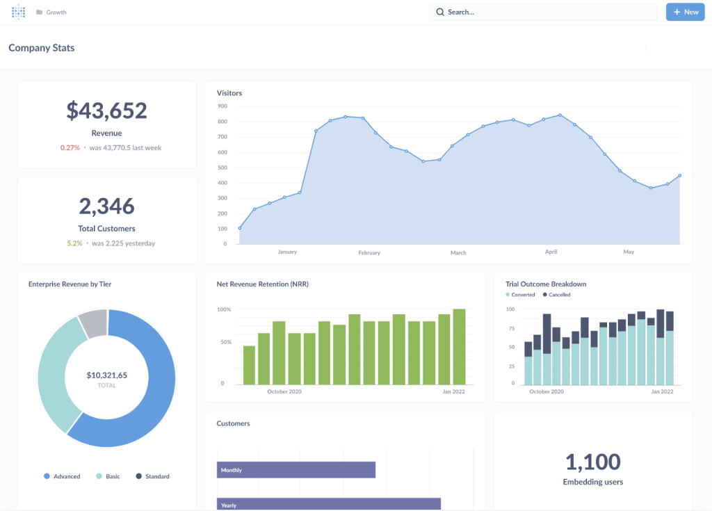
Domo
Domo is a fully cloud-based solution for business intelligence, analytics, and data visualization, having a top spot among alternatives to Looker Studio. It empowers organizations to collect data from both cloud applications and on-premises legacy systems, transforming this data into actionable insights.
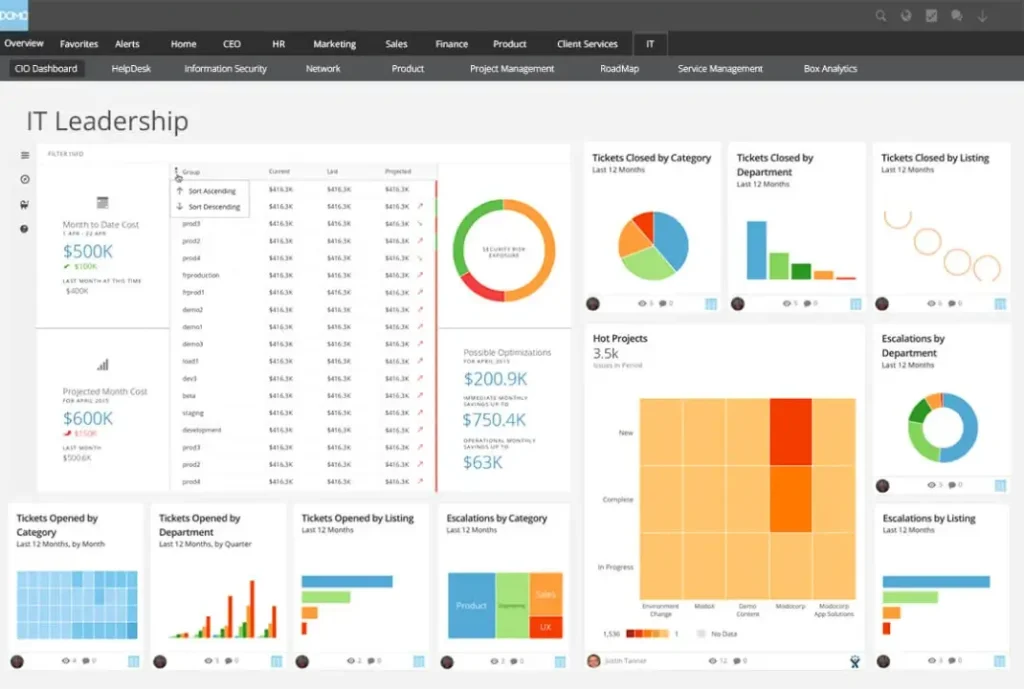
What sets Domo apart from other BI and data visualization tools is its exceptional level of customization when crafting visual graphs and charts. Additionally, users can integrate artificial intelligence and machine learning functionalities for predictive analysis based on the data at hand.
Key features
- Powerful visualization palette. Choose among the 150+ data chart types for data visualizations.
- Simple interface. Domo uses drag-and-drop functionality for quick operations with data sets.
- Cloud infrastructure. Domo uses cloud-native infrastructure with MPP (massively parallel processing), perfect for working with large data sets.
- Drill-down functionality. Users can easily define a drill path without coding and perform data discovery with slicing/dicing operations.
- AI-powered insights. Integrated AI algorithms and ML models ensure advanced analytics, which allows users to obtain valuable insights into their data and make informed decisions.
- Alerts. Set notifications in your workspace once any change to your data occurs.
Pricing
Dome comes with several distinct pricing packages:
- Free Usage Tier: Up to 300 credits per month at no cost.
- Standard Package: Starting from $300 per month.
- Custom Solutions: Tailored pricing for high-volume and large user base organizations.
- Cloud-Based Model: Pay-as-you-go pricing structure for Domo’s services.
Target audience
Domo can benefit from many different roles within a company, from executives to operations teams. Companies can use the tool to gain visibility into data across channels. The tool helps prove ROI and informs marketing, finance, and sales decisions. Domo also helps companies deliver insights faster and scale their BI operations.
Pros and cons
Pros
- Real-time BI & analytics. Dashboards and AI-driven data science features.
- Data integration. No-SQL ETL for easy data pipeline management.
- App creation. Low-code to pro-code app development with automation.
- Data governance. Full control with tracking changes for security and quality.
Cons
- Learning curve. The platform may be complex for non-technical individuals.
- SQL knowledge. Some features could necessitate understanding SQL.
Supported by Coupler.io?
No
Metabase
Metabase is an open-source solution that helps teams explore and visualize data. It’s easy to use, works with SQL, and offers both self-hosting and managed cloud options, making it a good alternative to Looker Studio.
Key features
- User-friendly interface. You can create charts and dashboards without knowing SQL, though advanced users can use the SQL editor for complex queries.
- Self-service analytics. Teams can explore data, set alerts for key metrics, and download reports, all without technical expertise.
- Embedded analytics. Dashboards and charts can be embedded into other tools or apps for seamless integration.
Pricing
- Open source: This self-hosted solution is free to use with community support and unlimited queries, charts, and dashboards.
- Starter plan: $85/month + $5/user. Includes managed cloud hosting, automatic updates, and 3-day email support.
- Pro plan: $500/month + $10/user. Adds SSO, granular permissions, and self-hosting options.
- Enterprise plan: This plan starts at $15,000/year and offers priority support, a dedicated success engineer, and advanced services.
Target audience
Metabase is best for teams and startups that need a simple, open-source solution for business analytics. It works well for non-technical users and advanced teams who want flexibility and control.
Pros and Cons
Pros
- Free and Customizable. The open-source version is free, and you can customize it to fit your needs.
- Easy to Use. The interface is simple, making it accessible for beginners while still powerful enough for advanced users.
- Flexible Hosting. You can self-host for more control or use the cloud option for convenience.
Cons
- Fewer Advanced Features. It doesn’t have as many advanced options as some enterprise tools.
- Scalability. Large organizations may face performance issues with bigger datasets.
Supported by Coupler.io?
No
Apache Superset
Apache Superset is also an open-source business intelligence tool that enables users to explore and visualize data through a modern and user-friendly interface. It offers a comprehensive library of visualizations and supports SQL-based data exploration.
Key features
- Intuitive interface. Superset provides both a no-code visualization builder and a powerful SQL editor so that users with different technical expertise can use the platform.
- Extensive visualization options. With over 40 pre-installed visualization types, users can create a wide range of charts and dashboards to suit their analytical needs.
- SQL-based exploration: Advanced users can leverage the web-based SQL editor for complex querying and in-depth data analysis.
Pricing
As an open-source platform, Apache Superset is free to use.
Target audience
Apache Superset is for technical teams and organizations looking for a customizable and open-source BI solution. It is well-suited for users comfortable with SQL and managing self-hosted applications.
Pros and Cons
Pros
- Cost-effective. Being open-source, Superset eliminates licensing fees, reducing overall BI expenses.
- Customizable. Users have the flexibility to modify and extend the platform to meet specific requirements.
- Robust visualization capabilities. The extensive library of visualization types allows for diverse and detailed data representation.
Cons
- Technical expertise required. Initial setup and ongoing maintenance can be complex, requiring a certain level of technical skill.
- Limited support. As an open-source project, official support options are limited, potentially leading to challenges in troubleshooting and customization.
- Performance Considerations. Handling large datasets may require additional optimization to maintain responsiveness and efficiency.
Supported by Coupler.io?
No
Sisense
Sisense is a business intelligence platform built to provide advanced analytics and AI-powered insights. It is known for its ability to handle large datasets and is commonly used by businesses integrating data-driven decision-making into their operations.
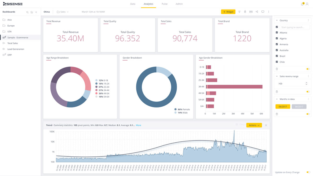
Key features
- Embedded analytics. Allows businesses to embed dashboards directly into their applications or workflows.
- AI-Powered insights. Automates the discovery of trends and patterns in data, making analysis faster and smarter.
- Flexible data models. Supports various data sources and lets users customize models to fit specific needs.
- Scalability. Handles large datasets efficiently, ensuring consistent performance.
- Interactive Dashboards. Provides visually rich dashboards that users can customize and share easily.
Pricing
Sisense offers custom pricing based on features, user types, and data volumes. Reports suggest an average cost of $137,000 per year or about $11,000 per month. You need to contact Sisense for exact pricing details.
Target audience
Sisense works best for organizations that need embedded analytics, especially those dealing with large and complex datasets.
Pros and Cons
Pros
- Customizable solutions. Offers flexibility to adapt analytics to specific business requirements.
- Improved decision-making. AI-driven insights help businesses make data-backed decisions faster.
- User accessibility. Embedded dashboards provide end-users with access to relevant data without switching tools.
- Data integration. Supports a wide range of data sources, allowing comprehensive data analysis.
- Reliable for large data. Performs well with big data, making it a dependable choice for high-volume operations.
Cons
- Steep learning curve. Advanced features can take time and training to master.
- Cost. Pricing can be high, making it less accessible for smaller businesses.
- Setup complexity. Requires technical expertise for installation and maintenance.
Supported by Coupler.io?
No
Which Looker Studio alternative is the right fit for you
Choosing the right Looker Studio alternative depends on your specific goals, technical skills, and budget. To make this decision easier, we created real-life scenarios where each tool is most useful. Whether you’re a startup looking for an affordable analytics solution or an enterprise that needs embedded dashboards, these examples will help you find the perfect fit.
Check out our blog post where we’ve compared Looker Studio vs Looker Studio Pro.
Coupler.io – Easy PPC reporting
Scenario: A marketing agency manages ad campaigns on platforms like Google Ads, Facebook Ads, LinkedIn Ads, and more. They need quick and clear PPC reports without spending time on manual data preparation and visualization.
Coupler.io offers built-in ready-made dashboards that consolidate data from single or multiple PPC channels into one view. Marketers can easily track key metrics like CTR and CPC without connecting to external BI tools. This helps to save time and focus on campaign strategy.
Not just limited to PPC reporting, Coupler.io automates data workflows and helps businesses create actionable, ready-to-use reports. With more dashboards on the way, it’s becoming an even more versatile tool.
Metabase – Affordable analytics for startups
Scenario: A small startup needs to track sales and user engagement data but wants to avoid expensive BI tools. Their technical team members are familiar with SQL and prefer open-source solutions.
Metabase is a good choice for them. They use the free open-source version for self-hosting and customize dashboards with SQL or a no-code query builder, ensuring flexibility and cost savings.
In addition to being an affordable solution for startups, Metabase provides powerful tools for self-service analytics. Its mix of SQL and no-code options makes it a solid choice for teams that want full control over their data.
Apache Superset – Building custom BI solutions
Scenario: A mid-sized company with a technical team wants a customizable BI tool to explore data and build detailed visualizations. They prefer open-source software and are comfortable managing self-hosted tools.
With Apache Superset, they get access to 40+ visualization types and a SQL editor for in-depth data analysis. Its no-code builder also helps business users create charts without relying entirely on the tech team.
Beyond its strength in building custom BI tools, Apache Superset supports extensive visualization options and SQL-based exploration while remaining cost-effective.
Sisense – Embedded analytics for enterprises
Scenario: A software company wants to integrate analytics directly into their SaaS product. They need a tool that delivers real-time data insights while handling large datasets efficiently.
Sisense enables embedded analytics, allowing the company to integrate interactive dashboards into their product. AI-powered insights make data analysis faster, improving the overall user experience.
Power BI: Enterprise-level analytics for Microsoft users
Scenario: A large company already using Microsoft 365 tools wants a BI solution that integrates seamlessly with their existing ecosystem.
Power BI is a natural choice, providing advanced reporting, secure data sharing, and easy integration with Excel and Teams. It’s affordable for smaller teams but also scales well for large enterprises.
While Power BI integrates seamlessly with Microsoft tools, it’s also adaptable for other businesses that need advanced analytics, real-time reporting, and interactive dashboards.
Tableau: Advanced visualizations for data analysts
Scenario: A retail company needs to analyze sales data across multiple locations. Their team includes analysts who need detailed dashboards to track KPIs and trends.
Tableau offers powerful visualization tools with a drag-and-drop interface, making it easy to create detailed dashboards. Its mobile app ensures decision-makers stay updated anywhere.
With its powerful visualization tools, Tableau not only caters to data analysts but also enables non-technical teams to extract insights effortlessly, thanks to its intuitive drag-and-drop interface.
Qlik Sense: Associative analytics for in-depth insights
Scenario: A financial services firm needs a tool to explore data intuitively and perform predictive analysis.
Qlik Sense uses associative analytics to connect data naturally, helping teams uncover insights that traditional systems might miss. Its AI-powered features also simplify predictive analysis for better decision-making.
While it excels in data exploration and predictive insights, it also supports seamless integrations, automated reporting, and AI-powered analytics for a more comprehensive BI solution.
MicroStrategy: Enterprise BI for large companies
Scenario: A global manufacturing company needs a BI platform to manage data across departments like sales, logistics, and production.
MicroStrategy provides scalable analytics with robust security. Features like HyperIntelligence deliver instant insights directly into business tools, helping decision-makers act faster.
The focus of MicroStrategy on large-scale enterprises is undeniable, but its real-time insights and advanced mobile functionality make it a valuable tool for agile decision-making across various industries.
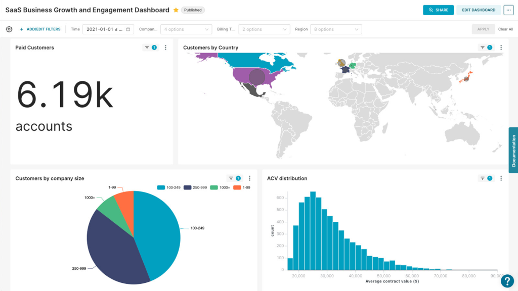
Domo: Cloud-based BI for growing businesses
Scenario: A growing e-commerce company wants a cloud-based tool to centralize data from sales, marketing, and inventory.
Domo connects data from multiple sources into one platform. Its drag-and-drop interface makes it easy for non-technical users to create reports, while AI-powered insights help forecast trends.
This BI tool also centralizes data across teams and adds value with AI-driven forecasts and powerful visualization options. It’s a great choice for growing businesses looking to scale their BI operations.
Criteria for selecting alternatives to Looker Studio
Choosing the right alternative to Looker Studio can feel overwhelming, but breaking it down into key factors makes the process easier. Here’s what you should focus on to find a tool that meets your data visualization and analytics needs:
1. Compatible with data sources
Ask yourself – Does the platform connect to the data sources I use?
Look for tools that easily integrate with your existing data ecosystem, including cloud apps, databases, and spreadsheets. For example, if you work with Salesforce, Google Analytics, or SQL databases, make sure the Looker Studio alternative supports direct connections to these sources. This eliminates manual data migration, saving you time and effort while enabling richer insights.
Tip: Prioritize platforms with built-in connectors for the tools you rely on daily.
2. User interface and ease of use
Ask yourself – Is the platform intuitive enough for my team?
An easy-to-navigate interface means less training and faster adoption for your team. Look for drag-and-drop builders, a wide variety of chart options, and the ability to create dashboards without technical expertise. Advanced users may also need customization options, like embedding code or tailoring dashboards to specific requirements.
Tip: Test the platform’s demo or trial version to ensure it matches your team’s technical comfort level.
3. Advanced analytical features
Ask yourself – Do I need features like predictive analytics or real-time data processing?
If your business requires more than basic visualizations, choose a platform with advanced analytical tools. Predictive analytics, machine learning, and real-time data processing can provide deeper insights, that help you make proactive decisions instead of reactive ones.
Tip: Identify whether your use case demands these advanced features or if basic analytics will suffice.
4. Scalability and flexibility
Ask yourself – Can the platform grow with my business?
As your data needs evolve, the platform should scale without compromising performance. Check if the tool can handle larger datasets, support multiple users, and offer advanced features as your business expands.
Tip: Look for platforms with flexible deployment options (cloud or on-premises) and pricing tiers that align with your growth.
5. Cost-effectiveness
Ask yourself – Does the platform provide value for its cost?
Compare features and pricing across different tools to ensure you’re getting the best value. Some platforms offer free or low-cost entry plans, while others cater to enterprise needs with more expensive but comprehensive packages.
Tip: Choose a platform that fits your budget now but offers options to upgrade as your needs grow.
Finally,
- List your must-haves: Identify the essential features you need, like specific integrations, ease of use, or advanced analytics.
- Utilize free trial and free versions: Test-drive platforms that offer free trials to see how they handle your real-world data.
- Consider team feedback: Involve your team in testing to ensure the platform suits both technical and non-technical users.
- Plan for growth: Think long-term. Evaluate if the tool fit your needs today and also in the future.
This comprehensive approach guarantees the identification of a Looker Studio alternative that matches and potentially surpasses your analytical, operational, and financial requirements.
Making sure Looker Studio alternatives meet your needs
Companies of all sizes, from small businesses to large enterprises, recognize the significance of implementing BI tools. These tools offer invaluable insights into current business performance. They serve as the compass for data-driven decision-making in the future. In our Looker Studio tutorial, we explain why this Google’s product stands out as a powerful BI tool. However, it’s crucial to acknowledge that it may not be the ideal fit for every organization.
We have provided an in-depth overview of five compelling Looker Studio alternatives that offer their unique set of features and advantages.
For example, Power BI caters to those deeply integrated with the Microsoft ecosystem. Tableau boasts a diverse range of visualization options. Qlik Sense leverages AI for intuitive data exploration. MicroStrategy provides robust analytics and mobile functionality. And Domo offers a fully cloud-based solution with advanced customization capabilities.
Yet, in the quest for optimal data visualization solutions, it’s vital to acknowledge the importance of data integration. While most BI tools offer their mechanisms for data ingestion, they may not always cover all the necessary data sources for a comprehensive analysis. Coupler.io seamlessly connects multiple sources and automates data transfer to most BI tools in this exploration, enhancing your data analysis capabilities.
Automate data export with Coupler.io
Get started for free


