A solid dashboard has one major mission – turn raw data into insights. The raw data for the dashboard can come from different sources, be it GA4, Facebook Ads, Google Search Console, etc. However, on the dashboard, this data is transformed into charts and tables that facilitate informed decision-making.
We’ve collected over 40 best Looker Studio dashboard examples designed by Coupler.io and other analytics solutions. Since this number is pretty big, we’ve grouped the dashboard into 4 areas:
- PPC & marketing
- CRM & sales
- Ecommerce
- Project management
PPC and marketing examples of a Looker Studio dashboard
#1. PPC multi-channel report template by Coupler.io – for Facebook Ads, Google Ads, and other ad platforms
This Looker Studio dashboard template by Coupler.io is called the PPC multi-channel dashboard. Multi-channel means that you can monitor and evaluate the key performance indicators of paid media campaigns for different advertising platforms. Currently, it supports the following ad sources:
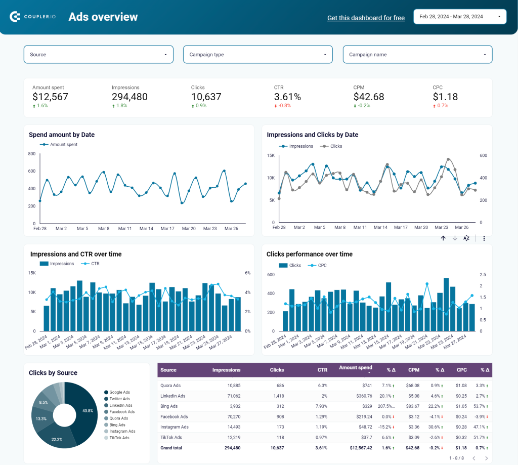
This dashboard is a perfect solution for marketers and PPC experts to monitor their ad campaign performance, compare channel metrics, and keep an eye on KPIs. You won’t have to jump from one ad campaign manager to another. The information from all your sources will be by hand in one place.
Dashboard metrics:
- Amount spent
- Impressions
- Clicks
- Click-through rate (CTR)
- Cost per click (CPC)
- Cost per thousand impressions (CPM), etc.
#2. Looker Studio template for a Google Ads dashboard by Coupler.io
This Google Ads dashboard within Looker Studio by Coupler.io provides a comprehensive and detailed analysis of your Google Ads advertising campaigns. You can gain a deeper understanding of your campaigns’ effectiveness, with access to a wealth of data and metrics, and align them with your marketing goals.
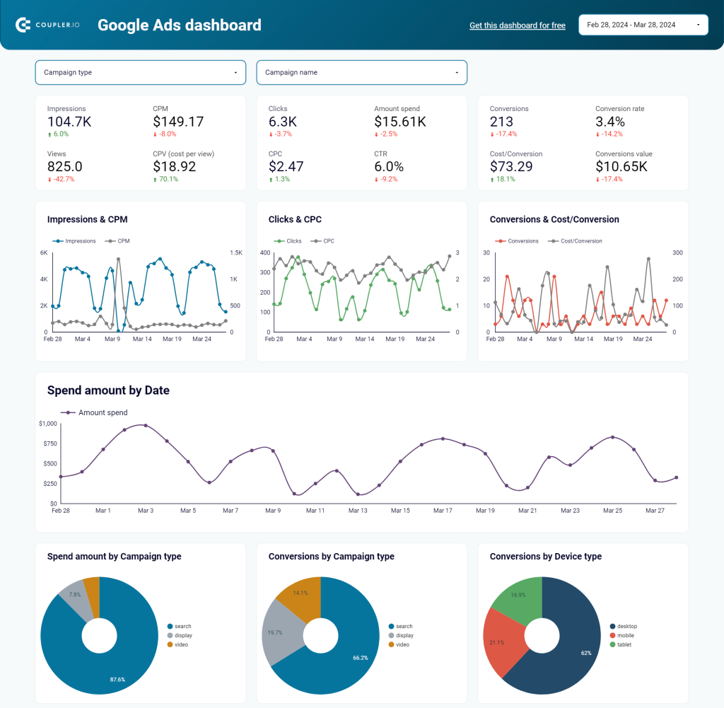
You should choose this dashboard out of other Google Ads Looker Studio templates to segment and analyze your campaigns based on various dimensions, ad groups, campaigns, and time. This level of granularity provides valuable insights into the performance of different elements within your campaigns, helping you identify areas for improvement.
Dashboard metrics:
- Impressions
- Clicks
- CTR
- Average Cost-per-Click
- Conversions
- Cost per conversion
- Cost per thousand impressions (CPM)
- And others
#3. Facebook Ads dashboard by Coupler.io
Running advertising campaigns on Google is good, but it’s even better to cover another channel – Facebook. For analysis of your ad campaign performance, Coupler.io prepared a Facebook Ads dashboard. It should help you better understand the efficiency of your campaigns and track essential metrics.
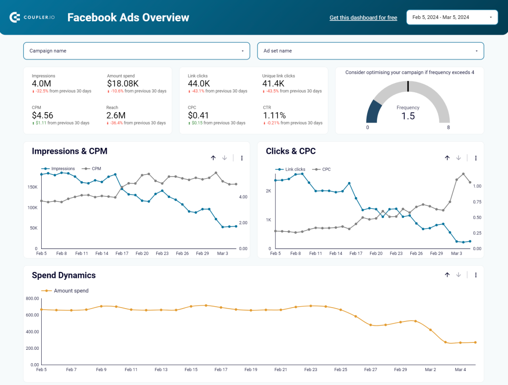
The dashboard is easily connected to your Facebook Ads account, so you won’t have to manually export and import the data. With a few clicks, the latest information is loaded to Looker Studio and your report is populated with records.
Dashboard metrics:
- Impressions
- Link clicks
- CPM
- CPC
- CTR
- Frequency
- Reach
- Amount spend
- Unique link clicks
Check out other Looker Studio Facebook Ads templates and ready-to-go dashboards for other advertising platforms by Coupler.io.
#4. LinkedIn Ads dashboard by Coupler.io
LinkedIn Ads dashboard will be a perfect match for your reports on Facebook and Google advertising campaigns. With all these templates at hand, you’ll be able to monitor your marketing activities throughout these PPC channels.
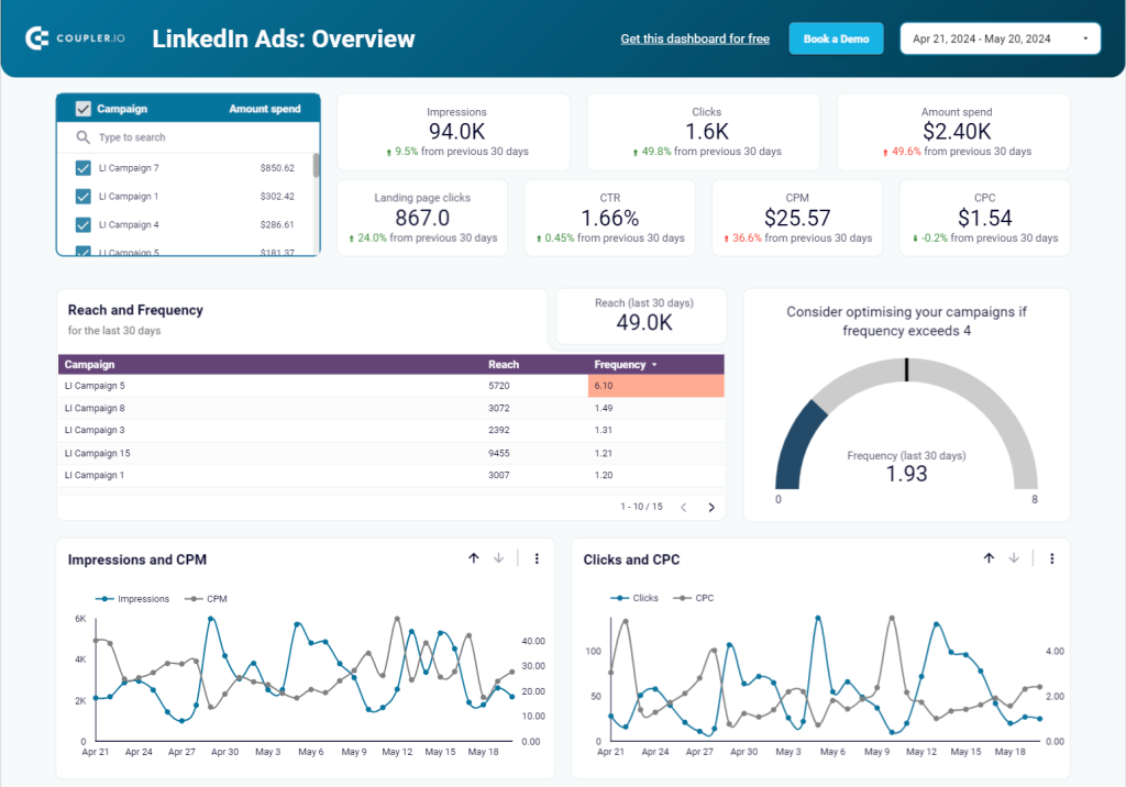
To connect this Looker Studio dashboard template to your LinkedIn Ads account, you only need to make a few clicks. No technical knowledge or any coding is required. The process is fast and guided by the wizard with detailed instructions. You will enjoy your LinkedIn Ads analytics on this interactive report.
Dashboard metrics:
- Impressions
- CPM
- Amount spend
- Clicks
- CPC
- CTR
- Conversions
- Conversion rate
- Lead form opens
- Leads
- And others
#5. Facebook Ads & Brand Awareness dashboard by Coupler.io
If you run Facebook Ads campaigns to increase brand awareness, this dashboard must be in your toolbox. It lets you monitor the relationship between your ad impressions and branded keyword searches.

The dashboard collects data from Facebook Ads and Google Search Console using the built-in Looker Studio connector by Coupler.io. As a result, you can easily track the impact of all your campaigns or filter by specific ones.
This template provides a quick summary of important metrics, including impressions, ad clicks, branded clicks, and more.
Dashboard metrics:
- Impressions
- Ads clicks
- Ads spend
- Branded impressions
- Branded clicks
#6. Instagram business dashboard for SMM reporting by Coupler.io
Here is one of the solid social media dashboard examples by Coupler.io. This template is designed for the Instagram social media platform. It allows you to get an overview of your Instagram posts’ performance in one place. This Looker Studio dashboard works well for analytics and reporting since you can easily share insights with the stakeholders.
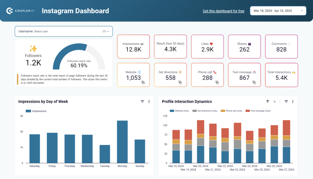
You can start using the Instagram dashboard right away by simply connecting your Instagram account using the Coupler.io partner connector. It will populate the dashboard with your data and will refresh it every day. If you want to choose another refresh interval, feel free to change the schedule in the settings.
Dashboard metrics:
- Followers
- Impressions
- Reach
- Likes
- Shares
- Comments
- Website clicks
- Get direction clicks
- Phone call clicks
- Text message clicks
- Total number of interactions
#7. YouTube channel overview dashboard by Coupler.io
The YouTube dashboard provides insightful information about video performance, viewer engagement, and content strategy. With an intuitive interface and user-friendly design, this Looker Studio YouTube template lets users track critical metrics and quickly understand how viewers discover and interact with their videos.
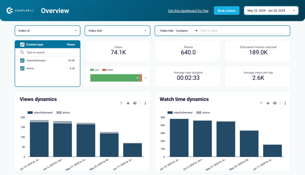
YouTube channel overview lets users look at essential aspects such as audience demographics, playback locations, channel performance, and subscriber growth in one go. YouTubers can identify trends, assess content performance, and refine their strategy by analyzing these metrics.
Dashboard metrics:
- Views
- Likes/dislikes
- Shares
- Average view duration
- Average views per day
- Subscribers gained/lost, etc.
#8. TikTok analytics dashboard by Coupler.io
This template is one of Coupler.io’s influencer dashboards that lets you monitor and analyze organic content performance on TikTok. It provides an overview of likes, new followers, views, and other essential metrics. The dashboard also shows your audience composition by gender and top countries by views.
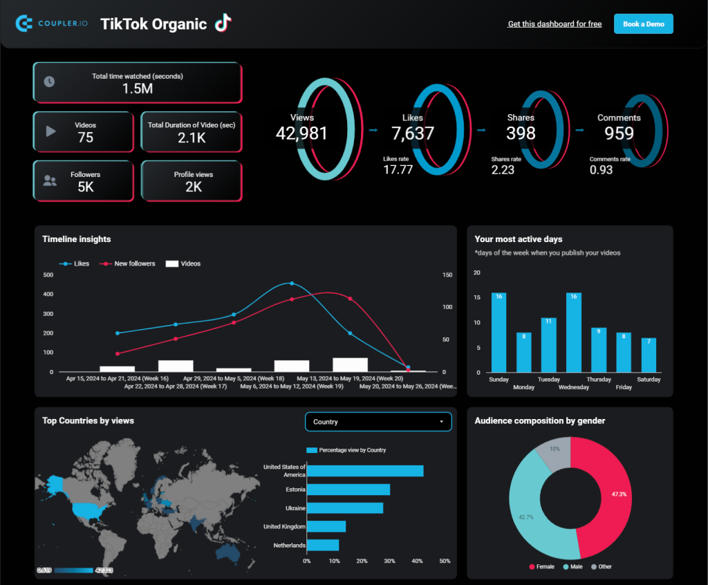
You will also get a breakdown of your video performance by views, likes, shares, and comments. To start using the dashboard template, you only need to connect it to your TikTok account using the built-in Coupler.io connector.
Dashboard metrics:
- Total time watched
- Videos
- Total duration of videos
- Followers
- Profile views
- Views
- Likes
- Shares
- Comments
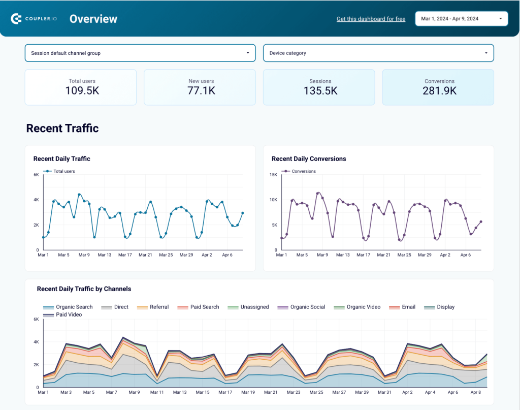
#9. GA4 dashboard for multiple properties by Coupler.io
This report is a must if you have several websites and want to analyze their performance together. Natively, Google Analytics 4 only shows you one website (property) at a time. But it’s pretty inconvenient if you have several products or projects and need to estimate total traffic or analyze channel performance across all your websites.
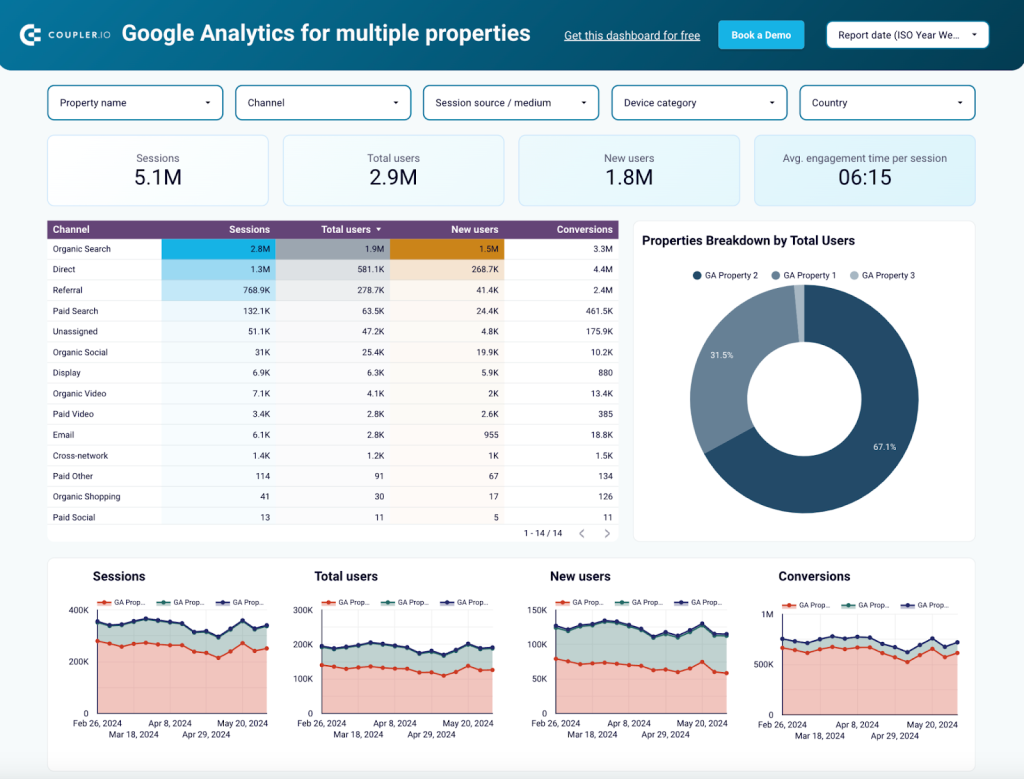
This dashboard solves this problem as it shows you data from all your websites on one page. You can compare results for different properties, analyze engagement trends, estimate total awareness, and much more. It also allows you to explore results by country and use various filters to analyze your data. Try the interactive version to see how it works in practice.
Dashboard metrics:
- New users
- Total users
- Sessions
- Traffic by source
- Average engagement time
- Traffic by source
- Traffic by channel
SEO and web analytics dashboards
#10. Web analytics dashboard by Coupler.io
The web analytics dashboard provides insights into how users find your website and what they do when they get there.
The source for these insights is Google Analytics. The dashboard collects data automatically thanks to the built-in connector by Coupler.io. As a result, you can better understand how people interact with your website and make changes to improve it.
With our web analytics dashboard, you no longer need to generate reports in GA4. You already have access to this data on your dashboard, which refreshes the information automatically.
Dashboard metrics:
- Indexed pages
- Pages with clicks
- Impressions
- Clicks, CTR
- Average position
- Click dynamics
- Best and worst performing URLs, etc.
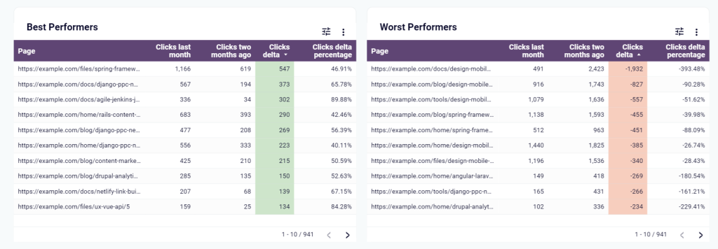
#11. SEO dashboard for Google Search Console by Coupler.io
Now, let’s move to the next dashboard in our collection of Looker Studio templates. If you use Google Search Console on a daily basis then this SEO dashboard by Coupler.io should be on your preference list. It’s equipped with a built-in GSC connector that will refresh data on your dashboard as frequently as you want (up to every 15 minutes).
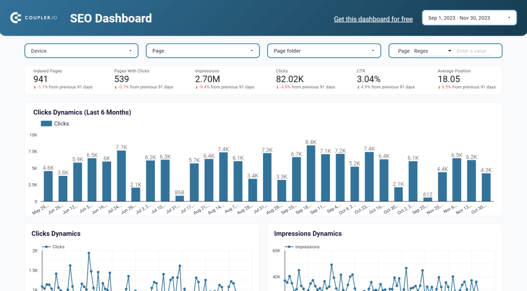
The SEO dashboard template allows you to track the number of indexed pages, pages with clicks, impressions, and other valuable metrics. It also displays the best and worst performing URLs – this is the information that you won’t find in the very Google Search Console as is. Check out the dashboard and explore other actionable charts and graphs on it.
Dashboard metrics:
- Indexed pages
- Pages with clicks
- Impressions
- Clicks, CTR
- Average position
- Click dynamics
- Best and worst performing URLs, etc.
#12. Technical SEO dashboard by Coupler.io
This SEO dashboard allows you to assess your website’s health from a technical perspective. It automatically pulls data from Google Search Console and visualizes it in easy-to-read pie charts. Green sections indicate that everything is okay and there are no issues. Red wedges let you know there may be a problem that requires your attention.
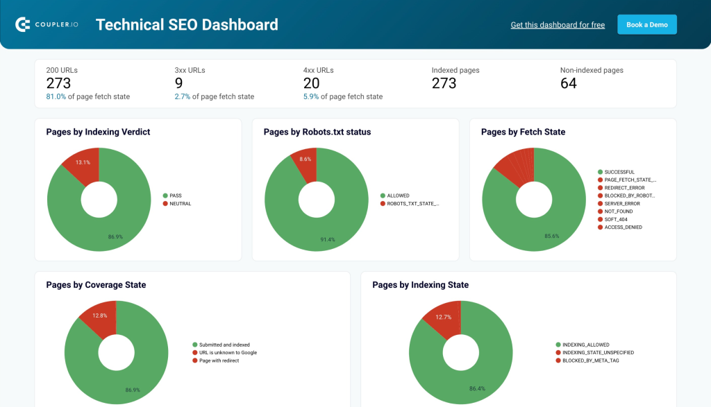
With this dashboard, it’s easy to identify pages blocked by Robots.txt or robot tags. You can also monitor page rendering status, track the list of submitted and un-indexed pages, check the AMP status, and more. Use this dashboard template to instantly audit your website, and then check this report on a weekly basis to stay in control of your website’s tech health.
Dashboard metrics
- Indexed pages
- Non-indexed pages
- Pages by fetch state
- Pages by Robots txt status
- Pages by indexing verdict
- AMP verdict
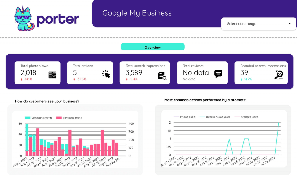
#13. Google Business Profile dashboard by Coupler.io
This dashboard simplifies Google Business Profile analytics by bringing all your location data into one central view in Looker Studio. It connects directly to your Google Business account to track how customers find and interact with your business on Google.
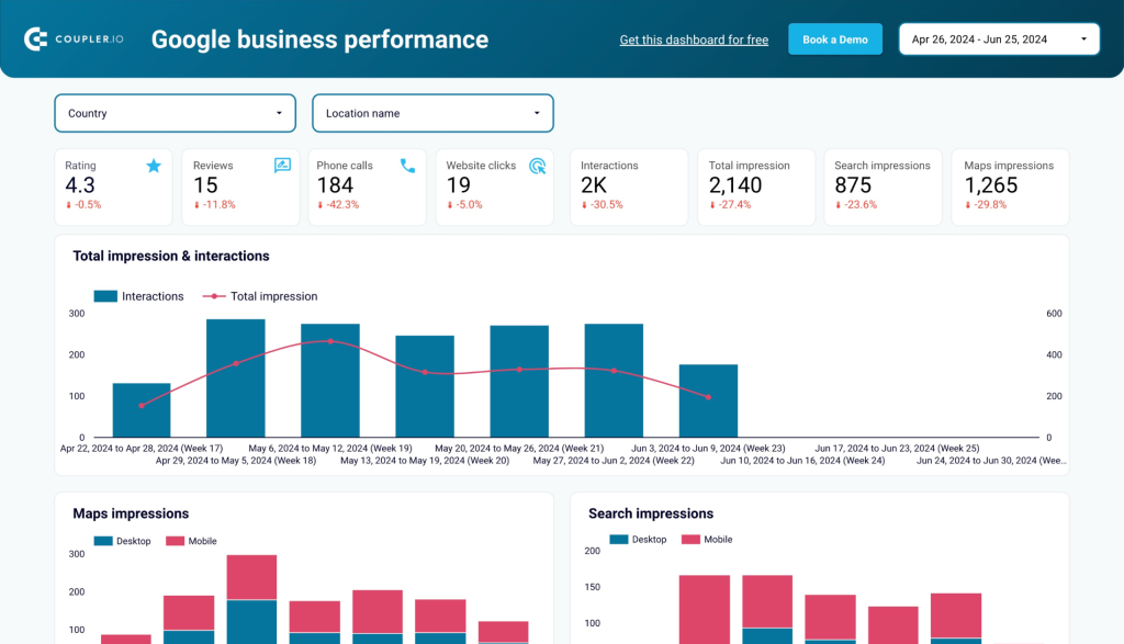
With this dashboard, you can monitor search queries, customer actions, and review performance across all your business locations. The built-in connector automatically refreshes your data, providing always up-to-date insights to optimize your local SEO strategy and improve customer engagement.
Dashboard metrics:
- Search impressions
- Total views (Search vs. Maps)
- Customer actions (calls, website visits, directions)
- Average rating
- New reviews
- Review response rate
- Popular times of visits
- Photo views
#14. Search types and appearance dashboard from GSC by Coupler.io
This SEO dashboard gives you deeper insights into your Google Search Console data by focusing on how your content performs across different search types and appearance features. With this Looker Studio template, SEO can specialists understand and optimize for specialized search results.
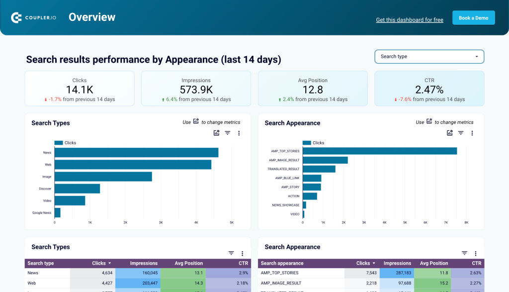
This dashboard collects data from Google Search Console using the built-in Coupler.io connector. It allows you to see performance differences between Web, Image, Video, and News search results, along with statistics for featured snippets, AMP pages, and other rich results.
Dashboard metrics:
- Impressions by search type
- Clicks by search type
- CTR comparison across types
- Position changes by type
- Featured snippet performance
- AMP metrics
- Rich results statistics
#15. Global SEO performance dashboard by Coupler.io
For businesses operating in multiple countries, this dashboard provides a clear picture of SEO performance across different geographic markets. It pulls data from Google Search Console to help you analyze and compare organic search metrics by country and language.
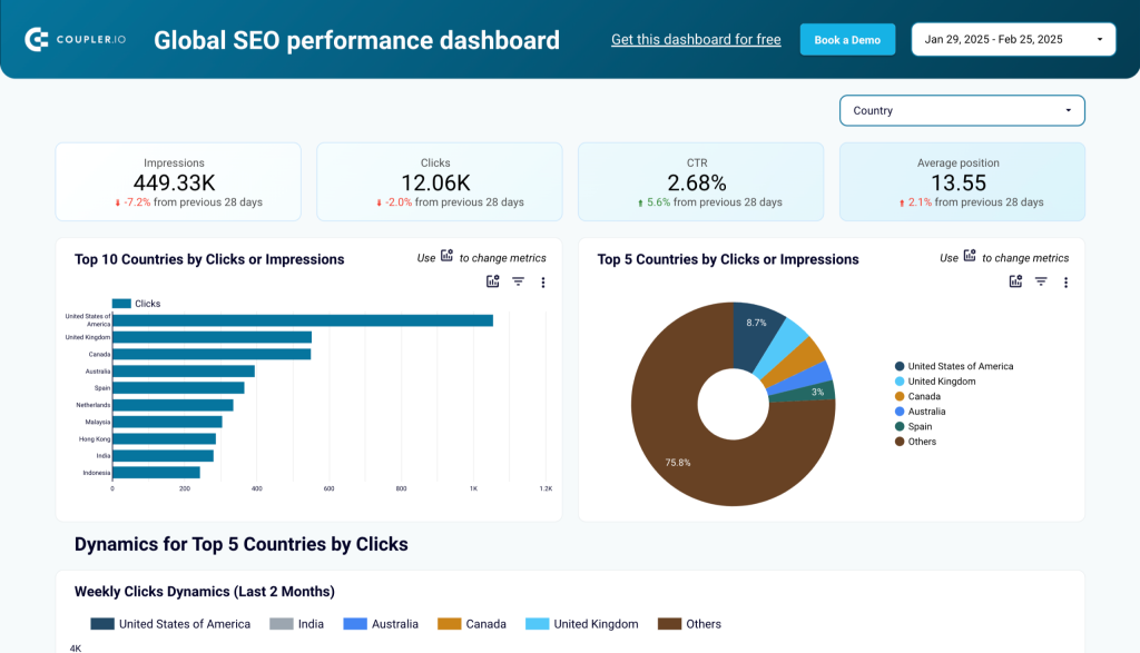
The dashboard presents country-specific data for clicks, impressions, CTR, and position, allowing you to identify your strongest markets and opportunities for growth. You can compare performance across regions and identify content that needs localization improvements.
Dashboard metrics:
- Performance by country
- Language-specific metrics
- Regional CTR comparison
- Position tracking by market
- Country-specific growth trends
- Top-performing pages by region
- International traffic sources
#16. GA4 Audience Experience Report by ByMarketers
The GA4 report comprehensively overviews audience demographics, category affinity, geo-location, device brands, and user engagement. This dashboard also offers a profound understanding of the age and gender distribution of the audience, enabling users to understand the target demographic better.
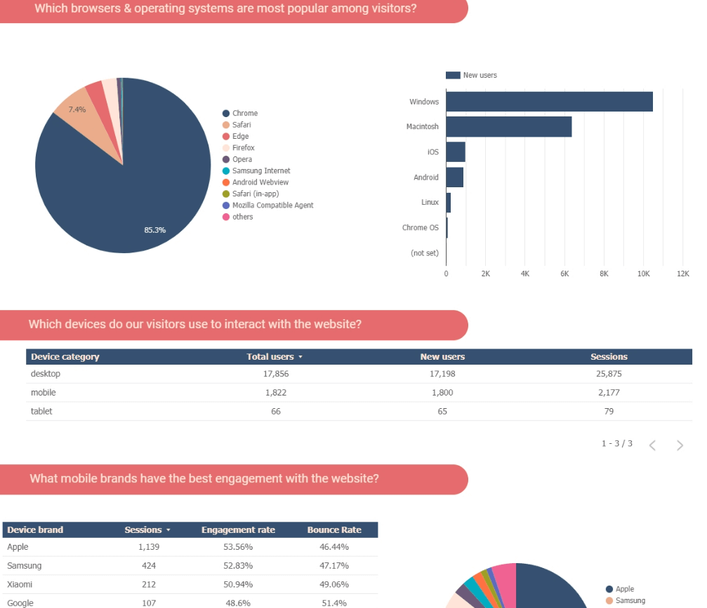
Furthermore, it allows the analysis of category affinity, uncovering the interests and preferences of audience segments. User engagement metrics are another key aspect covered in this report.
Setting up and using this dashboard is extremely easy.
Dashboard metrics:
- Session duration
- Bounce rate
- Conversion rates
- Engagement rate
- And others
#17. Google Business Profile + GA4 + Google Search Console by Porter Metrics
This integrated website performance template combines key data from various platforms and analytics tools. The dashboard consists of three Google products that are key to marketing strategy and focused on analyzing organic results.
The Porter Metric’s template incorporates Google Analytics data and tracks sessions, page views, conversion rates, and user behavior. Through integration with Google Search Console, users can assess the website’s SEO. Google Business Profile metrics help to evaluate the impact of business on Google users.
Dashboard metrics:
- Total users
- Conversions
- Engagement rate
- Clicks
- Event performance
- Sessions
- Top landing pages
- Traffic sources
- Events per user
- New users
- Average position
- Click-through rate (CTR)
- Total photo views
- Total shares
- Total searches
- Reviews and ratings, etc.
#18. Complete website overview by Data Studio Guru
This Looker Studio dashboard is designed to provide a view of your website’s performance using data from Google Analytics and e-commerce sources. It also includes key metrics from popular marketing channels like Google Ads, YouTube, and Search Console.
Features of the dashboard include:
- Built for large screens: For displaying on touch screens or TVs.
- 27-page layout: Offers a range of data to explore.
- Data security: Lock screen option for sensitive situations.
Using Looker Studio templates like this one, you can see all your data from different apps in one place.
Dashboard metrics:
- Total sales
- Total value
- Conversion rate
- Sessions
- Cost per source
- Page views
- Bounce rate
- Total users
- And others
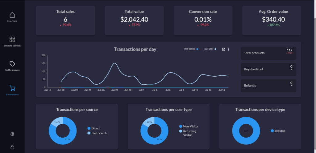
#19. Google Analytics 4 Template for Looker Studio by Avian
The template for Looker Studio by Avian is a tool that aids in measuring website performance. It consists of six pages, covering a wide range of use cases.
With a focus on e-commerce, this dashboard example allows users to extract meaningful insights from conversion and product data. It offers the flexibility to analyze performance based on specific devices or countries.
Dashboard metrics:
- Average session duration
- Bounce rate
- Active users
- Views over time
- Engagement
- And others
#20. Content Performance Report (GA) by ByMarketers
This one-page report within Google Analytics data provides insights into your content’s performance. In addition to top-level metrics, this report includes a breakdown of authors and categories by traffic.
Furthermore, the report provides information on the top pages and referrals. This knowledge can guide your content strategy and help you focus on optimizing high-performing pages and leveraging effective referral sources.
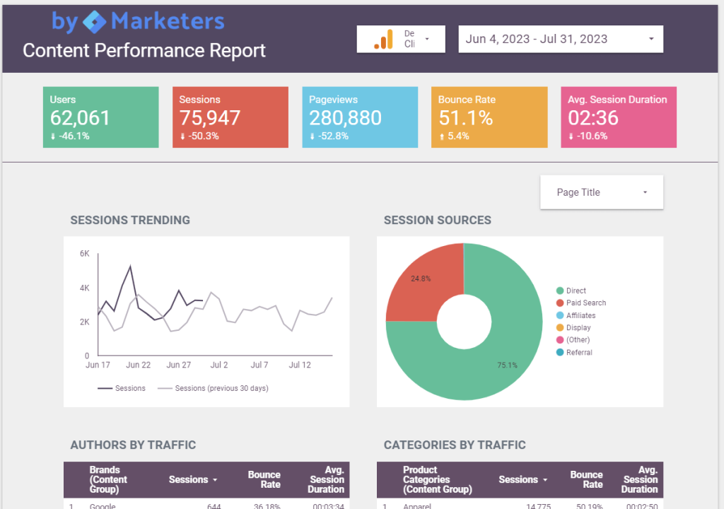
This Looker Studio dashboard offers flexibility regarding date range filtering and can be used across multiple Google Analytics properties. It is suitable for website managers who need a simple and visually engaging dashboard to assess content performance.
Dashboard metrics:
- Users
- Sessions
- Pageviews
- Bounce Rate
- Referrals
- Pages by traffic
- Average Session Duration
- And others
#21. User Experience dashboard by fxcuissot.com
The UX Dashboard is a tool designed to analyze user behavior and uncover insights to enhance the user experience. This comprehensive dashboard presents behavior metrics that help to identify and address user pain points, optimizing the digital focus.
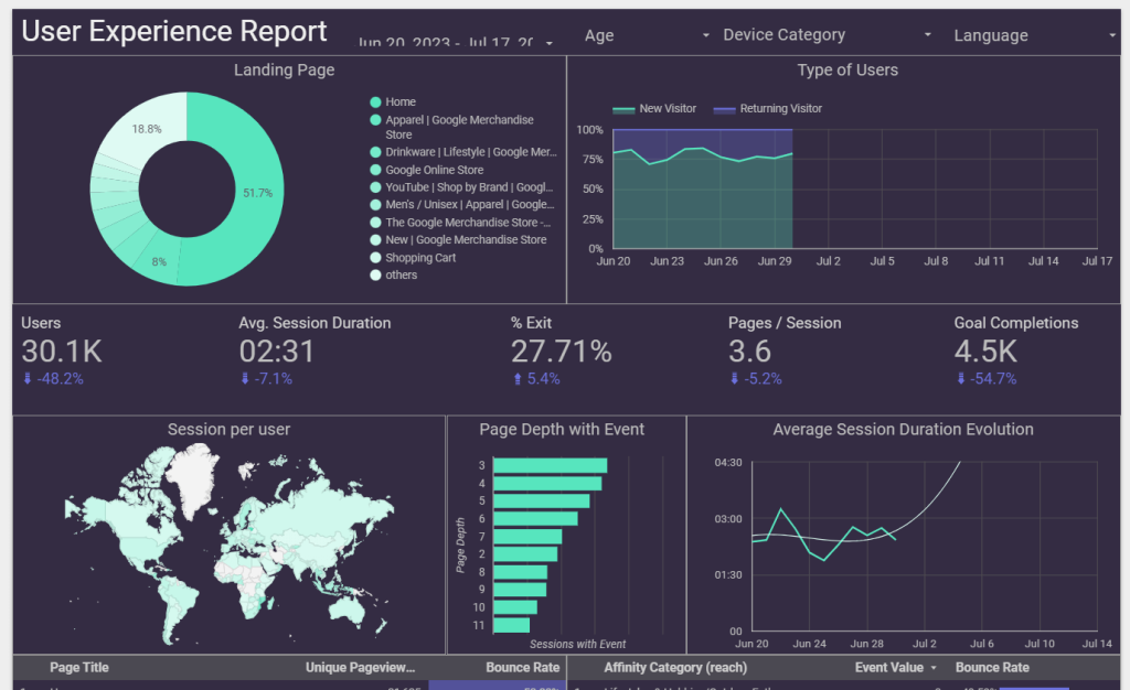
Using this template, you can dive deep into user interactions and explore data trends, such as page views and other user actions. With the integration of Google Analytics, this dashboard functionality allows you to select relevant KPIs specific to your UX goals and metrics that are most meaningful for your business.
Dashboard metrics:
- Conversion rates
- Session duration
- Click-through rate and other UX-focused metrics
#22. Complete Digital Analytics Dashboard for Mobile
This mobile-friendly dashboard is a versatile and visually appealing template that allows presenting the data beautifully on any mobile screen. Covering various digital channels, it features a user-friendly menu structure that resembles a modern mobile application interface.
Out of the box, this dashboard seamlessly connects to popular data sources such as Google Analytics, Google Ads, and Search Console. Every block, image, graph, and element within the dashboard is reusable, enabling effortlessly to create a personalized data presentation.
Dashboard metrics:
- Traffic sources
- Conversions
- Goals per user type
- Goals per device type
- Purchase completed
- Entered checkout
- Conversion ratio
- And others
CRM & sales Looker Studio dashboards
#23. CRM dashboard for Pipedrive/HubSpot/Salesforce by Coupler.io
A CRM dashboard template allows you to analyze the key metrics of your sales team and gives an overview of your opportunities.
This interactive CRM dashboard template is designed for different platforms including Pipedrive, HubSpot, and Salesforce. With the help of the CRM dashboard template, you can drill down into particular deals, identify top performers, and understand what drives your revenues. Like all Looker Studio templates by Coupler.io, this template is available for free.
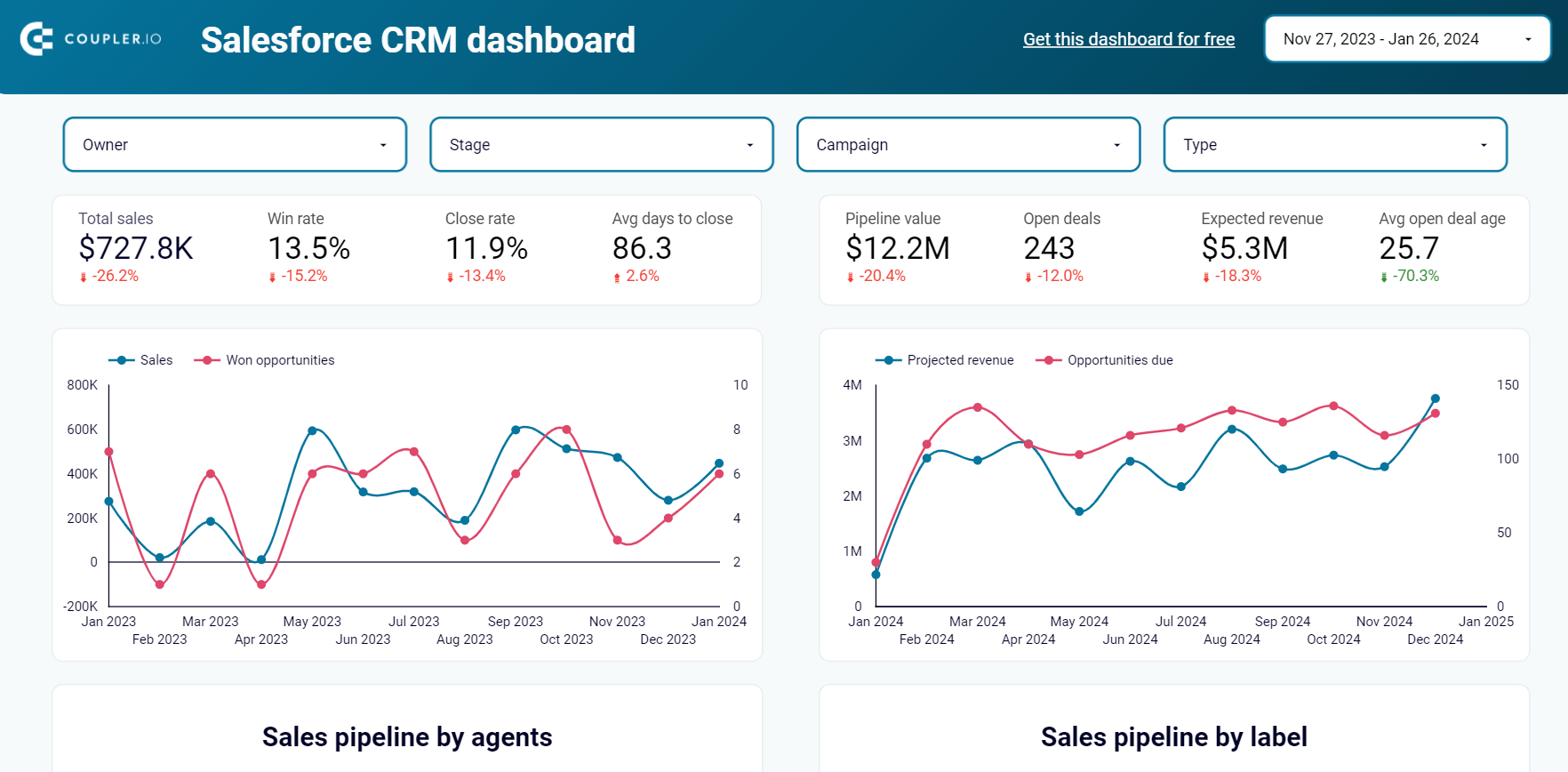
CRM dashboard for Salesforce in Looker Studio
Use our CRM dashboard for Salesforce to track key metrics, check how your sales team performs, and understand what drives your revenues.


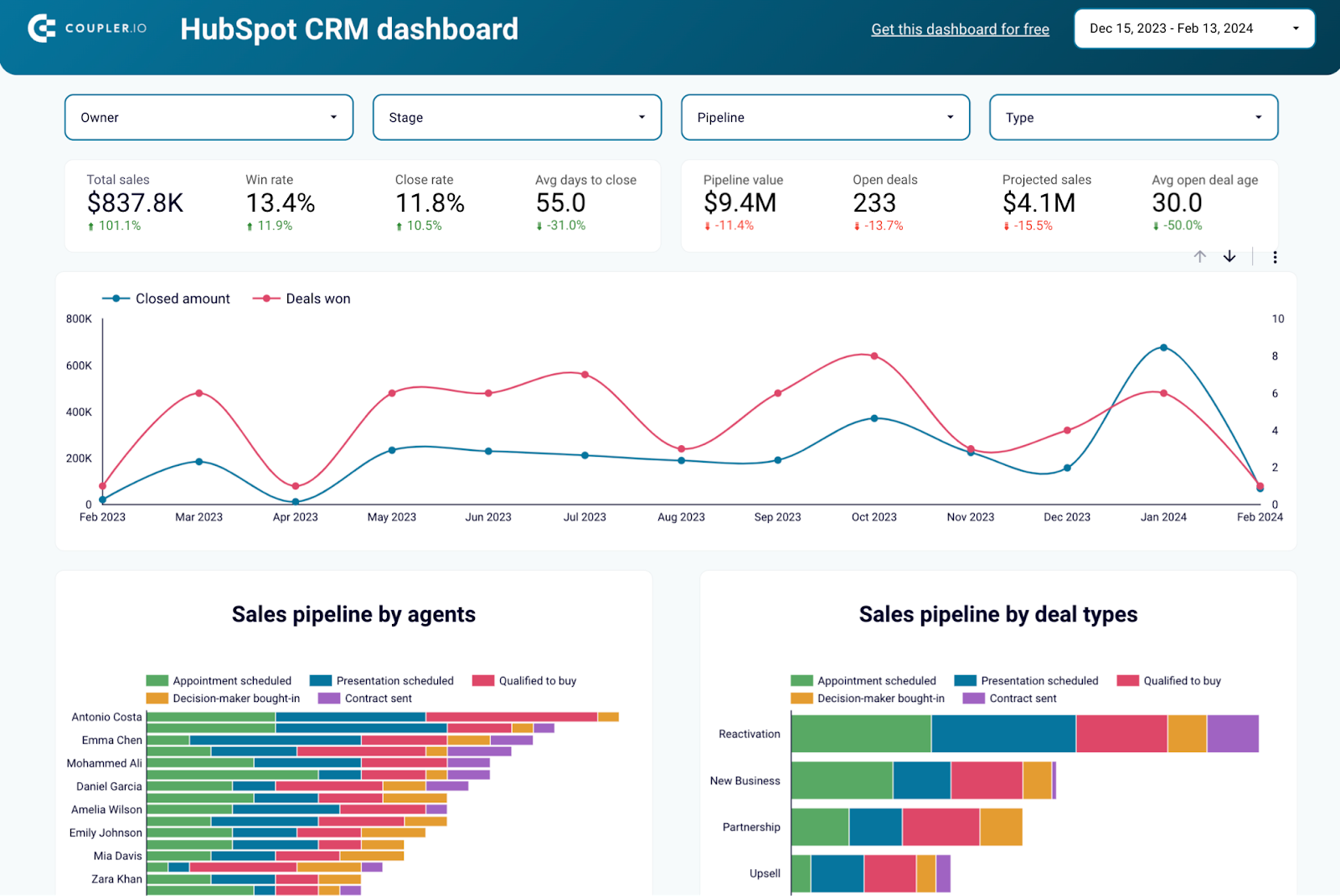
CRM dashboard for HubSpot in Looker Studio
Use our CRM dashboard for Salesforce to track key metrics, check how your sales team performs, and understand what drives your revenues.

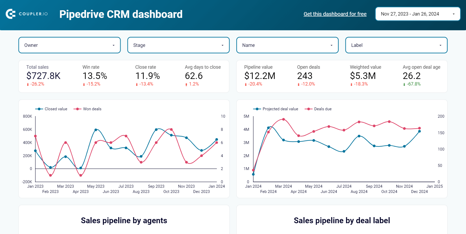
CRM dashboard for Pipedrive in Looker Studio
Stay on top of your Pipedrive sales using our CRM dashboard which allows you to analyze your sales department’s performance.

Dashboard metrics:
- Total sales
- Win rate
- Close rate
- Average days to close
- Pipeline value
- Open deals
- Weighted value, etc.
#24. Sales KPI dashboard for Pipedrive/HubSpot by Coupler.io
Coupler.io dashboard provides a comprehensive and user-friendly solution for analyzing critical sales metrics and key performance indicators from CRM apps. By leveraging the data visualization, you can make strategic decisions based on deal details, revenue, and sales pipeline, an all-in-one centralized platform.

This interactive dashboard example is designed for Pipedrive and HubSpot. It’s a plug-and-play report that allows you to dive straight into data analysis and gain actionable insights. Additionally, all Coupler.io dashboards ensure consistency in data representation across different channels. Regardless of your stakeholders’ technical expertise, the user-friendly interface makes it easy for them to navigate and interpret the data.
Sales KPI dashboard for HubSpot in Looker Studio
Get an overview of the HubSpot sales metrics and KPIs to derive insights into pipeline health using our sales KPI dashboard.
Sales KPI dashboard for Pipedrive in Looker Studio
Analyze the critical sales metrics and key performance indicators from Pipedrive to make smart strategic decisions.
Dashboard metrics:
- Revenue
- Won deals
- Revenue per deal
- Won/Lost ratio
- Open deals
- Avg days to close
- Lost reasons
- Won deals per pipeline stage, etc.
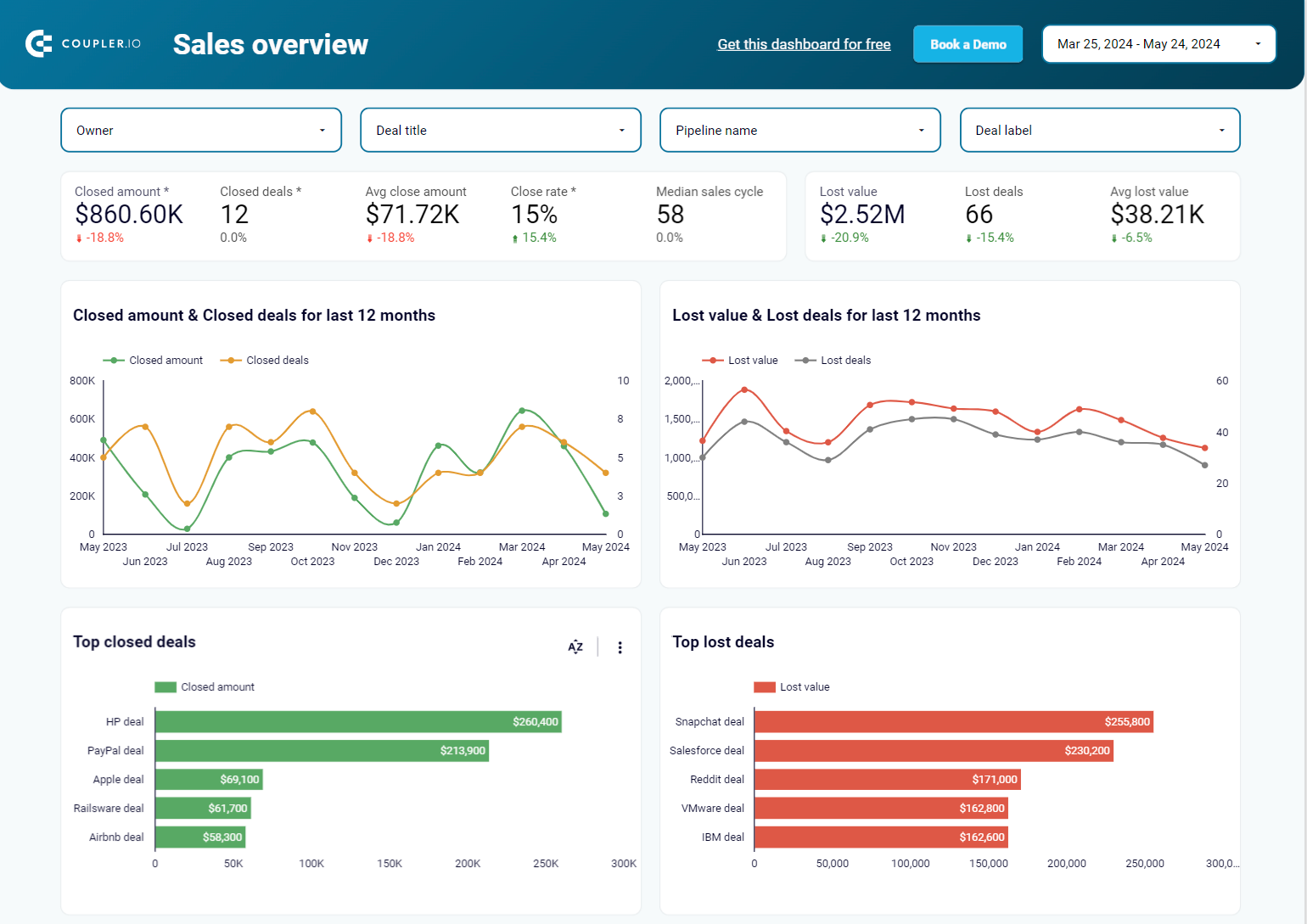
#25. Salesforce sales dashboard by Coupler.io
This sales analysis report simplifies tracking and analyzing Salesforce metrics. The dashboard template includes 4 pages to see information about open, won, and lost opportunities. The sales overview page displays stats of all opportunities by stage.
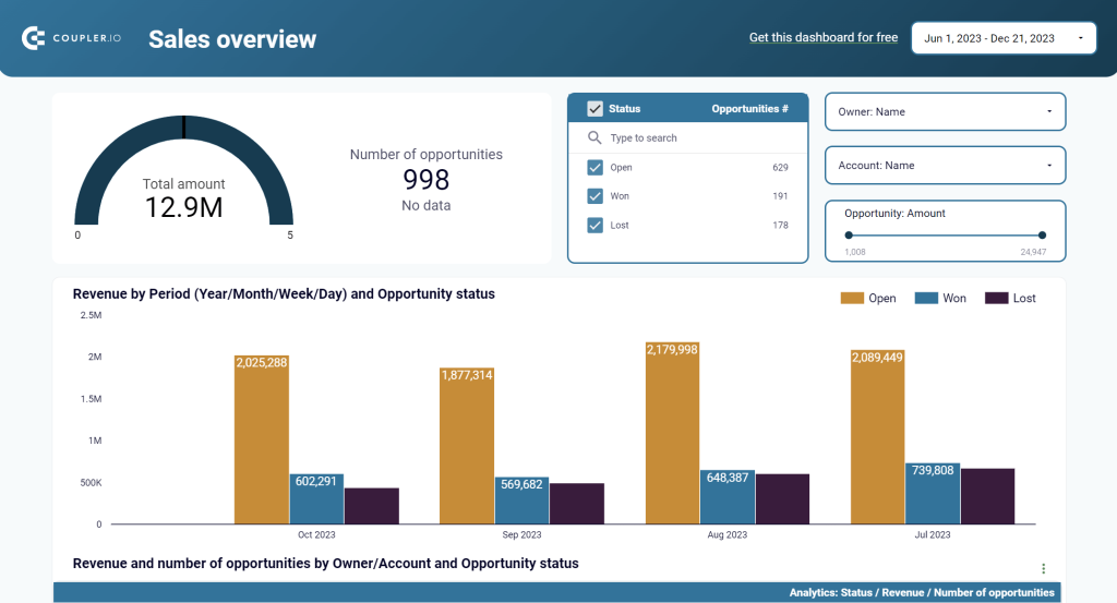
This Looker Studio dashboard template can become your main marketing dashboard, conveniently monitoring and assessing digital marketing efforts, covering many essential areas (website analysis, e-commerce reporting, organic search, and paid activities). Users will have a holistic view of their performance across various channels to make informed decisions and optimize their digital marketing strategies for maximum impact.
Dashboard metrics:
- Total amount of sales
- Number of opportunities
- Revenue by period
- Probability of winning
- Average push count
- Average days from opening to today, etc.
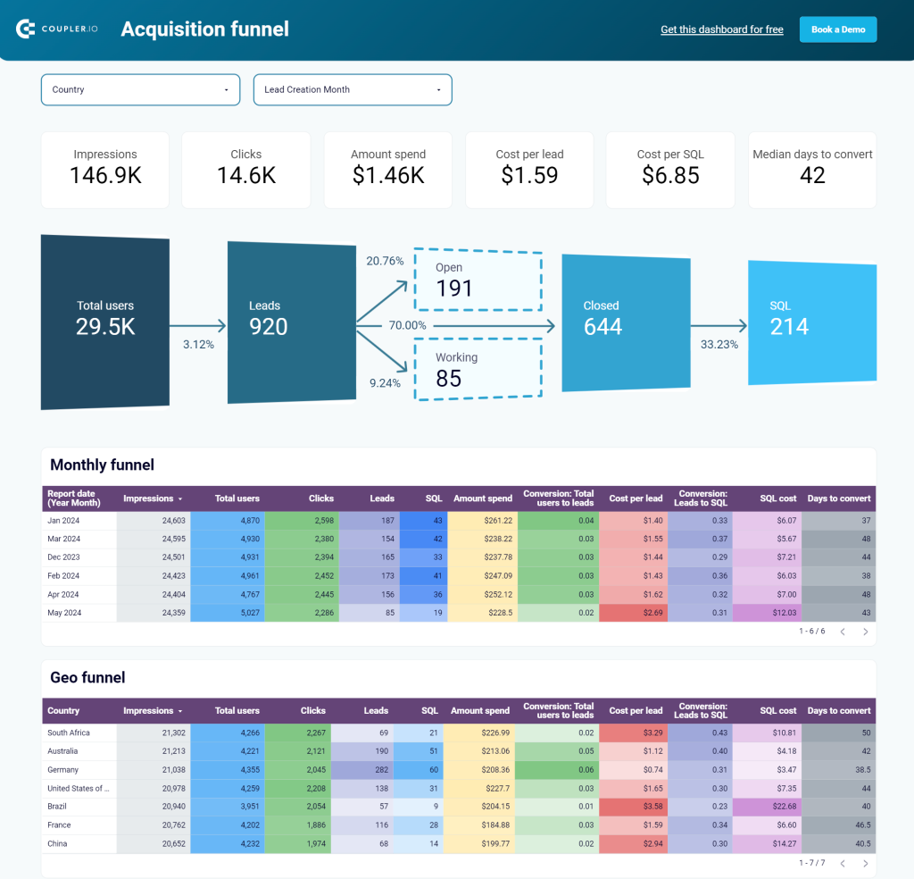
#26. Customer acquisition dashboard for Pipedrive by Coupler.io
This customer acquisition dashboard provides insights into the performance of your paid ads and organic traffic for lead generation in Pipedrive.
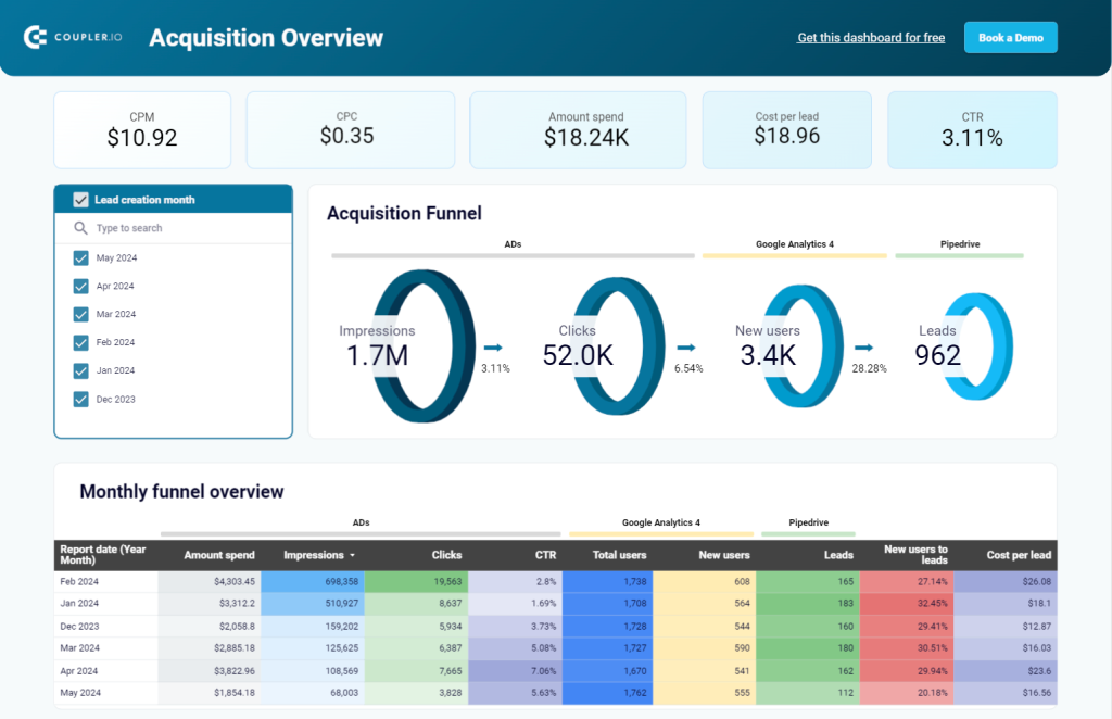
The dashboards displays impressions, clicks, new users, and costs on acquiring customers. The source for these insights is not only Pipedrive, but also GA4 and the advertising platforms you use like Google Ads, Facebook Ads, etc. With this in mind, you can see how many clicks your ad campaigns brought and how much you spent on them.
Dashboard metrics:
- CPM
- CPC
- Amount spend
- Cost per lead
- CTR
#27. Customer acquisition dashboard for HubSpot by Coupler.io
This dashboard is similar to the previous one, but it’s tailored for HubSpot. It automatically collects data from Google Analytics 4, HubSpot, and various PPC platforms – Facebook Ads?, LinkedIn Ads, Google Ads, Snapchat Ads, and X (Twitter) Ads. This data is then used to visualize your acquisition funnel in an analysis-ready way.
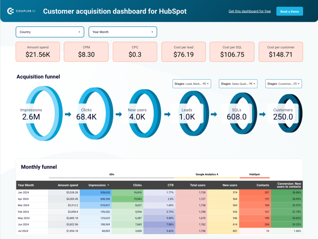
This Looker Studio report shows you how your customers go through different stages of the funnel. It visualizes the user journey from clicking your ad to visiting the website and, eventually, becoming a client. This lets you analyze how your ads contribute to acquisition, what stages might need improvement, and how the key metrics change over time. You can also use filters to select different stages for your funnel.
Dashboard metrics:
- CPM
- CPC
- Amount spend
- Cost per lead
- CTR
#28. Salesforce sales analytics dashboard by Coupler.io
Another customer acquisition dashboard but this time for Salesforce. Like the one above, it provides insights into the performance of your advertising campaigns and organic traffic to bring customers.
The dashboard displays impressions, clicks, new users, and costs of acquiring customers. The source for these insights is not only Pipedrive but also GA4 and the advertising platforms you use like Google Ads, Facebook Ads, etc. With this in mind, you can see how many clicks your ad campaigns brought and how much you spent on them.
The built-in connector by Coupler.io collects data from GA4, advertising platforms and Salesforce to present it in the form of actionable insights.
Dashboard metrics:
- Impressions
- Clicks
- Amount spend
- Cost per lead
- Cost per sales qualified lead
#29. Sales team performance dashboard for Salesforce by Coupler.io
Those who need to analyze their sales team performance can make use of this dashboard template. It provides a sales overview with key metrics such as won and lost amount. The insights are broken down by each member of your sales team.
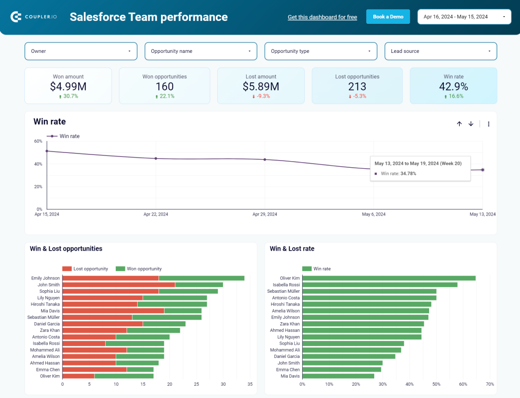
The dashboard is designed for Salesforce data. You only need to connect your Salesforce account to load your data to the dashboard. Try it yourself right away for free.
Dashboard metrics:
- Won amount
- Won opportunities
- Lost amount
- Lost opportunities
- Win rate
#30. Salesforce Win Loss analysis dashboard by Coupler.io
The Salesforce win loss dashboard provides insights into the intricacies of closing deals. You can track your lost and won opportunities and get an overview of the key sales metrics.
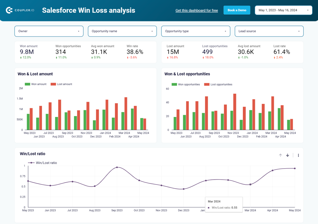
These insights play a role in improving sales techniques, understanding customer behavior, and refining strategies. The win loss dashboard template is equipped with the Salesforce connector. Just connect your account and start using the dashboard right away.
Dashboard metrics:
- Won amount
- Won opportunities
- Lost amount
- Lost opportunities
- Win rate
#31. Calendly event dashboard by Coupler.io
If you want to analyze events booked in Calendly, then this event dashboard template by Coupler.io is your pick. The report has a built-in Calendly connector, so you’ll get your data in a couple of minutes.
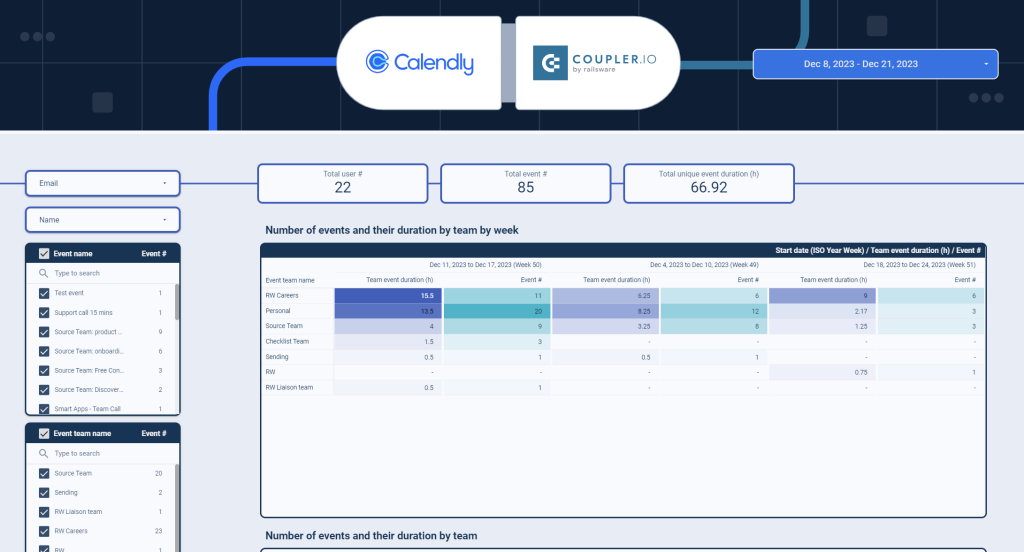
The dashboard allows you to identify the most popular time slots and optimize your scheduling process. In addition to that, you can benefit from other parts of the dashboard such as event breakdown by teams, detailed information about events, and so on.
Dashboard metrics:
- Total users
- Total events
- Event duration
- Most popular time of day
- Most popular day of the week
- Most popular day of the month
- Most popular month of the year
Ecommerce dashboards in Looker Studio
#32. Shopify orders dashboard by Coupler.io
Coupler.io offers a dashboard template to access the performance of your Shopify ecommerce shop. Basically, it’s a sales Shopify dashboard since it allows you to track total sales, discounts, outstanding amount, order processing time, etc.
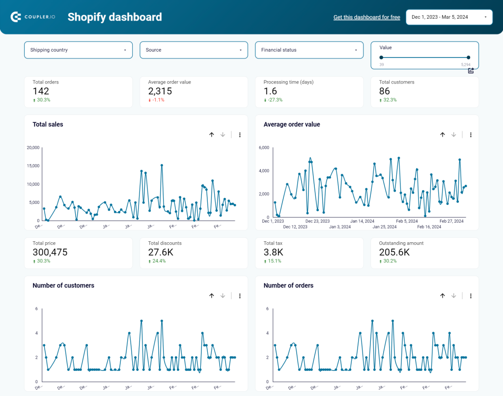
This dashboard template has several filters to filter your orders by shipping country, source, and financial status. Order performance breakdown is also available in the form of a table at the bottom. This is one of the most useful Looker Studio dashboard templates for ecommerce businesses.
Dashboard metrics:
- Total orders
- Total discounts
- Total price
- Total tax
- Outstanding amount
- Average order value
- Average order processing time, etc.
#33. Shopify sales funnel dashboard
This Shopify sales funnel dashboard lets you analyze the traffic coming to your store. However, to use the dashboard, your Shopify store must be linked to Google Analytics. If so, then you’ll get insights into each traffic source performance such as views, users, checkouts, etc.
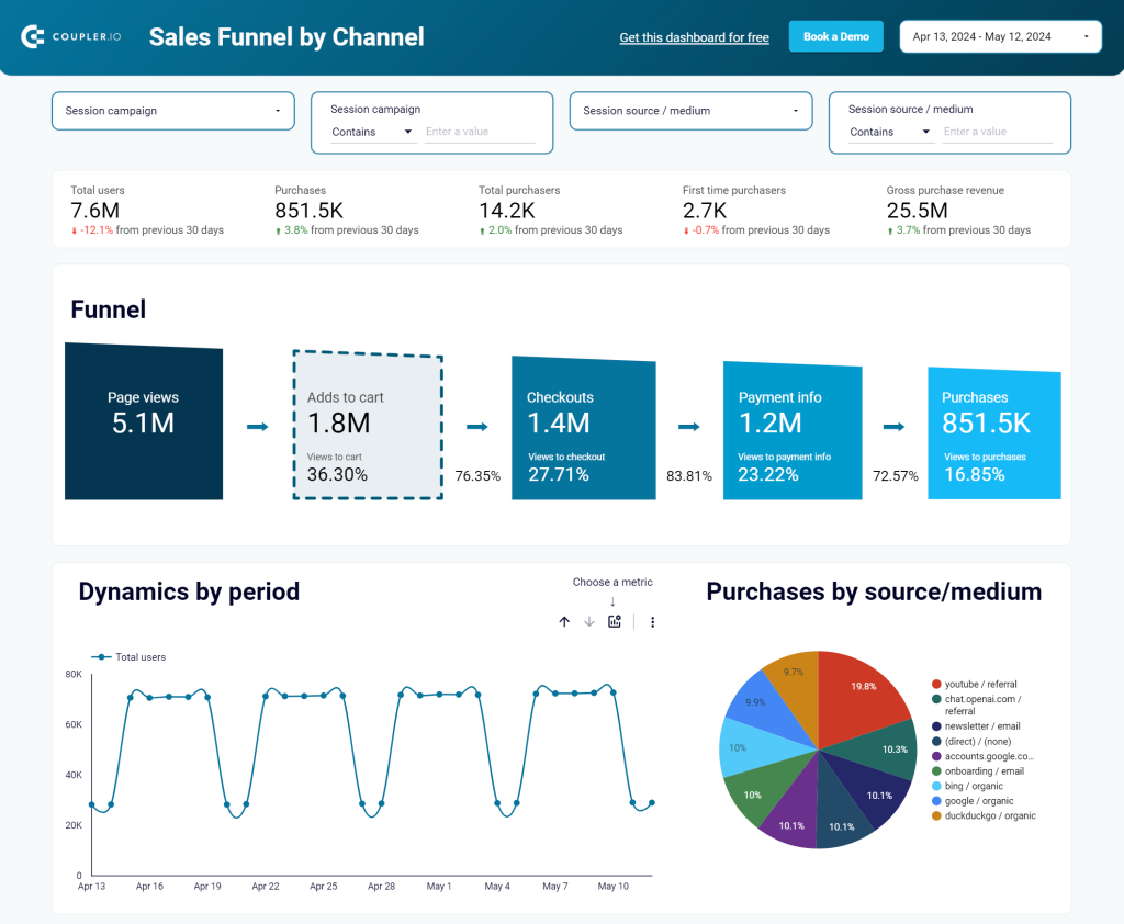
The Shopify sales funnel dashboard is ready-to-use – just connect your GA4 account to load data and enjoy your report.
Dashboard metrics:
- Users
- Purchases
- Adds to cart
- Checkouts
#34. Shopify marketing funnel dashboard
If you want to know the performance of not only your organic traffic but also the PPC campaigns, then opt for this Shopify dashboard template. It collects data from GA4, Facebook Ads, LinkedIn Ads, and other advertising platforms you use. The dashboard offers insights into ad amount spend, return on investment, and other crucial metrics.
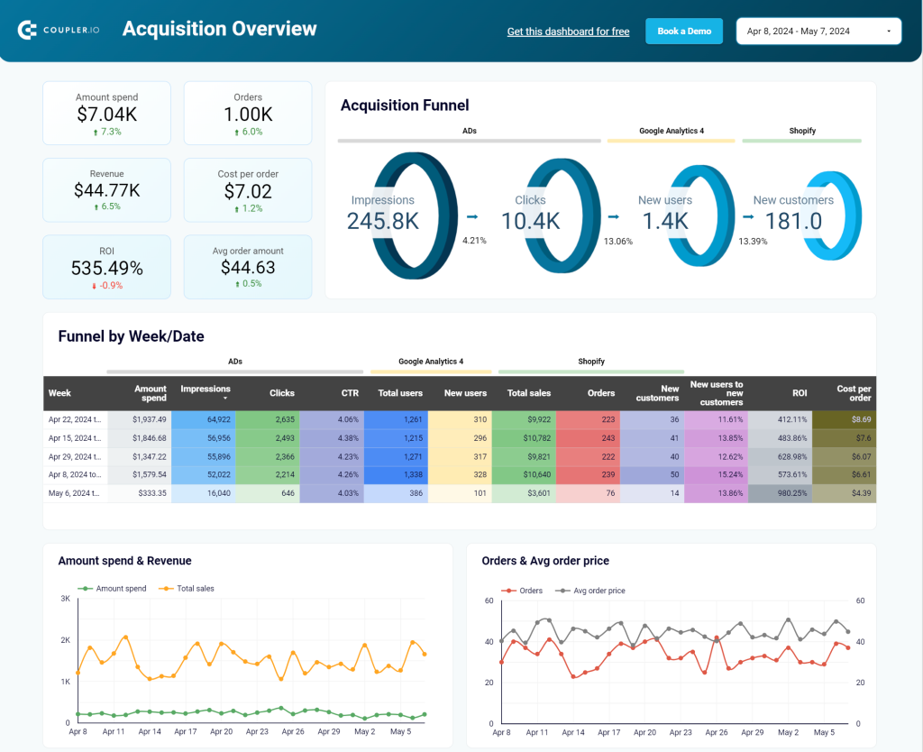
To start using the dashboard template, connect your accounts in GA4, Shopify, and ad platforms and, in a moment, your report will be populated with your data.
Dashboard metrics:
- Orders
- Amount spend
- Revenue
- Cost per order
- ROI
#35. Inventory dashboard for Shopify by Coupler.io
Coupler.io offers a comprehensive inventory management solution for Shopify store owners. This Looker Studio dashboard provides visibility into your product stock levels, turnover rates, and sales correlations to help prevent stockouts and optimize inventory investments.
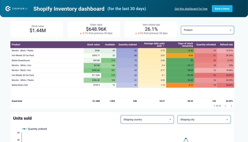
The dashboard automatically pulls data from your Shopify store and presents it in intuitive visualizations. You get a complete overview of inventory status, including low-stock alerts, bestselling products, and inventory aging metrics. This helps you make informed purchasing decisions and improve cash flow by reducing excess inventory.
Dashboard metrics:
- Current stock levels
- Inventory turnover rate
- Days of inventory on hand
- Low-stock alerts
- Inventory value
- Out-of-stock frequency
- Product performance correlation
#36. GA4 e-commerce conversion funnel template by Data Bloo
The GA4 e-commerce conversion funnel dashboard provides a solution for tracking and analyzing your website funnels. Connecting GA4 with Looker Studio via this template, you can monitor customer behavior across various devices, channels, and products and identify specific points where they drop off during the buying process.
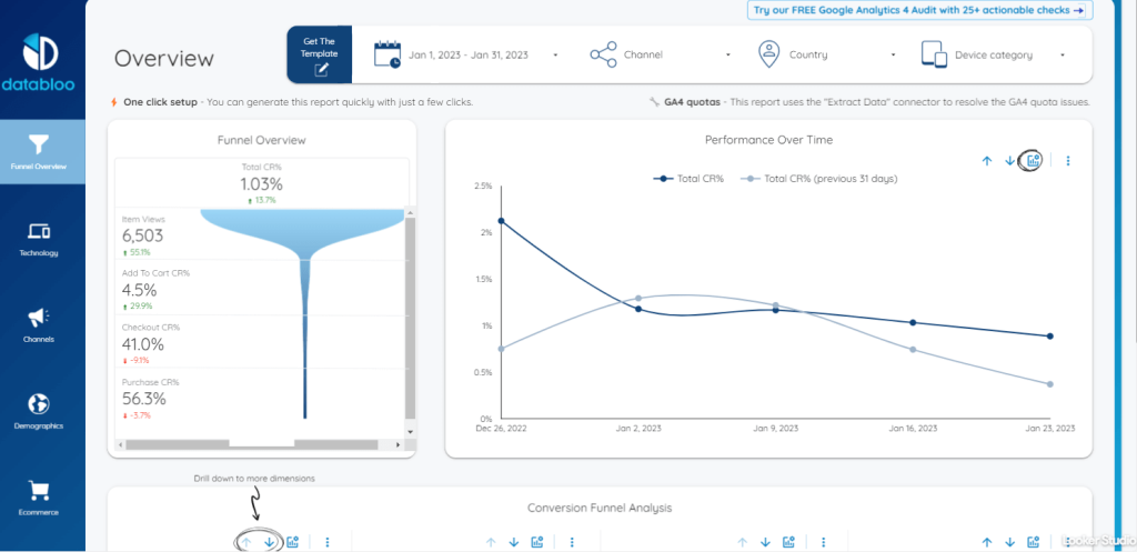
This conversion template allows you to analyze data for each step of the enhanced e-commerce process, from product views to add-to-cart actions and checkout to transactions.
Dashboard metrics:
- Viewing for each product
- Demographics
- Devices and platforms
- Conversion rates
- Performance over time
- Purchases, etc.
Financial dashboards for Looker Studio
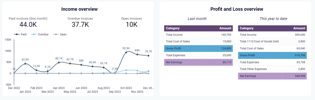
#37. Revenue dashboard for QuickBooks by Coupler.io
This is a dashboard template designed specifically for QuickBooks. It allows you to get an overview of your revenue based on the data loaded from QuickBooks Online. The report is quite simple to use and is a great solution if you need to share your results with stakeholders.
The main value of the revenue dashboard for QuickBooks is a quick overview of the main KPIs. It takes around 2 minutes to connect the report to your QuickBooks account and populate it with your up-to-date data. With this Looker Studio template, you can identify the best-performing products and customers, track invoices, and more.
Dashboard metrics:
- Paid invoices
- Overdue invoices
- Open invoices
- Total income
- Gross profit
- Total revenue
- Average price by product, etc.
#38. Financial dashboard for Xero by Coupler.io
This dashboard template provides an overview of your business’s financial performance by connecting directly to your Xero accounting software. It transforms raw financial data into clear visualizations that help you monitor business health and make informed decisions.
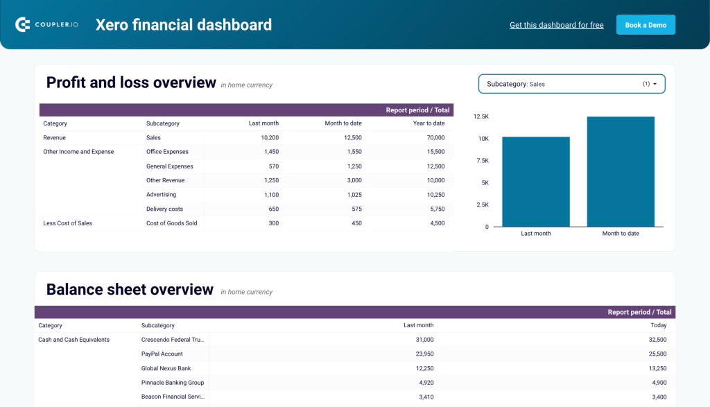
The dashboard displays key financial statements and metrics in a user-friendly format. As a result, entrepreneurs and financial officers have quick access to understanding financial trends without diving into complex accounting reports. It refreshes automatically through the Coupler.io connector to ensure you’re always working with the latest data.
Dashboard metrics:
- Revenue trends
- Expense breakdown
- Profit margins
- Cash flow patterns
- Balance sheet overview
- Key financial ratios
- Monthly comparison data
#39. Accounts payable dashboard for QuickBooks by Coupler.io
While the previous template is focused on the main KPIs and revenue in general, this one zooms into Accounts Payable. This free dashboard also connects to Looker Studio and refreshes your financial data on a schedule. It gives you a concise overview of unpaid, overdue, and paid bills grouped by vendor. This allows you to monitor outgoing invoices and prioritize payments.
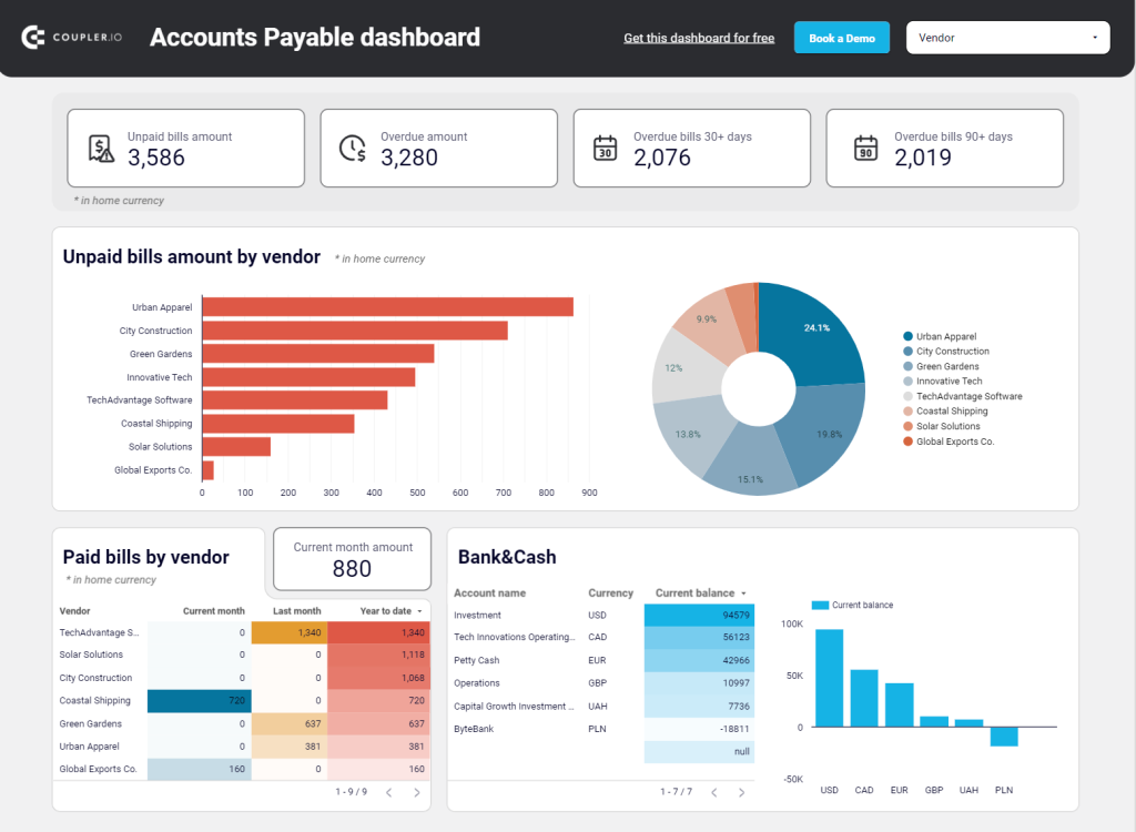
In addition, the dashboard provides you with analysis-ready information on AP aging. It also contains a detailed data table with the vendor bills overview. You can use interactive filters to sort bills by date, vendor, and total amount. All this gives you more transparency and helps improve cash flow management.
Dashboard metrics:
- Upaid bills amount
- Overdue amount
- Paid bills by vendor
- Upaid bills amount
- Bank&Cash
- AP Aging
- Vendor bills
#40. Accounts receivable dashboard for QuickBooks by Coupler.io
Here’s another useful dashboard that collects financial data from QuickBooks. It focuses on the Accounts Receivable data, allowing you to identify the customers with the biggest unpaid invoices amount, as well as keep track of the paid invoices.
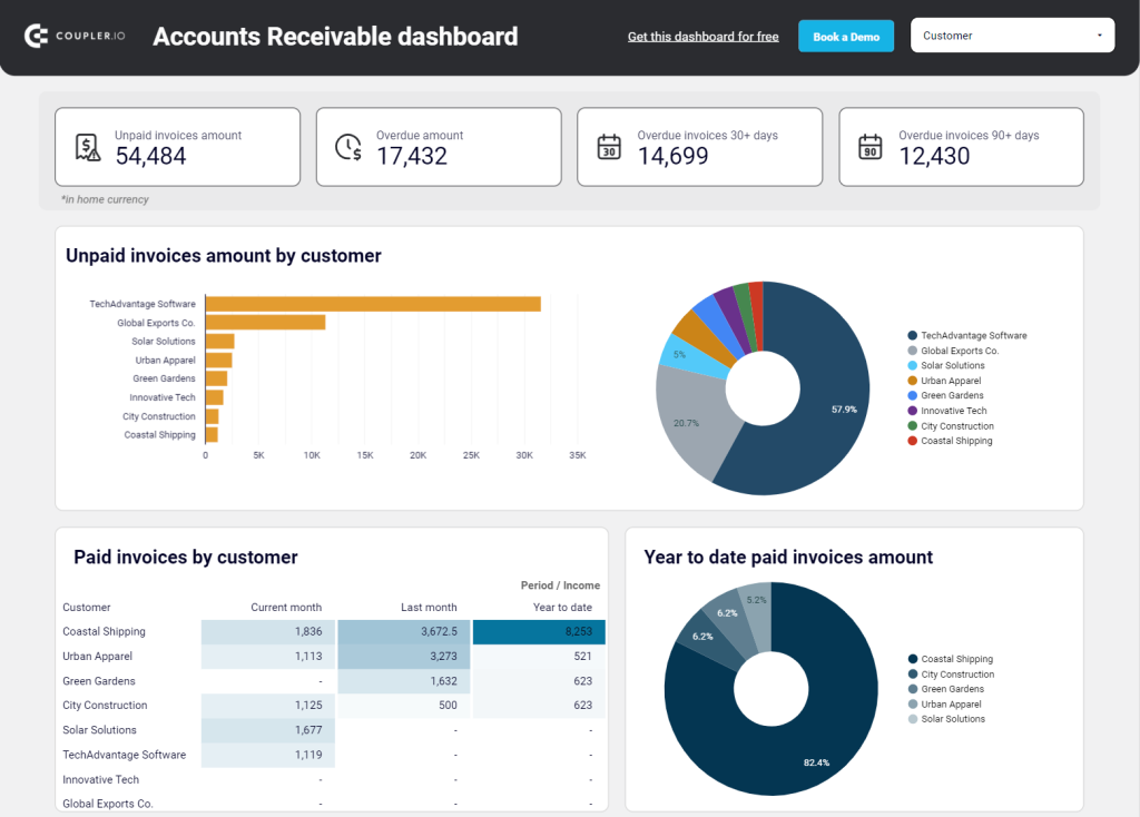
In particular, you can analyze payment dynamics over time with a yearly bar chart. For a more detailed analysis, there is a comparison table showing paid invoices by customer for the current and previous months. Apart from that, the dashboard gives you granular details on customer invoices and AP aging.
QuickBooks doesn’t offer a representation of the Accounts Payable information in such a format, which makes this dashboard especially useful.
It’s very convenient for analysis, monitoring purposes, and sharing data with the stakeholders. You can present the key trends and metrics without providing access to the QuickBooks account.
Dashboard metrics:
- Unpaid invoices amount
- Overdue amount
- Overdue invoices 30+ days
- Paid invoices by customer
- Year-to-date paid invoices amount
- AP aging summary
- Customer invoices
Project management dashboards in Looker Studio
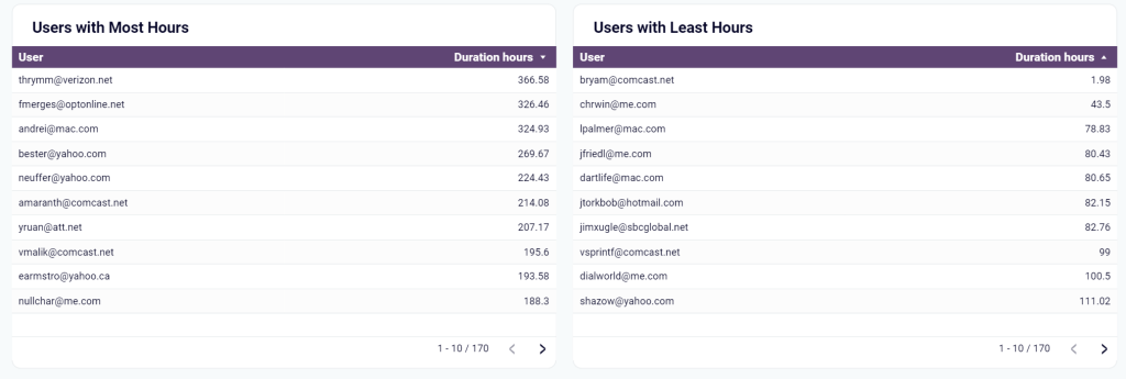
#41. Time tracking dashboard for Harvest/Clockify by Coupler.io
If you use Clockify or Harvest as a time tracking tool for your company, you can derive insights into the time efficiency of your team. Coupler.io offers a time-tracking dashboard template designed for both Clockfy and Harvest in Looker Studio. Traditionally, the template is equipped with connectors that will facilitate your data automation experience.
The main value of this dashboard is to let you understand how efficiently the time is spent in your company. You have several charts at your fingertips including hours breakdown, billable amount by client, calendar view, and others.
Dashboard metrics:
- Posted hours
- Active users
- Billable hours
- Billable amount
- Hours breakdown
- Duration hours, etc.
#42. Google Calendar dashboard by Coupler.io
The Google Calendar dashboard template provides insights into meeting hours, meeting breakdowns, out-of-office hours, and more. With it, you can analyze your meeting times, as well as time of your employees. This will give you an understanding on what you can do to optimize time expenses.
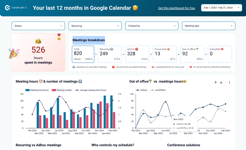
Google Calendar dashboard is an advanced alternative to Time Insights per se. To start using it, just connect your Google account and the built-in connector by Coupler.io will populate the dashboard with your data.
Dashboard metrics:
- Meeting hours
- Number of meetings
- Ad-hoc meetings
- Focus time
- Out-of-office hours
Practical applications of Looker Studio dashboard examples
Let’s explore how else the Looker Studio dashboard templates can be useful.
- Sales and revenue analysis. Looker’s dashboards can track sales performance from CRM and show revenue trends, identifying sales opportunities. Visualizations can provide insights into product performance, sales territories, customer segments, and sales team effectiveness.
- Marketing campaign performance. Examples of a Looker Studio dashboard in marketing reporting can help monitor the effectiveness using metrics such as click-through rates, conversion rates, and campaign ROI. Visualizations can highlight the best-performing channels, campaign engagement levels, and customer acquisition patterns.
- Customer analytics and segmentation. Looker Studio dashboard examples can assist in analyzing customer behavior, segmenting customers based on various attributes, and understanding customer lifetime value. Using this information will allow you to target marketing, offer personalized recommendations, and target customer retention strategies.
- Supply chain and inventory management. Looker Studio reports can provide insights into inventory levels, supply chain performance, and order fulfillment metrics. Visualizations can help identify bottlenecks, optimize inventory levels, and monitor supplier performance to improve operational efficiency.
- Financial analysis and forecasting. Various examples of a Looker Studio dashboard enable financial data analysis, metric tracking, and forecasting. This allows businesses to monitor cash flow, profitability, and financial health.
- HR and workforce analytics. Looker Studio dashboard examples can help analyze HR data, such as employee performance, retention rates, and workforce diversity. These insights can aid in identifying skill gaps and improving employee engagement and productivity.
- Product analytics and user behavior. Looker Studio reporting dashboards can provide an in-depth analysis of product usage, user behavior, and feature adoption. As a result, you can improve product development, identify improvement areas, and optimize user experience with this information.
- Operational analytics. Using Looker’s dashboards, you can monitor operational metrics, track efficiency, and identify process improvements. Visualizations can help identify operational bottlenecks, monitor service-level agreements, and optimize resource allocation.
- Healthcare analytics. Looker Studio dashboard examples can assist in analyzing healthcare data, such as patient outcomes, and operational efficiency. These insights can aid in optimizing healthcare delivery, identifying patterns, and improving patient care.
- E-commerce analytics. You can use examples of a Looker Studio dashboard to analyze customer retention, conversion rates, and average order value for e-commerce. Visualizations can help optimize pricing strategies, identify popular products, and enhance customer experience.
These examples highlight the versatility and value of Looker Studio dashboards in different scenarios. Businesses and organizations can leverage them to enhance overall performance.
FAQs on Looker Studio dashboard templates and examples
What are the benefits of using ready Looker Studio dashboard examples?
Let’s start thoroughly exploring the benefits for all business line representatives:
- Ease of use. The intuitive interface allows users to create and customize an informational panel without requiring extensive technical expertise.
- A high degree of customization. You can tailor the appearance of your Looker Studio dashboard examples to align with your brand’s visual identity. A lot of them offer the white label option.
- Flexibility. The tool lets you include or remove visualizations as needed, ensuring that your dashboards present the most relevant and impactful information.
- Interactivity. With just a few clicks, users can drill down into their data. The seamless integration of data connectors (BigQuery, Tableau, Power BI, Shopify, HubSpot, Google Sheets, etc.), which act as bridges connecting Looker Studio reports to underlying data sources ensures easy access.
- Scalability. Provided examples of Looker Studio dashboards excel in handling large datasets, making them scalable for organizations dealing with vast amounts of information, whether you’re analyzing terabytes of customer data or tracking real-time metrics from multiple sources.
- Data security. Looker Studio prioritizes the protection of your data through robust stringent security protocols.
- Time-saving automation. You can save time by automating data cleaning and visualization tasks and sharing findings with colleagues and stakeholders for collaboration. Additionally, the Looker Studio API provides a powerful tool for Google Workspace or Cloud Identity organizations, allowing them to automate the management and migration of Looker Studio assets.
Moreover, Looker Studio offers the capability of report embedding, enabling businesses to seamlessly include their dashboards within any web page or intranet.
How to choose the right one among the Looker Studio templates?
We recommend using pre-built Looker Studio marketing dashboards from various providers, including the Looker Studio Team by itself, for efficient and time-saving data analysis. Start by connecting your operational data sources using the built-in and partner connectors. Selecting the appropriate visualization format will enhance your data analysis.
What else to look for while choosing the dashboard?
- First, ensure the template is relevant to your industry or specific use case.
- Look for a dashboard highlighting the key metrics important for your analysis.
- Additionally, check if the template is compatible with your data sources and can seamlessly integrate with your existing infrastructure.
- Assess the design and user-friendliness of the template for a straightforward interpretation of data and consider the availability of documentation and support resources provided with the dashboard.
- Finally, read user feedback and recommendations to gain insights into the template’s effectiveness and usability.
Who can use Looker Studio templates?
With Looker Studio (Google Data Studio) dashboards, even those without a data science or business intelligence background can effortlessly leverage the data analysis.
Professionals from different industries and with various backgrounds use Looker Studio templates to organize, track, and analyze their data. Here are just some of them:
- Sales professionals. Even though most CRM platforms offer some simple reports, it’s often more useful to combine data from various sales-related apps on one page. Building a dashboard with a Looker Studio template is a simple way to do so.
- PPC experts. Running ads on various PPC platforms generates a lot of valuable data. With a dashboard, it’s easy to keep track of everything in one place and make adjustments on the go.
- SEO analysts. Monitoring key metrics in a comprehensive dashboard allows you to understand how the website is performing and what can be improved.
- Marketing professionals. Marketing campaigns often involve a number of various channels, platforms, and marketing apps. Aggregating this data for cross-channel and closed-loop analytics in a dashboard can be very helpful to stay in control of the KPIs.
- Finance and accounting professionals. They can use Looker Studio dashboard templates to monitor revenue, create analytical reports, and to get insights for improving financial strategy.
- Ecommerce businesses. For an ecommerce store to run smoothly, it’s essential to closely monitor and analyze where most orders come from, how shipping time correlates with the repurchase rate, and so on. So many business owners use Looker Studio dashboards to analyze their data.
In general, using readily-made Looker Studio dashboard templates is a good option that allows you to simplify working with data and save significant time.
Leverage Looker Studio templates to maximize efficiency
By harnessing the full capabilities of Looker Studio dashboard examples, including data connectors, the Looker Studio API, and report embedding, businesses can optimize their processes, drive informed decision-making, and effectively communicate data insights.
We have explored a collection of highly recommended Looker Studio dashboard templates. With an emphasis on integrability, visualizations, and customizability, these templates provide powerful tools to streamline your data analysis process and communicate data-driven narratives to teams.
So, take the next step in your data analytics journey and explore these dashboards to find the ideal Looker Studio templates that align with your needs. We wish you success in discovering insightful information and maximizing your data’s potential with ease!
For more information on the data visualization topic, check our article on Google Sheets dashboard examples and CRM dashboards.


