Looker Studio (former Google Data Studio) is a great choice for digital marketing and sales experts who want to create a sales dashboard. This data visualization solution offers robust data integration capabilities, support for real-time data access, and a rich data visualization toolset.
This article guides you on how to create a sales dashboard in Looker Studio for your business. Moreover, we’ll provide several Looker Studio sales dashboard templates for fast and efficient marketing reporting.
Options to create a sales dashboard in Looker Studio
Building a sales dashboard in Looker Studio can be approached in several ways, depending on your resources, expertise, and specific needs. Here are the options:
- Use templates
Looker Studio sales report templates may be a handy tool if you don’t have the time to design and build your dashboard from scratch. Using templates as a starting point can help you quickly and efficiently create data visualizations. However, it would be best if you have basic Looker Studio skills to be able to customize your report.
- Build from scratch
The second option is building your dashboard from the ground up. Nothing can stop you if you have a clear vision of what your Looker Studio sales dashboard should look like and possess the necessary skills. However, this can be time-consuming, even though you have control over every aspect of the dashboard.
- Hire a data consultancy service
Consider this third option if you need a high-quality result but lack the skill and time to learn. Or if your data needs are complex. Some companies and professionals specialize in data analysis and visualization. They can help you automate data flows from multiple sources, define the key metrics for your reports, clean and organize your data, and create a custom Looker Studio sales dashboard that fits your business needs.
Now, let’s look at each option in more detail in the next section.
Option 1. Free templates for Looker Studio sales dashboards
Templates are a great way to quickly visualize your data with almost no effort. Many platforms offer Looker Studio sales dashboard templates, some of which are provided for free. For example, it’s worth having a look at Looker Studio Gallery, where you can find various templates built by Looker Studio, their partners, and the community.
Data analytics and reporting automation platforms like Coupler.io, Porter, and Windsor.ai also offer curated selections of sales templates and Looker Studio marketing dashboards.
Let’s take a look at several free Looker Studio templates created by Coupler.io. To quickly build a dashboard, open the selected template and find the setup instructions on its Readme tab. Once the dashboard is ready, you can further customize it to your liking using Looker Studio’s functionality. For example, change colors, add your logo, rearrange graphs, add new ones, and so on.
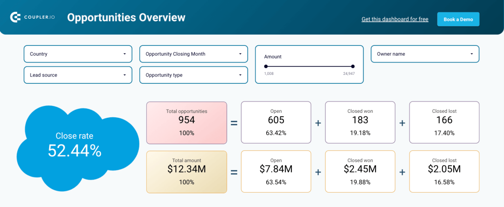
1. CRM sales dashboard for Pipedrive, HubSpot, and Salesforce
This template allows you to visualize data from your CRM app in less than three minutes – be it Pipedrive, HubSpot, or Salesforce. The dashboard provides an overview of your sales opportunities and lets you drill down into the specifics of your sales pipeline.
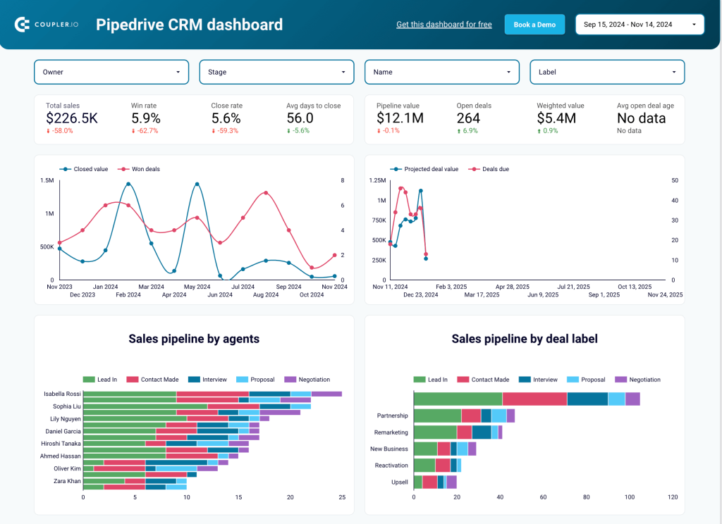
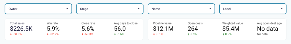
You can monitor deal progression, analyze your sales team performance, and keep track of the key metrics. For example, win rate and close rate, average days to close, and pipeline value. Apart from the metric value, the scorecards show how each metric changed compared to the previous period. As a result, you can estimate the pipeline health at a glance, quickly spotting growth or drop in the results and taking measures.
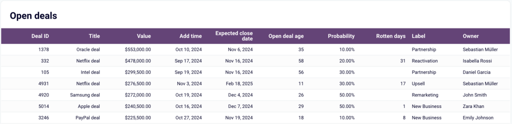
The report includes a detailed data table with information on open deals. To zoom in, sort data by owner, stage, value, and win probability. This will help you identify possible reasons for unclosed sales processes and decide what can be done to improve the situation.
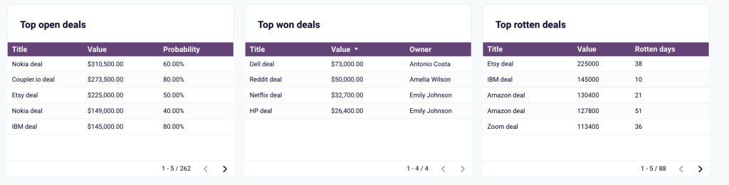
There’s a separate table showing top won deals and top rotten (lost or blocked) deals. It allows you to quickly determine which companies drive revenue and which deals require additional attention.
In addition, the template includes a set of filters enabling you to explore data from different angles. You can filter data by owner, stage, name (campaign), type, and date range. This provides you with a granular view of your sales processes and gives more insight into specific cases.
All this makes this CRM dashboard an important tool for monitoring, analyzing, and managing your sales processes. The template is automated with the help of Coupler.io, so it allows you to instantly build a live dashboard that can update all metrics automatically at intervals of up to every 15 minutes.
To use this dashboard, select the template version for your CRM app in the banner below and follow the instructions on the Readme tab.
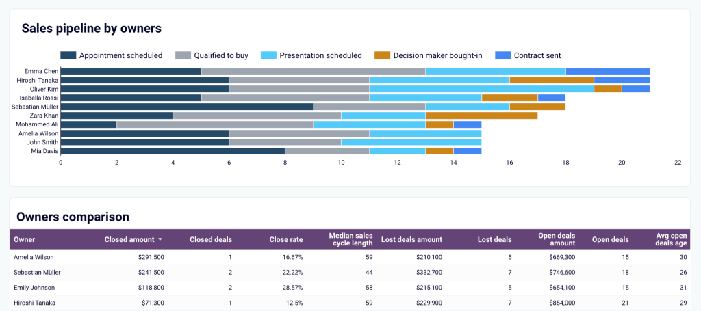
2. Sales KPI dashboard for HubSpot and Pipedrive
This dashboard helps you stay in control of your deals and see how different factors impact the outcome. It gives you a complete overview of closed deals over the last 12 months, allows you to monitor close rate dynamics and check reasons behind the lost deals. Apart from that, the report enables you to analyze your sales pipeline by stages and evaluate sales team performance.
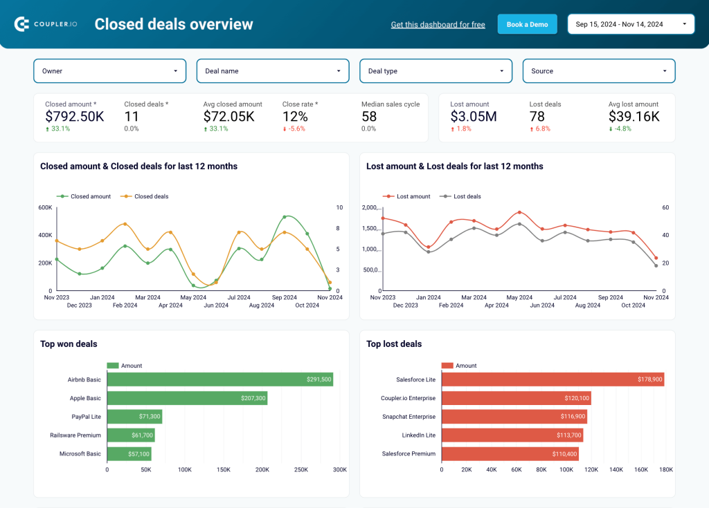
You can track the changes in closed amounts and closed deals, monitor the most essential metrics, and quickly identify the top won and top lost deals. By using the filters on the top, it’s easy to switch between different periods or deal types to get more details.
The template features a separate tab designed to analyze the sales pipeline. It allows you to select the event type for each stage – for example, Appointment scheduled, Presentation scheduled, Decision-maker bought-in, Contract sent, and so on. As a result, you get a customized funnel and can track how the number of key events changes from one stage to another.
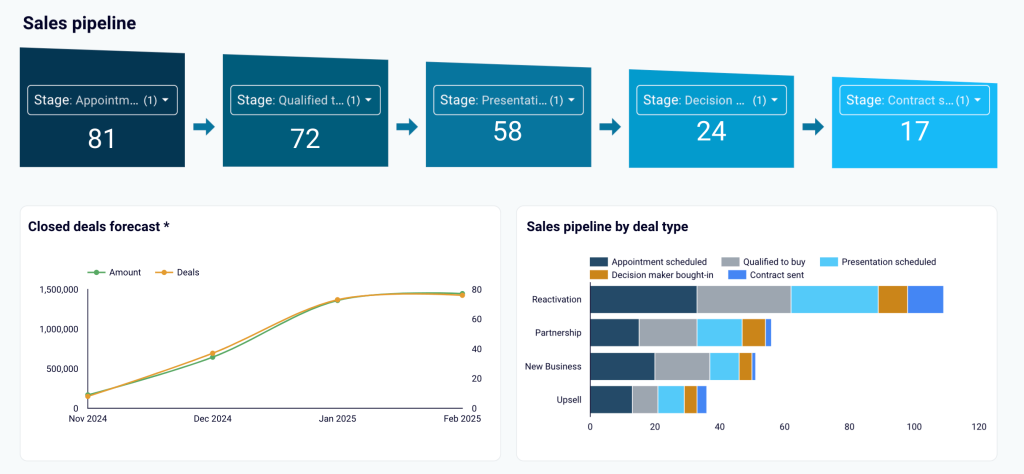
In addition, you get a graph showing deals by type. Another useful element is the forecast for future closed deals, which is based on historical data. This insight helps you understand whether the current performance allows you to meet the outlined goals. Having such projections can be crucial to adjusting your sales strategy in time.
One more important section of this report is the team performance overview. It enables you to identify sales representatives who drive results and those who may need some help to improve their close rate. You can explore your sales pipeline by the owner and use the data table to sort results by various parameters.
The template comes in two versions, optimized to export sales data from HubSpot or Pipedrive. Choose the version you need and follow the steps described on the Readme tab.
3. Sales team performance dashboard for Salesforce
Our next template is an essential instrument for controlling and optimizing your team’s performance. It presents a detailed overview of each team member’s results and allows you to identify bottlenecks and areas for improvement. This transparency into your team’s efforts helps you ensure that every professional is allocated to projects where they will be the most efficient.
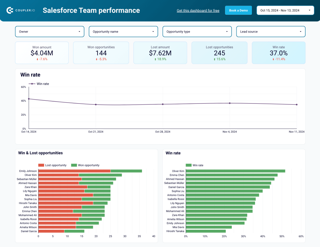
This template works best for teams with at least two sales managers. It also allows you to monitor the general win rate, won amount, won opportunities, and other metrics for the team as a whole. Filter data by owner, lead source, opportunity name, and type to identify trends and patterns in your team’s work.
Various graphs included into the dashboard make it easy to compare the number of deals or revenue generated per team member. Use this to identify your best sales managers and assign the deals with the highest potential revenue to those who can handle them best.
Another set of stacked bar charts helps you compare the types of closed deals per sales manager. This is a great way to determine what each sales manager is good at. For example, if someone demonstrates strong performance when working with partnership deals but has poor results for new business opportunities, you can reallocate tasks taking this into account.
To get a copy of this dashboard with your data, open the template and follow the steps on the Readme tab.
4. Salesforce sales analytics dashboard
If you run advertising campaigns, this dashboard will help you understand how your ads bring you new leads, how quickly they convert, and what this costs you. You can estimate the effectiveness of the generated traffic, compare your conversion rates to industry benchmarks, and analyze the stages of the acquisition funnel.
The template automatically collects and combines data from Salesforce, Google Analytics 4, and various PPC platforms: Facebook Ads, Google Ads, LinkedIn Ads, Bing Ads, and others.
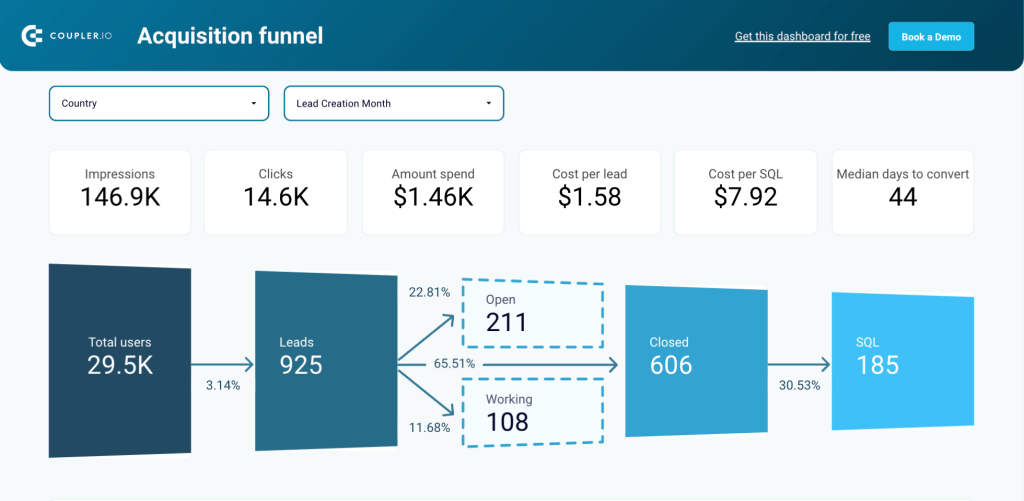
Analyze your sales funnel to see which stages are less effective than expected and need improvements. The filters on the top enable you to conduct geographical analysis and determine which regions are the most promising in terms of lead generation or conversions. By timely discovering problematic areas and new opportunities, you can improve pipeline health and increase the revenue it generates.
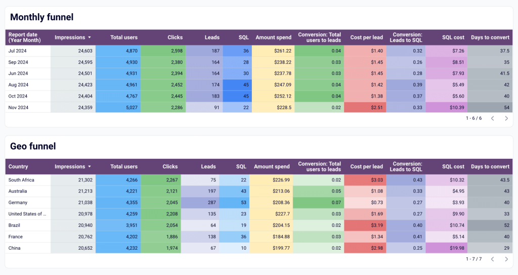
For your convenience, the dashboard also includes table-view funnels for analyzing performance by region and time period. This allows you to see the best-performing segments and then check if they were impacted by your advertising campaigns or other marketing activities. Once you identify what works best, these insights can be used to scale success.
In addition to funnel data, the dashboard has a separate tab providing you an opportunities overview. It displays information on opportunity dynamics over time, close rate dynamics, as well as a set of key metrics. By using filters, you can see data for specific cases that interest you and use the obtained insights to enhance efficiency.
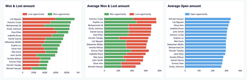
5. Salesforce win-loss analysis dashboard
If you want to improve your team’s results and increase the win rate, then a thorough win-loss analysis is a must. This free template helps you zoom into detail and identify success factors behind won deals, as well as zones of inefficiency that can lead to lost opportunities.
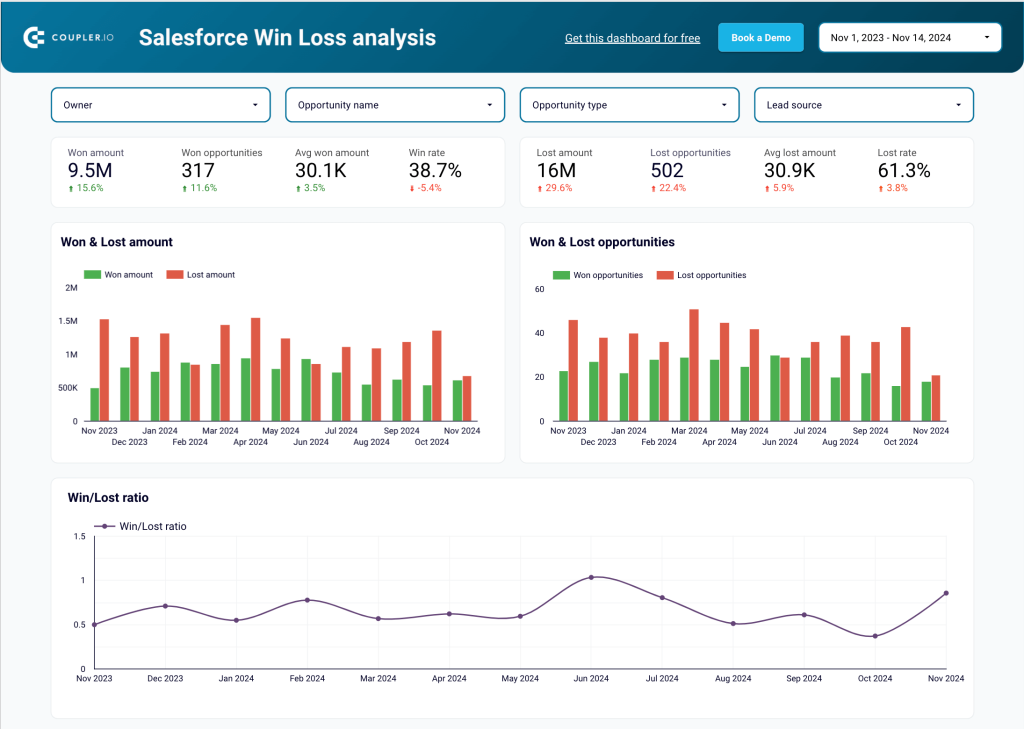
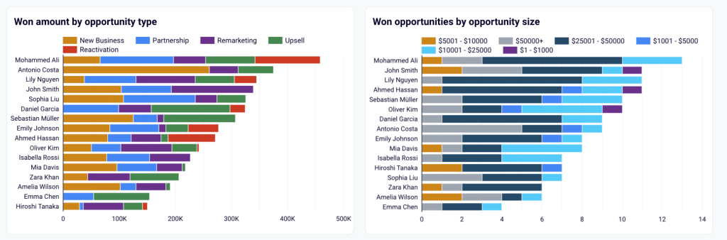
Filter data by opportunity type to estimate results for each of them. For example, you can compare the win/lost ratio for New Business, Partnership, Upsell, and so on. This allows you to estimate whether the effort invested into a particular type produces proportional results. Once you know what the most promising segments are, you can allocate more resources to work on them.
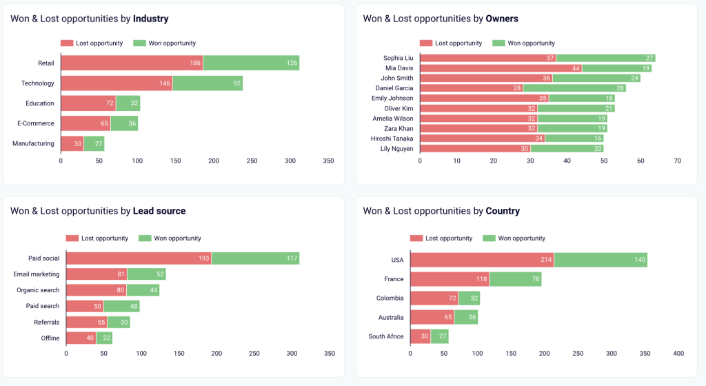
The dashboard includes a number of graphs presenting your won and lost deals from various angles. You can explore this data organized by industry, owner, lead source, country, and more. This enables you to determine the best-performing segments to focus on.
The Coupler.io template gallery is not limited to the sales dashboards. You can find useful Looker Studio dashboard examples for advertising platforms, CRM apps, ecommerce tools, and more.
Option 2: How to create a sales dashboard in Looker Studio
If you want to create your own sales dashboard in Looker Studio from the ground up, you will find a step-by-step guide in this section.
We’ll show you how to build a simple Looker Studio sales report with minimal formatting and a few charts: a scorecard, time series, and a table.
Step 1. Automate sales data load to your dashboard with Coupler.io
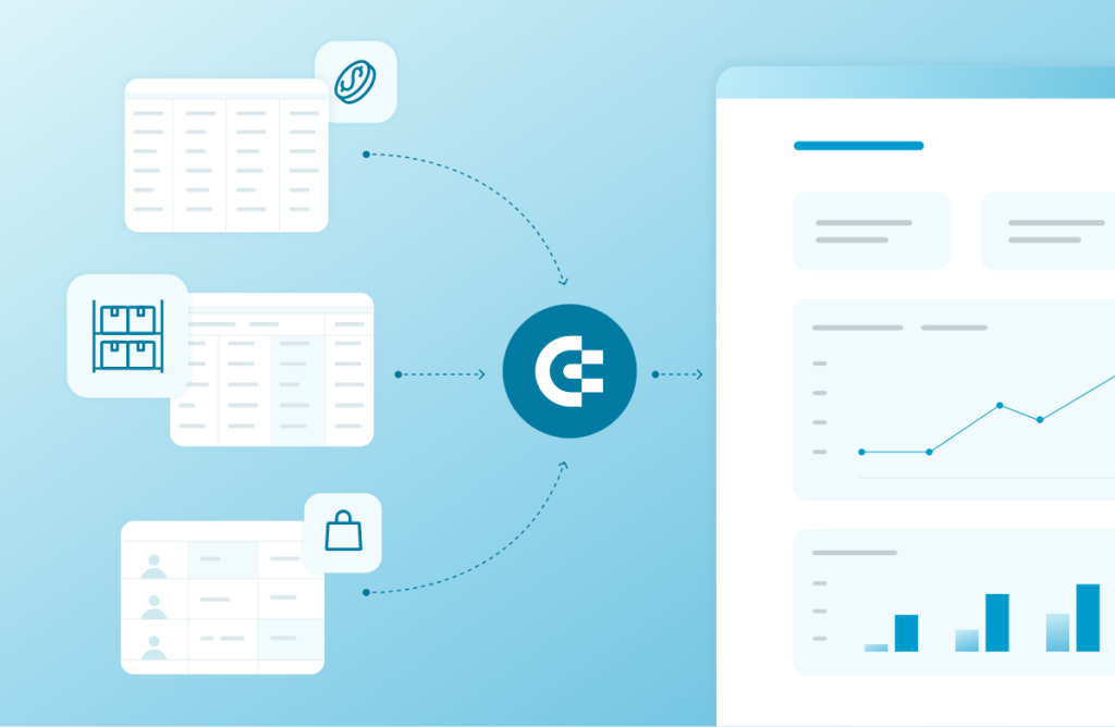
First of all, you need to connect your data to Looker Studio. Although data can be simply uploaded manually, it’s much better to transfer it automatically. For this task, you can use the Looker Studio connector by Coupler.io. This reporting automation platform allows you to collect data from over 60 apps and send it to Looker Studio. Coupler.io has automatic data refresh functionality, which makes your dashboard live and always analysis-ready.
- Extract your sales data
To start transferring your data, select your data source from the dropdown list below and click Proceed.
You will be redirected to the pre-configured importer. But first, create a Coupler.io account to use the platform – this only takes a moment, and no credit card is required.
Next, connect your data source account and select the data type to export.
- Preview and transform data
Coupler.io allows you to preview and edit the dataset, if needed. You can hide, rename or rearrange columns, use formulas to add new columns, and calculate custom metrics, as well as sort and filter data.
Apart from that, here you can merge data from several sources into a single dataset (for this, you will need to connect several data sources first).
As a result of performing data transformations on Coupler.io’s side, the dataset you send to Looker Studio will be clean and analysis-ready. This eliminates the need to transform data on Looker Studio’s side and makes your dashboard load faster. The reason for this is that the BI tool won’t need to process your data before displaying it.
This comes in handy as Looker Studio is notorious for its slow speed, especially when working with large datasets or several data sources.
- Load data and schedule updates
Next, follow the onscreen instructions to connect your Looker Studio account. It will take you just a couple of minutes to create a data source in Looker Studio, give authorization permissions, and connect your dataset.
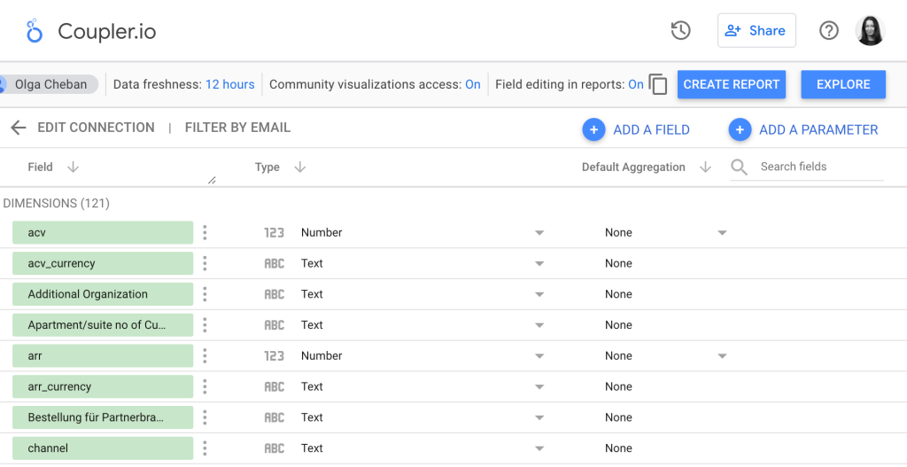
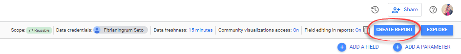
Then, check if Looker Studio has assigned the correct fields to all dimensions and edit them if needed. Once done, click Create report in the upper right corner.
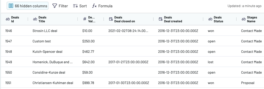
Looker Studio will automatically create a data table based on your data. In most cases, it’s not useful, so you can delete it.
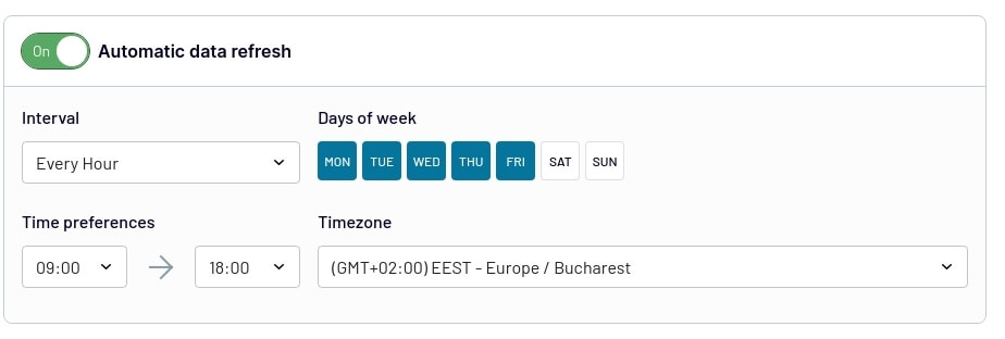
Then, return to the Coupler.io interface and set up a schedule for automated updates. Coupler.io can send fresh data to your dashboard up to every 15 minutes.
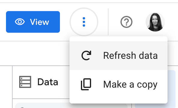
If Looker Studio doesn’t display the latest data, you can click on the three dots in the upper right corner of your dashboard and refresh data manually.
If you want to connect other data sources or data types, repeat the same steps for each of them.
Now, let’s see how to visualize your data and add the first graphical elements to your sales dashboard.
Step 2. Create a report and visualize data
We’re ready to create a Looker Studio sales report. But before that, it is a good idea to review the field settings.
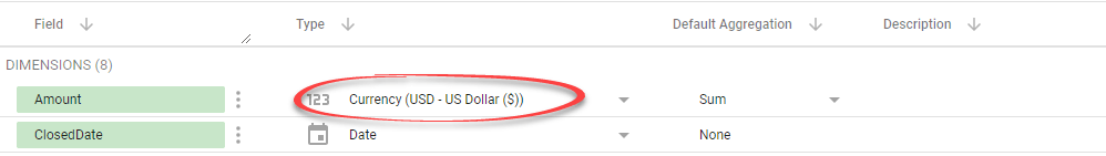
In the Looker Studio data source page, you can change a field’s datatype and aggregation to represent this field in charts better and how its value is grouped.
For example, change the Amount column to a currency field type since it represents monetary values. Do this by selecting Currency > USD – US Dollar ($).
If everything looks OK, create a new report by clicking the CREATE REPORT button at the top.
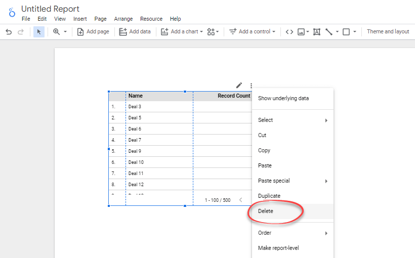
Looker Studio creates a random table based on the fields in your data source. Let’s just delete it for now.
To delete, right-click on the table and select Delete from the menu.
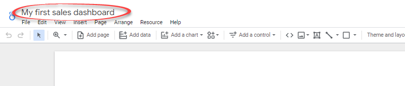
If you want, rename the report by clicking the Untitled Report text and typing a new title.
2.1. Add and modify a scorecard
A scorecard is a great start as it’s like choosing a headline.
This component is very useful to help you see the big picture. They are primarily used to summarize data over the entire time frame of the report.
We’ll add a scorecard that shows the total revenue in compact numbers. We’ll also show how the value compares with a target revenue.

The steps are below.
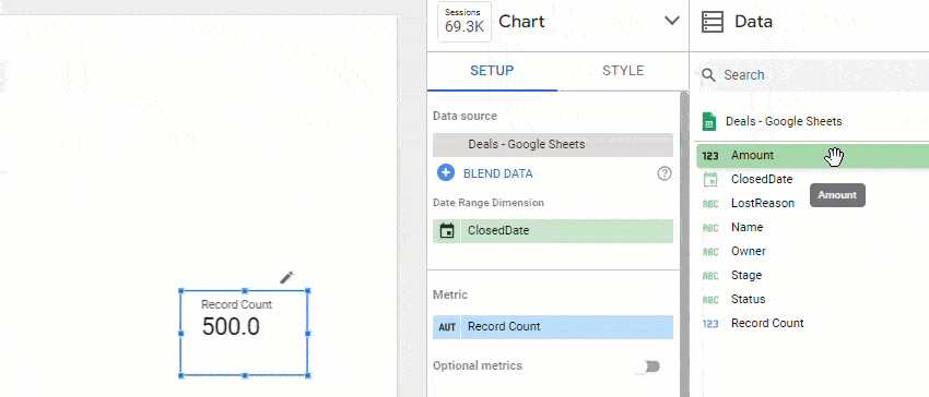
- Click the Add a chart icon in the toolbar, then select Scorecard with compact numbers.
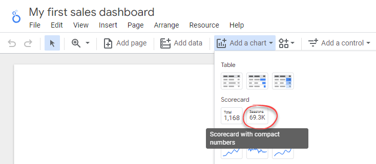
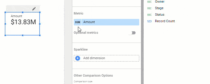
- By default, the scorecard will show the total Record Count metric. To change the metric, drag the Amount field on the Data tab to replace the Record Count field.
- To change the scorecard label, hover over the first column of the metric until you see a pencil icon. Click it to open a pop-up to edit the metric. Give your new metric a name: Revenue. Then, click anywhere outside the pop-up to close it.
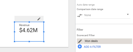
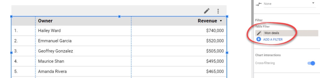
- Click Add a filter to open the Create Filter panel. We’ll add a filter so that the revenue represents only won values. As for now, it actually represents all won and lost.
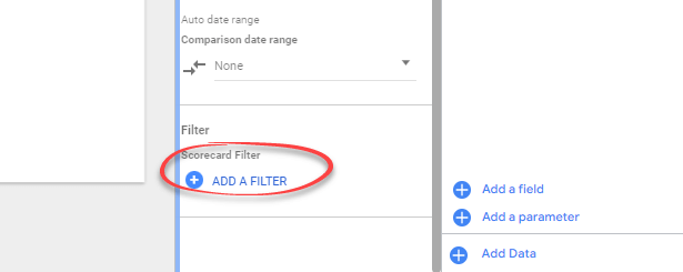
- In the Create Filter panel, create a filter that only includes rows with the Status equal to Won, as shown in the image below. Name the filter Won deals.
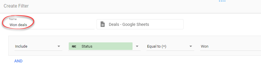
- Click the Save button to apply the filter. You’ll see that Revenue is now showing the total won deal values.
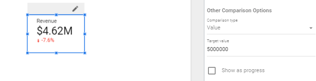
- Modify the scorecard to show the comparison to a target value. Let’s say our target revenue is $5M. To display the comparison, find the Other Comparison Options section. Change the Comparison type to Value and the Target value to 5000000.
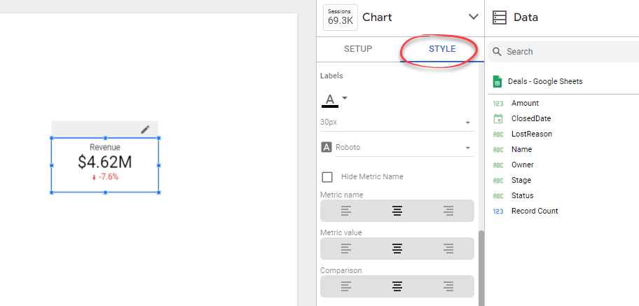
- Finally, click the Style tab. You’ll see options to change the appearance of your scorecard. Modify as you like. For example, you can change the alignment and font size of the text inside the scorecard.
2.2. Add a time series chart
We’ll add a time series to show how the revenue changes over time and compare it to the lost values.
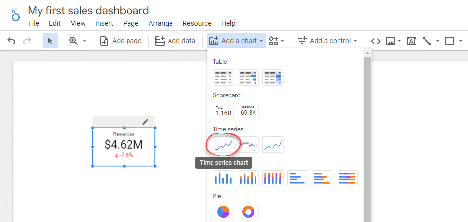
- Click Add a chart icon in the toolbar, then select Time series chart. Drag it next to the scorecard.
- We’ll change the time series to display monthly data. To do that, hover over the ClosedDate dimension, then click the pencil icon. After that, Change the field’s data type to Month and name it Month.
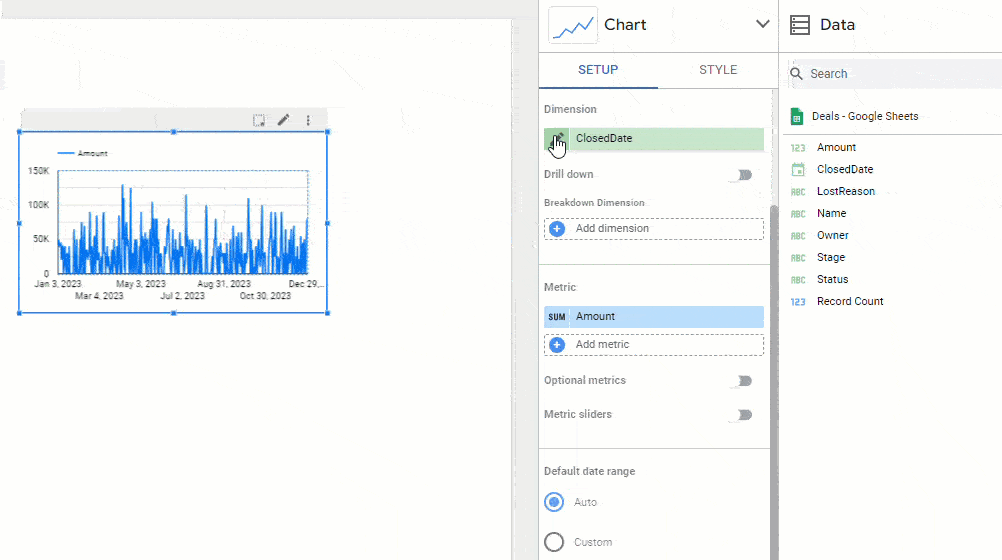
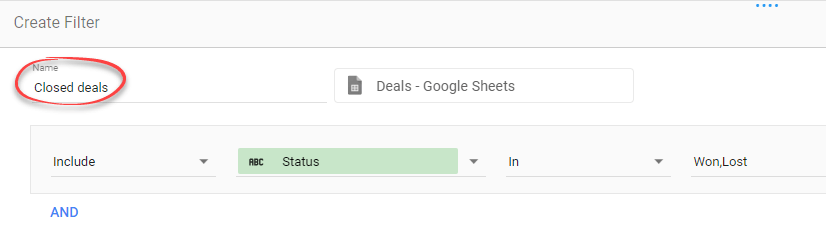
- Click the Add a filter button. In the Create Filter panel that appears, include only the deals with Won and Lost statuses, as shown in the image below. Name the filter Closed deals.
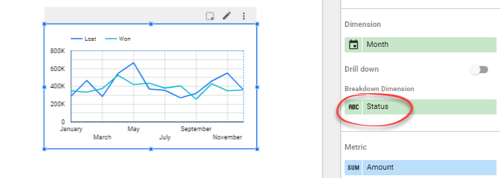
- To break down the metric into won and lost values, add Status as a breakdown dimension. When done, close the pop-up by clicking anywhere outside it. See that the x-axis of your chart now displays the month names.
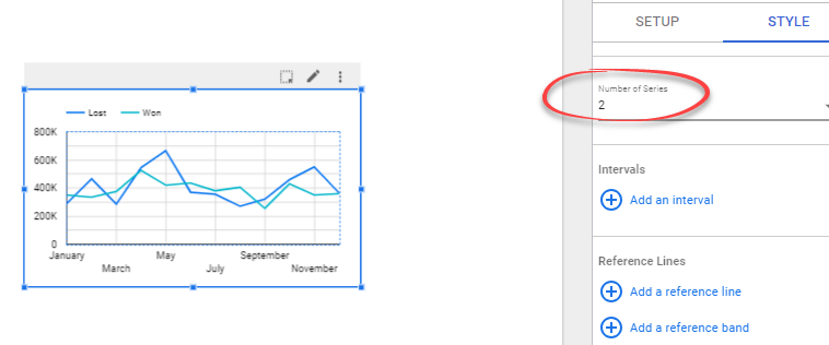
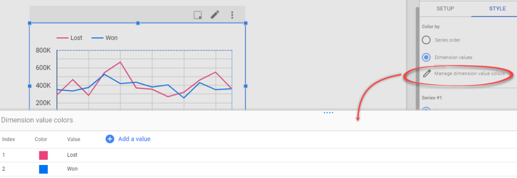
- Switch to the Style tab and change the Number of Series to 2.
- If you want, change the line colors by clicking Manage dimension value colors and changing the colors as you like.
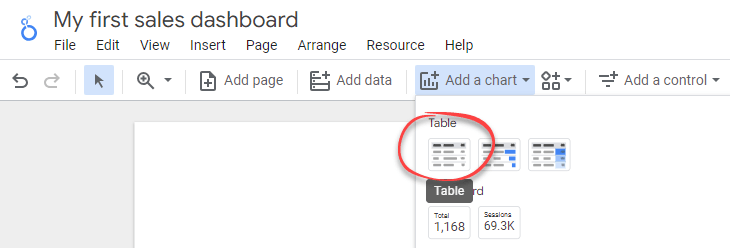
2.3. Add a table to your sales dashboard in Looker Studio
Now, we’ll add a table that shows the top 5 deal owners. To do that:
- Click Add a chart icon in the toolbar, then select Table.
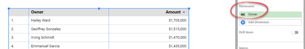
- Click on the Dimension field and change it to Owner.
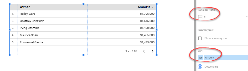
- Set the Rows per page to 5 and ensure the table is sorted by the Amount in descending order.
- Hover over the first column of the Amount metric until you see a pencil icon. Click it to open a pop-up to edit the metric. Name the metric to Revenue. Then, click anywhere outside the pop-up to close it. After that, you can see that the third column header is updated to Revenue.
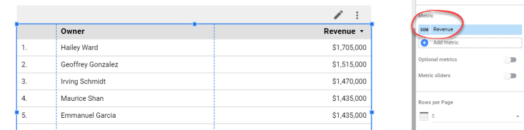
- Add a filter to the table to display only Won values. To do this, click the Add a filter button, then select an existing Won deals filter we’ve created before.
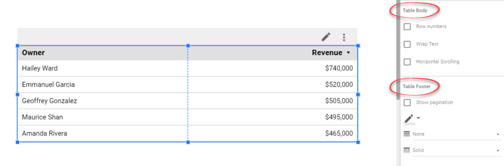
- Switch to the Style tab. In the Table Body, untick Rows number to remove numbers in the first column of the table. In addition, you can also remove pagination by unticking the Show pagination checkbox in the Table Footer.
2.4. Create a header and apply a theme
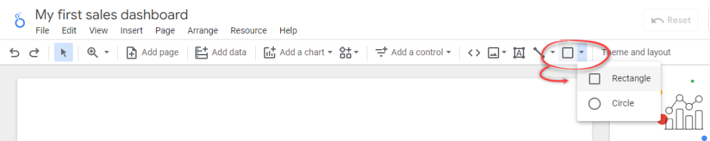
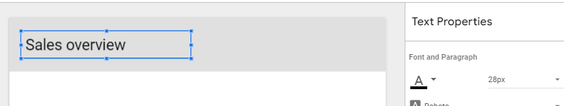
In Looker Studio, you can add a header to your report by adding a rectangle and a text.
Click on the Shape icon and select Rectangle. After that, draw it to the top of the report page.
Add text to the header by clicking the Text icon. Give your report a text header you like. You can also change its font size and other settings in the Text Properties panel.
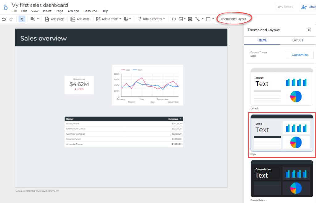
Change the look and feel of your report by clicking Theme and layout in the toolbar. In the Theme and Layout panel that appears, choose a theme that you like.
Congratulations! You’ve built a simple sales dashboard in Looker Studio. By following the steps in this article, we hope you’ll feel empowered to create your very own sales dashboards.
Ready to share your report with others? Click on the Share dropdown in the header toolbar.
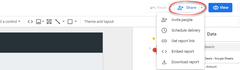
From the dropdown menu, you’ll have different options to share it:
- Invite people. This option lets you directly invite specific people or Google Groups to view or collaborate on your report. Simply enter their email addresses, and they’ll receive an invitation to access the report.
- Scheduled delivery. You can send scheduled reports in PDF format to specific recipients regularly. This option is useful for frequently updated reports, ensuring that stakeholders always have the latest updates.
- Get report link. This generates a unique short URL for your report. You can share this link with anyone you wish to have access to the report.
- Embed report. This option gives you a snippet of code, which you can embed into a webpage, such as a blog post.
- Download report. You can download the report as a PDF and share it with others via email or Slack. This option also allows you to protect the document with a password for added security. Remember you must create a strong password to prevent unauthorized persons from accessing your data and for this, you can use a password generator.
Consider looking through our tutorial on how to use Looker Studio for beginners to learn some other basics. This will help you explore Looker Studio’s interface and menus, data sources and data connectors, as well as metrics and dimensions.
Option 3. Hire experts to design your Looker Studio sales dashboard
For some complex data management cases, internal expertise may not be enough. Hiring an external data consultancy team can solve this problem. For example, when you have specific project requirements or need to work with multiple data sources and systems, or when you want to address a specific data-related challenge.
To better understand how this works, take a look at the following examples.
Case study 1: How Habitium saved 40 hours/month on pricing optimization
Habitium, a popular European ecommerce platform, used Coupler.io to manage data from hundreds of distributors. This led to significant process optimization and profit margin increase.
Challenge
Habitum was working with more than 500 distributors throughout Europe and had an impressive catalog of over 400,000 products across multiple categories. CRM apps and other ready-made tools proved unhelpful for managing such a huge volume of data.
The challenges they faced included:
- An error-prone pricing process, which was performed manually
- Lack of real-time data synchronization between the suppliers and Habitum’s online platform
- Changes in stock or prices had to be updated manually
- As each supplier was using their own data formats, bringing it all together was difficult and time-consuming
Solution
- Habitum used Coupler.io to integrate data from multiple sources and better manage its data flows
- They utilized Coupler.io’s built-in CSV and JSON integrations with its Prestashop instance that the shop runs on. This allowed them to automatically convert different data types and bring them to the common denominator. All data was channeled to Google Sheets, where it’s easy to manage it
- Apart from that, the company used Coupler.io’s dashboard templates for Google Search Console and Google Analytics 4 to streamline reporting
Results
After implementing the improvements mentioned above, Habitum received access to complete, fresh, and unified information while reducing manual workload and the probability of errors.
- Pricing and stock tasks from over 200 distributors were automated
- Manual labor on those tasks was reduced from 50 to 10 h/month
- All this led to an 11% increase in sales and a 5% increase in profit margin
Case study 2: How Fable saved $60k+/year on data analytics
Fable Food partnered with Coupler.io to consolidate financial and operational data siloed between systems and entities in different countries. The collaboration led to enhanced efficiency and significant savings on data analytics.
Challenge
Fable Food, an Australian-based ecommerce company, expanded into the UK and US markets. It established a separate entity in each country and started shipping its products around the globe. However, they ran into some difficulties:
- Issues with tracking inventory worldwide. In particular, lack of transparency often led to untimely management of soon-to-expire inventory
- Data was scattered across different entities, platforms, and departments
- Financial reporting for the company as a whole was hindered. Integrating data from several entities was complicated, inefficient, and could only be done with a delay
- Lack of a consolidated source of visual reporting about the company
Solution
- The Coupler.io team established automated dataflows from various sources to BigQuery and then to PowerBI for data visualization
- Coupler.io’s business analysts built a comprehensive live inventory dashboard showing stock levels and other product information all over the world
- They also created a complete financial dashboard, displaying consolidated data from all Fable’s entities in a single currency
Results
These optimization steps provided Fable with reliable tools for inventory management, financial analysis, and improving cost efficiency:
- 24/7 access to live financial information and inventory data
- 0% product expiration rate and a twice smaller quantity of close-to-expired products
- $60k+/year saved on data analytics. It would take a dedicated business analyst working full-time to achieve the same results as those delivered with the help of automation and tailored reporting
You can find data experts at Coupler.io. They can create custom Looker Studio sales dashboards tailored to your business needs. Our professional will help you integrate data from various sources, including CRM platforms like Salesforce, HubSpot, and Pipedrive. Apart from data visualization and automation, they will assist you with streamlining business intelligence processes or setting up your data infrastructure.
Automate sales reporting with Coupler.io
Get in touchYou can also hire freelance professionals on platforms like Fiverr and Upwork who offer Looker Studio dashboard creation services. They often have a wide range of prices and services, allowing you to find one that fits your budget and needs.
What option should you choose to automate sales reporting in Google Looker Studio?
You’ve learned about different ways to create a sales and marketing dashboard in Looker Studio, from DIY to hiring a consultancy service to do the job. And, of course, you can complete all the steps to create a sales dashboard in Looker Studio yourself. You’ll need to spend time setting up a data source, adding charts, applying a theme, etc. This requires certain skills and expertise. If you have these, you can tailor a solid sales performance dashboard on your own.
However, in our opinion, using Data Studio templates is the golden mean option. You get a ready-to-go reporting solution, which can be customized or scaled later. If you’re using Salesforce, HubSpot, or Pipedrive, we encourage you to try Coupler.io’s Looker Studio sales dashboard templates.
Thanks for reading! And good luck on your sales data management journey!