

You’ve already launched your first campaign in Mailchimp! Then you can accept our congratulations…or compassion? Well, how do you know whether your campaign was successful? The number of orders, total revenue, opens, clicks, and other figures are meant to tell you the bitter truth. All this data is not just an indicator of success or failure, but also a basis for your decision-making about what to do next. So, in this article, we’re going to talk about Mailchimp analytics and everything you need to know about it.
Does Mailchimp provide analytics?
Yes, it does! Mailchimp analytics provides a few out-of-the-box tools to get insights into your audience and campaigns. You can also have real-time campaign data at your fingertips if you use the Mailchimp mobile app.
If you google ‘mailchimp analytics explained’, the first result you’ll get is the introduction of Mailchimp reports. These contain versatile statistical data displayed in the form of metrics based on which you can make decisions.
Another performance analytics tool is the Audience dashboard. It’s a collection of insights about your contact data including locations, engagement, and even predicted demographics.
We’ll talk about the dashboard and reports below, but first a disclaimer:
The available metrics on the dashboard differ depending on the Mailchimp marketing plan.
Check out the following table to see which analytics options are available on your subscription plan.
Analytics in Mailchimp according to the marketing plans
| Free | Essentials | Standard | Premium | |
|---|---|---|---|---|
| Audience Dashboard | ? | ? | ? | ? |
| Campaign Engagement | ? | ? | ? | ? |
| Purchase Behaviours | ? | ? | ? | ? |
| Campaign Reports | ? | ? | ? | ? |
| Website Reports | ? | ? | ? | ? |
| Customer Journey Reports | ? | ? | ? | |
| Comparative Reports | ? | |||
| Predicted Demographics | ? | ? | ||
| Customer Lifetime Value | ? | ? | ||
| Purchase Likelihood | ? | ? | ||
| Lookalike audience finder | ? | ? |
Now let’s dive deeper into Mailchimp analytics.
Mailchimp analytics tracking
Audience analytics dashboard
The audience dashboard provides you with the data to better organize your contacts, understand what your customers want, and other valuable insights. You can access the dashboard through the Audience section on the navigation panel on the left.

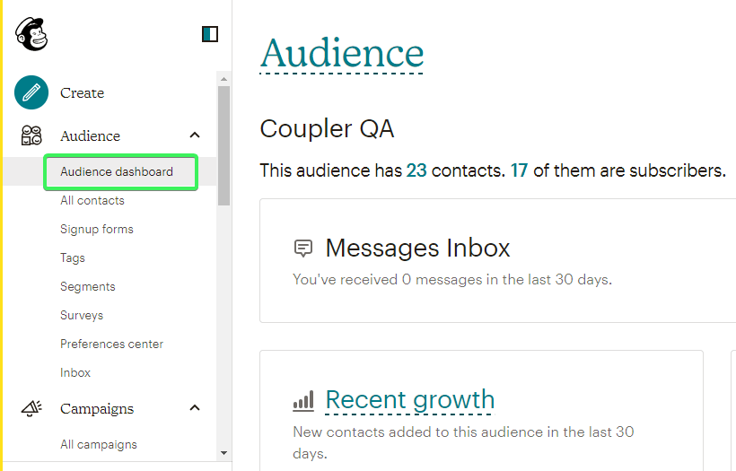
The metrics displayed on the audience dashboard include:
- Recent growth – an at-a-glance overview of how many new contacts have been added to your audience over the last 30 days and where they came from.
- Tags – your audience organized by the tags you use.
- Predicted demographics (available at Mailchimp Standard or Premium plans) – your audience broken down by their predicted gender and age.
- Email marketing engagement – your audience broken down by how often they interact with your email campaigns based on the open and click activity.
- Top locations – the top five geolocations where your audience most frequently interacts with campaigns based on the audience’s IP addresses.
- Customer lifetime value (available at Mailchimp Standard or Premium plans) – your audience broken down by their predicted future spending. This metric is based on advanced mathematical modeling that takes into account customer age, the time between the first and last purchase, the time since the most recent purchase, how many times a customer made a purchase and how much they spent in total.
- Likelihood to purchase again (available at Mailchimp Standard or Premium plans) – your audience broken down by how likely they are to make a purchase in the future.
That’s it for the Mailchimp analytics available for your contacts. Now, let’s see what you’ve got to analyze the performance of your emails, automations, landing pages, etc.
Campaign reports
You can find the Mailchimp campaign reports in the Campaigns section on the navigation panel on the left.

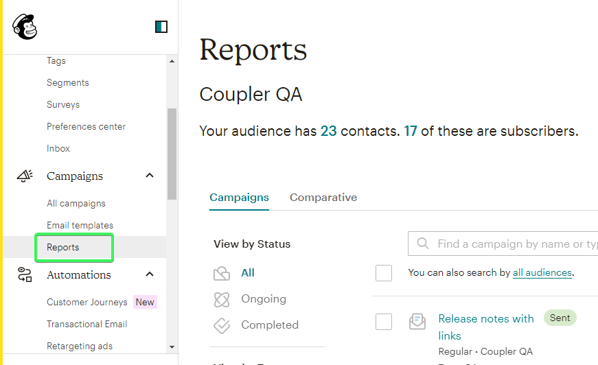
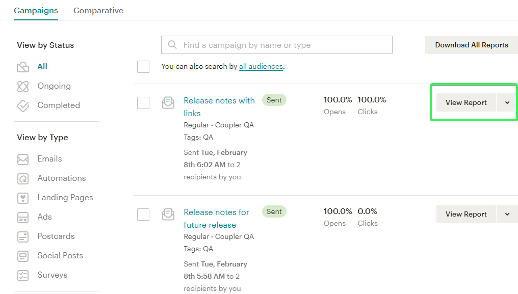
You will see all the reports, but you can also view them by status or by type. The latter includes the following:
- Emails – information about the campaign’s performance including clicks, opens, orders, total revenue, social performance, top locations, and many other metrics.
- Automations – statistics about the performance of an automated series of emails or individual emails including open and click rates, audience average, etc.
- Landing Pages – information about the performance of your landing pages including visits, clicks, performance graph, and other metrics.
- Ads – information about the performance of your ads including clicks, impressions, cost per click, total revenue, and other conversion metrics.
- Postcards – stats about your postcard campaign status, the number of postcards sent, audience, etc.
- Social Posts – information about the performance of your post including total reach, impressions, engagement, and other metrics.
- Surveys – overview of survey results including the total number of responses from known, unknown, and new contacts.
You can filter reports by type or status, as well as find a certain campaign by its name, then click View Report.

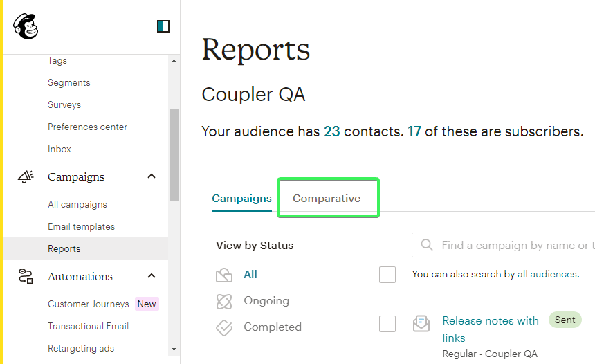
Comparative reports
(available with Standard or Premium plans)
You can generate aggregated and individual campaign stats in a form of a snapshot to identify patterns in subscriber engagement. Each comparative report includes three major sections:
- Aggregated results – an overview of your campaign statistics including open and click rates, bounces, etc.
- Performance over time graphs – set of graphs of the data per each metric in the report.
- Comparative results – a detailed breakdown of how each metric performed for each campaign in the report.
You can find Comparative reports on a tab next to Campaigns reports.

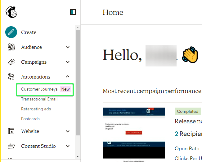
Customer Journey reports
(available with Essentials, Standard, or Premium plans)
A customer journey report includes the information about the contacts broken down by their status on a Customer Journey: started, in progress, completed. You will find these stats on the Customer Journey homepage.

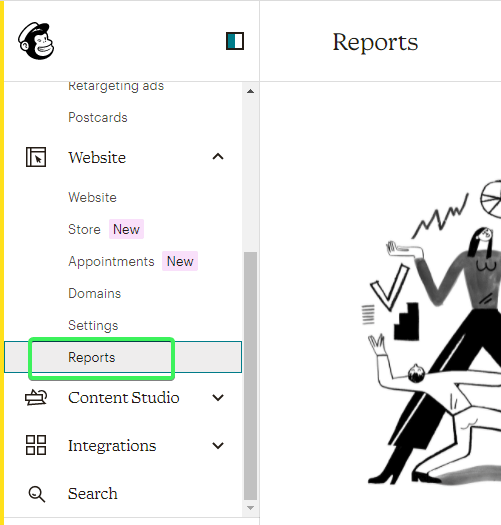
Website dashboard or website reports
Mailchimp analytics also provides you with a website report dashboard. Here you can get an overview of your website performance stats including page views, unique visits, and other metrics. Traditionally, you’ll find this report on the respective page on the left-side navigation panel.

Those seem to be all the available tools for Mailchimp analytics. At first glance, you get multiple preset metrics that should contribute to your decision-making.
On the other hand, your analytics is quite limited since you can’t add other metrics, change visual appearance, etc. In addition, you have to jump between different tabs to see the necessary information, however, it would be much more actionable to have everything in one place. I bet you can even imagine what a proper Mailchimp analytics dashboard should look like. So, what’s the issue? Do it yourself based on your Mailchimp data in the tool that you are familiar with.
Mailchimp data analytics dashboard DIY
When we say that you can build a Mailchimp analytics dashboard, we mean that you can transform the raw data from Mailchimp in many ways: group, calculate, filter, visualize, etc. For this, you basically need to take three high-level steps.
Step 1. Choose a tool to build a Mailchimp analytics dashboard
Choose a tool where you can perform data transformation and processing. This can be a spreadsheet app, such as Excel or Google Sheets. Or you can choose a more advanced option – a data visualization tool, such as Looker Studio (Data Studio), Tableau, Power BI, etc.
Step 2. Load data from Mailchimp
You can’t just manually export data from Mailchimp and load it to your tool. This would be rather inefficient since you’d have to do this again and again to refresh data in your dashboard. So, it’s crucial to automate the data flow from Mailchimp to your dashboard.
For this, you can use Mailchimp data integration solutions that support the tool where you are going to build a dashboard. You can consider such options as:
- Coupler.io – allows you to schedule data load to spreadsheet apps, data warehouses, and data visualization tools. For example, you can connect Mailchimp to Power BI or Looker Studio and build your interactive self-updating dashboard there.
- Zapier – lets you build trigger-based data flows between Mailchimp and Google Sheets.
- CData – provides an ODBC driver to access live MailChimp data in business intelligence tools like Tableau.
- And many others
Step 3. Build a Mailchimp analytics dashboard
At this step, you need to select which metrics you want to have on your dashboard, how to display them, which filters to implement, and so on. Use the functions and features available and turn on your creativity to tailor an actionable dashboard.
With that in mind, let’s see what this workflow can look like in the example of Google Sheets as a tool for our Mailchimp analytics dashboard.
Example of a Mailchimp email analytics dashboard in Google Sheets

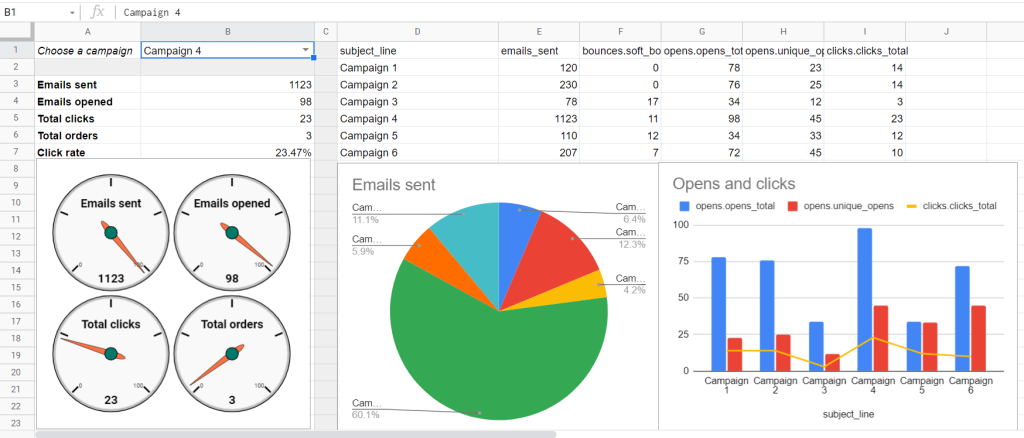
Here is what our simple Mailchimp email analytics dashboard in Google Sheets looks like. It has a filter by email campaign so that you can see different performance metrics per each of your campaigns.
To the right of it, there is an aggregation of these metrics among the campaigns so that you can see the performance in comparison. We spent up to 6 minutes building this dashboard without deep knowledge of Google Sheets. Here is what we did.
Export data from Mailchimp to Google Sheets
As we mentioned above, we did not export data from Mailchimp in a regular way by downloading reports as CSV. Instead, we automated the export of certain data entities using the Mailchimp Google Sheets integration by Coupler.io.
Coupler.io is a tool for the automated data import from different sources including Mailchimp, HubSpot, Pipedrive, and others to Google Sheets, Excel, or BigQuery.
Sign up to Coupler.io with your Google or Microsoft account and click Add new importer. Select Mailchimp as a source and Google Sheets as a destination and click Proceed.

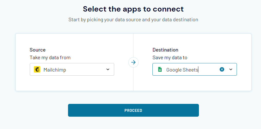
In addition to Google Sheets, you can export Mailchimp to Excel or Mailchimp to Google BigQuery.
Then you’ll need to take the following steps:
Configure source
- Connect your Mailchimp account.
- Select Reports as the data entity. Optionally, you can specify the period to filter your data.

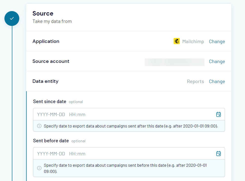
Note: We only exported Reports data for our dashboard, but you can also benefit from other data entities including Audiences, Automations, Contacts, etc. For audience-related entities, you’ll also need to select your Mailchimp audience.
Configure destination
- Connect your Google account
- Select a Google Sheets document on your Google Drive and specify a sheet to load data to. You can create a new sheet by typing a new name.

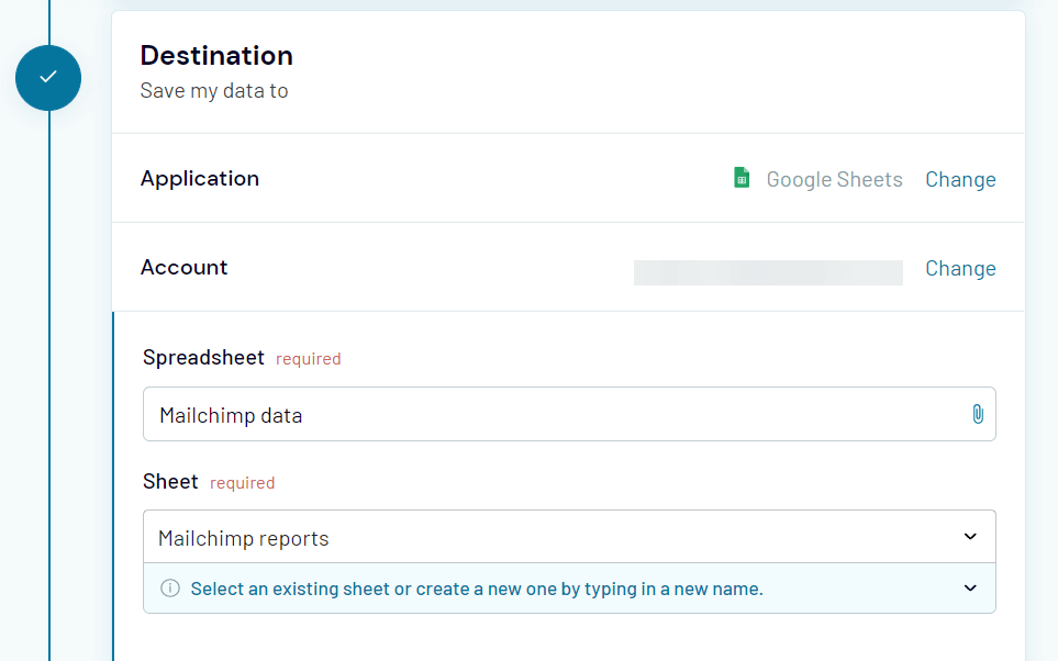
Note: Read the Coupler.io documentation to learn more about the optional features.
Configure schedule
This step is required to automate the data export from Mailchimp to Google Sheets so that our analytics dashboard is self-updating. Enable the Automatic data refresh and set up a frequency. You can schedule exports at a frequency from every month to every 15 minutes.

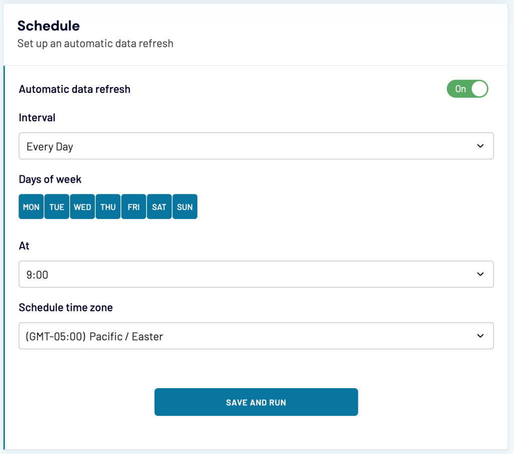
In the end, click Save and Run to make it work. There you go!

Now, with the data available, you can build the dashboard. At the same time, Coupler.io offers predesigned Mailchimp report templates. In our example, we did the following.
Filter by email campaign
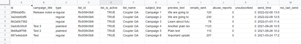
We applied data validation to create a drop-down list of email campaigns.

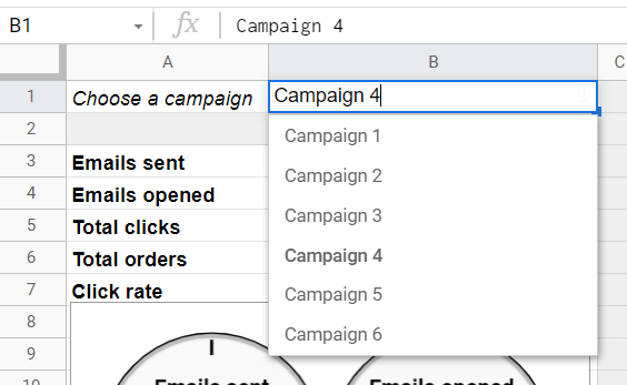
The range for the data validation corresponds to the column subject_line.
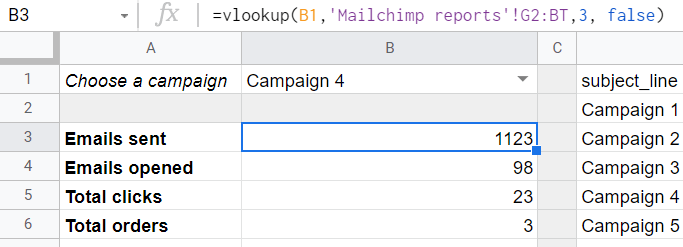
Metrics
We selected a few metrics that are already provided in the data exported from Mailchimp. However, to make these metrics linked to our filter by email campaign, we applied VLOOKUP formulas like this:
=vlookup(B1,'Mailchimp reports'!G2:BT,3, false)

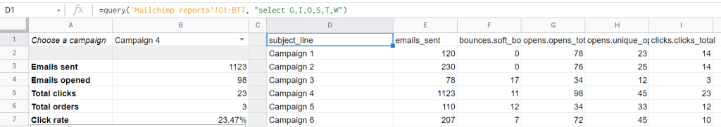
Comparison table
We also queried the metrics for all the campaigns to have a comparison table. This is done with a simple QUERY formula:
=query('Mailchimp reports'!G1:BT7, "select G,I,O,S,T,W")

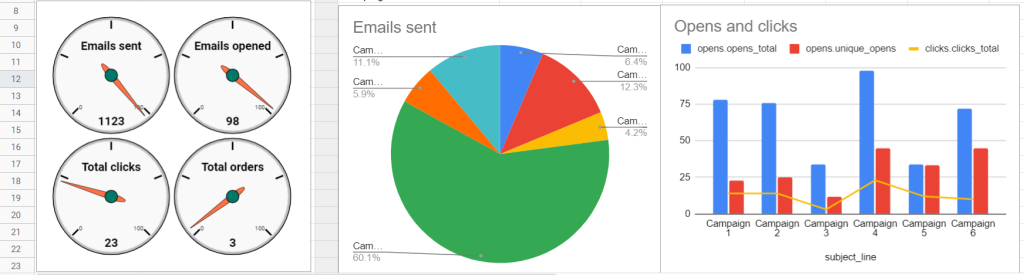
Charts and graphs
With all the metrics grouped and calculated, we inserted data visualizations to our liking 🙂

That’s how we saw our Mailchimp email analytics dashboard, but you have your own vision. So, feel free to implement it your way in your custom dashboard!
How can I do Mailchimp predictive analytics?
As we mentioned above, Mailchimp professional subscriptions offer some built-in tools for predictive analytics. But you can definitely do more of that, for example, in BigQuery, using its machine learning capability.
And you can easily load your data from Mailchimp to BigQuery using Coupler.io.
Bonus: Mailchimp events analytics
Events are activities that a contact engages in outside your emails that you want to track or monitor. Creating and tracking events is only possible via the Mailchimp Marketing API programmatically or with third-party integration.
In our article about exporting Mailchimp to Google Sheets, we’ve covered how to work with the Mailchimp API including:
- Getting a Mailchimp API key
- Loading data via the Mailchimp API using Coupler.io
We won’t focus on the basics covered in that article. However, we’ll show how you can import events data for analytics.
Let’s assume that you have already created an event, for example, to send an email and create a segment of contacts whenever a new user signs up with a referral code. In order to get insights about the audience based on this created event, you need to use the Events endpoint.
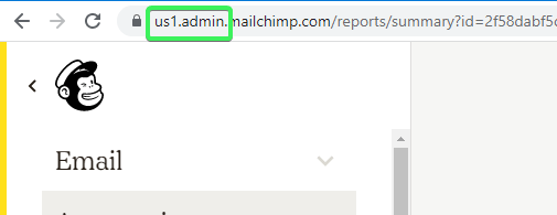
https://{server-prefix}.api.mailchimp.com/3.0/lists/{list-id}/members/{subscriber_hash}/events
{server-prefix}– the beginning of your Mailchimp account web address.

{list-id}– id of your Mailchimp list{subscriber_hash}– id or email address of a subscriber who triggered the event
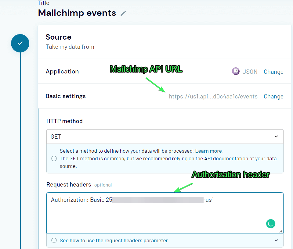
So, you’ll need to send a GET request to this URL, and do not forget about the Authorization header with your API key:
Authorization: Basic {your-api-key}
Here is what it may look like if you use JSON integration by Coupler.io to send a GET request:

As usual, you’ll need to configure your destination and click Save and Run. The information about your Mailchimp event will be loaded into a chosen spreadsheet. Then you’ll be able to use this information for events analytics.
For more information about the Events API, read the Mailchimp Developer documentation.
Mailchimp analytics: which option is the best one?
Let’s be honest – the native Mailchimp analytics provide you with essential metrics, but the way you can see those are not very convenient. So, Mailchimp users are quite limited in analytical capabilities. This is the main reason why more and more of them tend to export their raw data and build reports and dashboards upon it.
Although the analytics dashboard example featured in this article is rather primitive, it conveys the main idea – Mailchimp analytics is not limited to only Mailchimp. You can create a better version of a report or dashboard, combine it with audience and first-party data from other sources, and more. If you need this, then you know what to do. Good luck with your data!