You’ve got numbers coming in from Google Analytics 4, Meta Ads Manager, HubSpot, Mailchimp, and more. Page views, bounce rates, open rates, CPCs, and MQLs are a goldmine of insights. But when they’re scattered across platforms, it feels more like a mess than a map.
You’re not the only one stuck in this chaos. According to a Constant Contact study, only 24% of marketers say they’re happy with how they visualize data for decision-making. And just 20% feel they’ve nailed data organization.
Marketing data visualization turns raw data into charts, dashboards, and visuals. With this, you can spot patterns, understand performance, and make faster, smarter decisions. In this guide, we’ll walk you through:
- What marketing data visualization is (with examples)
- The best types of charts and when to use them
- Tools and tips to build dashboards your team will actually use
Let’s turn your scattered metrics into a story you can act on.
Marketing data visualization – what is it, and what does it looks like?
Data visualization is the process of eliciting insights from the raw data and displaying them in a visually understandable form.
Therefore, data visualization in digital marketing is the process of eliciting insights and visualizing them based on marketing raw data. The marketing data that you can represent in the different forms of graphs and charts includes:
- Website analytics (page views, conversions, bounce rate, etc.)
- Email marketing (open rate, click-through rate, unsubscribes, etc.)
- Social media (shares, subscribers, approval rate, etc.)
- Advertising (clicks, impressions, cost per click, etc.)
- Video marketing (views, likes, sign-ups, etc.)
- Other marketing activities
The format you choose depends on what you need to analyze. For instance, a web analytics dashboard might use a line chart to show daily traffic and key user actions. A pivot table in Google Sheets can break down website performance by channel or region. If you’re managing multiple data points, a more advanced view like a dashboard for CMOs can combine key KPIs, filters, and interactive visuals in one place.
Each of these formats serves a different purpose, like spotting a trend, summarizing a data set, or giving stakeholders a clear snapshot.
Types of marketing data visualization
Different visualizations serve different purposes. Some give a quick snapshot, others reveal trends or compare categories. Choosing the right one depends on what you want to analyze and who you’re sharing it with.
Here’s a breakdown of the most useful types of marketing visuals, grouped by how they help:
Summary visuals
These visuals are ideal when you need a snapshot of key metrics or a compact overview of your marketing data without overwhelming the viewer.
Pivot tables
Best for: Organizing large datasets to extract insights by segment or time period
Pivot tables allow you to group, filter, and rearrange marketing data to analyze performance without needing a chart. You can build them in spreadsheet tools like Excel or Google Sheets, or use more advanced business intelligence software like Looker Studio or Tableau for live data views.
Example: A content marketer could use a pivot table to see how blog performance varies by traffic source and week, revealing which distribution channel works best for each topic.
Read more about using pivot tables in Google Sheets.
Scores & indicators (KPI cards)
Best for: Displaying real-time values of critical marketing metrics
KPI cards present numbers like Amount spent, impressions, clicks, or leads generated in a clean and focused format, usually at the top of a marketing dashboard. They help teams stay aligned on performance without reading through reports.
Here is an example of scorecards you can see on the majority of dashboards to monitor campaign performance.

Trend visuals
These help you visualize how performance changes over time, making it easier to spot growth, drop-offs, or seasonal shifts.
Line charts
Best for: Showing trends or patterns across a timeline
Line charts help you track changes over time, such as daily traffic, monthly revenue, or campaign performance. They’re especially useful for spotting trends and seasonal patterns. If you’re comparing multiple data points like different channels or audience groups, this format gives you a clear side-by-side view.
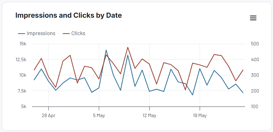
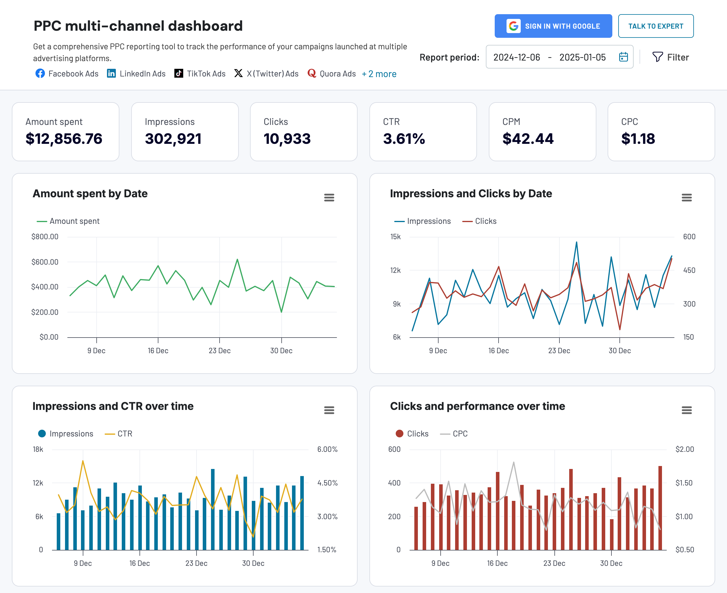
Example: In the PPC multi-channel dashboard, there is a line chart that compares impressions vs clicks, so you can assess the balance between engagement and acquisition.
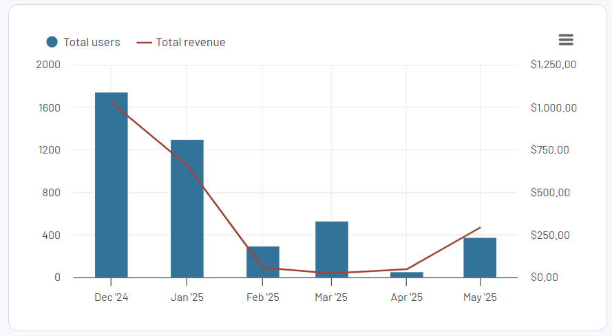
And the all-in-one marketing dashboard offers a line chart combined with a column chart to show the dependent between the number of users and revenue.
Area charts
Best for: Showing both the overall trend and the contribution from each channel
Area charts expand on line charts by stacking multiple series. This helps marketers see how different sources contribute to the total metric.
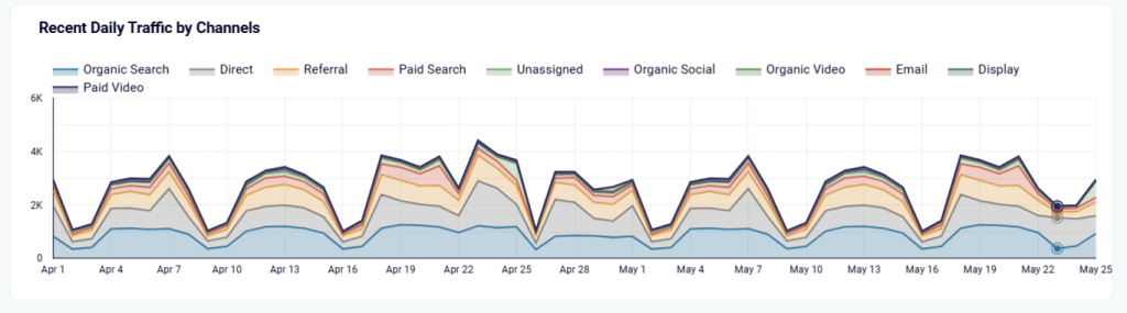
Example: Here is what an area chart showing daily traffic by channels looks like on the web analytics dashboard. It visualizes how each channel, be it email, organic, or paid search, contributed to overall growth. When paid drops, the chart helps justify shifting the budget to organic.
Comparison visuals
Use these when you want to compare multiple values side by side. They are great for performance reviews, A/B tests, and quarterly reports.
Bar & column charts
Best for: Side-by-side comparisons across campaigns, channels, or categories
Bar charts (horizontal) and column charts (vertical) are intuitive and easy to read. They’re great when you want to compare values, especially across many categories. Use horizontal bars when the labels are long, and vertical columns when comparing time periods.
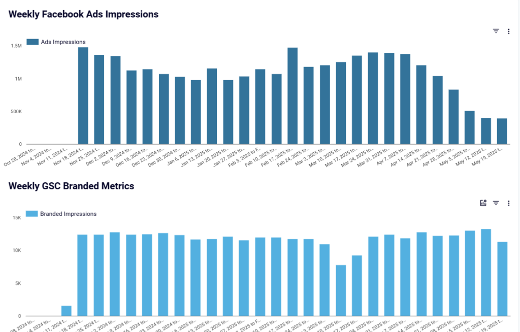
Example: The Facebook Ads & brand awareness dashboard shows the relation between brand impressions/clicks brought from ads and those you’ve had with organic search. It allows you to analyze cost-effectiveness by comparing ad spending to branded clicks for ROI insights on brand awareness campaigns.
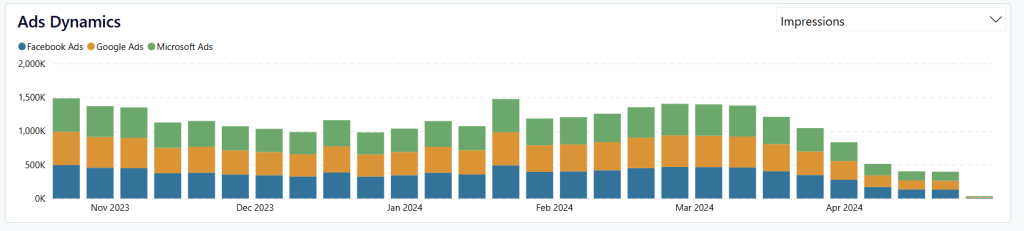
And here is another variation of the column chart made in Power BI. It’s called a stacked bar chart and lets you look at numeric values across one categorical variable to two or three. Here is what it looks like in the brand awareness dashboard that displays shares of Facebook Ads, Google Ads, and Microsoft Ads in the total number of impressions/clicks generated.
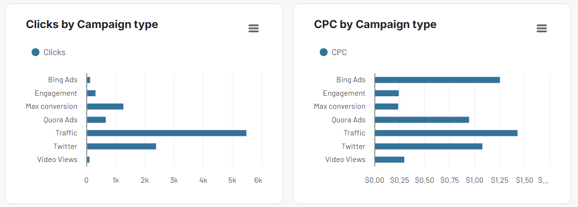
Bar charts are represented by horizontally located rectangles. Here is an example of bar charts on the already mentioned PPC dashboard.
Pie charts
Best for: Showing percentage breakdowns
Pie charts help visualize a breakdown of a whole into parts, such as showing how your budget is divided across channels or what percentage of leads came from each campaign. They work best with three to five categories.
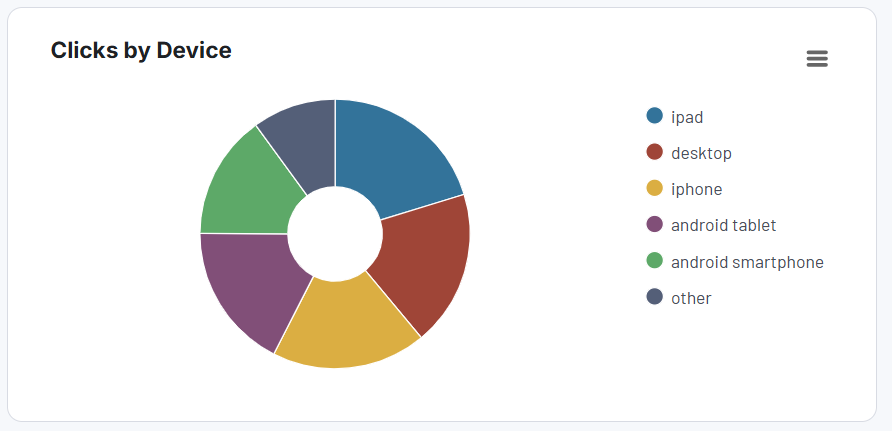
Example: The Facebook Ads dashboard lets you see the distribution of clicks by device, so you can optimize your campaigns accordingly.
Advanced visuals
Use these when you’re working with complex journeys, regional data, or multi-variable analysis.
Funnel? charts
Best for: Visualizing drop-offs across stages of a marketing or sales funnel
Funnel charts show how leads or customers move from one step to another like from ad impression to click, to form fill, to conversion. They highlight where users drop off, helping marketers identify and fix friction points in the journey.
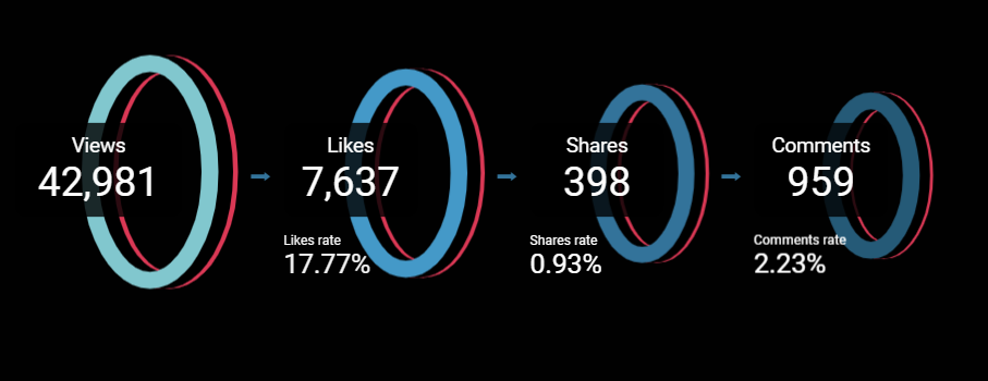
Funnel charts may look different. Here is what it looks like in TikTok analytics dashboard, showing the user journey from view to engagement (like, share, comment).
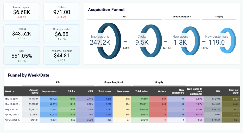
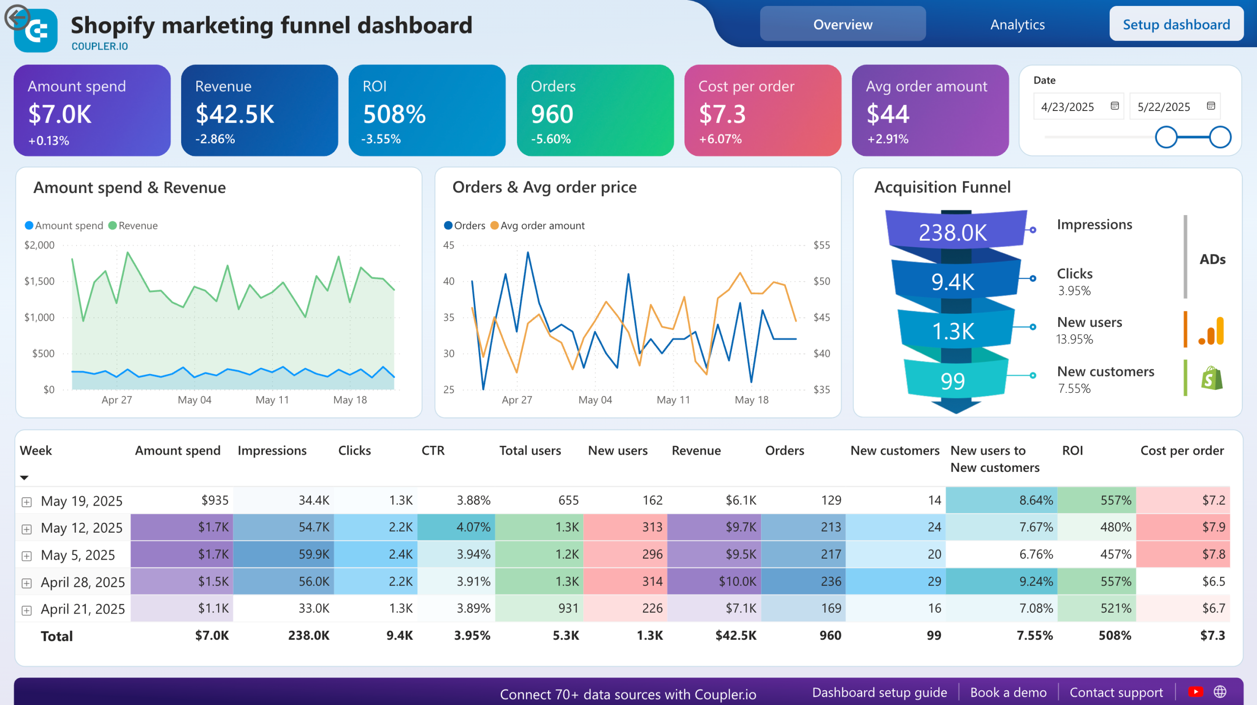
And here is an example of an ecommerce acquisition funnel in the Shopify marketing dashboard. It combines the visual funnel with a funnel in a table form, showing you the details of the customer journey from the first impression to making a purchase.
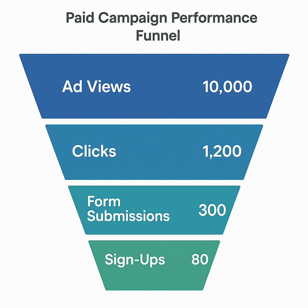
These funnel visualizations are horizontal, but you may also have a vertical one like this. A data-driven marketing agency can use this funnel chart to track performance from a paid campaign.
We even blogged about Looker Studio funnel visualization in a separate article.
Geo maps
Best for: Analyzing marketing performance by geographic location
Geo maps visualise data across regions like cities, states, or countries, using colour gradients or bubbles to show how a metric varies by area. They help marketers identify which locations are underperforming or overdelivering.
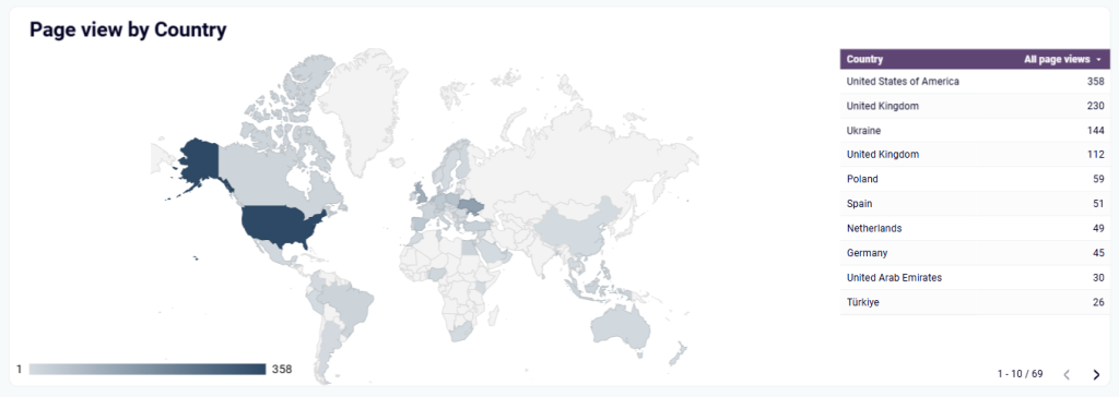
For example, in this LinkedIn company page performance dashboard, there is a geomap showing page views by country.
Other charts for marketing data visualization
We’ve introduced the most popular and widely used types of graphs. However, there are many other options that you probably would like to choose for data visualization in digital marketing:
- Scatter charts or plotted graphs display the relationship between two variables.
- Bubble charts are modified scatter charts with an added third dimension – bubble size.
- Dispersed charts ?display? ?data? ?sections? ?by? ?circle? ?color? ?and? ?the? ?data? ?volume? ?by? circle? size?
- Treemaps display? ?hierarchies? ?and? comparisons ??between? ?subcategories? ?and? ?categories.? ?
- Polar charts or polar area diagrams help you compare multiple KPIs across different marketing channels. They’re great for giving a high-level view of channel performance.
Probably, there are even more. However, in the majority of cases, the mentioned charts are enough to meet your data visualization needs.
Choosing the right chart isn’t the only thing that matters. What’s more important is making sure your data is visualized in a clear and useful way. Let’s look at how to do that.
Data visualization for marketers – what the flow looks like
Creating impactful marketing data visualizations is a multi-step process that starts with defining what you want to learn and ends with building a dashboard that delivers those answers clearly. Here’s what an ideal data visualization flow looks like:
Define the goal of marketing data visualization
Every dashboard or report should start with a clear objective. What question are you trying to answer? Is this visualization for internal performance tracking, investor reporting, or campaign optimization?
Being specific here helps determine:
- Which metrics to focus on (e.g., ROAS, MQLs, conversion rate)
- Which dimensions to break them down by (e.g., channel, region, product)
- What timeframes are relevant (e.g., daily, monthly, quarterly)
For example, if your goal is to analyze which platform drives the most efficient conversions, you’ll focus on CPA, lead volume, and conversion rates. They can be further broken down by platform over specific timeframes.
Collect data to be visualized
Once you’re clear on the objective, the next step is to gather relevant data. With Coupler.io, you can automate data imports from multiple marketing tools like Google Analytics, advertising platforms, CRM tools, and so on into one view.
For example, a marketer can export deals for the last 90 days from HubSpot and filter them on the go by status, e.g., closed-won, while pulling in ad cost data from Google Ads. This lays the foundation for ROI analysis in one view.
Transform marketing data
Raw exports are rarely ready for immediate analysis. They often contain unnecessary fields, inconsistent formats, or duplicated values. Coupler.io offers built-in transformation capabilities to clean and structure your data directly in the flow. Check out what it looks like in the interactive form:
Depending on the tool you use for storing data, you can perform the data transformation before or after loading, the so-called ETL or ELT. This step reduces manual work and ensures your dataset is clean, consistent, and aligned with your reporting needs.
Once your data is ready, you can set up an automatic refresh schedule in Coupler.io to keep the reports updated daily, weekly, or in real time without manual exports.
Design how to visualize marketing data
Once your dataset is structured, visualization begins. The goal is to present information in a format that makes interpretation quick and accurate. The chart type you choose should match the kind of insight you want to communicate. Use:
- Line charts for performance trends over time
- Bar/column charts for comparing values across categories (e.g., campaign performance)
- Funnel charts for visualizing conversion paths and drop-offs
- Geo maps for understanding regional differences
- KPI cards for spotlighting real-time metrics
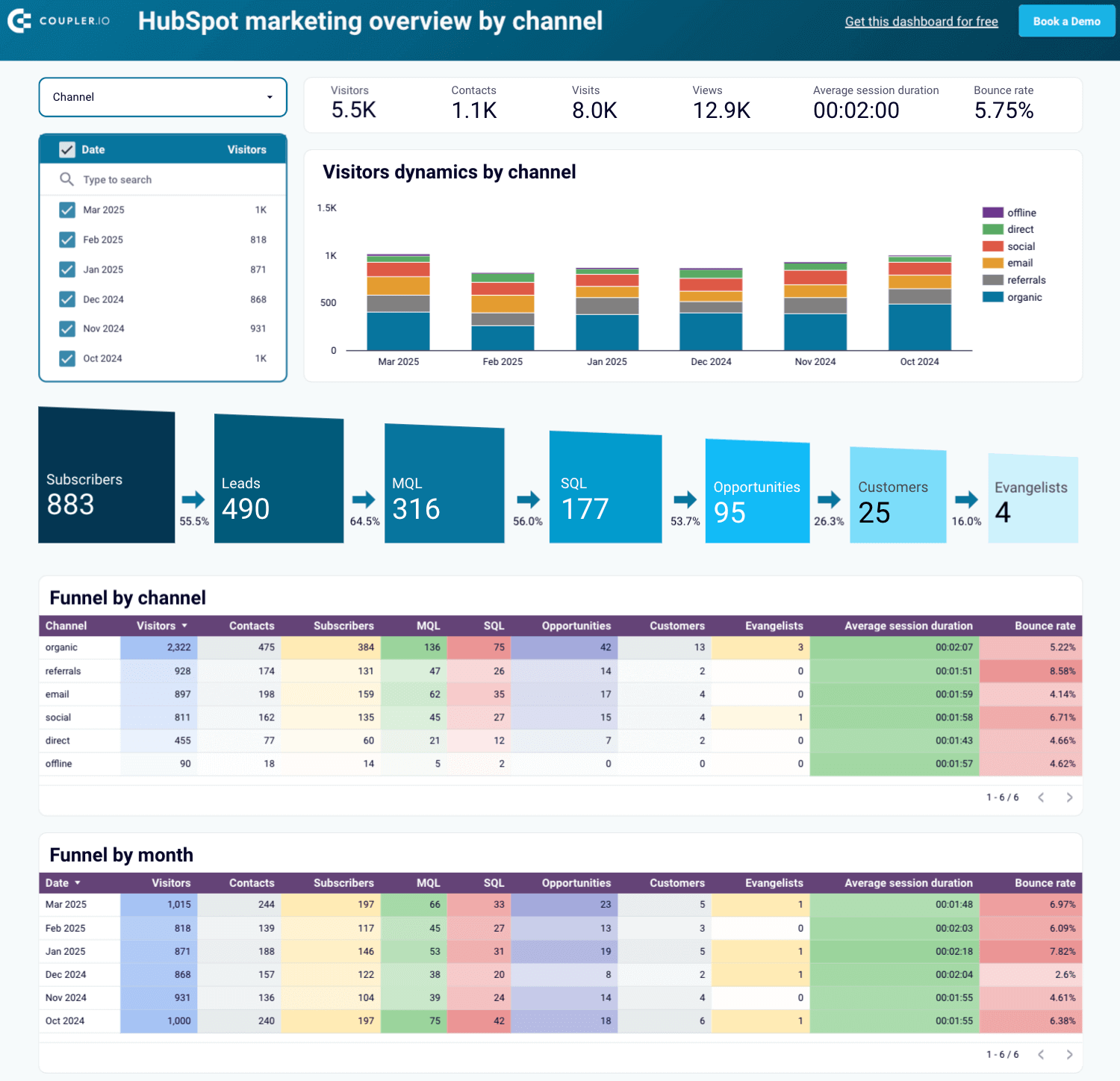
For example, this HubSpot marketing dashboard built with Coupler.io shows a complete funnel from subscribers to evangelists, broken down by channel and month. It includes visual KPIs, trend charts, and performance tables with a clear view of which channels drive the most conversions and where drop-offs occur.
Examples of data visualization for marketers
Pre-built marketing dashboards give you a fast and practical way to monitor performance across multiple platforms. Instead of switching between tools, you get a single view that keeps your team aligned and decision-ready.
Here are five useful marketing dashboard templates to help you get started:
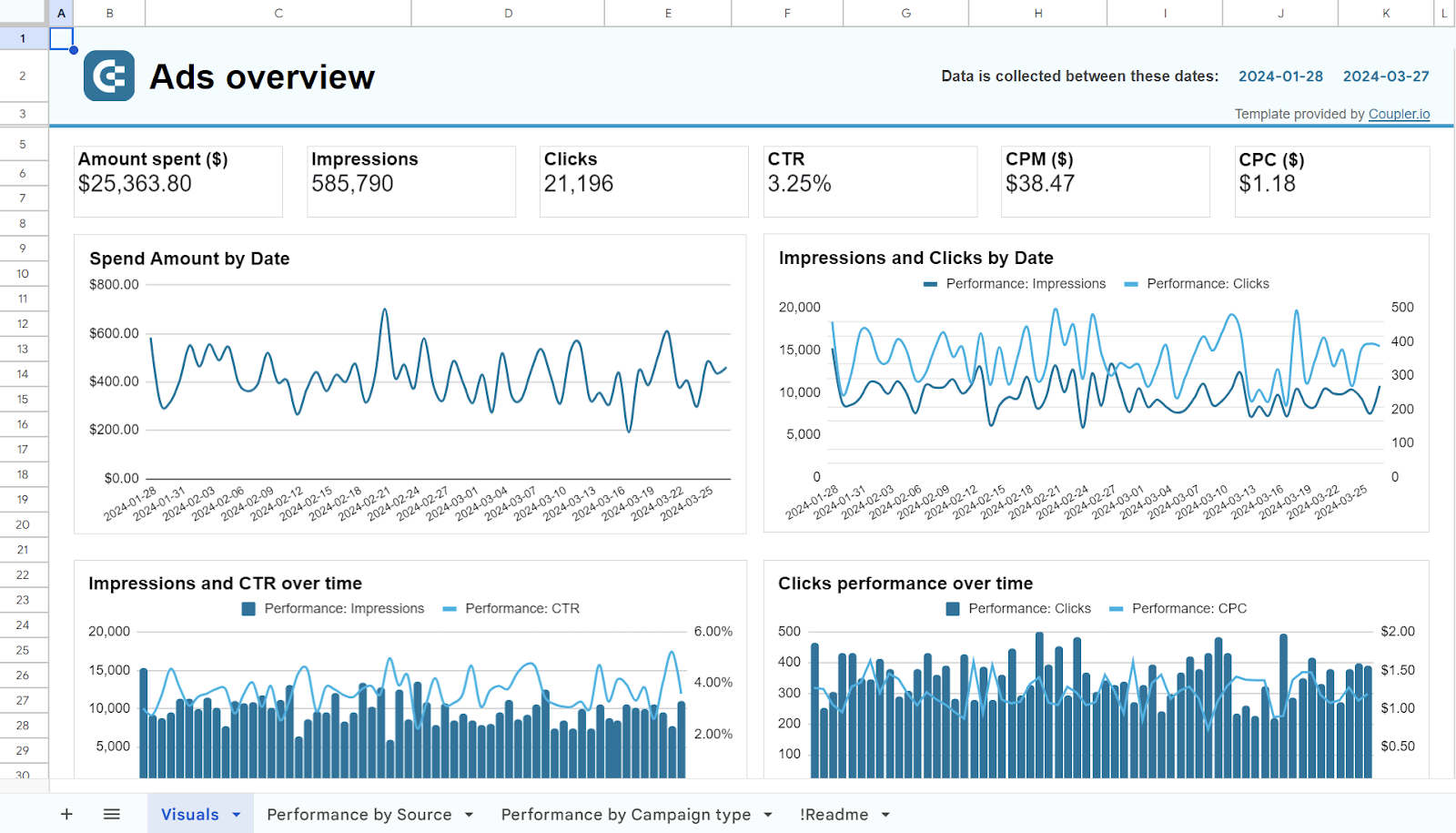
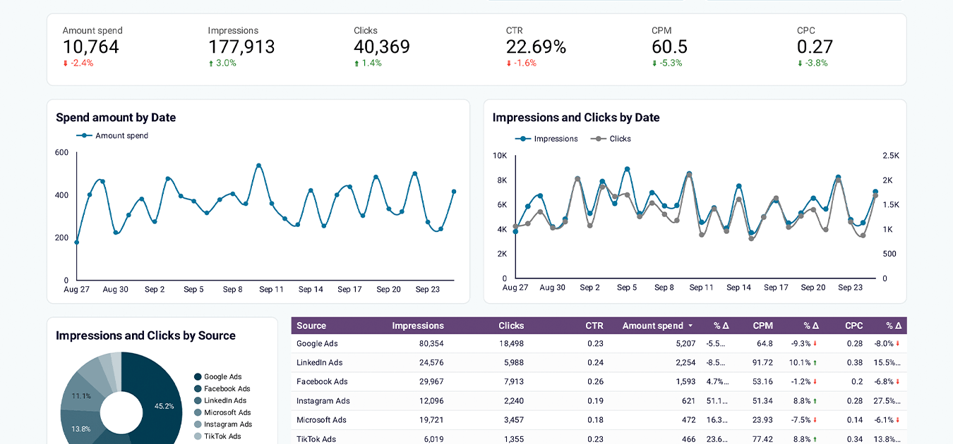
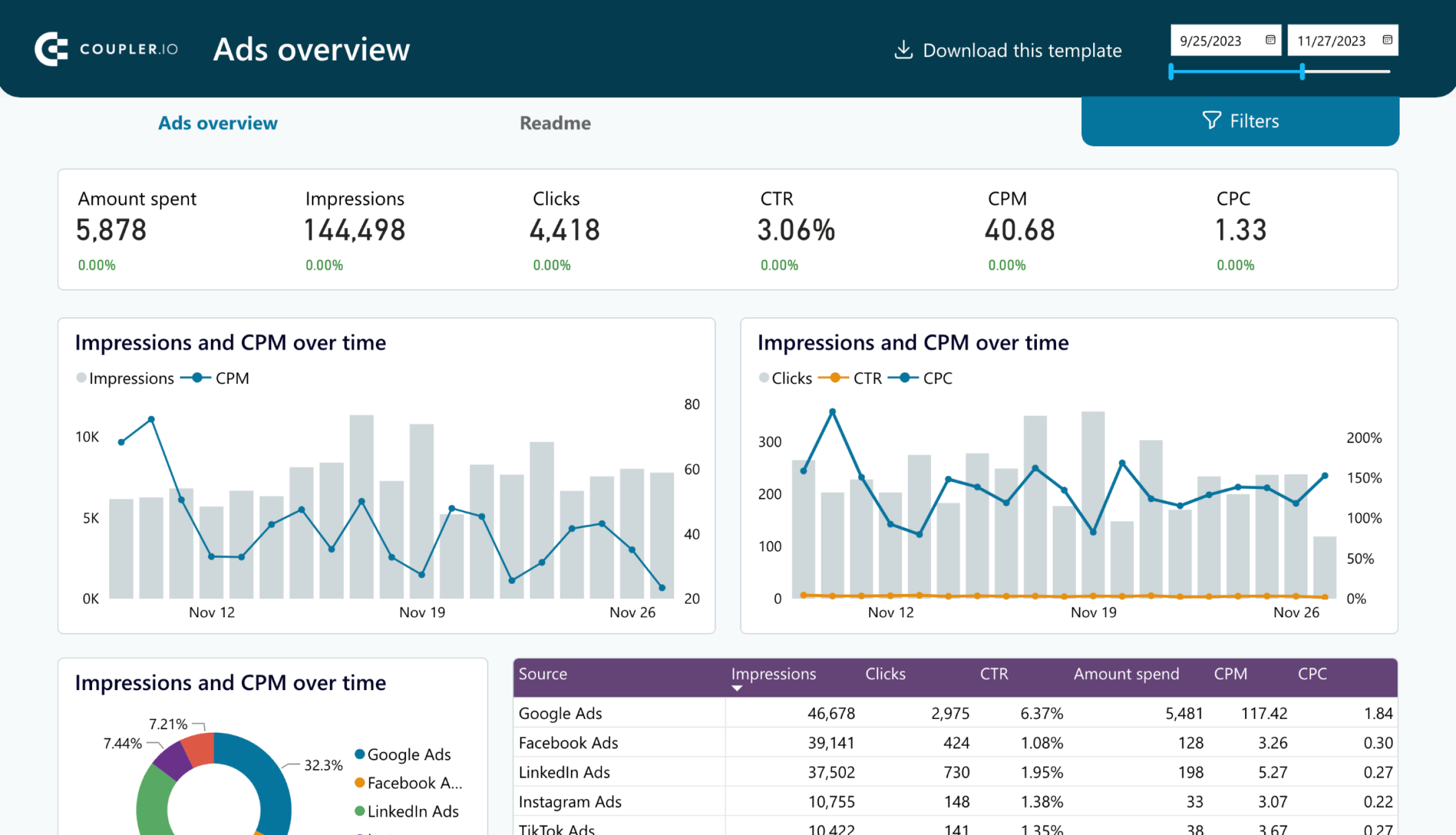
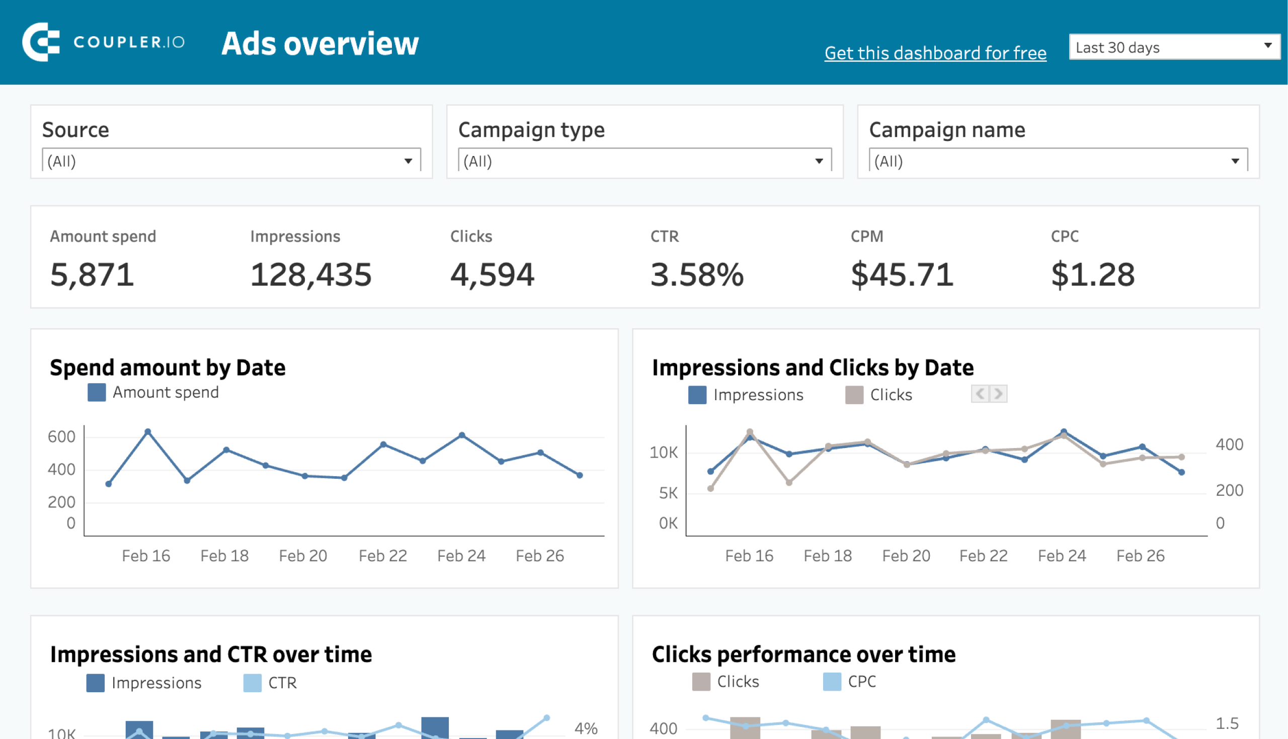
PPC multi-channel dashboard
Managing ads across multiple platforms can quickly become messy. This dashboard is designed to help paid marketers track and compare performance across Google Ads, Facebook Ads, LinkedIn, TikTok, and more in one place.
It shows key PPC metrics like impressions, spend, CTR, CPC, and CPM in a clean, tabular format that’s easy to filter and customize.
You can use this dashboard right in Coupler.io or get started with one of the available templates for BI tools. Follow the instructions in the Readme tab to connect your data.
PPC multi-channel dashboard
Consolidate data from multiple advertising platforms including Google, Facebook, LinkedIn, TikTok, and more to track campaign performance, analyze spend efficiency, and optimize your PPC budget allocation across channels.


PPC multi-channel dashboard in Google Sheets
Use a PPC dashboard designed for Google Sheets to track the performance of your campaigns across multiple advertising platforms.

PPC multi-channel dashboard in Looker Studio
Get a comprehensive PPC reporting tool to track the performance of your campaigns launched at multiple advertising platforms.

PPC multi-channel dashboard in Power BI
Use a Power BI PPC dashboard for tracking and analyzing your advertising campaigns across multiple platforms.

PPC multi-channel dashboard in Tableau
Track and analyze the performance of your advertising campaigns across various platforms using a one-stop PPC dashboard in Tableau

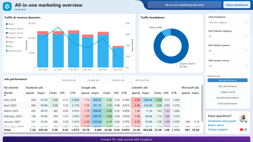
All-in-one marketing analytics dashboard
This is your go-to dashboard if you’re looking for a 360-degree view of your marketing. It pulls together data from paid ads, SEO tools, email platforms, Google Analytics, Search Console, and YouTube to give you a full-funnel perspective in one space.
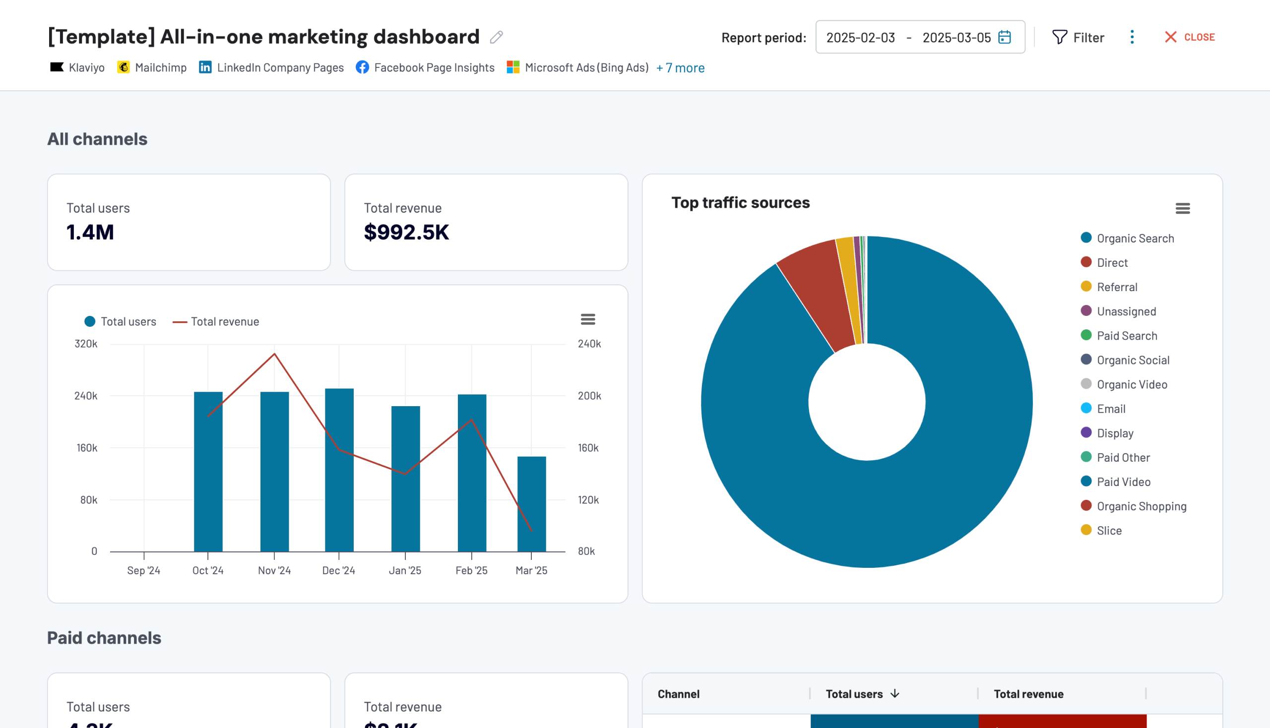
Whether you’re evaluating top-of-funnel performance (like impressions and CTR), mid-funnel engagement (such as email open and click rates), or bottom-funnel outcomes (like purchases or sign-ups), the all-in-one marketing analytics dashboard gives you the metrics you need to make cross-channel decisions. Its comprehensive scope makes it well-suited for marketing leads or CMOs who need to understand how all efforts are contributing to the bigger picture.
The dashboard is available in Coupler.io and as a template in Looker Studio. Try it right away for free! Set up the dashboard by following instructions and transform raw marketing data into actionable insights.
Google Analytics dashboard for multiple properties
If you manage multiple websites or properties (for clients or internal brands), this dashboard helps centralize your GA4 data in one visual space. It provides a side-by-side view of performance across all your sites so you can spot trends, compare user engagement, and manage growth more efficiently.
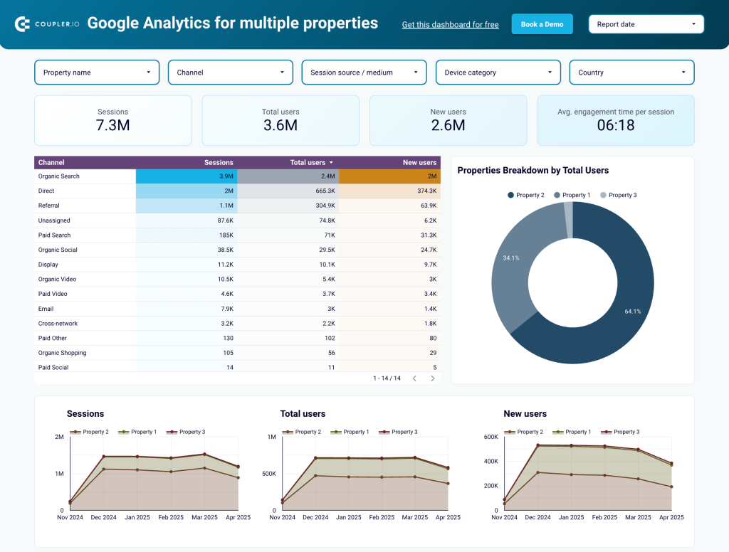
One standout feature is the ability to break down traffic sources, bounce rates, and conversions by property and geography. You can also drill into audience behaviour to see how visitors interact with different domains. This feature is perfect for marketing teams looking to streamline multi-site reporting and make faster decisions across properties.
The dashboard template is designed in Looker Studio and equipped with the Coupler.io connector. Follow the steps in the Readme tab to populate the dashboard with your metrics.
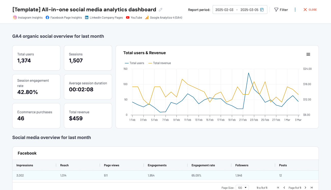
Social media teams often struggle with fragmented reporting where each platform gives its own numbers, but there’s no easy way to see the full picture. This social media dashboard solves that by bringing together performance data from Facebook, Instagram, LinkedIn, YouTube, and GA4.
All-in-one social media analytics dashboard
 Preview dashboard
All-in-one social media analytics dashboard
Preview dashboardIt tracks follower growth, post engagement, traffic to your website, and even how those sessions perform once they land on-site (via GA4 integration). You can compare month-over-month changes and pinpoint which channel is delivering real results.
The dashboard is available in the Coupler.io interface and as a Looker Studio template. Choose the version you prefer and try it right away for free!
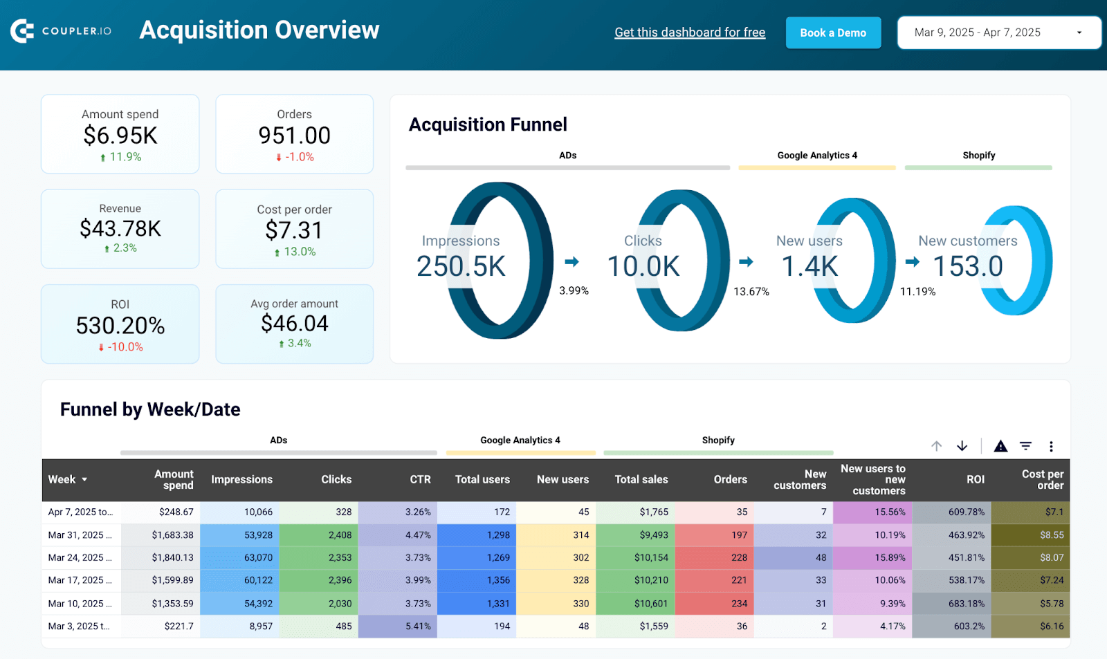
Shopify marketing funnel dashboard
This dashboard is tailored for Shopify store owners who want to understand how their marketing efforts lead to actual sales. It connects your Shopify store, ad platforms, and GA4 to show a complete picture of your customer journey, from impressions to clicks to purchases.
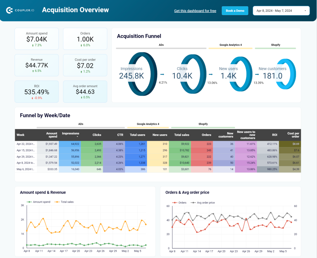
Inside, you’ll find funnel metrics like cost per order, return on investment, average order value, and drop-off rates at each stage. These metrics are especially helpful for spotting bottlenecks and optimizing specific parts of your funnel. The best part is they’re fully customizable and work out of the box with Coupler.io’s connectors—no coding required.
The Shopify analytics dashboard template is available in Looker Studio and Power BI. To connect your data, sign up for a free Coupler.io account, follow the instructions in the Readme tab and start tracking your performance in real time.
Shopify marketing funnel dashboard in Looker Studio
Analyze the performance of the traffic to your Shopify store using data from advertising platforms and Google Analytics 4, all consolidated on a single dashboard.


Shopify marketing funnel dashboard in Power BI
Examine the customer journey from advertising exposure to purchase completion with integrated data from your Shopify store, advertising platforms, and analytics tools.
These marketing reporting templates are a great starting point, but if you have specific reporting needs, our data experts can build a custom dashboard for you. You might need to track niche metrics, combine unique data sources, or create a presentation-ready report for stakeholders. We’ll help turn your raw data into clear, decision-ready insights.
Do you need a custom reporting solution for your marketing data?
Get in touchBest practices of data visualization for marketing
Use quality data for marketing analytics visualization
We’re pretty sure that it’s not worth additional yatter, but let’s refresh your memory about five key characteristics of quality data:
- Accurate
- Complete
- Reliable
- Relevant
- Up-to-date
This is a sort of a checklist to complete before doing any visualization with your marketing data.
Choose the right visualization for data sets
The type of visualization should correspond to the data set to be visualized. This will let you convey the main message of your data visualization in the most effective way. For example, use line graphs to show progress or regression, and go with bar charts to display comparison.
If a data visualization does not fit the data it presents, the information can be misinterpreted, causing stakeholders confusion.
Keep your data visualization design simple
You will achieve the top efficiency of your dashboard and reports if they are intuitively understandable. Of course, you won’t be able to disclose everything through visualization, for example, what variables are in your MRR formula. Nevertheless, the best data visualization is one that does not require much cognitive load.
The rule of thumb is to avoid visualization elements that require a high processing time of the human brain. It should take just a few seconds for a stakeholder to understand charts. Use consistent shapes, colors, fonts, and other design elements that will not overload the user’s cognitive process.
Declutter your data visualization
The metrics you put on your visualization should be logically interrelated to complement each other and create a whole picture of the dashboard. For example, if your visualization is dedicated to marketing channels’ performance, the information about retention rate or LTV may look out of place.
Besides, it’s important to only keep the information that will bring value to stakeholders – allowing them to build decision-making based on the data. All the vanity metrics and graphs should be cut off to make your dashboard and its visualization as efficient as possible.
Set a real-time visualization of all your marketing data sources
Your report or dashboard should be self-updating, i.e. the data on it will refresh automatically without any manual work like copying and pasting. Data visualization tools usually support multiple integrations to make this happen, for example, BigQuery to Tableau.
However, you can also use Coupler.io to automate exports of data from your sources to a marketing data warehouse (BigQuery), spreadsheets (Google Sheets or Excel), or BI tools (Looker Studio or Power BI). Each of these destinations can be easily integrated with most BI tools, so they will act as an intermediary for your data flow from the marketing source to the data visualization tool.
Coupler.io ready-to-use connectors are based on APIs. At the same time, it allows you to create custom integrations with sales and marketing APIs.
Collect feedback on your marketing data visualization
Your report with different fancy charts may look awesome to you as its creator. However, this is unnecessary for other members of your team or stakeholders. Therefore, you should collect feedback on your data visualization from these people and tune it accordingly.
We’ve already talked much about data visualization, but which tools can you actually rest on to live out your actionable dashboard or report? Let’s check out the top 3 tools for data visualization in marketing.
Top tools for data visualization in marketing
Tableau
Tableau is represented by a set of desktop and cloud-focused BI tools, including Tableau Desktop, Tableau Server, Tableau Cloud, Tableau Public, and other auxiliary tools. It’s an advanced solution to load data from different sources and build data visualizations. The free version, Tableau Public, has a limited DataViz set of options, which is still enough to create wonderful dashboards like this:
And if you purchase either a desktop or cloud version, you’ll have access to more advanced features and functionality.
Looker Studio (former Data Studio)
Google Data Studio, which is now called Looker Studio, is the beloved BI tool for Coupler.io data experts. It’s free yet powerful in terms of data visualization options. We even compared Looker Studio with Tableau to find out which one is the best, but no pure winner was detected.
Since it’s a free tool, you should not expect ultra-advanced data visualization features. However, even what you have can be enough to create a solid professional Looker Studio marketing dashboard that you can easily share with stakeholders, for example, like this:
Power BI
Microsoft Power BI is the third most popular data visualization tool in our recommended toolbox. It’s a business analytics and data visualization service to create interactive dashboards and reports. Its desktop version is free, but, as you may have guessed, it’s limited. The pricing for Power BI starts from $9.99/user/month, and you can try it out for free with a trial version.
What dashboards can you build with Power BI? For instance, here is what the All-in-one marketing dashboard template in Power BI looks like:
Check our article on Power BI visuals for more on this topic.
Coupler.io
Coupler.io is an all-in-one reporting automation platform that helps marketers collect, transform, and visualize data without needing engineering support. It connects to dozens of marketing tools like HubSpot, GA4, Facebook Ads, and Shopify, and sends the data to Google Sheets, Looker Studio, BigQuery, Power BI, and more.
Coupler.io also comes with ready-made dashboard templates that let you skip the setup phase. Just sign up for a free account, plug in your sources, and start analyzing your performance within minutes. No code needed.
A standout feature is AI Insights, an in-dashboard summary tool powered by Claude. It automatically scans your dashboard and gives you quick highlights on key trends, anomalies, and actionable recommendations—like reallocating budgets or optimizing campaigns. It’s like having a built-in analyst who works 24/7.
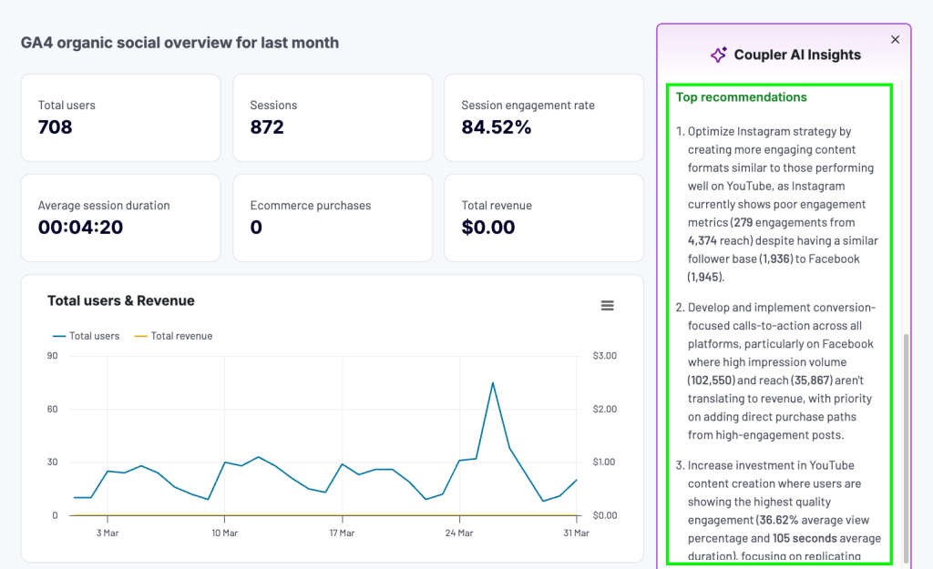
Whether you’re building a custom marketing dashboard or using one of the templates, Coupler.io helps you stay ahead with real-time data and smarter decisions.
Why is data visualization important for marketing analytics?
When data is visualized, it’s much easier to analyze the insights it contains to streamline decision-making.
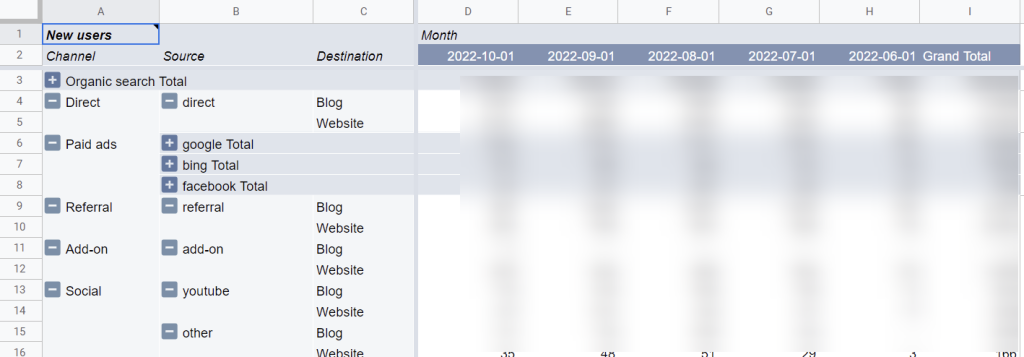
Considering one of the latest marketing trends that claims that marketing must be data-driven, visual data representation allows you to turn numbers into meaningful conclusions and translate metrics into decisions. For example, here is what the raw marketing data exported from Google Analytics 4 to Google Sheets looks like.
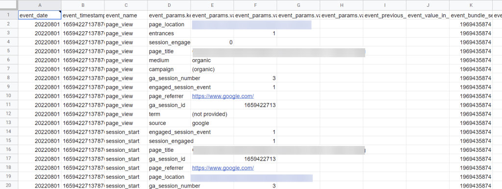
These records do not hook your attention. Moreover, if you share this report with some stakeholders, they may not even get the idea of how good or bad these metrics are. Marketing data visualization can solve this issue.
This time, you can even do without any charts or graphs. For example, the following dashboard uses some formulas to derive insights and a bit of Google Sheets conditional formatting. As a result, you get the marketing data visualized in a clear and comprehensible way.
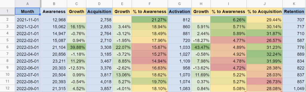
You do feel the difference, don’t you? Well-prepared Google Sheets dashboards can significantly speed up data analysis and enable faster decision-making.
Since we’ve mentioned that charts are not an indispensable element of data visualization for marketing, let’s actually look at what types of visualizations you can opt for.
Use marketing data visualization to make data-wise decisions
When your data is visualized clearly, it’s easier to spot patterns, track performance, and take action. A well-designed chart or dashboard helps you understand what’s working and what’s not faster than raw numbers ever could.
With Coupler.io, you don’t just visualize your marketing data. You collect it from multiple sources, transform it to fit your goals, and get AI-powered insights to guide your next move. Whether you’re running multi-channel campaigns or reporting to stakeholders, Coupler.io helps you turn complex metrics into confident decisions. Start turning marketing data into action with Coupler.io
Turn raw marketing data into visual insights with Coupler.io
Get started for free