While some marketing reports exist to tick a box for stakeholders, others have the power to influence strategy and set you on the path to success.
Ideally, every marketing report should bring value to your business. Reporting done right can help you:
- Track the day-to-day impact of your marketing initiatives
- Easily analyze campaign results and make targeted improvements
- Identify which activities deliver the best ROI or which are hindering growth
- Make informed decisions about budget allocation and marketing strategy
In this article, I’ll help you create impactful marketing reports that don’t take hours or days to compile. Let’s kick off with a brief definition.
What is a marketing report?
A marketing report is a visual representation of marketing data from various sources. It typically takes the form of a dashboard, document, or slide deck, containing several visualizations such as bar charts, line graphs, drill-down tables, and scorecards.
Marketing reports are designed to simplify data analysis. They aggregate and summarize key performance data, providing a solid foundation for team decision-making and strategizing. You can also share reports with internal stakeholders to communicate results and progress towards goals.
Learn more about the specifics of executive reporting.
Remember, you often need to create different reports for marketing channels and goals. For instance, a YouTube marketing report allows you to review the performance of a single channel, while an all-in-one marketing report lets you analyze your combined efforts across multiple channels (SEO, social media, paid advertising, etc.).
Key marketing performance indicators to report on
Ever heard the phrase: ‘If you can’t measure it, you can’t manage it’? That’s true in marketing reporting. Before you can start building your reports, you need to define metrics and KPIs to understand what’s worth paying attention to and improving.
General marketing KPIs
Let’s start with an overview of the most critical marketing KPIs for SaaS companies.
| KPI | What it means |
|---|---|
| Engagement rate | Tracks the level of interaction your marketing campaigns generate, such as CTA button clicks and shares of social media posts. |
| Customer lifetime value | CLV estimates the total revenue a customer generates for your business before they churn. The higher this percentage, the higher their value. |
| Conversion rate | Measures how effectively a marketing campaign provokes visitors or leads to take the desired action. For instance, booking a call through an ad ? signing up for your service. |
| Monthly recurring revenue | MRR refers to your predictable monthly income from subscriptions. It’s important for measuring business stability and profitability. |
| Annual recurring revenue | ARR is how much your business makes annually from subscription revenue. A steadily growing ARR shows that your efforts are paying off. |
| Churn rate | The rate at which customers stop using and unsubscribe from your service. High churn indicates poor user experience or lack of competitiveness. |
KPIs for specific channels
Keep in mind that this isn’t an exhaustive list. I won’t mention engagement and conversion rates for each channel, as they have already been described above. However, these KPIs are universally important, so be sure to pay attention to them in your single-channel reporting.
Paid advertising
| KPI | What it means |
|---|---|
| Amount spent | The total cost of paid ads campaigns. It helps measure the impact and cost-effectiveness of your paid advertising efforts. |
| CAC (customer acquisition cost) | The average cost of attracting a new customer. It’s useful for tracking the efficiency and cost-effectiveness of your paid marketing campaigns. |
| CTR (click-through rate) | Shows how many users from the total viewers number clicked on an ad, link, or button with a CTA. The higher it is, the more impactful your marketing content is. |
| ROAS (return on ad spend) | Tells you how effective your ads are at generating revenue relative to the amount you spend on them. |
| CPC (cost per click) | Defines how much you pay for someone to click on your ad. A high CPC can be a sign that your ads are too expensive to run. |
| Cost per conversion | How much it costs for someone who viewed your ad to complete a desired action (purchase, sign up). A high percentage shows that optimization is needed. |
Here are a few other important metrics worth mentioning:
Website and SEO
- Organic traffic: The amount of web traffic your website earns from search engine results. High volumes of organic traffic indicate your website content (e.g. blog) is useful and engaging.
- Pages per session: The average amount of pages a visitor views or interacts with during a single visit to your website. A high number (around 4) means that your site keeps visitors engaged.
- Bounce rate: The proportion of a web page’s viewers who left the website without viewing other pages. High bounce rates are a sign of low-quality content or deeper technical issues.
Social media
- Impressions: Refers to how often a piece of content is displayed on a person’s screen. Lots of impressions means your content is relevant to the target audience and is gaining decent exposure.
Note: Impressions are also a critical metric for PPC and SEO.
- Brand mentions: The number of times your business is mentioned organically on the platforms, such as tags in Instagram stories or hashtags on LinkedIn posts. A high number indicates strong brand awareness.
- Follower growth rate: How quickly your followers count on Instagram, TikTok, or X is growing. The faster, the better – it shows that your awareness campaigns are working and people are interested in your content.
- Views: The total number of people who viewed a piece of content.
Email marketing
- Open rate: Measures how often your emails are opened once delivered. A strong open rate shows that your subject lines and email content are well-targeted.
- Unsubscribe rate: The rate at which people unsubscribe from your newsletter or marketing emails. A spike in unsubscribes can indicate your strategy or content isn’t working.
How to create a marketing report
Let’s go through the steps of creating any type of marketing report from scratch.
1. Define the objectives
Start by defining what you want to achieve with the report and work backward. Ask yourself:
- What do you want to learn from the report?
- How often will you consult it?
- Who do you plan to share it with?
For instance, if you are mainly interested in improving your YouTube Ads targeting, your report should be focused on PPC data and metrics.
If you will use the report to track daily/weekly campaign results, then you will need to pick reporting and visualization tools that support automatic updates. This will save you time in the long run.
And if you plan to share the report with multiple internal stakeholders (such as C-levels and the sales team), then you’ll need to compile the report in a way that’s easy for non-marketers or PPC experts to understand. Aim to keep marketing jargon to a minimum.
2. Collect data
The next step is to gather the data you want to visualize in your report. To make this as efficient and error-free as possible, use Coupler.io – a powerful tool for reporting automation and marketing analytics. Coupler.io automatically collects data from your marketing platforms and loads it to a centralized view, such as a Looker Studio dashboard.
To avoid overcrowding your report, choose the most essential types of data. For instance, if you are creating a YouTube Ads report, and your main goals for your YouTube channel are to improve ad targeting and increase engagement, then you should plan to include audience demographic data and highlight specific KPIs (CTR, CPC, ad frequency, etc.).
Coupler.io ready-to-use connectors are based on APIs. At the same time, it allows you to create custom integrations with sales and marketing APIs.
3. Transform and visualize
The final step is to clean your data and visualize it in a report. These tasks typically require separate (yet interconnected) tools.
For instance, with Coupler.io, you can organize and make changes to your data before loading into the data visualization tool. While setting up a new report, you’ll have the chance to filter and sort your data, hide or rename columns, and merge data from multiple sources into a single cohesive dataset.
Once the data is properly organized, you can generate a report in a chosen spreadsheet or BI tool. In general, BI tools are the best option for visualization, as they offer stability, accessibility, and easy integration with automation tools.
I’d recommend the following, mainly because they are free, have a low learning curve, and decent visualization options:
- Looker Studio is part of the Google ecosystem and offers a wide range of charts, graphs, funnels, and interactive visualizations. You can easily connect multiple sources to a Looker Studio dashboard and customize the report to your liking.
- Google Sheets is a versatile platform where you can build simple reports. Use pivot tables and add pie, bar, and line charts to enhance analysis, and create custom formulas for additional dashboard functionality.
Sources of data for different types of marketing reports
Where can you find marketing data for your reports? Let’s explore the different sources based on the type of report you are creating.
Web analytics
When reporting on how your marketing initiatives have impacted website performance, web analytics tools like Google Analytics 4 (GA4) or Amplitude are crucial sources of information.
In simple terms, these platforms offer insight into:
- How visitors found your site (through a Facebook ad, newsletter link, etc.)
- What type of content they were most interested in
- How engaged they were throughout the session(s)
- Their overall conversion journey, e.g. from CTA click to ‘add to cart.’
Data from heat-mapping and session-tracking software like Hotjar and Microsoft Clarity can also be helpful, as they provide detailed insights on user behavior and engagement.
Search engine optimization (SEO)
SEO tools contain valuable information about website and blog performance. To gather data for your reports on the effectiveness of your content strategies, tap into Google Search Console (GSC), Ahrefs, SE Ranking, or Screaming Frog. You’ll find data on:
- Organic traffic dynamics
- Google Search page rankings
- Click-through rates for blog and web pages
- Best and worst performing blog content
- Pages indexed by Google, and many more
The above tools are also key sources for technical SEO reporting, i.e. reporting on the overall health of your website.
PPC platforms
When it comes to reporting on ad campaign results, you’ll need to consult the ad management tool/feature within each PPC platform. For instance:
- Google Ads (includes YouTube Ads data)
- Microsoft Ads
- Meta Ads Manager (Facebook & Instagram data)
- TikTok Ads Manager
- X Ads Manager
- LinkedIn Campaign Manager
That’s where you’ll find data on the KPIs I mentioned earlier: amount spent, CTR, ROAI, etc.
Social media platforms
To report on the organic growth of your social media accounts, relevant data can be found within each platform’s ‘analytics’ or ‘insights’ feature. For instance:
- Facebook and Instagram Insights
- X (Twitter) analytics
- TikTok Insights
- Linkedin page analytics
The data covers all KPIs we mentioned earlier and more, such as impressions, reach, engagement (likes, shares, comments), CTRs, follower dynamics, average video watch times, etc.
Email marketing tools
Likewise, email marketing reporting starts with gathering data from your platform(s) of choice. For example, it could be:
- All-in-one platforms like Mailchimp, Klaviyo, or Brevo
- CRM email marketing tools (HubSpot, Pipedrive, or Salesforce)
- Cold email outreach platforms like Reply.io or Lemlist
Types of marketing reports + template examples
Let’s look at how you can organize, visualize, and analyze the information from those sources in different marketing reporting templates.
Single-channel
A single-channel marketing report summarizes data from a specific channel, such as your website or social media account. You can assess the channel’s independent performance and analyze the key metrics in detail.
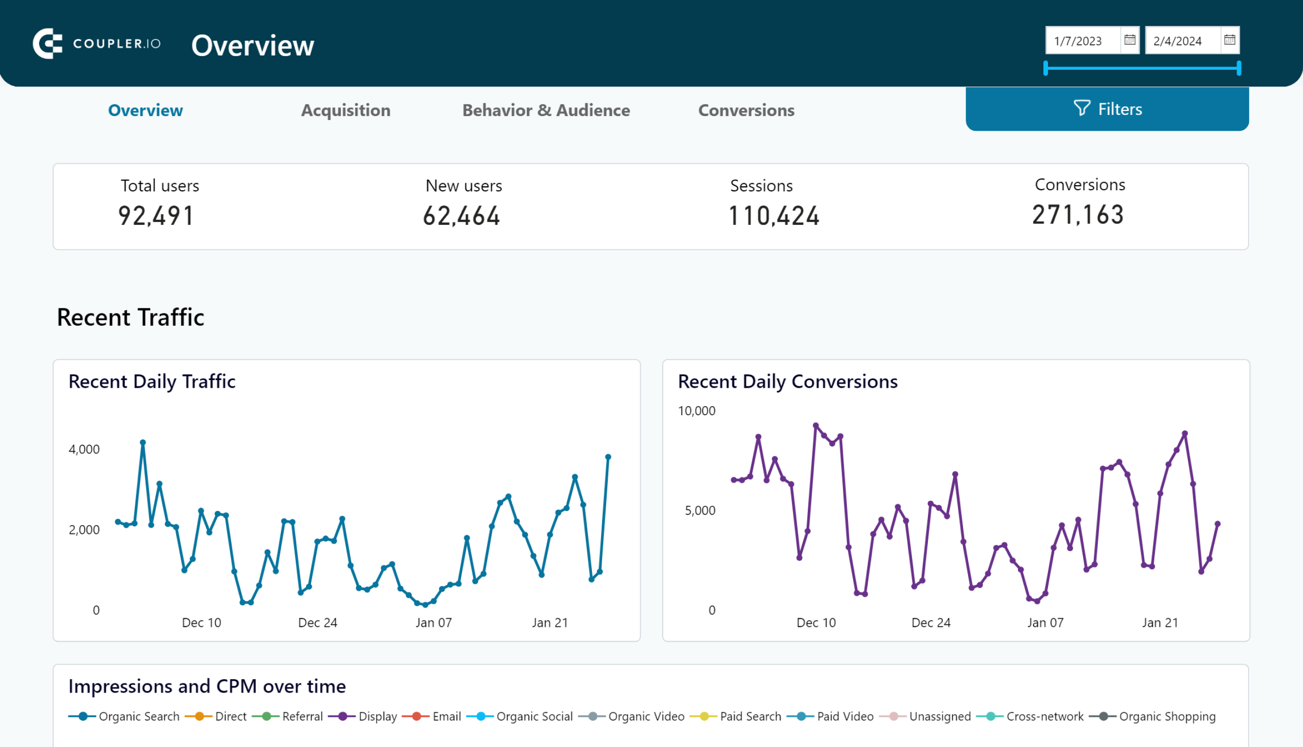
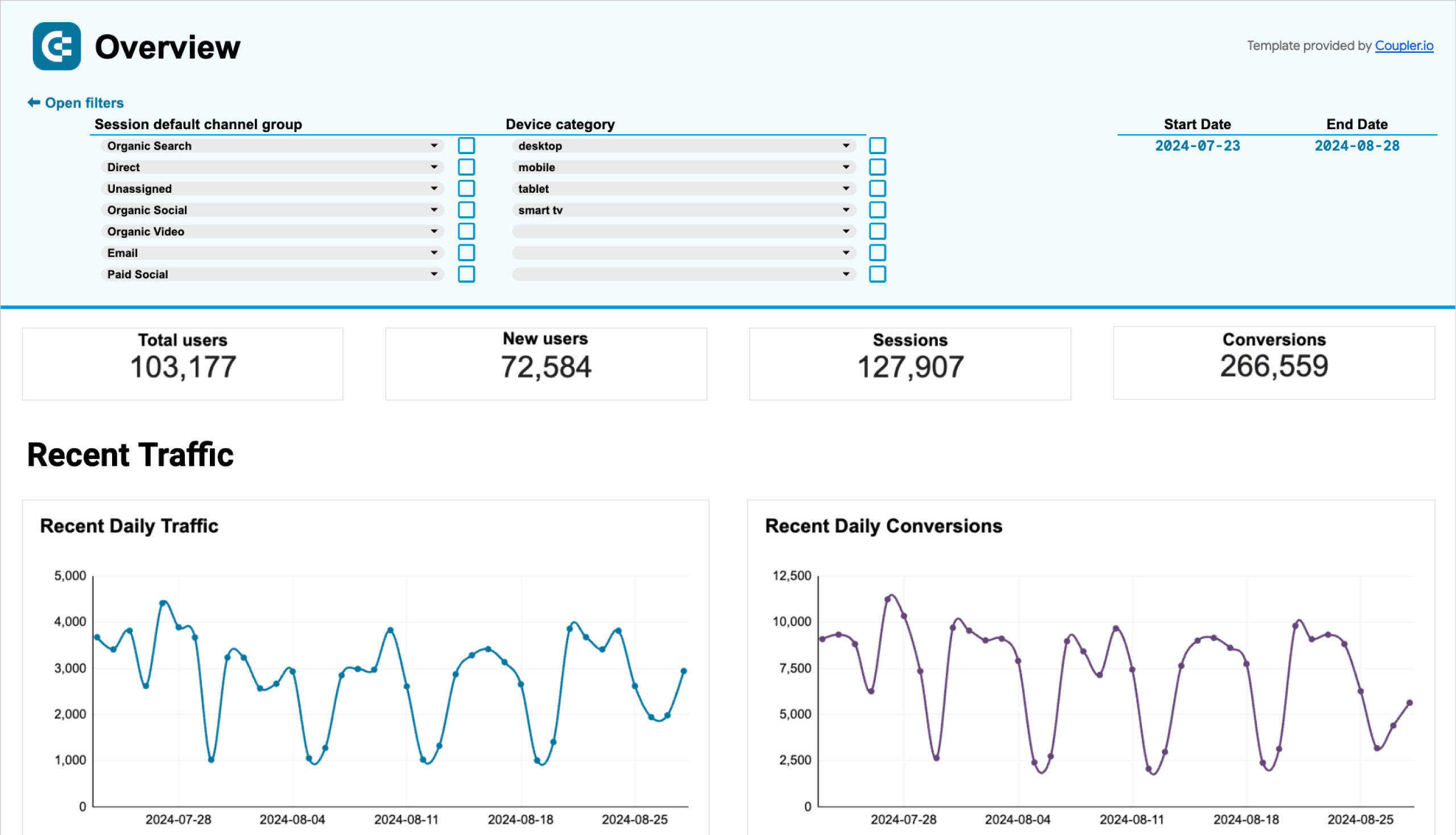
Web analytics dashboard template
This web analytics report provides an overview of daily updates on key product and marketing metrics such as web traffic and conversions. It pulls data from your GA4 account and presents four pages of insights: general overview, acquisition, behavior and audience, and conversions.
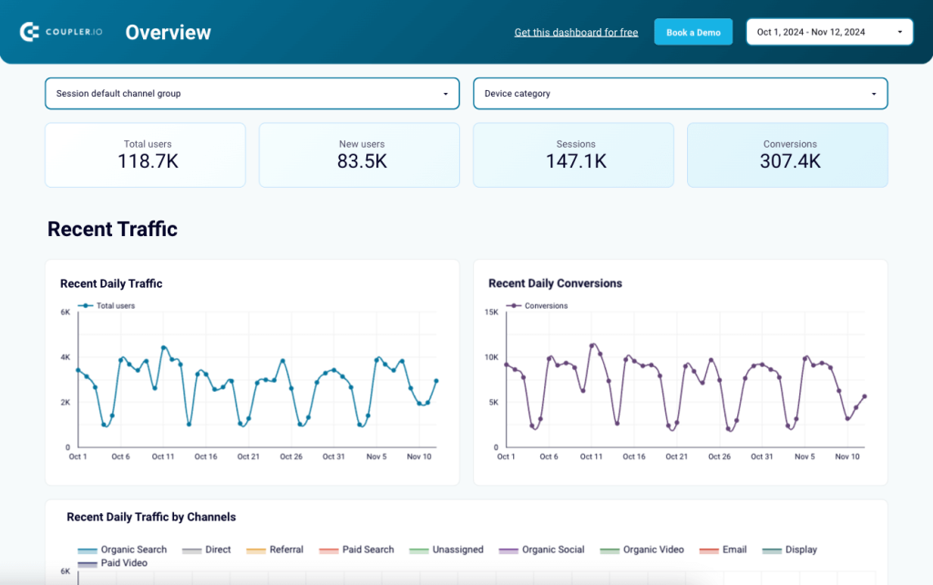
In this extensive report, the acquisition and behavior & audience pages can help you:
- Identify where website visitors come from (sources, countries, etc.)
- Understand key audience characteristics such as device, age, city, and gender.
- Analyze marketing metrics by channel groups, landing pages, page location, campaign, and much more.
On the conversions page, you can evaluate how well your website visitors convert into customers with a funnel visualization. Edit the metrics at the last two stages to reflect your conversion goals.
This web analytics dashboard template is available for Looker Studio, Google Sheets, and Power BI. To get started in just a few minutes – and set up data refreshes as frequently as every 15 minutes – have a look at the selection:
Web analytics dashboard in Looker Studio
Use the insights based on the data from GA4 to monitor your website traffic and discover which pages resonate most with your audience.


Web analytics dashboard in Tableau
Monitor the performance of your traffic, analyze the conversion funnel, and derive other insights from Google Analytics 4.

Web analytics dashboard in Power BI
Discover insights into your website’s traffic acquisition, audience, and conversions with Google Analytics 4 data seamlessly connected to our Power BI dashboard template.

Web analytics dashboard in Google Sheets
Gain valuable insights into your website’s traffic sources, user interactions, and conversion metrics based on data from GA4.

YouTube dashboard template in Looker Studio
Reporting on your YouTube channel results is easy with this next dashboard. Like the previous template, it comes with a general overview where you can analyze views, likes, shares, and watch time dynamics. Use the filters and tables to check the performance of individual videos.
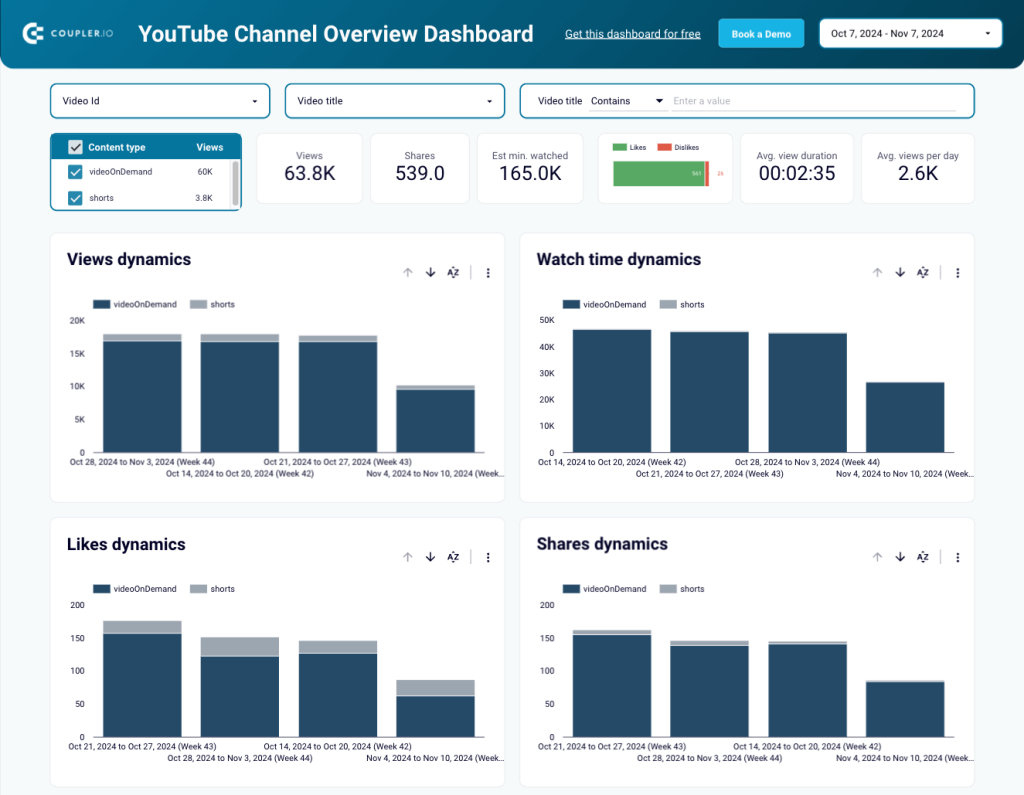
The report also has three additional pages, each dedicated to a specific performance indicator: subscribers, reach, and traffic sources. You can find:
- Scorecards with key metric totals to help you quickly gauge the health of your channel.
- Charts to examine the dynamics of impressions, views, clicks, and CTR over time and understand if you’re making real progress.
- Video performance tables with marketing KPIs to identify which videos bring the most subscribers, views, clicks, and more.
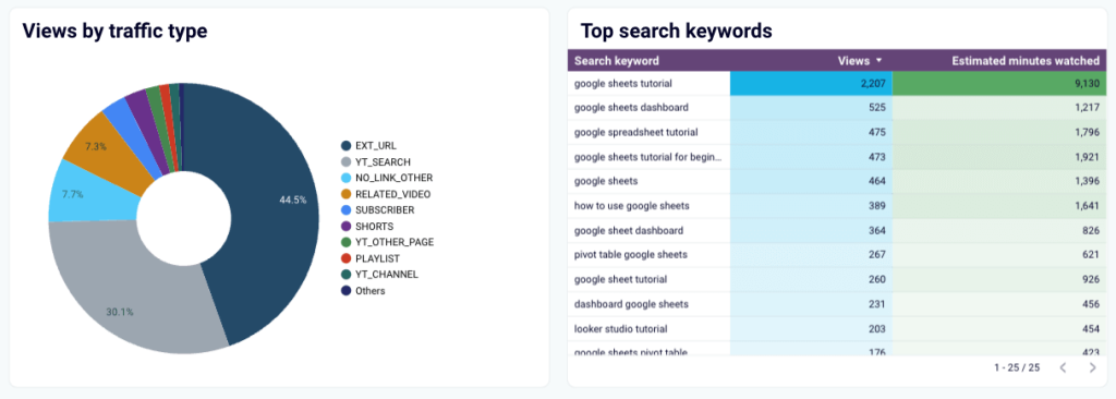
The traffic sources page has a set of charts and tables to see where your views come from and what search queries people use to find your content.
Simply connect your YouTube account with Coupler.io’s built-in connector and visualize your performance data in under 5 minutes.
Multi-channel
Considering the growth of multi-channel retargeting strategies as one of the top marketing trends, multi-channel reports help you understand how your customers interact across different platforms. Unlike cross- or omnichannel reports, however, they don’t let you track connected customer journeys.
PPC multi-channel dashboard template
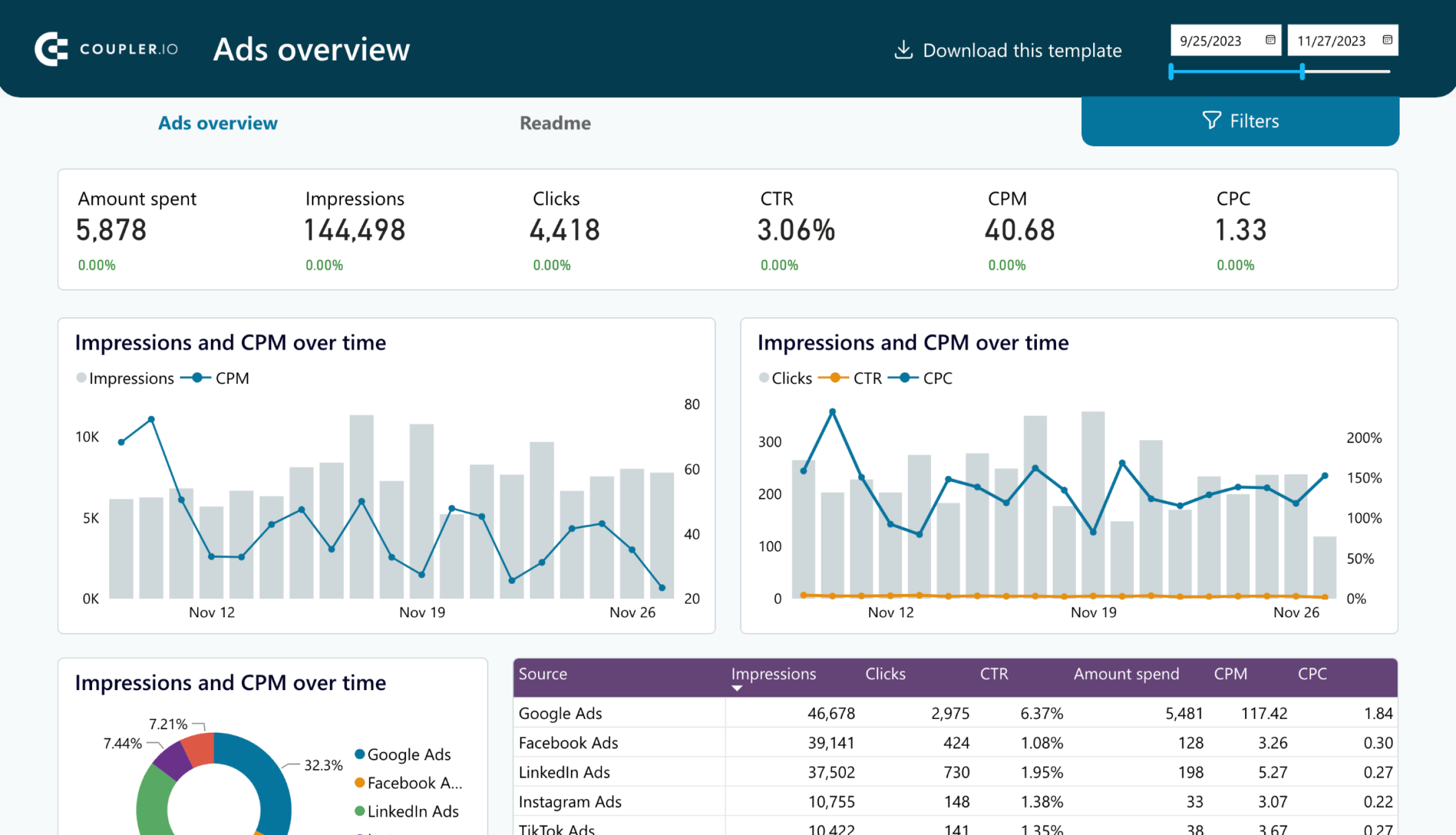
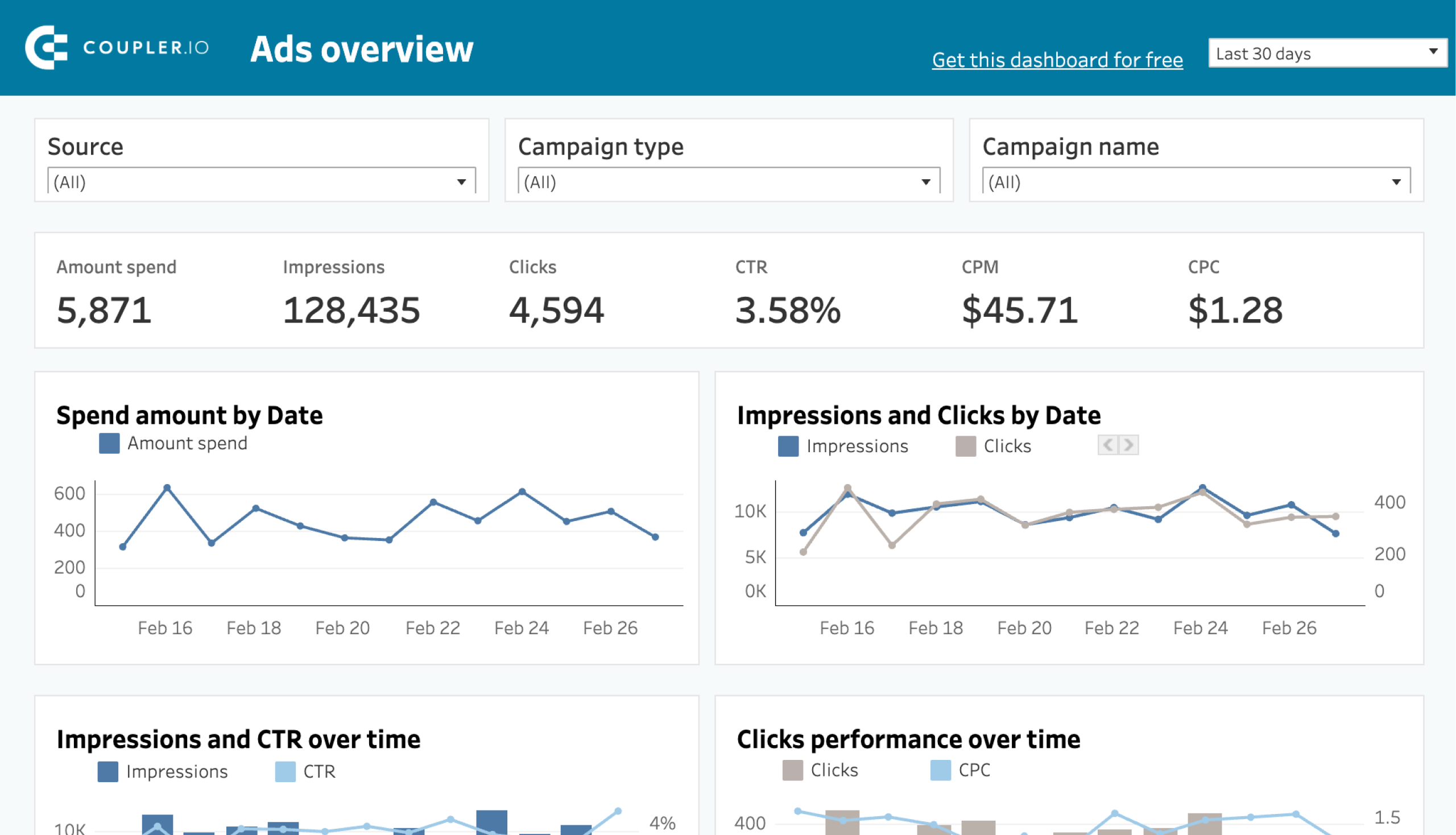
The PPC multi-channel dashboard template gathers data from Google Ads, LinkedIn Ads, Facebook Ads, and other platforms, so you can report, monitor, and compare campaign performance in one place.
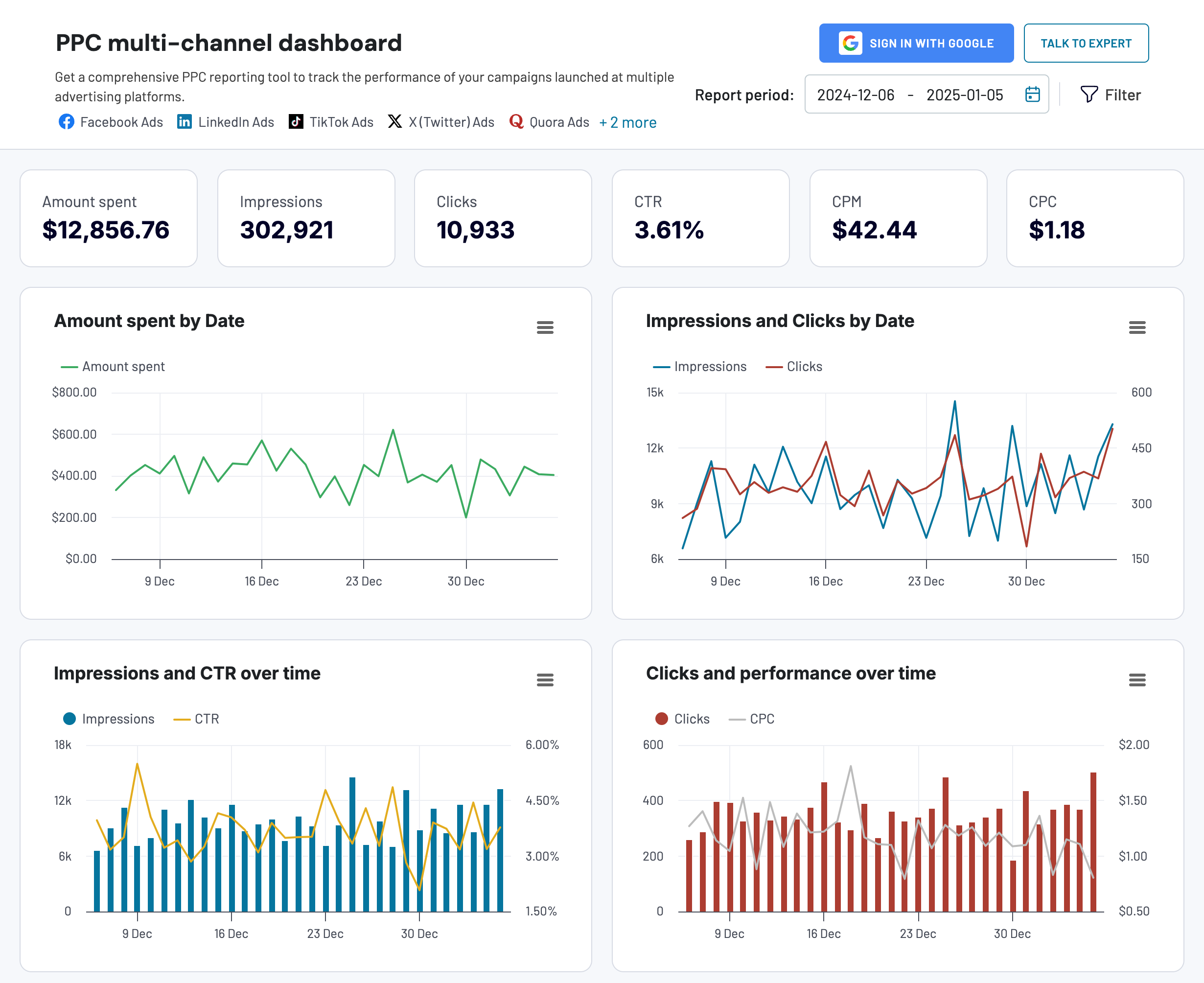
Among other things, you can:
- Combine campaigns from different channels to compare the cost and impact
- Control key spend metrics: cost per click, cost per impression, cost per action, and more
- Analyze the independent performance of each channel in a single interface, which makes reporting on your PPC efforts much more straightforward.
The dashboard is available in the Coupler.io UI and as a template in your favorite BI tool: Looker Studio, Power BI, Tableau, and Google Sheets. It only takes a few clicks to sign up for Coupler.io and get a PPC report that updates automatically (up to every 15 minutes!)

PPC multi-channel dashboard
Consolidate data from multiple advertising platforms including Google, Facebook, LinkedIn, TikTok, and more to track campaign performance, analyze spend efficiency, and optimize your PPC budget allocation across channels.


PPC multi-channel dashboard in Google Sheets
Use a PPC dashboard designed for Google Sheets to track the performance of your campaigns across multiple advertising platforms.
PPC multi-channel dashboard in Looker Studio
Get a comprehensive PPC reporting tool to track the performance of your campaigns launched at multiple advertising platforms.
PPC multi-channel dashboard in Power BI
Use a Power BI PPC dashboard for tracking and analyzing your advertising campaigns across multiple platforms.
PPC multi-channel dashboard in Tableau
Track and analyze the performance of your advertising campaigns across various platforms using a one-stop PPC dashboard in Tableau
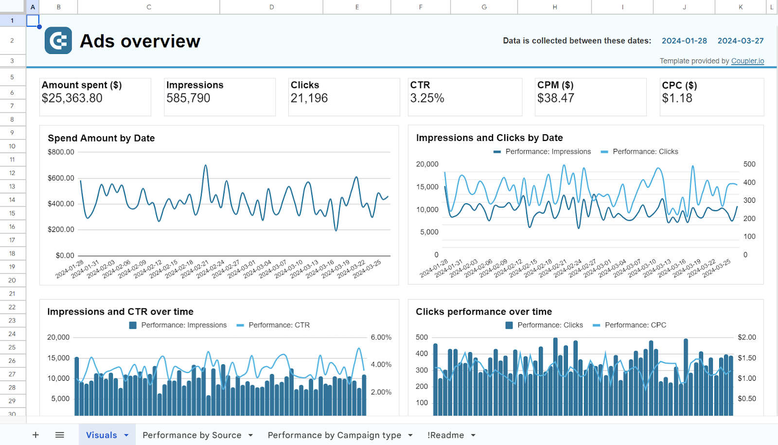
PPC monthly budget dashboard in Google Sheets
The PPC monthly dashboard offers an easy way to report on your ad spending across all platforms – Facebook Ads, Google Ads, TikTok Ads, etc. It lets you track advertising expenses in real time to ensure you stay within budget and make informed financial decisions.
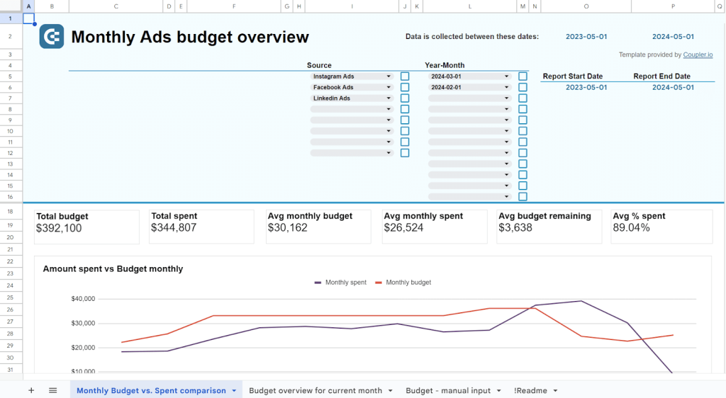
There are several line and bar charts for analyzing monthly spend and click dynamics. But one of the report’s best features is a budget overview chart with spending predictions and alerts to help you avoid overspending.
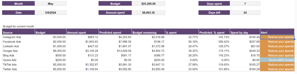
This template is available in Google Sheets. Want to try it for yourself? Click below and get started for free, no credit card required.
Cross-channel
Cross-channel reports let you analyze the performance of marketing campaigns across interconnected platforms, helping you understand how they work together to influence customer behavior.
Email marketing analytics dashboard template for Klaviyo and GA4 in Looker Studio
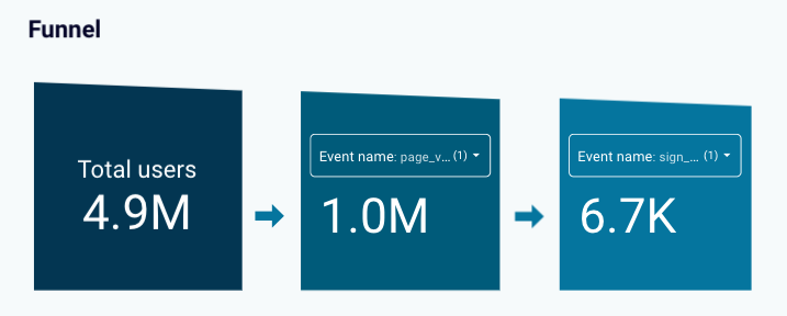
The dashboard allows you to track and analyze the user interaction with your email campaigns and their revenue generation performance. It pulls email marketing data from two interconnected sources: Klaviyo and GA4.
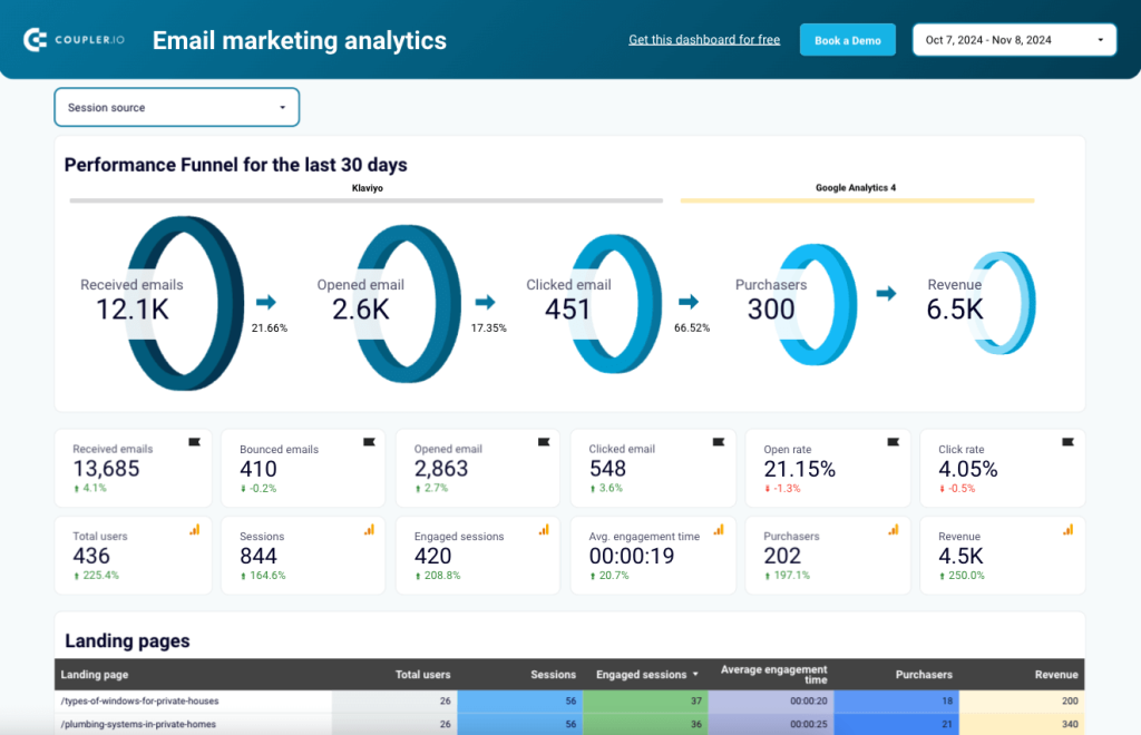
The report provides an overview of the key metrics to analyze email campaign performance and the traffic they generate. It also includes a visual representation of your email performance funnel for the last 30 days showing:
- how many emails were received, opened, and clicked.
- how many users made purchases.
- how much revenue your emails generated.
You can use the tables to examine engagement and conversion data for Klaviyo and GA4 campaigns. Analyze landing pages to detect the best and worst performers and develop hypotheses for increasing convertibility.
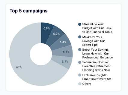
There is also a handy chart that displays your top-performing subject lines. Use it to determine which keywords draw the most attention and improve your campaigns’ open and click rates.
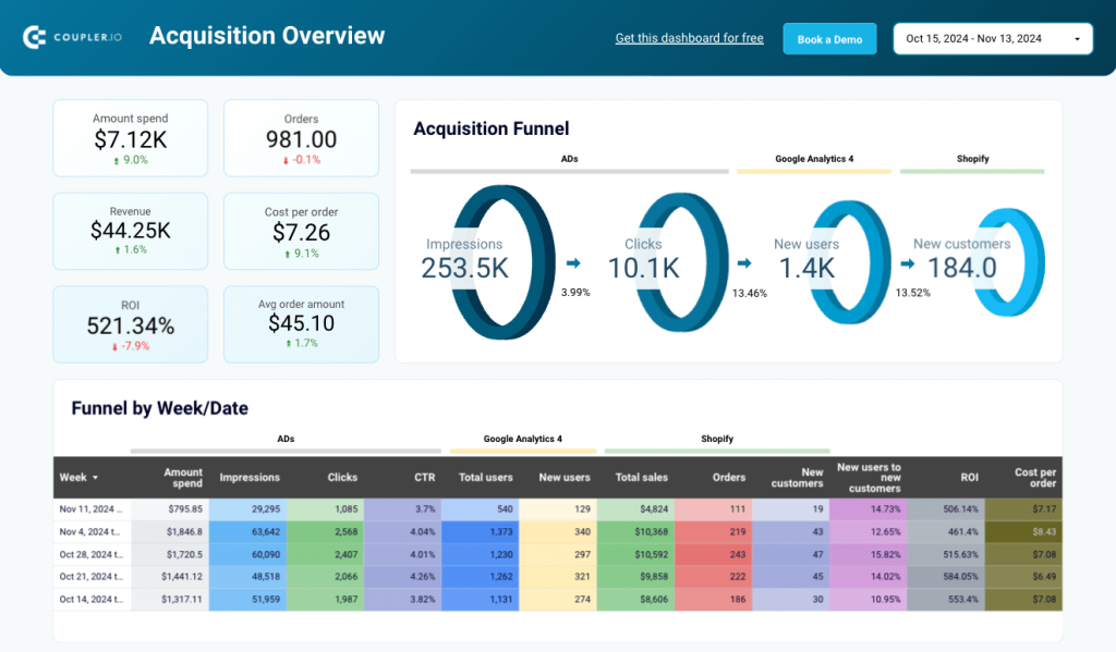
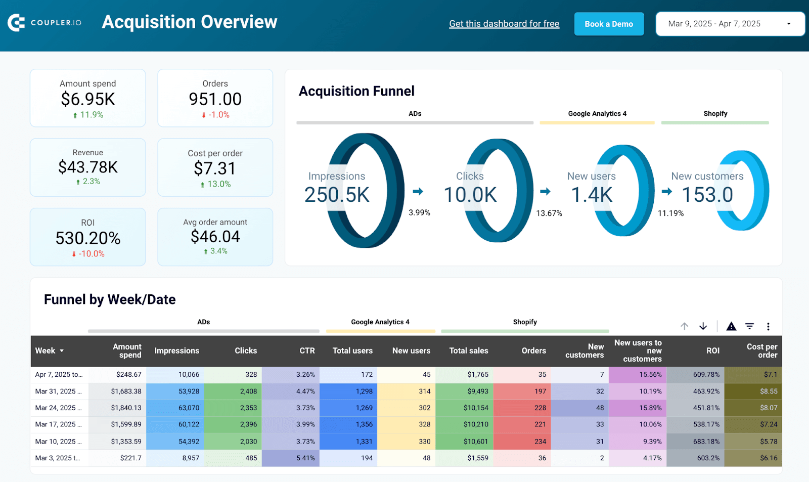
Customer acquisition dashboard template for HubSpot in Looker Studio
The customer acquisition dashboard for HubSpot offers an easy way to report on the journey your customers take from ad view to purchase. It combines HubSpot data with marketing data from GA4 and all major ad platforms like Facebook Ads, Linkedin Ads, Google Ads, etc.
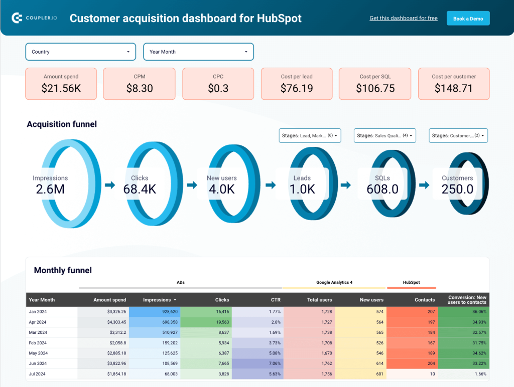
The dashboard has 3 types of funnel reporting visualizations (acquisition, monthly, and geo) for analyzing conversion data. You can use them to identify the best-performing months or regions to uncover the specific marketing initiatives that are driving acquisition. The dashboard also has several line charts for comparing key marketing and sales metrics, such as impressions & CPM, clicks & CPC, and so on.
This report template is available in Looker Studio, is free, and only takes about 5 minutes to set up with Coupler.io. Simply follow the instructions within the template to make a copy and connect it with your own marketing and CRM data.
Omnichannel
Omnichannel marketing reports combine data from all your marketing channels, helping you evaluate the overall performance and customer experience across various touchpoints.
All-in-one marketing dashboard
This all-in-one dashboard lets you view the performance of all of your marketing channels in a single, unified report. It collects data from your Google Analytics, Google Search Console, advertising platforms, social media apps, email tools, and YouTube account(s).
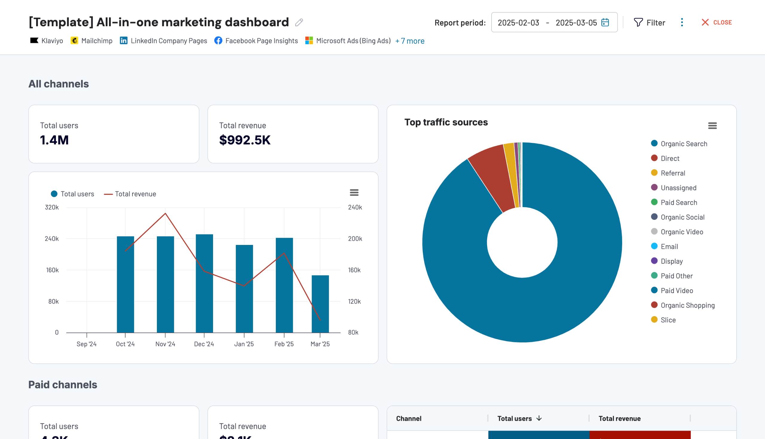
Each channel category displays the dynamics of total users and revenue according to GA4. You can also analyze key metrics (clicks, views, impressions, unsubscribes, etc.) for each channel with dedicated drill-down tables.
As a reporting tool, the dashboard helps you:
- Understand the impact of your marketing efforts across multiple channels.
- Optimize ad campaigns by comparing performance metrics across platforms.
- Refine your content strategy across platforms based on engagement stats.
- Improve click-through rates for videos and emails by analyzing the months with the best-performing campaigns.
You can get a copy of this dashboard with a free Coupler.io account. It’s available as a built-in dashboard in the Coupler.io UI and as a template in Looker Studio. It comes equipped with automated updates, ensuring you always have the freshest marketing data at your fingertips.
Shopify marketing funnel analytics dashboard template
With this Shopify marketing funnel dashboard, you can analyze your PPC and website traffic performance from the perspective of acquisition costs and conversion. The report collects data from Shopify, GA4, and ad platforms you use like Facebook Ads, Google Ads, etc.
The weekly data for impressions, clicks, total users, and new users helps you understand how ad spending translates into sales. With the insights from this Shopify dashboard, you’ll be able to make data-driven decisions and boost your e-commerce store’s performance.
Below the funnels, there is a handy set of line charts with key metric comparisons. This is useful for reporting on the performance dynamics of PPC campaigns, website traffic, and Shopify store customers.
Ready to get started with the free report template? This one is available in Looker Studio and Power BI:
Shopify marketing funnel dashboard in Looker Studio
Analyze the performance of the traffic to your Shopify store using data from advertising platforms and Google Analytics 4, all consolidated on a single dashboard.


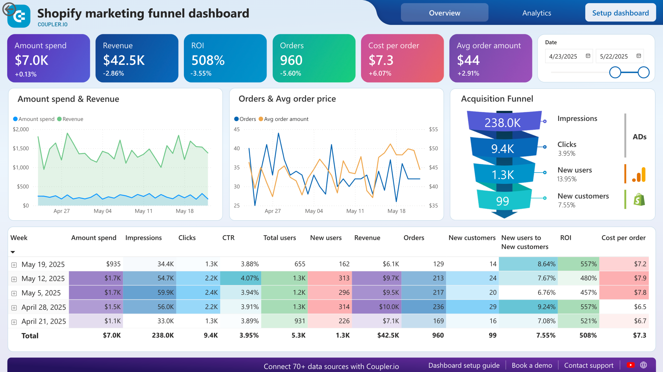
Shopify marketing funnel dashboard in Power BI
Examine the customer journey from advertising exposure to purchase completion with integrated data from your Shopify store, advertising platforms, and analytics tools.
Channel-specific
Channel-specific reports let you perform a deep-dive analysis of a particular marketing channel. They are different from single-channel reports in that you can analyze data from multiple relevant platforms under the umbrella of one channel (e.g. paid advertising, SEO, etc.).
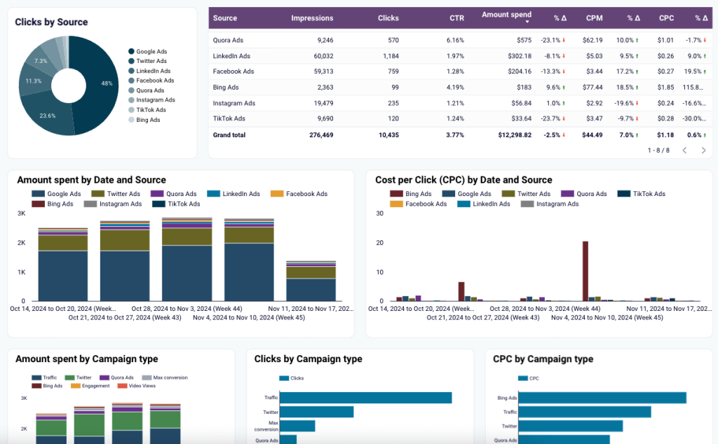
Google Ads and Meta Ads campaign performance dashboard in Looker Studio
This PPC report is a valuable tool if you run the bulk of your paid advertising campaigns on Google Ads and Meta Ads. It’s a two-page dashboard that allows you to monitor and compare performance data from both platforms. The first screen contrasts PPC metrics for each platform, including amount spent, CTR, clicks, and impressions.
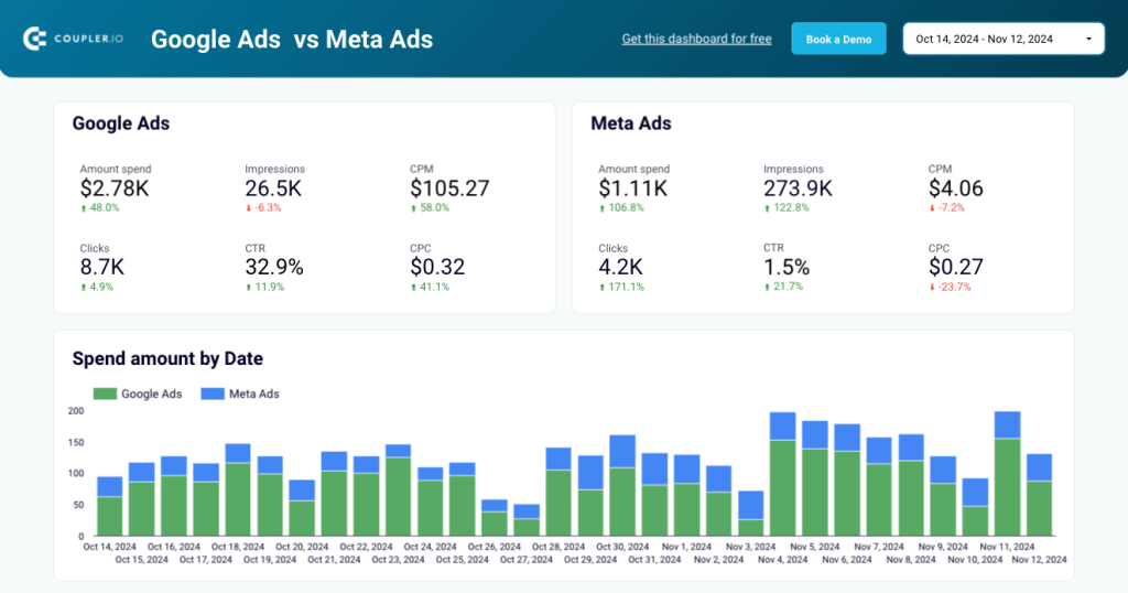
There are also charts to view the correlation between costs and campaign performance. Use the tables (and their filters) to compare the results of individual campaigns per platform.
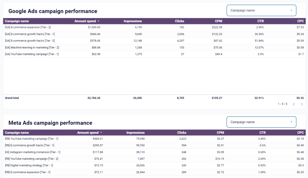
On the second page of this report, you can track and compare the performance of ad campaigns by month. This is helpful if you’re looking to optimize your ad spend based on seasonal trends or peak performance periods.
The dashboard template is designed in Looker Studio and is available for free. You only need to connect your ad accounts using the built-in Coupler.io connector. In a few moments, you’ll get a copy of the dashboard populated with your data.
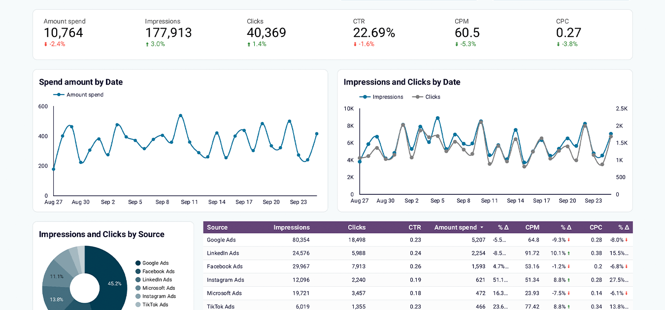
Google Analytics PPC dashboard in Looker Studio
Here’s another PPC-specific report template that can help you finetune your paid advertising strategy and optimize budget allocation. It combines GA4 and ad platform data to give you a complete view of your campaign traffic performance.
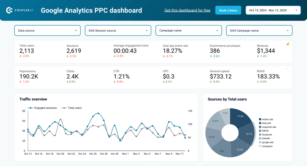
With line and drill-down charts, you can see your top source of website traffic by ad platform, track fluctuations in your ad spend and ROAS, and adjust your budget accordingly.
This report also has a second page with two tables. The first table lets you analyze campaign traffic data in GA4 with key metrics like total users, sessions, purchases, etc. The second table displays performance metrics (clicks, CPC, etc.) for your ad campaigns by source.
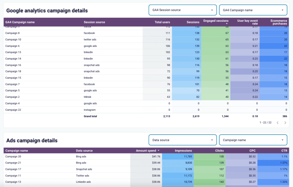
You can connect up to 7 ad accounts to this dashboard report template, in addition to GA4. It’s available for free in Looker Studio and you can configure it to update automatically on a schedule.
Specific cases
Sometimes, you’ll have a specific business case you want to report on, and you’ll need more than a standard dashboard template to cover it. That’s where these report templates come in:
Landing page performance dashboard template
Let’s say you want to learn more about which landing pages visitors engage with the most, and which ones they quickly navigate away from.
You can generate this landing page performance report to analyze all that and more. It’s a concise, one-page report that pulls data from your Google Search Console and GA4 accounts.
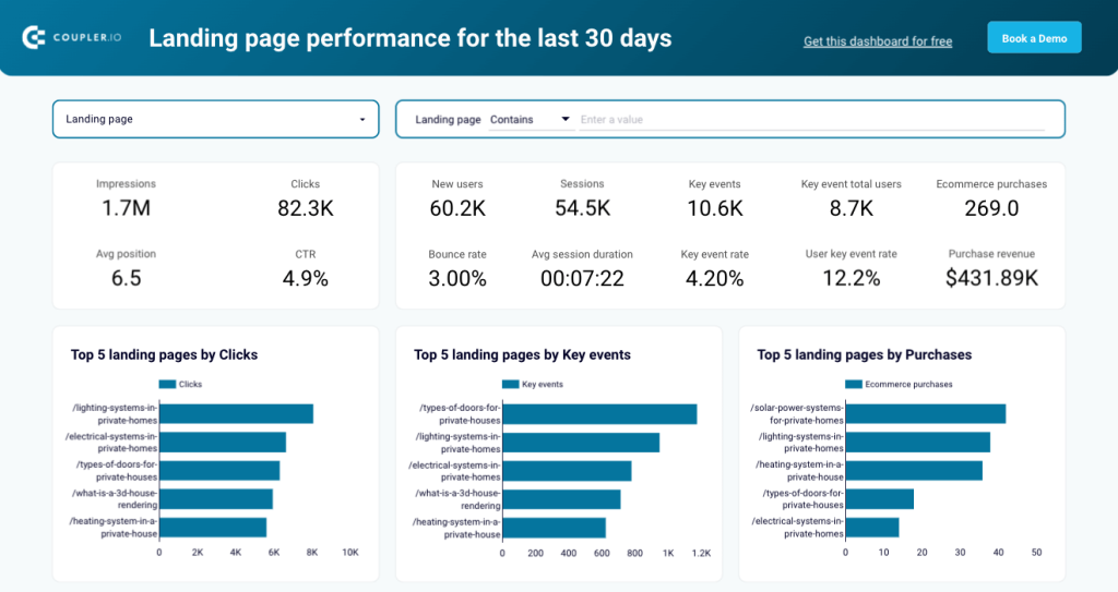
There is also a table displaying key marketing/product metrics such as clicks, impressions, CTR, bounce, and revenue. You can use it to see which landing pages generate interest and drive actual product purchases for your business.
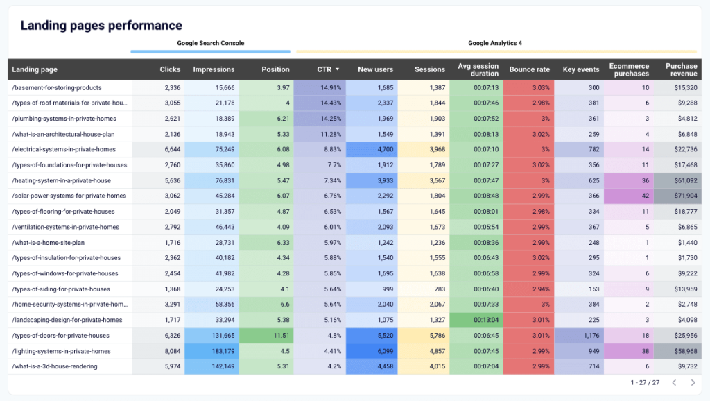
The dashboard is available in two versions for Looker Studio and Google Sheets. Try the preferred version right away for free
AI traffic performance dashboard template in Google Sheets
This one-page dashboard shows the performance of traffic coming to your website from AI tools. It’s simple but super helpful for answering questions like ‘Which AI platforms are generating the most traffic for our website?’ and ‘How can we increase traffic acquisition via these new sources?’
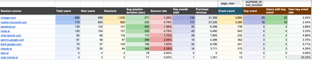
The report contains metrics like new users, average session duration, bounce rate, purchase revenue, and event count to help you evaluate each platform’s performance. You can determine which platforms to invest in and optimize your content strategies to attract more AI traffic.
It connects to a single source, your GA4 account. To grab this report in Google Sheets, sign up for a free Coupler.io account and get started in minutes!
Technical SEO dashboard template
This technical SEO dashboard is useful when you have questions about how the health of your website is affecting your marketing performance. It’s connected to Google Search Console and lets you monitor the state of pages by coverage, indexing, fetch, etc.
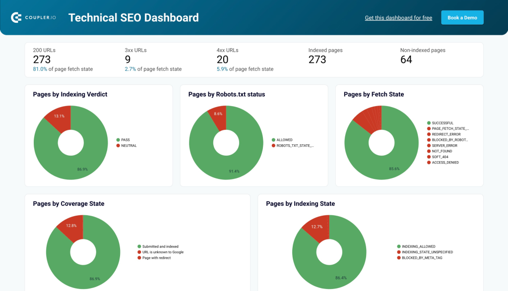
For example, if certain landing pages or blog articles aren’t performing as well as expected, you can check their indexing and robots.txt status to understand if Google is crawling them correctly. You can also use the pages overview table (with the filters on top) to investigate pages with other specific issues.
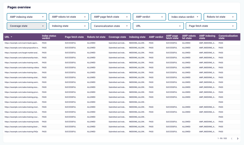
It only takes a few minutes to get a copy of this dashboard template and populate it with your SEO data. It’s available for Looker Studio or Google Sheets.
How to automate marketing reporting
Without the proper tools, marketing reporting can feel like a chore. Especially if you’re doing it manually and juggling data from various sources.
Automation takes the hassle and guesswork out of the process. It eliminates the need to copy and paste data from one tab to another, or to periodically download CSV files from marketing platforms and upload them to a data viz tool. Sounds wonderful, right?
So, to automate the marketing reporting process, you need two kinds of tools: one for managing data collection and transformation, and another for visualizing the data.
Reporting automation
As I mentioned earlier, you can use Coupler.io to automate most of the reporting process. Coupler.io handles data collection and allows you to sync multiple sources of data at the same time. All you have to do is select the preferred destination (a BI tool) and Coupler.io will generate a report with your aggregated data in minutes.
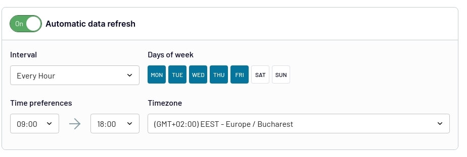
You can also set up automatic data refreshes to ensure you won’t have to manually update reports. It only takes a few clicks to toggle on and configure. Choose the data refresh interval (every hour, day), the days of the week, time constraints, and time zone. And that’s it, no more CSV uploads!
BI tools for data visualization
Now let’s get back to the report itself. Earlier, I mentioned that BI tools like Looker Studio or Power BI are good options for data visualization, and that still stands. But how does a BI tool help you automate the reporting process in general?
- It seamlessly connects to reporting tools like Coupler.io, ensuring a stable flow of data between the source and the report.
- It enables near real-time updates and displays fresh data from your sources (unlike static reports built with design tools like Canva).
- It provides you with easily accessible reports that you can share with stakeholders on demand.
As you saw, Coupler.io has a huge selection of free marketing report templates for Google Sheets, Looker Studio, Power BI, and Tableau. Feel free to try them out for yourself!
What makes your marketing reports useful?
Anyone can load a bunch of marketing data into a Looker Studio dashboard and call it a report. But what takes your reports from ‘good enough’ to ‘I think we can learn a few things from this?’
It’s usually more than one quality or structural element. Let’s explore them:
1. Actionable data
More data in your report doesn’t always equal more insights. What matters is the quality of your data, not the quantity. Opt for sources and metrics that actually drive results for your business.
For instance, if you want to report on your social media marketing efforts across channels, choose data sources (platforms) where your team is active, such as Facebook, Instagram, and TikTok – not the X account that you hardly launch campaigns on anymore.
Avoid including vanity metrics in your reports. Stick to the numbers that align with your strategic objectives. For example, if you create a Facebook ads report to analyze your spending, it doesn’t make much sense to include follower or share counts.
2. Ability to tell a story
The right structure is vital. Your report should tell a basic story about the state of your marketing channel(s). As soon as you open it, you should have a sense of how your campaigns are performing and how close you are to reaching your goals.
Put the most critical information at the top of the report. You can use dashboard visuals like scorecards, pie charts, and funnels to highlight the key performance indicators.
Keep the specifics for the second half or subsequent pages of your report. This is where you can look for additional context or investigate issues after reviewing the main points.
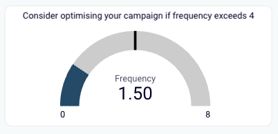
3. Contextualized data
For non-marketing stakeholders, reports without contextual information can be confusing and inaccessible. But context doesn’t have to mean long-winded summaries or KPI descriptions. It could be as simple as pointing out benchmarks for particular metrics, such as this one for ad frequency in a Facebook Ads dashboard:
So, to help stakeholders grasp the impact of your marketing efforts, use different types of visualizations in your reports. For instance:
- Include comparison charts to demonstrate month-over-month or year-over-year growth
- Create funnels to illustrate the conversion path and customer journey
- Use interactive maps to highlight regions with the highest engagement, web traffic, etc.
Maybe you (or your team) don’t need maps and funnels to understand the results on your screen. But remember, that may not be the case for a Sales Manager, PR Lead, or CEO. The more accessible your reports are, the more impactful they are likely to be.
4. Standardized practices
When reports have a consistent style, structure, and terminology, it’s easier to measure results over time. You can draw faster comparisons, track progress more reliably, and make decisions with greater confidence.
Implementing standardized practices for reporting helps maintain this consistency. For instance, you may:
- Use report templates (like the earlier examples) to keep the same style and general structure across the board.
- Use automation tools to eliminate copy-paste errors for actions such as data export/import and data visualization.
- Determine how often you will need to create or update reports, i.e., weekly/monthly/quarterly, and stick to a schedule.
And that pretty much covers everything you need to know about marketing reporting. By now, you should have an understanding of the most common KPIs and sources, how to create a report from scratch, and the essential tools for automation.
Of course, if you want to speed up marketing reporting, you can always use one of Coupler.io’s free templates!
Automate marketing reporting with Coupler.io
Get started for free