There’s no doubt that Microsoft Power BI is an excellent product, as 1 out of 3 business intelligence specialists use this software on a daily basis. Other 2 out of 3 specialists, however, use Power BI alternatives. And there must be strong reasons for that.
The general complexity of the tool (and user interface, in particular), difficulty in dealing with big data, and incompatibility of the desktop app with macOS are among the strongest arguments for switching to an alternative to Power BI. But what service for BI operations to choose? How would you know whether it’s better or worse than Power BI?
Don’t worry! We are here to cover all these questions and provide decent alternatives to Power BI to streamline your business operations.
Top 10 Power BI alternatives
Even though Power BI provides data visualization, analysis, and business analytics functionality, it may not be suitable for each and every business because of the limitations listed above. So, let’s have a look at Power BI alternative services with a brief overview of their principal features and pricing models.
| Alternative | Key features | Big Data support | macOS support | Pricing |
|---|---|---|---|---|
| Looker Studio | – Library of templates – Report sharing – Connectivity | Yes | Yes | Free version. The Pro version starts from $9 per month |
| Tableau | – Integration – Security – Mobile version | Yes | Yes | Free trial. Starting from $15 per month |
| Zoho Analytics | – Data preparation – Automatic analysis – User management | No | Yes | Free 15-day trial. Starting from $24 per month |
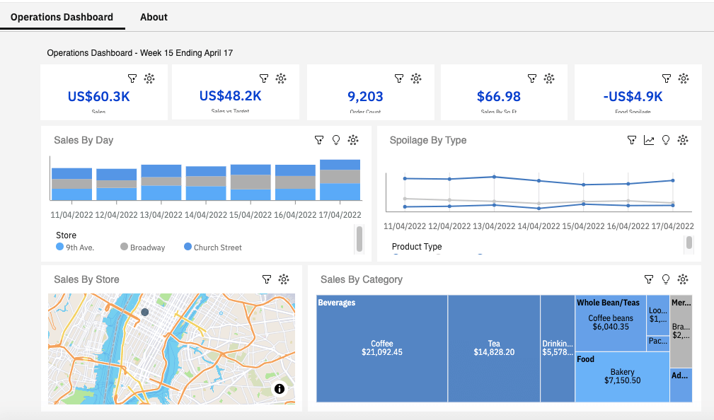
| Domo | – Drill-down functionality – AI-powered insights – Alerts | Yes | Yes | Free under 300 credits/month. Pay-as-you-go model applies. |
| Sisense | – Real-time analytics – AI-driven insights – Developer-friendly | Yes | Yes | No free trial. Pricing is available on request |
| Holistics | – Data exploration – Report sharing – Embedded analytics | No | Yes | Free trial. Starts from $150 per month. |
| Qlik Sense | – Automated reports – AI-based recommendations – Predictive analytics | Yes | Yes | Free trial. Starting from $20 per month. |
| Metabase | – Query builder – Auto-refreshing dashboards – Alerts | No | Yes | Free trial. Starts from $85 per month. |
| IBM Cognos | – Data modeling – Data exploration – Data prediction | Yes | Yes | Free trial. Starts from $10 per month. |
| Mode | – Python & R notebooks – SQL Editor – Custom HTML dashboards | Yes | Yes | Free version Pricing is available on request |
Being the most popular BI solution must have its grounds. So, let’s first explore the most powerful features of Power BI and then dive deeper into its limitations to understand what incites people to explore the Power BI alternatives.
Power BI features:
- Perfectly integrates with other Microsoft tools.
- Provides a wide set of visualizations (charts, graphs, tables, etc.)
- Allows for customizing dashboards and reports.
- Ensures real-time data processing and analytics.
- Offers powerful data transformation capabilities.
- Ingests data from diverse sources by establishing direct in-app connections.
- Provides mobile app support.
- Goes in hand with innovation by constantly releasing new features.
- Grants competitive prices for any type of organization.
Power BI limitations:
- Has a complex structure.
- Doesn’t provide data cleansing options.
- The desktop version can’t be installed on macOS.
- Experiences difficulties in ingesting data from large data sets.
- Has no option to share dashboards and charts with external users.
- Requires proficiency in DAX language.
Alternatives to Power BI in 2025
Now, it’s time to explore in detail each of the Power BI alternatives with a detailed overview of features. Note that such standard features as reporting, dashboards, and data visualization aren’t specified unless there are particular options associated with them.
1: Looker Studio (Google Data Studio)
Looker Studio, also known as Google Data Studio, is a web-based BI tool that builds informative dashboards and reports on the basis of data stored within other Google platforms (Search Console, Google Analytics, BigQuery, etc.) and third-party apps. Users can create those dashboards from scratch or rely on the templates provided directly within the tool. In fact, Looker Studio is one of the most powerful Microsoft Power BI alternatives due to the number of features it offers and the tasks involving big data it handles for making data-driven decisions.
- Ease of use. Looker Studio has a very intuitive and user-friendly interface, so users find it convenient to navigate the tool and create dashboards with drag-and-drop functionality.
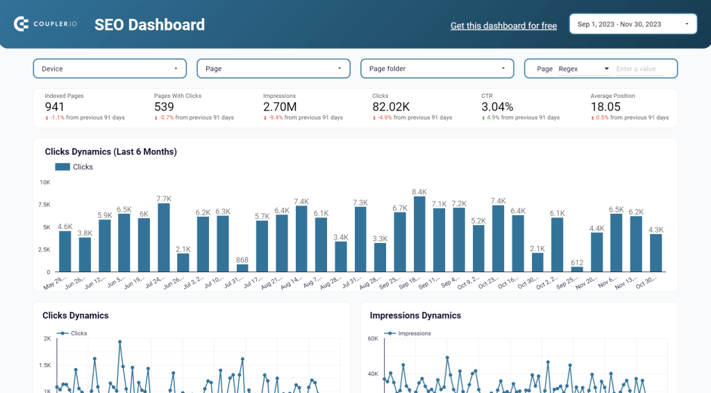
- Library of templates. The service offers dozens of templates, which greatly contributes to fast report creation. You can also use dashboard templates in Coupler.io to keep an eye on your performance, revenue, KPIs, and other data.
- Data modeling. Provides additional features and modeling language for obtaining a sophisticated data interpretation.
- Report sharing. Similar to other Google services, Looker Studio allows users to generate a link and share a report, even with external users.
- Tutorials. There are educational videos on the platform that help new users to get acquainted with its functionality.
- Connectivity. Looker Studio has multiple connectors, including databases and apps. However, there are sources that it doesn’t provide a native connection to. Luckily, there is the Coupler.io data automation platform suitable for a variety of data integration tasks. You can use it to send data from your favorite app to Looker Studio.
As you see, Looker Studio surpasses the drawbacks of Power BI because it has an easy-to-understand interface and tutorials to refer to. Also, it allows users to share dashboards and reports with external agents, which isn’t possible in Power BI.
Pricing:
The cost of Looker Studio depends on the selected service:
- Self-service BI – free
- Pro – $9 per user per project per month
Best for:
Given that Looker Studio offers various pricing models, it suits different kinds of companies, including but not limited to:
- Large enterprises
- B2C and B2B companies
- SMEs
- Software companies
- Startups
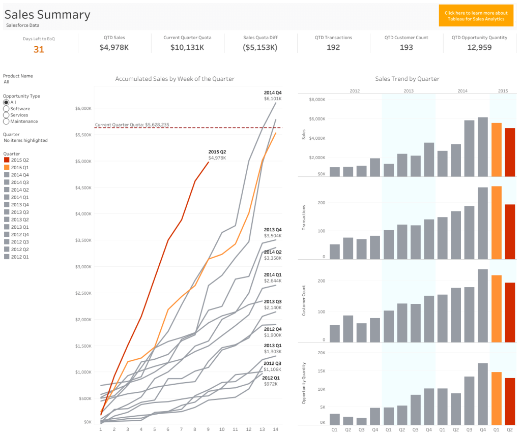
2: Tableau
Tableau is the best alternative to Power BI and one of the key Looker Studio alternatives in terms of data visualization capabilities. The core idea behind the tool was to keep marketing, sales, and customer service specialists in mind and make BI functionality available for them. Nowadays, the platform has grown into a large enterprise solution used both by professional analysts as well as non-technical users.
Tableau is available in multiple variations, where Desktop and Cloud versions are the most popular. Thanks to its powerful data visualization capabilities, it’s often used for KPI reporting and department performance metrics, and it’s often combined with other analytical tools for building complex data models.
- Integration. Tableau can connect to multiple data sources, including relational databases, data warehouses, cloud apps, big data streams, etc. If some sources are not supported, you can use Coupler.io to connect Tableau to the needed application. In addition to that, Coupler.io allows you to automate exports of data from Tableau to other BI tools, spreadsheets, or data warehouses.
- Security. This service implements advanced mechanisms for protecting data and ensuring its secure sharing.
- Visualizations. A great number of charts, histograms, dashboards, and other visual graphs is a competitive advantage of this tool, making Tableau the leader in data visualization.
- Scalability. Tableau perfectly handles large data sets and can even work with big data streams in real-time.
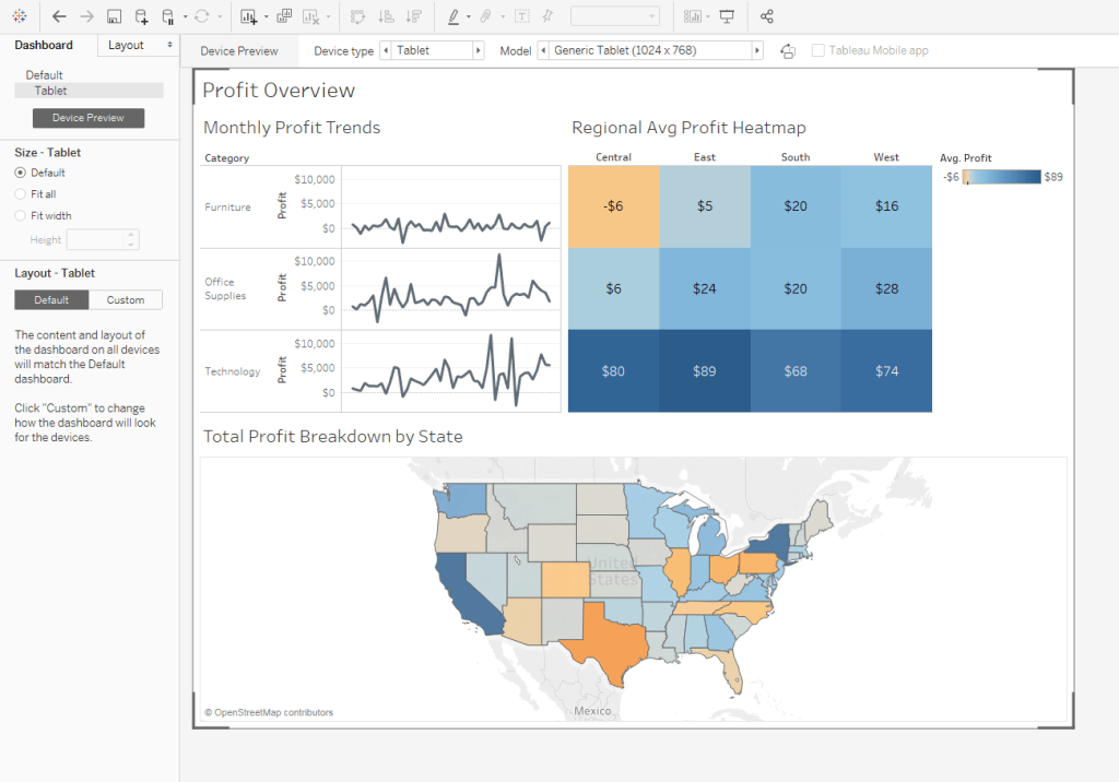
- Mobile version. Developers of Tableau have made a mobile version of the application so you can view and share reports right from your smartphone.
Pricing:
The cost of Tableau depends on the number of users and their typology:
- Creator – $75 per user per month
- Explorer – $42 per user per month
- Viewer – $15 per user per month
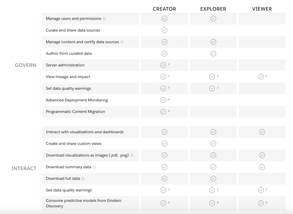
The Creator user has the most powerful set of permissions with all the available features and functions included. The Explore type is similar but with the difference in administrative and data preparation tasks. Explorers can connect to existing data sources and create new dashboards and reports. The Viewer user can only interact with already existing reports by observing them.
Best for:
- Large enterprises and startups
- Marketing, sales, and customer service users
- Data analysts
3: Zoho Analytics
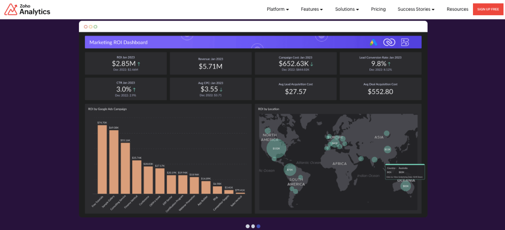
Zoho Analytics is one of the applications developed in 2009 by Zoho Corporation. This is a powerful solution specializing in data analytics, data visualization, and business intelligence for marketing.
Zoho Analytics perfectly integrates into the Zoho ecosystem as well as with some third-party tools. You can also upload spreadsheets and files with data for building informative dashboards and reports.
The boost of popularity of Zoho Analytics owes not only to its BI features but support of 50+ different languages and cross-platform availability. It’s possible to install a desktop version of the app on Mac, Windows, and Linux. Zoho Analytics is also accessible via cloud or mobile devices on Android and iOS.
- Data preparation. One of the most recent features of Zoho Analytics is its AI-powered data preparation and cleansing, allowing users to organize and enrich data properly for further analysis.
- Automatic analysis. This option allows users to select the needed table, and then the system automatically generates reports and dashboards based on it. This greatly facilitates the overall decision-making process.
- User management. Provides different user roles based on which they obtain permission to certain features and functions of the app.
- Security. Zoho Analytics provides access to the workspace only to those users who have such permissions. It also monitors and logs all user activities.
- Backup. The tool regularly performs data backup to ensure constant access to it regardless of any technical or anthropogenic factors.
Pricing:
Zoho Analytics offers 4 principal plans, the prices for which depend on the number of users and data volume.
- Basic – from $24 per month
- Standard – from $48 per month
- Premium – from $115 per month
- Enterprise– from $455 per month
Best for:
- SMEs up to 2500 employees
- Freelancers
- Non-profit organizations
4: Domo
Domo is a completely cloud-based platform for business intelligence, analytics, and data visualization. This Power BI alternative helps companies gather raw data from cloud apps as well as on-premises legacy systems to drive actionable insights out of it.
In contrast to other BI and data visualization platforms, Domo provides a high degree of customization for creating visual graphs and charts. It also allows users to incorporate artificial intelligence and machine learning functionality to make predictions using available data.
- Powerful visualization palette. Choose among the 150+ data chart types for data visualizations.
- Simple interface. Domo uses drag-and-drop functionality for quick operations with data sets.
- Cloud infrastructure. Domo uses cloud-native infrastructure with MPP (massively parallel processing), which is perfect for working with large data sets.
- Drill-down functionality. Users can easily define a drill path with no coding and perform data discovery with slicing/dicing operations.
- AI-powered insights. Integrated AI algorithms and ML models ensure advanced analytics, which allows users to obtain valuable insights into their data and make informed decisions.
- Alerts. Set notifications that pop up in your workspace once any change to your data occurs.
Pricing:
The service is free to use under 300 credits/month; the Standard package cost starts at $300/month. There are also custom solutions and pricing for organizations with high volume utilization and a large number of users. As Domo is a cloud-based solution, the pricing is based on the pay-as-you-go model.
Best for:
- Companies making SaaS products
- IT, Marketing, and Finance industries
- SMEs with 50-250 employees
5: Sisense
Sisense is another alternative to Microsoft Power BI for building AI-powered analytics. Gartner Magic Quadrant for BI and analytics named Sisense the best business intelligence tool for the completeness of vision.
This solution is particularly dedicated to working with big data sets and streams of data. It can process large amounts of data, visualize the key idea, and provide hints on the way to smart business decisions.
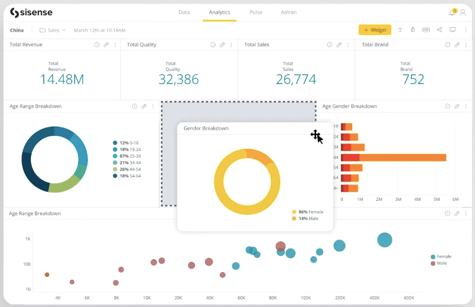
- Modern architecture. The tool relies on microservices based on Docker containers that allow users to deploy it on any cloud.
- Real-time analytics. Sisense can connect to data warehouses and analyze the raw data instantly.
- AI-driven insights. With the help of an in-built artificial intelligence core, Sisense assists BI specialists and analysts in data preparation for obtaining more precise results.
- Developer-friendly. This service provides a robust set of APIs that helps developers to embed analytics in other apps.
- Highly scalable. Sisense is perfect for incremental data loads and growing data sets owing to the containerized infrastructure that scales up easily.
Pricing:
Sisense offers totally customized plans for each particular organization. You need to fill in the form to get the quote and further discuss the details of your deal.
Best for:
- Companies in various industries, but is particularly suitable for organizations in the Technology, Healthcare, Finance, and Retail sectors.
- Businesses of any size due to its custom quotes and personalized solutions.
6: Holistics
Holistics self-service BI platform is among Power BI alternatives that keep non-technical users in mind. It allows them to explore data and create refined reports with a drag-and-drop interface and no code at all.
Even being a friendly solution for non-techs, Holistics offers a set of other tools dedicated to developers and professional analysts. They allow such users to define custom data logic with Python code and embed analytics reports into other applications.
- Data exploration. Contains slice-and-dice features for exploring and navigating through data sets.
- Report sharing. Provides a set of options to share dashboards or reports via email, PDF, and Google Sheets.
- Embedded analytics. Reports and dashboards generated with the help of Holistics could be integrated into other apps.
- Protects sensitive data. Includes mechanisms that ensure role-based access to data.
Pricing:
Sisense has the following plans:
- Entry – starts from $150/month for the max. of 10 users and 100 reports. This plan is perfect for BI beginners and small teams.
- Standard – starts from $600/month for a max. of 20 users and an unlimited number of reports. This plan provides all the Entry-level features plus custom charts, advanced as-code features, etc.
- Security Compliance Suite (SCS) – starts from $800 for a max. of 20 users and an unlimited number of reports. It’s very similar to the Standard plan with the addition of advanced security features (role-based access control, IP access whitelisting) for authorized control of sensitive data.
Best for:
- Marketers, sales, and other types of non-technical users to explore data and build reports.
- SMEs and startups
7: Qlik Sense
Qlik Sense is a cloud-based business intelligence platform designed to transform your business. Unlike other Power BI alternatives, Qlik Sense doesn’t use a standard query-based system but relies on its own associative analytics language. Its power is augmented with embedded artificial intelligence algorithms, which help to find the best chart types and discover the meaning of your data. Qlik Sense is also adapted to work with large amounts of data by summarizing it and pinpointing outliers on powerful visual graphs.
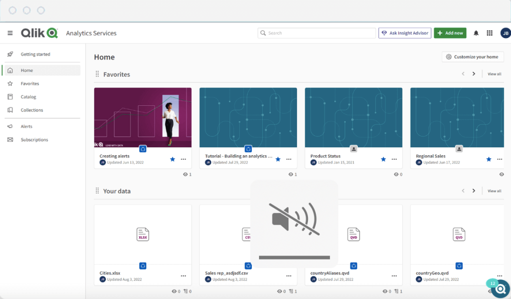
- Custom dashboards. Provides interactive reports and dashboards based on the data from various sources.
- Automated reports. Qlik Sense allows setting up reports on schedule.
- AI-based recommendations. Embedded artificial intelligence helps to explore data and find outliers easily.
- Predictive analytics. Uses ML models enhances the analytics capabilities of the tool to derive smart predictions from data.
- Integrations. Qlik Sense connects to different data sources directly, but you can also consider using Coupler.io for that. This tool will integrate data from your preferred apps into Qlik Sense and automate its import on a regular basis.
Pricing:
Qlik Sense offers three main pricing models:
- Standard – $20 per user per month (10 users minimum) and up to 50Gb of annual data capacity for analysis.
- Premium – starting from $2700 per month with 10 users and 50Gb for analysis capacity included along with embedded AI and ML, automated report compilation, and many other features.
- Enterprise – includes an unlimited number of users and data analysis capacity.
Suits best:
- Companies in the IT and Finance sectors
- SMEs under 200 employees
8: Metabase
Metabase is an open-source Power BI alternative that provides powerful data querying and visualization functionality. This tool is commonly used by developers and BI specialists with advanced experience to explore data, create meaningful reports, and analyze key metrics for business.
- Query builder. It’s very intuitive, allowing users to perform simple SQL queries for filtering and grouping results, creating columns, joining tables, etc.
- Auto-refreshing dashboards. Users can create and adjust dashboards according to their preferences and set up their automatic updates.
- Alerts. Configure notifications once some metric of interest reaches the desired number.
Pricing:
Metabase provides three types of pricing plans:
- Free – self-hosted open-source solution with access to 20+ databases.
- Starter – starting at $85 for 5 users per month
- Pro – starting at $500 for 10 users per month
- Enterprise – custom quote
Suits best:
- Users with confident knowledge of SQL to make the most of the Metabase functionality.
9: IBM Cognos
IBM Cognos is an all-in-one BI tool that helps you manage the entire analytics cycle, providing predictive, descriptive, and prognostic analytics in one place. This service relies on artificial intelligence to clean and aggregate your data in the same environment. So you’ll have more time to explore your data rather than spending time preparing it.
- Data modeling. Upload data from a CSV file or connect to online databases and apps to consolidate your data, cleanse it, and uncover hidden insights.
- Interactive dashboards. Drag-and-drop data to create meaningful dashboards quickly.
- Comprehensive reports. Work on reports in collaboration with other users.
- Data exploration. Use drill-down and drill-through functionality to explore your data.
- Data prediction. Ask the AI assistant to derive descriptions and predictions over your data.
Pricing:
- IBM Cognos on Cloud-on-demand starting at $10/month – ideal for startups and fast-growing companies.
- IBM Cognos on Cloud Hosted at the custom price for large enterprises.
Suits best:
- Large enterprises with 1000+ employees
- Companies in the Professional Services, Finance, Retail, and Manufacturing sectors
10: Mode BI
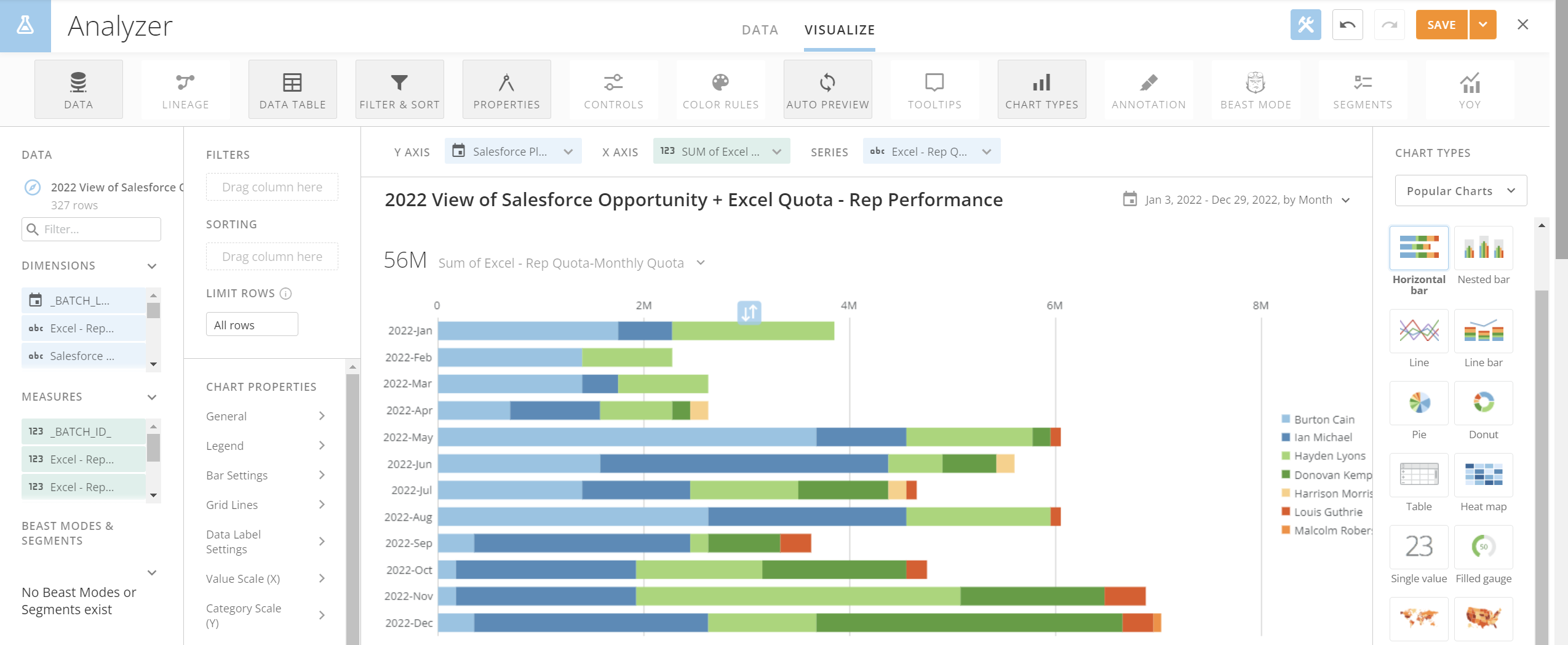
Mode is an SQL-based BI tool with a focus on data querying, visualization, and sharing. It’s claimed that data analysts have created this tool for analysts ? As a Power BI alternative, Mode can boast some peculiar features such as SQL editor, Python and R notebooks, collaborative report editing, and so on.
In terms of data visualization, Mode has some built-in charting options. At the same time, you can integrate it with JS libraries or use HTML to create custom interactive dashboards like this one.
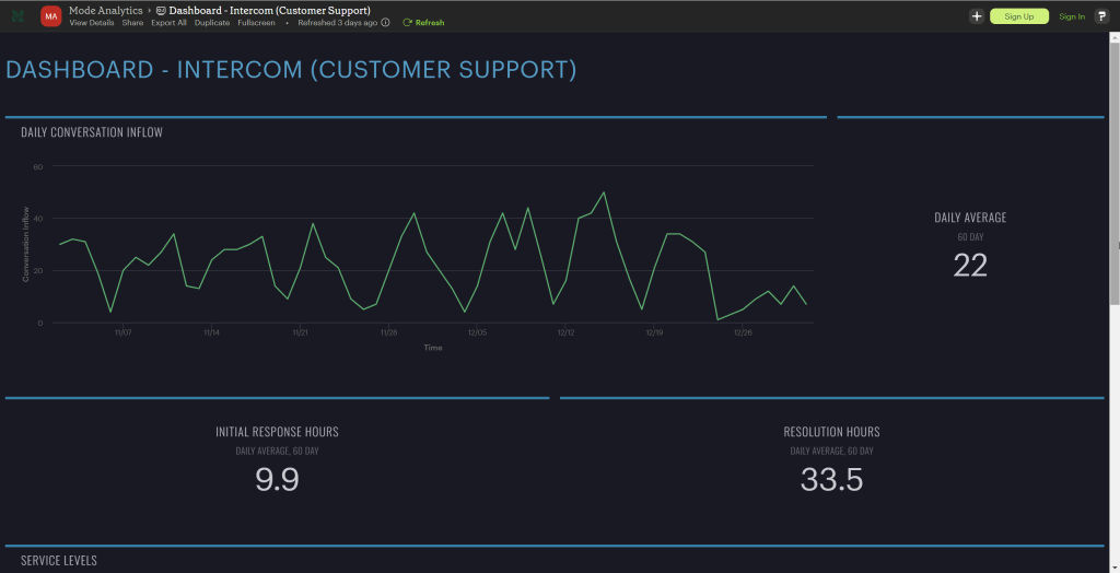
Key features:
- Python & R Notebooks – integrated notebooks for advanced analysis and forecasting.
- SQL Editor – a cloud-based SQL editor to build out queries to understand go-to data or a brand new source.
- Custom HTML dashboards – HTML, CSS, and JS libraries like D3.js and Leaflet to customize data visualization.
- Reusable datasets – reusable building blocks to distribute verified datasets to teams throughout your business by simply writing SQL.
- Scheduled reports – data flow automation to deliver data on a schedule.
Pricing:
- Studio – free (3 users)
- Business – upon request (minimum 3 users)
- Enterprise – upon request (minimum 50 users)
Suits best:
- Data analysts and data scientists
The main rival – Tableau
Most businesses, after a lot of exploring and eliminating, usually find themselves debating between two major players: Power BI vs Tableau. Both are robust BI tools that serve most businesses exceptionally well, making the choice even more challenging.
| Power BI | Tableau | |
|---|---|---|
| Ownership | Microsoft Corporation | Salesforce |
| Collaboration | Good with Office 365 integration. The setup can be complex for Mac users | Collaborate easily with Tableau Server and Tableau Online. It can be used on any OS |
| Functions and their types | DAX and M language | Calculated fields using built-in functions |
| Data Visualization | Robust and easy for beginners. It comes with 41 default visuals | Robust and more flexible to experiment. It comes with 21 default visuals |
| Data modeling | Simplified data models | Complex data models |
| Advanced Visuals | Extensive variety of advanced visuals (~521) | Limited compared to Power BI (~50+) |
| Number of data sources | Supports a wide range of data sources (~185) | Supports a good number (~80+) of data sources |
| Data cleaning | Uses Power Query | Uses Tableau Prep and third-party tools like Alteryx |
| AI | Interactive AI feature – Power BI Q&A generates insights from reports | The Ask Data AI feature allows you to ask a question about the existing database and will answer with a visualization |
| Mobile user interface | Good mobile interface | Strong mobile capabilities – uses different layouts for different phone screens |
| Data size | Limited by the capacity of Power BI service (max: 100 TB) | Handles large datasets better |
| Performance | Faster with smaller datasets | It can be slower but better for large datasets |
| Customization | Limited customization | Highly customizable |
| Software updates | Monthly updates | Quarterly updates |
| Tutorials | Free PowerBI video training modules are available | Free Tableau video training modules are available |
| Pricing | Starts from $10 per month | Starts from $70 per month |
Tableau vs Power BI: pros and cons in a detailed overview
Understanding the pros and cons of both tools can help you assess them better. So, let’s get into the details by comparing the pros and cons of Tableau vs Power BI individually.
Tableau overview
Tableau is a visual analytics platform owned by Salesforce. It manages the data flow and turns data into actionable information. It comes with a limited number of dashboard templates but a wide range of visualization elements encouraging the users to experiment. Tableau is more dynamic and flexible when compared to Power BI.
Tableau Pros:
- You can download the ‘Tableau Mobile’ app to view the reports and dashboards built on Tableau. It is available on Google Play Store and App Store. The best thing about this mobile application is it adjusts the report layouts based on the mobile screen size.
- Tableau easily handles large volumes of data and does not limit the number of data points in a visualization.
- Tableau is flexible and highly customizable. Thanks to this, you can create custom dashboards based on default visuals without even paying for advanced visuals.
- Performance is faster, irrespective of the data volume. The drag-and-drop feature helps you create interactive dashboards and visuals in a few clicks.
- Tableau has no OS restrictions. It works perfectly well on both Windows and macOS. However, the newest Tableau version does not support the M1 Macbook OS. But you can always download the Tableau 2020 version on any OS.
Tableau Cons:
- Tableau has only 24 default visuals, which can be limited for beginners to continue using the platform. The advanced visuals that can be purchased additionally are also offered in less variety compared to Power BI.
- Data cleaning is not very easy in Tableau. You must use tools like Tableau Prep or Alteryx, where you must transform the data before loading it to Tableau for visualization.
- Tableau’s software updates are not as frequent as Power BI’s. You can expect new updates once a quarter.
- It can be more expensive than Power BI as the Creator subscription costs around $70/ month, almost 7x the price of Power BI with similar features.
- Tableau is not easy to use and can take a long time to learn for beginners.
In short, Tableau can handle large datasets with ease, is mobile-friendly, and supports both Windows and MacOS. But it is expensive, with limited software updates and a steep learning curve for beginners.
Power BI overview
Power BI is a business analytics service. It has a robust front end that allows you to visualize data more easily. You can also analyze, visualize, and extract insights to share them across various departments of your organization. As Power BI is built and owned by Microsoft, it can be an excellent choice for someone already using other Microsoft products like Teams, Outlook, Sharepoint, and more.
Power BI Pros:
- Power BI user interface is straightforward and can be easily navigated by anyone, making it a user-friendly choice.
- It is integrated with Microsoft products such as Excel and SQL Server, making it a better fit for Microsoft-centric environments.
- Power BI is easier to learn when compared to Tableau.
- The functions are an added advantage for anyone using Power BI. They are easy to use and help in transforming data and building dashboards.
- Power BI has an in-built tool called Power Query that can transform the data by filtering and removing incorrect and incomplete data.
- Power BI Q&A is an AI feature built on natural language capabilities using machine learning. You can get quick insights just by asking questions.
- The pricing is economical, with the Pro plan starting at $10 per month per user. It is affordable for both small businesses and enterprises.
Power BI Cons:
- Power BI is less mobile-friendly than Tableau. While you can access dashboards built on Power BI through its mobile app, you may need a better experience as it has one standard screen size irrespective of the mobile.
- Power BI Desktop can only be downloaded on Windows 8 or newer versions. It does not support MacOS, and Microsoft does not have plans to launch it anytime soon. But you can use a Virtual Machine to install Power BI Desktop on your Macbook.
- Power BI performance can be slow when handling large datasets, and it can handle only up to 100 TB of data.
To conclude, Power BI is a good choice for beginner data analysts. It will help you get on your feet quickly with its easy-to-use interface, pre-built dashboards, and affordable plans. The major drawback is it cannot handle large datasets, resulting in slow performance.
Tableau vs Power BI: Products
Both Tableau and Power BI have a range of products, specializing in visual analytics and business intelligence for marketing.
Tableau Products
- Tableau AI: It is a generative AI technology inside the Tableau platform. It provides smart suggestions and in-product guidance that can improve the overall productivity of the data analyst.
- Tableau Desktop: It is the primary product to create, analyze, and build visual reports on your computer.
- Tableau Server: It shares the dashboards and reports created on Tableau Desktop within the organization securely.
- Tableau Cloud/ Online: It is a cloud-based service with all the features of Tableau Server.
- Tableau Prep: This is a separate product that helps you clean, organize, and transform your raw data, making it ready for data analysis.
- Tableau Public: This is a free platform to showcase visualizations and dashboards publicly. It can be a great place to build a portfolio and public data projects.
- Tableau Data Management: This product is an add-on to manage your data more effectively, like cataloging and preparation features.
- Tableau Advanced Management: It is an upgrade to the data management product with more advanced tools for handling large amounts of data with additional security.
- Tableau Embedded Analytics: You can embed Tableau dashboards and functionality into your own applications or websites with embedded analytics.
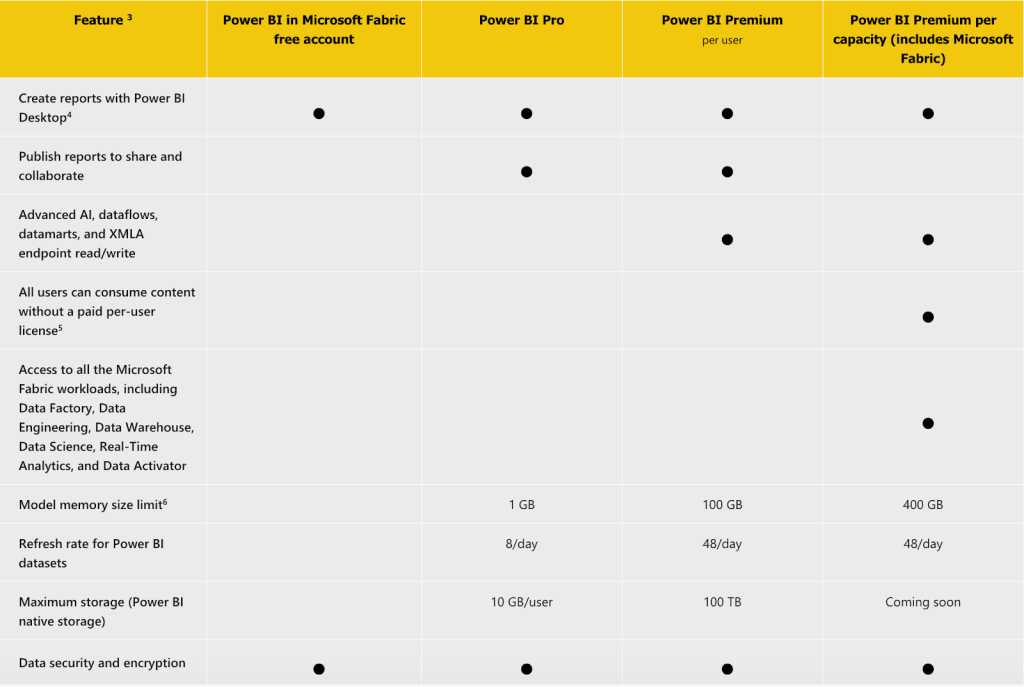
Power BI Products
- Power BI Desktop: It is a desktop application of Power BI that can be installed only on Windows OS. You’ll be using it mainly for all the data visualization activities. It has features like Power Query, Power Pivot, and Power View.
- Power BI Service: It is a cloud-based self-service tool that helps you publish reports and collaborate with colleagues.
- Power BI Pro: This is a subscription plan for Power BI Service. It costs $10 per user per month.
- Power BI Premium: This is another subscription for Power BI Service, especially for enterprises with more users. It costs $4995 per month.
- Power BI Mobile: The mobile application of Power BI is used to view reports and dashboards.
After getting a fair idea of Tableau and Power BI products, let’s jump in to compare Tableau vs Power BI in other aspects like visualization, pricing, ease of use and more.
Tableau vs Power BI: Visualization
Tableau visualization
Tableau is more customizable, with fewer pre-built templates. But it comes with various visualization formats like heat maps, waterfall charts, bar charts, and network graphs.
In most scenarios, you need to build reports and dashboards from scratch on Tableau. This might take more time, but will help you explore different functionalities of the business analytics software.
For example, assume you are building a sales dashboard with Excel spreadsheets. First, you must import the data from Excel to Tableau and transform it using Tableau Prep or a third-party tool.
After that, you create individual visualizations like bar graphs, trends, and more. It is now time to place all these visualizations appealingly and intuitively.
The process can eat up a lot of your time – checking for font style, size, and colors and going through multiple iterations to place these visualizations on a dashboard.
On the brighter side, Tableau has advanced mapping capabilities to visualize geographical data. They offer custom visualizations like creating geographical layers, highlighting visual clusters, and showing a path over time.
Tableau also has a hierarchical drill-down feature where you dig deep into data within a single chart or map without switching tabs. For example, looking at sales reports, you can dig deep into total revenue ? revenue from categories ? revenue from subcategories.
Power BI visualization
Power BI has pre-built visualization templates that can be used to create reports and dashboards quickly.
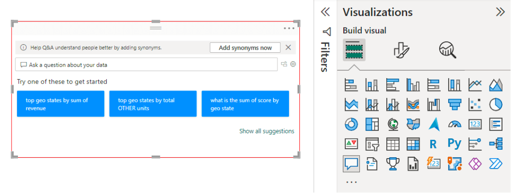
Let’s consider creating a sales report again. Once you load your data into Power BI, click anywhere on the blank canvas to see a Q&A pop-up.
Type in the report you are looking for in the Q&A.
For example, top geo states by sum of revenue.
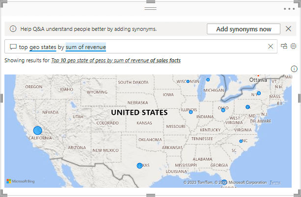
Another visualization example is the sum of revenue for VanArsdel as a column chart.
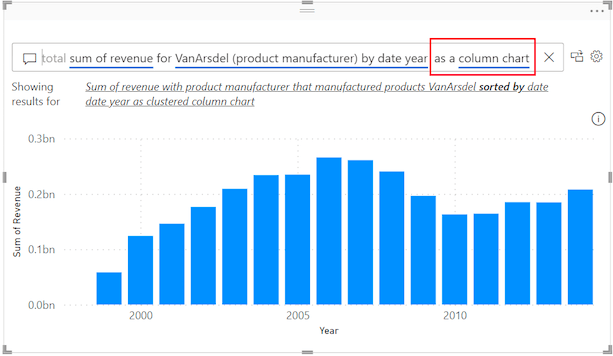
Now, arrange all the Q&A visualizations on the canvas.
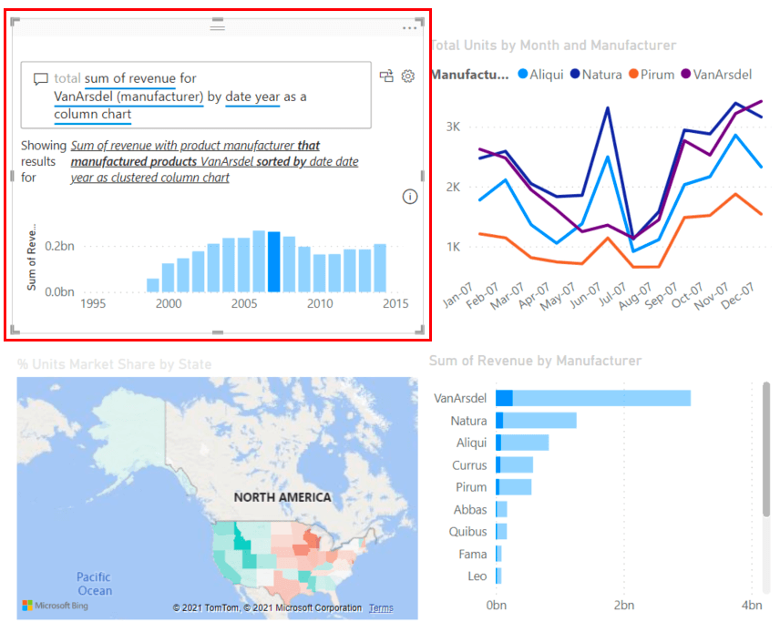
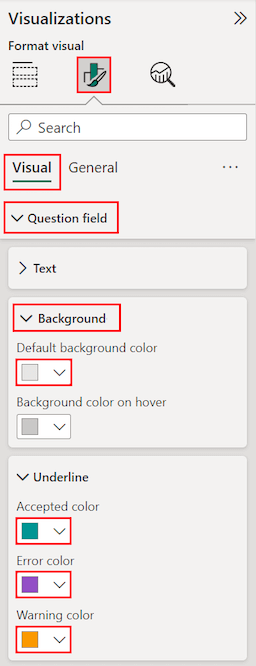
You can also format and customize the complete canvas at once or individual visuals using the settings on the right side of the canvas.
Power BI also has mapping and hierarchical drill-down capabilities but with limited customization. If you are looking to create interactive and intuitive reports quickly and easily, then Power BI is your go-to choice.
But if your priority is to have more flexibility to customize your reports and dashboards, then you can consider Tableau for your data visualization needs. Check out some useful Tableau dashboard examples.
Tableau vs Power BI: Pricing
Tableau pricing
Tableau hasn’t mentioned its pricing on the website now. Earlier, the subscription plans started from $70 per month. There are three plans:
- Tableau Creator – You can have full access to create and share reports.
- Tableau Explorer – You can interact with these reports and get insights from them but cannot create dashboards.
- Tableau Viewer – You can only view the shared reports.
To subscribe to any of the above plans, contact sales. Tableau does not offer a free version but provides a 14-day free trial.
Power BI pricing
Power BI pricing plans are less expensive and affordable to small businesses as well. There are five plans:
- Free version – You can create all visualizations and build dashboards but cannot share them.
- Power BI Pro – Along with building reports, you can also share them with departments within your organization. It costs $10 per month per user.
- Power BI Premium – Premium plan has advanced analytics tools along with all the features in Pro. It costs $20 per month per user.
- Power BI Premium per capacity – The same premium plan can be purchased for the complete organization. Here, the number of users will not be counted, and it costs $4995 per month for a complete organization.
Overall, Power BI is more affordable to get started with, whereas Tableau is expensive.
Tableau Market Share
Tableau was launched in early 2003 in California. It currently holds 15.69% of the market share in the data visualization industry, with 70,474 current customers. Geographically, most of Tableau’s customers are from the United States.
Power BI Market Share
Power BI is relatively new in the market. It was launched in 2015 and holds 15.63% of the market share in the data visualization industry, with 70,221 current customers. Similar to Tableau, most Power BI customers are from the United States.
Tableau vs Power BI: Ease of use
Tableau
The workspace layout has ‘shelves’ and ‘cards’, which can be confusing. Unlike Power BI’s ribbon, Tableau has a single-line toolbar. It gives you more space on the canvas, but may take some time to learn the icons and functions.
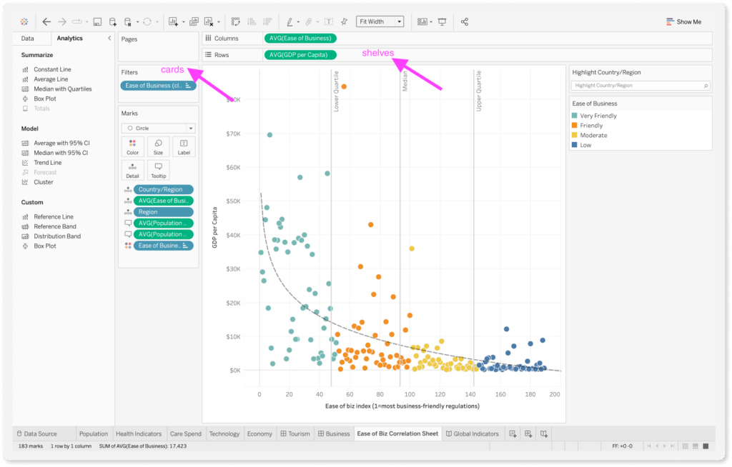
Once you get past the initial learning curve, Tableau has various customization options like parameter control, data blending, conditional formatting, themes, and more.
Power BI
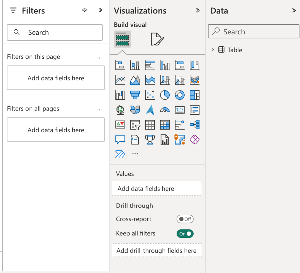
It has a structured environment and is easy to use for beginners. The ribbon interface is similar to Excel and Outlook, making it easy to find options. The tabs and icons are also easy to identify without complexity.
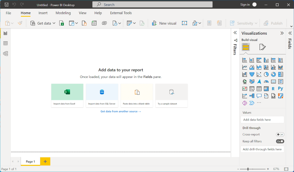
The drag-and-drop functionality is also quite convenient with ‘Fields,’ ‘Visualizations’, and ‘Format’ in the side panes. Additionally, Power BI has templates for reports, which you can edit and customize accordingly.
Finally, when it comes to user-friendly interfaces, the Tableau vs Power BI comparison leans in favor of Tableau.
Which Power BI alternative to choose?
From startups to large enterprises, almost every organization implements a BI tool as it helps to see how the business performs at present and derive data-driven insights for the future. Power BI is no doubt one of the top BI tools on the market, but it doesn’t suit every corporation or firm. So, in this article, we have provided a detailed overview of 10 powerful Power BI alternatives.
Even though all the presented solutions are very similar in terms of providing powerful visualization and reporting capabilities, each of them has distinctive features. For instance, Tableau has a very democratic pricing model and offers the macOS desktop app, so might be very convenient for Mac business users. Zoho Analytics might be extremely convenient for those who rely on Zoho products in their daily workflows. Meanwhile, Looker Studio and Sisense show outstanding results when working with big data sets and real-time analytics.
While most BI tools have their own integration mechanisms to ingest data from databases, cloud apps, etc., may not be enough to bring all the necessary data for analysis. Thus, here comes the Coupler.io automation and analytics platform that easily connects to multiple sources and automatically transfers data from them to most of the BI tools presented in this article.
Overall, it’s up to you to decide which of the Power BI alternatives works best for you. Everything depends on your business objectives, workflows, and budget!