The words dashboard and report are used interchangeably in everyday work. But does that mean they are the same?
No! Dashboards are summarized views to get a quick glance at the important metrics. Whereas reports are detailed and comprehensive and used for in-depth analysis. Now, let’s understand how these work in Power BI, the key differences, and when to use each for better decision-making.
Power BI dashboard vs report: A comparison matrix
| Power BI dashboard | Power BI report | |
| Overview | Single-page with a consolidated view. | Multi-page layout with a detailed view. |
| Creation Environment | Created in Power BI Service, not in Desktop | Created in both Power BI Desktop and Service |
| Customization | Limited – primarily involves arranging pinned visuals. | Extensive – includes adding custom data visualization and advanced data modeling. |
| Usage | Ideal for executive overviews and presentations. | Suitable for detailed analysis by analysts, and marketers. |
| Navigation & Interactivity | Static with limited interactivity. A gateway to detailed reports. | Easily navigate between different report pages to access different visuals. |
| Data Exploration & Presentation | Focuses on summarizing information from multiple reports. | Focuses on giving as much information and data as needed for a detailed analysis. |
| Sharing | Dashboards are published and shared within Power BI. | Reports can be saved, shared, and published. |
What is a Power BI report?
A Power BI Report is a detailed presentation of your data using different visualizations in Power BI. It has multiple pages where you can interact with and explore data in-depth. It is useful to understand trends, patterns, and performance metrics and make data-driven decisions.
Key features
- Multi-Page layout: Power BI Reports can have multiple pages to organize and segment the data with different visualizations. This layout is useful for visualizing and navigating different data sets, like sales performance, customer satisfaction metrics, inventory levels, etc, through multiple pages in a single report.
- High interactivity: Each report page is filled with features like drill-downs and data filtering within visualizations. You can use them to interact with charts to drill down from quarterly to monthly data in a review meeting. Or, explore specific product lines to understand the performance at a granular level.
- Custom visualizations: Users can import or create new visualizations that are not included in Power BI by default. For example, you might need a specialized map visualization to view the disease spread and hotspots over time. This can be custom-created and integrated into the Power BI report.
- In-depth data exploration and analysis: Power BI Reports have tools like cross-filters, slicers, and data dicers for detailed data analysis. You can use these features to filter consumer behavior data by demographics, slice by purchase categories, and dice by time periods to analyze seasonal trends.
- Visual customization options: You can also customize the layouts of reports by using different themes and color schemes. With this, you’ll design the reports to match corporate branding during stakeholder presentations.
- Collaboration and Sharing: With Microsoft’s cloud services integration, it is easy to share and edit collaboratively among team members. For example, project teams can share a report via Power BI Service, where stakeholders provide input, make revisions, or comment directly on the report.
- Real-Time Data Refresh: With reporting automation solutions like Coupler.io, you can configure to refresh data in the reports at scheduled intervals. This way, you’ll always have updated and near real-time data. For example, in an operational setting like logistics, real-time updates on vehicle locations and delivery statuses are crucial for everyday management.
Learn more about how to automate Power BI reports.
How to create a Power BI report?
Below is a step-by-step tutorial to create a Power BI report.
Step 1: Install Power BI Desktop
First, make sure you have Power BI Desktop installed on your system, as you can create reports in Power BI Desktop only. If not already installed, download it for free from the Microsoft website.
Step 2: Get data
You can load data from the cloud sources directly to Power BI using data connectors by Coupler.io. Select the source from the dropdown and click on Proceed in the form below.
Configure the source account by giving specific details (account, basic settings, report period, etc).
Then, you can preview and transform your data using filters, custom formulas, and other features. After that, generate and copy the integration URL in the destination settings.
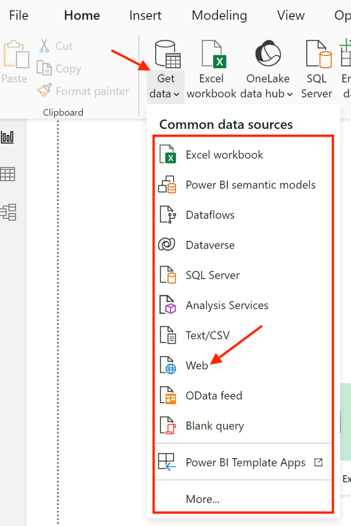
Now launch Power BI Desktop. Navigate to the Home tab and click Get Data. You will see a list of data sources available such as Excel, SQL Server, and many web services. Select Web.
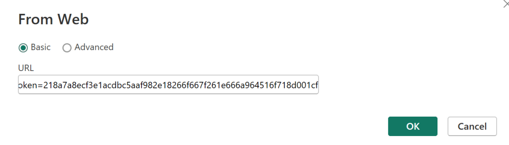
A dialog box will appear. Paste the integration URL of your Power BI connector here and click OK.
Before loading the data, you can also clean and organize your data by clicking on Transform Data. The power query editor will open, where you do all the data transformations, such as:
- Filtering out irrelevant rows
- Changing text to numbers
- Merging columns and so on.
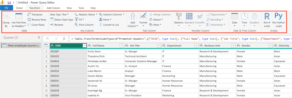
After making changes, click Close & Apply to save the transformed dataset and return to the main interface.
Step 3: Create relationships
If you have more than one dataset, you can create relationships between datasets using a primary column. This will help you analyze data from different sources. Generally, relationships are detected automatically by Power BI.
To manually create one, go to the Modeling tab, and click Manage Relationships> New. Select your first table and column, then select the second table and corresponding column. Click OK to establish the relationship.
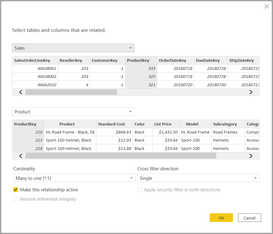
With relationships, you can spot trends, predict future performance, and make informed decisions.
Step 4: Add visualizations
Now, it is time to turn the transformed data into visuals. Select a type of chart or graph from the Visualizations pane. Drag the columns from the data pane into the appropriate areas of the visualization, such as Axis, Legend, or Values.
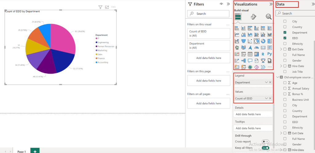
Customize the appearance of your charts and graphs with colors, labels, and tooltips to make them easy to understand and visually appealing.
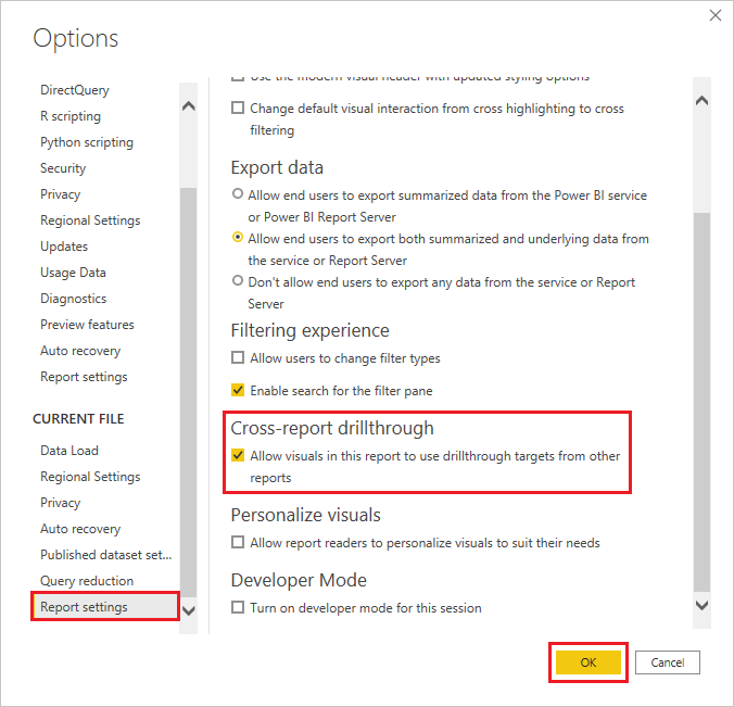
Step 5: Enhance your report
Make your report interactive by adding drill-down filters for in-depth data exploration and cross-report to link changes across different charts.
You can also use DAX formulas to create custom measures like Total Sales = SUM(Sales[Amount]), helping you analyze data more deeply.
Step 6: Save and share your report
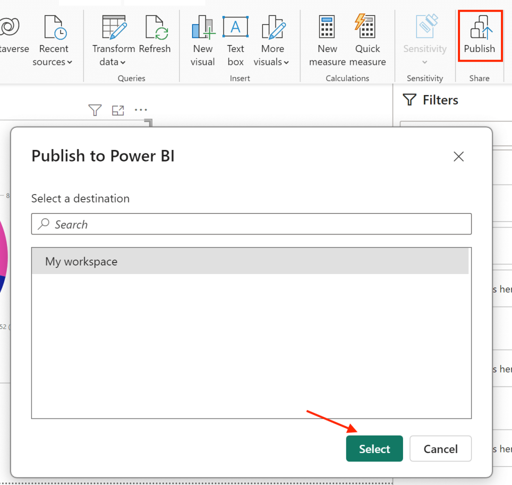
Save your report by clicking File > Save As and choose to save it as a Power BI Desktop file (.pbix).
Publish your report to the Power BI service using the Publish button on the Home tab. Manage who can edit the report by assigning roles in your workspace – admins, members, and contributors can edit, while viewers cannot.
Learn more about how to share Power BI report.
Examples
To save you the time and hassle of creating Power BI reports from scratch, Coupler.io offers pre-designed Power BI marketing report templates. You can connect your data sources in minutes and use these templates immediately. The best part is you set up the reports once, and Coupler.io will automatically refresh the data at intervals as specified.
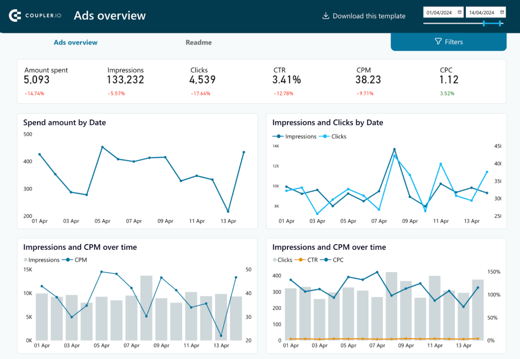
PPC multi-channel report
You can evaluate all your advertising efforts across different platforms like Facebook, Google, Twitter, TikTok, Bing, and LinkedIn Ads with this PPC multi-channel report.

It provides information about spending patterns, impressions, click-through rates, and cost metrics. For example, a PPC specialist can drill down into the Spend Amount by Date chart to see how expenditure on Facebook Ads compares with Google Ads on any given day. You can choose to explore the Impressions and Clicks by Campaign Type to evaluate specific performance metrics of engagement campaigns versus conversion campaigns.
As this report comes as a template, users can import their own PPC data and analyze it. The insights from this report can guide budget allocation, optimize campaign strategies, and identify high-performing channels.
SEO report
An SEO report is a must-have for all SEO professionals to monitor and optimize website performance data from Google Search Console. It provides a detailed view of important metrics such as indexed pages, pages with clicks, impressions, and average position. With interactive charts, you can track click and impression trends over time. They also help you understand performance by device, and identify top-performing and worst-performing pages. This way, you can filter out the pages that need more optimization.
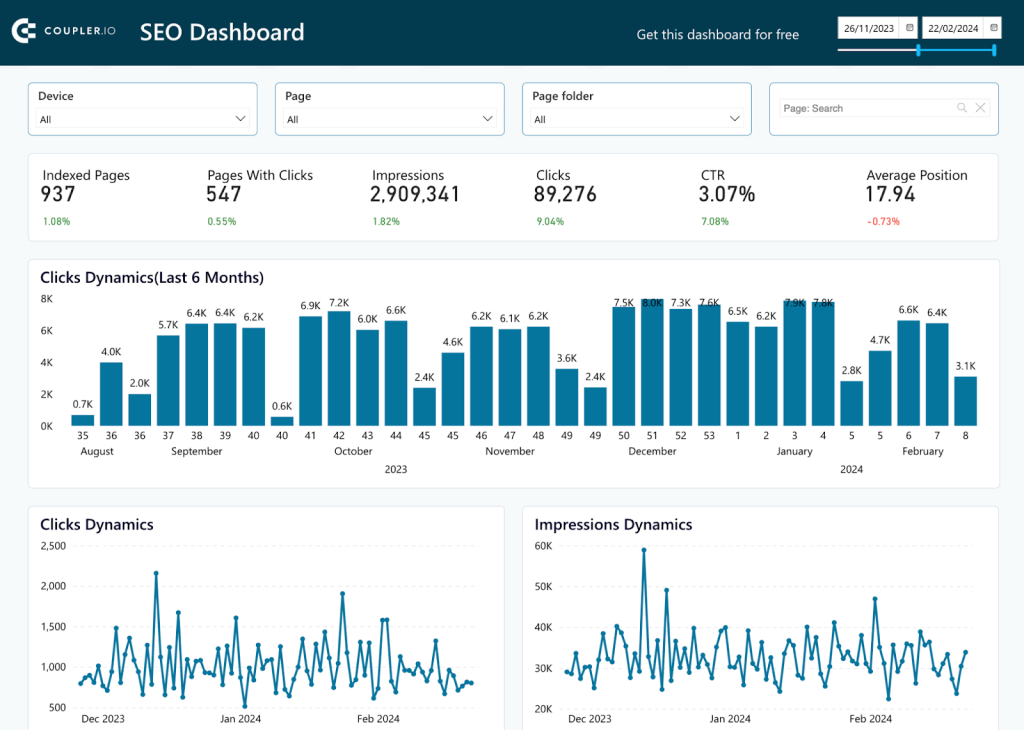
Detailed tables about click growth, help to analyze and understand what content resonates with the audience. Drill-down filters give a deeper look into specific data points, such as impressions by device or page, helping to refine SEO strategies.
To get this report, follow the instructions in the Readme tab. Replicate it with your SEO data and find ways to improve your website performance in no time.
Facebook Ads report
If you’re a PPC specialist, a Facebook Ads report can be helpful to track the performance of all your campaigns. Instead of building one from scratch, you can use the Facebook Ads report template. It is a two-page report with built-in visualizations like cards, graphs, geo-maps, and charts to monitor all your metrics over time.
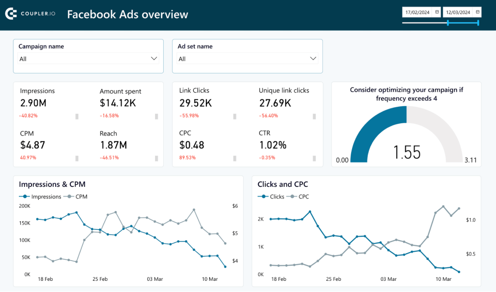
The template comes with filters to narrow down data by campaign, ad set, and date range. For more detailed information, you can also interact with the report, like clicking on a point in a graph to dissect click and CPC trends for a specific day. This hands-on approach helps you conduct a granular analysis of spending patterns and overall campaign effectiveness.
To use this report with your own Facebook Ads data, click on Get the Report and follow the instructions in the Readme tab.
What is a Power BI dashboard?
A Power BI dashboard is a collection of important visualizations from various reports and datasets on a single page. It showcases the key performance indicators in executive meetings to provide a quick snapshot. You can click through on any visual to navigate to the detailed reports of any specific metric. A Power BI dashboard provides a summary and also serves as a gateway for in-depth analysis.
Key features
- Single-Page Visualization: Power BI dashboards are mostly designed to be a single canvas. They provide a quick summary of key metrics and data insights. This layout helps business users to understand the health of their business at a glance without navigating through multiple pages.
- Data Aggregation from Multiple Reports: Dashboards can aggregate data from multiple reports and datasets. This gives a holistic view across various business functions.
- Real-time Data and Alerts: With Coupler.io, dashboards in Power BI can display real-time data updates. You can also configure alerts based on specific data thresholds.
- Interactive Tiles: Although dashboards offer limited interactivity compared to reports, end-users can interact with data through tiles. By clicking on a tile, you’ll access the underlying report for a deeper analysis. This feature connects high-level summaries with detailed data explorations effectively.
- Customizable Layout and Themes: Users can customize the arrangement and appearance of tiles on a Power BI dashboard to improve readability. This includes adjusting the size of tiles, organizing them for logical flow, and applying visual themes.
- Sharing and Mobile Accessibility: Dashboards can be easily shared across teams and accessible on mobile devices. Stakeholders can access key insights anywhere and at any time.
- Limited Scope for Detailed Analysis: Unlike reports, dashboards do not support extensive data slicing, filtering, or drilling down into multiple layers of data directly within the dashboard. Instead, they provide a high-level overview and direct users to reports for detailed analysis.
How to create a Power BI dashboard?
We have listed a detailed step-by-step guide to help you create a Power BI dashboard.
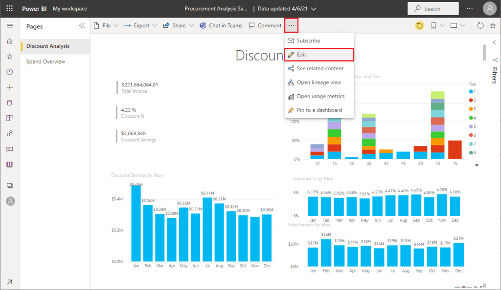
Step 1: Publish existing reports
Unlike reports, dashboards can only be created in Power BI Service. So, let’s start by signing into Power BI Service.
Before creating a Power BI dashboard, you need to publish your existing reports. Go back to Power BI Desktop and click on Publish. You’ll see a dialog to select the publication location in Power BI Service.
Step 2: Create a new dashboard
In Power BI Service, navigate to the report and click on Edit to start creating a dashboard from these reports.
Step 3: Pin visuals to your dashboard from reports
Hover over a visualization to see the available options. To add it to the dashboard, click the pin icon.
You can choose to pin to an existing dashboard or create a new one. For an existing dashboard, pick from a dropdown of available dashboards. For a new one, enter the name of the dashboard.
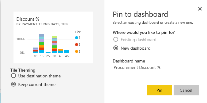
The visual elements will have a theme applied from the report. You can either keep the current theme or use a destination theme (from the dashboard).
Select Pin, and Power BI will add this to your workspace’s dashboard. Similarly, you can pin multiple visuals from different reports to create your dashboard.
Step 4: Arrange the dashboard
Once your visuals are pinned, Go to dashboard to organize it for optimal viewing.
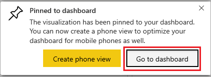
Rearrange and resize the tiles on your dashboard to create a clear and effective layout. Make sure that the important data is easy to see and the overall look is neat and easy to follow.
Step 5: Customize details of the visuals
Customize each visual on your dashboard to improve readability and effectiveness. Select a tile, click on the ellipsis (…) for more options, and adjust the title, subtitle, and display settings. You can change the color, font size, or background to match your company branding.
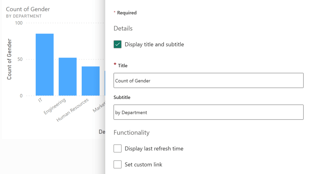
You can also add filtering functionality by using Power Bi field parameters.
Step 6: Save and share your dashboard
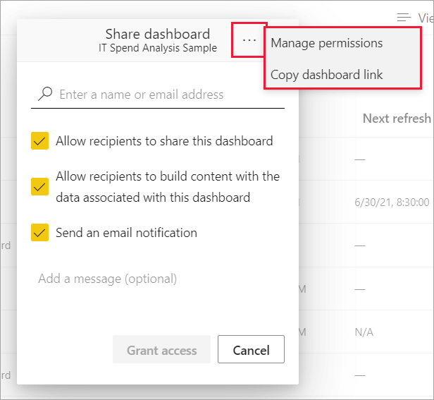
Once your dashboard is ready, click Save to update it on the Power BI service. To share a Power BI dashboard, enter the name or email of the user, add a message if needed, and select Grant access.
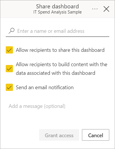
For more control, select Manage permissions to adjust access and review permissions.
Examples
Monthly sales KPI dashboard
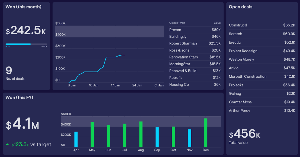
A monthly sales dashboard provides a real-time, high-level summary of key sales metrics. It focuses on immediate actionable insights like sales of the current month, deals you’ve closed, and what deals you could close soon. It is good for making quick decisions and seeing how close you are to hitting your sales targets.
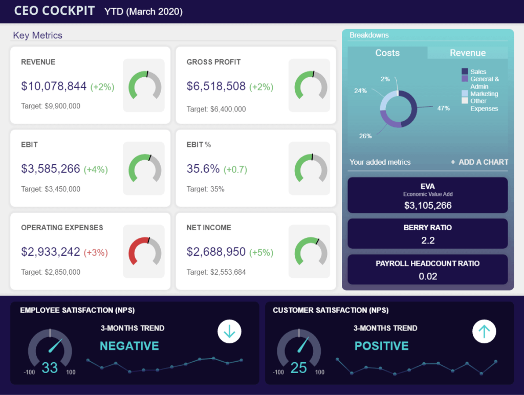
Overall business growth dashboard

This overall business growth dashboard, also called a CEO Cockpit, gives C-level executives a snapshot of the company’s health. It covers financials like revenue and net income against targets, showing the progress. The dashboard also tracks KPIs like EBIT and operating expenses. With visuals for employee and customer satisfaction, it goes beyond numbers to gauge the morale and service quality. This helps a CEO quickly see where the company stands in critical areas and decide where to focus next.
Procurement dashboard
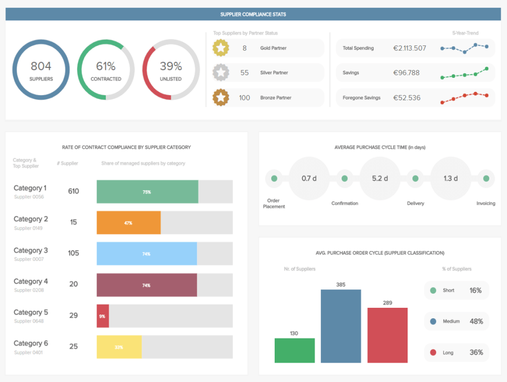
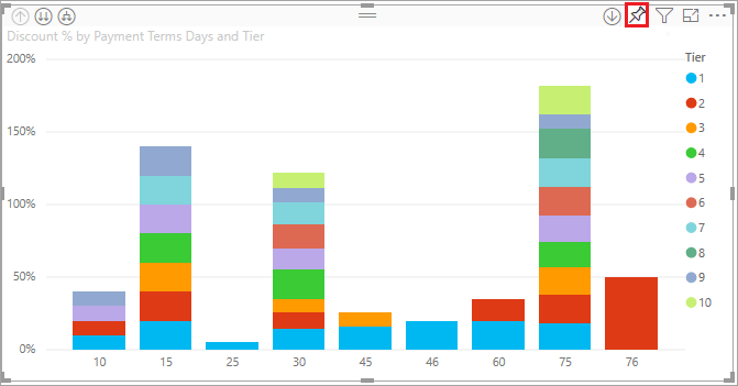
The procurement dashboard tracks supplier relationships and identifies risks. It shows how many suppliers you’ve talked to, who’s under contract, and the status of different suppliers. It also displays spending trends and savings to control costs. Overall, the dashboard keeps the procurement activities aligned with business objectives, ensures timely deliveries, and optimizes supplier performance.
Power BI Report vs Dashboard: Which one to choose?
Deciding between a Power BI report and a dashboard completely depends on your needs. You’ll use a report to dig into underlying data with detailed analysis and interactive elements like drill-downs. It’s great for data analysts who need to explore and present complex information. A dashboard offers a quick summary of key metrics, all on one page. It’s ideal for executives who need a fast, high-level view without much detail. Reports are for depth, and dashboards are for a snapshot.
Either way, it is always great to have updated data in your dashboards and reports. Try Coupler.io to create your self-updating Power BI reports and dashboards.
Connect your cloud apps to Power BI with Coupler.io
Get started for free