Using visualizations to analyze your marketing data makes it easier to spot trends, see patterns, and track KPIs. It’s much more convenient than working with raw numbers in a spreadsheet. With data visualization tools like Power BI, you can easily create interactive dashboards to monitor the results of your marketing efforts and share them with others.
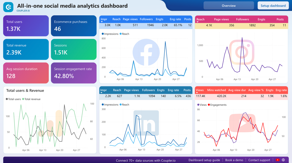
In this article, we walk you through the different ways to visualize data in Power BI. You will learn how to create interactive dashboards like the one below. We’ve also prepared a list of free, self-updating dashboard templates you can use for marketing reporting.
What graph types to use to visualize data in Power BI?
Choosing the right graph type is key to making your data easy to understand. Here are some options to visualize your data in Power BI:
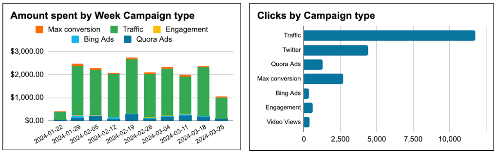
- Bar chart / Column chart: This is best used when comparing various groups or categories, such as results from different channels or time periods. For instance, you can use bar charts to compare ad spend for different campaign types or see how many clicks each campaign type generates.
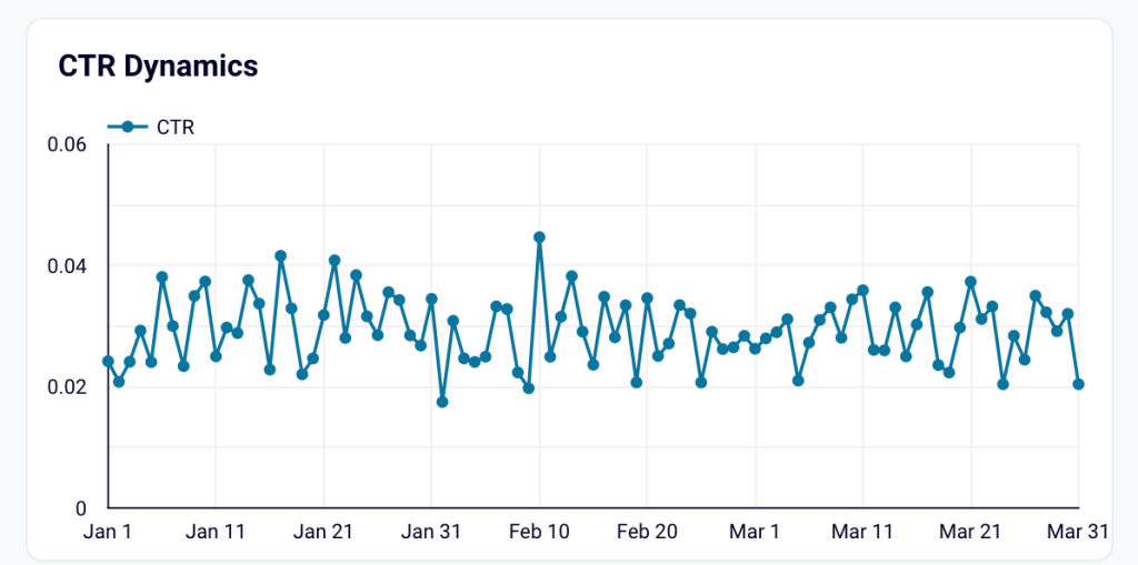
- Line Chart: This visual type is great for illustrating changes that occur over time and for trend monitoring. For example, you can use line graphs to show how your click-through rate (CTR) changes throughout the year, helping you track seasonal performance patterns.
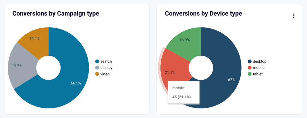
- Pie chart: This is used to display proportions within datasets. For example, you can use pie charts to show how conversions are distributed by campaign type or device type, which gives you a clear picture of where your visitors are coming from.
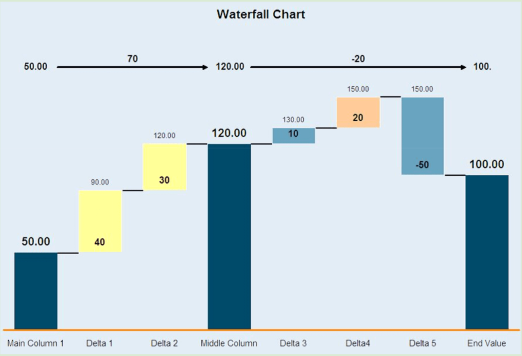
- Waterfall Chart: It uses color-coded bars to indicate how positive and negative changes impact an initial value and how the end result is formed. For example, you can use the waterfall chart to see how your marketing budget was spent and how it may have increased during a specific period.
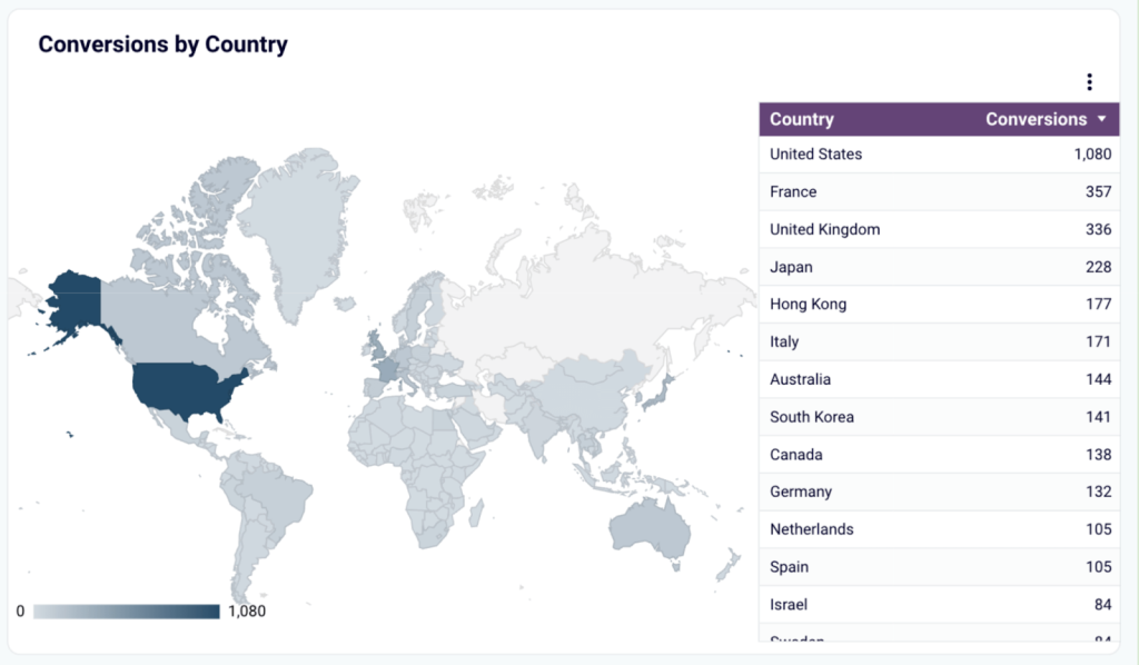
- Map: This visual is an ideal way to display geographical data. With a map, you can see which areas drive the most traffic to your site or show countries where your product is most popular.
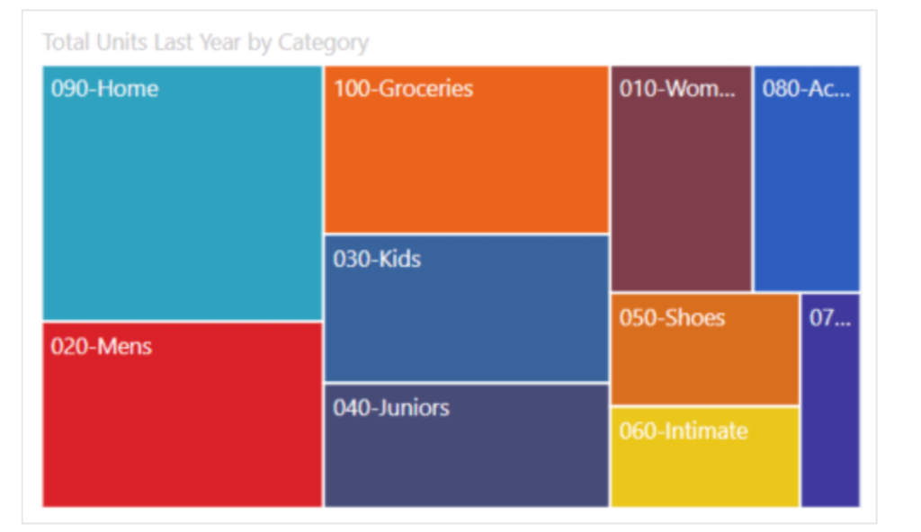
- TreeMap: This graph type represents data hierarchies as nested rectangles. You can use tree maps to see a breakdown of your total marketing sales distribution across different product lines.
To see more graph options, check out our article on 20 Types of Graphs for Marketers.
How you can visualize marketing data in Power BI
There are two ways to create Power BI data visualizations for your marketing data:
- Create a Power BI report from scratch.
Starting from a clean slate gives you the freedom to customize your Power BI dashboard exactly how you want it. However, this can be time-consuming and complex, especially if you lack data science skills or are new to BI tools.
- Use a Power BI report template.
If you don’t want to go through the stress of building your dashboard from the ground up, then you can use templates. They come with pre-set visuals and even data connectors, so you don’t have to spend a lot of time customizing things.
Option 1. How to create a marketing report in Power BI from scratch
1. Connect your marketing data
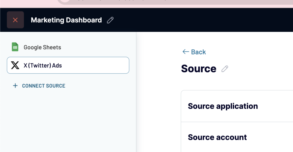
There are different ways to load your data into PowerBI. You can use native or partner Power BI connectors or even import your dataset manually. We are going to transfer data into Power BI with the help of Coupler.io, a reporting automation platform. It can pull your data from 60+ different apps and import it directly into Power BI according to your schedule. So, as a result, you can manage all your data sources from one place (which you can’t do if you opt for native connectors).
To start transferring data, select the data source you want in the form below and click Proceed.
Follow the onscreen instructions to connect your source account and select the data type to export.
If needed, you can also connect multiple data sources to the same importer.
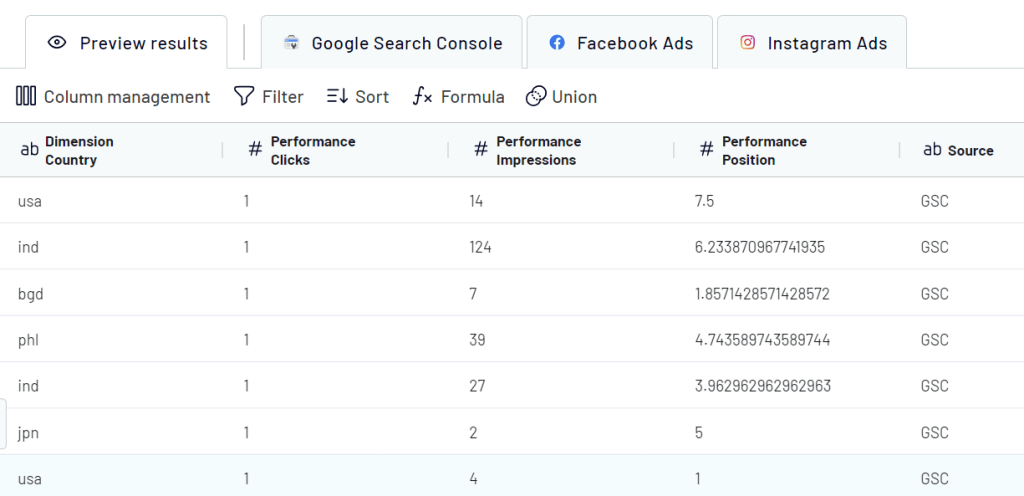
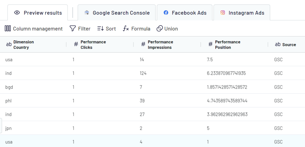
2. Preview and transform data
Next, check your data and make any necessary edits or adjustments:
- Hide, rename, and rearrange columns.
- Add new columns.
- using formulas.
- Blend data from several accounts or sources into one dataset.
- Sort and filter data.
3. Load data into Power BI and schedule a refresh
Once your data is ready, follow the instructions to load data to Power BI. Click the button to generate the integration link and copy it.
Open Power BI Desktop, go to Get Data > Other > Web and paste in the integration link.
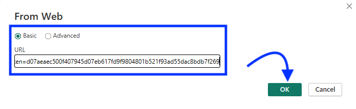
Once connected, your data will appear in the Power Query editor for you to preview. You can also transform it if needed. Then, load the dataset.
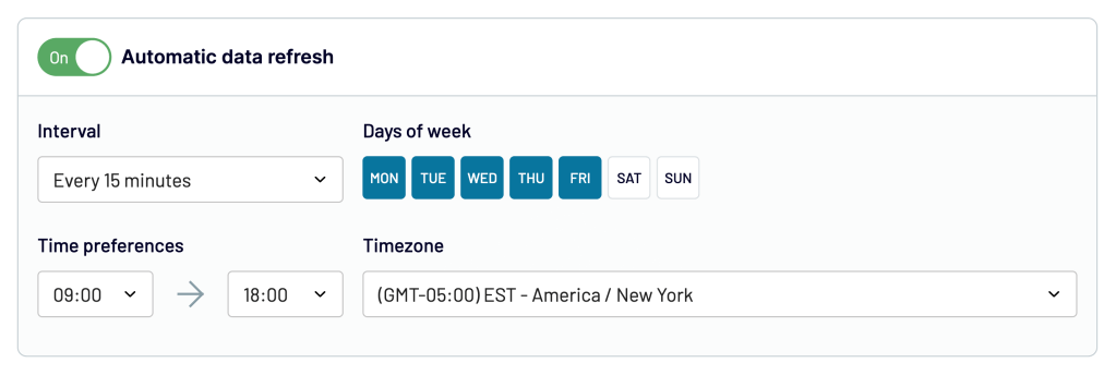
To make your Power BI data visualization self-updating, go back to Coupler.io and enable the automatic data refresh to schedule your data exports. You can select an update interval from once per month to every 15 minutes, which allows you to monitor data in near-real time.
Finally, you can start working with your data in Power BI.
4. Start building a data visualization in Power BI
Now that your data is loaded, it’s time to create data visualizations using Power BI.
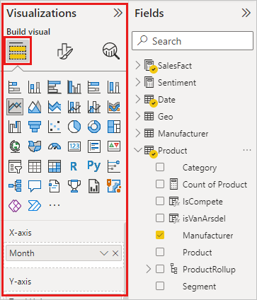
Add Visuals
- Go to the Visualizations Pane at the right side of the screen.
- Choose and drag the visual type you want to your report canvas. Power BI offers a variety of built-in Power BI visuals, such as bar charts, line charts, pie charts, maps, and more.
- Then, drag the relevant data fields from the Fields pane to the appropriate areas within your selected visual. This will populate the visual with your data.
Customize Visuals
You can resize or format the appearance of your visuals the way you want.
- Select your visual and click the “Format” icon in the Visualizations pane.
- Select the colors, fonts, axis labels, legends, data labels and so on to ensure your Power BI dashboard is visually appealing and easy to read.
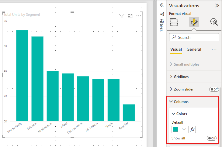
The option available will depend on the visual selected.
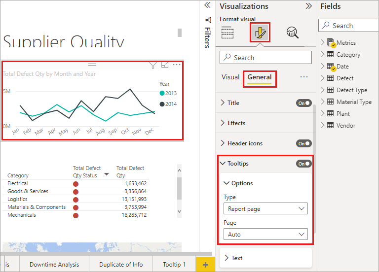
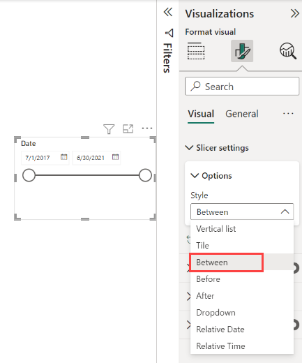
Add Interactive Elements
To make your dashboard even more engaging and user-friendly, you can add such interactive elements:
Tooltips: Include tooltips to show further information when users hover over data points. This helps to provide deeper insights without overcrowding the visuals.
Slicers: By adding slicers, users can choose what data they would like displayed. For instance, a slicer could be added for filtering by date range, product category or geographic region.
Use DAX Functions (optional)
Aside from charts or graphs, you can use DAX functions to calculate KPIs, track trends over time, segment data by various dimensions, and perform complex analyses that go beyond simple aggregations.
Adding custom data visualization with Power BI: how to do this?
If the built-in visuals aren’t cutting it, then Power BI has a marketplace called AppSource where you can download custom visuals created by the community and Microsoft partners.
- Go to the Visualizations pane, click on … and select “Get more visuals.”
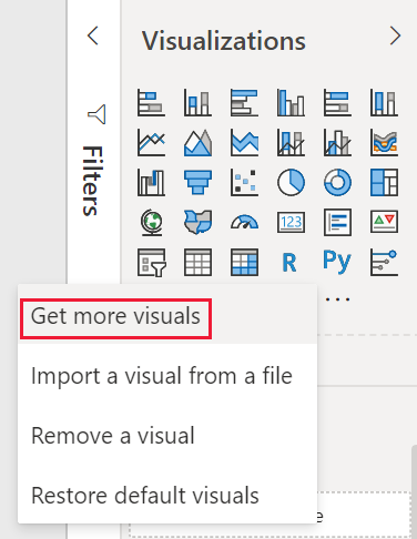
- Browse the available custom visuals, download the ones that fit your needs, and add them to your report.
Alternatively, if you have a Power BI visual stored in your local computer as a .pbiviz file, then, select “Import a visual from a file“ to import the Power BI visual to the visualization pane.
If you have more specific needs, you can create your own custom visuals using the Power BI developer tools. However, this requires some knowledge of programming languages like Python, R, or Javascript.
Option 2: How to visualize your marketing data in Power BI with a template
Coupler.io offers auto-updating, ready-to-use Power BI dashboard templates that can get you started in minutes. They are offered for free. You just need to connect your data source and Power BI account, and your data will be visualized automatically. With the auto-updating feature, you can relax knowing that your dashboards will always display the latest information. To get started with this:
- Select a template you need and go to the Readme tab for setup instructions.
- Create a Coupler.io account for free, click the link in step 1. You will then be taken to the importer settings page to connect your source account.
- After this, click Transform data. As this is a pre-set template, you don’t need to change anything here. Then, click Proceed.
- On the destination section, click Generate link and copy the link you got.
- Go back to the template and click on the button in step 4 to download the template.
- Once downloaded, a dialog box with configurations will open. Add the copied generated link in the Integration URL field.
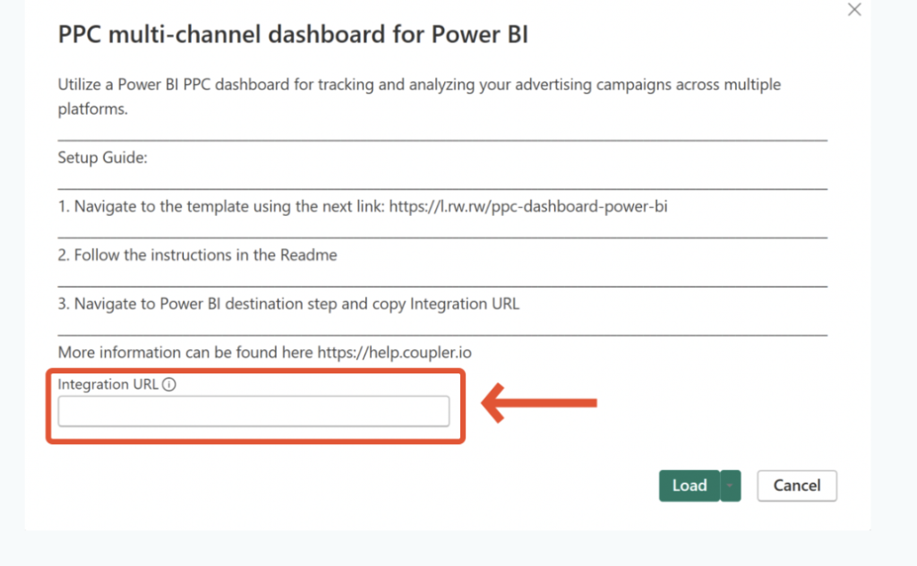
- Click Load, and that’s it. Your data from your source account will automatically be loaded into the dashboard.
- By default, the data in your report will be refreshed every day. For a custom schedule or more frequent updates, go back to the Coupler.io importer and navigate to the Schedule section. Select the days, times, and intervals for exporting fresh information from your data source. Then, Coupler.io will send the latest data to PowerBI. If the latter doesn’t reflect the changes, refresh the dashboard.
All this process usually takes around 5 minutes, and then you can start analyzing your marketing data on a self-updating, automated dashboard. If you prefer, you can customize the dashboard further by adding more visuals, rearranging sections, incorporating more data sources, and so on.
Free marketing templates for different use cases
1. PPC multi-channel dashboard template
This PPC Dashboard lets you track ad campaign performance across multiple platforms, including:
- Google Ads
- Twitter Ads
- Quora Ads
- LinkedIn Ads
- Facebook Ads
- Bing Ads
- Instagram Ads
- TikTok Ads
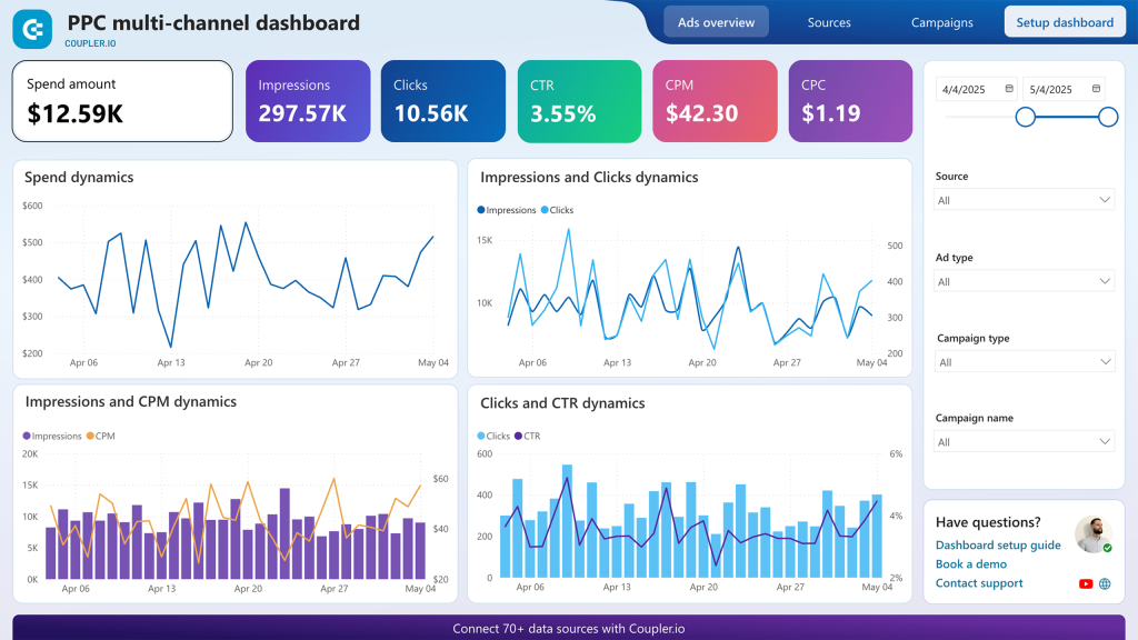
It consolidates all your ad information in one place, allowing you to easily perform cross-channel analysis. You don’t need to use all the supported ad channels to benefit from this template. You can just select the ones you want to use when setting up the dashboard, whether it’s all the platforms or just a couple, like Facebook Ads and Google Ads. This flexibility allows you to create a customized PPC dashboard that fits your specific ad channel set.
You can also drill down with filters like ad type, campaign type, individual campaigns, or specific data sources. It allows you to tailor the data view to your needs, making it easier to optimize your campaigns effectively.
2. Facebook Ads dashboard template
Our next example is the Facebook Ads Dashboard. It includes essential metrics, such as ad spend, impressions, clicks, CTR, conversions, and so on.
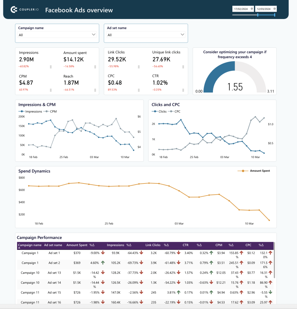
With this dashboard template, you can easily monitor your campaigns and make data-driven decisions to optimize your Facebook ads.
3. Google Ads dashboard template
Next is an automated Dashboard Template for Google Ads, which provides a detailed overview of your campaigns.
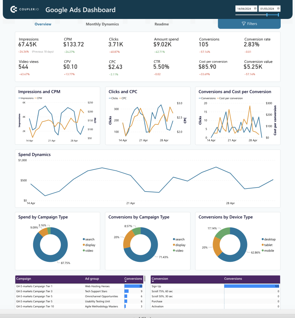
It breaks down your campaigns by different parameters — ad groups, campaigns, and time periods. This detailed view helps you understand how various components of your campaigns are performing, making it easier to see what needs improvement.
4. SEO dashboard template
This SEO Dashboard lets you analyze your SEO performance using data from Google Search Console.
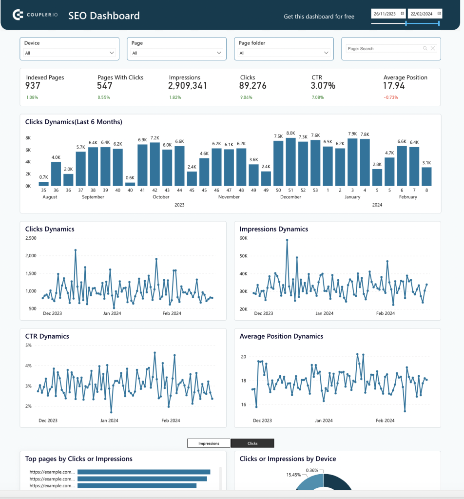
It includes visuals showing how your SEO metrics have changed over time. You can see the top pages by clicks or impressions, view metrics by device, and identify your best- and worst-performing pages. With this performance data, you can pinpoint success factors and make timely updates to pages that need improvement.
5. Web analytics Dashboard template
The Web Analytics Dashboard template uses Google Analytics data to give you a complete picture of your website’s traffic.
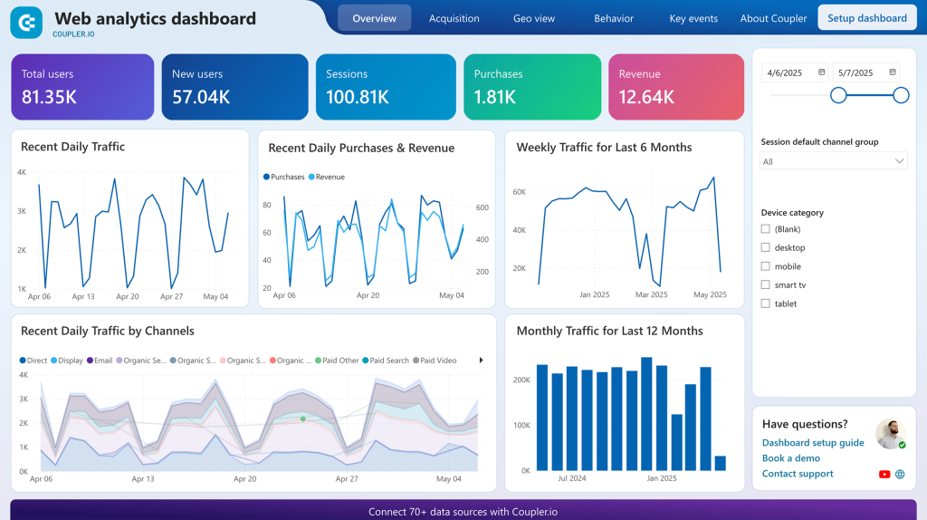
You can see where your visitors are coming from, your most popular pages, page views, bounce rates, and other key metrics. This helps you understand how people interact with your site. It also includes acquisition performance, audience behavior, and conversion tracking, giving you insights into your overall web performance.
6. Brand Awareness Dashboard
The Brand Awareness Dashboard template helps you see how your advertising campaigns affect brand search queries.
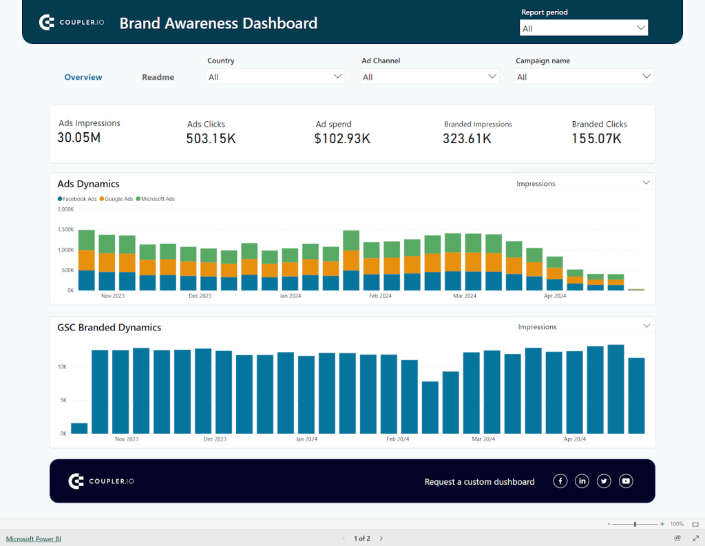
It combines data from Google Search Console with advertising data from Google Ads, Facebook Ads, and Microsoft Ads. Even if you don’t use all these ad platforms, you can set up the dashboard with just the ones you use. The dashboard compares your paid ad impressions with branded search impressions and clicks, showing you the impact of your ad campaigns on brand awareness. This helps you understand which campaigns are increasing brand visibility over time.
Check out other dashboard templates available at Coupler.io.
Is Microsoft Power BI a good choice for marketers?
Yes. Power BI is a business intelligence tool that turns your raw marketing data into interactive reports.
- It is easy to learn and use, especially if you are familiar with Excel.
- It integrates and analyzes data from multiple sources, providing a comprehensive view of your marketing efforts.
- You can create interactive visualizations by adding elements like slicers, tooltips, drill-throughs, etc.
- It provides various ways to share your Power BI reports within and outside your organization.
- It offers advanced analytics tools like machine learning models and predictive analytics.
- It has AI capabilities for more sophisticated data analysis and insights.
- It supports robust data modeling for complex data relationships and calculations.
Best practices to visualize marketing data in Power BI
Here are some useful tips to help you make the most of Power BI data visualization:
- Select the right visuals: This means choosing charts or graphs that work well with each type of information set.
- Simplify your dashboards: Concentrate only on what matters most and avoid filling one dashboard with too many visuals, which may confuse or overwhelm users who are looking at them.
- Use consistent formatting: Make sure everything looks similar across all pages by using the same color schemes/font sizes, etc., throughout the whole report. Otherwise, readers may find it hard to understand what is being presented.
- Make reports interactive: This involves adding features such as slicers (to enable filtering), drill-throughs (which help users navigate through hierarchies easily), tooltips (for showing detailed information behind aggregated values), etc.
- Emphasize insights: This can be done using annotations or conditional formatting, where certain parts of an image change color based on some predefined ruleset. For instance, the highest value is represented as green and the lowest as red. This lets you draw attention to key aspects that should not be missed when glancing over the report.
- Use custom visuals: Finally, if none of the standard options available suit your needs, there are many third-party visuals available on the Power BI marketplace, so feel free to check them out.
What’s the best way to use Power BI for data visualization and analysis?
Data visualization with Power BI, which is one of the best business intelligence tools, provides you with vast capabilities for data analytics. You can create interactive reports that make it easier to understand and share your marketing performance data, enhancing decision-making.
The best way to use data visualization in Power BI depends on your specific needs and capabilities. If you have a clear vision of what you want to build and the necessary expertise, then, creating a dashboard from scratch can be a good option for you. Alternatively, if you’re looking for a quicker start or don’t have the time or skills to build from scratch, then using customizable and auto-updating templates from Coupler.io can be a great solution as well.