With the explosion of data, the accounting profession has changed. Being an accountant today isn’t just about balancing the books; you need to analyze and deliver valuable insights to decision-makers.
Many tools can assist you in preparing, analyzing, and visualizing data. Spreadsheet apps like Excel are useful for helping with basic tasks. However, when data becomes too large to handle, you need something more powerful.
Microsoft Power BI is built to address this challenge. This business intelligence tool can manage large datasets, complex data analysis, and advanced visualization needs. It’s the tool you need to stay ahead and help your business grow.
Why Power BI for accountants?
Imagine you’re an accountant for a bag manufacturing company. The company is trying to establish the appropriate value of its inventory. Decision-makers may need to know: Are certain bag types unprofitable? Should we stop producing some of them?
You’d need to pull data from various systems like inventory, sales, and accounting. This often means working with a massive amount of information. Doing this manually is time-consuming and could take hours, even days. Worse, manual processes increase the chances of human error.
But decisions need to be made quickly, and they require accurate data.
This is where Power BI helps. It connects to all your data sources seamlessly. You can then analyze key metrics, like turnover rates for each bag style. Once the analysis is complete, Power BI lets you create a dashboard that presents the insights clearly. Management gets the clarity they need to act rapidly and make informed decisions.
Power BI transforms how accountants handle reporting by offering these key benefits:
- Saves time by automating tedious reporting tasks.
- Improves accuracy with real-time data syncing, eliminating human errors.
- Empowers decision-makers with clear visuals and actionable insights.
With Power BI in accounting, your role evolves from managing numbers to driving strategic decisions that shape business success.
Power BI accounting reports for decision-making
When it comes to accounting, reports can largely be grouped into two major categories: Financial Statements and Accounting Reports. Both serve different purposes, but together they form the backbone of decision-making for businesses.
Let’s break it down so you can see how Power BI helps you create them.
Financial statements
Financial statements are formal documents of your company’s financial health. They’re typically prepared to comply with standards like IFRS or GAAP, which are essential for large and public companies.
While not always required to follow these standards, small businesses may still need to produce standardized financial statements when seeking loans or attracting investors. Banks and external stakeholders often demand this level of transparency and consistency to build trust.
When used internally for decision-making, they are less commonly used in their strict, standardized form. Instead, businesses often rely on customized accounting reports (which we’ll cover next) that include elements of financial statements but are tailored to highlight specific insights relevant to the organization’s needs.
The primary financial statements include:
- Balance Sheets – Show what you own (assets) and owe (liabilities), along with your equity at a given moment.
- Income Statements (a.k.a. Profit & Loss) – Track revenue vs. expenses to reveal your net income over a specific period.
- Statements of Cash Flow – Explain how cash moves in and out of your business through operations, investments, and financing.
- Statements of Stockholders’ Equity – Detail owner/shareholder equity changes due to profits, losses, or dividends.
Power BI for accountants:
Accountants usually generate financial statements using tools like QuickBooks, Xero, or other accounting software. These tools handle the compliance-heavy aspects of creating the reports. Power BI, on the other hand, excels at visualizing and analyzing them. By importing data from accounting software into Power BI, you can transform static reports into dynamic dashboards that are easier to present and interpret.
Accounting reports
These reports are flexible and don’t follow rigid standards. You create a Power BI accounting report based on what you need to see. They can even include financial statements if that’s helpful. The goal here is to help internal executives make decisions.
Some example reports include:
- Accounts Receivable (AR) reports: Track who owes you money and how long they’ve owed it.
- Accounts Payable (AP) reports: Keep tabs on what your business owes and when payments are due.
- Revenue reports: Provide a detailed look at how much money is coming in, broken down by product, region, or customer.
- Financial reports: Deliver a bird’s-eye view of your company’s financial performance.
- Budget vs. actual reports – Compare your actual spending to planned budgets so there are no surprises.
- Cash flow projections: Forecast how much cash you’ll have on hand in the future.
- Tax reports: Gather data to simplify tax filing or audits.
- Inventory management reports: Monitor stock levels to ensure you’re not overstocked or understocked.
- Payroll analysis: Review labor costs and trends to make informed HR decisions.
Power BI for accountants:
For accounting reports, data may be spread across multiple platforms, such as your accounting software, CRM tools (like Salesforce), inventory management systems, payroll software, and more. Power BI allows accountants to effortlessly connect to all these sources, apply data transformations, and create visualizations to communicate insights.
Key features of Power BI for accounting
Power BI is packed with features that make your accounting work faster, smarter, and more accurate.
- Easy integration with multiple data sources: Power BI offers a range of connectors for various data sources, including CRMs, spreadsheets, SQL databases, and more. However, while Power BI connects to accounting software like QuickBooks, the number of built-in connectors for accounting apps is still limited. Thankfully, with Coupler.io, you can overcome this issue, as it provides Power BI connectors to cloud finance and accounting apps such as QuickBooks, Xero, and Stripe.
- Robust data modeling capabilities: Power BI’s data model allows you to organize and structure your data for deeper insights. You can create relationships between tables by linking sales to expenses for a complete financial picture. DAX (Data Analysis Expressions) takes it further, allowing you to build custom calculations, such as profit margins or year-over-year growth. This makes your analysis more dynamic and tailored to your needs.
- Visualizations: Transform raw numbers into visually appealing dashboards and reports. Use charts, graphs, and matrices to make complex financial data analytics easily understandable. These visuals help you identify trends, outliers, and opportunities at a glance.
- Real-time insights: Power BI updates your data in real time, giving you faster and more accurate insights. This enables you to make timely financial decisions, such as adjusting budgets or reallocating resources.
- Advanced forecasting capabilities: Use Power BI’s built-in forecasting tools to predict trends, or integrate with Azure Machine Learning for more advanced predictive analytics. This helps you plan ahead with confidence.
- Secure sharing and collaboration: Share reports securely with your team or clients. Power BI’s collaboration features ensure everyone stays on the same page, whether you’re managing a team or working with external stakeholders.
How to use Power BI for accounting reporting
Let’s see how you can use Power BI to transform your accounting data into clear and actionable insights.
We’ll break it down into four manageable steps:
Step 1: Get data for your accounting reports
Before you start, get clear on what you want to know. Ask specific questions that your data can answer.
Let’s say your company wants to analyze sales figures. Decision-makers could ask questions like:
- Which month and year had the highest profits?
- What region is driving the most revenue?
- Which product should we invest in to maximize growth?
- Which day of the week has the lowest sales?
- Why is revenue up in Germany but down in France?
- Can we predict revenues for the next three months?
By asking questions, you know exactly what to look for in your data. This helps you create clear and impactful Power BI accounting reports that lead to smarter decisions.
There’s plenty of data to answer accounting questions. Some possible data sources include:
- Financial data: Accounting software like QuickBooks or Xero, or even spreadsheets.
- Managerial data: POS systems, CRM platforms, ERP systems, standard cost data stored in SQL databases, etc.
- Other non-accounting data: Economic data, current and historical stock prices, social media, etc.
Getting data into Power BI starts with connecting to your data sources and pulling the information you need. You can do this using the Get Data button.
Open Power BI Desktop, then click Get Data in the Home tab. You will be presented with options for connecting to different data sources.

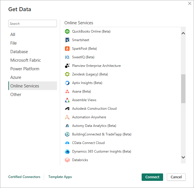
Note: Power BI for accounting offers a wide range of connectors, allowing you to connect to various data sources like files, SQL databases, online services, and more. However, not every source is natively supported. For example, Xero and Stripe aren’t built-in options. As a solution, you can use Coupler.io to seamlessly extract data from these apps into Power BI.
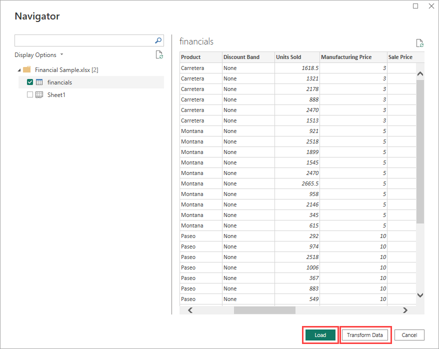
Once your data is connected, you can either load it directly into Power BI to start building visualizations or choose to transform it first.

Step 2: Transform and load data into Power BI
If you click Transform Data, the Power Query Editor will open. This is where you can prepare your data for analysis. This might mean cleaning it, like removing blank or invalid rows and columns. You can also sort and filter your data to make it easier to work with.
Another common example is changing the data type. To do this, select one or more columns, then use the Data Type dropdown to choose a new type.

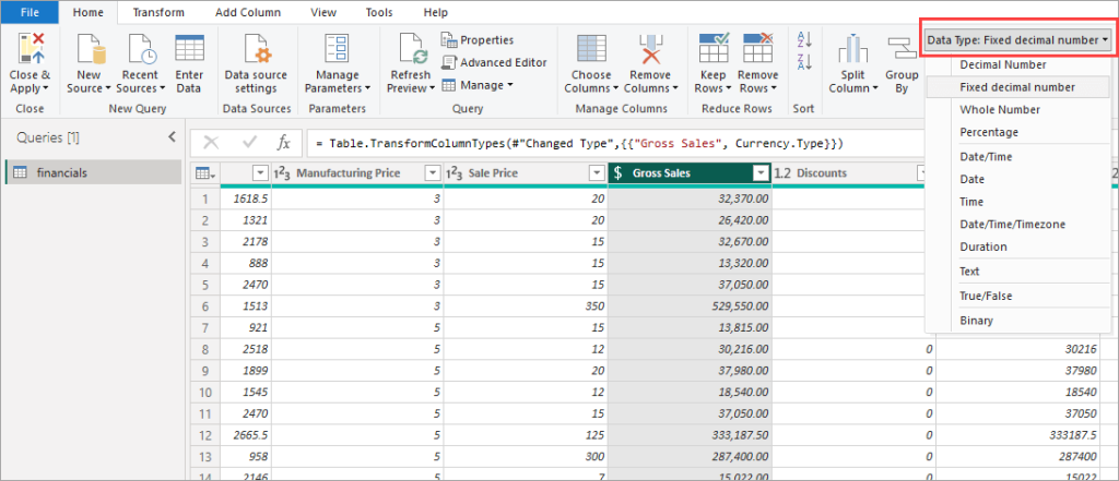
If everything looks good, click Close & Apply. This ensures that after the data has been transformed, it is loaded into Power BI for analysis.
You can load many data sources into Power BI. But here’s the thing: What if you want everything to come from a single source of truth?
With Coupler.io, you can make that happen. It pulls data from multiple platforms and organizes it in one destination, such as a data warehouse or spreadsheets. This becomes your single source of truth. Once your data is prepared, you can simply connect it to Power BI without the chaos of managing scattered sources. We’ll demonstrate how Coupler.io works in the next section.
Step 3: Perform the analysis
In this step, you’ll analyze your data to answer the accounting questions you identified in Step 1.
Power BI for accounting supports various types of analyses, from simple descriptive analysis to creating advanced predictive insights. But for now, let’s keep it simple and dive into an easy one.
Example
Let’s say we want to answer this question: Which day of the week has the lowest sales?
To find out, we’ll use descriptive analysis with summarization to review past data.
Analysis steps
First, check if your data has the necessary information. For example, if it has a “Date” column but not a “Day of the week” column, you will need to create a new calculated column. Go to the Modeling tab, click New Column, and use this DAX formula in the formula bar:
Day of the week = FORMAT(financials[Date],"dddd")
Switch to Table view to confirm that the new column is there.

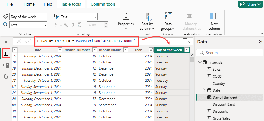
Next, let’s add a visualization. Switch to Report view and click the Matrix icon in the Visualizations pane. In the Data tab on the right, select the “Day of the week” and “Sales” fields. The matrix will populate with your data.

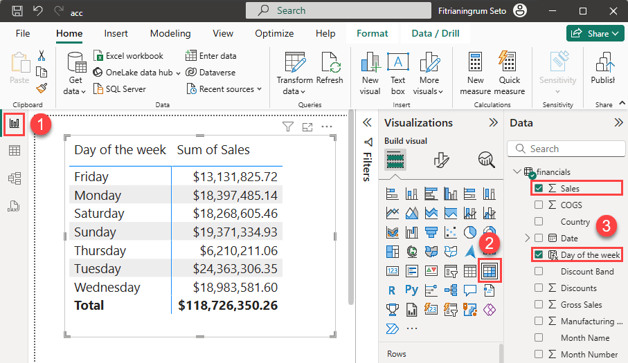
Sort the matrix by Sum of Sales from lowest to highest by clicking the column header. You can also hide the Row subtotals using the Format visual tab in the Visualizations tab.
Now, sort the matrix by Sum of Sales from lowest to highest by clicking the column header. To clean it up, hide the Row subtotals using the Format visual tab in the Visualizations pane.

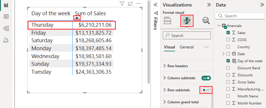
And there you have it—Thursday has the lowest sales, as shown in the updated matrix.
After completing your analysis, publish your report to Power BI Service to share insights.
Using Power BI for accounting offers a powerful way to uncover trends that can influence financial and operational decisions.
For instance, identifying the day with the lowest sales helps decision-makers evaluate if changes are needed. They might plan targeted promotions, adjust staffing levels, or optimize operations to boost sales on that day.
Sharing these findings ensures your analysis drives actionable strategies and supports better business decisions.
How to automate accounting reporting
Automating your accounting reports doesn’t have to be complicated. The key is to start small. Pick one process to automate, make it run smoothly, and then expand from there.
We’ll give you an example:
How a SaaS company automated accounting financial reporting
A SaaS company struggled with manual data collection and reporting delays. Their reporting process relied on manually combining data from multiple platforms, which was both time-consuming and error-prone. To manage their finances, they primarily used two tools:
- QuickBooks for invoices, tax reports, and financial statements.
- Stripe for collecting subscription payments.
Manually exporting and merging data from these apps was a headache. They used Coupler.io to automate their accounting reports. Now, they collect, clean, and organize financial data in just one place. Reports update automatically on schedule, so the team always has accurate insights.
Here’s how the SaaS company did it, step by step:
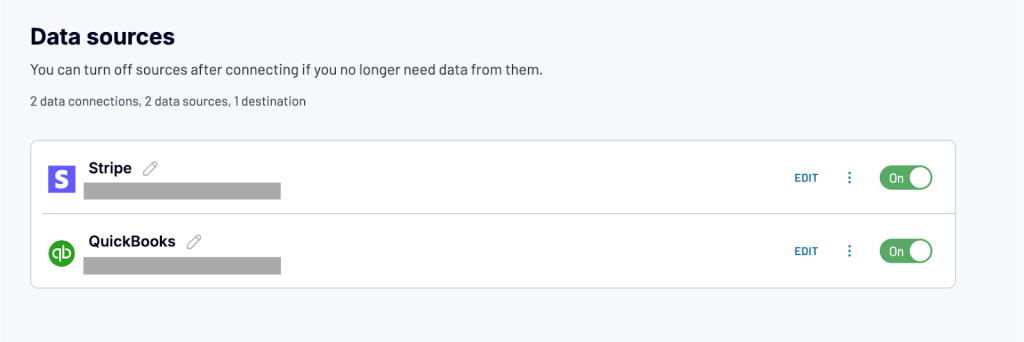
Step 1: Connect multiple data sources
They connected their QuickBooks and Stripe accounts using Coupler.io. This enabled them to automatically pull data from both systems in a single data flow.

You can easily add more data sources later if needed. With over 60 supported apps, Coupler.io is built to scale as your business grows.
Step 2: Transform data
The next step is to transform your raw data into meaningful insights. Coupler.io offers built-in transformation features to organize your data.

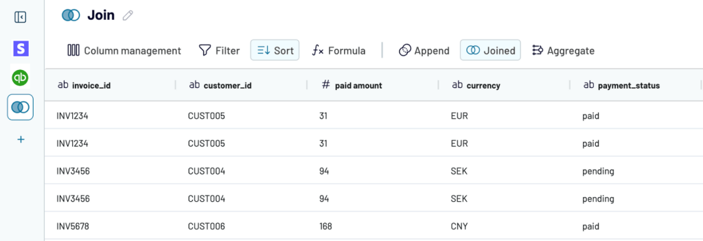
In this example, here’s how the SaaS company transformed their data:
- They used the Join function to combine QuickBooks and Stripe. This created a single source of truth for invoices and payments.
- To simplify reporting, they kept only essential data points, such as customer names, invoice dates, payment statuses, and outstanding balances.
- Finally, they created a custom column called “Payment Reconciliation” to simplify tracking. Using a straightforward formula, they categorized invoices as follows:
- “Paid”: When the invoice amount matches the Stripe payment.
- “Payment Pending”: When the invoice amount is greater than the Stripe payment.
Step 3: Load reports to Power BI and schedule data refresh
Next, they sent the transformed data to Power BI for visualization. Once set up, the dashboard became a live snapshot of their financial health. The data updates automatically. No manual refreshing is needed.
Note: In addition to Power BI, Coupler.io allows users to create financial dashboards in spreadsheets (Google Sheets, Excel) and other BI tools (Looker Studio, Tableau, Qlik).
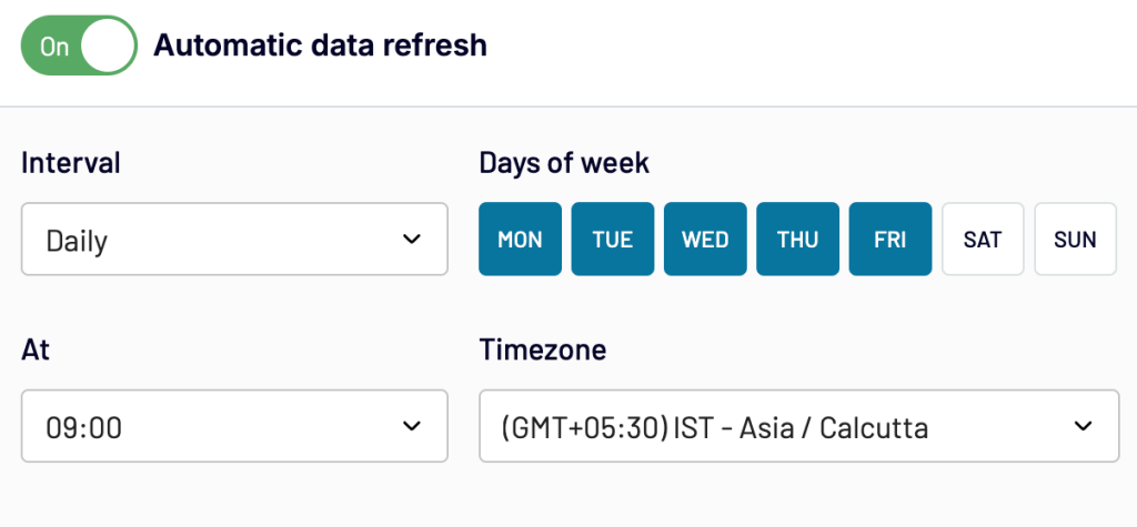
Coupler.io allows you to schedule data refreshes as often as you need—whether it’s weekly, daily, hourly, or even every minute.

With real-time insights, the SaaS company could check its dashboard anytime for insights. They identified overdue payments faster, improved cash flow, and made better financial decisions.
Creating custom dashboards from scratch takes time. You need to figure out what data to include, how to organize it, and how to visualize it. Templates take care of all of that for you. They come pre-made, with the structure and visualizations already in place. All you have to do is connect your data, and you’re good to go.
Coupler.io’s Revenue Dashboard Template is an excellent example of how templates can revolutionize your reporting. It’s designed to allow you to easily monitor income, expenses, and more.
Free revenue dashboard template in Power BI by Coupler.io
Take a SaaS business that offers subscription services. The company wanted to get a clear overview of its financial performance, identify top customers, track revenue trends, and spot underperforming products. Instead of building a dashboard from scratch, they used Coupler.io’s revenue dashboard.

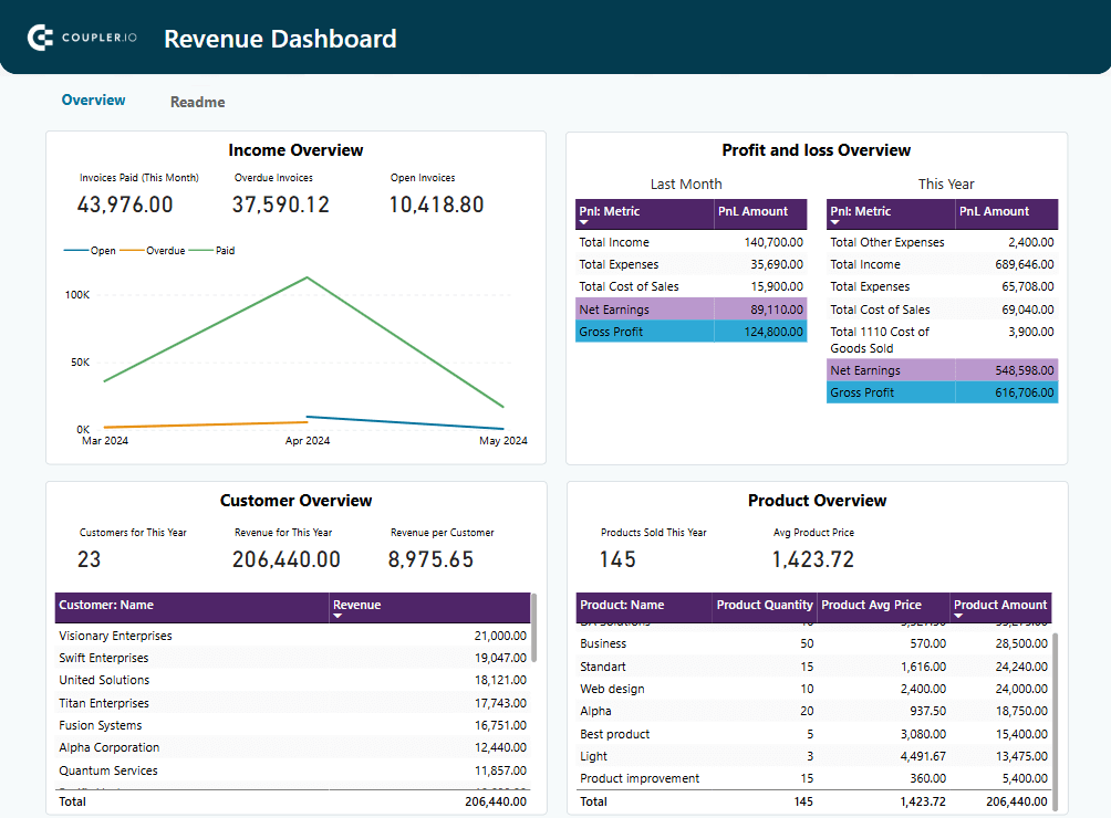
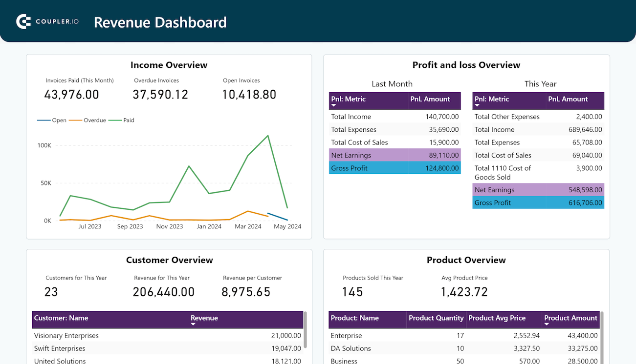
The dashboard gives them instant access to the following key insights:
Income Overview
With the Income Overview, they track revenue trends over the last 12 months. This helps them identify seasonal fluctuations, peak revenue periods, and any unexpected dips.

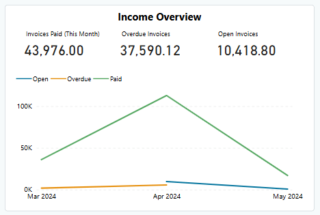
Beyond trends, the dashboard also breaks down paid, overdue, and open invoices. They use these insights to follow up on overdue invoices, improve billing practices, and even identify churn risks among customers who consistently delay payments. By analyzing open invoices, they estimate near-future revenue, which helps them make smarter budget decisions.
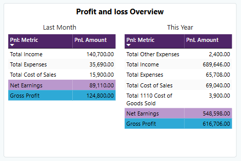
Profit and Loss Overview
Using insights from this section, the company can assess its net income by comparing revenue and expenses.
Two tables side-by-side compare last month’s and this year’s performance. If gross profit dipped last month but yearly trends look strong, they can identify short-term issues without losing focus on big-picture goals.

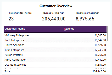
Customer Overview
Through insights from the Customer Overview, they identify their top 10 revenue-generating customers. This information can help them strengthen relationships with loyal customers by creating strategies to keep customer retention.

Product Overview
The Product Overview section displays scorecards highlighting the total subscriptions sold this year and the average subscription price. A detailed table breaks it down further, listing each product name with quantities sold and total revenue earned.

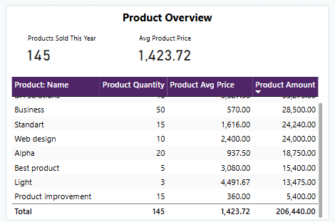
These insights helped the SaaS company identify top-performing tiers and adjust pricing for low-performing subscriptions to boost sales.
By using Coupler.io’s Revenue Dashboard Template, this SaaS company eliminated hours of manual data preparation and gained instant insights instead. Coupler.io’s automated updates kept the dashboard current every day as they set up daily data refreshes. Decision-making became faster, sharper, and entirely data-driven.
Setting up the dashboard is a breeze. Follow the simple instructions from the template’s Readme tab to connect to their QuickBooks data. Their financial data was automatically pulled and structured in the dashboard within minutes. Give it a try and see how much time you can save
Why automate?
The difference was huge. By automating their process, the SaaS company saved hours and eliminated errors caused by manual work. Furthermore, those real-time insights helped them make smarter financial decisions with confidence.
While this example focuses on integrating QuickBooks and Stripe, Coupler.io enables businesses to go beyond accounting data. You can combine your financial information with tools like CRMs, project management apps, and other business systems for a much more comprehensive view of your operations.
Want more proof that automation works? An accounting firm, Project Alfred, used Coupler.io to streamline reporting. By automatically pulling data from Xero and HubSpot into Google Sheets, they saved 40 hours a month. That’s equivalent to a full-time workweek! Check out the case study to see how automation transformed their finance operations.

Curious about where to start? Book a call with Coupler.io’s data experts to kickstart your automation journey. Your automated accounting reports are just a few steps away.
Best practices to follow while creating Power BI accounting reports
Here we share some best practices to help you build effective reports using Power BI for accounting.
Optimize your data modeling
Good reports start with good data models. You want your data to be clean, reliable, and easy to work with. To achieve this, you can:
- Clean your data first. Eliminate duplicates, irrelevant fields, and missing values that might lead to faulty insights.
- If possible, aim for a star schema design. This approach reduces complexity while boosting performance.
It’s important to note that as your business evolves, the data model must be updated to reflect new financial structures, accounts, KPIs, or reporting requirements.
Select the right visuals
Your visuals should match the story you want to tell. For example,
- Use bar charts to compare revenue streams.
- Line charts are ideal for tracking trends, such as monthly expenses.
- Avoid cluttered visuals like 3D charts or overly complex pie charts.
- Avoid overly complex visuals, like 3D charts. They might look fancy, but they can be difficult to interpret.
- Use consistent colors and clear labels. For instance, if “income” is always blue and “expenses” are always red, users can quickly identify patterns across visuals.
A simple, clean visual can save time and reduce errors in decision-making.
Design for interactivity
One of Power BI’s biggest strengths is its ability to create interactive visualizations. Leverage this feature to make your data more engaging:
- Add slicers and filters. These tools help users zoom in on what they need, like viewing revenue performance by product line or expenses by department.
- Enable drill-through options. For instance, a CFO might first view overall company profits and then drill deeper into regional data to identify why one location is underperforming.
Interactivity keeps your reports dynamic, ensuring they provide actionable insights rather than just static numbers.
Save time with dashboard templates
Building dashboards from scratch is no small task and can drain your time and focus.
Thankfully, Coupler.io can help you automate and simplify the process. It offers free templates for Power BI, Looker Studio, Tableau, and more.
With pre-built templates, you can skip the manual setup and jump straight into analyzing your data. For example, Coupler.io’s Revenue dashboard template for Power BI lets you connect your QuickBooks to Power BI for accounting and instantly generate an insightful report.

QuickBooks revenue dashboard in Power BI
Monitor your income and expenses on an all-in-one revenue dashboard connected to your QuickBooks Online account.


The template does all the heavy lifting for you, giving you clear, professional reports in no time.
Achieve data-driven accounting success
Power BI helps accountants transform scattered data into clear insights. With real-time dashboards and powerful visualizations, it accelerates decision-making and improves accuracy. You’ll spend less time on manual tasks and more time focusing on what matters most.
With Coupler.io, you can make it even easier. Our ready-to-use dashboard templates, like the Revenue Dashboard, are designed to enhance your Power BI for finance and accounting experience, making reporting even simpler.
Try it today and get started immediately. Streamline your workflows and stay ahead with smarter, automated accounting reports.
Automate accounting reporting in Power BI with Coupler.io
Get started for free