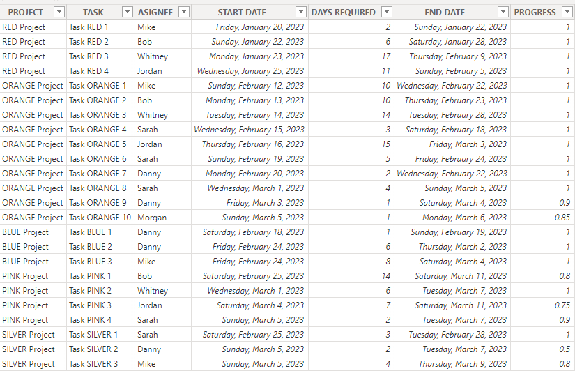
Project management teams need to perform analytics to understand the overall health of a project, monitor performance, and predict problems easily. It provides complete visibility into each unique project and helps to measure the time, resources and budget to be allocated.
You can analyze project management data in Power BI with the help of a Gantt Chart. It outlines all scheduled tasks in a project and the period of the time required to complete them. It makes it easier to create complex project plans (i.e. multiple teams, phases and milestones), monitor the progress of the project and provide accurate reports at the end. In this article, we’ll discuss how to use Power BI Gantt charts to depict project timelines.
What is a Power BI Gantt chart?
A Gantt Chart is a tool that’s used by project or product managers to visually represent project tasks and their schedules, milestones, task dependencies, and the assigned team. You can create a Gantt chart in apps such as Google Sheets or Excel but Microsoft Power BI is better for more interactive visuals and dynamic project timelines.
What does a Gantt chart consist of?
At the most basic level, a Gantt chart is made up of bar charts that showcase the tasks or activities included in the project and the amount of time required to complete them. There are columns that should be added to every Power BI Gantt chart. First, you’d need to ensure your project management data source has most of the columns required before importing the dataset to Power BI. You can also use a spreadsheet app to clean your data and add important details to fill out the columns for a more comprehensive Gantt chart. In particular, you will need data for such columns:
- Task – the name of each activity required in the project.
- Duration – an estimate of the time needed to complete each task.
- Start and End dates – when each task is expected to start and end.
- %Completion – the amount of work done per task.
- Resource – anything required to carry out each task
- Assignee – the name or role of each team member
- Dependencies – things a task may be dependent on.
- Milestones – the major progress points for every task.
How to make a Gantt chart in Power BI?
If you want to create a Gantt chart in Power BI, you need to prepare your dataset and also ensure that you have installed Power BI desktop. Next, you’ll import the data from your data source (a project management app or a spreadsheet app). Then, you’ll add a preferred Gantt chart visual to your report and include the columns to display your data. In the sections below, we’ll show how to integrate data and create the Gantt chart easily.
1. Load your project data to Power BI
Although Power BI has native connectors, this doesn’t include project management apps. This means that you’d have to find other alternatives for importing your data.
- Option 1 – manual. You can export data from your project management app as CSV or XLSX and then import it into Power BI manually. But you will need to repeat this process every time you want to update your Gantt chart.
- Option 2 – automated. With automation, you can connect your project management app to Power BI once, and then your Gantt chart will be kept up to date automatically. In our example, we import data automatically with Coupler.io, a data analytics and automation solution. It can help you export data from 50+ business apps such as Jira, Asana, Airtable, Google Sheets, Excel.
To transfer data to Power BI, select your data source from the dropdown menu below and click Proceed.
Then, you can set up a custom schedule for the updates. The tool will regularly transfer fresh data to Power BI according to your preferences. If needed, you can also transform and edit your data directly in the Coupler.io interface – rearrange columns, combine data from different accounts, and more.
If you want to import data manually instead, open the desktop application and click the Get data from another source button. Then, find the data source you need to upload data from.
2. Create a Gantt chart in Power BI
You can easily create a Gantt chart in Power BI with these step-by-step instructions. First, make sure you have the project management data ready and the Power BI desktop on your computer. Now, let’s see how to create a Gantt chart in Power BI.
If you used Coupler.io to import your data, as explained above, then your project information is already in Power BI and you can start working with it.
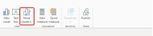
- Under the Home tab, click on More visuals to add Power BI visuals from Microsoft Appsource or from your files. In a similar way, you can add a Power BI histogram to your report.
Once you click on the button, it will display a list of available visuals to use for your data.
- Type “Gantt” in the search box to narrow the results down.
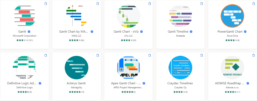
Choose a Gantt chart you’d like to use and click the Add button on the next page. You should see a notification telling you that the visual has been imported into the report. Here, we’ll use the Gantt visual provided by Microsoft Corporation for this example.
- Use the Gantt visual on the visualizations pane in Power BI. It would display an empty chart symbol on the page. Click on it to reveal the required measures.
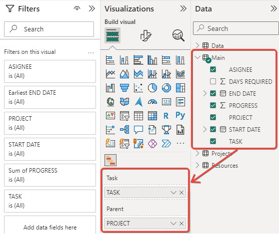
You’ll need to map fields to the Power BI Gantt chart visual by dragging each data field to its corresponding slot. This means that you can display your data regardless of the original field names. Note that “project” goes to “parent”, “assignee” goes to “resources”, “progress” goes to “%completion”, “start date” goes to “start date”, and “end date” goes to “end date”.
- After dragging the fields, your Gantt chart would display the project timelines.
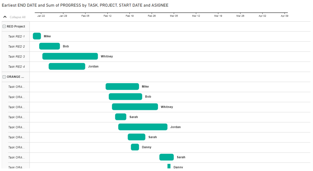
When you hover on each bar on the chart, you can view details such as task name, start date, end date, progress bar, duration, and resource. You can customize the Gantt chart by adjusting the colors, sizes, and positions of some chart features.
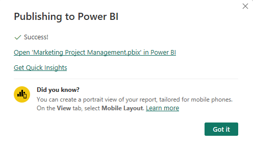
- Click the File tab to save the .pbix file and publish to Power BI service. Once your report has been published, you should see a notification such as below.
Those are the steps for Importing any gantt chart visual from Microsoft Appsource. In the next chapter, we’ll explain how to make use of Gantt charts for various projects.
How to use Gantt chart in Power BI?
After you create a Gantt chart in Power BI, you need to know how to use the Power BI’s features to utilize the chart more effectively. You can customize the appearance, add tooltips to display additional information, and include drill-downs where necessary.
Below we explore some elements to make your chart more interactive and insightful for stakeholders, managers, and the assigned project team. We will also explain how to use different types of Gantt charts to present and organize your project data.
Creating dependencies
You might want to add dependencies i.e. the sequence in which tasks should be performed for the project to be successful. A very common example is finish-to-start (when a task cannot start until one finishes).
Other dependencies include start-to-finish (task A cannot be finished until task B is started), resource dependency, external dependency, mandatory dependency, etc. There is no “dependency” well in Power BI Gantt chart so you’d have to find your way around it. First, you add a column in your dataset that specifies the dependency for each task.
Then, you use visual cues such as arrows, lines, or rectangles to show the relationship between two tasks. You can use the “Shapes” feature in Power BI to draw on the chart. It’s also advisable to add data labels or tooltips to display dependency details when anyone hovers over a task. You can also use a different color for dependent tasks.
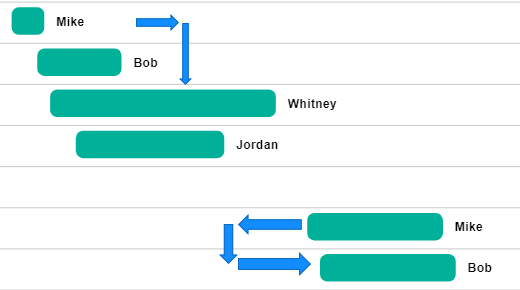
In this example, we placed arrows to show Finish-to-start and Start-to-start dependencies. Remember to also display details in the “Tooltips” well.
Using filters
You can use filters to focus your Gantt chart on certain parts of your data. For example, you might want to get a closer view on tasks or subtasks within a specific timeframe.
All you need to do is to drag some fields to the “Filters” pane and adjust the settings.
Adding slicers
It’s a good idea to use interactive filters such as slicers to break down your data in Gantt charts. It can help to go deeper and understand your project management data better. You can create one by clicking “Slicer” on the Visualizations pane and dragging a field to it. For example, a Gantt chart can use a slicer to filter tasks by a specific phase, resource, or even assignee. It allows you to segment your chart and only display information related to that category. You can add multiple slicers and customize them.
Calculating measures
A measure is a calculated field that can be created using the Data Analysis Expressions (DAX) language. It can help to enhance your Gantt chart with custom calculations. To do this, click “New Measure” from the menu bar and write a DAX formula to create the calculation. For example, you can use it for completion percentage or task duration. When the new field is made, you can drag it to the appropriate well for the Gantt chart.
In the next chapters, we’d like to discuss how you can display different project management data. You may customize a chart to get what you want or try out two or more Gantt visuals from Appsource in order to determine what’s best for dynamic or complicated project timelines. Let’s see how to use a Gantt chart for unique timelines
Using a Power BI Gantt chart with multiple phases
Some projects can be quite complex and so they have to be divided into distinct phases. Each phase contains separate tasks and must be completed before the next phase starts. Let’s see how to display a project with multiple phases in a Gantt chart.
- Upload your data and pick a Gantt chart visual. We’ll use the Gantt visual from Microsoft since it’s free and easy to use. Add it to your report and drag the fields.
When working with multiple phases in a project, your data structure should include basic columns such as task name, start date, end date, phase name, task status, assignees etc. Then, you’ll assign them to the appropriate Gantt chart fields. However, the “phase name” column goes to “Legend” since it allows you to differentiate tasks by phases.
- Once you’re done mapping the fields correctly, your Gantt chart should be good.
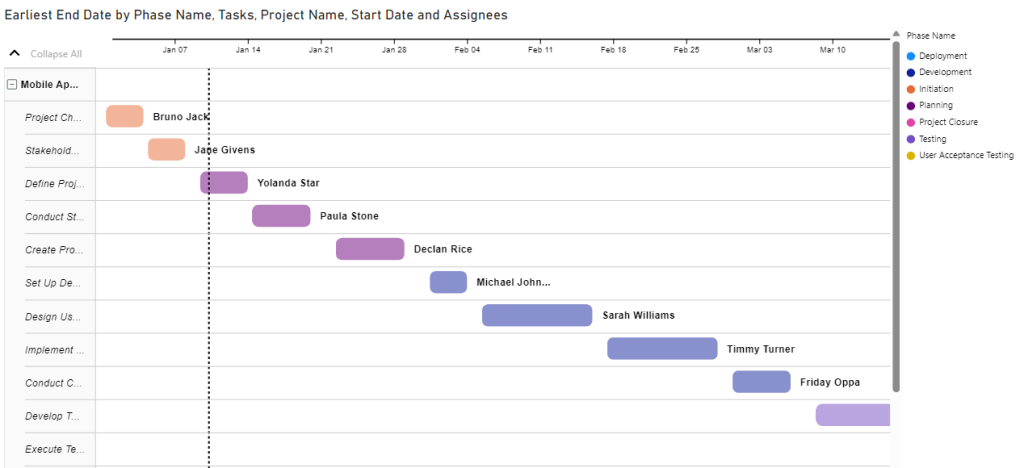
If you have milestones in your multiple phase project, you can add them to the chart too.
How to use a Power BI Gantt chart with multiple milestones
If you want to track progress with significant events such as task or goal completions, milestones can help. It helps to mark specific points in time when activities are to be completed and reminds everyone about the deliverables after each phase in the project. Let’s see how you can visually represent milestones in Power BI Gantt charts.
- Prepare your data in a spreadsheet and upload to Power BI. Next, you have to choose a Gantt chart visual to use. You need to keep in mind that not every chart displays milestones correctly. But the xViz Gantt chart seems to be effective.
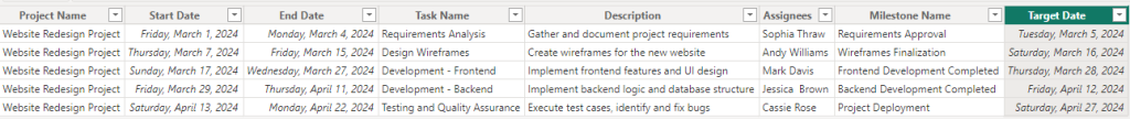
You’ll drag the data fields as usual but ensure that “Milestone name” goes to “Milestone Name”, and “Target date for milestone” goes to “Data Label”.
- Check whether the start, end, and target dates are in the right places.
If the Gantt chart from Microsoft doesn’t look appealing when you add milestones to it, you should try other Gantt charts. Most require a license to begin with or to unlock premium features but you may check out their websites on how to get a free trial.
Using Power BI matrix for a Gantt Chart
The matrix visual isn’t necessarily for creating Power BI Gantt charts but you can use it to make something similar. But keep in mind that it requires a lot of customization to do so. Let’s see how to create a simple Gantt chart using the matrix visual in Power BI.
- Upload your data and select Matrix from the Visualizations pane in Power BI. Drag “Task” to “Rows”, “Start date” to “Columns”, and “End date” to “Values”.
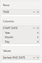
- Click the button shown below to get to the lowest level of data.
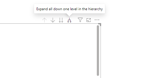
You need to click it about three or four times to create the Gantt chart-like appearance. Also, remember to remove Totals from the chart by going to the format settings. Then toggle off both Column subtotals and Row subtotals.
- Click the dropdown arrow beside “Earliest End Date”, select Conditional Formatting”, and choose “Background Color”.
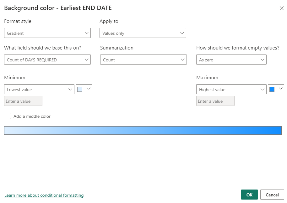
You need a field containing the number of days required for each task in the project. It’s easier to include it in your spreadsheet so you can just select it as the field to base the background color on, pick Count as Summarization, and simply click OK to continue.
But you can choose to write a DAX formula that establishes a relationship between Start Date and End Date, subtracts the number of days, and sends the values to a new field. Then, you’ll base the background color on the new field containing the number of days.
- Your chart should be coming together already. Next, you’ll go to Format > General and toggle on the Tooltips to display information when you hover on each cell. If the chart looks scattered, you can fix this by clicking the three dots.
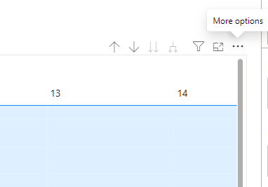
When you see the options, click on Sort ascending, and also pick Sort by > Earliest end date. This allows your chart to be more organized and shows the next end date.
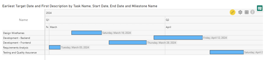
- See our Gantt chart look alike made with Matrix visual in Power BI
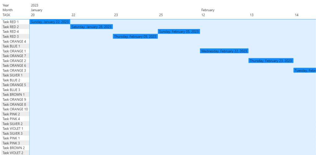
Remember that there are no rules when using the Power BI Matrix visual to create a Gantt chart. You can play around with formatting, add more data fields, and improve on your chart.
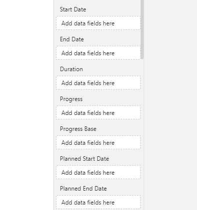
Power BI Gantt chart with multiple dates
If you have a project management dataset with multiple dates, it means there are various date fields that relate to unique aspects of the project. Some examples that typically require date format include start, end, planned start, planned end, actual start, actual end, milestone, dependency, review, task duration, etc.
Multiple dates allow project managers to record planned and actual timelines, track progress, and make better decisions. You may find these in your dataset if you export data from project management software such as Jira, Asana, or Microsoft Project. To include multiple dates in your Gantt chart, you have to look for a visual that has multiple wells for dates. Then, you can go ahead and drag your data fields to each one of them.
Here’s an example of the date wells available in the xViz Gantt chart:
Power BI Gantt chart with a roadmap
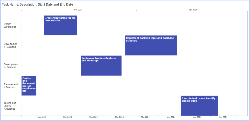
A roadmap in project management refers to a visual representation of the plan for the project. It mostly features common elements such as tasks, start date, end date, milestones, task description, and assignees. But you can choose to add more elements to make your project roadmap look and feel more professional, informative and robust.
Other elements include dependencies, resources, duration, progress, phases, costs, multiple dates, and extra descriptions. You should add them based on the nature of your project and the amount of detail required for effective communication and planning. You also have to check Appsource for the Gantt chart visual that supports these data fields.
Here’s a simple roadmap that displays the tasks, description, and timeline for a project:
Power BI Gantt chart timeline
A timeline in Gantt chart is a series of dates represented on a linear scale. It helps to display the schedule for tasks, milestones, phases, and the entire project. The first thing is the horizontal axis that helps to depict the progression of time from start to end. Next, you have task bars that depict each task and the length is as long as the task duration.
When you hover on a task bar, you’ll be able to see the start date, end date, and other specific information for that particular task. If you have milestones, you should be able to see the exact dates and other related details. Some Gantt charts may also draw a vertical line to indicate today’s date so anyone can monitor the progress in real-time.
Benefits of Gantt chart in Power BI
A Gantt chart is one of the best ways to visualize project tasks and schedules. It allows project managers and team members to be updated on the current state of the project. It’s great for planning timelines, defining resources, and monitoring team performance. Below are some of the amazing benefits of using Gantt charts in Power BI.
- It helps to break down the project and understand what each task entails.
- You can use it to improve the workflow and have a more efficient schedule.
- It ensures better collaboration and allows you to anticipate delays or problems.
- You can perform everything on one chart i.e. plan, schedule, and track progress.
- It’s a great tool for keeping stakeholders informed during all project phases.
Summary: Power BI Gantt charts for project management
Gantt charts in Power BI are useful tools for depicting project timelines and roadmaps. But you need to integrate your data before choosing a Gantt chart visual from Microsoft Appsource. With Coupler.io, you can set up the connection once and specify a schedule for automatic updates.
Note that many Gantt chart visuals in the marketplace aren’t exactly free but they often offer a free trial. But of course, you can use the free ones such as Gantt from Microsoft, Gantt from xViz, and a few others. If you need a done-for-you solution, reach out to our data consultancy team for custom dashboards. For more on this topic, check out our article on Power BI data visualization.
To learn more about data visualization, check out our tutorials: