Comparing actual values with target ones allows you to see how close the metric is to the desired goal. You can use the gauge visual to monitor the level of progress, assess performance, and make well-informed decisions. Let’s explore the essence of Power BI gauge, how you can create and customize it, and gain insights from this visual.
What is Power BI gauge?
A gauge in Power BI is a visual that shows a single value within a range or compared to a target. It usually includes a minimum, maximum, and target value. You can use gauges to assess performance against a specific goal and track task or project progress. This visual is relevant to all teams and departments within an organization.
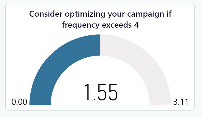
For example, the sales team can use a gauge to determine if they are meeting revenue targets or not. Marketers can use it to monitor campaign metrics such as conversion rates, leads and signups, etc. Customer service teams can also use Power BI gauge charts to display customer satisfaction scores, response times, resolution rates, etc. Here is what it may look like on your Power BI report.
How to create a gauge in Power BI?
Step 1. Get your data into Power BI
The first step is to collect information (datasets) from your sources. There are native connectors in Power BI that you can use for occasional reports. A downside is that they have to be manually updated and aren’t efficient when it comes to frequent reporting.
A better option is to use Coupler.io. It’s a reporting automation platform that can pull data from 60+ cloud sources, such as Facebook Ads, Salesforce, QuickBooks, Shopify, Google Analytics 4, and much more. Coupler.io also offers data refresh functionality (if enabled) that automatically queries the data source(s), and updates your reports or dashboards in Power BI on a schedule.
You can connect a cloud app source using the form below. Simply choose the desired source and click Proceed. The destination has been preselected as Power BI already.
You’ll be asked to create an account – it’s free (no credit card required). Make sure to follow the instructions given by the setup wizard. It will provide visual cues to help connect your source app, transform the data, load to Power BI, and schedule refresh.
Step 2. Configure the gauge visual
Once you’ve loaded data to Power BI Desktop, you can display it using Power BI visuals. In this step-by-step tutorial, we’ll use a sales dataset for the month of August.
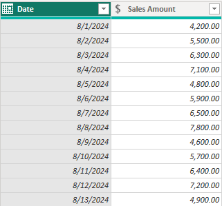
In the above columns, we only have sales figures for each day. The standard gauge can only display a single value so we need to aggregate to determine the total amount.
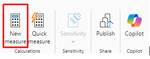
Under the Home tab, click New Measure.
A formula bar will pop up and you’ll type your DAX formula then hit Enter.
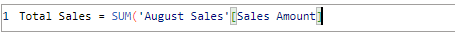
This will sum up the amounts and create a column called Total Sales.
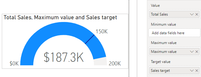
A standard gauge has 4 main wells – value, minimum, maximum, and target. It’s important to first add the columns for value and target. The minimum and maximum are starting and ending points for your gauge. You can use the default values or specify the preferred range. All of them help to create an insightful and visually appealing gauge.
First, you’ll select the gauge visual from the visualization pane and drag the fields to each well. If you don’t have these columns in your data already, you can always create a new measure and assign the value, for instance:
Sales target = 150000
Maximum value = 200000
We’ll dive into details in a subsequent chapter.
After adding the columns, here’s what our gauge chart in Power BI looks like:
Now, you can display data using a gauge chart. You can also add tooltips for more info.
How to use gauge in Power BI?
There are different ways to use gauge visuals depending on the type of data. Of course, the setup process is mostly the same but sometimes, you may need to do some tweaks. In this chapter, we’ll discuss various ways to use Power BI gauge visuals effectively.
How to create a Power BI gauge for multiple values?
A standard gauge is meant to display a single value, making it complex to work with multiple values. Here are ways to display multiple values e.g. marketing KPIs.
Multiple standard gauges
You can build multiple gauge visuals and place them on the same page for easier comparison. This allows you to display multiple values using the standard gauge.
Custom gauge visual
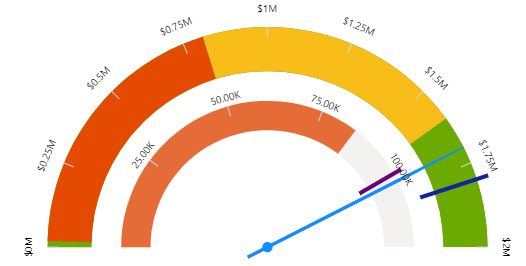
Another option is to look for a custom gauge chart from the Power BI marketplace. You should try to find one that lets you add multiple values. There are very few options that support this, but a good example is the xViz Advanced Gauge. It lets you combine two gauges by adding primary and secondary values.
Alternative visuals
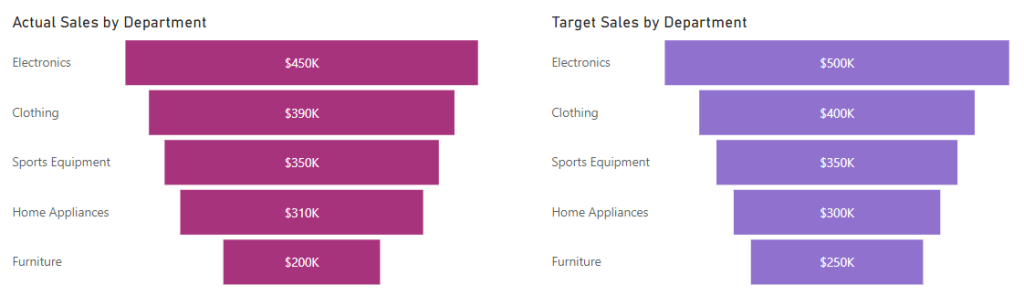
If the options above don’t exactly work for you, it’s probably better to use other visuals that can display multiple values easily. These may include bar charts, column charts, funnel, slicers, donuts, etc. You may pair them with standard or custom gauges too. For example, we used two funnel visuals to compare the actual sales vs target sales.
How to use linear gauges in Power BI?
A linear gauge helps to track progress in a project and measures performance on a continuous scale. Similarly to the standard gauge, it allows you to have a start point, target, and max width of the gauge. But you should note that it’s visibly different from a circular gauge because it presents data in a straight line. Here’s how to use it:
- Under Visualizations, click the three-dot menu and select Get more visuals.
- It will open Power BI Appsource. Now, you’ll type Linear gauge in the search bar.
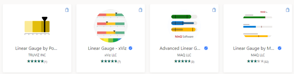
These are the available options. We’ll use the Linear Gauge by MAQ here. You can click on any visual and proceed to Add it. A notification will appear if it has been successful.
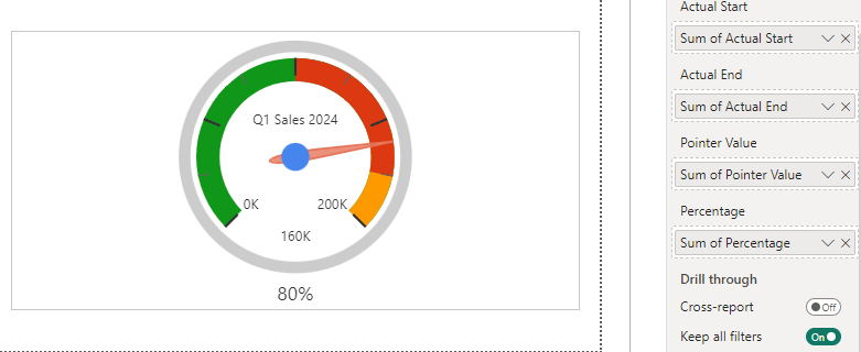
- Next, click the visual icon to use it in your report. Here’s the dataset we use as an example.
| Quarter | Current Sales | Sales Floor | Sales Ceiling | Sales Target | Last Quarter Sales | Last Year Sales |
| Q1 2024 | $150,000 | $100,000 | $200,000 | $175,000 | $140,000 | $160,000 |
- Drag your data columns to the appropriate wells under the Visualizations pane.
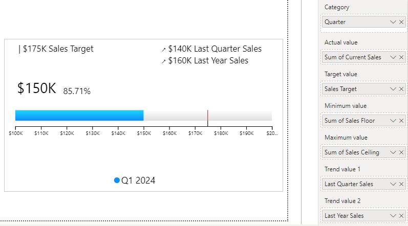
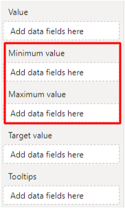
Note that a standard gauge requires three basic fields but a custom gauge, such as the Linear gauge provides numerous wells so you can add more information and context. For example, it includes Category, Actual value, Target value, Minimum value, Maximum value, and Trend value 1 & 2.
We’ve explained actual and target values in the previous chapter. Meanwhile, trend values help to visualize important data points over time and add more context to the performance scale. You may choose not to include trend values but it can be useful. In a later section, we’ll explain the minimum and maximum values.
Create a dial gauge in Power BI
A dial gauge helps to compare actual performance against a predefined target. As a KPI visual, it uses a circular format and a needle/pointer to present the current value. You can define the min/max, target values, actual values, pointer value, and percentage. The dial gauge can be used to display performance in marketing, customer service, etc.
- Click the three-dot menu in Visualizations and go to the Power BI marketplace. Next, you’ll search for a Dial gauge and pick any option available. We’ll use the Dial Gauge by CloudFronts here. Simply click to add the visual.
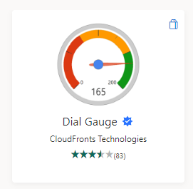
- Next, click the visual icon and add it to the report. Here’s the dataset we’ll visualize.
| Metric | Minimum Score | Maximum Score | Target Range Start | Target Range End | Current Range Start | Current Range End | Latest Score | Target Achievement |
| Customer Satisfaction Score | 0 | 100 | 80 | 100 | 60 | 85 | 82 | 82% |
- Drag the columns in your dataset to the wells.
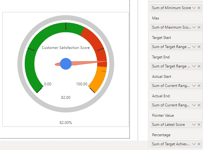
The dial gauge allows you to provide a range of values for the target and actual metrics. Although they are optional, you should use them to give more insights into performance.
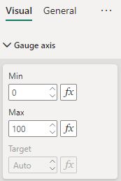
Set the maximum value in Power BI gauges
Every gauge needs a minimum and maximum value. By default, zero is the minimum value but the maximum value could be anything similar to where your target ends.
It’s good practice to choose the maximum value for your gauge visual for easier readability. You’ll be able to quickly interpret whether the current performance is meeting the target, going beyond it, or nowhere close to it.
If you don’t have a column in your dataset, you can always create one and set a value using DAX. The maximum value can be the next round figure after the target value.
To add the column using DAX, click New Measure under the Home tab and type in the formula bar. The syntax is simple – the column name, equal sign, and the amount, for example:
Maximum value = 1500
Now, let’s discuss the methods for adding maximum value to a gauge.
- When creating a standard or custom gauge chart in Power BI, you’ll find a well for maximum value. It’s usually under the minimum value like this:
- Another quick method is to simply go to Format your visual > Gauge axis and specify the values for min, max, and target.
If you already added a column to the min, max, or target wells, you won’t be able to provide these values using this method. So you have to pick either of these methods.
Lastly, under the Format your visual settings, you can choose to turn on Data labels to show minimum and maximum values on the gauge chart.
How to display percentages in Power BI gauges
The standard gauge in Power BI does not support percentage display. This means that any percentage value in your dataset would be shown as its decimal equivalent. To properly display percentage values, you need to use a custom gauge visual. Some good options from the Power BI marketplace are Dial Gauge, Activity Gauge by Powerviz, and Linear Gauge.
You can also use a standard gauge for percentage metrics but make sure there’s no percent sign in your data columns. Here’s an example with the percentage sign:
| Metric | Percentage Achieved | Target Percentage | Maximum Percentage |
| Customer Satisfaction Rate | 88% | 90% | 100% |
Here’s an example without it:
| KPI | Value | Target | Maximum | Trend Value |
| Customer Retention Rate (%) | 75 | 80 | 100 | 70 |
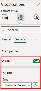
The columns with percent signs would be formatted as decimal values. But the example without the sign would be displayed as normal figures. After adding the columns to the gauge, you need to write a descriptive title and include the percent sign for clarification.
Now, you know how to display percentage values when using gauges.
Apply conditional formatting to Power BI gauges
Conditional formatting helps to make a visual more informative and ensure the report user is able to interpret the gauge chart more conveniently. For example, colors like green, yellow, and red can stand for good, fair, and bad performance respectively. This allows report users and stakeholders to quickly assess whether metrics are performing well or not.
The first step is to create a gauge (We’ll use standard here) and place the actual, target and maximum values in their respective wells. Next, you’ll create a new column.
If using DAX, the syntax should look like this:
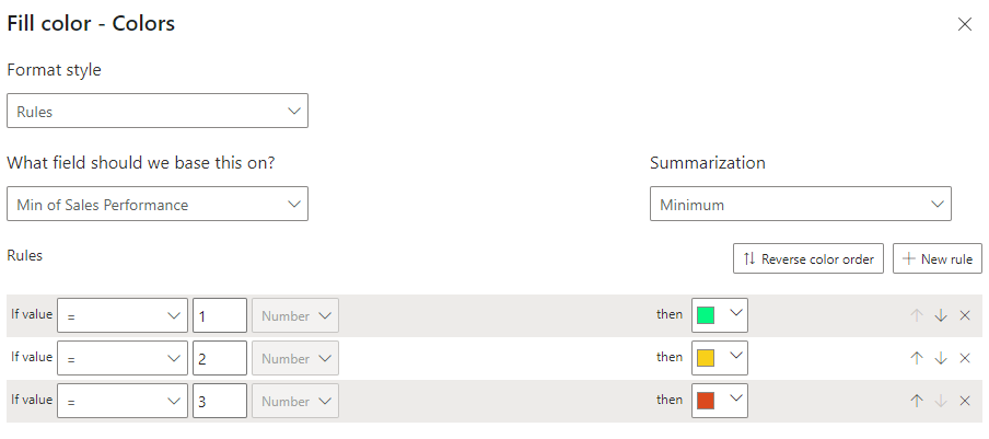
Sales Performance =
SWITCH(
    TRUE(),
    [Sales Goal (%) >= 90, 1, // Excellent Performance
    [Sales Goal (%) >= 70, 2, // Good Performance
    [Sales Goal (%) < 50, 3 // Needs Improvement
)
Or you can simply add a simple column to the dataset and map the values manually. For example, 1 for excellent performance, 2 for good performance, and 3 for bad performance.
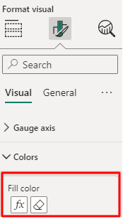
The next thing is to set up the conditional formatting options.
On the Visualizations pane, go to Format, expand Colors, and click fx in Fill color.
You’d choose a measure for color rules and assign colors accordingly. The new column helps to map colors to show performance ranges. E.g. green to 1, yellow to 2, red to 3, etc. See what the Fill color setup looks like:
Here’s what our chart now looks like:
The Data Color setting may differ in custom visuals but they are still quite similar. For example, the xViz Advanced gauge has a Semantic formatting option. It allows you to choose the number format and appropriate colors for negative and positive values.
What insights you can derive from a Power BI gauge visual
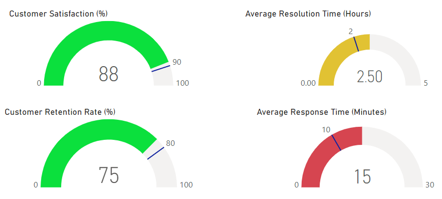
Now, let’s see how to analyze gauge charts. Below, we have some charts representing customer service metrics. Let’s see the insights we can gain by merely looking at them.
Customer Satisfaction (%)

The current satisfaction rate is 88%, the target is set at 90%, and the maximum is 100%. The pointer shows where the current rate is and the target indicator shows where the target is. The value isn’t up to the target, but it’s quite close to it and apparently, the color is green. So we can say the Power BI gauge chart indicates good performance.
Average Resolution Time (Hours)

The current average resolution time is 2.5 hours, the goal is to resolve tickets within an average of 2 hours, and the maximum is set at 5 hours. The pointer shows that the current resolution time exceeds the target and it’s in the color yellow. We can say the performance for this metric isn’t entirely bad but it definitely needs to be improved upon.
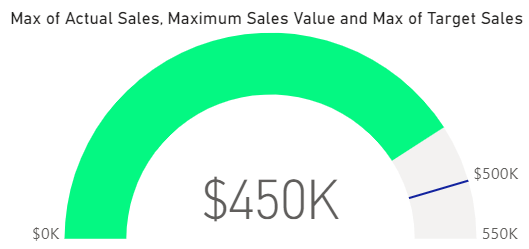
Customer Retention Rate (%)

The present retention rate is 75%, the target is 80%, and the maximum is 100%. According to the pointer and the target indicator, the current rate isn’t reaching the target but it’s close to it. The color shows green so we can say the performance is good.
Average Response Time (Minutes)

The current average response time is 15 minutes, the target is 10 minutes, and the maximum is 30 minutes. According to the position of the pointer and the target, you can see that the current response time is higher than the desired target. The color also shows red so you can easily deduce that the performance for this CX metric is bad.
Power your dashboards with a reporting automation app
A Power BI gauge can be an integral element of various reports including employee productivity, customer service reports, sales tracking, marketing and social media performance, project management, etc. You can create reports in Power BI from scratch or use the ready-to-go report templates that only require you to connect your data source.
Coupler.io will be useful for both cases. It’s a reporting automation platform that offers predesigned Power BI report templates for PPC performance, web analytics, SEO, finance, etc. All you have to do is connect the source(s) to the template and proceed to analyze your data using the visualizations in the dashboard.
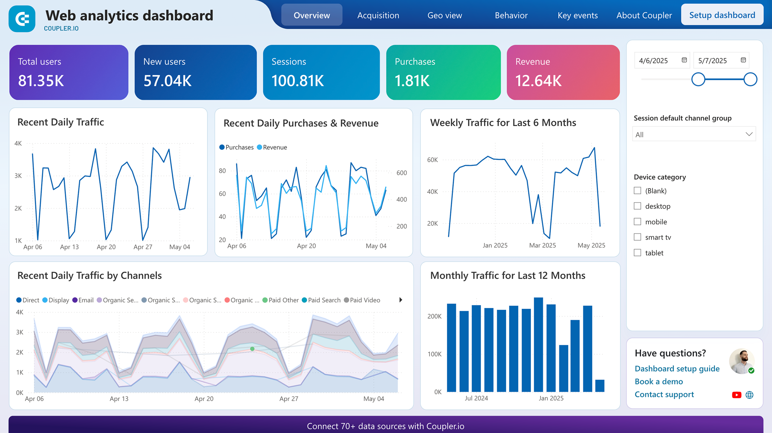
Web analytics dashboard
Discover insights into your website’s traffic acquisition, audience, and conversions with Google Analytics 4 data seamlessly connected to our Power BI dashboard template.


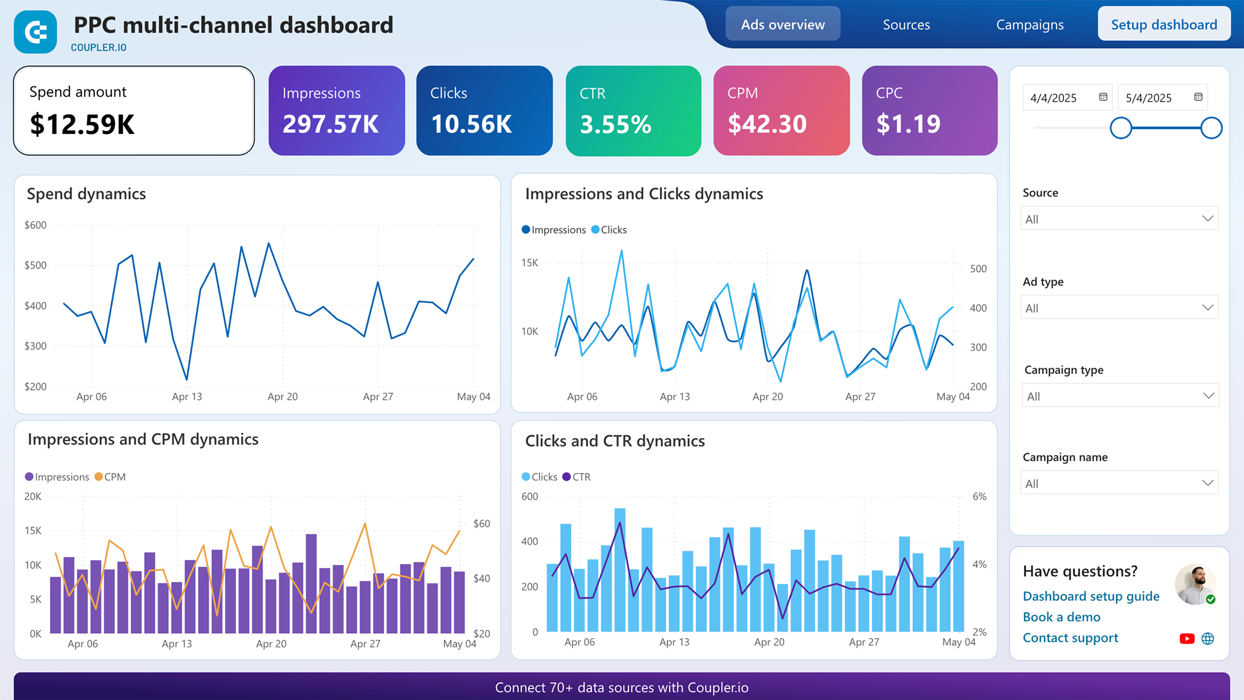
PPC multi-channel dashboard
Utilize a Power BI PPC dashboard for tracking and analyzing your advertising campaigns across multiple platforms.


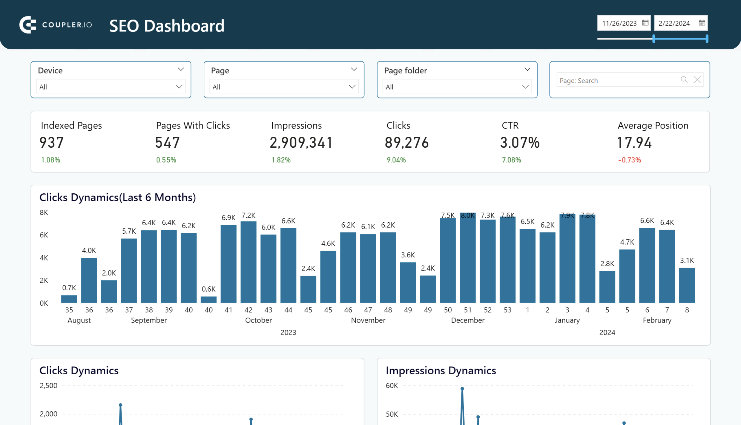
SEO dashboard
Optimize SEO with PowerBI’s dashboard for Google Search Console. Track page rankings, CTRs, and organic traffic efficiently.

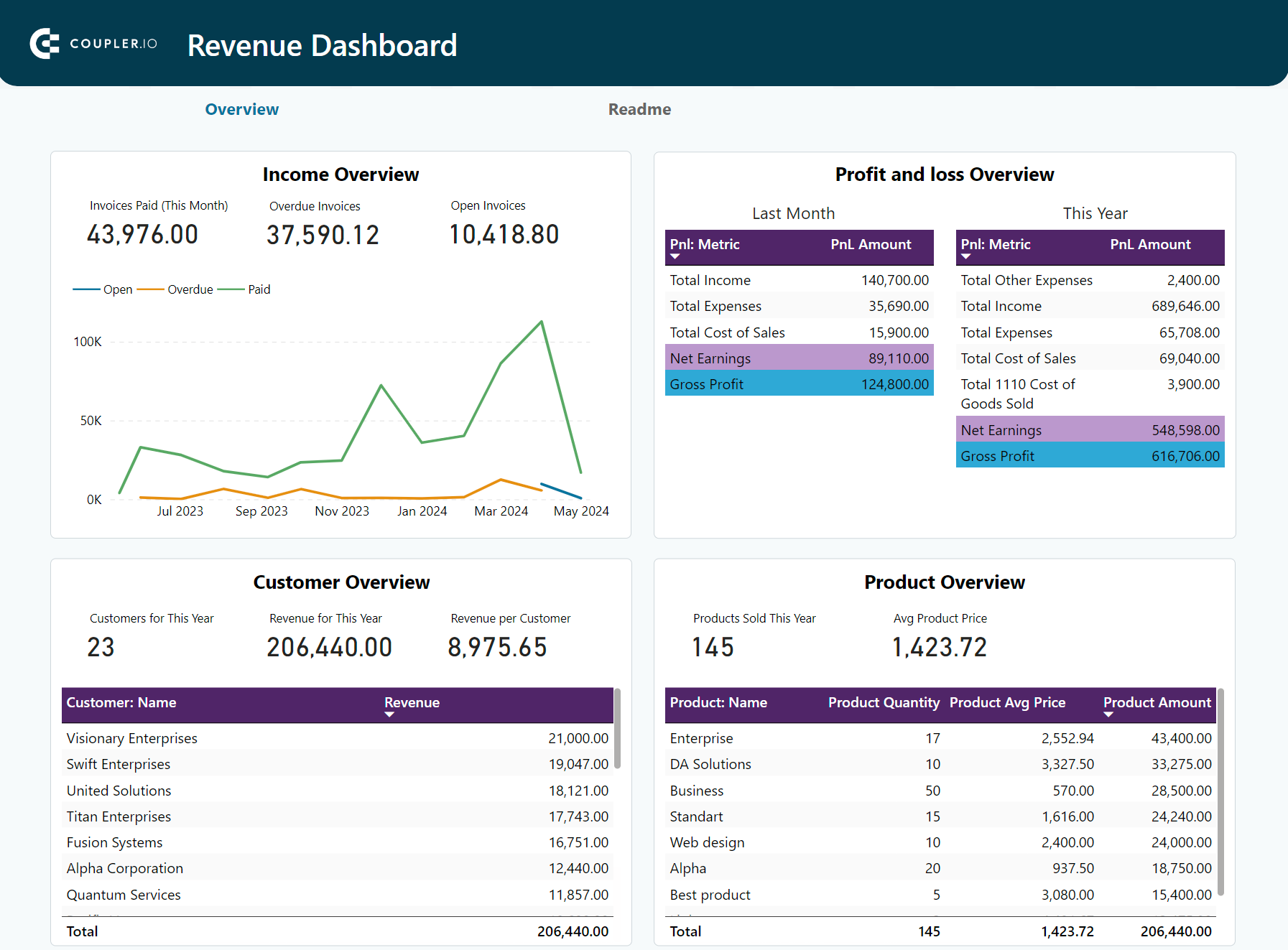
Revenue dashboard for QuickBooks
Monitor your income and expenses on an all-in-one revenue dashboard connected to your QuickBooks Online account.

At the same time, you can use Coupler.io to create custom self-updating reports. It allows you to connect cloud sources, collect, transform, and blend data from them, and automate data load to Power BI. Try it out for free right away! Choose the needed app from the drop-down in the form below and click Proceed.
Track KPIs and progress with Power BI gauge charts
A gauge is a great tool for comparing current metrics with their targets. It helps you analyze key performance indicators thoroughly. Other uses include tracking progress on tasks or projects, financial goals, employee performance, customer experience, and SLA metrics. As mentioned before, a standard gauge only shows one value at a time, but there are some workarounds to try.