Understanding the Power BI ecosystem
Power BI is one of the most popular services for businesses and analysts, with over 90% of Fortune 500 companies using it. It is a powerful and budget-friendly suite for getting ideas from thousands of rows in a spreadsheet through a simple drag-and-drop dashboard.
This Power BI tutorial will explain how the platform works in everyday scenarios, using examples to help you understand it better. We’ll also discuss pricing and its features. By the end, you’ll know how to make the most of this tool for your needs. Let’s begin!

What is Microsoft Power BI?
Power BI (or Power Business Intelligence) is Microsoft’s platform, specializing in data visualization and business intelligence for marketing. Its main purpose is to help users gather, analyze, and visualize data to see the results of the marketing activities and make decisions about the next steps.
With the help of this tool, you can upload raw data from various sources, such as CSV files, spreadsheets, databases, cloud services, and apps, and then transform it to create interactive reports and dashboards. These reports show data in an easy-to-understand way, helping companies deal with complex information.
What are the main goals of Power BI as a business intelligence tool?
Power BI is a versatile business intelligence tool that lets you connect to various data sources, transform data, and visualize it interactively.
- It is designed for diverse business environments. Thus, it seamlessly integrates with multiple systems, enabling you to analyze big data from various sources in one place.
- One of its key features is Power Query, which is a powerful tool for handling ETL (Extract, Transform, and Load) processes.
- Power BI uses a data model concept that allows for multi-system linkage, making it easy to answer numerous questions and build various dashboards using a single model. Its top-notch data model makes it a great choice compared to competitors like Tableau.
Moreover, although many experienced data analysts and data scientists find Tableau’s user interface super sleek, Power BI is considered more user-friendly for learners and non-data analysts due to its intuitive interface.
Overall, Power BI’s robust set of features, ease of use, agility, and seamless integration with other systems make it excellent at data visualization and business intelligence for marketing. This also makes it an indispensable tool in the fields of big data and data science.
Power BI history
It started as a set of add-ons for Microsoft Excel known as Power Query, Power Pivot, and Power View. These tools allowed users to connect to different data sources, clean up data, and create interactive visuals. While they were popular, they had limitations because they needed the desktop Excel software.
In 2013, things changed with the introduction of a cloud-based version of Power BI. Now, only with access to a browser, people could create and share reports and dashboards.
In 2015, Microsoft made a big update, introducing the Power BI Desktop software for more advanced modeling and visualization. They also launched a mobile app so people could view and interact with data on phones.
Since then, Power BI has kept growing. In 2016, they added Power BI Embedded for developers, and in 2017, introduced Power BI Report Server. In 2019, the Premium version arrived with even more features and capabilities.
Since then, it has become a must-have tool for businesses worldwide, used in many industries like banking, retail, insurance, oil and gas, and manufacturing.
Power BI Desktop vs. Service and other tools
Let’s take a look at 5 important tools to help you work with data, make reports, and share it with your colleagues. These tools are essential for anyone, whether you’re just starting or want to improve your skills:
Tool #1. Power BI Desktop is the main development and business intelligence tool for creating reports and dashboards. It is also a no-cost software you install on your computer. It allows you to connect to various data sources, shape your data, and create a data model by combining them.

Tool #2. Power BI Service is a cloud-based platform that allows you to publish, share, and collaborate on your reports and dashboards. Among its features are automatic data refresh, role-based access control, and creating and managing content packs for sharing with others.

By using both Power BI Desktop and Power BI Service, you can create comprehensive data analysis workflows that leverage the strengths of each platform.
| Power BI Desktop | Power BI Service |
|---|---|
| – This is a free Windows-based desktop application. – To start using it, you need to first download and install it on your computer. – Power BI Desktop allows you to create reports that you can then publish to Power BI Service. – While both the desktop and online versions allow you to create reports, the desktop version has more powerful data manipulation capabilities and supports more data sources. | – This cloud-based platform allows you to share, collaborate, and access your reports and dashboards via web browsers. – To access Power BI Service, navigate to https://app.powerbi.com/. You’ll need to have a Power BI account. – The service is particularly useful for teams and organizations as it facilitates real-time collaboration and ensures that everyone can access the latest data insights. |
Tool #3. Power Query Editor helps you transform and shape your data before it’s loaded into Power BI. It allows you to clean, filter, and merge data from various sources, ensuring your dataset is well-prepared for analysis.
Tool #4. DAX (Data Analysis Expressions) is a formula language that helps you create custom calculations and measures. With DAX, you can do advanced calculations, create complex relationships between tables, and generate insights from your data. Learn more about Power BI DAX functions in our guide.
Tool #5. Power BI mobile app allows you to access and interact with reports and dashboards on your mobile devices, ensuring that data insights are available on the go. It works offline, so you can view reports even without an internet connection.
Power BI architecture and features
The main component of Power BI is its data modeling engine, which organizes and optimizes data to ensure efficient analysis.
Once your data is prepared, you can upload it to Power BI Service, a cloud-based platform. Here, you can collaborate on reports and dashboards with your team. It also provides the Power BI gateway for integrating on-premises data sources securely.
Let’s take a look at the key components:
Visualization

Power BI offers a wide range of visualization types, from simple number displays to complex gradient-colored maps.
Datasets

Datasets are the raw materials for creating your data insights. They are basically collections of numbers used to make visualizations. A dataset can be as straightforward as a single table from an Excel spreadsheet or a blend of data from various sources, offering a unique cluster of information. Filtering data within datasets allows you to focus on specific information relevant to your analysis.
Reports

A report is a collection of visualizations that present data. They can spread across several pages. You can create different visual elements, arrange multiple pages, and structure them to better communicate your message. Whether you’re analyzing quarterly sales, monitoring product growth, or examining wildlife migration patterns, reports help you gather and showcase your data insights in a clear and shareable manner.
Dashboards
Dashboards serve as the front door to your reports and visualizations. They consist of selected visuals that offer immediate insights, are limited to a single page, and provide end users with an interactive gateway to explore underlying reports. For more details, see our article on Power BI dashboard examples.
Tiles

Tiles are individual visuals within a dashboard, which contain specific visualizations and can be moved, resized, or arranged to create a connected and informative dashboard. While users can interact with tiles when using shared dashboards, they cannot change their layout or size.
For more details, see our article on Power BI architecture.
How does Power BI work?
It connects to data sources, then extracts and transforms the data, and finally creates reports and dashboards. Users can then publish these reports to Power BI Service for sharing and collaboration. Let’s take a look at the process in more detail:
1. Data integration. You can connect to different sources, including databases (SQL Server, Oracle, etc.), cloud services (Azure, AWS), spreadsheets, and web services.
Explore how to connect API to Power BI.
2. Data transformation. After connecting to data sources, the Power Query component will extract and transform numbers. It can delete duplicates, standardize, and combine data from different places, making it pretty for analysis.
Example:
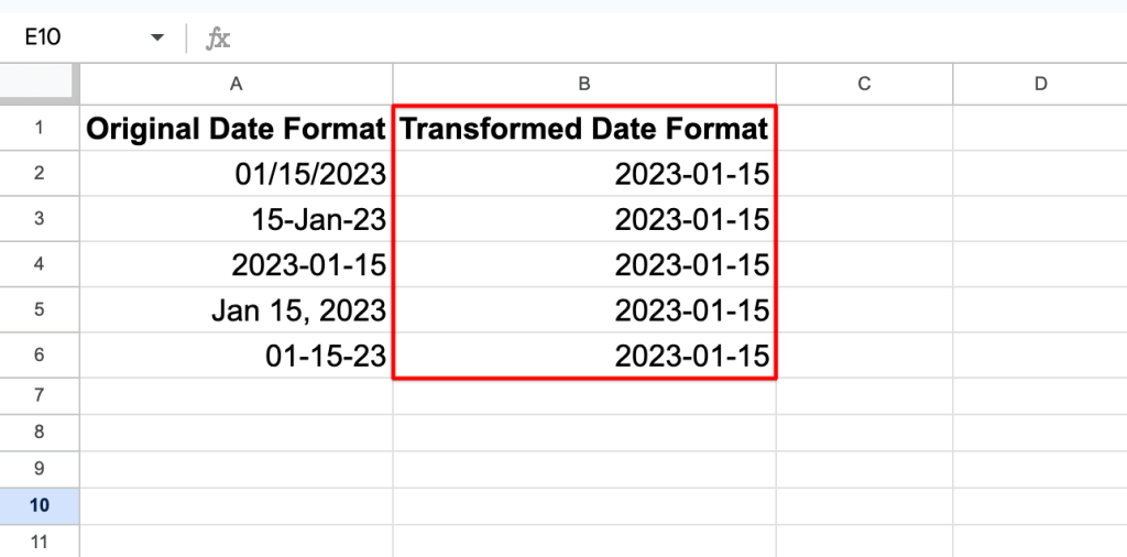
Suppose you have a dataset with different date formats (e.g., “01/15/2023” and “15-Jan-23”). Power Query can be used to standardize these formats into a consistent one, making it easier to work with.

3. Data modeling engine allows users to create relationships between different tables, define hierarchies, and calculate new measures using Data Analysis Expressions (DAX). This step creates a structured data model for analysis.
4. Report creation. After that, you can generate reports and dashboards in Power BI Desktop, selecting from various charts (i.e. column chart, bar chart), tables, and maps.
5. Publishing. Once reports and dashboards are ready, you can publish them to Power BI Service, Microsoft’s cloud-based platform for sharing with team members.
6. Data refresh. It supports scheduled data refreshes, guaranteeing that reports always display up-to-date information. It automatically updates the data from the original sources based on defined schedules.
7. Sharing and collaboration. Reports and dashboards can be securely shared with colleagues or stakeholders through Power BI Service. At the same time, as an owner, you can control access to the content through role-based permissions.
8. Mobile access. Mobile apps for iOS and Android devices give access to reports and dashboards on smartphones and tablets. They are optimized for smaller screens and offer offline access.
9. Integration and embedding. For more advanced KPIs, developers can use Power BI Embedded to integrate reports and dashboards into custom applications or websites.
Getting started: Installation and first steps with Power BI
In this step-by-step tutorial, we’ll walk you through the essential steps of installing and using Power BI to create reports and share them. We’ll also explore features like Power Query Editor and data refreshing to help you get started with data analytics.
How to install Power BI
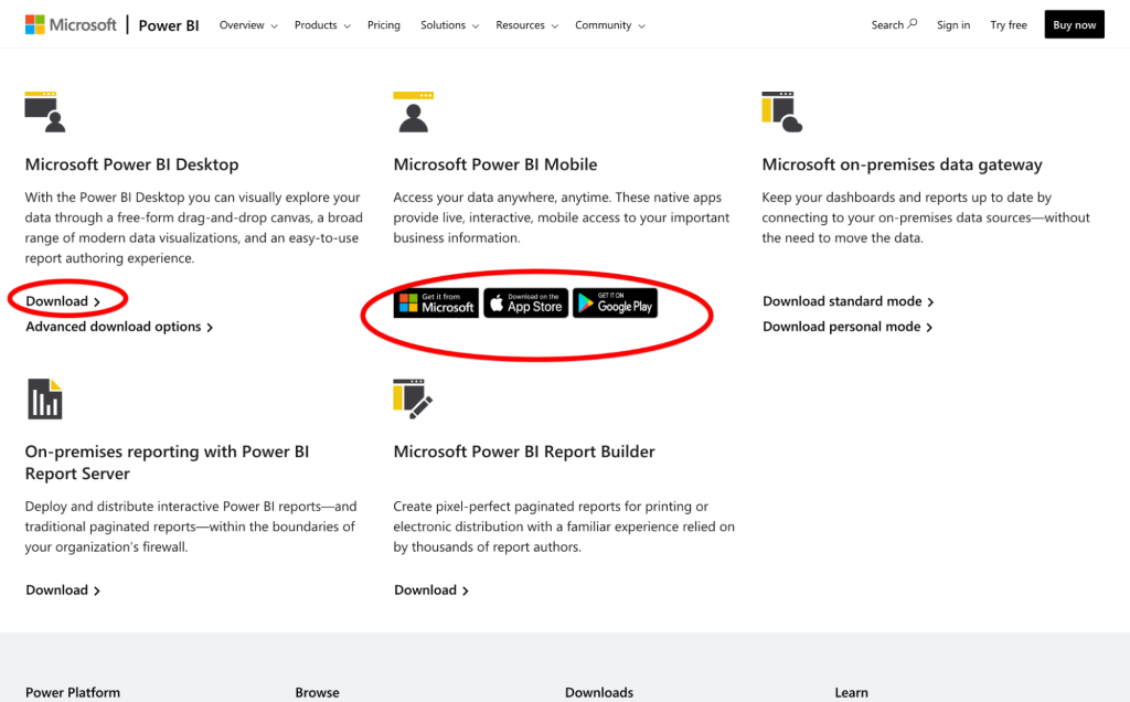
- Start by downloading and installing Power BI Desktop, which is a free app available from the Microsoft website.
- Launch Power BI and sign in with your Microsoft account, or create one if you don’t have it.
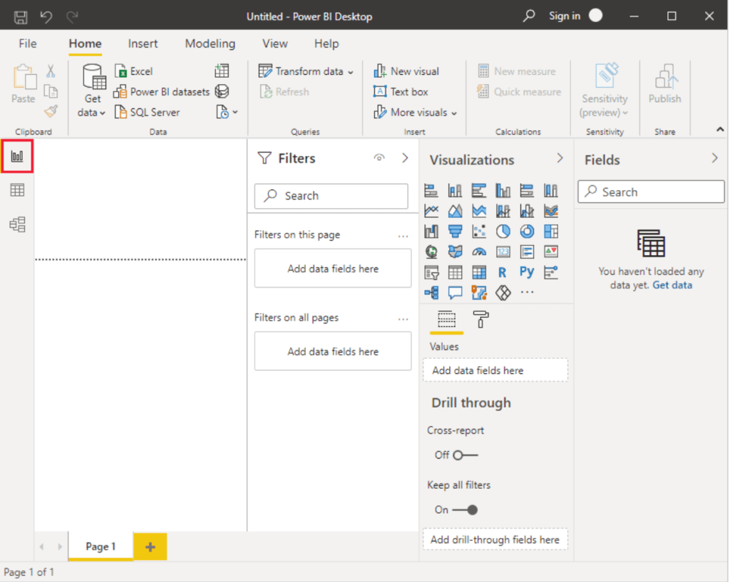
The default window where you can access all needed features is called “Report” view.

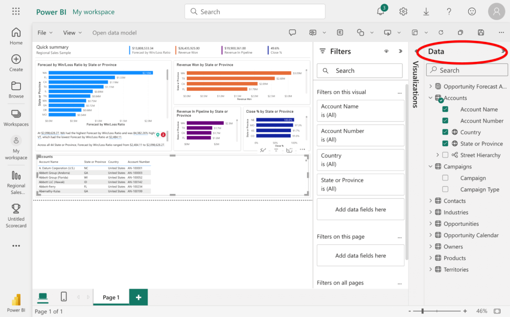
How to create your first report
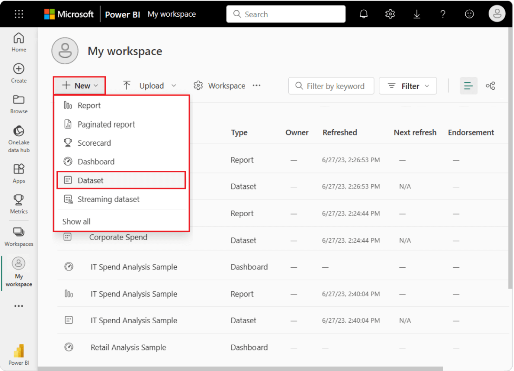
- Choose “My workspace” in the navigation pane.
- Next, click on New > Dataset to kickstart the import procedure. This will open up the “Add data to start building a report” page.

Power BI data connections and data sources
Power BI integrates seamlessly with Microsoft products and services like Azure SQL Database, Azure Synapse Analytics, SQL Server, Excel, SharePoint, etc. These integrations make it highly compatible with the tools many businesses already use. In fact, it’s one of the key reasons why Power BI has a very large user base.
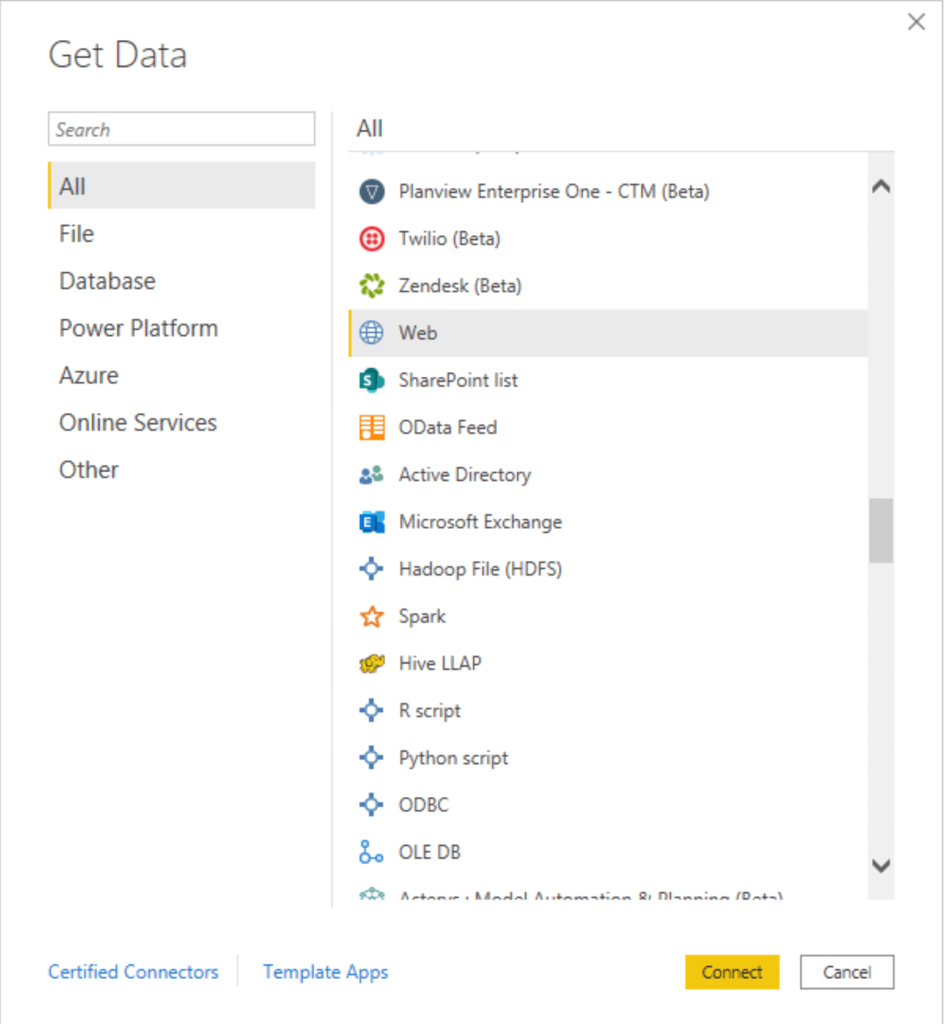
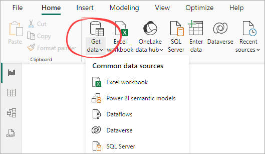
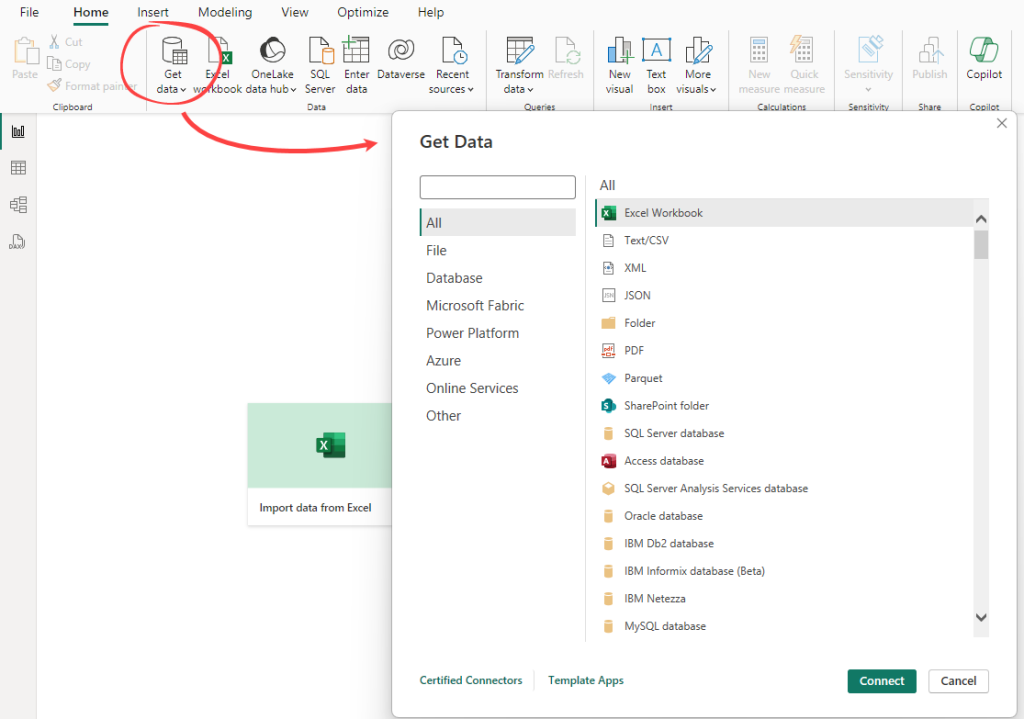
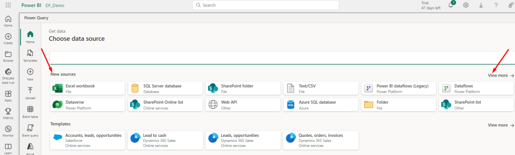
To see the data sources, go to the Home tab and choose Get Data > More. In the Get Data window, you can browse through the list.

It’s also important to note that Power BI supports non-Microsoft data sources, such as BD2, MySQL, BigQuery, and many online services like Salesforce, Google Analytics, and Databricks.
See also our complete list of Power BI data sources and how to connect to them.
At the same time, a great many marketing apps like Facebook Ads, Mailchimp, Google Search Console, and others are not natively supported. However, you can resolve this with Coupler.io. It is a reporting automation tool that lets you connect 60+ cloud data sources to Power BI to create self-updating reports. Coupler.io also offers dynamic dashboard templates in Power BI that can be a game-changer for reporting efficiency. Try it yourself – choose the needed data source from the drop-down list and follow the in-app instructions to set up the connection.

The art of data preparation using Power BI
Once you’ve connected to your data sources, the next step is to prepare and transform your data for analysis. This is where Power Query comes into play. Power Query is an ETL (Extract, Transform, Load) tool embedded within Power BI that allows you to clean, reshape, and transform your data before it is loaded into Power BI.
Some key features of Power Query:
- Data cleaning: Remove errors, duplicates, and irrelevant data to ensure data quality.
- Data transformation: Change data types, merge tables, split columns, and perform other transformations to shape your data as needed.
- Data aggregation: Summarize data through grouping and aggregation to simplify analysis.
- Custom calculations: Power Query uses M language to create custom calculations and transformations.
By leveraging Power Query, you can ensure that your data is optimal for analysis. This step is crucial for efficient data analytics in Power BI, as clean and well-structured data leads to more accurate and insightful results.
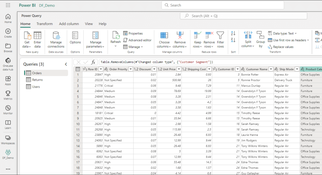
How to clean data with Power Query Editor
- To begin transforming your data, find the Power Query Editor by clicking on the “Transform Data” option located in the Home tab of Power BI Desktop.

When you’re working in Power Query Editor, every action you take to shape your data gets recorded as a step. These steps are automatically applied each time the query connects to the data source, ensuring your data remains consistently formatted according to your specifications.
- Identify column headers and names and make sure these headers are correctly placed.

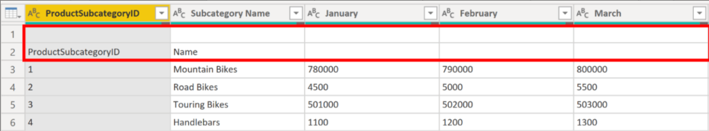
- Promote headers. Sometimes, the first row of data might contain column names, and Power BI doesn’t recognize it. You can fix this by promoting the first row as column headers using the “Use First Row as Headers” option in the Home tab.

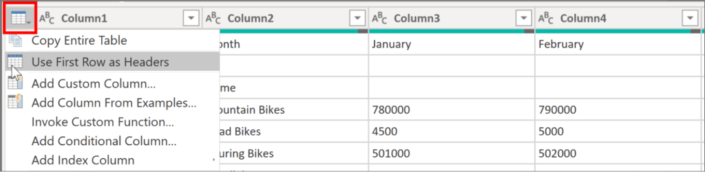
- Review your column headers and ensure they are clear and descriptive. You can rename them by right-clicking and selecting “Rename” or double-clicking and typing the correct name.
- Remove unnecessary rows and columns. If you have blank or irrelevant rows at the top of your data, you can remove them. Use the “Remove Rows” option in the Home tab to clean up your data.

What are Power BI dataflows?
Power BI dataflows are a self-service data preparation tool that enables users to easily extract, transform, and load (ETL) data from various sources into the Power BI service. They centralize and standardize data preparation tasks and also allow you to easily create reusable data transformation processes.
Key features of Power BI dataflows
- Data integration: Connect to various data sources for a unified dataset.
- Data transformation: Use Power Query for data filtering, merging, and cleaning.
- Reusable ETL processes: Create reusable dataflows for consistency across reports.
- Scheduled refresh: Automate dataflow refresh at set intervals for up-to-date reports.
- Common Data Model (CDM): Use a standardized data schema for seamless integration.
- Collaboration and sharing: Share dataflows with teams for collaborative data access.
- Data quality and consistency: Centralize preparation to ensure data quality and uniformity.
How do dataflows work and store in Power BI?
Power BI dataflows consist of tables created and managed within workspaces in the Power BI service. These tables, akin to database tables, have columns for storing data. Essentially, they serve as an advanced version of Power Query Online, allowing you to perform all Power Query operations independently in the cloud.

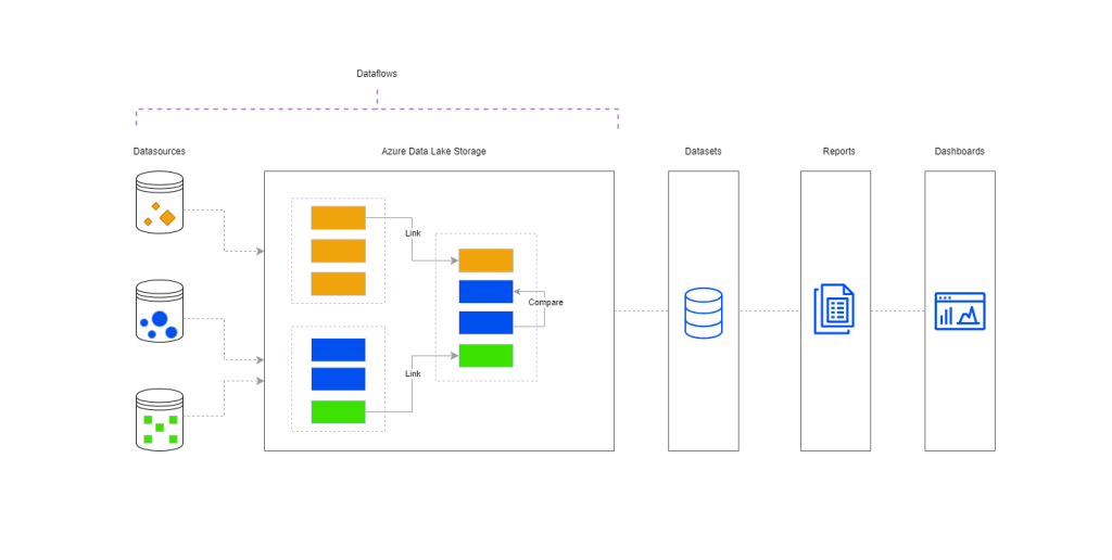
In dataflows, data from various sources is stored as entities in Azure Data Lake Storage without requiring an additional Microsoft Azure subscription. This allows you to access dataflows directly from your Power BI datasets, reports, or dashboards.
For instance, managing operations like sorting or replacing data across multiple datasets can be challenging. With Dataflows, you can carry out ETL operations in the Power BI service and then use them in Power BI Desktop. This centralization and reuse of tables simplify the creation of Power BI reports across multiple projects.
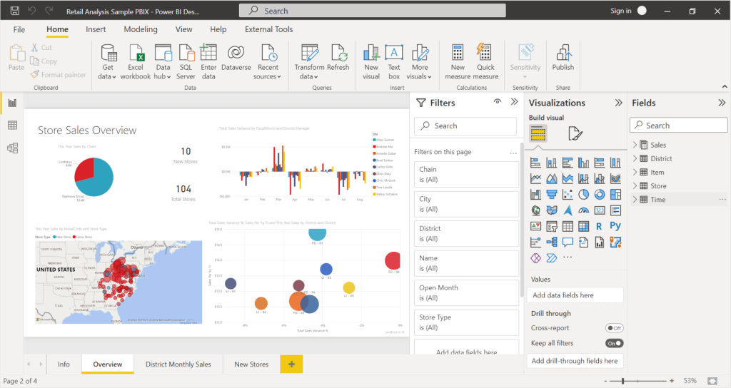
How to create reports and visualizations in Power BI
Creating insightful reports and dashboards is at the heart of Power BI’s capabilities. This section will provide an overview of the essential steps to create, publish, and share your reports effectively.
Create basic reports
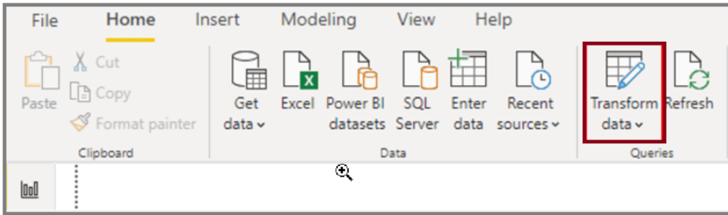
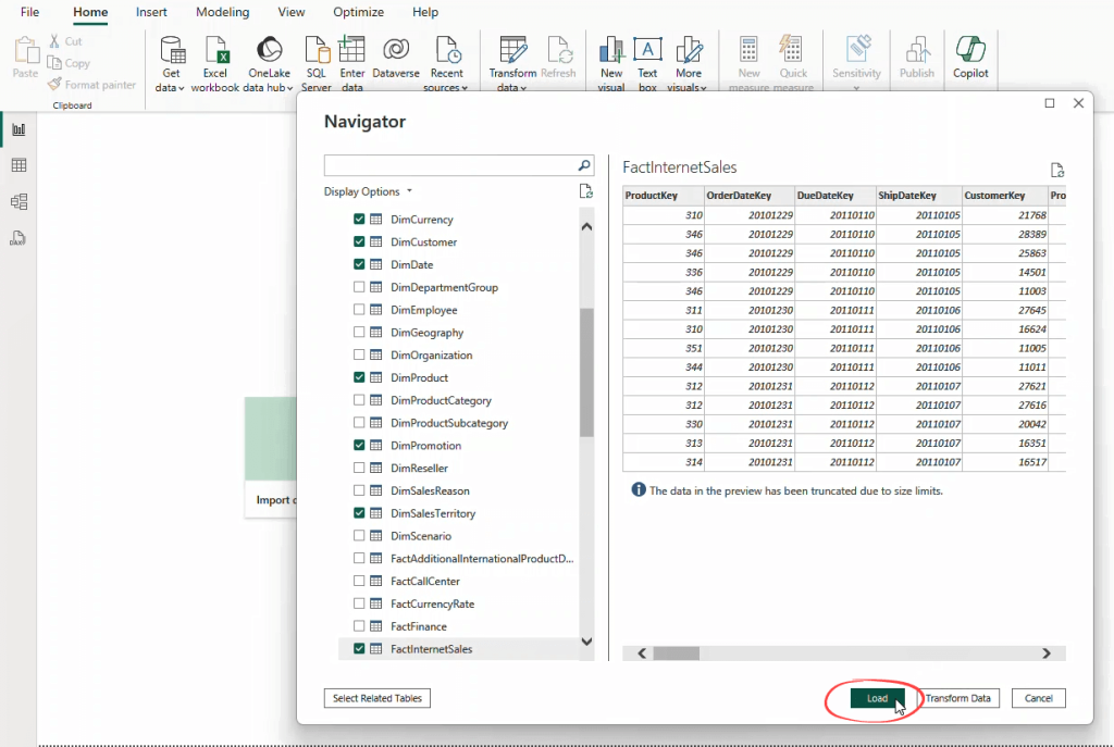
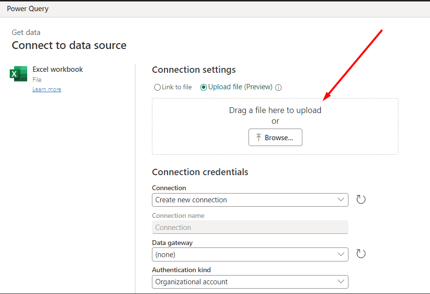
To create a report, click the Get Data button to import data from a data source.

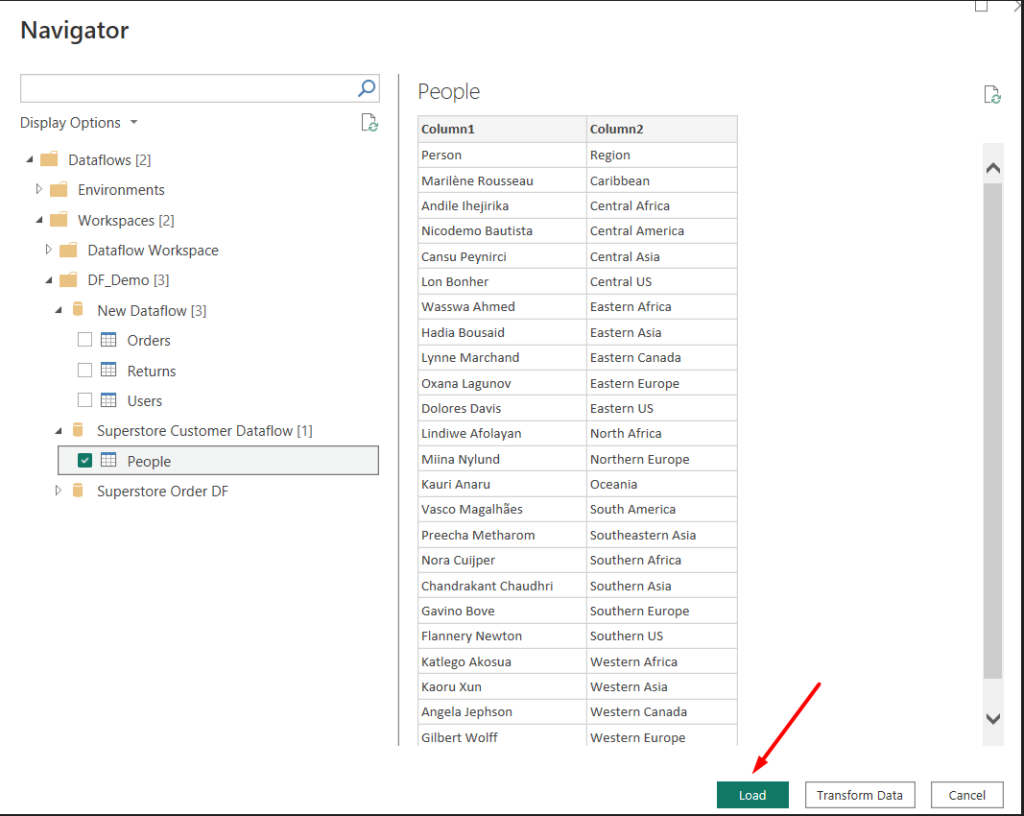
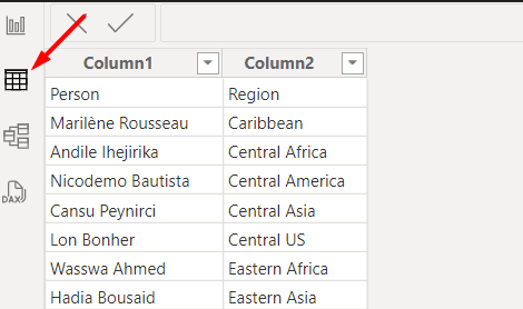
After you see a preview of your data, you can directly Load it to Power BI. If you want, use Power Query to clean and transform your data before loading it by clicking the Transform Data button (see the following screenshot):

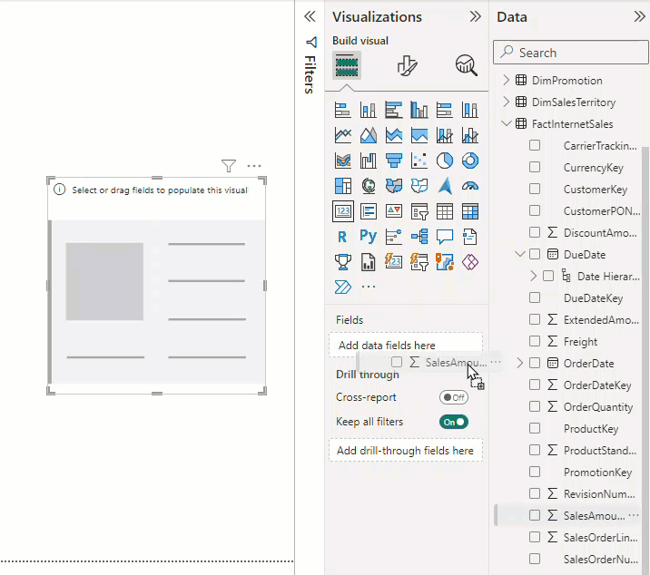
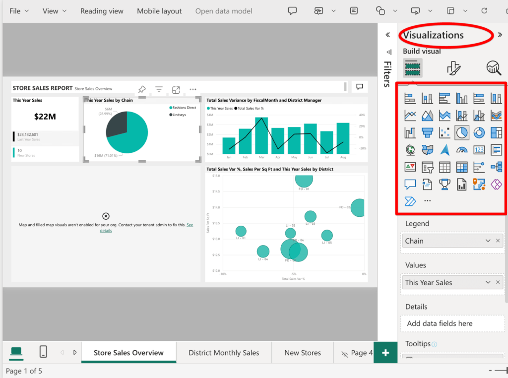
Now, it’s time to build visuals. Click a chart icon from the Visualization pane. For example, click the Card icon to create a scorecard. Then, drag and drop the appropriate field into the Fields area.

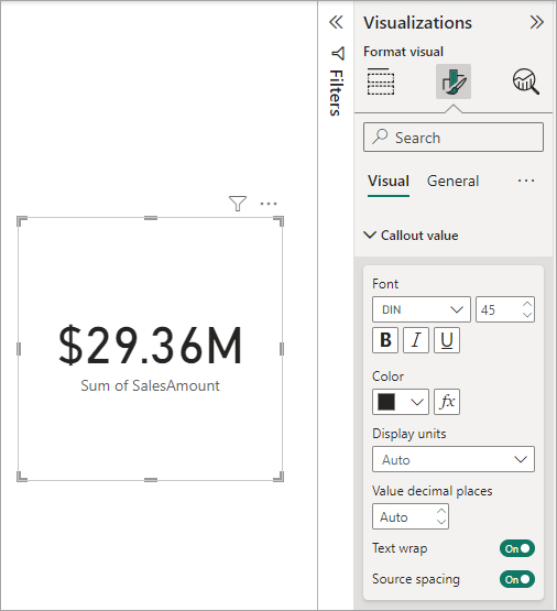
In the Format visual tab, you can customize the visual by adjusting properties like colors, labels, and formats.

Common visualization types
Power BI offers a wide range of options to help you present data in the most impactful way. Here are some common types of charts/graphs you can use for effective data visualization:
- Bar and column charts: Ideal for comparing values across categories.
- Line charts: Great for displaying trends over time.
- Pie and donut charts: Useful for showing proportions and percentages.
- Maps: Perfect for geographic data to show spatial distribution.
- Tables and matrices: Effective for detailed data presentations.
- Cards: Best for highlighting key metrics and summary values.
Choosing the right visualization type is crucial for effective data analytics using Power BI. It helps enhance the readability and insightfulness of your reports.
- Design your reports by selecting from a variety of visualizations like charts, tables, and maps.

- Drag and drop fields from your data model to create visuals.
- Customize the appearance of your reports, including colors, fonts, and layouts.
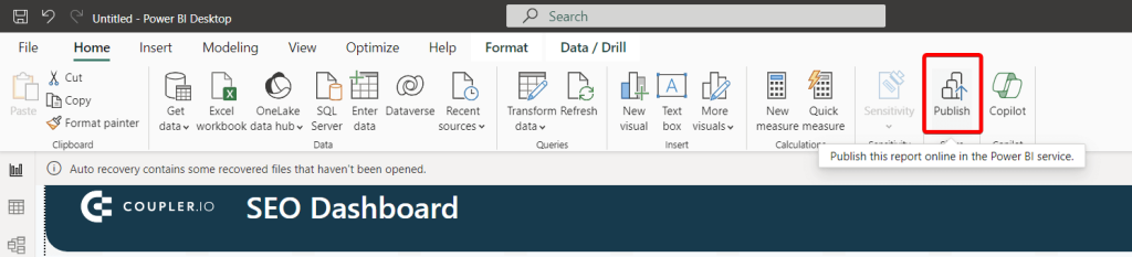
How to publish to Power BI service
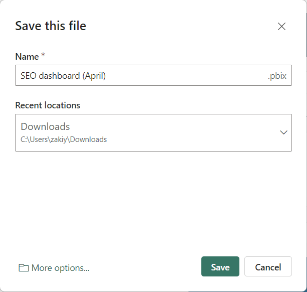
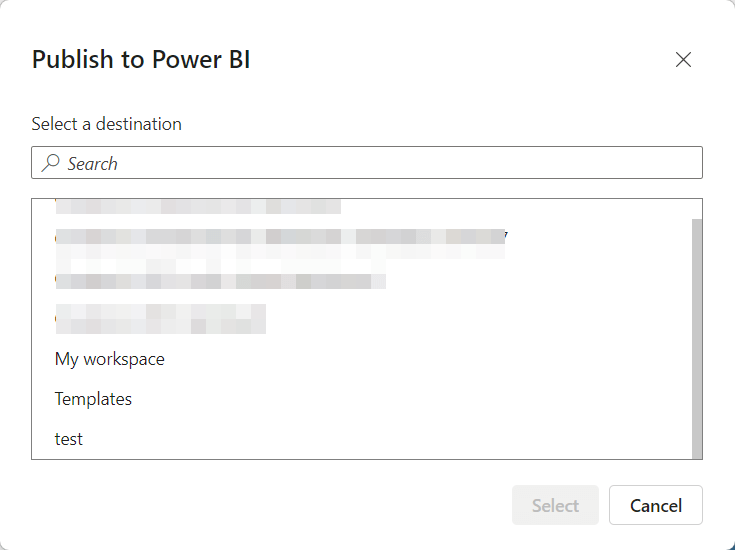
- Click on Publish to send your report to the Power BI Service, Microsoft’s cloud-based platform.

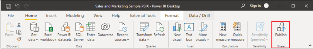
- Sign in to your Power BI Service account (or create one) to access the web service.

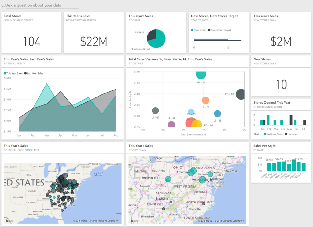
Create dashboards
Using dashboards enhances your data analytics in Power BI by offering a streamlined and easily accessible high-level overview of your key metrics.
While you can create reports in either Power BI Desktop or Service, you can only create dashboards specifically in Power BI Service:
- Pin visuals: From your published report, pin key visuals to create a dashboard. Select whether to pin to an existing or new dashboard. You can pin the most important charts and graphs for quick reference.

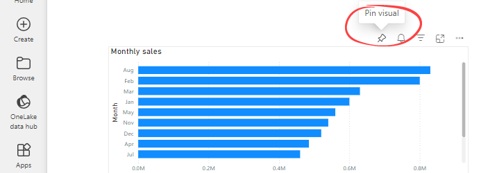
- Customize layout: Arrange and resize tiles on the dashboard to fit your needs. You can also group related visuals together to maintain clarity.
Enhance your reports with advanced features
With interaction in reports, it’s easier to understand, track, and manipulate complex data. There are different ways to achieve interactive filtering but we’ll only focus on drill through here. In this guide, we’ll explain how to set up and use drill through reports in Power BI.
What is Drill Through in Power BI?
Drill through is an interactive filtering feature that allows report consumers to expand on some data items. An overview report page is meant to contain a summary of all your datasets so it’s advised to create other pages for the breakdown of certain categories. It makes it possible for report consumers to drill from one visual to another report page. The action also connects all filters that apply to the visual to the drill-through page. Power BI drill through helps to keep your report organized and improves the report experience.
Example of Drill Through in Power BI
In case you haven’t seen drill through before, we’d like to show what drill through actually looks like. First, you’d have a main page that contains the primary visuals for your data. Here’s a contact page featuring a slicer visual for the First Name data field.


When you right click on each first name, you should see a dropdown with a list of actions. If drill through is working, you’ll see the target page name when you hover.

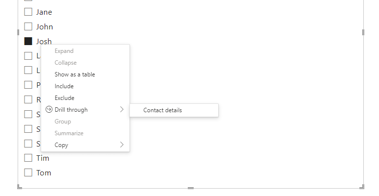
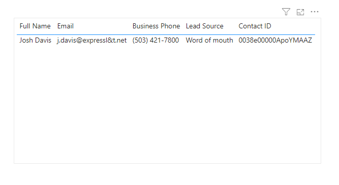
The contact details page has specific information about each contact. This is very useful in a situation where you have to summarize multiple aspects of your data on a page. It allows you to simply use a drill through to explore the required details on another page.

In the next chapters, we’ll provide a step-by-step tutorial on how you can add and set up drill through in Power BI.
How to set up Drill Through in Power BI?
Drill through allows you to navigate from one report page to another. You just have to pick a data point that needs to be explored, design the standalone page and connect. It can be done with just a couple of clicks on either Power BI service or Power Bi desktop. Before we describe the process in full, here’s a list of the main steps for drill through:
- Connect your data source using manual or automated integrations
- Create the source report page for the visuals you want to drill through
- Select a particular visual or data point for the drill through
- Create the drill through target report page and apply necessary filters
- Connect the two pages – drag the data field to the drill through section in the “Visualizations” pane of the target report page
- Return to the source page and right-click to see if it navigates to the target page.
What are Drill Through fields in Power BI?
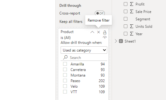
Drill through is an interactive feature that allows report consumers to navigate from a summary or overview report to detailed report pages by right-clicking on a data point. A drill through field helps to filter the detailed report and show the information pertaining to that data field. You can add drill through fields in Power BI to explore breakdown of specific visuals or data points.
Here’s an image of drill through fields that have been added to a Power BI report.

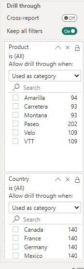
When you drag the data field to the drill through section, it automatically allows the user to drill through to the next page when any of the entities have been selected. For example, you can right-click on Amarilla wherever the “product” data point is found, and you’ll be navigated to a destination page that displays more information or KPIs concerning the Amarilla product. This provides the opportunity to focus on each data entity and analyze each of them separately.
Note: Power BI automatically creates a back button visual to return to the source page. It becomes a button in the published report and you can also use your own image for it.
Power BI Drill down vs Drill Through
Power BI has interactive features that let you organize data in a way that shows the relationship of general data to more comprehensive details. The most popular filtering options in Power BI reports are drill down and drill through. The first one, drill down, is an analytical feature that allows report consumers to visualize lower levels of a data point by nesting additional variables within the same chart or visualization.
You can add all your data to a report and only reveal them when the drill down button is clicked. It allows you to hide and show other report items when needed. Drill down in Power BI allows you to understand data and extract insights without leaving the page.
On the other hand, the drill through feature in Power BI allows you to visualize detailed data about a specific data point or KPI in a separate report. Although drill down and drill through are quite similar, they can’t replace each other. It’s best to use the drill down feature when you need to provide extra details within a chart or data set. But Power BI drill through is preferred when you’d like to explore other relevant aspects of the data.
Automate data exports to Power BI with Coupler.io
Get started for freeUse dashboard templates for efficient data analytics in Power BI
Benefits of using Power BI dashboard templates:
- Time-saving: The templates are ready to use, so you don’t need to create visualizations from scratch. You can start using all the templates right away.
- Effective: Each dashboard is designed for optimal data analytics in Power BI, displaying data in a clear and meaningful way to improve interpretation and decision-making.
- Interactive: They allow you to sort and filter your data.
- Customization: You can add, remove, or modify charts to display the metrics according to your needs.
Let’s look at some Power BI dashboard examples by Coupler.io that can help you analyze and report data more efficiently. Remember, all of these are dashboard templates that you can use for free. They’re also easy to set up, allowing you to get live dashboards with your data in just a few minutes.
SEO dashboard template
This SEO dashboard template provides detailed insights into your website’s SEO performance. It lets you monitor click-through rates (CTR), impressions, clicks, and other important metrics indicating your website’s visibility in search engines. The dashboard is designed to be dynamic with interactive reports. The visuals also update automatically based on the Impressions/Clicks button selected.

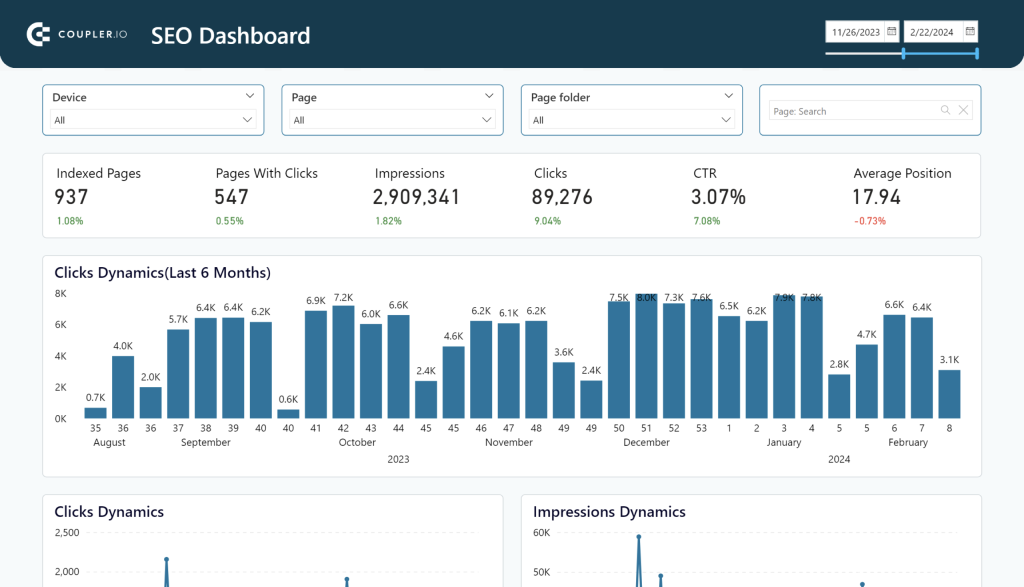
With this dashboard, you gain a real-time view of your site’s SEO health, making it easier to spot trends and adjust strategies as needed.
- Why use this dashboard? It is an essential resource for any marketer or business looking to optimize their SEO efforts and drive more traffic to their site. Moreover, the dynamic visuals allow for easy comparison and analysis, helping you identify areas needing improvement quickly.
- What does it help measure? This dashboard tracks clicks, impressions, CTR, average position, and top and worst-performing pages. Additionally, you can analyze impressions, clicks, and CTR by device.
- Data source: Google Search Console.
Facebook Ads dashboard template
This Facebook Ads dashboard template provides a detailed overview of your advertising campaigns’ performance. This dashboard is equipped with a no-code Facebook Ads connector for Power BI, allowing you to connect and pull your data for analysis effortlessly.

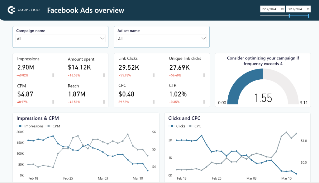
The clean and organized layout makes it simple to navigate through various metrics, providing a comprehensive view of your advertising efforts.
- Why use this dashboard? It helps you understand the health of your campaigns and how well your audiences interact with them. By analyzing the key metrics displayed, you can allocate your advertising budget more efficiently, ensuring your money isn’t wasted and maximizing your returns.
- What does it help measure? Key metrics include impressions, reach, clicks, CPM, CTR, CPC, ad frequency, and amount spent over time. Additionally, on the second page, you can view monthly performance breakdowns and clicks by country and demographics. See also: Top 10 Facebook Ads metrics and how to analyze them.
- Data source: Facebook Ads.
Google Ads dashboard template
This Google Ads dashboard lets you track the performance of your Google Ads advertising campaigns and track the monthly dynamics of key metrics.

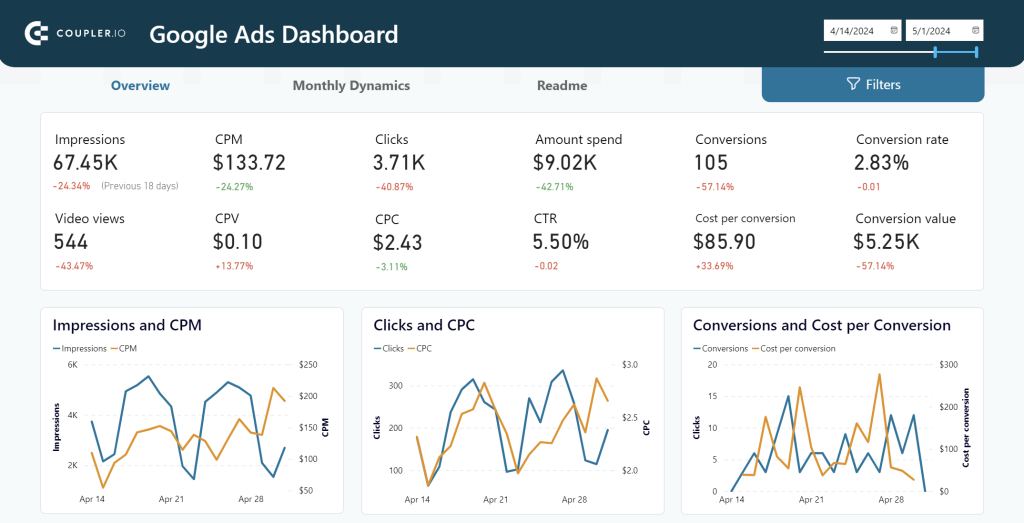
- Why use this dashboard? It helps you track key metrics like CTR and conversion rate to evaluate and optimize your campaigns. By analyzing these metrics, you can effectively manage your budget, identify areas for improvement, and benchmark your performance against industry standards and competitors.
- What does it help measure? Impressions, clicks, CPC, conversion rate, CPA, and amount spent. You can also see the breakdown of the conversion by campaign type, device type, country, age, and gender.
- Data source: Google Ads.
Web analytics dashboard template
This web analytics dashboard template provides comprehensive insights into your website’s traffic acquisition, audience, and conversions with Google Analytics 4 data seamlessly connected to the dashboard.

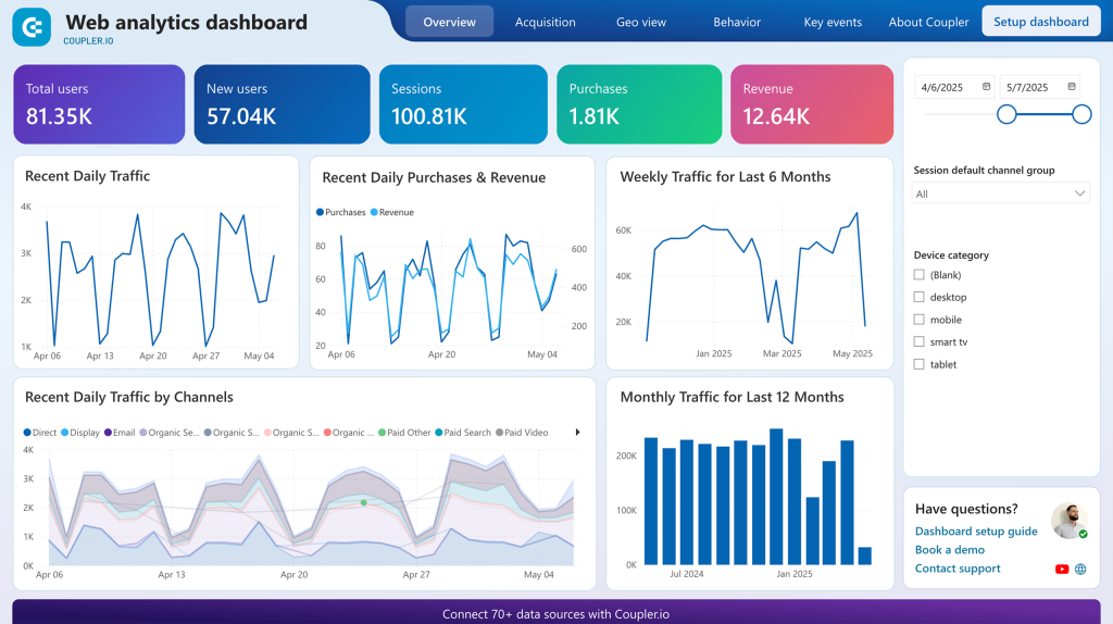
This dashboard provides a unified view of all your campaign metrics with clear visualizations that simplify complex data.
- Why use this dashboard? This dashboard provides a detailed overview of user interactions on your site, helping you understand what drives traffic and conversions.
- What does it help measure? General overview of the page views, total users, new users, sessions, conversions, impressions, average engagement time, and revenue. You can also see the breakdowns of the metrics by source/medium, channel group, campaign, country, landing page, page location, and user demographics.
- Data source: Google Analytics 4.
PPC dashboard template
This PPC multi-channel dashboard template is designed to track your pay-per-click campaigns across multiple platforms. It consolidates all relevant metrics to provide a unified view of your PPC performance.

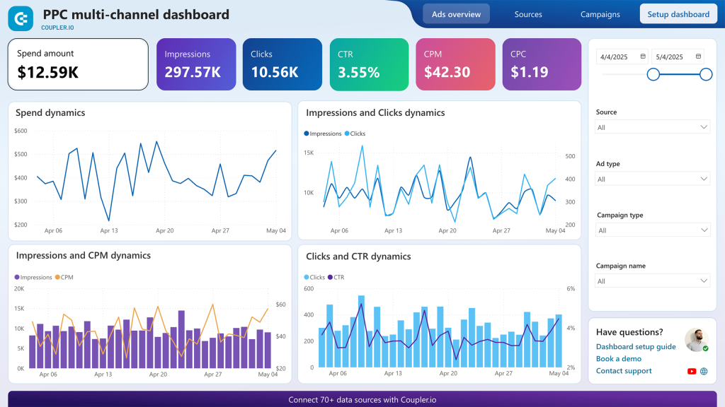
This dashboard integrates seamlessly with all major ad platforms, ensuring you have a comprehensive understanding of your PPC efforts in one place.
- Why use this dashboard? It helps monitor PPC performance, compare key metrics (CPC, CTR, CPM), track budgets, identify trends, and assess engagement across various ad channels. By reviewing historical data and engagement rates, you can optimize resource allocation and inform future campaign strategies.
- What does it help measure? Key metrics such as clicks, amount spent, cost per click (CPC), conversion rate, impressions, CPM, and cost per acquisition (CPA). You can also see the breakdowns of the metrics by ad source and campaign name.
- Data sources: Google Ads, Facebook Ads, Bing Ads, LinkedIn Ads, Twitter Ads, Instagram Ads, TikTok Ads, and Quora Ads.
Brand awareness dashboard template
This brand awareness dashboard helps you understand how your advertising campaigns on Facebook, Google, and Bing correlate with branded searches in Google to optimize your brand awareness.

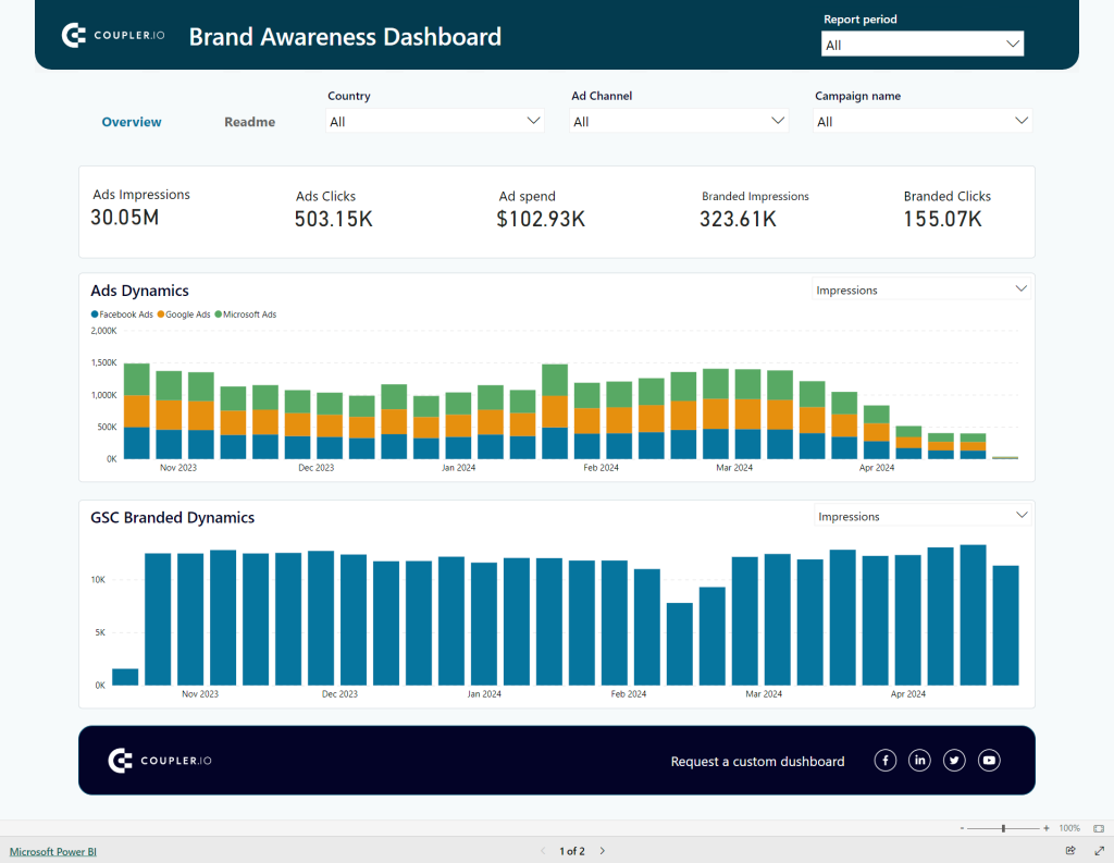
Combining data from different ad platforms, this dashboard reveals the correlation between your advertising campaigns and branded searches.
- Why use the dashboard? It tracks ad spend, monitors brand visibility, compares ad campaign performance, and evaluates geographic performance, helping you optimize your budget and tailor regional strategies.
- What does it help measure? Impressions, clicks, ad spend, and monthly dynamics of the metrics for branded and non-branded searches.
- Data sources: Google Search Console, Facebook Ads, Google Ads, and Bing Ads.
Predictive analytics with forecasting in Power BI
Forecasting and time-series modeling are essential techniques for predicting future trends based on historical data. Power BI provides built-in analytics tools to help you make accurate forecasts and analyze time-series data.


Forecasting in Power BI uses a time-series model to analyze historical data, incorporating seasonality into predictions. This feature is crucial for industries with seasonal fluctuations.
Here’s how you can access the Power BI forecasting feature:
- Get your data: Import data from Excel, CSV, or any other source you use. If you’re pulling data from multiple sources, such as various ad platforms and web analytics for marketing analysis, consider using Coupler.io for easy integrations.
- Add a line chart: Currently, this is the only visualization type that supports forecasting.
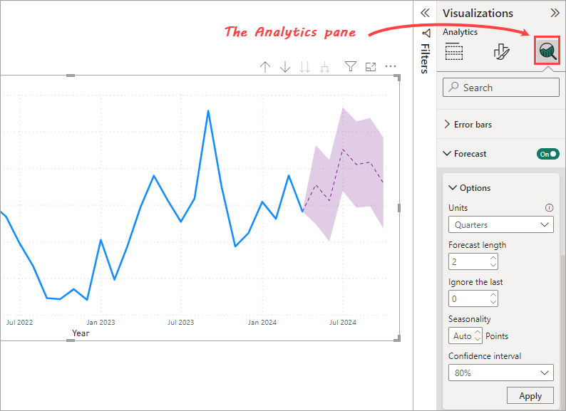
- Enable forecast: Select your line chart, then go to the Analytics pane in the Visualization area. Find the Forecast section and toggle it on.
- Adjust forecast settings: Fine-tune for accuracy and relevance to your needs. You can adjust forecast length, seasonality, and confidence interval to refine your predictions.
Learn more about Power BI predictive analytics and the value of first-party data for advanced performance analysis.
Power BI uses Exponential Smoothing as its built-in forecasting model. However, you can also use linear regression, ARIMA, and other models by integrating these models using DAX or scripts in R or Python.
If you have a Premium per-user or per-capacity license, you can build ML models directly in Power BI using Azure Machine Learning and AutoML. The steps include creating a dataflow with input data and then choosing a model like Binary Prediction, Regression, or General Classification.
Power BI forecasting for marketing: An overview
Forecasting in Power BI works by analyzing historical data using a time-series model. It also incorporates seasonality into predictions. This is crucial for marketing, where many industries experience seasonal fluctuations. Whether it’s holiday shopping spikes or summer slumps—understanding and anticipating these patterns allows for better strategic planning.
By doing marketing data analytics and forecasting with Power BI, marketers can analyze various interactions in the funnel and predict who is ready to purchase and who isn’t. This will contribute to decision-making. Marketing efforts can be directed more efficiently, targeting those most likely to convert.
How to access the Power BI forecasting feature
The feature of forecasting in Power BI can be found within the Analytics pane in the Visualizations area. To access the Analytics pane, you’ll need to select a visual first, then expand the Forecast section of the Analytics pane.

There are several points to keep in mind:
- While the Analytics pane is available for all visuals, the forecasting feature is only available for line chart visuals.
- The X-axis must have time-series data. It can be in date or datetime format or a uniformly increasing whole number. It can’t contain text or decimal numbers. When the X-axis values appear as dates but are actually formatted as text, they won’t work for forecasting.
- The line chart must have only one line. Multiple-line charts won’t work, even if all but one line is filtered out.
Note: This article uses the Power BI Desktop version of April 2024. Future versions of Power BI may have the forecasting options consolidated in the Format pane. These changes in the Visualization tab are currently still in preview. If you want to see the updated Visualizations and Format pane, you can enable the ‘On-object interaction‘ feature by selecting it from File > Options and settings > Options > Preview Features > On-object interaction.
How to do forecasting in Power BI: A step-by-step tutorial
Forecasting in Power BI is designed to be straightforward. It’s easy for both experts and beginners. Here’s a friendly guide to get started.
Step 1: Get your data
Forecasting in marketing typically begins with collecting data from various sources, like CRM systems, marketing tools, web analytics, social media, and ad platforms. This information builds a digital profile for each prospect, reflecting their interactions, like email activities and website visits. By comparing these profiles with patterns from successful sales, marketers can predict potential purchases.
You can use Power BI built-in connectors by clicking the Get data button. Select a connector to import data from sources like Excel, CSV, SQL Server, and many more.

However, Power BI does not provide enough built-in connectors to marketing data sources. So, Coupler.io can be an alternative way of bringing your data into Power BI. This reporting automation solution is a multi-source connector that allows your data transfer to be more manageable in a single place.
Getting started with Coupler.io is super easy. Select your data source in the form below and click Proceed.
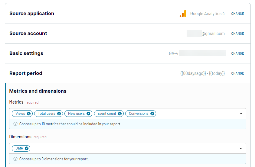
You’ll need to create a Coupler.io account for free and then configure your data source connection. For instance, if you want to make a forecast using GA4 data, you’ll need to connect to your GA4 account and select the metrics and dimensions to be included in your report.

You can organize your data by applying transformations, such as filtering data, hiding unnecessary columns, and creating custom columns with formulas. Also, Coupler.io lets you join data from multiple sources.
Once the report is ready, load it to Power BI following the in-app instructions. Do not forget to schedule the refresh of your source data in Power BI. For this, you simply need to enable the Automatic data refresh and configure the desired schedule.
That’s it! You can now create Power BI reports and apply forecasting.
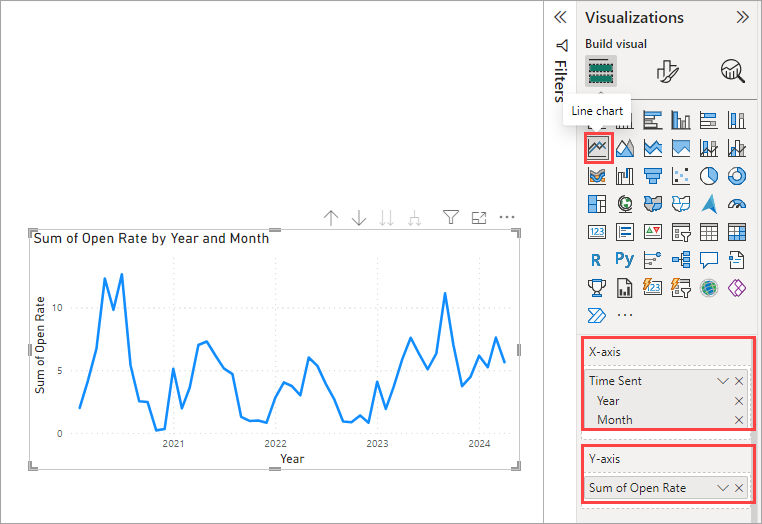
Step 2: Create a line chart
Select the line chart icon from the Visualization pane. Remember to use time-series data for your X-axis value. In the Y-axis, add the column with the metric you want to forecast. This could be website users, ad clicks, open rate, click-through rate, and so on.

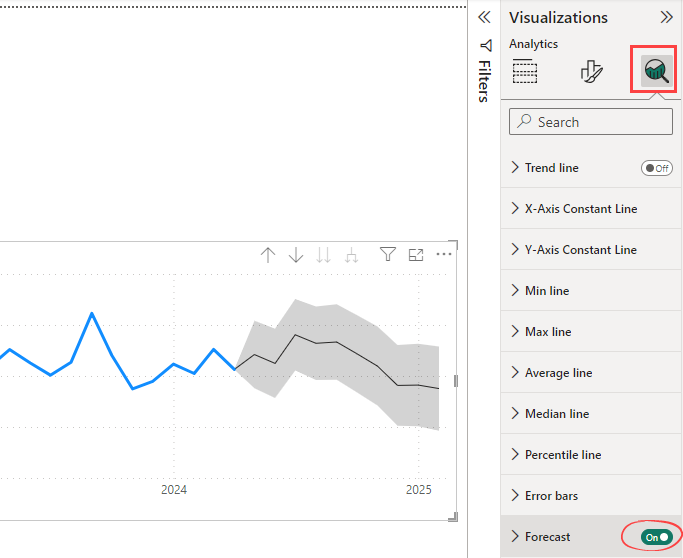
Step 3: Apply forecast
To apply a forecast, click on your line chart to select it. Then, click the Analytics pane in the Visualization area. You’ll find the Forecast section. Toggle the forecast button to On.

After applying a forecast, you’ll see the gray area in the visual. The middle line within this area is the forecast value. It’s surrounded by upper and lower bound lines that indicate the level of uncertainty associated with the forecast. A wider band suggests greater uncertainty, while a narrower band implies more confidence in the predictions.
Step 4: Adjust your forecast
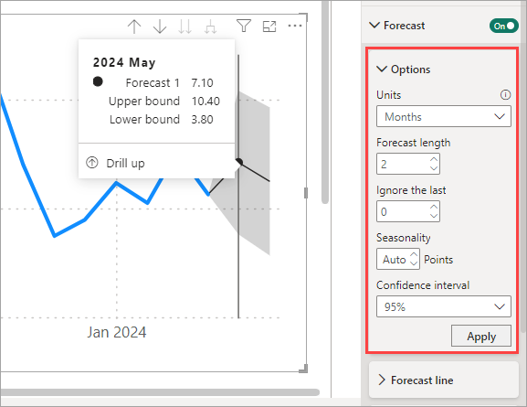
Adjusting your forecast is crucial for fine-tuning its accuracy and relevance to your specific needs. Here are some forecast options you can adjust:
- Units: This determines the time granularity of the data being forecasted. For instance, if your data is recorded hourly, you might want to forecast future values in terms of weeks, months, or even quarters. Adjusting the units lets you zoom in or out to see the bigger picture or focus on the details, depending on what’s more helpful for you.
- Forecast length: This is how many units far into the future you want your forecast to extend. The value is 10 by default. If you set Units to Months and Forecast length to 2, it means your forecast is 2 months into the future.
- Ignore the last option: Power BI provides the flexibility to exclude the most recent data points from the forecast. This can be particularly useful if you suspect the latest data might be anomalous or not reflective of future trends. For example, your data from last month might be incomplete. By choosing to ignore the last N periods, you can potentially improve the forecast’s accuracy by focusing on the most representative historical data.
- Seasonality: This setting allows you to specify the seasonality of your data, which Power BI uses to adjust its forecasting model. If the seasonal pattern is known, specifying it can greatly enhance the model’s ability to predict future values accurately. If it’s set to Auto, Power BI will attempt to detect this pattern automatically.
- Confidence interval: By adjusting this interval, you can control how aggressive your forecast predictions are. For example, a 95% confidence interval means that you’re 95% sure that the future values will fall within the forecasted area.
After adjusting these forecast settings, you’ll see updated forecast data visualized on the line chart.
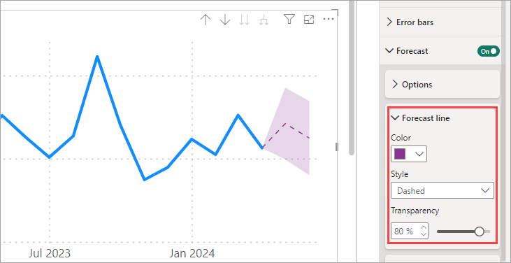
If you want, you can customize the Forecast line. This includes changing its style, color, and transparency, allowing for a more tailored visual representation of your forecast data.

What Power BI forecasting model is used by default?
Power BI is a business intelligence tool with a robust feature for time series forecasting. It uses Exponential Smoothing as the built-in forecasting model.
Check out our Power BI full tutorial.
However, you have the flexibility to implement other forecasting models, such as linear regression and ARIMA. Power BI supports integrating these models through DAX for simpler cases or R/Python scripts for more advanced analysis.
Exponential Smoothing
This is the built-in forecasting model in Power BI, integrated within the line chart forecasting options. Exponential Smoothing is simple and excellent for handling time series data. It can be applied to smaller datasets and still produce reliable forecasts.
Exponential Smoothing automatically detects seasonal patterns in your data as you start a forecast using a line chart. This model uses two different algorithms to accommodate different data characteristics: the ETS AAA algorithm (also known as the Holt-Winters algorithm) for seasonal data and the ETS ANN for non-seasonal data.
While this model is efficient and powerful, it might perform poorly for complex forecast data patterns that go beyond simple seasonality.
ARIMA (AutoRegressive Integrated Moving Average)
ARIMA offers greater flexibility compared to Exponential Smoothing when your data has irregular fluctuations without a clear pattern or trends that change over time.
To use ARIMA in Power BI, add an R or Python script visual to implement it. Depending on the visual you choose, you’ll need to write scripts using R or Python to apply ARIMA forecasting to your data.
Linear regression
This model is a basic yet powerful way to predict future values by understanding relationships between variables. It works best when your data is linearly related and you want to forecast an outcome based on new input data.
One convenient way to implement linear regression in Power BI is to use DAX. Functions such as LINEST or LINESTX can calculate slope and intercept, helping you create a linear equation for predicting future results.
ML models
You can build ML models in the Power BI service for forecasting without deep programming knowledge or expertise in machine learning. However, this requires a Premium per-user or per-capacity license.
Through Power BI’s integration with Azure Machine Learning and its AutoML feature, you can build ML models directly in Power BI and apply them to your datasets.
The steps include creating a dataflow with the input data. You can then choose a model such as Binary Prediction, Regression, or General Classification to apply to a table in your dataflow. Depending on your data, some model types might not be available.
Dataflow in Power BI
How to create data flows in Power BI
To create dataflows in Power BI, you need a premium per-user trial license.
Create a new workspace in the Power BI service. To do so:
- Click on Workspace ? (+) New workspace

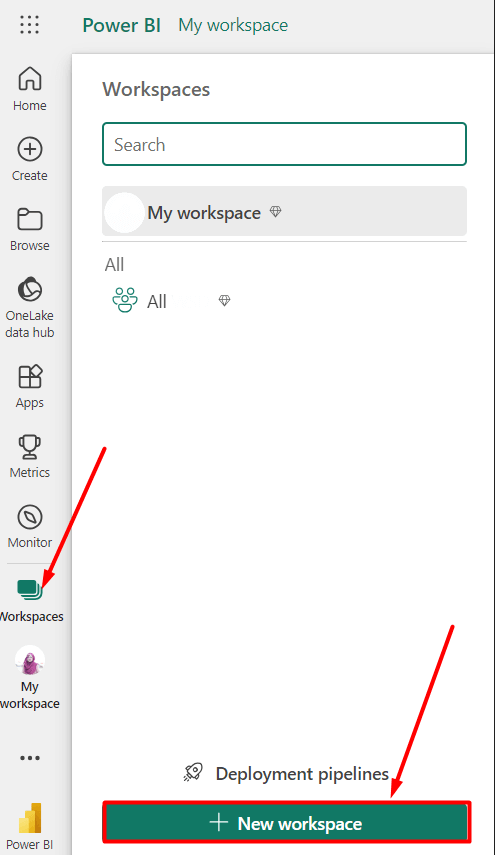
- Enter a preferred name and description (optional) then click on Apply
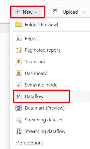
You can now see the newly created space. Click on the +New option. A drop-down section will appear, and you can select the Dataflow.

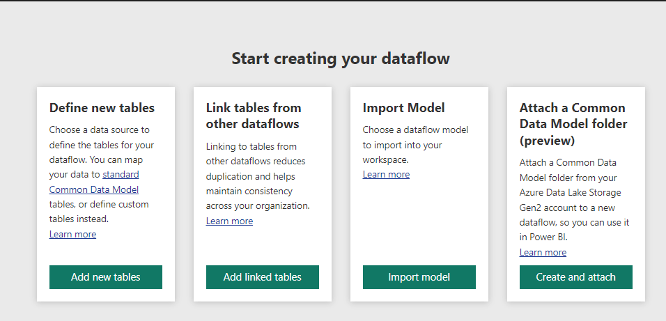
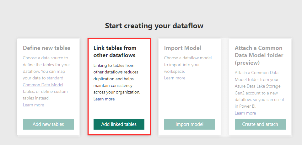
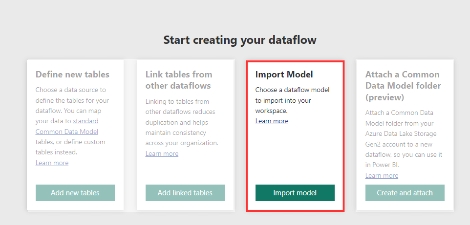
You will see a dashboard with 4 options to create a new dataflow:
- Define new tables
- Link tables from other dataflows
- Import Models
- Attach a Common Data Model Folder

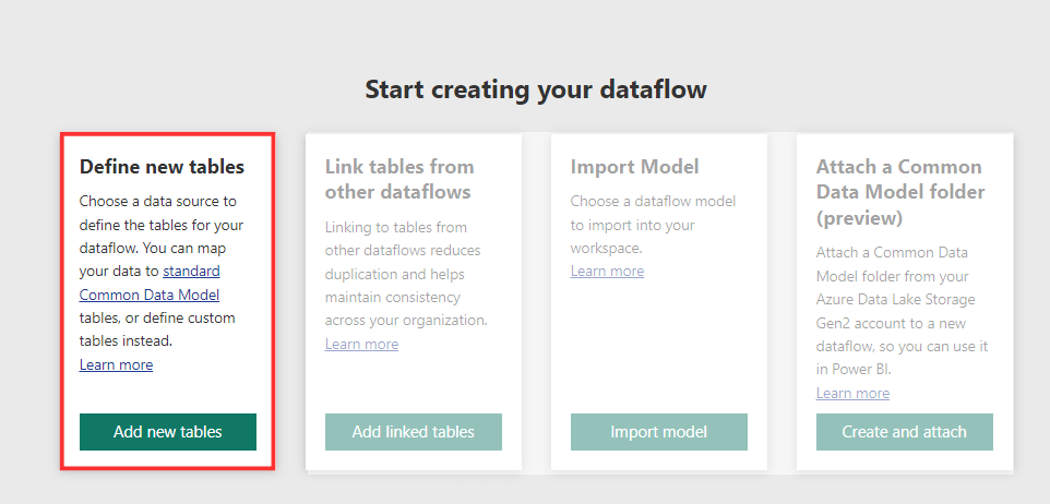
Define new tables
In Power BI, dataflows allow you to define new tables and connect to various data sources. Then, you can transform and load data into tables used in Power BI reports and dashboards.
- To create a fresh dataflow, click on Add new tables.

- You can see the available data sources such as Excel workbook, SQL Server database, Sharepoint folder, Azure SQL Database, Web API, and so on.
- To get more data sources, click on View More
- Select the preferred data source among supported data sources (Excel workbook in our case)

- Configure the connection settings
- Enter the file path from Onedrive or upload a file from your PC

- Adjust the connection credentials if required by clicking on Edit connection
- Load your dataset, then, click on Next

- It will then take a few seconds to load the dataset. Now, mark the required table to create the new dataflow in Power BI.

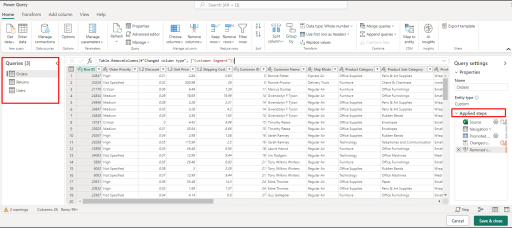
- Next, click on Transform data using the Power Query editor. You can remove specific columns to create more personalized dataflows. Also, you can apply Power Query to filter, clean, aggregate, etc the data from the data source. All operations will be added on the right sidebar labeled as Applied steps. Finally, click on Save & close.

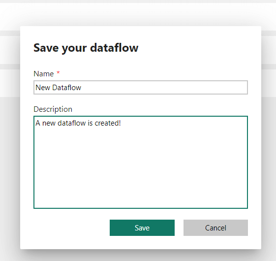
- Enter the dataflow name and the description (optional) and click on Save. The newly made dataflow is now ready to use!

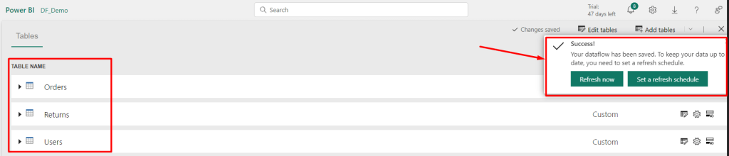
- After saving the new dataflow, you can see a message for scheduling refresh. Click on Refresh now.

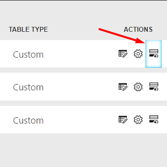
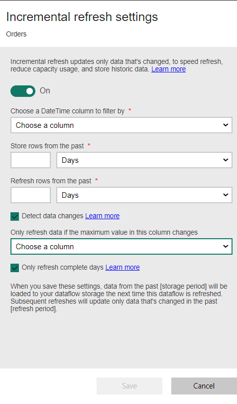
- Or simply click on the Incremental refresh setting under the ACTIONS tab.

- Here you can set the time duration such as days, quarter, month, or year. Adjust other settings and then click on Save.

Link and tables from other dataflows
Linking tables from other dataflows in Power BI can be very useful for reusability, maintaining consistency, and reducing redundancy.
To link tables from other dataflows in Power BI, click on Add linked tables.
Set up the connection or keep the settings as they are for the Azure active directory organizational account.
Now you can find access to the previously created or existing dataflows on the left sidebar.
- Select a table from an existing dataflow, e.g. Customer
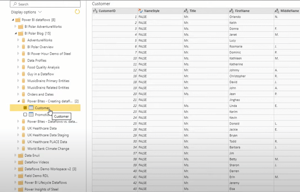
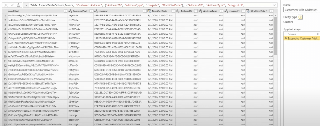
- Next, expand to another workplace. Select other tables to link with the dataflows e.g. Address, Customer Address, Products

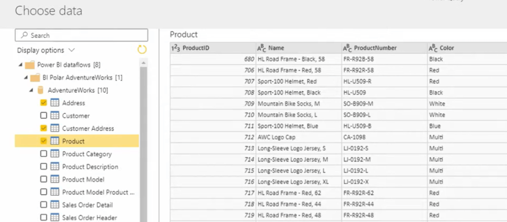
- Next, click on Transform data. Now you can see all of the entities you’ve defined earlier.
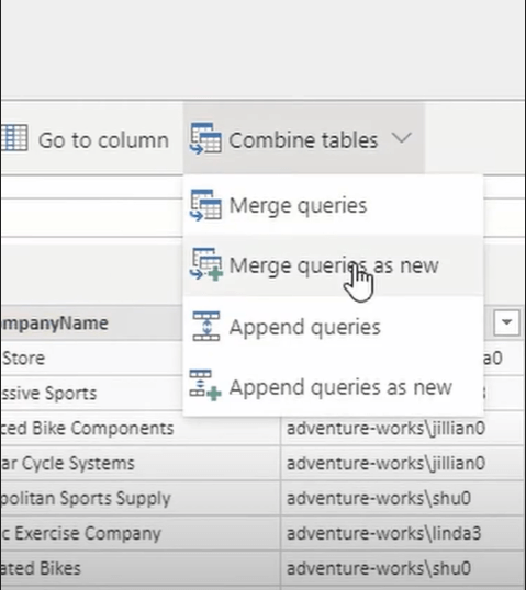
- You can also combine the tables. To do so, click on Combine Tables on the top pane.
- Select Merge Queries as new.

- A window will pop up. Select 2 tables, e.g. Customer and Customer Address.
- Select the common column such as Customer ID.

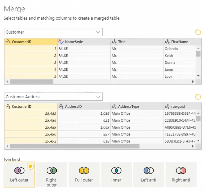
- Click on OK. Add a meaningful name and refresh it. Below is the resulting table.

Import dataflows as JSON
To import dataflow in Power BI, select the import model
- Select the .json file of your preferred dataflow

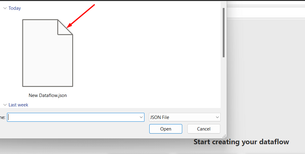
- It will take a few seconds and you can see a message for successful import. You can now find it inside your dataflow workspace, edit credentials and perform schedule refresh.
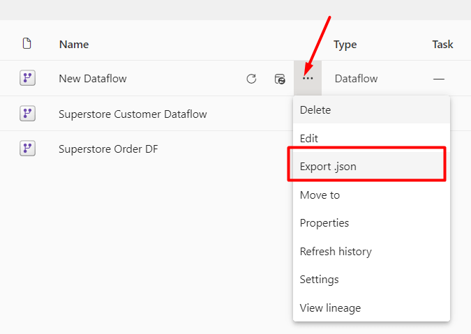
Export dataflows as JSON
Exporting and importing dataflows as JSON enables easy backup, sharing, and migration of dataflows across different environments or workspaces. Here’s how you can export and import Power BI dataflows.
- To export, select your preferred dataflow
- Click on the three-dot (…) option
- Click on Export as .json
- It will automatically start downloading the dataflow
- You will see an alert as soon as your .json file is ready

Create a dataflow by using a CDM folder
Creating a dataflow using a CDM folder standardizes data schemas and facilitates smooth data integration. However, it requires the full path to the CDM file stored in ADLS Gen 2. Let’s see how to do it:
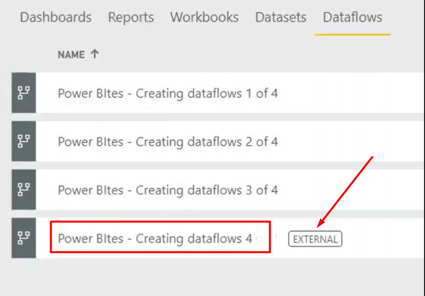
- Create a new dataflow by selecting the 4th option: Create and attach
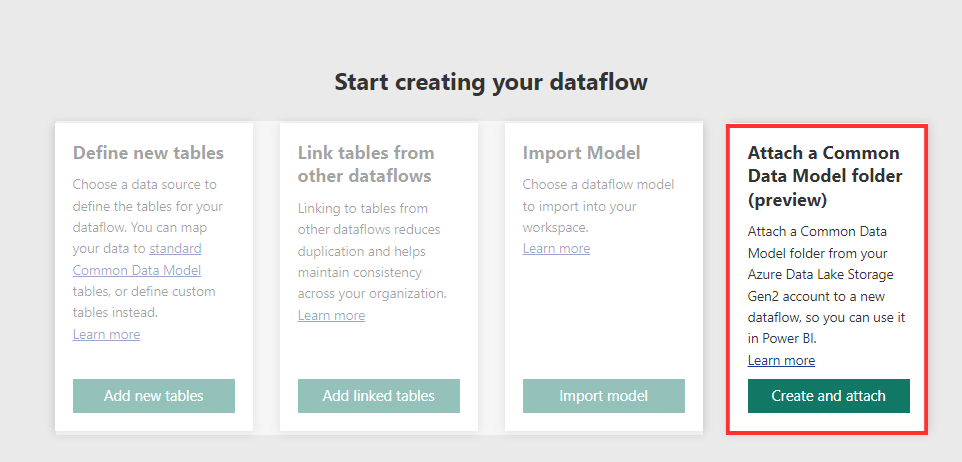
- Write the name. Enter the CDM or common data model folder path as per the directions. Click on Create and attach

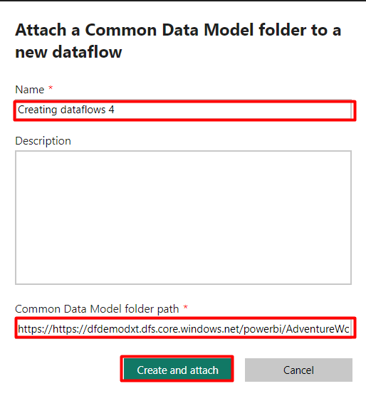
- You’re good to go, you’ll find the new dataflows with an EXTERNAL tag in the workspace

When to use dataflows in Power BI
Let’s explore the scenarios of when and where you can use Power BI dataflows to transform data management strategies for business intelligence.
To set the scheduled refresh
Dataflows in Power BI integrate data from sources that frequently update. For instance, transactional databases, web APIs, or daily operational systems, typically require scheduled refreshes.
Dataflow comes with a Schedule refresh feature to ensure that the data in your Power BI reports remains current and reflects the latest information from these dynamic data sources.
- Go to the workspace containing your data flow
- Select the dataflow Scheduled refresh icon

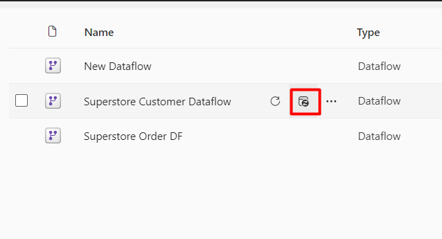
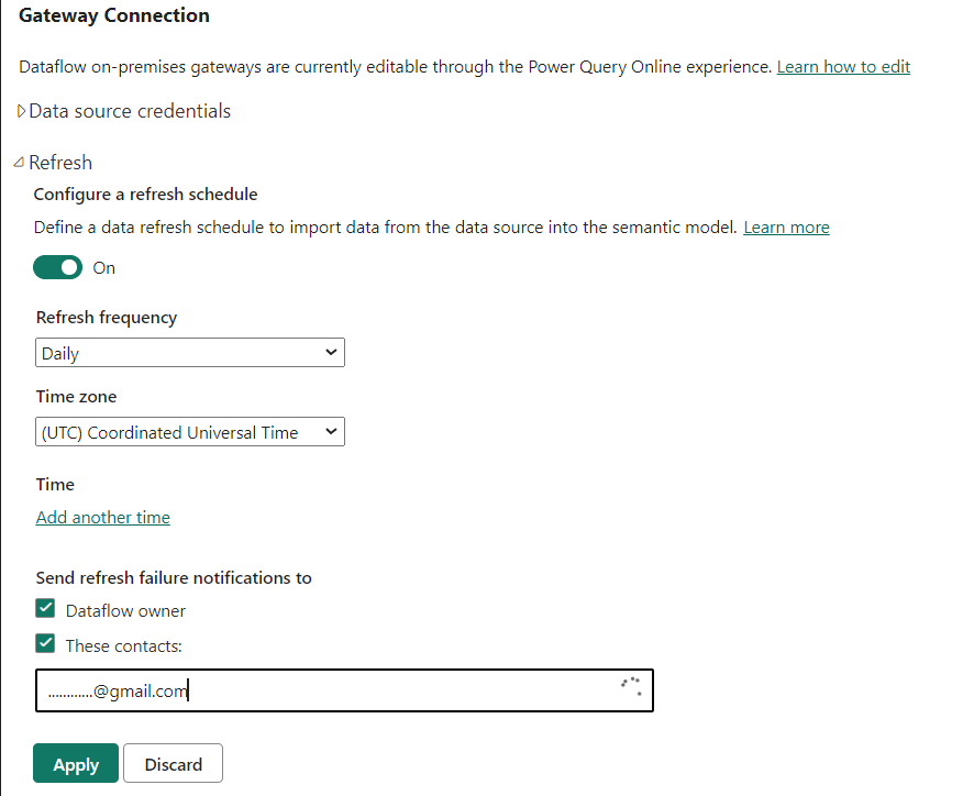
- It will redact to the Gateway Connection tab. Expand Refresh option.
- Turn on the Configure a schedule refresh option
- Select the frequency to set how often you want the data to refresh (e.g., daily, weekly)
- Specify the time zone
- Enter your email if you want to send refresh failure notifications
- Click on Apply to save your settings

To perform data integration and ETL
Dataflows simplify data integration and ETL tasks, crucial for organizations such as healthcare providers. They consolidate patient records, financial data, and operational insights from various systems into Power BI.
This also enables cohesive analysis of patient demographics, treatment outcomes, financial performance, and operational efficiencies. Overall, using dataflows supports easier decision-making and strategic planning.
To reuse data tables
Dataflows simplify the process of creating consistent and reusable data tables across different reports and analyses. For example, a retail chain can create a dataflow to aggregate daily sales data from each store location into a standardized format.
This can then be reused in various reports that analyze sales trends, inventory management, and store performance metrics. By maintaining a single source of truth for sales data, you can ensure consistency and accuracy in reporting across all departments and stakeholders.
To analyze sales performance
Dataflows streamline sales data analysis by centralizing and standardizing data from various channels and regions. For example, a global consumer goods manufacturer can consolidate sales data from distributors, retailers, and e-commerce platforms in Power BI.
This integration provides insights into regional sales performance, product preferences, pricing strategies, and market trends. It also helps sales teams identify growth opportunities, optimize inventory, and refine targeted marketing efforts.
To measure marketing campaign effectiveness
To assess marketing campaign impact across digital platforms, you need to combine data from social media, Google Analytics, email campaigns, and surveys in Power BI dataflows. This allows you to analyze metrics like reach, engagement, conversion rates, and ROI to optimize strategies and budget allocation for maximum effectiveness.
Integrating dataflows with Power BI reports
You can integrate dataflows with Power BI reports for consistency, accurate data centralization and transformation. This will help to create an organized and structured report for real-life cases. In addition, integrating with Power BI reports also improves collaboration by providing a single source of truth for all team members.
Follow a few simple steps to integrate dataflows in Power BI reports:
- Go to your Power BI desktop app. Then, click on File ? Get data. Next, select Dataflow as the source.

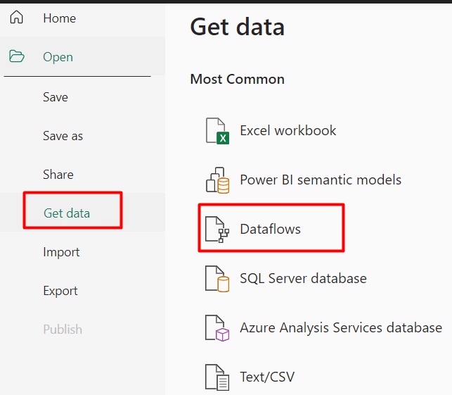
It will show the created dataflows in the Power BI service. Select the dataflow, choose the table, and click on Load. The selected data will appear on the Power BI desktop dashboard.

Go to the table view icon, and you can see the table. You can perform operations like creating a date table, cleaning, filtering, and adding columns by DAX function and Power Queries. Once your report is complete, save your Power BI Desktop file (.pbix) locally.

Advanced data analysis techniques in Power BI
Power BI’s advanced features enable you to delve deeper into your data, uncover valuable insights, and make more informed decisions. This section will explore two of these powerful features—Data Analysis Expressions (DAX) and the forecasting capability—and explain how you can use them for in-depth data analytics in Power BI.
DAX language, formulas, and functions
Data Analysis Expressions (DAX) is a formula language used in Power BI to create custom calculations and aggregations. DAX is similar to Excel formulas but is much more powerful and designed for data modeling and advanced analytics within Power BI.
Two key uses of DAX are for creating calculated columns and measures:
- Calculated columns: Use DAX formulas to create custom columns in your existing tables to enhance your data model.
- Custom measures: Leverage DAX to define measures that provide dynamic aggregations and calculations, which can be used in specific visualizations and across multiple reports.
You can use DAX functions within formulas. They allow you to perform various analytical tasks like aggregation, filtering, and data manipulation. With many pre-built DAX functions in Power BI, your advanced analytics tasks become much easier.
See also the practical examples of useful DAX functions in our top 10 Power BI functions for marketers.
Publication and sharing reports/dashboard in Power BI
Publishing to the Power BI Service
Once you are done with creating your report, share it with others by publishing it to Power BI Service:
- Save your report: Ensure your report is saved in Power BI Desktop.
- Publish: Click the Publish button in the Home tab. Then, select your workspace for publishing.
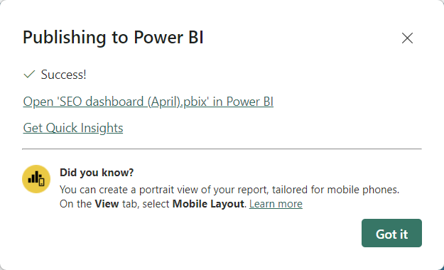
Once published, your report will be available online and accessible via web browsers. Collaborations and real-time updates are now also possible.
Sharing reports or dashboards
Collaboration is crucial for data-driven decisions. Power BI makes sharing easy:
- Share directly: Use the Share button in Power BI Service to invite colleagues to view your reports or dashboards. You can control permissions to ensure the right level of access.
- Embed: Embed your report or dashboard in an internal website or app using the embed code provided by Power BI.
- Export: Export reports to Excel, PDF, or PowerPoint for offline sharing or presentations.
By leveraging these sharing options, you can ensure that your insights reach the right people in a timely manner.
Keeping data fresh: Automation and scheduling in Power BI
What are the options to schedule refresh in Power BI dataset?
The case introduced above consists of two stages where I need to automate data flow:
- From a cloud source to the report in Power BI desktop
- From the Power BI desktop to the published report in the Power BI service
Scheduled refresh in Power BI desktop
You can’t schedule refresh in Power BI desktop. Even if you import data or connect directly to the data source using DirectQuery, you have to refresh the data manually.
Moreover, there are not enough built-in connectors to marketing and analytics apps such as Google Search Console, Facebook Ads, and others. So, it’s better to use a third-party solution that can solve both tasks. With Coupler.io, you can connect 60+ cloud sources and schedule data refresh in Power BI without any coding or complex setup. I’ll show you how to use it in the next section.
Scheduled refresh in Power BI service
The only natively scheduled refresh in Power BI is available between your desktop app and the Power BI service (app.powerbi.com). To implement this, you need to establish a gateway connection. You can check out the user-friendly Microsoft documentation to learn how to do this… just kidding, of course ? Even software engineers struggle with it sometimes. So, I’d better share precise and practical instructions in the respective section. Let’s go!
How to schedule refresh in Power BI desktop with Coupler.io
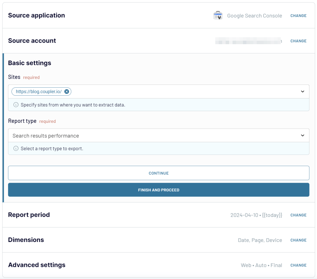
As I mentioned, Coupler.io is a reporting automation solution that allows you to connect different apps to Power BI. For our example, let’s get data from Google Search Console to create a dynamic SEO report.
For this, I need to add a new importer and select the source and destination apps: GSC and Power BI, respectively.
You will most likely have another source for your project so feel free to select it in the form below and click Proceed. You’ll be offered to create a Coupler.io account for free and then configure the connections.
1. Connect source
Follow the instructions to connect your data source account. You’ll need to either enter the data source credentials or log in to your account. Then, specify the data to load. This could be raw data or reports. The latter can be predefined or customized by selecting metrics, dimensions, report period, etc.
Here is what it looks like for my report based on the Google Search Console data.

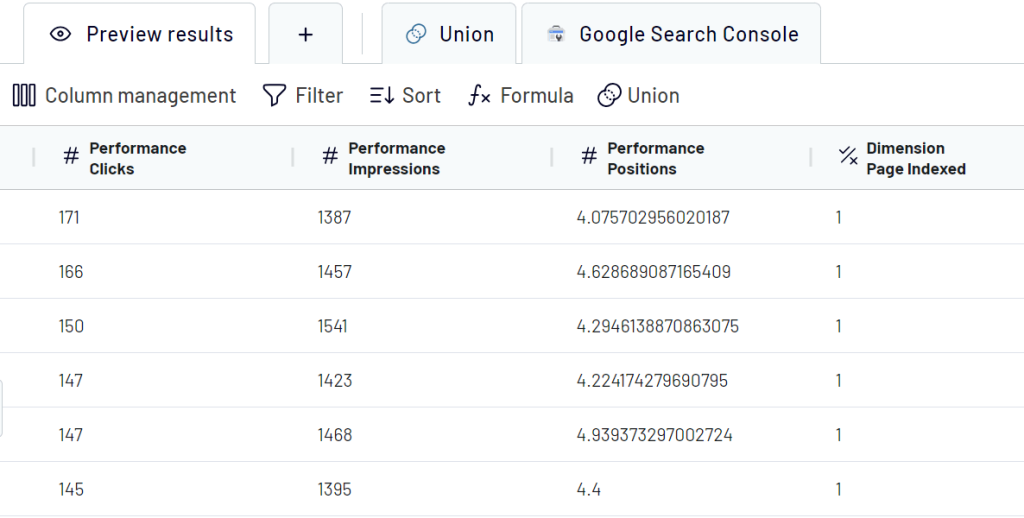
2. Organize data
The next step is to transform or organize your data. Once you click the Transform data button, Coupler.io loads up to 500 rows for preview. You can:
- Filter and sort data
- Hide unnecessary columns, reorder them, change their names, and make other edits
- Add custom columns using formulas
- Join data into one view (if you previously connected multiple sources)

3. Load data to Power BI
Next, you’ll need to load data to Power BI. Follow the in-app instructions, which are as follows:
- Generate and copy an Integration URL.
- Go to Power BI Desktop, click Get data, and select Web.

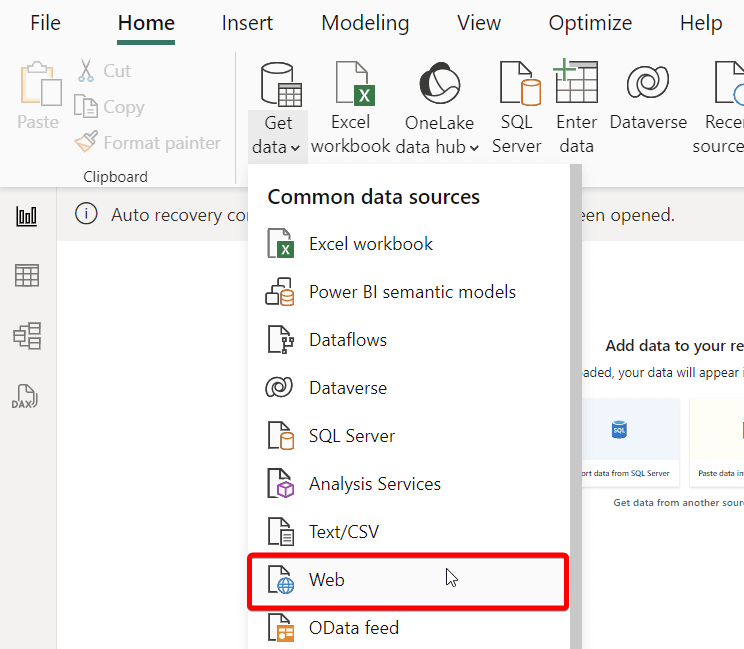
- Insert the Integration URL in the respective field and click OK.

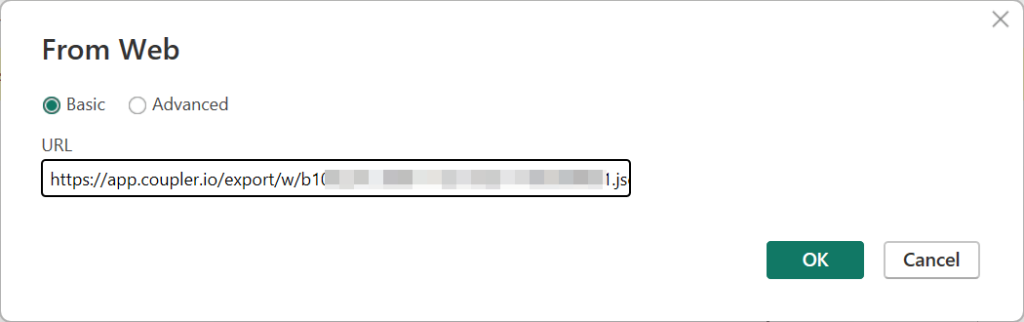
Power BI will establish the connection with Coupler.io, and you’ll see your source data in the Power Query Editor. You can now load it to Power BI.
4. Schedule refresh
Get back to Coupler.io since we have some jobs to complete. Click Set up a schedule to go to the final step. Toggle on the Automatic data refresh and configure the schedule to your liking.

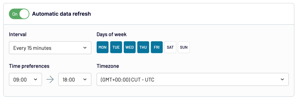
Click Run importer to finalize the setup. From now on, Coupler.io will refresh the data from your source in Power BI according to the specified schedule.
You can then create your dynamic reports or use the predesigned report templates as I did.

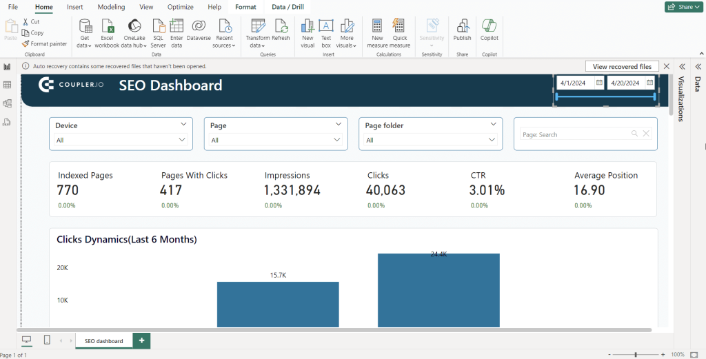
I used this SEO report template by Coupler.io. It’s a white-label solution with a prebuilt connector to Google Search Console which allows you to start using the report in a matter of minutes. Follow the instructions on the Readme page to connect your data and load it to the predesigned template for the Power BI desktop. You don’t need to separately schedule refresh in Power BI since this functionality is enabled by default here.
In addition to 60+ ready-to-use Power BI integrations, Coupler.io allows you to create custom ones without coding. Learn how to connect API to Power BI.
How to schedule refresh in Power BI service with Coupler.io
Earlier, I mentioned that you can schedule refresh in app.powerbi.com using a gateway connection. This is true if your semantic model (source of data ready for reporting and visualization) is on-premises.
In our case, Coupler.io extracts data from the cloud source – Google Search Console. Therefore, you can schedule refresh of the online published reports without gateways. Let me show you how to do this.
1. Publish your desktop report to Power BI service
- Click the Publish button in the toolbar.

- Save changes and then enter the name for the report file to save on your device.

- Then select the workspace where to publish your report in the Power BI service.

In a few moments, your report will be available online.

2. Schedule data refresh in Power BI
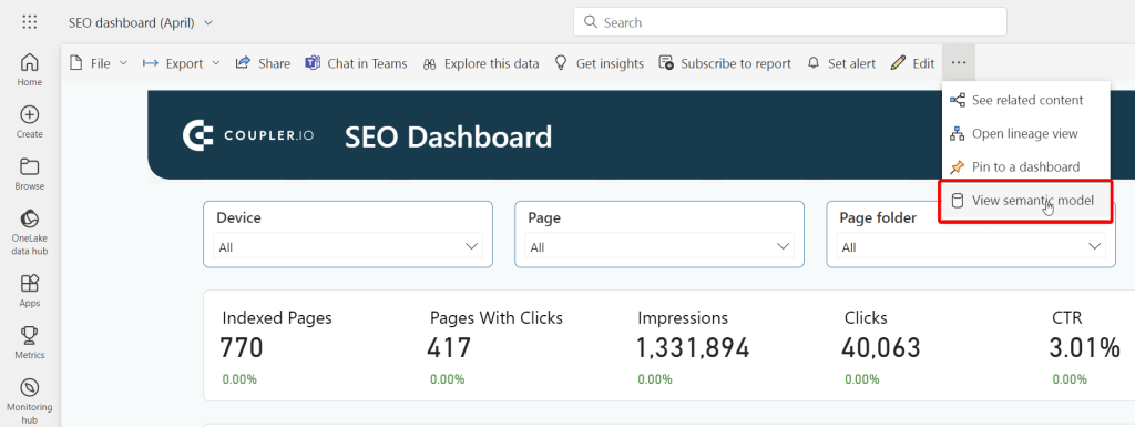
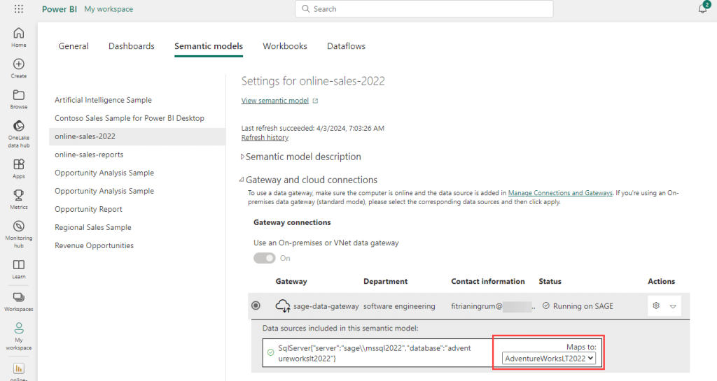
Open your recently published report. Go to More options => View semantic model.

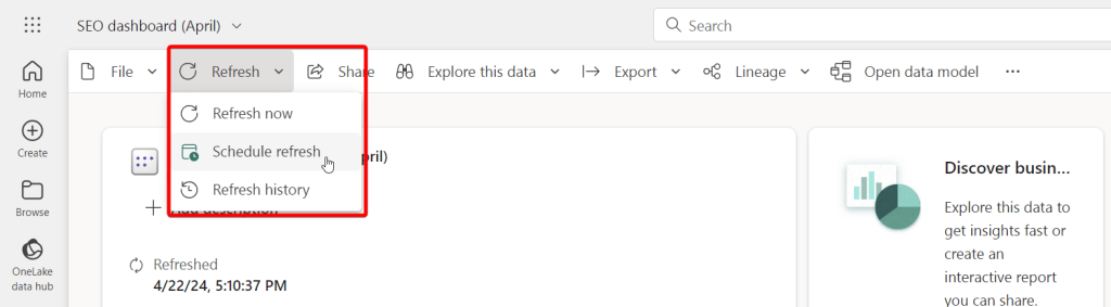
- Click the Refresh drop-down menu and select Schedule refresh.

- It’s a Microsoft product, so do not be surprised that you’ll need to make another redundant step. Expand the Refresh menu.

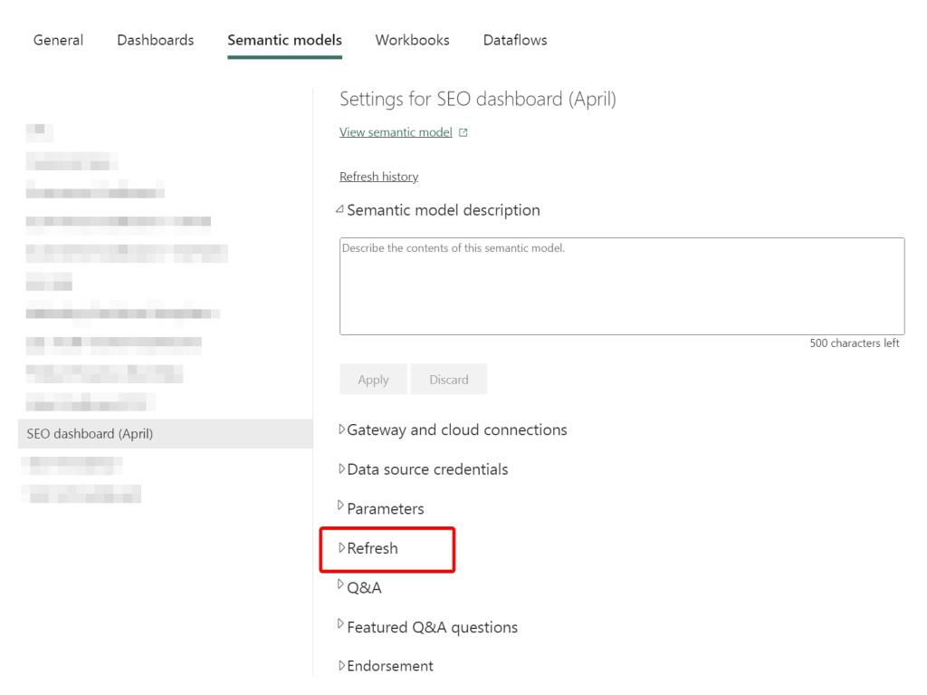
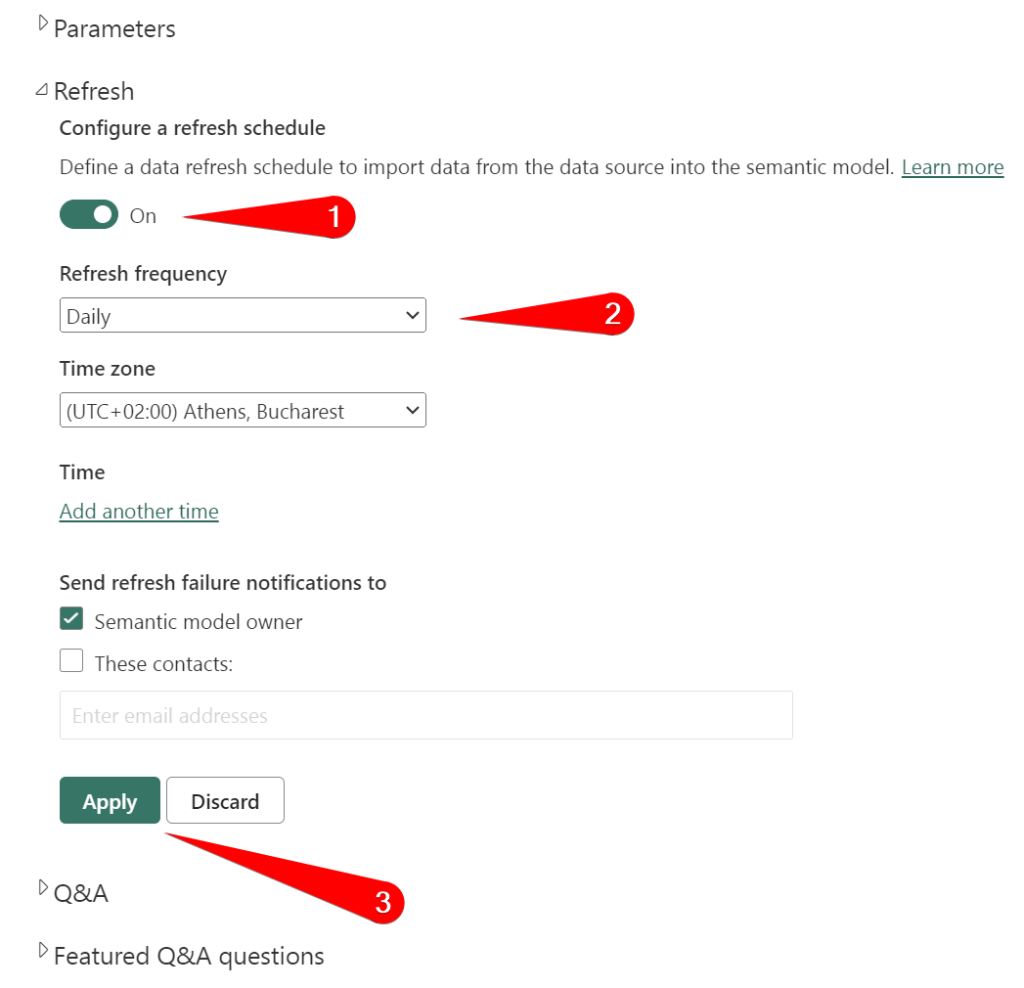
- Here, you’ll need to enable refresh and configure the schedule:
- Choose the frequency: daily or weekly.
- Choose the time zone
- Change the refresh time if needed.
Do not forget to click Apply to confirm your selection.

Congratulations! Now, your report will refresh automatically on a schedule!
Note: Make sure you align your schedule refresh frequency in Coupler.io and Power BI service to always have the recent data in your reports.
How to schedule data refresh in Power BI service using gateway
And what if the data source for your report is not in the cloud but on-premises? In this case, you need Power BI gateway. In our article, we explained what it is, how to install and use it. So, if you haven’t worked with the standard or personal gateway in Power BI before, then you’d better check out this information first.
So, if you publish a report with the on-premises data source, you need to:
- Connect to the Power BI gateway data source.
- Map the gateway’s data source to your report’s semantic model.
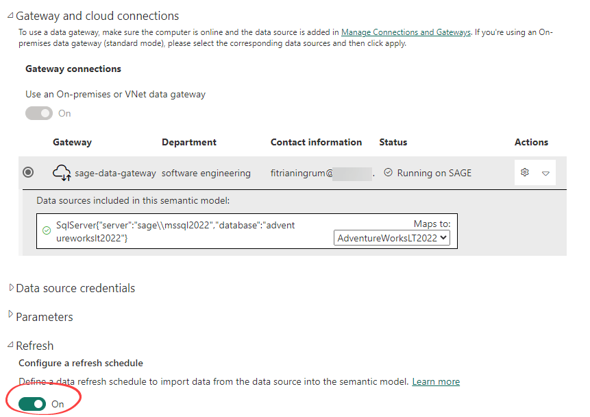
1. Connect to Power BI gateway data source
- In the Power BI service, click Settings > Manage connections and gateways.
- In the Connections tab, click the New button.

- Configure the connection:
- Select the gateway
- Enter the connection name
- Select the connection type
- and specify other details.

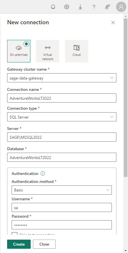
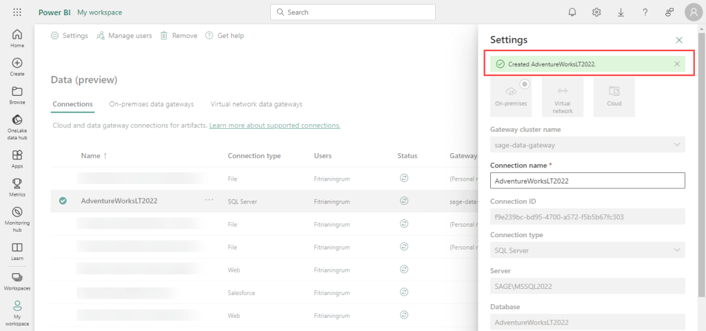
If everything is set up correctly, you will see a message saying the connection was created.

2. Map the gateway’s data source to your report’s semantic model (dataset)
- Click the Settings icon and select Power BI settings.

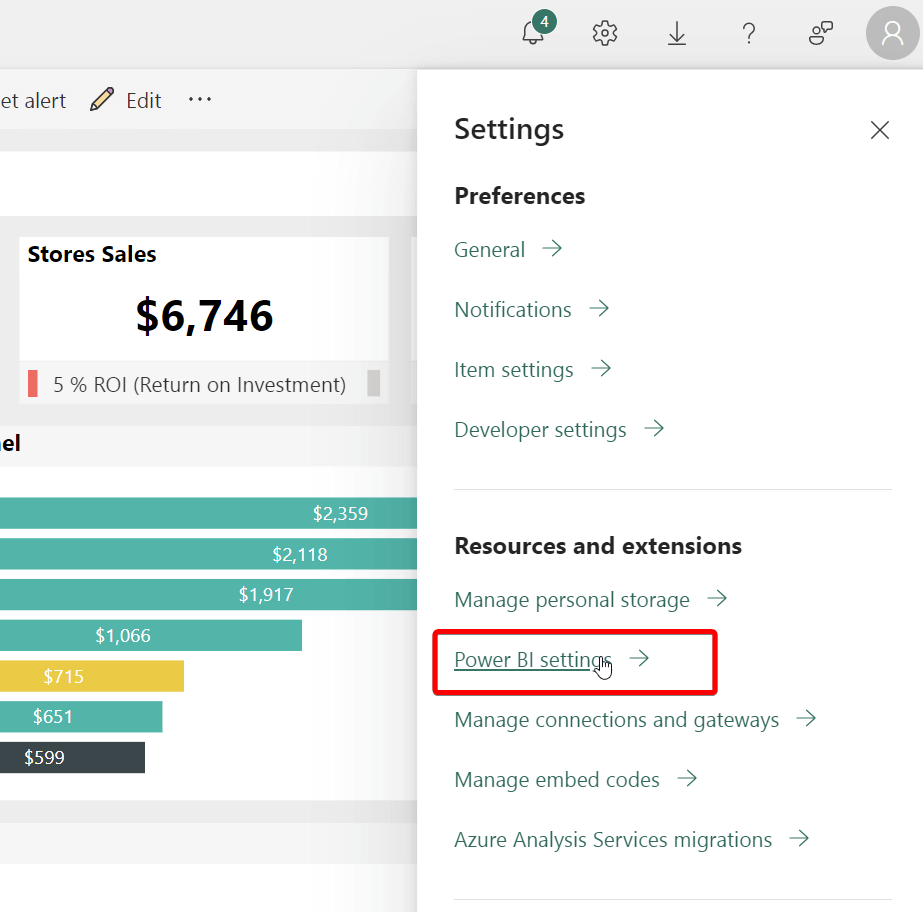
- Then, click the Semantic models tab and select your report. Under the Gateway and cloud connections settings, map the data source to use the on-premises data gateway connection and click Apply.

- After that, you can schedule refresh in Power BI and choose the refresh options in the same way as we did with Coupler.io.

Power BI pricing and licensing
Power BI offers flexible pricing options to meet various organizational needs:
Free Account (Microsoft Fabric preview):
- Cost: Free
- Features: Create rich, interactive reports with visual analytics.
- No credit card is required.
- Upgrade to Power BI Pro or Power BI Premium for report sharing.
What is Power BI Pro?
Power BI Pro is a paid plan for Power BI that gives you extra features compared to the free version. It is extremely useful if you work as a data analyst because you can share reports, schedule data refreshes for up-to-date information, and add more advanced things to your data analysis, like complex calculations and custom reports.
- Cost: $10 per user per month.
- Features: Modern self-service analytics, report publishing, and Power BI dashboard viewing across your organization.
- Power BI Pro license is necessary for report sharing.
- Included in Microsoft 365 E5.
- Available for purchase with a credit card.
What are the differences between the pro and free version?
- Pro version promotes effective teamwork with shared reports and dashboards, whereas the free version offers limited sharing options.
- You will have more frequent data refreshes.
- Pro version offers advanced security features, including data-level security and integration with Azure Active Directory. Especially useful for organizations with strict security requirements.
- You can do advanced data modeling and transformation, as well as many options for customizing reports and dashboards.
- Power BI Pro integrates with various Microsoft services, such as Teams, SharePoint, and OneDrive.
Power BI Premium (per user):
- Cost: $20 per user per month
- Features: Access to larger model sizes, more frequent data refreshes, XMLA read/write, deployment pipelines, and enterprise-scale capabilities.
- Includes all Power BI Pro features.
- Available for purchase with a credit card.
Power BI Premium per Capacity (includes Microsoft Fabric):
- Cost: Starting from $4,995 per capacity per month
- Features: Enables content consumers to review and interact with reports without additional per-user licenses.
- Access to Microsoft Fabric workloads.
- Includes all Power BI Premium per user features.
- Requires Power BI Pro license for report publishing to Microsoft Fabric.
Power BI Premium per Capacity (Includes Microsoft Fabric – Fabric SKUs F64 and above):
- Cost: Starting from $262.80 per capacity per month.
- Features: Access to Microsoft Fabric with unified capacity and storage.
- Includes all Power BI Premium per Capacity features (content sharing to users without a per-user license available only at Fabric SKUs F64 and above).
- Requires Power BI Pro license for report publishing to Microsoft Fabric.
- Offers pay-as-you-go pricing for scalability and flexibility.
If you’re a small group or just starting out, you can use the Free Account to try basic Power BI features. If you’re a small to medium-sized business and want to work together and share data insights, Power BI Pro is a good choice. For bigger companies with more complex data needs, there’s Power BI Premium. And for very big enterprises with lots of data, there’s Power BI Premium per Capacity, which offers even more advanced sharing abilities. Your choice depends on how big your company is, how complex your data is, and how much collaboration you need.
Troubleshooting and FAQs
Can I learn Power BI by myself?
Yes, you can learn Power BI on your own. There are many online resources, tutorials, and courses available to help you get started and advance your skills. If you’re a newbie, check this Power BI tutorial for beginners for building your first report within Power BI.
How long does it take to learn Power BI?
It depends on your existing knowledge and the expertise you want to achieve. For beginners, you can grasp the basics within a few days or weeks of consistent learning. To become proficient and handle more complex tasks, it may take several months of regular practice and learning.
Is Power BI harder than Excel?
Power BI and Excel have some things in common, but they’re used for different things. Power BI is great for handling big datasets and making advanced visualizations, although it can initially seem tricky. Excel is versatile and can do many tasks, including data analysis. The one you pick depends on what you need and how complicated your data is.
Power BI – clear Drill Through Filters
Drill through in Power BI helps to navigate the end user to a different page in the same report or to another report, i.e. cross-report drill through. It ensures that you do not clutter a report page with too many details. Rather, you can click to get these details when required.
If you want to clear drillthrough filters, all you have to do is click on the x symbol next to each field name to remove the filter. You’d repeat to completely clear multiple fields. You can return to the source page to check if the drill through action is no longer active.

What to do if Power BI Drill Through is not working?
Power BI drill through may not work if you added the wrong drillthrough filters. You have to know the data point and the target page it should lead to. If you notice that Power BI drill through isn’t working after adding the right filters, you should clear them and start over. Else, you should save your report, close Power BI, and open it again.
Next steps in your Power BI journey
Power BI is a powerful suit for data analysis and visualization, good for users of all levels. It simplifies data modeling and report creation, making it accessible and user-friendly. Furthermore, as it can connect to various data sources, work with large volumes of information, and provide regular updates, companies of any size and from any industry will benefit from this tool.
Check our articles on Power BI alternatives to learn how Power BI compares with other popular data viz tools. Or you can have a more detailed comparison overview in Power BI vs Tableau and Looker Studio vs. Power BI.
For more tips on using Power BI, check our article on building a Power BI Gantt chart.