What is a waterfall chart in Power BI?
This is a type of data visualization that shows how negative and positive changes affect a starting value, leading to the final value. These changes are represented by color-coded bars.
Using the above chart, let’s take a look at the breakdown of how a Power BI waterfall chart works:
- The waterfall chart begins with the starting value of what you’re tracking in the first bar.
- After the start value, you see a series of floating bars, as seen above. Each one represents a change. If the value increases (like making sales), the bar goes up and is often colored green. If the value decreases (like paying expenses), then the bar goes down and is often colored red.
- The last bar shows where you end up after all these changes, the final or total value.
This way, the waterfall chart shows how each specific change affects the overall total, helping you see the big picture through a series of individual steps.
How to create a waterfall chart in Power BI
1. Set up your Power BI waterfall chart data structure
This type of chart uses two main columns to visualize your data on the X and Y axes:
- Category Column: The category column contains the names or labels of each step or segment in your waterfall chart. These steps can either be time periods, operations, or any factors contributing to the increase or decrease of the initial value.
- Value Column: The value column contains the numerical change associated with each category. It can be positive or negative numbers, indicating an increase or decrease in the value being tracked.
Within these two columns, you need to structure and organize your data as follows:
- Initial Value: This represents the starting point from which changes are measured. It’s the baseline figure that the subsequent additions or subtractions (intermediate changes) are applied to.
- Intermediate Values: These values represent the additions or subtractions to the initial value. Each intermediate value corresponds to a category that explains the nature of the change (e.g., revenue, expenses, sales, etc). When listing the values for decreases, you should use the “-“ sign (for example, “-300”) so that the numbers would not be interpreted as increases, leading to incorrect final totals.
- Final Value (optional): This is the result after all the intermediate values have been applied to the initial value. It represents the end point of the sequence of changes. This may or may not be manually added to your dataset, as Power BI automatically performs the calculation.
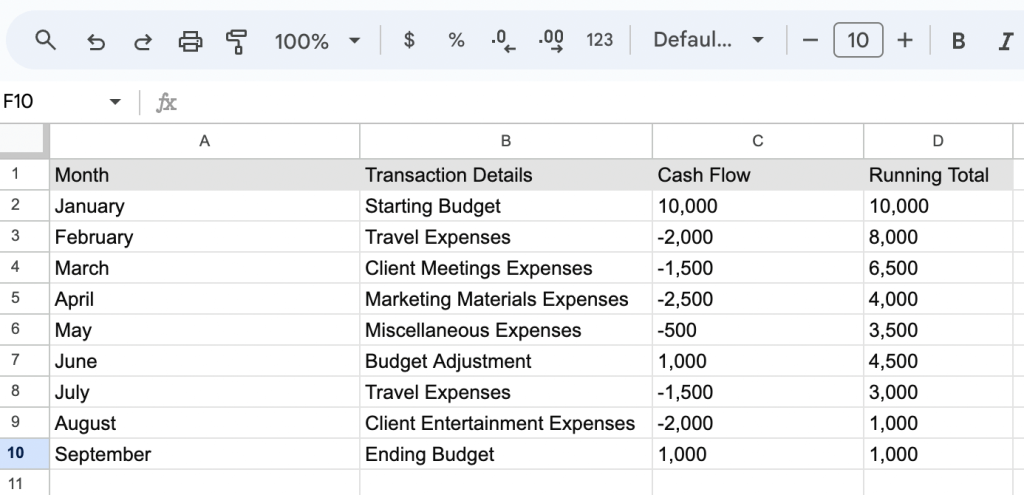
Let’s take a look at the table below:
| Category | Value |
| Starting Value | 1000 |
| Sales | 500 |
| Expenses | -300 |
| Adjustments | 200 |
| Net Income | 1400 |
In this table, the Starting Value and Net Income serve as the initial and final values of the waterfall chart. Sales, Expenses, and Adjustments represent the intermediate values with their effect (positive or negative) shown in the Value column.
The labels in the Category column, along with the numerical data in the Value column, work together to tell the story of how a total value is reached through a series of incremental changes.
2. Get your data into Power BI
The next step is to connect your data source to Power BI. While you can directly use Power BI’s built-in connector, if you’re dealing with many data sources, a simpler solution is to use Coupler.io. This tool lets you handle all your data sources in a single place, connecting over 50 different apps to Power BI. Plus, it keeps your Power BI data fresh by automatically updating it on a regular schedule.
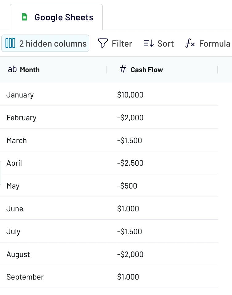
In our example, we’re pulling data from Google Sheets into Power BI using Coupler.io, but the steps are similar for other sources. Here’s the dataset we are going to import:
To start transferring data, select your data source from the list in the widget below and hit Proceed.
Follow the on-screen prompts to connect your data source (or multiple sources).
In the next step, you can preview and transform your data before it’s loaded to its final destination.
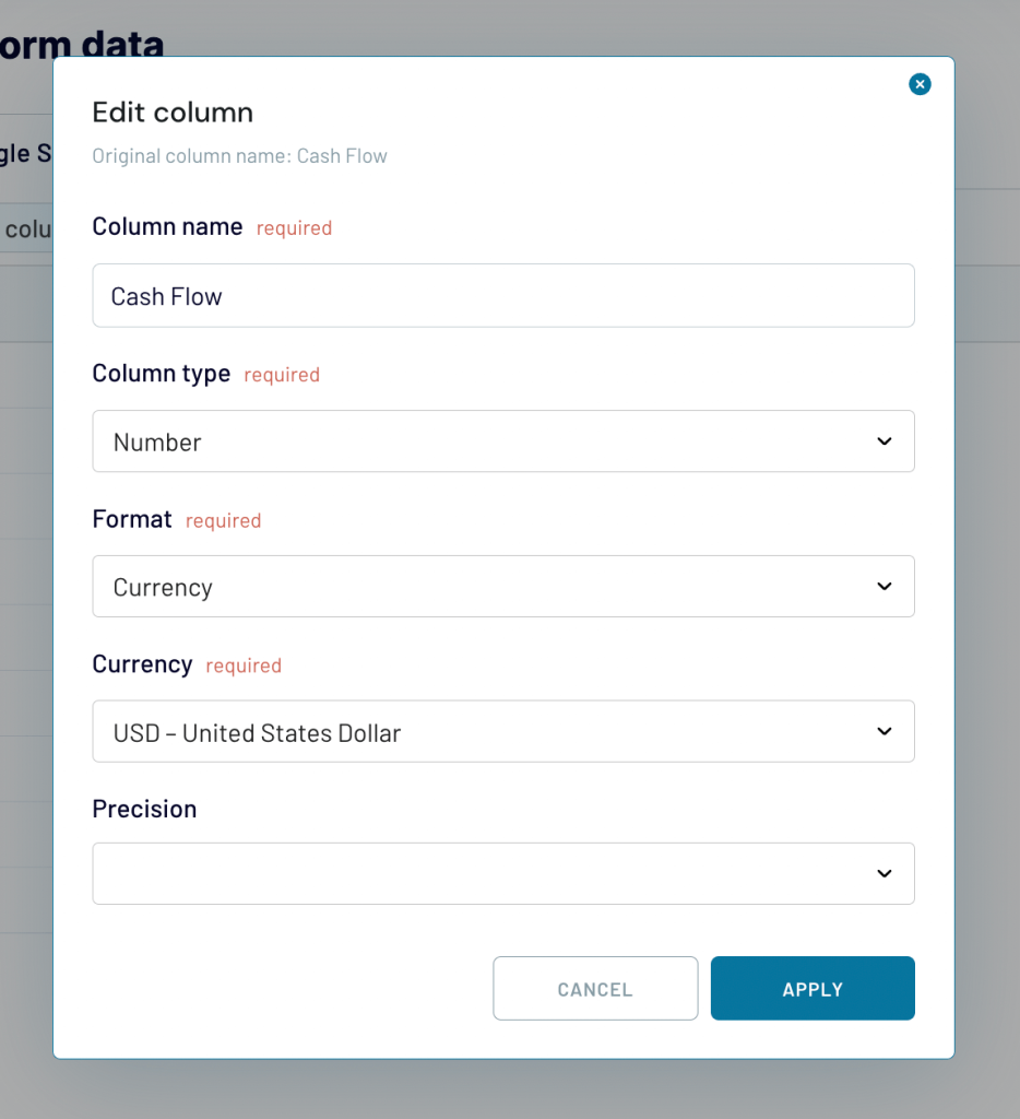
Here are some of the transformations you can apply to your data for the waterfall chart:
- Hide columns that are not relevant to the waterfall chart, focusing only on the essential data (e.g., categories, values).
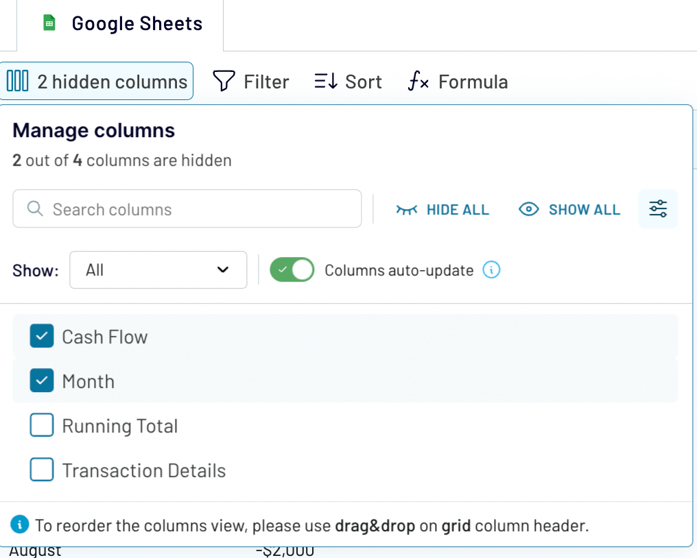
- Rename columns for clarity, ensuring that anyone viewing the chart understands what each category or value represents.
- Check the data type of your columns to ensure numerical columns are recognized for calculations and category columns are correctly identified.
By preparing your data in Coupler.io, you can ensure that the dataset sent to Power BI will be clean and analysis-ready.
Lastly, click the button to generate the integration link. Make sure to copy this link; you’ll need it in a bit.
You can switch on the option for automatic data updates and set your refresh schedule. Then, run the importer.
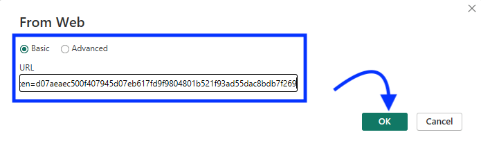
Open your Power BI Desktop, go to Get data > Other > Web, and paste in your integration link.
Once connected, your data will show up in the Power Query editor for you to preview.
3. Create your waterfall chart
With your data imported into Power BI, you can now proceed to create the waterfall chart itself. From our dataset, the Category column can either be Month or Transaction Details, and the Value column is Cash Flow. For this example, we want to see the monthly cash flow, so we are going with the Month category. Your choice will depend on the specific insights you want to get and the narrative you wish to tell with your data.
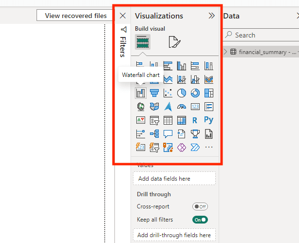
- Go to Visualizations and click on the waterfall chart icon to create a blank chart.
Learn more about another type of visualizations – Power BI maps.
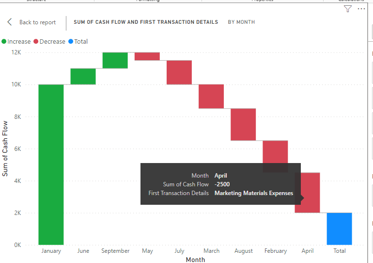
- From the Data pane, drag the Month field to the blank chart. This will serve as the X-axis of your waterfall chart, showing the progression of months.
- Also, drag the Cash Flow field to the Y-axis area. This represents the incremental changes in cash flow for each transaction.
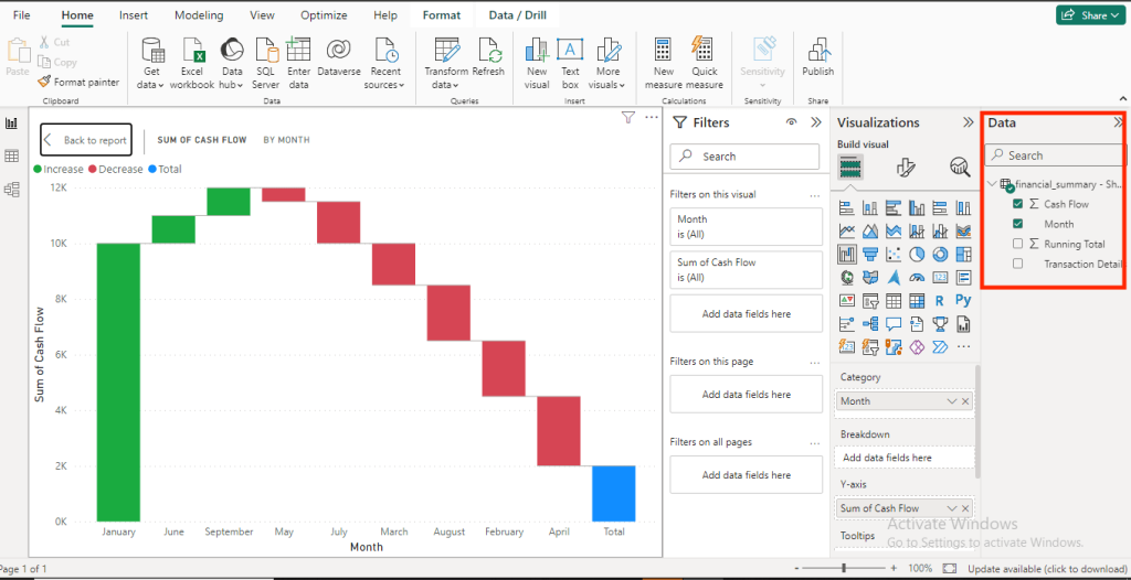
Each bar on the waterfall chart above represents the cash flow change for that month. To add more information when you hover over each bar, we will add tooltips to the chart. For this, we are going to use the Transaction Details field.
From the data pane, drag and drop the Transaction Details field to the Tooltips section under Visualization.
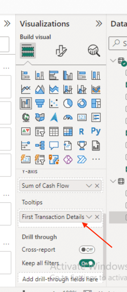
Now, when you hover over the bars in the waterfall chart, it will reveal a tooltip that provides detailed information about what each bar signifies.
Customizing your waterfall chart
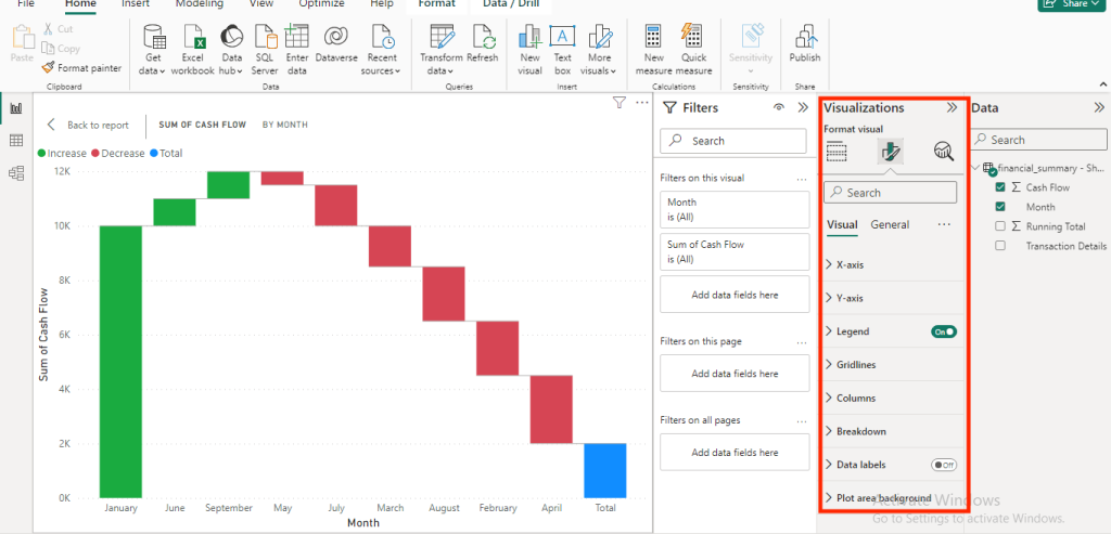
You can adjust your waterfall chart to make it easier for you to interpret your data. Go to Visualizations and click on Format Visual. Here, you can do the following:
- You can add start and end points to show where your data series begins and ends. This is useful for clearly defining the scope of your analysis.
- Customize the colors of increases, decreases, and totals to make the chart easier to read and align with your reporting theme.
- Turn on data labels to display the value of each segment directly on the chart for easy reference.
- Use the formatting pane to adjust the title, axis labels, legend, and more.
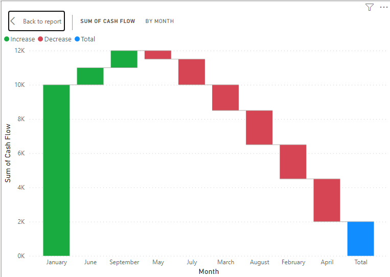
How to sort waterfall chart in Power BI
When you create a waterfall chart, you can change the sort order to view different data perspectives.
- In your waterfall chart, look for the three dots (…) in the top-right corner and click them to see more options.
- From the options that pop up, select the Sort axis. You can decide to sort based on the Category or the Value, in either ascending or descending order.
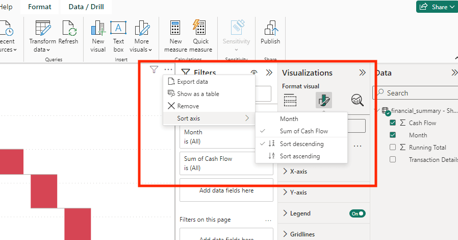
In our waterfall chart below, we sort the Sum of Cash Flow in ascending order.
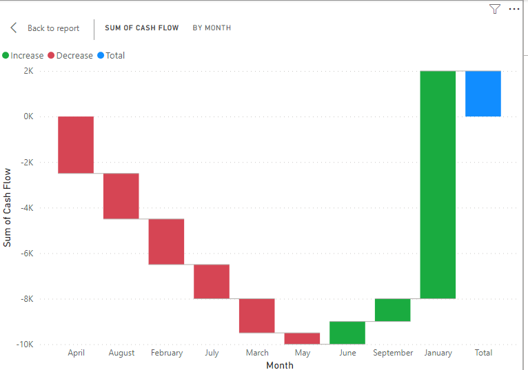
Waterfall chart with multiple measures in Power BI
In a standard setup, the waterfall chart in Power BI visualizes the increase or decrease of a single measure across categories. However, to show multiple measures in one waterfall chart, we essentially “trick” the chart into thinking each measure is a category. To do this, we will create another table with the measures as category and index values. Then, we will use the SWITCH function to pull the correct value for each category.
This might be a lot to take in; so let’s break it down.
Assuming you have four measures created from the example dataset above:
Total Cash Flow
Total Cash Flow = SUM('TableName'[Cash Flow])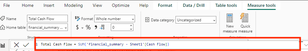
Average Monthly Change
Average Monthly Change = AVERAGE('TableName'[Cash Flow])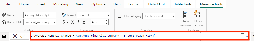
Maximum Monthly Increase
Maximum Monthly Increase = MAXX(FILTER('TableName', 'TableName'[Cash Flow] > 0), 'TableName'[Cash Flow])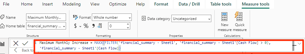
Maximum Monthly Decrease
Maximum Monthly Decrease = MINX(FILTER('TableName', 'TableName'[Cash Flow] < 0), 'TableName'[Cash Flow])
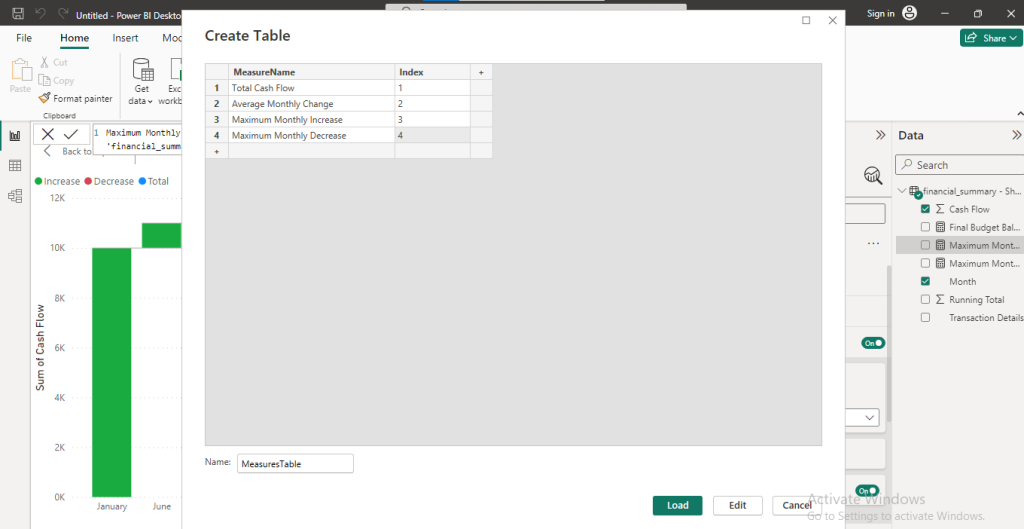
To get started, create a new table in Power BI with index values that represent each of the measures.
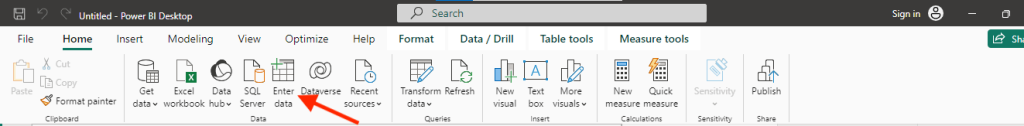
Go to Home > Enter Data.
Let’s call our example table MeasuresTable. Create a column to add the Measures and the index value
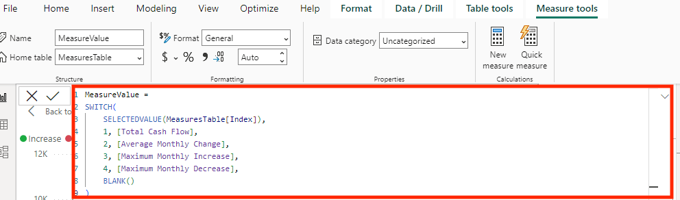
Next, create a unified measure using the SWITCH function to dynamically return the value of each of your measures based on the index column of your MeasuresTable.
MeasureValue =
SWITCH(
SELECTEDVALUE(MeasuresTable[Index]),
 1, [Total Cash Flow],
 2, [Average Monthly Change],
 3, [Maximum Monthly Increase],
 4, [Maximum Monthly Decrease],
 BLANK()
)
Finally, you are set to create the waterfall chart. From the MeasuresTable in the Data pane, drag the MeasureName field for the Category and the MeasureValue field for the Value.
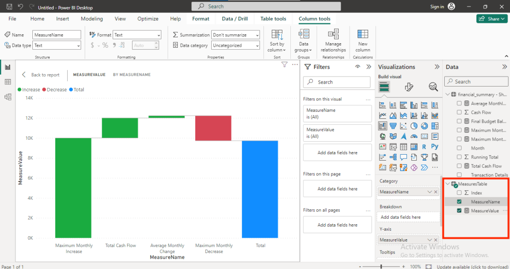
From the waterfall chart above, we can see a bar for each of the measures.
When and how to use waterfall chart in Power BI
You can use it when you need to:
- Break down how a total value changes from one period to another, showing specific reasons for increases or decreases.
- Interpret financial statements like profit and loss, showing how revenues and expenses lead to net income.
- Compare budgeted figures against actual outcomes, visually highlighting variances in revenues or expenses.
- Display cash inflows and outflows over a period, helping understand financial health and liquidity. In general, a waterfall chart in Power BI is a great tool to analyze financial processes.
- Show how a project’s timeline evolves, highlighting adjustments made in response to changes in the product.
- Track how fluctuations in sales, returns, and restocking affect inventory levels over time.
Tips to make your waterfall chart comprehensive
Here are some tips to help you create a more insightful and meaningful graph:
- Check that your categories are easy to understand and in a logical order.
- Ensure uniformity in your value indicators throughout your dataset to prevent any misunderstanding.
- Simplify your chart by focusing on the main elements that influence the outcome, rather than including too many categories.
- Utilize the customization features available in Power BI to enhance the clarity of your chart.
- Add tooltips to provide additional details when users hover over data points in the chart, making it easier to understand the underlying information.
- When creating a waterfall chart in Power BI, use descriptive labels for each category to make the chart easy to understand at a glance.
The key is to keep it simple for easy interpretation. To make your dashboard more useful, consider using other types of charts and visuals, for example, Power BI matrix or Power BI gauge. You will find more ideas in our article on data visualization with Power BI.
Also, you can use Coupler.io to prepare your data before sending it to Power BI. You can remove columns you don’t need, organize the data, or add new columns for your reports. You can also leverage the automation feature to keep your reports up-to-date at all times.
Connect your apps to Power BI and create dynamic reports with Coupler.io
Get started for free