What is productivity and how should you measure it?
Productivity refers to the rate at which an organization converts inputs into outputs and/or outcomes. A productive business or team achieves goals with minimal waste of time and resources.
Organizations measure labor productivity to understand how quickly and effectively they progress toward their business goals. Additionally, most teams have targets to reach, and productivity metrics help you track how efficiently your team is meeting those KPIs.
On an individual level, productivity is typically measured by the employee’s quantity of completed work over a specific period, such as:
- How many story points a developer achieved in a 2-week sprint.
- How many deals a sales representative closed in a month.
- How many support tickets a customer success manager handled in a day or week.
A traditional assessment boils down to this: high output = high productivity. The more tasks your team closes, the more successful you are. But it’s not really that simple.
The output vs outcome dilemma
The question is whether productivity – in humans, not machines – is best measured by output or outcome. Let’s explore the difference:
- Output defines success by the number of deliverables, such as the release of 3 new features last quarter. However, it doesn’t account for the quality and business impact of those results. What’s the point of releasing a bunch of new features if no one uses them and they don’t make you any money?
- Outcome focuses on the bottom line of a team or individual’s efforts. It measures productivity by the quality rather than the quantity of delivered goods. Take, for example, a whitepaper that took two months to compile but generated 3x the number of sign-ups compared to 6 blog articles published in the same time frame.
Ideally, you should examine both output and outcome when evaluating employee productivity. Why? Because to understand the true impact of your team, you need to pay attention to the value of what they are creating. Do their efforts lead to improved revenue scores or customer satisfaction? Are those hundreds of closed tasks saving your business time or money?
Still, you can’t overlook output, especially when assessing the impact of larger teams. Suppose you manage a team of 10 sales representatives with similar responsibilities and workloads. You notice a drop in a sales rep’s performance and, using outcome as a productivity gauge, chalk it up to market trends or your product’s new pricing strategy.
But what if the decline is due to a reduced workload? Perhaps they are contacting fewer leads or not following up on time. You can’t know for sure unless you track output as well.
How to monitor the output of your teams
Project management tools
The easiest way to track output is with a project management tool such as Jira, Asana, or Monday.com. Used consistently, it provides a single source of truth for task ownership and team progress. You can see who’s working on what and how long it takes them to complete assigned work.
Pay attention to:
- The number of tasks an individual has created and/or moved to an ‘In progress’ state.
- The number of tasks they have closed within a pre-defined period (e.g., week, month)
- Comments, which indicate engagement and desire to unblock the team.
Reviewing this information in a cluttered tool interface is far from ideal. That’s why Coupler.io allows you to create custom, consolidated reports using data from your project management tool(s). You can use the integrations for Jira or Asana to connect your data to a BI tool and visualize output metrics in charts and graphs.
Document collaboration tools
Platforms like Google Drive and OneDrive are also helpful for monitoring the output of sales, marketing, and customer support teams. Typically, these specialists spend a lot of time on content creation, which is evident by:
- The number of docs they create (e.g., it depends on their scope but consider 2-3 per week vs 2-3 per month).
- Activity in documents, such as the frequency of edits and the appearance of new content/textual updates.
You may also examine collaboration tools like Slack, Microsoft Teams, and Google Calendar. Sometimes the number of messages, impromptu calls, and meetings a specialist engages in correlates with high output.
Code editors
You can track the output of engineers in code editing software like GitHub. For instance, it might make sense to look at:
- The number of pull requests they performed within a given period, e.g., a sprint.
- Commit history for an overview of a developer’s contributions over time.
Oftentimes, monitoring these actions through Jira epics and issues is easier than checking the code editor.
Design tools
To assess the output of designers, look to the platforms they use the most – usually, it’s Figma or Adobe XD. You can analyze:
- The number of creations (according to project requirements) and the frequency of iterations.
- Comments and team interactions within Figma boards, such as feedback on designs.
CRMs
CRM tools such as Salesforce or HubSpot are crucial information hubs for sales team activity. You can monitor output by the number of closed or still-open deals, the win/loss rate for each manager, and the frequency of outreach (emails and calls with leads at different funnel stages).
Dashboards are invaluable tools for tracking different types of output metrics. With Coupler.io, you can use interactive templates or create and customize your own. For instance, if you want to build a dashboard to monitor sales team output, Coupler.io provides integrations for the most popular CRMs, such as Salesforce, Pipedrive, and HubSpot. Collecting data for visualization only takes a couple of clicks.
Team productivity metrics for measuring the outcome
Now, let’s take a closer look at how you can quantify the outcome. I’ll describe key productivity metrics for a handful of different teams: sales, software engineering, marketing, and management.
Sales productivity metrics
Closed deals
Analyze the value and types of deals a sales rep/manager has closed within a month, quarter, etc. This demonstrates their ability to nurture leads through the funnel stages, quickly resolve blockers, and build relationships with target customers.
For instance, Jane is talented at closing huge six-figure enterprise deals, but she only finalizes one deal every two months on average. Meanwhile, John closes a couple of upsells every month worth 15K on average. In this case, Jane is more productive than John.
Revenue generated
How much money has a team member generated for the business through closed deals? Look at the total number for a relevant period, such as a financial year. Then compare it to your annual team targets to understand the extent of their contribution.
It’s important to consider seasonal trends when measuring productivity based on generated revenue. For instance, revenue from a summer quarter might differ significantly from a winter quarter. Be sure to analyze longer time frames (6-12+ months) for an accurate picture.
Success rates
As mentioned earlier, win/loss rates are critical performance indicators for sales reps. However, they don’t tell you about the quality of the customer experience after a sales-led process. Is the team member selling prospects a solution that meets their needs? Or are they scraping the barrel for the sake of a closed deal?
You can tell the difference by analyzing:
- Activation and product usage data, which tells you if the customer ultimately found value in the provided solution.
- Customer reviews on platforms such as G2, Capterra, and Google, as well as responses to satisfaction surveys, reveal whether or not the product solves customers’ problems and whether they have the potential to become loyal customers.
Software engineering productivity metrics
Improved product metrics
The ultimate goal of software development is to solve a problem for the end user. That’s why it makes sense to measure an engineering team’s productivity by their impact on product value.
Pay attention to key metrics such as active users (DAU/MAU), retention, churn, and feature adoption rates. How do these figures change over time? This will help you understand the stability of the user experience and the team’s capacity to drive product-led growth.
Improved infrastructure costs
Highly productive engineering teams can streamline the development workflow without sacrificing quality. Cost efficiency is crucial, especially for startups. If the team can do more with less and regularly identify opportunities for resource optimization, it will benefit your business.
To measure it, compare your actual infrastructure costs to the annual budgeted or expected amount. Look for instances where an engineer improves team efficiency through automation, load balancing, and data storage allocation.
System reliability
You can’t completely avoid bugs, technical debt, or unplanned downtime from affecting the product. Even the most skilled engineering teams may face these issues periodically.
However, a stable system is a marker of productivity, as it demonstrates the team’s proactiveness, attention to detail, and commitment to maintaining clean development processes. Consult uptime statistics and customer reviews for valuable insights into product reliability.
Marketing productivity metrics
Product sign-ups
For SaaS companies, consistent sign-up growth indicates that target customers see value in the marketed solution. It means that the team’s efforts drive acquisition and directly impact the bottom line.
To understand the extent of the team’s contribution, examine sign ups in the context of the marketing funnel – from awareness to purchase. It will also help you better understand how new subscribed users convert into paid customers.
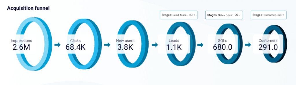
Leads
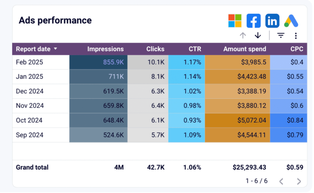
Tracking leads as a productivity metric helps you understand how effectively the team attracts potential customers. The aim is to achieve the greatest number of marketing-qualified leads (MQLs) for the smallest investment. Typically, this cost-efficiency is measured through the results of paid ads campaigns on platforms like Google or Meta.
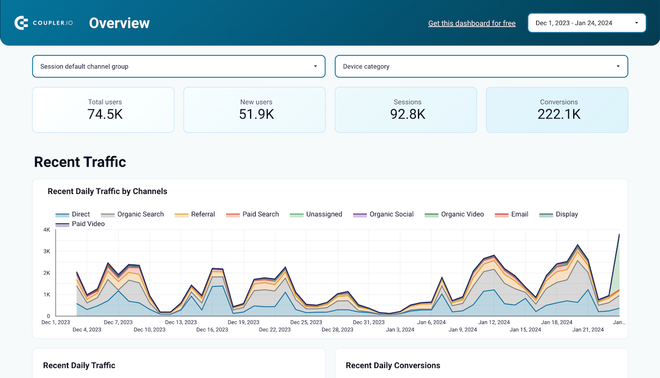
Track your funnel data in a dashboard, such as this customer acquisition dashboard for HubSpot/Pipedrive, to understand the drivers behind lead acquisition. This can help you recognize where the team succeeds and where improvement is needed (e.g., better content, smarter targeting, etc.).
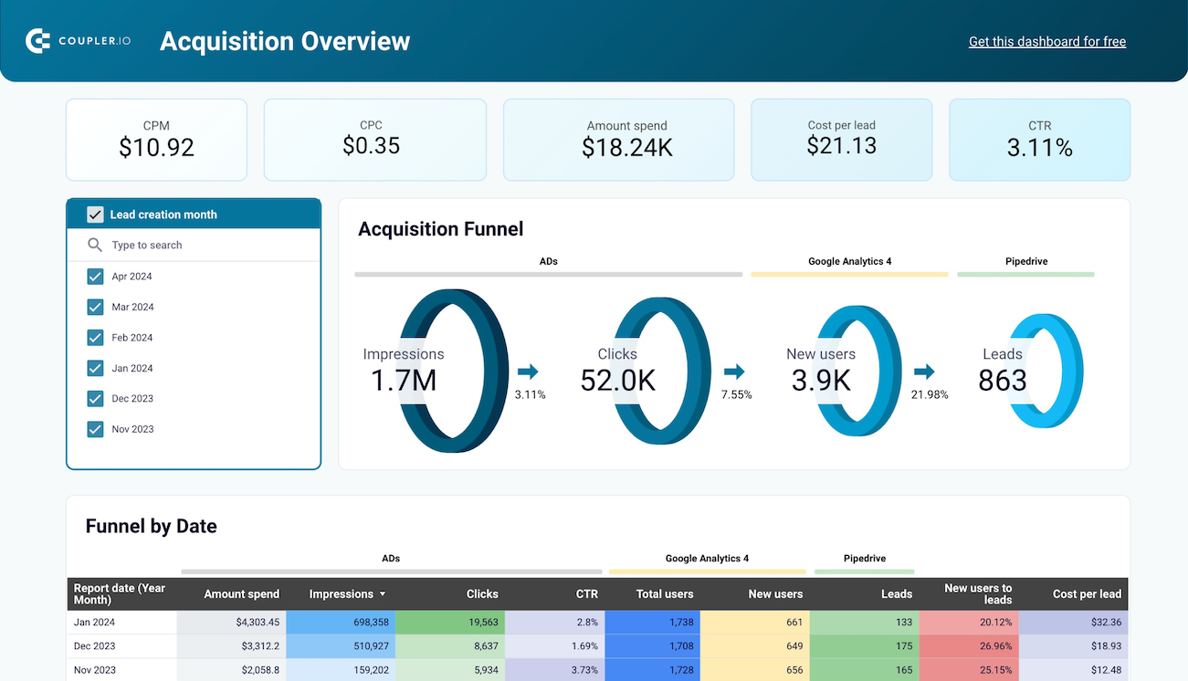
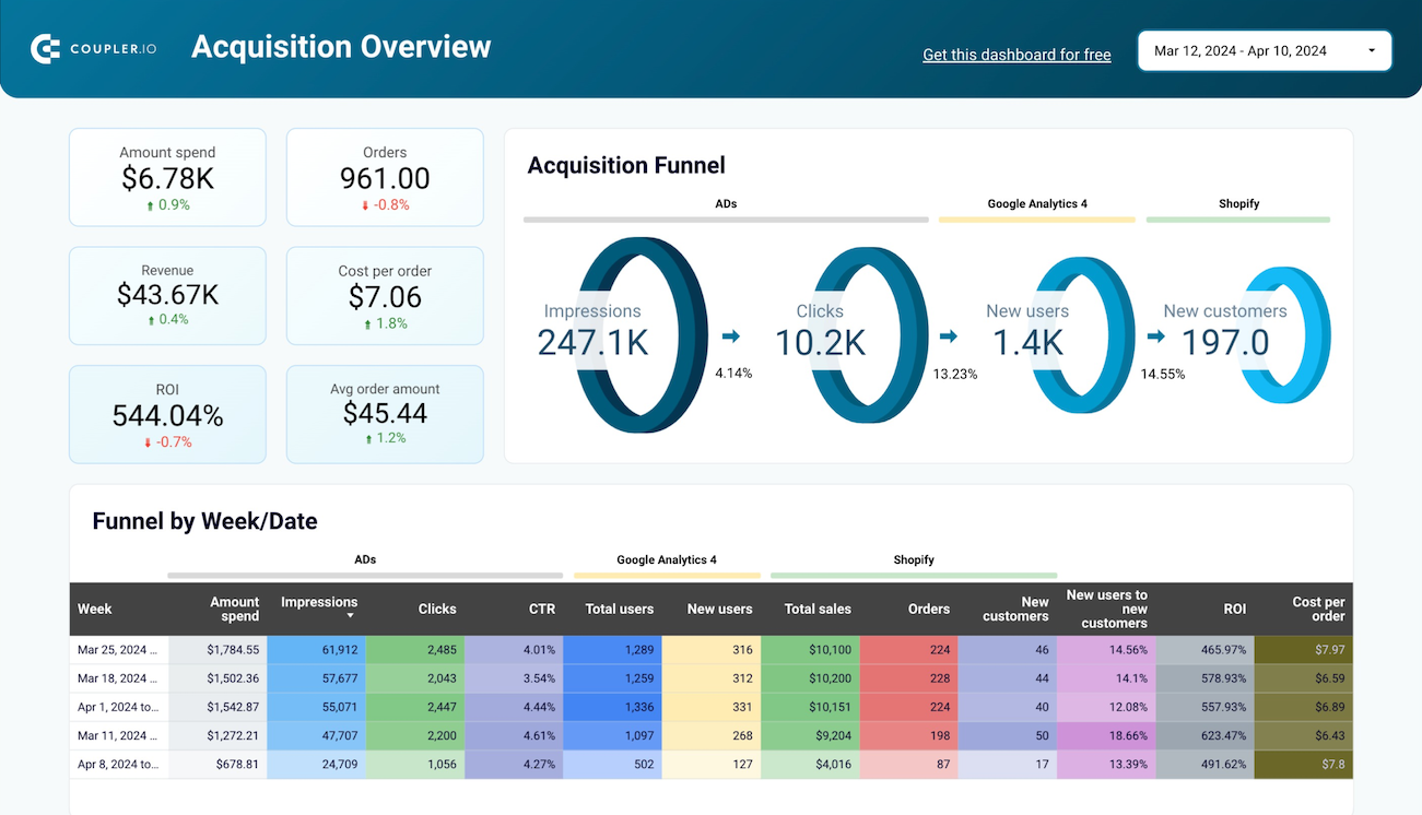
Customer acquisition dashboard for Pipedrive in Looker Studio
Use one dashboard to analyze the effectiveness of your Pipedrive acquisition funnel. Gain insights from data sourced from ad platforms and Google Analytics 4.


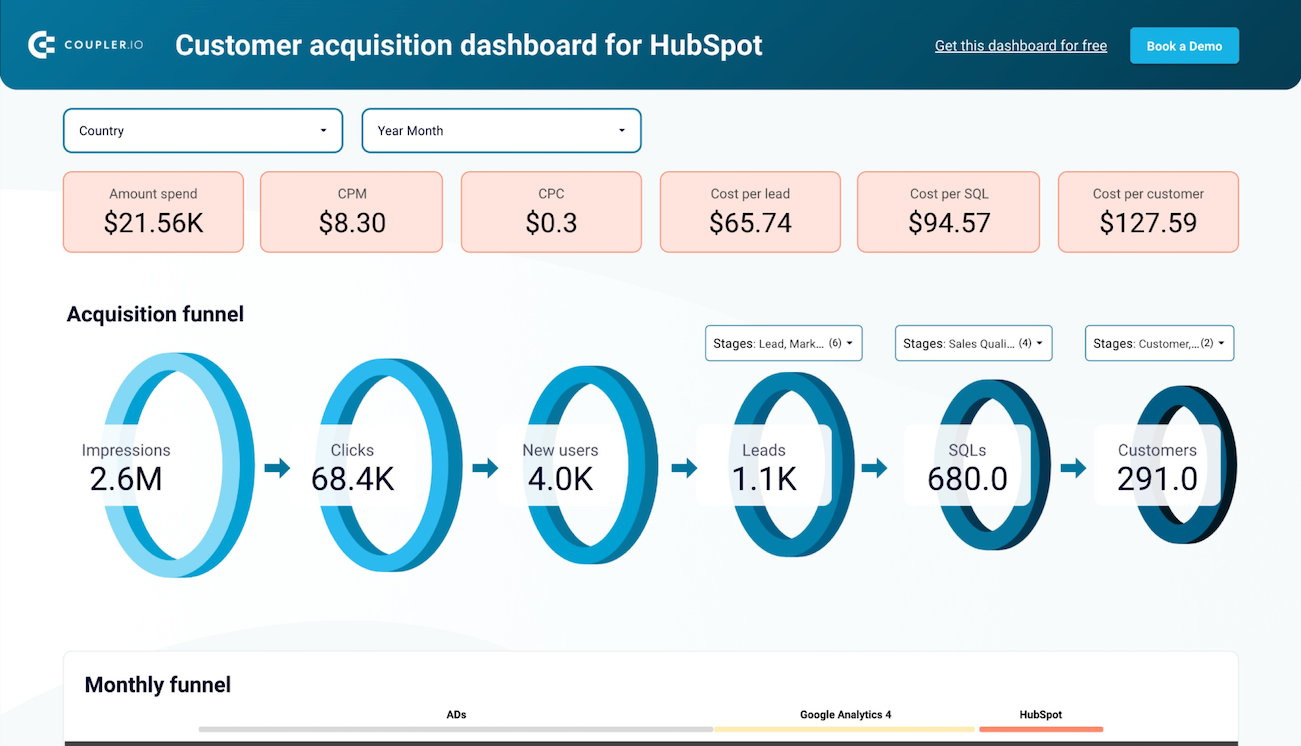
Customer acquisition dashboard for HubSpot in Looker Studio
Monitor your acquisition funnel and analyze its effectiveness using the insights from HubSpot CRM, advertising platforms, and Google Analytics 4.

Purchases and revenue
The ultimate goal of a marketing strategy is product purchases and the revenue they bring. A highly productive team acquires paying customers for the business at an exponential rate.
To understand how revenue growth correlates with marketing efforts, analyze metrics such as cost per acquisition (CAC), conversions from specific campaigns (such as paid ads, blog articles), and any spikes in purchases after targeted promotions (for example, a Black Friday discount initiative).
Brand awareness
Brand awareness can be difficult to measure, but it’s a critical metric for businesses seeking product-market fit. The more people who know about your solution, the more likely you are to acquire leads and product purchases. High brand awareness proves that your team can accurately position your product within the market.
You can track it with social listening tools, customer surveys, and benchmarking your historical data. For a detailed step-by-step guide, I recommend reading the article on how to measure brand awareness.
Management productivity metrics
Team satisfaction
Again and again, research shows that managers who guide and uplift their teams contribute to better business outcomes. For example, a Gartner study found that employees with ‘effective managers’ are 15 times more likely to be high performers.
Internal, anonymized surveys are a qualitative way to measure a manager’s performance within a team. You can also analyze employee retention/turnover rates and the team’s track record with reaching targets.
Customer satisfaction
Happy customers are just as important as a happy team. Even though a manager’s impact on the customer experience can be nuanced, it’s critical to track whether they are driving positive outcomes for the business or creating friction. For example, if a customer support manager reports low user satisfaction scores, it could be because of how they deal with escalated complaints.
Customer satisfaction can be measured through surveys, happiness scores, and customer retention, churn, and LTV dynamics.
Deployment frequency
You can also monitor how often the manager finalizes projects. Deployment typically refers to product development, but depending on the manager’s niche, it could be a new sales process or affiliate marketing program. What you’re looking for is the individual’s ability to motivate the team toward a concrete goal and deliver as promised. The more efficiently a manager can do this, the better for your business.
A unified view of various metrics will help you accurately track productivity markers from different tools. Coupler.io helps create custom dashboards that bring together data from team satisfaction surveys, customer feedback platforms, and project management tools, giving you a complete picture of a manager’s output and related business outcomes.
Dashboards to monitor employee productivity metrics
Analyzing productivity across different teams doesn’t have to be complicated or time-consuming. Coupler.io’s auto-updating dashboards give you quick insights into overall productivity and the specific contributions of individual employees. Let’s explore some easy-to-use examples:
Sales team performance dashboard for Salesforce
This dashboard is designed for sales team leaders or regional managers who need a centralized way to monitor team performance. It pulls data from your Salesforce CRM and updates automatically. The interactive dashboard displays several key productivity markers, such as win rate, won amount, lost opportunities, and open amounts.
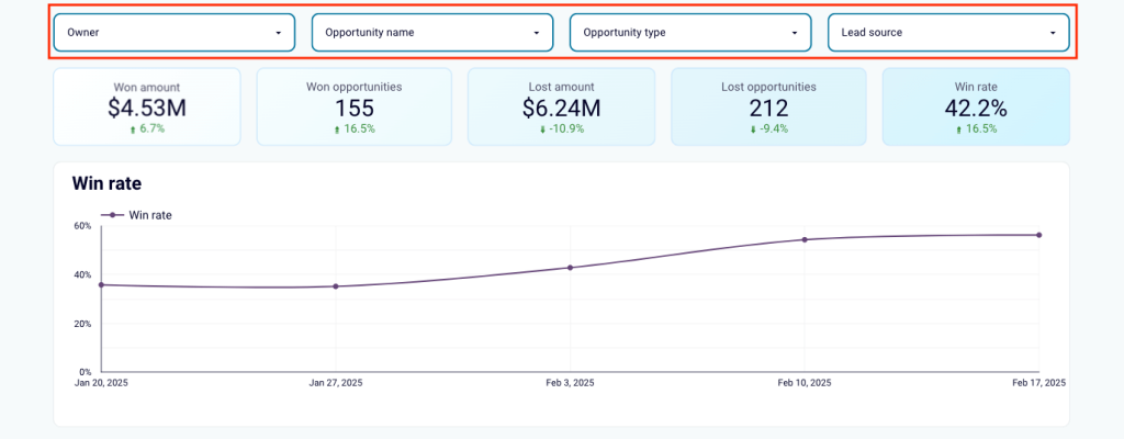
Insights this dashboard provides:
- Team member impact – filter the dashboard by owner to analyze each team member’s performance across key performance indicators. Focus on opportunity dynamics and lead sources to understand where certain sales reps excel. This way, you can optimize team allocations for improved win rates.
- Productivity comparison – use the bar charts to compare the win/loss rates, won/lost opportunities, and won or open amounts of individual team members.
- Sales pipeline – track the efficiency of sales specialists as they guide leads through the pipeline. Spot common bottlenecks and take steps to resolve them.
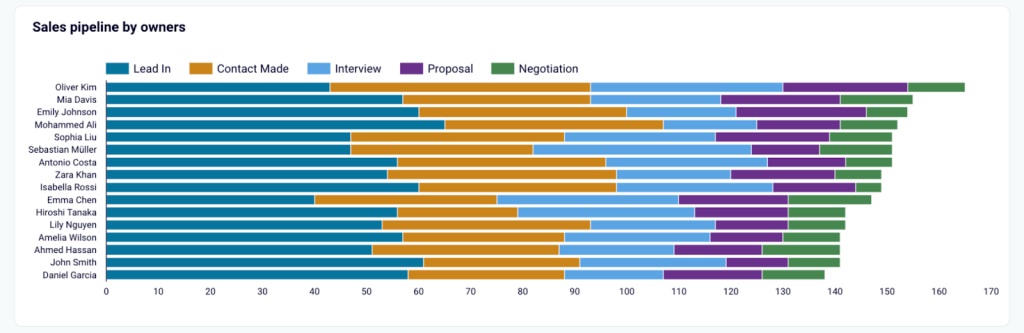
- Top performers – quickly identify your best-performing sales reps in a handy table visualization. Uncover the main reasons for their success and figure out how to replicate this among the team.
- Tasks overview – analyze task completion rates from a different perspective of who gets the most impactful work done.
This dashboard template is available for free with a Coupler.io account. You can get a copy of your Salesforce data by signing up today – no credit card required. Try it in Looker Studio or Google Sheets:
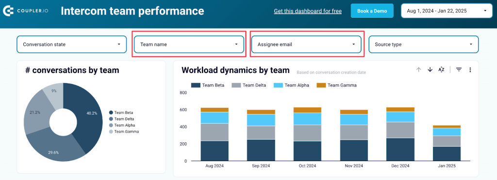
Customer support dashboard for Intercom
It’s challenging to monitor and compare the performance of entire customer support teams in a CRM like Intercom. This dashboard simplifies productivity analysis by bringing all your data together. Connect your Intercom account to start analyzing key metrics such as response times, quality of service, conversations per day, and more.
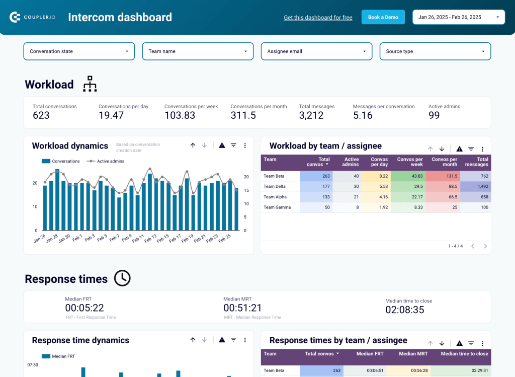
Insights this dashboard provides:
- Workload balance – monitor workload dynamics to see how each team handles ticket management. Compare these stats to your benchmarks for a clear view of employee performance.
- Customer satisfaction – track average response times and quality of service. Understand which teams are most productive by how quickly they resolve tickets, manage onboarding, and create a positive customer experience.
- Performance drill-down – in a separate dashboard tab, use the filters (including date) to analyze the performance of a team or individual. You can identify the best and worst performers by response times, reopen rates, and workload dynamics. This information can help you make data-driven decisions on resource planning and overall customer service optimization.
Generate a copy of this template by logging in or signing up for Coupler.io. It’s free and the whole set process only involves a few clicks. Find it in Looker Studio:
All-in-one marketing analytics dashboard
This dashboard makes it easy to analyze key metrics (e.g., impressions, new users, revenue) for different marketing channels in one place. It consolidates data from paid advertising, organic search, social media, email, and video to provide a complete picture of team performance.
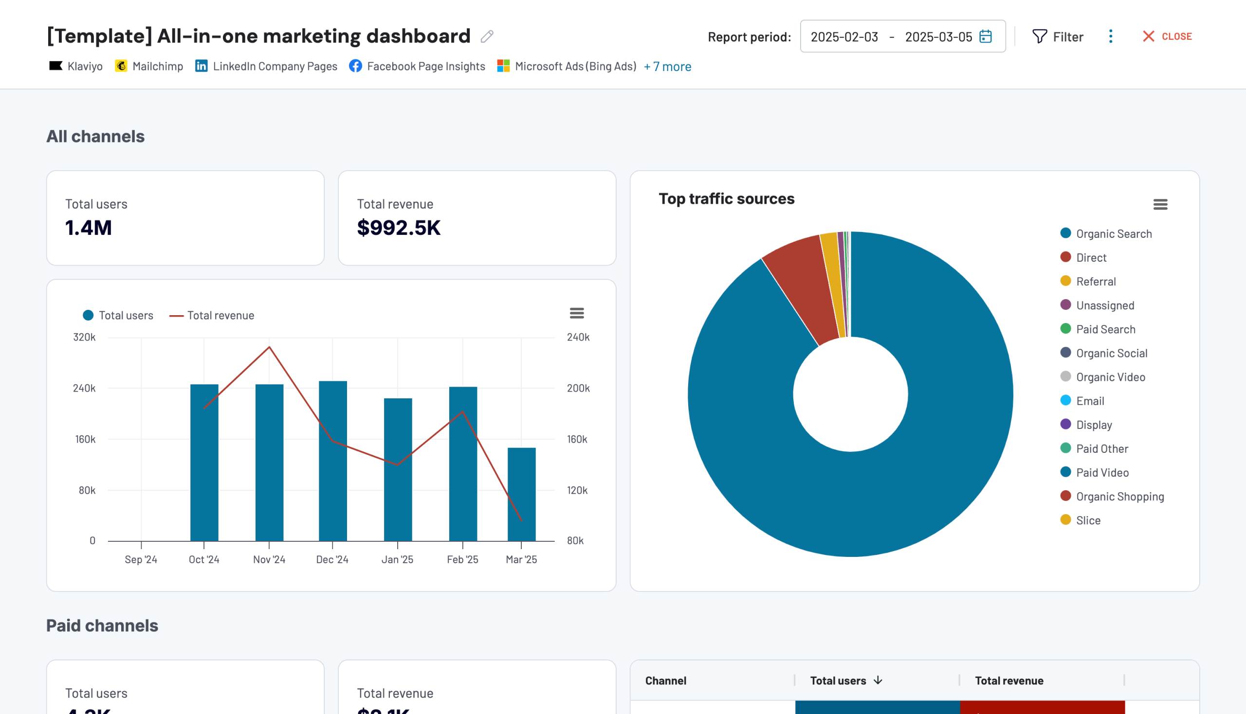
Insights this dashboard provides:
- Generated revenue by channel – identify which channels (for instance, organic search) offer the greatest return on your marketing investment.
- Analyze the graph with historical data to pinpoint months with the highest revenue and traffic acquisition. Cross-check it with content initiatives the team (or specific specialists) released during that period of time to understand who – and what – is driving actionable results.
- Easily compare revenue for each channel to uncover which marketing teams (such as your YouTube creators or content writers) are the most productive in terms of business impact.
- Monthly performance – track and drill down into channel growth with a month-by-month overview. This can help you identify which teams created the best strategies and adapted their approach based on campaign data.
The dashboard pulls data from your GA4 account and a bunch of other sources, such as Facebook Ads, LinkedIn, Google Search Console, Mailchimp, and more. You can use the dashboard right in the Coupler.io UI or get a free copy of the Looker Studio template. It takes less than 5 minutes:
You may also find these dashboards useful based on the marketing metrics we mentioned earlier:
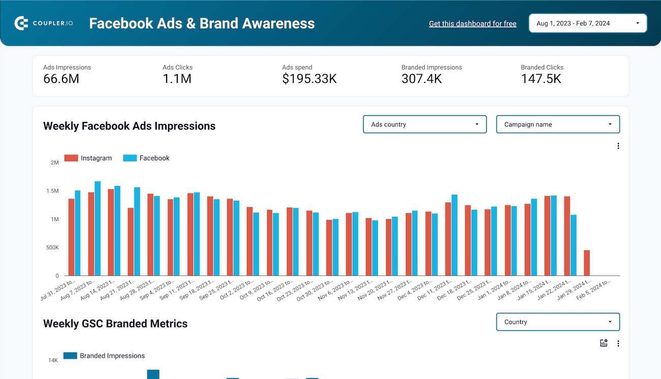
Facebook Ads and Brand Awareness dashboard in Looker Studio
Understand how your Facebook or Instagram Ads campaigns impact brand awareness. Find a correlation between paid impressions and branded searches in Google. Check country by country with 2 simple charts to find where your Ad spend impacts the most.

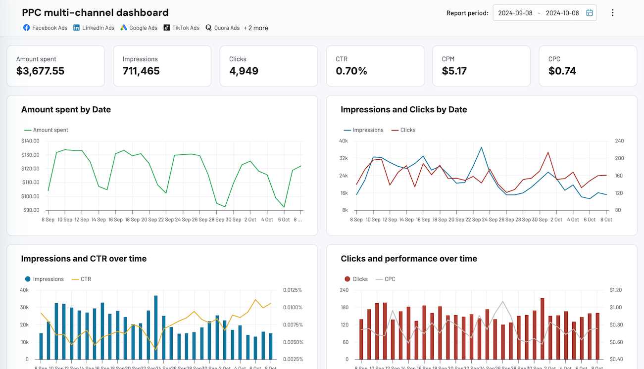
PPC multi-channel dashboard
Consolidate data from multiple advertising platforms including Google, Facebook, LinkedIn, TikTok, and more to track campaign performance, analyze spend efficiency, and optimize your PPC budget allocation across channels.


Shopify marketing funnel analytics dashboard in Looker Studio
Analyze the performance of the traffic to your Shopify store using data from advertising platforms and Google Analytics 4, all consolidated on a single dashboard.

Web analytics dashboard in Looker Studio
Use the insights based on the data from GA4 to monitor your website traffic and discover which pages resonate most with your audience.
Clockify time-tracking dashboard
One of the easiest ways to measure productivity via output is with time-tracking tools. If your business uses Clockify to log hours for client billing – or simply for internal time management – this dashboard helps you make sense of the data.
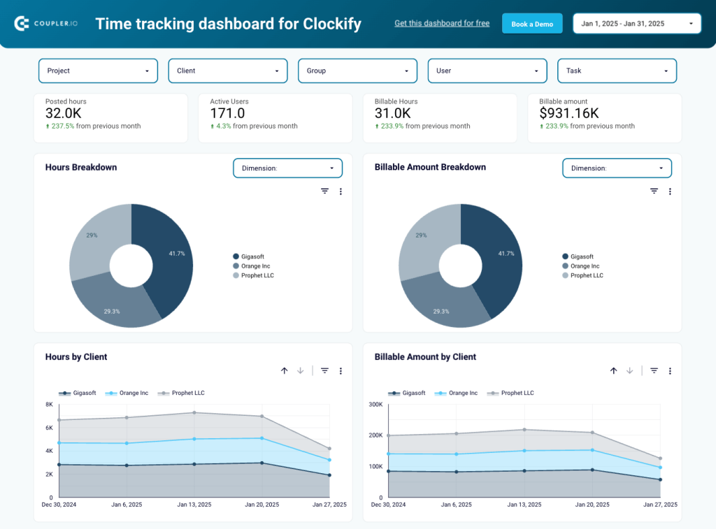
Insights the dashboard provides:
- Performance drill-down – use the set of filters to tailor the dashboard view. For example, you can filter by ‘group’ or ‘user’ to analyze the performance of specific teams and individual contributors. This offers insight into who works the most hours and which teams make the most money for your business (if you work with clients).
- Project dynamics – monitor monthly changes in work hours and billable amounts to identify concerning fluctuations or teams struggling to maintain a consistent output. With this insight, you can optimize resource allocation and provide targeted support to underperforming teams.
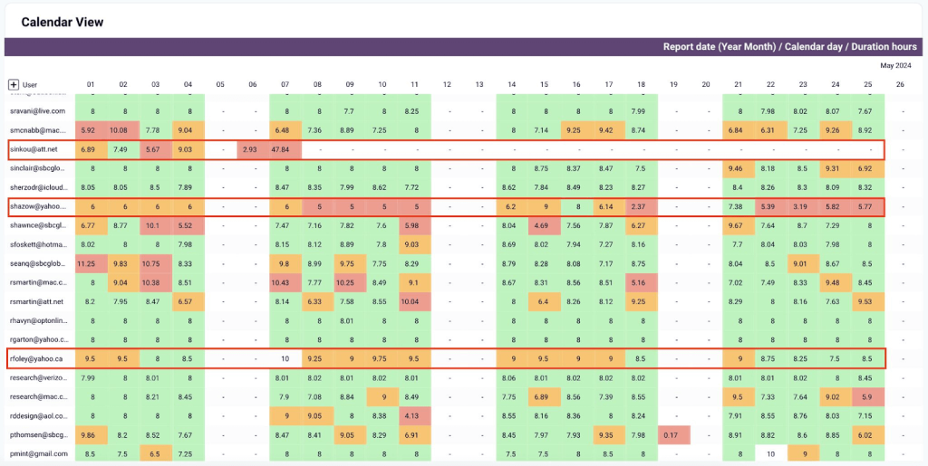
- Calendar view – analyze the table for a day-by-day breakdown of team member productivity. This helps you pinpoint employees who are underworking (logging less than 8 hours a day or 40 hours a week) or overworking (e.g., 9+ hour days). This way, you can develop strategies to rebalance workloads, prevent burnout, and boost productivity. It also allows you to quickly rectify mistakes – for example, when an employee accidentally logs 47 hours on a Monday.
Like the other templates, this dashboard is available for free with a Coupler.io account. You can generate a copy, schedule near-real-time updates, and start analyzing your data in just a few minutes. Check it out in Looker Studio or Google Sheets:
There is no straightforward way to accurately measure human productivity. That’s why this article didn’t contain a list of the ‘top 10 essential metrics’ – they aren’t one-size-fits-all.
Every department, team, and (sometimes) individual has different targets and methods of contributing to business success. It’s better to analyze desired outcomes for each unique context and combine them with output indicators. This way, you can clearly see how your people create value and work toward organizational goals.
Of course, you can’t do this without data, and that’s where Coupler.io can help. Feel free to experiment with the templates I’ve mentioned above or create a custom dashboard from scratch!
Automate performance tracking with Coupler.io
Get started for free