What is report automation?
Report automation is the process of using software and tools to collect, process, and generate reports without manual intervention. It replaces the repetitive tasks of gathering data, organizing it, and creating reports with an automated system. This ensures that reports are accurate, consistent, and always up-to-date.
Beyond saving time, report automation minimizes human error in data handling. It also delivers reports in real-time or at scheduled intervals and ensures uniformity in report formatting and calculations. So, the stakeholders can focus on analyzing insights instead of spending hours compiling data.
For example, a sales team can automate weekly performance reports using a CRM system and a BI tool. Their sales data will be turned into a report with the key sales metrics. The report can now be scheduled to email managers every Monday. This transforms hours of manual effort into a simple and reliable process.
Types of report automation you can benefit from
Now, let’s explore the different types of automated reports.
Self-service reports
These are built-in reports available in apps like Mailchimp, Facebook Ads, QuickBooks, etc. They can be scheduled to email daily or weekly updates, and the data auto-populates when the app is opened. However, a limitation is that the emailed version of these reports is often non-interactive and does not support dynamic reporting.
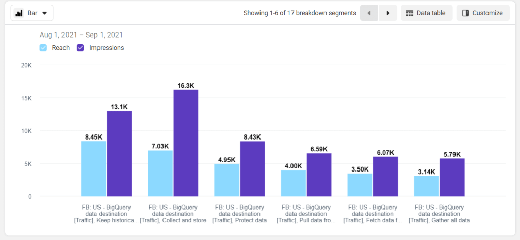
Here is an example of a self-service report that you can generate in Facebook Ads Manager.
Custom reports & dashboards
These reports are built from scratch using spreadsheets, BI tools, and reporting automation tools. You import data, add visualizations, and schedule updates. Custom reports can also have filtering and sorting options to make them interactive. While this process is time-consuming, you can simplify it with reporting automation tools like Coupler.io to automate data updates on a set schedule.
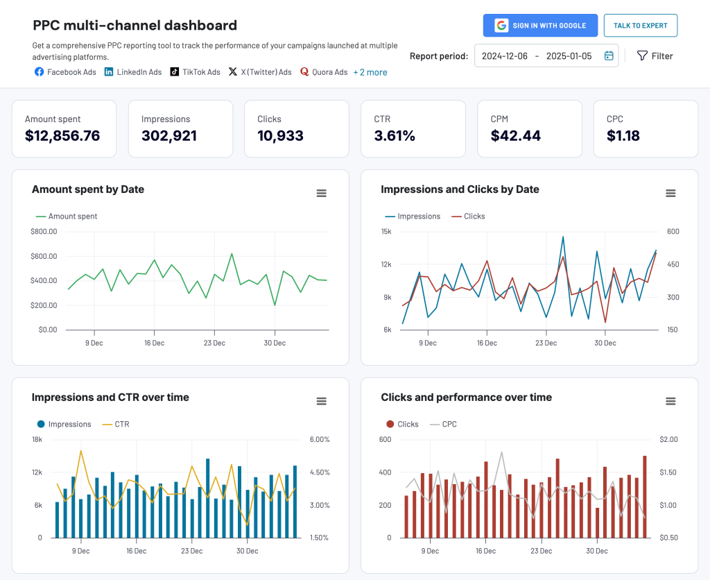
Below is a custom report for tracking PPC campaign performance across multiple platforms. It is created in Coupler.io and allows you to filter metrics by platform, campaign, period, and more. These features make it easy to explore data, focus on specific details, and customize the view based on their needs.
Dashboard templates
The simplest way to automate reports is by using pre-built dashboard templates, like the ones from Coupler.io. These templates support BI tools, spreadsheet apps, and more. They come with pre-configured visualizations, so you only need to connect your data from the source account following the template’s instructions. This saves time and effort in creating charts and graphs from scratch.
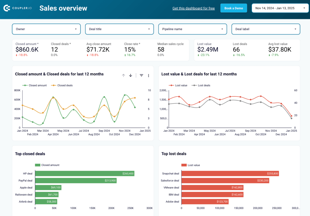
Here is a sales KPI dashboard template for Pipedrive in Looker Studio. You only need to connect your Pipedrive CRM tool to the dashboard using the built-in Coupler.io connector. In a few moments, you’ll be able to check the dynamics of deals and closed deal revenue, analyze the pipeline funnel, and more.
Why report automation matters
- Saves time: Automating reports eliminates repetitive tasks like data gathering so that you can have enough time for strategic decision-making.
For instance, if you currently spend hours every week collecting sales data from Shopify, ad performance metrics from Google Ads, and customer information from Salesforce to create a report, then automating this process can save you a lot of time.
- Increases accuracy: Manual data handling can lead to errors, but automated reporting ensures data is consistent, reliable, and error-free.
For example, you might accidentally duplicate rows of customer data from your CRM or misalign revenue figures with incorrect dates while preparing reports manually. Automation avoids these mistakes by pulling data directly from the source, keeping your reports accurate and consistent.
- Real-time insights: With automation, reports refresh data in real time, offering up-to-date insights critical for timely decisions.
For example, during a holiday sale, you can track real-time sales and inventory levels to know fast-selling products and restock them immediately. This way you’ll always meet customer demand without losing sales opportunities.
- Enhances productivity: Teams can focus on analyzing data and identifying trends instead of wasting hours creating reports manually.
For instance, when preparing a financial report in a BI tool often requires pulling data from QuickBooks, organizing it into categories like revenue and expenses, and manually creating charts to visualize trends. Instead of spending hours on this, automated report templates let you connect your data sources and instantly generate a professional, formatted report in just a few clicks.
- Scales with business needs: As businesses grow, data increases. Automated reporting handles large datasets without delays or errors, making it scalable for growing businesses.
For example, when you expand your business to multiple locations, you may have to manually collect weekly sales and inventory data from each location. It takes days and often results in errors like missing data or incorrect calculations. With an automated reporting system, you can integrate all stored data seamlessly and get error-free, real-time reports in minutes.
- Improves decision-making: Clear, accurate, and timely reports help businesses identify opportunities, address challenges, and stay competitive.
For instance, an ecommerce company might face challenges with low conversion rates or high cart abandonment. Automated reports and real-time analytics dashboards can highlight these issues, identify patterns in customer behavior, and suggest optimized marketing strategies. This helps ensure higher sales, reduces customer acquisition costs, and improves retention rates.
How to get started with report automation
Report automation can be simple or complex based on your goals. For example, generating a profit and loss report in QuickBooks with its prebuilt templates is easy. Moreover, you can use a free P&L dashboard by Coupler.io.
However, combining data from multiple platforms like Facebook, Google, and LinkedIn to create a report from scratch requires more time and skills. Below are the core steps to get started with report automation.
Step 1: Identify needs
First, list the reports that take the most time to prepare, such as weekly sales reports, monthly financial statements, or campaign performance summaries. Prioritize automating reports that directly impact decision-making, like sales trends, churn rates, or cash flow analysis. For the latter, check out the free cash flow dashboard by Coupler.io
Step 2: Define data sources
Identify the data sources where your data is stored—CRMs like Salesforce, marketing tools like Facebook Ads, or accounting software like QuickBooks. To prevent discrepancies in your reports, make sure the data is clean, well-organized, and ready for integration.
Step 3: Choose tools
Report automation can be simple if you pick the right tools according to your needs.
- Native connectors: These data connectors link your data sources without additional setup. For example, Google Analytics integrates easily with Looker Studio.
- Reporting automation tools: Coupler.io, an automated reporting solution, helps you create and automate reports easily. Whether building from scratch or using ready-made templates, it allows you to connect data sources, schedule updates, and automate data transfers to BI tools, data warehouses, and spreadsheet apps. By combining data from multiple sources, it’s easy to launch cross- or multi-channel reporting without complex setups.
- BI and reporting platforms: For advanced visualizations and dynamic dashboards, you can use BI tools like Power BI, Looker Studio, Tableau, etc. For example, to present sales data like regional performance, product category trends, and revenue comparisons, use interactive visualizations like heatmaps, bar charts, and drill-down graphs. This will help you quickly identify top-performing regions, best-selling products, and seasonal trends.
- API connections: For unsupported data sources or custom workflows, APIs are a simple way to connect and transfer data. APIs (Application Programming Interfaces) allow different platforms to communicate, making it easy to pull data from data sources to reporting platforms. Generally, you need to create custom scripts to import data from the API which requires technical skills.
At the same time, Coupler.io lets you automate data integration via APIs using the JSON API connector without coding. You can fetch data from almost any source, format it as needed, and include it in your reports.
How to choose reporting automation tools – the checklist
As you know, different tools available for report automation, you can use this checklist to choose the best combination of tools for your needs.
- Make sure the tools can connect directly to your data sources, whether through native connectors, APIs, or integration tools.
- Determine the level of detail and visualizations you need, from simple reports to complex dashboards.
- Consider your team’s technical skills to choosing tools that match their expertise.
- Check if the tools integrate with your existing systems, like CRM apps, accounting, or marketing software, to streamline data workflows.
- Select tools that align with your budget and deliver cost-effective solutions for your reporting needs.
- Choose tools that can grow with your needs, handling larger datasets and more complex reporting as your business scales.
Step 4: Build & test
Building and testing automated reports requires attention to both design and validation to make sure they are effective and accurate.
Start by creating a layout that clearly communicates your data story. Focus on presenting key metrics prominently to make your report easy to interpret. For example, if you are creating a dashboard to track the performance of PPC campaigns, place KPIs like total spend, conversions, and ROI at the top. Follow this with detailed breakdowns by platform or campaign for more insights.
To speed up the process, you can use dashboard templates. They come with predesigned visualizations like charts, graphs, tables, and filters. Simply connect your data source using the instructions in the template, and your report will be ready in minutes.
Test your report
Testing ensures that your reports are accurate, functional, and ready for use. Here’s a checklist to guide you through the key steps for validating your automated reports.
- Data accuracy verification: Compare the automated report’s results with manual calculations for a specific period. This helps confirm that the data being pulled and processed is accurate and error-free.
- Update frequency testing: Test whether the report updates correctly at the scheduled intervals or triggers, ensuring it reflects real-time data as intended.
- Filter and parameter testing: Validate all interactive elements, such as filters, dropdown menus, and parameters. Ensure they work as expected and allow users to navigate the data effortlessly.
- Cross-platform compatibility: Verify that the report displays correctly across devices (desktop, tablet, and mobile) and browsers, maintaining consistency in design and functionality.
- User acceptance testing: Share the report with end users for feedback. Confirm that it meets their requirements, is easy to navigate and understand, and provides actionable insights.
Step 5: Schedule & monitor
Set up your reports to run automatically, like daily sales dashboards or weekly expense reports. Tools like Coupler.io automate data transfers and generate up-to-date reports easily. Alternatively, you can use Google Sheets notifications or Power BI alerts to flag anomalies. To match your growing business needs, regularly review and fine-tune your reports.
By following these steps, you can an efficient report automation system for your data that saves time, reduces errors, and delivers valuable insights for smarter decisions.
Toolset to build an automated reporting system
To set up an automated reporting system, you need solutions that connect your data, automate updates, and generate reports. With the right combination of these features, you can save time, minimize errors, and produce reports that support smarter decision-making.
Below is a list of tools you’ll need to build an automated reporting system.
Data sources and integrations with them
Let’s start by connecting the data sources. Here’s a breakdown of major categories of data sources and how they integrate with reporting platforms.
- Marketing tools: Google Ads, Facebook Ads Manager, HubSpot Marketing, and Mailchimp. These tools provide insights into ad performance, audience engagement, and campaign ROI.
- Ecommerce tools: Shopify, BigCommerce, Magento, and WooCommerce. These platforms offer data on customer purchases, inventory, and sales trends.
- Customer Relationship Management (CRM) tools: Salesforce, Zoho CRM, HubSpot CRM, and Microsoft Dynamics. CRM tools track customer data and sales pipelines.
- Finance and accounting tools: QuickBooks, Xero, and Zoho Books. These tools manage revenue, expenses, and cash flow
- Project management tools: Asana, Trello, Jira, and Monday.com. These tools track project progress and team productivity
- Other tools: Google Analytics, Mixpanel, Zapier, and Amplitude. They improve reporting by providing data on website traffic, user behavior, and automation workflows.
Integrating these data sources with reporting platforms like Looker Studio, Power BI, Tableau, or Excel ensures that your reports are accurate, up-to-date, and actionable. These connections automate updates and reduce manual work, so that you can focus on insights and decision-making.
Connectors – to automate data load
Connectors automate the data transfer from data sources to BI tools. They make sure the reports always have the latest information by scheduling data updates.
Coupler.io provides data connectors to automate data load into spreadsheets, BI tools, or databases. You can load data from a specific source, transform data on the go, combine it with information from other sources, and more. The icing on the cake is the capability to schedule data refresh or trigger it based on specific events.
Coupler.io also provides built-in visualization templates for common use cases, like sales performance or marketing KPIs so that you can generate reports quickly.
Spreadsheets and BI tools – to create reports
Once data from the source is ready, these tools help you create clear, engaging, and actionable reports:
- Looker Studio: A popular tool for creating interactive dashboards with filters, charts, and graphs. It integrates with over 800 sources, including Google Analytics and BigQuery, to give near real-time updates.
- Tableau: Supports over 100 data sources, including cloud and local systems. Its drag-and-drop interface and advanced visualization options make it suitable for detailed and interactive reports.
- Domo: A low-code platform that combines visualizations with collaboration features for sharing insights.
- Google Sheets/Microsoft Excel: These are useful for simpler reports. Built-in automation features, such as pivot tables and macros, simplify data analysis.
- Power BI: Offers rich visualizations and interactive dashboards, making it a good fit for businesses that need in-depth analysis.
To choose the right tools, start by identifying your needs. If you require basic reporting, spreadsheets or Looker Studio might suffice.
For more advanced needs, Coupler.io is an all-in-one solution. It connects and automates data from multiple sources, supports transformation to organize and transform data, and provides built-in templates to generate interactive reports quickly.
How to automate reports for your business with Coupler.io
Now, let’s see how to create and automate a custom report with Coupler.io. We’ll be building an SEO performance report by combining data from Google Search Console and Google Analytics 4.
Step 1: Set up data sources
Start by signing up for a free Coupler.io account.
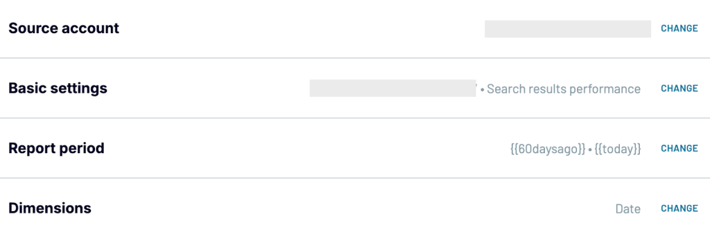
Go to Dataflow and click on Create. Select the source – Google Search Console. Then configure the source settings by connecting your GSC account.
Select the site, report type (Search results performance), and specify the report period (Start and end dates). Modify dimensions if needed – for this example, use Date and Page.
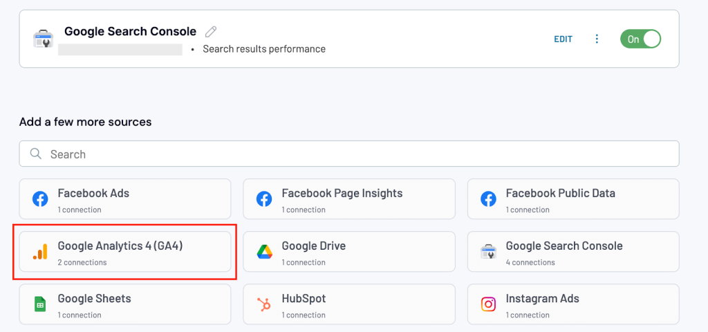
Click on Finish & Proceed. You’ll now be prompted to add more sources. Select Google Analytics 4 to add the second source.
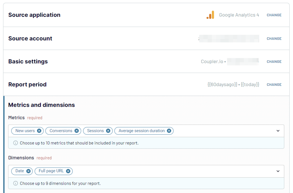
Connect your GA4 account, choose the property, and set the same report period. Select relevant metrics like New users, Conversions, Sessions, and Average session duration. Make sure the dimensions match those in Google Search Console.
Click on Transformations to move to the next step.
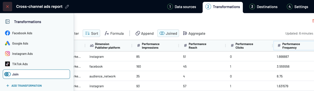
Step 2: Transform data
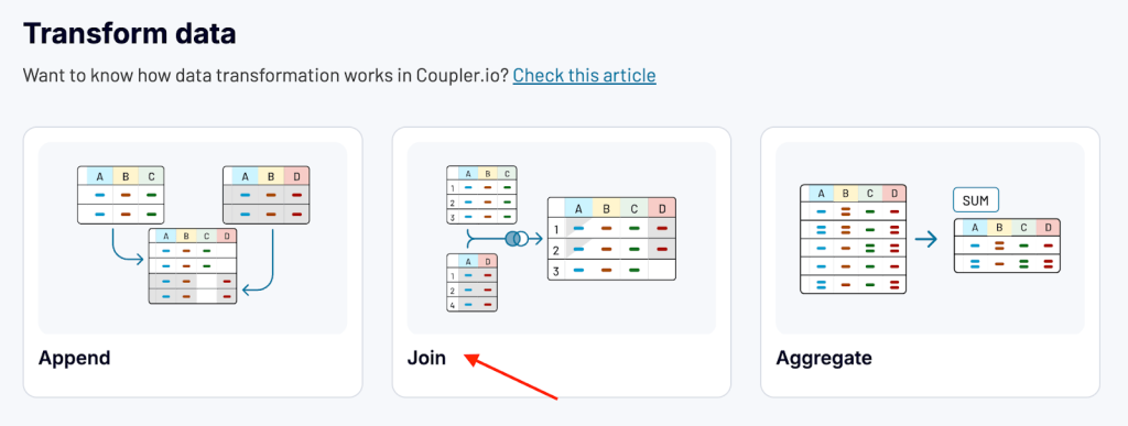
To combine data from GSC and GA4, you have two options.
- Append: Combine data from multiple sources with similar structures. Columns are matched by name. Rename any unmatched columns for proper mapping.
- Join: Merge data from multiple sources with different structures. Select one or multiple shared columns to link.
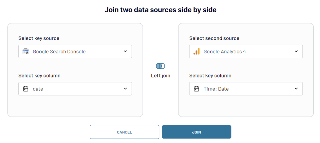
We’ll select to join for this case.
To join the data sets side by side, use the Date column as the key. Make the respective selections and click Join.
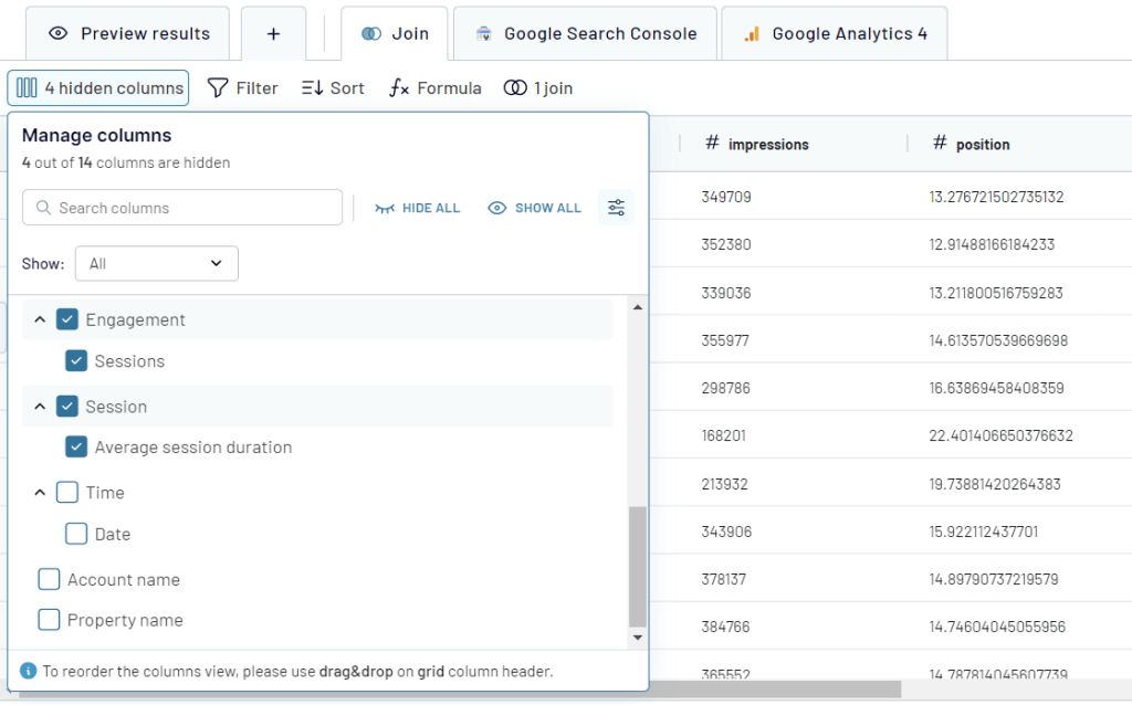
After joining the data, you can apply other transformations like
- Update names of columns
- Hide and reorder columns
- Filter and sort data
- Add formula columns
Step 3: Set up destination
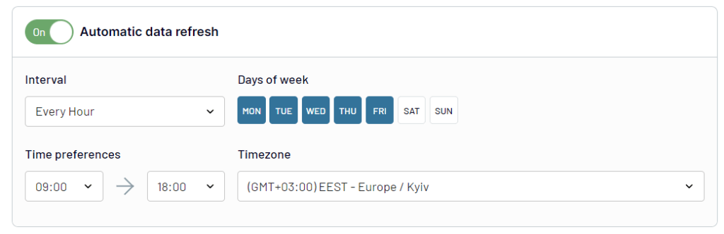
Once the data is ready, proceed to the destination part where you need to select the desired app and configure the connection to it to load your report.
After that, you need to automate the report by enabling the automatic data refresh and customizing the desired schedule. This will keep your report up to date.
Step 4: Visualize your report
Depending on the chosen destination for your report, you can enhance it by adding visual and interactive elements:
- Tables, bar charts, line graphs, or pie charts to present key SEO metrics like traffic, conversions, or session duration.
- Filter controls to allow users to explore specific dimensions, such as traffic by device or conversions by page.
- Date range picker so users can analyze performance over custom time periods.
- Drill-down features to let users click on data points for more detailed insights, such as keyword-level performance.
- Scorecards to display dynamic KPIs like total clicks or impressions, which update based on filters or date ranges.
Once done, your SEO performance report may look like this.
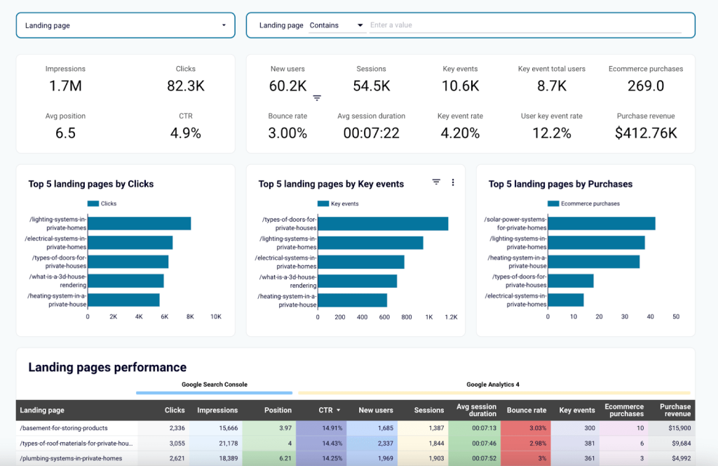
This report is available as a Landing page performance dashboard template in Looker Studio. Thanks to Coupler.io connector, you can set it up with your data in just a few minutes.
Examples of automated reports
Creating a custom report requires both time and skills. A simpler option is to use Coupler.io’s automated report templates. Just follow the instructions in the Readme tab, and you’ll quickly generate a report using your own data.
Here are a few examples of automated reports which can be used as templates.
PPC reports
PPC dashboards help you track and improve your advertising campaigns. They provide insights into key metrics like user engagement, conversions, and ROI, to make better decisions about your advertising strategies.
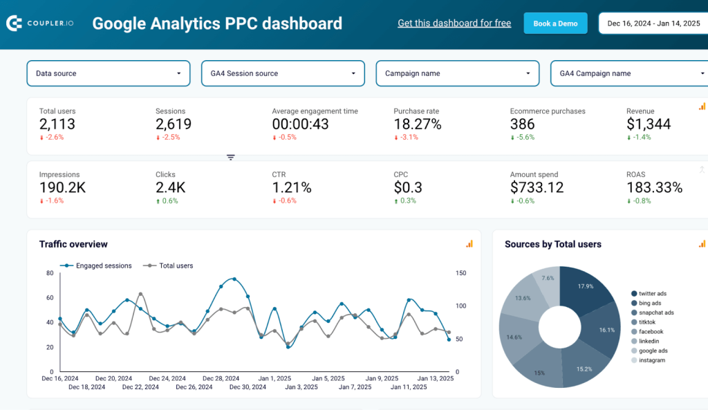
This Google Analytics PPC dashboard uses data from Google Analytics to analyze your pay-per-click campaigns. It highlights user engagement, session trends, conversion rates, and return on ad spend (ROAS). You can easily see which campaigns perform best, optimize your spending, and understand audience behavior through detailed breakdowns of traffic and revenue.
Marketing reports
Marketing dashboards give you a complete view of your campaigns. They show overall performance and how each channel is contributing.
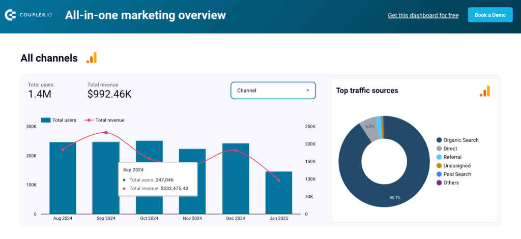
The All-in-one marketing dashboard provides insights into overall and channel-specific performance, covering metrics like total users, revenue, impressions, clicks, and engagement. It combines data from multiple sources—Google Analytics, Google Ads, Microsoft Ads, Facebook Ads, LinkedIn Ads, Instagram, YouTube Analytics, and Mailchimp.
The dashboard highlights top traffic sources, paid vs. organic channel contributions, and email campaign effectiveness. With visualizations such as bar charts, line graphs, and tables, marketers can track trends, optimize campaigns, and make data-driven decisions.
CRM reports
CRM dashboards focus on sales and customer relationships and give you a clear view of the pipeline.
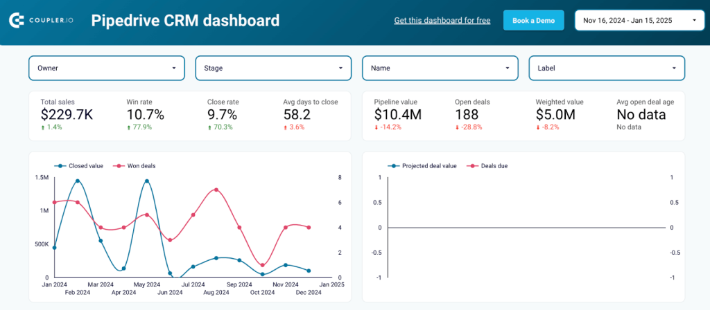
The Pipedrive CRM dashboard provides a detailed overview of sales pipeline performance from Pipedrive data. It tracks key metrics such as total sales, win rate, close rate, and average days to close. The dashboard visualizes closed and projected deal values, sales pipeline stages by agents and deal labels, and a breakdown of deal progress. These insights help sales teams to identify bottlenecks, improve conversion rates, and optimize their pipeline management.
Sales reports
Sales dashboards help you measure team performance and monitor progress toward sales goals.
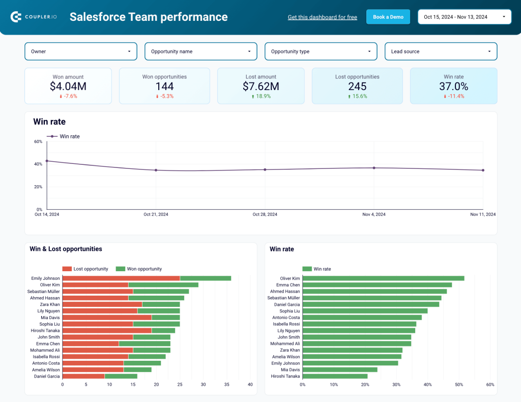
The Salesforce team performance dashboard focuses on evaluating team and individual sales achievements. It highlights total targets, completed opportunities, win rates, and lost amounts. The dashboard includes detailed visualizations of sales performance by owner, opportunity type, and lead source. Additionally, it tracks task completion by priority and status, offering actionable insights to improve team efficiency and align efforts with sales goals.
Social media reports
Social media dashboards make it easy to track performance across platforms. They help you measure engagement, understand audience behavior, and optimize both organic and paid strategies.
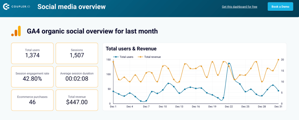
The All-in-one social media dashboard aggregates data from platforms like Google Analytics, Facebook, Instagram, YouTube, and LinkedIn to deliver a complete view of your social media performance. It visualizes metrics like total users, sessions, engagement rates, and revenue from social media channels.
Additionally, it tracks impressions, reach, engagement rates, and followers for individual platforms, offering insights into trends and audience behavior. This dashboard helps marketers optimize their social media strategies and assess the impact of their organic and paid efforts.
SEO reports
SEO dashboards focus on tracking the performance of your website and landing pages. They provide metrics that help you improve rankings, user experience, and conversions.
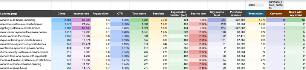
The Landing page performance dashboard provides detailed insights into the effectiveness of individual landing pages by pulling data from Google Analytics and Google Search Console. It highlights metrics like clicks, impressions, average position, CTR, total users, sessions, session duration, bounce rate, and revenue generated. This dashboard also tracks user interactions through key events and event counts, helping to identify high-performing pages and those needing optimization.
Ecommerce reports
Ecommerce reporting is useful to track key metrics and identify areas of improvement. The dashboards provide a clear view of your sales funnel to understand customer behavior and optimize conversions.
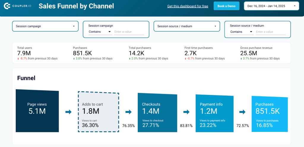
This Shopify sales funnel dashboard provides a detailed view of the Shopify sales funnel, from page views to purchases. It tracks key conversion stages such as add-to-cart, checkout, and payment info, offering insights into user behavior and identifying drop-off points. The funnel is further broken down by country, item, and traffic sources to optimize sales strategies.
Finance reports
Finance dashboards make financial reporting simple and efficient. They help you monitor key metrics like profit and loss, cash flow, and balance sheets to keep your finances on track.
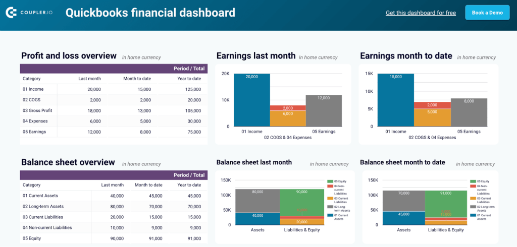
The QuickBooks financial dashboard provides insights into the company’s financial performance, focusing on profit and loss, balance sheet metrics, cash flow, bank and cash accounts. By integrating data directly from QuickBooks, it tracks key financial indicators to maintain clarity of financial health. This dashboard is useful for financial managers who want to streamline reporting and improve decision-making.
Report automation challenges you may face
While report automation can bring many benefits to businesses, you should be aware of the following potential challenges:
Initial setup and cost: The initial setup and cost of implementing report automation can be high. It may require software tools, hardware, and training investment, which can be a significant expense for small businesses.
Over-reliance on technology: Report automation can lead to over-reliance on technology, which can be problematic if the technology fails or needs to be fixed. This can lead to delays in reporting and impact decision-making processes.
Human supervision and interpretation: When you use BI and dashboard tools, a human usually makes a layout and a report in a readable business-oriented format. Unfortunately, Tableau & Looker Studio don’t generate reports themselves. So, this would require certain human supervision and knowledge to do the job.
In addition, automated reports may need more ability for human understanding and analysis, which can limit insights and the ability to identify trends or outliers that may be important.
Inaccurate data: While report automation can reduce human error, it can also lead to inaccuracies in data if the automated reporting tools are not set up or programmed correctly.
Limited flexibility: Automated reports may be limited compared to reports generated manually. This can restrict customization options and make it difficult to create reports that meet specific needs or requirements.
Overall, report automation can bring many benefits to businesses, but it’s essential to consider these potential disadvantages and weigh them against the benefits before implementing report automation.
Best practices to automate reports efficiently
Let’s look at some best practices that can help you automate your reporting process and create valuable visualizations.
Identify key metrics: Before setting up report automation, identify the metrics you want to track and report on. This will help you focus your efforts and ensure that the reports provide valuable insights.
Use the right tools: Choose report automation tools that are easy to use and integrate with your existing systems. Look for tools that offer data visualization and other features that make it easier to analyze and interpret the data.
Set up alerts: To stay on top of important metrics, set up alerts to notify you when specific events occur, or thresholds are reached. This will help you to take action quickly and make adjustments as needed.
Keep reports simple: Focus on the most important metrics and keep the reports simple and easy to understand. Refrain from cluttering the reports with too much data or information, as this can make them challenging to interpret.
Test and refine: Test your reports over time to ensure that they provide valuable insights. Seek feedback from key stakeholders to ensure that the reports meet their needs and deliver the insights they need to make informed decisions.
Maintain data quality: To ensure that the reports are accurate and reliable, it’s essential to maintain the quality of the underlying data. This means regularly cleaning and updating data and ensuring that the data is entered correctly and consistently.
By following these best practices, you can improve the accuracy and efficiency of your reporting, saving you time and providing valuable insights to drive business decisions.
Future trends in report automation
The future of report automation is being shaped by AI, machine learning, and real-time analytics. These technologies are turning static reports into dynamic tools that deliver faster and more accurate insights.
Machine learning algorithms are becoming better at detecting patterns and anomalies every day. Instead of just showing numbers and charts, reports will flag unusual trends and even suggest solutions. For example, a sales report could identify a drop in performance, analyze its causes, and recommend actions to fix it.
Natural Language Processing (NLP) is making reports easier to understand by turning complex data into plain-language summaries. A financial report might explain, “Revenue grew 20% this quarter due to strong sales in North America after a new campaign.”
Reports will also become more personalized. They will adapt their content and visuals to the user’s role and needs. A CEO might see high-level KPIs for strategic decision-making, while a sales manager views detailed operational metrics for a region or team—all from the same data source.
Real-time updates will replace periodic reporting, allowing businesses to act quickly on new opportunities or challenges. These advancements will make report automation not just a convenience but a critical competitive advantage.
Automate reporting with Coupler.io
Get started for free