
Imagine for a moment that all financial reporting in your company is done automatically…that all your reports are always ready and up-to-date. You have a perfect revenue dashboard that only displays the latest data and you don’t even need to click a single button for this. Doesn’t that sound great? Now, let’s see how you can achieve this.
In this article, we share useful tips and handy assets that will help you build a revenue dashboard, such as:
- Top 5 revenue dashboard examples
- Free customizable templates
- Use cases with hands-on examples
- Best practices
- Tips on how to automate reporting
Now, let’s draw the first line for your future revenue dashboard and dive in.
Top 5 revenue dashboard examples
Now, as we’ve explored how businesses use revenue dashboards, let’s see some specific examples. For your convenience, we have also included a couple of free templates that can help you create a revenue dashboard within minutes.
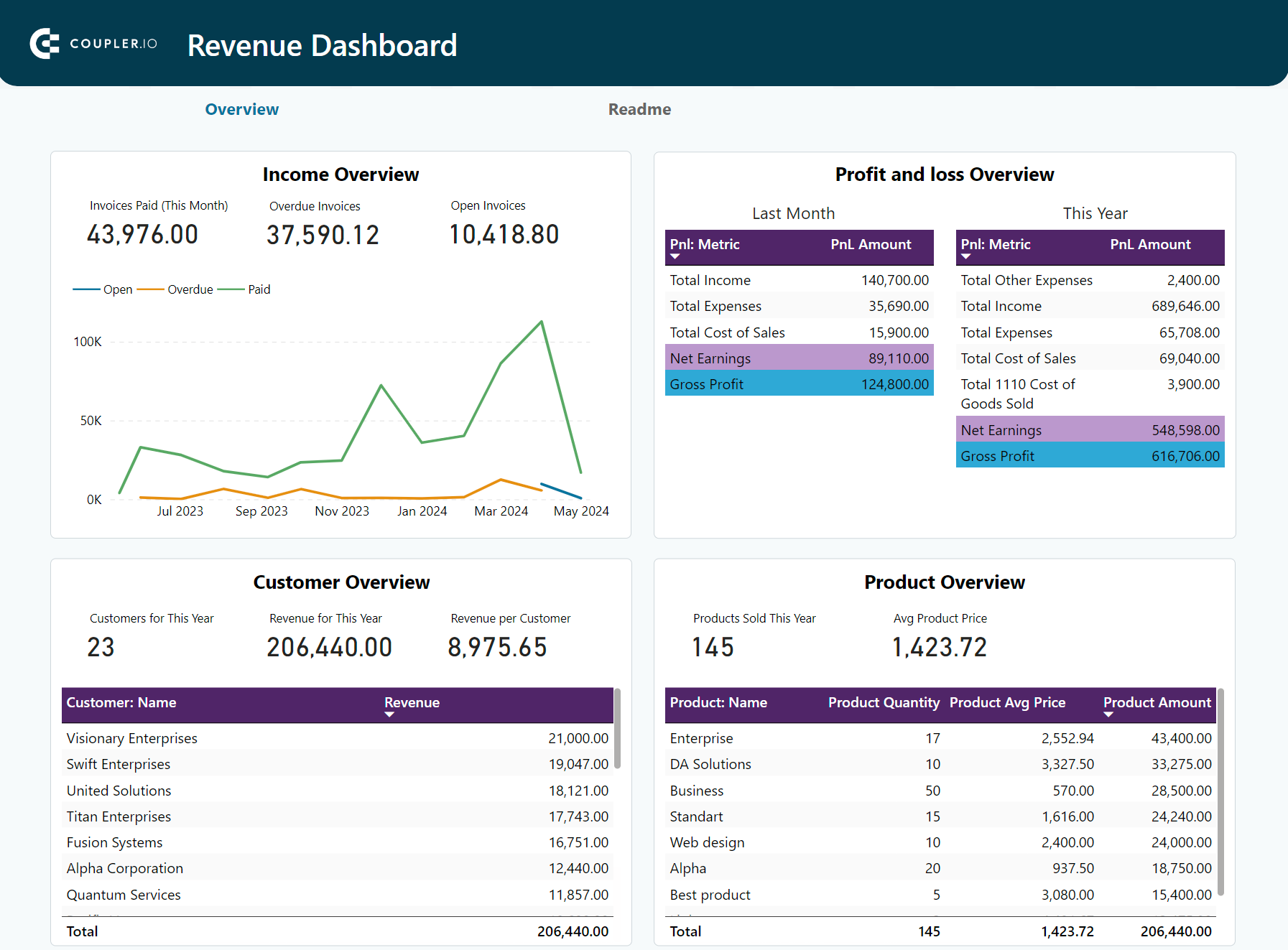
1. Revenue analysis dashboard for QuickBooks (+ free template)
The first example on our list is a revenue analysis dashboard for QuickBooks. It contains the most crucial metrics, such as total revenue, net earnings, average revenue by customer, and more. The dashboard also includes a comprehensive overview of profit and loss, income, products, and invoices. All this makes it a useful tool for day-to-day monitoring, financial analysis, and informed decision-making.
QuickBooks revenue dashboard + AI insights

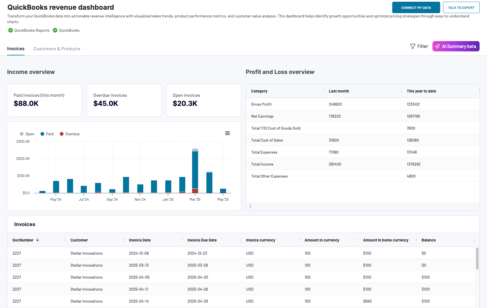
QuickBooks revenue dashboard + AI insights
Preview dashboardThis revenue dashboard is:
- Interactive. You can sort and filter your data, drill down and drill up, explore metrics over different time periods, and more. Thanks to interactivity, it’s easy to perform analysis and work with data.
- Automated. The dashboard is automatically integrated with QuickBooks with the help of Coupler.io, a popular data analytics and automation solution. The data comes from five QuickBooks importers with different reports and data entities connected. We explain this in more detail in a later section.
- Live. Thanks to the automatic data refresh feature, Coupler.io keeps this dashboard up-to-date. It can pull fresh data from QuickBooks Online according to your preferred schedule. The refresh interval can vary from “every month” to “every 15 minutes”.
- Analysis-ready. Data from several different QuickBooks reports is combined and presented in a clear and concise way. This allows you to focus on things that matter most and easily analyze your revenue metrics.
With the QuickBooks revenue reporting dashboard, you can:
- Continuously monitor revenue growth
- Identify patterns and correlations
- Define products and customers that drive the most revenue
- Extract actionable insights and use them to improve your revenue strategy
- Share information with the stakeholders without giving them access to your QuickBooks account
- Build accurate data-backed forecasts
- Facilitate data-driven decision-making
This revenue analysis dashboard for QuickBooks is available for free in Coupler.io and as a template for Looker Studio, Google Sheets, and Power BI. You can connect your QuickBooks account and get a copy of this dashboard with your data in just a few minutes. To use the template, follow the instructions on the Readme tab.
QuickBooks revenue dashboard
Transform your QuickBooks data into actionable revenue intelligence with visualized sales trends, product performance metrics, and customer value analysis. This dashboard helps identify growth opportunities and optimize pricing strategies through easy-to-understand charts.


QuickBooks revenue dashboard in Google Sheets
Analyze your revenue through a set of reports collected from QuickBooks Online on a single dashboard.

QuickBooks revenue dashboard in Looker Studio
Get an overview of your revenue based on the data from QuickBooks and unlock in-depth insights to drive informed business decisions.

QuickBooks revenue dashboard in Power BI
Monitor your income and expenses on an all-in-one revenue dashboard connected to your QuickBooks Online account.
2. Sales revenue dashboard for HubSpot/Pipedrive (+ free templates)
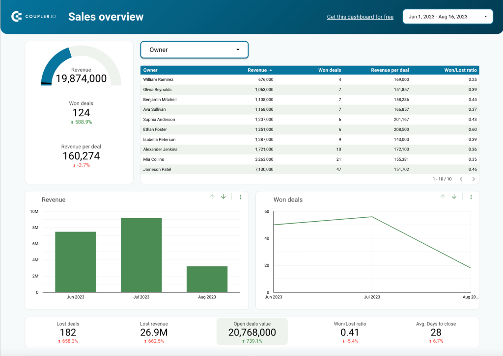
This sales revenue dashboard explores metrics from a slightly different angle, focusing on sales performance. This report allows you to track total revenue towards set financial goals, see how it correlates with deal statuses, analyze reasons for lost revenue, and more. The dashboard also demonstrates the sales team’s performance. You can see which sales managers drive the most revenue and how revenue metrics change over time.

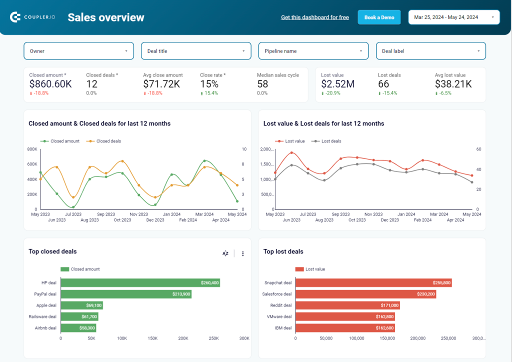
Just like the previous dashboard, this report is also live, interactive, and automated with the help of Coupler.io. The latter extracts data from the CRM app according to the set schedule and channels this data into the dashboard.
This is one of the CEO dashboard templates that can be connected to Pipedrive or HubSpot – if you use one of these apps, we recommend trying it out.
3. Product revenue summary dashboard
As you probably noticed, revenue dashboards can vary depending on their goal and focus. Dashboards for different purposes and audiences can include different sets of metrics and vary in the level of detail. This dashboard presents a granular overview of product revenue over the course of two months.

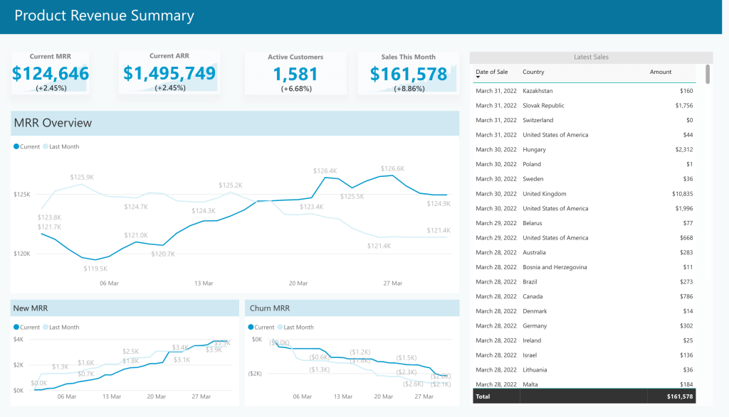
It allows you to track essential metrics such as current MRR and ARR (monthly and annual recurring revenue), monthly sales, and their growth rate. The dashboard can also be used for period-over-period analysis. Here, you can see the comparison of MRR for the current and previous months. You can analyze revenue trends and monitor changes in new MRR and churn MRR.
If you want to build your own custom dashboard like this one, you can contact our data analytics services team for help.
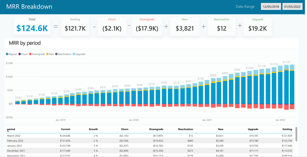
4. Monthly recurring revenue breakdown
Our next example presents data for a detailed analysis of monthly recurring revenue by period. The dashboard shows MRR growth over the course of several years. Analyzing revenue performance for such a long period can be useful for shaping financial strategy and defining new opportunities.
In particular, the main graph here gives us information about the regular MRR, churn, new, and reactivation MRR. It also shows their percentage in the total MRR for a given month. All this allows you to conduct in-depth analysis and obtain useful insights for the future.

5. Revenue cycle KPI dashboard
The next example on our list is a revenue cycle KPIs dashboard by HealthCatalyst. This is one of the most important revenue dashboard types. It can be used as a helpful instrument of revenue cycle management and maintaining financial health.
This dashboard allows you to track the most essential KPIs, such as collection rates, bad debt rate, total accounts receivable, and so on. You can keep track of the changes, perform analysis, and find opportunities for optimizing your organization’s revenue cycle.

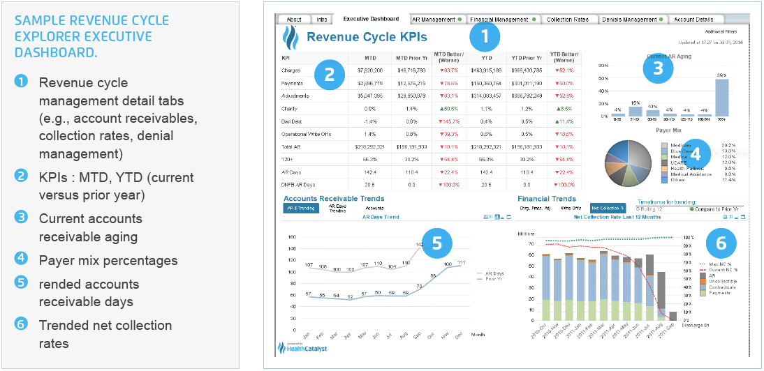
Revenue cycle KPIs dashboards are often used by organizations working in healthcare. However, such reports can be useful for businesses from other industries as well.
How businesses use revenue dashboards: two case studies
To give you a better idea of how revenue dashboards can improve business results, we’ve prepared two case studies. Both are based on our partners’ business cases. They are an illustration of how efficient data management and financial reporting can propel companies forward.
Case 1: PlumbBooks. Using a high-level revenue dashboard for daily monitoring

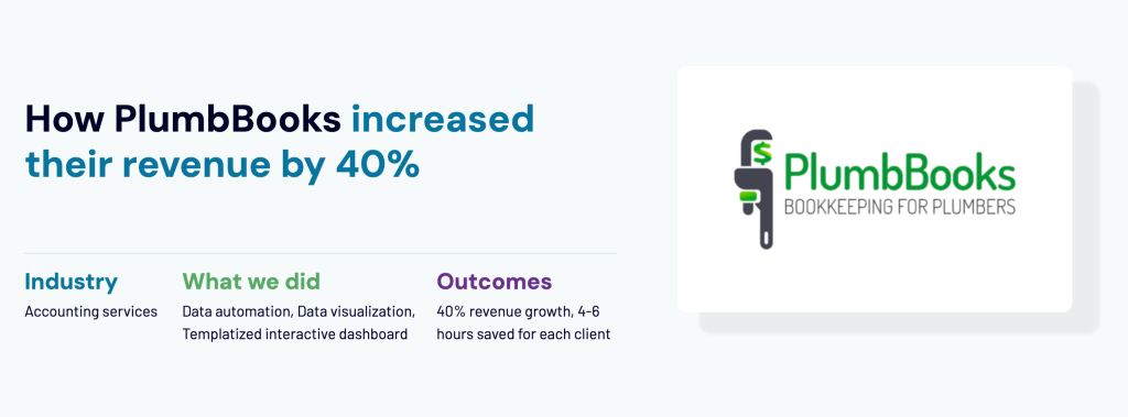
PlumbBooks is a premium QuickBooks-based bookkeeping service for plumbers, electricians, and other home service providers.
Their clients wanted to track their revenues, expenses, margins, and other metrics in a clear and simple visualized format. However, they couldn’t do this in QuickBooks as it isn’t well-suited for monitoring high-level financials.
To solve this problem, Coupler.io’s team of data analysts came up with a user-friendly dashboard template. It could be automatically populated with data and required little to no effort to set up. This revenue dashboard template was created in Looker Studio. Data from QuickBooks was imported into Looker Studio automatically with the help of a Coupler.io importer.
Under the hood, Coupler.io importers automatically pull 4 different reports for each client: Profit & Loss, Balance Sheet, Account Payables (AP), and Account Receivables (AR). These reports are linked to dashboard templates in Looker Studio, so this data is used to populate the visualized reports.
Explore the free balance sheet dashboards provided by Coupler.io.

As a result, PlumbBooks clients can track their finances in an easy-to-use automated revenue dashboard that focuses on the high-level metrics that matter most. This option was very useful and immensely valuable to the customers. Offering these dashboards became one of PlumbBooks’ USPs (unique selling points) and resulted in increasing their customer base and revenue. Read the full case study
Business outcomes
- PlumbBooks revenues soared by ~40% in 2023
- The team saves 4-6 hours of manual setup for each client
Case 2: Terminal 1. Reducing reporting time with revenue dashboard and automation

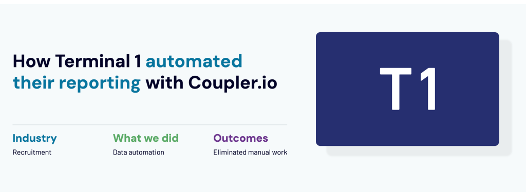
Terminal 1 is a popular recruitment platform, focused on connecting engineers with recruiters.
Since the company has separate business entities in Taiwan and Hong Kong, the accounting team works with two different QuickBooks instances. They needed to combine this data for reporting and analysis, but couldn’t do this in QuickBooks. In addition to this, they also wanted to analyze their QuickBooks data together with the information they collected in Airtable.
To solve this challenge, Terminal 1 used Coupler.io to automatically export and merge data from Airtable and different QuickBooks accounts. After this, Coupler.io automatically imported the merged dataset into Google Sheets. In the spreadsheets, analysts used this data to create a set of dashboards: a revenue dashboard and other financial reports, sales dashboards, and project dashboards.

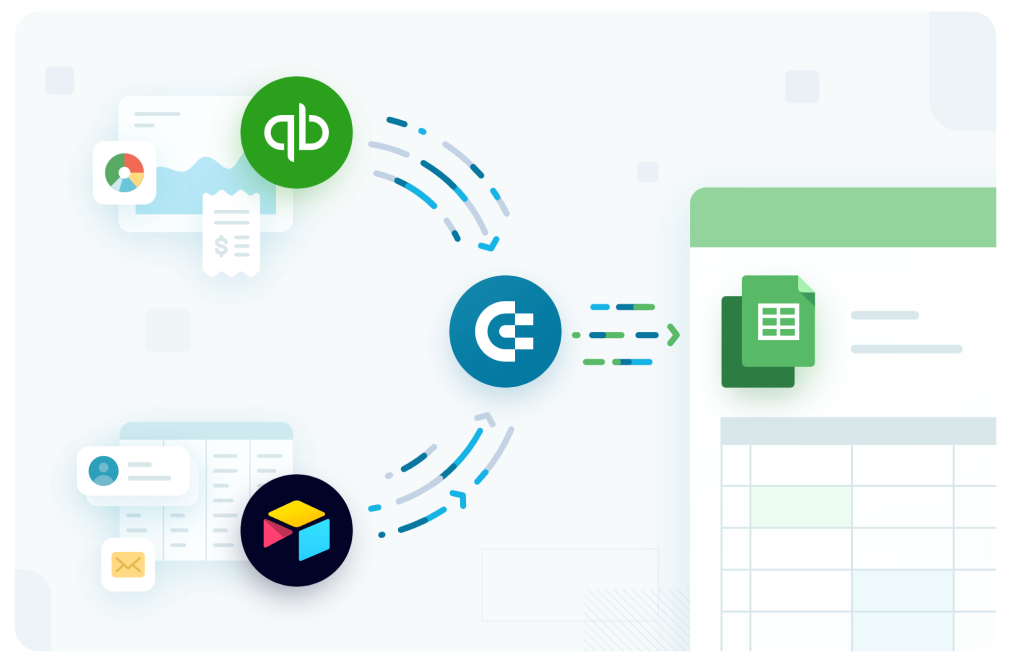
Coupler.io keeps refreshing information in the spreadsheets daily to keep the dashboards up to date. Now the Terminal 1 team has access to fresh and complete analysis-ready data from all over the company. This gives them an opportunity to use their data to the fullest and turn it into actionable insights. Read the full case study
Business outcomes
- All financial data is collected in one place and can be analyzed together
- Financial reporting within the company is automated
- Refreshing reports and merging data from different accounts requires no manual effort
- A significant amount of time is saved due to automation
In this case, we see that the revenue dashboard was part of a more comprehensive effort to automate financial reporting in general. Such an approach proved to be the most beneficial. It allows businesses to effectively manage financial data flows and obtain a 360-view of a company’s financial performance.
Build an automated revenue dashboard in minutes with a free template
There are several options for creating a revenue dashboard: you can build it from scratch on your own, use a template, or hire an expert.
Building a dashboard with a template is one of the most convenient options. For example, with one of our free templates, you can get an analysis-ready dashboard in a matter of minutes. Check out the dashboard templates available at Coupler.io.
These free templates are automated with Coupler.io. So you will only need to connect your data source and your Looker Studio account – after this, your data will be visualized automatically.
- Choose one of the templates from the list above and open it.
- Navigate to the Readme tab of the selected template and follow the instructions.
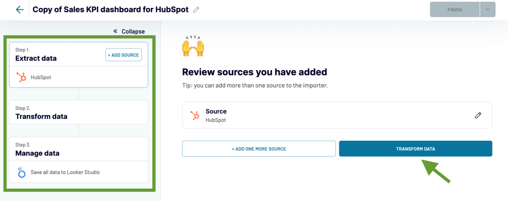
- Once you create a Coupler.io account and click the link in step 2, as shown in the screenshot above, you will be taken to the importer setting page.
- Connect your data source account. Actually, that’s the only thing you will need to do – all the other settings are already preconfigured. This means your data will be exported and visualized automatically. When your data source account is connected, click Transform data.

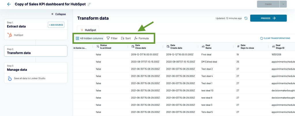
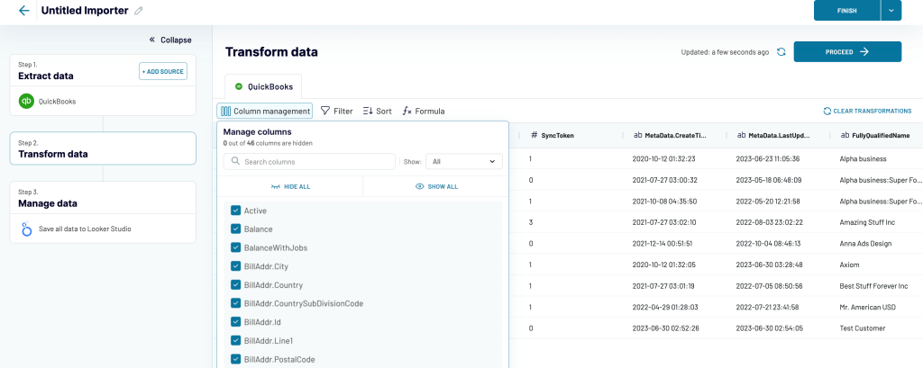
- In this block, you can preview your data before it’s exported. Data transformations are also available, but you don’t need to change anything as you are using a pre-set template. However, you might need to perform some transformations when you create a dashboard from scratch. In this case, you can manage columns, sort and filter data, use formulas, and more. We will cover this in the next section. Right now, just preview your data and click Proceed.

- Then, follow the on-screen instructions to connect your Looker Studio account. You will need to add this importer as a data source and authorize Looker Studio to connect to Coupler.io and import data.
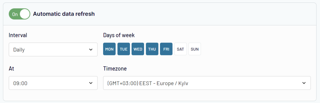
- In the last step, you can specify a schedule for automated updates. Toggle on Automatic data refresh and select the days, times, and the interval for exporting fresh information from your data source. When Looker Studio imports this data from Coupler.io, your dashboard will be updated automatically.
- Save and run the importer, then view the results. That’s it! You will get a copy of this dashboard with your data.

This process usually takes up to 5 minutes, and then you can start analyzing your financial data in an automated revenue dashboard. Or, if you prefer, you can use Looker Studio’s rich functionality to customize the dashboard to your liking – add your logo, rearrange sections, connect additional data sources, and so on.
But what if your data source is different from QuickBooks, Pipedrive, or HubSpot, and there’s no template available? In this case, you can take another route, which we cover in the next section.
How to automate your dashboard if you build it from scratch
If you want to build a revenue dashboard without a ready-to-use template, it can take a bit longer. But you can still easily automate your report and make it self-updating with the help of Coupler.io.
1. Extract your data automatically
Select your data source and the preferred destination from the drop-down menus in the form below. In our example, we will connect QuickBooks and Looker Studio.

Then, you will need to connect your data source account and select the data type to export.
2. Preview and transform your data
In the next step, you can preview and edit data that is about to be transferred to the destination app. In particular, you can:
- Hide columns that you don’t need
- Split, merge and rename columns
- Perform formula-based calculations
- Sort and filter data
- Blend data from different apps or accounts
This ETL functionality is very useful as it allows you to prepare an analysis-ready dataset and only import data you really need.

Once this is ready, follow the in-app instructions to connect your destination account.
3. Schedule updates and manage your data
Before you run the importer, you can set a custom schedule for automated updates. You can select the days and times for data refresh, as well as the update interval (up to every 15 minutes).

Then, save and run the importer.
Now, your data is transferred to the data viz tool, so you can start building your dashboard. Thanks to Coupler.io, it will be automated and self-updating. If needed, you can also add other data integrations to your dashboard.
If you need help with the further steps on data visualization, you can check our Looker Studio Tutorial: Dashboard for Beginners.
Best practices for building a revenue dashboard
Here is a summarized list of the main best practices that can be useful to you.
- Tailor the dashboard to the target audience and objectives. Start with the question: who will be using this dashboard and how? For example, C-level executives will likely prefer a high-level overview. At the same time, other stakeholders can need a more detailed version for day-to-day management or deep analysis.
- Include drill-down capabilities. This is an excellent way to keep the design clear and simple while allowing for further exploration. Give your audience the information that matters most, and include additional details as drill-through views.
- Power it with real-time data. Your revenue dashboard will be much more valuable if it always displays the latest data. This will make it an indispensable instrument for continuous monitoring. A live revenue dashboard will help your organization implement data-driven decision-making as a daily practice.
- Leverage automation to save time. Automation is vital for using your business data to the fullest. It allows you to automate financial reporting, build live dashboards, create auto-updating reports in spreadsheets, and more. The right tool can collect data from numerous sources across your organization and keep it analysis-ready in the single source of truth.
- Use specialized data viz tools. Native reporting features in financial apps are usually limited. They don’t give you much flexibility for data visualization, customization, and shareability. So it’s better to opt for specialized data viz and BI tools, such as Looker Studio, Power BI, and Tableau.
- Start with templates. A pre-set template is a good place to start. While you will probably have your own requirements and unique needs, you can always customize the dashboard built with a template. In most cases, it’s faster and easier than creating a new one from scratch.
- Use the SMART criteria for metrics. The SMART formula means that your metrics should be: specific, measurable, attainable, relevant, and timely. This will ensure clarity and help you obtain actionable insights from your financial data.
Following these best practices will help you build useful and concise revenue dashboards for various purposes.
Even though all these practices on our list are useful and important, it’s worth double-underlining the value of automation. According to recent studies, hyperautomation is one one the key intensifying trends in finance. What is meant by hyperautomation is “an approach of rapidly identifying, vetting and automating as many business processes as possible – using an orchestrated combination of multiple technologies, tools or platforms”(1). This includes various solutions ranging from AI/ML algorithms to low-code/no-code tools.

So, to maximize the outcome, the best thing is to include your revenue dashboard in a more systematic effort to automate your financial data flows. See our case studies at the beginning of the article to learn how businesses are already doing it and what results they are achieving.
Business value of financial dashboards and revenue dashboards
Revenue dashboards undoubtedly come with a lot of benefits, from reducing risks to enhancing forecasting and improving financial health. They increase transparency, enable continuous monitoring, and serve as a valuable tool for informed decision-making. What’s important, they address some of the major pain points many companies have. Let’s take a quick look at those pain points and then see how a revenue dashboard can cure them.
What issues does inefficient revenue reporting cause?
One of the major pain points for businesses is getting caught up in the so-called organizational drag, or organizational inertia. This is when processes within a company are not organized efficiently enough, so things that should happen lightning-fast become protracted and take forever. This affects a company’s ability to respond to challenges, implement new ideas, and grow.
As you can see from the image below, the absence of clear and transparent reporting is one of the major reasons contributing to this issue.

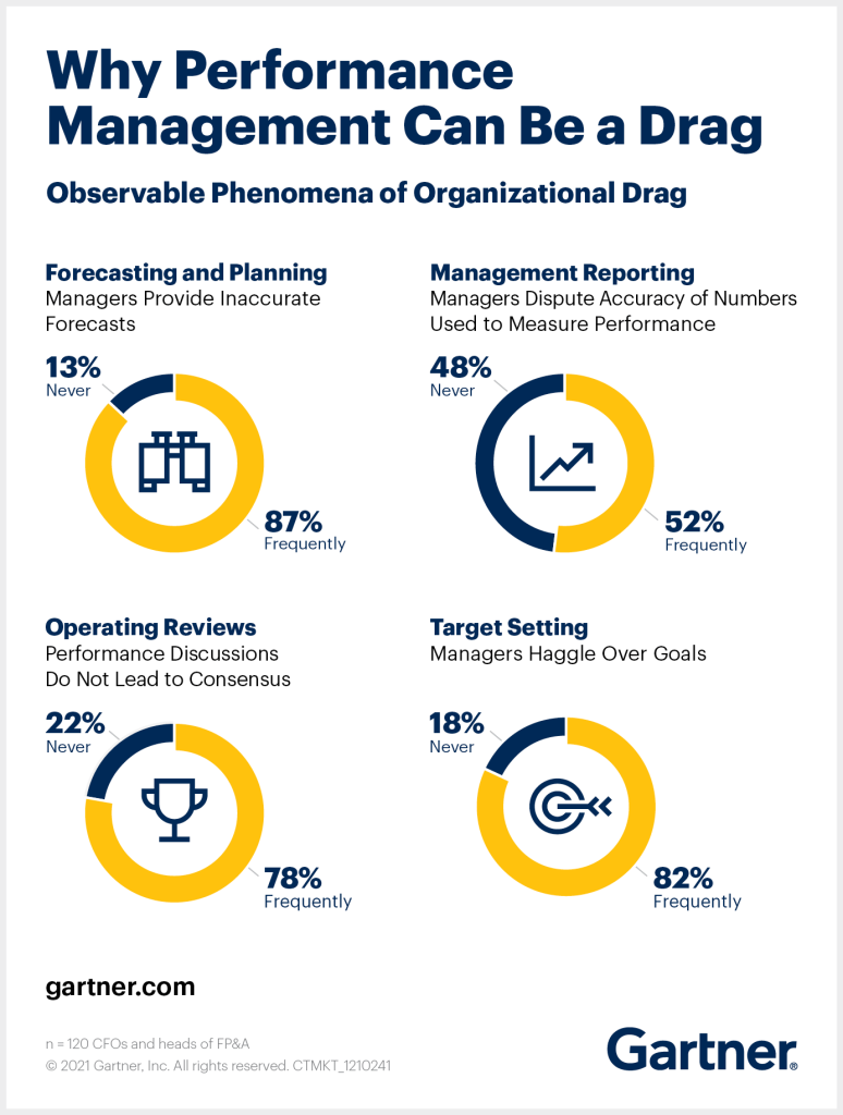
Addressing the problem of an organizational drag can significantly boost efficiency and lead to increasing ROI. This is confirmed by Gartner research, stating that “CFOs who report the highest return on investment (ROI) on performance management activities focus on reducing the drag on organizational decision-making” (2). In other words, when you clear all the obstacles in the way to making decisions faster, a company becomes more agile and responsive to change. Which, in turn, eventually allows you to increase ROI.
Along with this overarching challenge, businesses typically encounter many others:

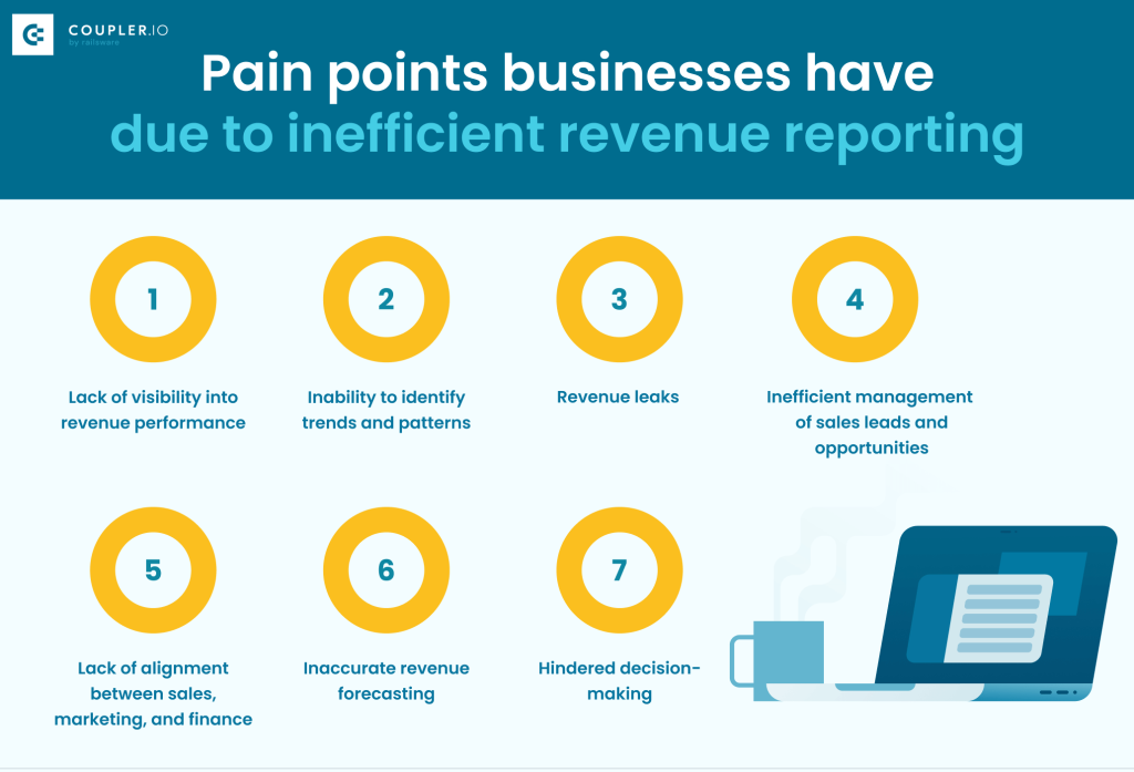
All these factors can accumulate over time and hinder future business growth.
How can dashboard reporting help you deal with these challenges?
These issues can be effectively addressed by having a centralized data cockpit. A place where all crucial data is accumulated and maintained in the analysis-ready format – clean, regularly refreshed, and easy to work with.
This can be achieved by preparing a set of financial dashboards, which includes a revenue dashboard as well. Such automated visualized reports provide a transparent, up-to-date overview of all the key performance indicators. If created in a specialized data viz tool, a revenue dashboard can be easily shared with all stakeholders. With all the latest information available 24/7, it’s much easier to control the processes and keep everyone on the same page.
To be an effective instrument for financial analysis, a revenue dashboard should be fit for 2024 challenges. This means it should be live, interactive, automated, aggregating information from across the organization, and providing a basis for data-driven decisions.
With such an automated live dashboard, you get:
- Full transparency of your revenue flows. When all your revenue data is consolidated in one place, you can finally get rid of data silos and get the full picture of your financial processes.
- Continuous monitoring. With an automated revenue dashboard, you can closely monitor your financial KPIs on an ongoing basis. This allows you to track profit and loss, manage budgets, and stay in control.
- Always fresh analysis-ready revenue data. You won’t have to wait for the next quarterly or monthly report to review the changes and assess where you stand. Automation gives you instant access to the latest information whenever you need it.
- Faster reaction to challenges. Visualized data is easier to analyze, so a revenue dashboard allows you to spot trends, patterns, and correlations early on. This enables you to react faster to possible issues and opportunities.
- Improved collaboration. You can easily share a dashboard in Looker Studio or Power BI with your colleagues, clients, and other stakeholders. When everyone has 24/7 access to the latest data, it helps keep stakeholders aligned.
- Solid basis for building projections. When you have historical data well-organized and stored in the same place as your recent data, you can perform period-over-period analysis and use the obtained insights for forecasting future revenue trends.
- Data-driven decision-making. With fresh data easily available to more people, you have a good foundation for making informed decisions that translate into business results.
In one of the previous chapters, we provided examples of automated dashboards that can give you all these benefits.
Revenue dashboard FAQ
What is a revenue dashboard?
This is a comprehensive data visualization that represents a company’s revenue performance through charts, graphs, tables, and other graphic elements. Typically, modern revenue dashboards are automated and display the latest financial data in real time.
Why a revenue dashboard is important
Revenue dashboards can serve as vital instruments in enabling data-driven decision-making. They allow businesses to keep track of their revenue performance, identify risks and areas of improvement, and monitor progress towards financial goals.
What should you include in a revenue dashboard?
The exact list of elements to include in a revenue performance dashboard depends on its specific goals and focus. But, in general, such elements are typically present:
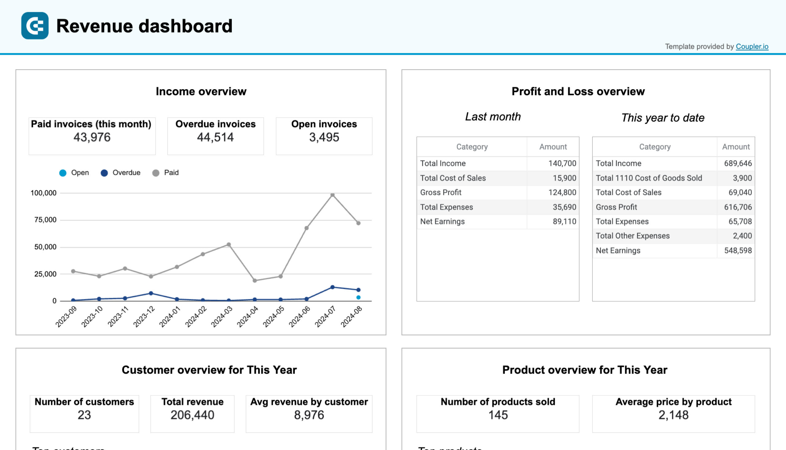
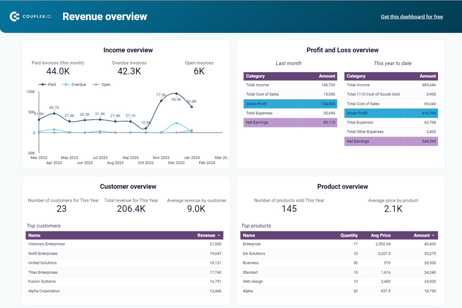
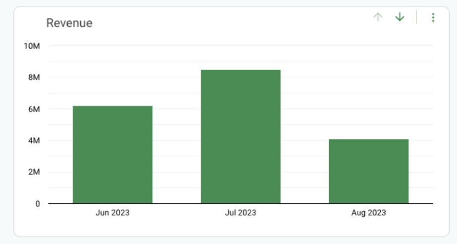
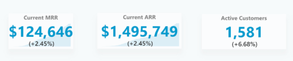
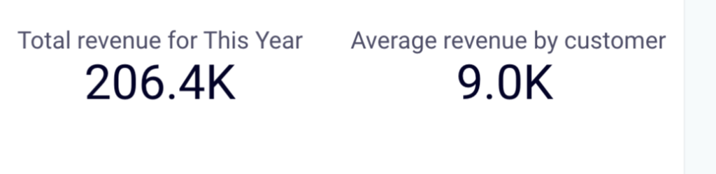
- Key metrics. There are a lot of metrics you might need to track. One of the most important ones is, of course, total revenue. It’s also useful to monitor average revenue by customer, MRR, ARR, and other benchmark metrics. For example, this can take the form of graphs…

…or scorecards


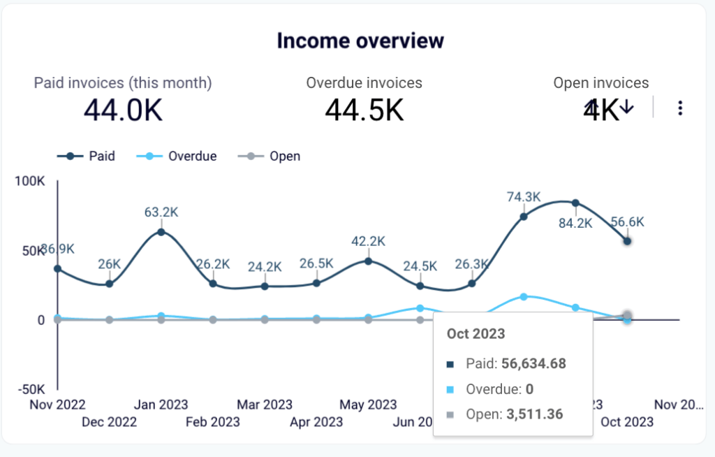
- Income overview. This can include crucial numbers such as paid invoices, overdue, and open invoices. It’s convenient to present this information in the form of an interactive graph that allows you to analyze income over time.

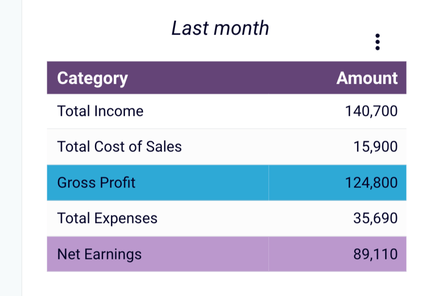
- Profit and loss. It is one of the most important financial statements. The profit and loss dashboard contains such metrics as total income, gross profit, and total expenses. Most revenue dashboards feature this information.

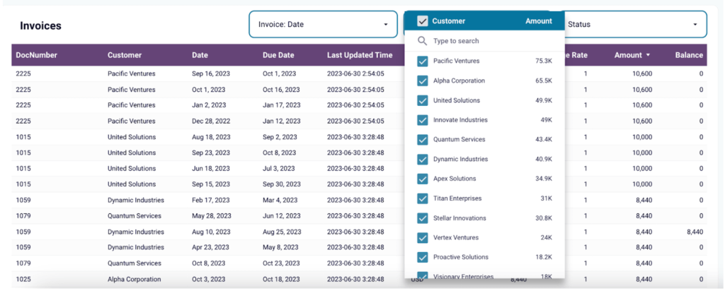
- Invoices. Granular information on your invoices will help you analyze revenue performance in more detail. It’s useful to add filters that will allow you to see invoices with a specific status or from a specific customer.

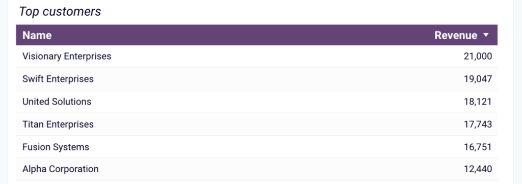
- Customer overview. Many revenue dashboards include a block summarizing information about top customers and the amount of revenue they generated. This information helps you understand who your key partners are and where your sales efforts should be focused.

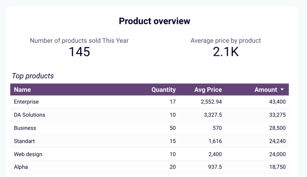
- Product analysis. Likewise, analyzing your top performing products gives you an understanding of where most of the revenue comes from. It can give you valuable insights and ideas on how to adjust your strategy to maximize revenue.

- Additional metrics. Depending on your needs, you can also include some other metrics. For example, customer acquisition and retention metrics (customer acquisition cost, lifetime value) or sales performance metrics (average order value, conversion rate), and so on.
These are the main elements typically included in revenue dashboards. But, of course, there are no two companies that are exactly alike, so the financial dashboards are always tailored to the specific requirements and processes.
A revenue dashboard as a part of your financial reporting
A revenue reporting dashboard is an important instrument for financial analysis, identifying areas of improvement, and building forecasts. As it offers full transparency and clarity, it can also reduce the “organizational drag” in the company and facilitate decision-making.
Having a revenue dashboard is most beneficial when it’s a part of a broader financial reporting process. For example, when a company uses a data automation tool to manage its financial data efficiently, This allows them to collect all the valuable data across all departments and from different applications, and aggregate it in one place for in-depth analysis. These automated data flows then can be used to power a set of auto-updating financial reports and live dashboards, including revenue dashboards. For example, you can use Coupler.io to streamline data flows and automate reporting.
In this case, an organization can use its financial data to the fullest and obtain valuable insights for increasing ROI and improving financial health. If you want to explore this topic in more detail, check our articles on Financial performance analysis and The value of financial data analytics.
Good luck with your revenue reporting dashboard!
References
1. What CFOs need to know about finance technology. – Gartner
2. Tune Your Finance Dashboard Using Metrics to Drive Performance. – Gartner