A sales reporting dashboard plays an important role in the success of sales strategies. It ensures transparency and empowers sales leaders to make decisions based on data. With the right dashboard, you can easily track performance indicators, identify patterns, and establish targets that drive business growth.
In this article, we explore 15 sales dashboards categorized by their primary function or purpose. This approach focuses on what business problem each dashboard solves and allows you to easily identify which options will address your specific sales challenges. Here are the categories of sales dashboards we’ve come up with:
- Performance analysis dashboards provide detailed insights into sales performance at both team and individual levels. They allow you to identify top performers, analyze win/loss patterns, and optimize sales strategies.
- Pipeline management dashboards focus on visualizing and optimizing your sales pipeline to track deals as they move through different stages and identify bottlenecks in your sales process.
- Marketing & sales integration dashboards show how marketing efforts translate into sales results and help both teams align their strategies.
Performance analysis sales dashboards
1. CRM dashboard for Pipedrive, Hubspot, or Salesforce + free template
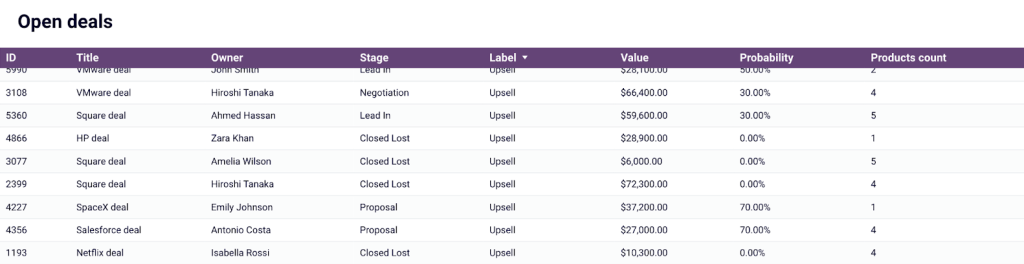
Let’s start off strong with this CRM dashboard that gives you a detailed overview of your sales pipeline and other major KPIs, such as total sales, win/close rate, and open deals. It uses Coupler.io’s built-connector to regularly pull fresh sales data from either your Pipedrive, Salesforce, or HubSpot CRM.
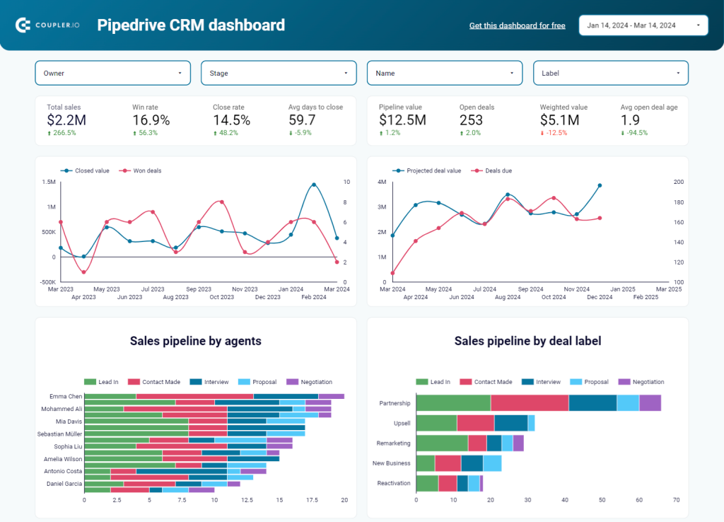
This dashboard is useful for optimizing your pipeline efficiency. For instance, you can analyze unclosed deals by owner, type, revenue, stage, and win probability to identify common blockers, adjust your sales process, and secure immediate revenue.
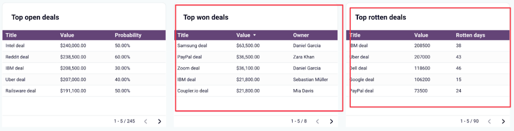
You can also check the scoreboard for top won deals to understand which types of companies generate revenue, who their decision-makers are, and what industries they operate in. For rotten (lost or blocked) deals, avoid future losses by determining the critical number of days for closing the deal.
This free template is available in Looker Studio for Salesforce, HubSpot, and Pipedrive. Get a copy of this dashboard with your data by signing up or logging in to your Coupler.io account. It only takes a few minutes to set it up!
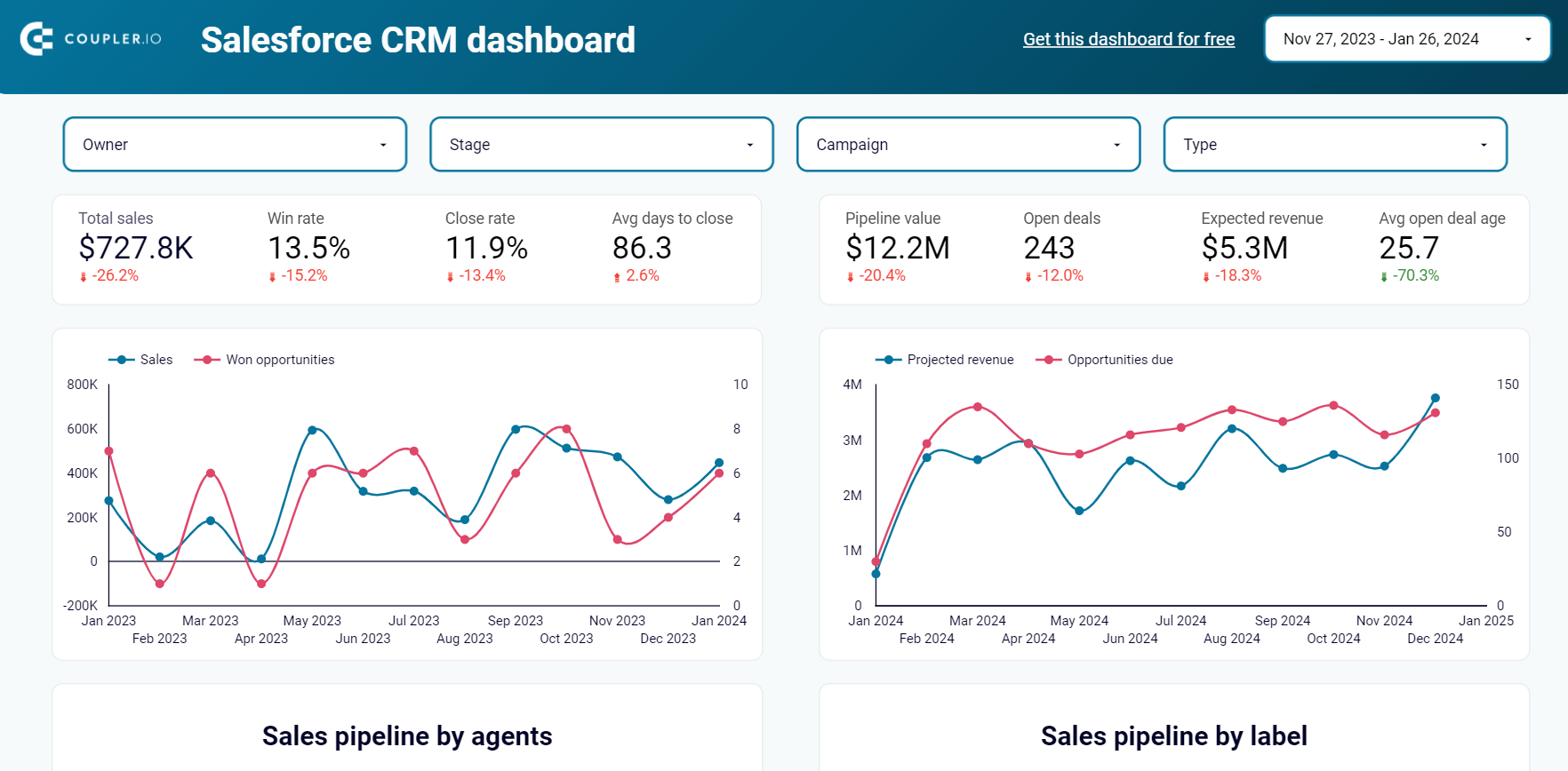
CRM dashboard for Salesforce in Looker Studio
Use our CRM dashboard for Salesforce to track key metrics, check how your sales team performs, and understand what drives your revenues.


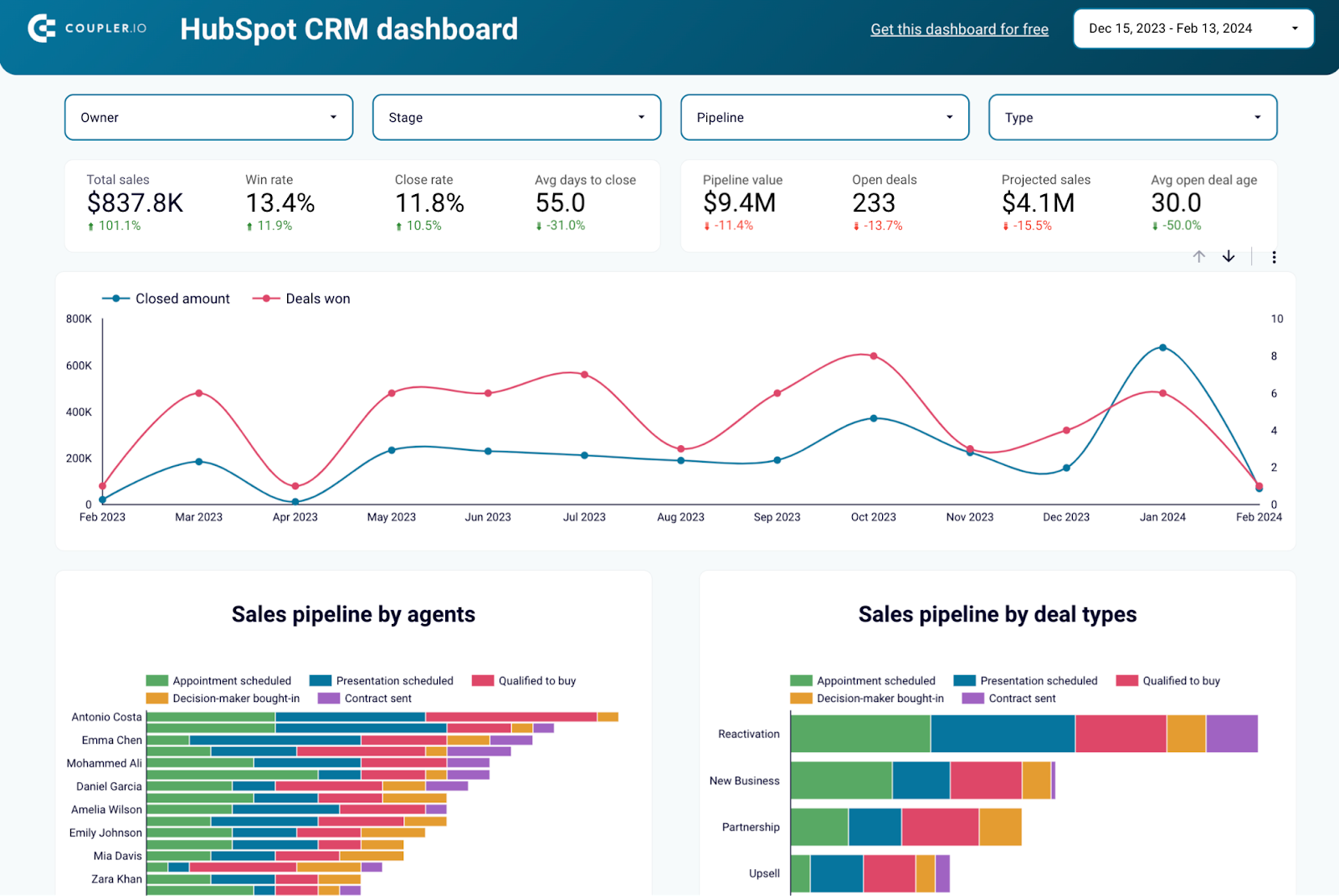
CRM dashboard for HubSpot in Looker Studio
Use our CRM dashboard for Salesforce to track key metrics, check how your sales team performs, and understand what drives your revenues.

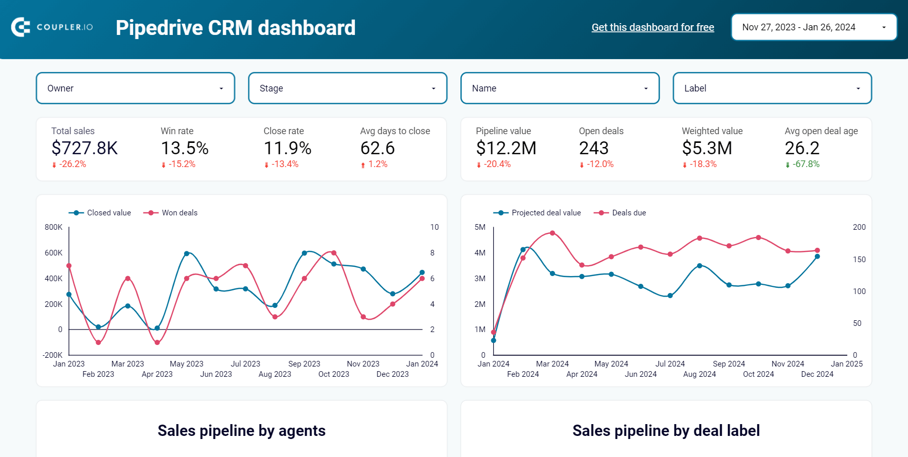
CRM dashboard for Pipedrive in Looker Studio
Stay on top of your Pipedrive sales using our CRM dashboard which allows you to analyze your sales department’s performance.

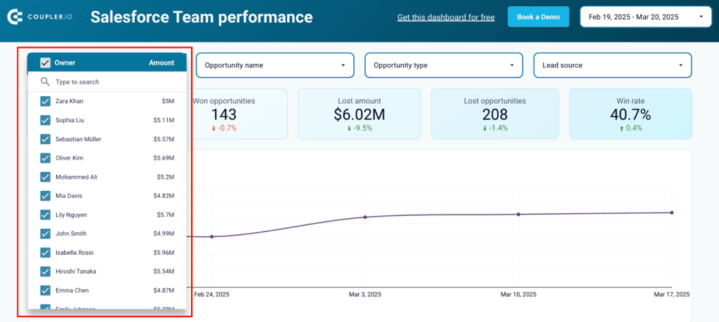
2. Sales team performance dashboard for Salesforce + template
The sales team performance dashboard allows you to analyze your team’s efforts and measure each sales rep’s contributions and performance. It works best for teams with at least 2 sales reps or managers.
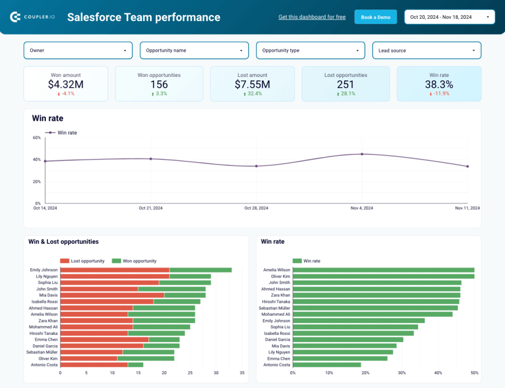
The dashboard pulls deals data from your Salesforce CRM using Coupler.io’s built-in connector. Use the filters on the main screen to:
- Understand fluctuations in team member performance. Segment sales metrics by owner to assess individual contributions and varying results by geography, stage, lead source.
- Identify deal ownership trends. Segment deals by type to identify which owners are most frequently responsible for specific deal types.
Quickly identify your teams’ best and worst performers by comparing win/loss rates, average won and lost amounts, and won opportunity types. You can also check how each sales rep’s funnel looks at different sales stages.
As an added bonus, the dashboard has a second page that provides an overview of tasks. Analyze the charts and tables to see who completes the most high-priority tasks, or who has the biggest backlog.
This is one of the CEO dashboard templates that you can get with a free Coupler.io account, which also allows you to schedule automatic data refreshes (every day, week, etc.). That means you’ll always have the freshest Salesforce data on hand.
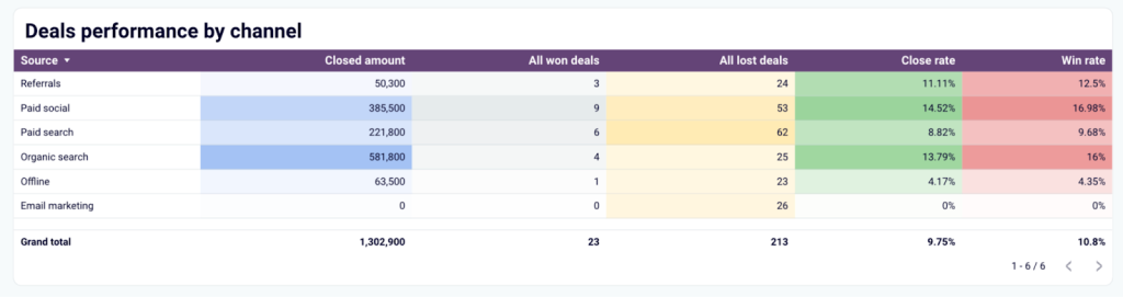
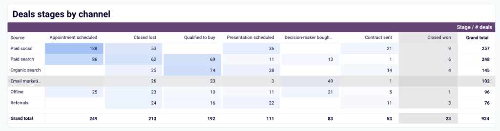
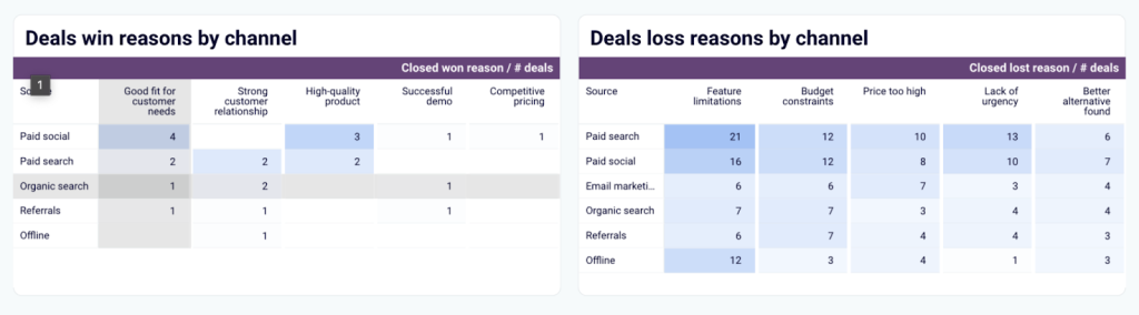
3. Salesforce win/loss analysis dashboard + template
If you want to pay special attention to your win/loss dynamics in Salesforce, this dashboard is the perfect tool. It allows you to compare and contrast won and lost amounts, opportunities, and rates. You can use the filters to dive even deeper and develop ideas for sales strategy refinement.
You could start by checking different types of opportunities to understand their effectiveness. If your team focuses heavily on upsells, filter data by Upsell deals to see if they generate the expected revenue.
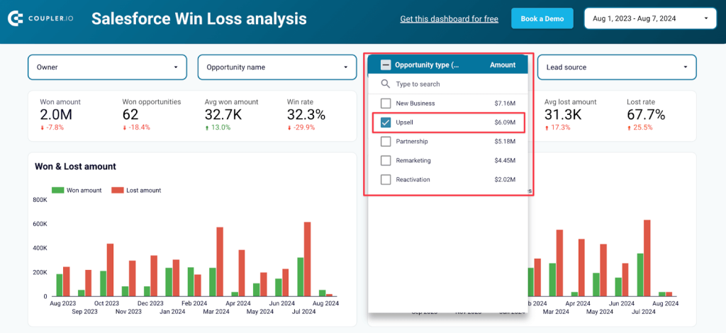
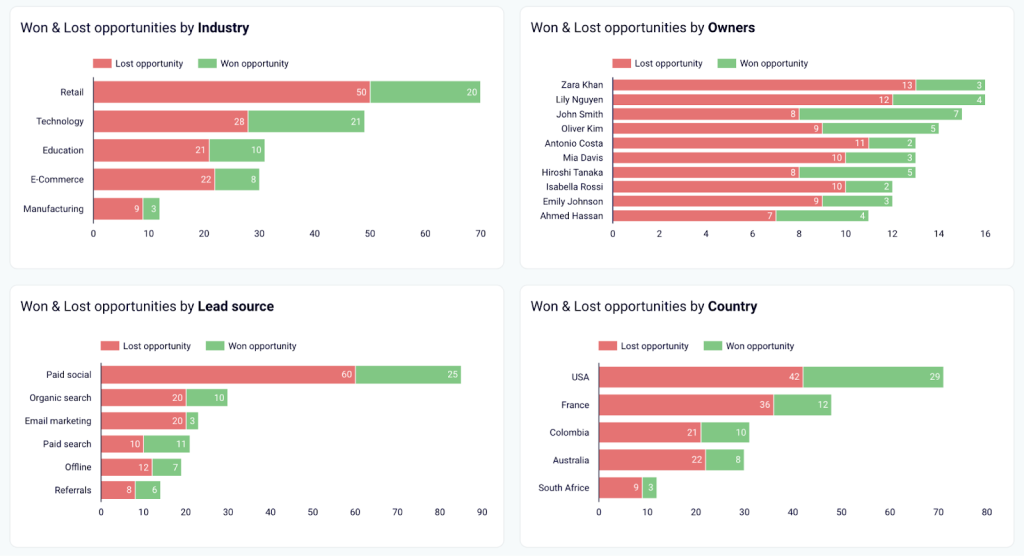
The dashboard also has several charts for analyzing all won and lost deals, segmented by various categories, such as industry, owner, lead source, country, and others. Identifying the best-performing segments will help you concentrate on specific types of deals. Conversely, identifying underperforming segments can help you scale back in those areas.
You can get a copy of this template with a free Coupler.io account. It only takes 5 minutes to sign up, connect your Salesforce CRM, and populate the dashboard with your own win/loss data. It’s available for Looker Studio:
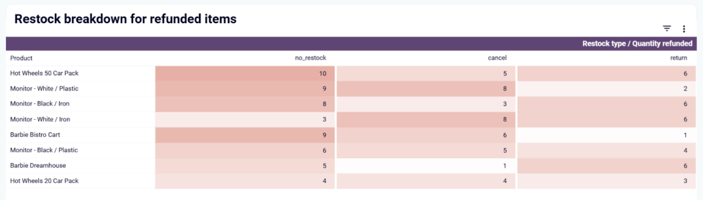
4. Inventory dashboard for Shopify
Managing inventory in Shopify becomes much easier with this Shopify inventory dashboard. It pulls data directly from Shopify and gives you a real-time overview of stock levels, sales trends, and refund rates.
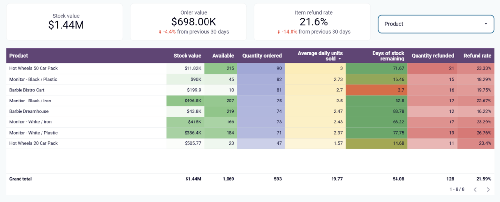
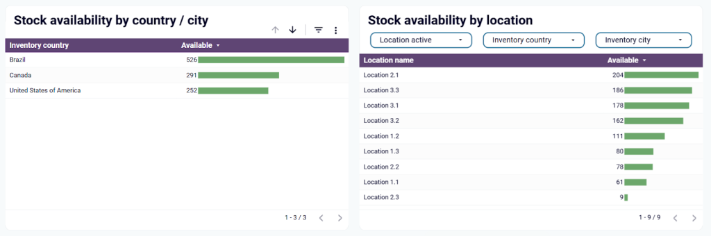
With this dashboard, you can easily identify products that are running low, track refund rates, and spot trends in sales volume. For example, if a product consistently has high return rates, you can investigate potential quality issues, misleading descriptions, or shipping delays. It also allows you to monitor stock availability across multiple locations, making it easy to balance supply and demand.
Another key feature is the ability to track daily sales trends and restock efficiency.
You can analyze how different products perform over time and ensure that returned items are either resold or replaced. This optimizes your inventory and minimize financial losses from refunds.
To get this template with your data, sign up for a free Coupler.io account, connect your Shopify store, and follow the Readme tab instructions to transfer your data. The dashboard will be ready in a few minutes.
5. Individual sales rep dashboard
We’ve discussed dashboards for sales teams and managers, but what about for sales reps? With this dashboard by Geckoboard, it’s easy for team members to track and assess their own performance. Sales reps can also use it to stay motivated and report on their personal results.
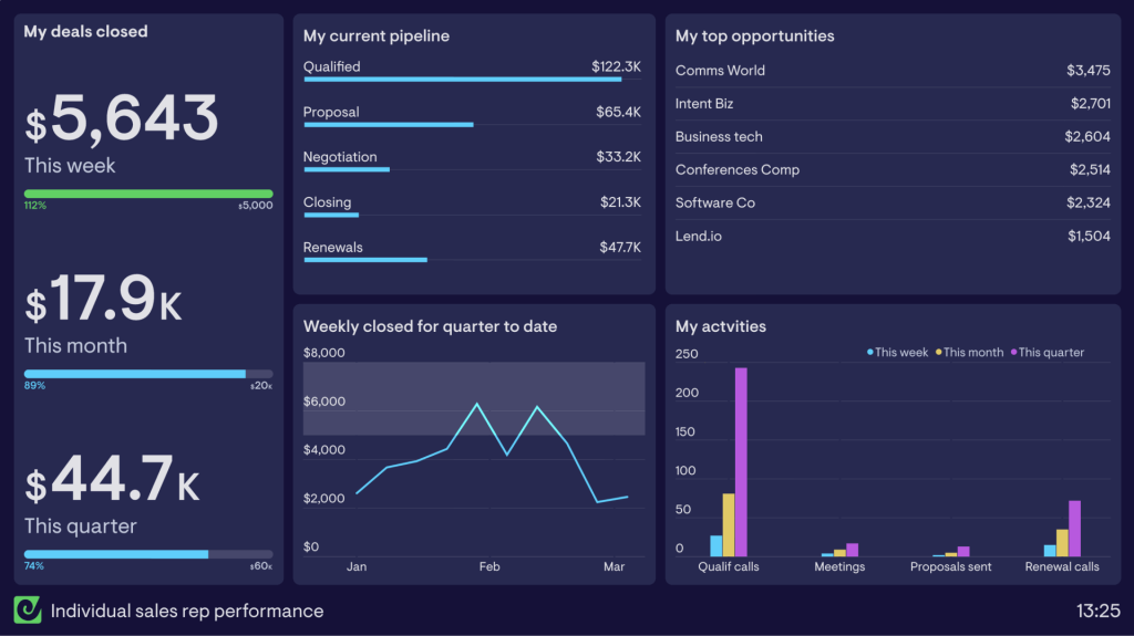
What else can you do with this dashboard?
- Track closed deal amounts by week, month, and quarter to measure progress against individual targets.
- Keep an eye on the current pipeline to help prioritize daily activities.
- Identify top opportunities to understand who to focus on and when to follow up.
- Assess your most frequent types of activities by week, month, or quarter to make changes in your calendar and improve productivity.
6. Sales leaderboard dashboard
A sales leaderboard dashboard is designed to create a healthy sense of competition within the sales team. This example by Plecto demonstrates how you can create leaderboards based on new revenue and deals won by sales reps. It helps ‘gamify’ the sales process and motivate team members to engage and perform at their best.
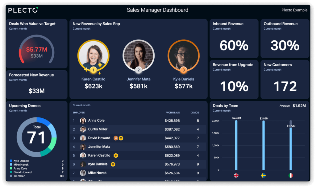
For instance, you can create a table with sales reps’ names and headshots, comparing performance by won deal amounts and demos held. You could also display the top three performers to show who brought the most revenue that month. If you have several multinational teams, visualize the top-performing regions to encourage competition.
This type of dashboard is helpful for quickly identifying your team’s best assets. It can also be used during team meetings to recognize achievements and inspire underperformers to improve their results.
7. Win/loss dashboard
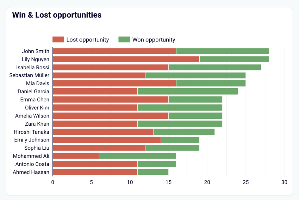
This win/loss dashboard example is similar to the one I mentioned earlier by Coupler.io. It pulls data from your Salesforce account, but it’s built in Google Sheets instead of Looker Studio. The dashboard enables you to track win rates by team, industry, lead source, etc., and uncover patterns in successful deals. It also allows you to evaluate the number and value of opportunities won or lost.
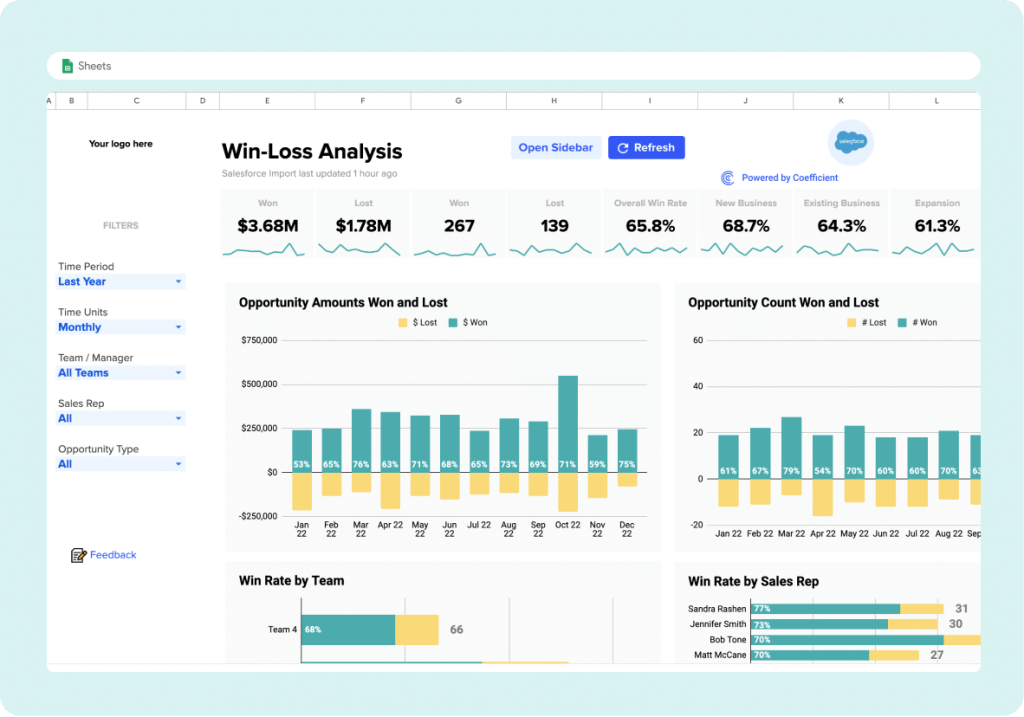
You can use the dashboard filters to segment data by time period, team, sales rep, and more. This can help you identify performance trends in deals won and see which team members land the most lucrative deals. It’s also easy to pinpoint where your lowest win rates are, so you can brainstorm how to increase them.
In general, the bar charts and scorecards simplify win/loss analysis and offer guidance when you need to make targeted improvements to your sales process.
8. Sales activity dashboard
This sales activity dashboard can be useful for sales teams who want to keep an eye on their day-to-day operations. It is designed by BoldBI and connects to your Pipedrive CRM to provide an overview of team activities such as calls, meetings, emails, etc.
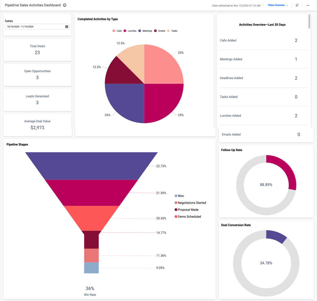
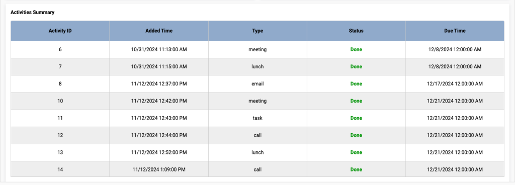
In addition to a sales pipeline funnel, there are scorecards for analyzing average sale cycle time, deal value, as well as activities completed and emails sent/received. An activities summary table allows you to track activity status and monitor deadlines.
Overall, the dashboard helps you answer questions like:
- How many new contacts and companies do we have this month?
- How quickly is the team progressing towards high-value activities?
- What is our average deal size? How long does it take to close a sale?
Sales dashboard examples for pipeline management
9. Sales KPI dashboard for HubSpot or Pipedrive + template
This sales KPI dashboard is a handy tool for tracking your key sales metrics, results pipeline, and overall team performance. It connects to your Pipedrive or HubSpot account and lets you visualize data related to closed/lost deals, open deal progress, and more.
For example, you can analyze the charts and tables to uncover seasonal patterns in your closed-deal revenue and understand the factors impacting results (team growth, marketing campaigns, etc.). Identify the reasons for lost deals and address them to increase your sales conversion rates.
On the second page, there is a pipeline funnel with 5 customizable stages. You can use it to identify where major drops occur and adjust your sales strategy to retain more leads.
The last page of this dashboard is dedicated to team performance. It allows you to compare team members’ achievements and pinpoint the cause of high/low results. For example, you can examine pipeline type or deal type to understand why certain owners achieve better results.
Want to try this dashboard for yourself? Simply create a free Coupler.io account and use the built-in Pipedrive/HubSpot connector to get started in minutes. First, choose your preferred template:

Sales KPI dashboard for HubSpot in Looker Studio
Get an overview of the HubSpot sales metrics and KPIs to derive insights into pipeline health using our sales KPI dashboard.
Sales KPI dashboard for Pipedrive in Looker Studio
Analyze the critical sales metrics and key performance indicators from Pipedrive to make smart strategic decisions.
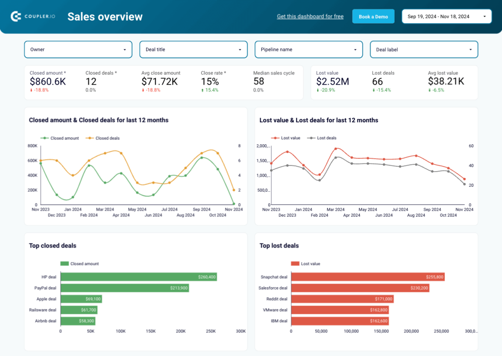
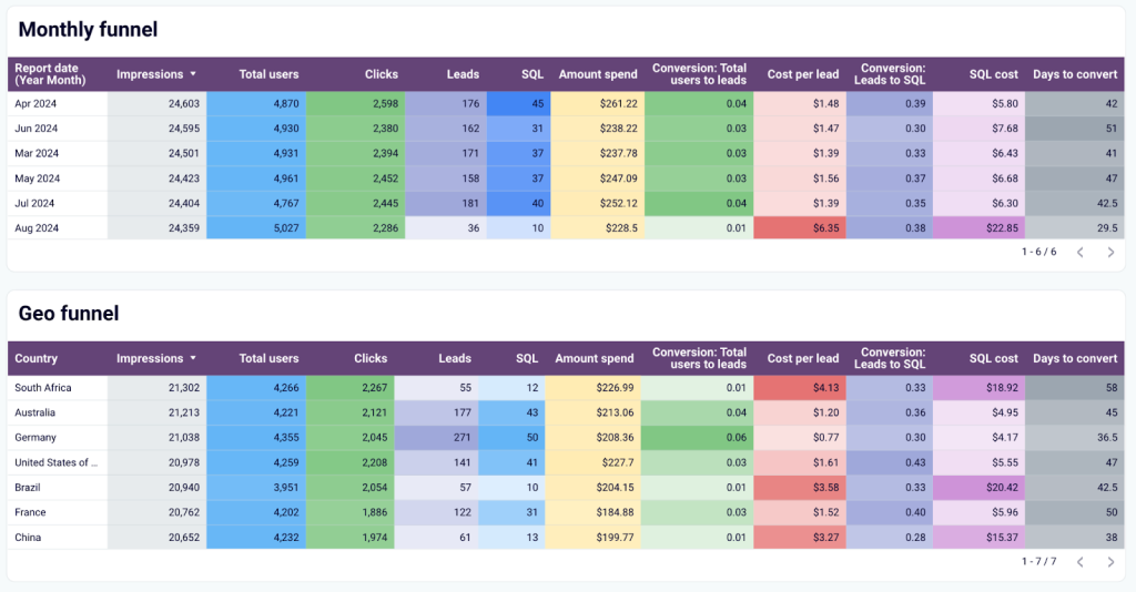
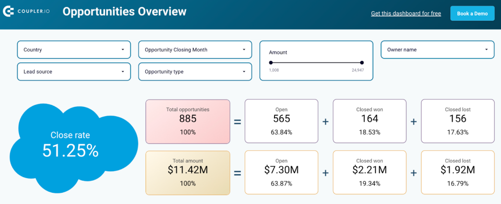
10. Salesforce sales analytics dashboard + template
Here’s another two-page dashboard template that seamlessly connects to your Salesforce account. It aggregates data from your CRM and advertising platforms to provide insight on lead acquisition dynamics and key performance indicators, such as clicks, impressions, cost per SQL, etc.
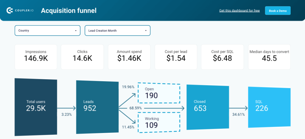
The dashboard has 3 funnel variations. The first is for tracking acquisition and conversions (total users ? SQL), while the table-view funnels allow you to compare the performance of different time periods and regions. Identify the best-performing segments and correlate them with marketing or lead-generation activities to uncover growth opportunities.
The second page is dedicated to open deals. Track their status and segment deals by owner, revenue amount, or deal type to prioritize high-value opportunities and identify potential bottlenecks.
This dashboard is available in Looker Studio. Simply sign up for a free Coupler.io account, connect your Salesforce and ad platforms in a few clicks, and schedule automatic updates for a daily or weekly data refresh.
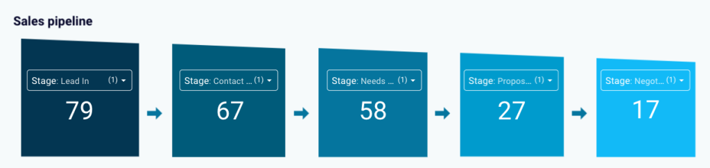
11. Sales pipeline dashboard
Sales managers frequently rely on a sales pipeline dashboard to visualize how prospects move through the sales funnel. This dashboard example by Tableau (Public) lets you track each stage of the pipeline by deal size, sales rep, and deal type. You can also filter the dashboard by region and stage name to spot geographical trends and address gaps in your pipeline.
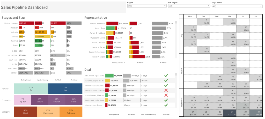
There is also a handy calendar widget for tracking expected deal closure dates for the next 3 months. It can help you prioritize certain open deals and assign the right sales reps to manage them.
Keep in mind that this dashboard measures deal amounts in millions, so it will only be useful if you have a pipeline with very high-value deals.
12. KPI dashboard for sales
A sales KPI dashboard is designed for sales managers and executives, as it helps connect sales activities to long-term business strategies. This next template was developed by Geckoboard and connects to your Salesforce account. It provides a brief overview of main KPIs, such as won deals (number & amount), result vs target, and the total value of open deals.
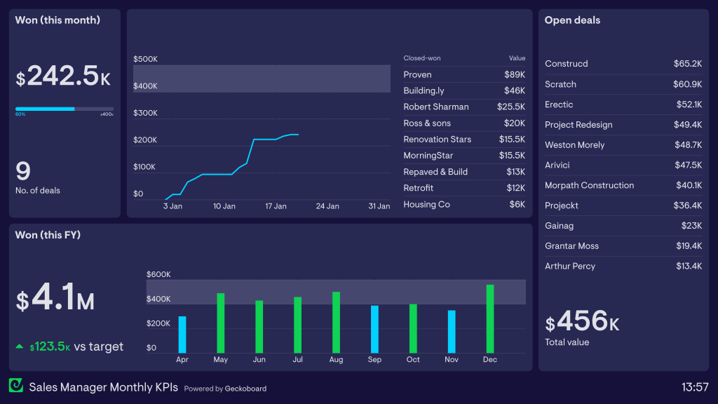
You can open it every few weeks or month to understand your overall sales performance. In general, it works as a guiding compass for a sales manager or account executive. For instance, you could:
- Check the closed-won graph to see how quickly the team is progressing toward the monthly targets – and change tactics accordingly.
- Analyze won amounts by calendar month to spot seasonal trends and identify the best time of the year to launch new campaigns.
- Evaluate the list of open deals to help prioritize the team’s efforts for the remainder of the month.
Marketing & sales integration dashboards
13. HubSpot marketing performance dashboard
If you’re looking for a complete overview of your marketing efforts, this HubSpot marketing performance dashboard is a must-have. It pulls data from HubSpot CRM and HubSpot Marketing Software, combining website analytics, sales funnel insights, and campaign performance.
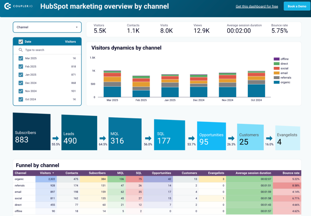
One of its biggest advantages is full-funnel tracking. It starts with the number of visitors you get and follows them through every stage of the seven-step sales funnel. You can track subscribers, leads, MQLs, SQLs, opportunities, and customers, all the way to evangelists. The dashboard also lets you filter by traffic source (organic, social, referral, paid, etc.) so you can see which channels bring the best conversions.
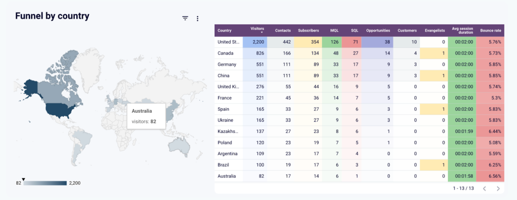
Need to analyze performance by region? Use the geo breakdown to see which countries drive the most leads.

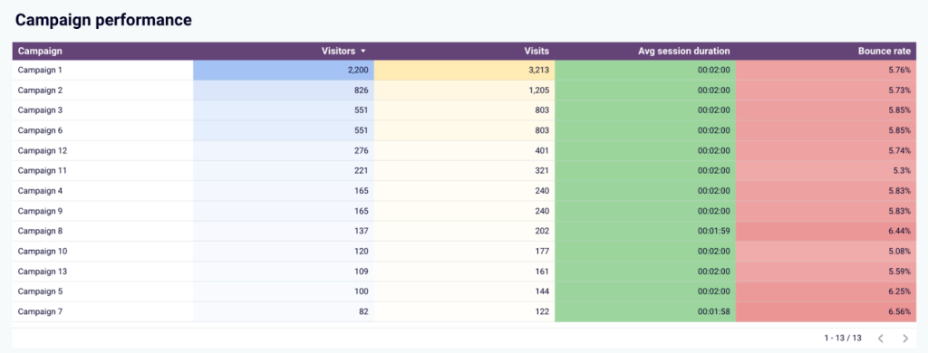
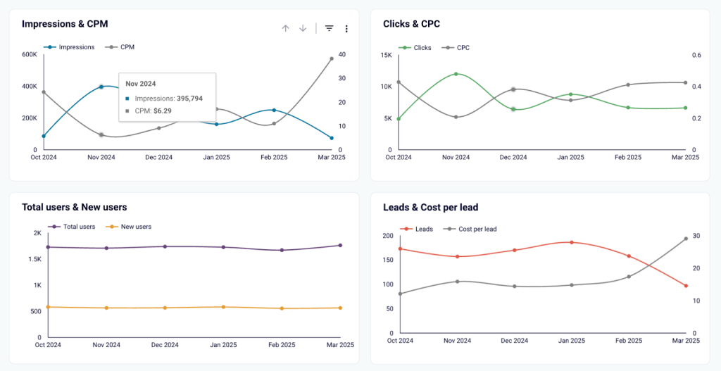
Want to check ad performance? The paid campaigns tracker compares the performance of different marketing campaigns. You also get a website and page-level performance report to find out which pages are working and which need improvement. The email campaign analytics help you track open rates, clicks, and bounce rates.
This dashboard is perfect for marketing and sales teams who want real-time insights to make better decisions.
To get this Looker Studio template with your data, follow the instructions in the Readme tab and sign up for a free Coupler.io account. In just a few minutes, you can connect your HubSpot CRM and Marketing Software, sync your data, and start tracking your marketing performance.
14. Marketing and sales performance dashboard for HubSpot
For businesses that want to see the direct impact of marketing on sales, this HubSpot marketing and sales performance dashboard connects the dots. t pulls data straight from your HubSpot CRM, so you can see exactly where your leads are coming from, how they move through the funnel, and which channels bring in the most valuable deals.
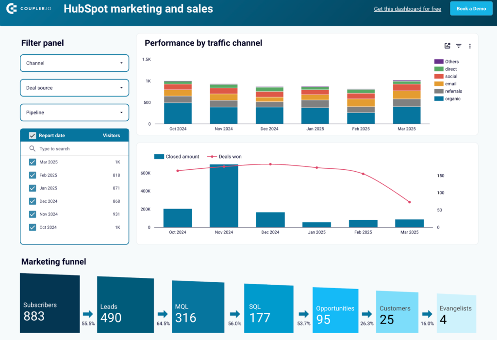
The dashboard gives you a full view of your sales funnel, from subscribers to evangelists. You’ll see conversion rates at every stage to spot where leads drop off and where you need to improve. If certain traffic sources bring in lots of leads but few conversions, you’ll know it’s time to adjust your strategy.
Another standout feature? Side-by-side channel comparison. It breaks down organic, referral, paid social, email, and direct traffic. This shows which sources drive the most qualified leads and closed deals.
Sales teams can take it a step further with the deal stage breakdown. It shows how deals progress through the pipeline, making it easy to identify which sources result in faster sales cycles.
And with win/loss attribution, you can pinpoint why deals are won or lost. If price objections or lack of urgency are common deal-breakers, you can adjust your sales strategy to overcome them.
Setting it up is simple. Sign up for a free Coupler.io account, connect your HubSpot CRM, and follow the Readme tab instructions to sync your data. In just a few minutes, you’ll have your marketing and sales performance dashboard in Looker Studio.
15. Customer acquisition dashboard for Pipedrive
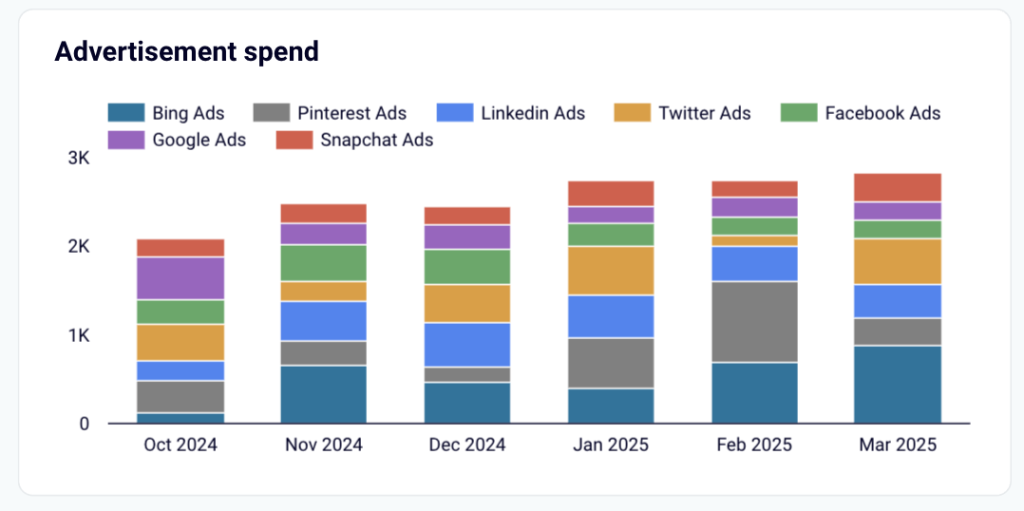
Want to know which marketing channels bring in high-quality leads? The Pipedrive customer acquisition dashboard gives you a full-funnel view of how your ads drive traffic and conversions. It pulls data from Pipedrive, GA4, and major ad platforms like Facebook Ads, LinkedIn Ads, and Google Ads, so you can see exactly which channels perform best and where you’re losing potential customers.
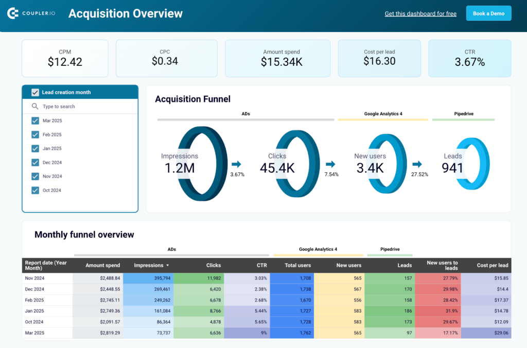
If certain channels are costing more but converting less, this dashboard helps you spot the leaks. You can compare conversion rates at each funnel stage, track performance trends over time, and adjust your strategy to maximize ROI.
One of its key features is funnel performance tracking. It shows:
- How many people see and click your ads
- How many visitors convert into new users
- How many leads enter your Pipedrive CRM
By comparing these numbers with industry benchmarks, you can optimize your targeting, landing pages, or sales process to boost conversions.

The dashboard also lets you evaluate ad spend efficiency. If one platform has high spend but low conversions, you’ll know exactly where to adjust audience targeting, creatives, or landing pages.
To get started, sign up for a free Coupler.io account, connect Pipedrive and your ad platforms, and follow the Readme tab instructions to sync your data. Within minutes, you’ll have a clear picture of your acquisition funnel.
Methods to build sales performance dashboards?
Sales performance dashboards turn data into insights. But how do you create a dashboard that is really useful and meaningful? Let’s review your options:
- Use templates
Creating a dashboard from a template is a great way to start, as most of the work is already done. For example, you can use an automated sales dashboard template by Coupler.io to get a visualization of your sales data in minutes. As a result, you will receive an automated live dashboard that will regularly pull fresh data from apps like Pipedrive, Salesforce, HubSpot, and more.
- DIY from scratch
For those who prefer a hands-on approach, there’s an option to build your sales dashboard yourself. This gives you a lot of customization opportunities and allows you to create a data visualization tailored to your specific needs and goals. However, it takes more time to set up than a quickstart template.
To make this process easier, I’ve included a step-by-step tutorial in the next section of this article. If you need more guidance, you can also check out our Looker Studio tutorial for beginners.
- Hire professionals
Another option is to request help from a professional data analytics team to create a data visualization for you. This is especially convenient if you need to create an advanced dashboard or need help with analyzing your data.
For example, you can consider Coupler.io’s data analytics team. We can help you with data visualization, business analytics, data infrastructure, and data automation.
You can choose one of these methods to create a sales dashboard that works for you.
How to create a sales dashboard using Coupler.io
Creating your own sales dashboard with Coupler.io is hassle-free. It only takes a few minutes to connect your sales data and organize it as a report on the go. Then you can load the organized dataset to a spreadsheet or a BI tool, such as Looker Studio, to turn data into a dashboard.
Start by signing up for a free account with Coupler.io. No credit card is required – take a shot for free. Then, navigate to the Data flows tab in the left-hand menu of the main screen and create a new data flow. This will take you to the setup process.
1. Connect your sales data with Coupler.io
The very first step is to choose which sales CRM you want to visualize data from in a dashboard. For the purposes of this guide, we’ll pick Pipedrive.
- Specify the source account and the data entity you want to export. You can also use the advanced settings to further customize the export.
- When you’re finished, click Finish and Proceed.
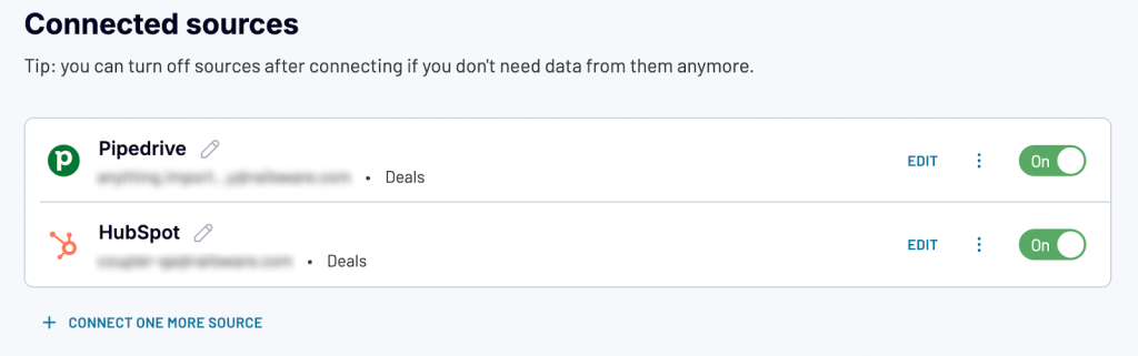
- You can also connect multiple sources before previewing the data. If you would like to combine data from multiple sales applications, you can add more sources here. We’ll add HubSpot as an additional source to show you how it works.
- Once again, choose your source account, data type, report type, and in the HubSpot case – optional settings such as date filters.
- Click Finish and Proceed, review your sources, and then proceed to the Transformations step.
2. Organize and transform your data
This is the step where you can make strategic changes to your sales data before visualization. For instance, you can:
- Hide or rename columns
- Sort and filter your data
- Append or join data from the various apps
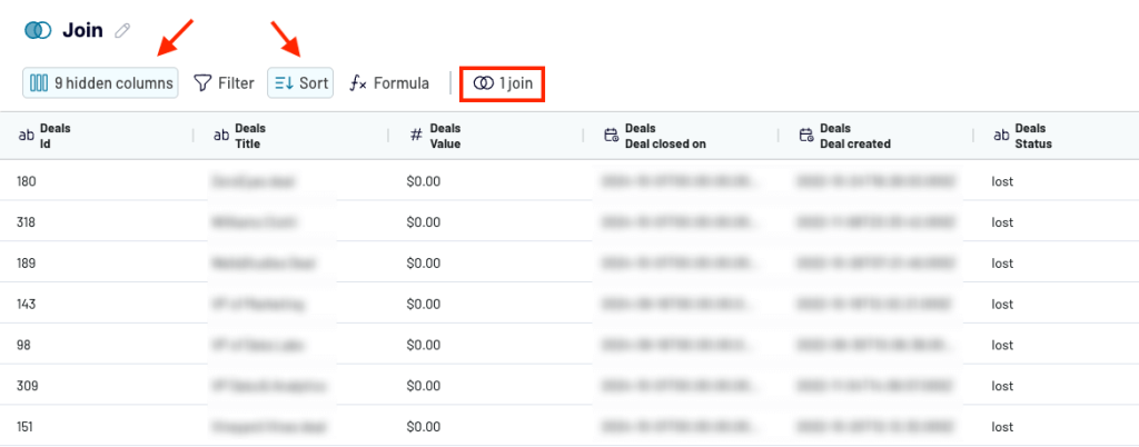
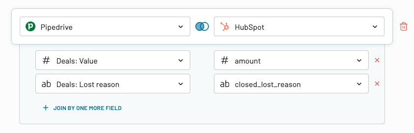
The Join function is helpful when you have 2 or more data sources and want to ensure your data is aligned in a final dashboard. This will eliminate any inconsistencies and give your dashboard a cohesive structure. You can add several fields, depending on how many columns you need to merge.
Once you have added all necessary fields, proceed to the Destinations step.
3. Load data and schedule automated data refreshes
To finalize your dashboard setup, simply:
- Follow the Authorization instructions to Generate a data source in your Looker Studio account.
- Then, navigate back to the Coupler.io tab and proceed to set up a schedule for automatic data refreshes.
- You can configure the interval (up to every 15 minutes), timezone, time preferences, and days of the week.
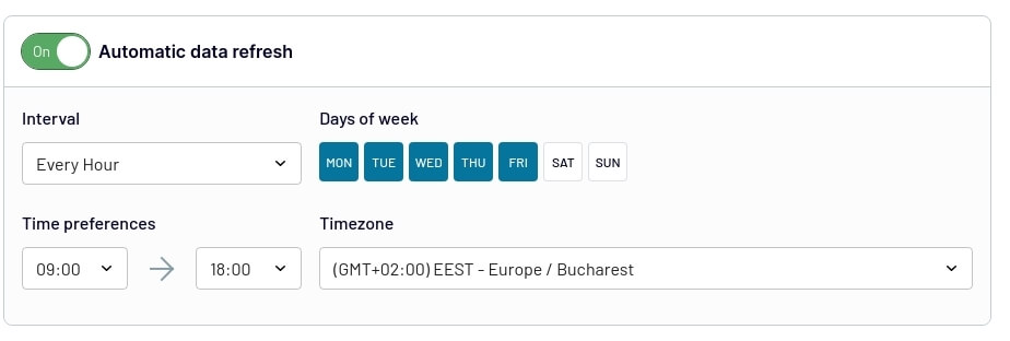
And there you have it, a from-scratch sales dashboard that updates automatically! You can return to your Looker Studio tab to make visual customizations such as adding charts and tables for enhanced analysis.
Frequently asked questions about sales dashboards
What are sales dashboards?
A sales dashboard is a data visualization that draws sales metrics from multiple sources for tracking and analytics. It gathers data such as leads, conversion rates, and revenue trends. This is a convenient and efficient way to organize your sales data, translate it into insights, and make your sales process data-driven.
Take a look at these examples of sales funnel templates.
Why are sales dashboards important?
Sales dashboards serve as a hub for your sales operations. They provide real-time analysis of sales data, allowing for gleaning insights and making adjustments. By presenting sales data in a concise manner, these dashboards make complex trends and correlations visible, giving you more information to work with and enhancing the efficiency of your sales team. Tracking performance becomes a simpler process as well. These dashboards are vital in facilitating strategic and data-driven decision-making by condensing huge amounts of information into an analysis-ready format. Additionally, they promote transparency and collaboration by enabling leadership and other teams to access the latest data at any moment.
Benefits of sales dashboards
A sales dashboard provides an interactive way to present sales information. This allows sales managers and business owners to quickly evaluate performance, identify challenges, and make informed decisions.
Moreover, there are other benefits associated with using sales dashboards.
- Real-time insights: Sales dashboards offer real-time updates on important metrics. This enables quick responses and timely strategic adjustments.
- Improved decision-making: With visualized and well-organized data, sales managers can easily identify trends, new opportunities, and areas of concern. This leads to decisions driven by data.
- Enhanced collaboration: Visualized data is accessible, easy to work with, and easy to share across different teams. This ensures transparency and facilitates collaboration. Whether you are sharing it with a marketing team or the C-suite, a dashboard is a great way to present the results of your work and keep everyone on the same page.
- Customization: Customize your dashboard based on the aspects that matter most for your business, whether it’s retail, software development, or real estate segment. You can keep track of the KPIs that drive your success.
- Accessibility: As sales dashboards can be available on different devices, they can be accessed anytime and anywhere. Stay connected and keep track of your sales performance even on the go.
- Saving time: Bid farewell to manual data collection and compilation as professional sales dashboards automate this process. This gives you access to fresh information with zero manual effort and frees up time for strategic tasks.
What should a sales dashboard include?
A well-designed sales dashboard goes beyond numbers. It should have a clear and real-time view of key sales metrics. It includes:
- Scorecards for KPIs: Almost every dashboard includes top-level metrics like total sales, open deals, win rates, and average deal size displayed in scorecards. These provide a snapshot of performance at a glance. For example, the marketing overview dashboard shows visitors, contacts, views, average session duration, and bounce rate.

- Customizable funnel charts: A pipeline visualization monitors deal progress across different stages. For example, the Sales KPI dashboard has a customizable five-stage pipeline funnel for sales teams to spot drop-offs and adjust strategies to retain more leads.

- Geo maps: The HubSpot marketing performance dashboard includes geo filters and maps that show visitor and lead data by country. This helps teams identify high-performing regions or countries with higher return rates.
- Comparison line charts with dynamic filters: The customer acquisition dashboard includes tables line charts impressions, clicks, visits, and CRM entries by ad platform (Google Ads, Facebook Ads, etc.). This side-by-side view helps marketers understand which platform converts better at which stage.
- Stacked bar charts for win/loss analysis: The sales win/loss dashboard visualizes won vs. lost deals by owner, deal type, lead source, and industry. These charts help teams understand what kind of deals they’re losing and why.
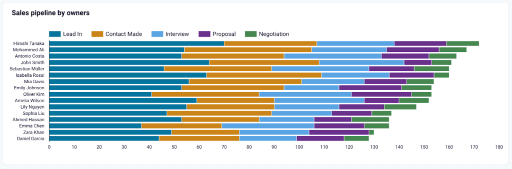
- Filter panels: Most dashboards allow you to slice the data by time period, owner, deal stage, or channel. For example, in the sales team performance dashboard, you can filter by rep to compare individual pipelines or task completion rates.
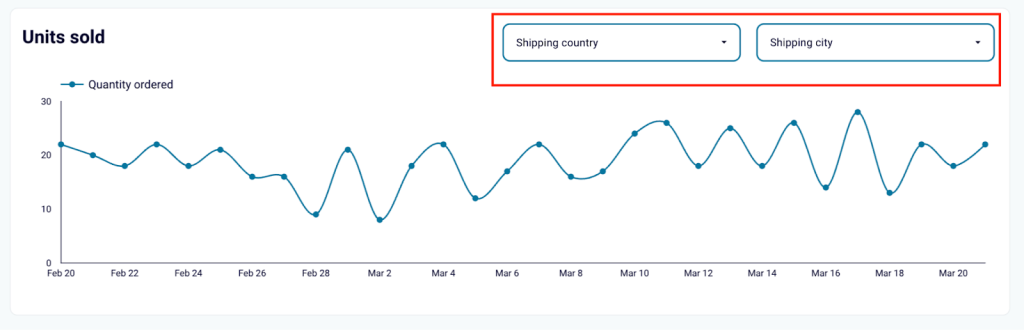
- Tables with deal-level drill-downs: In dashboards like Shopify inventory dashboard, tables list units sold with fitlers for shipping country and city. Business owners can drill into specific region and analyze the sales there.
A great sales dashboard should provide actionable insights that help teams close more deals and optimize the sales process.
How to choose the best sales dashboards?
When selecting a sales dashboard, here are a few factors to consider.
- Key metrics: Check for the KPIs included in the dashboard. Does it have the KPIs you track? Do those KPIs make sense for your business?
- Customization: The dashboard should be in line with your objectives and meet your specific needs.
- Clear data visualization: The sales dashboard should be neat and easy to read for viewers. Having too much data in a single dashboard can also be confusing.
- Real-time updates: The whole point of creating a sales dashboard is to save time on reporting. If you need to pull sales data every week manually, then it defeats the purpose. So, for the best results, your dashboard should support automatic real-time updates.
Simplifying your sales with sales reporting dashboards
Sales reporting dashboards are not just tools, they are a part of a sales strategy that empowers sales leaders to make informed decisions based on data. Whether you are keeping track of performance indicators, setting targets, or identifying trends, these dashboards play a crucial role in enhancing business performance.
Building a dashboard doesn’t have to be complicated. You have options like using templates, creating a visualization from scratch, or even hiring professionals for assistance.
To summarise, sales reporting dashboards can streamline the sales process and help you reach your goals. Coupler.io can take care of your data, automatically collecting it across your organization and channeling it into your sales dashboard on a schedule.
Explore free sales dashboard templates with Coupler.io
Get started for free