Salesforce offers powerful reporting tools, but sometimes you require more clarity to get the full picture. This is where report templates come in. They eliminate the need for you to build reports from scratch. In this article, we review the top 5 Salesforce report templates that will help you transform raw Salesforce data into actionable insights.
Top 5 unique Salesforce report templates
The templates that we’ve chosen enable you to track revenue growth, team performance, deal progress, and provide other valuable information for data-driven decision-making. Their pricing is pretty attractive – each of these report templates is free to use.
1. CRM dashboard for Salesforce
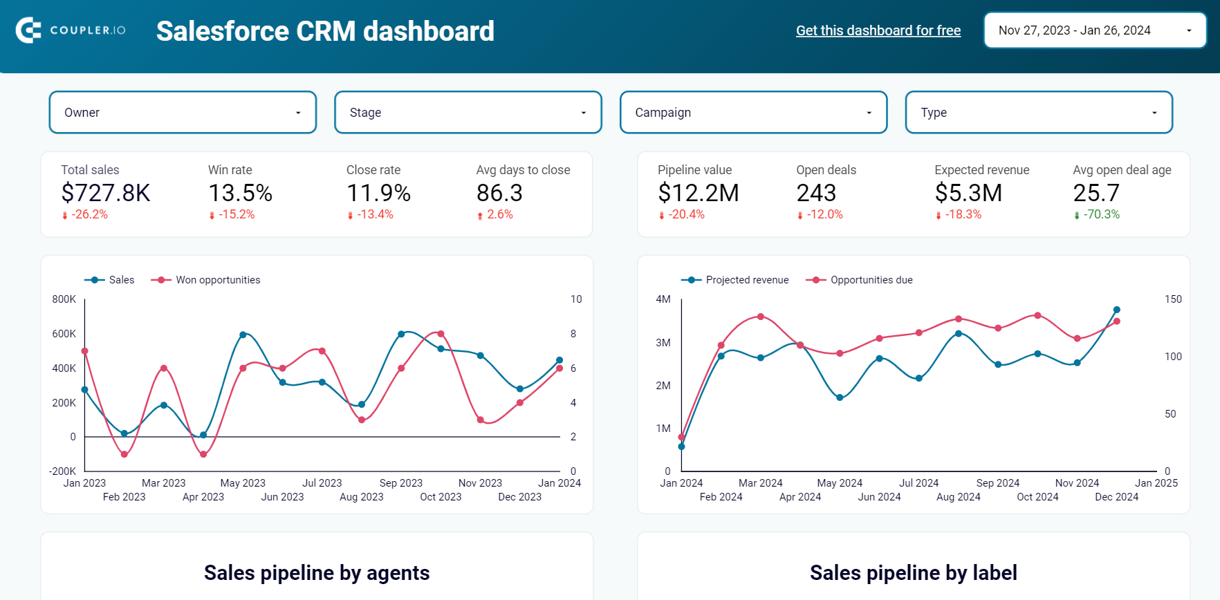
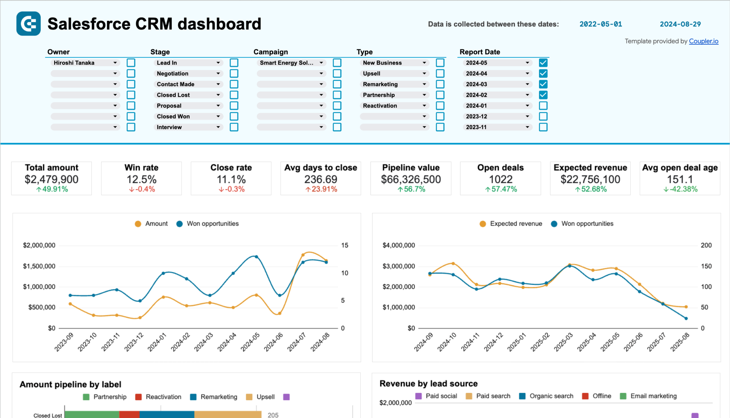
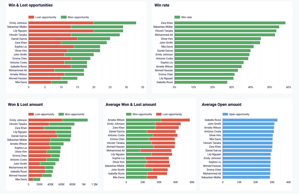
Use this Salesforce report template to identify and understand the factors driving your revenue. The report provides an overall view of customer relationships, sales activity, and business performance. This is a good way to visualize trends, understand opportunities, and point out places that need adjustment.
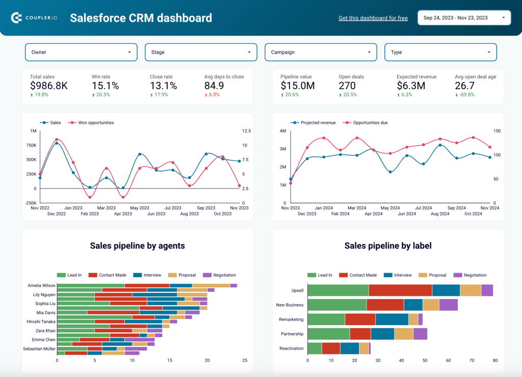
Insights the report provides
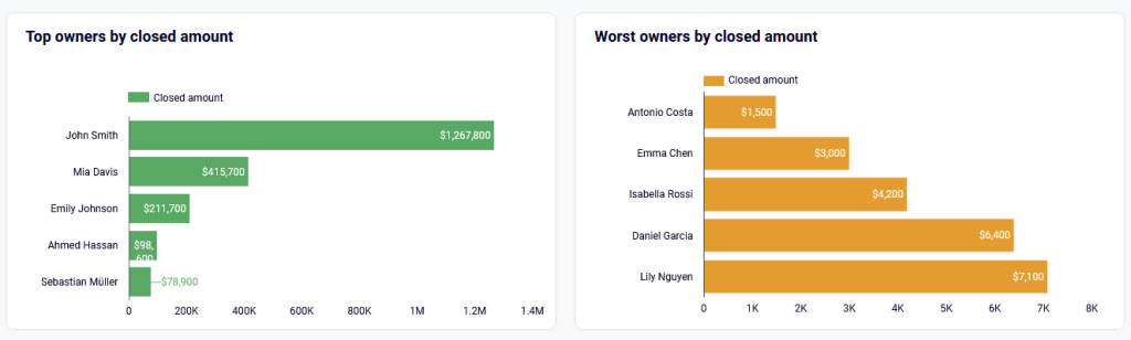
Top performing opportunities and owners: The dashboard highlights top-performing accounts and sales reps. It showcases the sales team members who closed the most valuable deals. This allows managers to quickly identify impactful opportunities and recognize top performers.
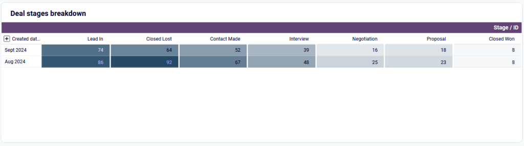
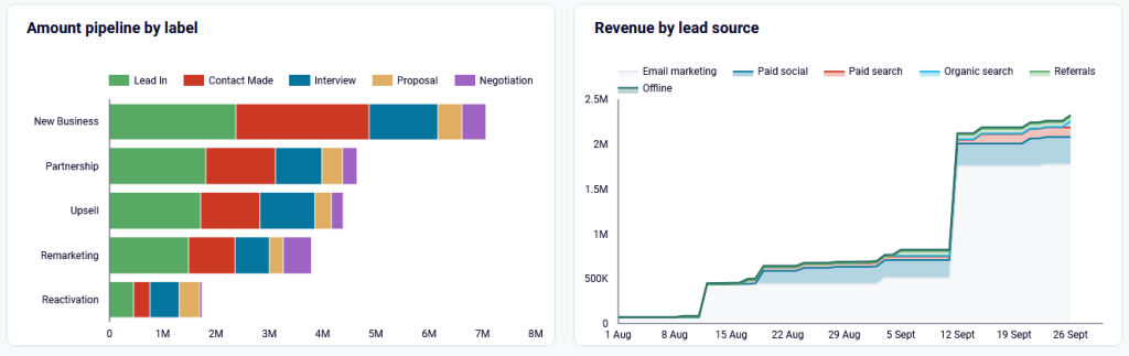
Deal stages breakdown: The Salesforce reporting template includes Deal stages breakdown charts, which illustrate how deals progress through stages like “Lead In,” “Proposal,” and “Closed Won.” Sales teams can easily see which stages take the longest or where most deals are lost. This helps them improve their strategies and boost conversion rates at key stages.
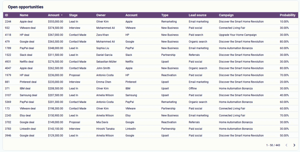
Overview of open opportunities: This section of the dashboard displays all active deals with key details. It includes information like deal amount, stage, owner, and probability of closure. This helps managers quickly assess the status of each deal and prioritize high-value deals still in progress. This can ultimately improve the likelihood of closing more deals.
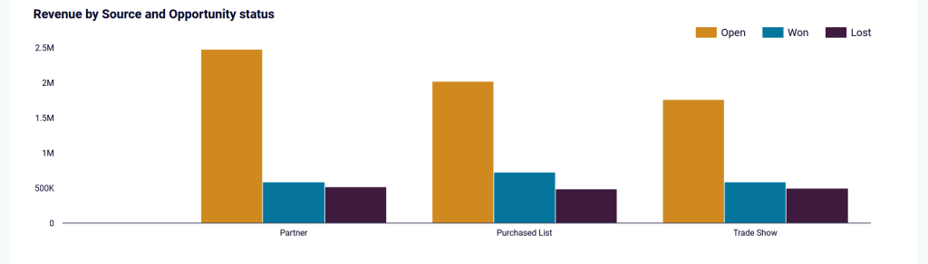
Revenue by lead source: This chart shows which channels yield the highest return. Teams can utilize this insight to focus on investing in the most effective marketing channels.
Why use this report template
Centralized data view: This consolidates all key sales and CRM metrics into one place, making it easier to track performance without searching through multiple reports.
Performance Monitoring: This section of the dashboard displays all active deals with key details. It includes information like deal amount, stage, owner, and probability of closure. This helps users quickly assess the status of each deal and enables executives to stay informed and make timely decisions.
Resource Optimization: Companies can see which teams, channels, or regions create the most value. They can also track which industries contribute the most. This helps them optimize their sales and marketing resources.
Process Improvement: These deal-stage insights help a business improve its sales processes. They allow the business to fix delays and eliminate inefficiencies.
Forecasting: Expected revenue and deal pipeline data help create more accurate sales forecasts. This is essential for effective business planning.
How to use the report template
The template is available for two platforms: Looker Studio and Google Sheets. In both versions, it is equipped with a Salesforce connector by Coupler.io with data loading automation. Follow the instructions in the Readme tab of the template to connect your Salesforce account and load data to the report. Choose the version that suits your reporting needs and get started with it right away.
CRM dashboard for Salesforce in Looker Studio
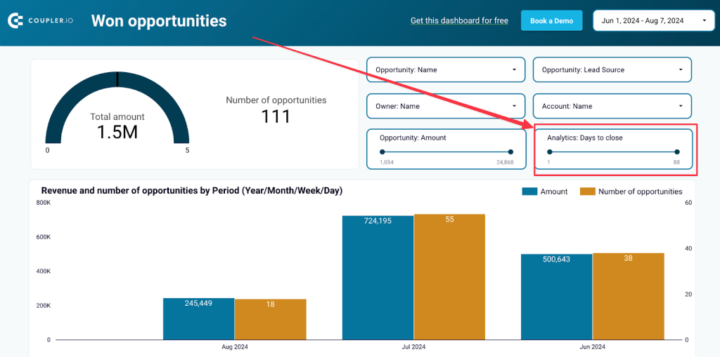
Use our CRM dashboard for Salesforce to track key metrics, check how your sales team performs, and understand what drives your revenues.


Salesforce CRM dashboard in Google Sheets
Get a detailed overview of your opportunities in Salesforce and analyze the performance of your sales team.

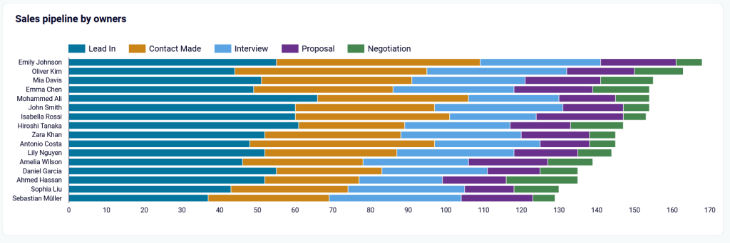
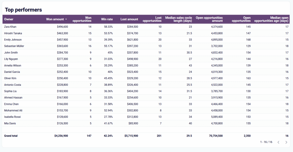
2. Sales team performance dashboard
The Salesforce sales team performance dashboard provides detailed, data-driven insights into the performance of individual sales team members. It is designed for teams, ideally with more than two managers. However, the number of managers can vary based on the team’s setup.
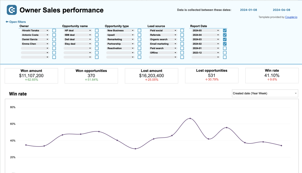
The Salesforce report template is designed to track and visualize key performance metrics for sales team members. It provides insights into various aspects like the types of deals closed, win and loss rates, and sales funnel stages.
The dashboard includes filters that allow users to segment data either by individual team members or by deal types. This flexibility in segmentation enables users to dive deeper into specific performance details.
Insights the report provides
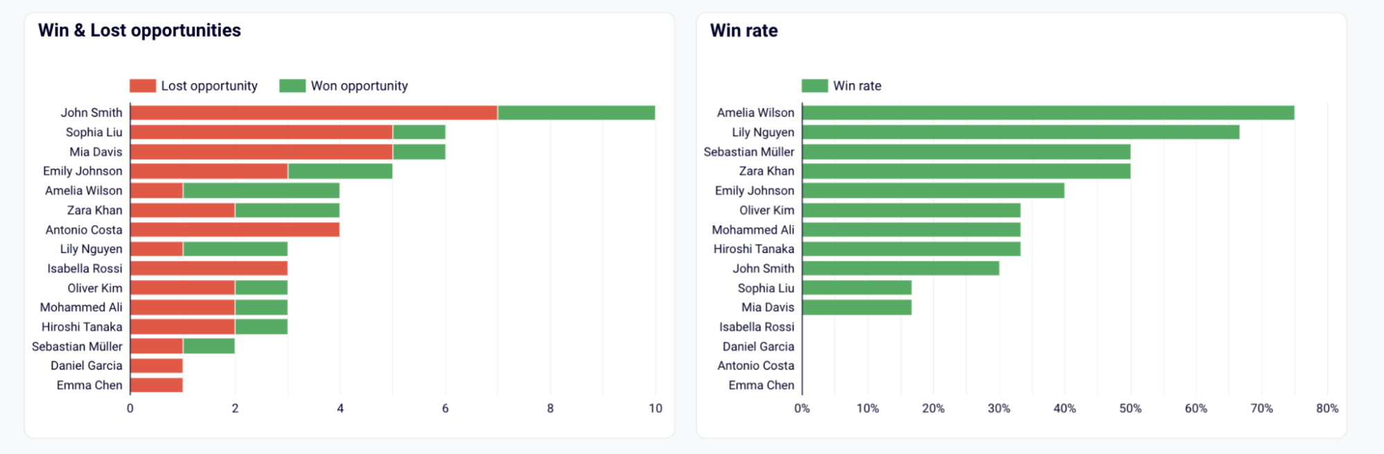
Win/Loss ratios: These insights help adjust sales strategies and optimize team members’ assignments to make sure the best performers work on higher revenue deals.
Deal type strengths: You can easily identify which team members excel in specific types of deals. This helps with better resource allocation and specialization.
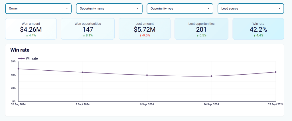
Sales funnel health: Knowing where a sales manager excels or struggles in the sales process is crucial to guide training and improve processes.
Top performer identification: With this table, you can reward top-performing sales managers and reassign them to high-value opportunities.
Why use this report template
Data-driven decision-making: The report provides valuable data to help leaders make informed decisions, reducing the need to rely on gut feelings.
Centralized critical metrics: The report provides a centralized view of key metrics. It consolidates all the important sales information, like revenue, lead sources, and deal stages, in one place. This helps users promptly assess sales performance and facilitates swift decision-making.
Actionable insights: The dashboard displays visual representations of stalled deals, top performers, and lead sources, enabling management to make quick, data-driven decisions. It ensures informed choices based on clear insights.
Efficient resource allocation: Insights into deal progress, team performance, and high-converting channels help businesses allocate resources better. This maximizes ROI, boosts sales efficiency, and leads to overall improved business performance.
How to use the report template
The report template is designed in Looker Studio and equipped with the Coupler.io connector to automate data load. The automated workflow saves time and effort while also reducing the risk of human error during the process. You can get started for free with no credit card required. Just follow the simple steps in the readme tab and get your ready-to-use sales team performance report in just a few minutes.
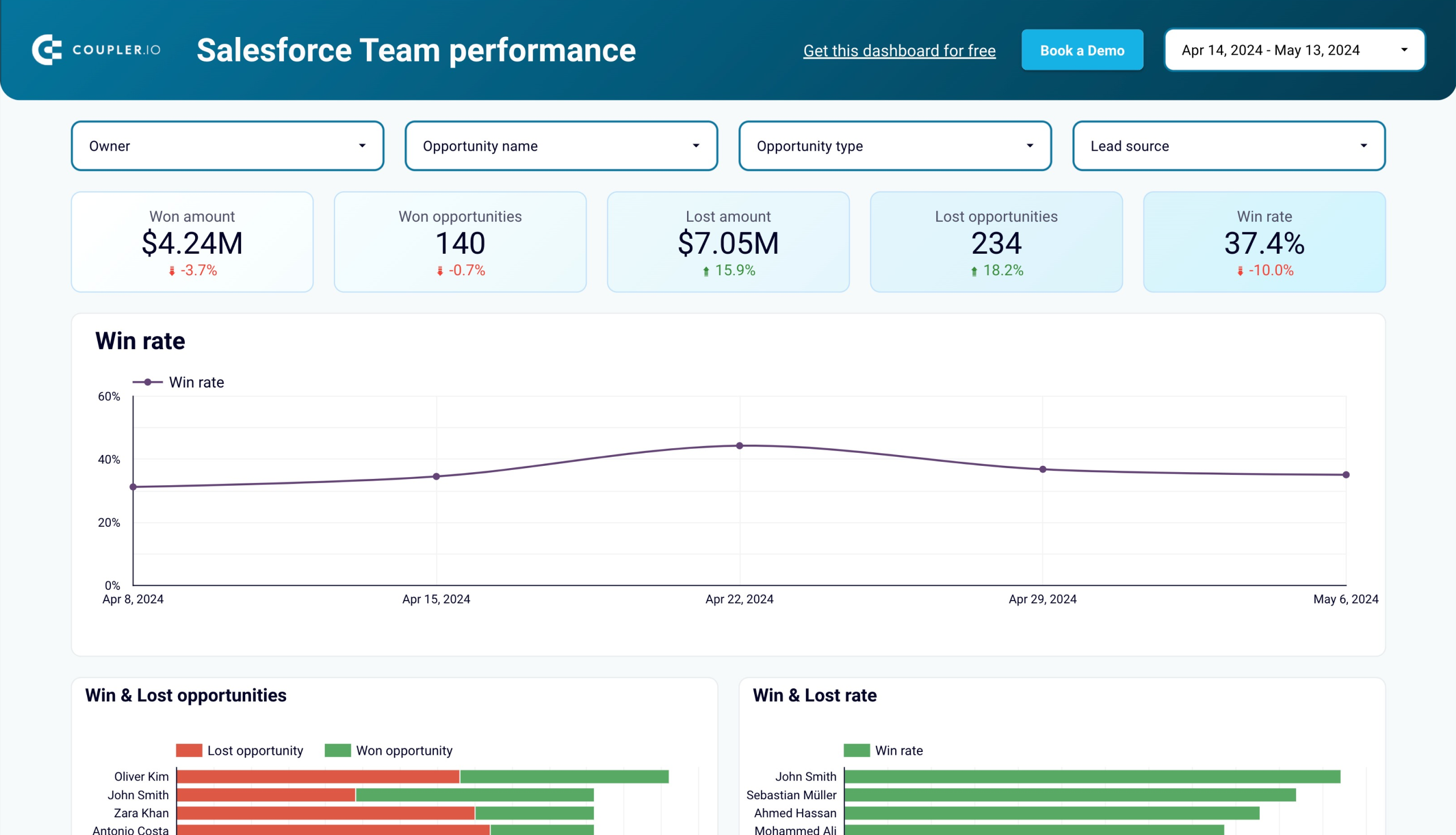
Sales team performance dashboard for Salesforce in Looker Studio
Get insights into your sales team’s effectiveness in converting opportunities within your sales pipeline in Salesforce.
Sales team performance dashboard for Salesforce in Google Sheets
Monitor the effectiveness of your sales team and derive insights into how to optimize your sales pipeline conversions in Salesforce.
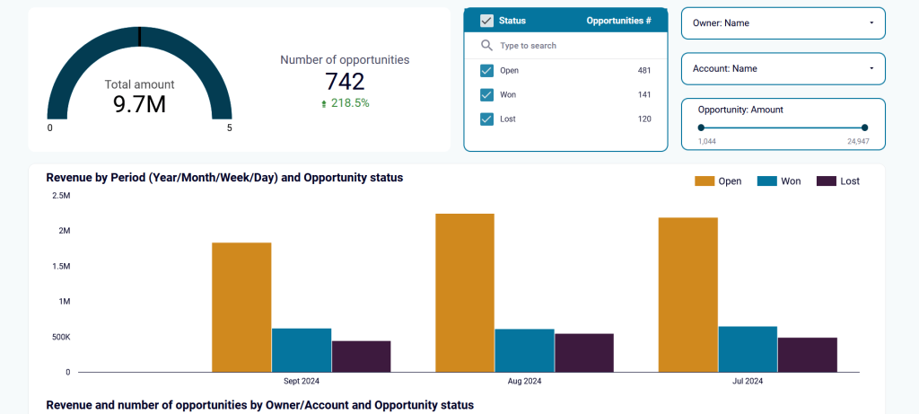
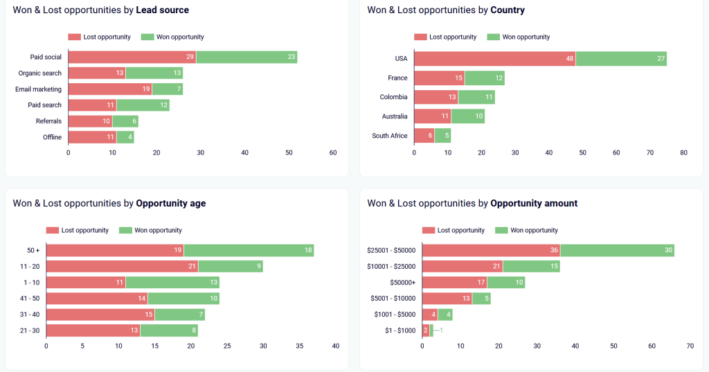
3. Salesforce sales overview report
This report template for Salesforce provides a visual overview of sales performance, focusing on opportunities, deals, lead sources, and other relevant metrics. Users can filter and segment the data to analyze specific aspects of their sales pipeline efficiently.
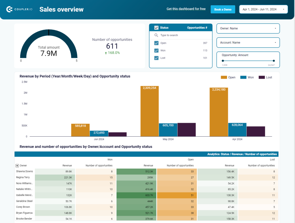
Insights the report provides
Revenue-based deal information: By filtering for opportunity amount, users can focus on high-revenue deals. This helps assess the effectiveness, owner performance, and status of deals. As a result, you can allocate the best efforts to the most valuable opportunities.
Lead source effectiveness: The chart enables users to compare deals by status from different sources to optimize marketing and lead generation efforts.
Deal success and failure analysis: Segmentation of won and lost deals into separate tabs shows what is working and what isn’t. It also highlights the factors driving each outcome.
Understanding sales cycle: Days to close shows how long it typically takes to close deals. It reveals variations by deal type, geography, and other factors. This insight helps identify trends and improve the sales process.
Why use this report template
Focused data analysis: The report lets users focus on specific segments of their sales pipeline to make more targeted and actionable analysis.
Optimization of sales strategy: By comparing lead sources and deal outcomes, users can make informed decisions on where to invest their marketing and sales efforts. This ensures better use of resources for maximum results.
Efficiency in deal management: The visual breakdown of open opportunities shows bottlenecks and areas needing attention. It helps improve the sales process and decision-making.
Sales cycle insights: Tracking and understanding the timeline of deals helps refine sales processes to improve closure rates.
How to use the report template
The report template is designed in Looker Studio and comes equipped with the Coupler.io connector to automate data connection to Salesforce. The setup process is straightforward. Simply follow the instructions in the readme tab to connect your Salesforce account and populate your report with your data.
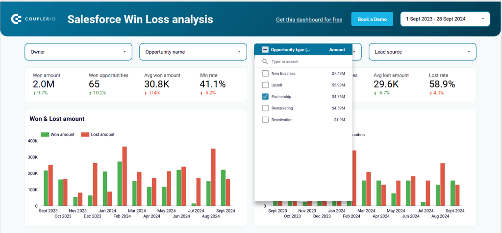
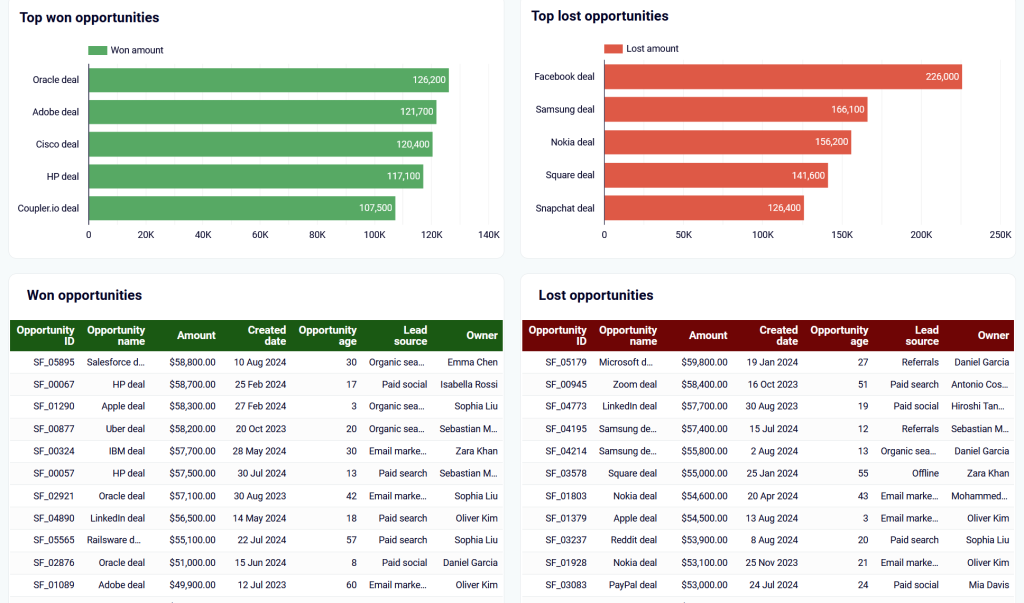
4. Salesforce win-loss analysis dashboard report template
The Salesforce win/loss analysis dashboard analyzes deals won versus deals lost. On this dashboard, you can segment opportunities by deal type and owner, as well as sort them by industry, lead source, and geography. This helps you delve deeper into what drives sales success as well as sales failure.
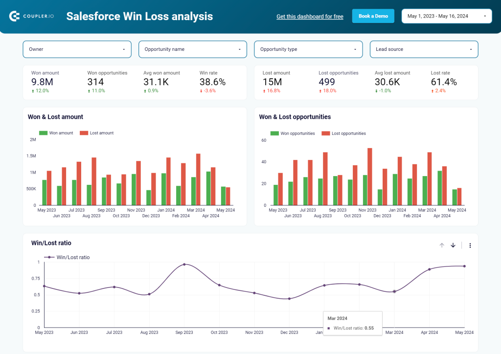
Insights the report provides
Effectiveness of different deal types: By filtering for specific opportunity types like upsells or new deals, users can evaluate their effectiveness. This helps assess revenue and performance, providing a clear view of how these deals contribute to business growth.
Segmentation of deals: The dashboard pre-segments won and lost deals by key criteria like industry and geography. This provides a clear view of top-performing segments and highlights which areas are lagging behind.
Focus areas: Users can spot high-performing segments to focus on areas with the most potential. Conversely, underperforming segments can be deprioritized or re-evaluated.
Why use this report template
Actionable insights: Segmentation and filtering of deals offer actionable insights for sales teams to focus on promising opportunities and improve their chances of success.
Data-driven decisions: This dashboard offers a detailed analysis of deal-type performance and examines lead sources and geographical regions.
Efficiency in strategy: Insights into high-performing and underperforming areas help refine sales strategies for better adjustments and results. This enhances efficiency and improves the overall performance of sales teams.
How to use the report template
To set up or configure the Salesforce report template, follow the instructions in the readme tab. To automate data load from your Salesforce account to Looker Studio, use the built-in Coupler.io connector. You can get started for free with no credit card required.
After connecting your Salesforce data, you may need to adjust the reporting period if it doesn’t align with your needs. In Looker Studio, generate the data source, and for “Win rate” and “Lost rate” fields, select Percent as the data type.
5. Salesforce sales analytics dashboard report template
The Salesforce report for sales analytics tracks leads and revenue by marketing channels. It gathers data from Salesforce, Google Analytics 4, and advertising platforms to visualize the sales funnel. The report also includes tables to compare performance by regions and periods. This helps identify which marketing efforts drive conversions.
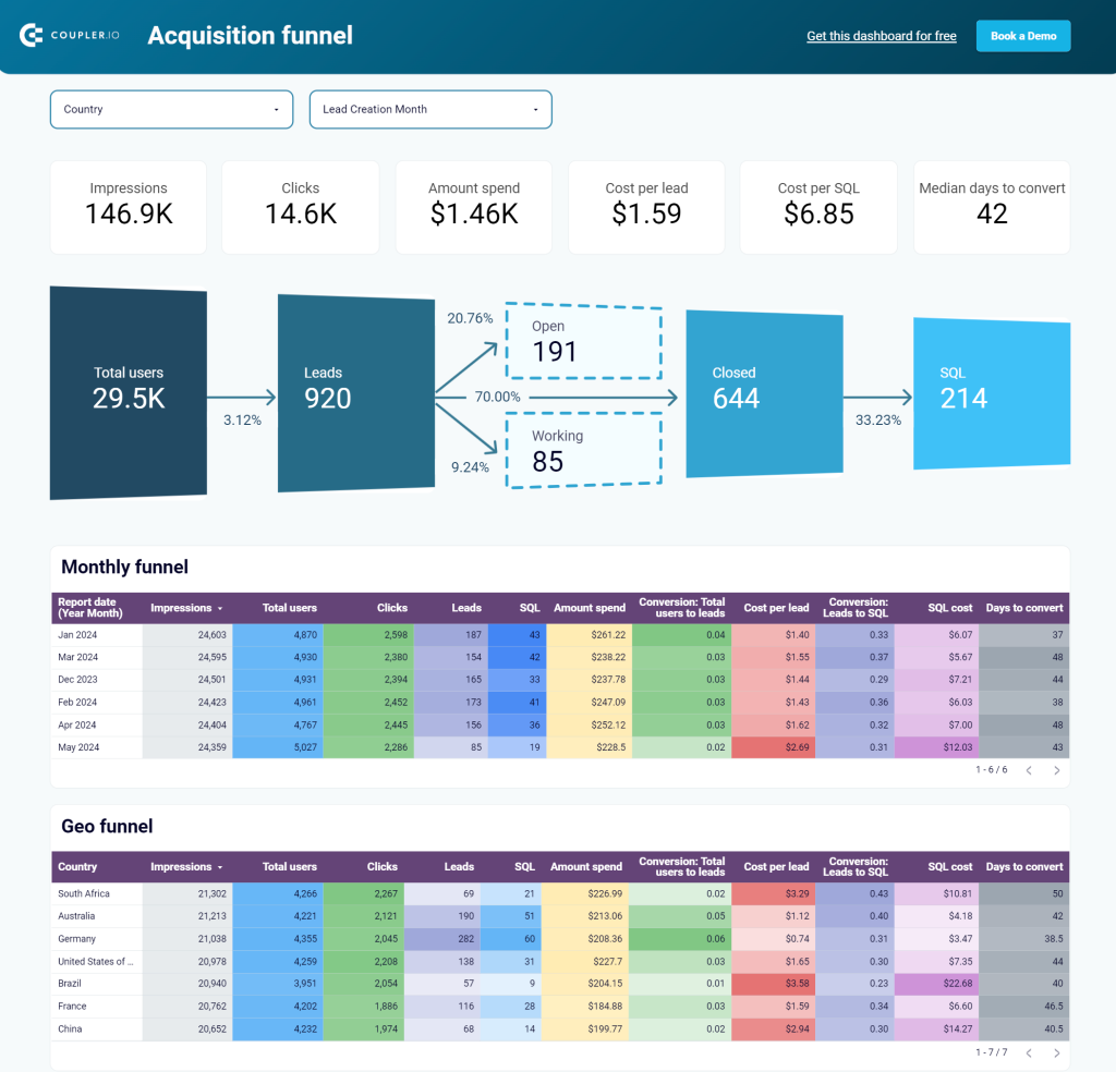
Insights the report provides
Sales funnel performance: The visualized sales funnel lets users assess conversion rates and identify underperforming stages. This helps them create strategies to improve revenue from the current pipeline.
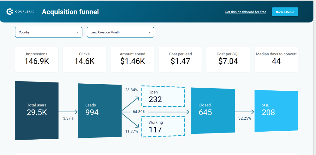
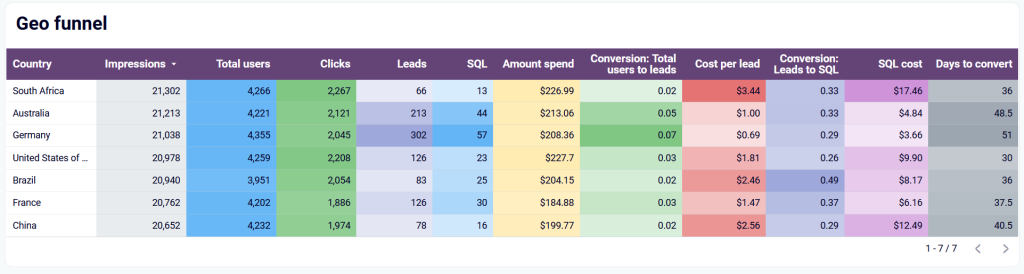
Geographical insights: Filtering by country is useful for identifying the most promising regions for lead generation and conversion. The Geo funnel also reveals challenges such as language barriers or shipping issues. Users can compare performance across different periods and regions. This helps identify growth opportunities more easily and link successful periods to specific marketing actions.
Key acquisition metrics: Tracking acquisition metrics over time supports long-term strategic planning and helps you identify which regions or channels to prioritize. This leads to more effective resource allocation.
Open deals overview: The dedicated tab for open deals offers a detailed breakdown by owner, revenue, and deal type. With this data, users can prioritize opportunities and focus on the most promising ones.
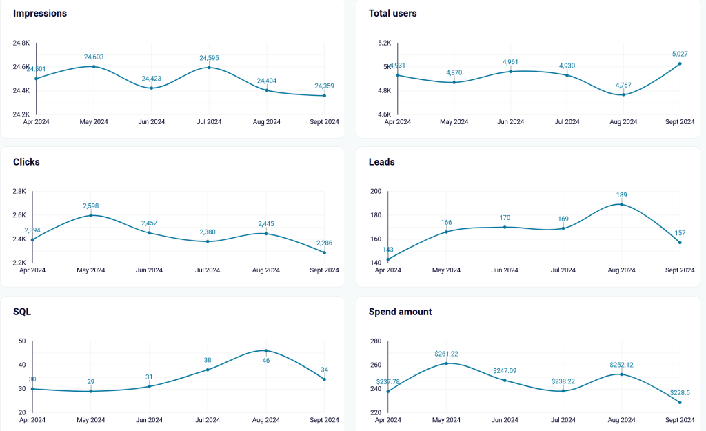
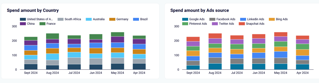
Amount spend: The dashboard shows a steady advertising strategy across regions and platforms from April to September 2024. All regions have stable budgets. Google Ads dominates in ad platforms. Facebook and LinkedIn Ads also get significant investment, while Snapchat and others hold steady shares.
Why use this report template
Comprehensive view: The report offers a comprehensive view of how marketing activities contribute to lead generation using the data from Salesforce, GA4, and advertising platforms.
Actionable insights: The dashboard provides filters for region, period, and deal type to quickly identify high-performing segments and highlight potential bottlenecks in the sales process.
Efficient strategy refinement: Clear visualizations and segmentations allow sales teams to optimize marketing efforts and, as a result, improve sales conversions.
Real-Time tracking: Tracking acquisition metrics and open deals in real time allows users to focus their efforts effectively. This ensures they concentrate on areas that need the most attention, which enhances overall productivity and decision-making.
How to use the report template
The template is designed in Looker Studio and combines data from GA4, Salesforce, and different PPC platforms. You don’t have to worry about how to aggregate all this information since the report has the built-in Coupler.io connector for this. Just follow the setup instructions described in the readme tab and enjoy a powerful reporting solution in just a few minutes.
What are the metrics and KPIs you should include in a Salesforce report template?
Building effective Salesforce report templates includes the selection of the right metrics that are aligned with your business goals. Here are 10 metrics and KPIs you should consider:
Win/Loss rate
This measures the percentage of deals won versus lost, indicating overall team performance and possible bottlenecks in sales. A good benchmark for a win rate is about 30-40% in most industries. It’s equivalent to:
(Number of Won Deals Total Number of Deals Closed) × 100Pipeline stage analysis
Visualize where deals are in the sales funnel to understand the bottlenecks and pain points in that deal’s flow. In a healthy pipeline, 50-70% of deals should progress through at least the early to mid-stage of the pipeline.
Revenue by lead source
This demonstrates which channels yield the most revenue. Marketing and sales efforts should be optimized in these channels. Allocate 60% of the marketing budget to these high-performing channels.
Calculate it by getting the total revenue from each lead source.
Top performing sales reps
This identifies which sales representatives close the most deals or generate the highest revenue. The metric is helpful for proper resource allocation and recognition. Top performers typically meet or exceed 100% of their quota, with many surpassing this benchmark significantly, depending on company goals and industry standards.
Deal size segmentation
Segmenting deals by size helps concentrate on high-value opportunities, as well as evaluate how the team manages larger deals. Usually, the top 20% of large-sized deals amount to around 70-80% of revenue flows. Segment the deal value by small (<$10k), medium ($10k-$50k), and large (>$50k).
Sales funnel conversion rates
Tracking how many potential sales move forward at each step of the sales process helps you see where deals are most likely to succeed. It also shows where they might get stuck. Conversion rates from mid to late stages should range from 25-30%.
(Deals Moved to Next Stage ÷ Total Deals in Current Stage) × 100Days to close
This measures the duration required to close a deal, segmented by lead source, deal type, or geography to optimize the sales cycle. The average time to close a deal depends on the complexity of the deal. You can calculate it with the formula below:
(Revenue from Specific Deal Type ÷ Total Revenue) × 10Geographical performance
Analyzing performance by region reveals the most profitable markets and highlights areas that need improvement. Consistent growth in key regions is a good indicator of successful sales strategies.
Open opportunities overview
Reviewing all active deals, their current stage, and their potential value helps teams focus on high-priority opportunities. Focus on deals with a 50% or higher probability of closing.
Deal type effectiveness
This metric evaluates how different deal types, such as upsells and new deals, contribute to revenue. It helps identify which deal types are most effective. Upsell deals should contribute 20-30% of total revenue. To calculate this, divide revenue from a specific deal type by the total revenue, and then multiply by 10:
(Revenue from Specific Deal Type ÷ Total Revenue) × 10How to create a custom Salesforce reporting template
Creating a custom Salesforce report template that fits your needs can greatly improve your data analysis. You can easily do this with Coupler.io, which lets you collect data from Salesforce and other sources, transform it on the go, and visualize it in spreadsheets or BI tools. Although it uses the Salesforce API, no coding or tech skills are needed. Here’s how you can use Coupler.io to create custom report templates in three simple steps:
1. Collect data
Select the preferred destination for your report in the form below and click Proceed. You’ll be offered to get started with Coupler.io for free with no credit card required.
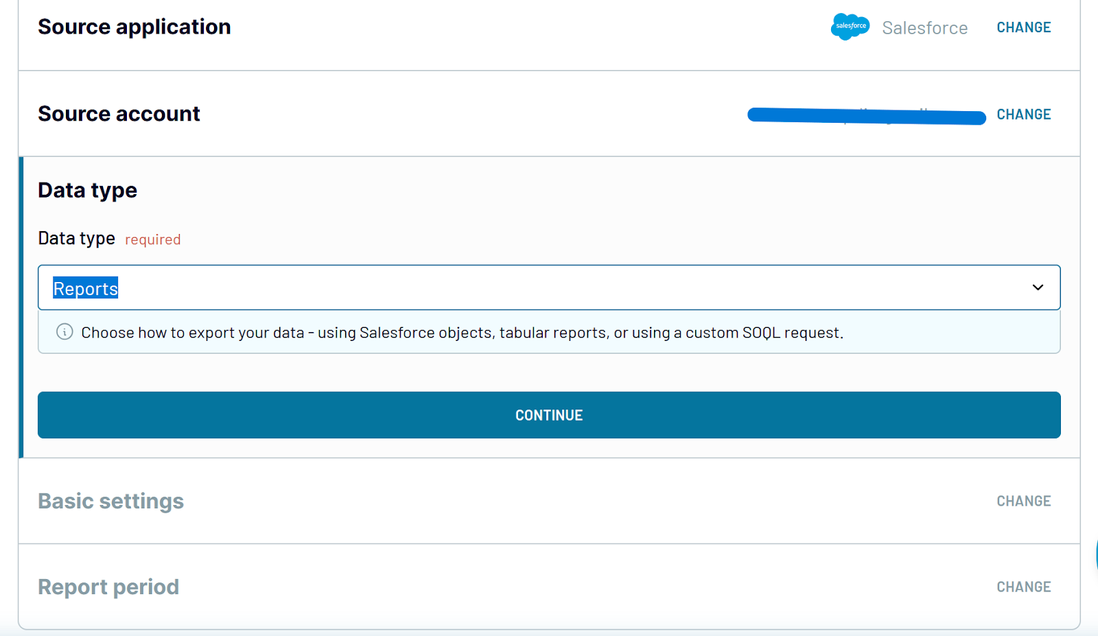
Then, complete your Salesforce account authentication and select your preferred data type. There are three options:
- Reports: Extract data from Salesforce tabular report types.
- Objects: Choose from predefined Salesforce objects like Account, Opportunity, Account History, Leads, and more.
- Custom SOQL: Fetch data or export multiple data types simultaneously.
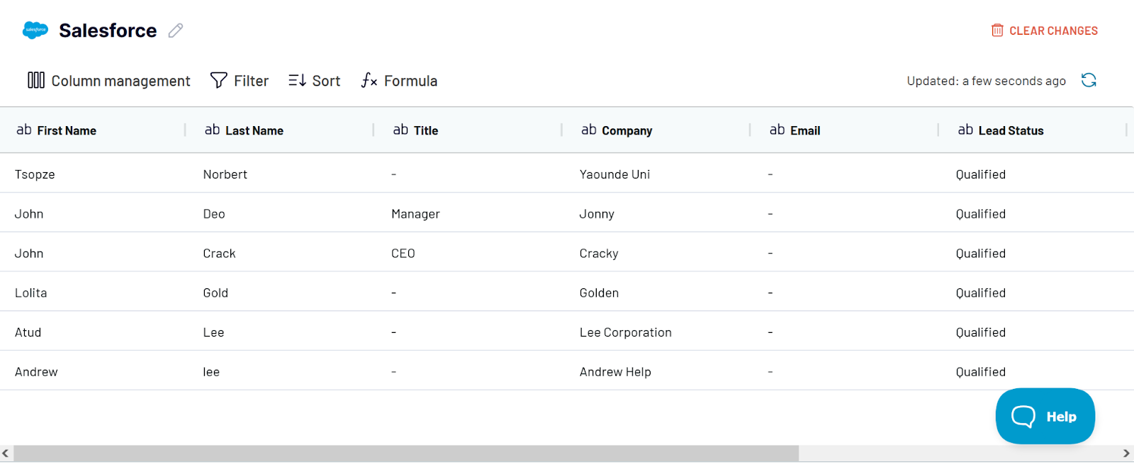
2. Organize your data
Before loading your datasets into the destination app, you can organize it using Coupler.io functionality:
- Edit, rearrange, hide, or add columns.
- Apply filters and sort the data to match your desired order.
- Create new columns using custom formulas.
- Combine data from different accounts or apps to create cross-channel reports.
3. Load data and schedule data refresh
Follow the instructions to connect your destination app and load your Salesforce data. You can enable automatic data refresh and set a custom schedule. This ensures your Salesforce report always shows the latest information and notifications.
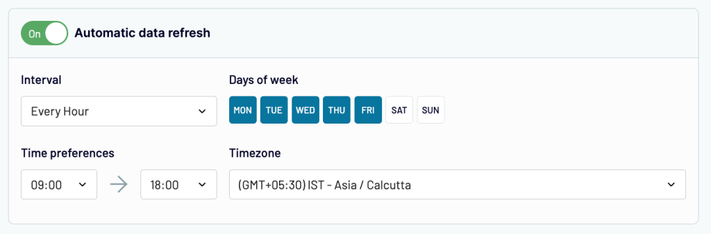
After setting up auto data refresh, you’ll get notified in your dashboard. You can then view your file and run or edit it to fit your needs.
Setting up Salesforce reports from scratch can be overwhelming. But you don’t have to do it alone. Coupler.io offers prebuilt Salesforce report templates that eliminate the need for manual work. With these easy-to-use Salesforce dashboard examples, you can quickly gather your Salesforce data and start analyzing critical metrics straight away. Track sales performance, deal progress, or lead source effectiveness. Coupler.io makes it easy to optimize your enterprise processes. Start now and elevate your Salesforce reporting to the next level today!
Automate Salesforce reporting with Coupler.io
Get started for free