Many SEO professionals don’t go further than rank tracking and checking native dashboards in Google Search Console or GA4. However, if information from these apps is not combined with first-party data, you won’t get the full picture. A custom SEO dashboard solves this issue by bringing together data from multiple sources and visualizing it in an analysis-friendly way.
At Coupler.io, we utilize several SEO dashboards, each tailored to a specific task. For example, one provides a general overview, another is for analyzing the SEO funnel, and another is for conducting a technical audit. These and other dashboards help me see how much revenue SEO brings, allow me to work with GSC data aggregated by week and by month, help me monitor our position on the market, and much more.
In this article, I share my experience with using SEO dashboards for various purposes. I also provide free templates and give tips on how to make the most of your SEO data.
TL;DR: Why should you use SEO Dashboards?
In short, an SEO dashboard gives you more insights in less time.
For example, it can be quite difficult to find answers in the overcomplicated GSC interface. But with a custom dashboard, you can see everything you need at a glance. Here are the main benefits of using an SEO dashboard:
- Gain better control of your SEO – with a helpful overview, it’s easier to timely identify success factors or processes behind drops.
- Understand the impact of your SEO efforts – by combining data from multiple sources, you can clearly see the funnel and measure the end value generated by your SEO activities.
- Save time on data collection and speed up analysis thanks to clear visualization and automation.
- Improve communication – you can share your live dashboard with the team to keep everyone on the same page.
- Present results to the stakeholders – visualized information is easier to present, analyze, and work with.
- Track the impact of SEO on business results – a custom dashboard enables you to track how SEO activities translate into revenue. This gives you a strong basis for data-driven decisions.
- Check impact on the go – when you try something new, see the effect in real-time, flexibly adjust your SEO strategy, and act swiftly.
The ideal situation is when an SEO specialist opens such a dashboard every day to monitor changes and analyze trends. This allows them to see the points of growth, identify success cases and drop cases, examine market trends, and turn these findings into action points.
SEO dashboard vs SEO report – should you have both?
My answer is yes. They serve slightly different purposes and complement each other, giving you all the tools you need for in-depth analysis.
- A proper SEO Dashboard is a live visualization that presents data from several sources and refreshes metrics automatically. Such a dashboard can provide a 360° overview of your SEO results, help you monitor dynamics, and conduct continuous analysis. An SEO dashboard is a versatile instrument and can be used for many purposes.
- In contrast, an SEO report typically doesn’t reflect a broad picture. Instead, it focuses on a specific area and often addresses a mono-task, giving you a deep understanding of the selected topic. For example, an affiliate traffic report, landing page performance report, and so on. SEO reports are usually needed to analyze the results for a specific period of time rather than track dynamics.
Let’s take a look at some examples and explore this in more detail.
The main types of SEO dashboards and reports: examples from my practice
Here are some dashboards that we built either for internal use or for our clients. They were all created to address specific challenges and answer various SEO-related questions. We offer some of these dashboards as free templates, so you can try them out and see how this changes your perspective and analytics routine.
1. SEO overview dashboard: analyze the overall dynamics
One of the most important SEO dashboard types is a performance overview dashboard providing you with the big picture. It should allow you to track the crucial KPIs, zoom into details, and zoom out for a broader context.
For example, here’s a CEO dashboard we use at Coupler.io to gain an overview of a project’s SEO performance. It also demonstrates how raw and generic big data from different sources can be accumulated on one screen to form a complete story:
- It combines data from GA4, GSC, Ahrefs, and rank-tracing tools
- The set of metrics includes Clicks, New users, Signups, Trials, and Purchases
- The line graph can switch between these performance metrics to show them separately or together in one graph
- You can see the dynamics and track the KPIs daily, weekly, and monthly
- Set your own parameters to display data for specific segments. For example, check the performance for the required directories, link categories, article types, and epics you have on your blog or website
- See what drives business results – a dashboard like this is essential for understanding the impact of SEO on business results and revenue. It provides you with a valuable overview and enables you to trace purchases down to individual URLs
- It gives you a system for monitoring, making it much easier to see the opportunities for growth and communicate with stakeholders
As I use it myself, I can say that it’s a very helpful instrument for me as a CMO, for our SEO professionals, and for product managers. For example, you can determine which epics drive the most revenue and then allocate more resources to producing SEO content for those epics. The dashboard also allows you to see the funnel, from clicks to purchases, and decide which stages need improvement.
If you are interested, we can build a similar automated dashboard tailored to your specific case. Book a demo, and we’ll discuss what your custom SEO dashboard could look like.
2. Technical audit dashboard: monitor your website’s health
Another important dashboard type is a technical audit dashboard. Most SEO professionals use third-party tools for this purpose: Screaming Frog, Ahrefs, SiteChecker, and others.
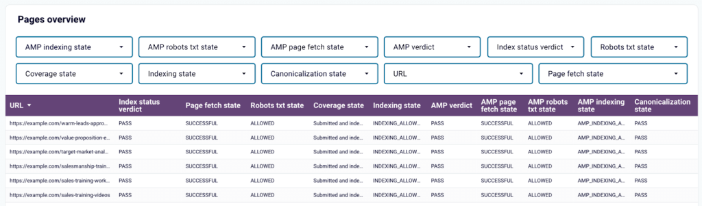
However, a lot of information you need for this can be found in GSC, although the platform doesn’t make it easy to access. What GSC gives you is just a table with unstructured data, and you have to make twists and tweaks to get to the essence. Additionally, some things can’t be viewed in bulk, and certain data is only available via the API. That’s why a custom dashboard for technical audit is a much more convenient option.
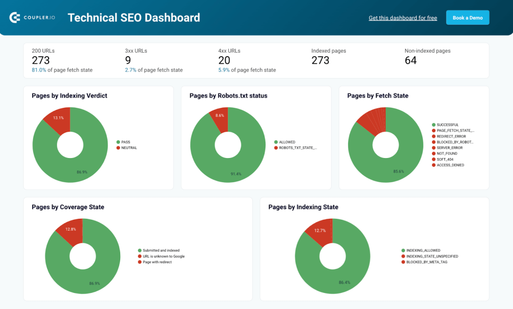
For example, the dashboard above extracts relevant data from GSC and automatically visualizes it in an analysis-ready format. As a result, you can quickly assess the situation at a glance. You will know something needs your attention if you see a red wedge on the green pie chart.
Here’s why I think this dashboard is a good example:
- It’s a free GSC-based dashboard enabling you to see all the issues with your or your client’s website that GSC can see
- A complete technical audit of your website’s health. Once you have the results of the first audit, you can use the dashboard for routine checks
- 1-minute set up – data is extracted from GSC and visualized automatically; you just need to plug your GSC account into this free template
- Data can be filtered and sorted for a more granular view – analyze individual pages to fix the discovered issues
- See the list of submitted and un-indexed pages – check if your pages were affected by the latest search engine algorithm updates and take timely action
- Identify pages blocked by Robots.txt and robot tags
- Monitor page rendering status and check the AMP status
This dashboard was created by the Coupler.io team for our internal use, but we are pleased to share it with you as a free template. It’s available in two versions: for Looker Studio and for Google Sheets. I believe the opportunity to have a user-friendly technical dashboard based on GCS data is a great thing, so I encourage you to try it out.
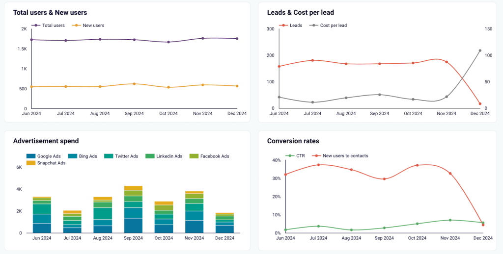
3. SEO funnel dashboard: see the impact for business
This dashboard type bridges the gap between SEO data and sales results. We all know it can be difficult to understand how search engine optimization impacts your client acquisition funnel and how it brings you revenue.
To see this connection, it’s necessary to combine data from several sources. You can build an SEO funnel dashboard based on joined data from GA4 and your CRM platform. Such a dashboard will give you:
- A complete picture for analysis. Track how the key events convert into leads and check how much those leads paid.
- Data from several apps in one funnel. As the report combines data from GSC, GA4, and a CRM (HubSpot or Pipedrive) and presents it as a single funnel, you can clearly see the stages of the customer acquisition process.
- Clear business value and efficiency evaluation. Check the revenue produced by your SEO efforts, and analyze conversions and cost per lead.
- A compelling presentation of your results. An SEO funnel dashboard is perfect for presenting your results to stakeholders as it shows the impact on business.
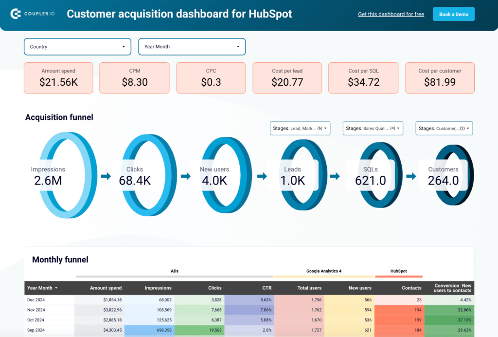
We don’t have a public example for this dashboard type, but here’s a similar one to help you understand what it can look like. The funnel dashboard above is created for a slightly different purpose. It represents the impact of paid ads on user acquisition and shows the funnel stages – from impressions and clicks to converting users into leads and customers.
The template collects data from PPC platforms, GA4, and a CRM platform (HubSpot or Pipedrive). However, it can be easily adjusted for SEO purposes. So, instead of the Ads block, there would be data on SEO organics, and the rest will work by the same principle.
In short, an SEO funnel dashboard can demonstrate a complete process: from SEO metrics to the main funnel stages and the revenue produced by SEO.
If you need such a dashboard, you can book a demo. Our data consultancy team will help you adapt this template for SEO or find another tailored solution.
4. Rank-tracking SEO dashboard: swiftly react to changes
Analyzing SEO results is impossible without rank tracking, so it makes sense to build a dedicated dashboard for this. It can combine data from Google Search Console, Ahrefs, position tracking tools, and various other tools you use. The example below shows what it can look like:
This dashboard allows you to monitor changes in the positions of your top priority keywords and quickly estimate the dynamics for different keyword groups:
- Check the ranking for your top keywords. The set of scorecards shows the percentage of growth or drop for your keywords grouped by their position (1-3, 4-10, 11-20, and 21+). This helps you to instantly identify areas that require attention and improvement.
- Monitor the share of keywords with different positions. See how the majority of your prioritized keywords perform in ranking. In the example above, over 35% of keywords rank from 1 to 3.
- Track SERP position over time to understand the dynamics. The line graph shows the performance of your high-priority keywords grouped by their position (from 1-3 to 21+). This shows you the key trends and helps you work on improving your SEO strategy.
- Conduct historical analysis with the 12-month summary of data on SERP position. This gives you more context for analysis and gives you a valuable retrospective.
- Filter data by semantic groups to narrow down results and see how different topics drive performance.
- Analyze position changes compared to 7 days ago and 30 days ago. The dashboard also contains a data table with a breakdown of these metrics for individual keywords.
If you want your own rank-tracking dashboard tailored to your tasks, please contact us, and we’ll discuss the possible solutions.
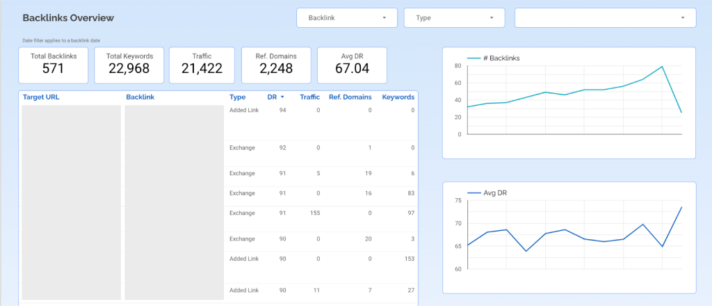
5. Backlink report: analyze efficiency
The next example I wanted to share is a backlink overview report. There are different approaches to working with this data, depending on your goals.
- Backlink tracking. If you want to monitor backlinks and their overall performance, you can do this with a dashboard like the one below. It includes scorecards with the key metrics and a data table showing DR, Traffic, and Keywords for each backlink. The line graphs help track dynamics over time, and filters allow you to filter data by backlink type, date, and individual links.
- Tracking with funnel analysis. Another option involves putting backlink data into a broader context for more in-depth analysis. For example, here’s a referral traffic dashboard showing New users, Event count, and Purchase revenue for each partner website. It allows you to see which referrals are the most relevant and profitable. This report can be combined with a list of backlinks secured by your digital marketing team.
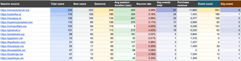
- After adding this data, it will show you not only the number of backlinks, but also the traffic they get, generated events, and the revenue produced by your link-building campaigns. That’s much more than what you can get from some specialized services. From my experience, they sometimes charge $100 for a report that shows you neither traffic nor conversions.
You can build such a backlink report on your own or contact our data analytics consultancy team for help.
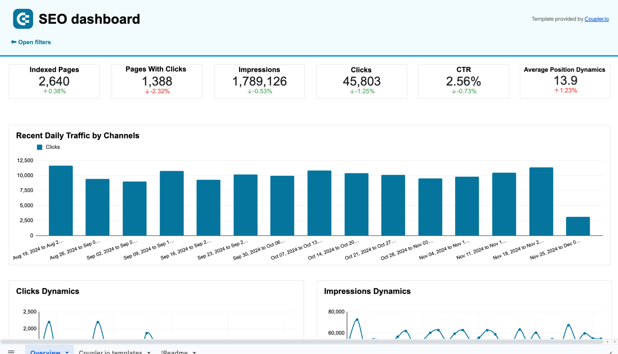
6. Search Console overview dashboard: make your data analysis-friendly
The next example on my list is the overview dashboard for Google Search Console. Strictly speaking, all this information can be found in GSC, but that raw data is far from being in an analysis-ready format. For this reason, I recommend having a dedicated SEO dashboard. Here are some advantages of this approach:
- User-friendly data visualization. Working with GSC is very inconvenient, and it’s not easy to find what you need there. With an SEO dashboard, the key performance indicators and dynamics are on the front page.
- Aggregation by month and week. GSC doesn’t offer data aggregation: the performance information is only split by day. With a custom template, you can see weekly and monthly data ranges.
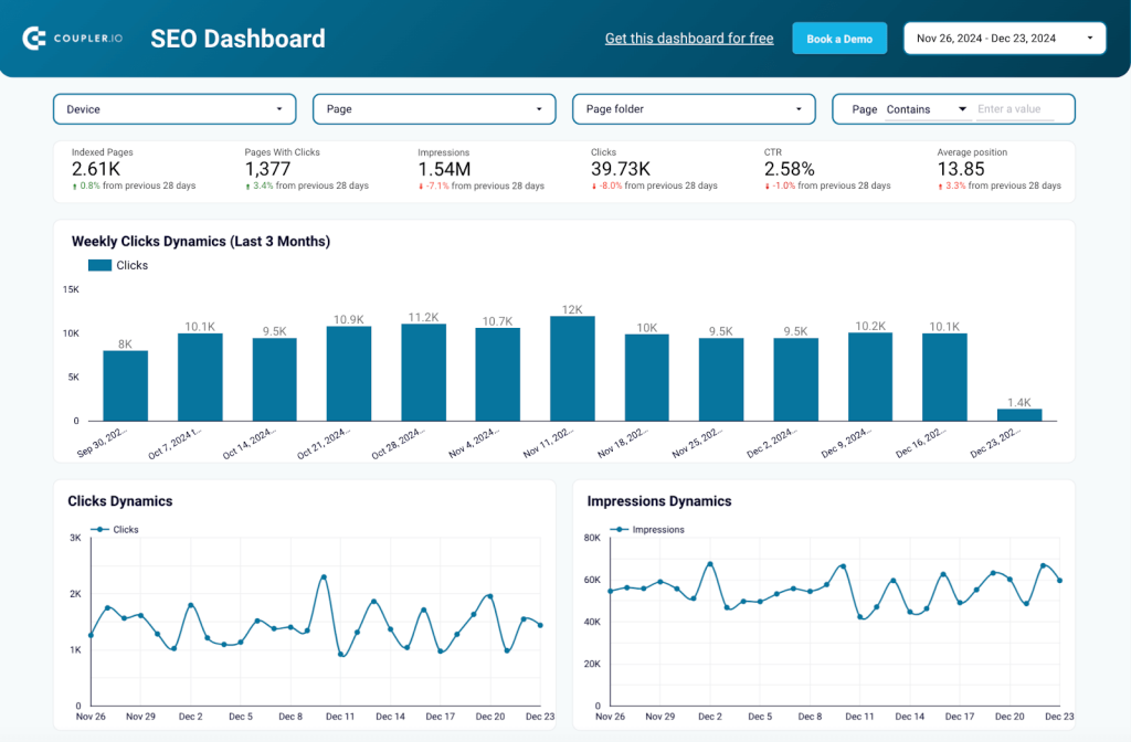
- Advanced filters. The set of filters offered in Google Search Console is extremely limited. When you build a custom dashboard, you can add advanced filters for fast and convenient analysis. In this example, data can be filtered by Device type, Page, Page folder, and custom values.
- Tracking dynamics. You will be able to see performance dynamics for the selected date range and with all your advanced filters applied. At the same time, GSC doesn’t show you dynamics at all.
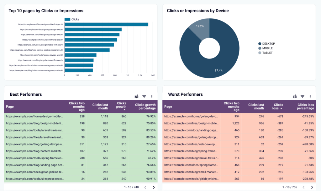
- See best- and worst-performing pages. You can check the list of landing pages that show growth or a decline in clicks. This helps you quickly react to any issues and adjust your strategy. GSC doesn’t show you this data in an easily accessible way.
In conclusion, a custom GSC dashboard can help you extract useful insights from your SEO data. At the same time, native GSC reporting often makes your data obscure and difficult to work with.
The dashboard I showed as an example is available as a free template. It comes in three versions: for Looker Studio, PowerBI, and Google Sheets. To use this template, select the version you need from the banner below and check the setup instructions on the Readme tab.
SEO dashboard for Google Search Console in Google Sheets
Get an overview and details of the key performance metrics from Google Search Console required for SEO of your websites.


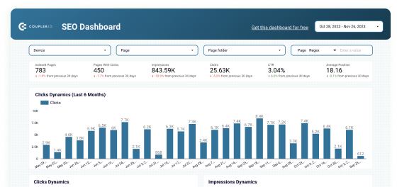
SEO dashboard for Google Search Console in Looker Studio
Optimize SEO with Looker Studio’s dashboard for Google Search Console. Track and enhance page rankings, CTRs, and organic traffic efficiently.

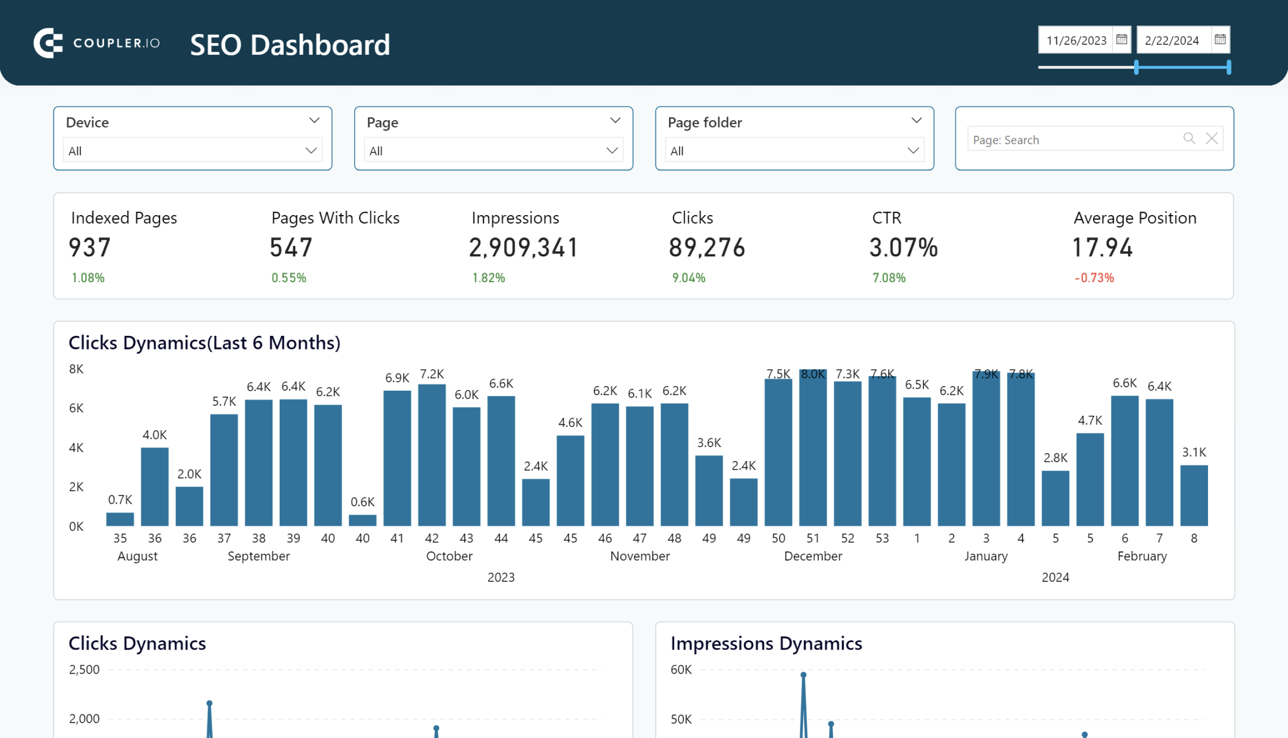
SEO dashboard for PowerBI
Optimize SEO with PowerBI’s dashboard for Google Search Console. Track page rankings, CTRs, and organic traffic efficiently.

7. Brand keywords performance: see the impact of ad campaigns
In this example, the dashboard contains data on organic search and paid performance (Google Ads vs GSC). This allows you to monitor your ad campaign spending and how much traffic you get for your brand keywords in search.
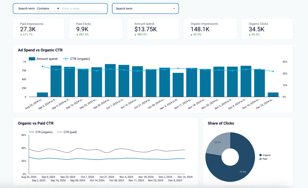
Here’s what you can do with a report like this:
- Track traffic dynamics for organic search traffic and for paid traffic. Analyze how performance changes over time.
- Check the share of clicks you receive from these two channels. If the ad share is 50% or higher, you should conduct a competitor analysis and determine whether you need to invest in ads to this extent. If your competitors don’t run ads actively, it’s possible to achieve good results even with a smaller ad budget.
- Estimate ad impact. Check whether a new ad campaign or ad budget increase results in improved organic traffic for your brand’s keywords.
- Compare metric dynamics. Look for correlations between the paid and organic performance in terms of traffic, clicks, impressions, and CTR.
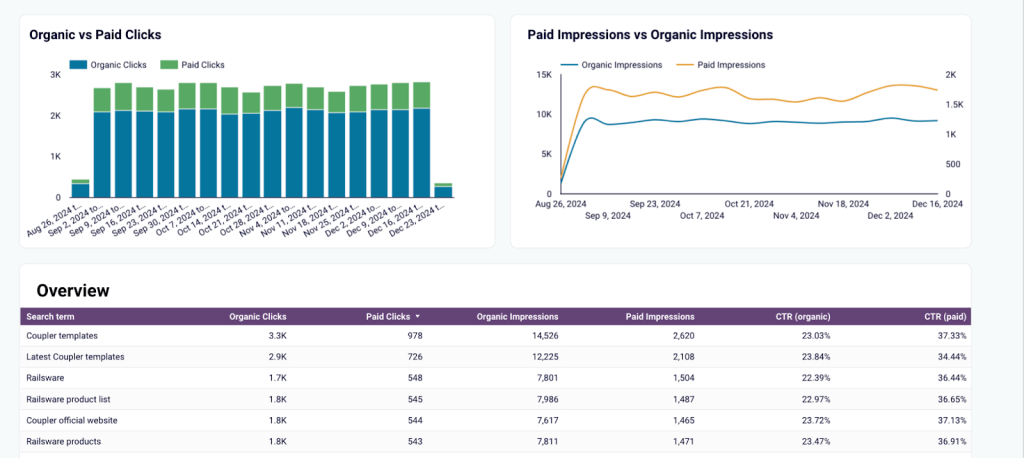
This dashboard serves as a valuable analytical instrument for marketers and SEO professionals. It allows you to understand impacts and dependencies that are difficult to track otherwise. Try our free template for the Brand keywords report and assess the impact of your ads.
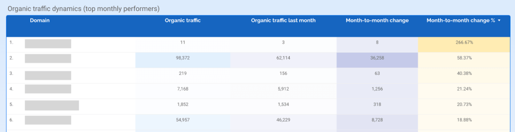
8. SEO competitors and market overview dashboard: get the context
Most SEO professionals do not perform competitor analysis every month as it can be time-consuming. But with an analysis-ready dashboard, it’s easy to regularly check data and see at a glance what’s going on in your business niche.
This helps you understand where you stand in the market and evaluate the impact of your recent activities.
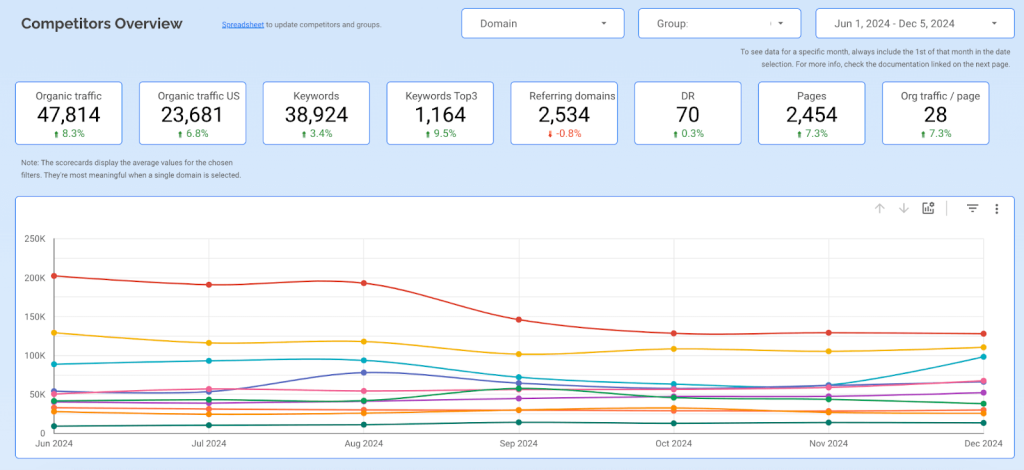
The dashboard I want to show you is based on the AhRefs API. It allows you to check right away what your competitors are doing and quickly understand which of them requires additional attention. As a result, you can detect changes in their strategy early on and investigate their success factors.
Apart from that, this dashboard also helps you to:
- Analyze traffic dynamics. Monitor changes over several months and filter data by group or domain to zoom in.
- Check the state of your niche. For example, you can see how the latest Google search algorithm updates affected your competitors. If traffic drops for the whole niche, you know the issue is not on your side. Alternatively, if only your metrics drop and the competitors get your traffic, you’ll know that, too. This dashboard gives you transparency and context.
- Get month-over-month comparison. Analyze the month-to-month changes in percentage and in absolute numbers to understand who had the biggest traffic increase or drop.
If you are interested in building a similar dashboard for your company, our data analytics consultancy team can help you with this. Please book a demo, and we’ll explore a solution tailored to your requirements.
9. Landing page performance dashboard: refine your strategy
This SEO report is vital for monitoring your website performance. It helps you see which landing pages and content types generate the best results. With these insights, you can adjust your content strategy and SEO activities to ensure the best outcome.
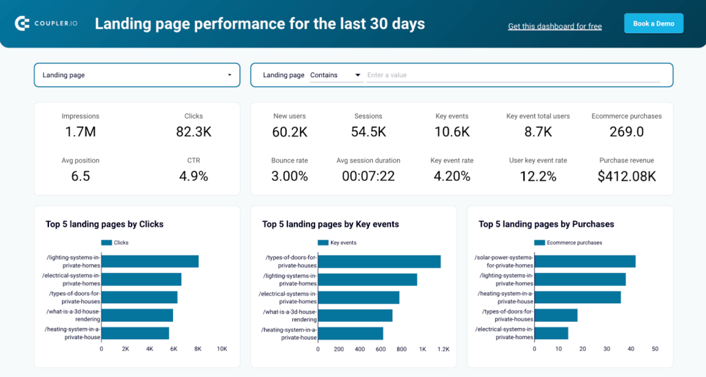
In this example, the dashboard combines Google Analytics data and Google Search Console data, providing you with the metrics for conversions and traffic on one page. Here’s how this helps you:
- Estimate efficiency. The data table below demonstrates how effectively your landing pages drive traffic, engage visitors, and convert them into customers.
- Analyze user behavior. Check how traffic correlates with the engagement metrics from GA4 (bounce rate, session duration, etc.). This will help you better understand how users interact with your landing pages.
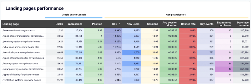
- Optimize SEO and ad strategies. Scan results for red flags and success cases. For example, check for pages with high traffic and low clicks or conversions. You can also identify pages with low clicks but a high conversion rate – a sign that there are growth opportunities there.
We offer this report as a free template in two versions; for Looker Studio and Google Sheets. Check out the Readme tab of the selected template for setup instructions.
10. Local SEO dashboard (for Google My Business): strengthen your online presence
The last example on my list is a dashboard for local SEO. Although not relevant for every business, this report type still deserves a mention. For companies that offer services at a specific physical location, Google My Business is an important instrument for engaging with local customers. A dedicated dashboard will help you analyze the data you collect and make the most out of it.
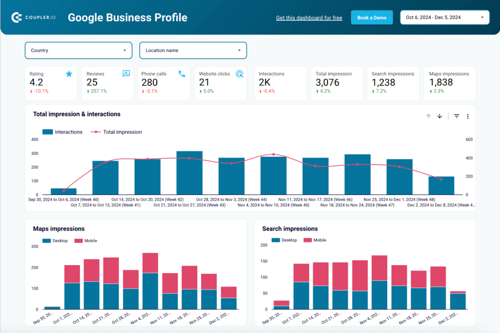
Above, you can see a dashboard template designed to track the main performance metrics. This includes Search impressions, Interactions, and Website clicks. The dashboard collects data from several Google My Business profiles so that it can be analyzed in one place. Here’s how you can use it:
- Check the dynamics for impressions and interactions. For example, if you are not getting enough impressions, you may need to work on the keywords in your profile.
- Analyze interactions by date and type. If you run ad campaigns, you can check whether this impacts performance.
- Use the Searches by Keywords table to see what brings you the best results.
- Track reviews and ratings. The template includes a separate tab dedicated to reviews. It allows you to monitor dynamics, analyze review sentiment, and check individual comments from the users.
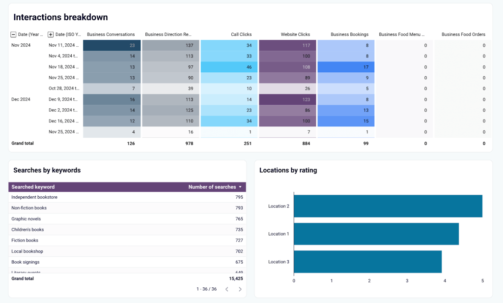
This Looker Studio dashboard is available as a free template.
How to track and analyze SEO performance. Tools and approaches to use
Hopefully, by now, I have persuaded you that an SEO dashboard is a valuable instrument worth having. Feel free to use the templates I shared or book a demo with our data consultancy team for a custom solution. But if you are considering building such a dashboard on your own, here are some tips to help you get started.
Tools that can be useful for building SEO dashboards
- Google Analytics 4 – one of the main data sources for an SEO dashboard. It gives crucial information about user behavior on a site and conversions (sign-up, purchase, install, form submission).
- Google Search Console shows you if Google has indexed your site’s pages, which keywords bring visitors, and how your landing pages are performing.
- Ahrefs – arguably one of the best SEO tools to analyze your backlink profile, research high-value keywords, and perform competitor analysis.
- SE Ranking – apart from tracking keyword rankings, this tool can be useful for conducting website audits and identifying ways to improve your website’s position.
- SpySerp – a tool that enables you to build easily customizable SEO reports and helps you check historical SERPs for your target keywords.
- Semrush – a versatile solution that is useful for keyword research, competitor analysis and conducting on-page optimization.
- SiteChecker – includes features for rank tracking, monitoring backlinks, and conducting technical audits of your website. It also combines its own data with the metrics from GA4 and GSC.
Ways to analyze SEO data: a checklist
Here, I won’t go into details and will only list the main ways in which you can perform SEO analysis. If you are interested in a more in-depth overview, please take a look at the Hands-on SEO analytics examples in one of our previous articles. It explains exactly how to extract insights with the help of SEO dashboards. You can also check our blog post on SEO analytics and Looker Studio SEO report templates.
Approaches to analyzing your data:
- KPI tracking and dynamics analysis
- SERP analysis
- Competitor analysis
- Time-over-time analysis
- Analyzing the best and worst-performing URLs
- Backlink analysis
- Customer behavior analysis
- Geographical analysis
- Technical SEO audit
- Content performance analysis
- Brand keywords performance analysis
- SEO funnel analysis
Use SEO dashboards that match your goals
Depending on your situation, you may not require every type of SEO dashboard on the list. However, some are essential, in my view: for instance, an SEO overview dashboard, a technical site audit dashboard, and an SEO funnel dashboard. The latter is particularly valuable as it can demonstrate the business value of your SEO campaigns and the revenue they generate.
A good option is to start with a free SEO dashboard template and then see if you need to customize it for your SEO reporting purposes. All the templates I provided in this blog post can be customized in Looker Studio, Power BI, or Google Sheets (depending on where they are built). You can use the native functionality of these tools to change colors, add more data sources, remove or rearrange graphs and add new ones, insert your logo, and so on. Alternatively, if you would prefer to get a custom solution tailored to your specific requirements, feel free to book a demo and discover the options available to you.
If this blog post was useful to you, I invite you to take a look at my other article, How to Build a CMO Dashboard That Makes Sense. Many thanks for reading!